Home Blog Page 180

Review: New Heroes Rise in STAR WARS: THE HIGH REPUBLIC ADVENTURES #2

STAR WARS: THE HIGH REPUBLIC ADVENTURES #2, available Wednesday from IDW, continues the tale of several younglings set in the time of the High Republic. Namely, young Zeen and Lula, two determined young women.

Things are not looking great on Trymant IV.

All of a sudden there has been so much in way of new material surrounding the High Republic. Both in books and comic books, the time period is blowing up. Thankfully, not literally. In fact, you probably noticed that there’s another series with a very similar name (Star Wars: The High Republic).

Both series do feature a combination of Jedi and their Padawans, though the focus for each feels very different. In this case, the dominant themes are loyalty, learning to make decisions, and the power of secrets.

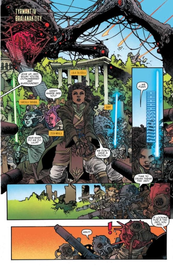
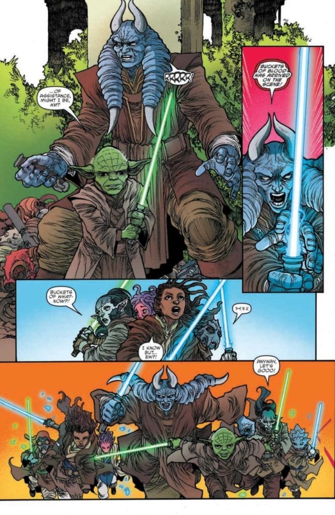
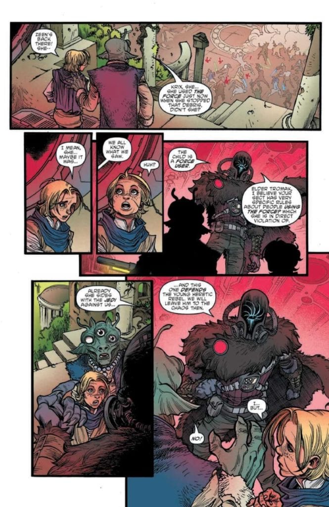
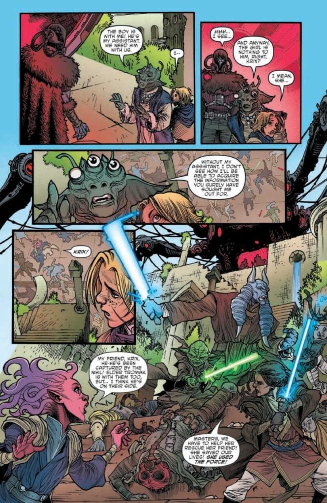
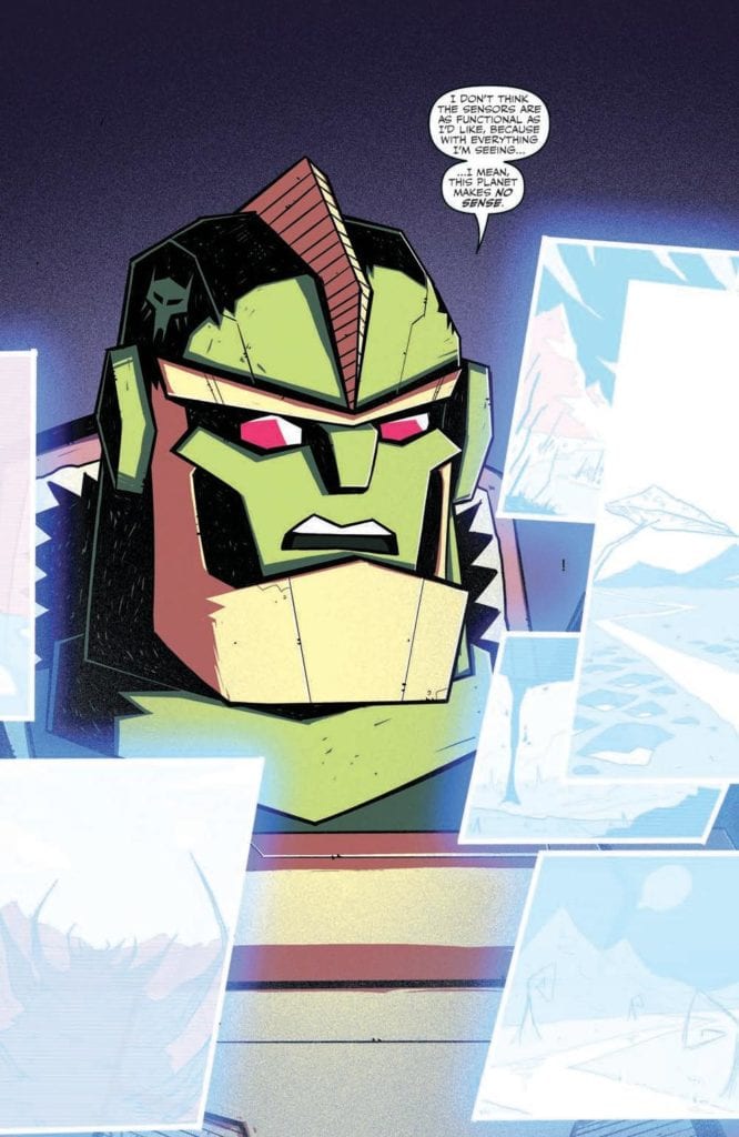
Star Wars: The High Republic Adventures #2 brings us back to Trymant IV, a planet that faces a fiery end. This is the planet that Zeen and Krix grew up on, and the planet that Padawans Lula, Farzal, and Qort all came to help.

Now would probably be a good time to mention that there’s a Nihil ship involved as well, and regular readers are probably already dreading what that could mean.


The Writing

padawans
Yet the Jedi and their young Padawans rally, even now.

While there’s no doubt that Star Wars: The High Republic Adventures #2 is targeted at a slightly younger audience, it makes no effort to dumb down the plot. Daniel Jose Older has written a plot that is both thrilling and tense, one that will hopefully result in plenty of character development down the line as well.

The devastation happening on Trymant IV won’t surprise anybody, myself included. It’s literally in the comic description. Yet there are several surprises throughout this issue. The first being that there’s a bit of humor hidden in this tense moment in time (thanks to a certain character and their odd choice of names).

Many characters were given a chance to shine here, getting a chance to show how they fight, think, or otherwise take action. It was fascinating to see and leaves me hopeful that this will be the expected pattern going forward.

There are many themes in this issue that will be familiar to Star Wars readers, as Daniel Jose Older made clever use of them. Such as the belief of staying true to oneself, and the consequences of decisions made. They feel right at home here, and help to solidify the series, rather than bring it down.

padawans
Meanwhile, another youngling must make a choice.

The Art

Star Wars: The High Republic Adventures #2 has to be one of the brightest Star Wars series I’ve read, and that’s saying something. The bright backdrops allow for a stark contrast, while also setting up for several fantastic action shots.

Harvey Tolibao and Pow Rodrix (Magnus Arts) were the lead artists, and their character designs are still one of the many highlights in this series. Each character looks unique and memorable, especially the ones that have been named (obviously). There are some intentional contrasts being drawn here, both in writing and in design, and it makes for an iconic look.

Rebecca Nalty’s colors really do give this issue such a bright look to it. These are bright battles, space scenes, and so much more. The use of solid and bright colors for backdrops is not new but is used to great effect here.

Jake M. Wood’s lettering is surprisingly evocative, capturing the depth and complexity of the situation, not to mention the high emotional levels that are running all over the place. The letters also help to increase that feeling of danger, as impacts feel and look real.

padawans
Who will he choose? The one speaking up for him, or his friend?

Conclusion

Star Wars: The High Republic Adventures #2 continues to build upon the characters and world that have been introduced. These young Padawans feel full of potential, and it’s impossible not to root for them as we watch their journey progress.

Monkeys Fighting Robots Youtube

Review: Chaos, Resumes, and Social Media in MARVEL ACTION: CAPTAIN MARVEL #1

MARVEL ACTION: CAPTAIN MARVEL #1, available Wednesday March 3 from IDW, is about to bring two iconic heroes together for a highly unique tale. It’s a tale that brings in concerns of the modern age. Namely, social media.

Carol
Look at Chewy on that leash!

Is it true? Is Captain Marvel really getting another Marvel Action series? Well, yes! She is. Marvel Action: Captain Marvel #1 kicks off an all-new series, featuring a beloved heroine, her stubborn flerken, and all of her allies.

Given that this is Marvel Action we’re talking about, we already know that this series is going to be both light and approachable. It’s perfect for all ages, but especially for those readers out there that could use a bit of a break from all the doom and gloom.

And you just know that this issue is going to be full of humor. How could it not be, when the core concept revolves around Captain Marvel, queen workaholic, trying to take a vacation? A vacation ordered by her best friend, mind you.

Carol
Enter young Gwen, aka Ghost-Spider, a fan of Chewy, and a great potential candidate for Carol’s new program.

The Writing

Marvel Action: Captain Marvel #1 is a lot of fun, thanks to Sam Maggs’ writing. It’s light and not afraid to get a little silly at times. Hard to believe, I know. But even somebody like Carol Danvers has a silly side. Probably.

The issue starts off with the highly entertaining concept of Carol taking Chewy for a walk (on a leash and everything) and quickly escalates from there. It’s exactly the sort of chaos one would expect from somebody promising to have a ‘relaxing vacation.’

That is to say, Maggs threw everything in Carol’s way, but did so in the most amusing ways possible. These scenes involved several other iconic Marvel ladies, including Ghost-Spider, Squirrel Girl, and Ms. Marvel. That alone makes it worth the read, don’t you think?

All things considered, this isn’t a plot that dives too deeply into character growth, drama, or any of the heavier concepts that Marvel loves to play with. And that’s not a bad thing. It makes for a bright break from the norm and is diverting and comical in its own right.

I would like to mention how refreshing it is to see social media handled in such an open way. Maggs played with the concept of superheroes (especially the younger ones) living in a world full of social media. This also opened the door to (briefly) touch upon the dark side of that subject: the comments section.

Carol
So much for Carol’s vacation, huh?

The Art

As much fun as Maggs must have had when writing, Marvel Action: Captain Marvel #1, the artists also seemed to really enjoy their work here. Mario Del Pennino (layout artist), Isabel Escalante (inks), and Heather Breckel (colors) were all involved in this project, and they really let so much personality shine through.

The scenes portrayed in this issue are all lighter in tone, matching the writing perfectly. They portray everything from bubbly and BFF vibes, to chaotic fun. Am I giving them bonus points for creating a scene where Chewy somehow not only got leashed, but happily walked through New York City? Yes. Am I okay with that fact? Also yes.

The character and costume designs are another noteworthy feature. Right away readers can tell when something is off, and that really does heighten the whole experience. As do the occasionally over-the-top reactions that occur.

Something seems…off here…

Conclusion

Marvel Action: Captain Marvel #1 is a fun and light read, one that is perfect for anybody looking for a bit of a break. Or a lot of tongue-in-cheek humor. Either way, it’ll get you laughing at the antics of this crew.

Monkeys Fighting Robots Youtube

FEAR CASE #2: The Anticipation That Comes From Intrigue

Fear Case #2 from Dark Horse Comics, out March 3, depicts the titular MacGuffin and how it controls the plot. Under the pen of writer Matt Kindt, known for his work about the influence of memes like this series’ predecessor Bang! this issue shows how the plot tells itself. With art by Tyler Jenkins and Hilary Jenkins’s colors, the anticipation on display creates a thick atmosphere.

Fear Case #2: The MacGuffin Case

For clarity, a MacGuffin is a plot device that advances the plot and character motivations despite its insignificance. Think of the iconic case from the movie Pulp Fiction in how it drives the plot. It’s not a doomsday device or money; it’s just something everybody wants and can change a subplot’s direction. With Kindt at the writing-table, this concept combines with Lovecraftian horror.

Our quirky secret service agents Mitchum and Winters, who the audience comes to love in the last issue, chase every lead. From how the case has rules surrounding it, Fear Case #2 provides context as to why. While the Secret Service wants to secure it, Mitchum and Winters are becoming obsessed with it. It doesn’t help that there’s a criminal gang looking for it too. Hence why there’s a time limit for the agents, stay on the assignment too long, and the case consumes them.

It sounds ridiculous when you hear the outline, not that the reader won’t feel the obsession. The case, through its own set of rules it instills, sends whoever is pursuing it on a wild goose chase. Nobody knows how or why, but somehow, it can motivate whoever has it to pass it along, all from a box that has no value other than the one it fabricates. Through Mitchum and Winters, the reader feels the frustrations behind it all.

Anticipate The Madness

Tyler draws out the tension throughout Fear Case #2 with panels and images that make the reader feel uneasy. The pencils that make panel layers alone create small permeable barriers between situations. It’s like whatever’s on a page is ready to invade a moment of clarity. The images of eldritch horrors appearing at random times in characters’ thoughts only add to the cosmic horror. If Tyler also does the lettering, he arranges it in a way that assists in anticipation. Like when the agents feel the scent of death, leaving the reader anticipating.

Hilary certainly helps drive that feeling forward with her coloring. That rotten smell Mitchum and Winters feel gets a visual equivalent when Hilary shows the red colors of intestines. Those eldritch horror scenes often have colors that look gloomy with an otherworldly green and purple.

Does Fear Case #2 Have You?

Fear Case #2, much like its MacGuffin, digs its way into readers’ minds to see it through. Now that the rules of engagement are set up, it’s time to see what comes next. Just be sure to set up your own rules of engagement. Otherwise, the anticipation will kill you.

Monkeys Fighting Robots Youtube

DEAD DOG’S BITE #1: A Dramedy Of Twilight Tones

Dead Dog's Bite #1 Cover

Dead Dog’s Bite #1 begins a new Dark Horse series on March 3. With full creative duties going to Tyler Boss, this series opens on the relatable dramedy of adolescence.

Dead Dog’s Bite #1 Captures Awkward Adolescence

Tyler Boss gives Dead Dog’s Bite #1 a substance by evoking a sense of adolescent self-consciousness. Being self-conscious is a state that readers can find very humanizing; it’s one of the few ways to display character flaws without being too jerkish. It’s what makes Joe’s sass bearable as she’s a rocky stage of transition in life; she’s 18, on medication, and her best friend is missing. It’s what makes the semi-confrontational conversations she has with a cop and her best friend’s boyfriend easier. Joe’s one of those flawed yet empathetic people you can’t help but relate with.

That’s all especially relevant with how Joe’s town of Pendermills is very… odd, to say the least. The townsfolk are quirky as they can be, like the mayor whose cowboy cosplay at a search party can feel insulting. So why does it feel okay to the point of a town elder joining in on it? Probably because they just want to raise morale in an awkward fashion.

Then there’s someone who stands out among everyone in Dead Dog’s Bite #1, a narrator straight out of the Twilight Zone. From beginning to end, he’s the one who instills the reader’s interest in everything by putting them in the sense of self-consciousness. This makes the reader feel like they’re part of the town by interacting with this narrator.

Presenting The Anxiety

Throughout Dead Dog’s Bite #1, Boss presents every page with a sense of control and lack of it. The first pages have 9-panel grids that have the narrator catch the reader’s interest. Coming out of a manhole then following up with a disclosure certainly does that. The more important piece comes from how consistent the next page is until the last panel vanishes. It says time ran out after going over some rules with the reader needing to figure it out as they go.

Most of the pages follow the grid formats for similar acts of control and immersion. Most of them go for mixing between the formats of each grid. A 3-panel grid combines with a 9 panel to act like comic strips. Each row tells a story like Joe entering a story, and a newspaper is in the corner, foreshadowing a later event in the issue.

In juxtaposition, Joe’s actions control the moments the reader sees. So when the grids break apart the last row, Joe loses her control. The rest of the page continues with this as Joe interacts with people. Anytime she shares screen time with someone, they and Joe cause the panels to break down further. One page features a panel where Joe and her best friend’s boyfriend, Allen, say the same word as they share control of that moment.

Talking Weirdly

Standing out the most in Dead Dog’s Bite #1 is Boss’s implementation of unique dialogue between each character. Joe speaks defensively with a dry wit that hides thoughts of confusion expressed in a ball of lines. She wants to get control of her life by using her words to take power out of confrontations but has trouble getting everything together.

Compare this to the narrator, who is practically an extension of the narrative itself. He constantly has the reader’s attention to keep control, especially with how his word balloons arrange. The geometry they arrange in is neat and follows an easy pattern. Then he gives exposition in the form of an allegorical story. Unlike Joe, the narrator retains control and rarely seems to get thrown off.

Get On Dead Dog’s Bite #1

Dead Dog’s Bite #1 begins a phenomenal take on surreal towns like Twin Peaks by capturing the subjectivity of self-consciousness. Going into adulthood is a difficult thing to depict without alienation. It’s because it’s a period that is a spectrum of feelings ranging from funny to outright uncomfortable. Going onto a state of mood that fluxes between those feelings just happen to be the proper depiction. Boss takes on an unenviable task and blows everyone’s minds away with how he presents this phase.

Monkeys Fighting Robots Youtube

Review: INFINITE FRONTIER #0 Is Full of Excitement and Promise!

Infinite Frontier 0 Cover

The Journey into the Infinite Frontier has Begun!

It has been a journey going through each of the Future State titles. One would consider it a new frontier full of possibilities. But while we were focusing so much on the future, what is happening in the present? In the wake of Dark Nights Death Metal, the heroes and villains unite to create a new station to protect the world from future cosmic threats. They also use it as a staging ground to map out this new multiverse. While this new infinite frontier is laid out before our heroes and villains, only one question remains. Where do we start?

Infinite Frontier 0 Cover

**Some Spoilers Below**

Story:

We open with the multiverse reforming and Wonder Woman popping out near the center of it. As she gets her bearings, she is greeted by the Quintessence, the group of god-like entities observing the DC heroes. One of the entities, The Spectre, explains that she has been chosen to join their ranks because of her bravery during Death Metal. While she is flattered by the offer, Diana is hesitant. To help sway her choice, The Spectre offers to show her what has happened that has started since the new era began. There the pair travel across this new frontier, seeing what the heroes are up to.

The problem with writing this review is that there is A TON of stuff that is revealed. The Quintessence is only a framing device for an issue dedicated to setting up the new comic arcs. We see the beginnings of the next incarnation of the Justice League, Barry giving Wally the title of The Flash, The Justice Society coming back into play, and so much more. It’s honestly really overwhelming trying to keep track of it all.

The strongest pitch, and the one with two sections of the issue dedicated to it, was the Batman set-up. We see our next antagonist step into the spotlight with an explosive plot that continues to reshape Gotham. What’s coming up will be divisive, as this can be seen as a board clear to tradition. This reviewer, however, is intrigued, to say the least.

Art:

There are a plethora of art teams, each bringing their own unique styles to the tales they are presenting. No two stories look the same, and it just shows how diverse these stories really are. 

The highlights of the bunch would be Dave Marquez with Justice League, Stephen Byrne with Alan Scott’s story, and John Timms with the framing story. Dave’s take on the Justice League is simplistic, relying more on more traditional designs to bring people in. The same can be said with Alan Scott’s Story, leaning towards traditional design and softer colors to help deliver a more personal story. Finally, we have Timms work for the framing story, and honestly, it’s cosmically brilliant. He is able to truly capture the size of the story with mind-blowing visuals, such as Wonder Woman and Spectre speaking to one another while looking down upon several adventures happening at the same time. The overall art is well done, but those three should provide hope for the coming series.

Conclusion:

Overall this bombastic first step into the Infinite Frontier is an interesting one. We get a ton of peeks into the coming stories, promising new adventures for fan-favorite characters. The art for each story fits perfectly and would get any reader excited. The only complaint I actually have is the fact that it can be a tad overwhelming. This comes with every DC era start, but it really never gets easy. That doesn’t mean I personally didn’t have a good time, just be careful if you’re looking for one particular story.

Monkeys Fighting Robots Youtube

Review: The Aliens Arrive Early In TRANSFORMERS: BEAST WARS #2

Beast Wars

Transformers: Beast Wars #2 out this week from IDW Publishing introduces more familiar faces from the TV series much earlier than in the original story. The early arrival of such a well-known element of the old show shows the comic is planning ahead. The surprise arrival is made possible thanks to Erik Burnham (Writer), Josh Burcham (Artist), and Jake M. Wood (Letterer).

Summary

The Maximals, led by Optimus Primal, and the Predacons, led by Megatron, have crashed on a strange new world and they are not alone. To survive the planet…they’ll have to explore their surroundings and their new bestial alt-modes in search of an advantage.

Beast Wars

Writing

Within the first few pages, the Vok are introduced to the story. The Vok were revealed to be the puppet masters behind many of the mysterious elements in the Beast Wars TV series. In this issue, it is apparent these creatures are aware of and observing both the Maximals and Predacons from the moment they arrive on the planet. This early introduction is another major indication the new comic intends on adding unique aspects to the overall story.

Writer Erik Burnham is slowly re-establishing the story of the Beast Wars. Characters are still trying to analyze their surroundings and figure out what they should do next. The familiar characters are perfectly represented such as Tarantulas is shown to be more concerned with research and Rattrap annoying to his teammates. There is a battle later in the issue though so the issue isn’t without action.

Beast Wars

Artwork

Josh Burcham provides both linework and colorwork for the issue. The linework makes sure to distinguish the Vok are a different race of creatures than either the Maximals or Predacons. Yet, it captures the floating head with tendrils look from the CGI TV show and makes it very recognizable.

Burcham’s colorwork for the issue allows for a subtle fade effect as characters transform into their different modes. The use of more pastel tones on the Vok makes them look unnatural, especially as the other characters become white and black when they appear. It conveys the Vok operating on another plane of existence.

Beast Wars

The lettering work by Jake. M Wood offers visually pleasing sound effects and distinct styles for when computers are presenting data to the characters. Strangely, there is no change in font or word bubbles for the Vok. This seems like a bit of a wasted opportunity as they are supposed to be alien beings the Transformers are unaware of. The use of a distinct font could add to their otherworldly aspect.

Conclusion

Transformers: Beast Wars #2 has a nice twist with the early introduction of the Vok but still moves slowly in establishing the familiar story. Still, the revelation the Vok are not only present but are monitoring all events from the very beginning shows ambition. It means the creative team will have to work on some surprises the old school fans won’t see coming.

Monkeys Fighting Robots Youtube

MAN-BAT #2: Keeping Things In Episodic Fashion

Man-Bat #2 Cover

Man-Bat #2 continues the surprise DC Comics series on March 2 after appearing in Future State’s shadows. Writer Dave Wielgosz crafts a short-term story within a larger one, a feat uncommon in miniseries. With art as eye-catching as Sumit Kumar’s, the issue certainly feels big enough to stand on its own. That, of course, gets help from the vibrant color array from Romulo Fajardo Jr. The lettering by Tom Napolitano compounds this further by giving captions design as unique as the character voices.

Background

Kirk Langstrom, the Man-Bat, has been getting favorable depictions in series like Justice League Dark. Before all of that occurs, Kirk was at his lowest with the Man-Bat being the only thing that gives his life meaning. But when this addiction causes an incident, Kirk wants to try and fix everything.

Man-Bat #2: A Jumping On Point

Man-Bat #2 introductionWielgosz demonstrates Man-Bat #2‘s narrative like it’s an issue of another series. He provides just enough context to set up the premise of the series as well as the issue. In this case, it’s Kirk’s initial humanitarian efforts to help people like his deaf sister. Only for his work to take over his life and hurt people around him. This makes Kirk a very sympathetic character who has gone through loss and is trying to take responsibility. The only problem is, Kirk is ignoring the core roots of his problems. As the premise sets up, Kurt tries to control everything without realizing why that’s a problem.Conflict in summary 
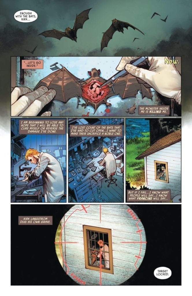
The inclusion of the pre-Taylor Suicide Squad is practically a reflection of Kirk’s situation. The squad is mostly Batman’s rogues’ gallery-like Deadshot and Killer Croc, once great villains now a disposable clean-up crew. They want to capture and control Man-Bat in a way like the overarching villain Scarecrow uses Kirk’s Man-Bat serum to build an army. Everybody is so focused on trying to take control of Man-Bat they fail to actually fix anything.

While Man-Bat #2 does continue a larger story, its ability to tell an individual story within its boundaries is remarkable. It doesn’t just make things easy to jump into; it stands on its own little narrative.

Scale Of The Man-Bat

Kumar presents Kirk’s character arcs in substantial and weighty ways in Man-Bat #2. The opening page features a wide-open sky full of beautiful stars where a couple bonds. Everything looks good until a smaller panel pops up, revealing that the happy memories drifted away. Kirk felt small in many of the panels he was in, like his makeshift lab, as small and helpless as the bats he dissected. When Deadshot shoots at him, the large volume of Man-Bat is a pure attempt at animalistic intimidation.

Just another point
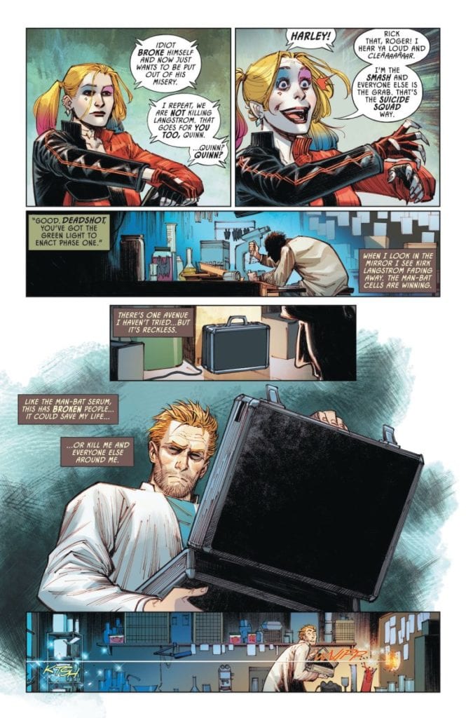
The dark coloring of Man-Bat in action via Fajardo adds to the intimidation. It’s a strong contrast to the colorful Suicide Squad who forces Man-Bat out in broad daylight. The shading that Man-Bat is covered in when he’s on the offensive is often in blurring speed. This makes Man-Bat feel like a predator that’s always moving. Unlike when he is clearly seen, which displays him in vulnerable positions.

To complete how Man-Bat dominates whatever page of Man-Bat #2 he’s on, the captions by Napolitano display his nature. In comparison to Kirk’s uniform captions with a similarly dark color scheme and light fonts, Man-Bat’s are tattered black and bold font. It looks as if Man-Bat has taken control of Kirk with the way Man-Bat speaks as though they were different people.

You Can’t-Miss Man-Bat #2

Man-Bat #2 is part of a series fans can enjoy at any moment in time. This issue stands out by focusing on a character arc; it feels like an invitation for latecomers. There’s plenty of spectacle that lives up to the title character’s scale in both story and art. If readers go further in, they are sure to get rewarded for following this series.

Monkeys Fighting Robots Youtube

Review: Old Evils Come Home In THE DREAMING: THE WAKING HOURS #8

Writer G. Willow Wilson and artist Nick Robles, along with colorist Mat Lopes and letterer Simon Bowland, return with another chapter of their outstanding addition to the Sandman mythos in The Dreaming: The Waking Hours #8. This issue sees Heather After, Ruin, and Jophiel take a trip to the land of Faerie (some more reluctantly than others), and what results is quite possibly the most outright entertaining issue of this series thus far. With a hilarious and well, sexy script and staggeringly incredible artwork, this is a masterwork of a comic issue and possibly the best single issue of 2021 so far.

“Heather After has a theory about just where Ruin’s lost love might be found…but the realm of Faerie is a dangerous place under the best of circumstances, and as Ruin, Heather, and Jophiel will quickly find when they cross between worlds, the circumstances there have changed quite a bit!”

Writing & Plot

G. Willow Wilson has been firing on all cylinders during this run, so when I say that her script on The Dreaming: The Waking Hours #8 is some of her most impressive work yet, I’m saying quite a bit. The different personalities of the angel Jophiel, the naïve nightmare Ruin, and the confident sorceress Heather. After are all written to clash and bounce off of one another, and it makes for some of the best conversational dialogue I’ve ever read in a comic. The humor in this issue is outstanding, and every funny bit lands with a chuckle. The latter part of the issue with the group’s arrival in Faerie makes for the most hilarious yet ominous moment in the book, blending humorous sexual comedy with that classic Sandman mythological subject matter and dark magics. Indeed, there is a growing dark undertone to this comic that carries along as Dream follows the trio’s trail, making for a layered and complex read. This mix of whimsy, humor, and threatening auras is pure Sandman magic of course and is the exact sort of thing one would expect to see in a book sprouting out of Gaiman’s universe. However, it’s not since Gaiman’s original Sandman that this world and this cast of characters has been so damn delightful to be a part of.

Art Direction

The phenomenal Nick Robles, the artist behind the first 6 issues of The Waking Hours, finally makes his return here for issue #8. While the fill-in artists have done amazing work, I’d almost forgotten what I was missing when I saw Robles’s pencils again. His thin, delicate linework allows for so much intricate detail and animation on every panel, and everything springs forth on the pages from the décor of a coffee shop to the fur of a burly minotaur. The animations for every character, both main and random extra, are full of individual life, and the personalities of each person come through perfectly. Robles may indeed have my pick for my favorite drawing of Dream of the Endless (maybe, at least for Daniel, if not Morpheus). Robles’ originality and vision construct page layouts is once again an awe-inspiring experience, as he once again eschews traditional formats and directing for images that organically bleed from one image to the next. Panel borders hardly seem to exist, and when they do, they are unnoticeable – but nothing ever feels cluttered. Mat Lopes’s colors once again work immense wonders into this saga in the Sandman Universe, offering an incredible array of tones on every page. I admired the opening orange sunlit scene in a coffee shop on the first couple of pages for a few long moments before moving on. This is a pretty tame scene compared to Lopes’s coloring of Dream and the Dream realm, Faerie, and numerous mythological beings and the luminous colors they exhibit. It’s just such simple moments are rarely given such beauty in this or any medium. Simon Bowland’s lettering is as grat and consistent as it’s always been, with the character-themed fonts and pitch-perfect bolds and italics on every page. The Dreaming: The Waking Hours continues to be one of the best-looking comics on stands right now.

The Dreaming: The Waking Hours #8 is a stupendously clever and witty comic. G. Willow Wilson’s script offers up a ton of personality and heart, as well as some of the funniest moments ever seen in a Sandman comic. The visual work is once again outstanding, with Robles’s pencils and Lopes’s colors creating a world that can only be described as the height of visual work in the comics medium. Be sure to grab this newest issue when it hits shelves on 3-2!


Monkeys Fighting Robots Youtube

5-Page Preview: THE EXPANSE #4 From BOOM! Studios

5-Page Preview: THE EXPANSE #4 From BOOM! Studios

THE EXPANSE #4 hits your local comic book shop on March 17, but thanks to BOOM! Studios, Monkeys Fighting Robots has an exclusive five-page preview for our readers.

The limited comic book series’s final issue is written by Corinna Bechko, with art by Alejandro Aragon, Francesco Segala drops the color and Ed Dukeshire’s letter work. W. Scott Forbes worked on the main cover, Tigh Walker and Will Sliney created the two variants.


About THE EXPANSE #4:
The series is set between the fourth and fifth seasons of the television show. Bobbie and Avasarala make their final moves in the battle to save humanity, but any victory may come with a cost neither of them is ready to pay.


Enjoy the five-page preview below:

Monkeys Fighting Robots Youtube

Review: THE SWAMP THING #1… Now THAT’S How You Start a Series!

The Swamp Thing creative team DC Comics

We live in exciting times. On the heels of DC Comics’ Future State, many creative teams are creating series that lead up to Future State’s events. The Swamp Thing is one of those series. Writer Ram V, artist Mike Perkins, colorist Mike Spicer, and letterer Aditya Bidikar are playing with our expectations in this issue. They are filling these pages with doom and gloom. But their characters, all new to the Swamp Thing mythos, read like old friends. They’re immediately familiar, full of life and plans for the future. So, even though we know we probably shouldn’t get invested in these doomed folks, this dastardly creative team gets us caring right off the bat. DC Comics’ The Swamp Thing #1 is the start of your next heartbreak. Minor spoilers ahead.

spoilers ahead

Writing

V doesn’t do much in terms of introducing our characters. Instead, he keeps us guessing. Levi, who it seems safe to assume is the protagonist, is returning from a trip home to India. He’s clearly recovering from whatever happened over there. But V doesn’t tell us what that was. He doesn’t give us Levi’s life story. V just puts Levi on a plane and fills his head with nightmares. It’s intoxicatingly mysterious. The only character V gives us details about is the Pale Wanderer. The Pale Wanderer is a being of legend. Characters at a crime scene swap ghost stories, building up the terror we feel that the Wanderer could be around any corner. When the Wanderer finally shows up, V does something that sends chills down the spine. He gives the creature a voice. This force of nature, that seems inhuman and ghostly, wants to chat.

In giving us lots of details about our antagonist, and keeping the cards close the vest about our protagonist, V ups the stakes. If Levi, whoever he is, ends up facing off with the Pale Wanderer, will he make it out alright? The answer: we don’t know. But knowing so little about Levi makes him a puzzle we want to solve. Though, occasionally, V does slip into exposition mode. Jessica, Levi’s friend, tells Levi why he was sent back to India. It feels like dialogue that’s aimed at the reader, not Levi. Levi knows why he went home. But V still obscures so many of the details of this story. And he’s setting up a cast of characters who soliloquize and share their hearts with one another. That’s just who they are. It’s the tone V is creating. In the midst of mystery, these characters have their hearts on their sleeves.

The Swamp Thing creative team DC Comics

Art

Perkins is just as much of a culprit when it comes to hiding the answers. In Levi’s flashbacks, Perkins makes us feel as though we’re caught between important details. The long, slender panels feel like half a picture. We see angry faces, crowds gathering, but we don’t get to see why. It’s infuriating and exciting, all at once. Perkins never lets us think, however, that he doesn’t know the answers. Every panel feels haunted by a deeper knowledge. It almost reads like Perkins is drawing these pages with a heavy heart. He knows the chaos he’s drawing his characters into. As the plane Levi’s on passes through dark clouds, Perkins makes them look like tentacles trying to grab ahold of the plane. Even seemingly innocuous images of trees feel like omens of death and destruction.

This all culminates as Levi runs to the bathroom. Perkins twists the panels, making them look lopsided and warped. It’s hard not to feel ill looking at those panels. Perkins so brilliantly replicates the feeling of dizziness in these pages, that it’s best to read this comic sitting down. Every inch of this issue is terrifying but beautiful. Perkins will lure you in  to this story and then scare the crap out of you.

The Swamp Thing creative team DC Comics

Coloring

Spicer’s coloring is breathtaking. It pairs so perfectly with Perkins’ art to make everything feel both foreboding and gorgeous. It’s in these pages that Spicer reminds us that bloody corpses and beautiful sunsets are both red. And our history lesson about the Pale Wanderer looks faded from time. But Spicer also makes these moments feel faded for another reason. These aren’t just old memories. We’re watching the progression of a man losing his humanity. The only moment that looks vibrant and alive on those pages, is the deep red image of the Pale Wanderer making his way through a group of soldiers. Whenever Spicer has the opportunity to connect something awful with something awe inspiring, he does. Haunting memories are a gorgeous orange. Every moment of terror somehow makes us want to dive deeper into the horror.

Lettering

Bidikar’s lettering is a tug of war between order and chaos. As we learn about the Pale Wanderer, some captions are given a text box and others are not. It’s the nonchalant captions that have clear boxes around them. These are the little bits and pieces that we’ll probably forget about soon enough. Little things like what the Pale Wanderer was doing before he became what he is. But it’s the captions that are just set against the page, with no border around them, that haunt the reader. “And instead of going back to civilization, he chooses to go deep into the hear of the desert,” one of these captions says. “He wanders, he hunts,” the next says. It’s a disconcerting idea. Why would someone choose to go out into the wilderness? It’s a dangerous caption. One that can’t be contained by text boxes or borders. With this small change in how they present the captions, Bidikar highlights the captions they don’t want us to forget. And we won’t.


DC Comics’ The Swamp Thing #1 is exactly how you should start a story. It’s full of mystery. It’s both deeply haunting and deeply beautiful. V, Perkins, Spicer and Bidikar are luring us into a dangerous new world. And though we may know, from Future State: Swamp Thing, where things are likely going, we’re glued to the page to see just how we get there. These characters feel like living, breathing human beings and the horror that faces them feels disturbingly enticing. Pick up The Swamp Thing #1, out from DC Comics March 2nd, at a comic shop near you. It’s the first issue of a surefire gamechanger.

Monkeys Fighting Robots Youtube