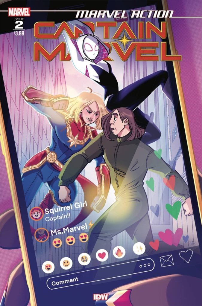
Captain Marvel and Ghost-Spider team-up in Marvel Action Captain Marvel #2.
IDW’s MARVEL ACTION: CAPTAIN MARVEL #2, available now, brings two (or three, depending on how you look at it) iconic heroes together for an action-packed adventure involving social media and trends.
Captain Marvel and Ghost-Spider team-up in Marvel Action Captain Marvel #2.
It’s still hard to believe that we’re lucky enough to get another Marvel Action: Captain Marvel series. But who am I to complain!? Better yet, this series seems to be bringing in many fan favorites – characters who would be a delight to see interacting with Captain Marvel.
Thus far, the series has been virtually full of ‘girl power’ characters – in all the best ways possible. Captain Marvel is reaching out to the younger heroes out there that need her help—all while getting a little bit of support from the younger generation at the same time. It makes for a light and approachable series for all.
Marvel Action: Captain Marvel #2 continues that trend, throwing Captain Marvel, Chewie (the one and only), and Gwen Stacey (Ghost-Spider) together for a chaotic battle against…technology?
The Writing
Marvel Action: Captain Marvel #2 is a fun and endearing adventure, courtesy of writer Sam Maggs. Picture a team-up between Captain Marvel and Ghost-Spider. Now imagine that Ghost-Spider is a bit on the younger side, in need of a mentor, and looking to increase her online presence. Now you have an idea of what sort of chaotic fun is in store.
This issue has a lot of fun with expectations and tropes surrounding the world of social media. It pokes fun at things like ‘ClikClok’ (any guesses on what that could be standing in for?), flash mobs, and social media trends.
It’s all in good fun, of course. It’s a great counter to work-obsessed Carol Danvers fans are most used to seeing. Perhaps this is precisely what she needed on her vacation. Granted, most people wouldn’t consider fighting a villain their idea of a break, but this is Carol we’re talking about.
Adorably, even Chewie seems to get a moment or two in this issue. While some people would be concerned about her joining in the fight, this is still a lighthearted issue. Meaning that nobody gets eaten – or sent to another dimension.
The Art
Unsurprisingly, the artwork in Marvel Action: Captain Marvel #2 is just as much fun as the writing itself. It isn’t every day you get to see Carol deal with social media – or save the day through creative means (though there is still some fighting involved, promise!).
You can tell that Mario Del Pennino (layout artist), Isabel Escalante (inks), and Heather Breckel (colors) all had a blast illustrating this issue. The scenes are sometimes silly but in a good nature sort of way.
Likewise, the colors in this issue are all very bright and eye-catching. Our leading ladies (all three of them) pop off the pages while they deal with the oddest of villains. Meanwhile, the villains feel intentionally slightly cartoonish, but in a way that will make you laugh.
Conclusion
Marvel Action: Captain Marvel #2 is another fun and entertaining issue in this series. If you’re looking for an issue that will make you smile, then this is the issue for you. The overall good nature and humor of the issue is very tongue-in-cheek and is perfect for audiences of all ages.
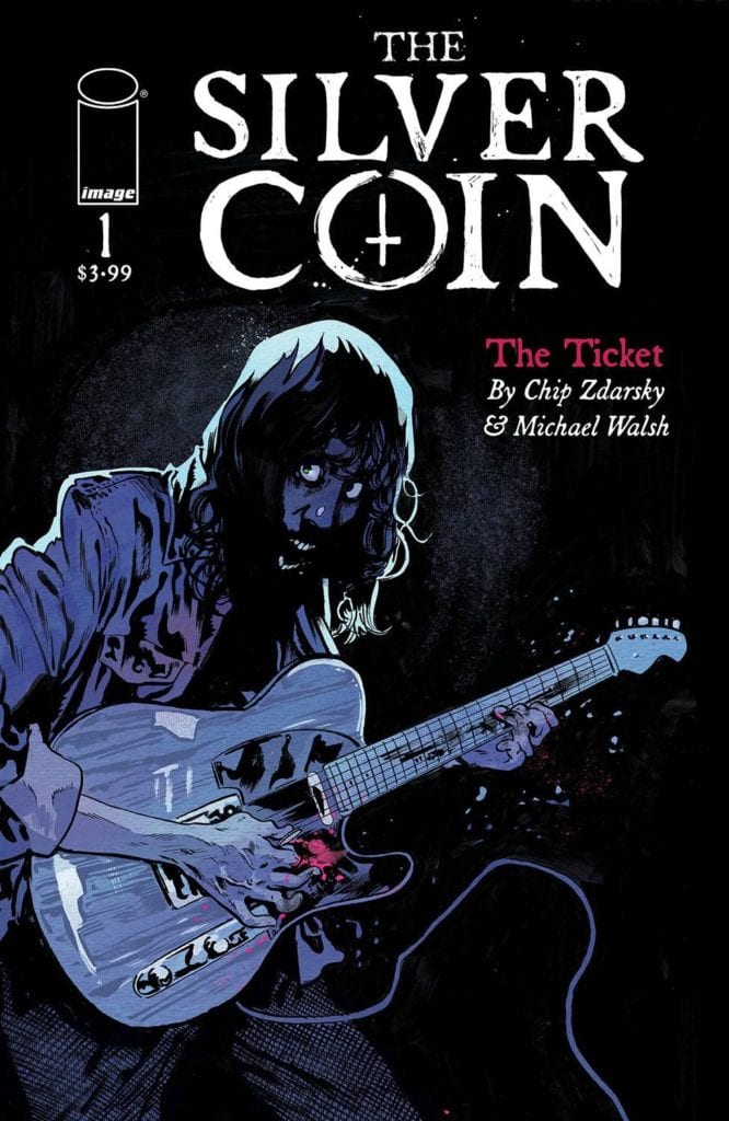
Silver Coin #1 is the start of a new anthology created by Chip Zdarsky, Michael Walsh, Kelly Thompson, Ed Brisson, and Jeff Lemire.
Image Comic’s THE SILVER COIN #1 is the start of a thrilling new horror series. One that brings many different creatives together. This is the first in an anthology created by Michael Walsh, Ed Brisson, Jeff Lemire, Kelly Thompson, and Chip Zdarsky.
Silver Coin #1 is the start of a new anthology created by Chip Zdarsky, Michael Walsh, Kelly Thompson, Ed Brisson, and Jeff Lemire.
The Silver Coin #1 is the start of a brand new collaboration, one that brings Chip Zdarsky, Michael Walsh, Kelly Thompson, Ed Brisson, and Jeff Lemire all together for one series. Specifically, it’s a horror series, and who can pass that up?
The first issue was written by Chip Zdarsky (Stillwater), and illustrated by Michael Walsh (Star Wars, Black Hammer), and it does an excellent job of setting the tone. But more on that later. Every issue will be set in the same world, one that is naturally quite full of horror, chills, and thrills.
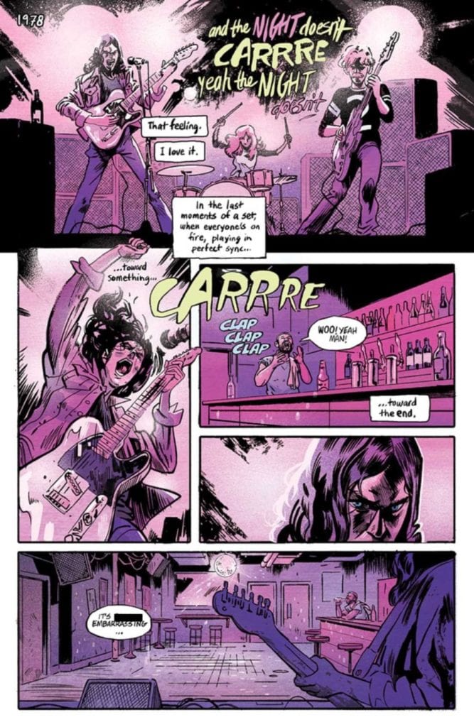
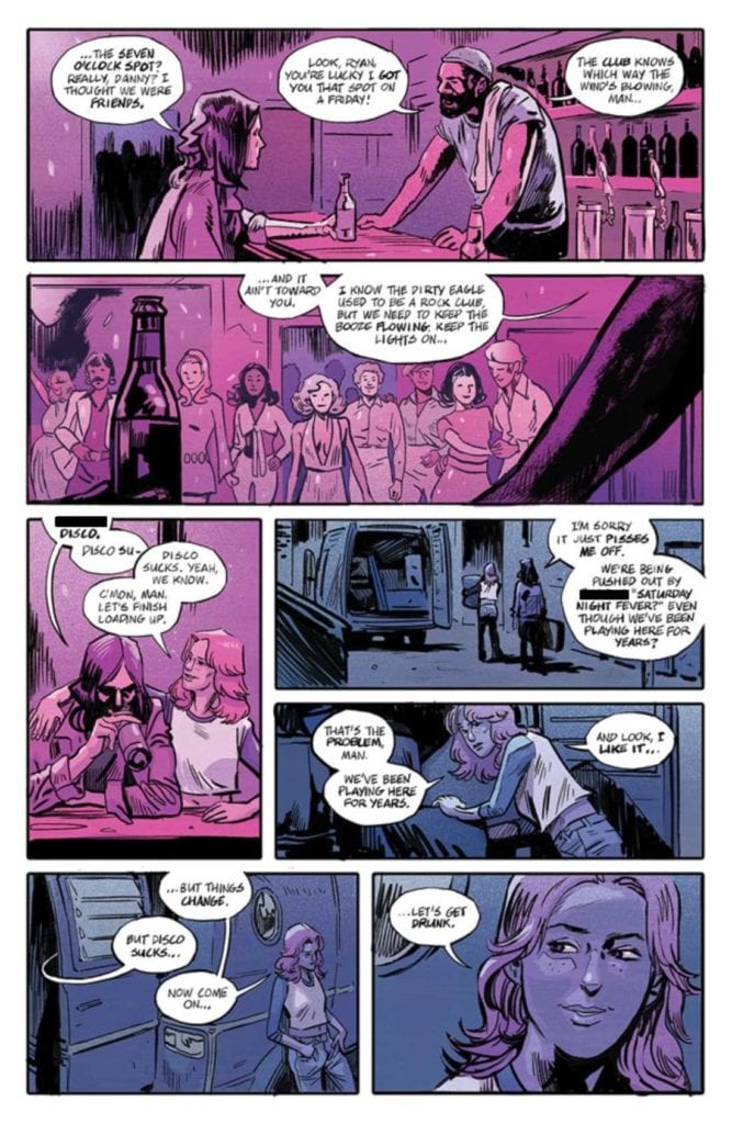
It’s 1978, and one rock band is falling to hold the attention of their audience. They just can’t outshine the newest trend – disco. That is until one of their bandmates finds this mysterious silver coin…
It’s one rock band versus the rise of disco in Silver Coin #1.
The Writing
If you’re looking for a graphic series that merges horror with rock vibes, then The Silver Coin #1 is an issue you need to pick up. Chip Zdarsky starts this anthology off right. The introduction is one that is easy to imagine and even easier to emphasize.
That fact makes what follows all the more tragic. The characters in this story aren’t necessarily likable – but they don’t have to be. Their struggle is real – a band fighting against the changing of the tides (IE: the audiences’ growing love of disco).
Zdarsky elegantly introduced the true driving force of the series: the silver coin. It’s immediately clear that something is wrong with this coin. Every time it comes into play, something happens. It’s easy to predict that things will worsen before they get better (assuming they survive that long).
One of the most intriguing parts of the narrative, at least for me, was watching how one character’s obsession seemed to grow. Sometimes it was subtle; other times, it seemed to double between panels. It spoke volumes about the horror of the unknown, and I can’t wait to see how the anthology’s next issue follows it up.
As you can see, the struggle is real in Silver Coin #1.
The Art
The Silver Coin #1 has such a dark aesthetic; it’s quite perfect for the plot. It matches the horror and rock elements in equal measures. The end result is a story that feels as organic as it is chilling.
The lines, colors, and letters were all done by Michael Walsh, and the level of cohesion really shows. The color palette is a highlight worth talking about here. Each panel seems to have one solid color that it runs with. It gives the issue a really unique look, one that feels quite at home with the overall style.
Walsh’s lettering is another element worth discussing and with good reason. He takes the lyrics (literal lyrics) to a new level here – you can almost hear them being sung. More than that, you can practically feel the passion going into the words.
Likewise, it’s the lettering that hints at something more sinister happening, especially towards the end. Take note of the stability (or lack thereof) in the way thoughts and words form. It’s pretty telling.
A mysterious silver coin has been found in Silver Coin #1.
Conclusion
The Silver Coin #1 is a dramatic start to this horror anthology. The creative team/creators of this series is what originally caught my attention, but it’s the aesthetic that really sold me on the whole series. I am very much looking forward to seeing what happens next.
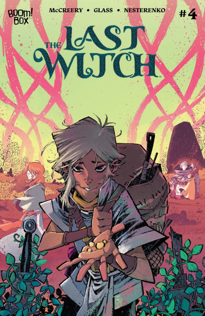
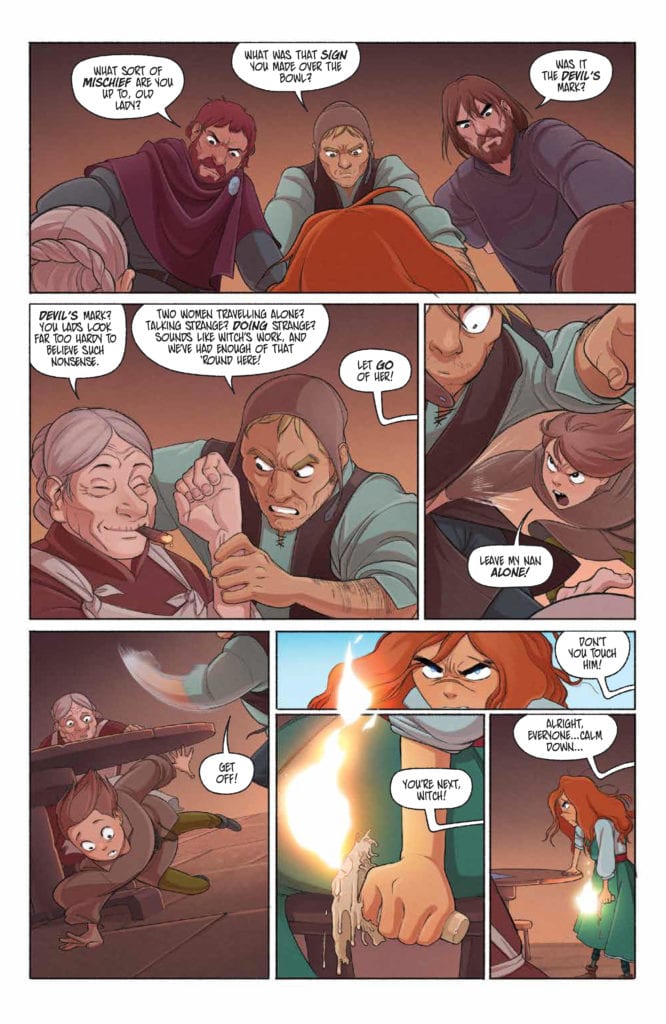
THE LAST WITCH #4, available Wednesday from BOOM! Box continues the tale of Saoirse and her growing powers. She’s faced two lethal battles so far and barely managed to survive both. She’ll have to get even stronger before she faces off against the next witch.
A new character arrives in The Last Witch #4.
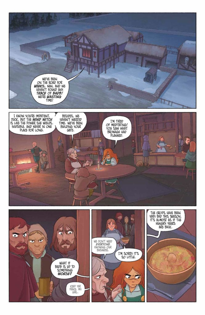
Not too long ago, little Saoirse’s biggest concern was whether or not she’d get away with sneaking out into the woods. Those days are long gone. Now she’s striving to gain as much power as possible before being forced into battle against yet another witch.
Yes, that’s right, another witch. She’s already faced off against two of them: one wielded fire and the other water. Next, Saoirse will be facing off against a wind witch, though she must take a minute to train before that can happen.
The Last Witch #4 continues the tale of one young woman and her fight to keep the world safe. More specifically, she’s fighting to keep her grandmother and brother safe. They’re all she has left of this world, and she’ll do whatever it takes to protect them.
Perhaps now would be a good time to keep your voice down?
The Writing
Each and every issue of The Last Witch has felt different from the last. That is partially due to how much Saoirse seems to change between each issue. But it’s also more than that. Her battles, her elements, and countless other details have changed along the way as well.
The Last Witch #4, written by Conor McCreery, continues her story. By this point, she’s defeated two witches, and it shows. Her power and confidence have risen, though that in itself brings complications. Already we’ve seen the grandmother warn time and time again about the dangers of magic use – of how it can corrupt.
That has been a dark undercurrent this whole time as we watch Saoirse grow in power. It’s hard not to be concerned about her, and this issue really picked up that particular thread. So while there is no major battle fought in this issue, there is still quite a lot going on.
Much of it is internal, while there are some new developments happening around our little witch (and her remaining family members). The new changes are fascinating, and admittedly just a little bit concerning. That seems to be the theme of the series, after all.
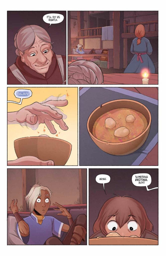
Well, that’s a handy trick!
The Art
As per usual, the artwork inside The Last Witch #4 is simply stunning. V.V. Glass (art), Natalia Nesterenko (colors), and Jim Campbell (letters) really do make a fantastic illustration team. Saoirse’s story is just as much a visual tale as a narrative one, and I sincerely do not believe it would carry the same impact without the artwork to support it.
The magic portrayed within this issue is fascinating. Here we see her fire and water, but also more than that. Finally, we’re getting a chance to see the deeper connection that has formed—the connection between Saoirse and the world (ley lines) around her.
There are so many little details worth picking up on, much like previous issues in this series. It makes it a worthwhile experience to read the issue more than once. Speaking from experience, it seemed like I spotted a new implication every time I read it.
The colors are vibrant and do an excellent job of blending with the magical elements (literally) of the series as a whole. Saoirse’s fire is a dominant feature, but it felt like water demanded more attention this time around. Likely, we’ll soon see more of an influence from air in the future.
Yeah, that’s about the reaction I expected.
Conclusion
The Last Witch #4 is yet another fascinating addition to this series. Saoirse has grown and changed so much already – and somehow the series is doing the same right alongside her. This is one of those series that is nearly impossible to predict, thanks to all of the surprises it brings with it. Yet it still feels so familiar at the same time – delightfully so.
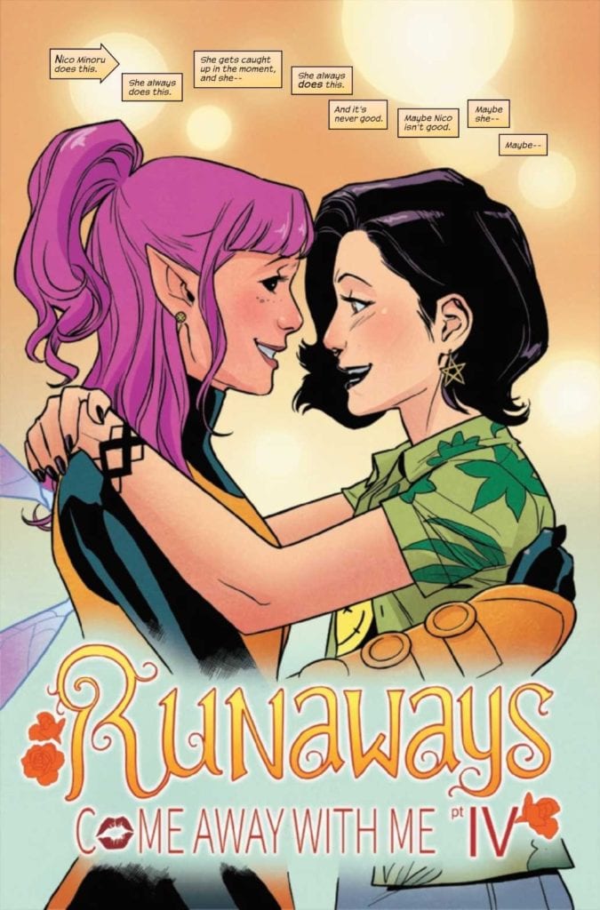
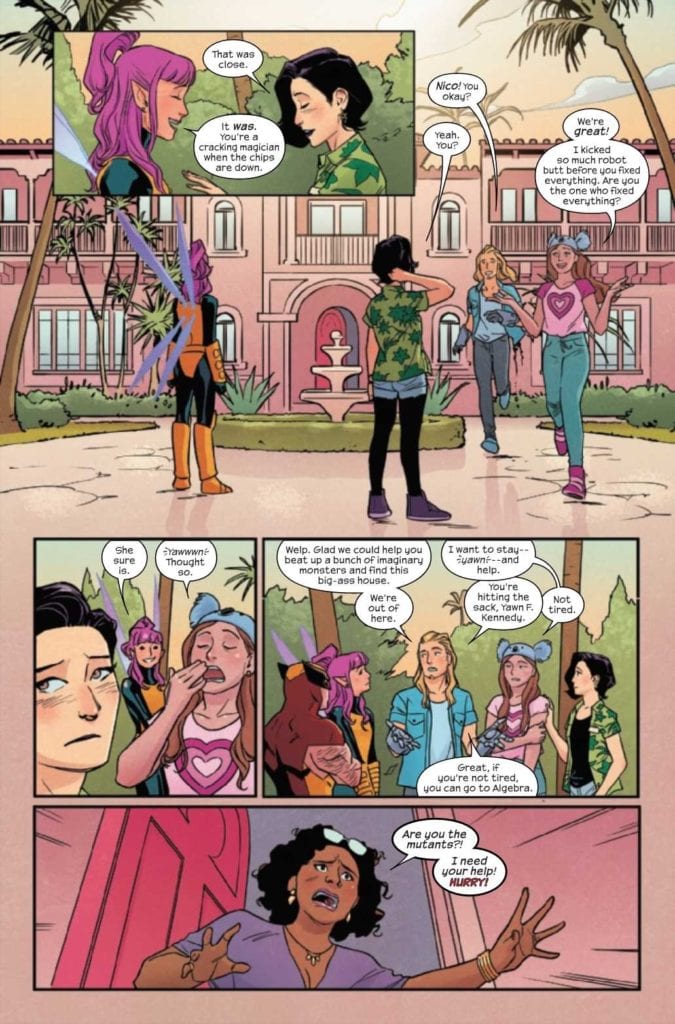
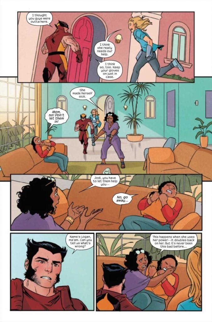
Marvel’s RUNAWAYS #35, available Wednesday, is a complex issue. It wraps up several plot arcs while raising more concerns along the way. This issue is a masterclass in foreshadowing, proving that the Runaways are never far from danger.
Nico does have a talent for getting herself into these situations, doesn’t she?
Last we saw, the Runaways were in the middle of a daring mission – one they hadn’t fully agreed to. But they’re the Runaways, so getting pulled into random missions is sort of their thing, especially when a young hero is on the line.
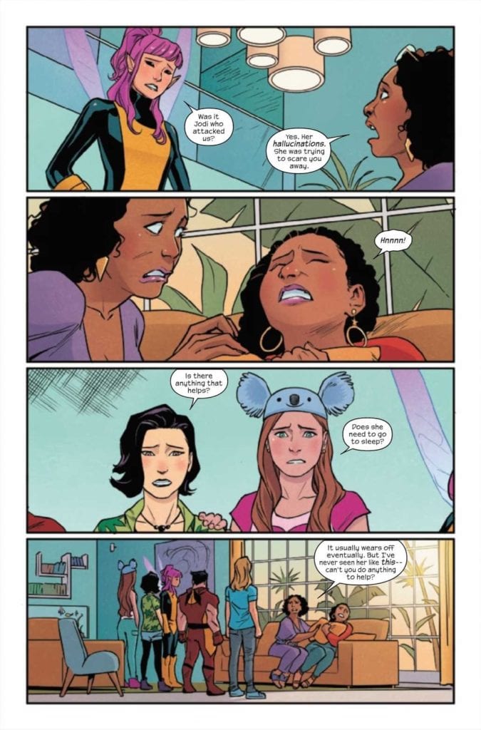
On the bright side, the chaos came with an X-Men team-up. Wolverine and Pixie are also wrapped up in this adventure (they may or may not be the cause of said adventure). Fans of superhero interactions will undoubtedly appreciate the more comical moments brought about by their presence (see the last issue for a real treasure).
Runaways #35 picks up where the last issue left off, naturally. Before we dive into the review itself, let’s take a moment to discuss that cover. That has got to be one of the most foreboding covers I’ve seen in some time. It’s full of foreshadowing. Surrounding the deal that Nico made. One that I feel like most of us would have known to turn down…
Meanwhile, there is still somebody in need of saving.
The Writing
Runaways #35 is an issue that will run readers through the emotional wringer. It’s tense, fascinating, and (as mentioned above) fairly foreboding. There’s a lot of subtlety to appreciated in Rainbow Rowell’s writing, as always.
The truth of the matter is there’s actually quite a lot that happens in this issue. While it isn’t an overwhelming amount, it does take a little more time to process – mainly due to all of the implications.
One thing is certain, fans old and new will appreciate some of the hints (and revelations) that happen here. Some of it feels like a blast to the past, while other moments are clearly building on newer plot arcs. The result is an issue that feels fully fleshed out. While still fitting in with that classic Runaways vibe.
There are some severe highs and lows inside. Most of these points were pertaining to the relationships that have formed along the way. It’s hard to predict how things will go from here, but I imagine every fan will have a different theory.
That looks like a painful power backlash.
The Art
The art of Runaways #35 had a lot to keep up with this time around (nothing new there), but it did so with style. That classic Runaways look is there, with sharp pops of color and lots of small details to pick up on.
Andrew Genolet’s artwork really brought that sense of foreshadowing to a whole new level. While I firmly believe those moments would have been fascinating regardless, the impact is a lot higher. Deliciously so. Additionally, Genolet’s portrayal of the characters and their gambit of emotions really brought the story home.
Dee Cunniffe’s colors are divine, as always. They’re bright and bold, much like the characters themselves. These colors enhance the frequently subtle backgrounds, allowing them to pop or complement as needed. The colors surrounding Nico’s magic are especially eye-catching – with a clear intent to draw the eye.
The lettering, provided by VC’s Joe Caramagna is the final touch this issue needed. It easily picks up on all of the details Rowell, Genolet, and Cunniffe were working into the narrative. The lettering makes it all flow smoothly, ensuring that the readers miss nothing.
Both Nico and Molly can certainly sympathize with the negative sides of using their power.
Conclusion
Runaways #35 is a fascinating and richly detailed issue. This is an issue that fans will be remembering – and theorizing about – for quite some time. Personally, I can’t wait to see what Runaways #36 is going to bring with it.
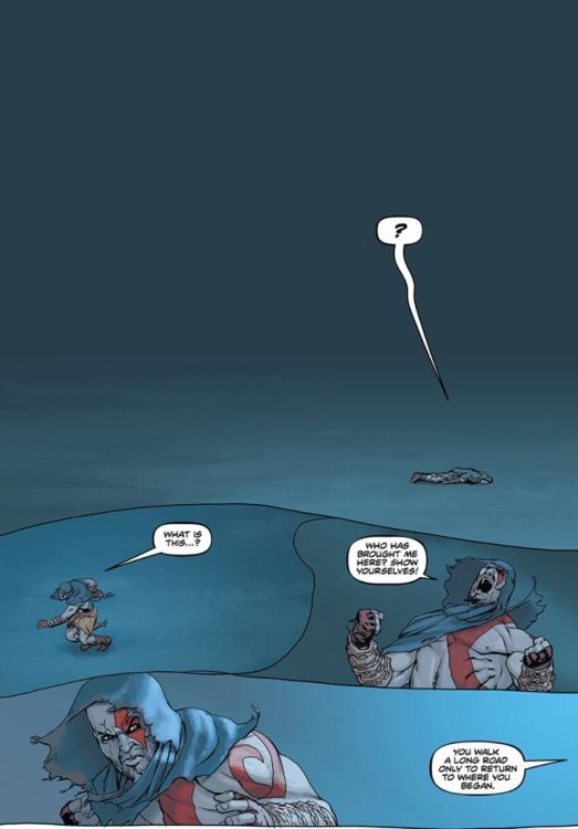
GOD OF WAR: FALLEN GOD #2 hits comic book stores on Wednesday, April 7th, further detailing Kratos’s agonizing journey after battling the gods. Along the way he met an elderly man who spoke of fate and destiny, ideals the warrior is vehemently opposed to. So our protagonist continued running. But an old “friend” may throw another wrench in the mix, one that will further propel Kratos toward his destiny.
Story
Last issue Kratos sought to escape from the Blades of Chaos bound to his hands. Yet each attempt to rid himself of them failed—even throwing them into the ocean sent them right back. His travels now lead him into an expansive desert where one can commune with the forces that be.
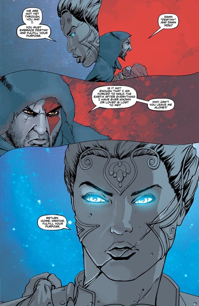
After listening to the cryptic messages from the old man for so long, Kratos is surprised to hear another voice speaking in this desert. He soon recognizes it as Athena’s, the goddess who he believes to be the cause of all his past—and present—suffering. The reader can practically feel the frustration, rage, and sorrow all in this one panel.
Athena and Kratos’s words ask readers an age-old philosophical question: Is our destiny determined, or do our choices shape it? And as if to purposely add further confusion to this query, the story throws a “chaos beast” (which is aptly named) at our hero to test his resolve.
Chris Roberson’s narrative does a brilliant job of casting Kratos as a reluctant savior figure. Choosing to believe the people see him as the true monster, the protagonist hopes to dispense with any notion of duty. It’s clear the might of Kratos’s will and the force of the gods’ determinism are engaged in a battle with no end in sight.
Artwork
Tony Parker’s penciling and ink work, Dan Jackson’s coloring, and Jimmy Betancourt of Comicraft’s lettering fit extremely well with Robertson’s written story. The detailed figures of Kratos heaves his muscled body across expansive desert and brush to emphasize how difficult his self-imposed quest is. Readers will notice how his pale gray skin stands out against even the most colorless backgrounds, reminding us of the past burdens he carries. What’s more, the blend of wordless exclamations in the dialogue speaks volumes, showing how few words effectively placed work extremely well with a character like Kratos.
Conclusion
GOD OF WAR: FALLEN GOD #2’s reluctant hero makes this story just as engaging as the games that brought him to life. We can’t wait to see where his destiny lies.
Do you think Kratos actually controls his own destiny? Let us know in the comments below!
DC Comics and Marvel Comics have several peacekeepers in space, but which Space Force does the best job? For the sake of this op-ed, in order to qualify: officers must have the backing and support of some form of authority, patrols and activities must be on an intergalactic level, and memberships should not be limited to one species or group. This unfortunately means we cannot include the Guardians of the Galaxy because they’re more along the lines of outlaws. We’re going to determine how well these forces operate, both in terms of function and ethics to see who is the most ideal among them.
Contenders
Let’s go over which forces from the Big Two meet the requirements. Some on the DC side are rather obvious but they do have fair competition. Marvel is also no slouch when it comes to a Space Force.
DC Space Forces
The most obvious contender from DC is the Green Lantern Corps and its other color counterparts. For simplicity’s sake, we’ll be focusing on the Green Corps since its leaders, the Guardians of the Universe are major points of discussion. Also on DC is the Green Lantern’s darker competition, the Dark Stars. They formed in reaction to the Guardians. Finally, we have the Legion of Super-Heroes in the 31st century for their service to the United Planets.
Marvel Space Forces
From Marvel comes the Nova Corps, a military force on Planet Xandar that accepts outsiders into its ranks when reaching intergalactic levels. Next is the Fraternity of Raptors, who Darkhawk was once part of, a former Shi’ar military force until striking out on their own. Finally, comes the contenders who just barely make the cut: the Space Knights. Please note that this faction will primarily follow the post-ROM era for licensing reasons.
Functions and Ethics
It stands to reason that all of these space forces have codes they have to follow in order to avoid inconvenience. But how functional are they?
Looking Green?
While the Green Lanterns are some of the most influential of these forces, their leaders and policies are very questionable. The Guardians are responsible for a number of war crimes and have often not been held responsible. Take, for example, when they tried to wipe out the universe’s magic users, which a recent comic brings back to light. Also, instead of trying to manage the Lantern’s mental health like when Hal Jordan was having a nervous breakdown, they use black-ops and special forces to hunt down people who are threatening their reputation. Only recently are the Guardians making progress after years of corruption.
Not that any of that progress will erase the forces made in reaction to the Guardians, like the Darkstars, made from Guardian offshoots called the Controllers. Frankly it’s not surprising that the Darkstars turn against the Controllers because unlike the Guardians they’re not subtle about their corruption. But here’s the problem, the Controllers instilled in the Darkstars a sense of dogmatic justice. Think of it like legalized lynching where the smallest of infringements means a death sentence. So who would hold these people responsible if their makers couldn’t?
Expanding Militaries
Between the Nova Corps and the Fraternity of Raptors, being military units, their actions prove to be questionable. With the Nova Corps more or less being led by a supercomputer, their operations often lack context. For example: after a peace treaty, they were left defenseless to an attack by the Kree. Next, after recruiting an extremist as a field leader, a number of casualties ensued. The Novas had to be rebuilt three times from all of this chaos, each weaker than the last.
The Fraternity meanwhile are zealots who recruit anyone to push their agenda for the Shi’ar Empire. They were so extreme, they were willing to kill or maim anyone who doesn’t suit their vision, like former empress Lilandra. Even when the Shi’ar disown them, their wishes to be an intergalactic paramilitary force remain present. More frightening is their effort to brainwash others into their cause, like with Robbie Rider. Military ops probably shouldn’t be the primary focus of a comic book space force.
The Ideal Space Force
Now it’s time for arguably the best examples of a Space Force from either side of the Big Two. First, Marvel’s surprising representative, the Space Knights. After the Prime Director (legally safe name of ROM) cleans up Galador of its mechanization philosophies, these space traveling cyborgs put more effort into rebuilding. This doesn’t just mean their planet but other civilizations affected by crises like the Annihilation Wave. They are also not opposed to working with others for better outcomes, as was the case of The Thanos Imperative through the Annihilators. The only problem is, their activities are still mostly limited to Galador.
Then there’s DC’s Legion of Super-Heroes who, unlike the other space forces, are more akin to volunteers than government backed organizations. Following in the footsteps of superheroes from millennia ago, like Superman, Legionnaires are people more than willing to help others out of ethical duty and be held accountable for their screwups. In The Great Darkness Saga, Chameleon Boy is dealing with an incident he caused by order from the United Planets. As such, the Legion is probably comic’s ideal space force.
What Space Force Can We Learn From?
An ideal space force is meant to exemplify the best, brightest, most cooperative, and still be accountable for misconduct. With the Legion holding all of the best qualities, the other groups have something to aspire towards. A few of their recent comics display how. Within Geoffrey Thorne’s Green Lantern, the Guardians are amending their laws and being held accountable for past sins. Speaking of guardians… Al Ewing’s Guardians of the Galaxy run seems to have the titular group qualifying as a legitimate volunteer space force.
What do you all think? Is the Legion of Superheroes the best model to follow? Are some of the other space forces like the Space Knights too limited in depiction to get a proper grade? Is there room for improvement in any of the other forces? Leave your thoughts in the comments.
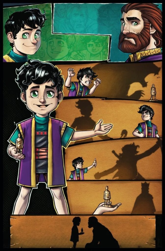
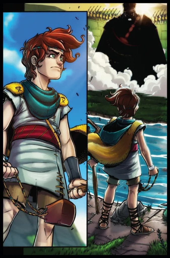
One of the most inventive takes on the biblical figure David is found in MercyWays and Brainy Pixel’s CHRONICLES OF FAITH: DAVID #0. This faith-focused story details the steps David, son of Jesse, took to become the ancient Israelites hero. In it readers will find that one does not become a hero without the proper preparation and faith.
Story
The narrative opens in the Valley of Elah, setting the scene for an epic battle between the Israelites and Philistines. From the panicked soldier’s exclamations, readers see how terrifying one particular Philistine warrior can be.
Goliath goads the Israelites into bringing out a champion to face him. But who is brave enough for the task?
Seeing the young David stand up against a seasoned fighter of such immense power is awe-inspiring. The sense of calm that washes over his inner thoughts shows readers they can find peace in their most trying times.
However, just as this story approaches the climatic moment, the narrative abruptly switches to Solomon, David’s son. This story within a story dynamic engages readers on an entirely new level. We find David teaching Solomon what it looks like to live a life of faith, rather than giving all the credit to himself.
Ivan Anaya’s script is one of the most engaging retellings of David and Goliath in recent history. Rather than employing a chronological narrative, this story uses various moments in David’s life to show how he became a hero of faith.
Artwork
Readers are treated to astounding displays of action, emotion, and colors, as well as clever word balloon placement throughout this story. Anaya’s penciling and ink work provides expressive characters with highly detailed facial features. We also loved Marvin Hernandez and Sofia Gonzalez’s coloring, which made each panel pop with bright hues. And Soffia Flores B.’s lettering completed the ensemble with a brilliant mix of font variants to represent the sound effects and character’s exclamations.
Conclusion
We were thrilled to read CHRONICLES OF FAITH: DAVID #0 and join in David’s story. This creative retelling remains true to the original tale while adding in those relatable elements to fully engage the modern reader. We look forward to seeing more heroes featured in the Chronicles of Faith series!
Do you want to see more biblical icons depicted in the comic book medium? Let us know in the comments below!
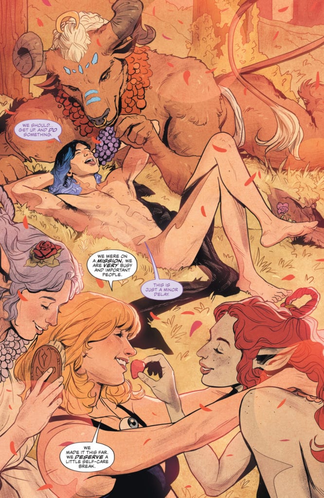
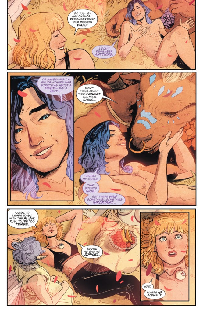
Writer G. Willow Wilson and artist Nick Robles, along with colorist Mat Lopes and letterer Simon Bowland, return to the land of Faerie in The Dreaming: The Waking Hours #9. This issue feels more like a vehicle transferring us from one stage of the story to the next, but it is still a wonderfully entertaining and tightly paced comic with great moments and incredible visual work.
“Seduced by the sensual wiles of the realm of Faerie, Ruin and Heather After have not only been separated from the angel Jophiel, they’ve completely forgotten why they even set foot in this delightful place. But Faerie’s charms (literally) are lost on Jophiel, and he remains firmly on a mission…unfortunately for him, the king of Faerie has his own ideas on just what Jophiel’s power can do for him!”
Writing & Plot
G. Willow Wilson’s script for The Dreaming: The Waking Hours #9 is just as clever and competent as the prior issues, albeit a little more subdued. This chapter is more of a segue from one major plot point to the next rather than a point in and of itself, but it’s still a highly entertaining affair on its own. Watching Ruin and Heather struggle against the temptations laid upon them by the denizens of Faerie is delightfully amusing, as is much of the dialogue. Wilson always leverages the perfect amount of snark in her scripts, and weaves it in and out of more serious moments with a natural ease. Despite this issue being more of a “problem of the week so we can continue the main quest’ type story, it never feels boring or out of place and still adds to the overall plot. We get a bit more backstory for Heather (which I will never tire of), and a couple more major Sandman Universe players get reintroduced. This is a sharply written comic, nothing less than what I’d expect from the likes of Wilson up to this point.
Art Direction
Almost every issue of The Dreaming, both this series and its predecessor, have been gifted with an unbelievably talented art team. This still rings true on The Waking Hours #9, with the pencils of Nick Robles and colors from Mat Lopes. Robles’s pencils are rife with imaginative detail, crafting fresh designs for both diverse humans and mythical beings as if it were second nature. The world design is brilliant as well, as the dilapidated Faerie is a beautiful but desolate landscape that contrasts brilliantly with the same setting from the days of Vertigo past. The panel direction is as sharp as ever too. While the panels and transitions never get quite as abstract as some prior issues have, it’s still a finely tuned experience from a directing perspective. Mat Lopes’s coloring is as stunning as ever, offering a vivid variety of gorgeous, otherworldly hues and tones to this fantastical realm just as he has been doing since the previous Spurrier/Evely run. The lettering from Simon Bowland replecates the classic Todd Klein letters from the original Sandman, with widely varying fonts for different characters and that unmistakable white-on-black dialogue lettering. The Waking Hours continues to be one of the most stunning books from the visual end on shelves right now.
The Dreaming: The Waking Hours #9 is a clever, well scripted, and stunning chapter in this outstanding series. While Wilson’s script has this issue functioning more as a segue from one piece of the story to the next, it is still rife with clever and funny moments and great characterization. The visuals from Nick Robles and Mat Lopes are as incredible as always, animating and coloring this world of magic with breathtaking detail. Be sure to grab this issue when it hits shelves on 4-6!
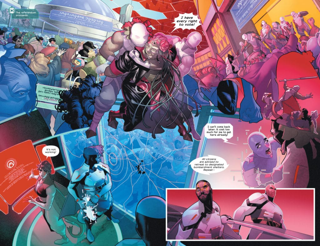
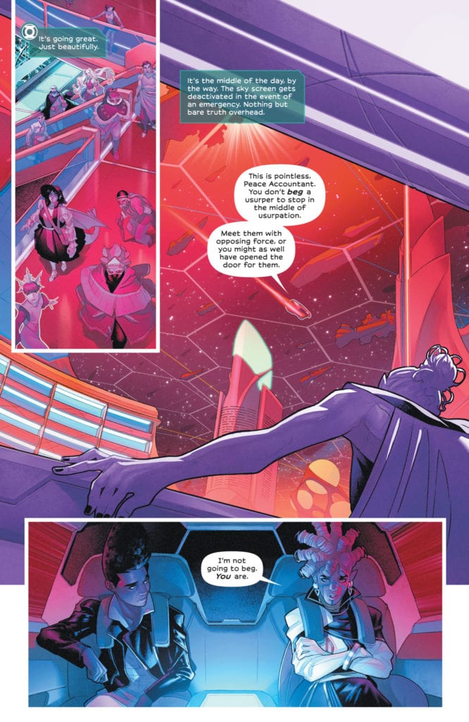
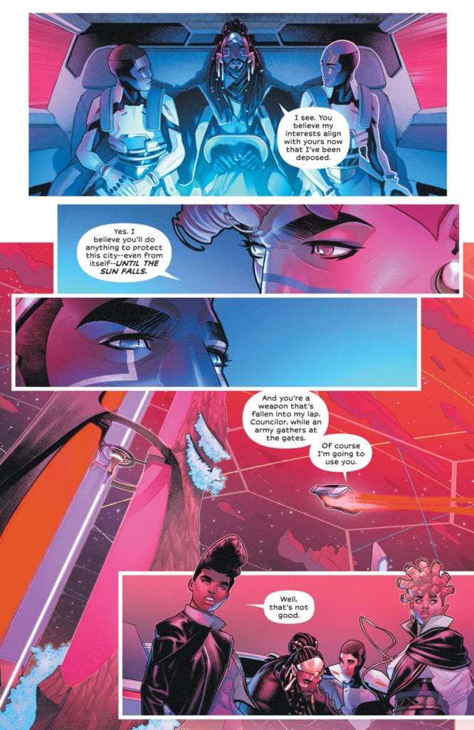
Writer N.K. Jemisin and artist Jamal Campbell return with the second to last chapter of their brilliant series Far Sector. This issue lays out the full focus and interests on all sides of the massive coup on the city enduring, crafting a sharp societal critique without getting lost in any kind of political preaching. With a busy but sharp and intelligent script and once again outstanding artwork, this issue is a stellar setup for one of the most anticipated finales in comics this year.
“Riots are breaking out across the City Enduring as its citizens realize that there are political shenanigans disrupting their way of life and subverting the will of the people. To quell this unrest, @BlazeofGlory is threatening to unleash a terrible weapon upon her own people. Jo has to race against the ticking clock of a Green Lantern ring that is rapidly losing power to bypass the city’s entire defense forces and stop this attack from above.”
Writing & Plot
N.K. Jemisin’s scripts for Far Sector are always packed with info and interlaced with great character narrative, but this issue focuses a bit more on the former. Far Sector #11 is chiefly concerned with making sure the reader knows who lies where and why, and where exactly the different factions of the City Enduring’s allegiances lie during this massive coup. There are still some solid bits of character writing, and the dialogue is very solid, but issues like this make me thankful for collected editions. Don’t get me wrong, every issue of this series has been a delight to get to read, but with all of the info and complex socio-political context to keep track of among the different races in the story, it gets to be a LOT to try and keep track of; especially now that the series has been only been releasing an issue every other month. This all being said, this is still a very tight issue that addresses its own plot and its exterior influences with intelligence and nuance. It presents an example of when a rebellion can rise up for the right reasons, but in its passion utilizes the wrong methods to achieve change. Jemisin’s treatment of Jo Mullein as a protagonist has made her one of my favorite characters to read, and this increases with each issue. Every chapter we unravel just a bit more about what makes her tick, but there’s always something under the surface. This issue continues the trend, while also keeping her unique link to the Green Lantern Corps alive while never focusing entirely on it. It’s honestly easy to forget that Mullein is a GL, even when she is wearing the ring. It’s a completely secondary trait to her character, and that makes her and this comic all the more fascinating.
Art Direction
I have been raving about the incredible work of Jamal Campbell for every issue of Far Sector that has been releases so far. So now, for Far Sector #11, I will do so again. Campbell’s incredible, almost 3D digital artistry for his characters and environments makes for one of the most beautiful science fiction comics ever released with each subsequent release. This issue darts around with breakneck speed, but Campbell manages to keep up with the chaos on every front. Every page is a flurry of focused and frenzied conversation, as well as cuts around and above the plant to catch glimpses of the growing conflict. Each shot is rife with impact and importance, building the urgency and atmosphere of this penultimate chapter. The complex emotions every character is facing feel genuine and relatable to the reader, and the scenery of a planet at war is both concerning and stunning. The high-production concept art-style of this comic is perfect for the story being told, and I’d love to see Campbell draw more sci-fi in the future. Deron Bennett’s lettering is sharp and clean, and combined with Campbells makes for one of the most stunningly well-put together comics hitting shelves this week.
Far Sector #11 is a frantic and busy comic book, full of important expository dialogue and developments regarding the massive conflict that has sprung up for Jo Mullein to finally deal with once and for all. N.K. Jemisin’s script carries a ton of important dialogue and information leading into her finale, but still manages to avoid making it a chore to get through. Jamal Campbell’s art is forever a display of modern perfection among comics art, and a masterclass in what contemporary techniques are capable of. Be sure to grab this penultimate issue when it hits shelves on 4-6!
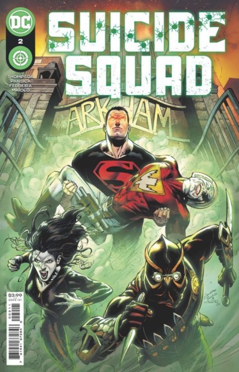
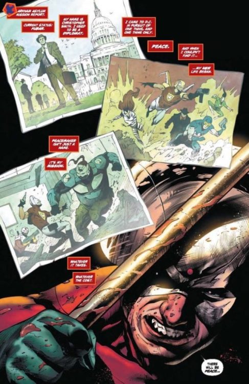
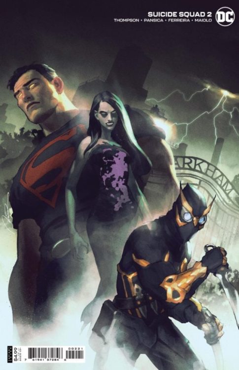
Suicide Squad #2 hits your local comic book store today, and Monkeys Fighting Robots can provide some insight into the series after our chat with writer Robbie Thompson.
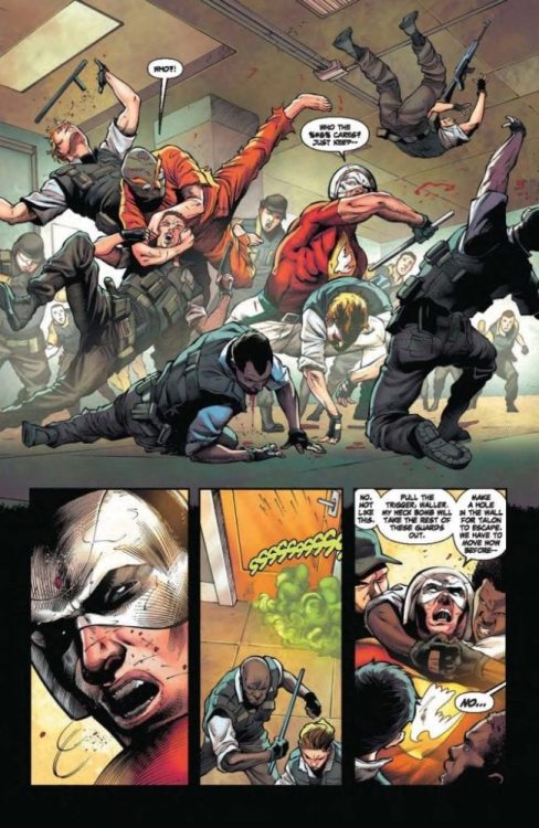
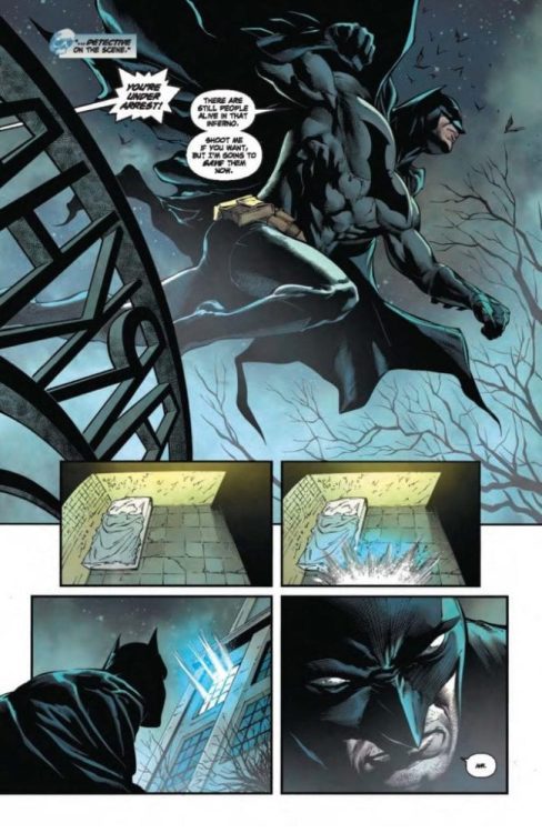
About the issue: With the power of Superboy now under her control, Task Force X mastermind Amanda Waller sends the hero into Arkham Asylum to rescue Peacemaker and bring Talon—the famed Court of Owls assassin—back to join the new Suicide Squad. With lives hanging in the balance, the teen clone must decide if he’s going to assist Waller, even if it means getting his hands a little bloody along the way.
Any mention of Connor Kent and my head explodes; that’s why I was excited to talk with Thompson. The concept of Superboy on the Suicide Squad adds a next-level layer of moral code in the giant grey world in between black and white.
MFR: Robbie, thank you for taking the time to talk with me.
THOMPSON: Thanks so much for taking the time to talk with me!
MFR: Eduardo Pansica’s art is brilliant in the first two issues of Suicide Squad. Talk about how he pairs well with your script.
THOMPSON: Eduardo is the perfect artist for this book. We worked together previously on Teen Titans, and I was so excited to get to work with him again. What I noticed on working on Teen Titans with him was how well he managed the team aspect of the book – he was able to create specific moments for every character and give them their due, and I really wanted to write to that in this series. So, I was riffing off his work, and trying to pair my script to him, really. As a team, we wanted to find a way back to that [writer John] Ostrander type tone, and Eduardo is able to bring this really fun, and nuanced balance between the action and emotion, which builds more and more as we get to know the team and explore their dynamics and humor in subsequent issues. And we have Julio Ferreira’s flawless inks, Marcelo Maiolo’s dynamic colors, and Wes Abbot’s killer letters – I am super lucky to be working with this squad!
MFR: Who was the first person you told that you wanted to put Superboy on the Suicide Squad, and what was their reaction?
THOMPSON: The first person who was told was me, haha – [DC] Editor extraordinaire Mike Cotton had discussed the book internally prior to my involvement, and there was a core group that he had floated and Superboy was one of the big names on the list. My first reaction was REALLY?! Then I wanted to know about the jacket and glasses, haha. Honestly, I thought it was a great idea – and I’ve always enjoyed when the Squad has brought in heroes to play on the other side of the fence. And when you have a great, true blue hero like Conner Kent in this type of situation, it creates instant conflict for the characters and the team. When we started to discuss the series, though, and where his character would be going, that’s when I was all in, and excited to dive into that emotional arc. I can’t wait for readers to see where we’re headed.
MFR: Was there anyone that DC Comics said you couldn’t use in Suicide Squad?
THOMPSON: You know, I pitched one character I thought they’d NEVER say yes to, and as of right now… they said YES! We’ll see if it all works out, but Mike and [Assistant] Editor Bixie Mathieu have been so great about going after the characters we want and working with other DC editorial groups to make sure they’re available to use.
MFR: Amanda Waller is one of the most intimidating fictional characters in comics. How do you bring that out in your writing?
THOMPSON: She’s such a fantastic character. And has such a great history. To be honest, I go back a lot to old Suicide Squad issues for inspiration, but a huge influence for me was Viola Davis’s performance in David Ayer’s Suicide Squad film. She’s one of the best actors working, period, and she is so scary in that first film and looks just as scary in the sequel (which I can’t wait to see!)
MFR: The first two issues are constant action and banter, but there’s chemistry, and the plot moves forward nicely. How do you know you’re hitting all the right notes with Suicide Squad?
THOMPSON: That’s a great question – for me it’s when there’s humanity in the mayhem. When these extraordinary heroes have grounded moments. Sometimes it comes out with humor, other times sadness. It’s one of the great joys of working on a book like this, that range of emotions. It also feels like you’re hitting the right notes when someone’s head explodes, too, of course.
MFR: James Gunn’s The Suicide Squad dropped a trailer last week. Is there pressure when you know a lot of new readers are going to give your book a read?
THOMPSON: No, in fact, for me it’s a huge inspiration. I really hope that folks that watched that amazing trailer and are hyped for the film come check out what we’re doing in the comics – and I really hope it inspires them to dig deeper and check out Ostrander’s run which, from what I’ve read, is a huge inspiration for the new film. I have watched that trailer about 500 times, and when I write the book now, I’m listening to Steely Dan’s “Dirty Work” on a loop. James Gunn is one of the best writer/directors working and that trailer is nothing but a big bag of awesome and inspiration for me personally. August 6th can’t get here fast enough!
MFR: The first two issues are loaded with large panels, single panels, and splash pages. Who’s idea was that, and why do you think it was the best approach for the story?
THOMPSON: We discussed a look internally early on and wanted to embrace the action that Squad stories usually have, but balance that with emotional moments. For example, we wanted to start with a breakdown of a character, or team, at the beginning, and then open it up, start with a sense of intimacy and then go really big, literally, for scale and action. Because we are also 22 pages instead of the usual 20, it felt like we had a little more room for things like that, for some pacing variation, and to really let the splash pages land with a punch – sometimes literally. I’m also a big fan of giving Eduardo room to play, so for example, I’ll just write the emotional beats and dialogue for an action scene, and leave him the most room to experiment and play visually. He always delivers something unique and puts his own spin on the moments which is the part of the collaboration that I enjoy the most. (Check out the five-page preview below to see what Thompson is talking about.)
MFR: Can you talk about where Superboy is emotionally and where you want to take him with your run on Suicide Squad?
THOMPSON: Superboy is a hot mess! He has no idea why he’s been dragged onto the Squad, he has no interest in being a bad guy or doing bad things, and worse than all that, he has the sinking feeling that something is deeply wrong with him. He’s not sure if it’s mental, physical, or both. Whatever it is, it’s going to break him down. That mystery of what’s wrong with him is something we’re going to unpack slowly, and will take a big turn in Issue 6. As I mentioned before, when we first started talking about Future State and then in success the on-going series, Superboy’s character arc was a huge linchpin of where we wanted to go and I can’t wait for readers to see what’s really going on.
MFR: I read in another interview you were given a list of characters to choose from to form your squad. Was there a character that you wanted to use but didn’t quite fit?
THOMPSON: Definitely, but more from a sense of timing. We are going to build our core group, the group you see in Future State, slowly. There were some bigger names that we wanted to slowly roll into the Squad as Waller pieces together her ultimate crew. So, for example, we wanted to use Bloodsport, but he fit better in our later issues than at the start. But overall, Mike, Bixie, and everyone at DC have been very supportive of the book, and, so far, nobody has been off-limits, which is great for us �� not so great for those characters, because not everyone is coming home from this series!
MFR: Robbie, thank you again for your time, and best of luck with Suicide Squad!


 The most obvious contender from DC is the Green Lantern Corps and its other color counterparts. For simplicity’s sake, we’ll be focusing on the Green Corps since its leaders, the Guardians of the Universe are major points of discussion. Also on DC is the Green Lantern’s darker competition, the Dark Stars. They formed in reaction to the Guardians. Finally, we have the Legion of Super-Heroes in the 31st century for their service to the United Planets.
 From Marvel comes the Nova Corps, a military force on Planet Xandar that accepts outsiders into its ranks when reaching intergalactic levels. Next is the Fraternity of Raptors, who Darkhawk was once part of, a former Shi’ar military force until striking out on their own. Finally, comes the contenders who just barely make the cut: the Space Knights. Please note that this faction will primarily follow the post-ROM era for
 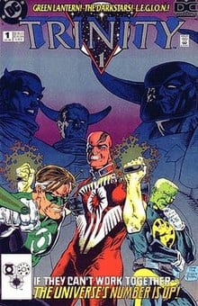 Not that any of that progress will erase the forces made in reaction to the Guardians, like the Darkstars, made from Guardian offshoots called the Controllers. Frankly it’s not surprising that the Darkstars turn against the Controllers because unlike the Guardians they’re not subtle about their corruption. But here’s the problem, the Controllers instilled in the Darkstars a sense of dogmatic justice. Think of it like legalized
 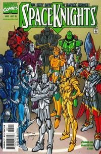 Now it’s time for arguably the best examples of a Space Force from either side of the Big Two. First, Marvel’s surprising representative, the Space Knights. After the Prime Director (legally safe name of ROM) cleans up Galador of its mechanization philosophies, these space traveling cyborgs put more effort into rebuilding. This doesn’t just mean their planet but other civilizations affected by crises like the Annihilation Wave. They are also not opposed to working with others for better outcomes, as was the case of The Thanos Imperative through the


")
")