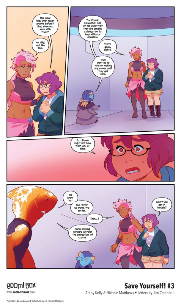
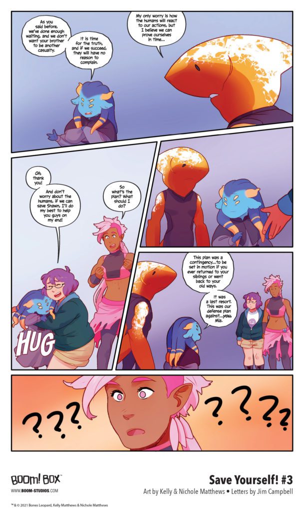
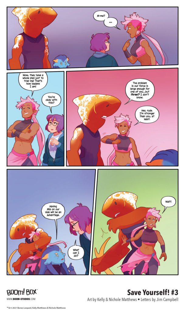
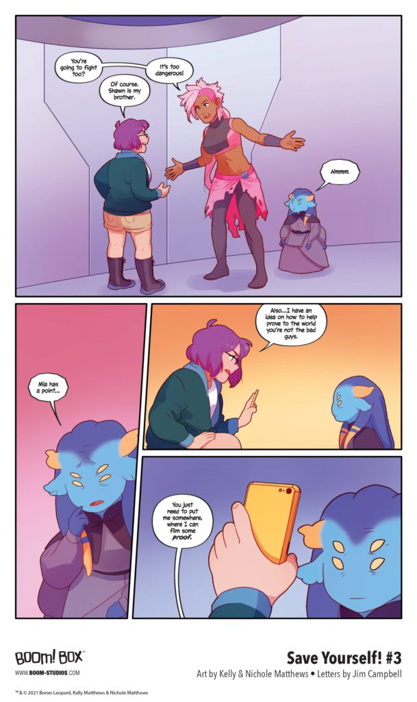
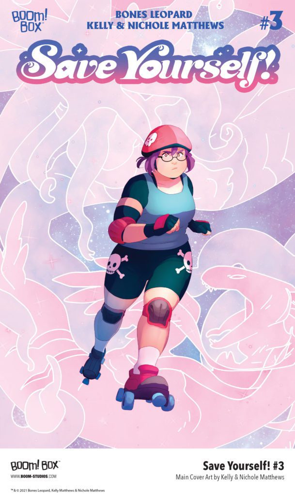
SAVE YOURSELF! #3 hits your local comic book store August 18th, but thanks to BOOM! Studios, Monkeys Fighting Robots has an exclusive five-page preview for you.
About the issue: Even as Gigi is still reeling from the revelations about the Lovely Trio, she’ll have to pull it together to rescue her brother Shawn! And the only place she can turn to for help is Mia and the Cosmic Federation, who will need Gigi if they ever hope to expose the truth about the Lovely Trio…
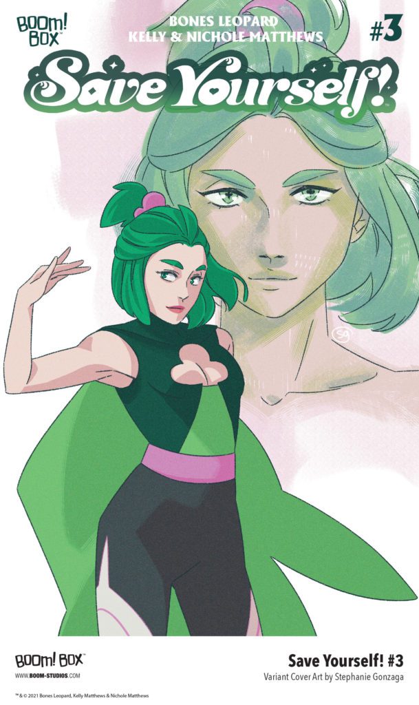
SAVE YOURSELF! #3 is by writer Bones Leopard and artists Kelly & Nichole Matthews, with letters by Jim Campbell. The main cover is by the Matthews, with the Magical Girl variant by acclaimed director and artist Stephanie Gonzaga.
“Perfect for fans who grew up loving magical girls and are ready to step up and save the world, no matter who they have to face”
Check out the SAVE YOURSELF! #3 preview below:
Are you reading SAVE YOURSELF!? Sound off in the comments!
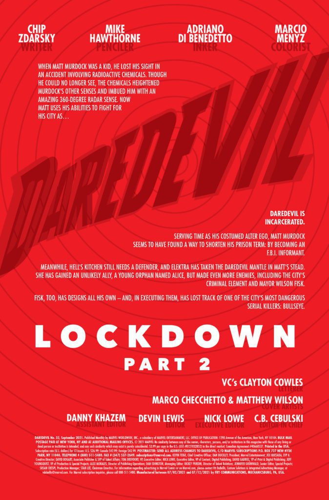
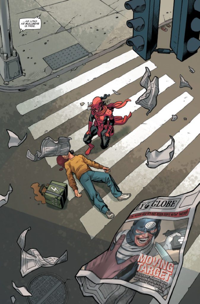
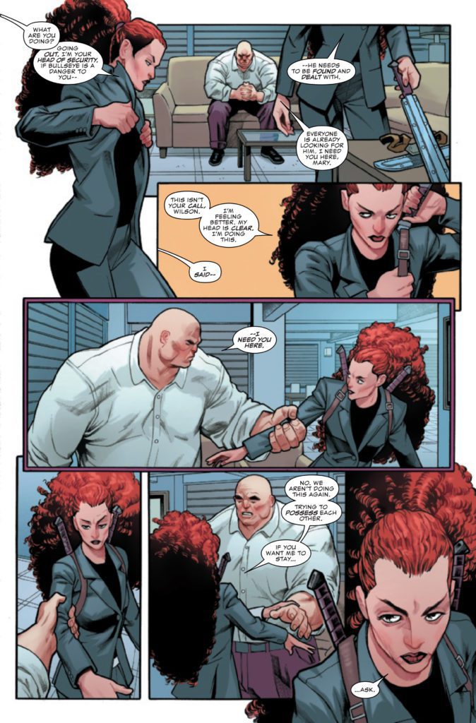
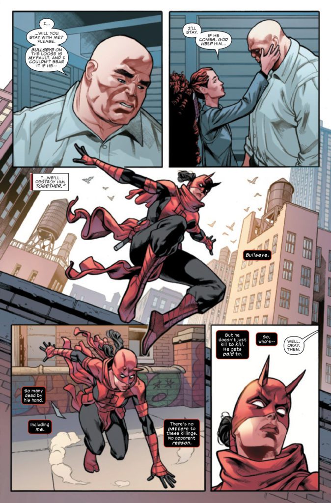
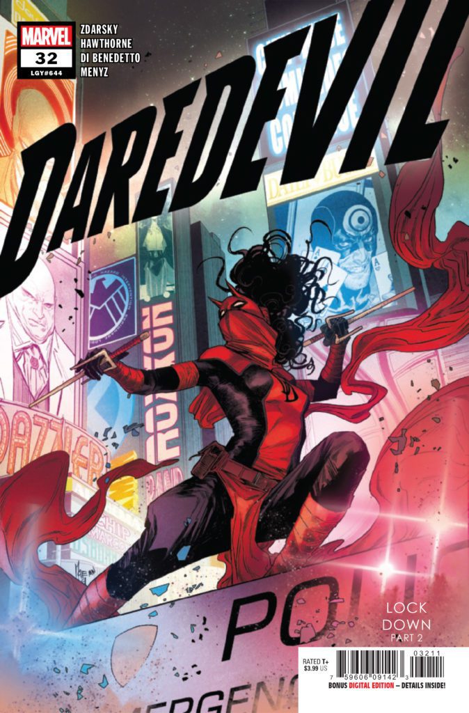
DAREDEVIL #32 hits your local comic book store July 28th, but thanks to Marvel Comics, Monkeys Fighting Robots has an exclusive 4-page preview for you.
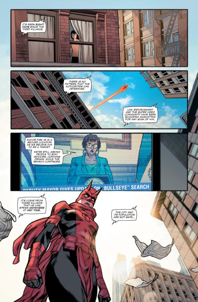
About the issue: “LOCKDOWN” STARTS HERE! The Angel of Death has come to Hell’s Kitchen and New York City. A series of grisly murders tests Elektra’s mettle and commitment to her role as the new DAREDEVIL, as the city spirals in a state of near panic. Meanwhile, Matt Murdock faces tests and challenges of his own, as the inmates he’s serving time alongside aren’t the ones in the prison targeting him…
The issue is by writer Chip Zdarsky, penciller Mike Hawthorne, inker Adriano Di Benedetto, colorist Marcio Menyz, and letterer Clayton Cowles. The cover is by Marco Checchetto and Matthew Wilson.
DAREDEVIL has been one of Marvel’s most critically acclaimed series over the past few years. It’s nominated for three awards at this year’s Eisners: Best Writer for Zdarsky, Best Penciller/Inker for Checchetto, and Best Continuing Series.
Check out the DAREDEVIL #32 preview below:
Are you reading DAREDEVIL? Sound off in the comments!
Old, M. Night Shyamalan’s latest film, is a mixed bag of his best and worst qualities as a filmmaker. His first film since closing out the Unbreakable trilogy with Glass in 2019 is a thought-provoking story that examines the fear of getting old, but its concept feels held back at times. While it gets messy, Old is one of Shyamalan’s stronger efforts. His skillful direction is on display but dampened by bizarre camerawork more than once, and Old reinforces the argument that someone else should write the films he directs.
The thought of getting old is a fear for many, but some feel indifferent towards the inevitable. Shyamalan capitalizes on these fears by combining them with an environment several people would consider going to for peace, the beach. However, many will plan a getaway to escape their problems at home and that’s what’s going on for the central family in Old. Shyamalan’s screenplay almost serves as a reminder that running from your problems won’t make them better. Directed and written by M. Night Shyamalan, Old stars Alex Wolff, Thomasin Mckenzie, Gael Garcia Bernal, Eliza Scanlen, Abbey Lee Kershaw, Vicky Krieps, Rufus Sewell, and Aaron Pierre. The film follows a family on vacation that discovers the beach they are on is causing them all to age faster than normal.
(from left) Maddox (Thomasin McKenzie) and Trent (Alex Wolff) in Old, written for the screen and directed by M. Night Shyamalan.
The primary family includes Guy (Bernal), his wife Prisca (Krieps), and their two kids, Maddox (Mckenzie) and Trent (Wolff). Old begins with them arriving at the resort, letting it be known these are the four characters to watch out for. Shyamalan’s screenplay introduces many others along the way, which is fine, but by the end of the film, you haven’t given audiences a reason to care about the core family or their fates. The time spent with Guy and his family does include an argument between him and Prisca to showcase this vacation is an escape from the hurdles they are avoiding. Once the beach horror starts, everyone is one-dimensional at best for the rest of the runtime. Whether intentional or not, characters are defined by their occupations and health issues.
Old spoonfeeds the audience too often when it doesn’t need to since Shyamalan doesn’t hide his signature twist this time around. It’s revealed halfway, but the reasoning comes towards the end, so the over-explaining can grow tired. Shyamalan’s twist this time is an acceptable but lukewarm revelation. The dialogue that Guy, his family, and the other characters share amongst each other is unbearable. Their conversations and behaviors during the intense moments will have many scratching their heads. For instance, someone gets stabbed to death midway through the film, a scream is heard, but seconds after they find the body, this same person acts as if they weren’t just terrified.
(from left) Maddox (Thomasin McKenzie) and Mid-Sized Sedan (Aaron Pierre) in Old, written for the screen and directed by M. Night Shyamalan.
Shyamalan paces this film very well, for the most part, it is sluggish at times, but there’s this feeling of anguish from start to finish. The atmosphere created in this film will keep audiences uncomfortable for many sequences, some that include body horror. It’s an improvement over Glass, which seemed to drag on for a lot of its middle act. Old becomes a heart-racing, beach vacation gone to hell in the blink of an eye. Shyamalan doesn’t let up once it kicks in and utilizes this seemingly tranquil environment to create a stressful scenario for the characters and the audience. Performances here are hit or miss at times, specifically with the line delivery from the characters.
Everyone does a terrific job displaying the panic and confusion felt throughout the film. Wolff and Krieps are the standouts here, Wolff delivers yet another emotionally draining performance as this kid whose losing his youth quicker than he can process. Krieps’s performance as his mother is equally heartwarming and sad to watch because she can’t protect her children, which is what any mother wants to do. The pain and sadness in her eyes are enough to make up for the underdevelopment of this family because audiences will start to care about them. Trevor Gureckis’ score sounds off at all the right moments to amplify the fear and frustration felt by everyone on this beach. Shyamalan’s concept is half-baked, but the technical strengths are undeniable here.
(from left) Prisca (Vicky Krieps), Maddox (Thomasin McKenzie), Guy (Gael García Bernal) and Trent (Luca Faustino Rodriguez) in Old, written for the screen and directed by M. Night Shyamalan.
Old probably won’t be a Shyamalan film that many will grow to appreciate, this execution is going to spark a divide, but that’s to be expected at this point. Its underlying themes regarding life are the strongest aspects as it relates to the screenplay. While Skillfully directed and well-acted, the script hiccups prevent the film from being considered nothing more than alright. This horrific concept will make you contemplate your life in more ways than one.
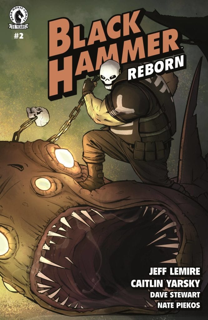
Dark Horse Comics’ Black Hammer Reborn #2is one part morality play, two parts fever dream. Writer Jeff Lemire, artist Caitlin Yarsky, colorist Dave Stewart, and letterer Nate Piekos show us how the life of a superhero can turn on a dime. The world Jeff Lemire has created with Dean Ormston in Black Hammer is now a sprawling universe. This series gleefully reaps the rewards of their hard work.
Writing
Lemire immediately shows us how Rose Weber is just like her mother, Lucy (AKA Black Hammer II). She’s curious, ambitious, and very, very irresponsible. But the world of Black Hammer is full of surprises, and Rose isn’t ready for all of them. As this issue turns from scenes of teenage rebellion into dreamscapes and twisting realities, Lemire sends us back in time to catch up with a younger Lucy Weber. It’s no accident that this happens. Lemire is not only hinting at where some of the danger, both metaphysical and natural, may be coming from, but he’s also showing us that Lucy, in her heyday, got herself into as much trouble as Rose.
Art
Yarsky’s art in the previous issue sometimes dabbled in the world of melodrama. In my review, I suggested it might be that she was counteracting the mundanity of Lucy’s life with big expressions and flare. Black Hammer Reborn #2 seems to confirm this theory. We see both Rose and a Lucy in scenes where they’re in grave danger. They smirk and smile, only occasionally getting very expressive. Even when scenes twist and flip upside down, Rose doesn’t look too worried. Yarsky brilliantly savors the really expressive moments of her art. She balances big stakes with sly smiles, and familial arguments with wild faces.
Coloring
Stewart continues some of the themes he underlined in the last issue. His colors often look dark or muted. The scenes we see look as though they are occurring at night. But it’s the moments of superhero-level stakes that are colorful and bright. Windows into the Parazone are brilliant green and yellow, just like Lucy’s Black Hammer costume as she fights crime on rooftops. But when we see Skulldigger in this issue, he creates a tone that sits in-between these extremes. As a character, he’s colored in greys, whites and blacks. But behind him, the scene feels both dark and colorful at once. The night air is a soft purple, with rays of pink and orange light radiating from below. It’s as though Skulldigger is neither mundane nor is he super. He’s his own flavor entirely.
Lettering
Peikos truly writes sound effects that you can hear. And their brilliance lies in their subtle differences. As the issue goes on, there are many sounds that repeat themselves. The “choom choom” noise of lasers is uniform. So is the “chak chak” of a weapon, or the “bzzz” of a phone. These are the unchanging noises of machines. But the “SHRAK” of a portal opening is unlike the “SHRACK” of it closing again later on. The fonts look the same, but as it appears it begins with a big S and H. The sound hits us like a wall, then fades away. And as the portal disappears, it’s the A, C and K that are large now. It gives one last earsplitting noise before fading out altogether. Piekos’ letters change in subtle ways, but the sounds they represent are as clear as day.
Dark Horse’s Black Hammer Reborn #2 continues to be a fun return to the Black Hammer universe. It shows us the terrifying realities of what it’s like to be a superhero or a parent in that wild, unpredictable world. Pick up Black Hammer Reborn #2, out from Dark Horse July 21st, at a comic shop near you!
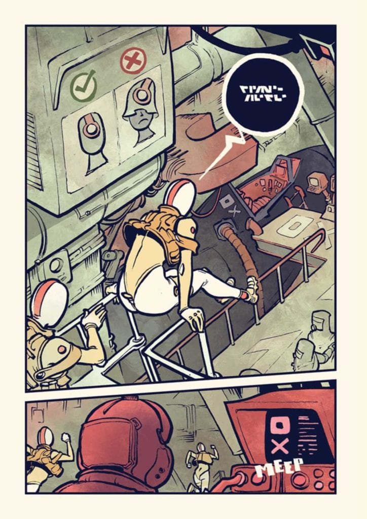
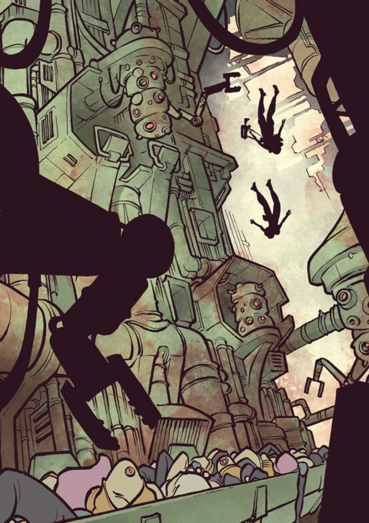
Mawrth Valliis is a unique piece from Image Comics coming to comic stores on July 21. This fast-paced kickstarted narrative by cartoonist EPHK looks like it authentically comes from Mars.
What’s Mawrth Valliis Mean?
Mawrth Valliis makes a dynamic first impression. Aside from specially designed Martian airships, there’s a strong sense of urgency to their encounters. Even without showing the character’s faces or understanding their words, the body language, emotive imagery, and sound effects hold weight. It gives readers a strong reason to invest in the story to reread and look for background details. Like a sign that says pilots/soldiers have to keep their masks on.
With this investment, readers get a better inclination towards understanding the scenario of Mawrth Valliis. Because the plot can be a little confusing on the first read with how surreal the Martian environments become. But once the protagonist’s face is revealed, there comes a strong sense of empathy to try and understand everything with her. If they want to, maybe they can decipher the patterns and language of Mars. That way, they can fully understand the schematics of the airships and other equipment. At the very least, the reader will come to appreciate the time and effort to create an environment that feels truly alien.
Give It A Try!
In a straightforward plot, Mawrth Valliis presents an authentic alien world. Amid the intense action movie pace, there are environments and equipment that feel out of reach at first. But with enough time, effort, and understanding, the reader will find a world and character to hook onto.
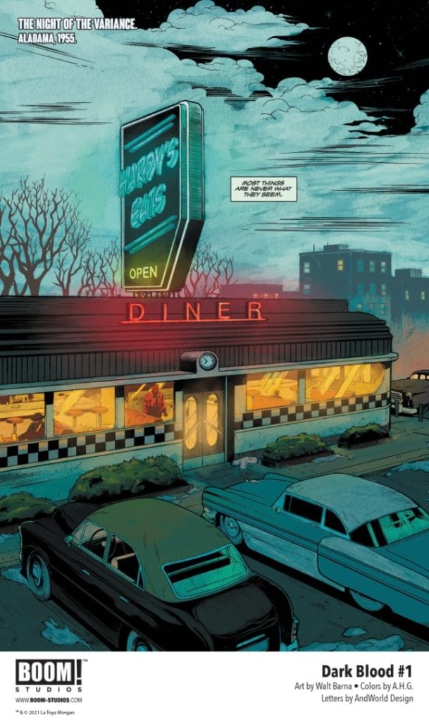
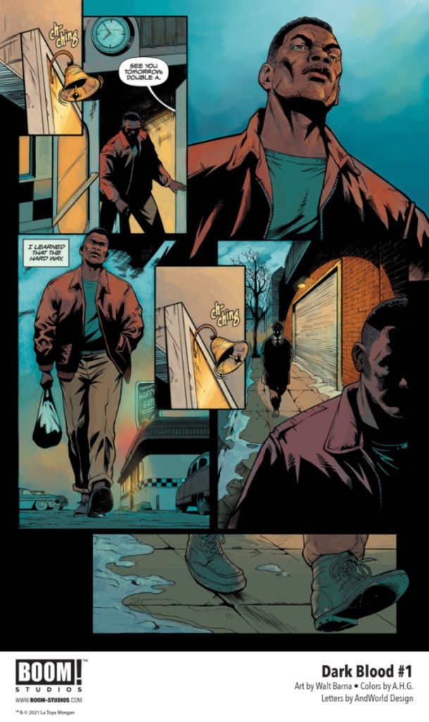
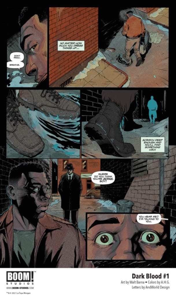
Writer Latoya Morgan and artist Walt Barna have put together a phenomenal debut issue with Dark Blood #1. Along with colorist A.H.G. and letters from Andworld Design, this poignant and original comic blends real world socio-political issues into a superhero plot in a way the Big 2 often have trouble doing. With a brilliantly smart script and fantastic visuals, this is easily one of the best #1’s of the year.
“What if you were given the power to change the course of history? Alabama, 1955. Avery Aldridge is an ordinary young Black man. A decorated World War II veteran, Avery provides for his wife and daughter. But wounds of the past have a way of coming back, and Avery Aldridge will soon discover he is anything but ordinary… After a run-in awakens strange new abilities, Avery’s about to become more powerful than he could have ever dared to dream… in a country and society that never wanted him to have any power.”
Writing & Plot
Latoya Morgan pens a script that blends a harrowing reality with a House of Ideas style origin story in Dark Blood #1. Avery Aldridge’s life after returning home is a discomforting reminder of a harsh truth – as it well should be. Morgan utilizes the medium to dart between flashbacks of Aldridge as a WWII pilot and his life back home as a black man in the Jim Crow South. Dark Blood is a gripping comic, with cutting dialogue and intense pacing. Morgan understands how to use the comics medium well to tell this story. There isn’t that much dialogue. Morgan writes the script to allow it to be told with sharp panel direction. Morgan’s experience as a screenwriter no doubt comes into play here.
A worry I had coming in was that the superhero comic-ish element of this book would stick out like a sore thumb and not fit into the book. Fortunately, Morgan sticks the landing here as well. The moment where we witness Aldridge’s powers manifest for the first time is a damned satisfying thrill. The buildup and unexpected unleashing of this power given the context of the scene here made my hair stand on end. This is a textbook lesson in how to write a great opening comic, with a tight and exciting script that makes me endlessly excited for what comes next.
Art Direction
Walt Barna elevates an already astounding script to immense heights in Dark Blood #1. His pencils and inks provide a that makes the reader get lost in this comic’s pages. Barna’s thin lines are filled by sharp, shadowy inks. This pays in dividends with the comic’s dark, imposing “current” setting as well as its thematic subject. His Character animations are outstandingly detailed, giving us insight to Aldridge’s mentality and making it very easy to empathize with him. Action sequences are full of weight and momentum, making them pack an exhilarating punch when events stop being quiet. Panel direction here is expertly crafted as well. Barna excels at the sequential progression of tension, building to the intense payoffs with a careful hand.
The colors from A.H.G. are top notch as well. Every page is brought to life with a thick, vivid palette. This work intensifies the atmosphere of the book, capping off the outstanding visual work. The lettering here is intuitive and modern, with sensible font changes and great special effects work. This is an outstanding looking comic, befitting the excellence of the story being told.
Verdict
Dark Blood #1 is a phenomenal opening issue for this mini-series. Latoya Morgan’s script is poignant and calculated, and crafts a unique script packed with narrative power. Walt Barna and A.H.G.’s visuals are stunning and atmospheric, packed with detail and great direction. This is a prime example of a great #1, so be sure to grab it when it hits shelves on 7/21!
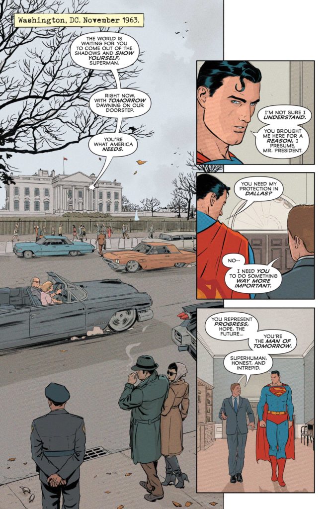
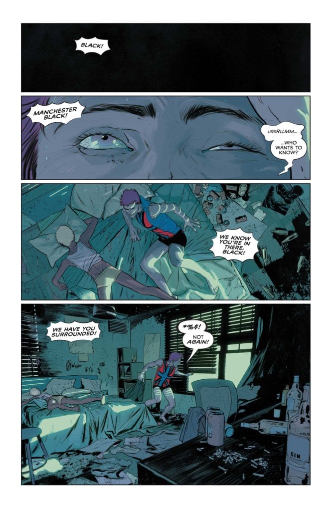
Alright, that’s quite a headline for you. Probably sounds a little ridiculous when you read it, right? But no, DC Comics’ Superman and the Authority #1really is something to behold. It’s the best version of what it could be, with plenty of hints at incredible things to come. Writer Grant Morrison brings us the trippy, edgy, whimsical writing that they’re known for. Artist Mikel Janin, with colorist Jordie Bellaire, and letterer Steve Wands, turn Superman and the Authority #1 into the start of a new mythology.
Writing
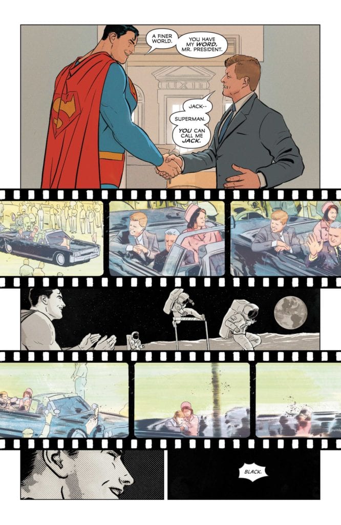
Morrison’s writing oozes with a love of the medium. Even when they’re breaking the rules of writing, they’re doing it in a way that is drenched in enthusiasm. We bounce around time in this issue. Morrison shows us scenes of Superman chatting with JFK before bringing us back to the modern day, where we catch up with Manchester Black. It’s a brilliant juxtaposition. We see what’s often considered a golden age in history, written in all its glory. Morrison’s Kennedy is a man who is full to the brim with ideals and driven by an excitement for the future. He’s the Kennedy people dream of: the spirit of a nation struggling to be better. He’s Superman, if Superman were president in 1963.
When Morrison introduces us to Manchester Black, he’s the very opposite. Black is disgusting. He is disingenuous, disengaged and disillusioned. He wants nothing to do with anyone and would be happy getting pissed drunk on his own in a grungy apartment. But quickly, that becomes impossible. Black is forced out of his hovel, and he is picked up by Superman and taken away. When we see Superman, he’s still got that belief in him, the belief that JFK put there. He believes in the things he promised to Jack Kennedy. But those beliefs are buried under years of disappointment. He lists them off: “After that day, it all came down like dominoes–Bobby Kennedy–Martin Luther King–The Space Race–Intergang–Darkseid–Doomsday.”
With this list, Morrison seamlessly blends real history with the history of the DC Universe. It’s so simple, yet so effective. And as the issue goes on, the stakes grow to what can only be described as “Morrison-esque” proportions. Zonedroids, Thought-beasts, and clandestine meetings give us a taste of Silver Age style comic book shenanigans. Superman explains the stakes in wordy exposition dumps and Manchester Black announces his powers before using them. It would all fall flat if it weren’t written by the giddy pen of Grant Morrison. Their love of this medium turns each of these moments into a joyful callback to the comics of old. Morrison channels their best Jack Kirby impersonation and pulls it off with flying colors.
Art
Janin’s art is stunning, through and through. But, above all else, it is constantly adapting in this issue. The Superman of the first few pages is deeply different from the Superman that shows up later on. When this issue begins, everything is picturesque and beautiful. JFK and Superman stand in panels symmetrically. Nearly every panel looks as though it could be a magazine cover. But then it all ends. Janin interrupts the page with footage reels. We see the assassination of JFK, placed around images of man walking on the moon. Superman looks on at the astronauts, applauding and smiling. As the footage of JFK’s death ends, we zoom in on Superman’s smiling face again. No words are needed, the subtext is clear. “It was a simpler time,” it tells us. Janin is depicting the death of Superman’s innocence. He’s showing the turning point of the world.
The next page confirms as much. We get a close up of Manchester Black’s eyes rolling open from an alcohol induced-coma. His shitty apartment and the violence of his altercation with the military would be enough to tell us times have changed. But it’s not that that seals the deal. It’s Superman’s arrival. He appears like a black ghost. Janin depicts him almost like a disembodied spirit. His anger at history’s decline is as clear as his red eyes burning through the night. But with all this doom and gloom, Janin balances it with idealism. Superman’s Fortress feels like it houses the building blocks of utopia. It’s in here that we see the angry idealism of Superman clash with the apathetic disillusionment of Manchester Black.
Coloring
The image Morrison and Janin give us of the 1960’s may be idealized and beautiful, but Bellaire also creates a distance to it. The colors are muted. All except for Superman, who stands out in brilliant red and blue. But overall, the scene feels almost as though it has paled with time. It’s a vision of the past that is firmly aware that it’s set in the past. But it also lends Superman an immortal quality. Even as he and JFK walk down the hall, they pass a photograph of the JSA. The image is brown with age, discolored by time. But Superman is young and bright.
While the modern scenes have more of a brightness to them, vibrant color often shows up in disturbing situations. Bellaire colors the nightmarish visions Manchester Black gives the military in a bright red. And when Black is shot full of holes, the background panels are blue and red. They almost form a twisted, violent Union Jack, like the one on Black’s chest. And as the issue goes forward, the colors become more and more deep. Whether it’s the red glow that Superman’s heat vision bathes the room in, or the green lights that herald an oncoming danger, it’s all incredibly colorful. Bellaire’s coloring is moving and fantastic!
Lettering
There are so many fun moments in Wands’ lettering. And surprisingly few of those moments are sound effects, though the “Plenk,” and “Kkk-kzzrk” of Manchester Black being electrocuted is both funny and cathartic. No, Wands shines most in the details. The captions or datelines on each page are written like they were done on a typewriter. Wands makes this whole issue feel like it came out of some government file. And as Superman is fighting off Zonedroids, with Manchester Black walking out into the snow, Black’s word balloons are incredible. At first, he talks. We see the scribbled interior of the balloon, showing us his words are unintelligible. Then, he speaks briefly again. “*” is all that’s written. Finally, he shouts, but the word balloon is empty.
And just like that, Wands turns a small scene into something memorable and hilarious. But it’s throughout the whole issue that he’s constantly adapting. Fonts grow and shrink. Words fade out into grey. Wands is using everything in his toolbox to create rhythm, style and even humor. And he’s nailing it.
DC Comics’ Superman and the Authority #1 is just perfect. It’s all the bombastic, thought-provoking scripting you want from Morrison. It has all the gorgeous visuals and dynamic style you’d want from Janin. Bellaire imbues every scene with meaning and flare. And Wands’ specialty is found in the details, making it all work together flawlessly. Superman and the Authority already promises to be an amazing series. It’s a comic about people aiming for lofty goals. Funny, because it surpasses all goals I’d set up for it in my head. Pick up Superman and the Authority #1, out from DC Comics July 20th, at a comic shop near you!
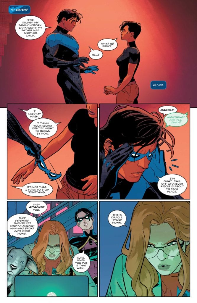
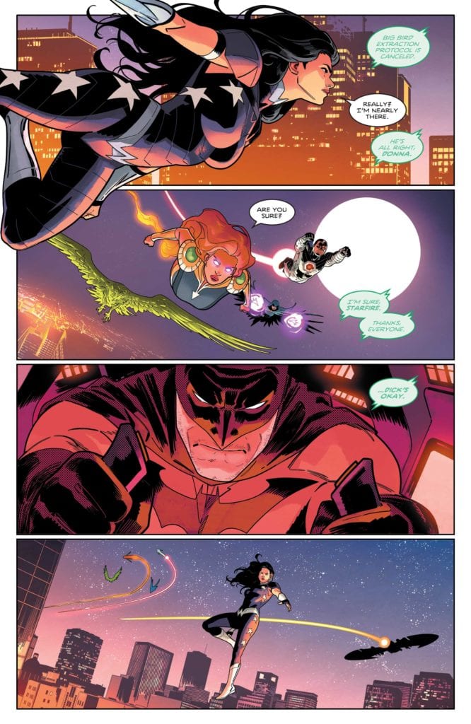
DC Comics’ Nightwing #82 is a relatively straightforward issue. It takes the twist from the finale of Nightwing #81 and explains how it could be possible. Yet, in a single issue, writer Tom Taylor, pencillers Bruno Redondo, Rick Leonardi and Neil Edwards, inkers Bruno Redondo, Andy Lanning and Scott Hanna, colorist Adriano Lucas, and letterer Wes Abbott, (what a huge creative team for this issue!) show us that we may be wrong about the characters that seemed at first to be “the bad guys.” Spoilers ahead for the previous issue, Nightwing #81.
Writing
Taylor has a lot of fun in this issue. It’s both a heartfelt look at the lives of Nightwing’s parents, the Flying Graysons, and a thriller-style history of Tony Zucco. With this issue, Taylor is showing us how Nightwing and Melinda Zucco could be related. Briefly, Taylor confuses things a little. Melinda tells Nightwing that his father didn’t have another child, but then we go on to hear a story that contradicts that. And later, when John Grayson talks to Tony Zucco, it feels like both John Grayson and Taylor overplay their hand a little. “Please accept this oversized fluffy bear and all the condescension that goes with it,” John Grayson says. It seems that the Grayson knack for taunting was perfected in a later generation. But overall, this issue is about the beautiful legacy that the Graysons created. It’s about how their lives touched more people than we know. And Taylor shows us where Dick’s drive and desire to do what’s right comes from.
Art
It’s no surprise this issue has a huge art team. That’s because Nightwing #82 changes art styles to tell its story. When Meili Lin, Melinda’s mother, begins her story, the issue transitions into an older style than what we’ve become used to. It’s a fantastic way to take us back to another time. The most notable change, is the use of Ben-Day dots. Redondo often uses Ben-Day dots in his art. Often they’re used as accents. In this issue, in the modern scenes, they’re most noticeable on Melinda’s shirt. But the scenes of the Flying Graysons are completed colored by Ben-Day dots. It gives the whole section a feel of being right out of the 1940’s.
Coloring
Of course, the use of Ben-Day dots is also part of the job of the coloring department as well. But Lucas goes beyond that. It looks almost as though the scenes showing the Flying Graysons were depicted using the four-color coloring method. Even colors that aren’t cyan, magenta, yellow or key(black), have a look of being a muddy combination of those colors. Again, it’s a fantastic way to take us back in time. Lucas also makes a point of setting these scenes in juxtaposition to the modern scenes. Scenes of Nightwing, Melinda and Meili talking are shown in deep reds and clear blues. The evolutions of coloring in the comics industry is on full display in this issue.
Lettering
Abbott’s lettering is always a joy to behold. His sound effects are simple but effective. With every new issue, it feels more and more impressive how fresh his sound effects feel. No gunshot feels quite the same, and Abbott is always using new fonts for new situations. But one of the best parts of Abbott’s lettering in Nightwing #82, is in a scene of the Flying Graysons doing tricks in the circus. The word balloons stretch high, and then dive low, before going back up again. Our eyes, as we scan the page, mimic the movement of the Flying Graysons on the trapeze. It’s a simple trick that works brilliantly.
DC Comics’ Nightwing #82 is surprisingly fun for an issue that deals with some nasty history. That’s because this creative team is always finding the beauty in small moments. We come out of this issue, more in love with the Graysons than ever, and wondering what this team has next for Nightwing! Pick up Nightwing #82, out from DC Comics July 20th, at a comic shop near you!
Original series creators Cullen Bunn and Tyler Crook, along with artist Emily Schnall, return to our favorite haint-filled town in Harrow County: The Fair Folk #1. This new series is an instant return to form. Bunn’s script is full of the same heartfelt character writing that we got in the original comic. He’s also still quick to turn up the creepiness and mystery, which is brought to life spectacularly by Schnall. This will be a definite pick for both fans of the original Harrow County and horror fans alike.
“Fresh off the loss of her goblin friend to a strange portal, Bernice must weigh her responsibilities as protector of Harrow County with her desire to get her companion back safe and sound. But the past weighs heavily and the fair folk use Bernice’s and her memories against her. And something more disastrous than she could have feared may be around the corner to threaten both the worlds of humans and of haints.”
Writing & Plot
Cullen Bunn returns to the town he created in Harrow County: The Fair Folk #1 in the same fashion he last left it. Bunn’s character writing has always come across as genuine and full of emotion and humanity despite the horror setting. Fair Folk starts off shortly after the events of Death’s Choir with Bernice dealing with the personal fallout. This issue is all about reestablishing relationships and finding old friends. All of the dialogue feels real and unique, and it hits with an emotional reality that makes you feel like you’re standing in the room with the characters.
Bunn’s penchant for taking the Southern setting and its folklore and both utilizing it while also paying it respect has always been one of my favorite elements of Harrow County. The use of magic and legends feels like manner they’re told by superstitious relatives in backwoods North Carolina. Another is how he handles the numerous creatures and their characterization. Granted we only get one speaking monster appearance here, but he is fantastic. I’m all set for more of this series and this world in general.
Art Direction
Emily Schnall has a daunting task in maintaining the visual aesthetic of this established world in Harrow County: The Fair Folk #1. Tyler Crook created the perfect visual language for the original series. This was then continued by Naomi Franquiz in Death’s Choir, who also managed to nail this story’s look. Fortunately, Bunn and Crook have an eye for artists as Schnall once again provides top-notch visuals that keep this unique aesthetic alive. Her visual style is distinctive from her predecessors, but still blends in with the prior Harrow County comics. Her thick lines created expressive characters human and haint alike. She follows the designs set out by Crook, but they still have her distinct flair.
Panel direction is much like how it’s always been, with a careful visual progression guided by narration. A large portion of what helps Schnall’s work blend in with the prior series are her colors. She utilizes the same sort of watercolor style to give this series its unique look. Every surface, from the foliage to the human characters and the monsters themselves are decorated in an array of shades. Tyler Crook himself returns for the lettering, which is as dynamic as ever. His fonts change from character to character, and the way he hides effect sounds within the environment will never not be impressive. This is a stellar looking comic that stays right in line with the rest of this fantastic world.
Verdict
Harrow County: The Fair Folk #1 is a stellar return to this wonderfully eerie and fascinating world. Cullen Bunn’s script is full of humanity and charm, and still knows how to being the horror. Emily Schnall fits right in with the artistic legacy of this series, bringing her own style to bear while keeping in line with the world as a whole. Be sure to grab this outstanding new issue when it hits shelves on 7-21!
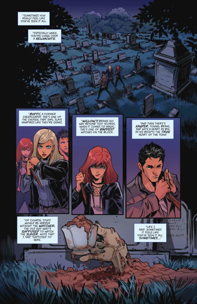
It’s fun to fantasize about your Watcher becoming the monster you’re tasked to slay until you’re forced to face some emotional truths. Available now from Boom! Studios, Buffy the Vampire Slayer: Tea Time #1explores what would happen if Giles became a vampire. This issue is written by Mirka Andolfo, with illustrations by Siya Oum, inks by Giuseppe Cafaro, Francesca Follini, and Dario Formisani, colors by Eleanora Bruni and letters by Ed Dukeshire.
During a long night of pre-slaying research at the library, Buffy and friends trade scenarios in which Giles has become a vampire. Writer Andolfo, instead of keeping us in suspense, makes it clear from the beginning that Giles isn’t actually a vampire. But the idea itself is so shocking that I found myself questioning it throughout the issue. This question was enough to lend a unique spookiness to the issue.
Contributing to this spookiness are the inks and layout. Many of Oum’s panels are inset or slightly out of alignment which makes you feel off-kilter. Inkers Cafaro, Follini and Formisani gave each individual scenario blocky angular shadows and hard outlines that reinforce a dream-like darkness. The inky darkness contrasts severely with the real scenes in the library that consists of bright lighting and ever so slightly brighter colors. While the contrast is dramatic, it feels more playful than stark.
Seeing Red
THE SCOOBY GANG IMAGINES FIGHTING VAMPIRE GILES.
However, what’s also playful is Bruni’s emphasis on the color red, especially where there’s blood. In fact, the red of the blood is more saturated than any other color in the issue. Bruni uses the familiar pink, blue, and purple based color palette, but in muted tones. Such muted coloring adds to the serious tone. Then, when the muted colors come in contrast with the bright red blood, the tone lightens up a bit. It’s a reminder that though the series is about vampire slaying, it’s not an especially visceral or violent one.
On the lettering end of things, Dukeshire maintains the playfulness through higher than usual use of SFX. Dukeshire has previously gained my favor by restrained use of SFX, but for this issue the increased effects are appropriate. The SFX font sizes, shapes and colors are varied to suit the situation and action. It’s the variety as much as the number of SFX that’s fun.
For all Dukeshire’s strengths, there were a couple errors in the dialogue. On one page, there was either an issue with the placement of a dialogue bubble or a panel that gave me pause. No one is perfect, nor any comic for that matter. Despite its flaws, however, Buffy the Vampire Slayer:Tea Time #1 comes close to a perfect Buffy comic, if not a perfect comic altogether.
Giles the Vampire
You may have come expecting only a light tea, but got a vampire Giles instead. In true Buffy fashion, Tea Time #1 balances the light-hearted with some heartbreaking emotion. Giles may not really be a vampire now, but what would it do to the Scooby Gang if he were? And the big question is how would they go on without their Watcher and surrogate father?
These questions sound like good fodder for the main story. I do wonder whether anything from this special will make its way into the main arc, especially the blink-and-you’ll-miss-it reference to Tara. Who knows? Maybe we’ll really see a vampire Giles in the near future.