

It’s fun to fantasize about your Watcher becoming the monster you’re tasked to slay until you’re forced to face some emotional truths. Available now from Boom! Studios, Buffy the Vampire Slayer: Tea Time #1 explores what would happen if Giles became a vampire. This issue is written by Mirka Andolfo, with illustrations by Siya Oum, inks by Giuseppe Cafaro, Francesca Follini, and Dario Formisani, colors by Eleanora Bruni and letters by Ed Dukeshire.
During a long night of pre-slaying research at the library, Buffy and friends trade scenarios in which Giles has become a vampire. Writer Andolfo, instead of keeping us in suspense, makes it clear from the beginning that Giles isn’t actually a vampire. But the idea itself is so shocking that I found myself questioning it throughout the issue. This question was enough to lend a unique spookiness to the issue.
Contributing to this spookiness are the inks and layout. Many of Oum’s panels are inset or slightly out of alignment which makes you feel off-kilter. Inkers Cafaro, Follini and Formisani gave each individual scenario blocky angular shadows and hard outlines that reinforce a dream-like darkness. The inky darkness contrasts severely with the real scenes in the library that consists of bright lighting and ever so slightly brighter colors. While the contrast is dramatic, it feels more playful than stark.
Seeing Red
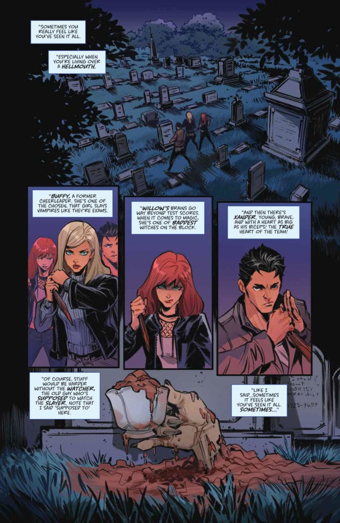
However, what’s also playful is Bruni’s emphasis on the color red, especially where there’s blood. In fact, the red of the blood is more saturated than any other color in the issue. Bruni uses the familiar pink, blue, and purple based color palette, but in muted tones. Such muted coloring adds to the serious tone. Then, when the muted colors come in contrast with the bright red blood, the tone lightens up a bit. It’s a reminder that though the series is about vampire slaying, it’s not an especially visceral or violent one.
On the lettering end of things, Dukeshire maintains the playfulness through higher than usual use of SFX. Dukeshire has previously gained my favor by restrained use of SFX, but for this issue the increased effects are appropriate. The SFX font sizes, shapes and colors are varied to suit the situation and action. It’s the variety as much as the number of SFX that’s fun.
For all Dukeshire’s strengths, there were a couple errors in the dialogue. On one page, there was either an issue with the placement of a dialogue bubble or a panel that gave me pause. No one is perfect, nor any comic for that matter. Despite its flaws, however, Buffy the Vampire Slayer: Tea Time #1 comes close to a perfect Buffy comic, if not a perfect comic altogether.
Giles the Vampire
You may have come expecting only a light tea, but got a vampire Giles instead. In true Buffy fashion, Tea Time #1 balances the light-hearted with some heartbreaking emotion. Giles may not really be a vampire now, but what would it do to the Scooby Gang if he were? And the big question is how would they go on without their Watcher and surrogate father?
These questions sound like good fodder for the main story. I do wonder whether anything from this special will make its way into the main arc, especially the blink-and-you’ll-miss-it reference to Tara. Who knows? Maybe we’ll really see a vampire Giles in the near future.