Home Blog Page 425

Interview: SOMETHING IS KILLING THE CHILDREN’s James Tynion IV & Eric Harburn

Monkeys Fighting Robots

Check out the spookier corners of your local comic book shop and you’re sure to come across a few titles by James Tynion IV. The prolific writer not only spearheads the creepy side of the DCU as writer of Justice League Dark, but he’s also got several horror titles lurking over at BOOM! studios, including his GLAAD-award-winning series The Woods.

Recently, James announced his terrifying return to BOOM! with the title Something is Killing the Children, a spine-tingling supernatural thriller written by Tynion and edited by Eric Harburn, with art by Werther Dell’Edera and Miquel Muerto. Monkeys Fighting Robots was recently able to chat with Harburn and Tynion about the upcoming book, and just before our interview began, we received some thrilling news: Something is Killing the Children has officially been promoted to an ongoing series. Check out what the creative team had to say about the book, and its new development.

Something is Killing the Children Issue One: Variant Cover by Jenny Frison, Boom! Studios

Grant DeArmitt for Monkeys Fighting Robots: Well first of all, congratulations on the story’s move to becoming an ongoing series! That is incredibly exciting news. I guess my first question is: what’s it going to be like to write a comic forever?

James Tynion IV: (Laughs) Great question. Honestly it’s really exciting. This is a story that has shifted around in terms of its format a few times. When I was pitching it at the end of last year, I saw it as a series of one-shots. Erica Slaughter, that’s our monster hunter, would arrive in a small town and would take care of a monster. People would bear witness to this strange figure who they never fully understand, then she would move on. It was in the writing of the first issue that I saw the story I was writing wasn’t actually built for these one shots. It was something bigger and stranger. It was something that would live in the quieter moments.

Now the story is finally in its true form, what it always should have been. It’s this long-form horror novel in a comic book. There is an ending to the story, but the ending is now further out. We’re going to really be able to live in this world, in this town of archers Peak. I’m really excited about that.

MFR: Yeah, I read that this was a story that was brewing in your head for a while, so this is very cool. Now, onto the first issue of SIKTC: One of these characters seems to be semi-autobiographical. This kid’s name is James, he has long black hair and glasses, and he loves telling spooky stories. Am I correct in assuming that that’s you, James?

Tynion IV: Yes, that is absolutely correct. It’s funny because honestly, I could give a whole bullshit answer about how “this is me trying to tell this autobiographical story,” but the truth is when I was writing that first scene I didn’t know what the names of the kids were going to be. So I plotted in the names of me and my closest friends from when I was growing up.

But that just changed the emotional intensity of the book for me. For a long time, even into writing issue two, I would talk to Eric and say, “I’m still thinking I might change the name as the main character. It won’t be James.” But the character forming there is kind of this miniature version of me, circa 8th grade. That felt more authentic, and it means that I can get into a fictional version of myself’s  mind pretty easily. It really opened up the horror of the series too. I remember how it feels to be afraid at that age. That’s where my whole fascination with horror comes from. So it’s me tapping back into that.

Something is Killing the Children Issue One: Cover by Werner Dell'Edera

MFR: So the key to the horror of this piece is what you grew up scared of?

Tynion IV: In a way, yeah. Not in a literal sense; I wasn’t afraid of monsters coming out of the woods and murdering me and all of my friends. But the monsters in [this story] represent a larger type of fear. It’s the fear of threats that you don’t really understand, of something out in the world that you don’t know about,. And when you try to explain it to the adults around you, they can’t really see or they can’t put themselves in your shoes. And so you feel vulnerable. It’s those types of fears that really build up inside you.

In this story, those fears become something more in a very literal sense. We’ll learn a lot about the nature of these monsters and also why, in the world of this book, adults can’t see these monsters.  The only adult who can see them is Erica Slaughter. And the reason she can see them, which is part of the mystery of her character, will now unfold over the whole long-form series. I’m excited to dig in deep and go to some pretty dark places with it.

MFR: So James, you obviously have a very long history with this project. But Eric, what’s your history with Something Is Killing The Children? Where do you come into the project?

Eric Harburn: I think the first time James told me the title was probably about five years ago. This was, I believe, in Emerald City in 2015, maybe 2014. I can’t remember exactly. But I knew, even way back then, that it was a scorcher of a title. I think it might have gone through a few different iterations before we finally started working on it together late last year. I’ve been working with James for six plus years now; we worked on The Woods together, we worked on the Apocalypse trilogy, we did a book called Ufology together. In the last year or so, we’ve been gearing up toward the next slate of titles, this next phase of James’s career in creator-owned comics, with his BOOM! collaborations. Something is Killing the Children felt like it was an excellent vanguard title for what James is doing here. 

So we’ve been talking on and off about the book for a while, but we’ve been in production on it coming up on a year now. Probably last October was when we first hit pedal-to-the-metal and James whipped up a story document, plus a description of Erica Slaughter as this ghostly, ethereal protagonist for this book. It’s bloomed from there.

MFR: Is that where artist Werther Dell’Edera comes in, once you have that very iconic image of Erica? She’s got this fantastic character design. Was that something that he came into it with, or did you have that idea in your heads?

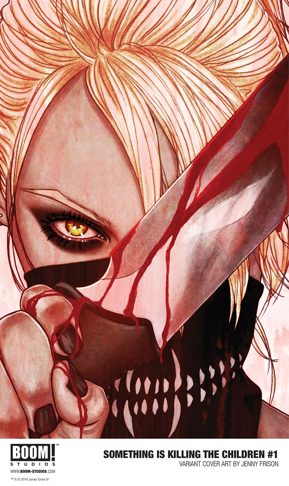
Tynion IV: There was an image of her that was forming in my head. It was of this blond woman with her hair parted over one eye to cover this scar on the back of her head. It was also the idea of the sleep-deprived, shadowy eyes. The idea of someone who has just been doing this for so long, and you can see the effects of it on her. Once we brought Werther onto the book, we started talking about the character, and in the first few sketches he added a few of these elements that really brought her whole design together. It was Werther that came up with the idea for the bandana with teeth on it. He gave her the “strange” vibe. 

Something is Killing the Children Issue One: Variant Cover by Jae Lee
Something is Killing the Children Issue One: Variant Cover by Jae Lee, Boom! Studios

Tynion IV (continued): So much of the book is grounded in the real world. It exists in a space that you can really touch and feel and live in. [Erica] is the character who looks like she’s almost from a different comic book. That was part of the idea, we wanted her to be a little out of place. And Werther just captured that so effortlessly. The other person that’s just an inexorable part of this creative team is our colorist, Miquel Muerto, who just has brought this series to life in such vibrant color. I’m so excited about this world that we’ve started building together. 

MFR: All right, last question. This first issue deals with the spooky stories that we tell each other as kids. That’s the opening scene, a bunch of kids telling stories to freak each other out at a sleepover. So I was wondering from both of you, what is the spookiest story you remember telling your friends or your friends telling you when you were a kid?  

Tynion IV: The scene at the beginning of this comic is very true to life. [My friends and I] would prompt each other to tell these scary stories. The exact story that the character James tells isn’t the real thing I remember telling, but I remember sitting in my room and staring out into the forest it just freaking me out. I had a very active imagination, and I would just imagine these things coming out of the forest. It was always something different. I made up different things to be afraid of. For a long time I couldn’t even watch horror movies, because if I let my brain alone I would get scared. More than anything, that is the genesis of this project. It’s also the thing that guided it into its current form. It was writing that first scene that made me see what the series needed to be. 

Harburn: I’m kind of similar. I didn’t grow up watching horror movies, I was kind of a wuss as a kid. I probably saw some a little too early. And now I work on ten horror books? I don’t know how the hell that happened. My earliest memory of…well, it’s not even a horror movie, but I was watching Gremlins with my parents and I just couldn’t handle it. When the lead character goes into a, what is it, a laboratory? I had to run out of the room. I think it was probably another five or ten years before I started watching horror movies again. 

(Laughs) So this book right up my alley.


Pick up Something is Killing the Children at your local comic book store on September 4th. Once you do, let us know what you think of it in the comment section below, or over on our Twitter page. For more on this comic, and for every other title you love, stay tuned to Monkeys Fighting Robots.

Monkeys Fighting Robots Youtube

OP-ED: About Sony, Disney, And Spider-Man, It’ll Be Okay

It’s been close to 24-hours since it was announced that Sony and Disney would not continue their partnership that brought Spider-Man to the Marvel Cinematic Universe (MCU). For now, it seems, the web-slinger will return entirely to Sony for them to make more movies.

Naturally, the geekosphere lost its collective sh*t. 

Many love the MCU and love that Spider-Man is a part of it. It’s certainly great to see the few remaining major movie studios working together. But sometimes they won’t, and that’s okay too.

You see, people are ignoring a slew of reality in favor of living in their echo chamber of binary thinking. Disney good. Sony bad. Or, as of late, vice versa.

Sony definitely has been in a bit of a slump making films in recent years. However, let’s not forget how Disney wasn’t all that great just 12 or so years ago. They were sputtering along with terrible Pirates of the Caribbean movies and John Carter or things like The Game Plan. Outside of Pixar, Disney movies were in a death spiral (again). Then they bought a film franchise that was five successful movies deep. And the Mouse House did the smartest thing they could do, they got out of the way of Feige and company.

Yet, for all of Disney’s efforts with Marvel when it comes to the discussion of best comic book movies, you often see one, two, or three of Disney’s MCU there (at best). The Avengers (which was already in production when Disney bought Marvel), Black Panther, and — Insert Most Recent Film Here. Three films out of 23. Quite often, you’ll see Spider-Man 2 on there and in more recent lists, Spider-Man: Into the Spider-verse. What are two common factors in those last two films? Sony.

It’s also important to keep in mind, if you’re a fan of Spider-Man: Homecoming or Spider-Man: Far From Home, then guess what? Those were co-produced by Sony. So, it’s a Sony film too.

But beyond all that, there’s so much else that’s been forgotten or ignored by the zealots on one side or the other who is simply rushing to commentary without any contemplation.

1. No one actually read about the negotiations. So, a lot of people missed that it was a mutual rejection. Sony offered to keep the same deal going, and Disney asked for more of the share. A lot more. Fifty percent to be in exact when Disney already gets all the merchandising money which is typically 10x what the movie makes. But most headlines would have you believe that “Sony killed the deal.” It’s business, they didn’t agree. Also, this doesn’t mean that Disney and Sony can’t just call each other tomorrow and work things out. It goes back to that binary thinking. On or off when things like this are much more nuanced and fluid.

2. Tom Holland is still Spider-Man. So many of the angry nerds out there say they love the character and want him in the MCU. So, if things stand, the second part of that is done for sure. But the first part, arguably the most crucial part, the character and who is playing it will remain the same. Not to mention, the deal between Sony and Disney extends to one more Spider-Man film. If that movie is a hit, and Holland wants to keep playing the character, then Sony will have to pay him a lot of money. All that is good for the character and the actor.

3. Most people we regard as great visionaries or artists, people like Lucas or Stan Lee, all needed something first: confidence. Talent can be trained and honed, but it cannot happen without an initial bit of confidence. Into the Spider-Verse might’ve been that confidence boost that Sony needed. They’re going to take another shot at live-action Spidey. There’s basically a 50-50 chance we get another Spider-Man 2 or Into the Spider-verse. Do the math. Sony has made six Spider-Man films (not counting the MCU films which they also produced), three are good (Spidey 1, 2, and Spider-verse), and two of those are some of the best made to date.

4. The greatness of comic books and to much the same extent films is the diversity of the voices behind the work. We’ve been through 10 years or one artist (Disney) drawing ALL the books. That’s counter to what comic books are about. Kirby, Lee, and company created Spider-Man, but Todd MacFarlane drew the character decades later in a way that took things to a new level. That’s comics. That used to be movies. But we’re quickly moving into a world of one voice for these characters who were otherwise born out of diversity. Maybe Sony will make a terrible or mediocre film. Maybe Sony and Disney work things out. In an ideal world, they’re both trading off years where they make their version of Spider-Man. Spectacular and The Amazing and Web Of if you catch my drift.

5. Sony worked with Marvel on the most recent live-action Spider-Man films. Far From Home became Sony’s biggest film ever. And it’s less to do with the MCU and more to do with the fact that Spider-Man, like Batman and Superman, is as close as you can get to a guaranteed hit in film. These characters are beloved by generations. They rarely, if ever, lose money outright or in a massive way.  Case in point, if adjusted for inflation, the maligned Spider-Man 3 still made more money (domestically) than any of the MCU Spidey films. But the real point here is, Sony may have learned (A LOT) from the partnership.

6. The possibilities. Sony recently bought Insomniac games which made the insanely awesome Spider-Man game for PS4. What if Sony is gearing up to make a new Spider-Man movie that’s also a Bandersnatch type game? The movie has a main version that is shown in theaters but then the BluRay has a game mode that lets you make decisions? That would be a step toward a future where games and movies blend in a seamless way that allows traditional viewers to enjoy it passively and gamers to enjoy the story actively. Also, it’s something Disney would have trouble doing because they don’t have the gaming expertise of Sony.

7. Perhaps this is the only real point that matters. All we’re seeing may simply be a form of “public negotiation.” Both sides putting the feelers out there to get the fans on one side or another. In fact, as fans we have an opportunity to shape this thing by pushing both sides towards a compromise.

So, OMG, STFU about Spider-Man, Sony, and Disney. One way or another, it’ll be okay. For MCU fans, it may be the best possible thing that happens. If Sony fails, Disney will buy them and own everything and we never get any other version of any of these characters. Hooray! I think?

Monkeys Fighting Robots Youtube

Review: PLANET CARAVAN #1 More Than Carries Its Weight

Monkeys Fighting Robots

Andrea Amenta and Stefano Cardoselli’s Planet Caravan #1, which releases August 28th from Scout Comics, draws inspiration from everything between Sin City/300–era Frank Miller, Mike Mignola, and Matt Kindt. Amenta’s script is direct and simple but contains tiny details that flesh out its broad characters. Cardoselli’s art is a tad messy, lacking in detail, yet somehow transcends above these faults to produce some of the most memorable art of the year. Planet Caravan #1 sets expectations for a huge series.

Planet Caravan #1 is a very straightforward quasi-Mecha comic. A lone soldier, Jason, is stranded on a planet after a huge conflict that left him no contact with his forces. The only communication he has had with anything is his Mech Suit/Ballon that permanently hangs over his head, which he has a seemingly symbiotic relationship with. Not much is known about what the war was about, where this planet is, nor who Jason’s forces fought against, and as of now, specifics don’t seem to matter much. Everybody is fighting everyone over nothing.

Amenta’s script is much more focused on Jason’s emotional well being, and the story begins with a VERY Miller-esque monologue that reads like it was ripped straight from the pages of Sin City. Almost the entirety of the first half of the comic sets up how much Jason misses his wife, Grace, and that is about it. It makes sense due to the stories solipsistic nature, but I can’t help but feel it could have been done better. Maybe include more details of the battles, his comrades, or honestly include no dialogue. Silence in this story could be one of the most effective monologues. All of this is interrupted by his Mechanical suit that floats above him, ironically named Love, which feels more interested in keeping the emotion out of Jason.

Enemies Attacking Jason
Follow the guy with the chainsaw sword!!

Much is to be made of Stefano Cardoselli’s art. Speaking honestly, it is not for everyone. It is messy, lacking in detail, and still, I cannot stop looking at it. The level of emotion radiating from these panels is breathtaking. There are obvious allusions to contemporary artists such as Love’s bloody red fist being blatantly inspired by Mignola’s Hellboy or the beautiful watercolors and scratchy line-work more reminiscent of Matt Kindt’s work.

Much of the story is depicted through the art, probably even more so than the dialogue. When Jason is waxing poetic about the rose’s being grown in the grave of all the fallen, it’s implied that the scale of the battle is large, but then the scene pulls back and the entire lower half of the panel is covered in waves of red, further clarifying the bloodshed. The almost classical Roman era design of Jason’s attackers give the impression that they are a simplistic if not outdated and brutal society. And of course, the close-ups of Jason’s face convey so much trauma, ache, and emotion that it more than triumphs over the perceived shortcomings of the style.

Planet Caravan #1 is a daring leap from Scout Comics. Writer Andrea Amenta, translator Daniele Bonfanti, artist Stefano Cardoselli, and letter Bram Meehan produce a comic that while flawed is as satisfying a read as is out currently. Planet Caravan #1 is simply a cut above the competition.

Monkeys Fighting Robots Youtube

Review: GOON #4 – Four Comes After Five, The Goon Says So

Monkeys Fighting Robots

Eric Powell continues to tackle real-world current affairs in his own humorous style with Goon #4, out this week from Albatross Funnybooks.

With the release of #4 following #5, Powell keeps you on your toes. Goon #4 takes on American capitalism and politics in typical Goon fashion. Opening with an age-old axiom about teaching a man to fish, “eat the rich” is taken to an entirely new level.

The theme of this issue is manipulation, corruption, and preying on the weak. Find anyone at their lowest point and they can be convinced of many things. Look at the political rallies of today. Politicians stand up on a stage saying anything to incite the crowd into a frenzy. Promising many things they will never even try to accomplish, or are impossible, like eradicating cancer.

The Goon is what you’d get if you imagine The Onion wrote a horror story. The sarcasm and witty dialogue would make many Onion authors jealous. Poking fun at controversial subjects is walking a tight-rope and Powell is the balance king. Rachel Cohen adds some color to this story that gives pages 1-3 some bright colors typically not seen in this series.

WARNING SPOILERS FOLLOW

Beginning with a pompous ass politician telling a crowd of people that they need more fishermen not more beggars, the unfortunate soul of Henry Briggs hears the words and becomes inspired. This begins a chain of events that are all too familiar to many of us. Can’t get a job because you don’t have experience, but you can’t get experience because you don’t have a degree, but you can’t get a degree without money. It’s slavery disguised as a free market.

There are unfortunate citizens in this country that are too poor to work. Would you hire a person who has no reliable transportation to work for you? Would you hire someone that can’t shower regularly? These are things many of us are fortunate enough to never have to think about, but is the reality of many, and Goon #4 shines a light on the problem.

In typical corrupt American fashion, the only fishing poles are also owned by Pfefferish, the politician. Pfefferish won’t donate any fishing poles, and complains about being exploited trying to make himself the victim. Whining like we see multiple times a day from just about every politician of the last 20 years. Pfefferish supporters then attack poor Henry after yelling multiple stereotypical insults heard from our favorite red hat hooligans of the last 4 years.

Typically, we’d believe Henry to be the hero of our story, but not the case here. Goon #4 tells a story that any person, beaten down and destitute, can force even the nicest, kindest people to do terrible things just to survive. The weak and mentally-ill are the best recruits for cults and other revenge related activities, as they are usually just looking for anyone at all to care about them.

If you let all the unfortunate events that happen to you rule your life, it will take its toll, and drive you towards anything that feigns positivity. In the case of American politics and religion, you can’t have one without the other, so Powell takes a quick jab at religion as well. The evil hobo god Greedy Gut drowns Henry and his new pal, calling it a baptism, as they are born again in Greedy Gut’s image.

Greedy Gut is hilariously creepy, even in one panel appearing to have three elbows. Eric Powell does great work with this book. Time and time again he addresses problems in our world through the pages of Goon, giving what would normally be a serious subject some much needed humor. The Goon is a hero we all wish we knew. He makes things right. He evens the score and does what we all wish we could do to the assholes in our life.

The Goon is a great dark comedy horror story that reminds me very much of a film with Andy Serkis called The Cottage. Horror comedy is not a huge genre and is very hard to do well, but The Goon and The Cottage do it VERY well.

Goon #4 is an outstanding story that takes a light-hearted and hilarious look into current politics and uses a people eating hobo monster to do it. I’ve never read Goon before this relaunch, but I love the hell out of this series and the character. Goon regularly brings a smile to my face and I hope this series does the same for you.

Monkeys Fighting Robots Youtube

Review: ABSOLUTE CARNAGE VS. DEADPOOL #1 – Symbiote Unicorn With A Mouth

Monkeys Fighting Robots

Absolute Carnage Vs. Deadpool #1, out this week from Marvel Comics pits two contrasting, talkative characters against each other with stale dialogue that would’ve worked better 10 years ago.

Cletus Kasady has always been one of the most talkative villains during his existence since being introduced in Amazing Spider-Man #344 & #345. Not known for jokes so much as descriptive murder threats and generally just being disgusting; Carnage has faced off with Deadpool before and it’s typically a word bubble infested roller-coaster of destruction.

Writing Dr. Phil and Facespace jokes into Deadpool stories in 2019 is not a good sign and  maybe some assistance is needed with the comedic side of Deadpool. Personally my favorite Deadpool issues to read were the issues with Brian Posehn contributing, and I believe that was for a reason. Deadpool is a character that should always be written by a team. He most definitely benefits from a writer experienced with super-hero level action mixed in with a comedian for quality, topical jokes.

If I were a Marvel Comics executive, that would be my main goal. Keeping a comedian working on a Deadpool title seems like a no-brainer. Could you imagine the hype and sales of a series written by Chip Zdarksy and Danny McBride or Dave Chapelle? We should all hope and dream for it to happen one day. I’d love for someone with some extremely dark humor like Anthony Jeselnik to write a few runs on Deadpool.

Frank Tieri feels like your elderly uncle trying to make jokes over Thanksgiving and his only material is about back in his day and walking miles through the snow uphill. Separation Anxiety was an amazingly drawn horror piece and a great addition to the event, this installment of Absolute Carnage is otherwise forgettable. The artwork by Marcelo Ferreira leaves me yearning for more Spider-man/Deadpool with his pencils. Roberto Poggi inks this issue while Rachelle Rosenberg colors, and Joe Sabino handles the letters.

Tyler Kirkham provides an amazing A cover for this issue as well. This is one of those issues where the interiors hold up to the amazing cover art. Much too often I find myself enticed by a cover only to immediately lose interest as soon as I open the book.

Ferreira, Poggi, and Rosenberg achieve an impressive feat by keeping a dark, gritty and serious atmosphere in a Deadpool story. The colors inside the institution for the criminally insane is reminiscent of the SAW films when his victims awake in his or her gruesome death traps. Green and yellows fill the hallways as if the only lights in the entire building are electronics and a few broken lamps. Carnage and his crew of symbiotes radiate like a lava pit smoldering in the heart of a volcano in an otherwise only candlelit room.

Even at the beginning of the issue, as Deadpool and Spider-Man flea through the city, you start to wonder if maybe there’s so much crime because every corner is lit like the last two hours of the Purge. The colors keep the mood of the story exactly where it needs to be for a Carnage story.

There’s even a great merchandising idea that I couldn’t readily find on Google, but I expect we should see ads for it in future Marvel comics. When it is released, if the Rhino hoodie fits as dashingly as the one Deadpool wears, I’d consider buying it. A nice loose-fitting hoodie is great, just keep it locked away from your girlfriends or it’ll somehow find its way to her closet, as most hoodies do.

Absolute Carnage Vs. Deadpool #1 is ultimately just a tie-in issue we really didn’t need. Get rid of the stale old-timer jokes and I’m sure this series would’ve been more exciting as a one-shot. Dried out comedy teamed up with fantastic artwork, unfortunately, isn’t enough to entice me to spend money on this book. Many people will buy it for the cover art and won’t be too terribly disappointed by the book’s contents. I expect many people to enjoy this issue. It was honestly just not what I wanted from this title.


Monkeys Fighting Robots Youtube

Review: GHOST-SPIDER #1 And Why Marvel Shouldn’t Have Renumbered Spider-Gwen

Monkeys Fighting Robots

With great power comes a college degree? Or in GHOST-SPIDER #1’s case, a beginning issue that falls short on its web-slinging.

In recent trends Marvel (and DC) loves to renumber their ongoing series a fair amount. This renumbering usually comes with a rebranding of the series name, and a new first issue. Essentially this tactic is to draw in new readers, but if you ask long-time collectors it’s an annoyance. Marvel has done just that with today’s release of Ghost-Spider #1.

Ghost-Spider #1, out this week from Marvel Comics is a continuation of the Spider-Gwen title, but is re-titled for a multitude of reasons; one such is the acting of a jumping-on point. Another would be the fact that it’s a huge location and story shift with Gwen now going to college on Universe 616. With any first issue comic that’s a continuation of a previous story, it’s good to give a little background. Well, that’s where Ghost-Spider #1 web unravels.

This ‘recap’ page doesn’t give much info for a new reader interested in Spider-Gwen (Ghost-Spider).

Taking place after Spider-Geddon and the ten-issue Spider-Gwen: Ghost-Spider, Ghost-Spider #1 follows Earth-65 Gwen Stacy as she decides her next big step; as everyone in her dimension knows Gwen as her superhero identity Ghost-Spider (formerly known as Spider-Gwen). Now with no private life and the ability to travel between dimensions Gwen makes the decision to finally go to college–on Earth 616.

With this new life chapter opening up Ghost-Spider #1 should be an easy jumping on point for new readers, but it relies heavily on knowing what has previously transpired. Instead of giving readers a quick exposition moment or a flashback it relies on the readers’ keen use of Wikipedia or buying the past series. The title page has a quick recap but barely enough for newcomers.

Instead of recapping past events (where’s the new suit from? Her name change?) there are a few instances when Ghost-Spider #1 drops some prior info needed, but it’s barely enough to understand all of what’s going on. One being between Gwen and Peter Parker (Earth-616) where Peter explains what is happening with Gwen’s costume now that it’s a type of symbiote. Confusion on why Ghost-Spider #1 is a renamed first issue and not titled the same as the previous issue aside; the plot is only bearable due to its characters moments sticking out most.

Seanan McGuire’s dialogue between Gwen and her supporting cast plays off quite naturally, showing a history behind the characters. During her introduction to the Earth-616 college by its Dean, they mention Gwen being from another dimension like it’s old hat. This nonchalant attitude from the Dean and those around her became the highlight of a rather bland issue that feels like Ghost-Spider #1 doesn’t deserve the re-branding, or numbering.

The original Spider-Gwen series was known for the art – personally, I loved it’s frantic feeling – by Robbi Rodriguez. Whereas Ghost-Spider #1 isn’t drawn by Rodriguez but by Takeshi Miyazawa, who doesn’t try to emulate Rodriguez’ style instead he spins his own web. Miyazawa’s art is parallel to Manga with his use of multiple size shots for different actions. In one conversation you can bet on there being more than five panels as not to make it linger too long and becoming stale.

Ghost-Spider #1 has only one fight scene, so it’s hard to comment completely on how great of a flow Miyazawa has when it comes to fights. In the scene which involves a huge rat, Ghost-Spider and Spider-Man fighting, Miyazawa keeps it limited to four panels showing the action. This style makes the fight seem fast, but while losing any fun flow or acrobatics that the Spider-heroes are known for.

Colors can easily make the art stand out for better or worse, in Ghost-Spider #1’s case it is meh. Ian Herring uses bright colors that seem that they want to pop out at you but is instead dulled down making it less vibrant. This dulling of bright colors makes the backgrounds dull and flat instead of lively and vibrant. In a title that should feel alive and teaming with colors Herring’s colors never hit that desired high.

Ghost-Spider #1’s lettering (courtesy of VC’s Clayton Cowles) doesn’t have much you can shake a web at for its dialogue bubbles, but its location fonts are horrendous. When a location is brought upon the page, a huge grunge looking yellow font pops up that makes numbers look like words. Instead of reading Earth-65 it read as Earth-GS.

Squash Goes The Ghost-Spider (A Conclusion)

Instead of being a completely new series where you either don’t need prior knowledge or said knowledge is given in a clever manner, Ghost-Spider #1 feels like a new arc not deserving of a re-brand. Whereas Marvel could’ve used its last series name and added the arc to the cover and this issue would’ve felt better in that respect. But even that wouldn’t help the feeling of how bland and unoriginal Ghost-Spider #1 is while not living up to Gwen’s past solo series.

Throughout Ghost-Spider #1 no part of the story feels specific to Gwen herself sans the dimension traveling. With her going to college while still crime-fighting and having the fabled ‘Parker Luck’. You could easily copy and paste any other Spider-hero and the story beats would feel the same. Much like every other Spider-hero, Gwen now even has a symbiote.

A cliffhanger ending with a classic Spider-Man villain doesn’t even feel special, instead, it makes you go, “Are we really doing this again?” But we are glutton for punishment and will read issue two hoping that it doesn’t go down a familiar route.

Memorable Quote: “Oh. That’s easy. My suit is made of spider!” – Ghost-Spider

Yeah, that’s not something you want to tell little kids!

Dear Faithful Web Slingers

If you’ve been reading Spider-Gwen/Ghost-Spider throughout the last few years let me know what you think of this “first” issue! If this is your first web swing Ghost-Spider then come check out the Wikipedia over here, then let me know what you think!

Monkeys Fighting Robots Youtube

Review: The Bat-Family May Never Be the Same After BATMAN #77

Monkeys Fighting Robots

Woah. That’s probably the best way to sum-up the implications of Batman #77, out this week from DC Comics. Whether it’s meant in a positive of negative way is yet to be seen.

Defying Bane’s warning, the youngest member of the Bat family has a “that’s so Damian” moment and launches a solo assault on occupied Gotham. Meanwhile, Bruce wakes from his coma, resolved to confront Bane and his father, regardless of the cost.

Batman #77

The Writing

Let’s discuss craft before delving into the details. Tom King’s writing on Batman #77 is tense, tight, and action-packed. Damian is effectively on a speed run through Gotham, attempting to make it to Bane’s base of operations without being bogged down, and one feels the momentum pushing the story forward.

Thomas remarks to Damian that he is “Stubborn, defiant, naïve. You are your father’s son.” And in fairness, they’re all traits Damian exemplifies in great quantity here.

Bruce and Selina’s story gets overshadowed by the rest of Batman #77, but there’s a decent amount to ponder from a thematic angle here as well. For instance, we first see Bruce wake up while Selina is across the room in the kitchen. She’s singing a verse from Habanera which, at first, seems to obviously underscore the theme of her relationship with Bruce. As the book moves on, though, we see it echoes Bruce’s relationship to Gotham. He can never truly leave the city behind, and by the issue’s end, he’s resolved to make a final stand for the city.

The real narrative payoff, of course, comes at the end of Batman #77. When Tom King promised to “change the character for a generation, or maybe more. Maybe forever,” the shocker in this issue could be part of what he had in mind. Without divulging spoilers, suffice to say it’s a substantial blow to the Bat-family, one that will likely polarize fans, as well as change the dynamics of the Bat mythos. Of course in storytelling, one can justify even a radical move like this if ultimately motivated and serves the story. With that in mind, King has some high standards to clear with the climax of his run.

Batman #77

The Artwork

Mikel Janin and Tony S. Daniel provide art for Batman #77. The pair forms a fantastic team, delivering visuals that hit every story beat and capture the action behind the storytelling. While the art styles are distinct, they mesh well, making the work feel cohesive as a whole.

The artists employ repetition in layout, with similar images presented from different perspectives or special focus in the frame. The effect capitalizes on the drama and accentuates the tension in the work. It’s especially noteworthy when contrasted with a more kinetic pages, yet both still work as a singular presentation.

Jordie Bellaire and Tomeu Morey split color duties for Batman #77, and they don’t disappoint in comparison to the quality illustrations. One can appreciate the eye for detail right from the first page; Damian and Gotham Girl meet on a rooftop, backed by the Gotham skyline. The colors on the buildings in the background give it an almost cel-shaded quality.

The colors Bellaire and Morey employ throughout are vibrant, eye-catching, and perfectly match the tone of the work. It’s a quality presentation in this department.

Final Thoughts

Batman #77 is packed with excellent artwork and compelling storytelling from start to finish. The bombshell it drops will carry narrative weight though, and King needs to make it work in the end. Otherwise, he risks the entire story he’s built over these three-plus years. Decide for yourself after stopping by your local comic shop this Wednesday.

Monkeys Fighting Robots Youtube

Review: Clark Works To Become Heroic In SUPERMAN YEAR ONE #2

Monkeys Fighting Robots

The Golden Age of Superman has been Remade!

The origin of Superman is one many people know by heart, even if you’ve never read a comic before. The biggest challenge to writing the story is doing something different that has your version stand out and last issue Frank Miller did just that. Instead of focusing on the alien nature of his origin or the powers manifesting, we focused on Clark Kent growing up in Smallville, falling in love with Lana Lang, and trying to find his place in the world. It was a nice, coming of age story that ended with Clark not going to Metropolis but the Navy to help the world. What adventures will our young Kansas native find out at sea?

Superman Year One 2 cover**Some Spoilers Below**

Story:

Clark Kent begins his training for the navy and soon rises to the top as one of the best recruits. From strength training to marksmanship, the trainers agree he might be the best soldier they have. One day during training, however, Clark sees something out in the bay where his training takes place. After that, he soon grows more distracted and sloppy, leading to a bar fight.

He gets chewed out by his leaders, but Clark can’t help but think of the bay. That night, he sneaks out and swims to the location only to find Atlantis, which has been wrecked by a submarine. Only thinking of a moment, Clark quickly gets to work helping the people, gaining the attention of the mermaid, Lori Lemaris. She begs her Superman to stay, but Clark returns to the surface, promising to return after his work in the Navy.

Superman Year 1 p1

When I read the first issue and saw Clark heading to the Navy, I was unsure of what direction Frank Miller was going. It was a pleasant surprise to see him use elements from the golden age of Superman comics in the modern-day. From the romance of Lori to the original Superman shield having a black background, this issue captured the past of the Man of Steel.

Aside from the nostalgia factor, the navy sequences are a surprisingly nice change up to past Superman origins. Usually, we see Clark in Metropolis, facing off against a Kryptonian superweapon or the monster that killed Krypton. This time around, however, we bring the focus on him trying to be a hero as humans can be. Clark knows he isn’t human, but he still tries to help how humans help. Stopping bar fights to protect harassed ladies, holding grenades to protect his fellow soldiers, and just going out of his way to help the Atlanteans. He’s not trying to be a Superman; just a hero.

Superman Year One 2 p2

Art:

While I’m usually okay with John Romita Jr.’s artwork, there were certain parts that weren’t quite up to quality standards. While the navy and action sequences look great, the Atlanteans have a bit of a mixed bag about them. While the linework of those above the water gives detail to each character, most of the merfolk lack real linework to distinguish what is their attire and what’s them. This wouldn’t be such a problem if the colorwork would have it melt into each other, but even that gets hiccuped with mismatching looks.

The only sequence that works for this reviewer, however, is the reveal of Clark’s Superman suit. It captures the look of the Golden Age with bright colors having him pop right off the page. It brought a smile to this reviewer’s face and almost had me forget about the Atlanteans’ lack of detail. Almost.

Superman year one 2 p3

Conclusion:

While it isn’t as great as the first issue, there is still some cool stuff in this one. Along with some kick-ass action, we get Clark building up to become a hero through training and a chance encounter with Atlantis. The art sadly doesn’t hold up, but hopefully can get itself back on track as we approach the final issue. Overall, a decent read for a neat retelling of the Superman origin.

Monkeys Fighting Robots Youtube

Review: JANE FOSTER: VALKYRIE #2- Another Entry In A Redefining Series

Monkeys Fighting Robots

Few writers have a grasp over their characters histories and tones like Jason Aaron has over the Thor mythos, and his understanding is on full display in Jane Foster: Valkyrie #2 out this week from Marvel Comics. Sharing writing responsibilities with Al Ewing, their script and plot are top-notch. Coupled with Cafu’s lines, Jesus Aburtov’s colors, and VC’s Joe Sabino’s letters, Jane Foster: Valkyrie #2 is another worthy entry into Aaron’s Thor collection.

Picking up immediately following Bullseye’s stabbing Heimdall from chapter 1, Jane Foster: Valkyrie #2 continues the ensuing battle between God and Man. Jason Aaron and Al Ewing decision to make most of the dialogue an internal monologue from Valkyrie’s perspective was a clever one as it allows the action to flow simultaneously.

This entry goes a long way in supporting Aaron and Ewing’s theme of establishing a new legacy, exemplified by Jane Foster destroying Brumhilde’s Dragonfang. In most other arcs or stories reacquiring Dragonfang from Bullseye would have been the main concept for the story. The idea of retaking a sacred artifact to restore it’s Divinity and maintain its holiness is a classic trope. However, Jane Foster: Valkyrie #2 is not concerned with this at all. Instead, it opts for reformatting of the canon, establishing Jane Foster as the tried and true Valkyrie by escorting Heimdall to the assumed-to-be-destroyed Valhalla.

This story arc is also a nice nod to the original Nordic mythos of the Valkyrie doing this exact thing instead of fighting with people in Iron Suits with superpowers. It shows that Aaron and Ewing has a respect for the source material dating back to the ancient tales.

The choice of using Brumhilde’s Dragonfang as the object symbolic of the past status quo is smart as well. There are thousands of stories of swords with mystical powers that give its wielder divinity or mystic powers (ie. Excalibur), but placing this holy weapon in the hands of a sociopath highlight the flaw in these stories. If someone who is outright evil holds this powerful weapon, the weapon itself becomes evil. Jane Foster’s Undrjarn, The All-Weapon shifts to be whatever Jane Foster needs it to be. Undrjarn is all about the intent of its wielder as well. But in Valkyrie’s hands, Undrjarn is a force for good.


Valkyrie Saves Bystander
The benefits of hallucinating giant balls of Death are endless

Valkyrie’s ability to see Death approach is an interesting mechanic and reading Valkyrie says she could use it to essentially track Bullseye shows how well thought out her powers are. What seems like an ability less suited for combat gets repurposed into a quasi-detective ability. Cafu and Jesus Aburtov’s rendering of these blobs are equally impressive.

Similarly, the art in this chapter is phenomenal. Cafu’s lines are clear, kinetic, and fluid and Aburtov’s colors pop off the page. In combination, they produce some of the most stellar art of the year. One scene, in particular, is when Bullseye is riding in on his flying horse. It seems like a shot ripped right out of a traditional opera or fable, the powerful Valkyrie’s riding in on flying horses to conquer evil. But with Bullseye as the rider the sky is colored blood red, symbolizing the coming bloodshed. Not to mention that the close-ups of Bullseye make him look certifiably unhinged.

Jane Foster: Valkyrie #2 is a tremendous feat from Jason Aaron, Al Ewing, Cafu, Jesus Aburtov, and VC’s Joe Sabino. The story is bold, theatrical, and definitely, a launchpad for Valkyrie to remain a prominent figure in ongoing Marvel stories and the art more than holds it’s own. Jane Foster: Valkyrie #2 is a dramatic reshaping of the character and should be on everyone’s list.

Monkeys Fighting Robots Youtube

Review: AQUAMAN #51: Aquaman Teams Up With Aqualad, The Son Of Black Manta

Monkeys Fighting Robots

When readers last saw Arthur Curry, he was adjusting to life back in his hometown of Amnesty Bay, Maine after a brief stint with the Old Gods. Most of the townspeople welcomed the oceanic warrior back with open arms, but many held strong reservations about his new deity friends. Their differences seemed to scare people. Unfortunately, this prejudice was directed toward another newcomer who happened to be Jackson Hyde, a.k.a. Aqualad, the son of the villain Black Manta. AQUAMAN #51 from DC Comics, available in stores Wednesday, August 21, tells the story of his reintroduction to Arthur.

Story

Kelly Sue DeConnick Jackson is a kid struggling to shape his identity. Aside from struggling with the normal issues every teenager faces, his villainous father makes it particularly difficult for the young hero to carve a good reputation for himself. To make matters worse, the authorities of Amnesty Bay find Jackson be a “suspicious individual,” a classification the duo suspect implies something more.

Arthur picks up Jackson Hyde from detainment

Jackson is a complex yet relatable character that often serves as tempered foil to complement the more adventurous Arthur. He’s a cautious person who takes the time to think things through before acting on impulse. That’s why it’s great to see the more seasoned hero help his companion ease his mind after experiencing such awful treatment from the town. Part of this process involves helping the Old Gods build a home for themselves on the Island of Amnesty, which allows for a perfect bonding opportunity between Jackson and the others who are considered outsiders.

Readers will enjoy viewing these worlds collide, but DeConnick won’t let them forget about Queen Mera and the upcoming royal wedding ceremony taking place in Atlantis. It’ll be interesting to see how she conducts her role as ruler without Arthur by her side. But the challenges he and Jackson meet in this story tells us the sea isn’t done with him yet.

Art

Robson Rocha’s penciling, Daniel Henriques’ inking, Sunny Gho’s coloring create brilliant landscapes in AQUAMAN #51. They present highly detailed landscapes of the Maine coast, complete with rocky cliffs, aqua blue waters, and multicolored skies.

Clayton Cowles’ lettering is the standout feature of this issue. His placement of the letter boxes is almost magical in that it creates effects of both movement and sound. For instance, the panel depicting Arthur diving off a cliff shows a speech box for the exclamation “Follow me!” that looks like a standard oval, that is until the reader traces a long, narrow deviation that follows him as he plummets to the water below. This helps the reader feel the effects of Arthur’s descent by helping them imagine an extended echo all the way down.

Arthur crazily jumps off a cliff

Comic Covers

Rocha, Jason Paz, and Alex Sinclair’s depicts Arthur fighting a mechanized version of BLack Manta, giving readers a sense of conflict coming our heroes’ way. Josh Middleton’s variant cover, on the other hand, shows Arthur swimming peacefully with a school of stingrays, emphasizing his renewed carefree attitude upon returning from the “dead” in recent issues.

Conclusion

In AQUAMAN #51, DeConnick brilliantly brings back a fan favorite character while speaking to the real world issues of prejudice and self-identity. We’ll have to wait and see how the duo face the challenges ahead.

What did you think of Aqualad’s reintroduction? Let us know in the comments below!

Monkeys Fighting Robots Youtube