Home Blog Page 415

Review: THE BLACK GHOST#1 Excellently Mixes Noir, Mystery and Vigilantes

Monkeys Fighting Robots

The Black Ghost #1, published by ComiXology, and created by Alex Segura, Monica Gallagher, Marco Finnegan, George Kambadias, Ellie Wright and Taylor Esposito perfectly blends noir, mystery and vigilante action into an exciting and great-looking new series that is a treat for comic fans.

Meet Lara Dominguez—a troubled Creighton cops reporter obsessed with the city’s debonair vigilante—The Black Ghost. With the help of a mysterious cyber-informant named LONE, Lara’s inched closer to uncovering the Ghost’s identity. But as she searched for the breakthrough story she desperately needs, Lara will have to navigate the corruption of her city, the uncertainties of virtue, and her own personal demons. Will she have the strength to be part of the solution—or will she become the problem?
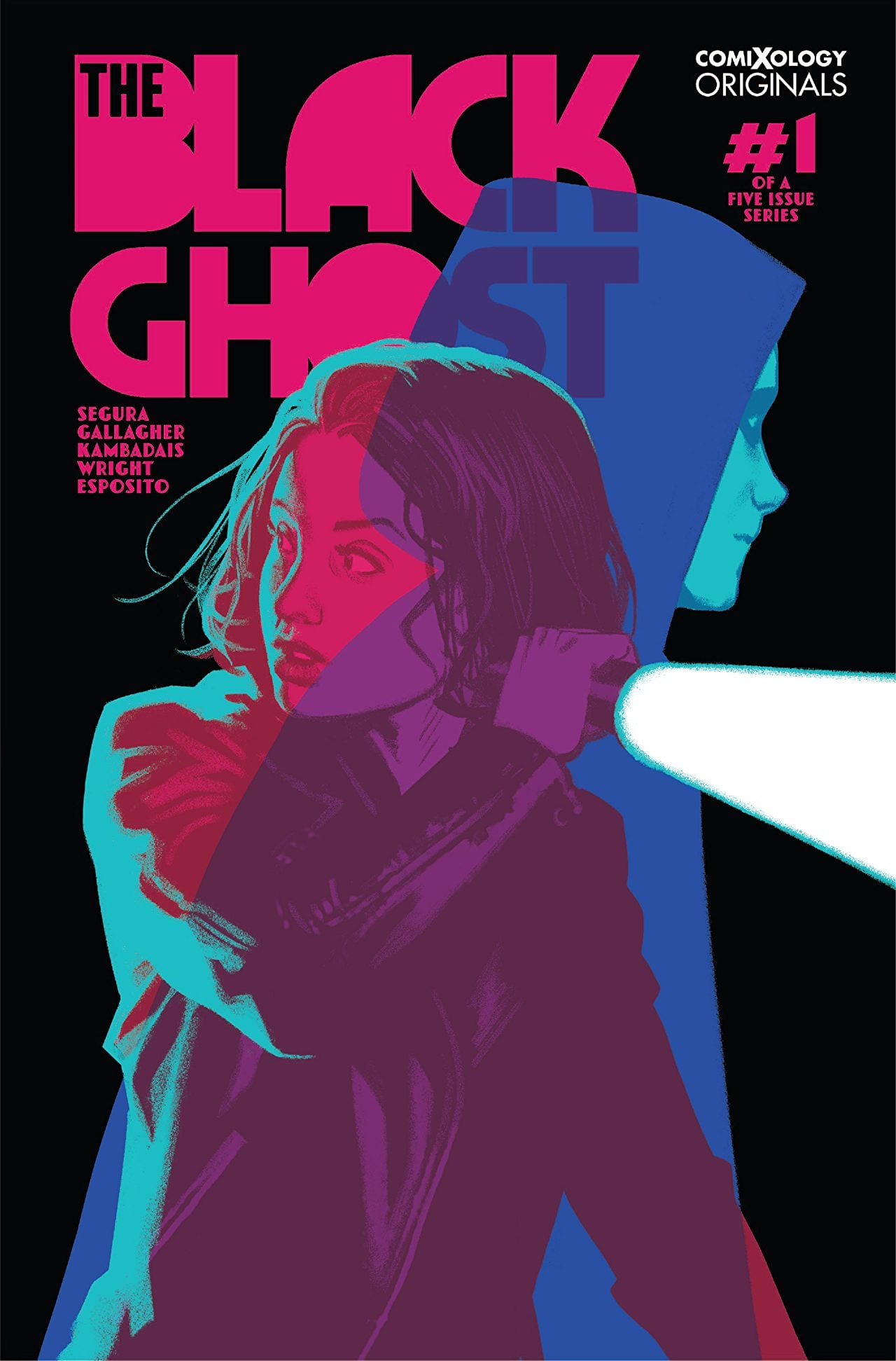
The Black Ghost

The Black Ghost #1
Written by: Alex Segura & Monica Gallagher
Art by: George Kambadais
Layouts by: Marco Finnegan
Colors by: Ellie Wright
Letters & Design: Taylor Esposito

Story

The Black Ghost #1 opens with an exciting in medias res scene that does a great job of introducing its main character, Lara, and also what her motivations and role in the story are. As the story progresses you organically learn more about Lara; very little exposition too, it’s all done through some great dialog and narration.  Writers Alex Segura & Monica Gallagher create a protagonist you immediately start to feel for, given the situation she is in. Lara is tough, independent and smart. But she is also not without her faults, as both job neglection and a drinking problem are alluded to. We also get to see her relationship with a student (Lara is ALSO a night school teacher-great detail!) which helps add even more layers to Lara.

They also do a fantastic job in creating the world around Lara. The city of Creighton feels real and has atmosphere. In great crime/noir fiction setting and places are as important as characters and that is the case here. It gives readers a great overall package that feels complete, even for a first issue.The Black Ghost

The writers also do a fantastic job in blending genres. The Black Ghost is a noir, a crime/mystery procedural and of course a superhero/masked vigilante story. That it works as all these things individually AND together shows how much care and love these writers must-have for their characters, world and the genres they are mixing.

And then we get one hell of an ending that leaves things with such a great set-up. I can’t remember the last time I said “Holy Shit” out loud when I finished a comic but The Black Ghost #1 a brand new book with brand new characters made me say it. And that’s no easy feat.

Art

The Black Ghost is a very good looking book. The art here is clean and thick-lined, creating a sense of heaviness in the digital images that make it feel tangible. There is also a great use of empty space; the technique opens up the pages to some great layouts that are as inventive as they are effective. The colors pop and are vibrant. The lettering is clear and designed effectively to convey differences between word balloons, descriptions and ‘voice over’ narration.The Black Ghost

Overall the art falls somewhere between indie comics and superhero art; a nice place to hang out in if you can get there.

Conclusion

The Black Ghost #1 is a great start to what could potentially be a fun and unique comic book series. It’s rare to find a debut issue that delivers so much. Give it a try, you will not be disappointed! The Black Ghost


The Black Ghost #1 is available here from ComiXology on September 18, 2019.

Monkeys Fighting Robots Youtube

Review: The Expansion Never Ends in STRAYED #2

Monkeys Fighting Robots

STRAYED #2 from Dark Horse Comics is out this Wednesday, and it is the perfect read for any cat lover hoping to get into a new series. Little Lou is an adorable astral projecting cat, but the world he lives in is content to take advantage of his abilities.

A different focus on the second issue’s cover.

***SPOILER WARNING***

After the first issue of Strayed came out, many fans still had questions about Lou and the world he lives in. Strayed #2 went a long way in answering some of those questions – while also tugging at the heartstrings of any animal lovers out there.

Lou has a special gift – he can astral project; a fantastic talent, especially when combined with his owner’s technology, thus granting him the opportunity to communicate with humans properly. Unfortunately for both him and his human, there are other humans in control who want to abuse this ability set.

Enter Strayed #2. Lou has been pushed to the limits as of late, with the greedy humans who control his fate sending him out again and again? What are they seeking? And worse, what will they do when they find it? These are questions fans have been asking. And while these questions were answered, many more were brought up throughout this issue.

Lou looks cuter than ever in this alternate cover.

Strayed #2 blends science fiction and drama, turning it into something curious and new. And it’s sure to make cat lovers feel a little pain in the hearts, especially when one overthinks about the conditions that Lou has been put through.

Heartache aside, this issue went a long way in explaining the world (or rather, universe) around Lou and his owner. There are still so many questions left to answer and to ask, but we’re getting there. Along the journey, even more, planets and species were showcased, all in a montage format. The world-building was done to hint at the depth behind the mission these humans have been on.

Carlos Giffoni is still at the helm of this series, so you can blame him for any emotional distress you experienced during this issue. We have to give him credit for giving us some emotionally compelling reasons to care because there’s still quite a lot left to this tale.

Lou is traveling once again.

As with the first issue of the series, Juan Doe has taken the brunt of the artwork. He handled both the lines and the colors, resulting in one cohesive and dynamic piece of work. There are a lot of positive things to be said about the artwork within this issue.

The myriad of worlds was shown in a striking compilation. While each world hosted a plethora of vibrant colors, no two worlds seemed overly similar. It’s clear; Doe has a creative mind for building an expansive universe.

The way Doe shows Lou’s astral form is fascinating – there’s a clear distinction between the physical cat and the astral one, and not just because of the color change. The structure and way the body moves change slightly as well. It’s all exceptionally done.

Finally, Matt Krotzer provided the lettering for this issue, and he had a solid template to work with. Krotzer handled the montage dialogue in a way that fits each panel perfectly. He also made a point of not blocking as little of the artwork as possible, which is appreciated.

What a world Loua has stumbled upon.

Strayed #2 proves to readers that there is still a lot going on behind the scenes. The world has been further established, as has the situation that Lou is in. We still have dozens of questions yet to have answered, but we’re feeling more confident about the anticipated delivery of those answers.

Monkeys Fighting Robots Youtube

A Dark and Deadly Tale Begins In NOMEN OMEN #1

Monkeys Fighting Robots

NOMEN OMEN #1 is the start of an all-new series from Image Comics, coming out on October 2. Enter a world where you can only outrun your fate (and the supernatural) for so long before it catches up with you.

Becky and a mysterious reflection on the cover of Nomen Omen.

***SPOILER WARNING***

Nomen Omen shows us a world in which the supernatural has a way of interfering with characters every day lives. Becky Kumar may seem like an ordinary college student – but her history makes her more unique than you might ever imagine. And she’s just about to find out what that means for her.

The series is intended to run for fifteen issues – long enough to give us a chance to do a deep dive into the plot. But not a significant investment, all things considered. So if you’re looking for a new series to explore without a substantial commitment, give Nomen Omen a chance.

A dramatic and disturbing alternate cover.

Nomen Omen #1 is an interesting start to this series. It had a lot of groundwork to cover, for the series to make sense. And it still has a lot of explaining to do. But it certainly got our attention; there’s no denying that.

The story may seem a bit disjointed at first, but there’s a strong enough lead to leave us convinced that everything will tie together in the end. And there’s already a more than healthy dose of foreshadowing to go around as well.

Here we get a better look at the supernatural elements in the series.

Marco B. Bucci was the writer for this issue, and he did an excellent job of grabbing attention – and holding it. The series already has a disturbing and eerie tone to it – one that is sure to increase with time. The introduction alone rivals some horror movie beginnings.

Oddly enough, there was a sort of twisted humor sprinkled throughout the issue. It livened things up and earned a few chuckles here and there. It was an impressive (and smart) balance. What will be most interesting is seeing where this series is planning on going in the long run. There are a lot of answers to be discovered over the next 14 issues.

The calm before the storm?

Jacopo Camagni, the artist behind Nomen Omen #1 definitely shows off his range in skills as he handles double duty as artist and colorist. He had to portray a variety of thematic elements in a single issue, and frankly, we can’t wait to see what he’s forced to come up with next.

Despite the varying elements, there is a certain amount of consistency to tie the whole thing together. The end result is something striking and memorable, with a decidedly darker tone overall.

Camagni’s ability to push the artwork to the limits shines in Nomen Omen, in ways that might have been hindered with a larger team. Meanwhile, Fabior Amelia did the lettering, and his work entirely supported what was happening on the pages.

Where will this lead us, we wonder?

Nomen Omen #1 was a strong start to a new and supernatural series. Time will only tell how far they go with this tale, or what will happen to Becky after the final three pages of the book.

Monkeys Fighting Robots Youtube

Lobo’s Kid Snaps In Our Exclusive First Look At TEEN TITANS #34

Monkeys Fighting Robots

Teen Titans #34 hits your local comic book store on September 18, but thanks to DC Comics, Monkeys Fighting Robots has an exclusive five-page preview for you.

Crush is the half-Czarnian daughter of the intergalactic bounty hunter Lobo, and she might make a turn towards the dark side in this Year Of The Villian crossover.

The issue is written by Adam Glass, with art by Bernard Chang, Marcelo Mailo is the colorist, and Rob Leigh is the letterer. Francis Manapul and Alex Garner worked on the two covers.

About Teen Titans #34:
Who is crazy enough to steal a djinn’s ring? We’ll do you one better: How much damage can you do with a stolen djinn ring? Robin and the Teen Titans hunt the thief of magic…but are they looking in the wrong place? The Year of the Villain strikes close to home, as a major turning point in the Titans status quo starts here!


What are thoughts on this version of the Teen Titans? Comment below with your thoughts.

Check out the five-page preview of Teen Titans #34 below:

You can find the first appearance of Crush in Teen Titans Special Vol. 1 #1 from August 2018.

Monkeys Fighting Robots Youtube

Frank Miller And The Dark Knight: Together Again

Monkeys Fighting Robots

He’s currently chronicling the adventures of the Man of Steel in Superman Year One, but it seems Frank Miller’s heart will always bring him back to Batman. DC Comics announced that Miller will be writing the Black Label book Dark Knight Returns: The Golden Child, illustrated by Rafael Grampá and colored by Jordie Bellaire.

Frank Miller Dark Knight Golden Child

According to the press release:

The story takes place three years after the events of Master Race, where Batman, Superman, Wonder Woman, Carrie Kelley, and Lara Kent overcame the renegade priest Quar and his cult of Kandorian fanatics in their bid to convert humanity into worshipping them as gods. During this interim, Lara has spent time learning about what it means to be human, while Carrie has grown into her role as Gotham City’s new protector, Batwoman.

So, who is the “Golden Child” of the title? None other than Jonathan Kent, who now “possesses power unlike anything the world has ever seen and could be all that stands in the way of the destruction of Gotham City, as well as the whole planet.”

frank miller dark knight golden child

Miller told Entertainment Weekly:

“The possibilities for what he could be just started coming to mind like crazy. I thought the contrast between him and Lara could be really exciting. Lara has so much power and passion, so for the little boy to embody all of the wisdom and intelligence of the Kryptonian race would be an exciting new dimension. He really sort of developed as a little floating Buddha, someone who when he wasn’t even a toddler yet was speaking in full sentences and had an understanding of events that surpassed anybody else’s. He’s the most magical member of the family.”

Dark Knight Returns: The Golden Child will be a Black Label 48-page prestige format one shot in stores December 11. Variant covers will be available from Miller, Paul Pope, Joelle Jones, and Andy Kubert.

Are you ready to see Miller back in the Dark Knight world? Leave us a comment!

Monkeys Fighting Robots Youtube

Review: DEAD END KIDS #3 Will Leave You Needing Tissues

Monkeys Fighting Robots

With the concluding issue, DEAD END KIDS #3 wraps up its emotional coming-of-age story on a somber, yet high note. Word of warning, you may need some tissues on hand.

Issue three of the murder mystery from Source Point Press releases September 25th, culminating with the reveal of who killed Ben. If you haven’t read the previous issues, it’s highly suggested. If not, check out our reviews for issue one and issue two.

Dead End Details

Kicking off this issue, we see Murphy as an adult in 2019, his narration stating that the story you are about to read is real life, “not a f***ing fairytale,” hinting at the hard realism the reader is about to endure. In the previous issues of Dead End Kids, writer Frank Gogol used time hops and blank pages to help break up moments and create tension while building momentum. This technique is used here, with a great placement of the title page after Murphy (back in 1999) declares he knows the killer. This break in story causes you to page turn so fast you may cut yourself.

Nearly every page is filled to the brim with tension you could slice with a knife, causing you to charge through the plot, yet stay on each page to soak in every detail (which there are plenty of). Throughout Dead End Kids, Gogol has excelled at creating drama, grief, and many other emotions. One page will make you overjoyed, then the next sad enough to want to abandon ship (but you can’t). This varying of feelings is done with immense skill, as Gogol never goes for cheap or easy emotions. With the motivations of the “villain,” you even feel for him, while still not agreeing with his actions.

Dead End Design

Continuing on art duties for Dead End Kids #3 is Nenad Cviticanin, who hits all the emotional beats that Gogol throws his way. While taking the emotional spectrum up a level with his use of paneling and character actions, Cviticanin also handles colors, which should be noted for the great use of a grey shading for night. The colors added or lost help amplify each scene, especially when portraying the cold night time and “break up season.” With his pencils showing the winter months in near perfection, you can feel the winter chill, as if you were in Alaska.

Cviticanin’s art is soft in a manner that feels inviting, no matter what is displayed. This feeling of softness comes off as human, helping Gogol’s characterization and plot, with it only falling flat in a few moments where the characters feel stiff. But hey, sometimes humans are stiff.

While letterer Sean Rinehart changed colors multiple times in the previous installments for effect, that isn’t seen as much in Dead End Kids #3. But by placing the dialogue bubbles in a varied amount of locations, he continues to help pacing, while hitting the punch when it comes to emotions, by guiding your eyes through the panels. When characters yell, Rinehart helps hammer it home with bold lettering, helping convey emotions, but the best examples would be when characters speak quietly. For these, a small bubble and small lettering is used to help the low speaking of the moment, which – at a critical moment – conveys the emotion on a more subconscious level.

Dead End Denouement

Gogol’s characterizations of the kids and the emotions they go through in Dead End Kids #3 feel real, as if they could be a group of kids down the street. Cviticanin’s art adds to this realism with each panel, making this finale feel like a memoir, not just a comic. Dead End Kids may not be for everyone, as it deals with hard and heavy emotions that some may not enjoy. But this series is amazing in a myriad of manners, with a recommendation for any of those even slightly interested to go check it out.

Memorable Quote: “But life’s not a fucking fairytale.” – Murphy

As someone who is going through personal stuff, this sentence hit hard; so did this series.

Dear Reader

What did you think of the finale? And, were you able to guess who the killer was?

Monkeys Fighting Robots Youtube

RELICS OF YOUTH #1 Brings The Spirit Of 80’s Adventure Films To Comics

Monkeys Fighting Robots

Out September 25th, Vault Comics’ new series Relics of Youth #1 oozes themes akin to an 80’s adventure film.

Relics of Youth #1 Cover B by Nathan Gooden and Tim Daniel, paying homage to Wes Craig’s Deadly Class #1 cover.

Unmapped Story

Nat Rodrigues is having strange visions and dreams of a mysterious island, and she locates six other teens who have been experiencing this phenomenon. But that’s not where the coincidences stop, as one day they all awaken with a tattoo only they can see. Right out of the gate, Relics of Youth #1’s plot sounds like a mystery movie from the adventure-filled ’80s (The Goonies is even mentioned) with each character fitting a trope, while not being an exaggeration of said tropes. Luckily, co-writer Chad Rebmann and screenwriter Matt Nicholas (the 80’s film vibe now makes sense) don’t fall into the ‘teens becoming best friends at the first meeting’ trope.

As Nat gathers the grouping of teens in person, their tattoos begin to glow, setting the course for The Bermuda Triangle, where it seems most of Relics of Youth‘s story will take place on. To get to their destination, trust fund baby Garret Evans uses his families yacht —Seas The Day. With the story revolving around the group of six, writers Rebmann and Nicholas’ dialogue for the teenagers work perfectly with each character, as the duo have a great sense of how to write for the situations throughout. Plus the writing duo keeps the mysteries as hidden as they can while giving each moment a sense of wonder.

Within the first issue of Relics of Youth, the 28-page count is used to the max, as the writers cram in as much information as possible (while keeping the mystery alive), leaving little room to breathe, or showing how Nat was able to locate and find the others like her. For a title such as this, the story matters as much as the adventure aspects, but in multiple moments it seems a lot is being said, yet a substantial amount of it feels unimportant.

Interior art by Skylar Partridge

A Treasure Trove of Art

As Relics of Youth #1 spends the majority of its pages introducing the plot and characters, there’s only one moment of violence, which comes towards the end. To make these moments of character interactions flow better, artist Skylar Partridge keeps their personalities and movements in motion. In these moments Partridge portrays quite a bit of the youths personality in the way they are drawn, and how they act. The characters really drive the plot for Relics of Youth #1, meaning that Partridge isn’t given the opportunity to let her art breath. That is until they discover the mysterious island.

With the teens finally finding the unmapped location, the dialogue takes a step back, while the art is given its opportunity to shine, and shine it does. Using a full page to flex her art muscle, Partridge illustrates a vibrant island that seems teeming with life. By making the ship small, she shows the full scale of the monstrous island, adding a cloud of dust and dangers in the water to help steer home how uncharted this land is.

Relics of Youth #1’s colors are tackled by Vladimir Popov, whose natural colors blend perfectly with the pencils and story being told. Popov’s colors bring life to Partridge’s art, especially during the Island reveal. While the line work illustrates the island beautifully, Popov’s bright vibrant greens help it come alive. This accomplishment is done by his use of lifelike colors that are beautiful, yet can be seen in the real world.

Interior art by Skylar Partridge

The Land of Lettering

Being void of its share of adventuring, Relics of Youth #1 doesn’t have much in the way of sound effects or other unrealistic happenings. This means Letterer Deron Bennett has no moments to play around. Although Bennett isn’t able to mess around with font styles, or colors, he does place the dialogue bubbles efficiently. During the heavier dialogue moments, the bubbles never clutter the page. This may not seem like much, but when your comic is dialogue/plot heavy it helps the flow greatly while keeping the art malleable.

Relics of Youth/Relics of Conclusion

If Relics of Youth #1 was a film, it would easily be classified as an 80’s adventure. Although it may be heavy with dialogue that doesn’t explain or adds much to the plot. Any fan of adventure comics or movies would love the mysterious start to this adventure! While it seemingly ends on a note promising an explosive next issue!

Charting The Lands With Our Readers

Are you looking forward to the newest Vault Comics series? Their recent number ones have been pretty great. To check out those go here (The Plot, Mall, Sera, Resonant, Test, She Said Destroy).

Monkeys Fighting Robots Youtube

Donny Cates Kills Off The Marvel Universe In GUARDIANS OF THE GALAXY #9 Preview

Monkeys Fighting Robots

Guardians of the Galaxy #9 hits your local comic book shop on September 18, but thanks to Marvel Comics, Monkeys Fighting Robots has a five-page preview.

If you were hoping for unicorns and rainbows, this is not the reading material for you. Donny Cates brings death and tons of it.

About Guardians of the Galaxy #9:
The Guardians have been torn asunder by the Universal Church of Truth! After revealing his secret, Rocket has come out of hiding to help rescue his former team, but will Groot be able to forgive him long enough to save their friends or is this the end of the Guardians?!

The issue is written by Cates, with art by Cory Smith, Victor Olazaba on inks, David Curiel’s colorwork, and Cory Petit letters the book.

What do you think of Cates’ run on the cosmic heroes of the Marvel Universe? Comment below with your thoughts.

GUARDIANS OF THE GALAXY #9 Preview

Monkeys Fighting Robots Youtube

Sailing Away With Bat & Cat in BATMAN #78

Monkeys Fighting Robots

After the shocker presented in our last issue, few readers may be ready for what we find in Batman #78, out this week from DC Comics. What is it, you ask? Why…it’s a beach vacation.

Bruce and Selina unwind on a beach, soaking up the sun and making up for lost time. It’s not all relaxation, though; Batman is—in a roundabout manner—training to face Bane and his father and to retake Gotham, with Selina’s help.

Batman #78

The Writing

Batman #78 isn’t a conventional Batman book. Then again, King’s approach to the character has never been conventional.

The writing is carefully-metered and well-paced internally. However, the book leaves the tension from our last issue unresolved. Instead of following on the events transpiring in Gotham, we’re with Batman and Catwoman in a tropical island setting. This is frustrating on a certain level; while it’s good to draw out tension, the weight of the narrative makes it hard to feel fully invested in what’s happening here. On a certain level, we want the story to hurry up and get back to the action.

Batman #78 reads in some ways like a surreal, alternate version of a lighthearted Silver Age story. The book’s marked by complex emotional tumult; it’s difficult to read where either character stands, or where they will end up. They each struggle to resist their feelings for one another and find a way forward, but falter multiple times. It feels like a realistic take on a pair of exes awkwardly attempting to find a way to interact around one another.

The writing is good on its own, but it tugs against the impetus of the larger narrative. We feel the story moving toward its peak, but this chapter runs counter to what would be conventional structure. Thus, it doesn’t necessarily serve the larger story well at this point in the sequence of events.

Batman #78

The Artwork

Artist Clay Mann has a great eye for employing cinematic techniques, and isn’t shy about showing it in Batman #78.

Mann creates continuity from one panel to the next. This is displayed very well in one sequence around the book’s middle point; although Bruce and Selina are broken up between panels and are in different rooms, they match one another’s eye line, opposing one another as if inches apart. As panels move from one to the next throughout the book, there’s a distinct continuum of movement.

The use of repetition for effect throughout the book is a nice touch as well. There are several points at which we see near-identical—or in some cases, replicated—images repeated over and over. This lends the visuals in Batman #78 a great sense of symmetry. It could even be read as a visual metaphor; the two characters are stuck, unable to move forward until the tension between them is resolved.

The illustrations themselves are nicely stylized. They’re sharp, yet given a soft glow, like an idealized flashback, owing to Tomeu Morey’s color palette. Morey’s a skilled colorist, and this is some of the artist’s best work yet on the series.

Batman #78

Final Thoughts

Batman #78 is an interesting and compelling story on its own. It might have been better suited placed a couple of issues earlier, though, as it creates some tonal clash following from our last issue.

Monkeys Fighting Robots Youtube

AfterShock Exclusive Preview: BAD RECEPTION #2 – OMG, The HORROR! 😱🔪🔪

Monkeys Fighting Robots

Bad Reception #2 hits your local comic book store on September 25, but thanks to AfterShock Comics, Monkeys Fighting Robots has a four-page preview of Juan Doe‘s amazing work.

Doe, known for his work on DARK ARK, AMERICAN MONSTER, and WORLD READER is the artist and writer on the series. Bad Reception is a searing horror story that doubles as a topical, satirical critique on society’s obsession with technology, social media and the cult of celebrity.

About Bad Reception #2 :
The toast has been made, and the cake has been cut. The most intimate wedding reception of the century has started, and all the guests are suffering a bad case of nomophobia (a.k.a. “no-mobile-phone phobia”). But things get real in a hurry when the mysterious killer sets off a frenzy that drives the remaining guests into a world of unknown primal fear. Now they must learn to depend on each other if they are to survive the hunt.


The bold opening and the approach that Doe has chosen may put some people off. This is a challenging comic with some moments more challenging than others. However, if you commit to it, and allow yourself to get lost in this world Doe has created, the payoff from each section is wonderfully handled and will make you want the next chapter straight away.Darryll Robson’s review of Bad Reception #1


What did you think of the first issue? Comment below with your thoughts.

BAD RECEPTION #2 PREVIEW

Monkeys Fighting Robots Youtube