Home Blog Page 413

Review: Sending a Message to Bane in BATMAN #79

Monkeys Fighting Robots

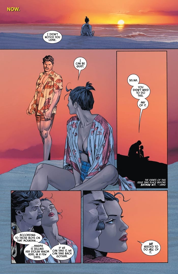
Bruce and Selina’s beach vacation continues in Batman #79, out this week from DC Comics. Occurring before the events of Batman #77, we see the pair continuing to prep for their assault on occupied Gotham, while also plotting to interrupt a shipment of Venom being moved by Magpie.

Batman #79

The Writing

Batman #79 is, admittedly, not the most exciting chapter in the story. Action and narrative direction still largely take a backseat, as they did in our last issue. Even the Venom bust is largely treated as an afterthought, only worthy of a couple of pages. Instead, writer Tom King elects to focus on continuing to rebuild Bruce and Selina’s relationship.

Throughout the issue, the pair bickers back and forth about where they first met. Was it on the streets, as portrayed in Frank Miller’s Batman: Year One? Or, was it on a ship, à la Catwoman’s Golden Age introduction in the pages of an early Batman issue?

The conversation at first feels somewhat banal throughout Batman #79. By the end of the book, though, it begins taking on more significance and poignancy. Bruce and Selina first met before he donned the cowl, made his vow, and truly became The Batman. Bruce’s relationship with Selina predates his relationship with his own iconic persona. Given that, perhaps it’s possible for Bruce to reconcile his vow and his love for her.

The thesis motivating King’s entire run on this series comes down to a singular question: “can a character who’s motivated by trauma actually heal and find happiness?” This doesn’t come from nowhere; in fact, it’s a long-debated topic among fans. While the last several issues have seemed to suggest the author’s answer, Batman #79 codifies it in certain terms. This book, more than most in King’s run, tackles this question head-on. Thus, while not the most engrossing chapter in the story, this issue does carry narrative weight. With Batman #79, it feels like we’re clearly advancing the story, and the concept that motivates it.

Batman #79

The Artwork

Clay Mann is back on art duties for Batman #79. He approaches the work in a similar manner as our last issue; we see a lot of use of repetition with subtle variation to advance the story while maintaining cohesion.

Even when the artist breaks with the repetition, there are visual motifs throughout. We see a lot of wide-shot panels in which the figures displayed are centered within the image. Of course, these are often interspersed with extended segments of close-cropped panels in which we may only see part of an object or a character’s face repeated. As with our last issue, the manner in which Mann approaches the book lends it a very cinematic feel.

Tomeu Morey is on colors in Batman #79, bringing much of the same bright palette as we saw in our last issue. More of this book takes place at dusk and night, though, allowing Mann to play with a wider range of tones. He captures these moments in rather stunning lighting; it fits tonally, while remaining vibrant and eye-catching. Excellent work overall.

Final Thoughts

Batman #79 is an interesting chapter in the story. While still keeping our focus away from the crux of the action, it is entertaining and thematically-packed, making it an essential chapter in Tom King’s narrative.

Monkeys Fighting Robots Youtube

Review: FLASH FORWARD #1 Begins the Redemption of Wally West

Monkeys Fighting Robots

Wally West begins his Journey to redeem the Flash!

Wally West was the face of DC’s Rebirth as well as its original Titans series. As one of the most popular versions of the Flash, the comic book community cheered for his return. Over time, however, he began sliding further and further into the background. After losing his connection to his Pre-New 52 wife and kids, his next big arc was seen in Flash War, which ended with him getting sent off to Sanctuary for therapy. 

Just when people thought this would be a new chapter, the Heroes in Crisis storyline happened. Feeling the weight of all the heroes pains, Wally lashed out, inadvertently killing 13 C-List heroes. Now we have a new series that hopes to redeem the Scarlet Speedster. But can he?

Flash Forward 1 cover

**Some Spoilers Below**

Story:

We open with a view from outside the Multiverse. A being known as Tempus Fuginaut watches as the Dark Multiverse continues to seep into the DC Multiverse. Knowing full well, this could mean the end of everything, Tempus seeks out “The Fastest Man in the Multiverse.” Back on Earth, Wally sits in Blackgate, unable to sleep due to his actions. Every day, inmates try to kill him, and he keeps hoping they do. The only one who visits him is Linda Park, his pre-New 52 wife. While she says there is hope for him, Wally refuses to believe and leaves her, heading back to his cell to suffer.

Flash Forward 1 p1

The way Wally is acting is precisely how he should have acted in Heroes in Crisis. I honestly felt more compassion for him here than the entirety of the last miniseries. We didn’t get a hint of his depression until the very end of the miniseries, with him acting more like a selfish villain in previous issues. Lobdell is successfully able to show how Wally is suffering after the events of Heroes in Crisis, making him a more sympathetic character that you want to see redeem themselves.

As for the story itself, it does an excellent job in setting up the redemption journey for the Flash. Instead of it just focusing on Heroes in Crisis, Lobdell takes pieces from across the Rebirth era so far. From Dark Knights Metal to Flash War, it feels like this is a culmination for Wally’s journey. The only problem with it is that is it could just fall back on these old stories instead of presenting something new. It still needs to be fleshed out more, but it’s a very good start to the series.

Flash Forward 1 p2

Art:

Brett Booth has always done fantastic work on Flash-related titles, and this is no exception. His design for Wally’s Flash suit looks as amazing as it was first seen in Titans, as well as his speedster lightning. He also did an incredible job with the design of Tempus and the outer multiverse, capturing the weight of the situation as the dark inky earths of the Dark Multiverse rose from the ground.

The colorwork of Luis Guerrero brings Booth’s linework to the next level. With the brightest colors being Flash and his flashbacks, it is a reminder of the man Wally once was and will be again. The team works well together, and I can’t wait to see how the rest of the series will look.

Flash Forward 1 p3

Conclusion:

For a first issue, this does a great job setting up the miniseries. We see the stakes that threaten the multiverse, but we also see that this story really will be a redemption story for the fan-favorite Flash. The art team does a fantastic job bringing the tale to life and has me excited for the rest of the series. Wally’s journey has just begun, and I highly recommend it.

Monkeys Fighting Robots Youtube

Review: YEAR OF THE VILLAIN: LEX LUTHOR #1 – Another Year, Another Ode To A Classic Villain

Monkeys Fighting Robots

Year Of The Villain: Lex Luthor #1 is a strong collaborative effort that is a true celebration of one of the most complex villains in the DC mythos. Written by Jason Latour with pencils from Bryan Hitch, inks from Hitch and Andrew Currie, color art by Tomeu Morey, and letters from Tom Napolitano Year Of The Villain: Lex Luthor #1 doesn’t add much to the existing Luthor canon, but instead explores what makes the character so memorable and malleable.

Year Of The Villain Lex Luthor #1 begins with a super-powered multiverse traveling Lex Luthor as he confronts each universe’s version of himself. Until the end it is unclear what his purpose exactly is, but when it is revealed it is the most Lex Luthor utilitarian reasoning ever.

We do get some introspection from several Luthor’s as they interact with their traveling counterpart. Perhaps the most interesting encounter is with the Luthor and “Superman” from Earth-32. In this universe, Lex has somehow become the “Batman” figure even including an Alfred and the Superman is part, Martian. It’s a fun twist to the symbiotic relationship of Superman and Lex, but in this universe, Batman-Lex is partners with the Martian Superman instead of enemies.

Batman-Lex comments mid-fight that he recognizes the traveling Luther’s attack plan because it would have been his method if Batman-Lex never fostered his relationship with Superman. There are other moments such as this that punctuate Latour’s script, offering strong insight into how far the main Luthor has fallen from humanity. Some of the encounters can seem pointless or meandering, as they don’t add anything revelatory to the Luthor character, but that can be said of the entire chapter throughout. Year Of The Villain: Lex Luthor #1 is a fine entry for the character, but it is hardly essential reading.

Across The Multiverse is clearly the sequel to Across The Universe

The entire art team is consistently well-executed throughout the chapter, as Bryan Hitch’s pencils and inks, as well as Andrew Currie’s inks, Tomeu Morey’s colors, and Tom Napolitano, are the standout of the issue. The linework is detailed and thorough, and the inks and colors are sleek and shiny. I feel that there was a missed opportunity somewhere, though. In an ideal world, they could have hired individual creative teams to depict different universes truly giving each iteration it’s own style and feel. Despite this, this generalized style still works for each universe, as it looks cold and specific, probably the way this overpowered Luthor sees everything.

This style is also exceptional in the action sequences and splash panels. The level of detail in the figure work is impressive as it gives each bicep weight and impact. Specific mention has to be made of the Luther-Doomsday who looks horrifyingly imposing as he jumps towards you in the page. Also, in a later scene in which a character is getting vaporized, the use of colors and letters really sells the vaporized characters pain and feelings of betrayal. The fluorescent ice-cold blue smoke that lifts from the character’s decomposing body contradicted with the yellowish-orange guttural howl from the character is iconic.

Year Of The Villain: Lex Luthor #1 is a fine addition to the DC catalogs. Jason Latour’s script is thorough and entertaining, and the entire art team consisting of Bryan Hitch, Andrew Currie, Tomeu Morey, and Tom Napolitano is stellar. While Year Of The Villain: Lex Luthor #1 feels far from essential, it is entertaining enough to merit itself.

Monkeys Fighting Robots Youtube

Review: SUPERGIRL #34 Crashing Back To Earth In Style

Monkeys Fighting Robots

It’s back to Earth and straight into action for Supergirl in this week’s release from DC and once more under the Year Of The Villain banner.

After the disastrous, in almost every way, final issue of The House Of El United storyline last issue, writer Marc Andreyko returns Supergirl to National City to face a new enemy, one that has been plaguing other sectors of the DC universe: Leviathan.

Luckily for casual readers, a keen understanding of the greater DC Universe is not needed to enjoy this issue of Supergirl. Everything you need to know about the villains and what they’ve been up to is presented in this comic. As a result, the narrative flows much more evenly than in issue 33 which was like a handful of stories stuck together with no thought about the single issue they were a part of.

Supergirl #34
Supergirl #34 Credit: DC Comics

Return of Supergirl

In Post Mortem Andreyko is telling a story about Supergirl, or to be more precise Kara Danvers, as she returns home to find everything has changed. There are some surprising and even horrific moments in this issue which Andreyko times wonderfully for greatest impact. The different strands of the story weave around each other leading the reader on an emotional journey. Heartbreak and excitement go hand in hand as the reader witnesses Kara’s world torn apart.

This comic is emotionally gripping because Eduardo Pansica’s pencils and Julio Ferreira’s inks capture the character’s reactions in a visually stunning way. Words are not needed to understand Kara’s emotional state and the reader is hit hard by her physical and emotional distress. The inking is less defined than recent issues, giving everything a harsher edge.

Added to this is the realistic coloring by Fco Plascencia firmly setting the action on Earth. Gone are the flat, Pop Art colors of recent issues. Plascencia’s colors work better with the new inking style, giving the overall aesthetic a mature look more fitting for the story Andreyko is telling.

Supergirl #34 Credit: DC Comics

The lettering used for Briainiac and his quest for knowledge helps to single out this part of the story. Although part of the Supergirl world, Brianiac’s journey is separate from the main story and this is instantly made clear by the pink text and boarders on the speech balloons. This style does not feature in any other part of the comic making it unique to this aspect of the story and in turn reminding the reader that this is an aside; world and plot building.

Tom Napolitano uses overlapping speech balloons to push the narrative forward, increasing the pace of the dialogue. He also uses connectors for the opposite effect, emphasising a character’s reaction or a particular part of the speech. Not only does this control the reader across the panels but also adds depth to the characters.

Supergirl #34 Credit: DC Comics

Conclusion

This issue of Supergirl has a lot to do. It has to move Kara on from her previous adventure, re-introduce her to a world she left months ago and tie in with a publisher wide event story. Andreyko handles the task suitably well. He creates an exciting story and fills it full of traumatic experiences, some bordering on horror. The ridiculous space story that preceded this is wiped away within the first few pages; forgotten and barely mentioned.

This is a return to form for Supergirl, with a creative team who are comfortable working together. Plascencia’s colors and Napolitano’s letters complement Pansica’s pencils and Ferreira’s inks. Overall the visuals have improved greatly from previous issues aiding the telling of a difficult story.

Supergirl #34 may not seem like a great jumping on point but everything you need to know is in this issue. And it is presented in a dynamic, entertaining way. DC just need to stop using Supergirl as a sidekick for the other superheroes in the DC Universe and let her enjoy being the star that she is. And with the recent announcement of a new creative team, including Jody Houser and Rachael Stott, starting in December, it would seem to be up, up, and away for Supergirl.

Monkeys Fighting Robots Youtube

Review: The Cavalry Arrives In ABSOLUTE CARNAGE #3

Monkeys Fighting Robots

In Marvel Comics’ Absolute Carnage #3 (on sale September 18), writer Donny Cates continues to play with the expansive sandbox in his hands. The series continues to stun the reader with increasingly wild expansions of the Venom mythos. Plus, Cates broadens the scope of an event that’s already remarkably far-reaching by bringing in the Earth’s Mightiest Heroes.

Writer: Donny Cates

Penciler: Ryan Stegman

Inker: JP Mayer

Color artist: Frank Martin

Letterer: VC’s Clayton Cowles

The first few pages of each issue have been some of Cates’ best work and the third installment continues that trend. Here, we pick up where we left off in Absolute Carnage #2, where Carnage infected Miles Morales. Through Eddie Brock’s narration, we learn what the protagonist is feeling at his lowest moment. “I lost the kid,” he states in a moment that calls back to Tony Stark mourning the loss of Spider-Man in Avengers: Endgame. Eddie has lost all hope and he doesn’t know how to swing the odds in his favor. Once again, the work of penciler Ryan Stegman, inker JP Mayer and color artist Frank Martin makes the moment even more impactful. Stegman shows Miles drowning in a black and red ocean before the monstrous arm of Carnage drags him deeper into the depths. Paired with Brock’s narration, the imagery of Miles unsuccessfully fighting for his life against Carnage adds even more narrative weight to the sequence. The powerful collaboration between Cates and the art team is unrivaled in contemporary comic books. 

Absolute_Carnage_3_Miles
Miles Miles is drowning and Eddie can’t save him.

Absolute Carnage was never going to be a story confined to Venom’s world, which makes the arrival of the Avengers one of the most optimistic moments in the series. Venom and Spider-Man have been extremely outmanned and Eddie has consistently doubted their ability to win this war. But the sight of Captain America, Wolverine, the Thing and Bruce Banner is a shot in the arm for both Eddie and the reader. Adding the Avengers to the mix doesn’t automatically guarantee the heroes’ victory but, as Captain America tells Eddie, “The cavalry is here.” But the moment is bittersweet because Carnage and his goons crash the party. 

In every issue, Cates and the art team have depicted Carnage an utterly terrifying villain. In one of the first pages of this installment, Carnage effortlessly lifts a car over his head and prepares to destroy Venom with it. In a guttural voice conveyed by letterer VC’s Clayton Cowles, the vile villain asks Venom, “Awww, is Daddy scared?” The art team makes Carnage’s head look like a spooky jack-o’-lantern; though he’s partially covered in shadow, the image of his jagged eyes and mouth that glow red in the dark is nightmare fuel. Cates also gives Carnage some of the best villainous lines in recent memory; “I am the guns and the knives and the wickedness of this whole sick [expletive] world,” Carnage says. “You know my name.” Thanks to Cates and the art team, we certainly do now.

Absolute_Carnage_3_Norman
The art team make Carnage look like a horror movie monster.

Absolute Carnage #3 continues the series’ exceptional start and the whole team continues to impress. Carnage has been built up as an unstoppable monster but the cliffhanger at the end leaves some seeds of hope that the heroes will triumph.

What’d you think of Absolute Carnage #3? Where do you hope to see the series go from  here?


Monkeys Fighting Robots Youtube

G.I. JOE #1 Is a Joe-Tastic Start For New Readers

Monkeys Fighting Robots

This Wednesday the action-packed first issue of IDW’s newly rebooted G.I. Joe releases, where everyone can be a Joe, even you!

The G.I. Joe comic franchise has been published by multiple companies throughout the years, but in 2008 it landed in IDW’s hands, finding great success. Luckily none of the franchise’s history needs to be known to enjoy the 2019 rebooted G.I. Joe. As the Joe’s recruit everyday citizens, it seems IDW is trying the same tactic with everyday readers.

YO JOE! MINOR SPOILERS BELOW!

Interior art by Chris Evenhuis and colors by Brittany Peer

Now We Know (The Story)

G.I. Joe #1 begins with a world already in the middle of a widespread war with Cobra. Throughout the planet only a few places stand untouched by the Joe’s classic nemesis. Acting as totalitarian regime, Cobra’s propaganda against the known members of the insurgent movement named, G.I. Joe has caused them to become fugitives, or villains in some eyes. This all may sound confusing or a lot to go over in its first issue, but writer Paul Allor makes the information flow easy in G.I. Joe #1.

This ease of access comes in the form of central character Rithy Khay, code name: Tiger. The majority of G.I. Joe #1 is seen through the eyes of Tiger, whose job is that of a carrier in specialty and narrative. On what seems like just another run, Tiger finds a flash drive that G.I. Joe member Duke had tossed in a trashcan. Grabbing the flash drive, Tiger follows Duke as he is chased by Vipers and Major Bludd. After a funny back-and-forth between the enemies, (SPOILERS HAPPEN!!!!).

After you read the book, come back and comment below to discuss plot points.

Much of G.I. Joe #1 comes as a surprise, but a welcome one. Allor doesn’t hold back on the drama, cheesy dialogue, or fresh ideas as the new concept of the Joe’s being formed of everyday civilians is a great way to draw in a myriad of readers. This idea is emphasized with one of the hardest hitting moments of Tiger learning that G.I. Joe member, Frontier was just a substitute teacher, or when Roadblock nets his first kill and freaks out.

Interior art by Chris Evenhuis and colors by Brittany Peer

Army of Art

G.I. Joe #1 focuses on a serious story matter that contains realistic, brutal situations that theoretically could happen in the real world. This realism is where artist Chris Evenhuis life-like penciling comes in. Evenhuis’ style of art never strays far into the fantasy or exaggerated, as each movement he shows is something you can do yourself. This theme of fluid, human-like drawing bodes well with the story of having everyday citizens become one of the G.I. Joe. Essentially pushing the fact that anyone can, in fact, be a Joe.

For a few panels during a fight, the background goes white with a purple brush highlighting the action. Or in another more dramatic moment, the characters are colored completely black with a white background. These moments of simple backgrounds occupied with an opposite color helps draw the readers eyes towards the violent moments. This simplicity of coloring helping moments pop comes courtesy of colorist Brittany Peer. For a world overrun by an organization such as Cobra, Peer makes the colors of the world bright and homely. Making you feel like the world may not be so bad; granted the world is still dark, and overrun by Cobra.

It seems the use of brighter, more vibrant colors were used not to scare away the new crowd of readers. With its color scheme feeling akin to that of a cartoon, and more inviting. Luckily the colors never feel too bright at the most emotional scenes, or when the plot becomes darker.

Interior art by Chris Evenhuis and colors by Brittany Peer

Letterer Neil Uyetake bubble placement works well within the heavier dialogue moments, as it never feels like it’s covering the art. While also giving a flow through the panels helping your eyes glide through. The one problem being throughout is the lack of sound effects. In some cases, it’s used to stylize the fighting, or moment with silence, but in a few where there should be sound, the panel is void of noise. One great instance is when Tiger throws a Molotov cocktail and a building that explode but has no sound.

G.I. Joe Team Building

G.I. Joe #1 may not allure to those not already interested in the franchise. But Allor’s new take in G.I. Joe #1 is fresh and fun while retaining a serious demeanor, with some cheesy dialogue mixed in. Those moments combined with Evenhuis’ realistic art and Peer’s brightly colored palette makes G.I. Joe #1 a great start for new readers.

Memorable Quote: “…I can slip past them like…like a thing that’s slippery.” – Tiger

Damn, Tiger just has a way with words!

And Knowing Is Half The Battle

With this first issue being pretty new reader-friendly, what did you think? Comment below.

Monkeys Fighting Robots Youtube

Review: It’s Alive’s PINK LEMONADE Mashes Kirby & Knievel

Monkeys Fighting Robots

It takes a special kind of talent to be retro without being repetitive. Too often comics that harken back to the Silver Age just end up copying them, and to anyone familiar with that time period, fall flat. That’s not the case for Pink Lemonade, a new series from indie publisher It’s Alive that’s both as original as it is reminiscent of 60s comics. That’s an impressive feat in itself, but especially when you consider that auteur Nick Cagnetti serves as its letterer, author, colorist, and artist. So, should you pick up Pink Lemonade when it hits comic stores next month? Read on to find out.

PINK LEMONADE # 1 COVER
PINK LEMONADE # 1 COVER – Image via Nick Cagnetti, It’s Alive Comics

Imagine if Evel Knievel was born into a Jack Kirby-designed universe, and you essentially have Pink Lemonade. She’s a high-flying, death-defying adventurer with a motorcycle best friend and a bad case of amnesia. When we meet her, Pink Lemonade is trying to rediscover a purpose in life, but all she has to guide her is a bright pink bike, a stunt suit, and strange dreams of battling otherworldly entities.

Fortunately for her, Pink Lemonade meets two kind strangers in Pammy and Linda, who invite her to their home for dinner. Pammy’s a little girl who idolizes the mysterious rider, and Linda is her comic-drawing mother. The two bring focus into Pink Lemonade’s world, and their influence sets Pink Lemonade on a path to do as much good as she can with her bike and her skills, memories or no. However, Pink Lemonade is soon to learn that the otherworldly entities she sees in her dreams are bleeding into real life, and if she’s going to find out more about who she is, she’ll have to confront some very strange, and possibly deadly, challenges.

Cagnetti’s introduction to the world of Pink Lemonade is chock-full of mystery and surrealism, and he does a great job establishing a very large, mystic universe. At the same time, having Pink Lemonade interact with Pammy and Linda grounds the human element of the story. Pink Lemonade is both the audience’s introduction to the world and the person at its center, kind of a Mulder and Scully at once. That’s a cool thing to see, ensuring the reader will invest in this story.

PINK LEMONADE #1, PAGE 7
PINK LEMONADE #1, PAGE 7 – Image via Nick Cagnetti, It’s Alive Comics

All that said, the absolute strongest piece of Pink Lemonade is the artwork. As we mentioned earlier, this is Silver Age comics fun at its best. Fans will notice influences like Jack Kirby, Adam Strange, and Amazing Fantasy, but at no point is there any copying of what’s come before. Nick Cagnetti knows the instruments of the Silver Age but doesn’t repeat any of the tunes.

Cagnetti does with 70s motorcycle aesthetics what Mignola does with occult artwork: he matches familiar icons with a distinct style. The result makes the reader feel like they’ve been transported to the world of an action-figure ad. In fact, Cagnetti actually throws in some fictional adds of his own, which feature into the story and give the reader the sense of going through an old comic issue. It’s sure to please readers who prefer that type of book, but also anyone who likes to see the style imitated. Fans of Mike Allred’s Silver Surfer or Batman ’66 could do worse than to add Pink Lemonade to their pull lists.

PINK LEMONADE #1, PAGE 3
PINK LEMONADE #1, PAGE 3 – Image via Nick Cagnetti, It’s Alive Comics

If there’s one thing that Pink Lemonade could improve upon, it’s the dialogue. Occasionally characters will overexplain something that’s going on, or say something that feels unnatural to their situations. This can be distracting, especially since the art already speaks for itself so well. Cagnetti is great at drawing expressions; we don’t need Pink Lemonade to say how she feels in a thought dialogue box. To be fair, this is a Silver Age pastiche after all, and anyone who’s read Reed Richards introduce himself a thousand times knows those comics could be talky.

If you’re a fan of the Silver Age or Silver Age-style art, this comic is definitely for you. But there’s another type of comic reader that should check this out, and that’s anyone who’s forgotten how fun comics can be. If you’re bogged down by the gritty, dark tone that some comic book movies have taken, pick up Pink Lemonade. It’s a positive, fun book, but it doesn’t lose any resonance for it. It’s that kind of story that gave us our favorite Big Two comics today, and it’s always nice to be reminded of their origins. You can pick up Pink Lemonade at your local comic book store on October 16th.

PINK LEMONADE #1, PAGE 6
PINK LEMONADE #1, PAGE 6 – Image via Nick Cagnetti, It’s Alive Comics

For more reviews like this one, follow us on Twitter. And for all the best comics discussion and interviews, keep an eye on Monkeys Fighting Robots.

Monkeys Fighting Robots Youtube

A Dark King Rises In ONCE & FUTURE #2

Monkeys Fighting Robots

ONCE & FUTURE #2 is out this Wednesday from Boom! Studios. The dark tale of a warped legacy continues, twisting the legend into something wholly new and deeply insidious.

An ominous cover for Once & Future #2.

***SPOILER WARNING***

Once & Future is Boom! Studios’ take on the legend of King Arthur, because apparently it is the year for King Arthur retellings. That being said, this series has one of the more unique takes on the legend than shown in recent times.

It is said that during Britain’s darkest times, King Arthur will return. But the legend never clarified is King Arthur comes back before or after the darkest times begins. Once & Future explores the possibility that the king of legend is perhaps the cause, rather than the savior.

It’s no surprise that Kieron Gillen has managed to come up with such an unusual take on the oft-retold tale. After all, this is the mind that brought us the spectacular Wicked + the Divine.

Nothing like having your grandmother holding you at gunpoint.

Once & Future #2 continues where the first issue left off; with Duncan being held at gunpoint by his grandmother. It’s quite the start to an issue, is it not? Well, the issue only goes up from there, though perhaps Duncan wouldn’t agree with that assessment.

Duncan and his grandmother are an exciting choice for protagonists in a series, yet they’re fascinating. And while we don’t know much about the forces that oppose them, it’s already becoming clear that there’s a lot that dear grandmother is holding back.

This issue does take some time to sit back and explain a few points, but don’t worry. It doesn’t spend the whole time focused on dialogue. In fact, a large chunk of the issue is spent showing us dark scenes while it pushes the plot forward.

Everything is out of control.

The artwork for this issue is just as striking as the tale being told. The lines are bold and oddly foreboding, while the colors are rich and vibrant. Even the scenes full of dialogue have something interesting happening somewhere on each page.

Dan Mora is the artist that provided the linework for this issue, and there are a lot of positive things to be said about his work. The way he portrayed multiple figures of legend, for one thing. And the overall eerie tone he was able to convey into the work itself. There are some truly bone-chilling moments towards the end of this issue.

Meanwhile, Tamra Bonvillain provided the colors, a fact that is clear right away. Her distinctive coloring brought the artwork to impressive heights, adding depth and elegance. Her mastery of colors showcased well here, but especially in a few panels in particular (she does have a way with ancient structures).

Finally, Ed Dukeshire was the letterer for this issue. And he brought both pieces – the writing and the artwork – together into one cohesive tale. He balanced the amount of words on the page perfectly, and his delicate touch shines throughout some of the more intense moments.

And so it begins.

Once & Future #2 is as dark as the first issue, slowly unveiling the truth behind the legend. The bone-chilling moments will linger with the readers, while not being quite enough to overwhelm our curiosity. There is more to this story, and we can’t wait to see how it pans out.

Monkeys Fighting Robots Youtube

Review: BLACK HAMMER: AGE OF DOOM #12-The End of an Epic

Monkeys Fighting Robots

With Anti-God threatening existence once again, Abraham Slam, Golden Gail, and company are forced to make a difficult choice in Black Hammer: Age of Doom #12, out this week from Dark Horse.

Black Hammer has never been your typical super-hero comic. This is not a story about a team of heroes fighting their rogue galleries in new and exciting ways. This is what happens after. It explores the humanity and emotion of a diverse group of people that never really shared much in common except super-powers and the desire to help people. The team is dealing with what to do to defeat Anti-God, but that is not what this story is really about. This is about a makeshift family coming together and finding serenity for themselves in a way that also saves the world.

Black Hammer is a Jeff Lemire creation with artist Dean Ormston. Dave Stewart handles the colors, and Todd Klein takes care of the letters. Stewart stays very busy in the industry, and it is easy to see why. His diverse skill set seems to fit just about any art style and always brings out the very best in every artist he works with. Going from the extremely vivid colors of Silver Surfer: Black to a more realistic palette for this story; Stewart is a executive-level talent.

While there was not much action that would’ve given Klein plenty of work; his lettering always feels perfect. It has an old pulpy science fiction feel that merges right into the storytelling.

WARNING: SPOILERS WILL FOLLOW

Black Hammer: Age of Doom #12 starts right in the thick of it. There is no time to waste and not a single lull in the narrative. Time is not on the side of our heroes as Anti-God’s looming presence is felt. Abraham Slam and company returning to this reality has tipped the scales again, so Anti-God is on the way to even it out.

The team has to come together at Madame Dragonfly’s disguised cabin of horrors. Dragonfly wiped their memories upon coming back and have been reminded (rather violently) by Black Hammer’s daughter Lucy. Dragonfly remembers everything. She was still attempting to get her own “fresh start,” but her new life was really just an illusion created inside her magical cabin.

Anti-God will manifest and destroy everything Dragonfly has done, and without a horde of extra heroes, they cannot defeat him in combat. Colonel Weird suggests there is another way; going back to the farm. Last time the group were sent there by an elaborate spell cast by Dragonfly, and although it worked, they were unaware that it was magic and treated it like a prison. They had not yet confronted the love they have for each other and what it means to be a family.

You live, and you learn, and that is precisely what Dragonfly used to find serenity at the latest version of the farm. This time they are going willingly and without their memory, but they also get to be a real family together. Abraham Slam is as happy as can be taking care of his new family. What else really matters?

Black Hammer: Age of Doom #12 is a fantastic and emotional ending to the main story in an extensive universe. I cannot wait to dive deeper into the Black Hammer universe with Lemire and company. I also don’t believe we have seen the last of Abraham Slam, Golden Gail, Madame Dragonfly, and the rest of the crew.

What did you think of Black Hammer? Do you hope there’s more from Abraham Slam and company? Let us know in the comments.

Monkeys Fighting Robots Youtube

FIREFLY #9 Shows How The Past Is Never Far Behind

Monkeys Fighting Robots

FIREFLY #9 by Boom! Studios is out this Wednesday, and it’s a poignant reminder that one can never truly escape from their pasts. Least of all our wayward crew or their captain.

This image is a perfect example of how Wash is so different from his wife.

***SPOILER WARNING***

The Firefly series has picked up the beloved character that Joss Whedon left behind, and they’ve done a decent job of fitting new plots into a very limited time period. All the events that follow occur sometime between the events of the episodes.

Firefly #9 revolves almost entirely around Mal and Zoe – and their shared history. Their pasts and their losses haunt the Browncoats. And this issue is bent on dragging all of that up to the surface again.

To be fair, we had a feeling it was coming, what with Zoe running off with a bunch of old Browncoat allies. But it’s unlikely that any fans were able to anticipate what happened within these pages.

Looks who’s napping while the fight is about to happen.

Greg Pak has continued blending the past and the present for this dynamic series, and we’re grateful he’s stayed on the project. It’s been enlightening, seeing Mal and Zoe’s past in this new light. He seems to be particularly interested in talking about the Browncoats and their old war – and fans are unlikely to complain about seeing more of their long lost allies.

Firefly #9 has upped the ante for this plot – now it isn’t just that the crew is split or, or even a battle of one small crew trying to survive. It has become something much bigger. And so much darker. In a way, things are finally coming full circle. It’s just a shame that we never got to see something like this in the TV series.

A striking cover showing off the endearing Book.

The mood of this issue was firmly set thanks to the artwork carrying the story. Dan McDaid provided the linework, giving us dramatic expressions and scenery to behold. Meanwhile, Marcelo Costa’s coloring was atmospheric and intense.

Together they gave us a dramatic series of pages, jumping from one focal point to the next. Some of the pages or panels in this issue were remarkable, while others had a powerful emotional impact – which was likely the intention.

Jim Campbell was the letterer for this issue, and he handled the significant amount of dialogue with class. His lettering was placed in such a way as to enhance rather than obscure or subtract.

The Tams seem to be having trouble of their own, on this variant cover.

Firefly #9 was an intense read, bringing things full circle in a way fans likely never dared hope or expect for. At least, not after the series had been canceled. Now readers will have to anxiously wait to see how Mal and his crew deal with the next turn of events.

Monkeys Fighting Robots Youtube