Home Blog Page 410

Review: DEAD EYES #1 Proving You Can’t Keep A Good Man Down

Monkeys Fighting Robots

Refusing to quietly disappear, Dead Eyes #1 from Image Comics is re-branded and re-released on October 2.

Almost a year ago Gerry Duggan and John McCrea’s Dead Rabbit was released through Image Comics. But then a so-strange-it-has-to-be-true copyright claim halted production before the third issue hit the shelves. A New York restaurant took umbrage and there ended the story of a retired hold-up man before he had chance to return in glory.

However, just like their titular character, Duggan and McCrea were not going to be beaten, so with a little bit of touching up and a name change, Dead Rabbit returns, under the uncomfortable title Dead Eyes.

To be fair, if you bought Dead Rabbit last year there isn’t much in this ‘new’ number 1 that you haven’t already seen. The story and art are almost exactly the same with only a few minor tweaks to the script. In fact letterer, Joe Sabino, appears to have had the most work to do on this reissue; replacing each reference to Dead Rabbit with Dead Eyes.

However, if you are new to the story, then you are in for a treat.

DEAD EYES #1 Proving You Can't Keep A Good Man Down
Dead Eyes #1 Cover Art Credit: Image Comics

An Eye For A Tale

Creating ‘real’ lives for superheroes and vigilantes is, by now, nothing new or surprising. When Alan Moore and Dave Gibbons did it in Watchmen it felt like a breakthrough, a game changer but these days it’s almost expected. But with all great stories, it’s not what the story is but how it is told that makes it stand out and, with Dead Eyes, Duggan and McCrea are making a big splash in a small pond.

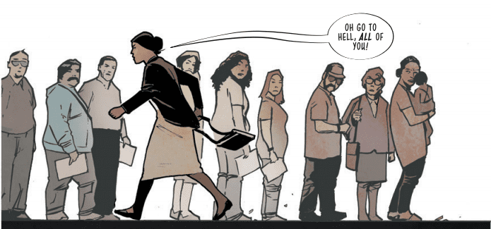
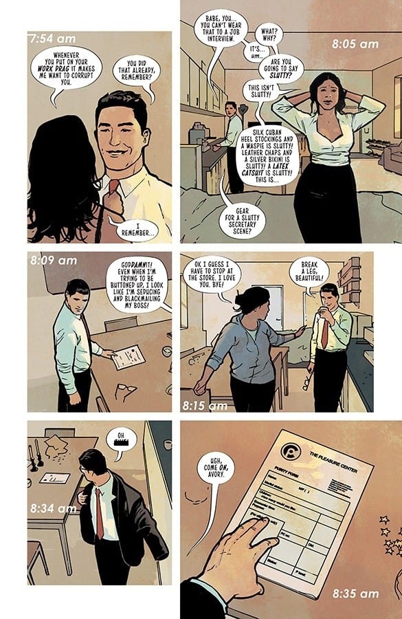
The comic tells the story of Martin, a retired hold-up man and hoodlum, who is living with his wheelchair bound wife. What little money he made when wearing the mask has long since disappeared despite what the news stories seem to think. As a result he lies to his wife and has secretly taken on a regular job just to save them from dept.

It isn’t long before his instincts warn him of a criminal act, one that he might be able to stop. Donning the mask one more time, Martin, aka Dead Eyes, risks everything in his uncontrollable urge to battle crime. 

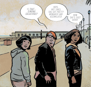
Duggan has a wicked sense of humour. There are some hilarious moments in this issue that contrast the comic book element of the story with realistic interpretations of life. The heart of the story is a man struggling to get on in a world he finds tedious and uninspired, something most people can relate to. There is a realism that you can’t escape from which in turn intensifies the violence of the vigilante scenes.

By the end of this first issue the reader has a clear understanding of the central characters, who they are, what they’ve done, and also the world in which they inhabit. The plot is packed with action and character, while laying the ground work for future issues. 

DEAD EYES #1 Proving You Can't Keep A Good Man Down
Dead Eyes #1 Credit: Image Comics

The Art of Dead Eyes

McCrea uses heavy black inks with thick shadowing that creates a darkness to the pages. The panel borders are lost in the black gutters giving the impression that the darkness is creeping into the images. The overall effect is one of an imbalance within the visuals drawn from within the narrative. Even within the home scenes McCrea makes the reader uncomfortable, as if something is not right.

The composition and camera angles of the panels are dynamic. Each page has a sense of drama about it long before you start to read. And, just like the script, McCrea’s art often contains humour. Comical poses and exaggerated expressions provide contrasting tones to the violence and horror that Dead Eyes contains.

Some of this tone is brought about by Mike Spicer’s coloring. The bright, almost garish colours used for the moments of comedy is replaced with grim hues when Dead Eyes goes into battle. The distinction between the two is important for the narrative to hit the right beats as the comic progresses. The feel of the page, and the story elements contained within, have to be set by a quick glance so that the reader understands when Duggan is making a joke.

DEAD EYES #1 Proving You Can't Keep A Good Man Down
Dead Eyes #1 Alternative Cover Art Credit: Image Comics

Conclusion

Dead Eyes is an uncompromising look at ‘what comes after’. It contrasts the difficulties of reality with the extremes of vigilante justice in an attempt to link the two experiences. It is forcing the point about the metaphors abound in superhero fiction; these aren’t just stories about people dressing up and fighting crime, there are deeper meanings and cultural or social parallels being drawn. 

Duggan and co. want to entertain but they also want you to think about what you read in the pages of Dead Eyes and beyond. They touch on fake news, violence within society, and the lies we tell to make it through the day. The story of Dead Eyes is a serious drama told in an entertaining, often humorous, manner. 

Unfortunately for the creators, Dead Eyes just doesn’t have the same ring to it as Dead Rabbit, but it is a small price to pay to get the comic into the readers hands.

Monkeys Fighting Robots Youtube

Review: RUBY FALLS #1 Tears Open The Mundane To Find The Forgotten

Monkeys Fighting Robots

Berger Books expands it’s range this week with the release of the murder mystery title Ruby Falls #1. Embracing the slow life of forgotten towns, Ruby Falls opens up old wounds and shines a blinding light into the recesses of peoples memory.

Comic book fans will recognise Ann Nocenti’s name from a number of DC and Marvel titles, most notably Daredevil from the late 1980’s and Kid Eternity from the early 1990’s. She is also credited with co-creating Typhoid Mary and Longshot. More recently she had a hit with The Seeds with artist David Aja on the Berger Book imprint of Dark Horse Comics.   

With Ruby Falls Nocenti is bringing the reader firmly down to Earth with a slow paced, murder mystery set in small town America. She introduces Lana and her partner Blair. Together they are surviving in an old mining town, facing each day as it comes. Their lives are nothing extraordinary, as Nocenti illustrates with the hum-drum of existence that makes up Lana’s day, but all that is about to change. While visiting her grandmother Lana learns of a murder that the older woman witnessed when she was younger. A murder that went unsolved.

With her friend Raymond, a local librarian, Lana opens up the cold case and her life begins to change.

RUBY FALLS #1 Tears Open The Mundane To Find The Forgotten
Ruby Falls #1 Credit: Dark Horse Comics

Ruby Writing

Ruby Falls drifts along like a leaf on the wind. The narrative follows Lana as she weaves around town, interacting with the people that she meets. Nocenti keeps the conversations jovial and friendly for the most part, depicting a close knit town where everybody knows everybody else. All of the character interactions are intimate but there is an emptiness to the town. Long shots of public places lack the hustle and bustle of populated places. Artist Flavia Biondi creates empty spaces within the panels, often losing the characters in the straight lines of the architecture. 

Biondi uses cleanly defined lines to illustrate the world of Ruby Falls. This is an effective approach for the landscape and the scenery but doesn’t always produce the best character results. Occasionally the figures are stiff and a touch stifled, as if they lack energy. As a reflection of the town this is fine but other areas of the narrative requires more dynamism. 

Having said that, Biondi’s characterisation is effective. She creates instantly recognisable characters with a few, simple lines then fills the character out with costume design. The desolate long shots in the comic work so well because, even from a distance, you can spot and recognise the characters. 

RUBY FALLS #1 Tears Open The Mundane To Find The Forgotten
Ruby Falls #1 Credit: Dark Horse Comics

Colorful Scene Setting

Biondi’s main focus for this first issue is to set the scene for the murder mystery story. She does this by concentrating on the small town, building a world for the characters to fill later. A large part of this design is the color work provided by Lee Loughridge. Loughridge uses an autumnal palette throughout, mirroring the twilight years of the town and the slow ageing of the characters. There is a sense that this town has passed it’s heyday and is slowly winding down. 

The floods of bright orange and golden yellows produces a calming effect on the reader and slows the pace of the comic. For the most part, Ruby Falls has a warming effect, inviting the reader to take their time. Not only does this produce a lethargic visual but it seeps over into the narrative, lulling you into a false sense of security. When something shocking or exciting does happen, it leaps from the page as all of those calming colors disappear and are replaced with strong, harsh colors.

The lettering is adequate, relaying the speech in an unassuming manner. Sal Cipriano follows the tone of the comic, giving the speech a dull, melodic feel for most of the panels. The text is very monotone, very rarely altering from panel to panel. The highlight of the lettering is in the design of the town’s signs and printed word. This is where Cipriano has some fun. The contrast between the swirling design of the Silks nightclub sign and the traditional Ruby Social Club illustrates the differences between the places and the people inside. It also affects the way that Lana is portrayed; in one location she comes alive, excited by who she is and where she is; in the other she’s more formal and straight laced.

RUBY FALLS #1 Tears Open The Mundane To Find The Forgotten
Ruby Falls #1 Credit: Dark Horse Comics

Conclusion

Ruby Falls is an intriguing first issue. Nocenti slowly introduces the mystery into a town populated by a small cast of characters. You get the feel of the town and a fair assumption of who the main players are. However, the lilting tone and lack of changing narrative beats makes the comic drift along and at times barely holds the reader’s attention. 

It sets the scene, of a dwindling old town lacking life, almost too well. Unlike other recent crime comics like Criminal or The Girl In The Bay, Ruby Falls doesn’t have a strong hook to catch the reader and draw them in. A large proportion of the comic is ‘nice’ and nice just isn’t enough. However, the groundwork has been laid and future chapters of the story have a promising foundation to build on. 


Monkeys Fighting Robots Youtube

DOCTOR MIRAGE #2 Portrays How Far One Will Go For Love

Monkeys Fighting Robots

This Wednesday, Valiant Entertainment’s DOCTOR MIRAGE #2 elegantly displays how far Shan will go to bring back her husband; no matter the obstacles in her way.

If you haven’t had the chance to read Doctor Mirage #1 or need a refresher, check out our review here.

Letters by Dave Sharpe. Art by Nick Robles. Colors by Jordie Bellaire

A Story of Love

Below the surface, Doctor Mirage (2019) is a story of one’s journey to bring their loved one back; much like (Dante’s) Inferno. This theme is magnificently shown in flashbacks by writer Magdalene “Mags” Visaggio. Primarily taking place before Doctor Mirage #1, Visaggio regales events that caused the present day predicament. Not all of the past events are laid out, just enough to keep the reader interested.

Visaggio portrays Shan (Dr. Mirage) willing to hold another at magical weapon point, for a chance to bring Hwen back. This moment emphases Shan’s love and willingness to bring back her husband, being the main driving point of Doctor Mirage. Moments like this are portrayed beautifully, while in a realistic manner that people can relate with.

Doctor Mirage #2 continues the theme of a television show through narration. Canonically this makes sense as Shan and Hwen hosted a talk show in past series. But Visaggio uses it differently as Shan is the comics camera one, and Grace camera two. This method shows how each view a room/area in a different artistic perception.

Letters by Dave Sharpe. Art by Nick Robles. Colors by Jordie Bellaire

Magical Art

The art by Nick Robles continues to be astoundingly gorgeous. Even during ‘simple’ pages, Robles pencils perfectly guide your eyes through what transpires. Or when given a full page to showcase a moment, Robles does so magnificently, making you want it as your wallpaper.

One other artistic feat is how realistic it all feels. The emotions portrayed, crowded cities, and every ones’ reactions are showcased. Building upon Visaggio’s down to earth story; Robles builds it higher. Then when the story becomes out of earth, the pencils match.

For the different ‘cameras,’ Robles pencils show the similarities of the rooms, while the difference is still glaring. The magical colors of Jordie Bellaire help this difference.

For the life-like segments, Bellaire’s colors are human, never straying too far out the normal. That is until the perception shifts, or when magic is displayed. Anytime magic happens on earth, Bellaire makes sure it catches the readers eye. This is accomplished with bright colors that contrast with the dark.

The most fabulous display of color usage happens during Grace’s perception. Bellaire cranks up the bright colors meter and goes crazy. In these segments the colors beam into your eyes, showcasing the magic of what’s transpiring.

Letters by Dave Sharpe. Art by Nick Robles. Colors by Jordie Bellaire

One of Doctor Mirage #2’s strengths comes from letterer Dave Sharpe. Throughout the issue Sharpe uses differing fonts to his advantage. When Hwen talks the fonts are non-bold, showing his ghostly language. This looks amazing next to the usual bold lettering. Or in the moments he makes Grace’s bubbles rigged and out of control.

Doctor Mirage And The Means To An End

Visaggio’s take on Shan is a wonderfully realistic one. By showing how broken she is, and how far she’s willing to go for her husband, Visaggio shows a character many can relate too. Although the meaning behind Doctor Mirage is a realistic one, the art is out of this world. When all of these elements combine a perfect follow-up issue forms. Making 2019’s Doctor Mirage a must read.

Memorable Quote: “There should be a pamphlet. So you have discovered you are dead and also in hell.” – Grace.

I mean, she’s not wrong. Pamphlets would help a lot in life, and the afterlife.

Side Note: In the previous Issues review it was stated as an ongoing, but it turns out that Doctor Mirage (2019) is in fact a five issue mini-series.

Calling All Doctors

After reading this second issue, how do you feel it’s been so far? Let us know below!

Monkeys Fighting Robots Youtube

Head Into SPIDER-VERSE #1 In This Marvel Comics Exclusive Preview

Monkeys Fighting Robots

Spider-Verse #1 is out October 2nd, but thanks to Marvel Comics, Monkeys Fighting Robots has an exclusive four-page preview to share with you.

The book is by writer Jed MacKay and a whole host of artists (check out the full credits in the preview below). Joe Sabino letters the book, and Wendell Dalit did the main cover.

About the issue:
Miles Morales finally feels like he GETS this Spider-Man stuff… and then falls through a portal! But isn’t the WEB OF LIFE & DESTINY destroyed? Maybe not, True Believer. But who spun this new web? Regardless, Miles finds himself at the center of a multiversal adventure that will feature a who’s who of creators and characters as the series spins forward! And each issue features #SPIDERSONAS from some of the biggest Spidey fans and comic creators both!

Spider-Man: Into The Spider-Verse was one of the most celebrated films of 2018, a critical and commercial success, and from the cover alone, it looks like the Spider-Verse comic is going to try and capture the same sensibilities as the flick.

Take your first look at SPIDER-VERSE #1:

spider-verse credits marvel comics exclusive preview

spider-verse marvel comics exclusive preview

spider-verse marvel comics exclusive preview

spider-verse marvel comics exclusive preview

spider-verse marvel comics exclusive preview


Who’s your favorite Spider-Person (or animal, or robot…)? Let us know in the comments below!

Monkeys Fighting Robots Youtube

Review: POWERS OF X #5 – SOCIETY!! Are They Destined to Fail?

Monkeys Fighting Robots

The entire scope of Xavier’s plans are further revealed in Powers of X #5, out this week from Marvel Comics.

As you’ve surely figured out by now, House of X is the current timeline and Powers of X are the future ramifications of what they’re doing. I particularly love how the narrative unfolds in this story. Powers shows a what the X-Men have accomplished and House shows us how they did it.

Jonathan Hickman is the mastermind behind the reinvention of the X-Men. R.B. Silva pencils and inks while Marte Garcia colors his work. Clayton Cowles handles the letters. Powers of X #5 is an issue heavy on the planning, plotting, and discussing, so not much action for Cowles to show off his skills.

Hickman has been blowing the heads off of X-Men fans everywhere. Explaining the multiple timelines, resurrecting dead bodies, uploading their consciousness into different bodies, and the many technological advances made by the machines, all showing off the extensive knowledge Hickman has of the X-Men’s history. Choosing to bring along some new young artists to the scene to paint a picture of this new world for us is just another gift from Hickman.

R.B. Silva’s artwork in Powers of X has been nothing short of astonishing. Building a new home for the X-Men is an incredible opportunity, and Silva is absolutely thriving. Just look at all the panels in Krakoa, and you’ll see he’s enjoying every second working on this book with Hickman. Aside from Emma Frost’s floating eyebrow, the art is pleasing and smooth; Silva has definitely scored himself an animation gig in the future.

Marte Garcia is my MVP for this issue. The opening scene with Forge at an aquarium, the future on Krakoa, in the ocean at Atlantis, across the world at homes of other mutants, and in the desolate machine infested future, these environments are shimmering, and there’s no shortage of shine when Magneto is on the page.

With the last issues of House of X and Powers of X upon us in the next two weeks, there promises to be more shocking reveals and drama for these perpetually persecuted people. I’m positive that Hickman will save the biggest and baddest for the end. Will Moira and the resurrections be dwarfed by the last two issues? I firmly believe the best is yet to come.

What did you think of Powers of X? What do you think Hickman has in store for the finale? Let us know in the comments below.

Monkeys Fighting Robots Youtube

Review: ComiXology’s QUARTER KILLER #1 Drops A Funky Beat

Monkeys Fighting Robots

Do you like flow that makes the beat go woah? Then, put on your reading glasses because Quarter Killer #1 will teach you some classes.

My horrible rhyming skills aside, Comixology Original’s, Quarter Killer #1 has a funky fresh style that’ll make you smile.

On The Track

On the bombastic beat (Lines/Colors) is Jamie Jones, with Vita Ayala and Danny Lore bringing the lyrical (Scripts) heat. But, look out below, because here comes Adrienne Lopes’ editing flow (Edits). But, you need not search a mile because Ryan Ferrier brings the style (Design/Letters). Acting as the whipping cream on top is Tim Daniel and the street team (Logo).

Okay, no more rhyming.

Killer Lyrics (Story)

Quarter Killer #1’s strength is how it starts off small and focused, then quickly erupts into a large world. Ayala and Lore’s premise starts easy, guiding readers into the world by seeming as a one and done issue, but the duo quickly lay seeds for the future. By the end of Quarter Killer #1 the world and characters start to feel connected, while expanding.

Music is a massive inspiration for Quarter Killer #1, which Ayala and Lore showcase brilliantly. This inspiration shines within the first page with the creative team’s introduction (seen above). Even during dialogue, characters talk with a particular beat or style that feels unique. By the end of the issue, you’ll wonder why there was no CD.

Although each character is unique in their own regard, one shines the brightest—Quentin Kidd AKA QK, which makes sense as they are the main character. QK is a fresh, collective, and a fan of old school currency (quarters), while mysterious to boot. The few moments Ayala and Lore sprinkle throughout of their background makes you yearn for more.

Funky Fresh Art

For a Cyberpunk story, Jones’ art makes the world a delightful place to live in. Throughout Quarter Killer #1 the mix of bright colors and heavy lines melds beautifully with the portrayal of story beats. During the few fighting scenes Jones’ darker colors help show QK’s electrical weapon to the extreme.

Throughout, Jones uses varying degrees of clashing colors that elegantly showcase the motions in panels. These colors can be seen in stiff moments to make them pop.

For a debut issue Quarter Killer #1 has a fair bit of dialogue. Luckily Ferrier’s bubble placement easily guides the reader’s eyes. But, that’s not all Ferrier adds, as his loudly colorful sound effects pop off the page.

A Quarter For The Quarter Killer

Quarter Killer #1 hits the musical theme the dream team was aiming for. Luckily that’s not all it brings to the spinning table, as it features a uniquely fresh cast that’ll make it last.

Memorable Quote: “All aboard this janky-ass car! Next stop–that money! -Hi Top

I love Hi Top’s name and style. Plus, I didn’t think it was that janky of a car!

Extra Track: I’m a sucker for a logo, and damn does Daniel deliver a banging one!

For The Music Lovers

Did you get a chance to check out the Comixology Original? If so let us know what you think down below!

Monkeys Fighting Robots Youtube

Review: THE FLASH #79 Struggles to Focus on One Story

Monkeys Fighting Robots

The Flash has Foes on Several Fronts.


The Speed Force is dying. With the new forces making their way into the main DC Earth, Flash and his fellow speedsters have been slowing down. To fight this, the Speed Force unleashes its most dangerous avatar, Black Flash, to kill the other forces avatars. Barry gathers the four together, but Psych, the avatar of the Sage Force panics and runs for it. Barry takes Fuerza and Steadfast, the avatars of the Strength and Still Forces respectfully, back to the Speed Lab in the Flash Museum for safety. When he tries to go after Psych, Black Flash beats Barry to him and kills the Sage Force user. Can the Flash save the others from their fates?

Flash 79 Cover

**Some Spoilers Below**


Story:

At the Flash Museum, Fuerza demands to be released, but Commander Cold refuses. This causes her to demand the location of Barry, who arrives in that same moment with Psych’s body. Fuerza scolds the Speedster, but the rest of the group realizes Barry is becoming faster. When the Black Flash killed Psych, it uncoupled the Sage Force from the Speed Force.

Meanwhile, the revitalized Rogues go to find the final member: Lisa Snart, the Golden Glider. She runs an ice rink for abused youths, but her brother is able to convince her to return to crime. Soon after they make their move, a certain pair of young speedsters make it their business to go after them.

Flash 79 p1

The focus of this story is, unfortunately all over the place. While the previous issues have been focused on this Black Flash threat, that has begun to be pushed into the background. Due to the Year of the Villain, more focus has been put on the Rogues in preparation for their next arc. We’re still in the middle of this one, and it treats the Black Flash as if he didn’t just murder another force avatar! This should have been treated as a big deal, as the stakes have never been higher, but it comes off as a forgotten plot point.

There’s also not a lot of action to keep even the common reader entertained. This was trying to be one of those character development issues, as seen with Golden Glider. While I enjoyed the new life she has, growing as a character and being seen as more kindhearted, I am not a fan of how quickly she threw it away. This could have been a beautiful send-off for the character, especially with her new line of work. Instead, it’s tossed off to set up for the future. It feels like a wasted opportunity, and I can only hope it pays off.

Flash 79 p2

Art:

While I may have issues with the story, the art is a positive that continues to hold the book together. Rafa Sandoval’s art is just breathtaking, especially in the designs of the characters. One of the best looking parts is a reveal of another player in this story. While I won’t reveal who it is, but he looks amazing in Sandoval’s style. Arif Prianto takes that style to the next level with great colorwork. This team has worked hard to make this arc look great, and the effort certainly shows.

Conclusion:

While beautiful to look at, this chapter to the Death of the Speed Force arc falls flat. It focuses more on the Year of the Villain than it does the already exciting storyline. I don’t think the next arc will be bad, but it’s causing the current one to go off the rails. With the team of Rogues back together, it should straighten itself out, but there is worry. This needs to focus on the Black Flash threat, not the threat to come.

Monkeys Fighting Robots Youtube

Review: Freeze Takes Center Stage in DETECTIVE COMICS #1012

Monkeys Fighting Robots

Mr. Freeze finally reveals the plan he’s been working on in the background over the last several issues in Detective Comics #1012, out this week from DC Comics.

Women bearing a particular physical profile are going missing in Gotham. We know who’s behind it. The question: how long will it take Bruce to find out?

The Writing

In his run on Detective Comics thus far, writer Peter J. Tomasi’s focused largely on smaller, self-contained narratives. In contrast to Tom King’s sweeping Batman run, most of Tomasi’s stories are standalones, or maybe two-parters. With Detective Comics #1012, though, the writer expands into what feels like a larger narrative.

As alluded to, Tomasi’s spent the last several issues laying the groundwork for this story as part of the Year of the Villain event. Taking place before the events of Batman #77, the writer delivers the true opening chapter to follow the prologues. The writing still hews to much of the same sharp, driving storytelling we’ve seen from Tomasi thus far on the title. But, given that it’s just the beginning of the story, much of the issue still feels like setup.

The writing is largely expository. We get the details of Freeze’s plan, involving kidnapping women with similar profiles to that of his beloved wife. Nearly half of the book focuses on Freeze explaining his plan through expository dialogue. Batman, in turn, picks up on the thread after noting a strange 911 call from a victim. While he opens the book with a somewhat melodramatic soliloquy, Bruce doesn’t really impact the plot itself until the two-thirds mark.

Detective Comics #1012 isn’t the most exciting chapter of Tomasi’s run. It’s engaging enough, though, to keep the reader’s attention, promising an interesting story is to come.

The Artwork

Doug Mahnke provides art for Detective Comics #1012. From a stylistic point of view, it’s a strong showing; the artist’s sketchy linework is appealing and eye-catching as always. It’s less consistent in terms of layout, though.

Mahnke packs many of the pages with panels. And, in many cases, the layout of the page doesn’t feel particularly calculated or purposeful. As a result, panels have a tendency to overlap and overshadow one another. This effect is further accentuated by the visual busyness of many of the illustrations. The eye is not always drawn to any particular part of the panels (or of the page, for that matter).

Overall, the art in Detective Comics #1012 feels like something of a mixed bag. It’s stylistically interesting and appealing, but the unfocused layout can make one’s eyes a little tired.

In contrast, the colors, courtesy of artist David Baron, are on-point through the issue. They’re skillfully deployed, and in some cases, truly leap off the page. A brief conversation between Batman and Bullock near the book’s end, for instance, has a great noir tone to it courtesy of Baron’s colors, which lends the scene much more gravitas.

Final Thoughts

Detective Comics #1012 is a respectable work. Not a high point in the run, but it feels like we’re building to something bigger.

Monkeys Fighting Robots Youtube

Review: SFSX (SAFE SEX) #1 Comes Out As Smart, Sexy, and Scathing

Monkeys Fighting Robots

SFSX (Safe Sex) #1 by Tina Horn, Michael Dowling, Steve Wands and Laurenn McCubbin unleashes a powerful, erotic, revolutionary, gorgeous and sex-positive narrative that will open your mind as to what constitutes true freedom in a world hell-bent on crushing you.

From ImageNotorious kink writer TINA HORN teams up with artist MICHAEL DOWLING (Unfollow, Death Sentence) for SFSX, a social thriller about sex, love, and torture that reads like SEX CRIMINALS in Gilead crossed with Oceans 8—with a SUNSTONE twist! In a draconian America where sexuality is bureaucratized and policed, a group of queer sex workers keep the magic alive in an underground club called the Dirty Mind. Using their unique bondage skills, they resolve to infiltrate the mysterious government Pleasure Center, free their friends, and fight the power.SFSX (Safe Sex)

SFSX (Safe Sex) #1
Written by: Tina Horn
Art by: Michael Dowling
Letters by: Steve Wands
Edited & Designed by: Laurenn McCubbin


Story

It’s very rare to find a piece of art, let alone a comic book that challenges and changes a reader. And not in the “I don’t agree with this new take on Whatever-Man arc” (and that’s not a dig on that type of story). Challenging means it’s such a unique experience that it’s making you question the story and your own preconceptions as you read it. Changing means you are different after finishing it. SFSX (Safe Sex) #1 does that and much, much more.

This book, right of the gate, let’s you know what its intentions are; it opens with a graphic group-sex scene. But Horn doesn’t write it as a mere shock. Using the main character’s Avery’s narration, the writer immediately grounds the kink, making it less about what the act actually is and to what that act actually means.  Avery is relatable in that her ultimate goal is true freedom and her ownership of her role in such a large setting shows you how strong of an individual she is. It’s great writing that creates the main character we can follow even in just about in any situation, no matter how graphic or how tender; this book even does both at once.SFSX (Safe Sex)

And what a world it is. It’s fucking scary. This is a totalitarian government hidden behind the facade of family groups and centers. One aiming to stamp out individuality.  The Party, the ruling agency, has control over everything; people can’t even fuck their spouses without logging it. It’s details like that, daring little details, that make this future being created so unique.

Horn is also building a great mystery though, and make no mistake this is also an engaging thriller (a genre also built on teasing and tantalizing). Whatever is happening with Avery’s husband George is a great hook. And it can’t be good. Nothing ever good resides on the thirteen floor of any building in any story (great detail again by Horn).

Art

There’s a moment in SFSX (Safe Sex) #1 where Avery uses the term “glittery and gritty” to describe her world. That phrase can also be used to describe Michael Dowling’s remarkable art. This book is beautiful and seductive. It has delicate line work and the colors create a moody, sexy atmosphere that is both elegant, yet lurid. The figures, architecture and landscapes are also rendered on the realistic side giving it the grounding feel also present in the writing. It’s a great symbiosis that works so well, it almost seems effortless.SF SX (Safe Sex)

Steve Wands also does some remarkable work with lettering. He fills his pages with small touches like word balloons filled with fading letters to indicate someone talking under their breath. Avery’s narration is also rendered in purple. It being the only lettering not in black helps accentuate what she is saying and also her individuality.SFSX (Safe Sex )

Conclusion

SFSX (Safe Sex #1) is without a doubt a must buy. It’s a book that grabs you and forces you to think. But it does so with a hell of a story, a great main character and a revolutionary attitude that is hopefully infectious. Grab it this book at your local comic book shop!


Monkeys Fighting Robots Youtube

How the Gods Fool Us All in LUMBERJANES #66

Monkeys Fighting Robots

LUMBERJANES #66 is out from Boom! Box this Wednesday, and it’s leaving readers with the question; is there ever a good time to trust a god or goddess? The answer is probably not. Just ask any expert in mythology or lore.

The Lumberjanes appear to be enchanted by Freya.

***SPOILER WARNING****

If the goddess Freya suddenly showed up on your doorstep, would you trust her? What about if she showed up on your campgrounds? Well, regardless of how you feel on the matter, that’s exactly what the Lumberjanes did in Lumberjanes #66.

One would think that their previous encounters with mischievous gods and goddess would be enough to teach them a lesson, but then again the Lumberjanes have always had an overly strong sense of adventure. So this all likely seemed like another fun story to add to the list, right? And in their defense, Freya is the sort of goddess that would be attracted to and compliment the Janes of Lumber.

The preoder cover is a dynamic piece, even if it doesn’t fit in perfectly with the plot at hand.

Lumberjanes #66 split the campers into two groups. One team was off with Freya – joyfully drinking up all the juice in the land. And the other was on an alien hunt, while also talking about feelings and stuff. The balance between these two plots was comical and sometimes absurd – and thus perfectly in fashion with the Lumberjanes. It’s clear that Shannon Watters and Kat Leyh know how to write a perfectly balanced Lumberjanes issue.

It was delightfully refreshing to see a cheeky and mythologically accurate Freya running amok with the ‘Janes. Here was a Freya full of boasting, with broad shoulders and all of the knick-knacks her fables have spoken of. There’s something intensely satisfying about seeing gods and goddesses respectfully shown within comics.

Freya’s big personality was almost too much for these pages. Between her loud exclamations, her plotting, and a jealous Diane, there was hardly any room for the other Roanoke girls to have a moment. But that’ll surely change soon.

Meanwhile, the rest of the Lumberjanes were off hunting aliens? It was comical watching them follow the trail of a goddess, and all the while convinced they were about to stumble upon little green men. It is a classic Lumberjanes moment, in that sense.

As was the heavy inclusion of emotions; though it came from an unexpected source. Once again, love is in the air. But it isn’t our queen couple for once. A new relationship is being hinted at, while the two lovers are split between groups, there’s little room for doubt about how these two feel.

This month’s badge looks pretty interesting. Too bad it’s only available to Lumberjanes.

The mythological elements steadily bled into Lumberjanes #66. Freya was a delight – even if she behaved the way of any god or goddess, and did exactly as she pleased. Her portrayal in this issue was perfection. She was broad of shoulder, bold of spirit, and full of life. And let’s not forget all of the details that made her character feel more like herself. Everything from her Falcon’s Cloak to her brother Freyr’s Hanky has found its way into the issue.

Kanesha C. Bryant (artist) and Maarta Laiho (colorist) are the two responsible for making this issue a delightful and visual read. And they clearly had some fun here. Freya’s antics were larger than life in some instances. In other ways, she was made more child-friendly (such as the pile of juice boxes instead of the obvious alcohol it could have been).

Lumberjanes #66 had one of the best uses of a montage in quite some time. It showed a decent length of time, but more importantly, it showed off how even the Lumberjanes can find it exhausting trying to keep up with a goddess.

Finally, Aubrey Aiese was the letterer for this issue, and her work was the finishing touch needed to this tale. Between Freya and Diana, we had multiple characters speaking it what was essentially all-cap locks, but Aiese managed to show this without it being too jarring or frustrating for readers.

And Freya and her massive personality and booming voice. Sounds about right, doesn’t it?

Lumberjanes #66 was one of those fun issues where you just find yourself waiting for the other shoe to drop. Or perhaps that feeling only comes to readers who also immerse themselves in lore. Regardless, it was fascinating watching the Lumberjanes interact with yet another goddess – not to mention watching two totally different goddesses interact in such a manner. The next issue is sure to be a chaotic one! What do readers think will happen?

Monkeys Fighting Robots Youtube