

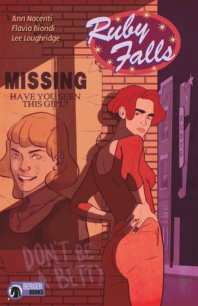
Berger Books expands it’s range this week with the release of the murder mystery title Ruby Falls #1. Embracing the slow life of forgotten towns, Ruby Falls opens up old wounds and shines a blinding light into the recesses of peoples memory.
Comic book fans will recognise Ann Nocenti’s name from a number of DC and Marvel titles, most notably Daredevil from the late 1980’s and Kid Eternity from the early 1990’s. She is also credited with co-creating Typhoid Mary and Longshot. More recently she had a hit with The Seeds with artist David Aja on the Berger Book imprint of Dark Horse Comics.
With Ruby Falls Nocenti is bringing the reader firmly down to Earth with a slow paced, murder mystery set in small town America. She introduces Lana and her partner Blair. Together they are surviving in an old mining town, facing each day as it comes. Their lives are nothing extraordinary, as Nocenti illustrates with the hum-drum of existence that makes up Lana’s day, but all that is about to change. While visiting her grandmother Lana learns of a murder that the older woman witnessed when she was younger. A murder that went unsolved.
With her friend Raymond, a local librarian, Lana opens up the cold case and her life begins to change.
Ruby Writing
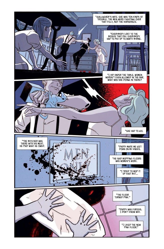
Ruby Falls drifts along like a leaf on the wind. The narrative follows Lana as she weaves around town, interacting with the people that she meets. Nocenti keeps the conversations jovial and friendly for the most part, depicting a close knit town where everybody knows everybody else. All of the character interactions are intimate but there is an emptiness to the town. Long shots of public places lack the hustle and bustle of populated places. Artist Flavia Biondi creates empty spaces within the panels, often losing the characters in the straight lines of the architecture.
Biondi uses cleanly defined lines to illustrate the world of Ruby Falls. This is an effective approach for the landscape and the scenery but doesn’t always produce the best character results. Occasionally the figures are stiff and a touch stifled, as if they lack energy. As a reflection of the town this is fine but other areas of the narrative requires more dynamism.
Having said that, Biondi’s characterisation is effective. She creates instantly recognisable characters with a few, simple lines then fills the character out with costume design. The desolate long shots in the comic work so well because, even from a distance, you can spot and recognise the characters.

Colorful Scene Setting
Biondi’s main focus for this first issue is to set the scene for the murder mystery story. She does this by concentrating on the small town, building a world for the characters to fill later. A large part of this design is the color work provided by Lee Loughridge. Loughridge uses an autumnal palette throughout, mirroring the twilight years of the town and the slow ageing of the characters. There is a sense that this town has passed it’s heyday and is slowly winding down.
The floods of bright orange and golden yellows produces a calming effect on the reader and slows the pace of the comic. For the most part, Ruby Falls has a warming effect, inviting the reader to take their time. Not only does this produce a lethargic visual but it seeps over into the narrative, lulling you into a false sense of security. When something shocking or exciting does happen, it leaps from the page as all of those calming colors disappear and are replaced with strong, harsh colors.
The lettering is adequate, relaying the speech in an unassuming manner. Sal Cipriano follows the tone of the comic, giving the speech a dull, melodic feel for most of the panels. The text is very monotone, very rarely altering from panel to panel. The highlight of the lettering is in the design of the town’s signs and printed word. This is where Cipriano has some fun. The contrast between the swirling design of the Silks nightclub sign and the traditional Ruby Social Club illustrates the differences between the places and the people inside. It also affects the way that Lana is portrayed; in one location she comes alive, excited by who she is and where she is; in the other she’s more formal and straight laced.
Conclusion
Ruby Falls is an intriguing first issue. Nocenti slowly introduces the mystery into a town populated by a small cast of characters. You get the feel of the town and a fair assumption of who the main players are. However, the lilting tone and lack of changing narrative beats makes the comic drift along and at times barely holds the reader’s attention.
It sets the scene, of a dwindling old town lacking life, almost too well. Unlike other recent crime comics like Criminal or The Girl In The Bay, Ruby Falls doesn’t have a strong hook to catch the reader and draw them in. A large proportion of the comic is ‘nice’ and nice just isn’t enough. However, the groundwork has been laid and future chapters of the story have a promising foundation to build on.