Home Blog Page 405

Review: In TRIAGE #2, Phillip Sevy’s Characters Shine

Monkeys Fighting Robots

If you can’t tell just by his striking covers, Phillip Sevy’s Triage, lettered by Frank Cvetkovic, is one of the weirdest, most captivating sci-fi comics to hit shelves in a while. Issue One created quite a buzz on comics Twitter and, for many comic fans looking for original comic storytelling, cemented the book as one of the most interesting Dark Horse titles this year. Now, Triage returns to stores with Issue 2, and whether you were one of the people who started with Issue One, or you just want some damn good sci-fi with really breathtaking art, you’d be wise to check it out. Read on to learn why.

Triage picks up with our protagonist, Evie, as she tries to come to terms with what she has just learned. First, there are two parallel-universe versions of her. One is a superhero called Orbit, the other is a post-apocalyptic soldier named Marco. And the second thing Evie learns is that, whatever the reason for their universes crossing paths, something wants all three of them dead. Now, Evie must save the wounded Marco, figure out some way of evading the mysterious “Hunter” that is after them, and oh yeah, explain all this to her girlfriend. Fingers crossed one of her alternate versions is a couples’ counselor.

THE STORY

Once again, Phillip Sevy knocks it out of the park with his unraveling of a cosmic mystery plot line. He gives us the information we need to know as the same time as the characters do (for example, the trio figures out how they can feel The Hunter coming). But Sevy’s good about not revealing so much that it spoils the intrigue of the comic. We still only get hints at the larger story going on, including a potential explanation of the science behind it. Sevy walks an engaging line between explaining complex sci-fi and keeping the reader in suspense, a really impressive feat in a story that relies on high concepts.

And since the story isn’t crammed with exposition, Sevy’s characters have room to interact and grow. Readers will especially like getting to know Tab, Evie’s girlfriend, who is both a great reality check for the insanity of this world and a valuable player once she accepts the rules. We also eat a little bit more personality out of the trio, three disparate personalities locked into the same impossible situation. For interactions that technically only one character, the trio’s dynamic is great. They make for a great, very cheer-able, team.

One final note on the story before we move on: it’s especially impressive that, for a story featuring a superhero, the superhero character doesn’t become the focus. Sevy makes it clear that Evie is out hero of this story, which is maybe the best mystery in the book. Why is Evie grouped with a futuristic soldier and superhero if she’s just a normal, human nurse? What’s so special about her? It’s that kind of unanswered question, kept at the forefront of this story, that makes both issues of Triage work so well.

THE ART

Of course, the reason many people came to Triage was the weird, purple-and-blue-hued art so well showcased on the covers. Issue Two doesn’t feature much of the surreal, dreamlike mid-dimensional plane that made Issue One so eye-catching, but It does make up for that in other ways. The action sequences are especially good in this issue, especially where Orbit is concerned. Sevy also does a great job conveying the emotions of his characters in smaller moments, so whether you’re watching a superhero punching an assassin or a couple having a difficult conversation, there’s always something about this art to pull you in.

OVERALL THOUGHTS

Triage continues to be a resonant, engaging story with some refreshing sci-fi concepts and some very relatable characters. In fact, it’s tempting to wish the series would be an ongoing, even though Sevy’s absolutely knew what he was doing in making it a limited run. Still, there’s a giant world (in fact, multiple worlds) within the pages of Triage. Dark Horse would certainly not be making a mistake in returning to it after this series is over.

For more reviews like this, follow us on Twitter. And for all the best comic book reviews, discussion, and news, stay tuned to Monkeys Fighting Robots.

Monkeys Fighting Robots Youtube

Review: BLACK STARS ABOVE Lights Up VAULT Comics Horror

Monkeys Fighting Robots

Vault Comics already made a grand entrance into horror comics this month with The Plot. With Black Stars Above, out November 13th in comic stores everywhere, they’ve made it clear they’re planning on staying. With a story by Lonnie Nadler, art by Jenna Cha, colors by Brad Simpson and letters by Hassan Otsmane-Elhaou, Black Stars Above is a perfect addition to the genre of horror comics. Read on to find out why.

Black Stars Above tells the story of Eulalie, a young woman from a fur trapper family living in Northern Canada in 1887. Eulalie is bright, imaginative, hopeful. She dreams of a world beyond the cold and poverty that her father’s business has afforded her family. Her dreams are dashed, however, when her father says he’s agreed to marry her off. Just as she’s about to give up hope, she meets a man who offers a large sum of money for a simple task. She is to take a package up north, through the wild and weird woods that surround her home. She takes the deal, believing it to be her last chance at a life. But there are things in the forest that are deadlier than wild animals, deadlier than the cold… deadlier than anything in the natural world.

Trails from the Crypt

Fans of H.P. Lovecraft will doubtless get a huge kick out of the way Lonnie Nadler is telling this weird horror tale. Nadler weaves a narrative in a creepy, unsettling pace. In fact, much of issue one is a perfectly normal period drama. However, Nadler brilliantly spends the first couple pages showing that there’s something supernatural going on in Eulalie’s world. As he’s fleshing out her everyday life, that knowledge lurks the back of the reader’s head, like a spider hiding in a dark room. And even when things do start getting all “Overlook Hotel” on Eulalie, it’s far from clear exactly what those supernatural events mean. There are big, scary forces in Nadler’s late-19th-century Canada, and not only to we not understand what they are, we get a very strong sense we’re not supposed to.

Forbidden Arts

But no matter what Nadler puts on the page, this spooky universe couldn’t exist without Jenna Cha’s spectacular art. Cha’s spectacular debut into published comic art is moody and unnerving, walking a thin line between depressing geographical climate and otherworldly haunted dreamscape. Just like Eulalie herself, readers will be unclear exactly where the natural and unnatural worlds split, so no scene feels quite safe. Beyond her gothic landscapes, Cha’s character work is also excellent. Like a great casting director, Cha populates her world with expressive, relatable characters. With the soul she gives them, readers will find themselves drawn into this point in history, whether they want to be or not.

Colors Out of Space

Bringing the harsh and alien landscape of Eulalie’s world to life are Brad Simpson’s colors. He paints the book with a grim and unwelcoming palette, something that will remind readers of all the best icy horror stories, like 30 Days of Night and others. When things start getting Lovecrafty, Simpson makes subtle but important changes in the tones and shades he puts on the page, contributing to the overall sense of dread and “otherness” that’s so prevalent in this comic. A cursory glance at this book might trick you into thinking that this story is just made of the frigid monochrome’s that make up most winter settings, but look again. Weird things can be done with white and gray, to say nothing of the titular brightness of this comics’ black.

Curse(d) Words

Letterers are often overlooked for their work in comics, and the work done by Hassan Otsmane-Elhaou in Black Stars Above proves just how unfair that is. This book is wordy, in a good way. As a child with parents from different cultures, languages are important to Eulalie’s culture, and Otsmane-Elhaou keeps them separate for the reader to follow along. He also crafts the torn pages of Eulalie’s journal, which adds to her character not just by showing us her inner thoughts, but how she chooses to put them down. Crossed out sections of the journal help us paint a picture of a girl who is trying to make sense of he life, whether that’s the oppressive way in which she’s treated or the unknowable entities outside her door. Without Otsmane-Elhaou’s careful organization of her thoughts, we wouldn’t know Eulalie half as well as we do, So feeling scared for her would be tougher. And speaking of fear, watch for how Otsmane-Elhaou presents the “voices” of the things in the woods. You’ll easily be able to hear their demonic cadence; the trouble will be forgetting it.

Overall Thoughts

Typically, the accepted wisdom of horror is to “show as little as possible.” That’s why horror novels get such rave reviews, and why the best monster movies hold off from seeing the beast until the end. However, Black Stars Above proves that there’s another method to telling horror stories. Like the films of David Lynch or the work of the aforementioned Lovecraft, Black Stars Above is perfectly fine with showing, because it knows that your fear won’t come from not seeing. In this horror comic, one of the best to hit shelves this season, your fear comes from seeing…and having no idea what you’re looking at.

For more reviews like this one, follow us on Twitter. And for all the best comic news, discussion, and interviews, stay tuned to Monkeys Fighting Robots.
Monkeys Fighting Robots Youtube

Review: POWERS OF X #6 – Dawn of a New Life

Monkeys Fighting Robots

X-Men and mutants everywhere are set up for many years of thrilling adventure after Powers of X #6, out this week from Marvel.

Jonathan Hickman’s stint with the X-Men, so far, has been amazing. The way he has rebuilt them has explained everything without changing anything at all. Every story you have ever read in an X-Men comic has happened, and Hickman explained how that was possible in 12 gorgeous issues.

R.B. Silva and Pepe Larraz are the young gun artists Hickman recruited to shape the new world of mutants. This is an issue heavy with flashbacks, so quite the breezy book to work on. Silva and Larraz have created a masterpiece. House of X and Powers of X are books that could be easily transformed into an animated film. The finished art reminds me of those iconic animated movies Disney put out in the 90’s that they’re remaking now. Hickman’s series would also be a fantastic starting point for the X-Men in the MCU.

Marte Garcia and David Curiel are the color extraordinaire’s. Every chapter of this 12 issue series has been beautifully vivid and an incredible treat for the eyes. There’s no doubt in my mind you’ll be seeing these two names working on more and more books in the future. Dave Stewart just might be able to take a vacation!

Clayton Cowles is the letterer for Powers of X and House of X. Cowles is always crisp on the page and a great read. Some issues out there can be exhausting with the need to squint to read some panels, and that is never a problem with a book Cowles is working on.

I’ll keep this review short and spoiler free, because this has been a surprising ride and everyone deserves to find out on their own. The X-Men have been around for decades, and Hickman found a way to make it new and original with a fresh take on the Marvel heroes and their enemies. House of X is an introduction into the current timeline spilling into the Dawn of X titles. Powers of X foreshadows the ultimate threat to their future plans.

The X-Men have endured their share of hardships, but Powers of X #6 finally shines a light on the final boss; the inevitability they can’t seem to escape.

Admittedly I was not an avid X-Men fan, or a regular reader of any mutant titles for that matter. The extent of my X-Men knowledge was mostly learned from the 90’s animated series, but Hickman has me hooked. He has hinted at so many possibilities for the future, and I’m excited for all of them.

I’m buckled up for a bumpy ride with plenty of twists, turns, heartbreaks, thrills, chills, and with Hickman at the wheel, we could end up anywhere.

See you next week for X-Men #1.

What did you think of Jonathan Hickman’s reboot of the X-Men? Will you read any of the Dawn of X titles? Let us know in the comments below. 

Monkeys Fighting Robots Youtube

Review: A Simple Setting For An Extraordinary Fight Scene In SUPERGIRL #35

Monkeys Fighting Robots

Issue 35 of Supergirl from DC Comics drops this week and writer Marc Andreyko throws the titular character into an onslaught of relentless action. While Kara is busy with one big bad, a potentially larger threat is rising in The Fortress of Solitude.

Back on Earth and reunited with her adoptive father, Supergirl should finally be able to relax but no such luck. The supervillain Leviathan has made a beeline for the Kryptonian and all they want to do is talk but they have a funny way of showing it.

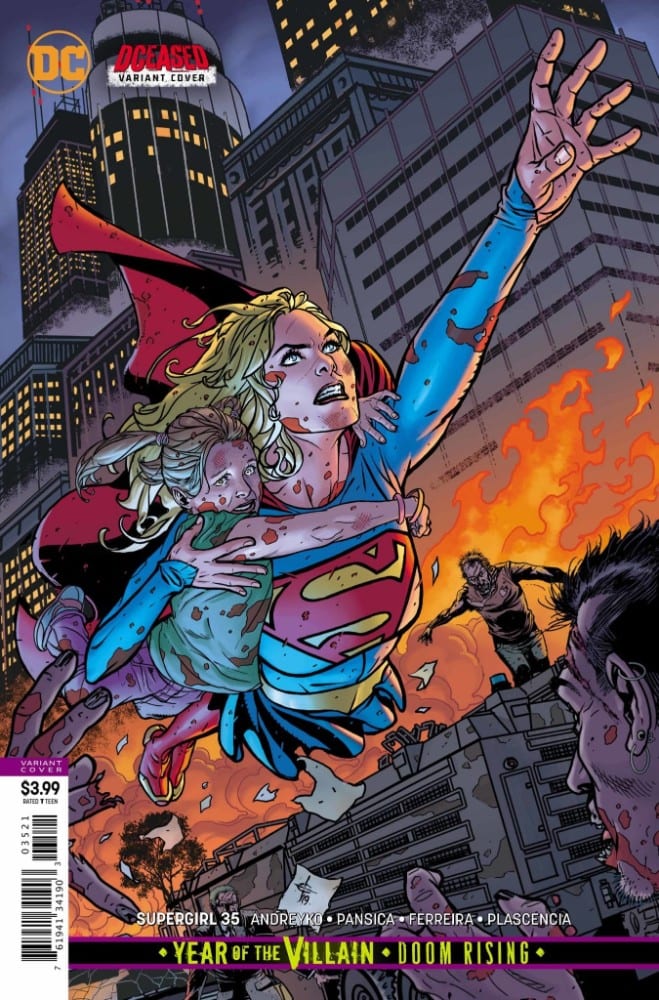
Supergirl #35 alternative art
Supergirl #35 Credit: DC Comics

Supergirl Action

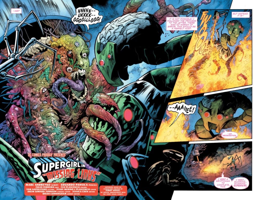
After the horrors of last issue, Andreyko makes this chapter a pretty straight forward superhero comic. The opening shows the further adventures of the new Brianiac as it tears into the heart of the Fortress of Solitude. This sequence is the only part of this issue that continues the horror theme started last month. One splash page in particular explodes from the comic with a vile, disturbing image sure to give you nightmares. The art team have clearly being influenced by the body deforming horror of Akira and have relished in bringing that aesthetic to Supergirl.

After this teaser opening, Andreyko gets down to the meat of the story; namely Supergirl against Leviathan. A few conversational moments are broken with a full frontal assault on Jeremiah, Supergirl, and Krypto. The action fills the pages with blows bouncing back and forth. In true superhero form, the characters shout at each other as they fight and, in the end, nothing of real worth gets said. 

A conversation between Kara and Jeremiah contains many words but somehow fails to say anything. The secrets that Jeremiah constantly alludes to makes the conversation pointless not just for the characters but also for the reader. The first panel of Supergirl hugging Jeremiah has more to say than the next two pages of speech. 

The same can be said for the banter between hero and villain. It’s good to have the banter and it  can provide much needed depth to endless fight scenes, unfortunately the banality of it here adds nothing but frustration to the narrative. It’s a perfect case of ‘speaking much but saying nothing’.  One small speech by Jeremaih may contain the secret to Leviathan but trying to pick anything else out of the rest of the cliched ramblings just interferes with the pacing of the action.

Supergirl #35 page art
Supergirl #35 Credit: DC Comics

Street Fighting

Despite the hollowness in the narrative, the artwork leaps from the page. The combined pencils and inks of Eduardo Pansica and Julio Ferreria infuse each page with an otherworldly dynamism. The horror elements from the opening repulses the reader while the superhero action draws them in. It is larger than life and full of energy.

The art introduces a sense of drama, especially through the body language of the characters. Some of the compositions may be cliched, especially in a superhero comic, but the draftsmanship in producing them is superb. The reader gets a true sense of the powers involved in the fight. When Krypto gets punched, you can feel the shock and pain in the panel.

The color work by Fco Plascencia emphasises the actions within each panel. On some pages the backgrounds become a single color to highlight the foreground action where on others the colors become more complicated to illustrate the chaos of the fight. Plascencia uses bold color choices throughout the comic which gives it that Superhero feel. Primary colors battle for dominance on the page just as the hero battles the villain. 

Tom Napolitano also adapts a comic book look for the sound effects. They are bold and cartoony, accentuating the actions they are linked to. He creates fun, onomatopoeic sound effects that burst from the panels giving the scenes a grandiose finish. You are never far from the spectacular in this issue of Supergirl.

Supergirl #35 Credit: DC Comics

Conclusion

The visuals are pure comic book and garners a high level of excitement in the reader unfortunately the plot this issue is lacking any depth. Despite the hard work of the artists Andreyko struggles to find a comfortable line between mysterious and benign. The hidden secrets of the characters and the hints at truth may be there but are lost within overwritten, cliched speeches.

This issue of Supergirl is an action packed spectacular, if you ignore most of the speech. It leads beautifully on from last issues readjustment back to an Earth bound story and on to the Brainiac confrontation that the creators have been building towards. Just don’t come into this comic looking for any real narrative substance as the majority of it is taken up by a fight in a car park. 

Monkeys Fighting Robots Youtube

Review: JOKER: YEAR OF THE VILLAIN #1 – Painting the Town Bloody

Monkeys Fighting Robots

The Joker takes a friend out for a wild night on the town in Joker: Year of the Villain, out this week from DC Comics.

Written by Anthony Burch and horror legend John Carpenter, this is a story more like what I would expect from a movie titled JokerPhilip Tan appears to channel Neal Adams in this wicked tale of spiraling madness. Inks are handled by Marc Deering, Danny Miki, Jonathan Glapion, and Philip Tan. Jay David Ramos colors a Gotham descending into chaos. Gabriela Downie has the busiest lettering job this year in comics.

Carpenter is known across the globe for his work in horror with movies like Halloween and The Thing, so getting him on board for a Joker story is something I’ve been looking forward to since it was announced. With his reputation I have to admit I was expected some more grotesque panels and terrifying visuals, but this issue is fantastic none the less.

Tan’s art in this issue has the feel of older bronze age books back when Neal Adams was creating Batman villains. Using heavier more apparent line work that gives the impression that everything is moving in a blur.

Downie steals the show in this one. A letterer you say? Yes, a letterer. The panels separated by laughing, that appears inconsistent and scribbled just like if the Joker had written it, is the most creative way to letter his maniacal laughter that I can recall. I’m surprised, and not surprised, that I can’t think of another Joker story that has used the same technique for panels, mostly because it looks like it took forever. It is also used at appropriate times in the story, so it doesn’t get overdone and annoying.

Even though I have a really hard time believing the Joker would just sit back and let Bane rule over Gotham, I feel that Burch and Carpenter really captured what he would be up to in a city without Batman. He would be lost, running around with no real sense of purpose, and just trying to get the attention he received when Batman watched over the city. Ignoring the Joker might just lead to the destruction of the City of Bane.

If you are a Joker fan that was disappointed by the movie, this one-shot is actually true to the character. Towards the end of the movie I expected Phoenix’s character to bump into the real Joker. I was really hoping that one of the guys that pulled him out of the cop car was going to take their mask off and you’d see the scars from ear to ear. It would’ve been more of a character study on the people Joker attracts, and be a much better explanation of the evil that is Joker. This is that story told by a horror mastermind in John Carpenter.

As a Joker collector, I’ve never felt he was crazy or mentally ill. Joker is evil. He knows what he is doing and in his mind he is constantly operating with a win-win mentality. If his plan succeeds and he kills tons of people or Batman finally snaps and kills him, then he wins, as the Batman Who Laughs has taught us. If Batman stops the plan and throws him back in the asylum, he just gets to kill some guards when he escapes again. Joker is an unstoppable force and to stop him you must allow him to win.

Bane needs to stay on his toes if he expects to keep control of Gotham while the Joker is on the loose.

What did you think of Joker: Year of the Villain? What did you think of Joaquin Phoenix and the Joker movie? Let us know in the comments below.


Monkeys Fighting Robots Youtube

Review: Entering the Mind of a Dead Man in THE BATMAN’S GRAVE #1

Monkeys Fighting Robots
Monkeys Fighting Robots Youtube

WONDER TWINS #8 – A Tale of Reunions Unravels

Monkeys Fighting Robots

Reunions can be a hard, good thing DC Comics’ WONDER TWINS #8 does its in a hilarious and witty manner.

If you need to catch up on Wonder Twins, check out the review of the previous issue. Or pick up the last seven comics when you grab Wonder Twins #8 this Wednesday at your local comic shop. The whole series has been fantastic.

Interior Pages by Mike Norton, colors by Chris Peters.

A Story of Reunions

Writer Mark Russell dramatically begins Wonder Twins #8, with both parties of the plot losing. Meaning, you can only go up from there, right? Yes, but no. Russell continues the trend of winning, yet not winning. But, instead of winning against a villain while having the feeling of not winning; Wonder Twins #8 makes the theme more personal with two grand reunions.

Although the themes and plot are serious, Russell keeps the fun/light-hearted feeling that has been throughout the series. Be it: dialogue, background gags, character moments, or the infamous accidental public confession trope with Principal Turner. This moment humanizes Principal Turner immensely while making him one of the most relatable characters for any adult.

Interior Pages by Mike Norton, colors by Chris Peters.

School of Art

Pencils change hands from Stephen Byrne to Norton for Wonder Twins #8. The change is barely noticeable as the duo’s art style mirrors each other magnificently. But Norton’s style leans more on the realistic style, whereas Byrne’s had more a Saturday morning cartoon style. Norton’s style fits significantly with the focus being on the more human side of Wonder Twins.

Much of Wonder Twins hasn’t consisted of action, which continues in Issue 8. The few panels that do have action look fluid while staying cartoonish. One panel that exudes this elegantly has Zan sliding to fist bump Jayna. The panel may look hilarious, but Zan building speed in the panel before to slide under the villains and fist-bump his sister works perfectly. Chris Peters’ colors help the action sequence.

Peters’ colors gel gorgeously with Norton’s pencils. Although the colors never get as bright as the previous issues, the subdued colors help portray the more down to earth story. Peters’ colors help the action mentioned above significantly. Adding a yellow blur to Zan’s legs, show how fast he is sliding while guiding the reader. Another beautiful color moment is the duo activating their powers. Norton uses a small panel to show the famous fist bump, while Peters adds sparkling white lights and brilliant blues.

Dave Sharpe continues his great work on letters. Throughout Wonder Twins #8, Sharpe helps guide the reader through the dialogue. But in some cases, Sharpe adds huge bubble breaking dialogue that shows the character’s excitement. This happens more during the ice-cream truck scene, showcasing how exciting ice-cream is.

Interior Pages by Mike Norton, colors by Chris Peters.

Wonder Twins #8 Conclusion

Russell continues the trend of meaningful commentary in an enjoyable, fun-filled issue of Wonder Twins. Norton’s pencils and Peters’ colors amplify this theme.

Memorable Quote: “Time has turned your principal into a geyser of petty failures and disappointments.” – Principal Turner

Time has done this to us all, buddy.

Extra Credit: I love that Jayna’s overalls have her superhero emblem on it. Also, I loved Zan as the ‘Pit Boss.’

Dear Readers

What did you think about the reunions in Wonder Twins #8? Let us know below!

Monkeys Fighting Robots Youtube

Review: COBRA KAI #1 Is A Fun, Energetic Book That Looks Fantastic

Monkeys Fighting Robots

IDW’s Cobra Kai by Denton J. Tipton (X-Files), Kagan McLeod (Infinite Kung Fu), Luis Antonio Delgado and Neil Uyetake is a solid book, with energetic and unique art that expands both the classic Karate Kid film and the current Cobra Kai show on YouTube.

From IDW- “JOHNNY’S STORY,” Part 1. See The Karate Kid in a whole new light in this retelling through the eyes of Johnny Lawrence, two-time All Valley Tournament Champion. When the new kid makes moves on the girl that broke Johnny’s heart, he vows to settle the score and win back her love. Or so goes the story Sensei Lawrence tells his students nearly 35 years later.Cobra Kai

Cobra Kai #1
Written by: Denton J. Tipton
Art by: Kagan McLeod
Colors by: Luis Antonio Delgado
Letters by: Neil Uyetake

Story

Although Cobra Kai #1 is a direct tie-in to the show, it’s not exactly necessary to have seen it in order to enjoy the book. Writer Denton J. Tipton makes it more of a re-telling of the film Karate Kid (but through Johnny’s POV) and that is what makes it accessible and fun. He softens teenage Johnny enough to make you start to feel for him, without making him a hero per se; anti-hero is more like it. Johnny has a terrible stepdad and he is also wanting to change himself. But it’s not dark and brooding either, the issue is written with a light, breezy tone (much like the show) that occasionally bumps into more serious moments without becoming melodramatic. It may not re-invent the wheel of the comic, but as far as licensed comics go, it’s a strong start; good for hardcore fans and good for newer, casual fans. Cobra Kai

Art

The art is where Cobra Kai shines. Brining in Kagan McLeod was a great idea. McLeod is well known for Infinite Kung Fu, a Top Shelf graphic novel that made quite a crane kick of its own back in 2011. McLeod’s art is all sketchy, but it’s far from messy. Energetic is more like it; loose linework yet easy to follow panel layouts that move the story along at a great clip. His looseness also carries over to the faces, giving everything that softer touch that helps the whole Jonny POV take. Cobra Kai

Luis Antonio Delgado’s colors, pulled from a more matte and muted pallet, accentuate McLeod’s soft art and doesn’t overpower it. This is more indie comix art that what you usually find in these kinds of licensed books. It’s a touch that elevates a bit out of the norm and should catch the eyes of comics fans.Cobra Kai

Conclusion

Cobra Kai is a fun book and well worth it to just have more Kagan McLeod on a printed page, once again drawing martial arts. If you loved the movie and like the show, you’ll totally be into this. It’s fast and fun. Throw in McLeod’s art and you have a book that should be checked out. Grab it at your local comic store today.

Monkeys Fighting Robots Youtube

Review: DOCTOR DOOM #1 – Sympathy For The Devil

Monkeys Fighting Robots

Thanks to the story by Christopher Cantwell and outstanding art by Salvador Larroca and Guru-eFX, Doctor Doom #1 makes you feel concern for one of the evilest supervillains in the entire Marvel Universe. How do they achieve such a feat? By backing the bad doctor into a corner, he may not escape.

Summary

Between running a country, having drinks with a time-traveling conqueror, and being framed for a major act of terrorism, Doctor Doom starts to have realistic dreams of the road not taken.

Doctor Doom

Writing

The entire issue serves as the perfect framework for everything a first issue should feature. The reader is presented with a look into the everyday life of Doctor Doom. Being a guest on a news show, running a country, ordering a kidnapping of a reporter, and having a late-night drink with Kang the Conqueror. All of it plays out in a way where the reader will find themselves thinking, “Yeah, that’s probably what his days are like.”

Still, Christopher Cantwell isn’t merely content on such a simple story of what Doctor Doom does with his Tuesdays. Instead, Doom is framed and put into a situation that will take all of his knowledge and skill to get out of. While at the same time, he keeps having flashes showcases a life where he wasn’t the world’s greatest villain and instead used his knowledge to better humanity and obtain a family. Will Doctor Doom clear his good name and find a way to enjoy the peaceful he keeps hallucinating about? Only future issues will tell.

Doctor Doom

Artwork

The artwork by Salvador Larroca is rich and offers a great look at Doom’s world. His lavish castle and all the treasures he fills it with are drawn with impressive bits of detail. Also, the look of alternate happy reality is drawn to feel like it would feel like a slice of heaven, even for a supervillain.

Thanks to the coloring work by Guru-eFX, the effects work in the action scenes seems to burst off the page. The coloring also works to add to the beauty of the scenery and the carnage of destruction. It also helps to add to the moments when Doom is lost in deep pontification of what he needs to do next.

Doctor Doom

The lettering by Cory Petit aids in helping the story to flow in a very dramatic fashion, as the dialogue is delivered at just the right moments where the reader can feel the narrative beats at work. Some of the fonts on the effects can be a bit distracting but not enough to detract from the overall quality of the issue.

Conclusion

Doctor Doom #1 might be the best way to look at the character in a long time. Unlike the Infamous Iron Man, where Doom was trying to be Iron Man. Here he can be himself. Doctor Doom #1 is a must-read for fans of not only the good doctor but anyone who is looking for an engaging storytelling comics provides.

Monkeys Fighting Robots Youtube

Review: RONIN ISLAND #7 Asks, “How Should We Fight Oppression?”

Monkeys Fighting Robots

Our two favorite samurai’s in training—Hana and Kenichi—reunite once again in RONIN ISLAND #7, available in stores Wednesday, October 9th. While Hana remained under the Shogun’s oppressive rule in his standing army, Kenichi managed to recruit a group of bandits to take on the imperial forces. Both want to end the overlord’s treachery, though their proposed methods couldn’t be more opposed.

Story

The Shogun’s army of soldiers and subservient Byonin has grown more ruthless than ever. Aside from chaining up the zombie-like creatures to fuel their rage, he’s managed to keep them in such close proximity that they’ve effectively merged with one another, resulting in the creation of a singular beast capable of far more destruction. It is this monstrosity Hana and Kenichi must face following their short-lived reunion.

mega byonin leads the Shogun's army

Readers get to sit back and watch Kenichi describe his plan to kill the Shogun with his army of murderous bandits, all for the good of Ronin Island. To this Hana can only stare in disbelief, soon experiencing a flashback to when the two companions were training on the Island as children. Their trainer during this time, Master Ito, showed them why fighting together was more important than simply seeking to destroy one’s enemies. And it’s this lesson Hana attempts to relay to her friend.

Over the course of this series, writer Greg Pak has been slowly unveiling the differences in Hana and Kenichi’s ideologies—features stemming from their past experiences—and they’re highlighted more than ever before in RONIN ISLAND #7. Hana’s desire to bring more people under her protection via compassion stands in stark contrast with Kenichi’s willingness to use nefarious means in order to protect his “own.” But in a surprising twist, Pak blends these two philosophies into one in the story’s final scenes, leaving readers to sort out the moral questions on their own.

Artwork

Giannis Milonogiannis and Irma Kniivila’s talents prove once again that they’re perfectly fitted for this series. The contrasts between the surrounding forests and the walking death of the Byonin plays on the narrative’s dichotomic themes. The putrid reds, oranges, and yellows stand out like a sore thumb throughout the landscapes and the people themselves.

Simon Bowland’s lettering adds to the Byonin’s distinctive features as well, primarily through his use of a large red font to show both its anger and almost otherworldly qualities; only a unique creature could utter the horrific sounds represented by the text.

Comic Book Covers

Main Cover

Milonogiannis and Msassyk’s artwork for the main cover depicts a blood-stained path that appears to be leading to the Island, adding immense foreboding based on the danger the Shogun and his Byonin pose.

Preorder Cover

Ethan Young’s preorder cover illustration is once again crafted using East Asian stylistic elements. It features younger versions of Hana and Kenichi playing in their homeland, reminding the reader of their shared past.

Unlocked Retailer Variant Cover

Takeshi Miyazawa and Raúl Angulo’s variant cover contrasts Hana and her fellow soldier with an encroaching horde of Byonin. The warriors’ unity stands out with bright, diverse colors while the Byonin fade into the dull, orange background.

Conclusion

RONIN ISLAND #7 is a major turning point in this series in that it brings Hana and Kenichi’s differences to a head. The fate of the island will ultimately depend upon where the two heroes go from here.

Did you agree with Hana’s declaration that Ronin Island wasn’t, in reality, an actual place? Let us know what you think in the comments below!

Monkeys Fighting Robots Youtube