Home Blog Page 397

Archie 2020 And Beyond: Predicting The Trends For The Next Decade

Monkeys Fighting Robots

The decade is almost over, so let’s look back on Archie’s ten-year evolution and speculate on his future. The first half experimented with different ideas not seen in the franchise for a long time. From marriage and adult life in “Life With Archie” to “Archie Horror“. The “New Riverdale” series spearheaded by Mark Waid was a huge change in the status quo of the franchise, pushing the main cast into new roles while reflecting on our current times. What can we expect from Archie Comics over the next decade? The Archie Americana series presents some suggestions.

The Premise Of Archie

Makes me wonder what the Archie 2020s will be like
I’ll take this over High School Musical any day.

Since the forties, Archie Comics has one goal in mind; depicting coming-of-age tales for America’s youth. Being a teenager is one of the most crucial and vulnerable times in a person’s life. With Archie, kids who ponder about high school or even teens in the same grade have a pal they can confide in. It’s not just about high school but reflecting on social events of that period. For each decade, readers get a new Archie to see what life is like for any generation.

Archie Americana

Basic is the best with all the renditions.

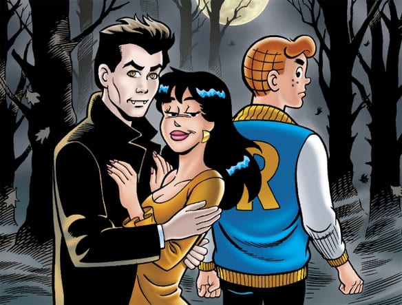
To help get a better idea, Archie Comics released the Archie Americana collection that focuses on different eras. This includes but is not limited to social commentary like the 80s Punk Movement. In a more milder move than South Park, Archie explores both sides of the topic realistically. For example, cable was semi-useful until the wires are cut. Other times Archie Americana parodies popular media like Batman and Knight Rider for fun.

Archie 2020s Predictions

With the turn of the decade, some trends are already starting to form for Archie and his gang.

Media

When it comes to TV some companies are already bundling their streaming services. But it can still go even further through some middleman companies like “Roku.” Think “Hulu,” “Disney+,” and a few less notable services like “YouTube Originals” in a 6-for-1 deal. Again though, it comes with some inherent flaws like lacking “Hulu with Live TV.” It would be middleman products, after all.

Virtual Reality is steadily improving enough to make 90s Jughead freak out. Music, gaming, and streaming are all viable areas for VR that steadily improves. Maybe the Archies will make appearances like the “Blue Man Group” or “Gorillaz”. Unfortunately, that also means more special effects like autotune. Thankfully live touring is still a thing that’s lucrative. Because sometimes real life trumps a virtual one.

Social Changes

I haven't even seen this character in other media, hope she appears more in Archie 2020s.It wouldn’t be social commentary without reflecting on positive inclusions on social lives. Representation is kind of hard though since Archie has at least one member of groups considered marginalized. Thankfully, Kevin and Harper are too fleshed out to even be considered token cast members. More mature topics like drugs or guns would have to be very subtle; this is supposed to be for all ages.

However, education vs. real-world experience is a very viable discussion for anyone. With the internet peaking its potential, schools are almost obsolete. Most people with Master’s Degrees don’t even get jobs in his or her major’s field. Betty is certainly someone who would be affected the most by all of this. The best thing to do is have Betty find herself through jobs and internships. That way, she can see what she’s good at and make smarter decisions.

Then there are the job benefits of small businesses and major corporations. Jughead working at Pop’s would have him work minimum wage but with benefits and personal fulfillment. Major chains or corporations like Lodge Industries meanwhile can offer higher salaries, benefits, and more opportunities. The problem comes from whether anyone wants to stick around. Most characters like Reggie are more than likely to end up in unfavorable warehouse jobs.

Anything else like fashion, Enoughism*, and social media events are all viable for Archie 2020s.

Parodies

This is actually a parody that would fit well in Archie Americana 2010sA few topics come to mind for popular media parodies. A parody of Game of Thrones is definitely a possibility, hopefully without all the ‘everybody dies’ cliche. But it would be a waste not to parody hit movies. Obviously, Archie’s superheroes from the Dark Circle imprint would have an in-comic cinematic universe. Maybe even biopics like Bohemian Rhapsody and Rocketman. Everything else remains subjective to the zeitgeist.

Archie 2020s Other Comics

Now for some real guesstimating. Archie Comics tackles everyday life in a way anybody can relate to. That usually means getting out of comfort zones. Putting the cast in new settings is always viable if it’s a slice-of-every-life. One idea is “College Life with Archie,” one where the New Riverdale cast has to choose where they go in life. Otherwise, there are remake publications analogous to Jughead’s Time Police.

Then there’s what the “Newer” Archie would look like. With the New Riverdale cast’s graduation, someone has to fill the void. A slight redesign like every other decade is also expected. Not a return-to-form series though, Classic Archie covers that complete with the old artwork. Then there’s the whole portrayal part. New Riverdale expands and retrofits the characterizations. From Archie’s looks, Jughead’s asexuality, and Veronica being a fish out of water. It would be great if Archie 2020s does this too. Reggie, for example, has a chance for more development.

Any Other Ideas?

It all comes down to the people behind the Archie Comics. But what do you all think? Will Archie make any big changes? What will be the next trends the Riverdale gang messes with? Share your thoughts in the comments.


*Enoughism is a theory according to which there is a point where consumers possess everything they need, and by buying more it actually makes their life worse off.

Monkeys Fighting Robots Youtube

Review: KING THOR #2 – All Hail The End Of A King

Monkeys Fighting Robots

Jason Aaron has cemented his legacy in comics with his essential run on Thor, and King Thor #2 most certainly does not tarnish his otherwise stellar legacy. Aaron’s script has an almost biblical weight to it, with narration equal parts brutal and beautifully poetic. Esad Ribić’s art and Ive Svorcina’s colors are equally frayed and distraught. King Thor #2 is fittingly apocalyptic, as it marks one of the last comics in Aaron’s run on the Thor line, and he shows he still has a firmer grasp on the character and universe than few others ever had.

King Thor #2 begins immediately after the resurrection of Gorr The God Butcher, or as he is now rechristened Gorr, The God of God Butchers. Gorr begins to mop the floor with Loki and Thor, and it becomes apparent that the only chance Thor has is to get Loki to help him.

Aaron has such a firm grasp on the tone and Meta text of the Thor canon; it’s as if he was destined to write this book. The fraught narration describing Thor’s inner-thinking and the inevitable doom of the universe makes the story feel like an apocalyptic myth from a Nordic tribe. It feels that there should be a group of men chanting ominously with each blurb.

Aaron is misotheistic and harbors some conflict towards the idea of an all-powerful god, but he is still capable of imparting some beauty in the downfall of the All-Father. The reader knows that Gorr’s logic is sound, and his goal isn’t impure, but his hatred and ruthlessness cloud him. Gorr’s end goal is to make a race of humans who don’t need Gods, who can be independent, which isn’t that evil depending on your philosophical and theological perspective. But the reader feels each blow to Thor because Thor, in theory, is the good guy. Aaron toys with these stances and presumed roles in simply masterful ways.

Another highlight of this chapter is the dialogue between Thor and Loki, as Aaron shows he has a full understanding of one of the more convoluted and electric brotherly relationships in comics. The barbs Thor throws at Loki to get him to fight against Gorr is underlined by his deep love for his adopted brother. In the end, as they are being absorbed by Gorr’s all-black matter, Thor and Loki are the last things each other have, and their final dialogue is a fitting capstone to their relationship.

Gorr The God of God Butchers Does Some God Butchering

Ribić’s art and Ive Svorcina’s colors are the ideal complements to Aaron’s more mature story. Ribić’s figures are bulky and weighty, Thor lumbers in this fight like a sore veteran gearing up for his last battle, and Gorr moves viciously. There are also parts of this comic that look like the cover art to an 80’s metal album, which is equally rad. One of Thor’s granddaughters rides throughout space on a shark. I mean, how can you top that? Svorcina’s colors are neutral and fittingly dour. Svorcina gives each panel an accent of fraying or areas that are lighter than others make the story feel more historic and dour. VC’s Joe Sabina’s letters burst off the page, and during the action scenes are impressively vibrant and eye-catching. The script he adds to the narration also gives a more biblical or apocalyptic feel to the ensuing battle as well.

Throughout Aaron’s run on the Thor series, he has shown keen understandings of the myths, it’s characters, and the stories themes, while also being able to inject his ideas into the story. King Thor #2 is no exception as Aaron maintains that he is the best writer of Thor we’ve seen in a while.

Monkeys Fighting Robots Youtube

30 Years of ARKHAM ASYLUM: A SERIOUS HOUSE ON A SERIOUS EARTH

Monkeys Fighting Robots

Grant Morrison and Dave McKean’s Arkham Asylum celebrates its 30th anniversary this year; let’s take a look back and see what makes the story such a spooky, satisfying, and enduring read.

Interior Page by Artist Dave McKean, Letterer Gaspar Saladino

Batman has a multitude of villains, and throughout the collective characters’ 80 years, most have their defining or well known stories. But, what about locations? Yeah, you could just plop a character in a well known city/state (like New York), but to give life to a story, the landscape should breath on its own.

When someone mentions Metropolis, people think Superman. Wakanda — Black Panther. The list goes on. For Batman, it’s Gotham, but even more so is the fabled asylum — Arkham. There aren’t many instances where the general public can name the prison/asylum that characters go to, but this is one of them. Arkham Asylum leaves an impression.

This shows that, yes, a location can tell a story. Arkham wasn’t always so established, though. early on, it barely had a backstory. Enter Grant Morrison, Dave McKean, and 1989’s Arkham Asylum: A Serious House on a Serious Earth.

Like Celine Dion asks in her song, “what if walls could talk?” Well, that’s what Morrison and McKean set out to answer.

The inmates of Arkham have taken over the asylum, and the Joker has an important demand: he wants Batman. The Dark Knight makes his way to the madhouse to confront The Joker, and once inside, he faces his famous list of villains in a maze-like asylum when The Joker begins a deadly game of hide and seek.

Arkham Asylum: A Serious House 15th Anniversary Edition Cover By Dave McKean

Origins of Arkham Asylum

Arkham Asylum: A Serious House on a Serious Earth released on October 5th 1989 as a graphic novel from DC Comics. This trip through the Asylum was writer Morrison’s first foray into the Batman Universe; he and McKean were joined by letterer Gaspar Saladino, and editors Karen Berger and Art Young.

As publishers typically do with iconic works, DC Comics has released a multitude of editions for Arkham Asylum, but the edition that first added behind-the-scenes extras was the 15th Anniversary Edition. This edition included: a full script with annotations from Morrison, thumbnail layouts for the art by Morrison, and an aftermath from Berger, as well as a host of information that tells the story behind how the book came together.

Arkham Asylum: A Serious House Morrison Script Page 1

The next few bits of information are from the extras in the 15th Anniversary Edition.

  • Morrison explained that the subtitle (A Serious House on a Serious Earth) originated from the 55th line of Philip Larkin’s poem Church Going. He also spoke on the inspiration of where the themes came from: “[Arkham Asylum was] inspired by Lewis Carroll, quantum physics, Jung, and Crowley; its visual style by surrealism, Eastern European creepiness, Cocteau, Artaud, Švankmajer, the Brothers Quay, etc.
  • Originally Morrison wanted Brian Bolland as the artist for Arkham Asylum: A Serious House on a Serious Earth, as he wanted it to look more realistic. Instead, McKean was tasked with the job. Morrison criticized McKean’s choice of making the novel more abstract, adding that their two styles clashed and competed with the novel’s symbolic systems. Later, he said this clash of creators was the story’s greatest weakness.
  • In what may be one of the funniest quotes in the Anniversary Edition, Morrison says, “Who’s laughing now, asshole?” This was pointed towards people in the comic book industry that got a hold of an early script version and called it “pretentious.” In context, this quote is quite hilarious with all the stories in varying media that the graphic novel has inspired.
Interior Page by Artist Dave McKean

In The Name

The idea of a story revolving around a building instead of a character is present in the name: Arkham Asylum: A Serious House on a Serious Earth. The cover still has Batman’s name on it, but in smaller text than others. And “Batman” is usually cut out when the story is talked about, with most people simply calling it Arkham Asylum.

Although it may focus on Batman making his way into Arkham to face his notorious nemeses, A Serious House relies more upon the history of the Asylum and its residents.

By using Batman as a narration device, Morrison essentially gave the fabled Asylum an expanded backstory. There’s no “big bad” villain for Batman to face off against, either, which is atypical of a superhero comic. Instead, Arkham Asylum: A Serious House revolves around a grand tour of the Asylum as The Joker forces Batman into a game of hide and seek. This form of storytelling gave Morrison and McKean the ability to focus on a multitude of villains, while still making it read organically.

Morrison and team sprinkled in a great deal of backstory of the Asylum’s founder—Dr. Amadeus Arkham. Dr. Arkham was originally conceived in Len Wein’s Who’s Who: The Definitive Directory of the DC Universe #1, but it wasn’t until Morrison took the character and his tragic backstory, making it even more heartbreaking.

Residents of The Asylum

What is an asylum without its residents? Morrison added his own take on these inmates (villains) that live inside of it. A few of these changes ended up sticking in future iterations. There weren’t many, but the most significant were Maxie Zeus receiving electricity powers, a more reptile Killer Croc, and Mad Hatter being obsessed with Alice in Wonderland. The latter became a defining character trait for the character.

A more controversial change was Mad Hatter’s obsession with children, especially ‘little’ girls, essentially making him a pedophile/child molester. Although he wasn’t around for a large page count, this change-up was a huge departure, and a taboo subject. That wasn’t the only ‘taboo’ area Morrison went for.

In a few scenes, Morrison paints Joker ‘in love’ with Batman. Or as it’s been said in the past, in a homosexual fashion. In the script Morrison originally added that Joker would “wear make-up and black lingerie in parody of Madonna.” This was shot down by DC Comics due to the success of the recent live-action Batman movie, but Morrison added in two other characters cross-dressing.

Joker is also dubbed as possessing ‘Super-Sanity’, an idea Morrison planted here and returned to later in his Batman run.

Although a few other characters are changed, they aren’t that different, or significant enough to mention.

Interior Page by Artist Dave McKean, Letterer Gaspar Saladino

Drawing on The Asylum’s Walls

As groundbreaking and crazy as Morrison’s writing is, Dave McKean’s art takes this graphic novel to another dimension. McKean’s art style is insanely distinct, enough so that you can instantly tell it’s his work. McKean is known for his ability to combine a multitude of media in his works of art. This skill is showcased to the max here as he mixes paints, photography, and the usual drawings, all in a media mashup, making each page a work of art.

At times, McKean’s art does feel muddy or hard to comprehend, but that’s part of its charm. The art helps the atmosphere greatly, much like the hard-to-read lettering (we’ll get to that). The art makes you feel as if you were there with Batman, even if it isn’t realistic. Each panel/page brings something new and unique to the table, while keeping the maze-like feeling, making the reader feel uneasy in each moment.

McKean himself didn’t feel the same, though, calling his own art “overpainted, lavish illustrations in every panel just didn’t work. It hampers the storytelling.” But, we’d have to strongly disagree.

And while McKean’s art may take Arkham Asylum to another dimension, letterer Gaspar Saladino does one of the best lettering jobs in any dimension, while being the hardest to read. As great as this story is, a common complaint from readers is that the lettering is hard to read at times. Is this true? Yes.

But, is it a problem? Actually not so much. At times you may need to reread a piece of dialogue, but when you do, you’ll catch more information. Negativity aside, Saladino’s lettering is one of the best seen in any comic. Each character has a differing dialogue balloons, with some not even having a balloon at all.

Saladino plays with font size, style, color, and placement so much that the reader feels like they’re in the Asylum. That’s how the ‘hard to read’ lettering can be interpreted, while it gives a certain uneasiness to the claustrophobic asylum. Plainly put, Saladino’s seemed to make the lettering hard to follow/read at times on purpose to help amplify the feeling seen throughout Arkham Asylum: A Serious House.

Interior Page by Artist Dave McKean, Letterer Gaspar Saladino

30 Years Later

Thirty years later and Arkham Asylum: A Serious House’s plot, art, and lettering is still a sight to behold. This famous story can be traced to a multitude of inspirations for future Bat-centric stories, especially 2009’s Batman: Arkham Asylum video game. Some themes also reemerge later throughout Morrison’s seminal run on Batman.

Should you read it? Hell yeah! Now’s the best time with the recently released Absolute Edition! It seems the 30th Absolute Edition comes with even more afterwards as well, and what may be the biggest change: McKean went back and restored the art himself. Look below for how great it looks!

After 30 years, you can still go back and read Arkham Asylum: A Serious House and find something new. That’s the magic that’s kept this story in the zeitgeist all these years, and which will keep it relevant for the next 30+ years.


Have you read Arkham Asylum: A Serious House? If so what do you think? Is it in any of your top lists? Let us know below!

Side Note: Check out Michael Fromm’s list of 10 scary DC Comics that includes Arkham Asylum: A Serious House and other great titles!

Monkeys Fighting Robots Youtube

Review: TALES FROM THE DARK MULTIVERSE: THE DEATH OF SUPERMAN #1 And The Problem Of Evil

Monkeys Fighting Robots

TALES FROM THE DARK MULTIVERSE: THE DEATH OF SUPERMAN #1, available in comic book stores Wednesday, October 30th, is a tale of a dystopian future in which the Man of Steel perishes and all hell breaks lose. But it’s not the villains who unleash an unimaginable amount of destruction upon society—it’s Lois Lane. Her anger at the Justice League’s inability to prevent Superman’s death leads her to adopt a harsher stance against injustice in society. Coupled with an unexpected visitor who has the ability to grant a compatible person Kryptonian powers, the hard-nosed reporter is ready to step into the void her beloved left behind, vowing to root out evil in a way he never could.

Story

Our story from the Dark Multiverse opens with Tempus Fuginaut, a celestial being much like Marvel’s The Watcher, pondering why evil exists in our world. Viewing the course of history over countless societies in the multiverse has acquainted him with mighty forces of darkness that often destroy the goodness in worlds—and it always comes back.

Tempus Fuginaut ponders the problem of evil

This question has been posed by all kinds of people throughout human history. It’s an existential angst within our hearts that tells us things should be different. By showing this doubt within a cosmic being like Tempus, writer Jeff Loveness establishes a relatability that connects with readers and makes it easy for them to empathize with an even more humanized character: Lois.

Following the death of Superman at the hands of Doomsday, Lois encounters The Eradicator at the Fortress of Solitude. This being from Krypton bestows all of the hero’s powers upon her after she pledges to continue the fight against evil. She adopts her own black and red version of the Kryptonian’s garb and begins a non-stop campaign against all the villains on Earth.

Throughout this process we witness Lois question why Clark held back so much of his power against the injustices plaguing the planet. In her eyes, the Big Blue Boy Scout provided quick-fixes to the problem of evil instead of seeking a permanent solution to the problem of evil. She believes it’s her duty to play God and root out all that’s wrong in the world, regardless of how much blood is spilled in the process.

Artwork

The artwork within this issue balances a fine line between good and evil, much like the opposing forces of the main and dark multiverses. Brad Walker’s penciling, along with Drew Hennessy and Norm Rapmund’s ink work, gives us highly detailed scenes of horrendous wreckage amidst the futuristic structures that typically dot the Metropolis skyline. It’s as if all the hope of progress and salvation that Superman represented died with him.

Superman fights against Doomsday in the Dark Multiverse

This clash of good and evil, order and disorder, is played out even more throughout the story with John Kalisz’s coloring; he contrasts the bright, primary colors of Superman and many of the other superheroes with the dark shades of red and black in Lois’ uniform. When it comes to lettering, Clayton Cowles draws us more into this clash by presenting her as a complex moral agent—her internal dialogue boxes are set in the neutral color of yellow so readers don’t assume either good or evil intentions.

Comic Cover

Lee Weeks and Brad Anderson’s cover artwork features an intense image of Lois as Superwoman, wearing a black costume with the “S” sigil written in blood on her chest. This juxtaposition to Superman’s classic outfit, coupled with the rage in her eyes, shows readers the vast differences between each one’s philosophy of crime-fighting.

Conclusion

This new addition to the TALES FROM THE DARK MULTIVERSE series is a monumental shift in Superman storytelling. We witness a human like us (Lois) step into the god-like hero’s shoes and succumb to the temptations that haunt our deepest desires.

Do you think Lois is a more effective hero than Superman? Let us know in the comments below!

Monkeys Fighting Robots Youtube

Review: THE LIGHTHOUSE Is a Legendary Piece of Cinema

Captain Marvel and The Unstoppable Wasp have shrunk down in Marvel Action: Captain Marvel #6

The Lighthouse is one of those films that can be unpacked and interpreted in many different ways. The biggest struggle many directors face after a hit film is avoiding a sophomore bomb. Back in 2015, Robert Eggers made his directional debut with The Witch, a film regarded as one of the decades scariest stories ever told. Four years later, he has returned with an even more engaging tale about two seamen going completely insane.

Directed by Eggers, who co-wrote the script with his brother Max Eggers, The Lighthouse follows Ephraim Winslow and Thomas Wake. Two wickie’s who spend four weeks on an isolated island only to be driven mad. William Dafoe (Thomas Wake) and Robert Pattinson (Ephraim Winslow) star as the two leads in this unnerving tale set in the late 19th century. Eggers has put together a film that will undoubtedly require more rewatches than The Witch. The Lighthouse is very ambiguous from start to finish, but it provides just enough for viewers to interpret all of the chaos in several ways.

William Dafoe and Robert Pattinson in THE LIGHTHOUSE

Eggers and his brother have teamed up to present a story riddled with symbolism, Greek mythology, and lots of farts from Dafoe. The script has elements of humor to it, and most of it comes from Dafoe’s rear. Also, the story requires viewers to remain attentive because Eggers is not holding the audience’s hand here. Pattinson and Dafoe deliver some of the year’s best dialogue, but it can become confusing when they begin to ramble. While the story is a bit incoherent at times and repetitive, Eggers includes so many setups and payoffs it makes up for that minor issue in this near-perfect film. There are several instances in the movie where earlier references become a reality for a particular character.

Dafoe probably won’t be up for an Oscar award, but he should be for this performance alone. He comes across as a completely insane individual and devours every scene from start to finish. Pattinson even dug down deep and managed to put on a performance that is an acceptable companion to Dafoe’s. From the moment both men appeared on screen, it was clear that something special was going to happen in this film. Neither one held back from their vocal deliveries and facial expressions; they put on performances worthy of a standing ovation.

Robert Pattinson in Robert Eggers THE LIGHTHOUSE

Eggers camera work is on an entirely new level here. Every shot in The Lighthouse is incredible. There is a sense of unease the moment the film begins, and then it just builds through till the final credits. Accompanying his marvelous direction is a score by Mark Korven that drives home the sense of dread and unease. The Lighthouse is very heavy on symbolism and mermaid imagery, all of which Eggers captures beautifully, but it won’t make sense if you aren’t knowledgable about certain topics. Regardless of that, Eggers has proven he is capable of securing audiences’ attention with his impeccable direction.

There is no right or wrong interpretation of this well-crafted film, as there is too much to consider and unpack for only one perspective to be valid. Not a complete masterpiece, but certainly something that deserves the attention it has received. Eggers will be disappearing for another few years before he decides to put out another film. It is clear that the gap between The Witch and The Lighthouse was used properly. Hopefully, his next project is filled with the same elements that made his last two films memorable and thought-provoking. The Lighthouse is one of the years best films, and it is brought to life by two actors who deliver award-winning performances.

Monkeys Fighting Robots Youtube

Why You Should Start Reading Mike Mignola’s HELLBOY Universe

Monkeys Fighting Robots

From massive monster battles to complex character drama, Mike Mignola’s Hellboy universe has Gothic horror for everyone.

SPOILER ALERT: Minor spoilers for Hellboy and B.P.R.D. ahead.

When Mike Mignola left DC Comics to strike out on his own in the early ’90s, he had horror comics on the brain. He had the early concept for a sort of paranormal Justice League, with the early con-sketches of a character he called “Hellboy” at the forefront. As the concept developed and was picked up by Dark Horse Comics in 1993, it’s doubtful that Mignola had any idea of the scope or influence his new story would have. The meticulously crafted mythology Mignola builds in the first issues of Hellboy would later explode into a massive comic universe of its own. The departure of everyone’s favorite half-demon from the Bureau for Paranormal Research and Defense (B.P.R.D.) spawned a series focused on the remaining cast. This new B.P.R.D. series would, in turn, become the fuel for even more independent series involving the characters of the Hellboy Universe and the world they inhabit. From long-form series like B.P.R.D.: Hell on Earth and Lobster Johnson to mini-series such as “Koschei the Deathless” and “Frankenstein Underground,” the Mignolaverse is rife with unique stories to jump into.

Yeti-Monks, in context, aren’t that weird.

A key element to why the Hellboy Universe is so praised is how consistent the quality of each series is. Mignola and the folks at Dark Horse over the years have brought together a team of top-notch writers, artists, colorists, and letterers that have carried the Hellboy vision forward in dozens of narratives. The talents of John Arcudi, Joshua Dysart, Duncan Fegredo, Max & Sebastian Fiumara, Dave Stewart, and countess others contribute to Mignola’s massive shared vision. The cohesiveness of this universe is something that arose organically, which is why each story has its own personality while still keeping with the central Hellboy plot. There isn’t anything in the 25 years of stories that feels rushed or shoehorned. Every development comes along organically.

Another feat of the Hellboy Universe is just how easy it is to get into for first-time readers. While all are obviously connected, each story stands on its own. Someone could jump right into the beginning of Hellboy, or happen upon the first volume of Sir Edward Grey: Witchfinder. While having knowledge of the events of this entire world does add to the reading experience, each saga reads perfectly on its own.

Beware the Lobster’s Claw!

While all of the series in the Hellboy Universe fall under its unique brand of Gothic/Lovecraftian creature horror, each one also has its own individual style. While Hellboy itself is a slow-moving road story that verges on romantic myth, its companion stories are often more complex. B.P.R.D. is a tense character drama that focuses on its cast’s individual and collective struggles between apocalyptic battles. Lobster Johnson is a pulpy love letter to pre-code comics of the 1930s and ’40s. Witchfinder is an old-fashioned detective tale with 19th-century supernatural bends and hints of political intrigue. The abundance of styles ensures that anyone jumping into this universe for the first time will find something to enjoy.

Arguably the most notable aspect of this comic universe 25 years in the making is that it all comes to an end. The events that were kicked off with Professor Bruttenholm’s discovery of an infant Hellboy in “Seed of Destruction” culminate in the finale that is B.P.R.D.: The Devil You Know. One of the most intimidating obstacles faced by newcomers to comics is where to jump in when it comes to mainstream comic universes. While the decades upon decades of superhero runs and crossover events are easy to parse for veterans, the never-ending cycle of reboots and restarts is dizzying for those who don’t know what they’re getting into. The Hellboy Universe’s stories all head in the same direction, whether they take place parallel to Hellboy’s journey or long before it. Regardless of where a new reader starts, they can be assured they’re heading towards a definite end and not an endless cycle of collectible issues.

So the End Begins.

Mike Mignola and Co.’s creation of the Hellboy Universe is a crowning achievement of long-form storytelling. The organic way its many original stories and characters contribute to the same strange vision is unparalleled in any medium. While the main Hellboy story may be over, there are still plenty of mini-series arriving from the minds of Mignola and his collaborators. Whether starting at the beginning in “Seed of Destruction” or in the middle of nowhere with Sledghammer 44, there is always one hell of a time to be had in this universe.

Monkeys Fighting Robots Youtube

Review: LAD: THE HOMECOMING #1 Mixes Gritty Noir With Urban Fantasy

Monkeys Fighting Robots

Lad: The Homecoming #1 is a new fantasy/crime thriller by writer Umar Ditta and artist Carlos Pedro, with letters by Kerrie Smith. The first issue of the comic miniseries recently finished a successful Kickstarter campaign, and will soon be available for all to consume.

Lad The Homecoming Cover

Story

Taking inspiration from neo-noir films and comics, Lad: The Homecoming is set in a world that is similar to ours, yet hauntingly different. The Family is a criminal organization that controls a small town in England. However, there is one place where no member of The Family will set foot – The Forest. Engulfing most of the town’s perimeter, The Forest is home to the feared entity, The Hermit. But when Dad, the patriarchal leader of The Family, is found savagely beaten just outside The Forest, The Family believes it to be an act of war. One which sets in motion a series of events that will change everything for The Family forever.

Much like The Forest that is frequently discussed in Lad: The Homecoming, there is an air of magic and mystery about the book, which makes it all the more appealing. Umar Ditta makes it very clear that there is a bigger world at play, with dark secrets to be revealed as the story progresses. 

And in the middle of this intriguing mystery is The Family, a ruthless criminal organization of tough guys. And they are ruthless. The notion that these gangsters take on familial titles, as opposed to their proper names, adds to the secrecy of Lad: The Homecoming. It also doesn’t hurt that this book is chock full of violence and offensive language, which makes it all the more entertaining. But what’s truly gripping about the book is not knowing what is waiting for Lad and The Family on the other side of The Forest. 

Lad The Homecoming Page 1

Art

The artwork in Lad: The Homecoming creates this gritty, noir aesthetic, which is fitting for a number of reasons. Characters are obscured by shadow in every panel they appear, adding to the air of darkness and secrecy of the story. Carlos Pedro’s use of heavy contrast makes the book that much more creepy and somewhat otherworldly. Backgrounds are usually solid white or shadowy black, except for when the night sky or Forest is illustrated, which shows off the artist’s command of lighting a panel.

Conclusion

A thriller filled with violence and swearing, Lad: The Homecoming #1 is a solid crime noir comic with an added layer of dark magic and mystery that will hopefully become more and more prominent as the story unfolds.


Want your independent book reviewed like Lad: The Homecoming? Send us a message on Twitter or email us at info@monkeysfightingrobots.com!
Monkeys Fighting Robots Youtube

AfterShock Comics Exclusive Preview: SHOPLIFTERS WILL BE LIQUIDATED #2

Monkeys Fighting Robots

SHOPLIFTERS WILL BE LIQUIDATED #2 hits your local comic book store November 6th, but thanks to AfterShock Comics, Monkeys Fighting Robots has an exclusive four-page preview for you.

About the issue:
Future cowboys, peaceful warlords, and pudgy children are all hurdles on Nussbaum’s path to a corporate-led monoculture! But he’s no quitter. It’s time to purge this bucolic underground society, and he’s got the training to get the job done!

Shoplifters Will Be Liquidated is by writer Patrick Kindlon and artist Stefano Simeone, with letters by Hassan Otsmane-Elhaou.

“A satirical take on the consumer society,” see what MFR critic Darryll Robson has to say about the series:

Shoplifters Will Be Liquidated shines a harsh light on consumerism as it tells a fast paced, action story. The art work is as cold and cruel as the corporation running the Superstore within the comic.”

Check out the SHOPLIFTERS WILL BE LIQUIDATED #2 preview below:

shoplifters will be liquidated exclusive preview aftershock comics

shoplifters will be liquidated exclusive preview aftershock comics

shoplifters will be liquidated exclusive preview aftershock comics

shoplifters will be liquidated exclusive preview aftershock comics

shoplifters will be liquidated exclusive preview aftershock comics


Are you reading Shoplifters Will Be Liquidated from AfterShock Comics? Sound off in the comments!

Monkeys Fighting Robots Youtube

INTERVIEW: Costume Designer Ginger Martini Dives Deep IN THE TALL GRASS

Shang-Chi #1, Adams cover

In The Tall Grass is a Netflix original features a brother and sister trapped in a mysterious field that’s luring them in for some dark purposes. Making the costumes look their best even while falling into mud or getting soaked in blood is designer Ginger Martini.

In The Tall Grass comes from the mind of Stephen King and his son Joe Hill, based on their novella of the same name. The film premiered at Fantastic Fest then landed on Netflix on October 4th. As you’d expect, it’s a twisted horror tale from one of the legends of the genre and directed by Vincenzo Natali, who brought us equally mind-bending films like Cube and Splice.

PopAxiom spent thirty minutes talking with Ginger about her name, making clothes, and the cute faces that turned terrifying.

What’s In A Name?

Googling “Ginger Martini” will bring up all manner of delicious adult beverages. But they are hard to interview. Undoubtedly, the name is super cool, but is it Ginger’s real name? “It is now. I changed it when I was 16.”

Why the change? “I started a clothing line when I was 16. I was looking for a name that stood out.”

As Ginger puts it, “My original name was … common.”

Drastic changes occurred. “I dyed my hair red, and my boyfriend at the time started calling me Ginger, and his last name was Martini.” The rest, as they say, is history.

Energy & Sewing

How did the road of life lead Ginger to make clothes? “I had a lot of energy when I was a kid. My mom was always looking for things to enroll me in to keep me busy. Her friend had a sewing lesson, she signed me up for those.”

However, at first, Ginger “… didn’t want to go.” The reason was simple: “I didn’t think it was very interesting.” Ultimately, though, Ginger says, “I loved it, and I was good at it.”

In her pre- and early teens, Ginger, “… started making my own clothes and wearing them at school. Some of my friends would say ‘I really like that.’”

Ginger adds, “To this day they some of my friends still talk about being so jealous because my scrunchie matched my hoodie because I made my own.”

Growing up in a small town where cool clothes were scarce, Ginger started her brand. “I retired in 2012 because I started working in movies as a costume designer and makeup artist.”

For Ginger, “Movies give me a lot of creative freedom. Instead of being so focused on 100 million things [as business owner], I can focus on the costumes and how they work for the movie and the cast. There’s more time to give creative energy to it without having to worry about the business side of things.”

Comedy & Horror

Ginger adds her talents to the Hulu series called Letterkenny, which is now in its ninth season. What’s it like working on the comedy? “Our creator, Jared, he’s one of the writers with Jacob. The two of them are just brilliant. They write incredible dialogue … it’s so relatable.”

As Ginger points out, “A lot of the show is taken from instances that happened in their life.”

During her work on the seventh season of Letterkenny, Ginger was busy “… shooting In The Tall Grass at the same time …” About that, she puts it as simple and obvious as possible. “That’s pretty hectic.”

She continues, “In The Tall Grass and Letterkenny began shooting on the same day.” One day, Ginger was “… doing this intense horror film and then a full-on comedy …” and also “… shooting in two different parts of the province.”

The contrast continues, “In the Tall Grass is shooting days in a field on a farm. Letterkenny was shooting overnights on a different farm on the other side of Ontario.”

In the Tall Grass shot over several months. For Letterkenny, Ginger says, “Being a comedy, on average we’d shoot about 10-20 pages a day, which is a crazy amount of dialogue. I’ve been a costume designer for 12 years, and this is the only show I’ve seen successfully do that. A lot of that is because of the cast.”

Ginger explains, “They’re all friends in real life, which I think really helps, they have a great rapport and know each other super well.”

To the fans of the show, she says, “As much fun as you think we have shooting it, we have 10 million percent more fun. It’s so hilarious every day.”

Into The Weeds, Uh, Tall Grass

In the Tall Grass mostly takes place on one day but several timelines. The characters played by people like Patrick Wilson (The Conjuring) wear the same clothes for the entire runtime. Along the way, there is blood and dirt and mud. “I’m very big on organization. I made an excel sheet.”

in the tall grass-horror-film-netflix
A glimpse at Ginger’s organization.

Ginger expands on how she kept track of things “They all have one outfit; however, those outfits go through many transitional periods. So they have different stages. Becky had nine stages. Travis had 11.”

To make things a little more fun and challenging, the movie didn’t shoot in sequence, and the narrative doesn’t play out in sequence. “There’s a bunch of timelines, and we’re bouncing around.”

Ginger and her team created multiple versions of each stage. “Something is happening post-stunt or post-fight, but we’re shooting it before the actual stunt or fight happens. So, we needed copies ahead of time. Figuring that out is kind of like predicting the future through predicting the past. We talk to the stunt coordinator and director … where do you see the action happening; are they going to land on their back, their front, on their side?

The simple fact about shooting in a grassy field. “When they hit the ground, they’re going to get muddy. There are no two ways about it.”

“There’s a lot of thinking ahead.”

Of course, most actors don’t do their own stunts and productions hire stunt professionals. “Those people need their own versions of the costumes too. And again, we’re shooting out of sequence as well, so you need multiples. The only way to really keep it cohesive is through the Excel doc.”

Ginger runs through some of the numbers. “Becky had 33 of the summer dress. Travis had something crazy like 43 or 45 of the plaid shirt he wears. He only wears a hat for a bit, but we had 10 copies of it.”

Thought Process

Patrick Wilson plays Ross Humboldt, a real clean-cut real estate agent. “From the beginning, it was classic polo. Really great khakis. His watch was actually tough to find.” Ginger ended up using the face from one watch and the strap of another when the right combo just wasn’t anywhere to be found.

As for Patrick’s shirts, “There were 31 copies of that polo.”

“I don’t want to buy everything off the rack. I want to be able to customize.”

Ginger expands on the customization work for the film. “For Becky’s dress, we went through a lot of options. Maternity clothes are a little tricky, so finding a maternity dress that hit all the points we wanted was a challenge. We found a really cool silhouette. The criss-cross loop on the back made it more visually appealing. You’re going to see her from the back a lot, so we wanted that to look cool and interesting too.”

Making Becky’s dress continued, “I found some white bamboo, we built the dresses, then we dyed the bamboo blue because we couldn’t find a blue we liked.”

Dressing Tobin

One of the characters lost In the Tall Grass is Tobin, played by child actor Will Buie Jr. (Gifted, Bunk’d). “I couldn’t find any kids clothes that I liked. Kid’s clothes now are just covered in graphics and logos.”

Will’s outfit turned out to be “… an extra small adult ladies shirt that we did some alterations to.”

The Process

Ginger’s first exposure to a project is the script. “I’ll read over the script, and depending on what the script is asking for, I’ll start doing a presentation board.” Effectively, taking imagines of things from the internet that gives an idea of what Ginger wants to do for the project.

At this early stage, “You’re envisioning a person in this role, but when the role actually gets cast, the outfit could change dramatically.”

The process continues. “The director and I will have a chat after the presentation board. We’ll talk again after getting the cast members. Then I’ll start working with the production designers to talk about color palettes to make sure the clothes don’t clash with the set.”

Set Surprises

Filmmaking is often presented with obstacles from out-of-the-blue. “One thing that people didn’t realize until we got out to the field is that the grass is really sharp. Running through it, it cuts you.”

That reality affects the process. “So, wherever possible, we tried to protect the cast as much as we could and give them clothes that would cover them up so that they wouldn’t get beat up in real life by the grass.”

“You want to make sure everyone is happy, especially in a case where they are wearing only one outfit for sixty-something days. So, making sure that they are comfortable and that they believe in that outfit as a character choice.”

All these factors are blended to create the final result. “The bamboo is another choice behind the material because I knew it was going to breathe well and show the dirt and the blood well, but I also knew it was going to launder well.”

Grass Face

In the Tall Grass features some creepy grass people who wear creepy grass-face masks. “I tried on every single one.”

It was a new challenge for Ginger, who “… never made a mask before …”

Her first attempt at creating the mask began. “I took a hot glue gun, a shelf liner, and took some grass and wove it. I made sure the actors could see through the grass. I showed it. People loved it.”

The next question from the director was, “Can we have 24 more?”

Ginger thought, “It took about 10 hours to make the first one …” Then answered, “Sure!”

However, to create the masks moving forward, Ginger got some help. “We brought in a professional mask maker to help build the other 24. We started incorporating petrified moss into some of them. Nine of them are woven, eight of them are just moss, and eight are moss and grass.”

For Ginger, the masks weren’t scary at all. “I’m a nerd, I gave them all little personalities, and thought they were really cute.”

Of course, movie magic worked its wonders. “I saw them in the movie with the lighting and movement and thought ‘these things are terrifying.’”

netflix-horror-film-ginger
“Grass Face” masks by Ginger Martini!

Wrapping Up

We’re all products of things that moved us as a child, young adult, and adult. Who inspires Ginger? “My biggest influence and the person who gave me the biggest ‘You can do this’ was Coco Chanel. I loved her story. Everything got thrown at that woman, and she took it all in stride and found a way to make it work.”

Ginger talks about another important influence. “I love Tim Burton and his movies and his partnership with Colleen Atwood. Just amazing. Awesome. Can’t even think of another word for it.”

What’s next? “At the moment, Letterkenny is taking up my life, and I couldn’t be happier. I have another feature premiering this month called James vs. His Future Self. Another film that I shot is premiering at festivals. It’s a true story, set in the 1920s called Brotherhood.”

Thanks to Ginger Martini and Impact24 PR for making this interview possible.

Want to read more interviews like this? CLICK HERE.

Monkeys Fighting Robots Youtube

Review: Oh, The Places You’ll Go In DOCTOR MIRAGE #3

Monkeys Fighting Robots

This week, Valiant Entertainment’s DOCTOR MIRAGE #3 continues its hypnotizing art, and emotionally gripping story, taking Doctor Mirage on a grand tour of Hell/The Other Place.

Doctor Mirage is shaping up to be one of the best mini-series of 2019. If you need proof, check out the first two reviews (#1,#2). Or go pick them up at your local Comic Shop!

Letters by Dave Sharpe. Art by Nick Robles. Colors by Jordie Bellaire

Taking a Trip to The Other Side

During the previous issue’s ending Doctor Mirage took her first step into The Other Side. Doctor Mirage #3 sees her take the full leap. Before that leap, writer Magdalene “Mags” Visaggio gives a brief future cryptic plot tease. Luckily the tease returns sooner than later, with the main duo making their way to the room showcased, yet promising more.

Unlike Doctor Mirage #2, Visaggio keeps the story in the present, focused around the duo (Grace/Doctor Mirage) in The Other Side. It was called Hell previously, but here Grace calls it ‘The Other Side.’ This could mean something more profound, or it could just be another name for Hell. Time will tell.

Visaggio puts a heavier emphasis on Doctor Mirage’s doubt in Grace, as she questions Grace’s conversations with Hwen. Increasingly more during key moments where Hwen supposedly tells Grace things that Doctor Mirage deems unlike him. Moments as such and a few teases of hidden characters help drive a new mysterious narrative. As guessed, there seems to be an ulterior-motive behind Grace’s help.

Letters by Dave Sharpe. Art by Nick Robles. Colors by Jordie Bellaire

Atmospheric Art

Nick Robles’ art would go great on a pamphlet of The Other Side. It has all things one looks for: exotic locations, famous structures, not so friendly locals. That aside, Robles seems to one-up himself each issue with Doctor Mirage #3 continuing this trend. Within the second page Robles treats the readers to an opening gorgeous double page spread of The Other Place. This page equally invites the reader while showing the location in its mind-bending glory.

Robles’ art isn’t just grand and beautiful during the huge double spread moments. Throughout the trip, Robles makes the simplest moments look spectacular. Or during the magical fights which are beautiful in their movements and actions. These magical moments are made even more appealing with the colors courtesy Jordie Bellaire.

Bellaire’s colors match Robles’ mind-bending art with the ability to pop off the page in a firework color show. Each breathtaking landscape is accompanied by bombastic colors that illustrate a museum-esque painting that’ll have you staring at it for minutes. Doctor Mirage #3 is filled to the brim with jaw-dropping imagery, meaning bubble placement is essential.

That’s where letterer Dave Sharpe comes in. Even if there’s an abundance of dialogue happening, Sharpe manages to place the bubbles in spots that don’t take away from the art. In other instances, Sharpe adds flavor to the dialogue by adding color or making the mysterious characters lettering non-bold.

Letters by Dave Sharpe. Art by Nick Robles. Colors by Jordie Bellaire

Doctor Mirage and The Crazy Trip to The Other Side

In the last two issues the team behind Valiant Entertainment’s 2019 Doctor Mirage has shown how magnificent of a series they can create. This rings true in its third issue, which ends on a wild cliffhanger that’ll make you impatient for November.

Side Note: If there was ever a The Last of the Really Great Whangdoodles comic adaption, Robles art and Bellaire’s colors would be a perfect fit!

Dear Reader, Let’s Take a Trip

With Hell/The Other Side finally showcased in its glory, how are you enjoying the first few steps in? Let us know below!

Monkeys Fighting Robots Youtube