Home Blog Page 392

Review: Bruce & Bane Square-Off in BATMAN #82

Batman #82

This is it: the showdown everyone’s been waiting for. Batman and Bane square off determine, once and for all, who truly runs the streets of Gotham in Batman #82, out this week from DC Comics.

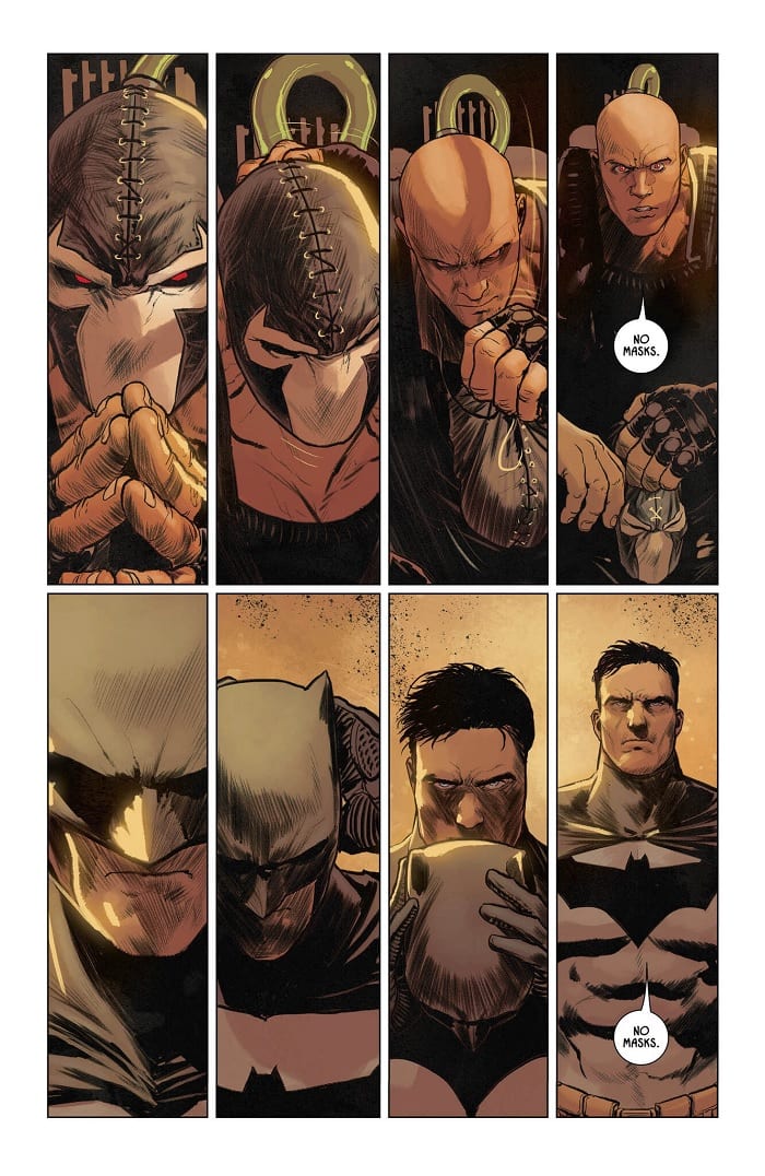
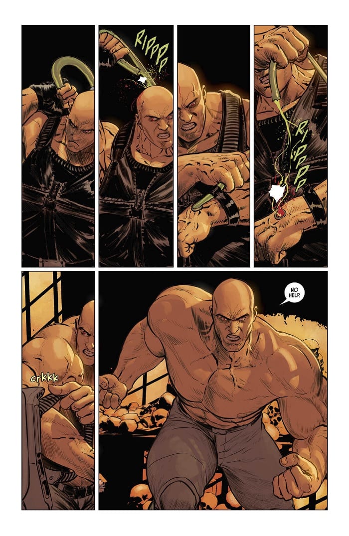
The two agree to a straight-up, bare-knuckle fight. No utility belt, to Venom…nothing. But of course, there’s much more going on here. The balance of power shifts constantly, keeping readers on the edges of their seats with dynamic, well-paced writing and artwork.

Batman #82

The Writing

The core of the narrative in Batman #82 is focused on the showdown between Bruce and Bane.

Over the last thirty or so issues of Tom King’s run on the series, we’ve watched as Bruce, Thomas Wayne, Selina, and Bane all jostle to determine who has the upper hand over the others. The balance between these characters shifts constantly. We’re never really sure who’s outwitted the other parties; just when you start to believe one might actually get the drop on another, the tables turn.

King ramps up that teeter-totter dynamic considerably in Batman #82. It seems that, on just about every page, one character upsets another. Such a dynamic narrative could give readers whiplash, but thankfully, King manages to nail the pacing, which makes for gripping storytelling throughout the book.

The writing is tense and engaging. The reader wonders: will Bruce manage to topple Bane? Does he have a plan to contend with his father? Will the story take another dramatic turn? Right up to the last two pages, we’re left unsure about who will ultimately come out on top.

The only point where the writing falls flat is when Bruce and Selina recall they had conversation about their plan to take on Bane. In mid-fight, we have the two characters taunting their opponent in the kind of blasé tone of inane chatter that occasionally slips into King’s work. Other than that, though, it’s great stuff overall.

Batman #82

Batman #82

The Artwork

As we see in the preview pages above, artist Mikel Janin preserves a sense of symmetry and a continuum of motion through the use of repeated motifs. The artwork throughout Batman #82 is evenly divided into grids. However, Janin still manages to keep things visually engaging and lively from page to page.

In terms of artwork hitting the beats of the story, this is some of the most impressive material we’ve seen on the post-Rebirth run of Batman. The reader feels propelled through the story, compelled from one page to the next. The only points at which things drag slightly are, again, when Bruce and Selina offer their “How I Did It”-esque bit of exposition.

Not to be outdone, colorist Jordie Bellaire also turns in some of her finest work yet on the series with Batman #82. Much of the book has a consistent reddish, yellowy hue. The intensity of the colors increases as the fight progresses, though, shifting to a more intense, fiery tone like the crescendo of a piece of music. It’s tasteful, yet highly-expressive work.

Batman #82

Final Thoughts

Batman #82 is an excellent, well-paced showcase of storytelling ability through sequential art. Definitely pick this one up.

Monkeys Fighting Robots Youtube

THE MAGNIFICENT MS. MARVEL #9 Gets REAL On Us

Cover by Eduard Petrovich

Out this week from Marvel Comics, The Magnificent Ms. Marvel #9 is both heart-wrenching and uplifting, it will quickly unsettle you but gradually bring you back with its wholesome scenes to follow.

Ms. Marvel has always felt like a symbol that you CAN still make new superheroes fresh and awesome. Anyone who has kept up with Magnificent Ms. Marvel might not have kept those same thoughts in mind the entire ride. Not to say they’ve been bad, I still enjoyed watching Kamala’s parents interact with alien life, as goofy as it was. But there’s still a clear hill to topple for this series to reach what it could be.

Issue #9 continues this story arc about Kamala’s father. (Spoiler warning for past issues) Yusuf Kahn is dying of a very new and unknown illness that doctors can not find a treatment for. Kamala turned to Tony Stark in issue #6 but even Iron Man did not have a way to help. Which lead to a lot of pain, and struggle for the Kahn family.

This was a very real tone that was significantly different from story arcs in previous Ms. Marvel runs. At first, it was a tough pill to swallow. However, issue# 9 really brings it together. Without giving too much away, the issue begins with Kamala and Zoe (Who I’m so happy to see again finally) at Kamala’s house on the dreaded homework grind. This scene is abruptly and horrifyingly interrupted by an off-panel yell and CRASH. Shown to be Kamala’s father who has fallen over in the next panel.

A shocking panel that still puts a knot in my stomach!

The lettering by VC’s Joe Caramagna in this scene made it all the more bone-chilling. It’s depressing when a close family member has any form of illness, let alone your own father. For Kamala I imagine hearing this yell, clearly from her father, was terrifying and the two panels that create this scene feel as real as it can get. It was the simplicity of the lettering that made it this way. There’s a sense of urgency, the way no one says anything when something like this happens, everyone hears it and reacts on instinct alone.

Ian Herring’s coloring for this scene is well executed. The way the first panel has that red tint over everything adding to the look of shock and heavy tone in the air. Speaking of that look of shock, Minkyu Jung’s penciling of this entire scene is very on point. The character expressions are believable, there’s a sense of blank fear on everyone’s faces followed by that rush of realization and worry. Paired with the inking by Juan Vlasco, who emphasized these dark foreboding shadows that linger around Kamala in the hospital after, this issue really does bring the art style for this series together.

It’s been a tough transition coming over from G Willow Wilson’s run with Kamala, where the struggles had more emphasis on social issues than domestic. But this is an issue where I feel the team starts to bring it all together and define the story they’re trying to tell. Magnificent Ms. Marvel is telling a harsher more real story than the previous series. Something less “Saturday morning cartoon” feeling which has its ups and downs for this character.

That’s not to say this entire issue stays like this. While things start off seeming as bad as it can get for Kamala and her family, this rest of it ends up focusing a lot on showing her relationships with characters. (As the cover by Eduard Petrovich may have implied)

Starting very simply with her and Zoe just palling around talking about Zoe’s potential crushes, we see their light-hearted relationship as school friends. But even Zoe doesn’t come with Kamala to the hospital. Of course, it’s Bruno who comes to her side instead. Anyone who has kept up with Ms. Marvel going all the way back to 2014 knows Bruno and Kamela have a relationship that is bittersweet and can only be described by the term “It’s complicated” at best. But Bruno coming to Kamela’s side in this detrimental time shows a lot for how close they still are despite their history.

Ain’t that just the sweetest thing?

Among these relationships, we also get to see a little Iron Man and Kamala in this issue, with Tony making a brief appearance. During Civil War II, Kamala once stated that the conflict between Tony and Carol Danvers, (Captain Marvel) was like her “superhero parents are getting divorced.” –Ms. Marvel #10 and I believe Ahmed has really kept that in mind when writing Iron Man in this issue.

Never mind this is DEFINITELY the sweetest thing.

While Tony describes himself as an uncle to her, there’s a clear sincere relationship between these two and that Tony will do anything for Kamala, much like a father would go out of his way for his daughter no matter the circumstances. This is a very wholesome part that adds relief from the heartbreaking moments in the beginning. As well as giving the reader hope for events to come.

Magnificent Ms. Marvel #9 ends on some action with the return of a classic villain who I will not spoil, leading into some more expected action for issue # 10. The end of the issue has one more surprise I’ll leave be, and overall this is a good issue for the new run. If you’ve been following this story but have not been crazy about it this issue may jump-start your interest in the series again. I recommend it for any long-time Ms. Marvel fan.

Read it already? Let us know how you felt about this issue in the comments below!

Monkeys Fighting Robots Youtube

CRONE #1 – No Rest for the Wicked

CRONE #1, out this Wednesday from Dark Horse Comics is all the proof we need that one can never truly outrun their pasts. Dive into a dark and brutal tale, one that twines the past and the present together.

This is not a woman you should risk angering.

***SPOILER WARNING***

A new dynamic team has gotten together to bring us Dark Horse’s latest dark epic, Crone. Dennis Culver (writer) takes the helm, with Justin Greenwood (artist) and Brad Simpson (colorist) setting the bloody tone of the series itself.

Crone #1 introduces us to Bloody Bliss, a warrior of legend – and one who has moved to the mountains for retirement. Or a bloody death, it’s hard to tell. But even the greatest of warriors can’t hide from the fight. And the past is always waiting to get dug up again.

And so it begins…

Crone #1 starts with a tale from the past – setting the scene and introducing us to the adventurous and gory history that Bloody Bliss became known for. Even this small hint gave a solid idea of her fighting prowess while giving us the impression that there is so much more to her tale.

Despite her chosen career path, Bloody Bliss somehow managed to live to a ripe old age. And boy, is she bitter about that fact. It’s a perfect example of the trope, the warrior who doesn’t want to die quietly in their sleep. And yet, there’s something more lurking beneath the surface.

As you can see, Bloody Bliss has earned her nickname.

Splitting Bloody Bliss’ tale into two parts, the past and the present, added vital context to the series. Yes, Bliss is now the Crone, and there’s little doubt that she’s still a brutal warrior. But we also needed to see the younger version of this warrior, to truly appreciate her abilities. And how much of an effect time has had on her?

Culver’s decisions for the introduction of this character and her story enhanced it all. Okay, the whole concept of an old crone warrior is pretty awesome on its own, we can admit that. But Culver takes it and forms it into something new and different. There are still a lot of questions that need answering, but the series will undoubtedly get to it.

What do we say to the god of death?

Take a look at the cover of Crone #1. This cover will give you an excellent example of what is to come. The style is evocative, and yet delightfully bloody. Any comic reader hoping to get their hands on a gore-fest will not be disappointed.

There are two distinct sets of character designs and even styles, to a slightly lesser extent. The tale of the past shows a Bloody Bliss living up to her name – covered in blood and shedding it all over the place, and loving every moment of it. Meanwhile, the Bliss of the future, the Crone, shows a woman worn down by time, and yet no less dangerous or agile. Greenwood worked hard at making the two time periods distinct. And again, it’s believable that this is the same character.

Perhaps the most striking difference between the two was the decision to alter the color palettes. The bloody past has a red hue on it, which is appropriate, given the battle occurring. But the present is a much colder tone, with blues taking over the scene. It was compelling and memorable, and we’re going to have to give Simpson credit for what was done here.

Lastly, Pat Brosseau was the letterer for this issue, and we can’t forget about their work here. This single issue boasted plenty of conversations, naturally. But it also had a lot of sound effects, which certainly added to the impact of several scenes.

What could these people possibly want from the retired Bloody Bliss?

Crone #1 was an exciting start to what is already proving to be a bloody series. But we were expecting that. What is impressive is the amount of finesse worked into the tale. Our Crone is tortured and desperately holding on to the oaths she has left. She’s not at all what we expected. She is, in fact, so much more than that.

Monkeys Fighting Robots Youtube

WASTED SPACE #11: The Psychological Trials of A Tortured Soul in Space

WASTED SPACE #11, out this Wednesday from Vault Comics, is the beginning of an all-new plot arc surrounding Billy and his allies. Naturally, that means there’s about to be a whole lot of chaos for the readers to absorb.

Annnd they’re back! What a sight for sore eyes.

***SPOILER WARNING***

Wasted Space has been an amusing and shocking series right from the start. But the new plot arc started within Wasted Space #11 is already proving to be the biggest upheaval of the series. So far, at any rate. There’s little doubt that Billy will find himself in an even bigger mess in the future.

This slightly screwed up team of misfits has a mission. They know what that mission is, even if they’re plagued by self-doubt from time to time. It hasn’t been an easy job – not by a long shot. And yet they’re still moving forward.

Wasted Space is a perfect read for people looking for something that borders between inane and twisted. It’s a nihilist’s dream come true – in space.

It looks like Billy and his crew are working on a new plan.

Michael Moreci outdid himself when he sat down to write this plot arc. It’s without a doubt the best the series has had to offer so far. Considering the fact the series has been a chaotic blast of a read so far, that’s saying something.

Wasted Space #11 has somehow managed to up the ante, bringing us a Billy who is simultaneously at his best and his worst. That’s only just the beginning; there are several things in motion in this latest plot.

Have you ever picked up a comic book and been utterly blown away by the events in those pages? That’s what reading Wasted Space #11 is like. This issue puts Billy and his crew through every emotion known to man – and then some. The roller coaster of emotions is both shocking and compelling.

The transitions between each set of emotions were sudden, and sometimes a little bit irreverent. But it flowed nicely with the way this series has gone so far. And it was a poignant reminder that when on a hero’s quest, one can never truly prepare for everything. Especially not when you’re in space, with a team such as this, on a ship held together by duct-tape.

Billy’s journey at times seems like a hero’s quest. And at other times reads like an extreme form of self-flagellation. So it probably shouldn’t come as a surprise when we see a gambit of emotions such as this one. We need these intense moments of emotion to balance out some of what we’ve seen Billy go through.

And something is about to blow up. Also, poor Squee!

Wasted Space #11 has that iconic look that readers have come to expect and adore about this series. Our characters look ragged – as would anybody spending that much time in space (in a ship that’s not doing too well, mind you). But it’s more than that. What’s especially impressive is how much emotion the artists were able to work into the expression of our characters.

The chaotic moments were a lot of fun to see, as well. The sense of movement and the explosions were especially fun. But when aren’t explosions fun? The self-censoring is still on-point, as well. There is nothing like a giant smiley right up in your face to remind you of everything you don’t want to be seeing.

Hayden Sherman and Jason Wordie are a power team when it comes to this series. They understand the story being told. Everything feels so balanced.

That’s one heck of a dramatic pose, don’t you think?

Wasted Space #11 was one heck of an issue. The creative team has good reason to be proud of this one. But don’t worry – all of those emotional moments are perfectly balanced out by chuckle-worthy moments, and more than a healthy dose of twisted humor. In short, it’s exactly what the fans have been looking forward to.

Monkeys Fighting Robots Youtube

Nothing Is As It Seems In NOMEN OMEN #2

NOMEN OMEN #2, out this Wednesday from Image Comics, throws Becky’s life into even further chaos. This fascinating and dark tale continues, creating more questions for the readers as it goes.

Is there about to be a new hero on the scene?

***SPOILER WARNING***

Nomen Omen has been described as an urban fantasy saga, and yet that term doesn’t cover all of the mystery and obfuscation occurring within these pages. Last we saw, Becky Kumar had miraculously survived an accident that should have killed her. So somebody else stepped up to try and balance the scale. But it’s not that simple, is it?

Well, as it turns out, Nomen Omen #2 manages to raise even more questions from us readers. Becky’s tale isn’t over. If anything, it appears to be just beginning. There are forces at work in this city, but one cannot tell by sight which side they are on. That makes the job of surviving rather difficult.

The alternate cover gives us a good look at some of the other characters in this series.

Nomen Omen #2 is not inclined to give Becky – or the readers – a chance to stop and process what just happened. Marco B. Bucci has written a wild ride of a series, throwing us from one point to the next in dramatic fashion.

Naturally, that’s raising a whole lot of questions. Questions that we’re hoping the following issues will take the time to answer for us. After all, the series only has another thirteen issues to work with. And we’re just dying to know what is going on here.

What is clear is that there is more going on here than meets the eyes. Oh, and you can’t trust your eyes to judge who is friend or foe. We think. Again, a whole lot is going on in this issue. But we do know who is protecting Becky, versus who appears to be hunting her. So there’s that.

That is a BIG monster on this alternate cover of Nomen Omen #2.

Perhaps the most memorable part of this issue comes from the artwork within its pages. Nomen Omen #2 boasts some dramatic work, as well as a sudden change in the color palette. While the covers feature a vibrant scene, the inner pages seem to be muted and dulled. And from the way the story is being told, we can only assume that was with intent. This assumption is confirmed, based on the few pages full of color and life – pages that will snag your attention thanks to the sepia-toned pages surrounding it.

It was all very cleverly done. Though it is, once again, making us anxious to see how it all pieces together. Jacopo Camagni was responsible for the art and colors in this issue, and the cohesive nature shows.

The other artist on this issue, Fabio Amelia, was in charge of the lettering. Their lettering was on-point, and the work was subtle – except for the should effects, which were as bold and in your face as they should have been.

And here’s a peek at next month’s cover.

Nomen Omen #2 was an interesting addition to the series. While it did raise more questions than it answered, the tale has still been enjoyable. Becky’s quest has only just begun, and we’re finally starting to understand how much bigger this is than just her.

Monkeys Fighting Robots Youtube

A Whole New Flerkin Problem MARVEL ACTION: CAPTAIN MARVEL #3

MARVEL ACTION: CAPTAIN MARVEL #3 is the cheerful and amusing conclusion to the Flerkin plot arc that we’ve all been hoping for. Coming out this Wednesday from IDW, this issue is everything that Captain Marvel (and Flerkin) would have wanted.

The Guardians meets Flerkins…that actually sounds familiar, doesn’t it?

***SPOILER WARNING***

Marvel Action: Captain Marvel has been a delightful and quirky series. It’s one of those rare series that is perfect for fans of all ages. And it shows our heroine in the best light. And okay, it also includes lots of Flerkins, and thus is automatically guaranteed to be awesome.

Naturally, that meant that we had high expectations for the final issue in this rather short series. But did it hold up to those expectations? Yes, yes it did. This issue was perhaps the quirkiest of the series, sneaking in little moments that will make you smile (or full-on laugh out loud).

Marvel Action: Captain Marvel #3 brings the Guardians of the Galaxy into the mix. And you just know how Rocket feels about Flerkins (spoiler alert: he hates them). So not the best mix out there, but thankfully this version of the Guardians of the Galaxy is adorably supportive of Captain Marvel and all of her horrible cat puns. So they’re more than willing to help save the day.

And yes, we do consider freeing a bunch of Flerkins from a Kree mind control device as saving the day. If you don’t agree, well, you’ve probably run across a cranky Flerkin or two in your life. And we feel bad for you.

A better look at our furry friends and their saviors.

Sam Maggs had a slightly whimsical take on the whole Marvelverse in this series, but it fits in well with the subject at hand. Seeing the Guardians of the Galaxy in a toned-down form was oddly adorable and endearing. But don’t tell them we said that.

The girl power/bestie power in this issue was an absolute highlight, and a joy to read. Jess and Carol are friendship goals, plain and simple. They’re a perfect example for young readers to see. And a healthy dose of nostalgia for the older readers in the audience.

But those puns! Carol has clearly been saving up on her cat puns because she unleashed in this issue. And just when you think you couldn’t roll your eyes hard enough, Jess joins in on the mix. And she’s got mad mother puns to throw around.

The conclusion to this issue, and thus the series, will make readers laugh out loud. The character interactions, in particular, are a pure delight. As it Drax’s request. And we’ve got to know – is anybody else hoping that this becomes canon? Because, yes please!

The artwork in Marvel Action: Captain Marvel #3 perfectly matched the writing. It was light and bubbly. But let us not ignore some of the things the artists were able to sneak into this issue. Such as Chewie in a spacesuit, it’s not something we knew we needed in our lives until now.

Sweeney Boo was the lead artist, and they are directly responsible for some of the best moments. There’s the aforementioned Chewie scene, of course. But there’s more than that as well. It isn’t every day that an artist gets to render dozens of Flerkins in a single scene, so Boo clearly made the most of it.

The colorist, Brittany Peer, helped to increase the amusement of the issue. Her colors were bright and fun. Peer was not afraid of going with vibrant colors for the backgrounds in some scenes, but in a way, it worked.

Finally, Christa Miesner provided the lettering did a solid job of it. What do you think the odds are that Miesner was able to add in those puns while wearing a straight face?

Marvel Action: Captain Marvel #3 was the conclusion the readers deserved. It was quirky and delightful – perhaps more so than the previous two issues, which is saying something. It was a lighter take on the superhero life, and that allowed for some comical and lighthearted moments. And it was exactly what we needed.

Monkeys Fighting Robots Youtube

NEW MUTANTS #1 – Old Crew, New Space Adventure

Space travel, snappy dialogue, interpersonal/group conflict, and action are just a few of the many amazing things you’ll find this Wednesday in Marvel Comics’ phenomenal NEW MUTANTS #1!

Aren’t hip with the New Mutants? Or you just need a refresher on some of the characters? Check out Marvels roll call to get caught up!

Art by Rod Reis, Letters by VC’s Travis Lanham

New Mutants in Space

New Mutants #1 starts its story as a simple trip to space, with the group making their way to see a friend. That may not sound like a simple start, but for mutants that’s just another Sunday. But, with their ride being the famous Starjammers – a group of galactic pirate outlaws – it’s more like a Mutant Friday. Couple in their knack of not listening to authority figures, then you have one hell of a space trip.

Writers Jonathan Hickman and Ed Brisson keep the attitude upbeat, and the zingers fast with dialogue that makes you want to be one of the ‘cool’ New Mutants. If the X-Men were the adults that stay home and BBQ, then the New Mutants are the cool hip kids that go out Friday night and watch Jubilee in concert, even if they have work the next morning. Any moment a character speaks, one of the team has a retort ready in the saddle. But no two characters sound alike.

Instead, Hickman and Brisson can retain each member’s characteristics, while showcasing why/how they work as a team. By the end, the group of mutants starts to feel akin to a family, more than a team.

Art by Rod Reis, Letters by VC’s Travis Lanham

Respecting The Old, Embracing The New

One of the highlights of the original New Mutants run was the art provided by Bill Sienkiewicz. Even today people talk about it’s impact, and how unique it is. Artist Rod Reis style emulates Sienkiewicz, but never strays to far into the absurd. This limiting of absurdity bodes well, because as revered as the unique style is, it’s hard to market to new readers.

Only praising Reis with his likeness to Sienkiewicz is a disservice of how great his art is. Between the fluid lines and watercolor esque look, Reis’ art is jaw-droppingly beautiful. Nearly every page will have you rereading it, but instead of words, you’ll be scanning the pencil and colorwork. Reis executes one of the few fighting moments with raw chaos, yet is still able to contain the pencils and colors in the panels. Or when personal moments happen between characters, Reis drops the background emphasizing what transpires.

Keeping pace with Reis’ art and colors is a grand task, seeing how abstract and chaotic it can become. Throughout New Mutants #1, VC’s Travis Lanham can keep said pace. This is seen exponentially in the two moments Lanham uses sound effects during the Magik and Raza. In this clash of steel, Lanham bends the lettering around the action, never getting in its way, yet still standing out gloriously.

Art by Rod Reis, Letters by VC’s Travis Lanham

To Space And Beyond!

New Mutants #1 is one of the best first issues to come out of the recent Dawn of X line. Between its fun and lovable characters, high stakes plot, and breathtaking art New Mutants deserves a spot in your pull list.

Cover Story: Graphic designer, Tom Muller knocks it out of the park again with an abstract cover! Much like the Excalibur #1 cover, I don’t know if it means anything deep. But it’s awesome!

Variant Cover by Tom Muller

Memorable Quote: “If you ask me to do that again, I’m probably going to punch you in the face. So. Many. Times.” – Mondo

I wouldn’t call myself a Mutant Master, but as a kid, I did own the Marvel X-Men The Ultimate Guide. Meaning, I knew my fair share of mutants. But, I’ve never heard of Mondo, and after New Mutants #1, I’m a fan of him.

Old Reader, New Reader

Four titles under the belt and two more to go how do you feel about the new line of X titles? Comment below with your thoughts.

Monkeys Fighting Robots Youtube

What Is Lost in WEB OF BLACK WIDOW #3

WEB OF BLACK WIDOW #3, out this Wednesday from Marvel Comics, continues Natasha’s journey to find the truth – and the person digging up her past. The series so far is a gritty tale that fans of the Black Widow will adore.

This cover looks mildly concerning for our Black Widow, does it not?

***SPOILER WARNING***

Black Widow‘s series has always excelled at questioning some of the darker elements within Marvel. Natasha’s backstory alone opened a pathway for that discussion. But this latest plot arc in Web of Black Widow #3 has taken it further than ever.

The past is never far behind. And it doesn’t matter if you can remember it or not – you cannot run from it. Even Natasha, who is willing to face this problem head-on, is going to have some difficulties. All thanks to the memory loss she’s learning – and how it was more significant than she initially assumed.

A refresher (up top) for those who need it, and an excellent view of all the creative members involved.

Web of Black Widow #3 does an excellent job of weaving several plots together. As with the last few issues of the series – the past and the present are dancing with one another. Slowly, they’re merging into something so much more significant.

Jody Houser has done an interesting job here, forcing Black Widow’s history to the forefront. Even in the way the story is being told makes it clear that there are holes in the story. And that means there are holes in Natasha’s memory.

There were some truly fascinating moments within this issue. And all because the series has taken the time to set the scene. It makes us wonder what will be next – because it’s clear that they’re building up to something.

This is going to be interesting…

Web of Black Widow #3 hosts a variety of dramatic moments, and thus there are plenty of opportunities for the artists to have some fun. Ironically, while the fight scenes are exciting to look at – they aren’t the highlight of the issue. No, that award goes to the flashbacks.

Each issue has shown us a different set of events from Natasha’s past. But this issue had some of the most striking examples. Perhaps the best decision of all was not to fully render secondary characters in the scene. Instead, they appeared blown out – more of a glowing white than a person with identifiable features. It resonated strongly with the concept of Widow missing parts of her memory.

Stephen Mooney (pencils and inks), Triona Farrell (coloring), and VC’s Cory Petit (lettering) worked together to bring us this issue. And their teamwork is notable. It’ll be interesting to see what they decide to tackle next.

And an old ally suddenly comes into focus.

Web of Black Widow #3 was a strong addition to the series. Black Widow seems to be a bit closer to answering the mystery at hand. And yet there is still so much that we need to learn about what is happening. And this issue seemed to raise more along the way.

It’s a solid issue, reminding us that Natasha is and always was more than what her previous employers wanted her to be. And yet, there is still a tie to her past. One that she’ll never be able to cut free from.

Monkeys Fighting Robots Youtube

Review: Reality Grows Ill In THE DREAMING #15

Writer Simon Spurrier and artist Bilquis Evely helm what may be the most tense and dread-inducing chapter of The Dreaming thus far with issue #15: “The Crown, Part One.”

Abel, keeper of Secrets and Mysteries; Murderer and Victim

Wan, the fully-sentient “dream machine” that has taken Dream of the Endless’ place has assumed control of the Dreaming as it has seen fit. However well this entity may mean, it still has the callous touch of a soulless mind. The decisions it makes have started to bring more harm than good, and Matthew the Raven’s need to find the true Dream Lord has reached its climax. There’s even more to Wan than any of the Dreaming’s residents could possibly know, and with it in control of people’s subconscious, reality begins to head in a devastating direction.

For the first issue of his final arc on this series before G. Willow Wilson takes command, Si Spurrier trades in the humor and sweetness of the previous issue for all-out dread and horror in this one. This issue is full of trademark Sandman narrative queues, such as the repetition of a key idea and the numerous important anecdotes of those having dreams outside the primary story. Spurrier has always been able to ape Gaiman’s writing style when necessary for this series, but what he can do with character and narrative is a skill all his own. Longtime favorite Sandman universe characters are still reacting to the leadership change and their own struggles, but none as hard as poor Abel with the loss of his brother, Cain. Having to pull double duty as the keeper of Secrets and Mysteries now is doing more trauma to the character than can be stated here, and Spurrier handles it with a deft hand. The shocking revelations and sudden left-hook twists will stick in the mind of any reader, and it all feels earned. All of the different and seemingly unrelated plots introduced in earlier issues are becoming intertwined in true Sandman fashion, making it an absolute treat to see where it could be going next.

Bilquis Evely just doing what she does.

Once again powerhouse artist Bilquis Evely returns to give Spurrier’s words form, and as always she knocks it out of the park. Her ability to blend grounded realism with visions beyond absurd or fantastical and maintain such a huge range of expression and detail is likely her greatest artistic feat, and it’s on full display here as usual. This issue is slightly more grounded because of its plot, but it still gives Evely plenty of room to stretch her talents on the full cast of characters and the emotional turmoil they currently face. Her pencils are brought to life by Mat Lopes’ colors, which cater to every bit of life and detail the art deserves. An endless palette of colors, from deep blacks to neon pinks, breathes life into each issue of The Dreaming and this issue is no different. It’s simply jaw-dropping work from the art team behind this series.

Simon Bowland’s lettering is sharp and clear, while also adhering to concepts set forth in Gaiman’s Sandman. For this issue specifically, the special lettering Matthew the Raven’s dialogue gets is replicated perfectly while still obviously being easy to read.

The Dreaming #15 kicks off the final arc of Si Spurrier and Bilquis Evely’s run with a thick atmosphere of foreboding and suspense. Eloquent and beautiful without being too dense, The Dreaming still proves itself to be a worthy successor to Sandman and the rightful flagship title of DC’s “Sandman Universe.” It will certainly be a privilege to witness where Spurrier and Evely take this story in its final three issues.

Monkeys Fighting Robots Youtube

Review: Space-Pirates Stay Sleazy in YONDU #1

Writers Zac Thompson and Lonnie Nadler team up with artist John McCrea to deliver an opening issue for Yondu full of low-class and trashy characters in the dirtiest reaches of the galaxy – just as the old pirate deserves.

Yondu Udonta, the criminal voted most-likely-to-owe-you-money in the galaxy, has learned how to survive on his own. After being cast out of his Centaurian tribe at a young age, he’s learned how to fight, double-cross and steal his way to safety and a quick buck. On the verge of a serious payday, Yondu stumbles across one of the most valuable objects in the universe: The Herald’s Urn. In the process of trying to flip it for a pile of cash, the pirate learns that his Centaurian heritage may mean more to himself – and those of his tribe – than he could ever care to know. Also, he’s wanted for stealing fuel, a crime punishable by death. Such is life for everyone’s favorite Cetaurian lowlife.

The script for “Yondu #1” penned by Zac Thompson and Lonnie Nadler is full of galactic slang and internal dialogue. Yondu’s own language is somewhat minimal due to him being such a loner. When he does speak, it’s typically to try and coax his way out of something. The slang terms that Thompson and Nadler use are fitting to both the character and feel of the book, and have echoes of DC’s “Lobo” character. This isn’t a criticism, as it obviously works. An interesting note about Yondu’s inner voice that comes up as narration is that his words come across as if he were a character trying to convince himself of how he lives. There’s a good deal of imagery that suggests that Yondu is clearly unhappy with how his life turned out, but his inner voice is constantly trying to convince both the reader and himself otherwise. There’s a neat shift from Yondu to another important supporting character and that character’s culture that is essentially the complete opposite of Yondu’s voice. Where Yondu is crude and insincere, this character is noble and direct with his regal dialogue. Without getting into spoilers, this character’s culture and voice bring an extra dimension to the writing and the story at large, and it will surely be one of the most interesting aspects of this series as it continues.

Few artists can create the kind of dirty and grimy illustrations necessary for a comic starring Yondu Udonta like John McCrea can. His work here consists of unattractive lowlifes and dusty backwaters that really sell the mood of what the story is shooting for. McCrea’s art doesn’t shoot as much for detailed character expression and emotion as much as it actually caricatures such aspects. Yondu’s expressions of irritation or disgust are made visible in an almost over-the-top manner, the same of which can be said for basically every character in the book. Enviornments are given an kind of polluted and gritty look that fits the sort of “used future” aesthetic this type of low-sci-fi earns. Much of this is due to McCrea’s use of heavy shadow and cross-hatching to create a consistently dark tone to his art. This is aided by Mike Spicer’s color work, whose wide array of colors are usually cast in a kind of shaded filter. It looks as if each panel were run through a cloud of charcoal dust before being printed. Again, none of this is an insult, as it works perfectly for the kind of comic being made here.

“Yondu #1” is the start of what’s sure to be a gnarly ride through the roughest reaches of the galaxy. Zac Thompson and Lonnie Nadler have written a fun and grimy issue that doesn’t require any knowledge of Marvel’s cosmic events, so it’s a good jumping on point for someone who doesn’t know much about this universe as a whole. John McCrea’s art perfectly captures the grungy atmosphere needed for this sort of book. Any fans of Yondu – whether from prior comics or his portrayal in the Marvel Cinematic Universe – can rest assured that this is a worthy pick from your local comic shop.


Monkeys Fighting Robots Youtube