Home Blog Page 393

Review: SPAWN #302 Takes On The World

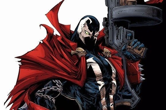
SPAWN #302 cover artwork

SPAWN #302 opens up an exciting new chapter for everyone’s favorite Hellspawn. Available in comic book stores on Wednesday, November 6th, Todd McFarlane’s latest installment is clearly riding on the coattails of the events from issue #301, featuring Al Simmons, a.k.a. Spawn, adjusting to his new “celebrity status” as Earth’s fighter against injustice. At the same time, new configurations of Hellspawn have seemingly erupted from the Earth itself, and corruption in all forms plague society.

It looks like this crusader has more than enough to keep him busy, but will his one-man army be enough?

Story

As if the notoriety and acclaim wasn’t reward enough for his recent feats, Spawn also received major suit update a few issues ago. The character’s gone through many costumes throughout his history, but this particularly change is significant in that it marks a clear distinction between the man and mask. Simmons is able to send the symbiote suit to do his bidding apart from his body—a practice he’s been prone to enacting on his targets as of late.

On top of these new abilities, readers witness Simmons embrace aspects of who he was before his death. Rather than relying solely on Hellspawn powers for the crime-fighting throughout this issue, he’s found the confidence to rely more and more on his military training to do the job. No suit? No problem. Because as we learned in issue #300, the power of this hero is in the man, not that costume.

But despite the relative ease with which Simmons tracks down corrupt businessmen and dealers in this issue, a greater threat slowly bubbles to the surface in conjunction with his improved powers.  Is there anyone who can lend aide to the hero?

Artwork

SPAWN #302’S illustrations embody an impressive blend of realism and supernatural horror. McFarlane and Jason Shawn Alexander’s penciling and ink work provides readers with crisp representations of Spawn and the men he murders, gore and all. This is completed by colorists Peter Steigerwald and Greg Menzie’s deep shades of crimson and black, with a splotch of bright green to remind us of the necroplasm that’s ever-present in our hellish hero. And Tom Orzechowski’s lettering ensures all of this artwork remains in focus by placing his long swaths of dialogue text in optimal spaces in each panel.

Comic Covers

SPAWN #3-2 variant cover

Covers A, B, and C

McFarlane and Greg Capullo’s penciling and Menzie’s coloring for these covers are top-notch Covers A, B, and (colorless) C depict Spawn in his sleek new suit while holding an impressive military-grade gun, reminding readers that this hero is ready to continue the fight with both his Spawn powers and combat training. .

Covers D and E

McFarlane and Menzie take on covers D and E as well, which feature Spawn and the newly introduced She-Spawn from a few issues back. This helps promote the mini She-Spawn series that could potentially coincide with the main series. We hope so; Spawn needs all the help he can get to face the coming battles.

Conclusion

The new storyline McFaclane sets up in SPAWN #302 has the potential to renew the character’s universe with multiple versions of Hellspawn. Will they assist him in his fight against injustice? Or will seek to make his life even more of a living hell?

How do you think Simmons’ recent stream of murders will affect the coming events? Let us know in the comments below.

Monkeys Fighting Robots Youtube

Review: GREEN LANTERN: BLACKSTARS #1 Ushers In Controller Mu’s New World

GREEN LANTERN: BLACKSTARS #1 cover by Liam Sharp

Grant Morrison’s revival of Hal Jordan in THE GREEN LANTERN last year introduced an  intriguing, otherworldly horror to the character’s mythos. He and artist Liam Sharp crafted storylines that tackled all that is weird and unsettling in our cosmos, including an intergalactic slave trade, drug trips, and parallel versions of the hero (and a not so heroic doppelganger). Now the hero finds himself enlisted in the Blackstar militia, seemingly brainwashed to do their bidding.

Story

When Hal agreed to the Guardians’ plan to infiltrate the Blackstars ranks as a mole back in THE GREEN LANTERN, he didn’t expect to be with them long. The goal was to learn what diabolical plan Mu was setting in motion and report back. But through a series of betrayals and cataclysmic events, Hal (adopting the name “Parallax”) finds himself in the hands of Countess Belzebeth once more. And the duo is tasked with planning housewarming party for Controller Mu.

The location? Planet Oa.

monstrous exiles on Oa

The godlike Guardians are no where to be seen. In their place lie horrific monsters of a Lovecraftian nature, poised to inflict existential terror upon the protagonists and readers alike. But before a Nyarlathotep look-a-like can finish its threat, Belzebeth unleashes her own brand of terror by biting into it like an afternoon snack. Such a display allows her, a single Blackstar warrior, to gain control of these creatures trapped on an abandoned Oa and prepare for Mu’s arrival.

Baellestra lays down the law

Morrison’s depiction of Belzebeth is inspiring despite her obvious villainous nature. It’s refreshing to see a story with a woman taking the reigns in and of herself without a “strong man” leading the way. In fact, our strong man (Hal) in this scenario sits back and enjoys watching her taking the lead.

This book looks to continue upending more expectations as the two Blackstars “domesticate” more of the monstrous features of Oa before the grand master behind it all arrives. However, the question remains: Is Hal is ready to usher in a universe ruled by Mu?

Artwork

Xermanico’s penciling, Steve Oliff’s coloring capture both the sci-fi and horror elements beautifully in this inaugural issue. Xermanico brings these horrific creatures living on Oa to life with detailed views of their appendages and fangs, then quickly transitions to the sleek, clean lines found on the Blackstar ships. The colors used highlight these transitions even more, moving between the darker, earthy tones of the monsters to the industrial grays and greens characterizing Mu’s technology. One feels as if they’re caught in an imperial takeover, reminiscent of humankind’s forced control of the otherwise uncontrollable natural forces.

Steve Wands’ lettering is another great feature of this piece. His fonts often burst out of the bubbles meant to contain them, most clearly seen when the monsters of Oa scream in agony. This leaves readers doubting who the real monsters are—the creatures on Oa, or the Blackstars?

Comic Covers

Main Cover

Liam Sharp, the master artist behind the recent THE GREEN LANTERN run, crafts an action packed title in the original series’ style. This helps establish a clear continuity from the former series into Morrison’s new chapter.

Variant Cover

Diego Rodriguez and Darick Robertson’s variant cover gives readers a clearer look at Hal and his new Blackstar teammates. The former hero is standing front and center with a determined look, showing us he’s ready for the inevitable challenges lying in wait with this team.

Conclusion

The first installment to the GREEN LANTERN: BLACKSTAR series is a hit right out of the park. Our expectations were not only met but surpassed by the in-depth characterization of Belzebeth and the beautiful artwork.

Do you think Hal has completely left his life as a Green Lantern behind? Let us know in the comments below!

Monkeys Fighting Robots Youtube

Review: Paradise Is Lost In X-FORCE #1`

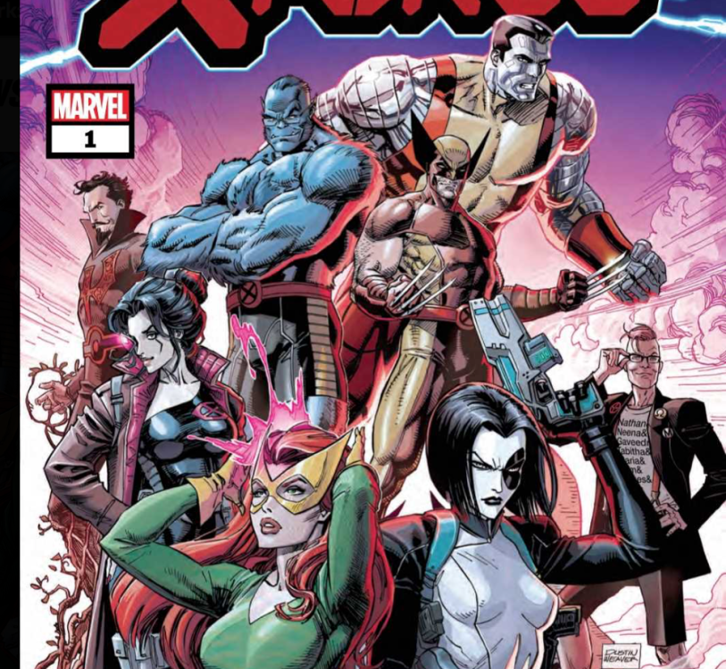
X-Force #1
Things look pretty grim for Domino in X-Force #1.

In Marvel Comics’ X-Force #1, (on sale November 6), writer Benjamin Percy unravels the utopia Jonathan Hickman has crafted throughout “Dawn of X.” Beneath the surface of the idyllic fade of Krakoa stands a nation that’s as flawed as any other, if not more so.

X-Force #1

Writer: Benjamin Percy

Artist: Joshua Cassara

Color artist: Dean White

Letter: VC’s Joe Caramagna

X-Force #1
There’s a deeper mystery beyond the one that’s sure to grab your attention.

Percy shows there’s no such thing as a true paradise, both by exploring the dark side of Krakoa’s new freedom and shattering the illusion with a devastating cliffhanger. To do so,  Percy quickly captures Wolverine’s genuine voice. Maybe more than any other character, Logan would be one of Krakoa’s most cynical residents. He’s lived a long, hard life, so he knows better than to blindly accept a supposedly perfect solution to mutantkind’s problems. Early on, a conversation between Beast and Wolverine emphasizes this character trait.

Percy’s ability to depict Logan as we know him is immediately evident when Wolverine saves Hank McCoy from a mysterious monster in a meadow. Beast asks Logan to let the creature go because he wants to study it. Wolverine, jaded as always,  reminds McCoy that there’s a predator in every meadow. He also criticizes McCoy and the others for their naivety; “That’s what Krakoa does,” Logan says. “Makes everyone feel safe. And when you’re safe, you’re soft.” This conversation is an early indicator of Percy’s mission to interrogate the notion of paradise and the consequences such a place can cause. Later, when one of the X-Men’s most beloved members is gunned down, Logan’s words ring particularly true.

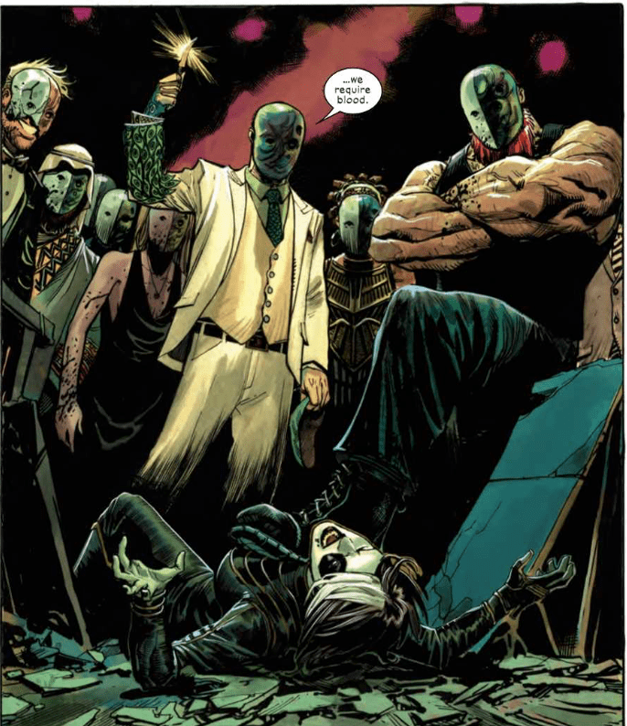
As eye-catching as the assassination is, Percy plants the seeds for a mystery even more compelling. In the first scene, we see a secret meeting of a menacing organization that could give the Court of Owls a run for its money. All the members are wearing matching masks and the group’s leader demands that they all prove their loyalty by allowing their blood to be tested. He vows to “scrub away” anyone who has the X-Gene. Hearing about this cult meeting would be off-putting enough but the art team makes it the most unsettling moment of the story.

X-Force #1
In X-Force #1, Domino meets a group pretty similar to the Court of Owls.

On the first page, the group’s leader calls his demand for blood a “purity test.” Here, artist Joshua Cassara isolates the character and he’s set against a black background. To boost the creepy factor, color artist Dean White sprinkles in red globes to foreshadow the leader’s bloodlust. When a Bane-like minion discovers the identity of Domino, an undercover attendee of the meeting, the moment becomes even more forbidding.

Cassara shows Domino’s best efforts in battle in a packed panel where she fights numerous cult members. But she succumbs to the group’s numbers advantage when a brutish goon slams her through a table. Using perspective, Cassara shows the cult members standing over a fallen Domino and you know her night’s about to get a lot worse.

X-Force #1 doesn’t blatantly bring the team together but it organically sets the stage for its formation. Of the various “Dawn of X” titles, it might be the most intriguing because it subverts the widespread idea that Krakoa is a perfect safe haven for mutants and we can’t wait to see where Percy goes from here.

What’d you think of X-Force #1? With the death at the end, is there more than meets the eye?

Monkeys Fighting Robots Youtube

Review: The Present Dooms The Future In AMAZING SPIDER-MAN #33

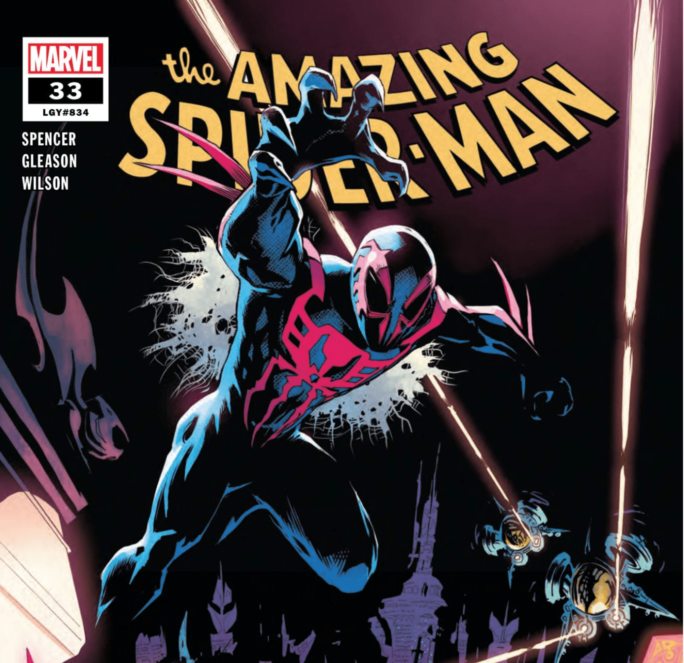
Amazing Spider-Man #33

In Marvel Comics’ Amazing Spider-Man #33, (on sale November 6), writer Nick Spencer builds the intricate foundation for Marvel 2099. He keeps the event shrouded in mystery but it’s only a matter of time before the story hits the next level.

Amazing Spider-Man #33

Writer: Nick Spencer

Artist: Patrick Gleason

Colorist: Matthew Wilson

Letterer: VC’s Joe Caramagna

Amazing Spider-Man #33
Miguel O’Hara goes out of the frying pan and into the fire.

Each and every part of Amazing Spider-Man #33 organically connects to the next. There’s no wasted space. Early on, it’s hard to see how the Foreigner’s schemes are related to the big picture. But by the end, the various moving parts combine to set the stage for a layered thriller. What’s not to like? There’s political drama, villainous planning and Peter Parker’s continual struggle to get anywhere on time. Spidey takes a backseat because the narrative focuses on the action surrounding him.

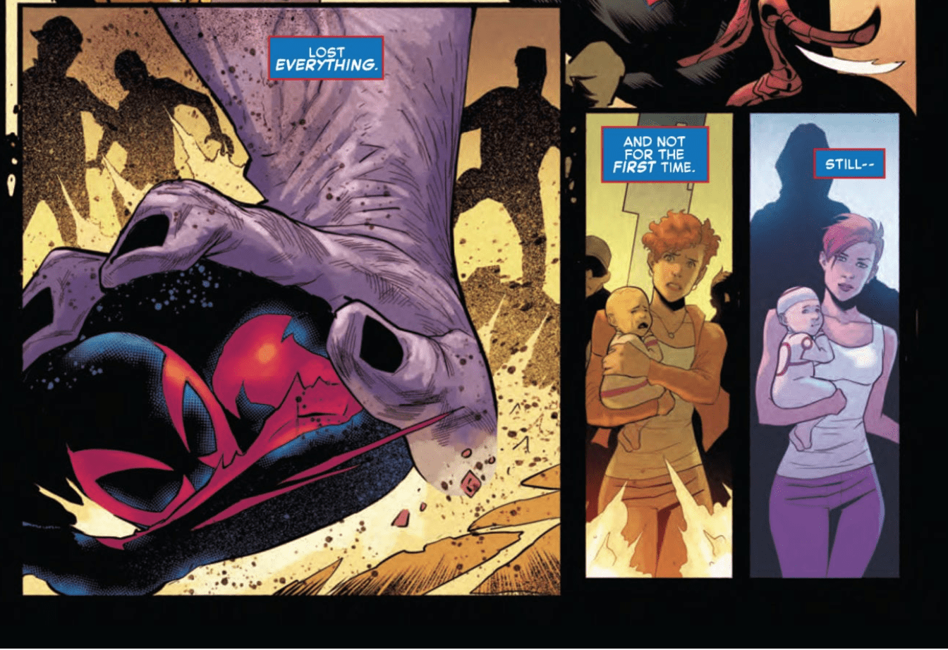
Because we’re gearing up for Marvel 2099, it’s fair to wonder how Spencer kicks off Marvel’s return to the future. Like last issue, we see Miguel O’Hara again. His displacement in time has left Miguel confused about his mission in the present. But Miguel is certain about two things: the world he comes from is in danger and he needs Spider-Man’s help to save it. You’d think  the progression of the event’s story would be primarily tied to Miguel. Instead,  the future is most evident during a presentation at Empire State University.

Here, Peter’s mysterious new classmate, Jamie, reveals his science project, one that the ever-tardy Peter supposedly worked on. It’s called the Clairvoyant and it allows the user to look into the future to calculate the statistical probability of any given outcome. While the device itself could have ramifications on the story, it’s Jamie’s dialogue that’s particularly telling.

Jamie echoes Miguel’s question in the previous issue: “What has yesterday done to tomorrow?” Through Jamie, Spencer digs deeper. As the student presents his project, he ponders the “unintended consequences of today’s innovations on the world of tomorrow.” Spencer continues to subtly include the realistic questioning of our present impact on the future. More than anything else, this exploration could be the most rewarding element of Marvel 2099 because Spencer has the opportunity to make a statement.

Amazing Spider-Man #33
There are plenty of similarities between Marvel 2099 and “Into The Spider-Verse.”

Spencer’s strong script is complemented by some fresh stylistic choices by the art team. Early on, while Miguel tries to get his bearings in the present, his view of the world is juxtaposed with his memories. When he’s surrounded by a crowd, he flashes back to the destruction of the world. Artist Patrick Gleason shifts to a sketchy, distorted style that looks like the multiverse dissonance in Spider-Man: Into The Spider-Verse. Colorist Matthew Wilson utilizes electric blues and greens to convey the impending destruction.

Amazing Spider-Man #33
In the issue’s most cinematic panel, Miguel’s mind plays tricks on him.

Gleason also showcases chronal confusion when a woman in the crowd reminds Miguel of a lost love. Gleason juxtaposes the two women in adjacent panels to produce a tangible sense of Miguel’s disorientation. In a story about time travel, the art can be crucial in conveying its numerous possibilities and the art team nails it here.

“The future just got a lot less scary,” Jamie says at the end of his science presentation. We’ve all read enough comics to know better: messing with time travel always leads to disastrous results. While we’re still not sure where the story is going, Spencer continues to build a strong structure for the impending heart of the story.

What’d you think of Amazing Spider-Man #33? Are you glad Marvel is going back to 2099?


Monkeys Fighting Robots Youtube

Review: COFFIN BOUND #4 Darkly Comic To The Bitter End

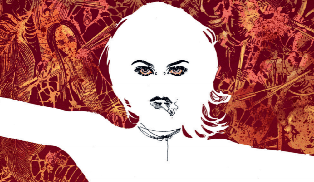
Coffin Bound cover detail
Coffin Bound #4 Credit: Image Comics

The final issue of the first arc of the Image ComicsCoffin Bound edges its way into stores this week. With an extended page count from writer Dan Watters and artist Dani, it promises to be a jolting kick to the mind as well as the eye.

What constitutes existence and exactly how far does someone have to go to remove themselves from the world? Izzy’s journey is almost over but there are still loose ends to tie up and not everyone wants her to disappear entirely.

Coffin Bound #4
Coffin Bound #4 Credit: Image Comics

Nearing the End

From the very beginning of this issue, Watters‘ illustrates the grotesqueness of violence and death. As he tells the story of Izzy he does not glorify any of her actions. The cold,lonely death that she has chosen was not an easy choice and no matter what she does to extract herself harmlessly from the world, there are always unsettling consequences.  

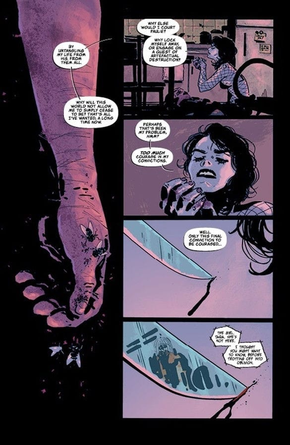
And so starts this issue, with Izzy sat in the ugly consequences of the world around her. On the one hand Watters’ makes a solid case for Izzy’s decision to die but on the other hand he highlights the awful aftermath of death. Those left behind suffer more than those who leave. Izzy’s attempts to remove herself from the world have failed and others have paid the price, others like Taqa.

Watters’ uses this bleak landscape to examine the human condition, especially relating to death and it’s after effects. His characters are experiencing consequences and reacting emotionally to a subject that is difficult to discuss. It can be argued that Coffin Bound is a personal autopsy of grief. The characters represent different reactions to a situation and their interactions are the colliding thought processes of a single mind. The desire to disappear; the rage of abandonment; the need for control; and even the urge to document; all of these are reactions to a traumatic event.

Watters’ has created a world of uncomfortable fitting characters that represents something greater, something that a reader can identify with. It is entertaining but can also act as a form of reflective therapy. You will get different reading depending on your state of mind when you pick this up.

Coffin Bound #4 interior art
Coffin Bound #4 Credit: Image Comics

Art to the End

Dani’s visual style is sublime. It encompasses a gothic horror tradition, which is present within the narrative, and combines this with modern aesthetics. Drawing on a host of modern apocalyptic influences, from Tank Girl to Mad Max, Dani produces something that is unique but familiar. There is a comfort to the setting which in turn is destroyed by the can’t-look-away horrors. 

Stripped flesh; swarming flies; shards of glass in disembodied eye balls; this is a nightmare made real however, the art is so tantalising that the reader slowly turns page after page until the very end.

The dark tones of the story are reflected in the dark tones of the coloring provided by Brad Simpson. Shadows and shades lead the reader through the quagmire of the landscape, accentuating and spotlighting areas of interest.

The scratched, impressionistic art style which utilises negative space as much as defined imagery, creates the sense of a dislocated mind. This idea is picked up by Aditya Bidikar when producing the lettering. The borders and balloon tails are not as defined as in other mainstream comics. The stark white of the balloon stands out on the darkly colored page but the forms of the balloon are broken, in some cases non-existent, which mirrors the central characters attempts to remove herself from the world.

Coffin Bound #4 Credit: Image Comics

Conclusion

Throughout the series, and in particular in this issue, the creators are illustrating a world disintegrating. The central characters are losing themselves, whether intentionally or not, and the landscape around them is following suit. Watters has created a complex story that is both a literal and metaphorical dissection of an emotional state of being. The art by Dani, Simpson, and Bidikar, reiterate this while creating a landscape on the page that reflects the emotion within the story.

This four issue run of Coffin Bound has been something to behold. A darkly comic tale of self destruction and eradication told in a sublimely modern gothic style, Coffin Bound is a visual success but is also an emotional one. It will affect readers in different ways and much of that will depend on how you approach what the creators have to offer.

Coffin Bound is more than entertainment, it is a comic book therapy session that you may not know you needed.

Monkeys Fighting Robots Youtube

Review: Rabbits, Sheep & Talking Severed Heads in RED SONJA #10

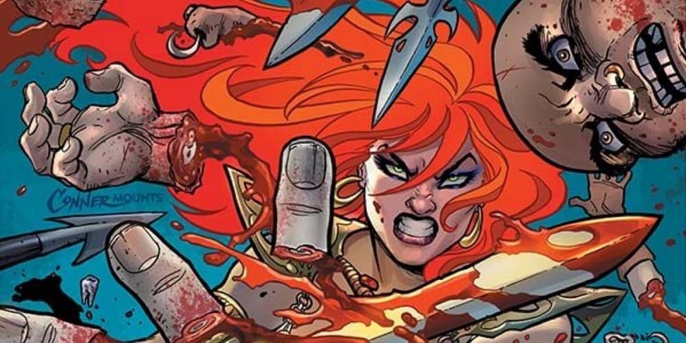
Red Sonja #10

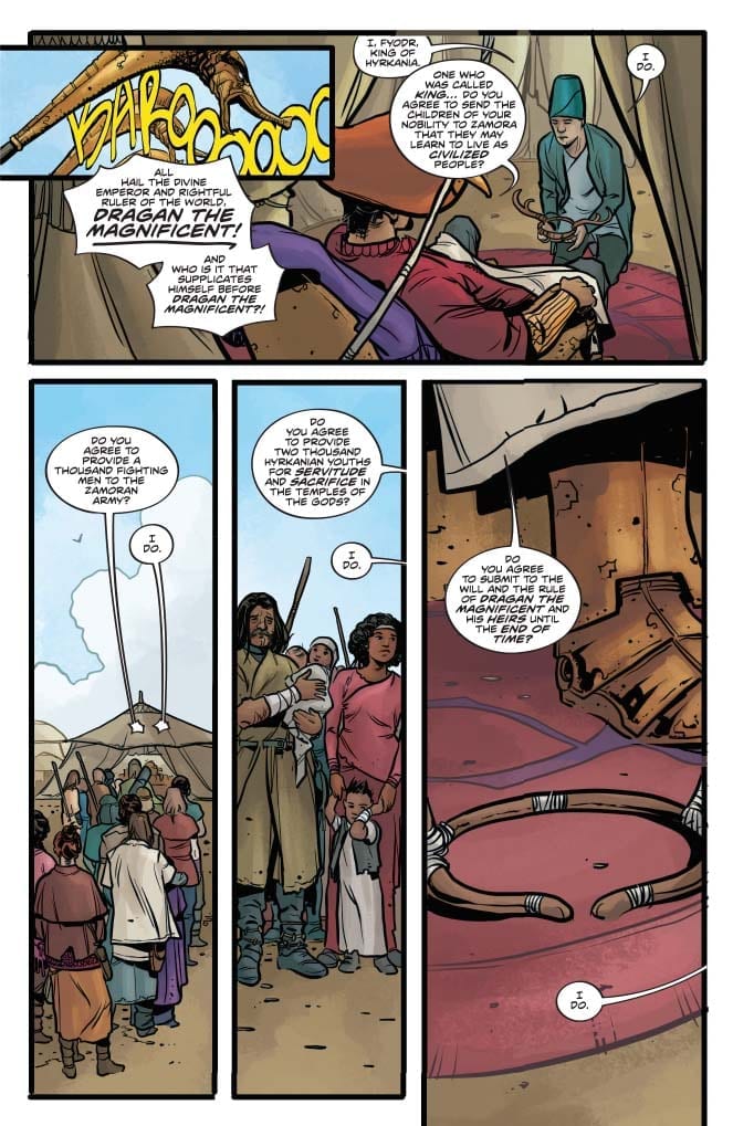
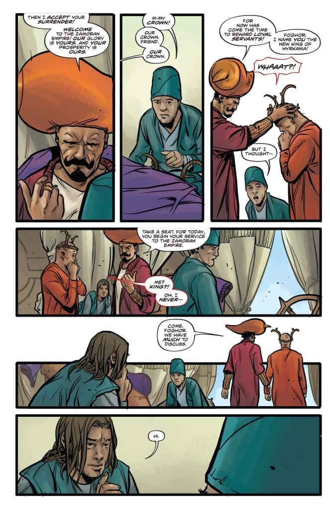
Most of her people have abandoned her. Many of her closest advisors betrayed her. Things seem bleak for our heroine in Red Sonja #10, out this week from Dynamite Entertainment.

Of course, appearances can be deceiving…if you know how to leverage your situation, and fortunately, Sonja may have a plan. Beyond that, she may find additional help from an unexpected source close to Dragan himself.

Red Sonja #10

The Writing

The majority of Red Sonja #10 is focused away from the titular character. Instead, we first have a flashback-within-a-flashback, showcasing more of Domo’s tactical wisdom, which he imparts to Sonja. After this, another flashback gives us insight on Minnas’s backstory, and how he came to serve Dragan.

One of the best elements writer Mark Russell brings to the series is the way he weaves themes and motifs into the story. There are multiple narrative threads in play in this single issue. However, Russell manages to tie them together by the book’s end. It’s almost poetic how well these seemingly-disparate narratives converge, giving the work a mature, well-constructed feel.

In Red Sonja #10 for instance, we see Minnas practicing divination in the past to determine how best to manage Dragan’s growing influence. But, while his medium can accurately see the future, it’s responses can be cryptic and tend toward misinterpretation. It’s a kind of monkey’s paw scenario that proves to be his downfall…but may also be key to his revenge. This, in turn, relates directly to Domo’s lesson from earlier in the book: “hubris is suicide.”

The only real complaint is that there are parts of the extended flashback which overlap with the present. It effectively showcases the dramatic irony of the situation, as we understand the fallacy of taking the theraphim’s advice literally. However, it can be a bit confusing on a first read through, as it makes it a little difficult to keep straight whether the dialogue is meant to be read as in the present, or in the past.

Beyond those minor gripes about craft, though, Red Sonja #10 is another excellent chapter in Russell’s story.

Red Sonja #10 Red Sonja #10

The Artwork

Artist Mirko Colak is takes over visual duties once again for Red Sonja #10. As with previous issues, Colak’s work flows well from panel to panel. One picks up on a sense of cohesion throughout which keeps the reader vested in the story.

The visuals are not exceptionally detailed or expressive, though. Characters’ faces, for instance, tend to remain stony and closed-lipped throughout the book. They only really feel especially lively when conveying over-the-top emotion. Otherwise, they’re largely inscrutable.

If we compare Colak’s work in Red Sonja #10 to that of artist Bob Q in our previous issue, there is a clear gap in the level of detail conveyed in the artwork. The backgrounds are fairly sparse and limited, while character designs feel a bit sketchier. This could be chalked up to a stylistic preference, but for my money, it feels somewhat unfinished.

The colors provided by artist Dearbhla Kelly, however, nicely capture the mood of the narrative. We see different sequences dominated by specific color schemes: dusty desert browns, icy blues, and twilight pinkish-purples. Kelly employs subtle shifts in tones to render shadows and really bring the art to life.

Red Sonja #10

Final Thoughts

Red Sonja #10 offers a rich, interwoven story that deepens the narrative and fleshes out a couple of characters about whom we knew relatively little. It’s worth picking up.

Monkeys Fighting Robots Youtube

Review: DEADLY CLASS #41- Reunions and Ruminations

Deadly Class

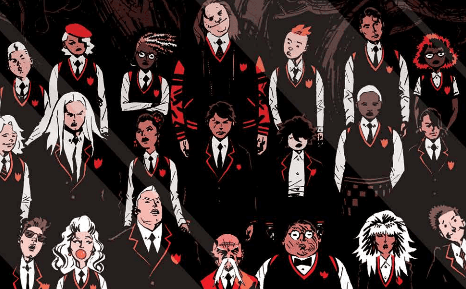
Image’s Deadly Class by Rick Remender, Wes Craig, Jordan Boyd and Rus Wooton continues to be one of the best books in the medium with another intense, somber and absolutely gorgeous issue. This is sequential storytelling at it’s best.

From Image- BONE MACHINE,” Part Two A nice, relaxing trip to a remote cabin in the woods—what could go wrong?Deadly Class

Deadly Class #41
Written by: Rick Remender
Pencils and Inks by: Wes Craig
Colors by: Jordan Boyd
Letters by: Rus Wooton

MILD SPOILERS BELOW

Story

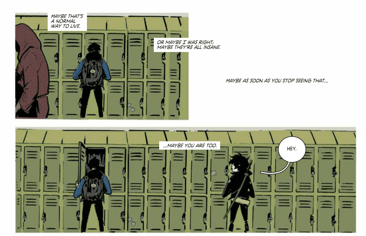
After a couple of issues with some big action, violence and turns, Deadly Class #41 slows down a bit. The bulk of this issue is spent inside the thoughts of the main character Marcus. This allows writer Rick Remender to bust out a first-person narrative. Remender is an excellent writer, and as much as Deadly Class is a sort of high concept comic, it’s when Rememender gets inside the heads of his characters that his talent really shines. Marcus’ thoughts tell us how much the character has changed since we first met him; he’s less angry young punk and more of a morose assassin and sort of school leader. But he still sees through the bullshit at King’s Dominion. Remender’s prose here flows with elegance, yet feels like the thoughts of a teenager (albeit a smart one who is also a deadly killer). It’s a tough balancing act the scribe has been able to pull in every issue.

Deadly Class
Excellent use of layout and composition!

The biggest plot development here is Saya’s return to the school and the reaction she gets from her re-appearance. Her return signals a big status change for the former bad-ass Yakuza, and where Remender takes Saya’s story from here is going to be a ride.

The end of the issue takes us out of Marcus’ head and we get our most plot-driven scene in the issue. The scene takes place in a carnival and ends in a murder, but it plays out like kids hanging at a fair. That dichotomy has always been one of the titles’ strongest narrative tools.

Deadly Class
Great way of balancing a page. And look at those colors!

Remender’s dialog also continues to be great. His teenagers talk like kids do, but there’s an element of word weariness to their talks too. These kids may be kids, but collectively they have been through more shit than any adult.

Art

Of course, the art is fucking fantastic. Since the first issue, Wes Craig has done nothing but create sheer comic book magic on every page. Deadly Class #41 is no different. Craig continues to create some of the best page layouts in modern comics. There is a balance and flow to his panels that draw on everything from Frank Miller to manga. His linework is also highly energetic, yet is clearly meticulous in composure. His inks give everything weight and form.

Deadly Class
The use of composition, colors, figures and letters on this are sublime.

When you add in Jordan Boyd’s colors, everything comes alive. Boyd is one of the best colorists in comics and pulls from a diverse palette that changes in order to suit mood and atmosphere.

The lettering in this issue is also a knockout. This issue (like a lot of Deadly Class) is very heavy on the number of words on a page. But letterer Rus Wooton’s clear letters alow for easy reading and his font just looks fucking good on the page. The layouts allow for heavy busts of words, yet it doesn’t take away from the art at all. It’s in fact integral to the whole package working. All you have to do is read the great sequence at the end of the issue to understand. It all comes together.

Conclusion

Deadly Class #41 is another great issue in one of the best on-going titles you can get right now. Comics like this are the reason you want to go to a store every week or month and not trade wait or read digitally. You want to hold this book and you want to flip these pages. It’s time you all attended King’s Dominion if you haven’t yet.


Deadly Class #41 is available at your local comics shop on November 6, 2019.

Monkeys Fighting Robots Youtube

Review: PANDEMICA #2 When World Domination Goes Wrong

Pandemica #2 cover detail
Pandemica #2 Credit: IDW Publishing

IDW Publishing’s political thriller Pandemica, written by New York Times best selling author Jonathan Maberry, reaches its second explosive issue this week. Mixing modern political concerns with theoretical end world scenarios, Pandemica is a hard hitting apocalypse story that cuts close to the bone.

When new strains of old diseases start wiping out large populations of ethnic groups, a small undercover team try to uncover the cause. This leads to the uncovering of a disturbing conspiracy and a highly motivated white supremacy organisation hell bent on gaining control of the government, and then the world. But their plans are starting to slip out of their control. In a world of modified and untested diseases, is anyone safe? 

Pandemica #2 Credit: IDW Publishing

Unsteady Beginnings

This is issue focuses on two characters and their actions in the ‘end days’. De, who the reader got to know in the previous issue, and Chick, a young more reckless agent. Maberry introduces them in action, raiding a secret bioweapons laboratory. He uses the situation to portray the main characteristics of both De and Chick so that the reader gets to know them by their actions.  

At this point some of the script is difficult to swallow. The conversation between the two characters is forced with Chick’s attitude coming off as unnatural in the circumstances. De’s speech does not have the same affect so the problem lays with Maberry’s attempt to portray Chick’s personality. 

This is not the only issue with the opening sequence. Some of the compositions within the panels are questionable, creating uncomfortable, sometimes unnatural, positions for the characters. There is even a lettering decision regarding De’s internal dialogue that is out of place and makes the words appear like an afterthought, added at the last moment.

However, to counter the negative, there are some wonderful little touches in that opening sequence and an important aspect of the narrative is revealed. The way in which it is revealed isn’t groundbreaking, via an interrogation with a predictable end, but the information itself adds extra depth and mystery to the story.

Alex Sanchez has an eye for exciting action shots. His use of stacked panels with images that cross the borders and gutters leads the reader through the pages at an alarming rate. His line work is precise and highly detailed in the foreground and the background. This produces some horrific images further down the line that really highlight the disturbing nature of the diseases spreading throughout America.

Pandemica #2 Credit: IDW Publishing

Building Visuals

The structure of the story is broken into two parts, one set in the present day and the other set in the future. In the first issue that jump was like an epilogue, similar in style to the final episode of the first series of Dollhouse. It was intriguing but also a contrast to the style of the rest of the comic. In this issue that step from present to future story-lines is more natural. Although there is still a big gap between the two time periods, and a lot of questions that need to be answered. It has, however, become clearer how the two are related.

Maberry is cleverly filling in the gap in the narrative, dropping plot points a bit at a time as if he is building a tower that the reader has already seen the top of. The tone of the two time periods is also creeping closer to each other thanks to the color work by Jay Fotos. There is still a distinct difference between future and past, mainly in the colors of the background, but Fotos is altering elements of the earlier time period to match the future world seen at the end of each issue.

As mentioned Sanchez’s artwork packs the panel’s with action, even during the conversational scenes set in labs or offices. There is a sense of urgency throughout which is mirrored in the placement of speech balloons by Shawn Lee. He breaks large speeches up into smaller segments, linked by touching balloons with a break in the outline. This extends the time within a number of panels but also emphasises personality traits of the characters speaking.

Pandemica #2 Credit: IDW Publishing

Conclusion

Pandemica has a hard hitting central theme. Ethnic cleansing and the rise of white supremacy is a terrifying part of the modern world. Maberry takes the hatred and single-mindedness to the Nth degree with disturbing consequences. However, after that initial shock, this reads like any number of political thrillers that can be found in comics or books.  A series of set pieces move the narrative on but they are filled with cliches and obvious outcomes. 

It is an enjoyable read, quick and easy, and will appeal to fans of the Jack Ryan series (in whatever format you enjoy the stories). It has elements of Dan Brown books mixed with the movie 28 Days Later. A weak start to the issue means that the comic is fighting to keep the reader interested but the later stages of the comic is where the best parts are.

Monkeys Fighting Robots Youtube

Review: UNDISCOVERED COUNTRY #1 – When I Stroll Into the Wild Wild West

“Wild Wild West, Jim West, desperado, rough rider. No, you don’t want nada.” These profound lyrics from Will Smith feel like they were written exclusively for Undiscovered Country #1, out this week from Image Comics.

Scott Snyder and Charles Soule bring an over-the-top history-based fantasy to the table with Undiscovered Country #1. Giuseppe Camuncoli is the visual creator of the team, and Daniele Orlandini takes care of the inks, and Matt Wilson has the colors. Lettering for this book is done by the one and only Crank!.

Snyder is never secretive about his creative process, especially when teaming up with another writer. This first issue takes readers behind the curtain and explains how this story came together and gives insight into the painstaking process of designing logos and covers. Future writers will always be thankful for insights into other’s methods, as it can help tremendously when you might find yourself with writer’s block.

Soule is not a writer I am very familiar with outside of his work with Marvel. Admittedly, I lost interest in Curse Words pretty early on in the series, but not because it wasn’t good, just not something I’m usually into. That being said, the humor and fantasy in that story is a perfect experience for the craziness in store in Undiscovered Country.

What starts out as something that feels very realistic, and honestly, it’s not that much of a stretch of the imagination to believe it could happen in the real world, quickly turns into something akin to Seven to Eternity or East of West. It doesn’t take any scientific analysis to see why New Republic Pictures have already optioned this property

I am a massive fan of Camuncoli’s work on this issue. He does a magnificent job of catching the emotions on the faces of his characters. You can easily see the anxiety and nerves the characters are going through. The group doesn’t have the dreaded same face syndrome either, so it’s easy to differentiate the people we are being introduced to, right as they are thrown into the flames.

Orlandini works seamlessly with Camuncoli’s pencils. The lines are thin, detailed, and show the entropy taking place in this world. Inks in this issue are precise and keep the panels clean. There are no lines just for the sake of it, so our eyes focus precisely where they should.

Wilson’s colors bring this doomed world to life. There’s a virus-killing through the world outside of the United States of America. Infrastructure is crumbling as people have new priorities. There’s a haze covering the world, physically and metaphorically, and it shows. Everyone’s clothes are worn, faded, mismatched, and it truly feels like the people are helpless. Colors are paramount to making this world feel real, and Wilson nails it.

Snyder, thanks Crank! for giving a voice to all the characters with a real visual flair, and I’d have to agree with the sentiment. For a colossal world-building adventure like Undiscovered Country, it’s refreshing to know that someone, as respected as Crank, is along for the journey. A creator-owned title with so many big names working on it will be huge for the industry, and hopefully, fill that giant hole left at Image since The Walking Dead ended.

Undiscovered Country is immediately poised for success. It has already been optioned ahead of the release of the first issue, it has two great writers working on the comic and the screenplay, the world is expansive and can go on for as long as the creative team wants it to, and it is based on history and real-life events. It is action-packed, intriguing, and I’ve been hooked since the ashcan.

I will be recommending Undiscovered Country to any readers who have been looking for something else to dive into after The Walking Dead has left them with a void to fill. Fans of Black Science, East of West, and any other adventure books will love this as well.

Whatever these people studied and trained for, nothing could prepare them for what they’ve stepped into. The United States of America has become something no one has ever seen before, and Uncle Sam needs you to join the revolution.

What did you think of Undiscovered Country #1? What events and conspiracies would you like to see come up in the story? Let us know in the comments below.


Monkeys Fighting Robots Youtube

How ALL-STAR SUPERMAN Changed My Concept of What a Comic Book Could Be

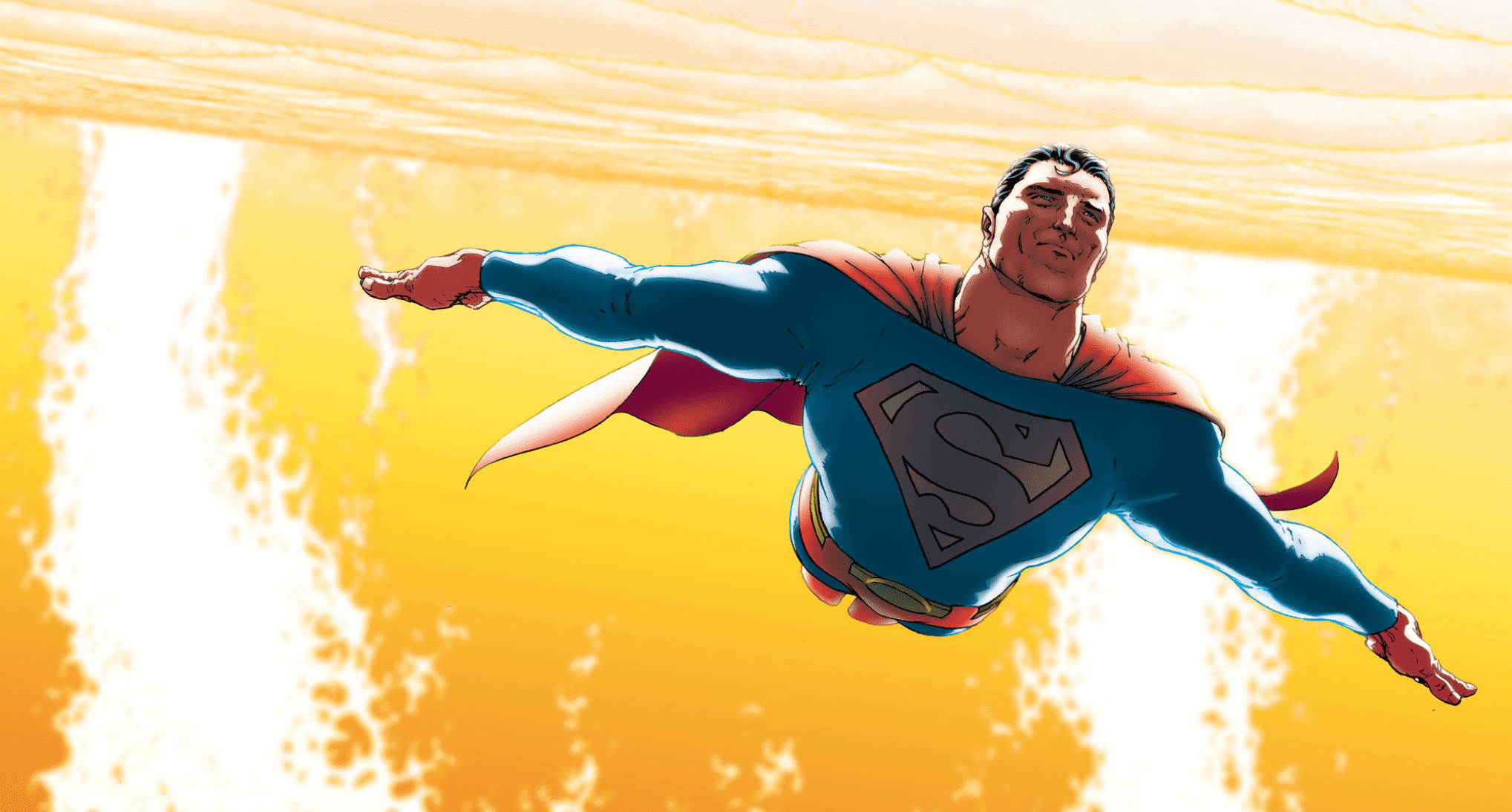
Superman Flying Near the Sun

In a time when countless comic book writers have attempted to give dark twists to the characters we know and love, All-Star Superman stands out and demonstrates that this isn’t necessary, and certainly shouldn’t be done to the Man Of Steel.

Superman’s personality has been altered time and time again by various authors, all trying to put his or her touch on the Man Of Steel. Still, there are absolute values the character possesses that should never be changed. Not only does All-Star Superman tell the story of a character with these ideals, but it gives one of the purest interpretations of them we have seen in years.

By the time I began reading comic books, decades had passed since the golden and silver ages. For most of us, this was the case. We never got to experience the classic tales of heroism written for children, nor the bright and hopeful storylines of those times. Long before I was introduced to the medium, writers were already looking for ways to darken the iconic characters. Frank Miller published his amazing The Dark Knight Returns, and Alan Moore and Dave Gibbons gave us a gritty satire of the superhero genre in the acclaimed maxiseries Watchmen. While I thoroughly enjoy gritty and dark tales, Grant Morrison and Frank Quitely demonstrate to us in their superb 12-issue series All-Star Superman that dark isn’t the way to handle the last son of Krypton.

In All-Star Superman, Morrison tells the story of the final days of the Man Of Steel after Lex Luthor successfully overloaded his cells by drawing him too close to the sun. In the final year that Superman has to live, he tells Lois his identity, fights some of his most iconic villains one last time, and reaches closure on things he never thought he would. It is a heart-warming and fantastic tale that, despite the sad knowledge that the Man Of Tomorrow will never see it, could not be a more hopeful telling of the Superman story.
With help from the art of Quitely, Morrison creates a beautiful contrast from the works of Miller and Moore, demonstrating that the darkness from the real world does not necessarily need to seep onto the panels. His eternal optimism most strongly characterizes Morrison’s pure interpretation of Superman. Even when it seems there is no possible way to solve a problem, when you are backed into a corner, Superman will always find away. Superman doesn’t win all of his battles by merely punching the bad guy, in many ways the Man of Steel sees his nemeses not as villains, but as people. It doesn’t matter if Lex killed Superman; Superman will never return the favor because it is never right to take a life. Do not misunderstand me; I recognize that this may not be the case in everyday life. A police officer or a member of the military could not go into battle with the goal of zero casualties, because it would result in his or her death. But Superman is not human. He is an alien superhero with the powers of a god. Superman can save thousands without putting his own life in danger nearly all of the time. The times the invulnerable Kryptonian is forced to endanger his own life do not affect Superman either, which is highlighted with stories such as All-Star Superman. They show us that in Superman’s constant devotion to the values of truth, justice, and the American way, he will never bend his principles, even when knocking at death’s door.

Under typical circumstances, All-Star Superman wouldn’t have changed my concept of what a comic could be, because it merely embodies everything I want from a Superman book. It reads like another Superman story; only this is one of the beautiful comics that understands the character. What caused this particular comic to have such a substantial impact on me was its release date. I’ve read boxes worth of comics in my time as a fan of the medium, but this was the first recent one that seemed to understand how comics could be an escape from the real world. I’ve read so many comics that assert that humans and heroes are naturally corrupt beings and that the idea that Superman would be so close to a flawless being is complete lunacy. I do not understand what caused people to lose their faith in humanity, but I don’t believe it. All-Star Superman showed me during a time when dark superhero stories saturated the market, that they don’t have to be dark. None of us will indeed be as good as the Superman immortalized on the pages we read each month, but there’s a reason he’s known as the Man Of Tomorrow. Superman stands as a beacon of what we can be, an ideal of what the future could be like if we only showed a bit more empathy and tried to do more good. I don’t believe that the heroes of the world would be corrupt and indistinguishable from the villains of the world, such as in Garth Ennis’ The Boys. In a world where superheroes exist, there would be enough good people to save the world every time. That may sound too hopeful, but All-Star Superman gives me hope.


What’s everyone’s favorite Superman comic? Leave your answer in the comments below!

Monkeys Fighting Robots Youtube