Home Blog Page 386

Review: VAMPIRELLA #5 Offers Great Characterization, Minimal Story

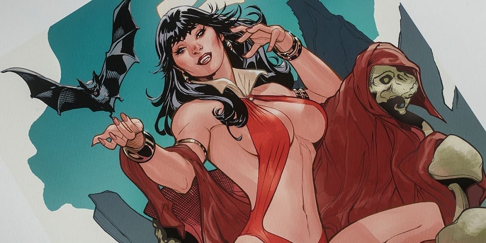
Vampirella #5

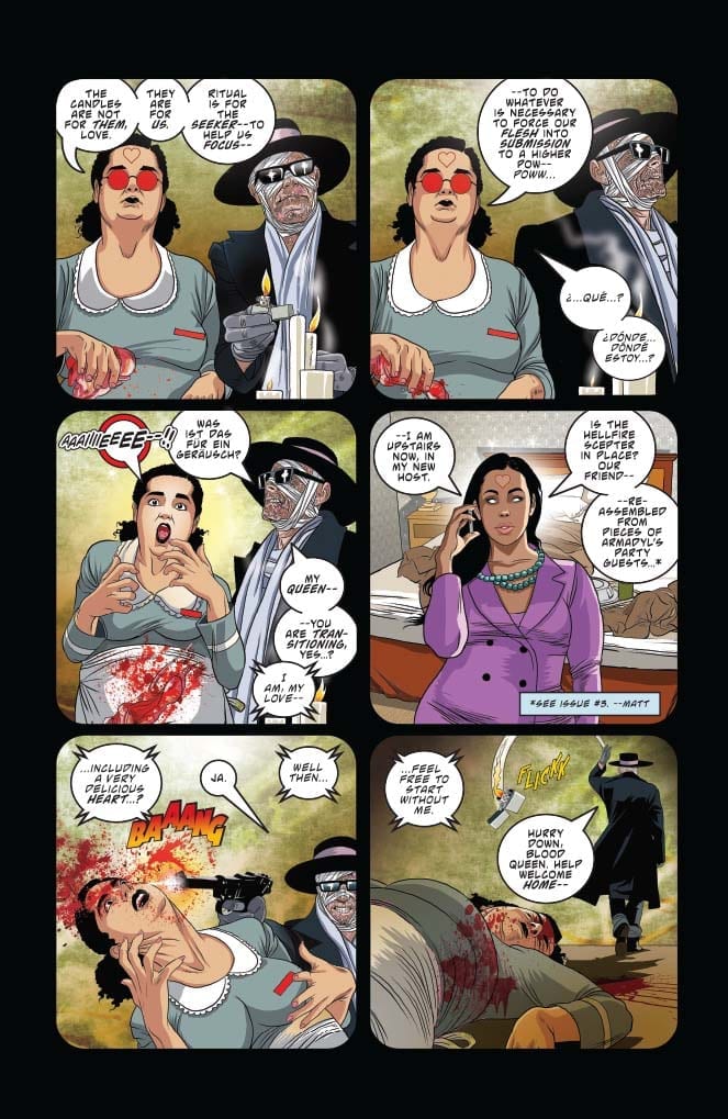
Vampirella’s enemies organize and grow in the shadows of Vampirella #5, out this week from Dynamite Entertainment. Meanwhile, the therapy sessions continue, delving into more and more of the character’s recent memories.

The Writing

We spend most of the book’s first half in a flashback focused on our antagonists: Von Kriest, Blood Red Queen of Hearts, and now Nyx as well. In this way, we learn a little more about their plans (if not their motivations). We then pivot, focusing on our heroine in the second half of Vampirella #5, fleshing out her relationship with other characters.

Writer Christopher Priest has spent his run on Vampirella slowly constructing a distinct impression of the titular character. The book reads like a puzzle, with each issue adding details to provide a clearer impression of Vampirella, as well as the events she’s trying to relay to her therapist.

Time-hopping has been a cornerstone of the series since the first issue. We’re constantly pulled from the therapy sessions, which Priest uses as a framing device, to different points in the past. Rather than a conventional, linear plot, we experience events out of order, but uncover more details with time. In Vampirella #5, for example, we begin a year before our first issue, then leap to six months later, all relayed through a framing device in the present. It’s an interesting experiment…but the time jumps can be disorienting and chronologically confusing.

Even after five issues, we’ve yet to see the emergence of any clearly-defined plot. One can be unsure which events are key moments that motivate any larger conflict, or what that conflict may be. Because we’re not firmly-grounded in the narrative, the structure (or lack thereof) makes it hard to orient ourselves and figure out where—and when—we are. This problem could be especially pronounced for new readers who are unfamiliar with some of these characters.

Priest’s characterization was a little rough in our first few issues. By Vampirella #5, however, the dialogue seems to flow more naturally, and personas feel more realistic and compelling. The series is evolving into a compelling examination of Vampirella as a character…but the lack of a distinct narrative continues to drag it down.
Vampirella #5

Vampirella #5

The Artwork

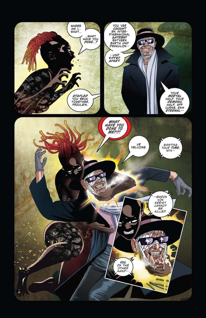
Artist Ergün Gündüz has a unique vision for the aesthetic of this series. He does a great job overall of composing panels, and occasionally gives us some very striking imagery.

That said, the level of detail employed varies throughout the book. In some panels, we see meticulously-thorough illustrations of backgrounds and environments, while in others, the background recedes, focusing the reader’s attention solely on the characters. While this approach can accentuate the figures in the composition, it’s not always the most visually stimulating.

In addition, the figures themselves can still be rather stiff from time to time throughout Vampirella #5. While generally looser and more natural than in some previous issues, there are moments when characters appear to simply stare into space, like a mannequin.

Gündüz’s color work, however, is excellent. We have a wide palette of colors on display; the visceral red gore and fiery, ethereal glows catch the reader’s eye, but don’t overshadow the rest of the page. It’s flashy, but well-balanced, highlighting the artist’s subtle skill.
Vampirella #5

Final Thoughts

Vampirella #5 continues to offer an interesting impression of this iconic character. If there were a story to accompany the study, we could reall have something here. As is, though, it still feels rather directionless and meandering.

Monkeys Fighting Robots Youtube

Review: MARAUDERS #2 Welcomes In The Red Queen

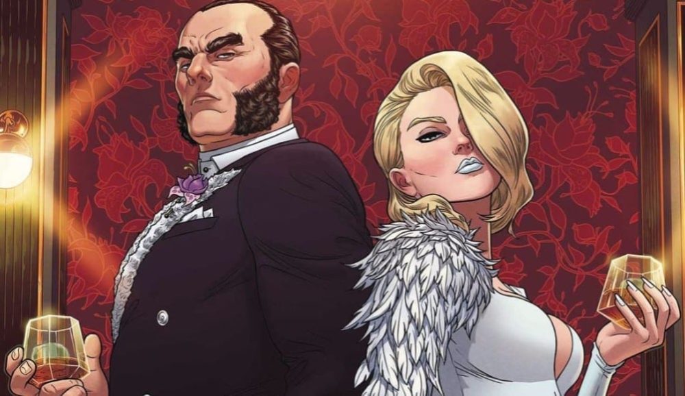
Marauders #2 cover detail
Marauders #2 Credit: Marvel Comics

The world is abuzz with X-Men stories and Marvel’s Marauders #2 hits the shelves this week with promises of high adventure and daring do. Mutant Pirates and Big Business are strange bedfellows, but this is the Dawn of X and anything is possible.

Going into this issue and two thirds of The Hellfire Trading Company’s directors seats have been filled leaving a single spot left open. Sabastian Shaw believes he can strong-arm his choice into that seat but Emma Frost has other plans. In fact, Emma Frost has all the plans and they are slowly unfolding for all to see.

Marauders #2
Marauders #2 Credit: Marvel Comics

A Cutthroat Business

Marauders #2 is a comic in two haves. The first half is set in a boardroom at the heart of The Hellfire Trading Company. The second half is on the open seas, where Kate Pryde and her boat of merry mutants are doing all the right things but not necessarily in the right way. 

Gerry Duggan hops from one location to the other creating a series of narrative beats, each building in dramatic tension as the pages are turned. He skips backwards and forwards between the action using one scene to add relevance or emphasis on the previous one. The narrative structure allows Duggan to break up the more conversational scenes with some action but it also provides opportunities to contrast characters.

Each of the three central characters are compared within this issue. Duggan uses the story to demonstrate personalities and the clashes that are inevitable later down the line. By the end of this issue you know exactly what to expect from Frost, Shaw, and Pryde. 

One of the highlights of Marauders is the witty banter between the characters. Duggan effectively uses conversation within action sequences without changing the pace of the fights. Short, snappy soundbites are built into the movements of the characters as they interact verbally and physically on the page. The script has the humour but the artwork provides the timing, especially the placement of the lettering by Cory Petit.

As the comic opens the speech balloons create a solid and steady thread through the images, leading the reader through the back and forth of Frost and Shaw’s conversation, When the action hots up, the placement of the balloons becomes more erratic in the panels, signifying the movement of the characters and the chaotic nature of the fights. The visual element helps to set the tone for each page and sequence, allowing the reader to digest the scenes more naturally. 

Marauders #2
Marauders #2 Credit: Marvel Comics

Art of the High Seas

Matteo Lolli has a smooth and fluid style of inking giving the panels an easy flow through the pages. His attention to composition within a panel and the page layout add to this fluidity in appearance. Lolli concentrates on the movement of the characters and their physical interactions, allowing the script to add most of the personality. This approach works because artist and writer complement each other; providing what is required from each of them.

A lot of the detail on the page comes from the color work. Federico Blee adds depth to the scenes and has a flair for bringing out the drama. He uses an array of bold colors and isn’t afraid to cover a page or panel. At times this produces a sense of chaos but then he’ll pull most of the color from a panel highlighting the action within it.

This issue is all about the appointment of the Red Queen and there is a foreshadowing of that throughout thanks to Blee’s use of the color red on pretty much every page. There is a bright splash of red as a constant reminder to the reader where this story is going.

Marauders #2
Marauders #2 Credit: Marvel Comics

Conclusion

With a lot going on in the Mutant world at the moment it can be difficult to keep up. The beauty of this issue of Marauders is that you can pick it up with no prior knowledge and still enjoy it. Duggan’s script is inclusive in every respect and the art style is easy on the eye, putting any reader at ease. 

Major things are happening in the narrative, and references are made to the larger X-Men universe but at heart, Marauders is a good old fashioned pirate romp with added mutant shenanigans, in both senses of the word. 

Monkeys Fighting Robots Youtube

INTERVIEW: Composer Lior Rosner On Will & Grace & The Day After The Nutcracker

NBC’s revival of Will & Grace is a beloved hit that’s added three seasons to the show’s original eight-season run and, now in its (second) final seasons, the show continues to deliver the same lovable characters but with updated sounds from composer Lior Rosner.

Will & Grace returned after an eleven-year hiatus with its four stars on board. Eric McCormack, Debra Messing, Megan Mullally, and Sean Hayes all returned to deliver new seasons that didn’t skip a beat. From the start, the reception was positive, “Will & Grace reunites its ever-hilarious cast for a revival season that picks up right where the show left … adding a fresh relevance and a series of stories that make sharply funny use of the passage of time.”

PopAxiom spent about the length of a sitcom talking to Lior about his journey from Israel to the U.S., making music for famous franchises, and an unofficial sequel to the Nutcracker known as Sugar Plum on the Run.

Beat Band

With a musical dad, Lior picked up instruments like guitar and trombone early on, but it wasn’t for him. “I liked playing the piano, and I was very into jazz.”

Born in Israel, Lior’s musical career took hold while performing military duties for his homeland. “It all started with my service in the Israeli Army. I got accepted to the prestigious group called the Air Force Beat Band. I was a keyboard player.”

Being a member of the band was motivational. “It’s amazing hearing your arrangements performed by a group.”

Lior, “… started writing arrangements …”

About his time in the Beat Band, Lior adds, “… it’s a great opportunity for young people to be in an environment like this where you can write something and hear it immediately. You hear it, fix it, come back the next day.”

After military service, Lior moved on to the University of Jerusalem. “It drew me back to study the masters of classical music.”

Ultimately, Lior, “… moved out here [L.A.] to work on film and T.V.”

FOX Family

Lior’s earliest gig in the U.S. started when he was hired by Fox Family. It was there that the young composer became part of a long existing franchise: Power Rangers. Lior laughs, “It was some of my first work and how I got my VISA here.”

At Fox Family, Lior says, “I learned a lot on the spot. You get to write a lot for cartoons and children’s shows. I did it for three years.”

After Fox Family was purchased by Disney, “I worked there for one more year.”

Will & Grace

Lior co-composes Will & Grace with Scott Icenogle. Lior, “… knew the original show.” His composer knew the producers of the show and together, “We implanted the idea of us giving the theme a facelift.”

The team put a presentation together where they “… created some new cues …” As they say, the rest is history. Lior and Scott were hired for the show.

Working on Will & Grace is “… a lot of fun.” Taking things to a whole other level of challenge and fun for Lior on Will & Grace: “I had to re-create the themes and song from I Love Lucy for a special episode. I had to write some original music in that kind of style.”

Run, Sugar Plum, Run

Lior’s work is part of a project called Sugar Plum on the Run, which features new and familiar sounds. The project, “… came out of my desire to create something for the holiday season.”

Lior explains, “When I moved here, I was fascinated by how, for a whole month at the end of the year, the vibe changes everywhere. I realized they always use the same music, and I wanted something that was evergreen like that.”

Lior began creating “… variations of the Sugar Plum Fairy.”

Together with a friend, they, “… created a story.” Lior “… created interludes …” and, “… narration telling a story about the Sugar Plum Fairy leaving the kingdom and going on a journey outside of the kingdom … basically a sequel to the Nutcracker. The day after.”

Lior recognized that he “… needed a strong narrator.” He began by “… approaching different actors.” One actor agreed, and his name is Jeremy Irons! “He did it for charity, which was nice.”

About working with Irons, “He’s incredible. His performance in the original Lion King is insane. It’s so good.”

Sugar Plum on the Run is available on your favorite streaming service. For fans, there’s also something more coming soon. “There’s also an animation short in the works with the character.”

Find Sugar Plum on the Run HERE!

sugar plum, lior rosner, jeremy irons

Wrapping Up

Who is part of Lior’s creative DNA? “If you look at my music on my iPhone, I have an eclectic list.” Lior thinks about it for a moment before dropping some names from the film scoring world. “Jerry Goldsmith, John Williams, James Horner, and John Powell.”

More specifically, Lior explains, that for Sugar Plum, “… it’s all very inspired by Russian composers. If, like, Tchaikovsky could assemble the best Russian musicians. Rachmaninoff, Khachaturian …”

How does the music of his homeland inform his work today? “One of the reasons I left Israel was because I don’t like the music. Especially the pop music. I was always attracted to the classic American songbook. I studied jazz. Film music and old Frank Sinatra.”

Lior reflects, “I must have some influence from Jewish music but in a very subtle way.”

Lior is hard at work on Will & Grace as it heads through its (second) final season. In January a new project is coming out. “It’s a show on Netflix called A.J. and the Queen created by Michael Patrick King and RuPaul.”

Thanks to Lior Rosner and Impact24 PR for making this interview possible.

Want to read more interviews like this? CLICK HERE.

Monkeys Fighting Robots Youtube

I’d Buy That For A Dollar: NEW MUTANTS #22 (December 1984)

I'd Buy That For A Dollar

Welcome to ‘I’d Buy That For A Dollar’ a column where I will be exploring the weird and wonderful world of dollar bin diving. The only rule is each and every comic is purchased for one dollar (or less!).

This week I’m focusing on The New Mutants #22. In this issue, superstars Chris Claremont and Bill Sienkiewicz co-headline a tale involving the New Mutants doing some danger room training. Night Crawler and Colossus make an appearance. Sunspot joins the Hellfire Club. And Wolfsbane writes a fairy tale. The story is classic Claremont and the setting and details allow Sienkiewicz to weave his surreal illustrative magic. Anyway, let’s jump right in and look at it!I'd Buy That For A Dollar
The New Mutants #22
Written by: Chris Claremont
Pencils and Inks by: Bill Sienkiewicz
Colors by: Glynis Wein
Letters by: Tom Orzechowski

Here is my picture of the actual book. For a dollar bin book, it’s in great condition. Not that it matters much in the case of a buck, but when you got a Sienkiewicz cover, you want it as best as can be!

Fun detail: 60 cent cover price! Dollar bin book wasn’t even a dollar back then.

I'd Buy That For A Dollar
That black Spidey in the lower-left corner box is a dope touch!

One cool thing I wanted to highlight is the entire credits list for this issue. Notice the comic being called a ‘Production’. Paired with the ‘Once Upon a Time…’ on the cover it adds a total fairy tale vibe.

Id Buy That For A Dollar
Great use of layout here!

Also, that’s a who’s who of talent in this book. All the way to the editors.  Ann Nocenti, the editor, also had a super great run on Daredevil. And EiC Jim Shooter is well, a huge part of comics history. He started writing as a teenager, was EiC at both Marvel and DC and helped make Valiant popular in the 90s.

Part of the fun of combing through these books is also some of the ads of course. Here’s one for Mario Bros. for the Atari!  The ad is even a comic!


I'd Buy That For A Dollar
That’s for both the 2600 and 7800!

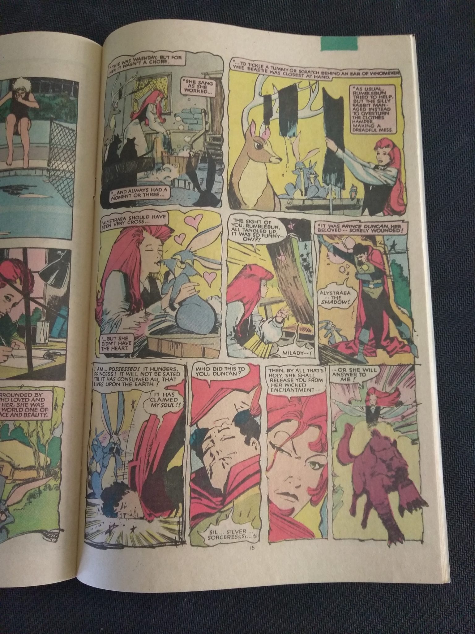
Alright onto some pages of the actual book. This comic is printed on newsprint, so these images have a very specific look and feel in the physical form. As awesome it looks here, flipping through the pages of Sienkiewicz art is even better. It reads well too as a one-off, which is a feat considering how dense Claremont’s stories have always been. Just take notice of all the lettering needed. That’s solid work by letterer Tom Orzechowski.


I'd Buy That For A Dollar
That’s a hell of a title page! Love how smooth Night Crawler moves. The lettering on that ‘BAMF’ is dope too!
I'd Buy That For A Doller
The squiggly panels here are fantastic. Such great detail. Everything also feels super lose but not messy. This one of the best pages in the issue!
Id Buy That For A Dollar
This drawing is my favorite image of this whole issue. So nutty.

Alright time to highlight another ad. Here’s one for Marvel’s line of ‘Secret Wars’ toys. These figures were some of the first comic book toys for a lot of folks (definitely for me). Again love how the ad uses the language of comics. These kinds of ads are all over the place in old comics.

I'd Buy That For A Doller
One of the best toylines of all time!

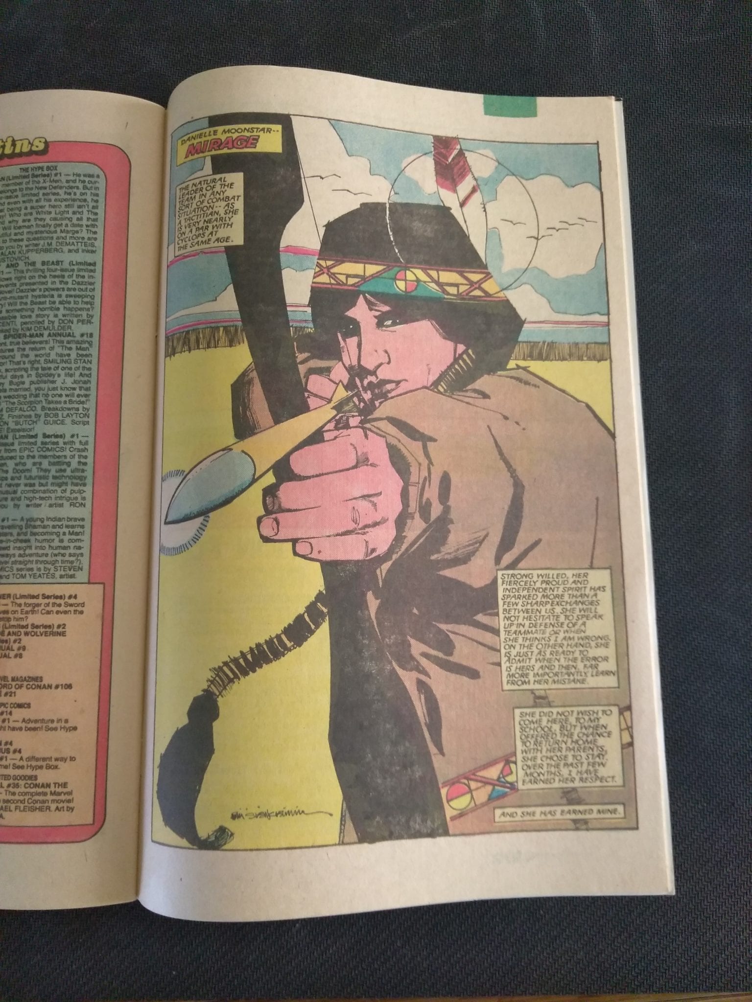
These series of pin-up style pages by Sienkiewicz are worth the dollar just by themselves. Enjoy!

I'd Buy That For A Dollar
Wolfsbane! Love how feral this page feels.
I'd Buy That For A Dollar
The colors here are awesome. Love the shapes too!
I'd Buy That For A Dollar
Another amazing image. The lave swirls on Magma are mesmerizing. That exploding volcano looks dope too.

Let’s end it with this cool Marvel Subscription page. Back then you could have these comics sent to your friggin’ mailbox at 16 issues for $6:50! Hell yeah!

I'd Buy That For A Dollar
Love they use Alpha Flight here.

You can find great dollar bins at almost every local comic shop. So find a shop, ask a comic clerk and start bin diving!

Got your own awesome dollar bin finds? Toss them at me! 
Send emails to manny@monkeysfightingrobots.com
Follow me on Instagram: _idbuythatforadollar_
Tweet at me: @MannyG1138


Monkeys Fighting Robots Youtube

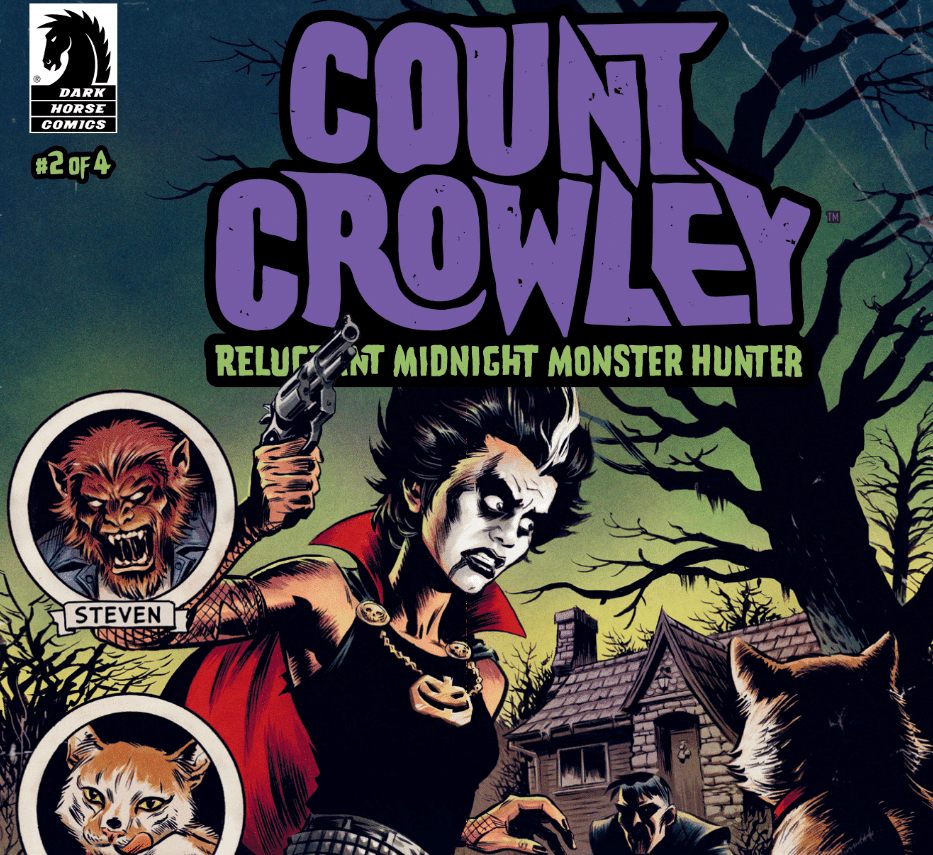
Review: The Plot Thickens With More Movie Monsters In COUNT CROWLEY: RELUCTANT MIDNIGHT MONSTER HUNTER #2

Writer David Dastmalchian brings in more monsters, personal issues and small-town mystery with “Count Crowley #2.” This second issue keeps the quick, natural dialogue from the first issue while also creating a fast-paced and suspenseful plot that will leave you hungry for the next chapter.

After her late night run-in with a werewolf, reporter Jerri Bartman goes on a hunt for clues regarding the whereabouts of the last person to play as T.V.’s Count Crowley. Her new mission to track down the man causing her so much trouble will take her to a true house of mysteries – complete with a deadly secret of its own.

Series writer and actor David Dastmalchian creates a serious page turner with the second issue of “Count Crowley.” The pacing, from a gripping opening chase sequence to quieter investigative moments, is given the tight work of a practiced storyteller. No parts feel like they detract from the story and all the pieces mesh together in an issue that manages to do some considerable storytelling in only thirty pages. Part of the pacing and character development that’s so well done is how the small town and Jerri herself are fleshed out without getting bogged down in exposition. There are sudden moments of looking at photographs or quick conversations with other characters that remind the reader just how vulnerable of a character Jerri is. Her personal problems are a compelling subplot beneath the monsters and mysteries. The dialogue still remains quick and natural, with Jerri’s nonchalant attitude mixed with shock and disbelief. If there was one minor nitpick, it’s that the end is a bit of an awkward cutoff. It’s certainly that sort of end that builds suspense for the next issue, but in a way that comes off as more annoying than intriguing. Overall however, this is a very tightly written issue.

A comic like “Count Crowley” requires the proper spooky-yet-light art style to really sell the experience. Luckily, this series has Lukas Ketner. Ketner maintains an aesthetic that loosely mimics the EC horror comics from days of old, combined with a light-hearted approach to some facial expressions and monster designs (again, a bit like Scooby-Doo). There’s just enough environmental detail to set the proper creepy little town mood, as most of the real work goes to the characters themselves. The different designs and sets of facial detail make it easy to tell character apart. This sounds like a rudimentary observation, but it can be surprising how even the best artists end up making character designs that all look like clones.

Lauren Affe returns to give “Count Crowley” its color, and she pretty much nails it. The kind of grainy and darkened palette she uses gives the comic its Creepy & Eeerie comics vibe that this series pays alms to. The art on this comic is the perfect blend of 50’s and 60’s horror comic looks with contemporary techniques. Even Frank Cvetkovic’s letters add to this element of the comic. On the face of it, the lettering is somewhat unremarkable in the fact that it’s competent and professional, but doesn’t really stick out much. However, it’s also a very common and classic font that still adds to the concept of “Count Crowley” being a love letter to those Silver Age-era horror comics.

“Count Crowley: Reluctant Midnight Monster Hunter #2” is a stellar follow up to a solid debut. This issue does its job in intensifying the plot while also delving more into the heart of its lead character without ever becoming bogged down in exposition. Dastmalchian’s tight plotting works in brilliant tandem with Ketner’s pencils and Lauren Affe’s colors. If you were a fan of the first issue, then there’s no reason not to pick this one up at your local comic shop on 11/20.

Monkeys Fighting Robots Youtube

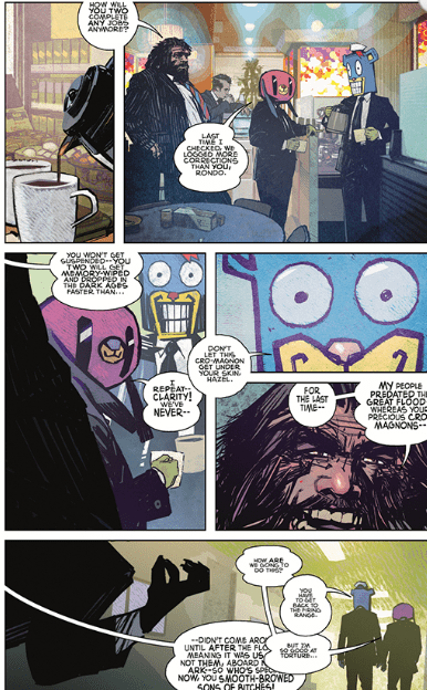
Review: THE UMBRELLA ACADEMY: HAZEL & CHA CHA SAVE CHRISTMAS

Series creator Gerard Way teams with Dark Horse editor Scott Allie and artist Tommy Lee Edwards to make a uniquely off-the-wall bonkers one-shot. Unfortunately, the experience is somewhat marred by troubled pacing and a lack of cohesion in the issue’s plot.

Everyone’s favorite time-traveling headhunters Hazel & Cha Cha hit the road once again to eliminate a rogue time-agent around Christmas time in the early 1980’s. Unbeknownst to them, their new directive is going to take the pair straight into the path of a plot to upset the balance of Christmas for all time. The legend of Santa Claus is about to get a lot more complicated.

Gerard Way‘s writing is known for being intelligently bonkers yet also tightly constructed, as can be seen in his work on Doom Patrol and the main Umbrella Academy series. Which is why it’s so strange that the writing in this one-shot is such a mixed bag. Dark Horse editor Scott Allie is credited as co-writer, so it’s unclear how much of a hand he had in the construction of the plot. Regardless, this Christmas special has a B-plot that, while certainly an original take on the whole Santa myth, is given almost nothing by way of character. The subplot follows Pete, a high-school loser with a poor family who has to take his kid brother around town. As the story progresses, Pete uncovers some sinister clues about Santa and Christmas just by random interactions with bystanders. Pete himself is a pretty bland window character for the audience, and the plot is constructed in a way that makes it feel cobbled together. It really only serves as a reason for Hazel and Cha Cha to coincide with this other strange happening and make it a Christmas issue.

Fortunately, Hazel and Cha Cha’s dialogue is absolutely superb. The pair’s banter regarding subjects that have nothing to do with their current situation is the true highlight of the whole story, as it’s endlessly hilarious. Way has always had a penchant for this manner of dialogue writing, and he’s in top form for these two characters specifically.

The world of such off-kilter comics as The Umbrella Academy requires an especially unique artistic touch. Fortunately, Mother Panic co-creator Tommy Lee Edwards was on hand to deliver his talents to Gabriel Ba‘s usual territory. Edwards’ brand of grime-stained pop-art and realistic detail is always a pleasure to behold, and the same goes for this issue. The sort of low-color gradient combined with the thick line work gives this one shot its strange and dirty atmosphere. There’s a great eye for detail here as well, and characters have suitably drawn facial features and the settings all look realistically used. It’s basically the 1980’s small town aesthetic without the vaporwave and neon. The coloring on Hazel and Cha Cha themselves has this scratchy finish to it, as if a file were taken over the finished product. It works as a sort of visual reminder that the pair don’t really belong in this world, and that they’re just passing through this specific time. Also, Edwards’ drawing of the masks Hazel and Cha Cha wear is suitably unnerving and also obviously funny. It’s hard to put a finger on why these absurd masks is so effective, but half of the joy in watching their interactions is because of these masks. So of course, Edwards nails them.

“The Umbrella Academy: Hazel and Cha Cha Save Christmas” is an exceptionally well drawn and often hilarious Christmas special of an issue. Unfortunately, the experience is damaged by a lackluster subplot with little to no character in itself. Any page with Hazel and Cha Cha on it is guaranteed to be hilariously entertaining. It’s those pages without the titular pair that prove to be this issue’s greatest weakness. Overall, if you’re ready to get into the Christmas spirit by way of mask-clad time agents shooting their way through the 1980’s and can withstand some messy B-plot time, this is an issue for you. Pick it up on 11/20 from your local comic shop.

Monkeys Fighting Robots Youtube

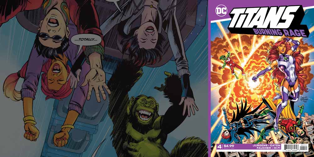
DC Comics Exclusive Preview: TITANS: BURNING RAGE #4

titans burning rage #4 dc comics exclusive preview

Titans: Burning Rage #4 hits your local comic book store on November 20th, but thanks to DC Comics, Monkeys Fighting Robots has an exclusive six-page preview for you.

About the issue:
Available to comics shops for the first time! It’s Beast Boy’s birthday, but the party won’t last long as the Titans make the save at catastrophic fire–and the arsonists are: Hawk and Dove?! Things aren’t as they seem, as former Doom Patrol member Mento is pulling the duo’s strings in a violent uprising. It’s up to the Titans to uncover his sinister purpose before someone gets killed! Originally published in Teen Titans Giant #7 and Titans Giant #1.

Titans: Burning Rage #4 is written by Dan Jurgens, with pencils by Scot Eaton, inks by Wayne Faucher, colors by Hi-Fi, and letters by Tom Napolitano. The cover is by Dan Jurgens, Norm Rapmund, and Alex Sinclair.

Burning Rage collects material first featured in the Walmart-exclusive DC Comics Giants.

Check out the Titans: Burning Rage #4 preview below:

titans burning rage #4 dc comics exclusive preview

titans burning rage #4 dc comics exclusive preview

titans burning rage #4 dc comics exclusive preview

titans burning rage #4 dc comics exclusive preview

titans burning rage #4 dc comics exclusive preview

titans burning rage #4 dc comics exclusive preview

titans burning rage #4 dc comics exclusive preview


Who is your favorite Titan of all time? Sound off in the comments (and be sure to tell us WHY)!!

Monkeys Fighting Robots Youtube

THE AUTEUR: How Narratives Warp Reality

The Auteur with a reference to Fantastic Four

The Auteur, written by Rick Spears, with art by James Callahan and Luigi Anderson is a series from Oni Press known for its absurdist look at both Hollywood and filmmaking. However, there is much more to this than just a narcissistic producer and his lofty goals. Movies, comics, and a few other narratives tell about tales as people envision them. Think the ‘Based on a True Story’ movies that are more or less means of winning Oscars. With that in mind, filmmakers take a few creative liberties to suit their audiences. Unfortunately for Nathan T. Rex, this is what turns into his downfall. This is the research from the gutters. Spoiler warning for the series.

Premise of The Auteur

The Auteur follows Rex, a film producer who built his career through exploitation films and mockbusters. After several bombs in both critics and the box office, he has one last chance to save his job. To get this done, Rex does just about everything from psychedelics to hiring a mass murderer for his Slasher movie President’s Day. Along the way, he tries to get the attraction of an actress named Coconut. Ultimately he succeeds in getting Coconut’s attraction, but he bombs President’s Day.

The sequel Sister Bambi continues off of Rex’s public disgrace and goes into Indie films. However, having lost his creative rights, Rex is now at the mercy of a producer with Nazi ties. Rex tries to wrestle control back from his producer by any means but fails. The ending meanwhile shows two different scenarios from a screenplay to an out-of-story slugfest with the series artist “James Callahan.” Yes, meta-commentary is slowly becoming a subgenre of its own.

The Nature of Exploitation Films

The Auteur mindscape

Rex’s specialty in Exploitation Films exemplifies the themes of the series. These movies as a whole are made to capture interest in certain groups through sensationalism. Some movies like Night of the Living Dead are major successes for their great writing and use of cheap special effects; others like Blacula are just excuses to sneak taboo content in. Rex attempts to make President’s Day look sensationally authentic by hiring a known murderer as a consultant. Unfortunately for Rex, he gets what he wanted when said consultant (Darwin) murders a hand-picked actress on set.

Changing Perceptions of One vs. Many

For Rex to save himself and in turn, get the attention of Coconut, he takes the drastic course of changing the entire premise and plot of President’s Day. Changing the movie into a generic romance tale is Rex’s way of learning to woo Coconut and cover-up his crimes. He seems to guarantee to fail on both accounts, but when Coconut sees the final product, she kisses Rex for going out of his way for her. The filmgoers, however, are immensely dissatisfied with the film for failing expectations. With this sensation, Rex’s crimes remain covered up since nobody wants anything to do with him. Well, among other things.

Rex, as it turns out, is not the only one who uses narratives to try and change outcomes. The inspector chasing after Darwin had actually planted false evidence to convict him. With no evidence suggesting this, however, Rex had to bribe the jurors to get Darwin out of court. All before trying to appeal as a lawyer no less. That’s misdirection for you, nothing but putting on a show.

Perception Vs. Reality

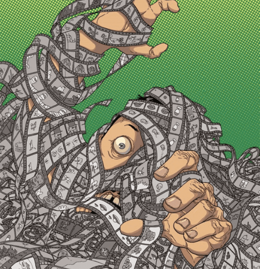
Did Rex's life become a movie?One of the bigger parts of putting on a show is trying to outdo what’s already been done. President’s Day has Rex often going into psychedelic drug trips to find new inspirations or ideas. During those times, the reader gets a look into his demented psyche. Sister Bambi takes it another step further with sensational events happening every other minute. As the series progresses, it becomes harder to know if anything is actually happening or if Rex is just high.
It’s also during these sensational points that Rex shows his inner nature. Most of the time, this inner nature only manifests through drug trips. On very small occasions, however, Rex displays traits like falling while being guided by a word balloon. At that point, Rex did not even use any drugs.

What of The Auteur‘s Ending

As explained in interviews, Rex is persistent in trying to be more than he possibly is. The answer to why comes in the ending. The dual ending comes in two sets: a manuscript that serves as Rex’s last saving grace, and Callahan pulling Rex out to confront him. The manuscript shows Rex’s making up with everyone and his and Coconut’s son having a successful future. But Callahan won’t have it and illustrates why Rex can’t have a happy ending. From his narcissistic behavior to how Coconut doesn’t have many layers herself. It all culminates when Callahan erases Rex’s outer layers, revealing his inner self, a green Bugs Bunny rip-off.

This reveals why Rex’s personality and work methods have no depth; being an exploitative knock-off is just his nature. So Callahan erases him to finish Rex’s story. Unfortunately, Coconut is left with her and Rex’s son. Rex may be gone but leaves his essence invades the reader’s mind. Because of these scenarios, it’s up to the reader to guess how this unfinished product goes.

Conclusion

The Auteur is a piece that redefines how people look at movies or comics. The best comics show readers that there is more than one story going on at the same time. As the subject of exploitation fiction itself; however, it’s not everyone’s cup of tea. But there is something in exploring style over substance and how it can be applied.

What do you all think? Feel free to leave your thoughts down in the comments.

Monkeys Fighting Robots Youtube

Review: BLACK CAT Annual #1 is Old-School Comic Book Fun

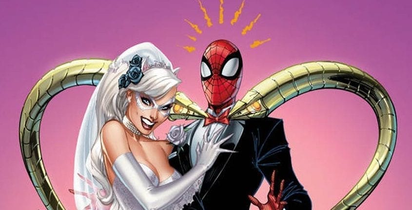
The Black Cat has a plan to use a secret tradition for a major cash heist against the Maggia. She just needs a wedding dress and your Friendly Neighborhood Spider-Man to pull it off. Black Cat Annual #1 is what an annual should be: Fun, funny, and slightly off-topic from the main book while providing a one-off story as an entry point to new fans.

Felicia Hardy (Black Cat) starts the story by sweet-talking Spidey into helping her with her plan, involving the two being “married” and fighting to the death in a Maggia wedding ceremony. As this is happening, henchmen working for the Cat are around town doing their part in the heist. The ending is sweet and not only cements Spider-Man as one of the nicer heroes of the Marvel Universe but provides a view into Black Cat’s mindset and personality as well, making her even more in line as Marvel’s Catwoman.

The actual heist isn’t overly complicated but provides just enough background information to make the story more vibrant and more entertaining. What’s better than an old-school mob robbery, anyway? The bad guys lose while looking foolish, and the “good” guys win and provide a happily-ever-after to a couple who desperately needs one. It’s the perfect wedding story.

Everything about Jed MacKay’s story is spot on. The interaction between Spider-Man and Black Cat, the overall plot and storyline, and the little twist at the end make this a fun story, one enabling old fans to remember back to the relationship Felicia and her Spider used to have as well as one allowing new fans to see a side of Peter Parker they may never have seen before. There is no fat to the plot at all; everything is lean and makes sense. Whether you’ve seen known these two since the early ‘80s or whether this is the first Marvel comic you’ve ever read, you’ll understand the story, the motivations of the characters, and appreciate the story.

The story is helped tremendously by Joey Vazquez’s art. The Black Cat has always been one of my favorite Spider-Man “villains,” and Vazquez’s pencils are flawless for this story. That combination of perfect, realistic art and a more abstract, emotional cartoonish brand of drawing is what this story demanded, with Vazquez providing it perfectly. Brian Reber’s colors are also a huge sell. While not showing off the bright pop of Spider-Man, Reber manages to give each character a certain glow, while combining realism and stereotypical comic book looks. The colors combined with the art make this book a must-read.

Finally, Ferran Delgado’s lettering is masterful. Letterers don’t tend to get a lot of notice unless they’re really bad at what they do. Delgado manages to add the tiniest flair to his work, which makes it stand out, but not in an obvious way that distracts the reader.

Overall, Black Cat Annual #1 is reminiscent of the days when we could buy a random book off the spinner rack, take it home, and read it over and over because it’s everything a Marvel adventure should be. As Stan Lee said, “Every comic could be someone’s first,” and if this comic is yours, you’ve got a fun day ahead of you.

What did you think of this issue? Comment below!

Monkeys Fighting Robots Youtube

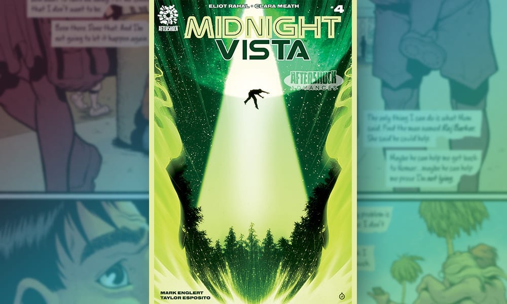
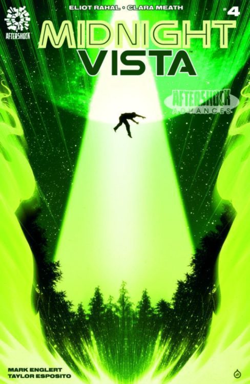
MIDNIGHT VISTA #4 – AfterShock Comics Exclusive Preview

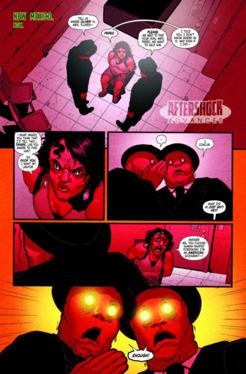
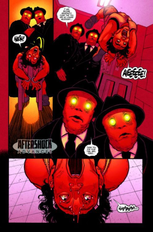
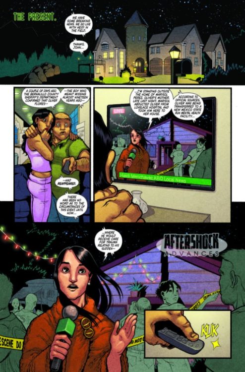
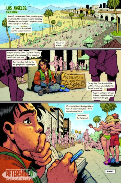
Midnight Vista #4 hits your local comic book store on December 4th, but thanks to AfterShock Comics, Monkeys Fighting Robots has an exclusive four-page preview.

Midnight Vista is based on a true story; written by Eliot Rahal, with art by Clara Meath, Mark Englert handled colors, Taylor Esposito is on letters, and Juan Doe created the cover.

About the book:
After making his escape to California, Oliver finds himself hiding in plain sight amongst the many invisible and forgotten faces of Los Angeles County. For the time being, he is safe. Neither the police nor the mysterious “Strangers in Black” know where he is. But he’s also alone. Lost in a city — and a world — that he doesn’t know how to navigate, Oliver seeks out the one man his mother told him could help reconnect him with the very aliens that abducted him so many years ago.


Are you reading Midnight Vista from AfterShock Comics? Sound off in the comments!

Check out the Midnight Vista #4  preview below:

Monkeys Fighting Robots Youtube