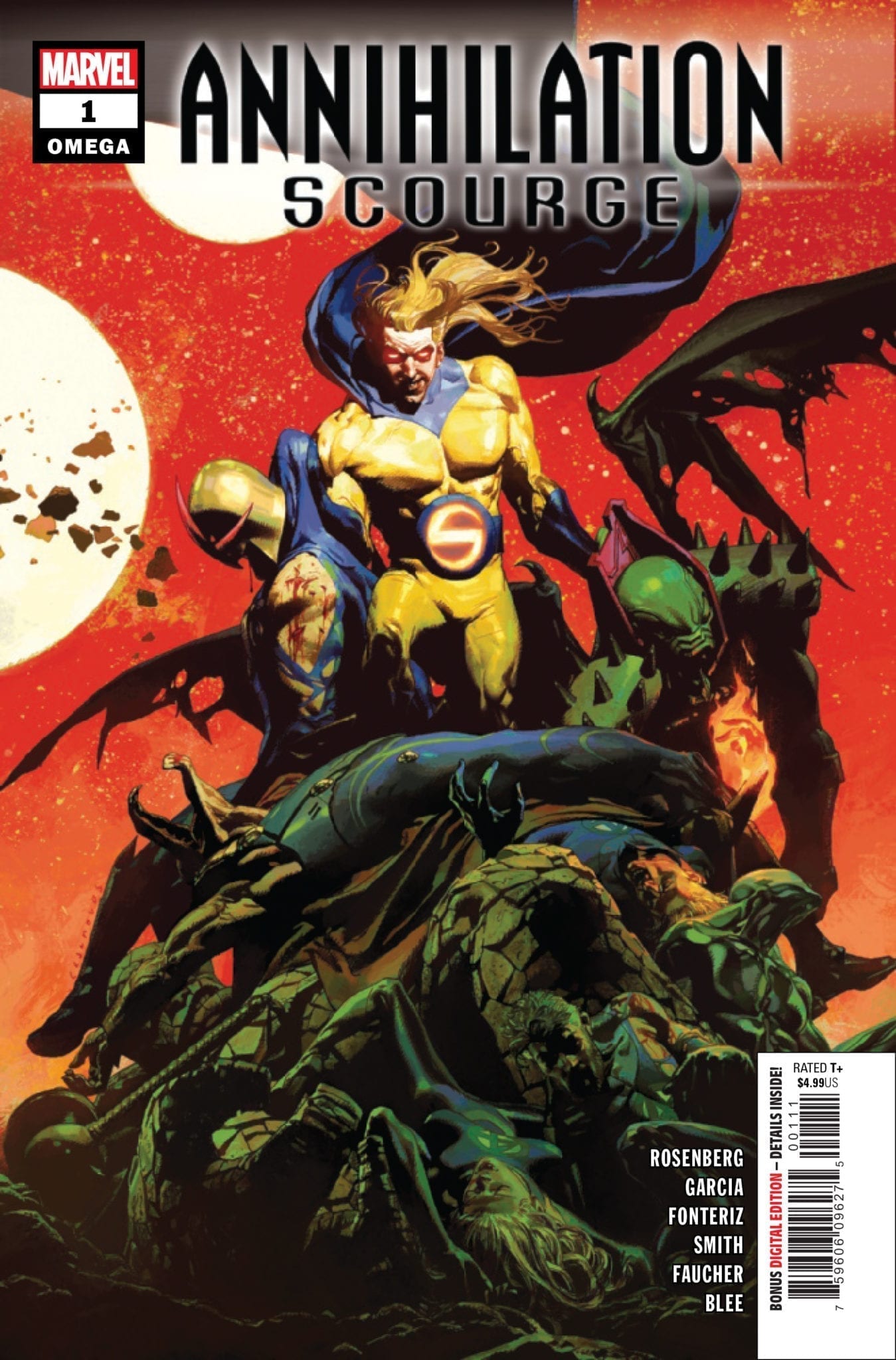
Annihilation – Scourge Omega #1 hits your local comic book store December 18th, but thanks to Marvel Comics, Monkeys Fighting Robots has an exclusive five-page preview for you.
About the issue: In the face of the Annihilation, there is no more room in the cosmos for heroes or villains – only survival.
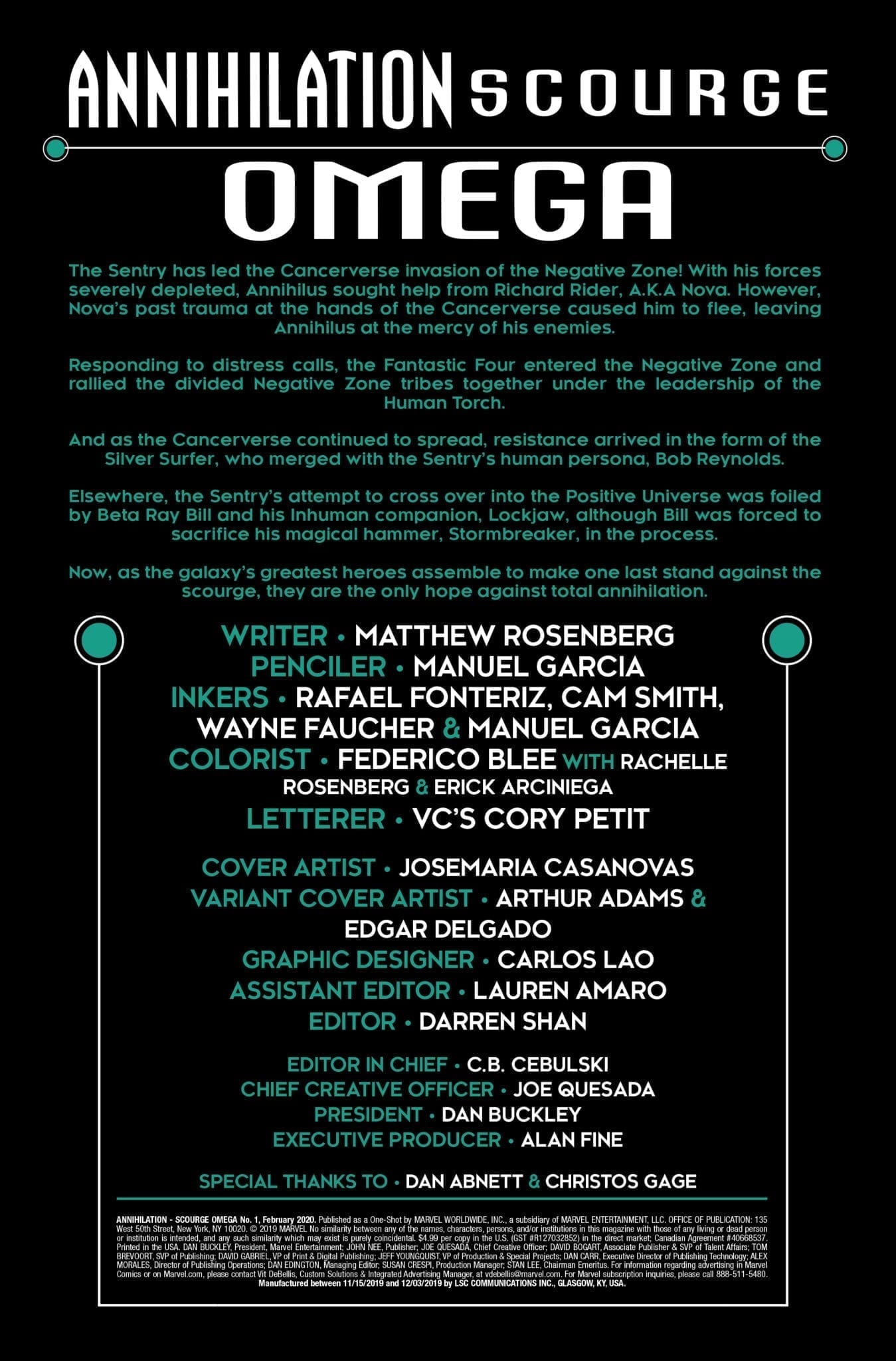
Annihilation – Scourge Omega #1 is by writer Matthew Rosenberg and penciller Manuel Garcia. Inks are by Garcia, Rafael Fonteriz, Cam Smith, and Wayne Faucher; colors are by Federico Blee with Rachelle Rosenberg and Eric Arciniega; letters are by Cory Petit. Josemaria Casanovas did the main cover.
This issue marks the end of Annihilation – Scourge, an event that’s been running through a series of one-shots over the past two months starring Nova, Silver Surfer, Beta Ray Bill, and the Fantastic Four. The story is a follow-up to Marvel’s Annihilation from 2006, a smash-hit event that led to a renaissance of cosmic superhero comics.
Check out the Annihilation – Scourge Omega #1 preview below:
*WARNING: SPOILERS AHEAD FOR ANNIHILATION – SCOURGE*
Are you reading Annihilation – Scourge? What is your favorite Marvel Comics cosmic event? Sound off in the comments!
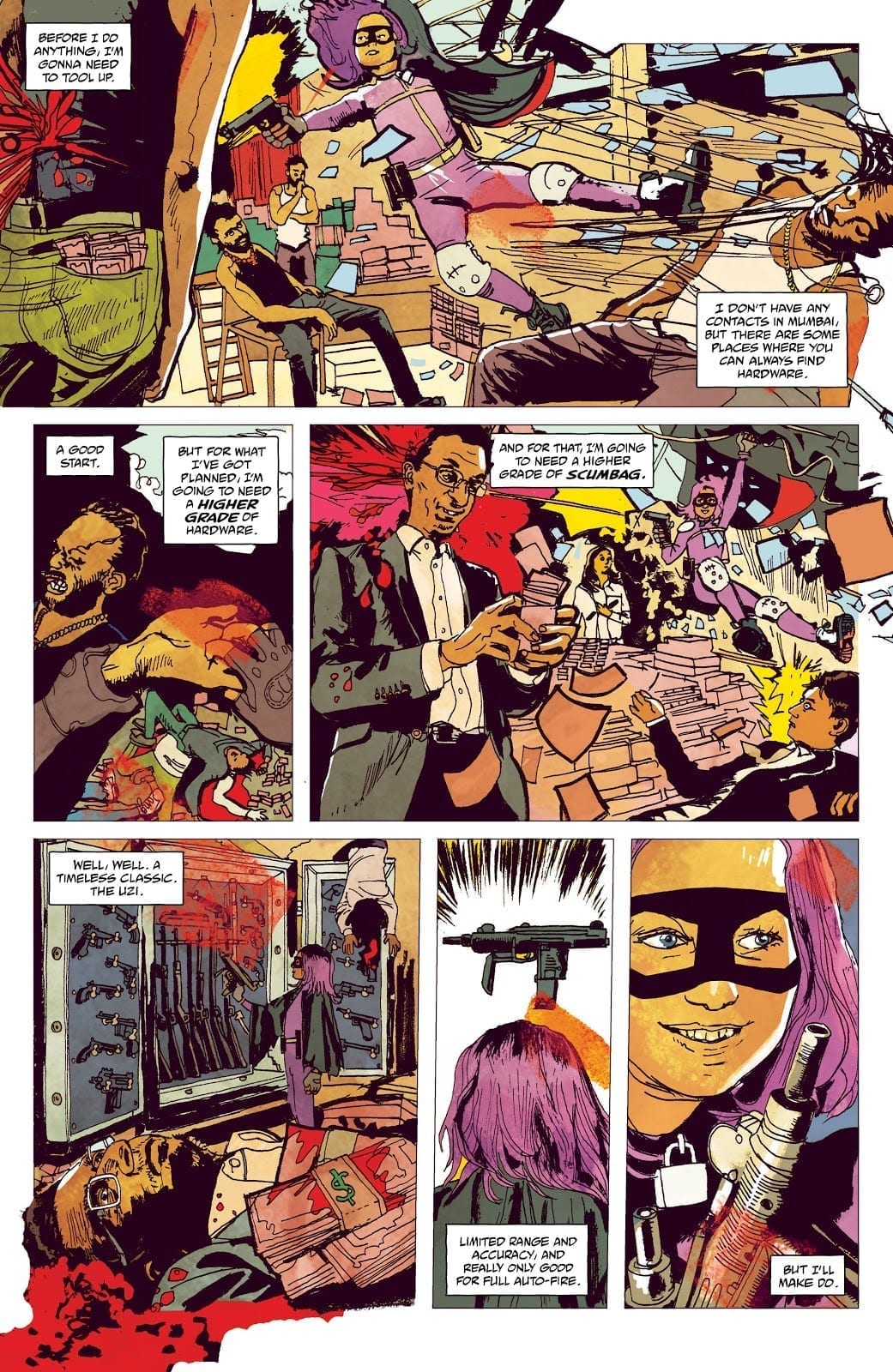
Continuing the world tour of one of Millarworlds more popular characters, Hit-Girl heads towards violent conflict on the streets of India this week. The third part of this arc from Image Comics is a spectacular vision of beauty and the corruption that lies just beneath the surface.
It is a hard hitting and poignant story produced by some of the greatest creators working in comics today. Peter Milligan has been writing comics for a while now, having worked for both of the major publishers on some of the biggest titles. Alison Sampson is relatively new to comics but her work so far has been outstanding and instantly recognisable. In their hands, is there any limit to what Hit-Girl can become?
Hit Girl Season 2 #11 Credit: Image Comics
The Story on the Street
Hit-Girl finds a friend who offers her some comforts that she’s not used to and her influence is spreading to the children of Mumbai. But she can’t allow herself to forget her mission and some harsh words are going to come back to haunt her.
Peter Milligan weaves a complex web of characters throughout the pages of Hit-Girl. He reveals the narrative through a stream of interactions, moving from one character to the next like links in a chain. Hit-Girl herself moves through these links, the common denominator in the story, and forms the larger narrative.
The characters are all fully rounded, complex individuals with histories waiting to be explored. Any number of them could feature in their own story, filling page after page. This is one of Milligan’s strengths; he is able to create engrossing characters, full of life, in a very short amount of time. The cast for Hit-Girl: India is surprisingly large but does not feel overcrowded at any time.
The criminal underworld that is depicted is also the perfect foil for Hit-Girl. She is still a child, although older than her years, so the threat to other children makes it more personal for her. This is demonstrated through her actions, especially in this issue. She implicitly trusts Ram and puts her life in his hands. This is not something that she would do with an adult, especially one she barely knows. Milligan portrays Mindy’s strengths and weaknesses through her interactions with the other cast members.
Hit Girl Season 2 #11 Credit: Image Comics
Indian Ink
As engaging as Milligan’s story is, the real star of this comic is the artwork by Alison Sampson and the colors by Triona Farrell. Together they have created a beautiful world for the characters to inhabit. Every page is so vibrant and energetic. The reader gets a real sense of location and the strange contradiction that is Mumbai city. The mix of affluence and poverty, sitting side by side, reflects the contrasting characters in the narrative.
Sampson’s style also contains an element of this contradiction. She has an expressionist style that is centred around a highly accurate architectural base. The settings are hyper realistic with an amazing attention to detail. The characters step into this world and then, as the action hots up, they twist the images to fit their warped behaviour.
Hit-Girl obviously has the greatest effect on the perspective within the panels but she isn’t the only one. It is as if Sampson is using composition and perspective to further character development. This means that some pages become almost ludicrous while others are overwhelming in their details. The notion of time within the narrative is controlled through the panel layouts and Sampson’s refusal to stick to the standard conventions of comic book storytelling.
Clem Robins’ lettering is more standard in presentation however minor inflections in the fonts give the characters individual voices. The placement of speech balloons adds to the pace of the narrative and gives Robins the chance to play with the interactions that are so important in Milligan’s script.
Hit Girl Season 2 #11 Credit: Image Comics
Conclusion
This version of Hit-Girl seems so removed from previous versions. There is a beauty in the imagery and a vulnerability in the characters that feed off each other and, in turn, fuel the greater narrative. Milligan is telling his story of a corrupt Indian city and fitting Hit-Girl into that. It works, and it works well but you do get the feeling this story could easily exist without Mindy’s presence.
Three issues into this four issue story and there is so much for the reader to immerse themselves in: the narrative, the art, the action. This Hit-Girl story is a spectacular read because it has so much going on and relays the information in such a surprising way. The comic is visually one of the best things currently on release. The warped realism of the art punctuates the social discourse at the heart of Milligan’s script and highlights the intriguing dissection of Hit-Girl as a character. You will come away from this comic believing you have read an entire arc, not just the standard 22 pages.
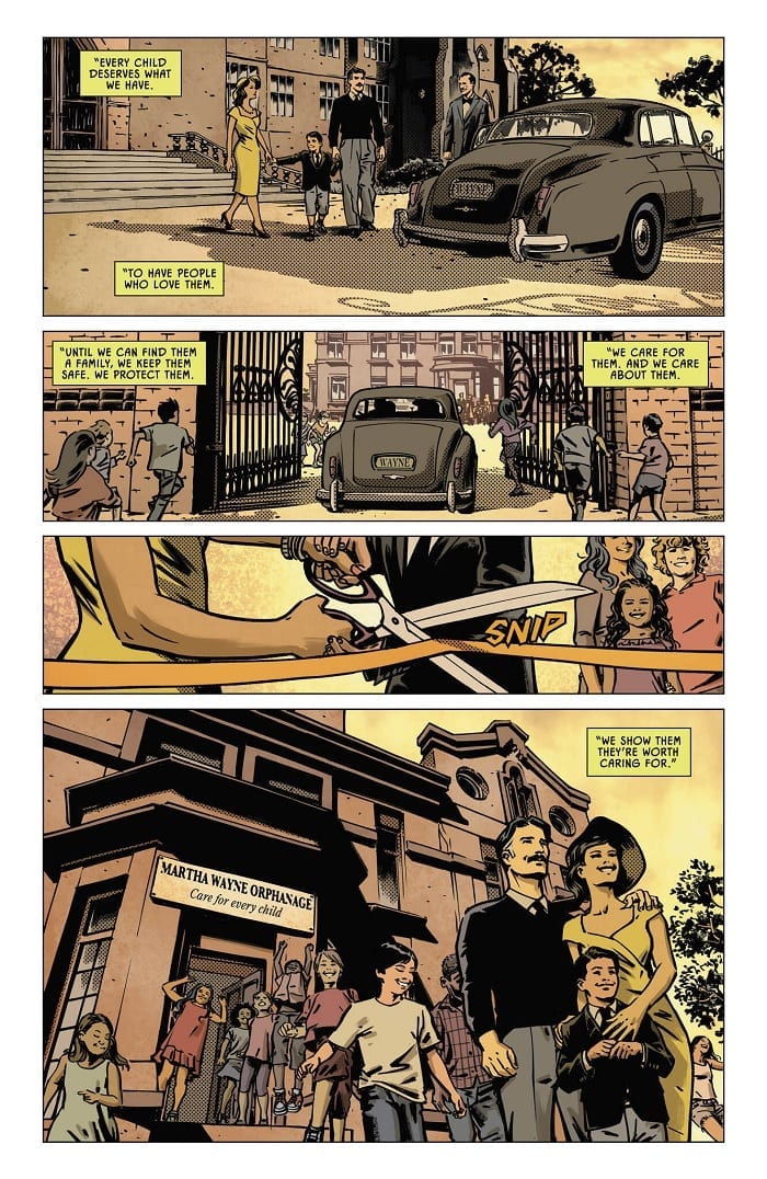
Detective Comics #1017, out this week from DC Comics, follows on the heels of our last issue, which closed out Mr. Freeze’s Year of the Villain arc. The book—a standalone story from writer Tom Taylor—offers an interesting and engaging change of pace.
When children begin to disappear from an orphanage funded with support from Wayne Enterprises, our protagonist decides to take action. In this case, though, he finds that Bruce Wayne—not Batman—may be the best persona to investigate the disappearances.
The Writing
Taylor offers up a quieter, standalone story here. Like the book’s namesake, it’s more of a genuine detective caper than an action story.
We’re well-aware of the impact Batman has on his hometown. In Detective Comics #1017, though, Taylor seeks focuses on Bruce Wayne’s capacity to impact the city of Gotham, even when he’s not wearing the mask. It’s a facet of the character that often goes overlooked in favor of the super-heroics, but one that’s well-worth exploring.
It’s a novel approach to the character, and one that we wish we could see more often, to be honest. Delving into Bruce Wayne’s role as Gotham’s foremost philanthropist could spark an interesting conversation, especially at a time when the philanthropy of real-life billionaires is under greater scrutiny. Compounding the political relevance is the backstory for one of the children, who only ended up in the orphanage after being separated from his parents at the border.
While Detective Comics #1017 is compelling in isolation, the ending is a bit of a disappointment in some regards. After uncovering the mystery of the children’s disappearances, Bruce pledges to locate the missing orphans. We don’t get to see this happen, though; the book’s end is largely exposition, summarizing the climax in a brief montage.
While this could set up an interesting and emotionally-powerful, multi-chapter story arc, it ends up leaving the action to be carried out off-page. As a standalone story, though, it’s unlikely to be followed-up on, which is a shame, as it would offer a compelling and interesting exploration of Bruce’s role in Gotham beyond the shadow of The Bat.
The Artwork
Artist Fernando Blanco brings a unique style to Detective Comics #1017. The book straddles the line between cartoonish and serious in terms of style; characters are expressive and lively, while retaining a sense of grit.
The creative team explores some interesting and varied layouts throughout the book. One page may be divided into evenly-spaced horizontal strips, while the next could be split into four quadrants. There’s a sense of internal consistency to the individual pages, though, along with a reliance on repeated visual motifs. This prevents the illustrations in Detective Comics #1017 from feeling unfocused or random.
Blanco doesn’t shy away from delivering the details in his work, either. His illustrations serve to fully-engage readers in the story. While it’s not overly-meticulous, the level of detail here hits the sweet spot.
Color artist John Kalisz’s work is not exceptionally eye-catching. It is, however, skilled and well-detailed. The artist takes a meat-and-potatoes approach, but it works for the effect that the book is trying to achieve.
Final Thoughts
Detective Comics #1017 is a solid little self-contained tale. Although it could have used more space to tell this story, it’s a great exploration of Bruce’s character outside the cape and cowl.
As the new age of 2099 continues, Doom 2099 #1 arrives with the help of Chip Zdarksky, Marco Castiello, and Chris Sotomayer. Will the success of the other series solo series featuring Doctor Doom carry over into this one?
The future is Doom! In 2099, everything has changed. Technology has changed. Governments have changed. People have changed. But only one thing has remained the same…DOOM.
Writing
This issue suffers from an inability to meld the story with its artwork. The issue buildings to a grand twist but the art doesn’t allow the reader to get comfortable with the storytelling process. You can tell right away this isn’t Doctor Doom or at least this isn’t the usual megalomaniacal individual known and feared throughout time. Also, Doom doesn’t act truly evil or display enough malice to trick the reader into believing otherwise. He’s more like Diet Doctor Doom.
Otherwise, it is a decent issue overall but it doesn’t break out of the shadow of what else is on the market. The new Doom series by Christopher Cantwell has been a fantastic read from the first issue but Doom 2099 #1 feels more like it’s setting up to be a series which will get better moving forward. It sets up some interesting aspects but just doesn’t knock the reader out of the park on this first outing.
Artwork
As mentioned in the previous section the art doesn’t meld well with the story. Marco Castiello isn’t shy about putting Doom’s naked face on display the entire issue but doesn’t go far enough with its presentation. The scarred face of Doctor Doom is supposed to be horrifying and disturbing. Whatever version of Doom this is supposed should look much worse. Here the face could be fixed with the use of a large of amount of concealer.
The colorwork by Chris Sotomayor is probably the best part of the entire issue. The color perfectly captures the post-apocalyptic look. The landscape characters look as if they could be a part of Fury Road.
The lettering work by VC’s Clayton Cowles does a great job of adding to the audio quality of the issue. Much like the writing work, the lettering serves its purpose but doesn’t bring any exceptional aspect to the presentation of the piece.
Conclusion
The new Doom 2099 #1 isn’t bad but it doesn’t achieve the greatness it set out to accomplish. Frankly, it’s a better experience in the future than Ghost Rider 2099 but only by a small margin. Doom should be able to bring greatness with an iron fist and sadly this issue doesn’t.
Flying onto the shelves this week from Marvel Comics, Captain Marvel #13 continues this dark twist Kelly Thompson has brought to the character.
(This issue is a little challenging to cover in full without spoiling anything, as I usually keep my articles spoiler-free, I’ll do my best not to reveal anything major but be forewarned depending on your own opinion on what’s a spoiler and what is not, you may want to read the issue before diving in)
Following up on the mind-boggling issue that kicked off Thompson’s “The Last Avenger” story arc, Carol Danvers now sets her sights on Tony Stark with a plan, much like her approach with Thor. Carol goes right for Tony at his most vulnerable, first thing in the AM and still in his robe. I know that’d be my most vulnerable time too. Hitting fast and hard, the once good Captain certainly catches Iron Man off guard, giving her the upper hand right from the start.
Good on the armor for keeping up the best it can.
Since her victory over Thor in the last issue, it is tough to say if Tony stands a chance against Carol, especially given the fight is on her terms, she’s had the time to plan, and Tony had zero clue something like this was even coming. Captain Marvel certainly proves to be a scary villain in this scenario, coming up with these vicious methods for gaining the upper hand on her teammates and fighting them so relentlessly.
The last issue did not give us much to go on as to why Carol is hunting down the Avengers, only that she is serving someone else, and based on her monologues, we can assume she’s not particularly happy about it. Without saying too much, I will note we do get more exposition on the whole picture this issue, more than just Carol’s inner thoughts and personal convictions.
Fans of the Dark Captain Marvel design get to see some great new panels showing off the new suit; one, in particular, is definitely worthy of being a lock screen for your phone. Lee Garbett’s art is killer in this issue and captures the intensity of the fighting. Tamra Bonvillain handles the colors and might be sick of the color orange when all is said and done, as there are a LOT of Photon blasts and auras in the past two issues, but they do look powerful and fiery and make Carol pop right out of the page.
I’d be lying if I said this didn’t IMMEDIATELY become my new lock screen…
VC’s Clayton Cowles had his work cut out for him this issue with the lettering, from metal crunching to zooming through the air, from inner monologues to cheeky back talk (as expected from a fight between Carol and Tony) there was a lot to write in. Regardless the lettering was solid and fluid and helped bring each scene together for one’s mental creativity.
Captain Marvel #13 gives us a lot for one issue, it’s difficult to say anything without feeling like you’re giving too much, so I highly recommend picking this up and seeing it all for yourself. Thompson’s new twist on Carol shows us a new side to both the character and her writing, and I am very interested to see her explore these further, as well as how consistently dark she wants to keep it.
As a whole, I like how she is handling Carol’s attempt at fighting all of the Avengers. This isn’t some showboating flex of the character’s prowess but instead giving us very specific scenarios where Carol is viciously taking on friends who don’t want to fight back right away. Someone is going to catch on eventually, and I’m wondering how it will go when Carol faces the foe who is expecting her. I highly recommend keeping up with this story arc; it feels worth the wait between issues, and the speculation on what will happen next is only making it better.
What other turns do you see this series taking? Are there any characters you would like to see written into a story like this where they’re the villain? Let us know what you think in the comments!
Batman is the Dark Knight, the Caped Crusader, and the Hero of Gotham, but that last part is the subject of debate among some comic fans. YouTube personality Rob Jefferson of Comics Explained says that Batman is not as good a hero as fans like to think he is. “If Batman was a good hero, Gotham wouldn’t be bad,” said Jefferson. So is the (arguably) most famous superhero is a failure?
It’s a little more complicated than that, from how the Dark Knight operates, to the nature of Gotham City, where law enforcement fits into the equation, and how the Caped Crusader actually has everything he needs. Every good modern age writer understands this nuance, and five of them show how it’s not as simple as “Batman isn’t such a good hero.” Some explanations by pop culture essayist Matt Draper go into further detail about the relationship between Batman and Gotham. Below is my research from the gutters.
Frank Miller: Batman Puts Things Into Place
Frank Miller presents the Dark Knight as the force that sets the city’s faults right. That perhaps is best shown in The Dark Knight Returns. With the police overwhelmed, Bruce has to come out of retirement to fight the crime waves. In just a few months, the Bat defeats and reforms the Mutants gang to become his personal army. But this is still an Elseworlds story, what about the mainstream?
Batman’s role remains largely the same in Miller and David Mazzucchelli’s Year One story. With corrupt cops and gangs ruling the streets, it takes something as crazy as Batman to clean up the mess. His presence alone is enough for Jim Gordon to toughen himself against the gang families who threaten his family. Unfortunately, while Batman can handle gang violence, supervillains present a challenge for him.
Jeph Loeb: A Long Defeat
Jeph Loeb demonstrates a semi-meta counterpoint to Miller’s viewpoint of Batman setting Gotham right. The Long Halloween displays a Long Defeat, a never-ending battle against an inhuman nature. While gangsters are no challenge for the Dark Knight, in escalation come Supervillains. Batman can overcome the villains, but due to their unique psychologies, they’re able to avoid the law. Unless they’re like Penguin, who isn’t insane but uses his connections and bribes. Jefferson states, “Batman’s not willing to do what needs to be done” with incorrigible villains.
That sounds like being willing to kill, maim, or sacrifice people. But Loeb has an argument against that viewpoint too. In Batman: Hush, the Caped Crusader is ready to kill the Joker for every horrible thing the Clown Prince of Crime has done, not the least of which was the death of his second Robin (Jason Todd) or putting the original Batgirl (Barbara Gordon) in a wheelchair. That is until Commissioner Gordon aims his gun at Batman. Gordon is someone who has every reason to kill Joker for his daughter alone. But Gordon wants Joker brought in. Why?
Because no one received shoot-to-kill orders from Gotham’s justice department, Gordon serves as a reminder that if Batman wants to help the city, he has to follow the law, not mock it. The revolving doors of Arkham Asylum and the sentences of inmates there are not the Bat’s responsibility. In other words, is very wrong about that argument against the Dark Knight. Batman might be capable of killing or worse, but he’s not allowed to. So how can he save Gotham, get help from Superman? No, Matt Draper explains Gotham, will never truly be brought into the light by Batman. Or by anyone else committed to the Greater Good.”
Kelley Puckett: Even Superman Can’t Help
During Batman: No Man’s Land, Superman tries to help Gotham in its darkest hour. The supervillains are certainly no problem for him, and Superman’s example is for people to better themselves. But Superman gets overwhelmed by the city’s (at-the-time) desperate state of might-makes-right. Kelley Puckett demonstrates here that leading by example won’t help anyone in such a city. Such a powerful presence like Superman makes the citizens feel insignificant. That may not even be because of the people, but because of Gotham’s very nature.
Scott Snyder: Gotham is a Place of Hunger
Scott Snyder’s time with Batman starting with Black Mirror brings out Gotham City as a character. Gotham’s darkness is voracious, and it can change people for better or worse. While Bruce and his extended family were strengthened, others like Commissioner Gordon’s son James Jr. were changed into monsters. Gates of Gotham shows the city’s hunger extended back to the city’s founding by the Wayne, Cobblepot, and Elliot families. Bitter jealousy towards the Wayne family’s success starts a silent feud. With each passing generation, this hunger grows stronger with more drastic measures needing to be taken to either stave off or starve. For Batman, it’s not enough to go out and punch villains; Bruce Wayne needs to do something too.
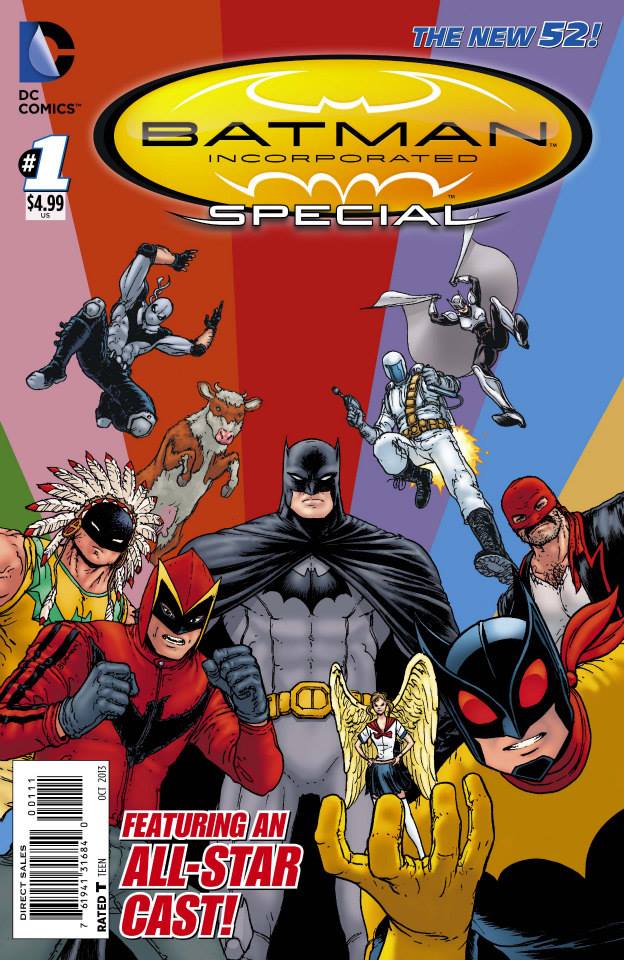
Grant Morrison: The Corporate Batman
Bruce’s resources in Wayne Enterprises allow him to look at Gotham from all sides. This naturally includes Arkham Asylum and several of Gotham’s desolate areas (including abandoned theme parks frequented by supervillains). Yet one man, even with two identities, still can’t handle an entire city alone. That’s where Batman Incorporated comes in. By franchising his secret identity, Bruce’s methods are now both legal and meaningful. The Bat-family grows beyond Gotham but also has ties to the GCPD through Jim Gordon’s membership. It’s possible that through this partnership, the GCPD get better equipment to deal with supervillains.
It would be an idea that’s driven forward in Batman: White Knight, even if it was by an alternate Joker. Of course, that’s just fighting some of the symptoms. Some real economic and political problems go along with what makes Gotham hungry. Bruce could continue his charity runs and even use Bat Inc. as a means of improving Arkham Asylum. But how much power would that give Wayne Enterprises? If anything, it would be near to a monopoly for the whole city. Having everything under his thumb would make Bruce a dictator. While Bruce is a good man, he needs Batman in order to prevent corruption.
Batman Is NOT a Bad Superhero
Despite what thinks, Batman is what Gotham City needs. While his methods don’t make the best results, those aren’t his fault. Gotham is just a hungry place that can eat away at people’s sense of right and wrong. Even paragons of goodness like Superman get overwhelmed by the city. Bruce Wayne gives everything the Bat needs and tries to do the same for his city. Having the Dark Knight around to take care of the extraordinary problems of Gotham is what can lead the city into being one worthy of having an open and positive example.
What do you all think? If Batman’s really a decent superhero, should he leave Gotham to crumble? Or should he let Bruce Wayne handle everything at the risk of becoming a corrupt bureaucrat? Leave your thoughts in the comments.
A new creative team brings DC’s Supergirl to comic book shops this week. Get ready to meet a different version of the Daughter of Krypton; one who has survived trauma upon trauma and, while still carrying the Batman-Who-Laughs infection, is struggling to find out who she really is.
Even with a new creative team on board, this issue is still carrying a lot of baggage over from this years crossover event. What can writer Jody Houser and artist Rachael Stott do to breathe life into the character?
Supergirl #37 Credit:DC Comics
Teenager of Krypton
Recent storylines have seen Supergirl facing the destroyers of her home world in the depths of space before returning to Earth to battle even more dramatic, and catastrophic, events. Ultimately, she has been pushed to the very edge. Left with an infection that has affected her mind as well as giving her a metal, punk rock look, Kara attempts to get on with her life. Unfortunately for those around her, her appearance isn’t the only thing that has undergone a radical alteration. Kara’s attitude has become confrontational, inpatient, even superior.
In essence she has become a teenager, cursed with super powers.
Houser has a lot of debris to pick through from the last few months of story. The direction that the character has been taken leaves Houser in a difficult position: she can’t just start afresh, the past is still very much present. Despite this, Hauser has made a clear statement with this issue, one that will set the course for the next few issues at least.
Supergirl’s new overconfident, almost cocky, attitude is front and centre in the narrative. From the opening pages with the traditional style rescue to the confrontation with her cousin and the Dark Knight of Gotham, Houser portrays Supergirl as impatient and self important. She has discovered a strength that she wasn’t aware of and, like anyone moving into a new phase in their life, she doesn’t have the experience to manage it.
Supergirl #37 Credit:DC Comics
Superhero Lightness and Dark
Despite the attitude, and the hint of darkness that comes with it, Rachael Stott’s artwork is full of joy and pops from the page. She creates exciting compositions within complex panel layouts. A wide angled shot of action is often interrupted by a personal close up, emphasising the emotion behind the activity.
Stott has drawn for a number of light hearted franchises that hold darker souls which makes her a perfect fit for this Supergirl. There is an air of enjoyment to the pages, and a flippancy that can be associated with teenagers acting out. The sequences where Kara fights Superman and Batman are largely humorous in the way Stott has depicted them. For example, Supergirl casually flings her cousin away while quipping.
A part of the jovial nature of the action is brought about by the comically expressive sound effects and the contrast between the speech fonts that Tom Napolitano uses. Supergirl’s speech is especially of interest as it flits between a standard, superhero font and a harsher, bolder text that appears more handwritten. These conflicting styles in her speech give the impression there is a struggle going on within Supergirl, as if Kara is fighting the infection that has turned her into a rage filled teenager.
This darker undertone is portrayed by Stott through occasional panels that give the reader a moment to pause and contemplate exactly what is happening. In these images there is a silent argument at work within the central character, one that almost physically manifests itself. These set pieces also give Cris Peter the opportunity to play with the colors.
For the most part the colors are competent superhero fare but there are panels where the color choices do more. The shifting of the background color from bright yellow to dark orange signifies more than just a sunset, it also highlights the inner turmoil of the characters.
Supergirl #37 Credit:DC Comics
Conclusion
The Supergirl comic goes through waves with strong, engaging stories lulling into page fillers and crossover events that rarely have any have any relevance to Supergril herself. This year the quality of the stories have been on a downward slope, however with a new writer and artist on-board it offers the comic a chance to perk back up.
With Houser and Stott in the driving seats the future looks good for Kara, even with the hangovers from the recent Year of the Villain to contend with. This issue of Supergirl is energetic, focuses on the titular character with some degree of respect, and proves that you can have fun superhero comics, even with some darker elements in the mix.
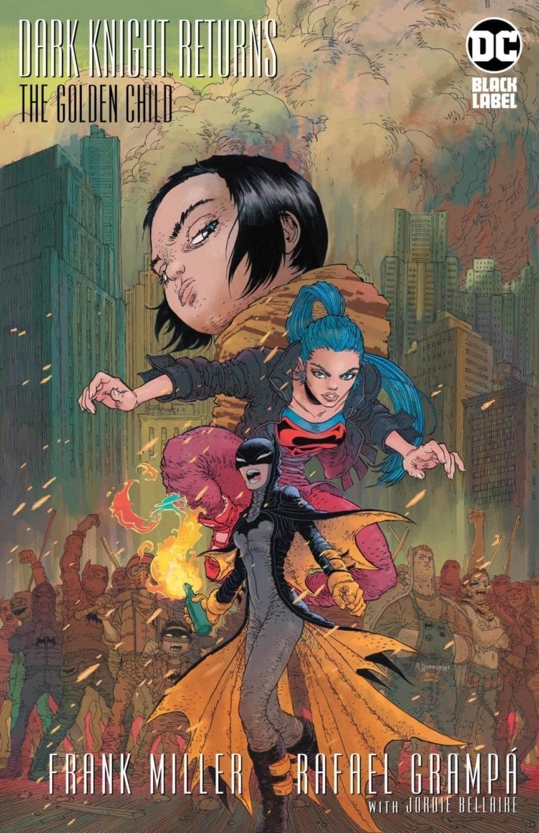
The Dark Knight Finale Raises More Questions than Answers
In 1986, DC put out the legendary miniseries, The Dark Knight Returns, by Frank Miller and Klaus Janson. It chronicles the story of an old Bruce Wayne coming out of retirement to bring order back to Gotham. Along the way, he takes on a new Robin, Carrie Kelly, and faced off against Superman. It was universally acclaimed, and Miller would return 15 years later for a sequel, The Dark Knight Strikes Again. While that story received much criticism, DC asked for one final series, with a few stipulations. One of these was working with Brian Azzarello.
While the final series, The Dark Knight: The Master Race, received great reviews, Frank Miller said he had one more story to tell in that universe. This story would truly be the end of The Dark Knight story, and it would be on his terms. How will this legendary tale end?
**Some Spoilers Below**
Story:
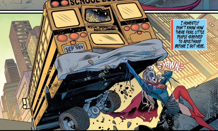
Opening up a few years after The Master Race, we focus on three characters: Superman’s children and Batwoman. During this period, a new political candidate(which may or may not be a parody of the current president) is pushing a hate-filled agenda. This has gotten the American people to start protests against him. A Joker style gangs rush these protesters in an attempt to break it up. Before they get too far, Batwoman and the Sons of Batman stop them while trying to find the leader.
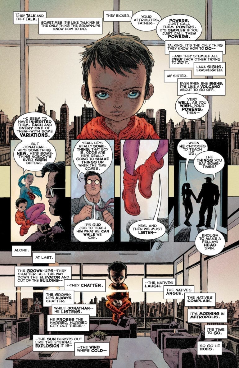
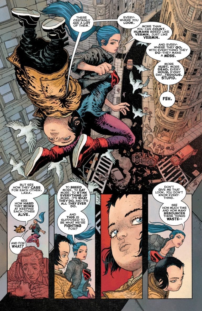
Meanwhile, Lara Kent is teaching her little brother about the world and how fragile humans are. Despite him being practically a toddler, Jon is quite intelligent and powerful, gaining the attention of the most dangerous villain in the universe.
After reading through this a few times, I honestly don’t see anything new. The commentary of this tale is nothing we haven’t heard before in recent stories. As for the involvement of the big villain, I’m scratching my head in confusion. Not because of who it is but why he is doing this. His whole part in the story felt forced as his master plan seemed a bit small for his level of thinking.
Another issue I have is the problem with how Miller continues to write the children of Superman as terrible people. Lara continues to be one of the most unlikable members of the Super-Family. Jon is not as bad, as he tries to prove to his sister that humanity is good, but still has this creepy tone and look that unsettles.
The only major part I liked was Carrie Kelly’s return as Batwoman. Seeing from where she started to where she is now is incredible. The best part was at the end, where she chases off the villain after inspiring the protesters against him. If this is truly the end, at least we got to see Carrie Kelly become the hero she was supposed to be.
Art:
As strange as this sounds, Rafael Grampa’s disturbing and bizarre art style is perfect for this world. It fits the aesthetic of the Dark Knight universe exceptionally well by giving us violent imagery and a dark future for us to return to. The action is visceral and will stick with you long after putting the comic down. The only issue with his style comes in the form of Jon, who kind of looks like one of the psychic children from the movie Akira. While nothing can quite match Klaus Janson’s style in the original story, this art team gets pretty close.
Conclusion:
Despite great creepy artwork and the return of Carrie Kelly, I’m wondering, “Why was this story made?” Other than taking a quite obvious political stance with Carrie and Lara, there was no need to tie this into TDKR Universe. When Frank Miller first announced this, he made it sound like that this was going to be the definitive ending to this world. All I see was one that in the end, felt forced and unnecessary. There will be those who like this book, but for me, this book just fell flat.
For the past four months, Phillip Sevy has been churning out some of the most visually interesting, emotionally resonant science fiction on comic book shelves. His book, Triage, is the story of three parallel universe versions of the same woman. Evie, Marco, and Orbit are hunted across realities by an alien killer and tasked with saving all of the multiverse. In issue four, Sevy begins his wrap-up to the series, placing our heroes in an almost no-win situation against time and their pursuer. It’s a penultimate chapter for the ages, inching us toward a conclusion that promises to be as deadly as the series’ armored antagonist. Read on to find out more.
When we left our trio of heroes, Marco had just kissed Tab, Evie’s longtime girlfriend. This added tension to the already fraught situation of being trapped on Marco’s home world. There, the forces of gravity are actively working against human civilization. With the Hunter still in their tail and tensions rising to a boiling point, the trio will have to find common ground and fix the damaged teleporter that Marco wears on her wrist. Without it, there’s nowhere to run from the relentless pursuit of the Hunter.
The Story
In our last review of Triage, we commented on the depth of character development. Little did we know, he had barely scratched the surface. Issue four is a punch to the gut for readers emotionally invested in Evie and her alternate versions. We get more backstory on her mother, plus further exploration of her relationship with Tab and reason Tab fell so quickly for Marco. This is a heavy, meaningful issue, but Sevy doesn’t fall into the trap of explaining backstory at the expense of the present. Everything we learn of Evie’s past matters immensely to her current situation, and will have ramifications toward her immediate future. A good writers knows when to hold off on explaining the full backstory of a character, and issue four proves Sevy deserves that title.
The Art
Reading Triage is a little bit like hopping across realities yourself. Triage’s world is built of landscapes that are so wildly different, it can feel like you’re reading two different books from page to page. There’s a danger in science fiction adventure stories for the settings to look too similar, but Sevy actively avoids this problem every time he switches location. After Triage wraps up next month, science fiction comics will have a lot to live up to visually.
The Lettering
Throughout Triage, letterer Frank Cvetkovic has done a great job bringing sound and voice to Phillip Sevy’s art. From sound effects to narration to important digital text that connects us to the series’ technology, Cvetkovic has immersed the reader in Triage’s strange, alien setting. However, this issue saw Cvetkovic doing a lot of normal dialogue and, unfortunately, it occasionally didn’t come together. Some of the speech bubbles took up a lot of space and contained too little text. The pattern of speech was sometimes hard to follow. Still, this tiny distraction wasn’t enough to draw away from the story or forget about Cvetkovic’s fantastic past work. Plus, issue five promises to be an action-packed final confrontation. Cvetkovic’s sound effects work has every chance to shine again.
Overall Thoughts
Though it may not be as visually thrilling as the first issue, issue four of Triage is a perfect showcase of what this series can be. The back-and-forth between Evie and her mom, then between Evie and Tab, were extremely powerful. Readers will be hard-pressed not to find themselves connection with these characters; excited to see what happens to them next but dreading the situation in which they find themselves. Pick Triage #4 up now for a penultimate comic done right, but make sure not to jump on with this one. This issue is a rewarding near-conclusion to a fantastic story; make sure you go into it informed.
For more reviews like this, follow us on Twitter. And for all the best comic book reviews, discussion, and news, stay tuned to Monkeys Fighting Robots.
IDW’s Teenage Mutant Ninja Turtles #100 fulfills the markers for a great comic. The culmination of years of plot lines? Yup. Big emotional hits? Check. A massive battle that defines the word EPIC? Absolutely. But it’s more than that. The book has a sense of its bigness. It feels important.
There’s a weariness about the story, the final piece of the City at War arc. It has that vibe you get in the final act of a blockbuster action movie; the heroes are against the wall. Not everyone is going to make it, but they’ll never stop fighting. There will be laughs and tears and blood, but the battle is glorious, and our noble warriors do the right thing.
In case you need to be brought up to speed, Karai has taken control of the Foot Clan after defeating Splinter on the heels of Old Hob setting off a mutagen bomb in New York City (Sidebar: At this point, don’t NYCers kind of deserve it if they refuse to move after decades of metahuman shenanigans?). Meanwhile, Katsune is resurrecting the Dragon, who happens to be her dad.
(This, kids, is what happens when Dad gets too many ties for Father’s Day…)
Beyond the well-hyped (and deservedly so) previews screaming that nothing in the Turtleverse will be the same again, what makes it so are the personal moments. Raph’s painful confession to Leo on the heels of his berserker rage while battling Bishop makes the story a human one. It reminds the reader of the themes of TMNT throughout its history. Acceptance. Redemption. Trust. On the other end of the spectrum, this issue reminds us that people can do the right thing and still leave a disappointing void.
The other component of this book that qualifies it for greatness is story quality. I’m not a Turtles guy. Nothing against those who are, just not my deal. This is the first TMNT book I’ve ever read, and it kept me hanging off every page. Yes, had I followed them throughout their history, this book would be a massive payoff. For readers of my age, think Uncanny X-Men #200 or Secret Wars #12. But those readers were going to buy the product anyway. What this murderer’s row of creators has done is not only tie up years’ worth of storylines, but present it in a way that attracts new fans, making them want to backtrack through all the issues leading up to this one.
(…and a pony.)
Kevin Eastman, Bobby Curnow, and Tom Waltz (with Waltz providing the script) imbued this story, from beginning to end, with love and respect for not just this arc, but the history of the book and its characters. Every aspect is firing on all eight, with the battle scenes mixed with comedic asides from B-Bop and Rock Steady and emotional depths interspersed with personal triumphs.
The art of Dave Wachter and Michael Dialynas is perfect. It combines the raw, indy feel that throws back to the books’ humble roots with the polish needed and deserved for a story this big. The buzz about this finale was not oversold. If you’ve invested any amount of time as a fan of TMNT, you understand this is a book that needed to radiate that kind of vibe. Rhonda Pattison’s colors work in concert with the pencils and inks to bring readers an emotional experience. Shawn Lee’s lettering is both solid and unobtrusive. It’s not sloppy, but not so overdone and embellished that it distracts from the overall piece.
If your only exposure to Teenage Mutant Ninja Turtles are the cartoons (or the toys, which are featured in the new season of Netflix’s “The Toys That Made Us” and brilliantly done) and you’re not sure why the four shellbacks have such a rabid following, read this book. And then read the other 99.
Did Teenage Mutant Ninja Turtles #100 live up to the hype? Let us know in the comments below.


 During Batman: No Man’s Land,
 Bruce’s resources in Wayne Enterprises allow him to look at Gotham from all sides. This naturally includes Arkham Asylum and several of Gotham’s desolate areas (including abandoned theme parks frequented by supervillains). Yet one man, even with two identities, still can’t handle an entire city alone. That’s where Batman Incorporated comes in. By franchising his secret identity, Bruce’s methods are now both legal and meaningful. The Bat-family grows beyond Gotham but also has ties to the GCPD through Jim Gordon’s membership. It’s possible that through this partnership, the GCPD get better equipment to deal with supervillains.