Home Blog Page 357

Why You Should Read: HARROW COUNTY

Horror is one of the most versatile genres in all of fiction. From slashers to psychological thrillers, and from creature features to supernatural terrors, its umbrella of subjects reaches far and wide. This is why it’s also such a subjective medium. The opinions and tastes of horror fans differ more from person to person than arguably any other genre. This is why Cullen Bunn and Tyler Crook’s Harrow County is such a rare treat. It’s an astonishing feat of storytelling that a horror story is able to hold such mass appeal while still maintaining genuine storytelling integrity. Bunn’s implementation of the southern rural setting and backwoods horror combined with heartfelt character-work makes the series a joy to read. This, along with Tyler Crook’s engrossing watercolors and charming detail makes Harrow County one of the most easily recommendable comic series of the past decade.

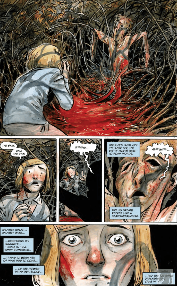
Emmy Crawford had always known that her quiet home of Harrow County had its share of strange secrets. The whispers of haints in the woods and old magics at work had kept her curious, but she never quite knew how close she was to all of this mystery. That is, just before her eighteenth birthday. Now with her understanding of who she is and how powerful she can become, it is her job to defend Harrow’s residents both human and haint from the dark magics that arrive in their quaint abode.

The humanity of Cullen Bunn‘s cast in Harrow is difficult to come across in any medium. There’s a sincerity in the convictions of the main characters that makes them instantly relatable, regardless if they’re human or not. Emmy is one of the most endearing protagonists of recent memory, a character with an almost inexhaustible amount of kindness coupled with a deep internal struggle. Watching her wrestle with the characteristics her kind-hearted father instilled within her and the immense power her bloodline gives her is always riveting. Her victories are earned in the eyes of the reader, and her sacrifices are understood and emotionally compelling.

The supporting cast is also given great care in its development. Emmy’s closest friend Hattie has to struggle with her own teaching and superstitions about the “evils” of magic. The path the takes is an at times frustrating but always understandable one. The haints of Harrow County are sure to be favorites as well, from the tiny but courageous hobgoblin Priscilla to the massive and menacing, um, bull(?) in the woods (no spoilers). Even Emmy’s ever-loyal familiar the skinless boy, who never says a word, is a character that is sure to endear himself to any reader who embarks on this series. Even many of the series’ supporting antagonists have understandable views within their own treachery. The story deals with differing shades of good and bad, with Hester Beck as the representation of ultimate evil.

Another winning mark for Harrow is the development of its world and rules within its fiction. Harrow County itself appears frozen in time, with it being separated from the outside world just via isolation. This allows the quiet and charming yet haunting atmosphere to build freely. This is coupled with Cullen Bunn’s soft approach to lore and magic in the series. He doesn’t waste any time detracting from the natural progression of the plot by delving into the hard rules of Emmy’s magical abilities. Nor does he spend any time really explaining the hows and whys of Harrow’s hauntings and haints. They just “are.” The only real explanations the reader receives are ones that are necessary for understanding the characters themselves. Points such as backstories and revelations are brought in via conversation when the time is right. Even these small points of exposition are created in a naturalistic way that doesn’t detract from the story’s pace. This maintains the sense of wonder and engrossment in this neatly crafted horror-fantasy.

It is unlikely Harrow County would have either the reader reception or impeccable atmosphere it does without the iconic visual work of Tyler Crook. The mixture of quiet and quaint southern-woods and the eerieness of that same environment is captured in an art style unique to the Harrow co-creator. Crook’s watercolored textures fill the world with a softness that is warm and inviting in the sweeter moments but turns surprisingly sinister during the horror sequences. The linework is a neat mixture of excellent character design and that aforementioned mixture of “sweet & sinister” environments. As much thought as Cullen Bunn put into the cast in terms of personality, Crook put just as much in how to make them visibly relatable. Emmy is drawn to be every bit as kind and endearing as could be imagined.

The emotional range Crook demonstrates in his art with her alone of astounding. From happiness that radiates off the panel to rage or heartbreak, Crook is there to provide some of the most human art in the medium. This goes for every character, from the unusual haints to the shady lodge of witches and the terrifying Hester Beck. Crook’s range of talent comes in extra handy during the story’s creepiest and most harrowing moments. The horror in Harrow County doesn’t rely on jumps or gore, but purely on atmosphere. Crook makes this work with his murky darkness and unsettling woodland landscapes. When blood does pour however, it’s always a brutal and shocking display without ever feeling gross or over the top. Even the lettering has its own personality, often changing fonts or appearing in wavy sing-song lines. Crook’s creativity further encapsulates the wonder and charm of this series.

Cullen Bunn and Tyler Crook’s Harrow County is one of the most easily recommendable and widely enjoyable comics of the decade. The effortless mixture of fantasy and horror with character-focused storytelling makes for an endlessly compelling read. Bunn’s carefully constructed and original plot is gripping from the opening page of issue one to the final page of issue 32. Tyler Crook’s art and lettering wraps the reader in its dense atmosphere and fantastic design. With a new sequel-series just having started, now is the perfect time to grab the first volume of this spellbinding comic.


Monkeys Fighting Robots Youtube

On Reading the 1st Year of Li’l Abner: Mammy and Pappy Yokum

Mammy Yokum
"Don't worry, Salomey. I won't hang you out to dry...for long! Heh!"

The original Human Torch has his more-or-less impervious android body. Captain America has his injection of Dr. Reinstein’s — I mean, Erskine’s — super-soldier serum. The Whizzer has his blood transfusion with a mongoose — that’s right, I said “mongoose.” And, of course, the famous Blue Blaze has his exposure to an unnamed blue flame that put him into a death-like coma for 88 years, finally rising from the grave to fight crime with the aid of spooky supernatural powers. Of course!

Superhero comics of the ’30s and ’40s were full of catchy, or not-so-catchy origin stories. Unlike these masked vigilantes, though, Li’l Abner‘s origin story is pretty simple. First, Pappy Yokum met Mammy Yokum. Shortly after they were married, Li’l Abner was born. Abner ‘et up lots of po’k chops, and now he’s almost as strong as his Mammy.

Pappy and Mammy Yokum

Mammy Yokum
“Miss, ah think yo’ is missin’ paht o’ yo’ dress!”

Mammy Yokum

Pappy and Mammy Yokum act as the ethical backbone of Al Capp‘s hugely influential Li’l Abner comic strip. Whenever Abner’s spurning of Daisy Mae starts seeming sad rather than funny, Mammy’s there to either set Abner straight or trick him into realizing that he actually loves the beautiful and lovelorn Miss Scragg. This is one thing that makes Mammy Yokum such a positive role model.

Rather than forcing Abner to take Daisy Mae out on dates, Mammy repeatedly orchestrates events so that Abner has opportunities to realize that, despite his statements to the contrary, he does love Daisy Mae. As Li’l Abner ages, the titular character wises up somewhat and figures out that Daisy Mae is, although “just a girl,” a serious freakin’ catch.

In addition to being Abner’s moral compass, Mammy is a force unto herself. In just one year of publication, Mammy settles a fraud dispute, exposes graft in a local beauty contest — which she ends up winning herself — settles a multi-million-dollar adoption dispute, rescues her husband from being tortured by his ex-fiancée, and cooks approximately a googolplex of po’k chops.

Mammy Yokum
“Oh boah, Mammy! You look jes’ like a sossij!”

Pappy Yokum

Mammy can cook po’k chops but even Li’l Abner must tip his hat in deference to how quickly Pappy Yokum can get ’em all et up. Abner might derive his strong moral sense and unmatched wrasslin’ skills from his Mammy but his Pappy provides the basis for his voracious appetite.

Possibly even more important than his all-consuming love for po’k chops, though, Pappy also seems to have been the point person on the tenderhearted side of Li’l Abner’s upbringing. A romantic with a heart of gold and a bottom less stomach, Pappy is as loyal as he is simple…which is quite a bit.

Salomey
“Don’t worry Salomey. I’ll only et yo’ frenz and relayshuns!”

Salomey

No house is a home without a pet, and even though their favourite food seems to be pork chops, the Yokums’ beloved pet is, nonetheless, a very cute pig named Salomey. Salomey is for the most part a relatively peripheral character but gets his time to shine when he uses his hoof to tap out a warning to Li’l Abner. Now that’s a pig to keep around.

Heroes and Villains…

No comic — strip or book — is complete without a good villain or two. And, although none of Li’l Abner’s villains have freeze guns or octopus arms, they still manage to make life pretty difficult for the good people of Dogpatch. Check out my next article on the various fraudsters and grifters that make up the rogue’s gallery of Dogpatch, USA.

Monkeys Fighting Robots Youtube

Review: We Wish You a Monstrous Christmas in DETECTIVE COMICS #1019

Detective Comics #1019

What begins as the investigation of an occult mass sacrifice—run of the mill stuff in a city like Gotham—evolves into eldritch-level horror in Detective Comics #1019, out this week from DC Comics.

After a close call with the Viking berserker, Bruce works to track down the root of the strange happenings. By the book’s end, he discovers that the brutal killings are tied to a creature that is not of this world.

DC_1019_Page 1

The Writing

Perhaps the strongest element at play in Detective Comics #1019 is the mood and atmosphere of the story. Writer Peter J. Tomasi crafts a bitterly-cold environment for the tale; a grim and frostbitten Gotham to complement the dark nature of the pagan cult pursued by Batman.

The story has plenty of gruesome and macabre ritual touches. These elements are counterbalanced by a decent amount of humor to complement, rather than clash, with the overall tone. This interplay of darker and lighter elements has been a staple of Tomasi’s writing style on the series, and remains one of the stronger points in his stories.

The narrative in Detective Comics #1019 keeps the reader’s attention from one page to the next. As the mystery deepens, the reader feels the tension heighten. Tomasi manages to keep you guessing until the end. Unfortunately, that’s also where the book’s biggest weakness lies.

The ending wraps up rather quickly, and is revealed largely through an expositive monologue by the entity that turns out to be the main antagonist. It’s a very interesting concept; however, the way it pans out feels a bit anticlimactic. The book is too content to wrap-up the story with convenient hand-waving. While most of the book is well-paced, the ending feels very rushed.

It’s possible that this was merely setup for a larger story yet to come. Tomasi weaves some heavy foreshadowing into the story, suggesting the entity may appear again at some point. As is, it’s enjoyable enough for the “festive” vibe.

DC_1019_Page 2

Detective Comics #1019 Page 3

The Artwork

Scott Godlewski’s art in Detective Comics #1019 doesn’t carry over much of the brooding atmosphere we saw in our last issue. That said, it’s still a good showing in the visual department.

Godlewski’s character designs are solid. While they’re not a standout component, the designs are coherent and expressive. The same can be said for the backgrounds and environs present in the book; they’re generally-well detailed, which helps draw in the reader.

There are some standout moments; for instance, the reveal of the entity responsible for the cult activity is a visual high-point. As a whole, though, the artwork in Detective Comics #1019 has a general sense of utility to it. From the designs to the page layout, the artist takes a very meat-and-potatoes approach to this book.

The colors by David Baron are one of the more interesting visual elements at play. The artist brings a lot of the darker, grimier, greenish tones that have become a stylistic staple of the series. It works surprisingly well as the backdrop to a frosty winter setting, especially when set against some of the warmer, more fiery tones.

DC_1019_Page 4

Final Thoughts

Detective Comics #1019 isn’t a bad issue. In fact, it’s very enjoyable until the uneven pacing and flat conclusion detract from the overall work. Not essential, but worth giving it a read if you’re a completionist.

Monkeys Fighting Robots Youtube

Review: INVISIBLE KINGDOM #9 A Reality Check In The Depths Of Space

Invisible Kingdom #9 cover detail
Invisible Kingdom #9 Credit: Dark Horse Comics

To round off the first month of the year, Dark Horse Comics releases the next chapter of their Science Fiction masterpiece Invisible Kingdom. The penultimate part of the second arc is released on 29th January and the action continues to heat up.

Space Pirates, daring escapes, and crew members pushed beyond their comfort zones. This issue has everything you could want from a space opera of this kind; including the usual kick-ass artwork and edge of the seat storytelling. Does anymore need to be said? Yes, yes there does.

Invisible Kingdom Panel Art
Invisible Kingdom #9 Credit: Dark Horse Comics

Character Building

A desperate plan gives the crew of the Sundog a glimmer of hope but what is the cost of their freedom?

As the escape plan unfolds so too does a deeper exploration of what it means to be free. G. Willow Wilson’s script is brimming with difficult questions about the roles that the cast play in the world around them. A confrontation between Grix and the recently rescued Luxx ship captain makes the reader consider the role that the Sundog captain is playing. Is she a revolutionary? Or just running scared? The audience is forced to evaluate Grix’s role in the narrative so far, just as the character herself is.

This arc as a whole has been more character driven than the previous one, with Grix becoming the main focus. She is defined more by her interactions with the other characters than she is by her actions in the story. This issue sees Grix pushed to the extremes of her emotions and her reactions move the story forward in dramatic ways.

One of the highlights of Wilson’s work is her ability to build characters in this amazing way while also making larger comments about society and the world outside the comic. Wilson’s opinions on certain subjects are clear in the narrative but it is never preachy, in fact every encounter encourages the reader to consider opposing views. The main cast have very open minds and Wilson uses this to confront topics. She pits certain characters against those who are not like minded. 

Invisible Kingdom #9
Invisible Kingdom #9 Credit: Dark Horse Comics

Artistic Wonders

Christian Ward’s art is always a joy to read and this issue is no different. To accompany the character fuelled narrative, Ward is increasing the emotional depth through his storytelling. This is most evident in two aspects of the comic.

Firstly the coloring. The contrasts between warm and cold colors mirror the relationships and the emotional states of the cast members. For example, at one point in the opening of the comic a number of Sundog crew sneak into the hold to steal some much needed supplies. The characters leave the relative safety of the brightly lit corridors and enter the cold, grey depths of the store room. The colors highlight the transition from safety to danger and is a continuing theme throughout the following pages.

The other exciting aspect of Wards work in Invisible Kingdom are his powerful layouts. His panels have thick, black borders that form a very strong shape on the page. Even with a standard panel layout, Ward’s treatment of the page gives it extra gravitas. Each panel makes a bold statement.

This is then accentuated when the layout transgresses from a normal pattern. Action sequences break the borders or distort the panels entirely. A page turn instantly changes the urgency of a situation and the reader involuntarily becomes on edge, anticipating the action.

This manipulation of the reader allows both writer and artist to control the narrative more successfully. The story beats are well placed to keep the adrenaline pumping. Issue 9 of Invisible Kingdom may be a character piece but it is an exciting one that keeps you engaged in every aspect of the storytelling.

Along with the out of the world visuals is the subtly enticing lettering by Sal Cipriano. At a quick glance there isn’t anything irregular about the lettering but when you start to read you notice the uneven speech balloon borders. Once noticed, it’s difficult not to see, and that sudden attention makes you focus on the words a lot more than you expect. 

In other comics, this could be seen as a failure on the part of the letterer, as not being noticed is usually the name of the game. But when you have the striking visuals of Christian Ward, getting the reader to give the text the attention it deserves is no mean feat. Cipriano manages to do this by giving the reader something slightly modified from what is expected.

Invisible Kingdom #9
Invisible Kingdom #9 Credit: Dark Horse Comics

Conclusion

By now Invisible Kingdom is not surprising anyone by its excellence: it is a comic that has proved itself month after month. The fact that the creators keep that level sustained each issue is impressive. 

The character of Grix is strong enough to carry the story and the greater concepts that the writer wants to raise. You can ignore the social commentary if you wish, however it is built into the fabric of the narrative and by brushing over it you miss out on deeper insights into the characters and their motivations.

It’s a safe bet that if you’ve reached issue 9 of Invisible Kingdom you know what you are going to get, but there is still a lot to offer and entice new readers. It isn’t that difficult to pick up the general gist of the comic so don’t be put off if you’ve not read any previous issues.

All in all, Invisible Kingdom is a fully rounded, modern science-fiction comic with the usual thrills and spills but also, an extra, deeper, social conscience.

Monkeys Fighting Robots Youtube

Kickstarter Review: ANUBIS: DOG OF DEATH #1

Anubis: Dog of Death #1

From writer Sindre Finnøy and artist John Barry Ballaran, Anubis: Dog of Death #1 will soon be available to support on Kickstarter

What is it about cute, small creatures with diabolic tendencies that we can’t seem to get enough of? Characters such as Stewie Griffin on Family Guy, Brain on Pinky and the Brain, and Plankton on SpongeBob SquarePants have entertained us for decades with their plans of world domination.

Enter Anubis, the ancient Egyptian God of death and the afterlife, who happens to find himself trapped in the form of a fluffy puppy.

Anubis Dog of Death Cover

Story

Anubis: Dog of Death is an action comedy series about the Egyptian god of death, doomed to an existence as a tiny purse dog in modern-day L.A.

Writer Sindre Finnøy successfully manages to craft a well structured first issue, giving us a succinct set-up to this world and its primary characters, as well as with what we can expect to come. Finnøy gives us these brief glimpses back in time, when Anubis was ANUBIS, in all his destructive glory. Those moments are used to comically juxtapose his present status, as a helpless canine who wants nothing more than to return to his former God self and bring death and destruction to the world. 

Art

John Barry Ballaran’s artwork in Anubis: Dog of Death adds to the humor and charm of the story. He’s drawn the titular character as a cute and scruffy dog, with purple fur and big eyebrows that really help makes him expressive and downright sinister. The pages taking place in Ancient Egypt are also worth noting. They are full of action and unique layouts to help showcase the calamity of war. 

Conclusion

All in all, Anubis: Dog of Death #1 is a fun, light-hearted read with a unique take on a familiar character trope. Pick it up and enjoy!

You can support the team behind Anubis: Dog of Death by donating to their Kickstarter

Anubis Page 1

Anubis Page 2

Monkeys Fighting Robots Youtube

AfterShock Comics Exclusive Preview: ANIMOSITY #26

aftershock comics comic books exclusive preview animosity #26

ANIMOSITY #26 hits your local comic book store February 18th, but thanks to AfterShock Comics, Monkeys Fighting Robots has an exclusive four-page preview for you.

About the issue:
In the land of the kings of Texas, the only thing worth more than oil — is blood.

ANIMOSITY #26 is by writer Marguerite Bennett, and artists Elton Thomasi and Rafael De Latorre, with colors by Rob Schwager, and letters by Taylor Esposito. The cover is by Rafael De Latorre with Marcelo Maiolo.

The series tells the story of a world where animals suddenly gain the ability to think and speak like humans…and they begin their revenge. Issue #26 is the second part of the “King of Texas” storyline.

Check out the ANIMOSITY #26 preview below:

aftershock comics comic books exclusive preview animosity #26

aftershock comics comic books exclusive preview animosity #26

aftershock comics comic books exclusive preview animosity #26

aftershock comics comic books exclusive preview animosity #26

aftershock comics comic books exclusive preview animosity #26

aftershock comics comic books exclusive preview animosity #26


Are you reading ANIMOSITY? Sound off in the comments with your thoughts!

Monkeys Fighting Robots Youtube

Marvel Comics Exclusive Preview: Horrors Unleashed In RAVENCROFT #1

marvel comics exclusive preview ravencroft #1

Ravencroft #1 hits your local comic book store January 29th, but thanks to Marvel Comics, Monkeys Fighting Robots has an exclusive five-page preview for you.

About the issue:
RAVENCROFT REOPENED! After the hellish horrors of ABSOLUTE CARNAGE, the Ravencroft Institute has received a much-needed facelift and is open for business with a new staff, including JOHN JAMESON, looking to atone for the part he played in ABSOLUTE CARNAGE. But will Ravencroft return the mentally unstable villains of the Marvel Universe to upstanding citizens and give John the redemption he’s looking for, or will they fall prey to the hospital’s seemingly sinister nature?


Ravencroft #1 is by writer Frank Tieri and artist Angel Unzueta, with colors by Rachelle Rosenberg and Dono Sanchez-Almara, and letters by Joe Sabino. The main cover is by Kyle Hotz and Dan Brown.

Check out the Ravencroft #1 preview below:

marvel comics exclusive preview ravencroft #1

marvel comics exclusive preview ravencroft #1

marvel comics exclusive preview ravencroft #1

marvel comics exclusive preview ravencroft #1

marvel comics exclusive preview ravencroft #1

marvel comics exclusive preview ravencroft #1

marvel comics exclusive preview ravencroft #1


Are you excited for Ravencroft? Sound off in the comments!

Monkeys Fighting Robots Youtube

I CAN SELL YOU A BODY #2 – Love, Money and Dead Bodies Reanimated

Denny stoops to new lows as he drags others into his final 48 hours of life while enacting an asinine plan in IDW’s, I CAN SELL YOU A BODY #2, in a morgue near you.

A team up in I Can Sell You A Body? Sadly, no.
Interior Art and Colors by George Kambadais. Letters by Ryan Ferrier

Don’t be caught dead not keeping up with I Can Sell You A Body, check out our review for the first issue, or pick it up from your local comic shop.

I CAN SELL YOU A BODY STORY

Writer Ryan Ferrier quickly sets the stage for the future issues of I Can Sell You A Body with a quick visit to Vatican City. It isn’t a long stay, yet Ferrier uses these pages to set up more antagonists for the unlucky Denny. Tonally this scene is akin to the whole issue. But, it feels as if it shouldn’t be. I Can Sell You A Body #2 reads like a jokebook with constant jokes. At times this comedy hits perfectly, yet in others, it would bode well to have a few serious moments. That’s not a dig at the tone of the book, as it wears its humor on its sleeve. Nonetheless, moments (especially Vatican City) could’ve benefited from a different demeanor.

The highlight of I Can Sell You A Body continues to be its main character, Denny Little. Throughout the little bits of history Ferrier sprinkles in, it seems the masses know and hate him. Hopefully, in the future issues (or a spin-off), Ferrier delves into these stories more. Yet, an interesting main character can only drive a story so far. Luckily, Ferrier keeps the plot remarkably interesting by diving deeper into Denny’s powers. The extent of his powers aren’t exactly shown, but we do learn Denny can raise multiple dead bodies at once. We learn this in a foolish plan that is hilarious but fails like much of the stuff in his life.

LETTERS TO THE DEAD

Ferrier continues pulling double duty by providing the lettering for I Can Sell You A Body #2. The lettering shines when it’s time for the undead and ghosts to speak. When Denny brings the bodies back to life, Ferrier makes them vastly different than others. Instead of the words being contained, they explode out, most times being bigger than the bubbles. On a more subtle note, Ferrier portrays the ghosts’ dialogue with a green border around their dialogue. It’s a small change, yet it works perfectly.

I Can Sell You A Body #2 brings in more players!
Interior Art and Colors by George Kambadais. Letters by Ryan Ferrier

LIVELY ART

George Kambadais’ art and colors retain the amazing quilty seen in the first issue while playing with lighting/shadow usage more. I Can Sell You A Body #1 had a few panels where Kambadais would focus on a face while casting them in a menacing light. Yet, in its second issue, he uses this technique in multiple instances that flow into regular moments as well. When Denny is visiting a “lover” at night, Kambadais paints the background pinkish with shadows forming about. This subtle lighting effect is gorgeous in its execution, making the world fill that more real.

The lighting/shadows aren’t the only places that Kambadais shines, as his art continues to be lively. Throughout I Can Sell You A Body #2, Denny and other characters don’t always stay inside of the panels. Instead, when the story calls for it, Kambadais breaks panels and backgrounds to make the pages pop to life while catching your eyes. While keeping the reader’s eyes by popping panels, the visual humor carries over from the first issue into the second. When Ferrier sets out to tell a joke, Kambadais follows through on the art side.

Interior Art and Colors by George Kambadais. Letters by Ryan Ferrier

CONCLUSION

I Can Sell You A Body #2 retains the comedy seen in its first issue, yet not every joke lands as desired. As hilarious as some moments are if I Can Sell You A Body took itself just a tad bit more serious the story would benefit immensely. Nonetheless, the ride throughout is a fun one that readers that love dark humor can kick back and enjoy.

Memorable Quote: “FUCK!” – Denny

Throughout this one page, Denny says, “fuck” 37 times. The page is hilarious in its simplicity and humor.

VISITING THE MORGUE

What have you thought of Denny Little’s story thus far? Let us know in the usual place.

Monkeys Fighting Robots Youtube

SUPERMAN #19: “I’ll Take a Superman Story with Everything on It”

Superman 19 from DC Comics

DC Comics’ Superman #19, written by Brian Michael Bendis, with pencils by Ivan Reis, inks by Joe Prado, Danny Miki, Julio Ferreira and Oclair Albert, colors by Alex Sinclair and lettering by Andworld Design, takes every kind of great Superman Story and says “I’ll do it all.” With the ongoing repercussions of Clark’s identity reveal, Bendis and company balance heart-to-hearts with alien brawls in a brilliant ode to the Man of Steel.

Writing

It’s tempting to say that Bendis (or DC Comics) is dragging out Clark’s big reveal. But the reasons for thinking that might be precisely what makes this series great. Where other series would skip past the nitty-gritty of what it means for a hero to tell the world who they are, Bendis attempts to deal with the fallout head-on. And while much of the issue is made up of heartfelt conversations, Bendis knows when to pull back. We hear of a statement Clark wants to make to the bullpen, though we never hear the speech itself. We see fellow heroes approach Clark, but we don’t hear what they say. Bendis knows we love these characters so much; nothing he could write would do these moments justice. And in doing so, we each get to hear a different statement, or a different word of encouragement, filling in the dots in our own way.

Superman 19 2

Art

Reis, Prado, Miki, Ferreira, and Albert pool together to give this issue its intimacy. Speaking through the smiles of the characters, or the somber looks in a sea of smiles, they remind us what Superman means to everyone. From his co-workers to the many civilians of Metropolis, the Man of Steel has a place in everyone’s heart. The team on inks and pencils makes that clear. They also gradually zoom out near the end of the issue, to prepare us for a change of pace. With cosmic clashes, zooming back in on snarling faces, the team shows us Clark can be more than heartwarming. He can be a lot of fun too.

Colors

Sinclair’s colors play a game with the reader. Winding down to darker tones, like the calm before the storm, Sinclair teases moments of grief that never arrive. It prepares the reader for the worst, only to then offer up the best. Similarly, Sinclair switches to brighter tones in happier moments and even in moments of danger. Sinclair truly knows how to use a color pallet to pull on heartstrings. It allows us to feel Clark’s triumphs and sets us on the edge of our seat for Superman’s trials.

Superman 19 3

Letters

Andworld Design’s lettering often varies in size and style. As a result, many characters are given his or her own voice, and moments are given their own unique significance. In one scene, when a group of people begins to clap for Clark, the first clapping sound effect is smaller than the ones that follow. It’s so easy to hear the real-life equivalent of this happening, and the representation of it makes the moment feel real. Many alien races are given their own style of lettering and word balloons. This variety helps to set them apart and even makes it that much more fun to read a page.


This is a Superman issue that does it all. The creative team from DC Comics shows us all the reasons we like Clark, and all the reasons we like Superman. And they remind us what makes the two so different. Pick up Superman #19 at your local comic book shop on January 22nd, 2020.

Monkeys Fighting Robots Youtube

BATMAN: CURSE OF THE WHITE KNIGHT #6 – Digging Up the Past

The past comes back to haunt the Wayne family in Batman: Curse of the White Knight #6, out his week from DC Black Label.

First Impressions

Sean Murphy dives back into the Three Musketeer-esque family history of Batman to reveal something Bruce definitely doesn’t want to hear. Batman becomes the biggest oxymoron the city has ever seen. Murphy mentioned on his twitter that he did something bold that people might not like. We’ll see how the reaction is from other readers, but I didn’t find the reveal to be earth shattering.

These are comics and nothing is permanent, so big reveals don’t do much for me anymore. The only revelation in the past decade that really made me feel anything was Jonathan Hickman with the X-Men and Moira McTaggert. No one stays dead anymore. Centuries old family history doesn’t change who Batman or Bruce Wayne are now.

Art

Murphy’s art in this series is sublime. His attention to detail is second to none. These panels look like they’d take most people months to complete, but I doubt it takes him long at all. His character designs are unique and Azrael’s mech-suit is awesomesauce. One day I hope we’ll see some of his art with some gaudy vivid colors. I doubt it, but a guy can dream.

Matt Hollingsworth is Murphy’s partner in crime. His colors are dulled, pale, and realistic. Let’s be honest, most of our world is dark and dirty. To use such bright colors in so many stories is more wishful thinking than realism. Unless there’s some type of explosion, lightning, or blinding light, there will be NO bright colors in Sean Murphy’s books. Lack of bright colors makes the shadows so much more important, and Hollingsworth is a ninja.

Letters

AndWorld Design takes care of the lettering in Batman: Curse of the White Knight. None of the sounds look the same to give different inflection to the same type of noise. Everything is easy to read, even the tiny noises from tossing keys. This issue is full of dialogue and plenty of action so AndWorld had no problem staying busy with this one.

My Two Cents

Batman: Curse of the White Knight really is a beautiful book. Each issue is meticulously drawn with so much detail in mind. Murphy is one of the most original artists in comics, there’s nothing out there quite like it. This story is a non-stop adventure from cover to cover, but it has its mystery as well. I’m reminded of Indiana Jones by the storytelling here. More is revealed the deeper and deeper they dive into history.

Flashback scenes allow Murphy to draw some stellar old outfits and classic architecture. I’m sure those are his favorite panels to draw, especially when you can see the extra detail and creativity that goes into the layout of those drawings. With the obvious references to the Three Musketeers, this is a comic you could recommend to those history and literature lovers that haven’t tested the waters of comic books.

It is always a treat to experience different creators’ takes on Batman. Elseworlds and other offshoot stories have put Batman in different locations with different challenges. Sean Murphy might have created one of the most interesting and successful alternative universes for the Dark Knight. I can’t think of any other alternate universes that have gotten this many sequels and one shots, and from what I gather, it sounds like there are more to come.

While the review was a little lackluster than what I was led to believe, I think it won’t be fully felt until next issue. We only know the information now, we don’t know how it will affect Batman, who else will find out, and how they will react. See you next month. Same Bat-Time. Same Bat-Channel.

What did you think of Batman: Curse of the White Knight #6? How do you think Batman will handle the new information? Do you think this changes anything? Let us know in the comments below.


Monkeys Fighting Robots Youtube