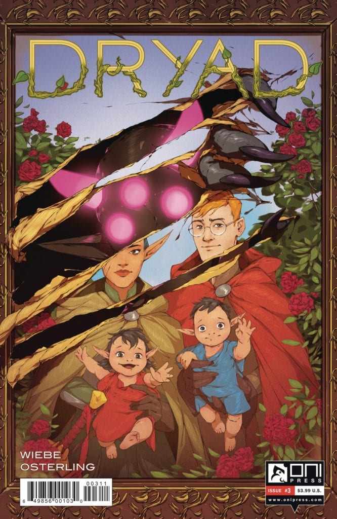
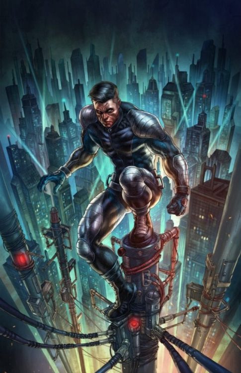
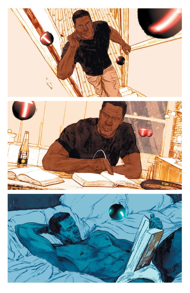
The Glass family is about to be torn apart by history in Dryad #3.
DRYAD #3, out July 8th from Oni Press, continues to merge science fiction and fantasy into something new, all while telling us the story of one family, and how their past has finally caught up with them.
The Glass family is about to be torn apart by history in Dryad #3.
***SPOILER WARNING***
The Glass family has quite the secret – one that is exploding out into the forefront in Dryad #3. What started out as a casual fantasy series has rapidly turned into a genre-blending tale as more technology is introduced by the moment.
From the start we knew that Morgan and Yale were on the run from something – we just didn’t know what. Well, after reading this issue, fans will have a slightly better idea of the where, but not the why. Not yet, at any rate.
The Writing
Dryad #3 is as lush as an adventure as the previous two issues, but it has raised so many more questions along the way. Morgan and Yale’s past may have been revealed, but not enough to explain their reasoning. Not to us, and certainly not to their children.
Kurtis Wiebe has done a brilliant job of creating and developing this world. It’s only been a short period of time, but already elements of it are clicking into place. The revelations made in this issue suddenly explained so many little moments before now. It makes you wonder what else will be revealed in later issues.
The Glass family is, simply put, fascinating. The journey of the parents raises a lot of questions, obviously. And with it come questions about how the teenagers will react. It’ll be interesting to see how much of these plot points are developed in future issues.
This has quickly become a world that readers are going to want to learn more about. It went from being something we’ve seen a hundred times before – to something totally different, but in a way that also made complete sense. The stability of the world helps to make it feel even richer and more fascinating, leaving fans eager for more.
The Art
The artwork inside Dryad #3 is something truly to behold. The plot and setting are a fantastic blend of genres, then none of it would be possible without the artwork to support it. This is a fantasy world infused with science fiction elements – or is it the other way around?
Justin Osterling was the lead artist for this issue, and their lines are incredible. They’ve created this unique fusion of elements and then fleshed out the world with characters to bring it to life. There’s so much to look at from this issue, from the current events to the flashbacks, to that surreal world created later on. All of it insists on the reader’s attention.
Meg Casey provided the colors, and wow do they ever pop in this issue. The world is vibrant and oh so very colorful. It’s interesting, because the colors are incredibly bright, yet they match both the fantasy and science fiction themes. That must have been a hard balance to find.
Last, but certainly not least, there’s the letting, provided by Jim Campbell. Campbell’s work is a masterpiece, as always. Everything from the subtle moments to the major swings (and sound effects) was so carefully placed.
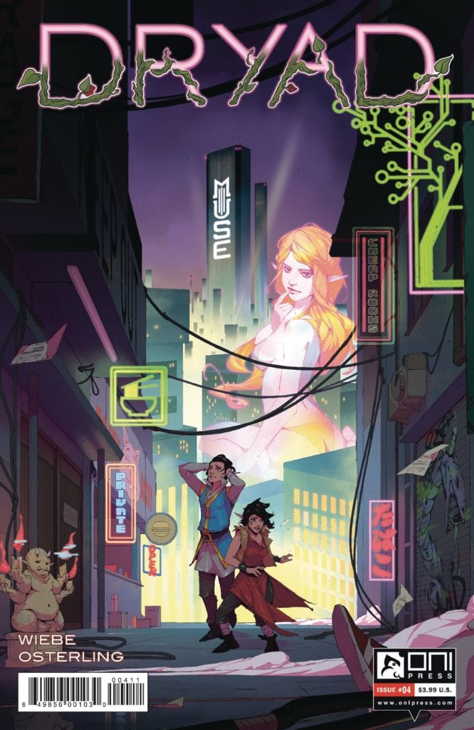
The Glass children are in for a whole new world in Dryad #4.
Conclusion
Dryad #3 is one of those thrilling issues that leaves you eager to get your hands on the next part of the tale. This is quickly turning into a world much more complex than we could have ever predicted, and yet we can’t get enough of it.
Darcy is taking point on this cover of Family Tree #6.
FAMILY TREE #6, out this Wednesday from Image Comics, continues the thrilling and horrifying tale full of family drama and surprising evolution. This groundbreaking story is far from over.
Darcy is taking point on this cover of Family Tree #6.
***SPOILER WARNING***
Family Tree is a series unlike any other. It merges family drama with horror, nature with humanity. It’s proof that sometimes the most haunting elements of a story are the parts almost too subtle to catch. Until it’s too late.
Created by Jeff Lemire, Phil Hester, Eric Gapstur, Ryan Cody, Steve Wands, Will Dennis, Family Tree is absolutely a series that will get under your skin (pun intended). It’s dark and chilling, with the stakes feeling higher than ever.
Why do the stakes feel so high? Because the series has gone above and beyond in making sure that we care about this family. It’s impossible not to hope for their survival, even as they face incalculable odds.
The Writing
Family Tree #6 starts it’s a tale in the past – finally answering the questions about what happened to Darcy. Granted, it doesn’t answer all of them. We still don’t know the cause of all of this, but knowing that would take away some of the horrors.
The inevitable conclusion to Darcy’s tale foreshadows what is currently happening to Grandpa Judd. Last we saw, he was not doing well, though admittedly he’s proving to be a tougher character than anticipated.
Even then, there are more answers being provided. Slowly, the full story is being made clear. You’d think that would help to tone down the horrifying elements, but instead, it is merely reinforcing this feeling of the inevitable.
One thing is certain, there is still more to be explained about this family and their journey. They must still come together once again, and there is still at least one more major fight on the horizon – and that’s if they’re lucky.
The Art
Once again the artwork behind Family Tree #6 is gritty and intense, providing the perfect backbone for this series. The style itself is oddly organic, so much so that it lends very nicely to the concept of arbors and Arborists.
There’s a dramatic transition within this issue when the past catches up with the present. It creates a stark contrast, one that was certainly intentional. The vibrant green hue is shocking and evocative, especially as it seems to only occur in that brightness around the antagonists of the series. There’s something to be said about that.
Visually speaking, this issue did not pull any punches. There’s no doubt to be had about the state of Judd’s health, or what will likely happen to him if he doesn’t get help, and soon. Yet that just adds to the impact, as well as the concern for the future.
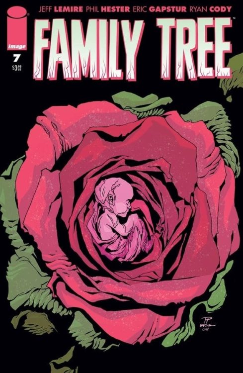
Beauty and horror collide on the cover of Family Tree #7.
Conclusion
Family Tree #6 takes a different turn from the rest of the series, providing insight and answers – all while raising more along the way. There’s no doubt that this series is just as chilling as ever, especially as the family drama goes up a few notches.
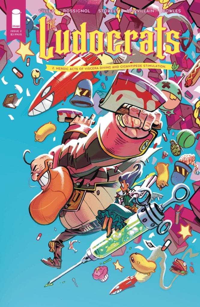
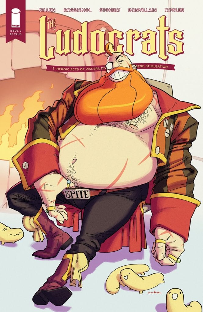
A chaotic journey is about to unfold in Ludocrats #2.
LUDOCRATS #2, out this Wednesday from Image Comics continues the fantastically insane tale of Aristocrats and absurdism. It’s a vibrant tale full of characters who hate predictability and logic.
A chaotic journey is about to unfold in Ludocrats #2.
***SPOILER WARNING***
Ludocrats is a series as unique as it is vibrant. That is to say; exceptionally. If you’re craving something new and totally different, this is the series for you. Especially if you like chaos, absurd references, quirky moments of humor, and slightly insane characters.
The series is only going to be five issues long, but there’s no doubt that it is going to have all o the fun possible before it concludes. It may also make a few messes along the way…or is that the characters doing that…
The Writing
Kieron Gillen and Jim Rossignol are the two minds behind Ludocrats #2, and it’s safe to say that this isn’t quite like anything they’re known for writing. That actually made the journey more fun, rather than less.
The sheer amount of absurdity and chaos within these pages is borderline overwhelming, while still being entirely entertaining. And perhaps a little bit messy, but that’s really the natural result of a party. Or breaking into a prison that also happens to be a giant creature.
There’s no doubt about the creativity behind this series, though it’s good to remember that this is not a series you should try to predict. Predictability went right out the window, alongside a sense of decency (looking at you, Otto).
This is an issue full of on-point comedic timing, inane references, and several hilarious twists. Who knows what the following three issues will bring with them?
The Art
As you might imagine, the artwork behind Ludocrats #2 is every bit as chaotic and vibrant as the plot itself. Jeff Stokely was the lead artist for this issue, working alongside Tamra Bonvillain for the colors, and Clayton Cowles for the lettering.
It must have taken a fair bit of work to keep up with the writing for this issue, yet the creative team did a splendid job of doing so. In fact, they arguably went above and beyond at several points. The creature/monster in particular is especially eye-catching, though there are plenty of smaller elements worth looking into as well.
The bold colors support Stokely’s lines, which portray characters that are up for quite the adventure. They’re constantly moving, arguing, or otherwise finding ways to express their passion. It’s highly entertaining.
Larger than life characters can be found within Ludocrats #2.
Conclusion
Ludocrats #2 is every bit the issue fans could have hoped for, living up to the promises made by the first issue. No, it went farther than those promises, diving fully into a world of absurdity and amusement, all for the sake of its readers.
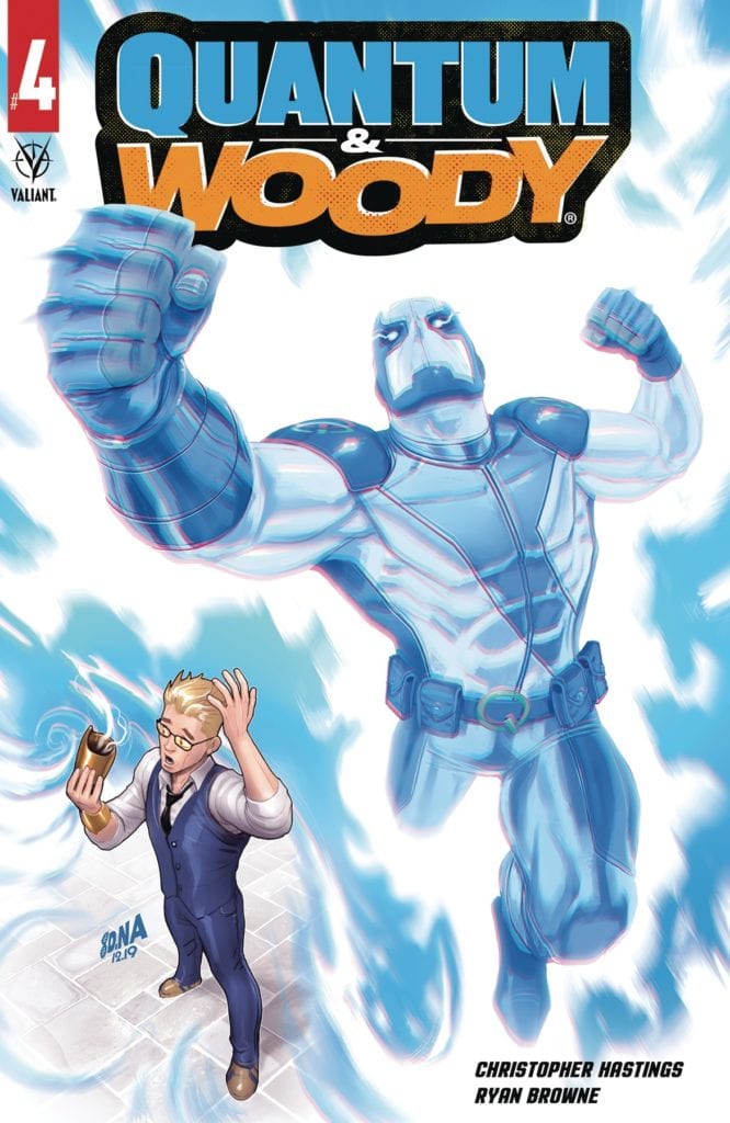
Something is up with Quantum on this cover of Quantum & Woody #4.
QUANTUM & WOODY #4, available for purchase on July 8th from Valiant Entertainment, concludes another hilarious and entertaining run from this dynamic duo. It is time for the truth to come out – and for enemies to be defeated.
Something is up with Quantum on this cover of Quantum & Woody #4.
***SPOILER WARNING***
Quantum & Woody got their latest chance courtesy of Christopher Hastings and Ryan Browne, who have been at the helm of this new series. If you’re looking for an infusion of humor and chaos in your life – this is the series for you.
The series follows Quantum and Woody, two unlikely brothers who couldn’t be more different. Well, with the exception of their current condition. Which also the reason why they have to stay in each other’s lives, no matter how much they drive each other insane.
The series is energetic, full of banter, quips, and sibling rivalry. Okay, there’s also a decent amount of chaos, and some show of powers as well. Given who we’re talking about though, that much should have been obvious.
Recently, Woody has taken up a new trick, or more accurately, he’s been faking one. That has resulted in no end of pain and chaos, especially for his brother, Quantum. You see, when one fakes having powers, it tends to affect those around you. Who would have thought?
These two brothers are off on an adventure (of sorts) in Quantum & Woody #4.
The Writing
As the final issue of the series, Quantum & Woody #4 has a lot to wrap up and very little time to do so. After all, Woody’s tricks have yet to be outted, not to mention there are several resolutions needed. Courtesy of said tricks, naturally.
There’s honestly a lot of satisfaction to be found in this issue, despite the sadness that comes with a hilarious series coming to an end. The creators did an excellent job wrapping up all the major plot points – something that even more impressive than usual, given that they lost an issue. But it’s more than that as well.
There were subplots directly addressed this time around, such as what Woody has been up to, and what Quantum has been trying to do. It all went somewhere here, making it all worth the read. The added chaos that naturally ensued was simply one more reason to be entertained in the process.
Seeing the conclusion of this miniseries, it’s hard not to want more. The dynamic between these two brothers has always been entertaining, but it felt like they were on the precipice of something new. Hopefully, in time, fans will be given a chance to see what could have been.
Infinite punches to the face?
The Art
The artwork behind Quantum & Woody #4 is as vibrant and chaotic as the characters themselves. There’s something eye-catching in every single panel, making sure that your eyes are always busy when looking at these pages.
It’s actually quite appropriate, given who the series is focused on. It’s not like either Quantum or Woody are very good at sitting still for long. Or keeping themselves out of trouble. The added dose of quirkiness truly fits the theme of the day.
The vibrant colors, the art style, and every little detail that went into this issue resulted in a lot of moving parts. Yet that is exactly what this series needed. Though some scenes took that to an all-new extreme (such as the battle itself). All of it made for a highly entertaining experience.
Conclusion
Quantum & Woody #4 was a fun, intense, and crazy issue. These two brothers went through a lot in less than thirty pages, and it’s enough to leave fans eager for more. There’s no telling what adventures (or messes) these two could potentially get into next time. Here’s hoping it’ll be just as amusing as this latest round.
Note:
Quantum & Woody was originally intended to be a five-issue miniseries, but unfortunately, it has been cut an issue short. That has more to do with the events going on, and the unsurprising drop of sales that would come with that. It sincerely doesn’t have anything to do with the quality of the series, which is still worth checking out. Perhaps now more than ever.
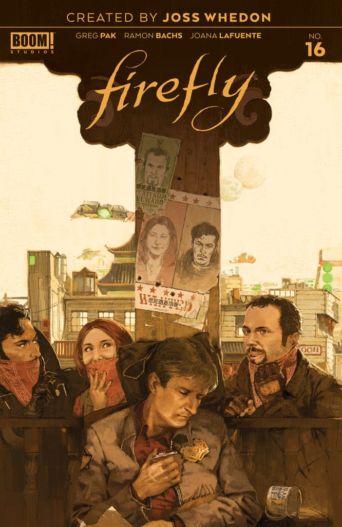
Heavy times are in store for the crew in Firefly #16.
FIREFLY #16, out this Wednesday from Boom! Studios continues Mal’s crazy scheme, showing what good a man like him can do when he actually has access to resources. However, in this universe, nothing is ever that easy for Malcolm Reynolds.
Heavy times are in store for the crew in Firefly #16.
***SPOILER WARNING***
The famous series that Joss Whedon created continues in comic book form, telling us more about the characters we love – and all of the crazy adventures they’re getting up to. These days, the crew is facing an entirely different set of circumstances.
You see, through a strange series of events, Malcolm Reynolds has gone legit. Well, mostly. This is Mal we’re talking about. Yes, it is every bit as strange as it sounds, and it will almost certainly come crumbling down on Mal’s head (along with the rest of the crew).
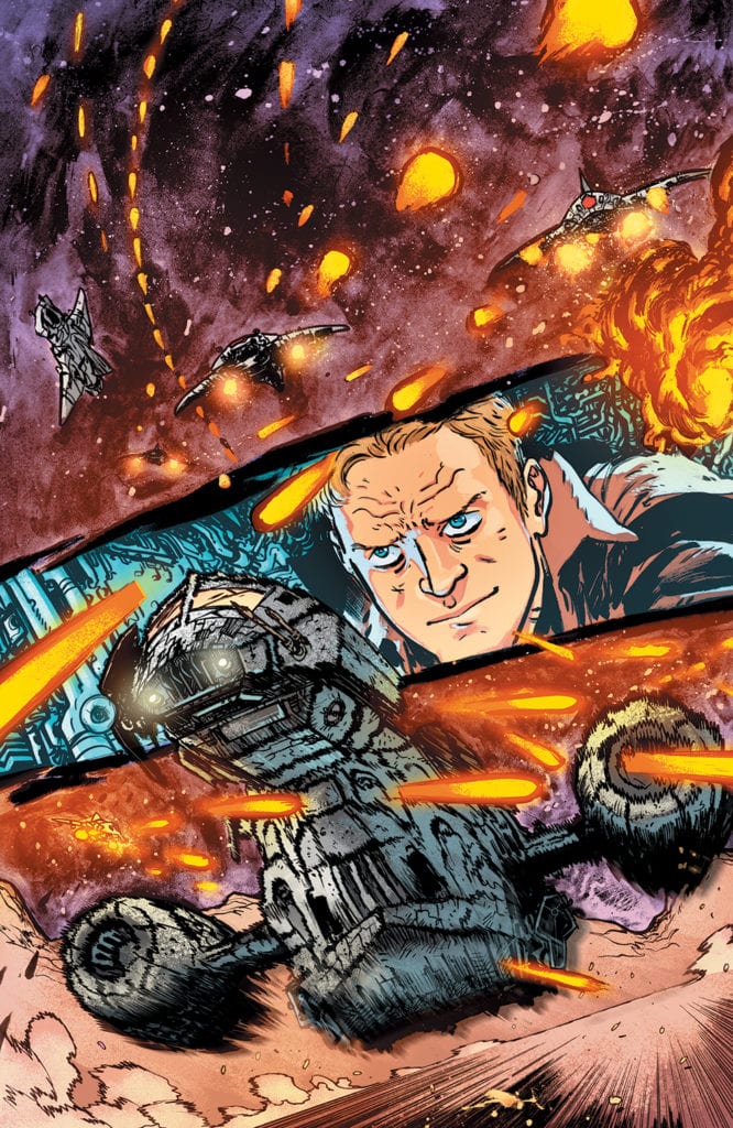
Firefly #16 features a fan favorite from the crew.
The Writing
Greg Pak has turned Firefly back into a series that cannot be predicted. Other than assuming that Mal is going to run into trouble of course, that part is simply inevitable. Firefly #16 proves how fans can still be surprised, even when Mal has taken a whole new path in life.
Don’t worry, plenty of our beloved characters have stayed the same, despite these changes. In fact, this issue did an excellent job of proving exactly that (you can probably even take a guess at which character once again showed their true colors here).
This plot has been a bit confusing for some fans, what with the changes already discussed. And yet there was something so incredibly satisfying about this issue. Probably because, even though he’s in a new job, Mal is still poking at the top dogs. He just can’t leave it alone, especially when people are suffering.
The fact that he was able to use his resources to do so only made that all the more satisfying. Yet there’s no denying the danger on the horizon. A threat we’ve been waiting for, as something was bound to happen. In a way, that too is quite satisfying to see come full circle.
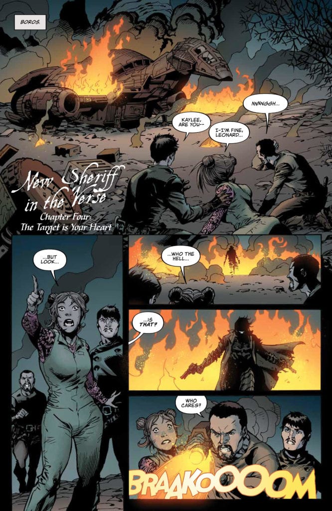
Firefly #16: New Sheriff in the ‘Verse.
The Art
Firefly #16 was bold and stylized, presenting the characters we love, but being unafraid to take a few risks here and there. That being said, there are absolutely certain scenes and images that stole the show. Such as the dramatic scene involving Kalee, or just how smug Mal manages to look in this issue.
Ramon Bachs was the lead artist for this issue, so give them all the credit for the expressions, especially those on Mal’s face. The scenes bounce from mundane to dramatic at a moment’s notice, showing an understanding in holding our interest.
Likewise, the colors, provided by Joana Lafuente, are intense and bright. Brighter than they would have been in the TV series, yet that feels perfectly natural here. The inclusion of vibrant reds and golds feels like a throwback at times. Then there are those lovely backgrounds, which cannot be ignored.
Finally, there’s Jim Campbell, who provided the lettering. Once again he went for a more understated look, but that’s exactly what this series needed. After all, the issue needed to focus on the looming threat, something Campbell made certain of.
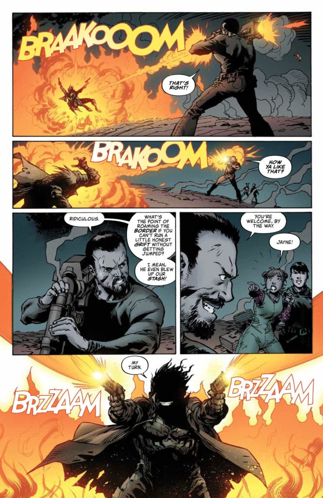
Looks like Jayne was ready for a fight in Firefly #16.
Conclusion
Firefly #16 may be bringing us a crew that has changed dramatically from the time of the television series, and yet it still feels familiar at the same time. Little details like Mal’s smug face or his tendency to get into trouble remind us of all the reasons why we loved the series, to begin with.
Yet this series is somehow still finding ways to surprise us, courtesy of all the dramatic changes they’ve been facing in recent months. Who’s to say how long this new bit of luck will hold.
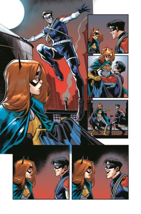
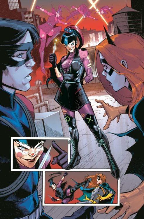
DC Comics has revealed an advance look at another “Joker War” tie-in issue: Nightwing #72.
Check out the whole preview below:
The march to “The Joker War” continues with this preview of Nightwing #72, a tie-in issue to the event that will have deadly impact across the entire family of Bat-Titles!
Dick Grayson has learned the truth: that “fixing” his identity lies with none other than Barbara Gordon. He must go to Gotham to find Batgirl-and runs into The Joker’s new henchperson, Punchline. Unlike Harley Quinn, Punchline’s deadpan black humor matches the deadly knives she uses on her victims…and for her next joke, Ric Grayson is the punchline.
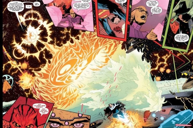
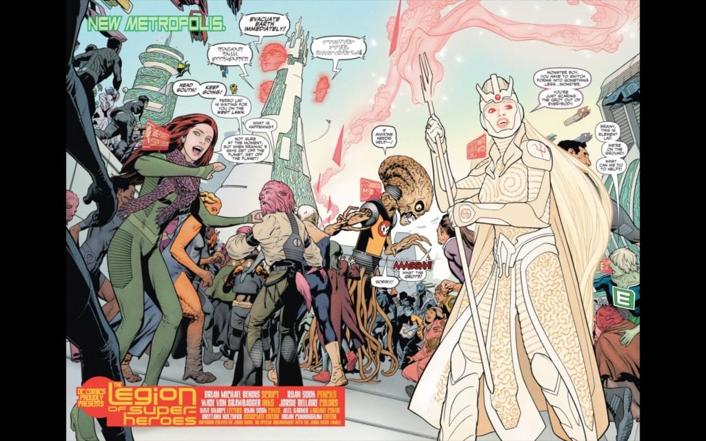
DC’s Legion of Superheroes #6 continues to be a fun, unique take on the 31st-century superhero team! Writer Brian Michael Bendis, Penciler Ryan Sook, Inker Wade von Grawbadger, Colorist Jordie Bellaire, and Letterer Dave Sharpe all contribute to what is, overall, a beautiful sci-fi adventure that is full of heart.
Writing
Even as he introduced a number of revelations about the history of the DC universe and its timeline in the previous issue as well as Jon Kent’s importance for the 31 century, Bendis ups the ante again, this issue ties off Jon Kent’s orientation into the Legion of Superheroes, introduces the Gold Lantern, and finishes out the Aquaman trident arc, bringing it to a hopeful conclusion, all while setting up future conflicts. Bendis does, however, leave some things unanswered, like why President Brande tried to confine the Legion to their headquarters. Bendis has been accused of being dialogue-heavy in the past, and while there is plenty of dialogue, it is well-balanced by the action in this issue.
Art
Sook continues to impress in this series, along with Grawbadger. Legion of Superheroes, probably more than any other version of the characters in DC’s history, portrays a very future-looking world (beyond the only difference being the use of flying cars). Sook’s 31st century truly convinces me that if the Earth survives for another thousand years, it could really end up looking like this. It is beautiful. It is unique. And it is extremely alien to someone from the 21st century. It would be easy to allow the diversity of alien life to becomes a blurry background piece to the story, but Sook makes the diversity of the future really pop on the page.
Coloring
Adding to the look of this fantastic future, Bellaire’s colors can only be described as “kaleidoscopically beautiful.” Exhibit A:
There is a lot happening on this page. Aside from the dialogue boxes surrounding the central image, the portrayal of Gold Lantern’s energy pushing back against the water from Aquaman’s Trident complete with explosions and the powers of other Legionnaires on display is a daunting task, but Bellaire is able to make all the colors pop while maintaining the uniqueness of each Legionnaire’s display of power.
Lettering
In a book with this many characters and this much action going on (and Bendis’s dialogue-heavy writing), it would be easy to lose track of who is talking. Thankfully, Sharpe does a decent job of keeping all of the voices distinct. Nowhere is this more clear than the spread on pages 2-3:
Not only are characters like Monster Boy and White Witch given unique lettering, but Brainiac 5’s evacuation message is shown in three distinct languages, each given its own unique lettering and shading to set it apart from the others.
There was one confusing moment for me. It was a little hard for me to follow the dialogue direction on the final splash page, which ends on the last page with the word “hope.” I’m a little unclear which part of the preceding dialogue anticipates “hope.” A few extra indicator words in the dialogue might’ve helped to make the direction the dialogue was supposed to be moving more clear.
There’s a lot happening in this book. Bendis has seemingly brought certain threads to a close while planting a lot of seeds for the future. Legion of Superheroes continues to be a fun title, and I can’t wait to see more of this new 31st century!
There’s so much to be said for DC Comics’ Strange Adventures. Like so much of writer Tom King’s other works, this story is willing to take its time. With artists Mitch Gerads and Evan “Doc” Shaner on the artwork, and Clayton Cowles on lettering, this creative team seems endlessly interested in the terrifically mundane. As Mr. Terrific joins the story, we get to see a glimpse into a day in his life.
Mr. Terrific: Routines and Ruts
Writing
King knows a thing or two about training. With some time in the CIA under his belt, he surely knows someone can’t just be a “crimefighter” casually. And so, as we follow Mr. Terrific through the rhythms of his daily life, we find it exhausting. Terrific’s T-spheres hover around, spouting trivia questions constantly. Terrific’s answers seem full of foreshadowing and thematic nods. At a few points, Terrific talks on the phone with Batman. The juxtaposition shows how each of them has dedicated themselves to their lifestyle. Batman is punching supervillains, while Terrific carries weights through snowstorms. Terrific’s regimen is so wonderfully boring. And with all of this, King asks us, “Can we really trust someone who makes everything seem like an adventure?” Because in the end, life isn’t as adventurous as Strange’s book would suggest. It’s full of workout regiments and trivia questions.
Art
Gerads’ art for these sections is stunning and messy. It feels as though Gerads refuses to put on airs. Terrific’s life feels real. We see it in the small things, the snow Terrific shakes off his hat, the smudges around the jar that has Terrific’s face mask. But the most noticeable thing about Gerads’ art is how slow it moves. He will spend a whole page on Terrific jogging, lifting weights, diving. And he focuses almost claustrophobically on Terrific. We rarely shift perspective to see someone else; many of the scenes are close up. It gives the whole storyline a sense of constancy. The constancy makes Terrific’s life feel like a rut. A rhythm. But it also gives him a sense of credibility. He’s a man who takes things so seriously; he makes no time for himself. He’s singularly focused on being the best he can be. If Adam Strange is guilty of lying to the populace, Mr. Terrific IS the man you want to look into it.
Coloring
Gerads’ coloring for this storyline is beautiful. It’s almost as if Gerads chose to fight the mundanity of Terrific’s life, with splashes of color. You’d expect a bleak color palette. Greys, whites, browns, but instead, each page feels vibrant. When Terrific is out in the snow, the panels look brilliantly blue. As he enters the bookstore, the palette warms up to a red haze. When he talks with Batman, we get a back and forth of color schemes. Batman is framed in yellows and oranges, fighting in chaos, while Terrific stands out on a frozen lake in a cool blue tone. It gives Terrific’s life a sense of beauty. Sure, he’s tireless. He constantly works to keep himself in shape, mentally, and physically. But life is still beautiful even if Terrific doesn’t have the time to stop and take note.
Lettering
Cowles’ lettering is carefully subdued in the Mr. Terrific scenes. When Terrific punches someone out in the ring, practicing his boxing, no sound accompanies his fist making contact. The silence makes the sudden win feel all the more impressive. And when Terrific visits the shooting range, we get the only sound effects of the storyline. White, crisp, clean. Sounds are just as you’d expect them to be in this world, no added flair. And as Terrific’s T-spheres speak to him throughout the issue, their word balloons, filled with mechanical writing, change color.
When Terrific is on a call with Batman, through his T-spheres, the balloon is grey, and the lettering is softer. Otherwise, the T-spheres speak in red or blue word balloons. The red almost gives them a lifeblood; the questions they ask that are strangely human seem to stand out. The blue feels cold and logical; the questions they ask that are calculated and mathematical stand out. It fits then that the one question Terrific can’t answer is asked in a blue balloon. Cold, distant, the question is asked without a calculation of what feelings it will evoke.
Strange Adventures: Romantic Brutality
Writing
While there’s much to say about Mr. Terrific, his is not the only story King is telling. After all, this is supposedly a comic about Adam Strange. So, King describes Strange’s adventures on Rann through Strange’s autobiography, as it’s read by Terrific. The drama of Strange’s story stands in complete contrast to Terrific’s routines. It’s romantic, full of honor and bravery. Strange is a man of few words. His lines are brief and to the point. He simply does what he believes is right, without all the moral anguish of Mr. Terrific. It doesn’t seem like he really thinks things through. This is a character who smiles in the face of danger. His threats to kill other aliens are couched in terms of his loyalty to the Rannians. Everything he does is right, noble, pure. He is a man who will do anything for the people he loves. But just how brutal is he about to become? And how will he put a brave face on it then?
Art
Shaner’s art style is perfect. Not just in the sense of being beautiful, but how it’s all meticulously put together. Every character, every object, has a crisp outline and just the right amount of detail. It’s clean and careful, yet full of life. There’s a clear emphasis on action in Shaner’s panels. Instead of the claustrophobic life of Mr. Terrific, Strange’s adventures are raucous and full of dramatic flair. Whether he’s plummeting through the air or aiming a gun at an alien “villain,” there’s a real sense of movement. With so much action, it leaves one wondering where the humdrum of it all went. Every moment for Adam Strange is a grand adventure.
Coloring
Just as Shaner’s art style feels meticulously correct, so do his colors. There isn’t the tonal haze we see in Gerads’ art. Everything is colored exactly as it should be. Yet, at the same time, the color scheme is warm and vibrant. Strange never looks discolored by hunger or thirst. Alanna’s face is flushed, and she has blue eyeshadow on, despite her and Adam’s plan to trek through the desert. In some ways, the colors are simple. Bright reds, deep yellows, solid blues, and not much of a gradient in between. It gives Strange’s story a kind of airbrushed simplicity. No shades of grey.
Lettering
In Strange’s book, Cowles gives a sound effect to just about anything that could make a sound. When Strange shoots an alien beast in the belly, we see the noises of his gun and the growling noises of the beams hitting their mark. Cowles deliberately plays up the sound effects to increase flair. As in the last issue, we a massive sound effect scrawled across the page. Cowles is reminding us over and over again; this is a story that’s being told. We don’t get lost in the realism of it as we do in the Terrific chapters. We also see that Adam Strange doesn’t talk much. He has brief lines, small word balloons. It gives us the impression he’s a “shoot first, ask questions later” kind of man. An action hero. It’s a simple story with an archetypical hero if we’re to believe Strange’s own view of his story.
This is not going to be a typical series from DC Comics. The experimentation this creative team is doing is both exciting and beautiful to behold. And the concepts they’re kicking around feel so important for us to consider. It’s a meditation on the boundaries of truth, and the responsibilities of storytellers to their audiences. It might take its time, but it’s already abundantly clear it will be worth the wait. Strange Adventures #2 is out June 16th from DC Comics. Order a copy before they fly off the shelves!
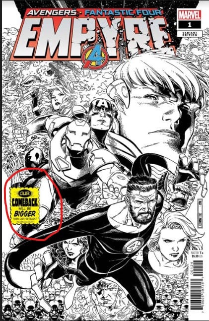
As reported on June 15th, Image became the first major comics publisher to add the “Back the Comeback” logo to a selection of its titles. Today, Diamond has released a press release confirming Marvel will be joining their campaign by adding the “Back the Comeback” logo to its cover of EMPYRE #1, available on July 15th.
At this time, there is no word from either publisher if the announced titles will be the only titles to carry the badge, and Diamond has not yet announced what other publishers, if any, are next to join in. MFR will post the announcements in full as we hear them.
Please follow us on social media using the links below, and let us know what you think about Diamond’s campaign in the Comments section.
Marvel Comics ‘Backs The Comeback’ With Comeback Logo Appearing on the Cover of July 15 Title
(BALTIMORE, MD) — (June 16, 2020) — On May 13, 2020, Diamond Comic Distributors and Alliance Game Distributors partnered to launch the “Back The Comeback” campaign, a multi-part initiative designed to support local comic book and game stores as they began to safely reopen, restart, and rebuild following the easement of nationwide stay-at-home orders amid the COVID-19 pandemic. Now, as comic book and game stores across the country have resumed selling new weekly product, many publishers have rallied behind the campaign to support retailers by including the “Back The Comeback” logo on the cover of their newest titles. Marvel Comics is the latest publisher to support the initiative by including the logo on the cover of their July 15 on-sale title.
Empyre #1 from Marvel Comics will be hitting shelves on July 15, complete with the “Back The Comeback” featured on the front cover. In Empyre #1 (DEC198912; SRP $5.99), the Kree and the Skrulls have united under a new emperor – and their war fleet is on a collision course for our world. Meanwhile, the Avengers are on the moon ready to strike with the full power of Earth’s Mightiest Heroes, but the Fantastic Four are seeking a diplomatic solution, and the two teams must come to an agreement in time to save the day.
Back the Comeback in-store promotions for game stores are in the works and will be announced shortly.
Fans can head to their local comic shop to purchase a copy of these Back The Comeback support titles from Marvel Comics. To find a comic shop near you, visit www.comicshoplocator.com. To stay up to date on Back the Comeback announcements visit the campaign’s social pages on Twitter, Facebook and Instagram or visit backthecomeback.com.
Retailers interested in placing wholesale orders for these items are encouraged to reach out to their Retailer Services Representative or contact Diamond’s New Accounts Department at newaccounts@diamondcomics.com.
Back in March, Netflix released a four-episode series called Unorthodox starring Shira Haas (Foxtrot) as a Jewish woman in an ultra-Orthodox community whose journey crosses oceans and cultural boundaries. Antonio Gambale is a composer with a diverse cultural background that brought the score to life.
Esther “Esty” Shapiro (Haas) is a 19-year-old woman who’s silently miserable in a pre-arranged marriage. There’s a woman yearning to see more of the world. Esty has a musician’s heart, and one day runs away from her life in New York to Berlin. It’s in Germany where she’s exposed to everything the secular world has to offer, for better or worse. The uncommon story Unorthodox is getting great reviews across the spectrum.
PopAxiom hopped on a Zoom call with Antonio to talk about his life across the globe, making music with punk rock pioneers, and the mesmerizing underscore of Unorthodox.
Australia, Italy, And France
Australian-born Antonio Gambale spent time living in Italy, where his parents were from. Now, Antonio lives in Paris, where he creates scores for films (Joe Cinque’s Consolation) and television. How’d he end up in the city of love? “Malcolm McLaren, legendary ex-manager of the Sex Pistols was producing an album here in France. Mutual friends were looking for people to work with him on that.”
Antonio was no stranger to collaboration, which is an essential skill. “At the time, I worked with a lot of DJs on electronic stuff and I also spoke English natively. Before Malcolm passed away, he lived in Paris but wasn’t a strong French speaker.”
That summer in Paris proved one person’s hot weather is another’s just right. “I decided to take a bit of a sabbatical. It was the early 2000s, and there was a horrible heatwave. For me, having lived in Sydney, I thought, ‘this is kinda nice.’”
Antonio’s sabbatical lead to meeting another composer, which made the decision to stay in Paris a no-brainer. “Soon after, I met Nathaniel Mechaly (Taken Trilogy). He invited me into the studio, and I showed him some of my stuff. He was starting to get more significant film offers and needed an assistant and a programmer.
Antonio’s skills as a traditional composer and electronic music-maker was a plus, given the trend taking over action films. “There was a real fusion of electronic sounds and orchestrated work. At that time, that sound was becoming a thing.”
About Unorthodox
Nothing teaches quite like experience and working with Mechaly propelled Antonio to even more work, including Unorthodox. “It happened thanks to an old friend. We were on a summer holiday in the Greek Islands. At the time, she was waiting to hear back from this job working for a film and television producer in Berlin. She got the job, and about six months later, she called me asking if she could suggest me for a project. They sent out three scenes to like 10 or 12 composers with some general notes about what they wanted and didn’t want.”
The composers submitted demos, and Antonio got the call. “One of the first themes I wrote was almost exactly what we kept for the show.” Unorthodox is a show that subverts expectations and takes viewers through a roller coaster of emotions.”
The demos included creating music for a diverse range of scenes. “I had to write for some early scenes that were quite varied. One was more of an intense scene, and another more of what might be a character’s theme. A week or so later I got a call from [director] Maria Schrader, telling me ‘I cannot imagine my show without that theme.’”
Creating themes is a powerful tool for composers. “For Unorthodox, I wanted to make themes that were fragile but also powerful. I used a lot of raw, single notes sampled from violin, cello and viola. They’re imperfect, slightly out of tune, but they hit you in the chest. When you use them softly, it gives the theme this gentle honesty, but when you go bigger, it gives off this big voice.”
Unorthodox is a story told within a sacred and private community with scenes representing authentic aspects of the Hasidic tradition, specifically the Satmar community. But the story is transcendent, and the score represents the global nature of the narrative. “There was no need for the score to try to imitate Jewish music. The focus instead was to make the score about the characters.”
https://www.youtube.com/watch?v=-zVhRId0BTw
No Temps
In most productions, placeholder music gets attached along the way. Between conversations with the director and the temporary soundtrack or “temp track,” the score is born from the mind of the composer. However, for Unorthodox, Antonio and the production did something, well, unorthodox. “We had no temp.”
Temp tracks are a double-edged sword. On paper, working on a film or series with no temp “… sounds super cool,” Antonio says. “But it brings its own challenges.”
Antonio accomplished working through the challenges of having no temp by focusing on the foundation of the story. “Because we had this real desire to work with themes, it gave us several clues and an internal logic to defer to when deciding what kind of score needed to go where.”
The process for Unorthodox was somewhat unusual for a series production. “I did a lot of theme writing while they were shooting. I spent that time making a lot of material.” As the process went on, Antonio provided, “… temp music for the editors to use.”
However there are two problematic caveats to this sort of process. First, the tracks are experimental but, Antonio explains, “it’s hard to get any feedback during that time. Everyone is busy shooting.” Second, “People also get married to those temp tracks just the same as when external temp music is used, and it becomes a new kind of challenge.”
Wrapping Up
What composers inspire Antonio’s creative DNA? “There are a few different eras, but I’m a kid of the 80s and 90s, so I grew up dreaming in John Williams. I’m even more of a fan of Williams’ later stuff like Minority Report and War of the Worlds.”
Antonio adds, “In the same era you have Jerry Goldsmith and the Newmans. I have a particular soft spot for David Newman. I think Galaxy Quest is a perfect film in every way, especially the score.”
Antonio puts a couple of names on the list who share the same electronic music background. “Trent Reznor and Atticus Ross. Their work is a great example of the bridge transitioning between electronic and more traditional film scoring.”
In the age of remakes, what film would Antonio love to compose? “I know what shouldn’t be remade, and that’s Galaxy Quest.” Antonio ponders the question for a bit. We discuss Tron: Legacy, The Last Starfighter, Ladyhawke, and The Last Dragon. Antonio answers, “I’d love to do They Live. And remember Starman? I’d love to score that.”
So, what’s next for Antonio? “A lot of people want to see the second season of Unorthodox. I’m also working on arrangements and programming with a duo of composers for a new French sci-fi series, it’s a comedy based in geek culture, similar to the film Paul with Simon Pegg.”
Unorthodox is available now on Netflix.
Thanks to Antonio Gambale and Impact24 PR
for making this interview possible.
Want to read more interviews like this? CLICK HERE.