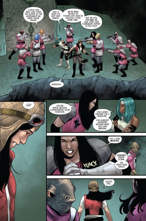
Marvel Comics Released Excaliber #11 on August 19. Writer Tini Howard, artist Marcus To, colorist Erick Arciniega, and VC’s Ariana Maher return us to the events at the end of Excalibur #9 in what is quickly becoming a complex plot to follow in the lead up to X of Swords.
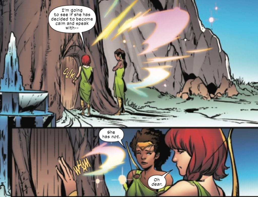
Before issue #10 introduced readers to a pocket reality, issue #3 left off with Excalibur’s attempt to arrive at the Starlight Citadel, which resulted in an injured Shogo. Shogo and Jubilee begin this issue detained by people of the Green, those who live outside of the Citadel.
Howard, along with To and Ariciniega does a fantastic job of conveying Jubilee’s grief over her injured son, whose injuries are conveyed by one of the characters in horrifying terms as being so big in his dragon form that his body could fall apart if he goes through a Krakoan gate and transforms back into a baby.
These scenes with Jubilee are full of heart, but not deprived of wit. The art team, along with letterer Maher, convey the desperate grief of Jubilee and her misplaced rage at her captors, whether through the bright colors expressing Jubilee’s power, or the “wham” indicating a fight-ready Jubilee!
This scene captures the way that the entire team for this issue comes together to produce some subtle character moments in this issue.
Excalibur does make it into the Starlight Citadel, where Betsy informs Lady Satyrne that she’ll have to get used to working with her instead of her brother because Betsy “is the only Captain Britain you’ve got.” This scene could very well be meant to be ironic, given that in the pocket reality, more Captain Britains have been created.
Meanwhile, Apocalypse’s plan for a mutant presence in Otherworld comes into focus as he seeks a stone of power that everyone’s favorite Cajun pickpockets from the Starlight Citadel.
One might be forgiven for having a hard time tracking the plot of the Excalibur series from issue to issue. Howard and co. are creating an increasingly complex tale, complete with alternate realities, secret plots, and hints of a war to come. This is all heading towards X of Swords, with the next issue serving as a prelude to this next big X-event.
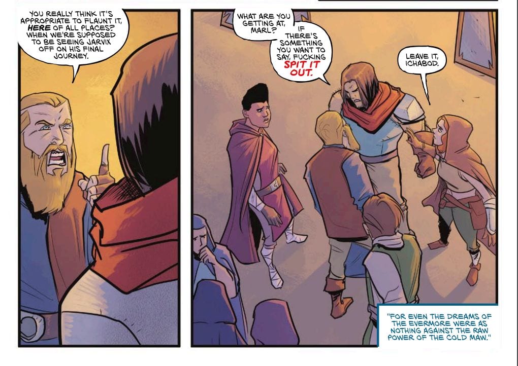
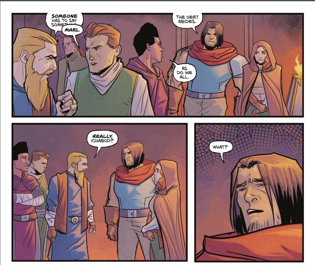
ENGINEWARD #2, available from Vault Comics on August 26th, peels back the layers on the colony’s history and confirms the gods are not as godly as they appear. Written by George Mann and drawn by Joe Eisma, the town’s tensions run high due to Jarvix’s death, mysterious disappearances of the townsfolk, and the escalating water shortage, ending in a game-changing cliffhanger.
Cover Art
Jen Hickman’s cover falls right in line with the art from the first issue (you can read our review here). Leo gives the reader a look of arrogance and malice with the slight lift of a single eyebrow. Per zodiac tradition, Leo’s love the spotlight, and this cover pulls off that conceited look in spades.
Writing
Mann’s story is definitely more focused and more forthcoming than the first issue. The ghoulem’s head starts blurting out bits of information like puzzle pieces falling into place. It’s not long before the past of the colony, and hope for its future becomes clear. Mann also lays out the corruption of the gods in a very subtle way that establishes the threat Joss and the others will soon face. This entire issue is a trail of satisfying breadcrumbs that sets up the next chapter brilliantly.
Pencils/Inks
Eisma’s art casts the entire town in a pall of sand, dust, and dry heat. The extended drought put the whole town on edge, and you can feel the tension in every interaction. The townsfolk are irritable after Jarvix’s death, and the water shortage adds layers of tension on top of their grief. Every scene that Eisma draws captures impatient anger on the faces of the characters. You can practically feel their irritation and short temper with every panel. That’s great acting through art by Eisma.
Coloring
Michael Garland’s coloring gets high marks for the excellent use of shading for different light sources. The lamplight used in Jarvix’s “funeral” cast a warm glow on the characters in a very natural way. Leo’s stage appearance is bright and theatrical, consistent with her personality. And the dinginess of Joss’s workshop is appropriately shadowed to reflect her mood.
Lettering
Hassan Otsmane-Elhaou’s lettering work is the highlight of the issue for one particular design choice. Leo’s speech is portrayed through the use of flourishing script over parchment paper as a word balloon. It’s unique. It amplifies Leo’s position as a self-proclaimed god, and it’s striking on the page. Brilliant creative choice by Otsmane-Elhaou.
Conclusion
ENGINEWARD #2, available from Vault Comics on August 26th, satisfies your story curiosity with well-placed breadcrumbs, and the team’s artwork is solid on all fronts. The revealed quest promises an exciting next issue.
She's getting ready for some action in Doctor Aphra #3.
DOCTOR APHRA #3, available this Wednesday from Marvel Comics, once again dives back into the latest adventure for Doctor Aphra. She’s back, and she’s already working on a new scheme or two. Naturally.
***SPOILER WARNING***
There’s no arguing about Doctor Aphra’s character. While she has had her redeeming moments, nobody would mistake her for a good person. Even the dramatic decision she made at the end of her last series was not enough to save her reputation. Not in this ‘verse.
So really, it’s no surprise that she’s once again working on a heist, alongside people with whom she has a decent amount of history. Regardless of that history, it’s pretty clear that Aphra had always planned on betraying them. It’s sort of what she does.
She’s getting ready for some action in Doctor Aphra #3.
The Writing
Doctor Aphra #3 brings with it plenty of drama, much of which is shockingly satisfying, even while still being pretty surprising. That’s Aphra in a nutshell, providing plenty of surprises, alongside a few archaeological facts.
Alyssa Wong wrote a compelling issue here, one that is full of twists and turns. Ironically, the most surprising parts of this issue don’t come from Aphra herself – which in itself is pretty surprising. She’s using the one pulling the fast tricks.
Yet it also feels appropriate, given how many players are currently on the field – and how aware of Aphra they are. As the issue was quick to remind us, Aphra has garnered herself a reputation, and eventually, people are going to start preparing for that.
Still, this is an issue full of action, as well as a few moments, allowing for character development. It’s intriguing, especially as it sets the scene for a bigger confrontation in the next issue. Aphra really doesn’t know how to do anything on a smaller scale, does she?
Not as dead as we thought.
The Art
The artwork in Doctor Aphra #3 is where the series really shines. Her sass has never been more evident, though her reactions to other events are certainly memorable. All put together; this issue is stunning.
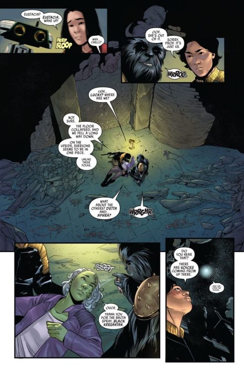
Marika Cresta was the lead artist for this issue, providing those classic expressions, while also throwing in a bit of action. Most notably, however, is the background itself. The characters were looking for ancient history, and they found it. Every panel in this issue feels old and somehow manages to draw the eye in.
Rachelle Rosenberg provided the colors, which are truly divine. Some characters stand out among the rest, from those that are newly introduced, to those making a reappearance (looking at you, Black Krrsantan)
Finally, VC’s Joe Caramagna provided the lettering, which is the icing on the cake as far as this issue is concerned. The lettering helped to lead the eye around this ancient building, making sure that every little detail was made note of.
That’s cold, Aphra.
Conclusion
Doctor Aphra #3 brought with it everything that fans could have hoped for. Action, adventure, and more than one case of double-crossing. It’s basically the usual for this character, and thus it really does feel like her adventures are back into full swing.
Grandpa isn't looking so good on this cover of Family Tree #8.
FAMILY TREE #8, available this Wednesday from Image Comics, brings fans back to a world full of horror and family drama. There’s no doubt that for one family, the world will never be the same. Even while it all keeps moving forward.
***SPOILER WARNING***
Family Tree has always provided a unique combination of horror and family drama. It’s what made the series stand out in the first place. Yet there’s no denying that the balance between the two has shifted over the course of the last several issues.
Now, it almost feels like everything shifted back, with the focus turning squarely on the family. And the potential horror they’re about to unleash on a mostly unsuspecting world.
Created by Jeff Lemire, Phil Heter, Eric Gapstur, and Ryan Cody, Family Tree is one of those series that defies definitions while breaking ground left and right (pun intended). The real question is, where will the series take us before it all wraps up?
Grandpa isn’t looking so good on this cover of Family Tree #8.
The Writing
Where the last issue was set in the future, Family Tree #8 felt set firmly in the present. There’s no hiding from what is happening to one unlucky family. Nor can fans forget those that are actively hunting them.
Even if those facts had somehow slipped the minds of readers (unlikely), this issue was quick to get everybody on the same page. It’s an emotional read, courtesy of all the harsh changes this one family is facing.
In a way, it’s heartbreaking. In many other ways, it felt inevitable. The glimpses into the future told a specific story, and as such, we all knew that change was on the way. It’s just hard to see that change sometime.
The creative team behind Family Tree has done an excellent job of infusing many elements together to create this series. One moment it’s a horror series, the next a family drama, then suddenly it’s a series full of hope for the future, the next it’s full of dread. It’s almost beautiful, in a way. All while being emotionally draining in the best ways possible.
The fight is still ongoing in Family Tree #8.
The Art
Family Tree #8 is yet another issue in this series that is full of bold and dynamic artwork. The stark white backdrop on many of the scenes forces the readers to take note of the story being told. And the cost that comes with it.
The rougher quality of the artwork is perfect for the more organic nature of this series. It also merges nicely with the scenes full of action and injury, in ways that many other art styles could not. It’s a quality unique to this series.
The infusion of green towards the end of the issue is oddly evocative, foreshadowing events in a way that is reminiscent of classic Marvel villains, whether intentionally or not. The end result is a mild sense of horror, long before any real change occurs.
Many changes are about to arise.
Conclusion
Family Tree #8 continues the harrowing story of one family and how they’re about to change the world. For the better or worse has yet to be seen, though at times one can’t help but feel like the series has a positive tone hidden inside all of that horror.
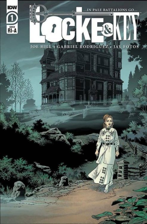
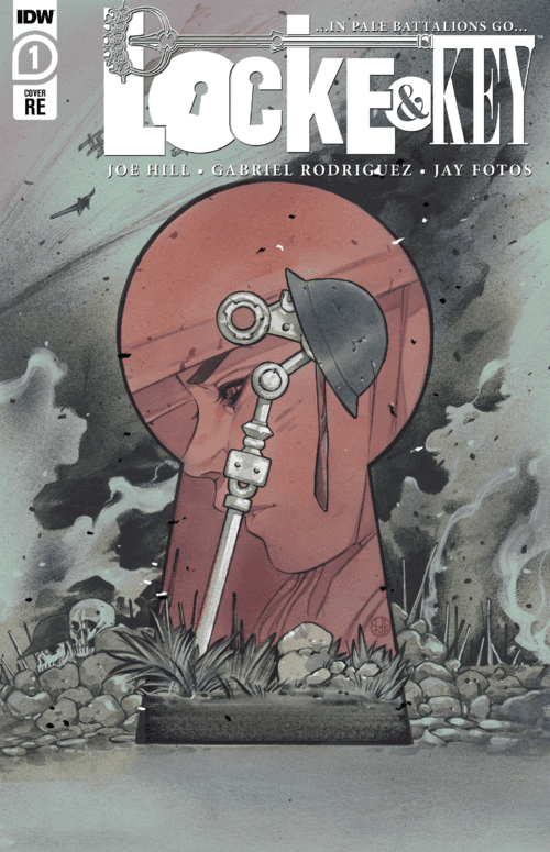
IDW’s Locke & Key: …In Pale Battalions Go… #1is a wonderful welcome home to Keyhouse. Writer Joe Hill, artist Gabriel Rodriguez, colorist Jay Fotos, and letterer Shawn Lee capitalize on the lesser-known parts of this big world they’ve created, and it’s both fresh and familiar at once.
Writing
It’s hard to review In Pale Battalions Go #1 on its own, because one gets the sense that so much elegant groundwork has been lain long before this issue. Hill has created a fully fleshed out world in the pages of Locke & Key, and in Pale Battalions he reels us back in. We become reacquainted with characters like John and Chamberlin Locke, only briefly touched on in the parent series. Despite their lack of “screen time” previously, they feel like old friends. Perhaps because they take on almost mythical proportions. The rosey homelife Hill presents us with is like something out of a dream, and so each character feels bigger than they ought to. Chamberlin is not just the father, he’s every father, just as John is every son and Fiona is every mother. It’s hard to pin down what gives Hill’s writing this quality, but it’s just as hard to deny that the quality is there.
There are a few moments in this issue that suffer from clumsy exposition. John explains his actions in one scene, almost seeming like a supervillain monologuing. Chamberlin and Fiona speak of their children, but their talk goes from conversational to primarily informational. Hill’s mythical tone in Locke & Key makes it so these moments don’t stand out too much, but they’re still peppered in. It’s a natural pitfall in a first issue, and Hill has proven in the past he will not get bogged down by the details going forward.
Art
Rodriguez’s art has always been sensational, but something seems to have happened between the original Locke & Key run and now. There’s a nuance and subtlety to Rodriguez’s art we didn’t even know we were missing until now. In the original run of Locke & Key, Rodriguez’s style is unmistakable. You know it’s him drawing it and no one else. But on rare occasions, Rodriguez could fall into making his characters look a little too similar. Like they were related, even when they weren’t. Somehow, in …In Pale Battalions Go…#1, Rodriguez keeps his style but overcomes his weaknesses. Every character looks unique and fresh, even compared to their depictions in this initial run. It’s just so wonderful to see. It’s like having a treasured memory of a place, and when you go visit you find it’s even more beautiful than you remembered. Rodriguez is doing some of the best work of his career.
Coloring
Fotos subtly makes us feel at home in Keyhouse. John, who is itching to go off to war, doesn’t understand what he’s wanting to get into. But Fotos understands. Fotos allows us to see the warmth of Keyhouse visually. When John is trying to enlist, the office he’s in is slightly paler than the scenes in Keyhouse. And when John is trying to get into the Vault of Shadows, we see it too is colored in greys and blacks. Fotos, in his own way, is begging John to be content with what he has. A warm home, a family who loves him. But John is lured in by the colorful purples and greens that come from using the keys. He wants a more vibrant life than Keyhouse gives him, even though war is not where he’ll find it.
Lettering
Lee does a great job of showing us the cadence of each character. Fiona and Chamberlin are as verbose as they come. Their big, fat word balloons are stacked on top of each other, allowing for as little break in their monologues as possible. Yet when we see John speak, though he’s trying to appear confident, Lee creates more “pauses” than with the others. When he says he wants to go to war and get in on the action, he sounds confident. But when he’s faced with the actual realities of war, we can visually see him second guess himself. His word balloons are connected by a long line in between. It’s John trailing off and wondering what he’s gotten himself into, before saying a simple “Oh.” In small moments like these, Lee brilliantly gives these characters their voices.
If you love IDW’s Locke & Key, you won’t be disappointed by Locke & Key: …In Pale Battalions… #1. It’s a fun, nostalgic, nuanced welcome back to the familiar halls of Keyhouse. Plus, it has couple easter eggs thrown in to get everyone psyched for an awesome upcoming crossover. Pick up Locke & Key:…In Pale Battalions…#1, out from IDW August 26th, at your local comic book shop!
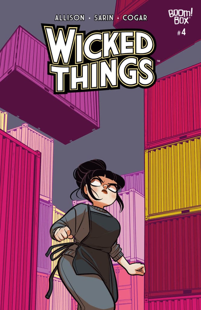
Lottie is about to take charge on this cover of Wicked Things #4.
WICKED THINGS #4, available this Wednesday from Boom! Box continues the tale of Lottie Grote, the best underage investigator around. Sure, she’s currently serving time for a crime she didn’t’ commit, but she still loves the thrill of a case.
***SPOILER WARNING***
Lottie hasn’t had a great streak of luck, as of late. Once upon a time, she had been the best young detective around. Now she’s being ignored by the police, while supposedly being assigned to help them solve cases. How’d she got into this mess? By being framed for murder. The irony is not lost on her.
The police she’s been assigned to work with are no happier about the situation than she is. Perhaps that’s why they were so inclined to ignore her, throwing off her theories as a desperate attempt to get attention. Or freedom.
Too bad that Lottie’s quickly formed theory is more accurate than they could have ever expected. If only they had listened, they might have been ahead of this case, rather than struggling to catch up, and failing.
Lottie is about to take charge on this cover of Wicked Things #4.
The Writing
Wicked Things #4 is a thrilling series of events. It’s hard not to take a certain amount of pleasure in seeing Lottie proven right – even if that fact is causing more exasperation among those who are in charge of her fate.
Written by John Allison, this issue has a lot of fun with the concept of a complicated crime. You just know that it is one of the most complex schemes out there when Lottie Grote is struggling to keep up with all the twists and turns.
Twists and turns there are, in abundance. The level of them is almost comical, especially when combined with the reactions of the police (and Lottie). It makes for a nice balance between crime thriller and that classic Allison humor.
Even the moments revolving around the crime itself have shockingly sweet elements. That was not expected but certainly brought it to new heights. At the same time, adding a bit more context and motivation into the mix. Now to see how Lottie reacts, when she finally figures it all out.
They’re all stuck on this latest mystery.
The Art
The artwork within Wicked Things #4 is just as entertaining and charming as the writing it supports. Max Sarin (art), Whitney Cogar (colors), and Jim Campbell (letters) worked together here to bring such a fun plot to life.
There’s a lot to appreciate about this issue. First and foremost is that sense of timing. It’s borderline comedic, as mentioned above. And it wouldn’t have had nearly the same impact without the artwork to resolve much of the show/tell issue.
The expressions of the characters are an absolute highlight of this issue. Not just Lottie’s over the top reactions, but those of the criminals and even the police force. It heightens the experience, allowing for a moment of humor.
Meanwhile, the colors bounce back and forth between dull shades appropriate for dull city life and work, to bold and vibrant – much like little Lottie herself. It adds a certain sense of personality to an already bursting issue.
The latest craze hitting the market.
Conclusion
Wicked Things #4 was an intriguing issue. In many ways, it read like a crime drama, with the crime being played out with the police none the wiser (for the moment). It also read in that classic Giant Days style at times, creating a unique and memorable balance.
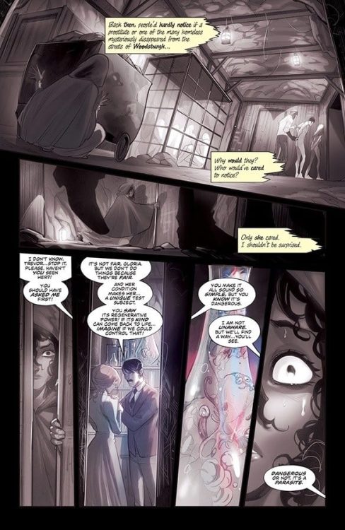
MIRKA ANDOLFO’S MERCY #5, available Wednesday from Image Comics, continues the dark tale of one small town, and the monsters that have come to feast upon it. There is a saying; you reap what you sow. It makes one wonder what this town has sown.
***SPOILER WARNING***
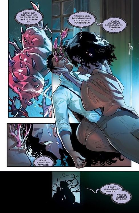
The Woodsburgh Devil appears to be far from done in Mirka Andolfo’s Mercy #5. Her quest is an odd one, feeling at times like a personal vendetta. At other times, it almost feels like the Lady Hellaine wants nothing to do with this town or the vengeance she could wreak upon it.
Mercy has never been a series to shy away from the dark, or the graphic for that nature. It has always portrayed this strange combination of beauty and horror, of elegance and gore. That element continues in the latest issue, but the implications feel darker than ever.
A word to the wise, where the previous four issues were not for the weak of heart, or those that dislike gory scenes, this one is so much worse. Not because of the gore (the previous issue was worse on that count), but because of the graphic implications of another variety. For those that cannot handle the idea of harm coming to a pregnant woman, now would be a good time to look away.
An odd pairing on the cover of Mercy #5.
The Writing
Mirka Andolfo has created a whirlwind of events in Mercy #5. It is an issue designed to intrigue the mind, as well as to horrifying the soul. The series has been hinting to events leading up to this point, but now it is all out in the open.
It’s so much darker than those hints could ever have implied. Suddenly, the need for the Woodsburgh Devil makes sense as does Lady Hellaine’s quest – and her resistance. There are still many questions that need to be answered, but there’s still one more issue to go.
There are a lot of things this issue does wonderfully. The constant comparisons between the past and the present. The slow revelation of what is going on – and who caused all of this pain and bloodshed to begin with.
In a way, it’s almost cathartic to see it all unfold so. Then again, there have been plenty of innocent victims along the way, so maybe that isn’t the case. One thing is clear; the end of this issue is setting up for the biggest confrontation yet, which makes sense, given that the next issue should wrap up the series.
The memories of the past creep to the surface.
The Art
As with the rest of this series, the artwork inside Mercy #5 is blindingly beautiful, even while displaying some startling grotesque scenes. Those are two descriptors that don’t belong in the same sentence, except to explain this series.
Mirka Andolfo is the lead artist for this issue as well, working alongside color assistants Gianluca Papi and Chiara Di Francia in order to bring it all together. Meanwhile, Arancia Studio provided the translations, and Fabio Amelia the lettering.
The end result is something unforgettable. The opening scene in this issue is designed to disturb – and it succeeds in ways beyond imagination. It’s a different type of horror than the rest of the series has portrayed, proving that there’s still plenty of shocks to be found in this tale.
The clashing of elegance and horror has always seemed to find a balance in this series, a fact that continues to be true in this issue as well. It’s almost disturbing how well it is done.
Actions always have consequences.
Conclusion
Mercy #5 is arguably the most disturbing issue of the series, confirming the truth of the previous issue while throwing in its own set of horrors—all while setting up for the final confrontation, and issue. Mercy #6 is sure to be the most alarming and darkest of the set.
NOMEN OMEN #8, available Wednesday from Image Comics, dives back into a world of magic, lore, and the darker sides they carry with them. Becky’s journey has been far from easy, and she’s still got a long way to go.
***SPOILER WARNING***
There’s no doubt that the story behind Nomen Omen is dark and mysterious. Becky’s life has never been normal, and now it seems that everything she holds dear is on the line. The real question is, will she be able to master this new world before it’s too late?
She went from living a life devoid of magic – and color – to diving headfirst into it all. Everything is so much darker than she, or the reader, could have imagined.
On that note, some of the events in Nomen Omen #8 could be disturbing to readers. While the series has never shied away from the more graphic elements of the supernatural, this issue takes it a step or two further. There’s a strong implication of sexual assault, and while it is never shown in detail, it is pretty unavoidable nonetheless.
Becky is back in control in Nomen Omen #8.
The Writing
In many ways, it almost feels like two stories are being told over the course of Nomen Omen #8. There’s Becky’s story, and the tale of her learning to master an art that once upon a time, felt completely foreign to her.
Then there’s the tale of those that oppose her, and the allies they’ve managed to capture. This is the darker side of this issue and contains all of the uncomfortable elements mentioned above, and then some.
Marco B. Bucci really knows how to capture the highs and lows in a single issue. The intrigue and triumph in Becky’s life can’t be avoided, nor can the darker actions of those she’s eventually going to have to oppose.
Both series of events raises dozens of questions. Questions that will be answered in due time, as the series crosses the halfway mark. There are only seven issues left to this deadly series, and that means the clock is ticking. Perhaps literally, for some.
A world where magic bleeds through.
The Art
The artwork inside Nomen Omen #8 is a complex creature, just like the writing. It portrays the best and the worst that magic (and the inhuman creatures that thrive in it) has to offer. While the magic itself may appear as bright light, it’s clear that the influence ends there.
Once again, there’s that harsh juxtaposition between black & white, and the infusion of color. It’s become the iconic look of the series, and it’s almost good to see it still playing a role this far in. Though there are times where it seems like the color, and thus the magic, bleeds onto the pages. The end result is something beautifully organic, as well as hypnotic.
This is an issue that portrays some heavy and upsetting scenes, as well as showing creatures that are (literally) larger than life. The end result is a bit of an emotional roller coaster for readers, and they’re flung from one reaction to the next.
All credit goes to Jacopo Camagni (pencils, colors) and Fabio Amelia (letters) for bringing this issue to life in such an iconic way.
One hand is not her own in Nomen Omen #8.
Conclusion
In many ways, Nomen Omen #8 is the darkest issue of the series. Likewise, it is the brightest of the series. The paradoxical nature has not gone unnoticed, and yet it seems perfectly at home in a series revolving around magic and beasts of legend.
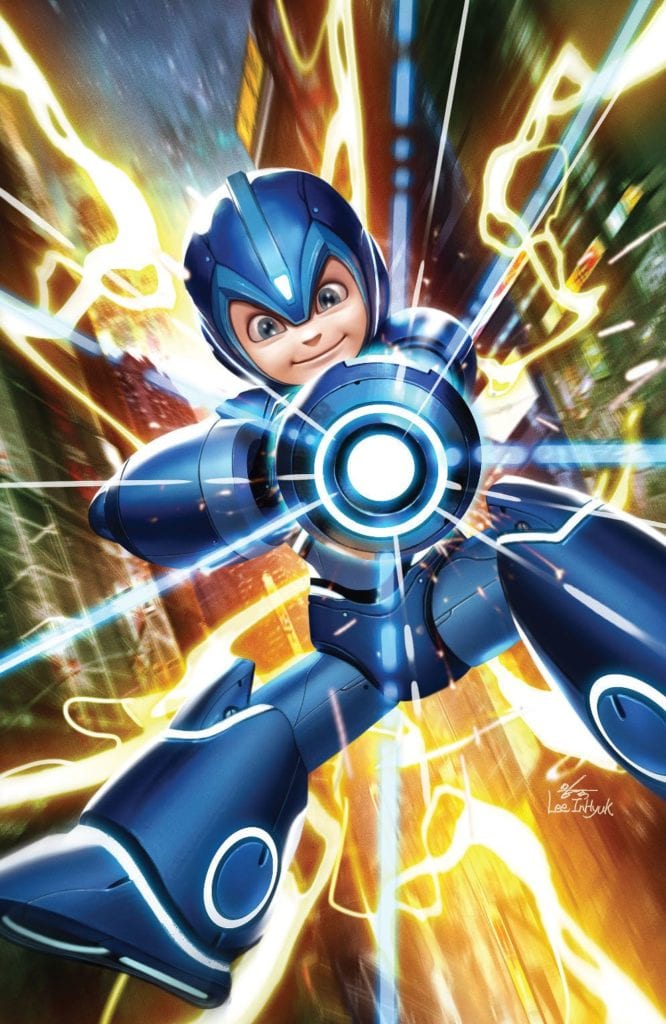
Mega Man: Fully Charged is a new comic book series from BOOM! Studios based upon the 2018 cartoon series of the same name. While the cartoon was canceled after a single season, this first issue sets the stage for a profoundly entertaining and completely different experience.
Mega Man is a character that has been around since 1987 and has a special place in the hearts of many. The classic series now has twelve installments and has spawned several spin-off series, which each have multiple games. The series has an incredibly long history and a devoted fan base, so it was no surprise when Capcom decided to create a new cartoon series with the blue bomber. Mega Man: Fully Charged first aired on Cartoon Network in 2018 and was received… poorly. The story told was entirely different from what fans of the series liked, and the cartoon didn’t stand out enough to attract enough of a newer, younger fan base. It stopped airing after a single season, and no news has surfaced about the show returning. Despite the lackluster reception of the show, this new comic book series features many of the same characters. The major difference being a distinct tonal shift and change in the target audience that allows the world created by the cartoon to be used to make a promising first issue.
Just like the cartoon, Mega Man: Fully Charged focuses on Aki Light, a robotic kid with the ability to transform into the superhero, the public knows as Mega Man. Created by and the surrogate son of Thomas Light, Aki lives with his sister Suna and his dog Rush. He also enlists the help of a robotic partner called Mega-mini that spends time in Mega Man’s helmet when he is engaged in battle.
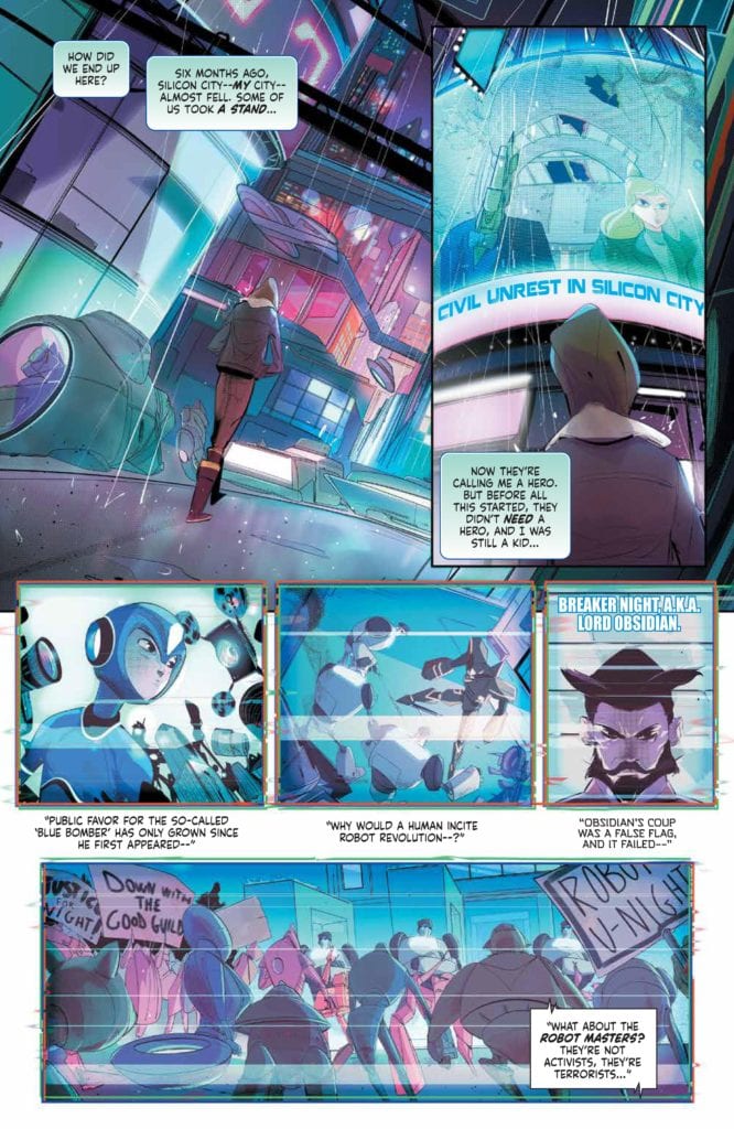
What I believe is the smartest aspect of Mega Man: Fully Charged is the evident tonal shift from the cartoon. A.J. Marchisello and Marcus Rinehart make it very clear from the beginning of the issue that this new series will not be aimed at the same audience. This is evident from the first page of the issue, which gives the story background that a robot revolution has occurred, and humans and robots are engaged in a civil war. The war is a brilliant way that Marchisello and Rinehart immediately distance the comic book from the cartoon.
One of the most important aspects of a first issue, and an aspect that Marchisello and Rinehart perfect, is planting seeds and beginning stories that hook the reader in and leave them wanting to read the next issue. In the single issue there are characters who are shrouded in mystery, reasons to doubt characters we thought we could trust, and internal struggles of Mega Man. Mega Man: Fully Charged #1 feels like nothing but reasons to continue following the series, and after finishing this issue, I’m not sure how you could not.
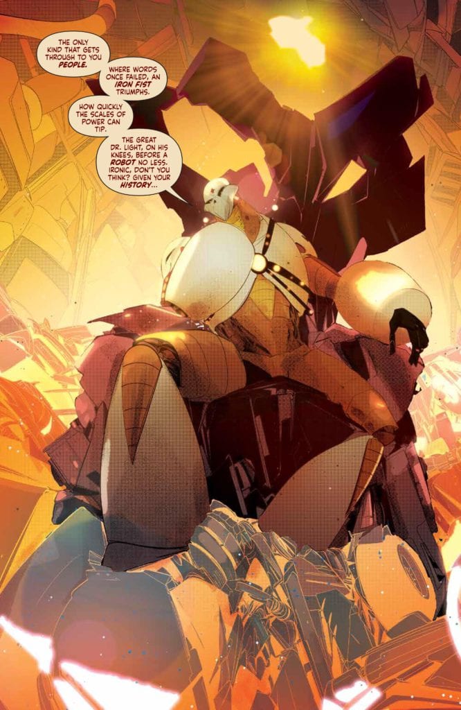
There are not many ways to describe the illustrations of Stefano Simeone except that they are stunning. Mega Man: Fully Charged #1 gives all of the characters a wonderful stylized look, and the redesign of Skull Man immediately excites readers for new versions of their favorite robot masters that lie in the issues ahead. Also, his interpretations of the main cast immediately let the reader know that what they are reading has a much more serious tone than the cartoon series.
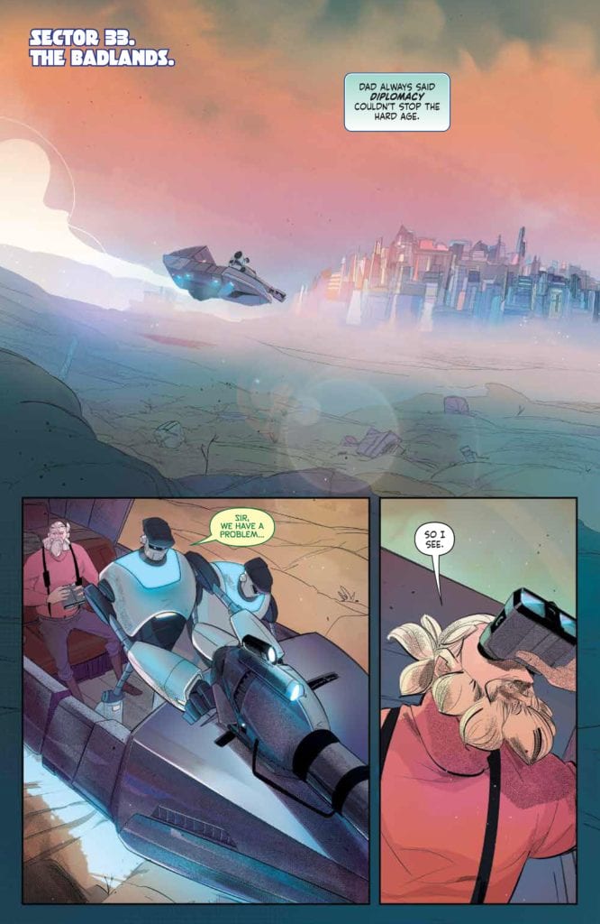
The coloring of Igor Monti in Mega Man: Fully Charged #1 is a highlight of the issue. Each scene looks astonishingly beautiful due to his work. Whether it be the cyberpunk Silicon City or the clear orange tone given to the Badlands, it is clear that Monti put much effort into each and every panel. It’s been a long time since I have had to stop and appreciate the colors on the first page of an issue, and the quality of the coloring continues throughout the issue. I deeply hope that Monti continues his excellent work throughout the series, because it alone makes Mega Man: Fully Charged worth putting on your pull list.
The lettering of Ed Dukeshire in Mega Man: Fully Charged #1 does an outstanding job of helping the story continue its intended flow. Each instance of lettering is done well enough that the readers feel like they are experiencing the story and dialogue rather than just reading off of speech bubbles, and color-coordinated captions allow for easily distinguishable inner thought from a character.
This is the Mega Man comic we need right now. The original series of games are fantastic, but their stories have always been kept simple, and comic adaptations had to take that story and add a lot of substance to it. In Mega Man: Fully Charged, an entirely new story is being told with elements from the original series, and I couldn’t be more excited for what is to come. Mega Man is an iconic character, and this first issue makes it very clear that Marchisello, Rinehart, Simeone, Monti, and Dukeshire will do him justice.
Are you a Mega Man Fan? Let me know in the comments below!
Adam Berardi plays Detective Sanchez in the found footage horror film The Last Five Days directed by and starring Clay Moffatt (Eyes on the Road) with Joe Pacini (Star Man).
A college project for film class leads two students to the truth about some gruesome deaths. The Last Five Days follows Greg Sanders (Clay Moffatt) and Brian Mills (Joe Pacini) through their investigation. It’s not long before things get worse, way worse when an unknown and violent force begins tormenting the young, would-be filmmakers. Adam Berardi’s Detective Sanchez is the unfortunate investigator charged with making sense of the case for the public.
PopAxiom spoke with Adam about watching himself and becoming Detective Sanchez for The Last Five Days.
Older & Uglier
Adam’s journey into showbiz started early. “I got pushed into it at a very young age. The first television show I was on was Superboy when I was 14 or 15 years old.”
Acting was “… never even a question,” Adam says, then jokes, “My father used to say, you’re not great looking, but you could be in catalogs.”
Adam’s 29 acting credits (and counting) is evolving. “The older and uglier I get, I find being behind the lens serves me pretty well.”
About The Last Five Days
Adam’s role in The Last Five Days came about through his relationship with director Clay Moffatt. Adam says, the pair “… made a love connection recently where we love doing films together. He has an exciting style of filmmaking that I love to tackle with him.”
Adam explains, “His shoot days can sometimes be 3-5 days worth for an entire feature, which is insane. It’s something a little different than the regular SAG workday where on a feature one actor might be on set six or seven days straight, and the entire production is 30 days.”
Moffatt, Adam says, “… likes to shoot for wherever the edit is going to be and call it a day. I like doing that kind of stuff with him.”
The birth of The Last Five Days came about during a hangout between the pair. “I was over at his house one day; he had a bunch of mini-DVs. I asked him a question about it, but he said ‘Oh, that’s nothing.’”
Adam kept prodding. “Nothing’s ever a secret between us. He told me it was a college project from when he went to film school. They were supposed to do an investigative film for a capstone project, so they did a found footage film. I watched it and thought ‘This is pretty good!’”
Fueled by Adam’s motivation, Clay gave the film a once-over. “We added the front and end caps which I acted in. That was the end of it. We got so many offers for that movie.”
Simply updating The Last Five Days with cleaner edits or colors wasn’t enough. “We wanted to do something different,” Adam says, “When it comes to found-footage, there are two ways to go about it. It’s either heavily scripted, or it can just have plot points and let outstanding improv actors do the rest.”
https://www.youtube.com/watch?v=ikuY-GDuyjc
Becoming Sanchez
The beginning and end of The Last Five Days features Adam as Detective Sanchez. “The end caps, we wanted to do something where we introduce the film.”
Inquisitive reporters litter the scene which came about from a brainstorm between Adam and Clay. “What questions would reporters ask, and what would the detective do? Let’s write down a bunch of questions; you pick out what you want to be asked.”
On the day of shooting, each actor playing a reporter was given a number and a question. “We went down the line, and each of our actors, about 12 of them, asked their questions.”
Trying to capture authenticity at the moment was pivotal. “The most authentic thing about the detective was that he didn’t want to be there,” Adam jokes, “I didn’t want to be there.”
Adam tried his best to experience everything as Sanchez would. “I watched the film; took coffee breaks; watched more. By the time I got to the set, I was the detective.”
Watching Yourself
Adam’s been an actor for a long time, yet, he says, “I’ve never seen a thing I’ve done. People tell me it’s horrible, and I just believe them.”
Adam’s not unique. Many actors avoid seeing their work, including Tom Hanks, Reese Witherspoon, and Joaquin Phoenix to name a few. “There are a million different couch critics at home that will pick your stuff apart,” Adam says, then brings up an interesting point, “The thing about art is that it’s not really acceptable to do that at an art gallery. You don’t stand in front of a painting and pick it apart.”
Criticism doesn’t bother Adam. He simply doesn’t like watching himself. He says that for up-and-coming actors to avoid critique like that, “Unless you have a very tough skin or do not care what people think or do not listen.”
“A lot of filmmakers are looking for acceptance,” Adam explains, “It’s a natural thing.”
Wrapping Up
Adam shares some of his long list of influences. “Spielberg, Kubrick, Reitman … those are some of the greatest minds of our times. Hitchcock was amazing too. So many.”
Adam talks about his fondness for 80s movies. “You watch movies like Goonies and Gremlins; every person in the Gremlins universe has their own story, objects have their own story. Like when you watch Back to the Future, every object in Doc Brown’s house has a story.”
What’s a dream project that Adam would love to create? “Easy, Vertigo.”
The Last Five Days is available for purchase on DVD from every major retailer. So, what’s next for Adam? “We have a really big film, two big films. Clay is finishing his kung-fu spectacular The Rise of Sir Longbottom. We made a movie called Sour that comes out in January. It stars Bourke Floyd and Natalie Maher. I got a chance to do some directing, and I was an actor. It’s a terrifying film.”
Are you excited to watch The Last Five Days?
Thanks to Adam Berardi and October Coast for making this interview possible.