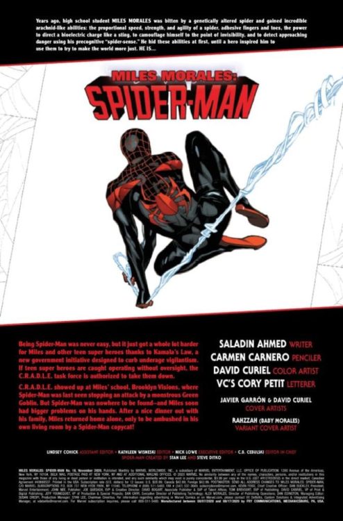
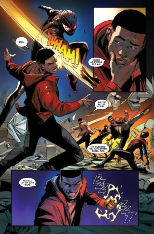
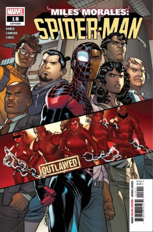
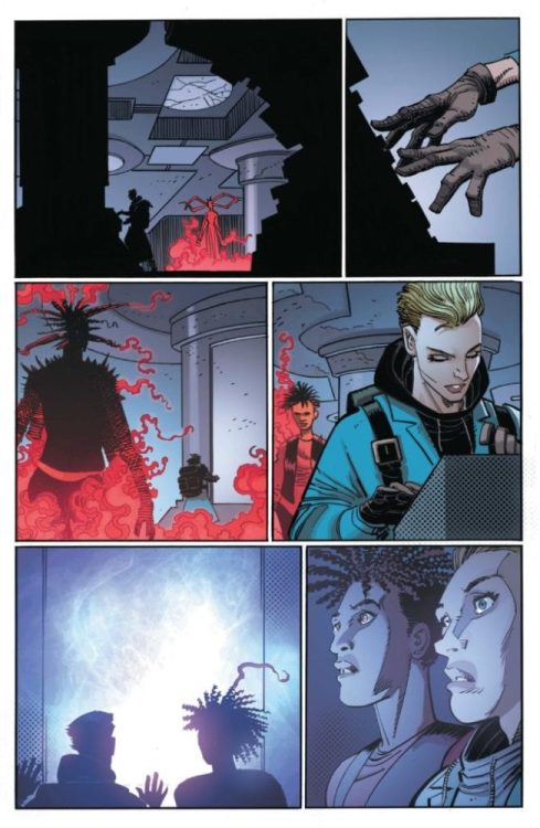
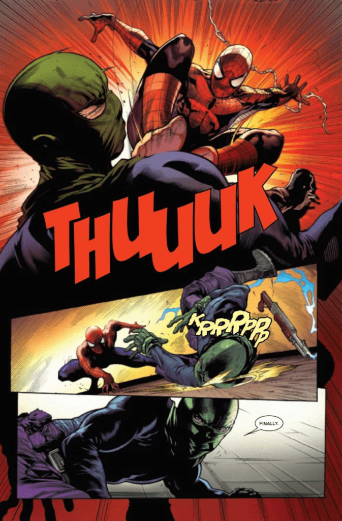
MILES MORALES: SPIDER-MAN #18 hits your local comic book shop on September 2, but thanks to Marvel Comics, Monkeys Fighting Robots has an exclusive four-page preview for our readers.
About the issue: Ganke. Barbara. Judge. Lana. Mr. Sumida. Rio. Jeff. Miles knows he has to help people as Spider-Man, so he’s ready to live as an outlaw. But is he ready to do it without the support of someone he loves? Who’s with Miles, who’s against him, and who’s side are YOU on?
MILES MORALES: SPIDER-MAN #18 is written by Saladin Ahmed, with art by Carmen Nunez Carnero, David Curiel drops the color, and you will read Cory Petit’s letter work. Javi Garron and Curiel worked on the cover, and Rahzzah (Baby Morales) handled the variant cover.
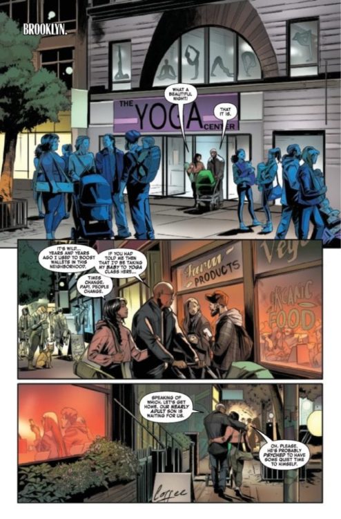
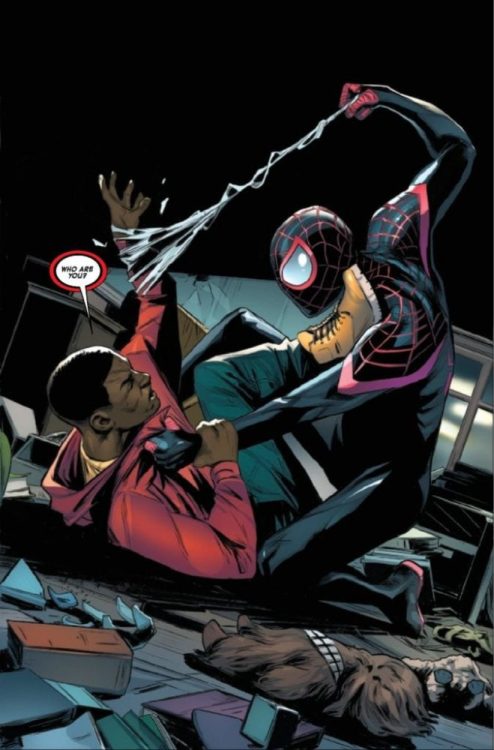
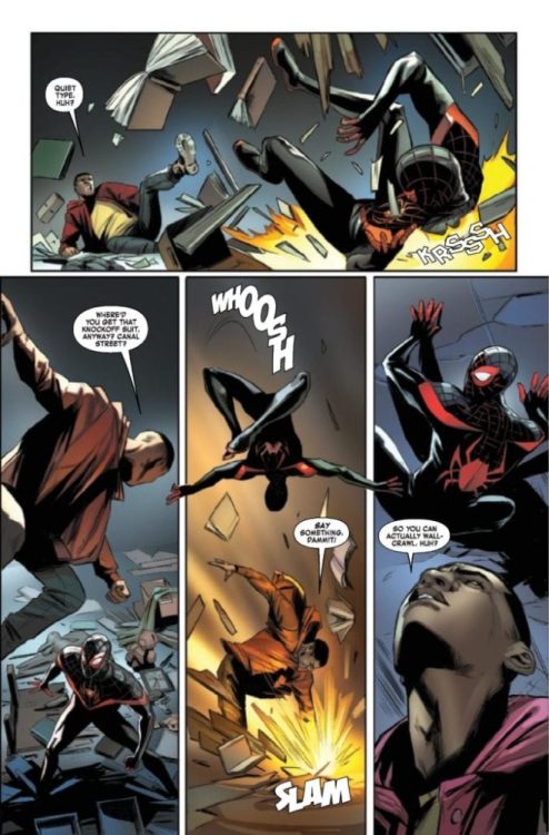
Check out the preview below:
Are you reading MILES MORALES: SPIDER-MAN, who do you think the new Spider-Man is? Comment below with your thoughts.
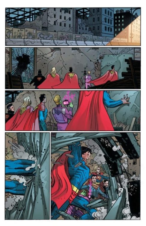
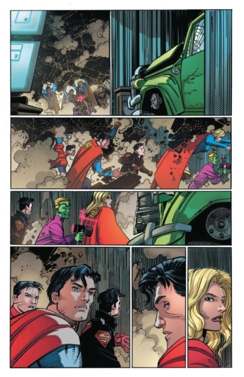
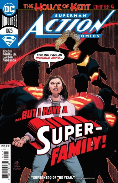
The “House Of Kent” storyline in Action Comics is about to get a lot more super — literally, with the whole Super-Family called into battle against the Invisible Mafia.
ACTION COMICS #1025: “House of Kent,�� Chapter Four!
On September 22, Lois Lane calls the bluff of the Invisible Mafia and raises them an entire Super-Family as the fourth chapter of “House of Kent” continues in Action Comics #1025.
Here’s your first look at art from comic book legends John Romita Jr. and Klaus Janson, as well as covers by Romita Jr./Janson and Lucio Parillo!
ACTION COMICS #1025
Written by BRIAN MICHAEL BENDIS
Art and cover by JOHN ROMITA JR. and KLAUS JANSON
Variant cover by LUCIO PARRILLO
On Sale 09/22/20
$3.99 US | 32 PAGES | FC | DC
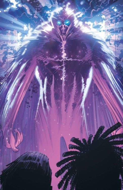
Welcome to the House of Kent! Superman’s truth is out there—and now it’s time to rewrite the rules! The Invisible Mafia has taken advantage of the chaos that’s descended on Metropolis, and the House of Kent is going to talk to them in a language they’ll understand. It’s a new adventure featuring Superman like you’ve never seen him—or them—before, in a story guest starring Supergirl and two—yes, two!—Superboys!
There are several movies where you will find yourself forcing your brain off for the narrative to make complete sense and Unhinged is the most recent film to join that club. A film with no real point to it other than being a 90-minute reminder that road rage could possibly get you in trouble. Following almost every cliche there is, Unhinged manages to still be a solid, but over the top thrill-ride that features Russell Crowe giving an unfortunate woman her worst day ever.
During the opening credits, it becomes apparent that the movie understands it doesn’t have much going for it. Set in a world where road rage is running wild, Unhinged follows Rachel Hunter on a day she will never forget. After a minor road rage incident, Rachel is stalked by an unstable driver who wants to show her what a bad day looks like. Written by Carl Ellsworth and directed by Derrick Borte, Unhinged stars Russell Crowe, Caren Pistorius, Gabriel Bateman, Jimmi Simpson, and Austin McKenzie.
Caren Pistorius and Gabriel Bateman as Rachel and Kyle Hunter in Unhinged
As mentioned above, the film relies heavily on plot conveniences and requires you to shut your brain off for most of this script to make sense. Typical dumb character decisions are in abundance and while the acting from everyone involved is adequate, there is no overlooking this nonsense in between. Russell Crowe stars as Tom Cooper, an unstable man that could care less what happens to him because the film makes it clear that he has nothing left to lose. Convinced his life is the worst, he is the poster child for misery loves company in this film. Rachel, the protagonist starts off at a low point in life and she never really develops beyond that because she’s still at the low point when the film ends. The only difference is now she knows to second guess honking her horn at strangers.
The premise is average but that doesn’t stop the film from becoming intense and over the top. Crowe has a blast in this role and eats up every scene from the opening credits to the final shot. He definitely is the standout and makes Unhinged more entertaining than it should have been. Pistorius plays the lead mother well and Bateman gives a solid performance as her son, Kyle Hunter. Fans of the Child’s Play remake will recognize him as the new Andy, but he is far better in this film. Performances aside, all of the characters are generic and underdeveloped so their fates are unimportant. Rachel makes so many irrational decisions that you find yourself not wanting to root for her but against her.
Russell Crowe as Tom Cooper in Unhinged
While this is a plausible scenario that can occur, the script involving the scenario just has too many errors. However, the film plays out just fine once your brain is removed. There are great action sequences throughout and Borte builds upon the tension with each scene as Crowe’s character becomes more deranged. The film’s score by David Buckley is a great addition to the tension Borte establishes and Unhinged never has a dull moment because once Rachel meets Tom the film rushes through to the finish line.
Unhinged is a fun thriller to pass the time with solid performances and great stunt work, but it’s really the script that holds the film back. Crowe and Pistorious clearly had fun while making this and it’s a shame their characters weren’t developed further. Overall, this is a very flawed film that’s anchored mostly by great acting and adequate tension building.
The Mirror Universe, Star Trek’s parallel dimension, is as much as a part of the geek zeitgeist as the series itself. Over the years each series has ventured into the alternative universe which first appeared in The Original Series episodeMirror, Mirror in 1967. The concept of an ‘evil’ dimension where the regular cast have become compromised by disturbing philosophies is a popular narrative featured in a number of different T.V. Shows. Series such as Doctor Who and Buffy The Vampire Slayer have both used the trope and the comedy show Community made it an ongoing part of their second and third seasons.
In Star Trek, the Mirror Universe has touched almost every aspect of the franchise. The first series of Star Trek: Discovery used crossing over a major part of the plot, and a number of comic writers and artists have also played in the sandbox of black leather and goatee beards.
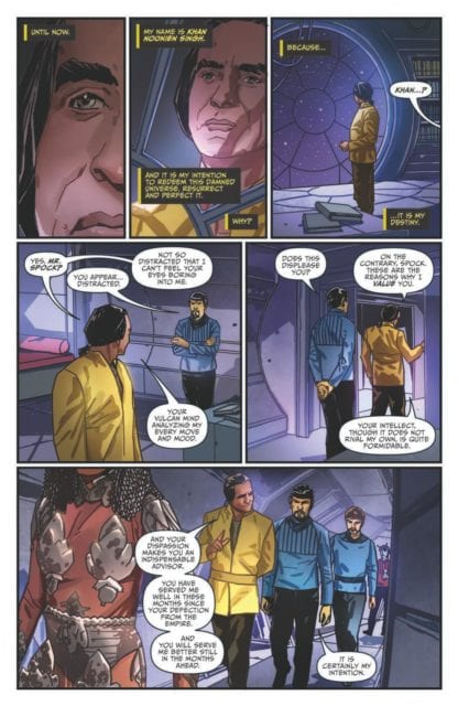
The latest one shot from IDW Publishing, Star Trek Hell’s Mirror, features the regular cast of the original series as seen in the first crossover story. It also includes possibly one of the franchise’s most popular villains: Khan Noonien Singh.
Star Trek Hell’s Mirror Credit: IDW Publishing
Crossing Over
J.M. DeMatteis will be a recognisable name to comic book readers. He has an impressive history writing for Marvel and DC as well as a slate of comics for smaller publishers. He also wrote the final issue of Marvel’s original Star Trek comic, published in 1982, so his return to the franchise is an exciting one.
The story is simple: DeMatteis reintroduces Khan to the reader through an opening monologue, although some prior knowledge of the character and the Mirror Universe at large is required. Going into this blind will leave you stumbling in the dark for a while, trying to reconcile the characters with what you already know about them. Having said that, the chances that this comic is picked up by anyone who isn’t already closely familiar with Star Trek history is very slim.
After the reintroduction, Khan’s journey takes him across the Terran Empire, inciting rebellion and behaving as you might expect, except there is a twist. In this universe Khan is the hero, a seeker of peace and freedom for all. DeMatteis tells the story from Khan’s point of view allowing the reader to get close to the character, with the regular Star Trek cast playing second fiddle.
DeMatteis picks out elements of the original Mirror, Mirror episode and the second Star Trek movie, recreating them in the story with a subtle twist. This roots the narrative in a world the reader will recognise but also highlights the difference between the Federation and the Terran Empire. It is clear from the narration by Khan and the actions on the page that this is a universe fuelled by hatred and anger.
Star Trek Hell’s Mirror Credit: IDW Publishing
Mirror Image
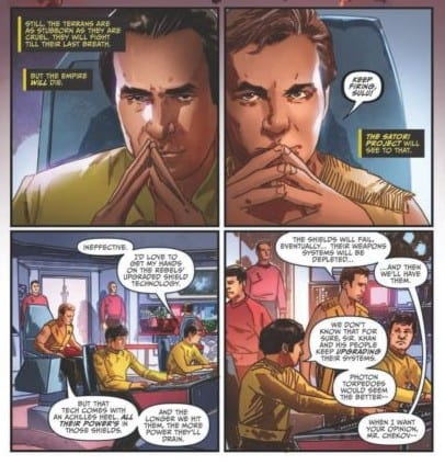
Artist, Matthew Dow Smith, renders the characters with thin, black lines, focusing on outlines while the detail is filled in by colorist Candice Han. This is a very effective style for the comic and adds depth to the page. The shading allows for a realistic image and brings out the emotion of the characters.
Han’s coloring also makes the characters easy to follow on the page. Each of the main cast has a slightly different uniform with a varying degree of brightness. This is important because some of the panels are laden with speech balloons covering up so much of the image. This is not a fault of the lettering by Neil Uyetake but a problem with an over-written script. The text on the page needed to be edited or the panel layouts should have been altered. On a number of pages, the text heavy script is not a problem, the opening of the comic is testament to this, but other pages are weighed down by exposition and flocks of speech balloons.
This is a shame because the artwork itself is wonderful. Smith draws an astonishing background that sets the scene perfectly. At no point throughout the comic are you in any doubt that this is an alternative universe or the form this dystopian world takes. The atmosphere on each page is as oppressive as the Terran Empire itself with the characters fighting their way through their lives. Smith also places panels side by side to create exciting comparisons between characters and situations. This is most notable when comparing the two leads, Kirk and Khan.
Smith uses a very standard set of viewpoints for the reader to see the action. This mix of long shot to body shot to close up relates to the era that the Original Star Trek hails from. The look of the series and the spin off movies is captured by Smith who only employs low or high angles to emphasise a major moment in the story.
Star Trek Hell’s Mirror Credit: IDW Publishing
Conclusion
The purpose of an alternate universe is to illustrate something about the central characters of the story. By portraying an ‘evil’, emotional Spock, it gives the audience a greater insight into the Spock we already know. Hell’s Mirror fails to do this, instead relies on the simple premise of the characters being opposite versions of themselves. The character of Khan isn’t grown by his appearance here because there is no comparison between the original and the doppelganger. We are given a fully realised character but not shown how he relates to the character we already know.
The assumption made in this comic is that because everyone else is playing against type, then Khan would do so as well. The main aim of Hell’s Mirror seems to be to retell The Wrath of Khan with the central roles reversed: Kirk is the aggressor and Khan the diplomat. This makes for a fun read, and this comic is a mountain of fun, but it feels like a missed opportunity. There was the chance here to delve into the mirror universe and create a unique take on the characters, giving the readers something truly unexpected. Unfortunately, this just isn’t the case and Hell’s Mirror is nothing more than a single idea stretched to fill 24 pages of comic.
Khan is a fascinating and fantastic character and deserves more page/screen time but there are much better stories out there with him in. This isn’t a bad rendition of the character, not like the Benedict Cumberbatch take in the movie Into Darkness, but the concept does have a greater potential than is present in Hell’s Mirror.
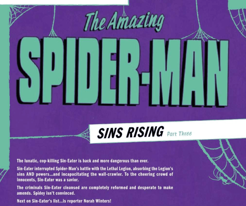
The Amazing Spider-Man #47, published by Marvel Comics, is the third part of the Sins Rising event and continues the outstanding quality of the arc.
About the Book:
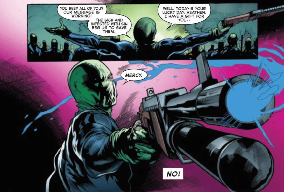
The Sin-Eater has been killing off villains of Spider-Man’s, only to have them come back to life in the morgue without their powers or urge to hurt others. Despite doing nothing wrong, Spider-Man does not trust the Sin-Eater and is doing everything he can to stop him.
The Amazing Spider-Man #47 Story
Nick Spencer, as always, does a phenomenal job of keeping the reader engaged with every page. The Sin-Eater’s motives and plans have not been entirely revealed, but each issue in this event we are given more and more, with enough information left to leave the reader curious enough about future issues. The Amazing Spider-Man #47 unveils another crucial step in the Sin-Eater’s plan that both fits the Sin-Eater character and is a new, unexpected twist. It makes the issue incredibly fun, while also creating excitement for what might result from the actions taken by the Sin-Eater in this issue.
What began in the previous issue is now having more profound effects in The Amazing Spider-Man #47, where Spider-Man wishes to stop the Sin-Eater for unfounded reasons. Yes, he was killing people, but they return to life eventually, now without the want to hurt anyone else. It seems like the perfect way to stop criminals. Spider-Man did have the fact that the villain Overdrive was in critical condition to help his argument, but we discover in this issue that it may be because of reasons other than the Sin-Eater. This leaves our hero with a belief centered on a hunch, which makes the public — and perhaps even the reader — doubt whether he is right. It is an incredibly exciting series of events that I cannot wait to see how it plays out.
Art
The Amazing Spider-Man #47 features many different scenes that appear only for a panel or two so that we can get a small slice of life for characters that we are not familiar with. These few panels that focus on many different locations allow for the pencils of Marcelo Ferreira and inks of Roberto Poggi to shine, as it allows for so many diverse characters to be brought onto panel that are living their everyday lives. The scenery and people are drawn beautifully and show off the high skill of Ferreira and Poggi.
Later in the issue, we are graced with a direct confrontation between the Sin-Eater and Spider-Man that features a multitude of powers and weapons that the Sin-Eater had acquired from villains he had shot. The battle is beautiful, and the dynamic poses and figures that Ferreira and Poggi make help create a deeply memorable confrontation. The way characters from certain panels overlap the borders of other panels is another technique frequently used, and it effectively makes characters pop out more than they would have otherwise.
The colors of David Curiel in The Amazing Spider-Man #47 are also shown off by the many different scenes at the beginning of the issue. The different palettes of each panel highlight just how skilled he is, no matter the environment he is coloring for. There is a point in the issue that takes place at a morgue with poor lighting that limited the abilities of what Curiel could do, but shortly after, we are able to witness his vibrant colors and gorgeous shading again in a brilliant fight scene.
The lettering of this issue was outstanding. VC’s Joe Caramagna kills at every chance he is given, and The Amazing Spider-Man #47 allows him to shine like few other issues. Rarely are there enough opportunities for the letterer to stun you, but the fight scene later in the issue features quick exchanges of blows from a multitude of weapons, which Caramagna enhances with fonts of many different styles and colors. Towards the back of the book features some of the best lettering I have ever seen in an issue as the action unfolds.
Conclusion
The Amazing Spider-Man #47 is yet another fantastic issue in the Sins Rising events. The end of each issue leaves the reader satisfied with what they have been given and wanting to know how each of the elements of the story will be resolved. It is a riveting piece of writing that is complimented incredibly well by stunning line art, colors, and lettering.
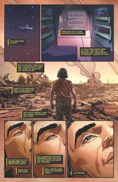
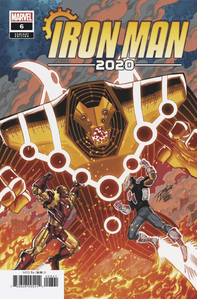
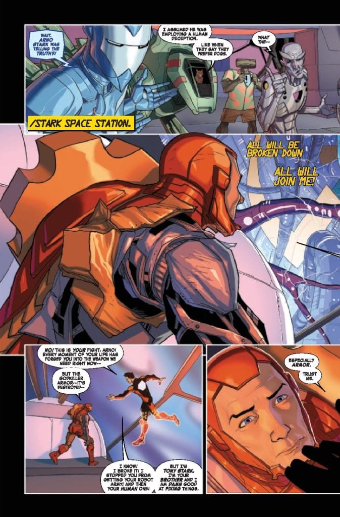
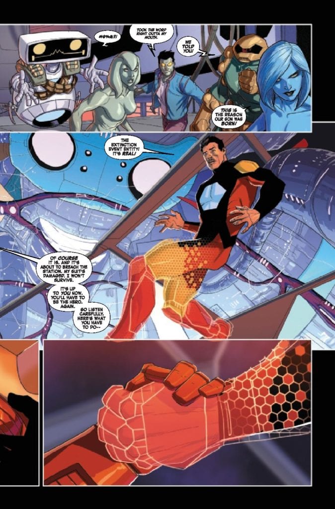
Iron Man 2020 #6 delivers an ending to the 2020 event thanks to Dan Slott, Christos Gage, Pete Woods, VC’s Joe Caramanga. After starting the year on a low point, Tony Stark is back with a new armor and finds him having to work with his brother Arno to defeat a much bigger threat. Will the two Starks be able to put aside their differences long enough to save the world?
Throw out the rest of your stupid, worthless flesh-bag calendars. 2020 is over, man! The moment Arno Stark has been preparing for is here: the end of all human and artificial life as we know it!
Writing
This issue marks the end of Dan Slott’s run on Iron Man and it truly feels like the closing of a chapter of the character’s history. Elements of both Tony Stark: Iron Man (which Slott wrote) and all of the 2020 events comics come into play in this issue. The fight against the Extinction Event Entity is massive and takes the efforts of Iron Man and his allies if they have any hopes of bringing it down.
The ending Dan Slott and Christos Gage deliver an ending many may not see coming or perhaps they will and they will feel unsatisfied with the way it wraps up. The bottom line is its a device ending which fans are either going to love or hate. Still, the way Arno was presented (as a borderline supervillain) there was little chance of him doing more with the armor than what was accomplished.
Artwork
The art by Pete Woods is fantastic and focuses on action scenes as the final battle plays out through the issue. Woods utilizes lots of two page spreads to showcase the scope of the battle as it plays out. To this end, the scale is incredible and allows the reader to experience the immense destruction as Tony and Arno work to takedown the Extinction Event Entity.
The Lettering by VC’s Joe Caramanga helps the audience to track the flow of the action as it plays out. The strategic placement of word bubbles allows for the reader to track the story especially with all of the two-page spreads which happen throughout the issue. Also, the little skull and crossbones asterisks will be missed which were used to censor the robots when they got to profane.
Conclusion
Iron Man 2020 #6 may seem like a quick wrap up to the 2020 event and has an ending many may not agree with. Still, after the delays and other downfalls of 2020, this issue is a course correction allowing Iron Man to have a better year than most. If there is one good thing to come out of such a chaotic year, its Iron Man 2020.
Marvel Action: Captain Marvel A.I.M. Small is the second trade in Marvel and IDW’s collaboration following Carol Danvers. Although on closer inspection, Sam Maggs makes this story illustrated by Sweeney Boo, colored by Brittany Peer, and lettered by Christa Miesner into a co-Unstoppable Wasp story.
Marvel Action: Captain Marvel A.I.M Small: Featuring The Unstoppable Wasp
Marvel Action: Captain Marvel, according to the reviews, ranks just behind the Spider-Man series in terms of acclaim. It’s pretty easy to see why. Captain Marvel puts in the time to enjoy the small things in life with her friends. Her driving lessons with Nadia Pym are just as exciting and nerve-racking as super-heroism. But of course, Maggs decides to use this time to explore Captain Marvel’s character through dynamics. Captain Marvel’s character usually involves trying to be the best possible version of herself. But she can be very stubborn and possess tunnel vision. Carol knows she’s powerful and leading thinking that as long as things go her way, nothing can go wrong. So Maggs’ forces the Captain to follow the Unstoppable Wasp’s lead.
After some MacGuffin forces Carol’s powers down less, they cause destruction, she and Nadia have to work together. This might be a little disappointing if people are coming in to expect Captain Marvel in action. Especially if half of the time, Nadia has more of the limelight. But this is a story about trusting someone you respect and letting go of preconceptions. All while trying not to force a situation to be too serious as Carol becomes a little more patient. Because despite Carol’s predicament, she’s far from helpless in the plot.
Art
Marvel Action: Captain Marvel A.I.M. Small retains the cartoony yet semi-realistic art of Sweeney Boo. It perfectly encapsulates the relatable conservations of Driver’s Ed and shrinks rays in the same world. The colors by Brittany Peer provide just enough contrast to highlight the settings while the best use is in the Wasp suit wings. The high-speed illusionary effects have a perfect sheen to them. Christa Miesner tops everything off with some word balloons and captions that, for the most part, are linear. Even if they do occasionally scatter about and confuse some of the reader’s direction of choice. Like do you begin with a caption with a timer first, then the word balloon, or the caption next to it?
Have A Little Fun With Marvel Action: Captain Marvel A.I.M. Small
Marvel Action: Captain MarvelA.I.M. Small may be more along the lines of a Marvel Team-Up than a Captain Marvel story, but it brings a nice dynamic. Along with the down-to-earth two-way mentoring is a romp that requires no overarching story that takes too long. Just a silly piece that goes on for as long as it has to.
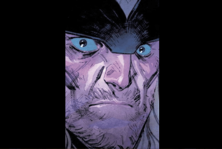
On August 19, Marvel Comics released Thor #6. Writer Donny Cates, artist Nic Klein, colorist Matt Wilson, and letterer VC’s Joe Sabino bring readers the sixth and final part of the “Devourer King” arc.
If there was any doubt that Thor is the strongest Avenger, this issue puts the matter to rest. CBR predicted a year ago that the Silver Surfer (is he the Black Surfer now?) would show up in Cates’s Thor, although probably not in the way the writer anticipated. “Norrin” shows up to console Thor and hear the tale of Galactus’s fate.
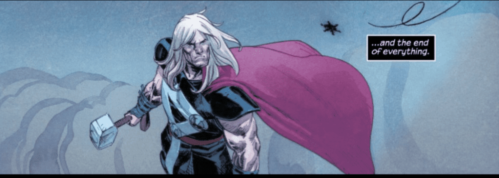
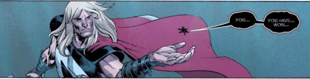
Telling Norrin Galactus’s fate and the defeat of the Black Winter (which may have been dispatched a bit too easy given how much the threat was built up), Thor reveals that the Black Winter, in its final moments, revealed Thor’s future to him.
Klein does exceptional work here, capturing Thor’s terror as he recalls the image that the Black Winter revealed to him.
The transition from Thor, drunk, depressed, and trying to forget, to Thor fully remembering what he saw is excellently and leaves quite an impact on the reader.
This issue is, of course, complemented by Matt Wilson’s colors, which, along with Sabino’s letters, construct a very compelling scene once the Black Winter is defeated and shows Thor is future.
The lone, falling black snowflake is a beautiful touch, particularly in the first panel where it is drawn and colored with a “smoky” look, which then crumples into dust in Thor’s hand, but not before the Black Winter gives him an ominous warning, lettered by Sabino, which complements the dark foreboding of this scene.
Conclusion
As foreboding as the Black Winter was, Cates and company tease greater horrors ahead for the King of Asgard, horrors that spell trouble not only for Thor and Asgard but the rest of the Marvel Universe as well.
What did you think of Thor #6? Tell us in the comments below!
Bomb Queen: Trump Card #1 published this week by Image Comics’ Shadowline imprint under the pen of Jimmie Robinson. Returning in a time when satire is practically a necessity, the titular character wastes no time in making readers laugh at their impending doom.
Background
Bomb Queen follows the titular supervillain, a vile, hedonistic, psychopath with a tactical mind, gadgets, and explosive superpowers. In her initial appearances, she is the despot of New Port City. Under the Queen’s rule serves, the city is a haven for criminals thanks to anti-superhero laws, among other things. Murderers, child molesters, even hate groups that would kill each other if they were anywhere else thrive in New Port. This brings most of the crime to one spot, which ironically benefits the US more than any superhero could.
The series originally begins as a satire of superhero fiction by playing up the absurdities. No matter how sacred or wicked the subject, the Queen would make them all look stupid. Later arcs put a more significant deal of emphasis on political satire; the most infamous is putting then-President Obama through the wringer. Even that’s just icing on the cake when the Queen destroys New Port City to go global. So how does Bomb Queen: Trump Card #1 fit in?
Bomb Queen: Trump Card #1 Expose
Robinson places Bomb Queen: Trump Card #1 between the sixth and seventh arcs of the original series. This allows Robinson to pull off a retcon without overwriting anything and utilize his character during her political commentary phase. It’s a smart move that uses in-continuity timing for satire. The lack of criminal haven, New Port City, shoehorns events like school shootings and mass riots to utilize how the Queen’s actions affect her world. Something that only gets touched upon in the original runs.
Bomb Queen: Trump Card #1 utilizes some exposition for newcomers through characters from previous arcs like White Knight. This can either drive people away or get them intrigued. Because who wants to hear people drone on without any action? But one of the more creative uses of exposition comes in a news report about Bomb Queen running against Trump. In addition to the newspeople making comments, there are complimentary reports in a rolling bar. It details reports like plastic in oceans that are in real news reports and a streaming service about school shootings. Considering the station has the not subtle name of “Fake News Network” (FNN), it says a lot of things. Not how much of this stuff is true, but how much influence the Queen has.
Art
Robinson certainly wastes nothing in all of his creative duties. After this interview, he features a 15-panel page, not unlike a recent issue of Savage Dragon. In it, there is a struggle to find equal footing in opinions on Bomb Queen. Some people hate her guts for personal reasons they wear on their faces, sometimes literally with fantastic detail on scars. The neutral ones look like they don’t have a care in the world despite the news. The ones for her meanwhile either have no idea what they’re getting into (hence blank backgrounds) or give reasons that benefit them personally (with actual backgrounds).
Bomb Queen: Trump Card #1 also goes headfirst into superhero action whenever it wants to. Robinson even uses the Queen’s color scheme to demonstrate she’s always the one in control. Like when she quickly knocks the Superman-Esque White Knight to the ground. Despite having a similar white and red coloring, the presence of her skin tone dominates their encounter. That doesn’t seem to bother her or Ramsay as her short brawl with a superhero team that probably parodies a controversial Marvel team attests to. The more dull looking costumes of “Blaque Shade” and “Hashtagger” get decorated with blood and explosions for contrast. Even “Mecha Fetus'” captions in relation to Bomb Queen show a humorous depiction of how boned this “Z-Gen Squad” is by displaying RPG stats. Whether a reader finds any of this funny or horrendous, however, is up to their taste.
Can You Tolerate Bomb Queen: Trump Card #1?
Bomb Queen’s return is undoubtedly aiming back at fans of the older series and for some social commentary to get new ones. The dark humor can be subjective, however, and not everyone will be on board with this series. Yet it’s this self-awareness of superhero fiction and social satire that drives the plot forward in an entertaining way. Once a reader gets past anything they don’t like, such as exposition, they might be able to laugh at the electoral situation close to home rather than despair.
What do you all think? Is Bomb Queen: Trump Card #1 the beginning of a decent Trump Era satire? Or is it just Bad Girl trash?
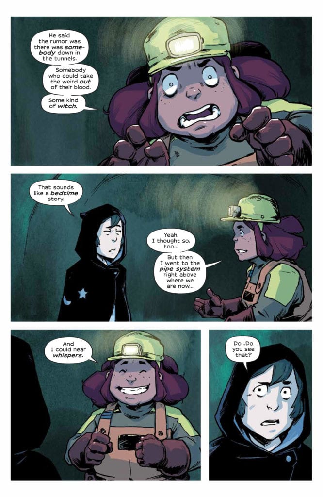
WYND #3, available from BOOM! Studios on August 26, brings Wynd, Oakley, Thorn, and the Prince together for the first time, fleeing toward separate destinies. Written by Jame Tynion IV and drawn by Michael Dialynas, this latest installment picks up immediately after issue #2 (read our review here), fills you in on some history, and puts the Bandaged Man squarely on Wynd’s trail.
Cover Art
Dialynas’ cover is a great setup for what’s to come. Wynd and Oakley look on in fear as someone comes after them in Pipetown’s tunnels. The green glow gives you a hint that something “weird” is happening down below, in more ways than one.
Writing
Now we’re cooking. One of the minor story problems with the previous issues was lack of context. The reader naturally would ask, “are the magical woods really dangerous?” This issue not only gives you a whimsical retelling of how the kingdoms came to be but answers the question about magical creatures in a definitive way. That all assumes you take the narrator’s word for it. Time will tell.
There’s a lot of rushing around and escaping as the group of protagonists are finally forced together by fate. You can’t help but see some similarities to The Lord Of The Rings, but the collision wasn’t forced or heavy-handed in any way. Tynion does an excellent job wrapping the setup in harried chase scenes and (possibly) a few sacrificial deaths that mean something. This is a great issue when it comes to both action and heart.
Pencils/Inks
Dialynas’ drawing style compliments and enhances Tynion’s story with a treasure trove of facial expressions, especially with the eyes. This chapter in the arc runs the emotional gauntlet from grief to surprise to skepticism to fear of embarrassment. It’s all done through Dialynas’ artwork, where sometimes no dialog is necessary. It’s a joy to read when an artist can pull off such a full range of emotion without the aid of narration or exposition.
Also, it was a pleasant change to finally see some of the “infected” peoples of the wood when they’ve only been talked about up to this point. Dialynas’ renderings of the weird folk are more reminiscent of refugees in a leper colony rather than a pack of dangerous monsters. It’s Dialynas’ designs that, again, help the reader feel through the artwork.
Coloring
Likewise, Dialynas’ coloring work brings a new element to the issue – green. Lots and lots of green. The infected are made so by the magical woods, and so, there is a heavy amount of vegetable growth in the afflicted. In a town characterized by its earth tones and rust, the green on the infected stands out in a way that leads you to suspect the infection may not be entirely malignant.
Lettering
Aditya Bidikar’s lettering has a little room to show some range in this issue. Not only do you have the dialog from Wynd and the rest of the established characters, but you also have an invisible narrator telling the story of the world and the mysterious guide with an inhuman voice in the underground tunnels. Bidikar takes full advantage of these different voices to letter flawlessly and add visual interest.
Conclusion
WYND #4, available from BOOM! Studios on August 26, is an emotional roller coaster, filled with suspense, excitement and a touch of grief. The writing fills in some of the missing gaps from the prior issue in a satisfying way, and the artwork is consistently great. I’m anxious to see where the fellowship goes from here.