Home Blog Page 266

Review: WE ONLY FIND THEM WHEN THEY’RE DEAD #1 — Scavenging For Gods

We Only Find Them When They're Dead #1 Cover

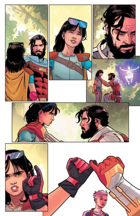
We Only Find Them When They’re Dead #1 — coming from BOOM! Studios on September 2 — is a space opera written by Al Ewing, illustrated by Simone Di Meo with colors assists from Mariasara Miotti, and lettered by AndWorld Design.

We Only Find Them When They’re Dead #1 Story

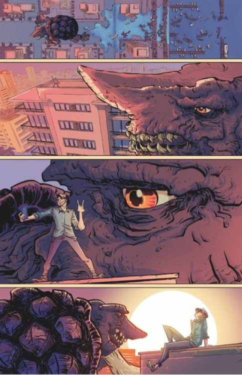
Al Ewing, venturing outside of his Marvel titles like The Immortal Hulk, writes a space opera with a unique premise. We Only Find Them When They’re Dead shows readers a glimpse of a space age where the emptiness of space takes a new meaning. Times are getting tough for a space autopsy crew that mines the bodies of dead god-like beings. These gods all appear at random points in the universe, and rather than acting as things of worship, discovery, or despair, they’re just another means of resources. It’s a pretty melancholic feeling that the reader shares with the crew’s captain who they meet in a prologue. The main story has him looking rather burned out about everything, like this way of life doesn’t suit him anymore. Especially when this “god mining” security looks at him with hostility despite being non-threatening to them. Readers can’t help but support the captain and crew’s journey for meaning to get some life back in them.

Art

Simone Di Meo dedicates We Only Find Them When They’re Dead #1 to his late mother, “who taught (Di Meo) to look at the stars.”

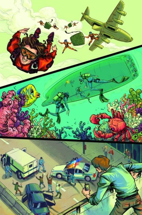
Di Meo uses the emptiness of space to highlight the designs of the ships, each with a unique style with a common characteristic: a spherical chamber that defines an autopsy ship and cuts and stores samples in the “god-mining.” With how these ships take apart the gods, it practically describes the bleak situations of the series; they’re like maggots mindlessly eating away carcasses. No one bothers to figure out what kills these gods, just harvest their remains for money. Even the other ships with different designs and purpose work to keep it like that, such as a sleeker escort ship built for speed which features engines connected with an arc.

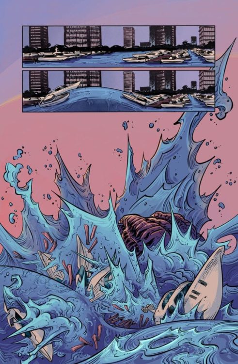
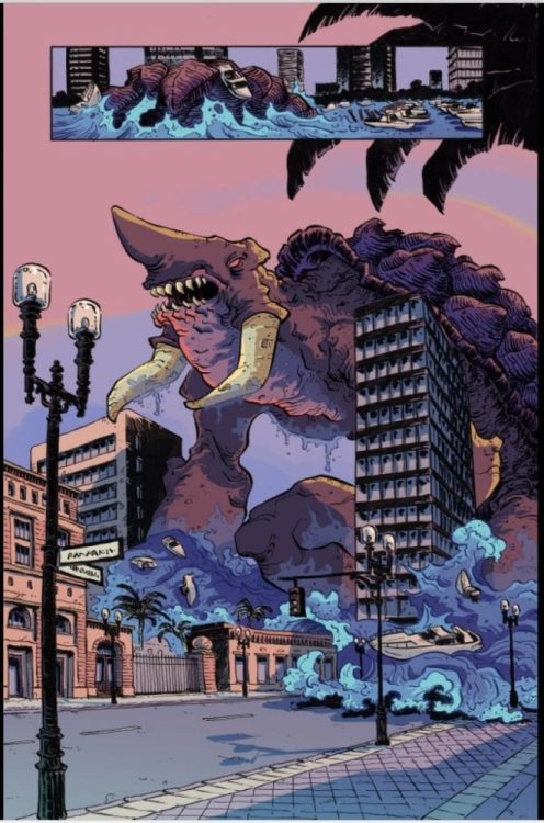
Di Meo colors these ships and empty settings with assistance from Mariasara Miotti. Most of the colors set the mood of what panel they take place in. The light purple vastness of space feels cool and practically worry free. That is until a red coloring shows up indicating a skirmish or dangerous presence. A small instance even has the entire interior of a ship yellow as a warning to its occupants. Compare this to the mostly single color panels featuring the main characters’ ship which has a green interior with yellow holograms. It’s an indicator that danger is near yet the crew stays out of trouble. It’s like both artists are keeping things afloat in We Only Find Them When They’re Dead #1.

Lettering

AndWorld Design provides some quality lettering to We Only Find When They’re Dead #1. The word balloons and captions provide a smooth and easy-to-follow trail to guide readers. On the note of captions, the lack of borders presents this omniscient narration that tells the story along with some of the characters. The main cast essentially has an ally that sometimes features words with colored outlines that match the background. It explains who some of the characters are with their identifying colors, but it also lets the captions blend in, which can make them a bit hard to read at times. Thankfully the lighter color word balloons make identification for voices that readers can’t recognize since they speak from their ships. Meanwhile, the inside of ships have the standard white coloring, and the rare instances of having several characters in the same space makes the distinctive lettering important, as this is having clear communication.

Look For We Only Find Them When They’re Dead #1

We Only Find Them When They’re Dead #1 leans subtly into finding meaning in a space devoid of thriving life. People have a common goal, but separate themselves through their diverging perspectives. I’m looking forward to what this space crew will do later in the series.

Monkeys Fighting Robots Youtube

Review: ADVENTURE TIME: FIONNA & CAKE TP Reminds Us Why We Love The Show

ADVENTURE TIME: FIONNA & CAKE TP, available in comic book stores on Wednesday, August 26th, brings together a plethora of hilariously exciting stories. This issue’s talented creators have put together engaging stories that showcase their unique set of strengths while remaining true to the characters and their mythos.

Stories and Artwork

Cake Bakes

Written and illustrated by Zachary Sterling, with letters by Britt Wilson, Cake Bakes is a fun story that stars the beloved cat. We enjoyed watching the cute cat surprise her best friend with a homemade breakfast.

Short Cakes

Short Cakes, written and illustrated by Ian McGinty, with colors and letters by Fred Stresing, presents readers with a series of literal short stories that feature our heroes as young children. With adventures ranging from snowball fights to mustache growing attempts, we were entertained by the sheer craziness of these goofballs’ predicaments.

Once Upon a Time

This story was written by Frank Gibson, illustrated by Becky Dreistadt, and lettered by Britt Wilson. We were thrilled to see this issue was crafted in the form of a fairy tale storybook, which keeps with the title’s theme. The fonts stand out from the page as if they’re part of the tale itself. And that tale takes Fiona and Cake on a perilous journey to the Ice Queen’s domain.

Adventure Time with Fionna & Cake: Card Wars

Adventure Time with Fionna & Cake: Card Wars, written by Jen Wang and illustrated by
Britt Wilson with Rian Sygh, is by far the longest story within this issue. And in a sense, it’s the most relatable of the collection. Readers fond of playing card games will find Fiona, Cake, the Ice King, and more partaking in their own version. It was great seeing these outlandish characters enjoy everyday games that are akin to Magic: The Gathering.

What’s the Punch-Line

The final story was written and illustrated by Kiernan Sjursen-Lien and lettered by Christine Larsen. Playing on this series’s penchant for puns, What’s the Punch-Line details the journey Fiona and Cake take as they travel to Prince Bubblegum’s party while carrying a bowl of punch. Surprisingly, this beverage becomes the focus of their adventure. While it may seem mundane at first glance, this special punch proves to be the life of the party.

Conclusion

ADVENTURE TIME: FIONNA & CAKE TP satisfies old and new fans alike. If you love the humor from the beloved television show, you’ll love joining in Fiona and Cake’s antics in this story.

What adventures do you foresee this dynamic duo getting into in the future? Let us know in the comments below!

Monkeys Fighting Robots Youtube

SUICIDE SQUAD #9 Preview: Bye-Bye Deadshot?

Suicide Squad 9 cover

DC Comics has released a sneak peek at September’s Suicide Squad #9, and it teases the end of one of the squad’s foundational members.

Check out the preview of issue #9 below direct from DC, including art by Bruno Redondo and Travis Moore:

DEADSHOT: SHOT DEAD?

If you ever needed proof that you shouldn’t get too attached to the “heroes” of Task Force X, it’s coming on Tuesday, September 22 in the form of Suicide Squad #9, and here’s your first look!

This issue, it’s the shocking death of Deadshot!

The man who never misses has been on the front lines of Task Force X since its inception—bomb in his neck, gun in his hand. He’s seen teammates blow

up and countries fall. He’s faced down heroes and villains alike. Now the Suicide Squad has one final mission: bring down the man who enslaved them, then put a bounty on their heads when they escaped: Ted Kord.

But to finish the job, the world’s deadliest assassin will have to do the one thing he’s never done for the cause: die!

SUICIDE SQUAD #9

Written by

TOM TAYLOR

Art and cover by

BRUNO REDONDO

Variant cover by

TRAVIS MOORE

On Sale

09/22/20

$3.99 US | 32 PAGES | FC | DC

Monkeys Fighting Robots Youtube

Review: ANGEL + SPIKE #13 Takes You Back In Time

Angel + Spike #13
Angel + Spike #13 Credit: BOOM! Studios

BOOM! Studios have spent the last 18 months building up the cast of Angel + Spike, re-introducing the main players in new and exciting ways. There has been a crossover with the Buffy The Vampire Slayer comic and even a change in name as the fan favourite, punk rock, demon Spike joined the team.

In this first issue not written by Bryan Edward Hill, the story shifts from the modern day to the edge of the Golden Age of Hollywood. Guest creators Adam Smith and Piotr Kowalski’s tale of murder fits snugly between the TV shows historical stories and the current comic book vision.

Angel + Spike #13
Angel + Spike #13 Credit: BOOM! Studios

Past Prologue

Issue 13 of Angel + Spike is a stand alone story but has links to the ongoing arc. If you have been intrigued by the new direction of BOOM! Studios Buffy-verse characters but yet to dip your toe in them then this is the perfect opportunity. Granted you’ve missed out on 18 months of wonderful comics, but everyone has to start somewhere.

The greatest thing about this issue, apart from being easy to access for new readers, is that Adam Smith makes Angel’s world seem so massive and full of history while maintaining a focus on the plot at hand. References to other, popular, stories from the TV show are dropped into Angel’s detective voice-over. This not only gives the comic an expansive feel but also creates a Hollywood noir effect. The setting is 1962, on the edge of the Golden Age of Hollywood, and Smith’s take on an Angel story reflects the changing climate.

The actual plot of this issue is a fairly standard affair: Angel investigates the murder of one of his acquaintances and, in true noir fashion, the trail leads him to larger criminal activities. The fact that there are demons and ghosts within this story does not detract away from the structured crime story Smith is telling. The mystery unfolds organically as the plot gets more and more complicated. There is a cast of new characters for Angel to contend with but you get the impression that the story will not end in this issue. The crime may be solved but the effects will have ramifications for our hero in the modern day.

Angel + Spike #13
Angel + Spike #13 Credit: BOOM! Studios

The Photographic Play

Long time readers of Angel will instantly notice the change in Art Style. Piotr Kowalski’s pencil and inks are more defined than Gleb Melniko’s. There is a purposeful shift from the emotionally driven expressionist pages in previous issues to a seemingly more rigid aesthetic. Kowalski is adopting the cinematic style of Hollywood from the first half of the 20th Century.

Classical Hollywood was obsessed with creating a realistic visual image. It did this by creating the impression that the shot continued beyond the frame of the image and focused on the actors, their gestures and emotions. This approach to storytelling is evident on every page of Kowalski’s artwork. On almost every page you have panels that bleed off the side, removing gutters. This creates the sense of expanding space and as a reader you fill in the rest of the room or location in your mind. You instinctively create a fully realised 3D world. The backgrounds are heavily detailed which reinforce a real world experience.

There is a simplicity to the characters, often with faces that are defined with a few inked lines, however Kowalski focuses on the emotion of each character. He forces the cast to act in very specific ways. To some it may appear simple and overacted in places but again this is due to the Hollywood influence. This issue of Angel + Spike is a drama being performed for your entertainment.

Angel + Spike #13
Angel + Spike #13 Credit: BOOM! Studios

Creating A Style

This issue is set in 1962 and plays out like a memory or a diary entry. As such everything has a hazy reminiscence to it. The violence is toned down and Angel’s emotional reactions are turned up because this is how the character remembers this period of his life. There is an element of romanticism to it, just like Louis’ narration in Interview With The Vampire. Mattia Iacono brings out this element wonderfully with his colors by toning everything down. Vibrant colors have been muted to give the impression of a time long passed. The hues are still there, setting scene’s and emotions, but the vibrancy has all been spent.

You get a similar feeling from Ed Dukeshire’s lettering. The placement and spacing of the word balloons is very structured and, in places, appears to take over the panels. Most often this would be counter productive for the storytelling but in this instance it fits snugly with the comic’s tone. In the retelling of the tale, certain elements standout, some aspects outweighing others. What Dukeshire does with his placements is emphasise the memory aspect of the narrative and illustrates the conversations that become more important than the actual visuals.

Angel + Spike #13
Angel + Spike #13 Alternative Cover Credit: BOOM! Studios

Conclusion

13 is unlucky for some but not the creators on this issue of Angel + Spike. The change in pace from previous issues is instantly noticeable but also welcoming and fits the tone of the story on offer. On the one hand this issue is a stand alone story, perfect for new readers to step into BOOM!s new Buffy-verse and on the other it enhances Bryan Hill’s work over the last 18 months.

The reference to the Hyperion Hotel and the TV episode Are You Now or Have You Ever Been isn’t a simple fan Easter egg. The pace and tone of this story mirrors that one and has a similar motive. The intention is to expand on the known character of Angel but also seed future stories. Smith and Co do this perfectly while telling their own, fascinating tale.

If nothing else, this issue of Angel + Spike proves that there is still a wide scope of stories you can tell in the Buffy-verse while still maintaining the core principles of the series.

Monkeys Fighting Robots Youtube

INTERVIEW: Sound Designer Martyn Zub Makes Noise For The Beastie Boys Story

AppleTV+’s new documentary, Beastie Boys Story, directed by Spike Jonez (Being John Malkovich), follows the musical trio’s journey over four decades of making hit music, and Emmy-nominated sound designer Martyn Zub (John Wick 3, Velvet Buzzsaw) came on board to make some noise.

For those not in the know or maybe coming out of a long stint in an underground chamber, I’ll fill you in. The Beastie Boys are Michael “Mike D” Diamond, Adam “Ad-Rock” Horovitz, the late Adam “MCA” Yauch. Two of the three members formed a short-lived punk band in 1978, which evolved into the Beastie Boys when the final piece of the puzzle, MCA, joined the lineup. In 1986, now with Rick Rubin and Def Jam onboard, the Beastie Boys released Licensed to Ill, the first rap record to top the Billboard charts. There’s a lot more to their history, and Beastie Boys Story takes viewers on an emotional journey with the

PopAxiom spoke with Martyn about becoming a sound designer, growing up listening to Beastie Boys, and working on a documentary about the beloved hip-hop group.

Dream Come True

Martyn started creating music somewhere in the teen years. “I started playing in punk bands in bars and what not as a teenager in Australia. I started mixing friends’ bands in front of the house, and I loved it. My parents showed me a sound engineering course.”

There’s been no looking back. Martyn completed the course then, “… got a job in a couple of small studios doing post-production for TV commercials. One thing lead to another, I eventually got into documentaries and feature films.”

Martyn’s professional life was going great. “My wife and I packed our bags and moved to LA. We didn’t think it would last. We thought we’d be here for one year, but it’s been ten years. We love it, and there’s no turning back now.”

Martyn’s influences growing up included, “Beastie Boys … also California punk, East Coast and West Coast hip-hop.”

Now, Martyn is an Emmy-nominated sounder designer for a documentary about the Beastie Boys who were a “… bit of the soundtrack of my life.” Martyn says, “It’s cool it’s gone full-circle from growing up listening to these guys, to actually sitting in a room and collaborating. It’s a dream come true.”

beastie boys-interview-martyn zub

About Beastie Boys Story

Working on Beastie Boys Story came with an itty-bitty hint of fear. “I never liked the idea of meeting your heroes or idols because you never know what kind of people they are. It turns out,” Martyn says, “… the Beastie Boys are down to earth guys and such great people to work with.”

How did Martyn become part of the Beastie Boys Story? “I have a sound studio in Santa Monica. One of the Beastie Boys producers talked to a studio producer about how much they loved the sound design of John Wick. The studio producer said, ‘Oh, you should talk to Martyn, he worked on that.'”

Martyn met Spike Jonez, and before he knew it, “… they booked me on Beastie Boys Story.”

Before the process officially started, Spike sent “… some scenes to see how I could clean it up and what vibe I could get out of it.” And as the process got underway in earnest, “We started working on one of the more intimate scenes. It’s a part of the movie where they’re reflecting on the passing of MCA.”

Capturing the intimacy and emotionality of the infamously and playfully obnoxious was of vital importance. “Everyone knows the Beastie Boys as this loud, outlandish bunch. So, we were trying to find the juxtaposition between the energies; the highs and lows. Finding those dynamics. It took work, but it pays off, you can hear it in the end product.”

However, with all that said about emotions, Martyn says, “After a while, you become so insular and a little desensitized. You watch it over and over. But it’s so rewarding sitting in a room and watching with an audience. We had a screening in IMAX before everything went into lockdown, and you see people’s body language and hear sniffles. It’s a great feeling.”

Designing Sounds

Martyn hears movies and TV shows, unlike most of us. “It’s a positive and negative. Often, I can’t listen to a soundtrack or watch a movie without dissecting what’s happening.”

What’s it like to mix the sound for something that could play on dozens of different devices with different sound systems? “You’ve got to think of that mindset once you’re doing the actual delivery. When we mix it, we do it in the highest format possible, in this instance, Theatrical Dolby Atmos, so we have speakers all over the place. Then we mix it for IMAX, which has another set of speakers all over the place.”

The mixes continue down from there for various systems. Martyn continues, “For Beastie Boys Story, we knew this was going to AppleTV+, which meant people would be watching on their laptops or phones. You try to get it, so it sounds its best on small devices. It’s the world we’re in now.”

Whaaat

Martyn’s work on Beastie Boys Story earned him and his team not one, but two Emmy nominations. How’d he find out? “It was just like any other day. I went to work mixing on a film that I just finished last week. A friend texts me ‘Congratulations’ I saw the phone out of the corner of my eye. I try not to get distracted by the phone, but I thought ‘Did that say congratulations?'”

Martyn responded to the text with, “What are you congratulating me for, what’s up? ‘You’ve just been nominated for an Emmy.'”

“It was super-humbling when I heard,” Martyn says, “I’m proud of our team and what we achieved on this film.”

But he still wasn’t entirely clear on what was happening. “I told my wife, hey Nicole, check it out I’ve been nominated for an Emmy. She replied, ‘Not one Emmy, two.'”

Martyn’s response was a high-pitched, “Whaaat!”

Martyn can’t help but repeat that the experience is “Totally humbling. I was incredibly surprised. It’s an absolute win no matter what happens the day they hand them out.”

Wrapping Up

Martyn works for Formosa Group, an independent organization doing sound work for dozens of movies and TV series worldwide. “I can see some of the best guys doing this work by going down a hall and knocking on their door. We started as a company with like seven, I think, and we’re now well over 150 people.”

What sort of dream films would Martyn love to work on? “ET would be so cool to work on. BMX Bandits would be cool to remake; it was like a teenage Goonies type of film on BMX bikes.”

Beastie Boys Story is out on AppleTV+. So, what’s next for Martyn. “I’ve been working on a Zack Snyder film called Army of the Dead, which will be on Netflix. I’ve started work on a Disney film called Cruella. Not sure how much I can say about that. It’s going to be really good fun.”

Is Beastie Boys Story on your watch list?

Thanks to Martyn Zub and October Coast for making this interview possible.

Want to read more interviews? CLICK HERE.

Monkeys Fighting Robots Youtube

AfterShock Announcement: Titans Battle In Comics & Film With THE KAIJU SCORE

The Kaiju Score #1, Broo cover

In a rare showing of synergy between comics publishers and film studios, AfterShock Comics has announced a film deal with Sony Pictures to produce a film adaptation of the to-be-released comic THE KAIJU SCORE. AfterShock’s new title, available to retailers on in November, is a unique twist on the kaiju sub-genre where “four desperate criminals are going all in on a once-in-a-lifetime chance to steal millions in art and turn their miserable lives around. The catch? They have to pull it off under the nose of a one thousand-ton kaiju.”

In concert, Sony has seen enough good stuff in the upcoming title to option the property for a new film. You can check out some preview images and read the full AfterShock press release below.

Are you a fan of the kaiju sub-genre? What do you think of the preview images? Let us know what you think in the Comments section, and please share this post on social media using the links below.

THE KAIJU SCORE / $4.99 / 32 pages / Color / On Sale 11.25.2020

Writer: James Patrick

Artist and Colorist: Rem Broo

Letterer: Dave Sharpe

Cover: Rem Broo

It’s the most dangerous heist ever attempted. Four desperate criminals are going all in on a once-in-a-lifetime chance to steal millions in art and turn their miserable lives around. The catch? They have to pull it off under the nose of a one thousand-ton kaiju. And a giant monster might just be the least of their problems.

Brought to you by the James Patrick (Grimm Fairy Tales, Death Comes to Dillinger, The Monsters of Jimmy Crumb) and Rem Broo (The End Times of Bram and Ben, Terminal Protocol) THE KAIJU SCORE is what happens when a Quentin Tarantino film takes place smack in the middle of a Godzilla movie.

  • In a competitive situation, Sony Pictures has acquired the film rights to AfterShock Comics’ upcoming comic book series THE KAIJU SCORE, from writer James Patrick (Grimm Fairy Tales, Death Comes to Dillinger, The Monsters of Jimmy Crumb) and artist Rem Broo (The End Times of Bram and Ben, Terminal Protocol).
  • Escape Artists’ Todd Black, Jason Blumenthal, and Steve Tisch will produce, along with Tony Shaw who brought the property into Sony. AfterShock Comics’ Lee Kramer and Jon Kramer will also produce.
  • Jiao Chen is overseeing the project for Sony Pictures. Sony Pictures’ Drew Reed and Jake Bauman were instrumental in the deal, as was Rive Gauche Television with Steve Burkow of Ziffren, Brittenham, who negotiated on behalf of AfterShock.
  • Escape Artists is currently in prep on The Man From Toronto at Sony Pictures, with Kevin Hart and Woody Harrelson attached to star and Patrick Hughes set to direct, as well as Journal For Jordan written by Virgil Williams and based on the memoir by Dana Canedy, with Denzel Washington directing and Michael B. Jordan starring.

THE BOOK HASN’T EVEN BEEN RELEASED YET AND THERE’S ALREADY A FILM DEAL WITH SONY – HOW/ WHY IS THAT EXCITING FOR YOU?

JAMES PATRICK: “I have a habit – maybe a bad one –  of always trying to be funny or clever or sarcastic when people ask me questions, and I find myself at a loss for any of that here. The truth is that the whole thing has been wonderful and surreal, but I’ve also found myself kind of having not digested it because it happened so fast. I’ve tried to not be excited about it and just focus on my work, but I’ve failed at that. I’m excited. Period. Excited because it will hopefully bring more eyes to the book since it won’t come out until November, excited for people to read the book and see how much more it is than just a good hook, and excited if it brings more attention to my other work and to Rem Broo’s wonderful art and his other books. And despite the fact that things happened with the publisher and movie deal so fast, this was a book that was developed for a while and it’s nice to see a payoff. And there’s a sense of relief since Rem had committed himself to it so long ago and put in so much work before anything ever came of it. And I can’t communicate enough how excited I am that this is with Sony and Escape Artists. They make great movies and I feel the material is in great hands. I can’t believe how lucky we got.”

REM BROO: “I was talking to a good friend of mine the other day, telling her how fast things are moving with this project and that I fear that this might make me feel anxious and overwhelmed in the end. She replied that after 10 years of intensely overworking myself in the industry, it’s about time for something to move fast in the right direction, so I should lay back and enjoy a bit of success. She’s right. I am excited for every step of this process, but it isn’t time to relax just yet. Not only has the book not been released yet, but it hasn’t been finalized. James did a fantastic job on the script, but I still have plenty to do on the visual part. This fact keeps me grounded and cool-headed for the moment. I need to keep myself focused on doing my job as well as my abilities allow me to, and let the things develop into something that I’m sure will be great.”

WHAT’S A PITCH TO READERS ABOUT THE BOOK AND WHY IT’S A MUST READ?

JAMES PATRICK: “I’ve said it before, and I’ll keep saying it because I think it’s spot on: the best pitch is that it’s a Quentin Tarantino film taking place in some corner of a Godzilla movie. A character piece with monsters in the background. But the “must read” aspect comes from that it goes deeper than the hook and has some great characters, great dialogue, great moments, and Rem’s killer art. We always believed this book should have a cool element and swagger that would make it stand out. That if this book were a person, everyone would notice it when it walked into a room.”

REM BROO: “Imagine a world where a 100 meter tall sea creature wants to have a casual sunbath in your neighborhood park. You might use common sense and leave, or maybe you would stick around, especially if there was money, ego, and some hidden high stakes involved. Now, that’s interesting. As for the presentation package for this story, I’m going to use the words that James did when he approached me for the first time, regarding a possible collaboration between the two of us. He said that I might be the right guy for the job because my art has “life and style and a nice slick vibe”. I think he used these words because they mirror his writing perfectly. The truth is that this book has attitude. And nobody can stay away from that.”

Monkeys Fighting Robots Youtube

The Trials of Barbara Gordon In BATGIRL #48

Her history is never far behind, not even in Batgirl #48.

BATGIRL #48, available this Tuesday from DC Comics, continues Barbara’s epic and dangerous journey in the Joker War. Her path has been far from easy, yet she keeps moving forward.

***SPOILER WARNING***

spoilers ahead

Once again, the Joker has been tearing through Gotham – and all of Batman’s allies. This is, unfortunately, something that Barbara Gordon has seen before. Has experienced before. Yet she didn’t stop then, and she sure as hell won’t stop now.

The last issue forced Barbara to relive some of the worst moments of her life. It could have been the beginning of a downward spiral. Instead, she took charge of the situation and of her own life. It was a moment that should have been cathartic, if not for the war still ongoing.

Now she’s left to pick up the pieces and face the consequences for the tough decisions she made. Once again, fans are reminded of how she became Oracle and how Babs always finds a way to continue her task of saving lives. No matter what.

Her history is never far behind, not even in Batgirl #48.

The Writing

Batgirl #47 took the trauma of Barbara’s life and brought it full circle. It was a harrowing moment and a reminder that many characters in this world will do everything in their power to keep Barbara Gordon from moving away on from her trauma.

The conclusion was a win in that Batgirl took control of the narrative and made decisions for herself. Yet there’s no doubt that there will be consequences for what was done. Cecil Castellucci didn’t shy away from those consequences in Batgirl #48.

It felt refreshingly honest. This is Batgirl through and through. The good and the bad. Her history is complex, as even just this single issue reminds readers. The family drama, the bat drama, it’s all still there.

This issue weaves all of that together while setting up for something else in the future. Will it be related to the Joker War? Or will this end up being a plot solely for Barbara? Only time will tell. But even so, it’s safe to assume that whatever happens next will have that classic Batgirl spin to it.

They say fighting is like dancing.

The Art

The artwork found within Batgirl #48 is the perfect support structure for such an intricate plot. Barbara’s ferocity and determination seem to seep off the pages, alongside some more complicated emotions and concerns from secondary characters.

Robbi Rodriguez was the lead artist and provided a stark look into the calm before the storm for Batgirl. Here she is, recovering and scrambling to put everything together in her head. The conflict shows on the pages, highlighted by the details around her.

Jordie Bellaire provided the colors, and it took this issue to a whole new level. The pages are surprisingly bright at times, in a way that allows her bold red hair and glow, alongside the iconic feature of her favorite building. It’s all pointing back towards the past, intentionally or not.

Finally, Andworld Design provided the lettering. There was a lot more of that going around in this issue, courtesy of all the panic texts Barbara received. Yet it worked nicely in this issue, showcasing everything that is going on – and what Batgirl was choosing to focus on (and ignore).

The complex history of Barbara Gordon.

Conclusion

Batgirl #48 told a complex story, one of recovery and determination, of history and the future. All while creating a plot that pulls readers in, and makes them desperate for the next issue. Granted, the conclusion alone might have done that part.

Monkeys Fighting Robots Youtube

REVIEW: SUICIDE SQUAD #8 Gets Stuck in Its Own Head

Suicide Squad Tom Taylor DC

Written by Tom Taylor, with art by Daniel Sampere, colors by Adriano Lucas, and letters by Wes Abbott, Suicide Squad #8 gets stuck in its own head. In a series that is so strong, issue 8 stands out like a sore thumb. Despite some genuinely great moments, this issue is mired by an uncharacteristically awkward script.

Writing

It’s always tough when you read something and can’t stop thinking about how one person wrote it. Taylor is typically very good at avoiding this pitfall. His characters have unique voices, and his plots have a joyful randomness. But Suicide Squad #8 feels like one person talking through many different mouths. In the beginning, Wink asks where Zoe is. When Floyd tells Wink that Zoe’s out playing with Dogshot, Wink says: “Zoe named the puppy Dogshot?” “Yes,” Floyd replies. “That’s the best.” Wink says. Honestly, who doesn’t love a puppy called Dogshot joining the group? It’s incredible. But Taylor, essentially complimenting his own writing, cheapens the novelty of it a little.

Suicide Squad Tom Taylor DC

When we follow the story of Wink and the Aerie, we arrive at some similar problems. Their conversation back and forth is awkward, but more because we’re just a slight bit behind Taylor’s thought process with each line. Perhaps it’s that Wink thinks ten steps ahead of everyone else, but Wink’s lines feel slightly out of joint. Similarly, when a character says to Kord, “Someone will stop you,” his response is, “Someone, hey? You couldn’t come up with a more specific threat?” It feels like a joke we’re not in on, a beat that didn’t quite land. Saying “someone will stop you” feels normal, and Kord’s response feels awkward and strange.

That said, the story of Wink and the Aerie getting to know each other is undoubtedly a highlight of the series so far. Despite some awkward lines, we get a real sense of their love for one another. Taylor doesn’t allow for the darker sides to their origins to detract from the fun or the humanity.

Art

Sampere’s art is wonderfully playful in this issue. It’s a joy to see him mess around with what he wants to show, and what he wants to keep hidden. Mostly because Sampere always seems to make the right decision. When the Aerie is locked away in a cell, they cover themselves with their wings. It’s a little odd to be hiding in an empty cell, yet the fact that the Aerie feels so vulnerable that they’ll even hide when they’re alone in a locked room speaks volumes. Later, when we get a brief cameo appearance from Croc and KGBeast, members of an earlier version of the Suicide Squad, Sampere brilliantly swerves away from giving us a real sense of their size.

The first time we see them enter the room, they’re in the background, and their relative size remains unclear. From then on, we mostly see them in parts — Croc from the waist up, looking huge and daunting. We see close-ups of KGBeast’s gun arm or Croc’s gargantuan foot coming into panel briefly to wreak havoc. Not knowing how large these characters are creates an added layer of fear. Sampere knows he can’t make them loom as large on the page as they will in our minds, so he lets us fill in the blanks.

Coloring

Lucas keeps much of this issue feeling light and fun, despite what may be happening. He colors moments of danger in bright yellows, and the respites between in cool blues. It gives the issue a rhythm, and the fight scenes a sense of spectacle. As the Aerie and Wink have a showdown with an old version of the Suicide Squad, the scene is cast in a pink hue. The whole scene is both terrifying and beautiful at the same time—kind of like the Suicide Squad themselves.

It’s interesting to see Lucas use the same colors for starkly different things. A dark cell, colored in light blues, goes from being depressing, to comforting and safe. The orange and yellows of danger in battle is then used to show the peace of a sunset or the explosiveness of a kiss. Each time Lucas shifts from one use of a color to another, we get a sense of the scene being reclaimed. The Aerie and Wink refuse to let the Aerie’s cell be a place of depression; it becomes their own little refuge. It gives us a sense of the layers to their relationship. Their relationship was built on a foundation of pain that they have reclaimed and turned into something beautiful.

Suicide Squad Tom Taylor DC

Lettering

The lettering keeps its flair in this issue. It’s interesting to see Abbott lettering moments of violence against our protagonists now. Thus far, most of the gunshots and explosions have happened in times of giddy chaos. But now, as we see the Aerie and Wink at the butt end of each sound effect, these moments feel different. That doesn’t stop Abbott though. Gunshots, explosions, tasers and breaking bones are all given the fun theatrics we’re used to. We just become more divided about how fun the moment really feels to us.

One brief sound effect does seem a little odd, though. When the Aerie and Wink are in the air, we see the sound effect of something approaching. The sound effect appears in the corner of the panel and disappears behind Wink’s arm. There’s just not quite enough space given to this particular sound effect for it to be noticeable, and not look like a misprint. Altogether, Abbott is an incredibly experimental letterer who is always trying new things, so it’s easy to take the moments that don’t work when there are just so many that do.


Suicide Squad #8 might be too self-effacing; it might be too self-aggrandizing. Whatever it is, it’s certainly too trapped in its own head. The creative team gets mired in commenting on what’s happening, detracting from what is otherwise a truly great story. If this were any other series, the problems with this issue would be completely unnoticeable. But this is Suicide Squad, and this series has gotten us used to a truly remarkable level of entertainment. Suicide Squad is a blast, and you can bet this creative team will find their footing in the next issue. They always do. Pick up Suicide Squad #8 at a comic book shop near you!

Monkeys Fighting Robots Youtube

Review: Everything Has A Price In JUSTICE LEAGUE DARK #25

JUSTICE LEAGUE DARK #25 hits comic book stores Tuesday, August 25th, diving further into the mysterious Other Place. Zatanna and Wonder Woman are looking for the former’s father, whose spirit lies within the realm’s grasp. In a brilliant feat of storytelling, Ram V brings readers along on a journey that teaches everyone a hard lesson about the true costs of life.

Story

Readers initially find themselves in a self-narrated memory from Zatanna’s childhood. The young girl finds a deceased rabbit and is brought to tears at the sight. Her innocence is clear as day, making us feel for the girl who’s yet to experience the horrors of reality.

Out of desperation, Zatanna uses magic to revive the animal. But, sensing a threat, her father Zatara rushes to her side and casts a spell that transfers the cost of her magic to his own body.

With this sacrificial act, the older magician teaches his daughter a valuable lesson: there’s always a price that must be paid.

After navigating the Other Place, Zatanna and Wonder Woman find themselves face-to-face with Zatara, the magician’s now deceased father. The two have a heartbreaking exchange reminiscent of the memory from earlier. This narrative choice allows readers to bridge the gap between Zatanna’s childhood and adulthood.

Unfortunately, Zatara is tethered to the nefarious Upside-Down Man. And so, on the outskirts of reality, our heroes must wage war against the powers of death itself.

Artwork

Amancay Nahuelpan’s penciling and ink work, June Chung’s coloring, and Rob Leigh’s lettering framed this issue beautifully. The gloomy illustrations of the hellscape in the Other Place are staggering, combining harsh yellows, reds, and oranges for Zatara’s burning soul, dark shades of the jagged rocks surrounding them, and the off-putting white tint of the Upside-Down Man. What’s more, the lettering balloons are modified to show the eery speech of the villain, adding to our feelings of dread as our heroes navigate the bowels of the underworld.

Conclusion

JUSTICE LEAGUE DARK #25 scared us, surprised us, and flat out enticed us with its heart-wrenching storyline.

What part in all of this does Zatanna and her father have to play? Let us know what you think in the comments below!

Monkeys Fighting Robots Youtube

Review: BATMAN: THREE JOKERS #1 Rallies In The Ninth

Review - BATMAN: THREE JOKERS #1 Rallied In The Ninth

BATMAN: THREE JOKERS #1 from DC Comics hits your local comic book this week, with the pressure to save the comic book industry and tell an un-tellable story. The book is by writer Geoff Johns and artist Jason Fabok, with Brad Anderson’s colors, and Rob Leigh’s letters.


How DC Comics describes the book:
Thirty years after Batman: The Killing Joke changed comics forever, Batman: Three Jokers reexamines the myth of who, or what, The Joker is and what is at the heart of his eternal battle with Batman. New York Times bestselling writer Geoff Johns and Jason Fabok, the writer/artist team that waged the “Darkseid War” in the pages of Justice League, reunite to tell the ultimate story of Batman and The Joker!

After years of anticipation starting in DC Universe: Rebirth #1, the epic miniseries you’ve been waiting for is here: find out why there are three Jokers, and what that means for the Dark Knight and the Clown Prince of Crime. It’s a mystery unlike any Batman has ever faced!


Review - BATMAN: THREE JOKERS #1 Rallied In The Ninth

For me to explain my thoughts on this comic book, I’m going to use baseball as a metaphor. BATMAN: THREE JOKERS #1 is like the first five innings of Game One of the World Series. Your team is on the road, down by four runs, and the ace of the staff has just been pulled. In the biggest moment, your number one pitcher didn’t have his best stuff, and a few errors in the field were costly. On the bright side, the game isn’t over; you’re only down four, and it’s only the first game.

BATMAN: THREE JOKERS #1 is a very good looking book that introduces a story and has a better than average cliffhanger, but for some reason, the first issue of this three-part miniseries doesn’t resonate emotionally. Johns doesn’t take the time to connect the reader with the story. Batman, Barbara Gordon, and Jason Todd are distant and emotionally walled off. You don’t know who to root for as the reader. Furthermore, the comic doesn’t do anything revolutionary; it is what it is. But when DC Comics hypes it as the next KILLING JOKE, readers are expecting something more than just another Batman story for $6.99 an issue.

Review - BATMAN: THREE JOKERS #1 Rallied In The Ninth

Fabok’s art is gorgeous, but there isn’t a panel we haven’t seen before. There is nothing iconic about the issue because it just seems to be borrowing from other iconic moments in the Batman mythos. BATMAN: THREE JOKERS #1 is a DC Black Label book, and I would have asked Anderson and Leigh to swing for the fences when it came to the colors and letters. But the colors are bland, and everyone in the story speaks with the same cadence. There are THREE JOKERS — this book should be pure chaos, but it isn’t. There are ways the colors and lettering could have visually enhanced the story, but they left the talent on the table.

To continue the baseball metaphor, BATMAN: THREE JOKERS #1 does rally in the last five pages of the book. Johns’ writing is filthy good and sets up a moral question that will have die-hard Batman fans battling it out in the Facebook groups.

Review - BATMAN: THREE JOKERS #1 Rallied In The Ninth

I didn’t go into too much detail because I want you to enjoy the book without spoilers, but my hope for the rest of the series is for Johns and Fabok to move away from THE KILLING JOKE style and tell their own story. Swing for the fences and shock the world.


Did you read BATMAN: THREE JOKERS #1? What did you think? Comment below with your thoughts.

Monkeys Fighting Robots Youtube