Home Blog Page 230

Review: Giant Mechs And Techno-Theocracy In GIGA #1

Giga #1, Lê cover

GIGA #1, available from Vault Comics on October 28th, begins a new tale of a war-ravaged world where dormant mechs have become the new cities and technology-based religion rules with an iron fist. Written by Alex Paknadel and drawn by John Lê, this new series combines Robotech’s large-scale future tech with the desperate-hope-under-claustrophobic-oppression of Brazil (1985).

Cover Art

Lê’s cover hits all the right notes to be successful. There’s a strong contrast between the dormant Giga’s hand and the peaceful blue sky. Your eye is immediately drawn to the figure seated casually in the Giga’s palm. Despite the scene’s serenity, you get a small hint of anxiety as the growing tree tilts precariously over the edge. Lê cleverly hints with symbolism, the tenuous nature of life, and its dependence on the Gigas in this world.

Writing

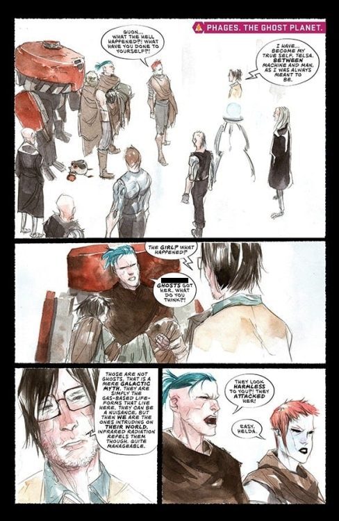
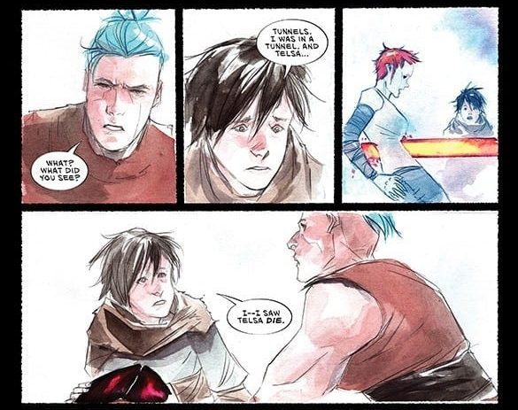
Paknadel’s story gives you the impression that something is about to happen to this future dystopia, breaking everything loose. Evan, a talented engineer, left the Order years ago after a tragic incident. In the years since, Evan’s life has been very hard as he struggles with robbers, finding scrap to trade for food, and surviving just above the bare minimum. Where Paknadel’s story works are in the thorough development of the world and its characters. You get history, government, people, and the predicament without getting lost in any of the jargon.

Where Paknadel’s story doesn’t quite land is the lack of a hook. In screenwriting terms, there needs to be an inciting incident that grabs the reader to invest them in whatever adventure lies ahead. The inciting incident is possibly Evan’s search for a robot part, but the action is so mundane for Evan’s daily routine that it hardly feels like anything is happening at all. I’m mildly curious to see what happens in issue #2.

Pencils/Inks

Lê’s artwork echoes a strong Moebius influence, particularly in the architecture and the backgrounds. The Gigas and the cities their “corpses” have created appear ancient – almost Aztec – but infused with futuristic technology details. When Lê combines the aging technology with the surrounding jungle’s overgrowth, the scenes become huge and feel much bigger than the panels they fill. Excellent design work be Lê.

Giga #1, art sample 1

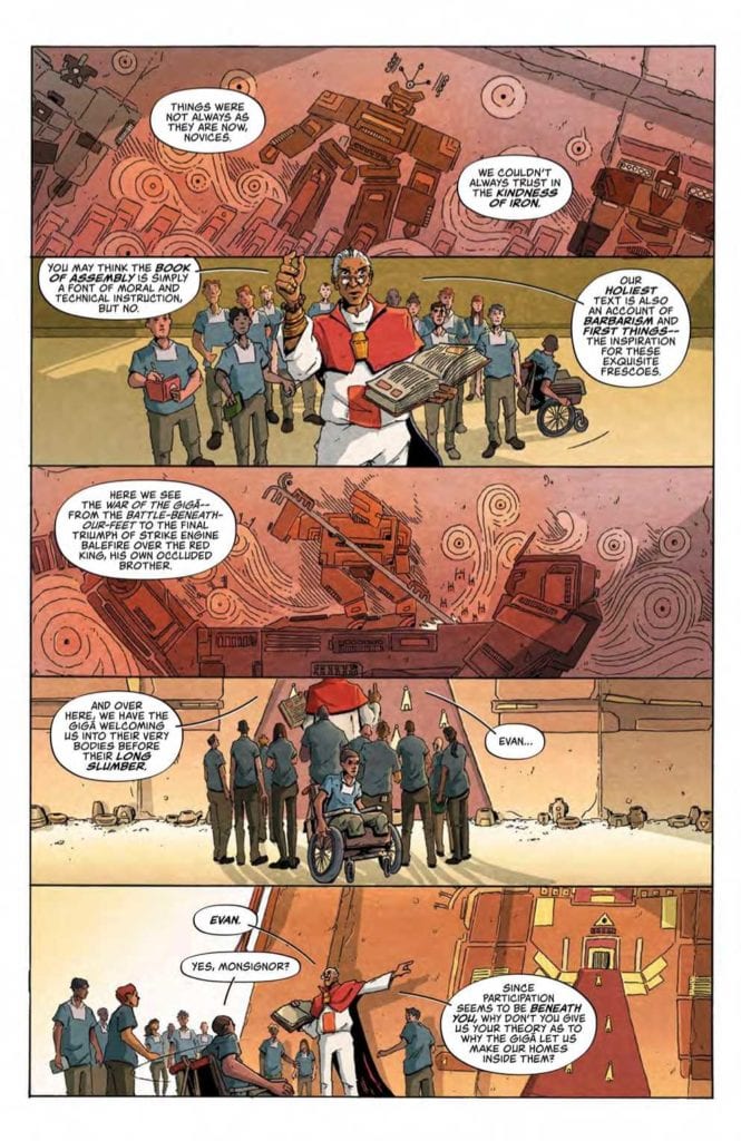
If there’s one area from the art that needs some work, it’s in the details of the faces. Frequently, the eyes are misaligned, or hairlines are off-center, or the angles of a chin or jaw don’t match the angle of the character’s head. It’s not noticeable in any of the wide panels, but it’s hard to miss on the closeups. It doesn’t detract from the issue overall, but it was distracting on scenes that were close-up where character emotion needed to come through.

Coloring

ROSH’s coloring work on this issue is excellent. Every scene is cast in varying lighting gradations, giving you the impression that you’re watching the scenes unfold during sunset or dusk. It adds a mood of transition, as day fades to night, which adds to the sense that change is about to happen.

Lettering

Aditya Bidikar made some unique lettering choices that add some uniqueness to the look of this issue. Word balloon tails are pairs of black and white lines, which gives each speaker their own unique style depending on how the lines are shaped. It’s a nice touch to add a little distinctiveness.

Conclusion

GIGA #1, available from Vault Comics on October 28th, does an excellent job setting up a unique world to explore. Despite the lack of a strong hook, the story fleshes out the main character very well, and the art team accomplishes the daunting task of creating a future world that looks wholly lived in.

Monkeys Fighting Robots Youtube

Review: WYND #5 Takes Flight

Wynd #5, Dialynas cover

WYND #5, available from BOOM! Studios on October 28th wraps up the current storyline with a fatal confrontation between Wynd and the Bandaged Man. Written by James Tynion IV and drawn by Michael Dialynas, this final issue in the current volume punctuates the general theme of self-acceptance with an act of sacrifice.

Cover Art

Dialynas’ cover, consistent with the entire series, ticks all the boxes for a solid cover. The Bandaged Man’s one visible eye stands out in stark contrast to the soft swirl of bandages and feathers. Those same falling bandages subtly hint that the Bandaged Man’s identity will be revealed, and falling feathers imply that somebody is headed for a fall.

Writing

Tynion IV wraps up the current arc neatly and with a fairly predictable outcome. The final confrontation builds tension through the Bandaged Man’s threats because it shows you he’s not above maiming and killing to prove a point, making you feel nobody is safe. Up to now, the Bandaged Man has always been in the background, but here he’s brought forward as a truly ominous and cruel villain to keep you on the edge of your seat.

There’s a rescue scene toward the very end, and it has a “wow” factor. Tynion IV provides a nice change of pace when the series has largely been overwrought with a frightened, desperate chase. The end of the story works as it gives the reader a deserving emotional payoff, all while Tynion IV sets up the next volume.

Pencils/Inks

Dialynas’ art has been consistently solid throughout the series, and this issue is no exception. The Bandaged Man’s true form design is monstrous enough to be intimidating, and Wynd’s appearance in the final battle is whimsical and epic. Dialynas’ style was a perfect match for this material, and I’m looking forward to more from him in the future.

Wynd #5, art sample 1

Coloring

Combined with the artwork, Dialynas did an excellent job of coloring in the uniquely magical creatures that are so prevalent in this issue. The woodland spyrtles practically glow and bubble with a rainbow of magical energy. For this reviewer, the highlight was the collage of dreamy hues in the epilogue’s dream sequence. This was a strong, standout coloring job by Dialynas.

Lettering

Aditya Bidikar’s lettering work is top-notch in this final issue. This is a conversation-heavy issue, aside from the final battle, and the Bidikar bolded the right words to give the conversation’s more energy. The word balloon place was excellent to guide the reader’s eye and keep a brisk pace.

Wynd #5, lettering sample 1

Conclusion

WYND #5, available from BOOM! Studios on October 28th, is a sound and satisfying conclusion to this original series from Tynion IV. The story hits all the right “feel good” notes in conclusion, and the art is a perfect marriage with the subject matter. I strongly recommend this series for fans of YA fantasy.

Monkeys Fighting Robots Youtube

Review: SPAWN #311 – Hunters Or The Hunted?

SPAWN #311, available in comic book stores on Wednesday, October 28th, takes readers on a thrilling hunt for Hellspawn. After breaking the timeline in a previous issue, a number of Hellspawn from the past found their way into the present. What’s more, undead warriors are running amuck. Can Al Simmons find a way to round up these beings? The issue answers this question in a way that leaves readers hungry for more.

Story

This issue follows three distinct storylines while telling one main story throughout each. The focus? An unaccounted batch of Hellspawn and undead warriors who have gone missing. There are a number of potential players who might be at the root of it all, and Al is on the case. But could he be one of the targets?

From a journalist’s mysterious death after interviewing a mayor to a vampire’s party, readers will find plenty of potential leads to the true culprit. But the most peculiar suspect is Jim Downing, a fellow Hellspawn Simmons thought he could finally trust. The resulting clash could either leave the two at odds, or create a team to take one whoever is behind the disappearances.

Todd McFarlane’s writing combines mystery, horror, and action in ways few creators can. In moments that make you hold your breath, the writer masterfully portrays protagonists who aren’t sure if they’re the hunters, or the hunted.

Artwork

Carlo Barberi’s penciling and ink work, Peter Steigerwald’s coloring, and Tom Orzechowski’s lettering pulled us into the narrative in spectacular fashion. The transformation sequences of hero and foe alike are drawn with an otherworldly fluidity. They’re then fleshed out with dark shades that occasionally transition into lighter colors, luring readers into the panel to find out more. We also found the word balloon placements effective in the ways they framed each scene’s action.

Conclusion

SPAWN #311 is an engaging read that will keep readers on the edge of their seats. We are excited to see where the events of this issue take our heroes next.

Who do you think is behind all of the disappearances? Let us know in the comments below!

Monkeys Fighting Robots Youtube

Review: Can Machines And Humankind Come Together In ASCENDER #14?

ASCENDER #14 hits comic book stores on Wednesday, October 28th, bringing readers one step closer to discovering the fate of Tim-21. Fans of the Descender series will remember him as the robot protagonist who helped bring humans and machines together. That call is a tall order for today, however, with divisions between the two groups more stark than ever. Can the machines and the flesh and blood types work together to decipher Bandit’s map and invigorate the resistance?

Story

Our story opens with clashes between the pilots and Dr. Jin Quon (now almost fully robot), reminding long time fans of their conflicting personalities. Tesla and Helda’s rage at the detached Quon seems justified to readers, however. The “ghost” beings on Phages attacked Mila, causing her to fall into an unconscious stupor. And Quon seems unconcerned.

But it’s not all for lost; the young magic wielder receives a premonition of imminent danger that could help prepare the group for what’s to come.

Will this spur the two groups—Quon and his machines and the living—to work together in their quest to follow Bandit’s map to his former owner?

Much like previous issues, Jeff Lemire’s narrative fluctuates between Mila’s perspective and Andy’s. While the former attempts to understand her magical vision, the latter works with Effie to defend Sampson from one of the largest vampire attacks yet.

The escalation continues to build in this thrilling story. Engaging character dynamics make this issue is perfect for readers both familiar and unfamiliar with the series.

Artwork

Dustin Nguyen’s penciling, ink work, and coloring demonstrates an ability to switch between vastly different scenes with incredible fluidity. The clean, metallic surfaces of the hideout on Phages are contrasted with the earthy tones found on Sampson without compromising the integrity of either.

Steve Wands’s lettering was an incredible asset to the illustrations as a whole. The scenes in which the fonts are bolded captures the intense emotions of each character.

Conclusion

ASCENDER #14, like many of the issues in this series, pays fan service through its many references from Descender. It isn’t necessary for readers to read the previous series, but it definitely helps.

What was the biggest surprise for you in this issue? Let us know in the comments below!

Monkeys Fighting Robots Youtube

X OF SWORDS STASIS: Setting The Stage For Battle

X of Swords Stasis Cover

X of Swords Stasis serves as the midpoint of an event so big Jonathan Hickman needs backup from Tini Howard. There are also two artists (Pepe Larraz and Mahmud Asrar) sharing duties for what’s essentially a Giant-Size Issue. It’s a good thing colorist Marte Garcia and letterer Clayton Cowles help lessen the creative burdens. Designer Tom Muller provides infographics to make sure readers stay on track for this October 28 release.

Giant-Size Plot

To recap, X of Swords is an event within Jonathan Hickman’s Dawn of X Saga. The mutants of Krakoa and Arakko must fight in a tournament to determine the fate of the planet. Arakko, lead by Apocalypse’s first Horsemen (his own children no less), are causing trouble. So the tournament’s organizer, Opal Luna Saturnyne, put this together to deal with them and Krakoa. With ten swordbearers representing each land, the X-Men must fight for the survival of all. But the lengths they’ve gone to retrieve their weapons may already have dire consequences.

X of Swords Stasis, the X-Men
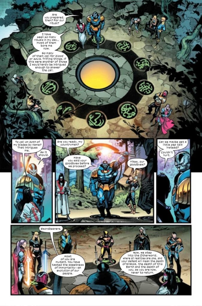
Between an overlapping plot by Hickman and Tini Howard, X of Swords Stasis will shake the X-Men to their core. While it might require a little backstory to get the whole picture, each swordbearer of Krakoa has something to gain and lose from this. Perhaps the one with the most at conflict is Apocalypse. Calling back to his motivations to reclaim parts of his past, he will now have to face the people he loves. You know the old saying, “be careful what you wish for.”

X of Swords Stasis: The Flux of Art

Swordbearers of Arakko
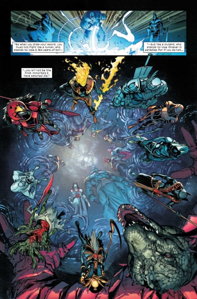
Between Pepe Larraz and Mahmud Asrar, their similar art styles allow them to play off each other. The designs of the swords and swordbearers of Arakko are genuinely creative and display their place in history. A gigantic crocodile man with extra limbs and a khopesh is certainly eye-catching enough for X of Swords Stasis. Especially with the coloring by Marte Garcia, which makes a color contrast in all of the costumes.

VC’s Clayton Cowles provides lettering that defines the actions and character of the person in question. The black word balloons of the Mask of Annihilation hide the identity of its hosts. But when recalling a flashback, the lack of decomposition suggests this host is powerful. So when the mask is removed, the change in word balloons is not just a display of will but also a danger the X-Men might not overcome.

On a smaller note, there is a reoccurring theme with tarot cards. For the ones less versed in the lore, Tom Muller’s infographics provide decent explanations along with the powers and weapons of the Swordbearers of Arakko. All of those tell the X-Men that they will be facing trials ahead that will push them to their limits. Storm’s card, in particular, foretells of something big coming her way.

Arm Yourself For X of Swords Stasis

X of Swords Stasis is best appreciated with a lot of background to see what everyone’s facing. Fortunately, the title shows how much is going into things before the real conflict begins. That way, everyone gets a general idea, and there’s only more to come.

Monkeys Fighting Robots Youtube

Review: THE CRAFT: LEGACY Offers Jumbled Witchcraft

The Craft: Legacy proves early on that it should have been a reboot instead of this convoluted mess. It offers hollow characters intertwined with a script that abandons the appeal of the original. In 1996, the coven was strong and had a purpose, but today it’s watered down and cashing in on nostalgia alone. The Craft: Legacy is another throwaway film from Blumhouse.

The Craft has developed a cult following over the years, but the same probably won’t occur for this horrid sequel. However, there are some treats sprinkled throughout the film, but they aren’t enough to save this trainwreck. Negatives aside, the film does feature an adequate lead performance from Cailee Spaeny, who should have no problem landing better roles in the future. Directed and written by Zoe Jones, the film stars Cailee Spaeny, Lovie Simone, Zoey Luna, Gideon Adlon, David Duchovny, Michelle Monaghan, and Nicholas Galitzine. Similar to the original, The Craft: Legacy follows a group of teenage witches who use their powers to get back at people who have wronged them.

Cailee Spaeny as Lily in The Craft: Legacy

Spaeny stars as Lily, the lead protagonist who is moving in with her soon to be stepfather (Duchovny) along with her mom, Eunice (Monaghan). Lily is a natural witch, but she meets three girls, Tabby (Simone), Lourdes (Luna), and Franky (Adidon), who are looking for their fourth member to complete the coven. Jones’ script never makes sense of why these girls are so eager to do witchcraft. This was a vital component of the original, as each girl had trauma or hardship that lead to them seeking out magic. Unfortunately, Lourdes, Tabby, and Franky are all void of any backstory, so there isn’t much for the audience to connect with. Also, there is a shoehorned plot device to connect this sequel to the predecessor.

The Craft: Legacy’s fumblings rest in its narrative for the most part because Jones never fleshes out any of the girls besides Lily, who is the most likable one from the group. Even if the original film didn’t exist, crafting a narrative about four ladies, and only making one feel important is ridiculous. There are many callbacks to the first film beginning with the opening title sequence and dialogue from it as well. The performances are a mixed bag at best because Spaeny delivers as Lily, but Duchovny gives one of his worst performances to date. There isn’t a single instance in this film that will spark an emotion on his face. It’s as if he knows the material he had to work with was half-baked, so he delivered a half-baked performance. He’s a brick wall for most of the film, and our three other witches aren’t compelling at all.

The coven in The Craft: Legacy

As mentioned above, there is a shoehorned plot device that is rushed and poorly executed. It is part of many subplots that go unresolved throughout the film, but it’s such a last-minute addition that it will leave viewers scratching their heads. Leaving stuff for the audience to interpret is fine, but typically there’s at least something in the film to point to a logical conclusion. The Craft: Legacy doesn’t offer a single clue for how we end up at the revelation it dishes out. In terms of direction, Jones fails here as well because there isn’t a single moment of suspense or unease even when they should be present. The film feels void of any emotion from start to finish. The cinematography from Hillary Spera is suitable, but another negative is some of the editing decisions and the visual effects in certain scenes towards the end.

Regardless if this was a film aimed at a specific demographic or not, The Craft: Legacy does nothing but borrow components from the original and squanders them in the worst way possible. It is not a film that respects what came before, and the execution makes it very evident. The Craft: Legacy might be enough for fans of the original to enjoy, but it is not a good film by any means and should have stayed in the development process.

Monkeys Fighting Robots Youtube

Review: THE AUTUMNAL #2 – Horror Via Family Drama

Writer Daniel Kraus and artist Chris Shehan return with the second chapter of their slow-burn horror series in “The Autumnal” #2. This issue solidifies this series’s status as a slower, more character-driven horror tale with an issue that focuses more on the two protagonists’ relationship to this strange new setting – as well as the weird mystery surrounding this quaint, quiet town. While the stellar visuals are on hand to deliver a couple of good false scares, it is abundantly clear that this is a comic for patient readers who like their horror delivered in steady bites rather than all at once.

“After missing the funeral of her estranged mother, Kat and her daughter, Sybil, hope to fit into the quaint town of Comfort Notch. But the town’s obscure history and strange customs make it a struggle, leading to a shocking confrontation.”

Writing & Plot

With his work on “The Autumnal” thus far, writer Daniel Kraus takes his time to ground this supernatural creepfest in the story of a single mother, her daughter, and their turbulent existence. Grounding a horror story in familial drama centers the audience’s attention on the experiences of the human characters, and when these characters are written in a realistic and relatable manner, it subtly forces empathy for them. This translates into a heightened sense of fear and tension when watching unexplainable and horrific things start happening to these same people. The Exorcist, Rosemary’s Baby, The Omen, Hereditary, and many other great horror tales have used this tactic to outstanding effect. Kat and Sybil, our mother-daughter duo in “Autumnal,” are fantastically unique characters that I loved reading in the first issue and continue to do so in this one. Their relationship and their personalities feel genuine, and this makes their mysterious backstory as well as the slowly creeping horror they begin to experience all the more enthralling. This issue takes its time to instill the relationship between the main pair and the peaceful but secretive town of Comfort Notch. This issue cements this comic series as a slow-paced mystery of a horror story, where most of the “horror” aspect comes in the form of its unsettling atmosphere and resolve to give the audience almost nothing about what is happening here. The horror elements of this comic are intoxicating, making the wait for the next chapter of this mystery a torturous one.

Art Direction

That oppressive atmosphere that “The Autumnal” #2 carries that I mentioned earlier is mostly the product of Chris Shehan and Jason Wordie. Shehan’s pencils bring out the humanity in every character that appears on panel, but especially succeeds in humanizing Kat and Sybil. His sense of panel direction also offers up a couple of great false scares that do occur in this issue, and they don’t come across as cheap. This comic frames the two protagonists as being alone in uncharted waters, both in terms of the town and strange circumstances of Kat’s mother’s death (and life, for that matter). Shehan constantly paints a focus just on these two characters, going to great lengths to make everything else seem strange and alien. The atmosphere is largely cultivated by Jason Wordie’s colors, who makes this comic feel like a haunted vision of its titular season. Every page looks like a cool autumn evening, but with an almost inexplicable dash of something not quite right in the air. How this effect is achieved in a comic is astounding on its own. The lettering from Jim Campbell is a classical and refined style, which still uses enough variation in its font to sell the tone of whichever character is speaking. From the visual angle, this comic is brilliant in terms of both fidelity and atmosphere.

“The Autumnal” #2 is a brilliant character-driven chapter that sells this comic as a slow-burn horror experience while maintaining a uniquely unnerving atmosphere. Daniel Kraus’s script is a thoughtful exploration of a struggling but happy mother-daughter relationship being exposed to strange circumstances both realistic and supernatural. The visuals of Chris Shehan and Jason Wordie are beautifully haunting, with detailed character animations and fantastic directing sensibilities. If this series can keep up its momentum, “The Autumnal” has the potential to become a new horror classic. Be sure to pick up this 2nd issue when it hits shelves at your local comic shop on 10/28!


Monkeys Fighting Robots Youtube

How A Series Wraps Up In BATGIRL #50

BATGIRL #50, available now from DC Comics, is a bittersweet issue. It brings with it closure, as well as the end to Barbara Gordon’s latest comic series. Yet her story is far from over, as she is still a hero in her own right.

She’s swinging into action on this variant cover of Batgirl #50.

Batgirl #50 is a landmark issue, in this case for a couple of reasons. The first one is fairly obvious, given the number of the issue itself. The second reason is a little harder to take, as this issue also marks the end of Batgirl’s series (for the moment). Thankfully, the issue is also a giant-sized one, giving fans more time to get a true sense of closure around this series.

Thanks to the Joker Wars, there have been a lot of changes as of late. Many characters are seeing the effects, including Barbara Gordon herself. Unfortunately, that’s far from the only thing that she’s tackling right now.

In a way, the sheer volume of change that Barbara is facing makes this a disappointing place for her series to end. On the bright side, this issue does contain three separate stories, all of which help to wrap up loose ends, and to leave hints as to how Bat Girl plans to move on from here.

Little Wonders starts off on a somber note.

Little Wonders

The first story in Batgirl #50 is also the longest, Little Wonders. Written by Cecil Castellucci, this is the plot that picks up exactly where the previous issue left off. That is to say, it starts off on a moment of change, as well as a moment of great sadness.

Yet the plot is also shockingly empowering, as Batgirl/Barbara Gordon picks herself up and continues to carry on – just like she always does. It doesn’t matter if she’s wearing the mask or not, she’s always going to be fighting for change. This message is practically screamed from each and every page, thanks to the actions of her character.

As a huge fan of Batgirl, this issue is difficult to take in. Mostly because we never really want to see a story about our heroes’ end. Yet, if I had been asked to chose how Batgirl’s series would end this time around, I couldn’t have asked for more than this. It doesn’t wrap up every little detail, but it doesn’t need to. We all know that Batgirl is going to keep on fighting, and that means her story isn’t over. Just her series.

The artwork worked hand and hand with the writing to help tell Barbara’s story. Emanuela Lupacchino (pencils), Wade Von Grawbadger (ink), Mick Gray (ink), Scott Hanna (ink), Jordie Bellaire (colors), and Becca Carey (letters) all did a fantastic job here. You can really see the conflict, not just in the physical sense, but in the moral sense as well. Everyone is struggling to adapt after the Joker War, and it shows.

Trying to find happier moments (Batgirl #50).

Stay Centered

Next up in Batgirl #50 is Stay Centered. This is a plot that really hits home. Through the use of heavy narration, Barbara’s story further unfolds. As with the first plot, this one is set after the events of the Joker War.

Cecil Castellucci was once again at the helm, and she imagined how it must feel for Batgirl. To be constantly pulled in so many directions, but so infrequently seen as her own being. It juggled this concept with the introduction of a new enemy, all of which seem to fit the theme (of Batgirl continuing her battle).

Marguerite Sauvage took charge of the artwork, providing some great action scenes and bold colors. Not to mention a really interesting design for a villain and her calling card, so to speak. Meanwhile, Becca Carey was responsible for the lettering, which was an impressive feat here. There was a lot to portray, and yet it was all smooth and distinct.

A venting of emotions (Batgirl #50).

Game Night

The last story in Batgirl #50 is Game Night, and it’s a fun take on the theme. The inclusion of several other heroes/friends certainly didn’t hurt things. Imagine the crew that Batgirl usually hangs out with, now picture them trying to learn an RPG, and suddenly you have an idea of the fun that is to be had in this plot.

Also written by Cecil Castellucci, this story continues the overarching themes found within this issue. Batgirl is facing change, some of which she’s even seeking out for herself. It’s the lightest plot in the collection, but is still full of her vitality and determination. Okay, and a fair amount of humor as well.

Aneke (art), Trish Mulvihill (colors), and Becca Carey (letters) were in charge of the artwork for Game Night, and you can tell that they had a bit of fun here. It’s not every day you get to portray dynamic heroes in anything other than their standard garb, after all.

Joining in with the movement for change.

Conclusion

Batgirl #50 is absolutely the ending that this series, and it’s fans, deserved. It’s bittersweet, and yet also carries so many wonderful and empowering messages. In that sense, it really did stay true to Batgirl, and everything that she stands for.

Monkeys Fighting Robots Youtube

A Thrilling Tale in BLACK WIDOW: WIDOW’S STING #1

BLACK WIDOW: WIDOW’S STING #1, available this Wednesday from Marvel Comics, with the Black Widow movie looming on the horizon (a distant one, admittedly), it’s time for a reminder of the Black Widow’s past, and just what she’s capable of.

A dramatic introduction to Black Widow’s current mission.

Natasha Romanoff is a long-standing favorite in the world of Marvel, one with a rich and complex past. That much is not, and has never been, a secret. Yet sometimes it’s good to be reminded of what she is capable of. As well as why she is so cherished as a spy.

Black Widow: Widow’s Sting #1 is a blast from the past. As Natasha is off on yet another mission from S.H.I.E.L.D. This time with the intent of taking down an infamous crime boss, Silvermane.

This tale is set back before Black Widow made herself known as an Avenger. Back when she was still heavily involved in deep cover cases for S.H.I.E.L.D. – she was the best of them, even back then.

Time for a wardrobe change in Black Widow Widow’s Sting #1.

The Writing

Black Widow: Widow’s Sting #1 was written by Ralph Macchio (yes, that Ralph Macchio), and it portrays a one-shot adventure for the one and only Natasha Romanoff. It’s a quick and fun spy thriller issue, full of action.

In short, it perfectly succeeds at what it is: a classic tale of Natasha the badass spy. Here Natasha is portrayed at jumping through all of the hoops, and succeeding where no other spy could possibly hope to do so.

As a standalone escapade, it is far from a bad one. Compared to the groundbreaking events of Kelly Thompson’s Black Widow series (which is actively updating), it may lose a little bit of that shine. It is an amusing adventure, to be sure, but it lacks any sense of depth or permanency.

However, it does quite a nice job of setting the scene, especially if one were to put it in the context of the impending movie. In one fell swoop, it showcases her abilities, her drive, and even her favorite weapon.

Enter Silvermane, or as he’s called here, “Mr. Silvermane.”

The Art

Black Widow: Widow’s Sting #1 is about as vibrant as the character herself, and not simply because of her bright red hair. The artists had a chance here to portray a spy adventure through and through, and they did not pass up on the opportunity.

Simon Buonfantino was the lead artist, and their version of the Black Widow at times feels larger than life. To be fair, her talents frequently make her seem that way, so there’s really nothing wrong with this take. She’s bold and confident, and up for surviving the strangest of circumstances.

The colors, provided by Rachelle Rosenberg, take those lines to a whole new level. The use of colorful backdrops to portray motion was a clever one, and it actually works really well with the character herself. It also enhances the look and feels of all the action, making it overall aesthetically pleasing and thematic.

VC’s Travis Lanham’s letters helped to add to that sense of movement, as well as a serious level of impact, when needed. Obviously, this further enforced the idea that Widow’s Sting was an action and spy thriller, bringing the point home.

Setting the scene quite nicely, as Silvermane lays out his plans.

Conclusion

Black Widow: Widow’s Sting #1 was a quick and bold dive into the history of Black Widow. Its story must be one of many, as Natasha surely took on countless cases during her time with S.H.I.E.L.D. It raises some interesting questions along the way, but overall just has fun exactly as it is.

Monkeys Fighting Robots Youtube

Tricking a Trickster in STAR WARS: DOCTOR APHRA #5

STAR WARS: DOCTOR APHRA #5, available this Wednesday from Marvel Comics, continues the adventures of the one and only Doctor Aphra. In hindsight, perhaps it is a good thing for this universe that there is only one of her. The sheer level she brings all on her own is more than enough.

A dangerous conversation may not be the best time to ogle all the pretties.

This latest series for Doctor Aphra wasn’t afraid to dive right into the deep end. While she may have made some grand promises to herself (and to others) to stay safe, and well behaved…Well, let’s just say that promises aren’t her thing.

Star Wars: Doctor Aphra #5 is definitive proof that even when things go right for Aphra (which in itself is a rarity), she’s still going to find herself in hot water. It’s a gift, one that she doesn’t relish, but she has learned to live with.

What started as an adventure (and heist) looking into an ancient and lost tomb quickly spiraled into something else, something infinitely more dangerous. Once again, that isn’t terribly shocking, given who we’re talking about here.

An egomaniac if ever there was one.

The Writing

There’s a lot of trickery and sneaking around in Star Wars: Doctor Aphra #5. While this isn’t unusual for Aphra, Alyssa Wong has succeeded in making this adventure feel entirely new, and somehow even managed to raise the stakes in the process.

On that level, there is quite a lot to appreciate here. On the surface, Aphra’s character doesn’t seem to have changed all that much. But there are subtle details that raise up, upon a close inspection. Details that make it appear that Aphra is still very much capable of feeling. Shocking, I know.

Doctor Aphra #5 is every bit the space caper that little Chelli grew up dreaming about. The high stakes, the sheer amount of treasures available for the taking, even the emotional ties (which increase the tension, and the reward, naturally).

It all made for a thrilling adventure, one with room for a touch of humor, a classic balance for Doctor Aphra. All of this was accomplished while setting up for yet another, and presumably much larger, confrontation. After all, this is Doctor Aphra, and even the most basic of missions result in her running for her life and making enemies.

What a pathetic way of leaving a mark.

The Art

Everywhere the writing succeeds for Star Wars: Doctor Aphra #5, the artwork goes a step farther. The action and adventure are vibrant and daring, the details hidden but present, and so much more.

Marika Cresta (art), Rachelle Rosenberg (colors), and VC’s Joe Caramagna (letters) really did something impressive here. It’s not just the action, or the explosive nature of some of the scenes. It was everything, especially all of those little details that make the series shine.

By all appearances, Aphra is one cool cucumber – until you look closer. The artistic team managed to leave little tells here and there, to make her stress levels evident. It may not feel like much, but it spoke volumes about her actions – and what it was costing her.

Then there are the colors, which really made certain scenes pop right off the pages. It’s all a perfect complement, both to the characters and the mess that they’ve managed to get themselves into. All while setting the tone – one of danger and intrigue.

Where the art and colors provide the groundwork, the lettering by and far is the final touch. It’s through Caramagna’s work that there’s a real sense of sound. You can practically hear the hissing of doors, the impact of shoulders on flesh. To say that these additions enhance the scene would be quite the understatement.

Here’s hoping that this is part of her plan…

Conclusion

Star Wars: Doctor Aphra #5 was another fun and chaotic adventure for the one and only Doctor Chelli Aphra. This issue managed to bundle all of her character development in with several action-filled scenes, and still have time to set up for the future.

Monkeys Fighting Robots Youtube