Home Blog Page 229

INTERVIEW: Director Sam B. Jones Gets Dirty In New Documentary RED, WHITE, AND WASTED

Red, White, And Wasted is a new documentary from directors Sam B. Jones (Sundown) and Andrei Bowden Schwartz (Pose) about ‘mudding,’ one of many peculiar subcultures in the United States.

You might be asking, what in the hell is mudding? Well, the name says it all. The subculture, which spans across the country, is all about driving through, frolicking, and otherwise rejoicing being in the mud. Participants love making a mess and having a good time. For Sam and Andrei, their deep dive took them to places they did not expect.

PopAxiom chatted with Sam about his road to making movies, remakes, and how Red, White, And Wasted came together.

documentary-interview-film

A  Lot Of Hats

“I have known for a long time that I wanted to make films,” Sam says. “It maybe took a little while to admit it. I was like many kids; I had a mini-DV cam and made movies with my friends in middle school and high school.”

The director-to-be found a lot of interests beyond film. “As I got older, I was interested in a lot of different things; journalism, photography, creative writing, theatre.”

All those interests were a broad stroke of possibilities and paths to walk. “I had this notion that to move forward in the world; I couldn’t do all these things, I had to pick.”

“Filmmaking was a way to wear a lot of hats,” he continues, “and specialize without specializing.”

Sam started working on sets as far back as high school “and working freelance in film since I was 17 years old.” Sam went on to major in film studies in college.

Hands-On

Becoming a professional creative is a unique path for everyone. “There’s no one path to directing,” Sam asserts. Some people leave film school and catch a break; others take a different route. I worked as a PA and crewed for a long time in grip, electric, and the camera department.”

However, Sam thinks his experiences give him a “hands-on relationship with film.”

“I worked my way into being a DP and camera operator,” he says, ”that was crucial because Andrei and I e-directed, co-DPed, and we both had so much technical experience.”

“We were able to work in such a small, flexible way.”

If he had to pick one, would he stick with directing or cinematography? “I enjoy working in both roles and wearing both hats, but if I had to pick, I’m more interested in being a director.”

“I’ve done a lot of different roles,” Sam says, and his IMDB page provides plenty of evidence to back that up. “With Andre, I’ve shot things for him; he’s shot things for me. We’ve done a collaborative, two-headed dragon sort of thing.”

Directing might be his pick, but there’s no plan on sticking to any one role. “Maybe at one point, I’ll stop touching the camera and step back, but at this point, it’s an asset to be able to do both.”

red white wasted-sam jones-documentary-interview

About Red, White, And Wasted

How did Sam and Andrei come up with the idea of doing a documentary on frolicking in mud? “The seed of the idea we stumbled upon online. Andrei and I had been kind of abstractly interested in American subcultures. We’d been kicking around different ideas of places we could explore in our country that was somewhat unknown.”

“One of us,” Sam says, adding that he doesn’t remember who, “found some footage of people mudding online. We were taken by the image of these people, mostly guys in these big trucks wallowing in mud for fun. We thought it was a fascinating image.”

Research began. “We couldn’t find anything that journalists had written about it or videos or much of anything on the topic.”

Soon into diving into the world of mudding online, “it was obvious that we need to go learn about this. So, we grabbed a camera, and we went to one of these big mudding events in Florida.”

Did they have options for final destinations? “We could’ve done the documentary in any of the states. It’s everywhere.”

Why Florida? “We felt that Florida was a particularly interesting, loaded, place to do the film.”

Sam and Andrei arrived in Florida. “We got there, and our jaws dropped, and our eyes got really big. We felt like we’d stumbled into something fascinating to us.”

The deeper they went into the mud, the more interesting it all became. “The more we dug into it, we found a broader thematic relevance, and it wasn’t some niche thing. The imagery, the politics, and the culture was relevant to a lot of bigger things that we saw happening in America.”

Making Red, White, And Wasted

“We were a combination of lucky and smart,” Sam says about entering the mudding world. “We started the process by just going to these big mud events that are these weekend-long parties. People are generally in a pretty good mood, and everyone is taking pictures for their Snapchat or whatever. People are there to be seen. So, approaching people and getting to know them in that space was relatively easy. Obviously, there were a few people who told us to fuck off. But, for the most part, I was surprised, people were receptive and open to being filmed.”

How receptive were members of the community as Sam and Andrei dug deeper? “To be perfectly honest, Andre and I are both straight, white men, and I think that helped us gain access.”

However, the pair were still “outsiders, and we said as much. ‘Hey, we’re from New York, we don’t know about mudding, and we want to learn and understand who you are.’ People saw us as ‘one of them,’ and it helped open doors.

Red, White, And Wasted isn’t just a documentary taking place at large, organized mudding events. The film follows individuals and the mudding life outside of the events. “Getting some of the access outside of these big mud events and into people’s lives and getting that intimacy was a little more work.”

The more intimate parts of Red, White, And Wasted taking place outside of organized events are often illegal. Were there run-ins with cops? “Yes. We got kicked out of a number of places. One of those encounters made it to the final edit of the film.”

“Most of mudding is just people either on their property or trespassing on land to find good mud,” Sam explains. “I think trespassing and avoiding the cops is part of the fun. Most of mudding is a communal thing; it’s their social life.”

Mudding is also facing an expanding concrete and steel world. “As more of the land in Florida gets developed and more heavily policed, they have fewer places to go mudding, so the options become these big events where you have to buy tickets.”

“There’s a feeling of disconnect for these people,” Sam says about those seeking a more personal connection, “and it’s changing to a point where it doesn’t serve the same function for them.”

sam jones-director-interview

Wrapping Up

Like most filmmakers of the past 30 years or so, Sam grew up on a diet of Spielberg, Tarantino, and other legends of narrative film. But asking about influences is “a tricky question. I went to film school, and I love watching movies. Andre and I both mostly work in more narrative work, also some video and commercial work, so we’re relatively new to documentaries. So, trying to structure our film more like a narrative feature was an influence.”

“In terms of specific influences,” he continues, “there are a number of character-driven documentaries like The Queen of Versailles was an amazing film. Some of the early Errol Morris movies. As a young film student, Werner Herzog.”

Red, White, and Wasted is available on VOD near you. So, what’s next for Sam? “I’m working on a narrative feature script. Andre and I are developing another subculture documentary. Andre is a DP on the current season of Pose. We’re working on things, so there will be more.”

Is Red, White, And Wasted on your watch list?

Thanks to Sam B. Jones and October Coast
for making this interview possible.

Want to read more interviews? CLICK HERE.

Monkeys Fighting Robots Youtube

Setting The Stage in THE BALLAD OF HALO JONES

Halo Jones
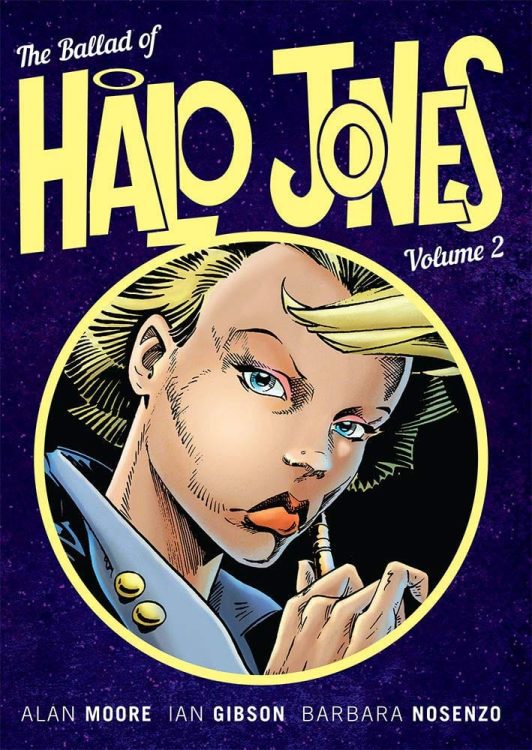
The Ballad Of Halo Jones Book 2 Cover Art: Published by Rebellion

Comics have a unique feature in that they are planned out entirely in advance and have control over where an audience looks. In Film, which needs to retain the sense of realism that is inherently a part of the medium, it is possible to plan shots but does not have complete control over the environment during filming, especially on-location sites. Therefore the background exists in real-time/space and contains elements of dressing that are not part of the narrative. The opposite is true in Theatre, where the limited space of a stage requires precision planning; only what is required is included in the set and props. Even then, the static nature of theatre means that the directors have less control over the audience and where they look.
In both cases, audience manipulation is possible, leading the viewer in a certain direction; however, film has elements of set not intended to be read, and theatre cannot focus attention onto the minutiae. Comics have control over both, and this is expertly demonstrated in Alan Moore and Ian Gibson’s The Ballad of Halo Jones.

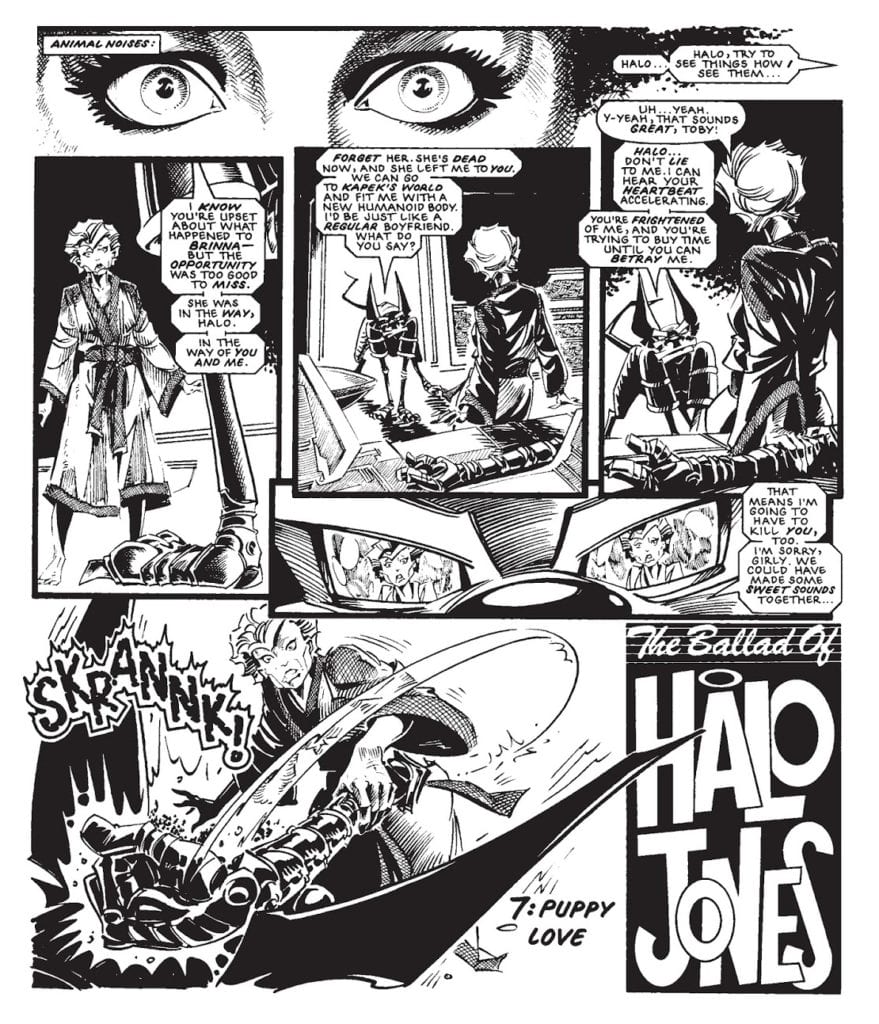
In Book 2, Chapter 7: Puppy Love, we have two scenes playing out, side by side, each of which has been meticulously staged to support the narrative. Each scene contains exactly what it needs and no more.

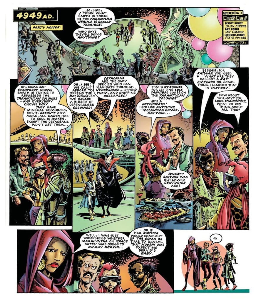
The Ballad Of Halo Jones: Party Scene. Published by Rebellion

At the Party

In the first scene on the first page of Chapter 7, there is a fancy party. The stage is large and open, dressed to represent the festivities. In the first panel, in the top right, are a selection of colorful balloons which, along with the caption on the left that reads like a stage direction, ‘Party noises:,’ indicates that the people in the panel are not passing by in a mall but are engaged in a party.

The landing levels create a sense of depth but also remind the reader about the hierarchical nature of the society that Moore is picturing. Even within this environment, there is a sense of division between the classes, and Toy is shown as being out of place as she jars against some of the other quests. Her interests are at odds with the others on her ‘level,’ and she is made to feel uncomfortable, so uncomfortable in fact that she decides to leave.

This simple stage set-up helps to convey a deeper reading of the scene, especially after the previous chapter, where we are shown Toy’s excitement as she prepares for the party. Moore goes to a lot of trouble to show the amount of time and effort she puts into getting ready, almost bullying Halo into helping her spray color her dress just so that she looks stunning for the crowds. However, once she is at the party, her appearance cannot disguise the fact that she has nothing in common with those around her. Gibson builds an environment, a stage, that serves a single purpose, and that is to accentuate the class division between Toy and the partying guests.

The Ballad Of Halo Jones. Published in 2000AD

In the Cabin

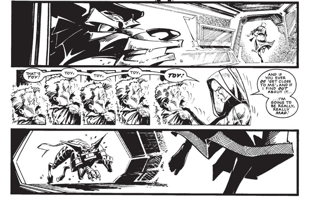
In the second scene of the chapter, the creators take stage setting to the next level. In the scene, Toby has burst into the cabin just in time to see that Halo has discovered his secret. This means that he only has one option; to kill Halo and stop her talking. What follows is an orchestrated fight sequence that draws on the idea of theatre set dressing much more than the action film the scene is emulating.

There are a number of panel transitions that are action to action, pushing the pace of the scene. The quick-fire panels switch between viewpoints, focusing on elements that Moore wants the reader to see, in opposition to the idea of Stage Performance; however, the props and set within each panel have been painstakingly designed and placed. What is more impressive is that all of these things have been set on the stage in previous chapters, introduced to the audience through passing but placed into the reader’s memory just for this occasion. As Anton Chekhov was famous for saying, “One must never place a loaded rifle on the stage if it isn’t going to go off. It’s wrong to make promises you don’t mean to keep.”

Chekhov wasn’t referring specifically to weapons but the staging of a scene in general. Within Theatre, there is limited room on the stage. Why clutter it with items that have no use and potentially lead the audience to speculate their purpose instead of focusing on elements that are important to the narrative. Much of Film set dressing would be distracting if it were constantly on screen, which is also true of the comic. However, the artist has the ability and license to manipulate the environment for their own needs, adding or removing elements of the background as they see fit. This allows the artist to introduce a prop or element of the set in advance but then not have to feature it until it is needed.

In the case of Halo Jones, and the Chapter in question, Halo strikes outs at Toby with an electronic arm. The arm has been there, on the stage, through the narrative and was introduced a few chapters earlier in an exchange between characters. The metallic arm was placed upon the stage, the audiences’ attention drawn to it, and then left until needed. This means that the moment Halo picks it up is fluid, and as a reader, we understand what it is and why it is there. It had been engraved into the narrative just as it would be when placed on the stage in a theatre where the audience can see it. The artist then has the freedom to bring the prop into play whenever the need arises.

Everything that follows throughout this Chapter and into the next, Hounded, works in exactly the same way as the metallic arm. Props and scenery, even characters that were introduced earlier in the series through the natural motion of the plot, all come back to serve a purpose in the fight between Toby and Halo.

The Ballad Of Halo Jones. Published in 2000AD

Conclusion

In The Ballad of Halo Jones, Alan Moore’s tightly planned script allows the artist to create a detailed plan of the ‘stage’ which runs from chapter to chapter. The elements necessary for the plot are introduced through the narrative naturally, often in passing or as throwaway comments; gags to keep the reader amused. Then, during moments of action when the plot requires a fast pace to keep the readers on edge, all of these staged elements can be brought back without any explanation necessary. As an audience, we understand what they are and why they are there, so we can accept their presence and move from panel to panel at a breakneck pace, as the creators intended.

By using a staging technique more inline with Theatre practices, that is to say, by placing everything required on the stage for the audience to see without filling the stage with superfluous set dressing, Moore, Gibson, and later Barbara Nosenzo with her superb coloring, can control the reading experience. The pacing of the narrative revolves around the characters and their interactions with each other and the set. But they also have the added ability to focus specifically on a particular prop or movement, which is a technique more specific to Film. When applied correctly, combining the two approaches gives the Comics creators complete control over their environment and their audience’s interaction with it.

Monkeys Fighting Robots Youtube

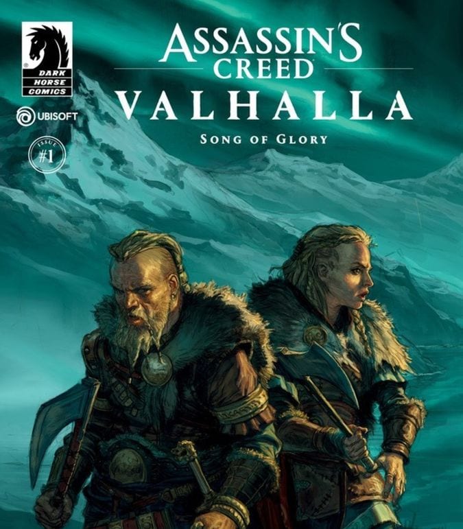
Review: ASSASSIN’S CREED VALHALLA: SONG OF GLORY #1 A Bloody Video Game Tie-in

Review: ASSASSIN'S CREED VALHALLA: SONG OF GLORY #1 A Bloody Video Game Tie-in

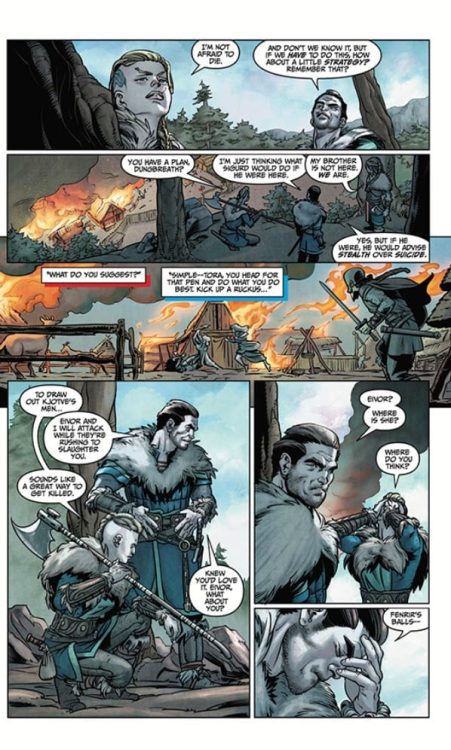
On October 21st, Ubisoft’s’ mega-hit stealth homicide simulator franchise returned to comics in the form of the first issue of ASSASSIN’S CREED VALHALLA: SONG OF GLORY, published by Dark Horse Comics. Cavan Scott scripted the book while MartÎn Tûnica handled the art. The story is meant to set up excitement for the upcoming video game and introduce us to the two protagonists that we will later play when the game is released. While one might end with a better feel for one protagonist, this issue does not succeed in doing much more.

Story

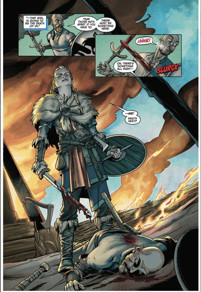
If you really enjoy gory depictions of Viking raids, this story is for you. However, there is not much more. The book is broken into two sections due to the fact you will be able to play as two characters in the game. One section focuses on Eivor, our female protagonist. She delights in conquering and pillaging. The comic does a great job helping us understand just who Eivor is, even if she is a little two dimensional. She is brave and strong, and she rushes at conflict head first, which is a little bit of a surprise for a series that has usually emphasized stealth and plotting each kill for a majority of the series. She has companions, but they are fairly forgettable Viking guys. They stand in the background and serve up exposition about how outrageous Eivor is.

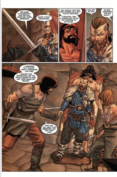
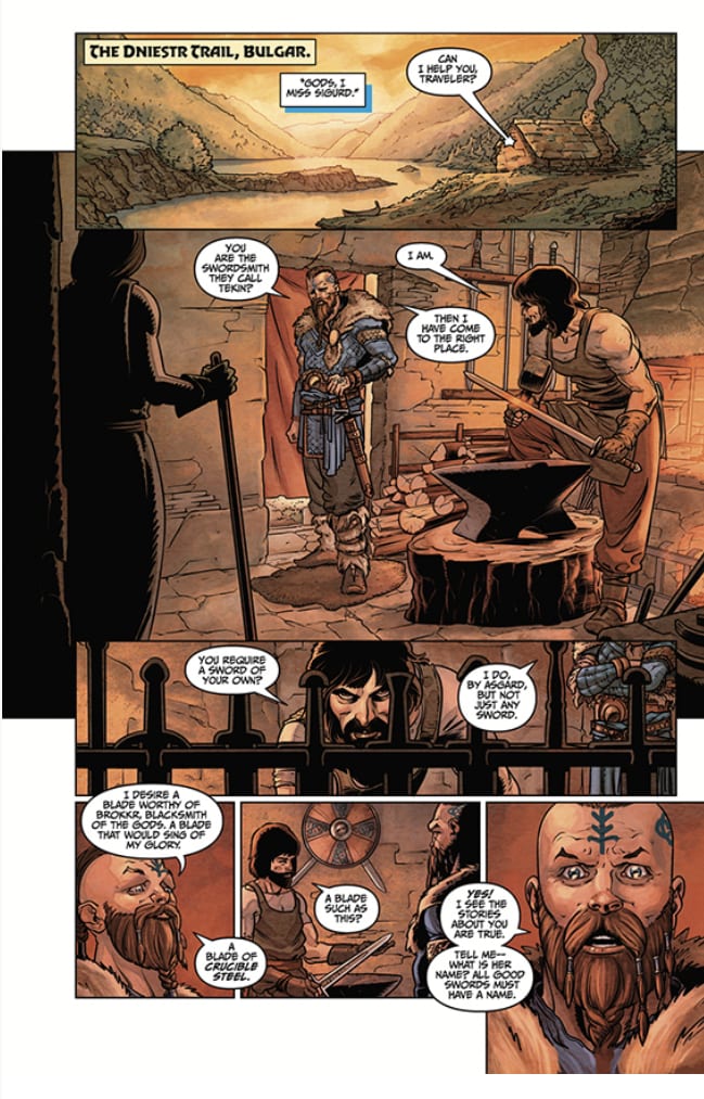
There is an interlude that introduces the other protagonist Sigurd, Eivor’s brother. He has killed some people. That has made some people mad, and they want revenge. He deals with it. There is some intrigue set up about where his story might go in future issues, but that is about all you get here. Sigurd – is a Viking, and he is good at killing people.

The book concludes by returning to Eivor’s adventures, and it does set up that there is more going on in this than just violence. However, that is for another issue. This first gaze into this new Assassins’ World is basically to tell you combat will abound when you get to play the game.

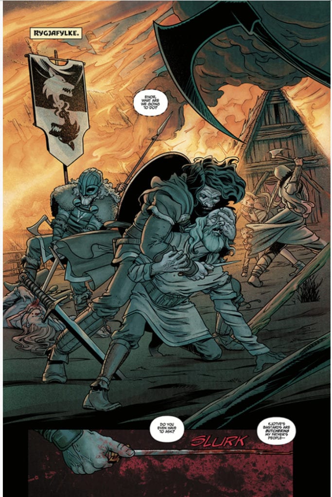
Art

MartÎn Tûnica’s art really is reminiscent of what Steve Dillon did in Punisher: Welcome Back Frank, which fits the comic because this kind of feels like Viking Punisher. There are two times in the book where our protagonists have to react to surprise attacks. Tûnica does a great job building the tension and conveying the rising desire to murder in the antagonists’ eyes and features. While the story is gory and violent, the art does not seem to romanticize that too much. This world is intentionally ugly at points and makes the reader deal with the ramifications of what they see in the action. As noted, this book focuses on two protagonists, and the pencils do a great job of introducing them and defining their look. Their companions are very hard to tell apart. The antagonists have a few moments to shine, but most are nondescript. The art does its best to make up for a lackluster story.

Coloring

Michael Atiyeh’s coloring is the star of the first issue. The colorist uses a muted blue palette, and it gives the book a wild frozen yonder feel that is spot on. Even in the intense action scene, the world felt cold and harsh, which is due to the color choice employed in this work. Atiyeh’s color does a magnificent job of conveying the temperature of the world and pulling the reader in. Eivor’s adventure is outdoors, and the colors invoke a frigidness that makes one shiver. Eivor’s color conveys a coldness to her that makes it seem if she is cold-blooded. Sigurd’s sequence takes place indoors, and the reds and browns bring us inside and make us feel the heat of the action in this place. The colors of Assassin’s Creed Valhalla: Song of Glory are amazing.

Lettering

The lettering provided by Richard Starking and Comicraft’s Jimmy Betancourt is adequate. They can convey changes in volume with different types of word bubbles. The lettering is fine and does not distract from the story. The letters used to title locations use appropriate Norse inspired font. The words issued from the characters are average. They convey the words of the characters and not much else.

Conclusion

Dark Horse’s first issue of ASSASSIN’S CREED VALHALLA: SONG OF GLORY is an adequately executed depiction of Viking violence. We get a good feel for one character. We see their world is fairly brutal, cold, and violent. The end of the comic does give enough intrigue to at least make the reader consider picking up issue two. The art does a great job despite a shallow story, and the coloring is amazing.

Monkeys Fighting Robots Youtube

BOOM! Studios Exclusive Preview: MEGA MAN: FULLY CHARGED #4

boom! studios exclusive preview mega man fully charged

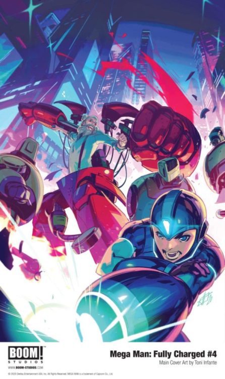
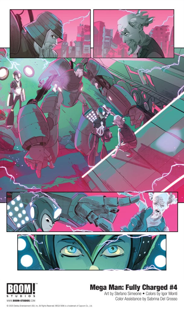
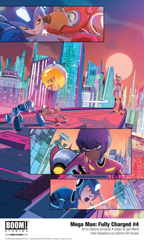
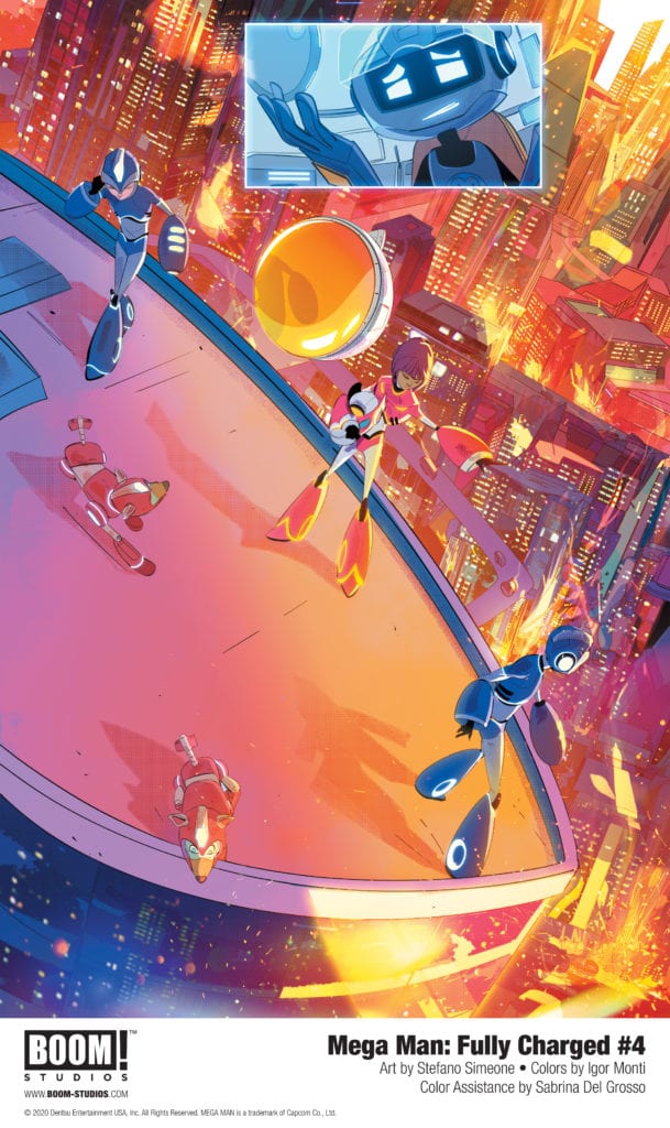
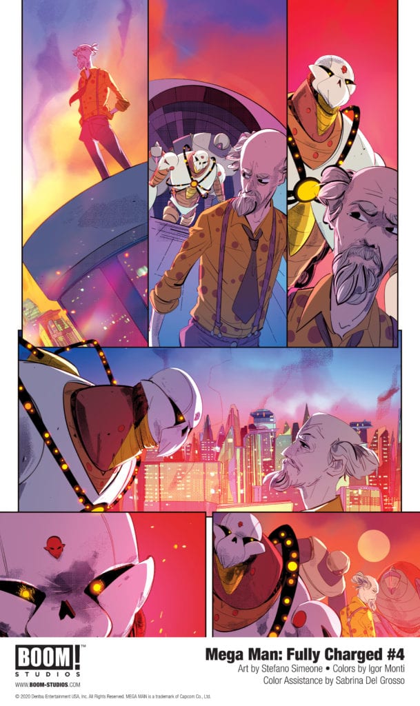
MEGA MAN: FULLY CHARGED #4 hits your local comic book store November 25th, but thanks to BOOM! Studios, Monkeys Fighting Robots has an exclusive five-page preview for you.

About the issue:
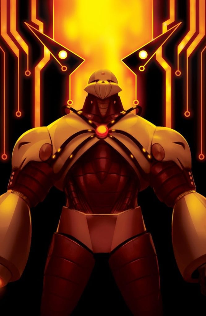
Skull Man and his army of Robot Masters have invaded Silicon City – but Mega Man and
his mysterious new ally aren’t going down without a fight! But Mega Man doesn’t realize
he’s playing right into the hands of an enemy he never expected!

MEGA MAN: FULLY CHARGED #4 is by writers A.J. Marchisello and Marcus Rinehart (the same writing duo behind the TV series) and artist Stefano Simeone, as well as the acclaimed creative collective Man of Action Entertainment. The main cover is by Toni Infante, with two variant covers by Miguel Mercado and Jonboy Meyers.

Based on the television series of the same name, MEGA MAN: FULLY CHARGED
features heroes like Mega Man, Rush, and Dr. Light in fully charged adventures battling
the wickedest of Robot Masters.

MFR reviewer David Weber calls MEGA MAN: FULLY CHARGED “the Mega Man comic we’ve neededwith awe-inspiring art and a thrilling story.”

Check out the MEGA MAN: FULLY CHARGED #4 preview below:

boom! studios exclusive preview mega man fully charged

boom! studios exclusive preview mega man fully charged

boom! studios exclusive preview mega man fully charged

boom! studios exclusive preview mega man fully charged

boom! studios exclusive preview mega man fully charged

boom! studios exclusive preview mega man fully charged

boom! studios exclusive preview mega man fully charged

boom! studios exclusive preview mega man fully charged


Are you reading MEGA MAN: FULLY CHARGED? Sound off in the comments!

The animated television series Mega Man: Fully Charged is based on the Mega Man
video game franchise from Capcom. Developed and produced by Man of Action
Studios, Dentsu Entertainment USA, and WildBrain, the series originally aired on
Cartoon Network in the United States. In the series, regular robo-kid, Aki Light,
discovers secret programming and transforms into Mega Man to battle the wickedest of
Robot Masters in Fully Charged adventures!

Monkeys Fighting Robots Youtube

INTERVIEW: Composer Roman Molino Dunn Creates Beautiful Sonic Chaos For The Film HURACÁN

Huracán is a psychological thriller written, directed, and starring Cassius Corrigan (The Caregiver) as a mixed martial artist battling opponents in the ring and within. Composer Roman Molino Dunn made his mix of sounds that enrich the experience of the acclaimed film.

Cassius Corrigan plays Alonso Santos, an up-and-coming mixed martial artist. A court-appointed therapist determines that Alonso is living with a dissociative identity disorder. Whenever Alonso feels threatened, an aggressive alter ego known as “Huracán” emerges. Alonso’s on the verge of homelessness and on parole, and his combative personality is his only salvation because it makes him a fierce fighter in the ring.

PopAxiom and composer Roman Molino Dunn spoke about becoming a musician, Instagram, and making the music for Huracán.

Definite Goal

Roman started playing the piano around the age of four. “Music was a part of my life at a young age. But pretty early, I rejected the traditional trajectory of performing people’s music, and I was more inspired to create my own music.”

“It was always a goal to be a composer,” Roman says, “but I had no idea I’d be getting paid to write music for other people. I didn’t know that was a thing until later.”

After studying classical music, Roman “wanted to do anything I could to stay in music. So, I didn’t get any composition jobs writing for symphonies or anything like that. But I worked in recording studios and eventually opened my own recording studio with a business partner. Even though we were recording music for other people, advertising agencies started using us to record things like voice-overs.”

“After a while,” Roman continues, “they started asking us to write music for the commercials. Directors who worked for those ad agencies started asking for music for their films. Before you knew it, I was writing music for movies and tv shows. It was an organic thing.”

Roman knew he wanted to work in music, so he “never turned down a music job.” The result? “Eventually, it lead back to my initial desire to be a composer.”

“I feel like if you have a definite goal,” Roman says, “it’s going to find its way into your life.”

Cassius Corrigan-huracan-film

About Huracán

Listen up, future composers, because getting the Huracán gig for Roman was a “modern success story,” as Roman puts it. “It was on Instagram,” he reveals.” I followed the director because I loved his work, and he was following me because he loved my work. We wanted to work together. When he finally had a feature film with funding, he reached out to me. I wrote some music for some of the early screen tests and then scored the film.”

Roman’s work on Huracán involved a deeper level of collaboration. “It was cool. A lot of times, I get a temp score. In this case, Cassius said to me, ‘Show me some stuff.'”

“That takes a lot of trust,” Roman says of Cassius’ offer of creative freedom, “which I was honored to have instilled on me. We developed something fresh.”

Huracán‘s score is a diverse mix of sounds. “What we ended up with is a composite of organic instruments and synthetic instruments. The interplay between organic and synthetic was a metaphor for the dissociative identity disorder that the main character is dealing with.”

“It wrote itself in that way,” Roman says of the score’s formation. “The story and the complexity of the psychology dictated the way that we were going to score the film.”

Studio Rat

Roman is in a constant state of making music. “In addition to scoring for film, I do a lot of EDM or Electronic Dance Music.”

“I don’t see a huge difference between classical music and pop music anymore,” Roman says but then recalls his shifting opinions throughout time. “When I was a kid, I went through stages where I hated classical, and I only listened to pop music. And then I went through a stage when I was a little older where I’d only listen to classical and never pop music.”

Roman continues, “But I was writing in both worlds, and I realized, it’s all music.”

“I’m a studio rat,” Roman proudly proclaims, “I live in a recording studio. Every instrument we have, be it a synthesizer, piano, or cello, they’re all a valid way to help people achieve their vision.”

Structure

“I grew up in a place called the Poconos in an area called the Delaware Water Gap,” Roman starts when the topic of jazz comes up. “There’s a rich jazz tradition, including the Delaware Water Gap Music Festival. I grew up around that music.”

Roman continues to discuss his connection to jazz. “While growing up, my parents made me take piano lessons, saxophone lessons, guitar, drums, and everything. I studied jazz for maybe ten or fifteen years.”

Why is jazz so powerful for so many musicians? “Probably because it’s the first divergence a lot of people have from a certain amount of strictness that you might be getting in your classical lessons. The ability to improvise while you’re within a structure is essential during film scoring. You have to think on the fly a lot of the times to fulfill sometimes quick changes that people might need.

The whole score is very ambient, textural, orchestral stuff mixed with synths. All of a sudden, there’s big band horns at the end and break-beat drums.

huracan-film-interview-composer

Wrapping Up

Roman’s scores are an eclectic mix of sounds, each curated to help tell a story. “Early renaissance music shaped me a lot because it’s the start of three-dimensional thinking in music. Those dimensions are so important, especially in mixed-media like film.”

“From the film scoring world,” Roman continues, “the list is huge. John Powell is great at mixing genre. In the mixing of the orchestral and synthetic, Joe Trapanese, Harry Gregson Williams, and John Paisano. Someone who crossed over from the EDM world is Junkie XL (Thomas Holkenborg).”

“Honestly,” Roman says, “the real answer is whoever is influencing the director that’s trusting me.”

Roman’s not a fan of remakes and shares a different vision than re-creating an old score. “I think if a movie is great, then the score did its job. But I can think of four or five directors off the top of my head who would be dream collaborators; Patty Jenkins (Wonder Woman), Anna Boden (Captain Marvel), Alfonso Gomez-Rejon (The Current War), and then also Zack Snyder (Man of Steel).

“I love TV. Director John Logan did the Penny Dreadful series, and the music was so similar to the thinking I had with Huracán and the textural stuff.”

Having worked for film and television, what does Roman think of each medium? “I love both. With film, you get a lot of time to develop this one distinct language, and with television, you get the opportunity to continue that language.”

Huracán is out and available to watch on HBO. What’s next for Roman? “Some cool stuff. The next big feature that I’m excited about is called Snake Head. It’s by Evan Jackson Leong, who is known for Linsanity. We’re wrapping up post-production. The story is very moving and important. It’s about human trafficking that’s based on a true story. I’m also working on a YouTube kids show and a cooking show that I can’t talk about.”

Is Huracán on your watch list?

Thanks to Roman Molino Dunn and Impact24 PR
for making this interview possible.

CLICK ME for more interviews on PopAxiom!

Monkeys Fighting Robots Youtube

Preview: GHOSTS ARE PEOPLE TOO Is “Charmingly Spooky”

ghosts are people too preview

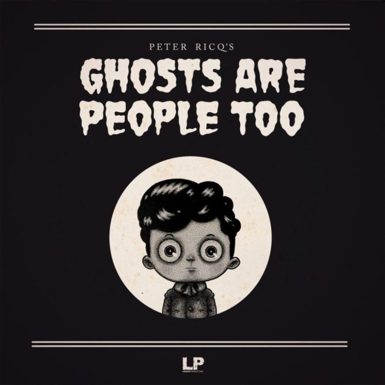
Peter Ricq’s book GHOSTS ARE PEOPLE TOO is currently on Kickstarter, and it’s perfect for fans of Jill Thompson’s SCARY GODMOTHER or Neil Gaiman’s THE GRAVEYARD BOOK.

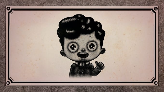
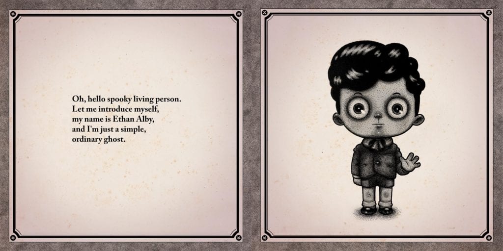
The 42-page, all-ages illustrated book is the first prose work from Ricq. It’s the story of a simple ordinary ghost named Ethan Alby.

About GHOSTS ARE PEOPLE TOO:
Ethan has a family—just like you. He likes playing with toys and his dog, Mini Ricky. Sometimes, though, Ethan gets scared. In GHOSTS ARE PEOPLE TOO, Ethan shares what scares him, how difficult it is to share a home with a living girl he’s fallen for (when she doesn’t even know he exists), and why we shouldn’t be afraid of one another.

“Halloween season has been my favorite season since I was a child,” said Ricq. “It had a sense of danger and adventure and that feeling has never dissipated since. I remember watching Fright Night and The Thing from Outer Space coming home from Trick or Treating when I was around 7 years old and those moments of counting your treats along with the excitement of monsters on the TV was so magical, more so than any other holiday. I’ve since always had a touch of horror, danger, and adventure in my work since.”

You can check out GHOSTS ARE PEOPLE TOO on Kickstarter right here.

And read on for a preview of the book:

ghosts are people too preview

ghosts are people too preview

ghosts are people too preview

ghosts are people too preview

ghosts are people too preview

ghosts are people too preview

ghosts are people too preview
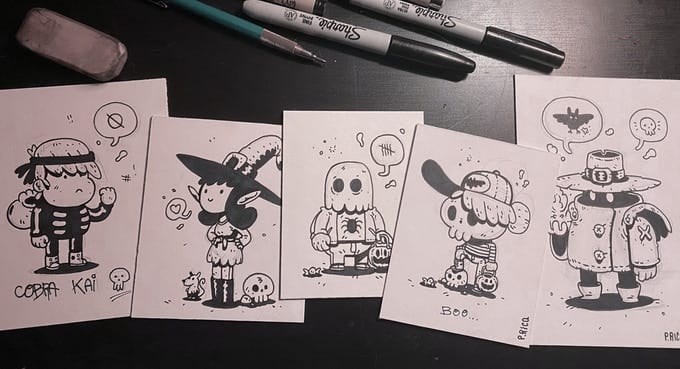
A “doodle book” is one of the rewards offered by the campaign.

What people are saying about GHOSTS ARE PEOPLE TOO:

“Charmingly strange, scary and sweet, GHOSTS ARE PEOPLE TOO gives you an Edward Gorey style tale with nods to classic and contemporary creepy crawlies. A lot of fun if you have anyone in your life who likes their spookiness with a little heart (not a literal one!) and great for kids who like theirs stories on the darker side.”
—Mariah McCourt (Ash & Thorn)

“GHOSTS ARE PEOPLE TOO is beautifully drawn, well designed and very fun! Just the book to “liven up” your spooky Halloween season.”
—Johnnie Christmas (Tartarus)

“Ricq’s vision of compromise between the human and spectral realms is both disturbing and endearing!”
—Simon Royal (Habitat)

“Like perusing an album of haunted photographs, GHOSTS ARE PEOPLE TOO is a fitting book for the samhain season. Reading it will send you strolling through your local cemetery, or make you brave enough to purchase that cursed talisman you’ve been eyeing since your last blood ritual.”
—Samuel Sattin (Bezkamp)

“Sweet, unsettlingly adorable.”
—Christopher Golden (Baltimore)

“Peter Ricq’s GHOSTS ARE PEOPLE TOO is a gorgeous book that brings to mind the best of Edward Gorey. Filled with stunning artwork and a charming story, it is a sincere, beautiful and imaginative love letter to the gothic and bizarre.”
—David Gallaher (High Moon)

“Just in time for me to get into the Halloween spirit, a being from the great beyond brought this delicious creepfest into my seance room! No, seriously, it is awesome! Help it manifest into our astral plane.”
— Stephan Franck (Silver)

Monkeys Fighting Robots Youtube

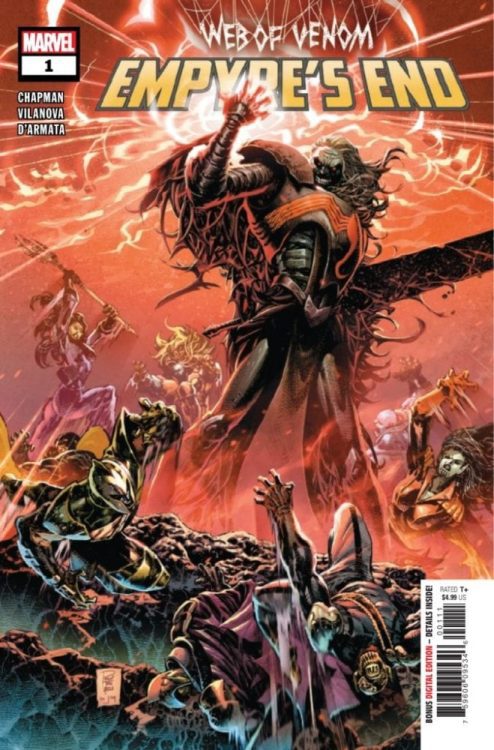
Marvel Exclusive Preview: WEB OF VENOM: EMPYRE’S END #1

Marvel Exclusive Preview: WEB OF VENOM: EMPYRE'S END #1

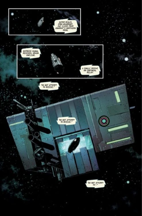
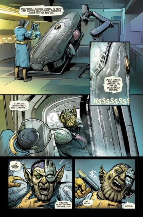
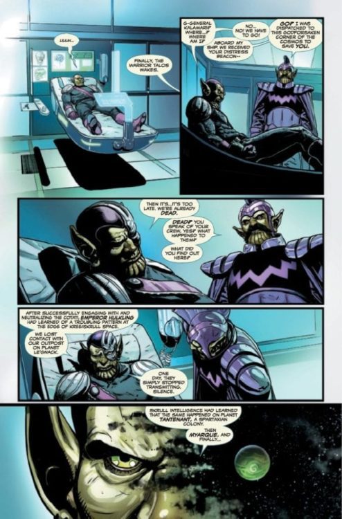
Web of Venom: Empyre’s End #1 hits your local comic book shop on November 04, but thanks to Marvel Comics, Monkeys Fighting Robots has an exclusive four-page preview for our readers.

About the book:
SPINNING OUT OF EMPYRE, KNULL’S DOMAIN BEGINS! FOR WEEKS, chaos engulfed Earth and space alike. First, the corpse of serial killer Cletus Kasady was bonded to a remnant of a mysteriously powerful alien symbiote, resurrecting his psychotic alter ego, Carnage. THEN, the generations-long Kree/Skrull conflict reached a brutal head-on Earth, with shocking and unforeseen consequences. MEANWHILE, one ancient entity at the edge of the universe has awoken. Born of hate and darkness, it’s the entity that feeds on chaos and brutality—and one group of unlucky fighters is about to face it head-on…

Web of Venom: Empyre’s End #1 is written by Clay McLeod Chapman, with pencil work Guiu Vilanova, Philip Tan worked on the cover.

Enjoy the preview below. FYI – KNULL IS COMING…

Monkeys Fighting Robots Youtube

Review: THE AMAZING SPIDER-MAN #51 – Magical Assistance From Doctor Strange

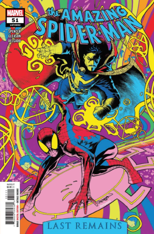
The Amazing Spider-Man #51 Cover

The Amazing Spider-Man #51, out now from Marvel Comics, is the gripping continuation of the “Last Remains” arc that will not disappoint you.

About the Book:
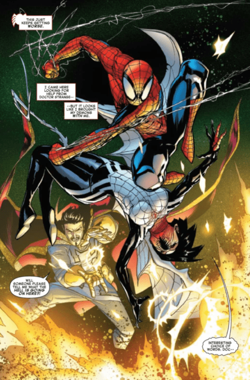
After Kindred has possessed Spider-Man’s friends, Peter flees to the Sanctum Sanctorum to get assistance from his friend, Doctor Strange. As Silk attacks the Sanctorum, the following conflict results in emotional dialogue that reexamines Peter’s guilt related to Kindred.

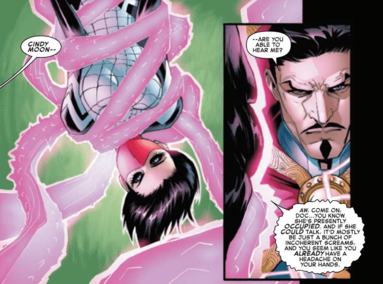
The Amazing Spider-Man #51 Dialogue example

The Amazing Spider-Man #51 Story

The Amazing Spider-Man #51 does a phenomenal job of bringing in outside elements of the Marvel Universe. Nick Spencer understands how to do this well, as is evident from previous issues in the series, such as The Amazing Spider-Man #34. It isn’t groundbreaking when this is done, but by bringing in elements that don’t often appear in the series, problems the characters have can be solved in ways that readers might have difficulty foreseeing. Spencer does this in this issue through Spider-Man’s partnership with Doctor Strange. It is an unusual way for Spider-Man to handle a problem, so it is interesting to see.

Spencer also does an amazing job of setting up tense scenes in The Amazing Spider-Man #51. He does this by having the villain communicate with Spider-Man through the possession of one of his friends. The dialogue that results from this scene is captivating, as a dreaded villain can get under our hero’s skin while talking through someone he strongly cares about. This tactic is so effective that the dialogue of the issue has you drawn in from just the first few pages.

The Amazing Spider-Man #51 Color example

Art

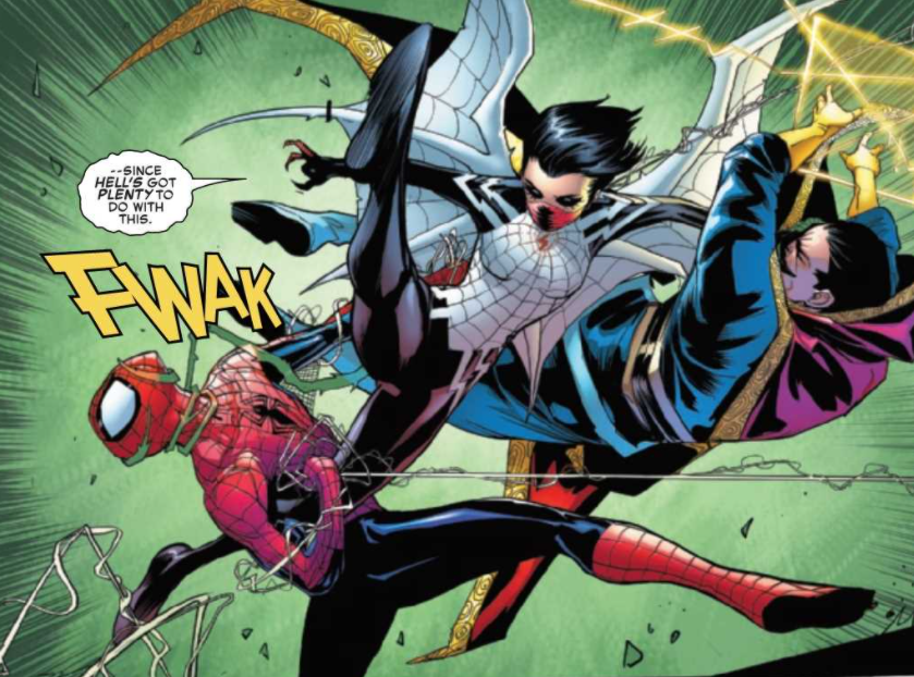
Patrick Gleason lets his stunning talent shine in The Amazing Spider-Man #51 and brings the issue to a whole new level it could have never achieved without him. The paneling in the issue is unbelievable. Gleason does not care about breaking the rules, and it pays off tremendously. Through characters extending past panel borders or oddly shaped borders, Gleason helps the reader feel as if they are experiencing the comic book rather than just reading it. This rule-breaking is really allowed to shine when Gleason draws visions due to magic or dreams, and this issue features a stunning case of that.

The Amazing Spider-Man #51 features some beautiful coloring from Edgar Delgado. The entire issue has a vast color palette, with there being never being a bland, single tone for any scene. Magical lights and dream sequences in the issue allow for incredibly fascinating coloring, and Delgado definitely delivers. Delgado also does a brilliant job of setting up contrasts between lights and darks that provides for some captivating art.

The Amazing Spider-Man #51 Art Example

VC’s Joe Caramagna once again provides solid lettering in The Amazing Spider-Man #51. The Bold fonts used for sound effects and captions pairs wonderfully with Gleason’s art and adds depth to the story that would not have been there otherwise.

Conclusion

The Amazing Spider-Man #51 is another gripping issue in the “Last Remains” arc. It features wonderful dialogue, exciting action, and rising tensions as Spider-Man creeps nearer and nearer to his final encounter with Kindred. The story is backed up wonderfully by the art, colors, and lettering, and every page is truly a pleasure to read.

Monkeys Fighting Robots Youtube

Advance Review: BURN RESIDUE #1 Ignites One Sizzling Crime Story

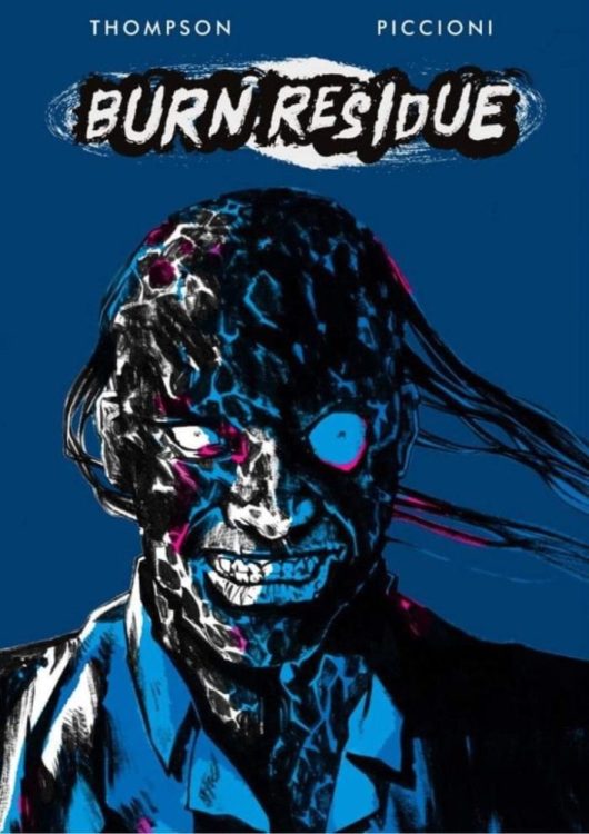
Burn Residue

Burn Residue by Jonathan Thompson and Rossano Piccioni delivers the heat with both it’s intense, propulsive narrative and moody, noirish art. A definite must-have for any crime comics fan.

Burn Residue

Burn Residue #1
Written by: Jonathan Thompson
Art by: Rossano Picciono

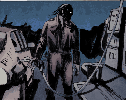
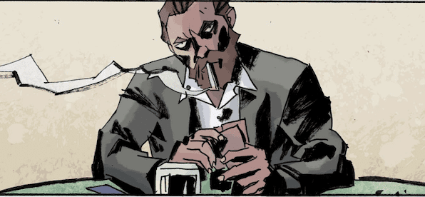
This is the story of Willy Boyd, a one time high stakes gambler who now lives life as a mild-mannered gas station attendant. One night while going back and forth to the pump to serve customers a car pulls into his station driven by one of the men who lit Willy’s body on fire years before.n the back seat of the car is a woman, gagged and bound. As the car rides off into the night, Willy must decide if he’s ready to be some sort of hero…or at least get his revenge. 

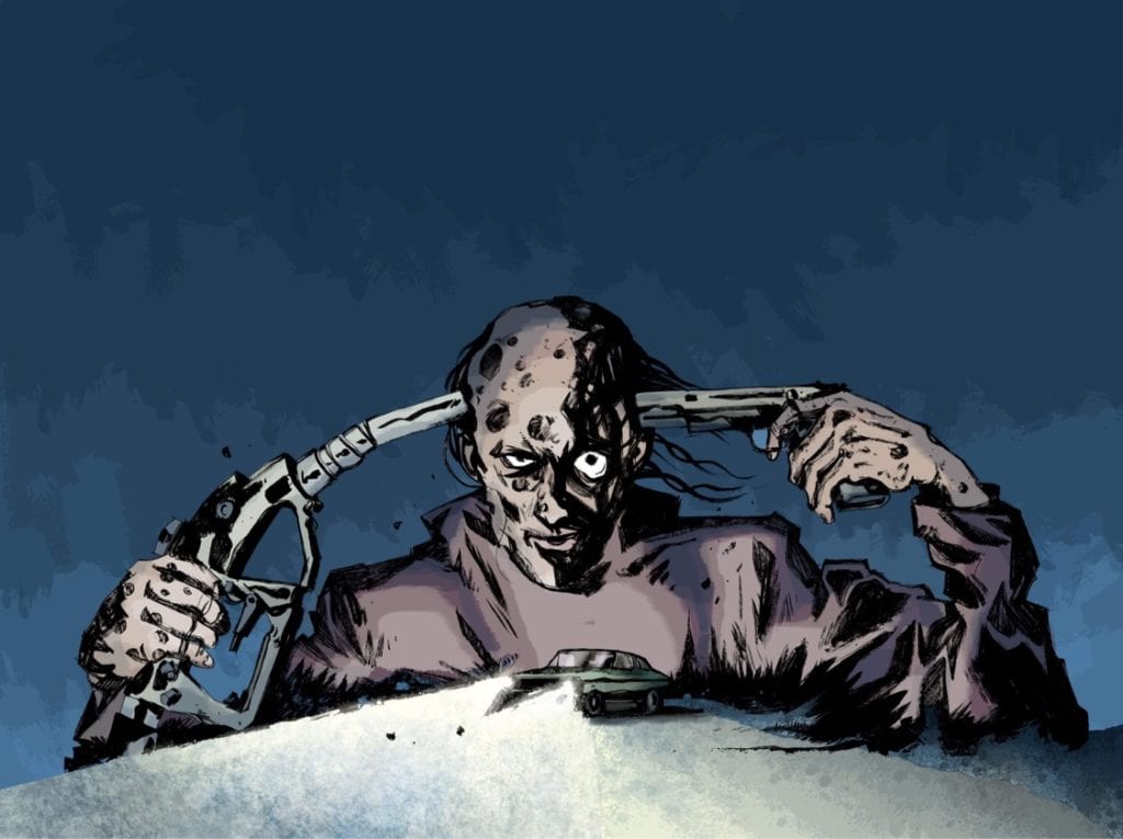
Crime fiction has been back on the rise in the comics medium, and Burn Residue #1 is a fantastic addition to the genre. Jonathan Thompson has a hell of a hook in the character of Willy Boyd. The image of Boyd, skin burned from head to toe, clad in a dirty gas station jumpsuit, is an image that is instantly burned (pun intended) on your retina. But a good character doesn’t mean a good story and thankfully Thomspon kills when it comes to the narrative as well. The first person voice-over, a classic of the crime/noir genre, is perfectly executed. Boyd’s narration drips with cynicism, and it’s easy to hear a gravely, cooked voice in your head. Boyd is also not a hero, not really, but he IS sympathetic despite what we learn of his past and what we see him do in this issue.Burn Residue

The storytelling strength does not stop there, as the narrative itself is filled with twists, turns, and reveals of the past that firmly place Willy and all the people we meet toward a collision course of revenge and violence. This first issue creates a believable underworld for these characters to exist. And by the end of the issue, you really want to see what the fuck Boyd is going to do now that he’s lit the spark of his revenge.

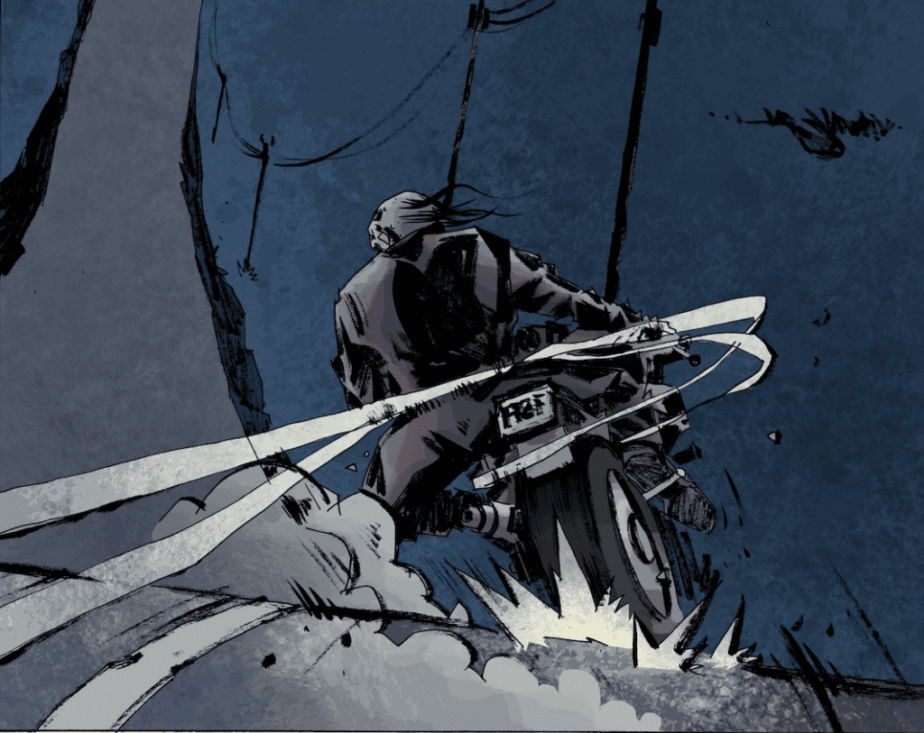
The art by Rossano Picciono is beautiful. The linework is angular, with sharp edges and straight lines everywhere. And it’s all colored in a dark palate, creating a crime comic that visually almost has a horror comic feel. Thompson is telling a very dark story and Picciono is nailing it with the visuals. Picciono also changes up the palate a bit in the flashbacks images, a technique that really tells the reader how different Boyd’s life and perspective were before someone poured gas on him and lit him on fire. And Picciono has designed such a great character in Boyd. This guy just looks cool and is almost an instant iconic and classic image. Burn Residue

So DO NOT sit on this book. Burn Residue has the makings of a new crime comics classic. It’s one hell of a read and one fucking fantastic book to look at. You want in on this. Trust me. The Kickstarted just launched and you can support it here. Let’s make sure this book gets the support it needs so we can all watch Willy Boyd gets his revenge. Burn Residue

Monkeys Fighting Robots Youtube

Review: MEGA MAN: FULLY CHARGED #3 – Inner Conflicts and a Shocking Ending

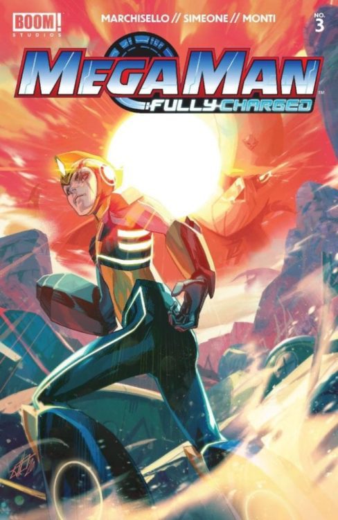
Mega Man: Fully Charged #3 Cover

Mega Man: Fully Charged #3, out now from BOOM! Studios is an engaging, action-packed, and beautifully drawn issue that ends, leaving you deeply wanting to read the next issue.

A.J. Marchisello’s writing in Mega Man: Fully Charged hooks in a reader like few others’ writing. Much of the focus in the past few issues has been on the internal conflict of Mega Man. There seems to be a new human and robot war near approaching, and Mega Man must choose a side to be on. He is a robot but has sworn to protect the residents of Silicon City. Both his father and sister, Thomas and Suna Light, are also human. Problems arise as more and more information is revealed that may imply people Mega Man thought were trustworthy might not be. Marchisello’s writing is so captivating that a scene of Mega Man talking with Nemagem will have you convinced there is a clear answer to Mega Man’s dilemma, and the following scene of him talking with his sister will have you believing otherwise.

Mega Man: Fully Charged #3 Variant Cover

Another part of what makes Mega Man: Fully Charged #3 such an entertaining issue is its ending. Going into nearly any detail would give it away, but the conclusion to this issue is certain to have any Mega Man fan dying to read the following issue.

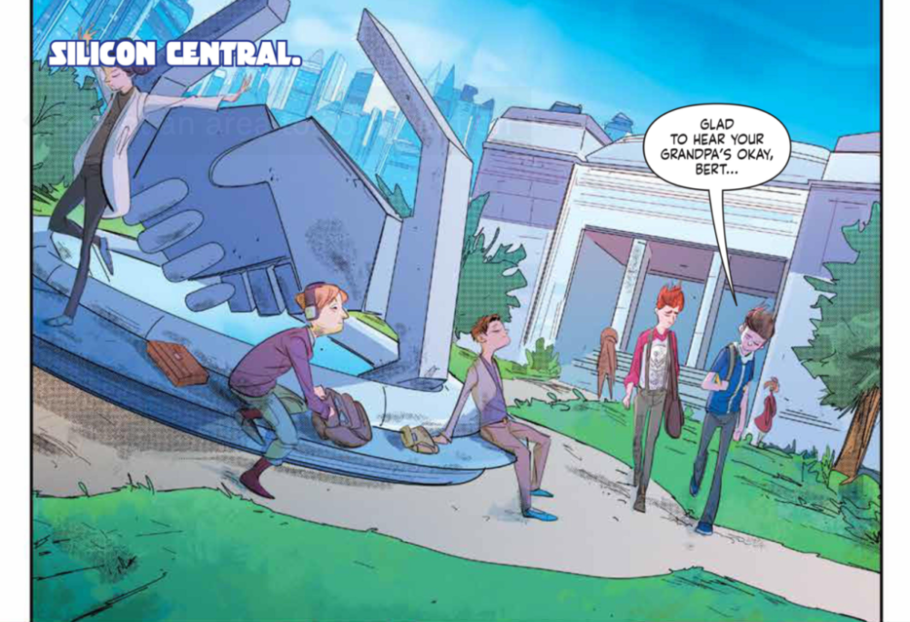
Stefano Simeone has provided excellent work in every issue of Mega Man: Fully Charged so far. This issue features some stunning cityscapes with interesting and complex architecture and surprising amounts of detail. Mega Man: Fully Charged #3 also contains tons of action, which Simeone brings to life through his art. His forms are always dynamic, and every character’s pose is filled with energy. The pages of combat — and really every page — is a pleasure to look at thanks to Simeone’s work.

Mega Man: Fully Charged #3 Coloring Example

Igor Monti brings his all in each issue that he works on, and Mega Man: Fully Charged is a clear example of this. Filling the issue with such beautiful palettes for areas such as the city, Monti makes all of Simeone’s art into even more of a spectacle through his coloring. The issue has a nice variety of tones, and each area and scene has its own palette that reflects the emotion of the scene. Monti’s work in this issue is truly marvelous, and I hope it continues for many issues to come.

Mega Man: Fully Charged features the talents of Ed Dukeshire for its lettering. Speech bubbles in the issue are never placed in ways that make the order confusing, and the fonts used never hinder the story. However, the work of Dukeshire doesn’t improve the issue much at all. The styles used for captions and sound effects don’t stand out as unique or intriguing, and there is little variety in the fonts used throughout the issue. Dukeshire’s work allows for the story to progress seamlessly and does what is necessary for good lettering, but the lettering doesn’t improve the story in many ways.

Mega Man: Fully Charged #3 is a riveting issue filled with gorgeous art and a captivating story. The ending is sure to shock readers and leave them impatient for the next issue to hit shelves. This issue is a wonderful read and is sure to leave fans of the games and the cartoon happy.

Monkeys Fighting Robots Youtube