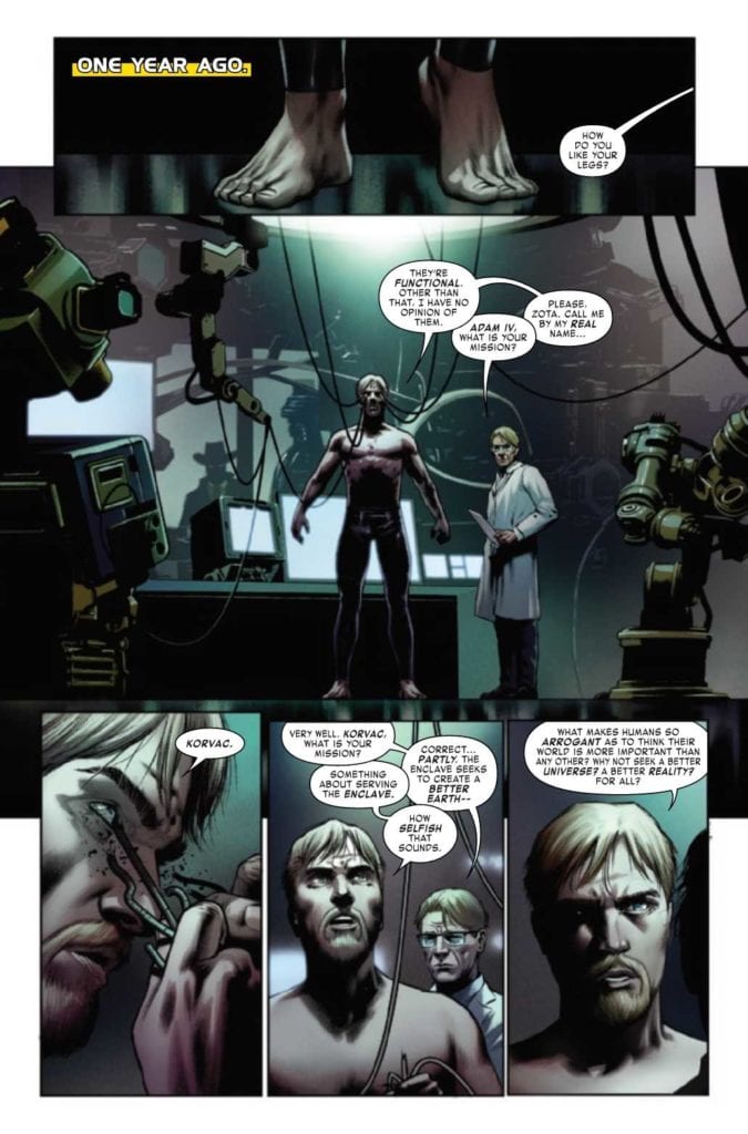
IRON MAN #2, available from Marvel Comics on October 21st, reveals this arc’s Big Bad and continues Tony’s quest for self-discovery by reckless means. Written by Christopher Cantwell and drawn by CAFU, the sophomore chapter in this run has really high highs and a couple of deep, down lows that make for a mixed issue.
Cover Art
Alex Ross can do no wrong in my book with his art. Famous for his phot-realistic style, Iron Man is steeled against the next blow with the smoke of battle wafting up from his armor. It’s a tense and dramatic cover from Ross.
Writing
Cantwell’s writing takes the interesting character work from the first issue and pushes further into the self-doubt territory for Tony Stark. It’s a nice change of pace to see one of the frontline Avenger’s personal struggles not brushed off so easily or resolved in a nice, neat bow. There’s a real opportunity for personal growth here with Tony Stark, and I’m looking forward to seeing if Cantwell can capitalize on the setup.
That said, a majority of this issue’s writing didn’t work for multiple reasons. The immediate reveal of Korvac completely diffused the anticipation from issue #1 (read the review here). It would have served the issue better to provide some build-up and drama to the reveal. In spots, Tony’s self-doubting dialog went so extreme as to come off as esoteric and out of character for the narcissistic playboy (“Is Iron Man just a wish in some kid’s game of pretend?”). It’s commendable to explore facets of the character in a new light, but taken too far, the character’s voice is lost. Lastly, Hellcat as the “tough love buddy” is anything but. She’s written as confrontational and it’s unclear why Hellcat is in this series. I hope Cantwell can clarify Hellcat’s role, and stabilize the erratic narrative that had such a strong start in issue #1.
Pencils/Inks
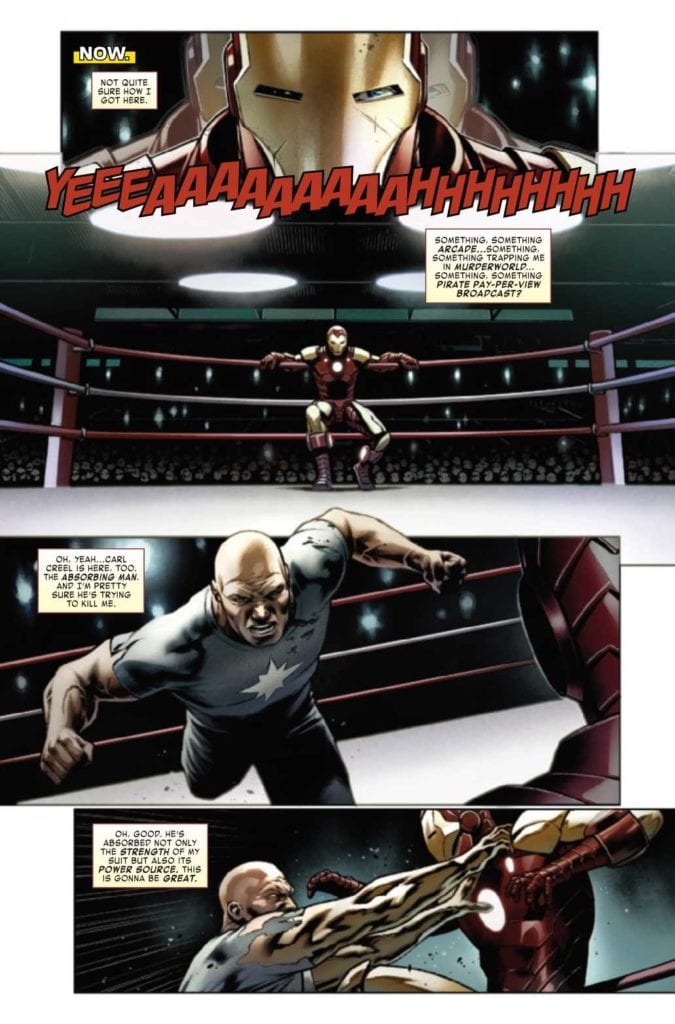
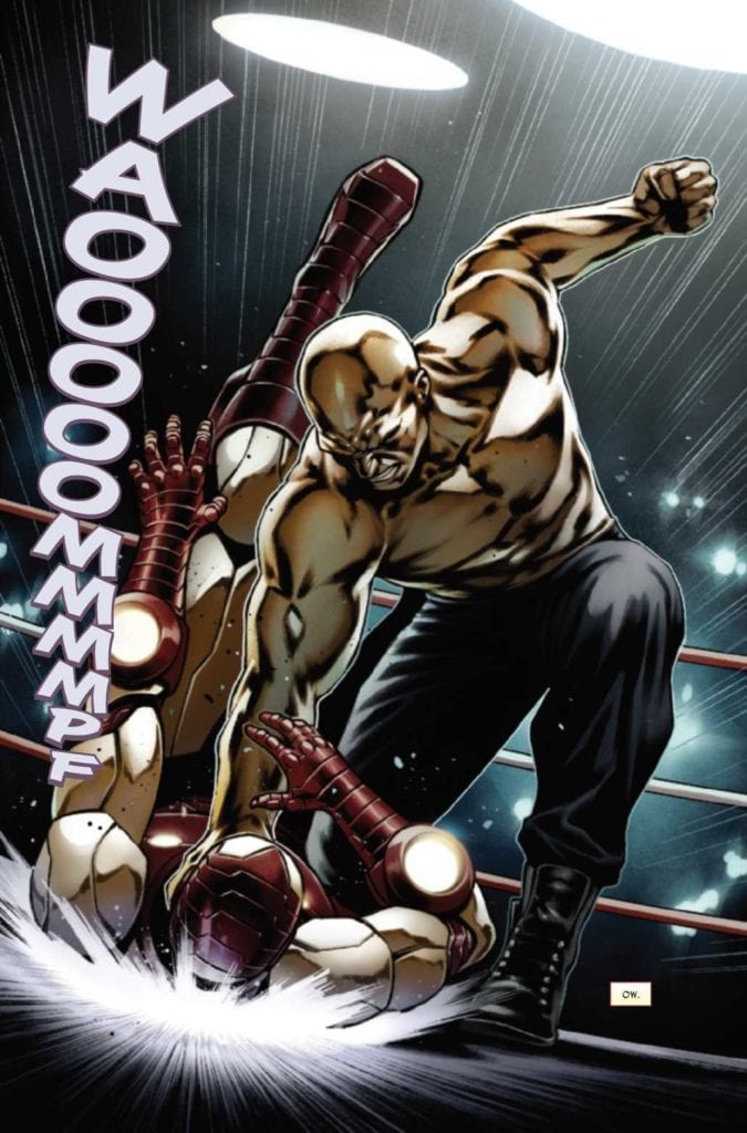
Thankfully, the strong art so prevalent in the first issue was carried through here from CAFU. Where a majority of the first issue relied on emotional acting, there’s a ton of action in this issue, and it’s exciting stuff. CAFU’s near-photorealistic style, similar to Alex Ross but stylistically unique, infuses all the panels with a cinematic quality that gets as close as possible to film without really being there.
This is a gorgeously rendered book, and I’m looking forward to seeing what happens when Korvac makes his presence known.
Coloring
Frank D’Armata’s coloring work is a perfect mate to CAFU’s renderings. D’Armata breathes life into every panel with shading in such high detail that you can see every wrinkle, fold, and crease in something as mundane as a t-shirt. That high detail works and adds texture that gives Iron Man’s suit a rich metallic sheen, making it stand out just a little more. Exceptional colorwork here by D’Armata.
Lettering
VC’s Joe Caramagna does an excellent job adding distinction to Tony Stark and Iron Man’s many voices in this issue. At various points, Tony is talking, whispering, talking through his helmet, talking over a communicator, etc.. Therefore this is one of the rare examples where a single character logistically needs multiple visual versions of his voice. Caramagna pulls it off to keep the narrative straight and the story flowing.
Conclusion
IRON MAN #2, available from Marvel Comics on October 21st, has great action and fantastic art but fails to build on the story potential from the first issue.
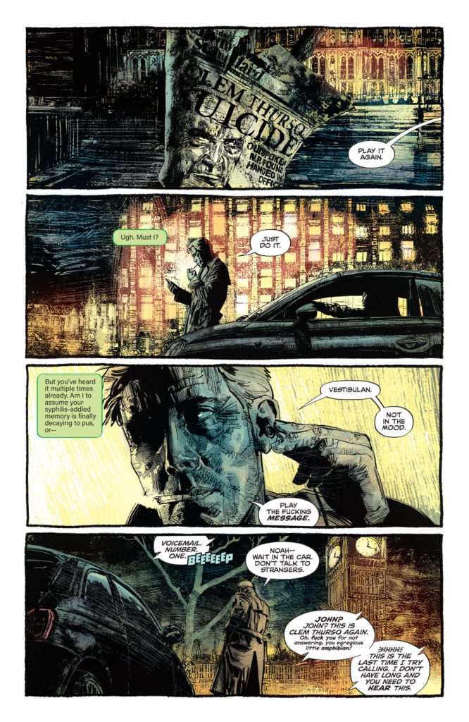
To call the cancellation of DC Comics’ John Constantine: Hellblazer unfortunate is underselling it. Writer Simon Spurrier, along with brilliant artists like Matias Bergara and Aaron Campbell, have created a truly beautiful series. As a creative team, they allow events to unravel in each arc so gradually that every narrative beat feels inevitable. But with Hellblazer‘s cancellation, this creative team has the task of tying everything up in the space of a couple of issues. DC Comics’ John Constantine: Hellblazer #11sees writer Simon Spurrier, artist Aaron Campbell, colorist Jordie Bellaire, and letterer Aditya Bidikar hurriedly getting through what feels like five issues worth of material. They continue to do incredible work, though one wonders about the scope of what they had planned.
Writing
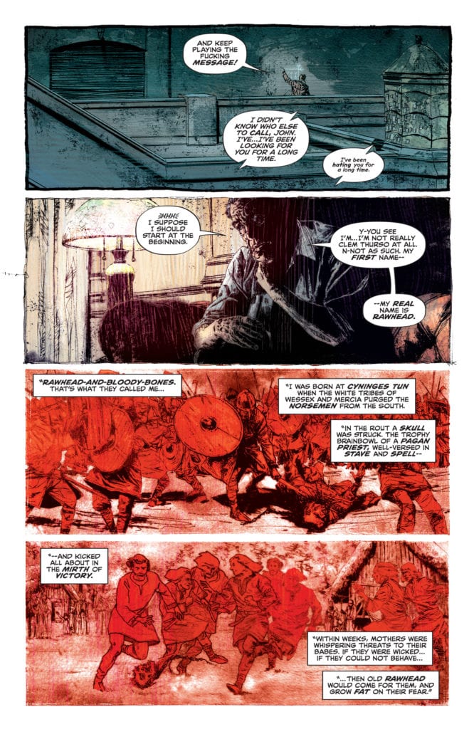
Spurrier’s script is pretty tightly packed in this issue. Clem Thurso, the British M.P. that this issue centers around, explains to Constantine how they are connected. Spurrier uses Constantine’s voicemail to get through all of this exposition. So much of what Spurrier does here shouldn’t work. But the substance of what Spurrier has to say is always so mesmerizing. Brilliantly, Spurrier uses real-life horror to scare us. It’s not the demons or underground cults that should scare us; it’s the growing collective hatred for others. Spurrier has his finger on the pulse of Britain, which works in Hellblazer as a microcosm of the world at large. Putting us in the shoes of Clem Thurso for an issue and watching his rise to power as he feeds off of hate and fear, we see the real horror that’s going on, both on and off the page.
Art
Campbell makes this issue outright terrifying. For one, we see Clem Thurso on the phone to Constantine at the beginning. With his face folded back a little, we can tell he’s not fully human. But the fear in his eyes is. Then, as we see Thurso’s rise to power, Campbell depicts him as laid back and comfortable in the midst of all of the evil he’s causing. Evil is Thurso’s comfort place. So seeing the fear in his eyes, Campbell has us question, “What could scare a demon?” Every chance Campbell gets, he keeps the horror off the page. We don’t see what’s scaring all the other characters. It’s Thurso’s eyes like pinpricks as he runs in the opposite direction that Campbell wants us to see, or Constantine trying not to hurl. When Campbell finally does lift the curtain, the horror and disgust do not disappoint.
Colors
Bellaire uses reds, yellows, and greens to depict the various forms of evil throughout this issue. When we see Thurso’s rise to power, Bellaire depicts these scenes in an untainted red. It has the look of pure evil, but an evil we can understand. In the modern-day, we see Constantine investigating what got Thurso so upset. The greens with which Bellaire colors these scenes look sickly like something is rotting beneath the surface. And as we cycle back and forth between these scenes, we begin to see Thurso’s scenes get infected. It’s no longer the pure red we saw at the beginning. These scenes begin to turn a little orange as Thurso’s own experiences with this new evil begin to spread the yellowing rot. Thurso’s influence is becoming something else. It’s evolving into a different kind of evil. One even he doesn’t fully understand. In the final moments, Bellaire allows green to become overpowering. You can almost smell death in the air.
Lettering
Bidikar nails the voice of Thurso. Plenty of letterers use bolding a lot in their work, but Bidikar uses it with incredible effect. Every word Bidikar bolds is a word that Thurso is savoring. “But OHHH! If we dare to say so?” Thurso says to a crowd. The “OHHH” takes up several lines of his dialogue and looks uneven. It has a flourish to it, just like Thurso’s speech. He revels in the hate. “We’re persecuted for being politically incorrect.” Bidikar shows how Thurso harps on every word that he knows will get a rise out of people. He has his buzzwords to keep the sheep in line. But Bidikar also shows how sadistic Thurso is on his own time. “I simply had to have his face,” Thurso says. “He peeled with the very greatest of ease.” You can almost hear Thurso licking his lips, relishing every sick moment.
DC Comics’ John Constantine: Hellblazer #11 is another incredible issue. There are signs of this creative team rushing, but far less than one would expect. This series is huge and bold. It deserves 30 more issues, and this creative team does a spectacular job tying these threads together. With one issue to go, they gear up for a heartbreaking finale. Pick up John Constantine: Hellblazer #11, out from DC Comics October 27th, at a comic book shop near you!
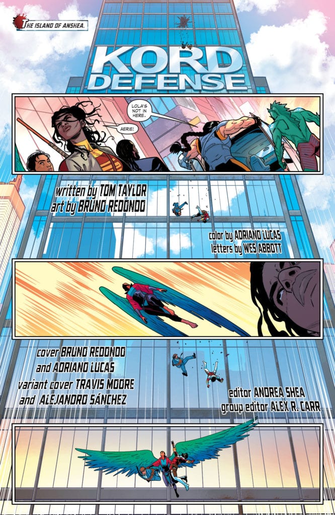
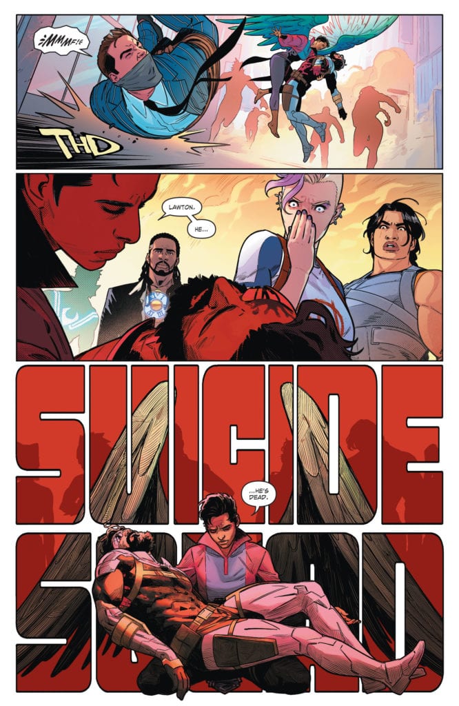
Written by Tom Taylor, with art by Bruno Redondo, colors by Adriano Lucas, and letters by Wes Abbott, DC Comics’ Suicide Squad #10 doesn’t get caught in trying to make us care. With the devastating events of the last issue, this creative team allows the tragedy to speak for itself. In a loud and colorful series, they opt for a more subtle approach when it comes to Deadshot’s death. This allows us to feel the loss of Floyd on our own, not because we were told to.
Writing
Taylor doesn’t waste time in this issue. None of the characters gather around to say some words about Deadshot’s life. I mean, hell, they don’t even get a chance to bury him. Instead, they are all forced to run off on the next act of this wild ride. Taylor speeds past the Suicide Squad’s pain and sadness. This actually makes the pain feel more real. Not only does it feel like they’re avoiding thinking about it, but it also feels like what Floyd would want them to do. Instead of allowing his death to be a waste, the Suicide Squad is hot on the trail of the real puppet master behind the scenes. Taylor allows just a couple nods to Floyd’s sacrifice: Harley grabs his mask and wears it for a fight and is later dragged away from his body. There’s no time to mourn, but Taylor’s acknowledgment of there being no time gives us a moment to feel the pain anyway.
Art
Redondo shows us how each of the Suicide Squad members deals with Deadshot’s death. Of course, there’s the initial sadness seen in all of their faces. Redondo beautifully depicts the recognition of Deadshot’s death as a kind of pieta. The Aerie acts as a Mother Mary figure, holding the body of Deadshot, who’s in the position of Christ. By bringing up this image, Redondo highlights the injustice and sacrifice of Deadshot’s death. As the issue progresses, we see most of the Suicide Squad’s faces go from sad to angry. And Redondo helps us feel their anger. Black Mask’s nonchalance is infuriating. He barely has his eyes open throughout the issue. Killing Deadshot is just another Tuesday to him. But things begin to change when we see the Squad face the army sent to stop them. They all look off-panel, their faces full of fury. We see Harley pull on Deadshot’s mask. Even with the mask obscuring her face, we can see the change in her eyes. It’s a dangerous change for anyone who gets in her way. Deadshot was a martyr, and his disciples are out for blood.
Coloring
Lucas’s vibrancy is still going strong. There’s no black cloud that hangs overhead in this issue. Lucas colors action scenes with backgrounds of bright yellow and orange. The skies are still blue. But there’s a looming death too. When we first see Deadshot, the background is a dark red. It’s easy to associate red with death at this point. The problem is, the Suicide Squad is often cast in a red glow from then on. We see the red shine of the sun as Black Mask’s helicopters swoop in. We see the red lights aboard Black Mask’s private jet. Even Harley Quinn is still sporting her red jacket. With Deadshot’s mask on, it’s hard to find this color in her uniform as innocuous as it once was. But the question remains, is it the death of the Suicide Squad that is drawing nearer, or are they about to bring death in their wake?
Lettering
Abbott also keeps the buoyancy of issues gone by. Every punch, kick, and explosion is given a giant neon sound effect. Even the issue cover has a kind of lettering that seems to fly in the face of what you’d expect the tone to be. Blue Beetle, cowering at the sight of the Suicide Squad, is saying, “Wait! You’ve got it all wrong!” in what can only be described as fun letters. Abbott pushes the doom and gloom back, again insisting that these characters don’t have time to mourn. And later, as one character is smacked across the face, Abbott gives us whiplash. We see the noise of a hand making contact and the person’s scream in agony, flying off to the right side of the page. But the next panel brings us back to the “k-klang” of something hitting the floor on the opposite side of the page. We almost feel how the character’s neck feels at that moment. The sudden move from one side of the page to the opposite mimics the movement of their head.
DC Comics’ Suicide Squad #10 is funny, joyful, and loud. It isn’t the issue you would expect coming on the heels of a major character’s death. But that’s what makes it so great. Taylor, Redondo, Lucas, and Abbott insist that the Suicide Squad doesn’t have time for goodbyes. They have a mission that they have to get through. And ignoring the pain only makes it worse. So this creative team manages to make a truly devastating comic that’s in the guise of a very happy one. Suicide Squad #10 is out from DC Comics on October 27th. Pick it up at your local comic book shop!
Fox Hunt Drive is one of those rare films that manages to subvert every expectation you could have going into it. It relies on a few conveniences and the premise is simple, but it’s taken to heights you wouldn’t expect. As rideshare continues to grow, crime has been increasing as well, so this film couldn’t have arrived at a better moment. Fox Hunt Drive is a meticulous take on the worst scenario a rideshare employee can find themselves in.
Uber and Lyft certainly have made life easier for many individuals, but the drivers are always at risk when they let strangers into their car. Recently, there have been several criminal acts involving rideshare, which only adds to the unease offered in Fox Hunt Drive. Directed by Drew Walkup, the film stars Lizzie Zerebko, Michael Olavson, Ryan Forrestal, and J.R. Ridge. Fox Hunt Drive was written by Adam Armstrong and Marcus Devivo, it follows Allison Meyers (Zerebko), a struggling architect trying to make ends meet through rideshare. After deciding to take one more client for the evening, she finds herself in a treacherous situation.
Michael Olavson as Mike in Fox Hunt Drive
Armstrong and Devivo take pleasure in making the audience feel for Allison before pulling the rug from underneath. Fox Hunt Drive includes some cleverly placed twists that will only add to the film’s rewatch value. A second viewing will lead viewers to watch certain scenes differently. Allison recently lost her architectural position and is very depressed, as she has dreamed of being an architect since she was a young girl. Those small details alone will be enough to feel for the character because many people spend time at a job while seeking something better. However, Allison’s position being lost is rooted in a bigger issue. Her nightly adventures as a driver lead her to meet Mike (Olavson), a thief with a drug addiction who has some personal demons.
Walkup does a terrific drop creating tension throughout the ride, as Allison and Mike have a seemingly normal conversation at first. Still, Mike’s mannerisms along with his intimidating gaze make Allison uncomfortable throughout their drive. Allison’s late-night spin eventually progresses to a nightmare fueled adventure. The writers effectively flesh out these two and give audiences a look into who they are, and what has brought them to this point. There is odd chemistry between them, and the performances are to thank for that. Zerebko is great at portraying this innocent driver who just wants her career to take off, and Olavson is amazing as the restrained, but menacing passenger.
Lizzie Zerebko as Allison Meyers in Fox Hunt Drive
Their performances alone will have audiences glued, and eager to witness what happens next. Allison is a seemingly polite individual with a squeaky clean resume behind her, and Zerebko brings that to life with ease. As mentioned above, Walkup masterfully creates tension during this drive and builds upon it when they are out of the car. The moment Mike enters Allison’s life, Walkup doesn’t let up and corners the audience into a very uncomfortable position. Also, the twists in this script really will catch many by surprise because every expectation is subverted. The cinematography by Anthony Kuhnz helps convey the terrifying nature throughout Fox Hunt Drive, while also elevating the audience’s concern for Allison.
Fox Hunt Drive is a well crafted independent film and another relevant feature that speaks to today’s society. While only grazing over the topic, the film does draw attention to mental instability and depression as well. Its simple premise is catapulted into a thrilling journey that will frighten those in the rideshare field. While it’s similar to other films, it packs enough to be considered refreshing at best.
Future is a graphic novel from a new publisher, Cast Iron Books, collecting in a Kickstarter ending on Halloween. This graphic novel serves as the first of comedian Tom Woodman acts as writer with Rupert Smisson as artist, with veteran letterer Aditya Bidikar.
Background
Future is the first project of Cast Iron Books, a new publisher dedicated to empowering writers and artists through storytelling. With a hook like that, a first impression is everything. So what better way to show a way to empowering people than a story fighting back against fatalistic realities?
Writing For Future
Despite Woodman’s comedic background, this doesn’t push him away from a rather serious topic about taking risks. Future revolves around Murray Rui Mielniczuk, the last astronaut of Earth, as it faces numerous crises. With all of this, including a terminal illness Murray faced since childhood, the only sensible thing is to wait for the end. Murray’s wife, Kay Mielniczuk, gets them an opportunity to change everything. While not everyone can time travel, the desire to take a chance with a loved one is a universal feeling. Because who at the time feels satisfied with the hopelessness of 2020?
Throughout Future the reader sees a world in ruin that serves as a bleak forewarning to everyone. For the Mielniczuks, it’s how after centuries of progress, it’s the feeling that all of their efforts are in vain. There’s no cure for Murray’s illness, and there doesn’t seem to be a way back. As the only humans left, the world is practically telling the Mielniczuks that their fates are inevitable. Murray seems content, but Kay won’t stand for it. It’s for that very reason that Murray experiences some of the more heart-warming sequences in the art.
The Art Of Splinters
Smissen instills Future with some impressive visuals that provide background elements. Throughout the story, Murray has some episodes where she glimpses into her past. Sometimes they splinter like glass shards from a cracked helmet. This serves as a good metaphorical look into the world and how messed up it has become. The purple coloring of this episode is practically a warning sign of a hopeless situation that comes with some comfort. At least the views of her marriage to Kay suggest that latter part.
At first glance, this is a hallucination from Murray’s illness, but that might not be the case. Considering the nature of the photonic time travel and why the Mielniczuks backers wanted Murray despite her condition, making her less than ideal for space travel, this might explain her place in the grand scheme of things. Especially during an episode where Murray seems to be experiencing walking through where the ocean used to be. But more importantly, the bright flashes of memory contrast with the dark abyss-like background Murray is walking in. That’s even despite the memory of her mother telling her not to waste effort on hopeless causes because even a bad memory connects to a brighter one where Murray recalls how she met Kay.
Lettering
As the most experienced of the creatives in Future, Aditya Bidikar displays his award-winning lettering. Bidikar’s letter work provides Smissen’s art with good company. Pages that practically have no backgrounds or panels rely on the word balloons to guide them. In context, it also lets people see Murray’s condition worsening and how its Kay’s words that she listens to with strong intent. Because again, Kay is what keeps Murray going despite all of the bleakness. This style of lettering is just Bidikar’s way of showing the reader how.
Plan For Your Future
Future is without a doubt a decent way of displaying how a person’s love for something or someone can provide hope. In the tough times of 2020, where things keep getting bleak, it’s important to try and make something good out of it. A startup company like Cast Iron Books is certainly trying their hardest. But if you want something more solid than a review, check out the first chapter: https://tinyurl.com/FutureCh1
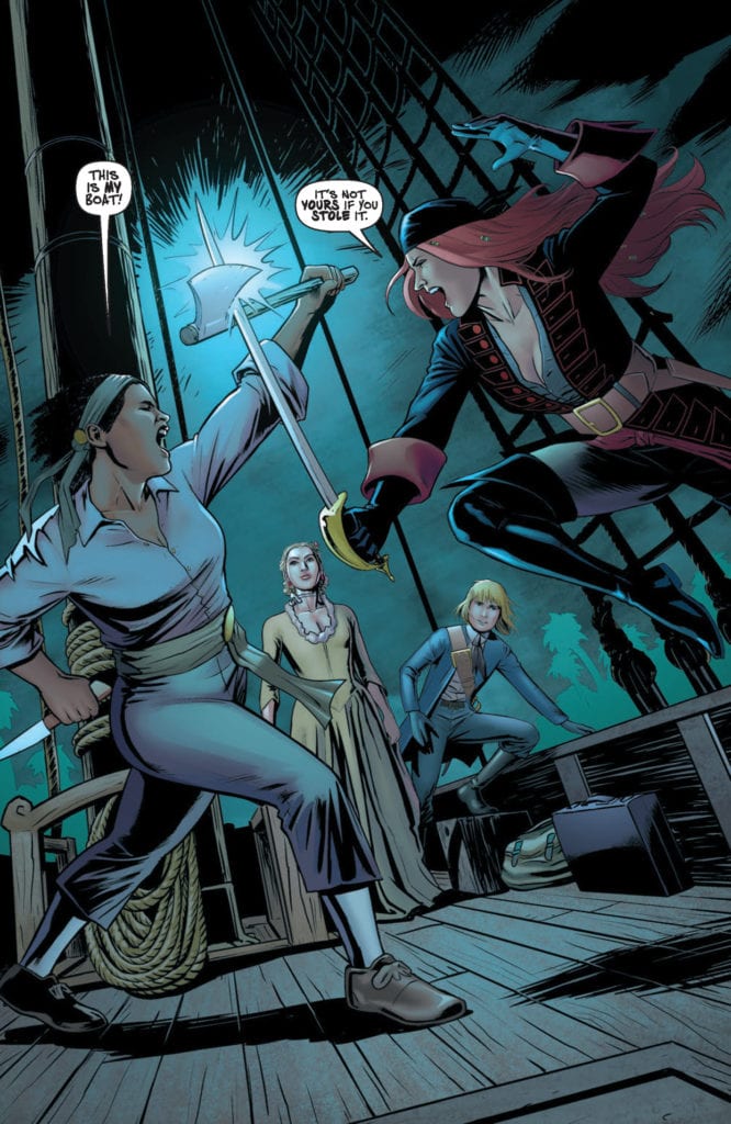
It’s all back-stabbing and storms at sea in the third issue of Top Cow Productions high seas drama A Man Among Ye. Released this week, Stephanie Phillips and her crew continue their adventurous semi-biographical tale of Anne Bonny, pirate extraordinaire.
While the King’s men trade with the mutinous pirates for the head of Calico Jack, Anne and Mary attempt to steal a boat. Unfortunately, they face stern resistance in the shape of Jane Castor, a wealthy runaway, and her once servant Iris who are in turn attempting to escape the lives they once led. The four women must learn to work together if they are to escape and survive the cruelties the world throws at them.
A Man Among Ye #3 Credit: Top Cow Publications
Surface and Depth
A Man Among Ye #3 opens with a dramatic and classic pirate confrontation that even Errol Flynn would be proud of. Craig Cermak captures the moment that two pirates meet, their weapons clashing, with a flourish of dynamism. As the fight progresses, over the shoulders of Jane and Mary, Stephanie Phillips unravels important plot elements through a conversation that is natural and befitting of each character. Phillips has a wonderful ability of embodying the characteristics of the cast members in the speech, thereby not becoming reliant on visual representation. This makes exposition dumps, similar to the one in the opening scene, much easier to digest and feels more like entertainment than information sharing.
As the story jumps from Anne and Mary to the fate of Calico Jack, Phillips paints a picture of pirate life and the hardships that surround them. The stakes are high because they are constantly fighting for their life, and their freedoms. The central characters are portrayed as romantic heroes and, compared to the rest of the society depicted, you will definitely be rooting for Anne, Mary and their new crew mates.
The surface story of A Man Among Ye may be a tale of swashbuckling pirates, but a mere scratch reveals a more complex narrative about the portrayal of women, especially in historical settings. This is as much about a woman’s fight for freedom from servitude or marriage than it is about sword fights and ship sailing.
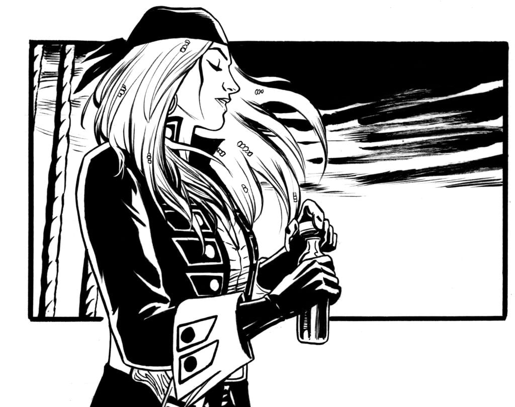
A Man Among Ye #2 Inked Artwork Credit: Top Cow Publications
Romantic Ideals
The only drawback to the narrative in A Man Among Ye is the artistic style. Cermack is a wonderful illustrator who creates exciting fight sequences through a clever use of panel placement and manipulation. Unfortunately, the style of the art is very smooth and crisp which is in contrast to a lot of the narrative themes. Cermak’s line-work is precise, a series of delicate lines that shape the characters and scenery. On top of this John Kalisz’ colors also have a pristine quality to them.
The clean, precise colors beneath the matching inked lines produce a particular look that is romanticised in nature. Just like classic movies in the Golden Age of Hollywood, the characters and the locations appear very staged and presented. Despite the undertones within the narrative, the artwork does not reflect the coarse life the majority of these characters have lived.
There are elements of design and composition which leap from the page. Some of the storytelling is absolutely wonderful with the reader being led around from panel to panel as if the action is being followed by a camera. The static elements of some of the scenes have been countered by the wonderful figure work in the mid to foreground. There is a lot going on, and this keeps you in the story at all times, however in retrospect, the grittier ideas are easily lost in the romanticism.
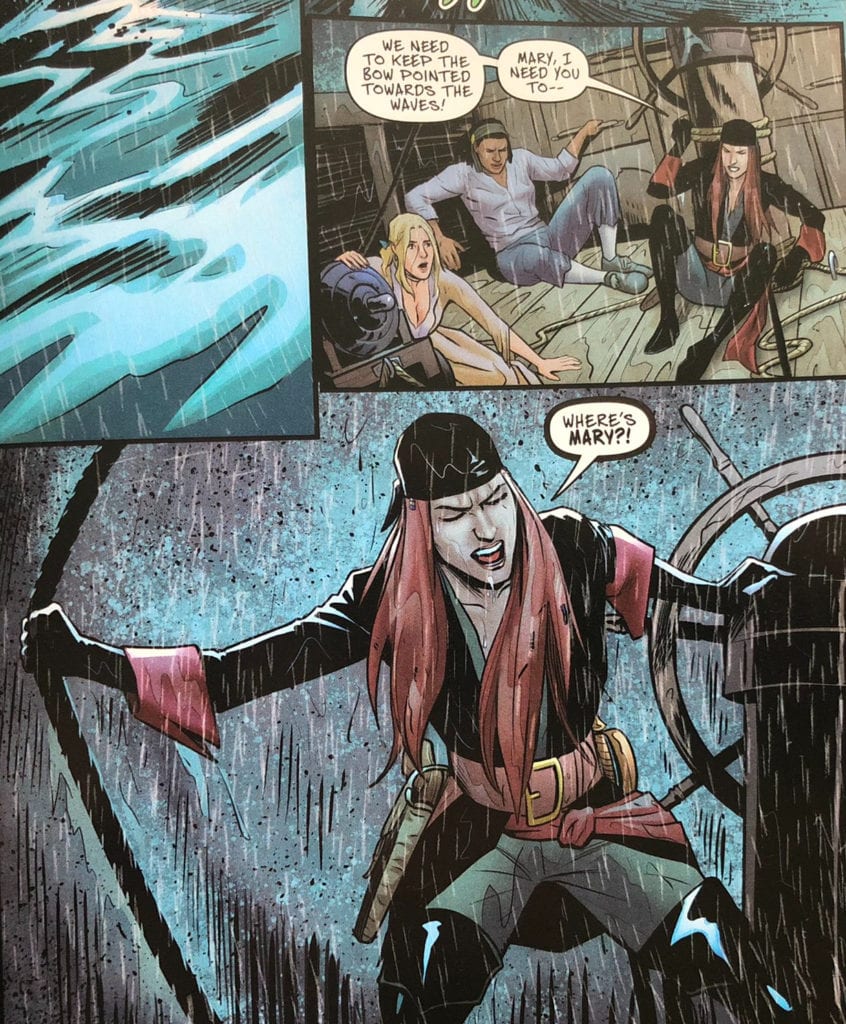
A Man Among Ye #3 Credit: Top Cow Publications
Conclusion
Phillips has created an engaging script full of character, which letterer Troy Peteri brings out through rhythmic balloon placements and integrated boldface emphasis. The sound effects create atmosphere and a feeling of dread, especially through the color and shape of the gun shots. There is something specifically abrupt and final about the pistol shots that reflect the violence better than a heap of dead bodies.
The contradiction within the comic created by the art style and the underlying narrative doesn’t detract from the pure enjoyment that the creators are having, or that most readers will share in. Cermak is using a distinct aesthetic voice to visualise the story and this relates to a classic ideal of pirate fiction in early pulp magazines and cinema. It is appealing even if it does lean more towards whimsy than serious biography.
However, there is so much to love about A Man Among Ye, sometimes it’s not worth getting tied up with stylistic choices, and better just to sail on the ship, wherever it takes you. It has so far been an enjoyable series and continues in the same vain, month after month.
Immortal is a horror anthology film with four chapters featuring an all-star cast, including Tony Todd (Candyman), Dylan Baker (Hunters), Samm Levine (Inglourious Basterds), Mario Van Peebles (New Jack City), and Aaron Della Villa as a wise-cracking teenager.
The chapters of Immortal connect through the very title of the film. Life, death, and immortality are themes explored in each of the movies. Aaron plays Kyle in the opening chapter called “Chelsea” about a high school track star confessing to sexual misconduct with her coach. But Chelsea’s (Lindsay Mushett) admission may be too late.
PopAxiom spoke with Aaron Della Villa about going from dancing to acting, boy bands, and learning from those around you.
Tell A Story
Born in Suffolk, Virginia, Aaron was a “dancer before an actor.” He studied music and dance training at the prestigious Governor’s School for the Arts in Norfolk, Virginia, in classical ballet and classical modern dance. “I looked up to Mikhail Baryshnikov, Vaslav Nijinsky, and Roberto Bolle. I wanted to be the best dancer.”
However, an injury derailed those plans. “I had a severe case of shin splints. But that didn’t lead to acting. It was a stupid sprained ankle when I hopped a turnstile in Chicago.”
“I had a contract on the table to dance with a contemporary company in Chicago, which is no longer in existence,” Aaron explains. “I got that opportunity after I sprained my ankle.”
He recalls, “I was thinking, ‘What am I going to do with my life?’ So, I hopped on Craig’s List. I joined this dinner theater show that lead to me getting an agent, which lead to my first commercial, which lead to a manager from New York and me moving out to NYC.”
Was Aaron determined to stay in a profession centered around performance and entertainment? “100%! I thought, ‘I can’t just sit here waiting to recover; I got to make something happen. So, I said, F it, I’ll act!'”
“When one door closes,” Aaron makes clear his sense of determination, “I’m going to find a different door. And if that door closes, I’m going to break the door down.”
About the jump from dancing to acting, Aaron says, “Dancing is acting. At its highest form, it’s storytelling through movement. The ability to tell a story without any dialogue.”
About Immortal
Getting a showbiz gig comes about in a variety of ways. But Aaron says the way Immortal came about is the most common in his experience. “It was a personal connection. I auditioned for director Rob Margolies’ other feature film, Yes, and they ended up going with a bigger name for the role. But Rob said, ‘We loved your audition, and we want to offer you this other part of Kyle in Immortal.'”
The next step was reading the script, which Aaron did, and he “thought it was so much fun. I get to work with Rob and Dylan Baker, so I said ‘Absolutely!'”
Kyle is one of those short but sweet roles. It’s not a huge amount of screen time, but it leaves a lasting impression. “Rob told me that Kyle’s a class clown, a lot of energy, and a hilarious guy. So, it wasn’t that hard,” Aaron let out one of those kinds of laughs that you can’t help but laugh too. “I know how to be that guy. And I didn’t have to lose 30 pounds and live in the woods for three months to do it.”
Aaron says of his experience on Immortal, “I showed up on set and cracked jokes.”
Rituals
Aaron dives deep into roles. “I played a series lead for a show called Duels. It’s one of my favorite roles. It’s a guy who’s a marksman by the age of 19, killed his dad at 16, and is so full of rage. Dueling becomes famous because of Stand Your Ground in Florida and takes the world by storm. He becomes famous because he’s a marksman and he’s able to win in these duels. So, he’s this guy who was never given much in life and always joked on, picked on, and bullied. Now he’s famous and gets everything he’s always wanted.”
To become different characters, Aaron says he has “a ritual. There’s a specific song list I listen to. There are specific things that I eat. I am militant with this so that I make sure that I’m back in that headspace.”
“When I did Pledge,” Aaron shares, “I went full method. But I use music as a way to get into character.”
What’s on some of these playlists? “For Duels,” he says, “it was the soundtrack for Requiem for a Dream and Smokin’ Aces.”
Aaron adds about his process for Duels, “I did a whole meditation thing. A 45-minute meditation every morning in the hotel.”
“For Pledge,” he says, “I’d listen to stuff like Disturbed or Metallica to get that inner rage going.”
In Pledge, Aaron plays a character on edge. “If you look at Max, you can see it in his eyes, he’s got so much rage, but he hides it behind a thin veil of smiles and charm. He’s cracking underneath, and as the movie moves along, he’s cracking even more.”
Aaron thinks his ritualistic behavior is definitely from the dancing world. “Dancers are even more concerned with their rituals. We’re in front of the mirror eight hours a day. We’ve all got eating disorders and body issues and crazy rituals.”
Wrapping Up
Aaron never took acting lessons as a dancer, but the lessons came after his turn toward acting. At the same time, he was already landing roles and learning hands-on from some legendary castmates. “I’ve learned a ton from the people I’ve worked with; Dylan Baker (Hunters), Lance Henriksen (Aliens), Tom Atkins (Night Of The Creeps), James Faulkner (Game Of Thrones). I’ve worked with Tea Loni (Deep Impact).”
“I’ve worked with some amazing freakin’ people. I’m blessed. It’s a dream.”
“I got close with James Faulkner,” Aaron says, “because I had a lot of scenes with his character in the movie All The Small Things.” Aaron’s proximity allowed for great study. “Seeing the way he works, seeing how much specificity, and how much he does with his eyes.”
There’s much more working and learning to do. “Actors I would love to work with are people like Viola Davis, Daniel Day-Lewis, DiCaprio, DeNiro, Edward Norton.”
What’s a dream remake that Aaron would love to star in? “Back to the Future. I know, it’s perfect, don’t touch it, please God! But, I gotta say, one of the movies I have coming up is Alpha Rift, and the director cast me because I reminded him of Marty McFly. Ferris Beuller’s Day Off or Footloose are two others.” Having spoken with Aaron, he gave Michael J. Fox energy vibes, and I’m all for #AaronToTheFuture!
“If they make a live-action Legend of Zelda too,” he adds to his list of dream projects, “I’d like to play a Skull Kid with Majora’s Mask, but Link would be cool too.”
What’s Next?
Immortal is available on a digital service near you, including for rent on YouTube. So, what’s next from Aaron? “Alpha Rift is a fan-boy turned action hero. It’s this guy who worships a comic book called Nobleman that turns out to be true. He’s part of this bloodline, and he has to accept his destiny and fight off a demon.”
“All Those Small Things,” with James Faulkner, “where I play a Kanye West-Justin Bieber type, not so narcissistic and more endearing. He’s a mixer for jazz and hip hop music,” Aaron says of the character, which allowed him to flex his musical muscles, “and I got to write lyrics for two songs in the movie.”
Aaron’s got no shortage of projects on the horizon. “I have an untitled Aaron Della Villa documentary project from the director of Pledge. It’s an in-depth, gritty look at a New York City actor trying to make it. You see the struggle, the day in and day out grind, also the experience I had while being in a boy band called We R Nation. It was also called The Current and Fast Four. We had a couple of names.”
Fans of watching YouTube content will see Aaron pop up on their recommended viewing. “I’m in a web series as a character that I created called Tucci Badaducci. I met up with an actor friend of mine and Black Wolf Productions. We shot season one based around this character, eight episodes, about a struggling rapper who teams up with his low-key neighbor to fight back against another rapper’s diss track. It’s silly, funny, and ridiculous. We think people are going to enjoy it.”
Is Immortal on your watch list?
Thanks to Aaron Dalla Villa and Studio Matrix
for making this interview possible.
There is perhaps no genre of storytelling more satisfying than one that scares the hell out of us. Since the art of storytelling was created, the aim of warning us about the things that go bump in the night, the things unknowable, and even the people who may hunt us, has allowed people to experience fear and terror in a safe manner. Horror has become arguably the most widely beloved hard-genre in almost every medium, and with Halloween fast approaching I thought it would be appropriate to examine just how this genre works within the pages of comics and graphic novels. Horror has been a popular and prevalent genre since comics first appeared, but the past several years have seen what could almost be considered a horror renaissance for the medium. How do these comics work though? How do they keep an audience engaged in the way a great scary story does? The mechanics and methods unique solely to comics and graphic novels are utilized by creators to craft tales that are haunting, grotesque, frightening, and often unsettling, and are themselves the reason horror comics are thriving in the current era of the medium.
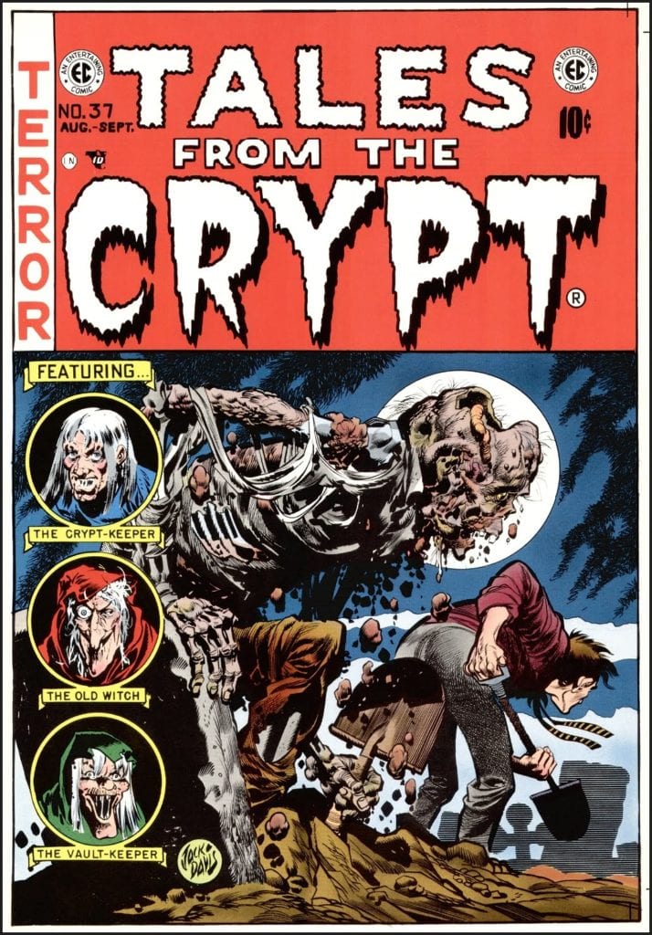
The earliest horror comics, often found in pulp strips and publications such as Eerie Comics and Tales From the Crypt, used a combination of the descriptive narration common to the era as well as the talent of the artists of that period. The narrative style in those comics was similar to that heard on radio shows of the time, but often without the bloated description, since the artist was performing much of that work. The illustrations within the panels would be bolstered by the writer’s adrenaline-inducing speech and narration bubbles that expanded upon the terror on the panel. Much of this narration is the lens from which the characters in the story are viewing the events, which in effect pulls the reader into that character’s perspective and has them feeling the full effect of the creators’ sadistic intent. This technique is still commonly used today, as it’s one of the easiest ways to get a reader immersed in a comic story. Think of it as a POV shot in a film. However, in the era of these early horror comics, film was still a relatively new medium, and comics were more plentiful and easier to obtain. The horror genre itself in popular culture was new as well, and these early comics made a shockwave in the entertainment industry and the minds of the collective consciousness for decades to come.
As decades have passed, censors have risen and fallen, and entire generations of comic storytellers have delivered their styles to the medium, it’s a bit off how horror comics have held onto their old conventions while still moving forward. Much like films, the longer the medium has existed, the more concepts and methods have been introduced with changing times. What’s so special about comics however when compared to film however is that, aside from their obvious differences as respective mediums, comics are less restricted than films are in terms of censorship. They took a bad hit when the Comic Code Authority came to power during the 1950’s and 60’s, a move that stifled the storytelling potential of horror, science fiction, and basically any non-superhero comic around at the time. However, this also forced creators to become more clever in how they presented their work. While they couldn’t be too forward with obvious gore, imagery, or subject matter, the writers and artists of horror comics in this period had to find subtle ways of getting their messages of terror across without setting off the censor’s alarms. Thus the art of “less is more” in horror comics was born. While grotesque and shocking imagery is certainly always fun, much of what makes horror scary is what the audience has to imagine. This approach works to the advantage that the comic medium uses which no other comic has, a mechanic that is wholly unique to comics and graphic novels: the page turn.
You’ve seen it before, or had it happen to you. The sense of tension in a scene or sequence builds along with the panels, alluding to a horror that has yet to be seen. The characters on the page then suddenly look off-panel towards something hidden on the other side of the paper, so you turn the page and –
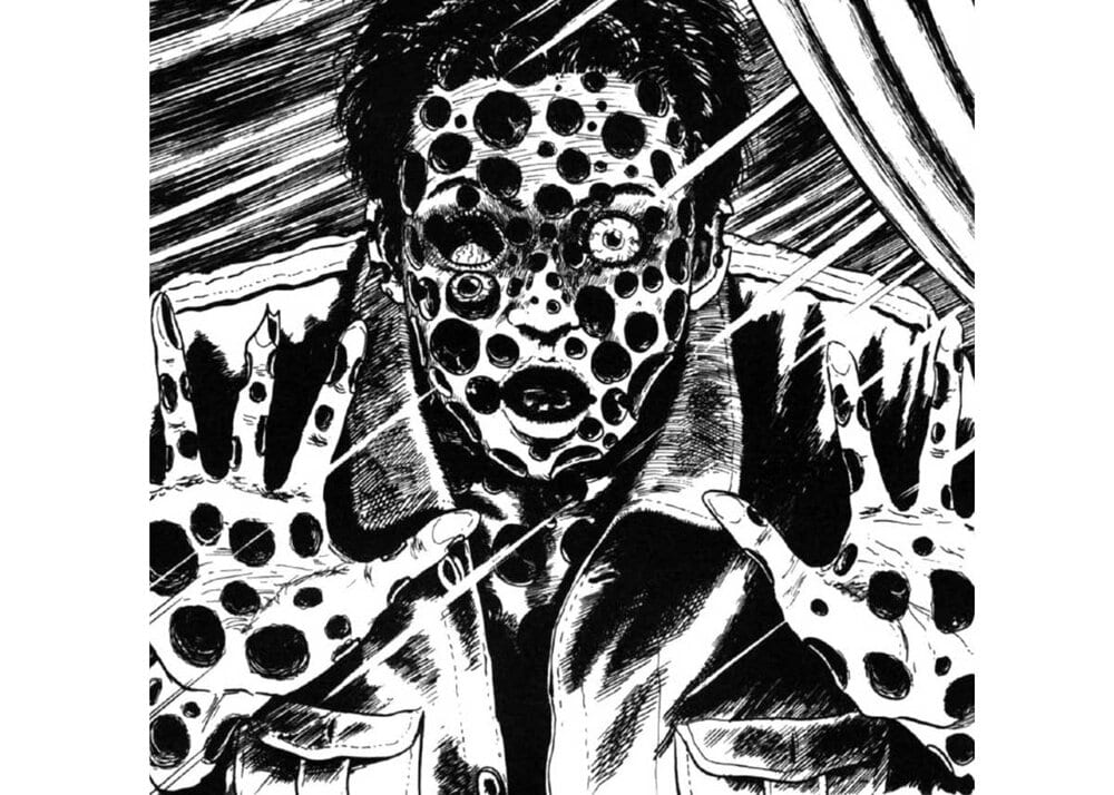
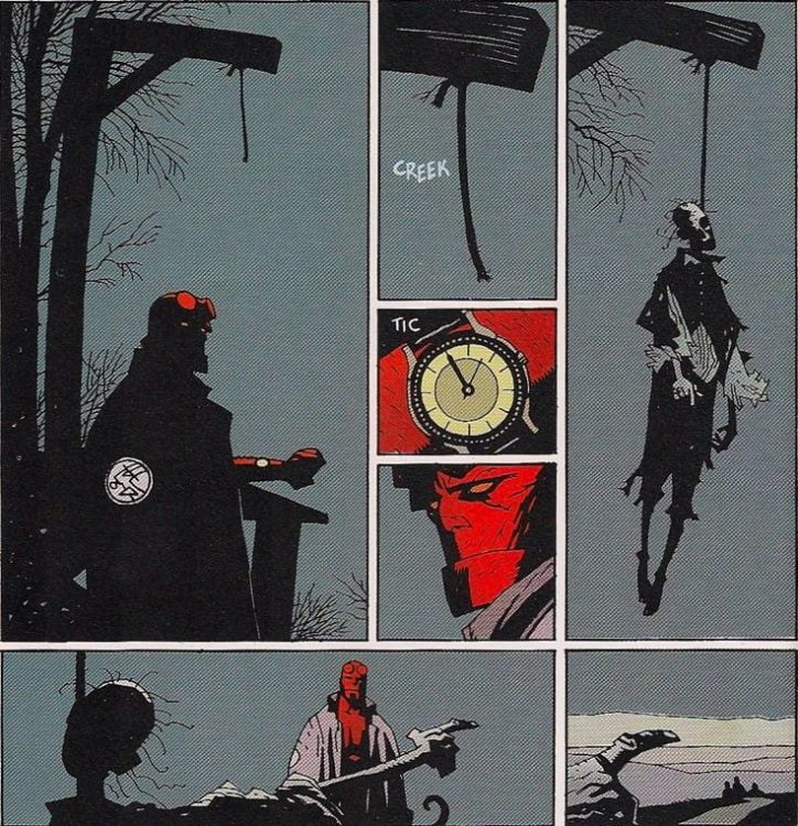
There’s a shock or rush that follows a great turn of the page scare or reveal that just can’t be done by films or prose. What makes it so effective is that you, the reader, do it to yourself. A film can be paused, or you can close your eyes before you reach a scare, but that undermines the medium. The director doesn’t intend for a film to be paused interrupted beyond its normal runtime. A novel’s frights creep up as the reader comprehends the words written on a page, making the reaction more of a slow burn rather than a jolt. A scare from a comic only happens because the reader makes it happen. Whether it be a slow build or a sudden spook, the reader guides their own experience through a comic or graphic novel, subconsciously picking how much time they spend on each page, panel, and image. The reader leads themselves through the climactic moments of a comic, and in a great horror comic they just so happen to scare the hell out of themselves in the process. Page-turn reveals are a common ploy in all of comics, used for delivering huge plot twists or breathtaking visual climaxes. The likes of Bernie Wrightson, Mike Mignola, Junji Ito, and many other brilliant creators have utilized this tactic for darker purposes.
Since the golden age, horror comics have covered every genre of horror imaginable; from slashers to monster tales, to supernatural terrors and unfathomable cosmic horror (a subgenre film consistently struggles with). This medium’s nature as a hybrid of written and visual storytelling, combined with the general creative freedom writers and artists are given with their work, makes for a seemingly endless wellspring of terrifying concepts to be explored. The vast amount of writers with varying influences and styles of plot deliver, along with artists all with completely different visual approaches, makes opening new horror comics an unexpected experience with each new series. The best horror, as with most genres, sets a foot in reality with commentary on events and situations in our own lives; from familial drama to socio-political commentary. Our current turbulent situation has made for a hotbed of poignant horror with something to say. With horror seemingly becoming more and more popular all the time, and with the comics medium itself seeing more success thanks to collected edition sales, there’s no telling what terrors the brilliant creatives who craft this genre will come up with on the next turn of the page.
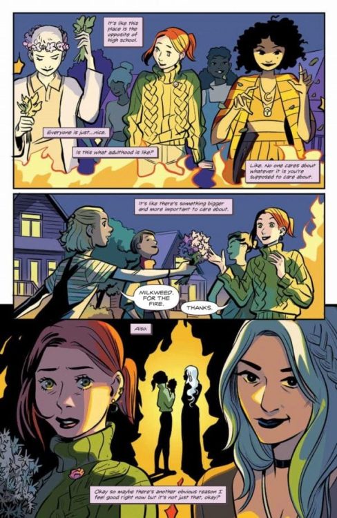
Available now, writer Mariko Tamaki and illustrator Natacha Bustos begin to unravel their magical web in Buffy the Vampire Slayer: Willow #4. Featuring colors by Eleanora Bruni and lettering by Jodi Wynne, this penultimate issue in the limited series gives us the action we’ve all been waiting for.
One might think issue four is the perfect time to jump into some climactic action immediately. But again, mirroring Willow’s experience, we’re lulled into a false sense of security. The creative team does this by providing more interiority through narration, using more dialogue, and emphasizing moments.
In previous issues, Tamaki and Bustos have subtly manipulated us in the same way Aelara has manipulated Willow. I felt quite foolish when I reread the previous issues and realized just how much of the story had already been foreshadowed from the first issue. For example, when Aelara and Willow first met, Willow had a flashback to the Hellmouth events as soon as Aelara approached. If you’re like me, you may not have thought Aelara the cause of the flashback. After all, at this time, Willow didn’t know the extent of her power and struggled to control it. The flashback could have been a surge of power or simply psychological.
How Touching
However, there have been multiple moments like this first encounter. Recall in issue three when Aelara demonstrated how power flows through everything in Abhainn. She took Willow’s hand and touched it to the tree. Willow then transported herself and Aelara to a memory of Xander. This moment of touch directly mirrors their first encounter in composition.
WILLOW FEELS FULLY INTEGRATED INTO THE ABHAINN COMMUNITY.
In issue four, the hand touching recurs inside a visual metaphor. The comfortable sweater Willow bought in the first issue has a loose thread. Aelara takes Willow’s hand and offers to fix the loose thread. Given Willow’s growing suspicion of Abhainn from the previous issue, the loose thread in this scene stands in for that suspicion which Aelara must rein in. It’s here where the manipulation became clear to me—and the moment when I felt betrayed by Aelara, whom I, like Willow, had trusted despite the red flags.
Moreover, Jodi Wynne’s FX lettering lends a sense of alarm to the issue. Every little noise is pointed out, seemingly disrupting the comfortable, delusional silence Willow has been enjoying up until now.
Escape
Overall, there’s more urgency to this issue. In the first half of the issue, Bruni’s colors were warm and almost no shadow in terms of inks. Then, in the latter half, as Willow and the character who is probably Tara planned their escape, the colors got colder and the shadows harsh. These choices, paired with the sound effects, contribute to the dread and increasingly urgent need to escape Abhainn.
Buffy the Vampire Slayer: Willow #4 is the most exciting issue yet. Tamaki and her collaborators have taken us down a magical yellow brick road. Now all that’s left is facing the woman behind the curtain.
Norse Mythology #2, out November 4th from Dark Horse Comics, is another issue retelling classic tales complemented by some breathtaking art.
“Norse Mythology #2″ Story
The choice of story for Norse Mythology #2 is clever for an issue so early in the series. The issue features many of the most popular Norse gods, including Thor, Loki, and Odin. By centering the issue around characters such as this, Neil Gaiman and P. Craig Russell can immerse new readers into the world of Norse mythology more easily. Readers who may not be well-versed in Norse myths are certainly still aware of most of the characters featured in this issue. They may not be familiar with the story, but they are with the gods, so the issue intrigues them as they attempt to learn more about such iconic characters.
Russell does an astounding job of adapting Gaiman’s novel, making the words of the novel transition seamlessly to the medium of comic books. Russell does this in Norse Mythology #2 by splitting sentences into fragments across multiple panels. This can be used to make sure a panel isn’t too word-heavy, but the main reason Russell uses this method is to allow the artist to make illustrations that don’t occur in the scene. When a character has a long sentence describing the many attributes of an object or place, splitting the sentence over many panels allows the artists to show the reader exactly what the character is describing. The story in this issue also has much of the plot occurring in one setting, so by having these panels that aren’t happening in the same place, there is more variety in location.
Art
Once again, Jerry Ordway presents extraordinary art to go along with the classic tales. Norse Mythology #2 features some easily readable facial expressions that make all the characters seem alive. Whether someone is expressing arrogance or genuine fear, Ordway can recreate expressions on characters’ faces like no other. Ordway also puts incredible amounts of detail into his art. Even if a panel is small and usually glanced over, he puts time and effort to assure his art looks phenomenal. One particular panel in this issue, which showcased a boat upon the water, had some of the most complex waves I had ever seen in a drawing. On nearly every page of Norse Mythology #2, Ordway is sure to amaze you.
Lovern Kindzierski does great work in Norse Mythology #2. Even though the issue only has two main settings that it takes place in, Kindzierski gives each its own distinct tone, reflecting the nature of the scene. There is also a very nice variety in colors in Asgard, as the brighter colors that many Asgardians wear stand out against the cool colors of the buildings behind them.
The lettering of Galen Showman in Norse Mythology #2 is unlike that of many others. It is evident that Showman is unafraid to stray from the standard lettering practices found in most modern-day comic books, and it pays off immensely. Whether using unique fonts or arranging text interestingly, Showman’s unusual lettering style provides an enthralling experience for the reader.
Conclusion
Norse Mythology #2 is another delightful issue. Gaiman’s writing makes the issue so entertaining to read, and Russell adapts it perfectly. The work of Ordway and Kindzierski brings the words to life, and Showman’s lettering is the cherry on top of it all. If you are a fan of Norse Myths or even have the slightest interest in any of the characters from them, I would certainly recommend this issue.


 Smissen instills Future with some impressive visuals that provide background elements. Throughout the story, Murray has some episodes where she glimpses into her past. Sometimes they splinter like glass shards from a cracked helmet. This serves as a good metaphorical look into the world and how messed up it has become. The purple coloring of this episode is practically a warning sign of a hopeless situation that comes with some comfort. At least the views of her marriage to Kay suggest that latter part.


")