CHAMPIONS #3, available Wednesday from Marvel Comics, dives back into an event that still feels eerily similar, as all underage heroes are forced to make a choice. That, or face the repercussions from C.R.A.D.L.E.
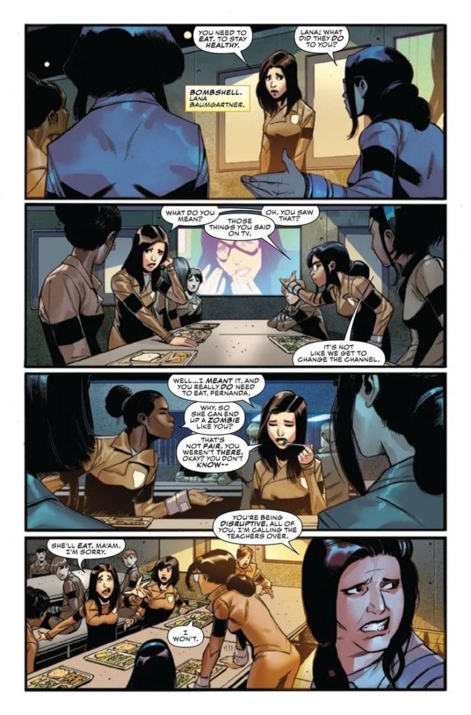
Bombshell is clearly having a difficult time here.
Thanks to the events of Outlawed, and C.R.A.D.L.E.’s growing support, the Champions are on the run. That is, some of the Champions are on the run – those who haven’t already been captured. In reality, this applies to any other underage hero out there.
It’s an event that feels eerily similar to that of the Superhuman Registration Act. Something that was almost certainly done with intention. After all, how could any agency possibly know the ages of the heroes they’re targeting, as most have secret identities? This feels like yet another excuse to harvest names and take control over those with power.
That is something openly discussed in Champions #3, as it should be. From the looks of things, it’s going to get quite a bit darker and dangerous before it gets better. All while history repeats itself.
Meanwhile, Snowguard, Starling, and Locust seem to having a…different reaction.
The Writing
Champions #3 is a rough issue to read, and it has nothing to do with writing quality. It is merely tough to see such a situation occurring – once again, at that. There are many parallels that can be drawn here, between the comics and the real world.
A fact that Eve L. Ewing likely wrote in with intention. It adds a raw element to the plot, as do the emotions and conflict portrayed on many of the characters within this issue. The Champions we all know and love have changed so much over the years, and this issue went a long way in showing the reasons why.
This issue is largely split into three parts. Those heroes who are in detention centers (sorry, reeducation camps), one group of young heroes that is on the run, and one solo hero trying to find herself after everything she has been through.
It’s fascinating to see how these three stories connect, albeit sometimes more than a little harrowing. It’s creating a powerful tale, with no shortage of emotion and impact. A fact that couldn’t be more true after that dramatic conclusion. Is anyone else counting down the days until Champions #4 drops?
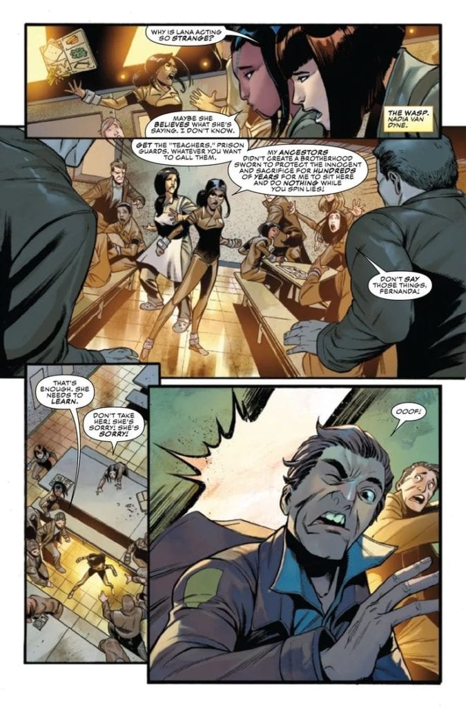
This isn’t going to be good…
The Art
As one might imagine, the artwork in Champions #3 is complex and fully capable of showy the variety of emotions that our characters are experiencing. There’s no doubting how broken up some of the captured heroes are, or how exhausted those on the run are. Not to mention dozens of other details.
Bob Quinn’s art is the basis for this issue, bringing over a dozen named characters to life, with little to no need to label any of them (though most do come with a courtesy label as well – nice touch). The dramatic changes in scenery is yet another impressive example from this issue, quickly jumping from a facility to a farm, and then back to the city.
Federico Blee’s colors enhance each and every scene that Quinn drew. There’s on sunset, in particular, that is simply breathtaking. It’s almost ironic how beautiful it is, given how dark it gets in this issue. The light blooms in general are wonderfully done in this issue, be it from a natural source, a bulb, or a power.
Finally, VC’s Clayton Cowles letters bring it all together. You can feel the exhaustion and exasperation coming off our young heroes. You can see the image and the damage caused. Most importantly, one sound effect and you can suddenly guess who is about to appear on the next page.
Locust is clearly done staying quiet.
Conclusion
Champions #3 is going to be an issue that hits many fans right in the feels. The connections to the past, and to real life, just cannot be avoided. It makes this issue a difficult – yet vital – one to read, all while our heroes continue to fight for what is right.
Side note: I really recommend that readers looking into Champions right now also pick up Magnificent Ms. Marvel and Miles Morales: Spider-Man. As both series show different sides of the events currently going on.
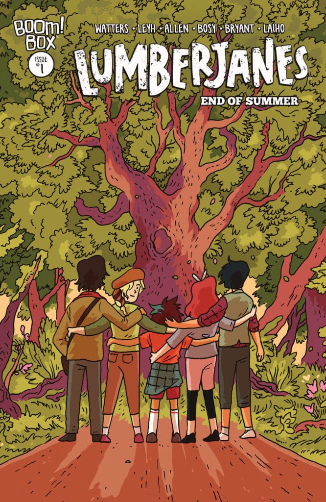
LUMBERJANES END OF SUMMER #1, available Wednesday from BOOM! Studios, brings with it the finale of a beloved series. Still, all good things must come to an end. Even summer camp and all the chaos it contains.
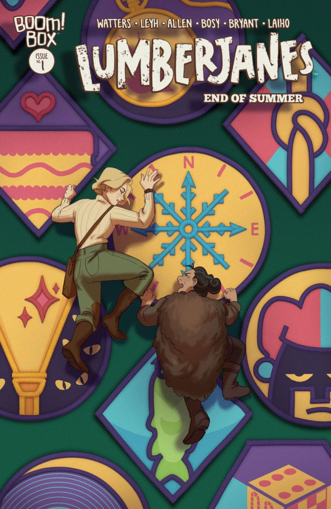
Two of the Lumberjanes veterans working together on this alternate cover.
This is a bittersweet moment for any and all fans of the Lumberjanes. The series is officially coming to an end here, with Lumberjanes End of Summer #1. That being said, it is certainly an ending that does the entire series – and the characters – justice.
More than that, it is always better to see a series conclude properly, than to see it canceled with little to no warning. On the bright side, this is a series that can easily be revisited by any fan, as it will always welcome them back.
The fact that the series will someday air on HBO will hopefully help to soothe any feelings of loss that the fans are dealing with. That and the endearing note included at the end of this issue, which may or may not make you tear up (hint: it will).
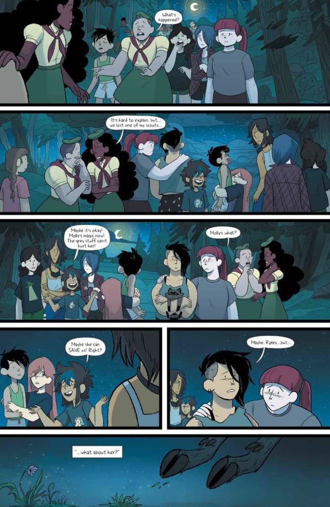
Lumberjanes End of Summer #1 is a whopping forty-eight pages, getting just a bit more time to wrap everything up with satisfaction. Our campers, their counselors, and all of the mystical friends they’ve made along the way.
These friends will always be close, especially after all they’ve been through.
The Writing
Lumberjanes End of Summer #1 was written by Shannon Watters and Kat Leyh and it is a whirlwind of an issue, to put it lightly. In many ways, this is an issue that brings the entire series full circle.
The Roanoke Cabin’s final adventure is possibly their biggest yet. At the very least, the stakes have never been higher. As such, there’s plenty of chaos, laughter, and rampant emotions bundled up into the narrative of this tale.
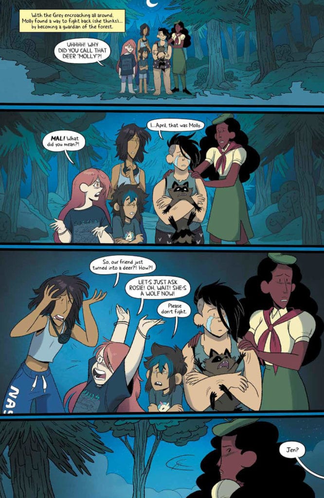
For a moment it almost seemed like Molly’s story was going to take dominance, but this series has always been balanced, and it didn’t take long for the rest of the Lumberjanes (not just Roanokes) to join into the fray.
It was a delight to read, raising hopes, spirits, and so much more before it came to the end. Throw in the excuse to laugh here and there (a feat that only little Ripley could pull off), and it all makes for a memorable conclusion.
A memorable conclusion worthy of this series. While most fans would never have chosen to say goodbye to this series, I can at least honestly say that this is one of the best goodbyes possible. That is something I can’t complain about.
It is also an ending that encourages fans to go back to the beginning and read it all over again. Not because it felt lacking – but because of how tightly it ties back to those very first plot arcs. It’s really quite clever, and leaves everything on a positive note.
Even for the Lumberjanes, having your friend (and girlfriend, in Mal’s case) run off and turn into a deer is…something worth getting worked up about.
The Art
There is no shortage of artists involved in Lumberjanes End of Summer #1. Brooklyn Allen (layouts), Alexa Bosy (art), Kanesha C. Bryant (art), Maarta Laiho (colors), and Aubrey Aiese (letters) all worked together to bring this amazingly spirited issue to fruition.
It’s a colorful and chaotic mess – and I mean that in the best of ways. Lumberjanes has always been full of vibrant colors and characters, running around and causing no end of adventures. All of that is captured in this single issue, as every camper and found friend works together against a common foe.
A common foe that stands out quite spectacularly, thanks to its complete lack of color. Another clever little twist from this series. On the polar opposite of that scale is the appearance of another old friend, one who couldn’t be more colorful if they tried.
All of these elements work together to bring about a look that is classically Lumberjanes. Every little detail, from the wardrobe to the characters, and even the way they react to new challenges. It all resonates, both with the characters, and with the readers.
Do you think Molly can do it? Can she save the day?
Conclusion
Lumberjanes End of Summer #1 is a heartwarming conclusion to a series full of spirit, acceptance, and adventure. This is a conclusion that the fans deserved, though it came with plenty of twists and surprises to keep everyone entertained. All while bringing the story full circle. In the Lumberjanes way, of course.
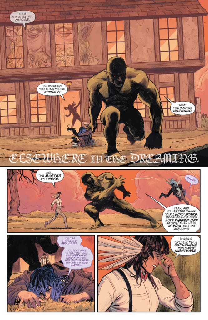
Writer G. Willow Wilson and artist Nick Robles continue their outstanding Sandman Universe saga with “The Dreaming: The Waking Hours” #5. Along with Mat Lopes on colors and Simon Bowland on letters, this issue resolves the series’s first major arc with relatable and emotional revelations as well as character developments that will no doubt be fascinating to read about in coming issues. With yet again incredible visuals from Robles and Lopes, this is yet another outstanding comic book from one of the most talented creative teams in the industry right now.
“After his escape to the waking world went terribly awry, Ruin finds himself face to face with his creator, Dream…and Dream is not happy. Is there any force in this world that could stop him from unmaking his most unpredictable creation?”
Writing & Plot
Every issue of “The Dreaming: The Waking Hours” that G. Willow Wilson has penned thus far has been, much like the original Sandman, an engrossing mix of relatable human character drama and wildly imaginative and intelligent mysticism. This issue ends the introductory arc with Lindy and her infant’s unintentional run-in with the denizens of the Dreaming in an emotionally meaningful way. This series thus far has been, among other things, an internal journey for both struggling single mother Lindy and the lovesick nightmare that is Ruin. While Lindy’s time with the assorted identities of Shakespeare does come to a rather abrupt conclusion, it ends in a way that still feels right from Sandman’s ever-present literary standpoint. The conclusion of Ruin’s introduction and his search for love and meaning is a stroke of brilliance for Wilson as a character writer and someone putting her stamp on this universe. Not only is Ruin a great new character that is near impossible not to love, but Wilson also understands Dream himself as a complicated being with his own sense of humanity. As always, the dialogue is naturalistic and engrossing. The pacing in this issue is a bit rushed at points compared to prior issues, but the conclusions that Wilson comes to still feel right and climactic. This is another fantastically written issue for this series and another great installment of Sandman universe storytelling.
Art Direction
I could never possibly run out of praise for Nick Robles’s work, and that still proves to be true on The Waking Hours #5. The dynamic animations and never-ending range of stylistic variety in terms of environments and characters – human and other – that Robles brings to the Sandman universe is some of the best seen in the franchise’s history. Getting lost in this world is an impossibly easy task thanks to how Robles’s pencils create such vivid detail and brilliantly designed characters. Not only are his pencils great, but his visual direction is just as inventive. In true Sandman fashion, panels run into each other or disappear altogether for the sake of how the Dreaming and its reality-shedding story often works. Robles – and the story at large – is aided by the astonishing colors of Mat Lopes. The sheer amount of variety in the shades and tones used by Lopes within the pencil lines is beyond impressive, but also the way the colors match and create the emotional tones of each panel is the work of an artistic expert. The visual experience crafted by these two artists work hand in hand to perfectly deliver this comic’s incredible visual experience. The letters from Simon Bowland are a modern touch on the classic Sandman lettering style; a classical yet contemporary aesthetic with each character having their own slightly different font. Once again, this series is gifted with an incredible art team that delivers perfect results week in and week out.
“The Dreaming: The Waking Hours” #5 is an emotionally sweet and beautiful ending to this series’s opening story arc. While this script feels a bit more rushed that the prior issues thus far, the story still feels complete and the character revelations are all earned. The visuals are once again beyond striking, making this one of the most gorgeous comics on shelves right now. Be sure to grab this latest issue from your local comic shop when it hits shelves on 12/1!
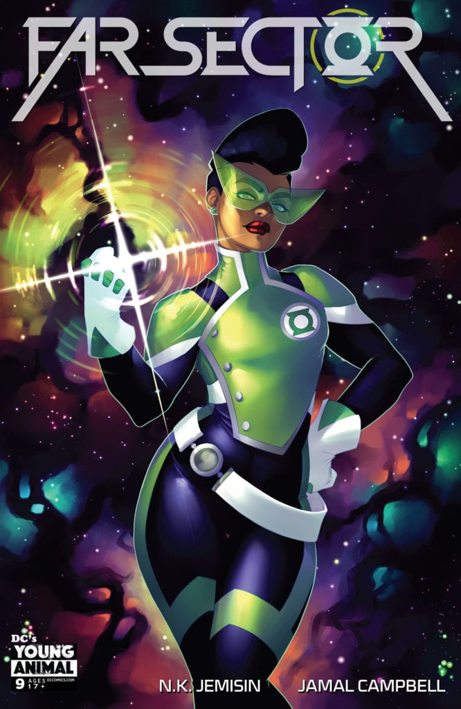
From Writer N.K. Jemisin and artist Jamal Campbell comes another chapter of DC’s surprise hit with Far Sector #9. While this issue is comparatively uneventful compared to the drama and action of most of the other chapters, this is still 22 pages of insightful and effective narrative combined with more of Campbell’s absolutely astounding artwork. With letters from Deron Bennett, this is still a great read that sets up the next intense arc for this series.
“Jo’s investigation into the conspiracy at the heart of the City Enduring takes her to Platform Solid Ground, an alien farmland where most of the City’s food comes from. But what the headstrong Green Lantern discovers there shakes even her to the core as Far Sector’s thrilling threads of murder and machinations build to a fever pitch.”
Writing & Plot
N.K. Jemisin has been known to pack massive amounts of story into every 22-page issue of Far Sector without anything ever feeling too slow or unnecessary. In this ninth issue, it’s interesting to see that she has decided to write a chapter that feels almost like a recap of sorts. This issue isn’t as exciting or eventful as the others (despite it’s disturbing final page revelation) because it goes back over many of the concepts we already understand while revealing new ones through conversational dialogue. This isn’t even a bad thing really, as Jemisin’s direction with the plot and her dialogue abilities make the issue still delightfully entertaining. Her decision to make this issue a stepping stone from the last arc to the next has me (and should have you) excited and intrigued at what she has in store for her finale. The socio-political concepts she tends to focus on are still here, but still read as if they are a fresh wound. Seeing the issues and plight of lower-class citizens on the City Enduring, as well as coming to understand the upper-crest’s absurd political system, is uncomfortably timely. Jemisin packs in a ton of relevant story and packages it with a continually compelling character arc.
Art Direction
In all honesty, what more can be said about Jamall Campbell’s artwork? His work here on Far Sector #9 is as stunning as always, full of spectacularly animated characters and stunning sci-fi visuals. This issue’s focus on character drama and investigation draws away from Campbell’s visual action choreography and more towards his ability to focus on person-to-person interactions. This issue is largely comprised of shot/reverse shot or reaction shot panels that build the story through the character lens. Campbell’s precise digital art style is perfect for this sort of space opera/noir tale, as the characters and environments bleed with color and imagination on every page. The lettering from Deron Bennett is modern and classy, using as clean font in the speech bubbles while being inventive (but not over the top) on the special effects. This is once again a brilliantly put together piece of visual storytelling.
Far Sector #9 may be a bit of a dull issue compared to its predecessors, but it’s still a completely effective piece of character storytelling and pointed political commentary. N.K. Jemisin pens a script that focuses in on what she wants this story to ultimately be about while setting up the next major arc. Jamal Campbell once again draws an immaculate sci-fi world with a variety of stunning alien life and vivid colors. This has been one of DC’s best comics of the past year, and it’s absolutely worth the pickup when it hits the stands at your local comic shop on 12/1!
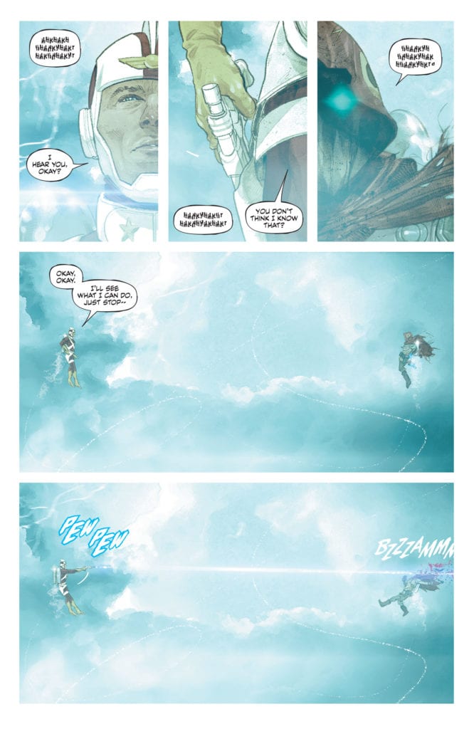
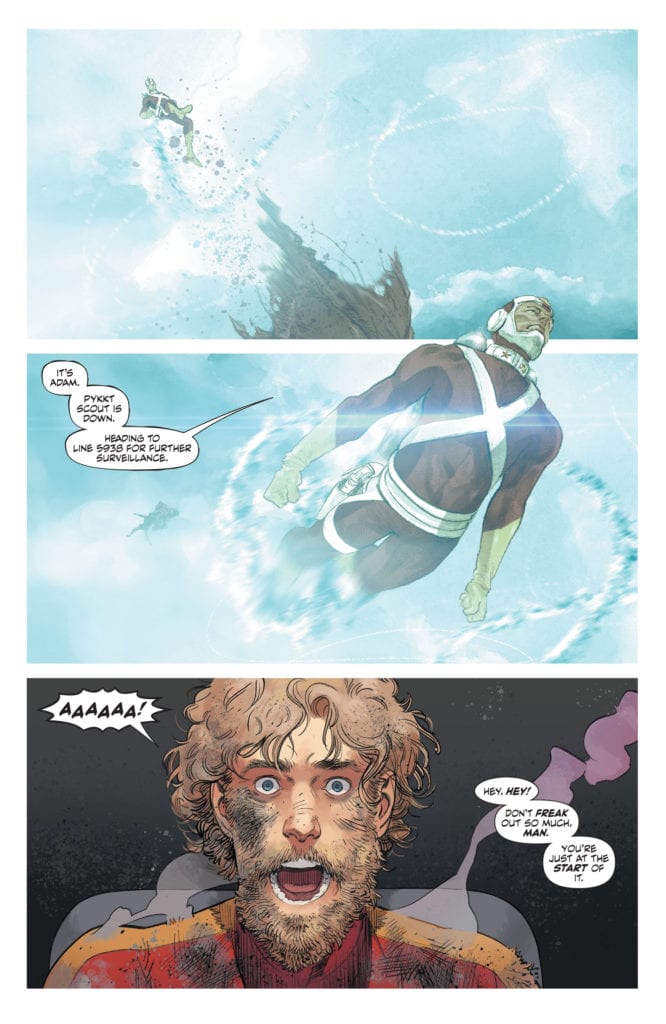
Usually, for a Strange Adventure review, I would write this in two parts: one section discussing the storyline of Adam’s book, the other showing the modern-day investigation into his actions. But DC Comics’ Strange Adventures #7is hard to get specific about. Not because it’s not brilliant. Writer Tom King, artists Mitch Gerads and Evan “Doc” Shaner, and letterer Clayton Cowles have delivered one of their strongest issues to date. It’s just so potentially spoiler-y. So to avoid ruining a magnificent issue, I’m going to keep this a little briefer than usual.
Writing
King makes us question everything from the first panel. Do we even know Adam Strange at all? King switches us back and forth between scenes of Adam staving off a new Pykkt invasion, to scenes of him being captured in an invasion gone by. His casual brutality begins bubbling to the surface. We begin to wonder if he’s even a hero. In fact, he seems to look down on superheroes. They can’t get their hands dirty like he can. We’re seeing a new Adam. An Adam that will do anything to get the job done. King’s scenes of Adam’s past with the Pykkts brilliantly creates a terrifying origin for this rage. It shows us the turmoil that’s turned now to violence, and it gives us more than enough reason to worry.
Art
Gerads and Shaner, in some ways, switch approaches in this chapter. Where Gerads once held the ground in the gritty and dirty, Shaner now stakes his claim. In fact, Gerads’ scenes are often disturbingly clean. There’s a war going on, but Alanna and Adam’s indifference to it all is shown visibly in scenes that look completely calm. Shaner, on the other hand, pulls out all the gritty, grimey, timey wimey stops. This change is most noticeable in a simple scene of Adam and one of his captors looking out a window. They’re silhouettes against the light. In any other chapter, Shaner would have their backs shown as a solid black. But here, we can actually see the pen strokes. It brings a grittiness and realism in that’s like sugar in a gas tank. Can the clean world Adam has created in his book deal with an encroaching reality, or will it crumble around him?
Coloring
A lot of the disturbing calm in Gerads’ scenes comes from his coloring. It’s a soft color palette. Gentle blues and greens, hints of orange. It feels serene, except for the occasional red burst of blood. There’s a sense of comfort in these scenes that makes us feel as though Alanna and Adam feel more at peace when they’re at war. Shaner’s colors are hypnotic and disturbing. He has brilliant rainbows of color spread out across his panels. It would be beautiful and mesmerizing, if it weren’t in scenes of violence and torture. Shaner invites us into the unraveling mind of Adam Strange. He gets us to feel the beauty of letting go and slaps us in the face with the harsh dullness of reality.
Lettering
There are so many opportunities in this issue for big sound effects. But as Adam gets zapped from place to place, no letters accompany him, except the sound of his own screaming. When Alanna stamps out a cigarette, or Batman takes a punch, there’s nothing. Cowles strips the lettering back to its essentials, and the sounds that stay jump off the page. The three panels, two with a “pew pew” and one with a heart-stopping “snap,” that have sound effects, stick with the reader vividly. Because that’s what Cowles does — he highlights the important. In a conversation with Alanna, Adam lays out his heart in a tumbling dialogue. But Cowles separates one thought from the rest. He spaces out the stacked bubbles on either side of the line “I thought I was crazy.” Those three panels and that one line are the core and soul of this issue.
DC Comics’ Strange Adventures #7 is wonderfully complicated. This creative team is upping the stakes as we pass the midway mark, promising with each new issue a conclusion that will blow us away. Pick this issue up, out from DC Comics December 1st, at a comic shop near you!
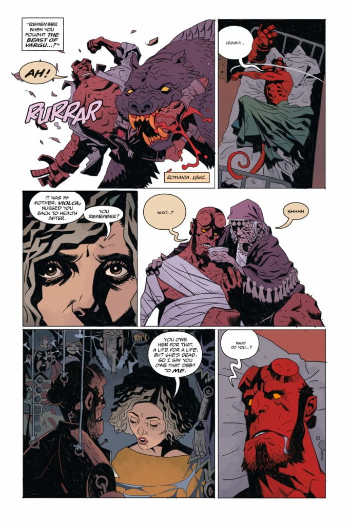
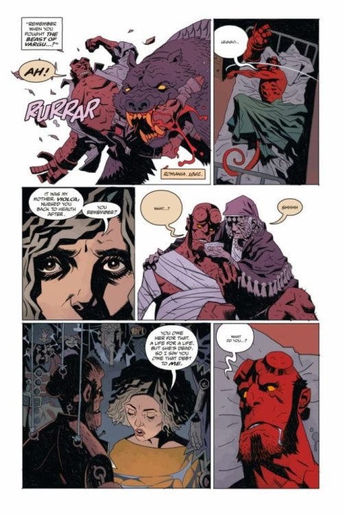
Writer Mike Mignola, artist Tiernen Trevallion, colorist Dave Stewart, and letterer Clem Robins come together to bring us Dark Horse’s Hellboy and the BPRD: Her Fatal Hour, a two-part issue about looking monsters right in the eye and yawning. “Her Fatal Hour” and “The Sending” show the sheer skill of the BPRD. These kinds of cases are just another day to them.
Writing
Mignola shows us just how used to this world his characters are. Hellboy, fighting a monster off of a girl, encounters a ghost at one point. “Save her,” the ghost says. Hellboy isn’t phased. “Workin’ on it,” he says before diving back into the mayhem. This is the heart of a lot of Mignola’s charm. He downplays the moments other writers would be tempted to overdo. Yet Mignola does overplay one moment.
Two BPRD agents stand outside of Hellboy’s room as he is “tossing and turning in his sleep.” What he’s really doing is fighting a monster. The entire sequence seems to take a while. Hellboy catches up with an old friend before the fight even starts. These BPRD agents apparently spend the whole time outside Hellboy’s door. It’s an odd moment where Mignola lets himself get a little too enraptured by his own character. It’s one of the extremely rare examples of Mignola lacking a touch of subtlety. Something he more than makes up for elsewhere in the script.
Art
Trevallion strikes a careful balance in approaches when creating this work. He pulls from both Mignola’s minimalism and Duncan Fegredo’s attention to detail. Some scenes, like Hellboy’s room, Trevallion adds in all the right details. A “High Noon” poster on the wall, dirty plates and empty cans on the floor. Other times, Trevallion pulls back. When one character holds their dying mother, Trevallion removes all signs of a background. It’s the two characters, alone against a blank white space. This makes the moment feel like nothing exists outside of it. It’s sad, it’s lonely, and it’s all we need to see to feel what Trevallion is communicating.
Coloring
Stewart creates such a calming feel throughout these panels. When no one is fighting, you can visibly see the safety in the gentle colors. When Stewart is coloring flashback scenes, he uses a dark purple color palette. At first glance, this looks almost calming. It’s as though all the events are happening in a kind of twilight. But as the flashback scenes progress, Stewart shows us that the “twilight” is a warning of the coming darkness. A bold red panel shocks the reader back to reality, reminding them that the stakes are rising.
Lettering
Robins also brings a lot of the “wake up calls” into each fight scene. The bright blue of the “SMAASH” or the pink “THUD” make the scenes feel full of action. At one point, when a ghost zooms into the room, Robins places the “AAAAAAAAAAAAAA” noise it’s making behind all the characters. This makes the noise feel like it goes on forever. Like it envelops the room. So later, when Hellboy grabs the ghost and the “AAAAA” is shown lower and in front of the ghost, it feels like there has been a shift in the dynamic. It’s these subtle differences that Robins uses to show who has the upper hand.
This issue is about drinking whiskey in the aftermath of a monster fight. It’s about shopping for books on a page strewn floor of the site of a ghost attack. This creative team wants to show us just how normal goblins and ghouls are to the BPRD. Dark Horse’s Hellboy and the BPRD: Her Fatal Hour is out December 2nd at a comic book shop near you. Pick it up there and also catch our own exclusive interview with this issue’s artist, the brilliant Tiernen Trevallion, here!
Hellboy and the BPRD: Her Fatal Hour, written by Mike Mignola, with art by Tiernen Trevallion, colors by Dave Stewart, and letters by Clem Robins, hits your local comic book shop this week. Thanks to the great people at Dark Horse Comics and Superfan Promotions, Monkeys Fighting Robots got a chance to talk to Trevallion about the upcoming two-parter.
About the Issue: Master of horror Mike Mignola is joined by artist extraordinaire Tiernen Trevallion and award-winning colorist Dave Stewart to bring you the follow-up to smash Hellboy hit ”The Beast of Vargu”!
1 of 7
Monkeys Fighting Robots: What about “Her Fatal Hour” and “The Sending” makes these great companion pieces to one another? What through lines do you see that thematically link them and lead to you and Mignola releasing them together?
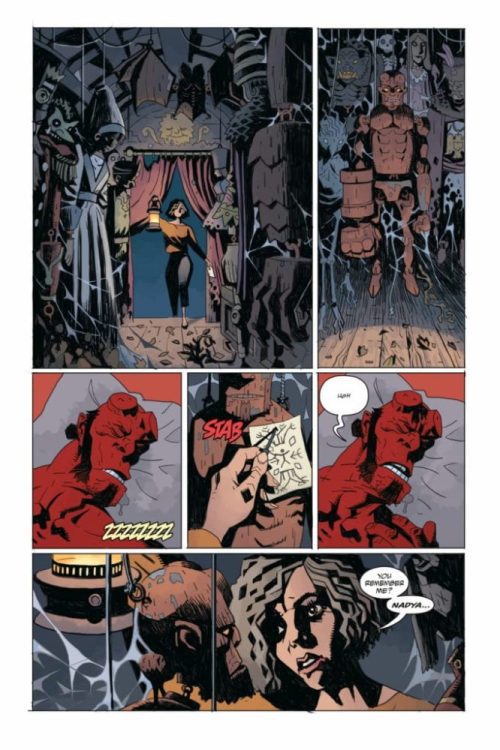
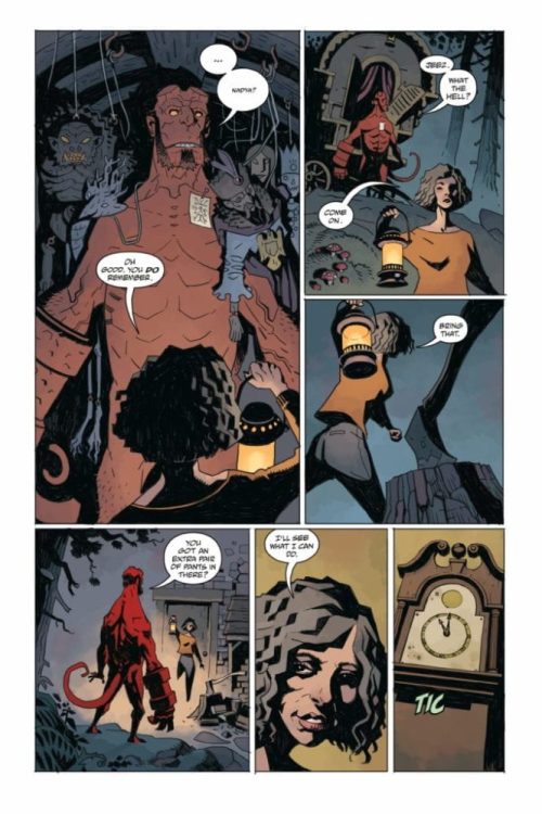
Tiernen Trevallion: That decision was entirely Mike Mignola’s. Both stories deal with old friends; both Nadia and in particular Harry Middleton are significant to Hellboy. There is, if you like, a theme of a distant outside influence, of manipulation from afar. One instance is the solution to the story, and one is the cause.
MFR: Your art style feels like such a perfect balance of Mignola’s minimalism and Duncan Fegredo’s (artist of “The Beast of Vargu”) more detailed approach. Some panels you draw with lots of details, like Hellboy’s room with the High Noon poster, and then other panels you remove the background altogether, like the women in the church. What factors lead you to choose one approach over the other as you went through?
TT: Thanks for that, I’m also a huge fan of Duncan Fegredo’s work. What I’m usually trying to do is focus. I’m asking the reader to concentrate on certain elements. With the women in the church, this is a poignant moment, so I’m attempting to emulate the feeling of loss and vulnerability in the simplest way possible: by isolating them. With fight scenes, I usually avoid any background, or maybe just leave a suggestion, because the reader wants to see a dynamic punch-up, not get distracted by an interesting vase…unless the vase is getting broken in a pleasing way… Damn those vases…
MFR: There’s a brilliant casual atmosphere to these scenes. Nadya is drinking in front of the fire after a big fight scene; Harry is leafing through broken books on the floor elsewhere. How did you hone in on this aspect of the characters? And when did you know you kind of wanted them to be laid-back despite the horror going on around them?
TT: I think these guys have seen enough to make them not so much laid-back, but rather prepared for how to deal with the situation. Harry leafing through books on the floor came from the script; Mike suggested that Harry is looking around, but listening. I liked the idea of him being interested in not only the case, but also all the books spread everywhere. Again, that final scene with Nadia, that’s at Mike’s direction. A horrific chapter in her life has been closed.
MFR: Harry isn’t a character we’ve seen a lot of, but he has a lot of significance. He was a friend of Bruttenholm, and a big influence on Hellboy. How much of his voice did you feel like you pulled from earlier appearances, and how much did you feel like you brought out on the drawing board?
TT: I have to confess, I didn’t know much about Harry until I did this story. There are a few gaps, I fear, on my Mike Mignola/Hellboy shelf. I have of course caught up a little on Harry Middleton now, and I rather enjoyed drawing him. Nice old chap! I hope I did him justice.
Thanks again to Tiernen Trevallion for taking the time to give such great answers to our questions, and for the brilliant work put into HELLBOY AND THE BPRD: HER FATAL HOUR!
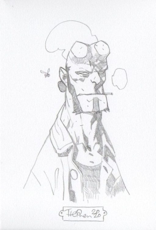
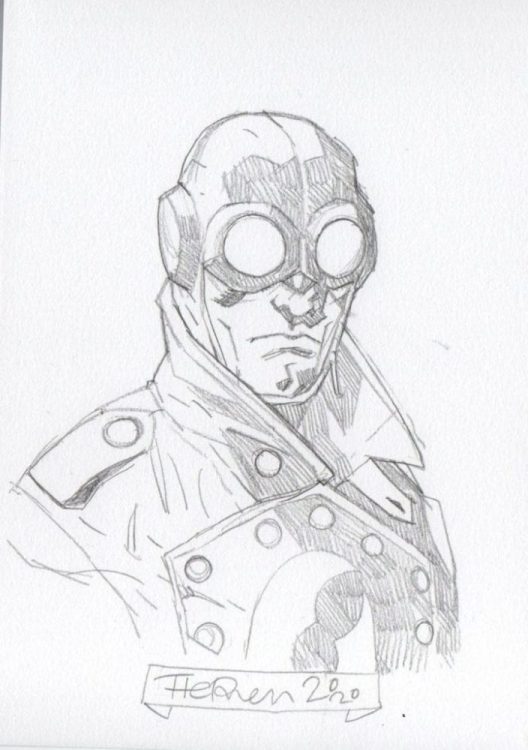
Trevallion is also currently selling limited edition giclee prints, signed and numbered, of this issue’s cover. Each print comes with an A5 sketch of something from the Mignolaverse. You can get ahold of these awesome prints and sketches on Tiernen Trevallion’s Facebook page. Below are some of the jaw-dropping sketches from his page:
1 of 3
Dark Horse’s Hellboy and the BPRD: Her Fatal Hour is out December 2nd at a comic shop near you! Pick it up, and keep an eye out for our upcoming review!
Director Shannon Kohli (Supergirl, The Magicians) makes her feature film debut with All Joking Aside, a comedy-drama starring Raylene Harewood (Supernatural, Legends of Tomorrow) as an up-and-coming comedian who befriends a comedian on the rocks.
Charlie (Raylene Harewood) is a smart young woman taking her first shot at stand up comedy. During her set before a sparse audience, Charlie meets Brian Markinson’s (Continuum) Bob, a grade-A heckler. In All Joking Aside, Charlie and Bob’s paths are destined to come together, and by the film’s end, it’s for the best for both of them. The pair form an odd-couple relationship that ends up telling a compelling and entertaining narrative.
PopAxiom spoke with Raylene Harewood about becoming an actor, doing stand-up comedy for All Joking Aside, and getting to play something evil.
The Goal
Raylene Harewood is originally from Winnipeg, Manitoba, Canada, and says, “Growing up, I had a lot of hobbies, and acting was one of them.”
“When I was around 16,” she continues, “I was in my first professional theatre show. I had this moment backstage where I thought, ‘Oh, my gosh if I don’t do this for the rest of my life, I will be so unfulfilled.’”
Raylene set her sights on studying acting. “I set my goal to get into a theatre school. I applied to a few and got into a few. I ended up choosing Studio 58 in Vancouver, and the rest is history.”
About All Joking Aside
Raylene’s filmography thus far includes the hit Fox-turned-Netflix show Lucifer, the undead detective series iZombie, and stints on Supernatural, Charmed, Legends of Tomorrow, and The Magicians. “I learned about the part while on the set of The Magicians,” she shares her road to starring in All Joking Aside, “[an episode] directed by Shannon Kholi. She pulled me aside one day and said she was doing a feature, and she thought I’d be great for the lead.”
Raylene auditioned and landed the role of Charlie, a stand-up comic in the making. “That was completely new for me. I was a huge stand-up fan before that. I love John Mulaney, Gary Gulman, but that was my first time doing it.”
Preparation is vital for success in just about anything. “I did one five-minute set a few weeks before doing the film,” Raylene says about her preparation to play Charlie. “That was one of the most terrifying experiences of my life.”
“I thought it was going to be an amateur night,” she continues, “but it turned out to be a night for experienced comics to test out new material. I was the only person who had never done it before.” No pressure.
“I wrote it myself,” Raylene says of the material she used in the five-minute set. “Stand-up is fun. I looked at it like a puzzle where you’re figuring out the best way to put words together to make people laugh.”
The stand-up moments in All Joking Aside are crucial to the way the narrative drives forward. “The main thing that we talked about in prep was mostly about getting me comfortable doing the stand-up.”
“We did a lot of me working the writing,” she adds, “especially because stand-up comedy is so personal. It’s tough to write it for someone else. So, that was a challenge, taking what’s written in the script and making it my own.”
“I can’t say I was totally comfortable,” Raylene laughs when asked about doing stand-up comedy. “I think it works for the character. The progression of where she started and where she ends makes sense.”
All Joking Aside was shot in and around New York City. “One of the tougher days was when we shot all the park scenes. It was very cold. Trying to get my mind off of the cold and on whatever I was doing was quite a challenge.”
“It was super-fun,” she says of her experience while making All Joking Aside. “I loved acting with Brian.”
Wrapping Up
Raylene’s wanted to be an actor since she was sixteen. Who’s inspired her along the way? “I’m going to say something now, but in three hours, I’ll think of something new. I will say Viola Davis is a huge inspiration to me. When I was younger, as a comedic actor, Raven-Symoné was a huge inspiration. She’s so funny in That’s So Raven. David Tenant is one of my favorite actors.”
“I want to play like a villain or something,” she says about future roles, “Cruella DeVille or something like that. Something really dramatic, evil, and glamorous.”
All Joking Aside is available in a digital store near you. “I’ve done a few made-for-TV movies this summer. One is called Cross Country Christmas and another called CranberryChristmas.”
Is All Joking Aside on your watch list?
Thanks to Raylene Harewood and October Coast
for making this interview possible.
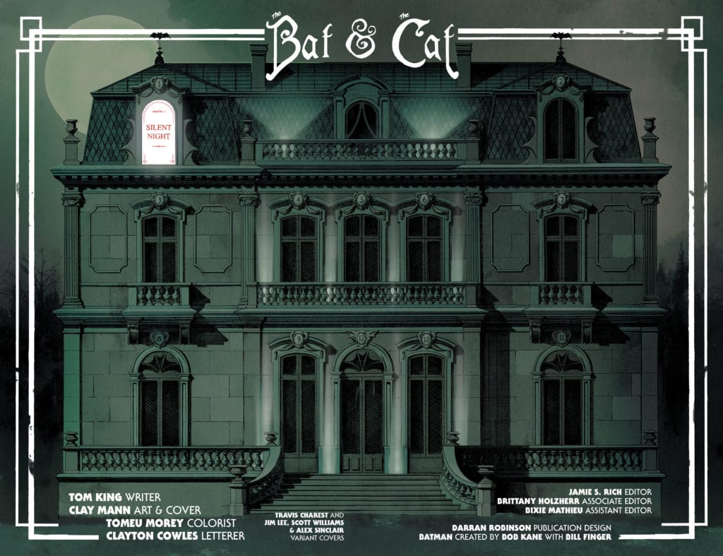
There’s something to be said for “romances” that plant themselves firmly in the realm of the platonic. Stories that discuss the connection between friends, not lovers. In some ways, these stories feel like they get at something deeper. They’re not just about mutual attraction and sexual chemistry. They’re about shared trauma, laughter, and the ability to let your guard down completely. So, DC Comics’ Batman/Catwoman #1 isn’t really about Batman and Catwoman. It’s a “romance” about the friendship, or at least the complicated relationship, between Catwoman and the Joker.
Writer Tom King, artist Clay Mann, colorist Tomeu Morey, and letterer Clayton Cowles push the titular relationship to the sidelines in their new series for DC Comics. They focus instead on the undeniable connection between Selina and her friend, colleague, and enemy, the Clown Prince of Crime.
Writing
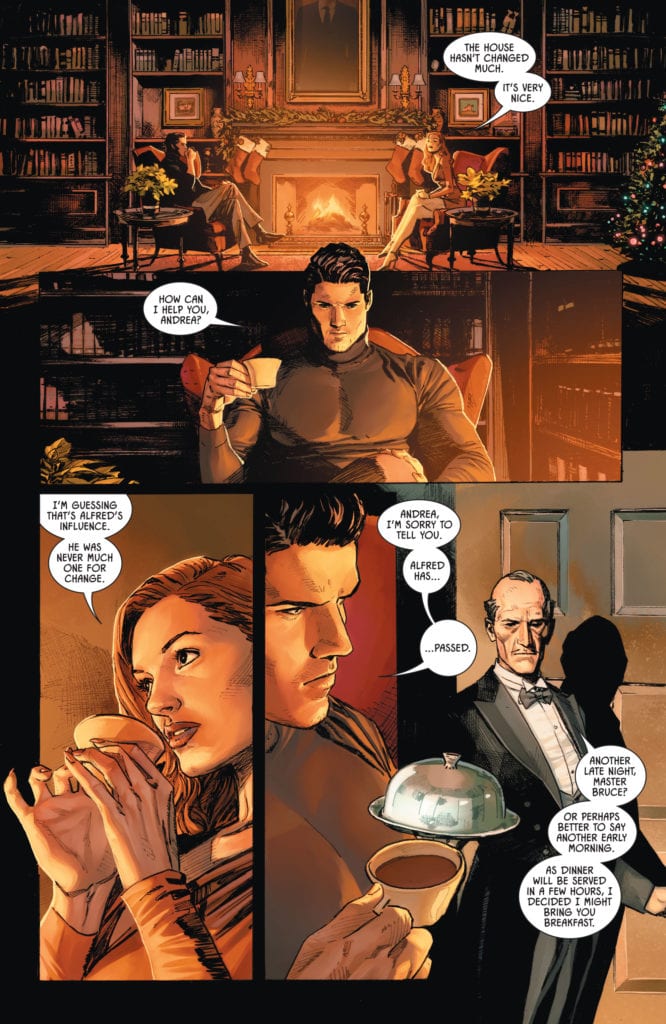
King isn’t focusing on the action in these pages. Deaths and fight scenes happen off-panel. We meet people who have somehow escaped death, but we don’t know how. Those moments don’t matter. They’re gaps we can fill in on our own. The moments that do matter to King are the quieter moments. King wants to talk about the aftermath of superheroism, the embarrassment that sets in after the adrenaline rush has subsided. And these are the scenes that count. We’ve seen the fistfights before; we know how they go. We haven’t seen Joker and Catwoman reminiscing on a rooftop as the sun rises.
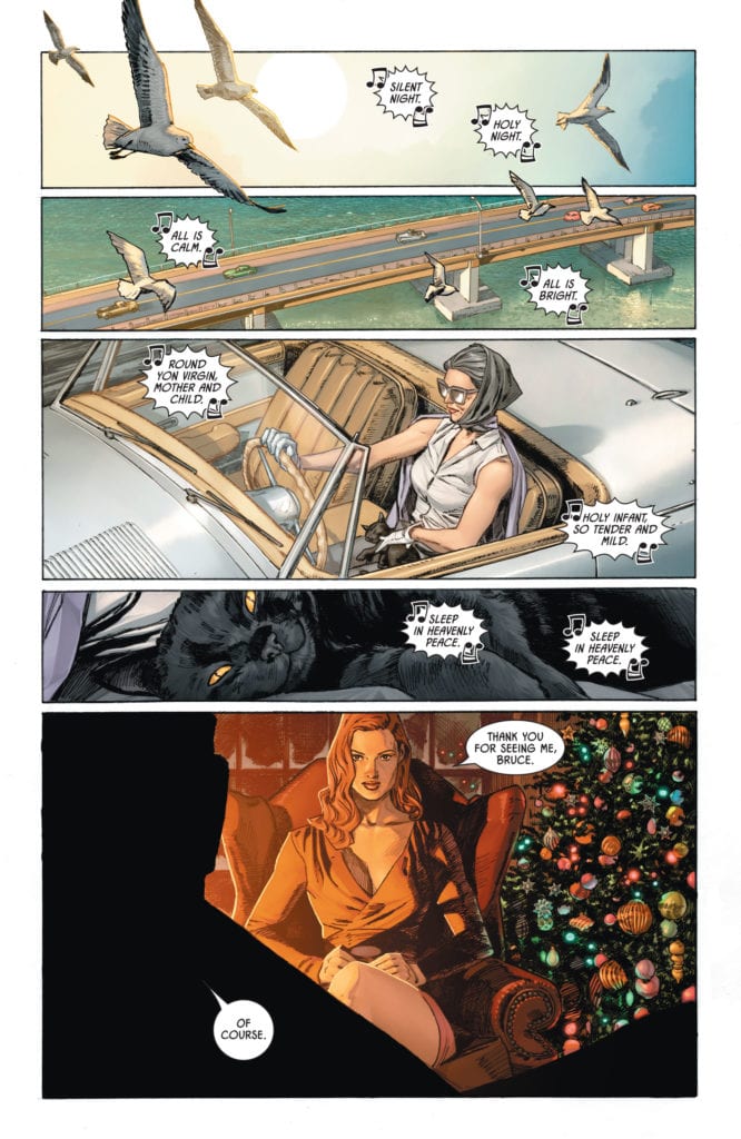
King also creates a kind of distance to the events of this issue. While one timeline follows our characters in the “present,” we also follow an older Selina Kyle, years in the future, as she goes to tie up loose ends with people she and Bruce knew. Bar everything else, we know she at least survives to grow old. Present-day happenings might scar our cast of characters, and Selina suggests they do, but they won’t kill them. King wants to see what it looks like for superheroes to try and live a normal life. But what’s so telling about this issue, is normality doesn’t sneak in when Selina and Bruce get together. Their relationship is larger than life, it’s mythological. No, normality sneaks in when she and Joker discuss how she’s changed. Knowing Selina outgrows her life as Catwoman almost makes her time with Bruce seem silly. It’s when her guard comes down, and her mask literally comes off, that feels like a respite from all this play-fighting through the night.
Art
Mann doesn’t stay within the lines. Characters jut out of the panels they’re in. Sometimes it’s just an elbow or a forehead that sticks into a neighboring panel, other times they tower over a separate scene. Mann uses this as simple way of creating a flow on the page. One panel seamlessly blends into another. But sometimes, Mann is showing us something important. As an older Selina talks with another character, we see a scene of her and Bruce, jutting into this scene from the future. The scene feels like it’s living in the shadow of the past. As she and her friend weep together, we see how much their lives are marked by times gone by. Maybe they’re chasing that feeling, the feeling of being an important player in the world. Maybe they wish they could forget it all. Either way, their present is inextricably tied to their past.
When the Joker and Selina talk about each of their lives’ new direction, Mann shows us how Joker is beginning to feel about Selina. Mann splits a panel of each of their faces in half, so they look like two sides of one person. Mann shows us their kinship, how they’re not that different. Joker was once her colleague, maybe even her friend, now she’s sleeping with the enemy. We see an image of Batman at the top of the page, and Joker’s head and shoulders are superimposed over it from the panel below. He and Batman are facing different directions. The Joker looks alone, even hurt. It’s as though he feels he’s lost a friend. His back is to Batman and Selina like he’s third-wheeling and left out in the cold. It’s incredible. He’s a villain, a murderer, a psychopath. Mann somehow keeps him dangerous, yet also makes him relatable.
Coloring
Morey gives us all the more reason to sense a connection between Catwoman and Joker. Throughout the issue, Morey uses purple and green. At first, this seems like it’s just the colors of the Joker. But Morey reminds us there are versions of Catwoman’s costume that were also purple or green. Yet the purple and green don’t stop at their fashion sense. It colors nearly every scene that they’re in. Whether it’s the purple sky of a sunrise over Joker and Selina talking, or the green alligators Batman and Catwoman are fighting off, or the color scheme of an old friend’s home. The only other color that takes up quite as much space is red. Red becomes the overpowering color of all of the most dramatic scenes. Whether it’s the sky in the background as Catwoman and Batman hunt for criminals, the red shirt of an old man trying to live down his past, or the red glow of the fire as Bruce catches up with an old flame. These are the moments of the golden age. The moments that feel important. Red is the passion, the violence, the blood, and the lust that fills a hero’s life.
Lettering
Cowles uses a clear symmetry on the page to tell us something about each character and how they relate to one another. He shows a mutual respect between Catwoman and Joker. Their word balloons mirror each other, almost as though they reach out to one another. At one point, as Catwoman is dangling from a ceiling, we see her dialogue stretch downwards. She’s speaking to Joker, who is sitting elsewhere in the room, waiting for her. His words go up to meet hers. And later, as we see they are almost merged on the page, their dialogue comes to the middle. Each line getting closer to touching the others. It’s this mirroring that makes them feel like equals. They speak to each other on the same level, literally. There’s no talking down or one-upmanship. They’re people who understand one another.
DC Comics’ Batman/Catwoman #1 is sneaky. It pretends to be a Bat/Cat romance, to get its foot in the door. Once it has, it invites you into a beautiful meditation on friendship, trauma, and the people in life you can never quite shake. This creative team lays out the complicated history of a superhero and the even more complicated history of a couple of supervillains. It’s brilliant, it’s shocking, it’s simple, and it’s oh so complex. DC Comics’ Batman/Catwoman #1 is the start of a rule-breaking, ass-kicking series that’s going to leave a mark on Gotham City forever. Pick up Batman/Catwoman #1, out from DC Comics December 1st, at a comic shop near you!
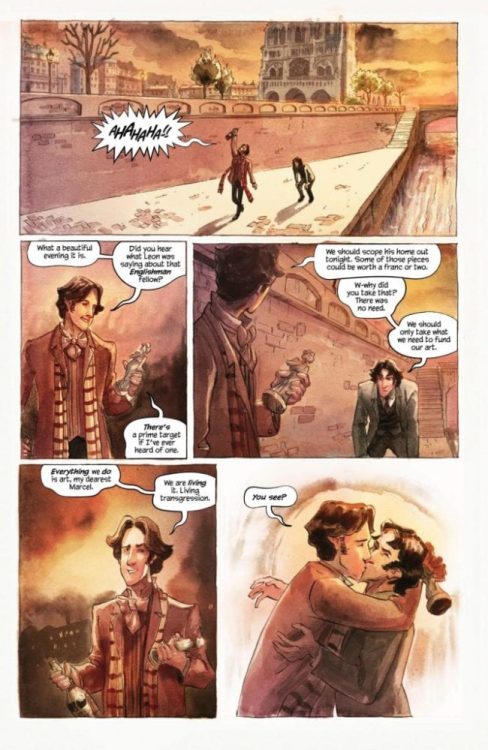
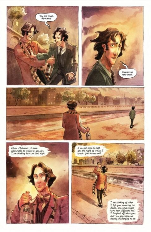
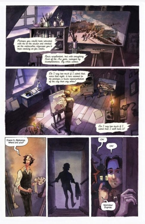
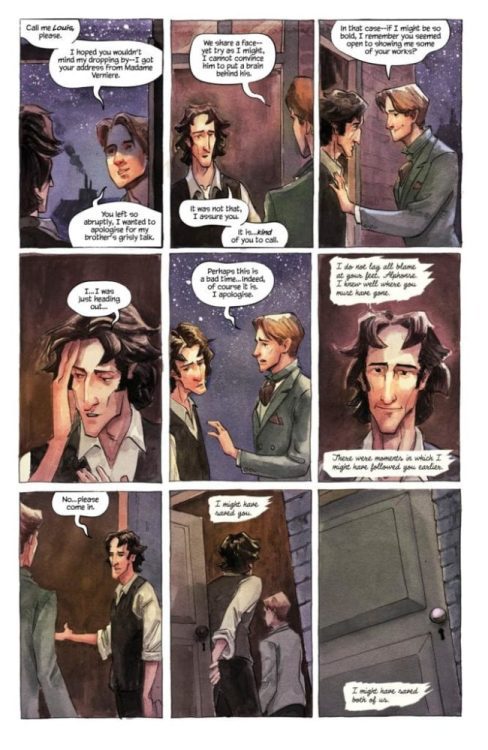
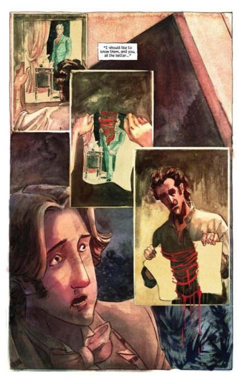
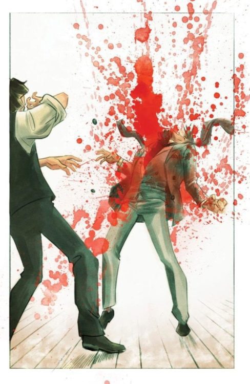
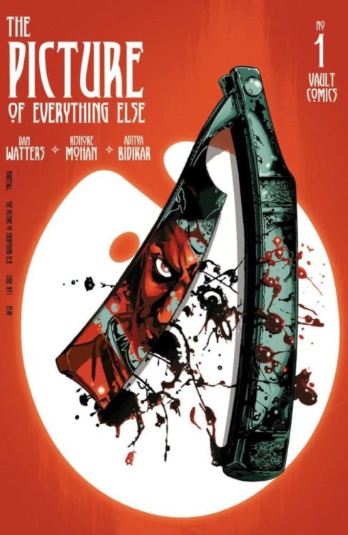
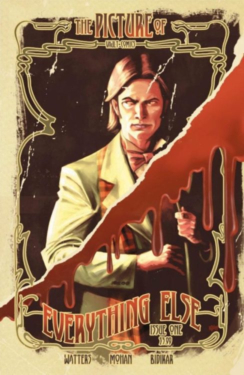
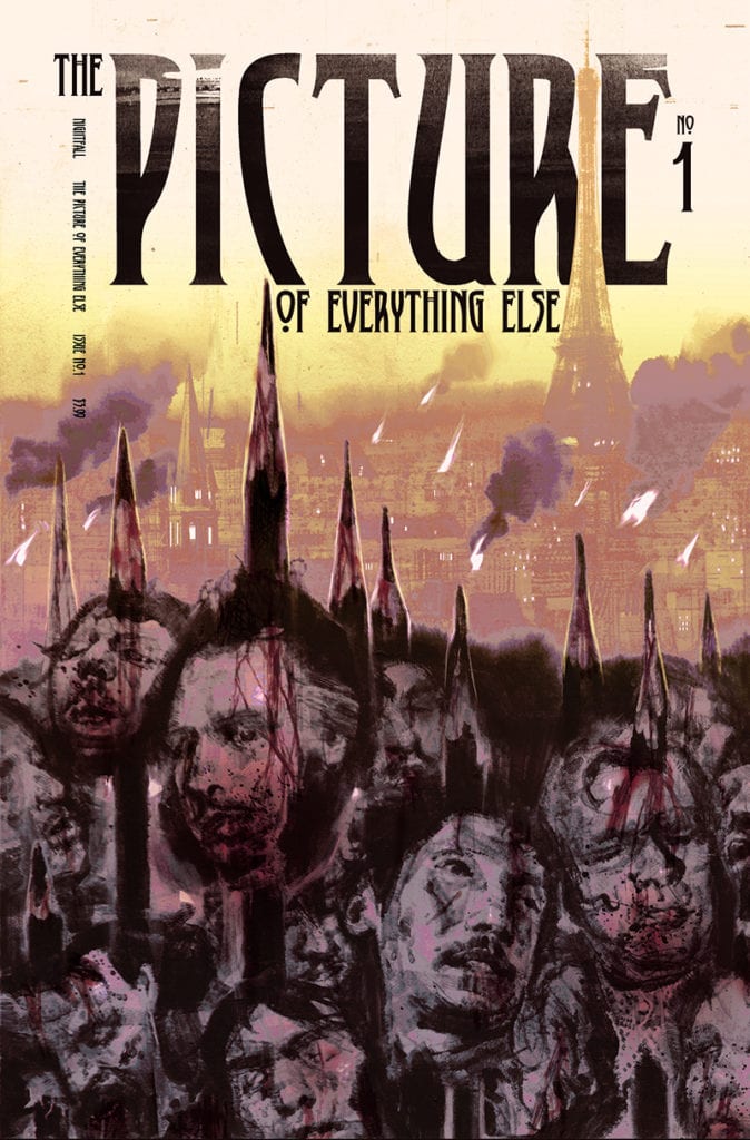
Monkeys Fighting Robots spoke with writer Dan Watters about THE PICTURE OF EVERYTHING ELSE, his new horror series steeped in the lore of Oscar Wilde’s The Picture of Dorian Gray.
The series is by Watters and artist Kishore Mohan, with letters by Aditya Bidikar, and design by Tim Daniel. Issue #1 hits your local comic shop on December 23rd.
About the series: As the 20th century dawns, art promises to change the world…and steep it in blood. A rash of impossible killings sweep through Paris, tearing the rich and beautiful apart in their beds. When two art thieves stumble upon the portraits of the victims damaged in the exact same manner they died, it appears the man who once painted the immortal portrait of Dorian Gray has returned-with darker plans for future works. From the minds of Dan Watters (Coffin Bound, Lucifer, Deep Roots) and Kishore Mohan comes a haunting balance of depravity and beauty.
We’ve read the first issue, and it is a beautifully unsettling horror story about art, friendship, vanity, and so much more.
Preview the first issue of THE PICTURE OF EVERYTHING ELSE right here:
1 of 12
And read on for our interview with Watters:
Monkeys Fighting Robots: What inspired you to tell this story, and how did you and Kishore come to work together on it?
Dan Watters: This story was pretty much inspired by seeing multiple TV series and books and things revisiting Oscar Wilde’s The Picture of Dorian Gray, and focusing entirely on the immortal decadent with his painting in the attic, while I sort of pointed with confusion at the man in the background who’d painted an immortal painting, and said “what about that guy? Isn’t he more interesting?” So as no one else seemed to want to tell his story, I realised it was probably my job.
As soon as that seed had taken root, I called up Kishore. We’d been developing something quite different — a gothic fairy-tale set during the Klondike gold rush, which I hope we come back to one day. He’d already drawn some beautiful pages for that when I called and said “I’m really sorry. But you’re the perfect artist for this. I think this needs to be our book.” And to Kishore’s eternal credit, his reaction was entirely one of excitement and the next thing I knew we were discussing the right sort of gas lamps for 1890s Paris.
MFR: What can you tell us about your protagonists, Marcel and Alphonse?
DW: Marcel and Alphonse have been great fun to spend time with. They’re two poor up-and-coming Parisian artists who moonlight as art thieves in order to meet their rent. They’re thick as thieves (or more accurately thick and thieves) but have very different ideas about what art is, and what art can do for the world. And that’s going to lead them to make very different choices.
MFR: And I feel like I know both Marcel and Alphonse intimately already after just the first issue. What’s your development process like to create such fleshed out characters?
DW: It’s horrible and cliché’d, but you mostly listen to them. They’ll tell you who they want to be. The main trick, I think, is to make sure each of them is distinct. Every one is different, and they aren’t just mouthpieces for the ethos of the story, if the story has one of those at all. Instead, the job of the writer is to be a bit of a horrible bastard, really. The job is to make them care about something, and then not to let them have it. That’s when people reveal themselves.
MFR: How did the themes of the story and the time period it’s set in influence the art style, i.e. the color palette and the choice to use watercolors?
DW: I don’t want to overly speak for Kishore and his process… but as I mentioned, I knew he was the right artist for the book as soon as I had the idea. He does these beautiful watercolor images, mostly cityscapes, but I hadn’t seen him do them for a comic before. He spent a lot of time on the palette, and will redo pages more than once sometimes if he’s not happy with them. He’s also been mixing in other methods and materials — switching over to acrylics to get across certain moods, for example.
MFR: Between the title and one of the characters, there are major connections between PICTURE OF EVERYTHING ELSE and Oscar Wilde’s Picture of Dorian Gray. What is your personal connection to the source material, and why did you choose to pick up its mantle?
DW: I love The Picture of Dorian Gray. It’s one of those books I come back to again and again, and it always reads so differently, depending on how old I’ve been, and what life’s looked like. It took on a whole different dimension as I learned more and more about Wilde’s life too. For example, I think most people see either Dorian or Lord Henry as Wilde’s stand-ins. I’m certain he was Basil. A great artist, destined to be betrayed by his work. Which is maybe daft, because Wilde wrote that book before his tragic downfall at the hands of his lover Bosie and his imprisonment. He couldn’t have known just how betrayed he was going to be. Maybe he tasted it in the air, or maybe the reality just added another facet to the book after the fact.
MFR: I love how you use Marcel’s letter to build suspense — it lets the reader know that something sinister is coming, and then we’re turning every page waiting for the shoe to drop. What other methods do you like to use to create dread in your horror comics?
DW: Well, I have quite particular ideas about how horror can and can’t work in comics. You don’t have jump scares, you don’t have musical cues to tell your audience how to feel. So building tension has to be done in other ways. I get labelled a horror writer a bit, which is probably fair, since I’ve written Lucifer and Home Sick Pilots and Coffin Bound; but I gravitate towards horror because I’m working in comics, and comics mean you have to do something different with the horror every time. You have to lean into the metaphors to make us feel for the characters, to make us really care if something bad happens to them. You can’t get away with simple life and death stakes and expect us to empathize with the character just because they’re human and we are too. I suspect that can work on screen because you’re looking at a real breathing moving person. That’s why bad horror films still make us jump. Comic images are that bit more removed from reality, they wear their artifice in every balloon and gutter, so you have to work that bit harder, innovate that bit more.
All of which is to say, I don’t know if I’d be quite as much of a horror writer in other mediums. I think it’s very interesting in comics.
MFR: Comic book covers are crucial in setting a tone and getting people to pick up your book, and your guys’ main cover pulled me in immediately. What was the thought process behind such an unsettling and haunting image?
DW: All the credit for that goes to Kishore! The cover image was entirely his idea. We knew we wanted everything to have a Belle Epoque feel to it, and that’s what we immediately started talking to designer Tim Daniels about for the logo. We wanted each cover to feel like an invite to a party as scary and anticipatory as the 20th Century.
MFR: In this story, there is a literal danger in art. How metaphorical is this? Do you as a creator find it’s dangerous to invest yourselves too much in your art, to use your “life as a brush” as Alphonse does?
DW: Ha! I guess this is kind of what the story is about, and it’s sort of what I’m asking myself by telling it. I do wonder if there’s a danger for artists — and definitely writers — to take themselves too seriously, though. Your work, and the response to it, should never be the thing that defines your life. That way lies echo chambers, and you can lose focus of what the point was in the first place — which was to talk about the world, and to marvel at it.
MFR: And, finally, what do you hope readers take away from this series?
DW: I hope they enjoy themselves. I fear that hoping for anything more than that would lead to a certain form of madness. I’m not convinced stories like this should particularly lay things out for us. They should show us things, make connections between them, and then say, “what did you make of that?” Those are my favourite kinds of stories.
Thanks again to Dan Watters for taking the time to chat with us. THE PICTURE OF EVERYTHING ELSE #1 is on sale 12/23/2020; Final Order Cutoff is 11/13/2020, which is TODAY if you’re reading this the day of publication.