Home Blog Page 214

X OF SWORDS Aftermath: The Quiet Council is Shaken and a Team of Heroes are Reborn in X-MEN #15

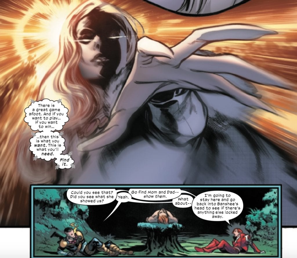
As Apocalypse faces off in a final contest with his long lost wife Genesis, Scott and Jean confront the Quiet Council with the news from Cable’s telepathic warning in Cable #6.

Scott and Jean suggest leading a strike team to rescue their people, but this meets with resistance from the Quiet Council members, particularly Sebastian Shaw. The danger, he suggests, is twofold. First, if the gates are left open for the strike team to return, this potentially leaves Krakoa open to invasion. Second, and an even greater point of contention in the issue, if members of the Quiet Council itself go and they fail, a loss of so many members could cause instability in the government of Krakoa. The council decides that if a member goes to Otherworld, they lose their seat.

While Scott’s status as a Krakoan captain going forward is unclear, the decision to go to Otherworld means Jean Grey has lost her seat and will need to be replaced. I’m sure this will be a point of contention moving forward in the aftermath, given that this may open the door to Krakoa’s first vote or to a more villainous person taking Jean’s place.

As independently operating heroes, the X-Men had the luxury of taking risks in the face of impossible odds. Still, this issue highlights how governing a nation is more complex than being a superhero. As Cyclops points out, governing requires necessary evil, but heroes can’t operate by the logic of necessary evil but my right and wrong.

Cyclops declares that while the Quiet Council governs Krakoa, the X-Men will be its heroes.

While Xavier and Magneto seem to give their tacit approval to this statement, this issue’s prose section reveals that the X-Men proper were disbanded when the Krakoan government was founded. While X-Force was approved as the nation’s official strike team, the X-Men’s independent nature and loaded history were seen as a potential impediment to Krakoan progress.

But Scott argues that the X-Men are still important as heroes and exemplars, injecting a little idealism into the real politick of governance. We’ll see if this opens up potential conflicts in the future with a Quiet Council that, in its attempts to include multiple mutant ideologies in its ruling body, may have let a few foxes into the hen house.

X-Men #15 is available now!

Monkeys Fighting Robots Youtube

X OF SWORDS Aftermath: A Call to Mom and Dad Sets the Finale in Motion in CABLE #6

X of Swords has been a little slower as an event than I’d like, but this issue sets things in motion for the final three issues.

Cable loses to Bei the Blood Moon in a battle to the death because of a moment’s hesitation. Still, thankfully, Cypher intercedes on his behalf, and Saturnyne accepts a death of Cable’s fighting spirit in place of bodily death.

Gorgon’s fight with the White Sword follows, with the former having to face the latter’s one hundred swords, thirteen of whom he kills before falling himself. This makes the score 19-19. Where Krakoa had fallen catastrophically behind, they find themselves tied with Arakko. Perhaps it’s here where we see Saturnyne rigging the contest to put Krakoa back on equal ground.

Back to Cable, we know he is one of the pieces Saturnyne has been moving from all the way back in X of Swords: Creation.

We know that Saturnyne showed Cable an image of the Bridge, an inter-dimensional transport device, located on the Peak, former headquarters of S.W.O.R.D. Powering up this device holds the key to opening a portal and releasing the deadly Vescora, a virus that infects and consumes entire realities. At the end of Creation, Saturnyne commented to Monet about facing their enemy and drawing their sword, with her words juxtaposed with the former S.W.O.R.D. Base.

In Cable #6, when Nathan communicates with his parents, Saturnyne cuts off their link. Nevertheless, it’s enough to set Scott and Jean in motion, and given what we know of the finale by this point, this leads them, ultimately, to raise. Their. SWORD.

And (minor spoiler), thanks to the finale, we know that this is exactly what Saturnyne wanted.

Cable #6 is available now!

Monkeys Fighting Robots Youtube

X OF SWORDS Aftermath: Mr. Sinister Makes a…”Sinister” Move in HELLIONS #6

When the Hellions set out into Otherworld, it intended to enter Arakko to stop their ten champions before they could engage in Saturnyne’s tournament with the sword carriers of Krakoa. Given how much of the event has passed, it should be apparent that that mission was a failure. Instead, Sinister’s true motives are revealed–to harvest the genetic codes of the mutants of Arakko.

As they enter Arakko, they encounter Tarn the Uncaring, the Genomic Mage and leader of The Locus Vile, a group of grotesque mutants whose mutations have been spliced and mutilated by Tarn. Ignoring Tarn’s warnings, Sinister collects genetic samples from the Locus Vile. In the ensuing fight, half of the Hellions are decimated, including Sinister himself, who gives his collected samples to Psylocke to take back to Krakoa (don’t worry about Sinister, though. It is long established that this is just one of many Sinister clones).

As Psylocke, Greycrow, and a severely injured Havok return to Krakoa with the intent of revealing that Sinister deceived them, they are ambushed by Sinister, who, using smoke as a cover, kills them all and feigns getting attacked himself.

This certainly raises more issues with Krakoa’s resurrection protocol since everyone’s backups don’t include these last few memories of their deaths (not the first time we’ve run into this problem with corrupt members of the Quiet Council using this system against other mutants).

Even more concerning, I noted in a previous piece that the existence of Amenthi hybrids opens the door to a topic brought up in House of X/Powers of X–the existence of chimera mutants. Chimeras are genetically bred (by Sinister) and splice together the powers of multiple mutants. By attaining samples of the Locus Vile, Sinister may be one step closer to unlocking the secrets to creating the chimera mutants.

Hellions #6 is available now!


Monkeys Fighting Robots Youtube

Review: KILLADELPHIA #10 – Engaging Historical Backstories

Killadelphia #10 Cover

Killadelphia #10, out now from Image Comics, is a mortifying issue of delightful violence and is one of the best issues to come out of the series so far.

About the Book:
Abigail Adams has been leading the vampires ever since her husband was killed. They recently have been responsible for the murder of the governor of Philadelphia and the famous rapper, Blake Scott. A particularly malicious vampire called Jupiter turned himself into the authorities to convert those in prison and stage a massive vampire breakout. At the same time, James Sangster Jr. and his group are doing everything they can to stop this vampire epidemic.

Killadelphia #10 Story Example

Killadelphia #10 Story

Rodney Barnes never fails to tell an engaging tale, especially in Killadelphia #10. The dialogue is terrific throughout the issue, whether it be comical or deeply disturbing. The backstories of characters often told in Killadelphia’s issues are another intriguing aspect of Barnes’ writing. In this issue, as in multiple other issues, we are given the backstory of a vampire. It is strange to spend so much time characterizing villains, but by doing so, Killadelphia becomes a more fleshed out world. The vampires here are not just mindless killing machines, but rather many were individuals whose lives were ruined to the point that becoming a vampire was the best way for them to get revenge. This by no means prevents the reader from seeing them as the villains, but it gives them an understanding of the characters’ actions, which prevents them from being a bland, standard monster.

These backstories also provide Barnes with the opportunity to fit more historical fiction into the series. One aspect of what made Killadelphia stand out from other modern vampire stories was the choice of former president John Adams as the main undead antagonist. This historical tie-in was a captivating scenario, and Barnes continues this after Adams’ death by introducing new vampires with ties to other important moments in American history. One such vampire is introduced in Killadelphia #10. They aren’t historical figures, but they originally lived during significant historical moments, such as the Civil War. It is a great way to keep the series’s historical fiction aspect without continuously focusing on Adams.

Killadelphia #10 Coloring Example

Art

Jason Shawn Alexander can create stunningly, realistic characters with expressions that make them genuinely seem alive. Killadelphia #10 features more of these highly believable characters, along with intense action. These horrifically violent scenes are marvelous to look at, as Alexander’s characters have beautifully dynamic poses and depth that makes it feel as if characters are coming out of the page. This issue also contains pages with the focal point. To make these central images stand out, Alexander places smaller panels around them or even makes the characters overlap the panel borders. The center of a page is almost always an automatic focal point, so by making the center image the most important, the effect becomes even more substantial.

Luis NCT pair’s colors spectacularly with Alexander’s art in Killadelphia #10 and give a stronger impact on the violent action scenes. NCT also provides some pleasant sepia tones for flashback scenes, which works phenomenally well as delivering an older tone due to the instant association people have between the color and old photographs.

Killadelphia #10 Lettering Example

Marshall’s Dillon lettering in Killadelphia #10 fits perfectly with the art and story. Both subtle and explosive sound effects help the story feel in motion and add to the terrifying imagery it accompanies. During flashbacks, Dillon places sound effects in panels’ background when they would ordinarily be in front of everything else. This dulls the lettering’s impact, which was most likely done intentionally to help relay the fact that the flashbacks are a retelling of events and are not currently happening. This is a highly effective choice and shows off Dillon’s lettering talents.

Conclusion

Killadelphia #10 is one of the best issues in the series so far, and you do not want to miss it. The plot is increasingly becoming more thrilling, and Alexander’s art is exceptional (as always). The coloring and lettering bring the story to life and help provide for a highly satisfying issue.

Monkeys Fighting Robots Youtube

Review: THAT TEXAS BLOOD #6 Comes To A Violent End

That Texas Blood #6, Phillips cover

THAT TEXAS BLOOD #6, available from Image Comics on December 2nd, solves the mystery of Travis’ murder, but not without a bloody cost. Chris Condon concludes the first arc of the series by highlighting the toll memory, anger, and regret can take on a person.

Cover Art

Jacob Philips created a strong cover for this final issue in the arc. Randy sits in a chair, looking at the reader, contemplating his next move with a gun in hand. The bright red pool of blood provides an eye-catching contrast. The cat lazily strolling by adds some curiosity to what’s going on, but Randy’s facial expression is unclear. Is he angry? Is he ambivalent? It’s tough to tell, and that brings the impact of the cover down.

Writing

Condon spent the previous 5 issues (check out our review for issue #5 here) putting Randy on a hot pan and slowly turning up the heat. You could feel the tension of the town rising by degrees with every single page as Randy crosses paths with the local gangsters and unsavory elements. Each time coming away from them a little more beaten down and resigned to the fact that he never really left the town and all the bad that comes with it.

Travis’ murderer and the circumstances of his death are wrapped up in a neat little bow. Randy metes out some well-earned “justice,” but when the Sheriff’s investigation and Randy’s inflicted retribution intersect, we learn that serious mistakes were made. It all goes horribly wrong.

It’s a satisfying conclusion to the arc in terms of connecting all the dots, but the finale felt anti-climatic. Randy’s decision to take action came off as numb or disconnected, but maybe that was the intent. All the simmering from the previous issues leads you to believe there’s going to be a big bang, but Condon doesn’t quite pay off the built-up energy. It’s a solid conclusion that fell a little flat.

Pencils/Inks

Jacob Phillips has been consistently good throughout the series, and this issue is no exception. There’s a lot of little character moments in this issue where the postures, faces, and gestures mean everything to push the panels’ emotions. Phillips nails the emotional expression right down to a simple hug.

For this reviewer, the best sequence in this issue is a scene where nothing happens at all… visually. There’s a shootout just at the halfway point that you never really see but can tell is happening (partly achieved by great lettering we’ll get to in a minute) that holds the tension and your attention with nothing more than perfect panel framing. Phillips deserves big props for the art of this series.

Coloring

Consistent with the previous issue, Phillips makes great use of color to shift between different scenes and flashbacks to help move the narrative along. There’s an exciting part where Randy meets the Sheriff, and the panels alternate between red and blue to match the flashing of the police car lights that’s visually creative. Overall nice work from Phillips.

Lettering

Phillips executes some excellent lettering issue, particularly with the aforementioned shootout scene. As the “camera” holds a position on the front of a saloon, it’s through the lettering and the sporadic exclamation of gunfire that you get the real impact of what’s happening. This is one of those infrequent cases where the sound lettering tells the story, and Phillips does a great job with it.

Conclusion

THAT TEXAS BLOOD #6, available from Image Comics on December 2nd, brings the latest bloody chapter in this town’s history to a close. This series takes a hard look at the toll of carrying the past with you and the dangers of letting the past decide your future. THAT TEXAS BLOOD is a great comic that holds up as one of the best examples of crime noir in years. I highly recommend the complete 6-issue arc.

Monkeys Fighting Robots Youtube

Review: JULIET TAKES A BREATH Is Different & Beautiful

Juliet Takes A Breath Cover

JULIET TAKES A BREATH, out now from Boom! Studios’ imprint, Boom! Box, is the graphic novel adaption of the novel by writer Gabby Rivera.

With art by Celia Moscote, colors by James Fenner, and letters by DC Hopkins, Juliet Takes A Breath is a beautiful, brave story that refuses to shy away from discussing uncomfortable topics like race, gender, and identity.

spoilers ahead

Writing

Rivera’s writing especially shines when Juliet, the titular character, dares to question everything around her and criticize certain social norms. Right from the start, we read an email sent by Juliet to Brisbane Harlow, her new feminist role model. The email is full of adoration towards Harlow, but Juliet is never afraid to talk about how she feels regarding the book and its lack of representation.

As the story progresses, Rivera reveals quite brilliantly that just because Juliet questions everything, it doesn’t mean that she has all the answers. Juliet is flawed, too. At times, the reader even learns together with Juliet about some things they might have been completely oblivious to, like pronouns or feminist history, or subtle racism. This liberates the reader from the feeling of being judged when Rivera makes the reader ask themselves some hard questions about their own behavior in some of the pivotal events in this book. It might feel uncomfortable to some, but that’s what great art does. It forces you to put a mirror in front of yourself and confront who you really are.

Juliet Takes A Break sample page 1

Art

I personally could talk endlessly about how I much adore Moscote’s gorgeous art and Fenner’s lovely coloring. But over the following sections, I’d like to zero in on my favorite moment of Juliet Takes A Breath to give an excerpt of how much thought has been put into every single page of this graphic novel.

Well into the story, there’s a poignant moment where Juliet’s girlfriend breaks up with her over a letter after being apart on different internships. There, to tell the reader how Juliet feels, it would’ve been easy for Moscote to show Juliet’s facial expressions. But, Moscote bravely decides against that. Instead, they turn Juliet away “from the camera” and use only Juliet’s body language and the background to convey her feelings to the reader. There are almost these tentacles of sadness creeping into the panels in the background until they almost swallow Juliet whole.

Coloring

To help Moscote emphasize the emotional weight of this break-up on Juliet’s psyche, Fenner starts coloring the first panel’s background in bright pink as Juliet opens the letter. But, as these tentacles of sadness take over, the background colors turn more grim and dark, making the reader feel as if they’re trapped there with Juliet. Behind Juliet (or in her), there’s still light- there’s still happiness. Although, Juliet’s light slowly begins to suffocate and die down.

Juliet Takes A Break sample page 2

Lettering

Hopkins’ lettering joins in on the fun and experiments throughout the graphic novel while remaining consistent. Some sound effects look timid and don’t attract too much attention, and some leap out the page beautifully. Each element has a consistent font. Hopkins places the balloons and captions well and never confuses the reader. Every font looks to be carefully chosen and helps to elevate this graphic novel’s fresh, young vibes. Great work here from Hopkins.

Conclusion

Juliet Takes A Breath is a wonderful, unique graphic novel. The story is a bold tale about race, gender, and self-acceptance, and the art’s vibrant style elevates the story’s fresh vibes, distinguishing it from other graphic novels that came before.

Monkeys Fighting Robots Youtube

Review: THE AMAZING SPIDER-MAN #53.LR – A Confrontation with Morlun

The Amazing Spider-Man #53.LR Cover

The Amazing Spider-Man #53.LR, out now from Marvel Comics, depicts an exciting journey for characters that don’t often get much attention in the series.

About the Book:
Spider-Man was able to set his friends free from the sins that Kindred possessed them with, but at a horrifying cost. Now, to save Peter’s soul, the “Order of the Web” has entered the astral plane with Doctor Strange. Simultaneously, the Sin-Eater, no longer acting under Kindred, is enacting his plan to restore his power: by taking it from the multidimensional being, Morlun. The bait has been laid, so all the Sin-Eater has to do is wait.

The Amazing Spider-Man #53.LR Coloring Example

The Amazing Spider-Man #53.LR Story

Nick Spencer and Matthew Rosenberg set up The Amazing Spider-Man #53.LR to be a continuously entertaining issue from the very start. The issue begins with the story of the Sin-Eater as he hunts the immensely powerful Morlun. In the previous issue, this story had been left off directly before the action, so choosing to begin with it is a smart way to hook readers in. The other plot the issue focused on, with the “Order of the Web” and Doctor Strange, did not immediately jump into the action, so choosing to show it second after the reader was already hooked was brilliant. The issue also featured a gripping ending that leaves the readers wanting to pick up the next issue as soon as possible. These endings that leave the reader in suspense are an easy way to drastically improve any kind of serialized fiction, and Rosenberg and Spencer are the masters of it.

Art

The pencils of The Amazing Spider-Man #53.LR were done by Federico Vicentini and Takeshi Miyazawa, and the inks by Vicentini, Miyazawa, and Scott Hanna. The art in the issue is astounding. As Morlun kills the bait that the Sin-Eater has set for him, his forms are so dynamic and vicious that the readers are instantly hooked. Few books are able to grip the reader so near the beginning of an issue, but for the gorgeous art of Vicentini, Miyazawa, and Hanna, that is no problem. The astral plane that the “Order of the Web” enter into was an opportunity for the artists to shine, and they do as a slew of vicious monsters appear. With horrifying features and unnatural movements, the artists are able to easily create some truly monstrous creatures.

The Amazing Spider-Man #53.LR Art Example

The Amazing Spider-Man #53.LR had the talents of Marcio Menyz and Erick Arciniega for its coloring, and the duo turns the issue into a beautiful spectacle. For scenes in the ordinary world, cooler tones are used, which do wonders to set a darker tone. As the energy rises, brighter, single-colored panels are used to highlight important actions. Menyz and Arciniega also provide some wonderful coloring when characters are in the astral plane. Here, they use gradient backgrounds of dark red and similar colors, giving a strange, otherworldly tone that perfectly fits into the scene.

The lettering of VC’s Ariana Maher in The Amazing Spider-Man #53.LR adds significantly to the issue. There is a large amount of variety to her lettering style, and her choices fit perfectly with the scenes they are in. For instance, a monstrous scream is not contained by a typical round word bubble but instead is shown as a long string of letters that sway back and forth. This gives the impression that the scream was not during a stagnant scene. The letters move back and forth, so it gives the impression that the scene’s energy is high. It is brilliant lettering that gives subtle characterization.

The Amazing Spider-Man #53.LR Lettering Example

Conclusion

The Amazing Spider-Man #53.LR is an epic, action-filled issue that follows characters we love but don’t often focus on in the series. The art is phenomenal, and the coloring is excellent at establishing tone. The lettering is the perfect complement to it all and is the cherry on top that completes the riveting read.

Monkeys Fighting Robots Youtube

Review: THE AUTUMNAL #3 Brings Hope and Rising Horror

Writer Daniel Kraus and artist Chris Shehan return with another fantastic chapter of their character-centered horror series with “The Autumnal” #3. Along with colorist Jason Wordie and letters by Jim Campbell, this issue delivers more fantastic emotion and relatability from its protagonist while never letting up on the story’s unnerving atmosphere. With a brilliantly put together script and fantastic visual work, this is another chapter in one of the most well-constructed horror comics I’ve read in recent memory.

“A drunken bender lands Kat in front of a wise and handsome tattoo removal specialist, yet she’s drawn back to eerie Comfort Notch, where a trove of old photos reveal the figure behind the town’s ominous legends.”

Writing & Plot

Daniel Kraus has made sure to spend plenty of time getting to know our lead characters with every chapter so far, but in “The Autumnal” #3 we get our first bits of outward vulnerability from Kat. The internal struggle this woman has had in trying to keep herself happy despite past trauma all while raising a daughter has been handled with careful sincerity by Kraus. She feels like a real person more and more each issue. The fact that her story ties in so well with whatever the hell is happening in Comfort Notch is this comic’s true work of wonder thus far. I’ve noted before how this comic pulls off its sense of tension so well because of how much the reader is made to care for the characters while also intertwining their lives with the horror at hand. The more uncertain the lead characters are, the more we are. The more frightened and unnerved they are, it’s the same for us. Kraus doesn’t give the audience any additional pieces to the puzzle; for the most part, we know just as much as Kat and Sybil do. The mystery behind the haunted autumn views of Comfort Notch is a mesmerizing tale of cultish and eerie behavior. Experiencing this tense horror tale from Kat and Sybil’s perspective continues to be an immense pleasure.

Art Direction

Artist Chris Shehan performs some of his best work yet (which is saying a lot) with his pencils on “The Autumnal” #3. His character animations and expressions is at its peak here, with much of the focus being on the subtle changes in expression from panel to panel. There’s a sequence where Kat is venting about her current experiences in Comfort Notch and her past trauma over a 6-panel grid (think the interview sessions in Heroes in Crisis), and Shehan draws Kat’s emotional journey across her face in a brilliantly recognizable yet subtle way. His design for the most creepy moment yet (no spoilers) is also chilling and will stick with you long after the comic is bagged and boarded. His panel direction is once again top-notch as well. There’s a sense of character focus combined with artsy cinematic appeal that is reminiscent of the cinematography seen in great horror films, but crafted in a way only achievable in comics. The colors of Jason Wordie are once again outstanding, immersing the comic in stunning amber autumn glows and foggy urban smog. Jim Campbell’s lettering utilizes a sort of soft, modern font that is used in a variety of ways. When characters whisper or talk to themselves, Campbell just uses small, faint lettering. It’s a move that’s been done, but not quite to this degree (at least not that I’ve seen) and it’s very effective. This is yet again a phenomenal piece of work from the visual team.

“The Autumnal” #3 is yet another chapter in this horror series that balances levity and character development with a deeply unnerving atmosphere. Daniel Kraus pens a script that mixes relatable human emotion and experience with a mysterious supernatural horror that makes for an intoxicating genre experience. The visual work of Chris Shehan and Jason Wordie is immensely detailed and well-animated and paints the town of Comfort notch with a deceiving beauty. This is another fantastic installment in this new horror series, and I can’t recommend enough that you grab this newest issue from your local comic shop when it releases on 11/26!

Monkeys Fighting Robots Youtube

Review: MEGA MAN: FULLY CHARGED #4 – Introducing A New Version of Zero

Mega Man: Fully Charged #4 Cover

Mega Man: Fully Charged #4, out now from BOOM! Studios, is a fast-paced issue full of important moments and events that will make your jaw drop.

The previous issue of Mega Man: Fully Charged ended with the shocking introduction of Zero into the world of Mega Man: Fully Charged. Fans of Mega Man will know the character Zero from his introduction in Mega Man X and later his own series, Mega Man Zero, which both take place after the events of the classic Mega Man game series. Since the world of Fully Charged is separate from the games, any knowledge we have of Zero is irrelevant. However, Zero’s appearance in the previous issue is still enough to leave readers desperate to get their hands on Mega Man: Fully Charged #4.Mega Man: Fully Charged #4 Variant Cover

While the mere presence of Zero in Mega Man: Fully Charged #4 is enough to excite fans, Marcus Rinehart immediately reveals more about this new version of Zero to draw the readers in better. As more about Zero’s identity is uncovered, we are connected more with the character, making the issue a thoroughly engaging read.

Another way that Rinehart is able to make Mega Man: Fully Charged #4 such a riveting issue is through constant surprises and gripping moments. This issue is stuffed full of action, as Skull man and his followers face off against Mega Man and Zero. Action-packed scenes are difficult in comic books since to show off the beautifully drawn moments of combat, much of the page needs to be occupied, which makes it challenging to fit in the story. Mega Man: Fully Charged #4 solves this by interspersing scenes that leave the reader in shock. These short moments are dense in content, so the reader doesn’t feel cheated (in terms of story) when the issue features a lot of action.

Mega Man: Fully Charged #4 Art Example

The art of Mega Man: Fully Charged #4 was done by Stefano Simeone, and it does a phenomenal job at bringing the issue to life. Since the issue is full of action and Simeone is a king of dynamism, each page is a brilliant spectacle that continuously draws you in. Every form in the issue looks as if it was a snapshot pulled from an intense battle, and this does wonders to make the issue an exciting read. It would also be a sin not to mention the glorious backgrounds that Simeone fills the issue with — mostly composed of highly detailed cityscapes — and the new designs of iconic characters. While Zero is an entirely new design, other characters in the issue are given new ways to engage in combat, and their new looks are stunning.

The colors of Igor Monti never cease to amaze or turn Mega Man: Fully Charged #4 into a sight to behold. Monti has provided astonishing work throughout the series and always pairs exceptionally well with Simeone’s art. This issue is particularly impressive, as Mega Man faces off against his foes and the sun sets on Silicon City. The vibrant colors of Mega Man, his friends, and his enemies on the same page of the setting sun, which creates a warm hue, is an awe-inspiring sight. The issue also contains more flashback scenes, whose distinct colors make it clear it is a flashback and set a grim tone.

Mega Man: Fully Charged #4 Colors Example

Mega Man: Fully Charged #4 contains the lettering of Ed Dukeshire, which is some of his best work in the series so far. The large amount of action in the issue allows for many sound effects, and Dukeshire does not disappoint as he provides a pleasant variety of fonts in his lettering. Dukshire also gives his fonts a robotic feel that blends in nicely with the setting of the series.

Mega Man: Fully Charged #4 is an incredible issue that knocks it out of the part in both writing and art. We figure out more about characters, there are more wonderful twists, and the action is continually engaging. The art is superb, and the turn of each page feels like an absolute pleasure as you gaze upon what Simeone, Monti, and Dukeshire are able to create. If you aren’t reading Mega Man: Fully Charged, you’re missing out.

Monkeys Fighting Robots Youtube

X OF SWORDS Aftermath: Arakko Runs Up The Score And Storm Beats Death In X-FORCE #14

X of Swords comes to a close this week, and while these articles will avoid any in-depth discussions about how these remaining issues lead into the ending, I will still be looking at evaluating this event, its easter eggs, and its storytelling nuances.

X-Force #14 reinforces my earlier comments about this event’s anti-climactic nature, as this issue breezes through multiple challenges, very few of which involve actual sword fights to the death. Instead, readers are treated to single panels depicting a dance contest, characters solving a literal puzzle, and Gorgon rushing to make love to a rock (for real). Unfortunately for Krakoa, Arakko wins most of these contests, with Captain Avalon accusing Saturnyne of rigging the contest against Krakoa (more on this in my future piece on Cable #6 and X of Swords: Destruction).

This issue culminates with Storm’s conflict with Death, but unfortunately, she is still drunk from the blightswill and cut off from her powers. Some might have assumed that this would put Storm at an insurmountable advantage, but for long-time X-fans, Storm’s victory here is no surprise.

All the way back in X-Men #201 (1986), a powerless Storm dueled with Cyclops to determine who would lead the X-Men…and won! By catching her still empowered colleague by surprise, she was able to turn his powers against him and win.

A powerless Storm is still a dangerous Storm, as Cyclops learned back then, and as Death learns in this issue, as Storm turns his own powers against him and wins. All while she was powerless. And drunk.

While this event has been a bit iffy in excitement, it is nice to see the depiction of a powerful, competent Storm, who even without her powers can overcome Death itself.

X-Force #14 is available now!

Monkeys Fighting Robots Youtube