All-Star DC writers Andy Lanning and Ron Marz team with artists Phil Hester, Andre Parks and Marco Santucci to deliver a comforting Superman one-shot in the midst of a wintry crossover event. “Superman: Endless Winter” uses its platform and context within its desperate world’s situation to remind readers to keep moving ahead during our own trying times. With a grounded script and some great superhero artwork, this one-shot special is a nice reminder that even The Man of Steel needs encouragement sometimes.
“Superman finds himself at the center of an epic battle as the Frost King’s hordes of ice monsters come to life. Is this frozen onslaught too much for the Man of Steel, or can he stop it before it rampages across the chilling wasteland the world is becoming and reaches civilization? The answer to this question comes from an unlikely source close to Clark Kent’s earthly roots!”
Writing & Plot
This comic can be broken up into three parts: a flashback building on the story of the Endless Winter event, the main chunk involving Superman, and the final pages that tease where this event is headed next. Marz and Lanning do a sold job of making this comic feel consistent in terms of style and subject despite there being two main focuses in this one-shot. The focus on the Endless Winter event itself doesn’t overpower the heart of the story with Superman, but it’s also given the time and effort to still obviously be important. The flashback at the beginning of the comic is especially awesome, utilizing the span of only a few pages to create an effective and tragic narrative for this event’s big villain. The final pages are the most forgettable – scientists doing stuff in labs they shouldn’t be with objects they shouldn’t be touching – not bad, but nothing terribly exciting. The meat of this comic however is obviously about what Supes is doing during this insane global occurrence and how he’s handling it both personally and as a hero. This part of the comic is simple and a little bit cheesy to be sure, but it’s still surprisingly effective. It’s blatantly obvious that the script is talking to us about our experience during this dreadful year while also assuring us that even the most powerful hero in comics has it rough once in a while too. Both Superman’s struggle against the global blizzard and his worry about his loved ones will likely hit home for a lot of people during this pandemic. Lanning and Marz even address the mental stresses of the public as a whole by way of this issue’s newspaper article narrative delivery (written of course by Lois Lane). Seeing Superman’s worries and struggles validates our own troubles, and watching him be comforted and assured by the people closest to him is one of the oldest but most effective tricks in the DC book. Reading the main chunk of this comic felt like wrapping a blanket around myself and eating a bowl of soup. That’s what a great Superman story does, I think.
Art Direction
The combined work of artists Phil Hester, Andre Parks, and Marco Santucci create the vivid (and cold) world that “Superman: Endless Winter” #1 has fallen into. Santucci covers the opening flashback sequence while Hester and Parks cover the main book. The former’s art is a clean and fantastic blockbuster comics style. Santucci utilizes a heavily penciled and highly detailed aesthetic akin to the work of David Finch or Jason Fabok, with considerable cross-hatching and inking. It looks outstanding and works brilliantly for the story being told in this flashback. What else works brilliantly is the art in the main Superman story. Hester and Parks use a neat and clean approach with think lines that exude a style that is somewhere between the Golden Age Superman and the Supes of the Bruce Timm and Paul Dini animated universe. Their style exudes a sort of light-hearted friendliness that makes the reader feel right at home in the comic’s messaging. The Hi-Fi colors are as professionally neat and pristine as can be had in any mainstream hero book, adding a variety and depth of visual fidelity that can only be found in a big budget superhero tale.
“Superman: Endless Winter Special” #1 is a simple but effective one-shot that manages to have its own message while still allowing itself to be a solid piece of the crossover event puzzle. Ron Marz and Andy Lanning use their combined experience to create a solidly paced and emotionally therapeutic short story that is some admittedly cliched but still warranted reassurance during our own turbulent times. The intensely detailed visuals Marco Santucci in the flashback and the classically-minded work of Andre Parks and Phil Hester in the main story all craft a stellar looking comic fit for a tale about The Man of Steel. Be sure to grab this one-shot when it hits shelves at your local comic shop on 12/8!
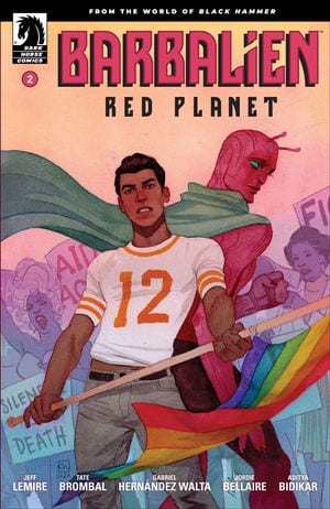
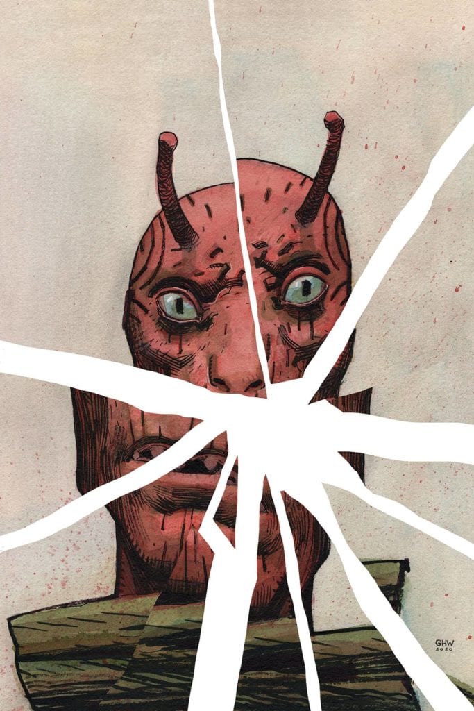
It’s tough writing a series that’s about something so black and white. Dark Horse’s Barbalien: Red Planet is one of those series. It’s about the struggle between cops and the gay community during the AIDS crisis. There’s not much room for interpretation there. The cops were bad guys, beating people for being different. But that didn’t stop writers Tate Brombal and Jeff Lemire, artist Gabriel Hernandez Walta, colorist Jordie Bellaire, and letterer Aditya Bidikar from giving us a nuanced, layered, human story about a man stuck in the middle, in their first issue. Unfortunately, Dark Horse’s Barbalien: Red Planet #2loses a lot of that nuance and subtlety.
Writing
There’s an aspect to Brombal and Lemire’s lack of subtext that works. Miguel represents the Uninhibited Person. He’s got his guard completely down, and he’s willing to say the truth when no one else is. This works particularly well when he’s shouting through a bullhorn or yelling in a cop’s face. Miguel also acts as a kind of “Beatrice,” or guide, through the underground gay “Paradise” Markz has stumbled upon. He explains the ins and outs of their scene, asks cutting questions, and provides no judgements. But when Miguel is in his personal life, there’s little room for interpretation. Any and all interrelational things that are happening, in every scene, is fully on the table. If Miguel is embarrassed, scared, or lonely, he lets us know. Each time he does, it strikes as a line that should be left unsaid. They’re the moments that were already communicated in the pauses and glances. It’s as though Lemire and Brombal are so passionate about this project, they’re tripping over their shoelaces to make sure everything they want to communicate gets through. It does get through, they just need to trust their readers more.
Art
Part of what makes Brombal and Lemire’s script frustrating at times, is that Walta’s art is already telling such a clear story. We don’t need Miguel to tell us he’s terrified. Walta shows it all over his face. And Markz waking up to stare at his police badge speaks more of his inner turmoil than him mixing up who he should be recognizing. Walta gives us every cue we need to connect the silent dots. Even if it’s just Miguel appearing in front of or above Markz in each scene. Walta shows us how Markz looks up to Miguel, through mere character placement. We see how Markz thinks of Miguel as a role model, someone who is as comfortable in their own skin as he would like to be. Walta’s implied storytelling is so efficient, much of the dialogue becomes unnecessary.
Coloring
Bellaire also helps us see Markz’s identity crisis. Early on in the issue, the soft purples and pinks of the nightclub give way to a bright red. It’s the red of the police lights and it’s accompanied by violence. But the red is familiar. It’s the same shade and color as Barbalien’s skin. This leaves us to wonder, does Barbalien feel like being a cop has become a part of his identity? But as the issue goes on, Bellaire brings in another familiar color. We see a dangerous green that follows Boa Boaz everywhere he goes. This is a similar green to the green of Barbalien’s cape. It’s these aspects to Barbalien’s identity that seem to be ripping him apart. Is he a Martian or is he a policeman? And while Markz knows he’s gay, the nightclub scenes are colored in foreign colors. It’s as though we’re watching other identities pull Barbalien away from accepting his sexuality. Things that feel ingrained in him. But as he boldly ventures in to explore, he’s still scared and feels like it’s a world that’s not familiar to him.
Lettering
Bidikar does something interesting in this issue. He keeps nearly every line of dialogue in one word balloon. Instead of dividing dialogue up, to give it a sense of rhythm, Bidikar delivers each line in one big chunk. What this means is, the moments with stacked word balloons stand out. “Yeah. Peace is great…” is in one word balloon, conjoined to another with “But my parents taught me survival.” If this line were written like every other line, it might be missed. Instead, Bidikar interrupts our reading to focus us in. Because Bidikar does this sparingly in the issue, we don’t become used to stacked word balloons. We notice each one that comes our way, and give special attention to each of those important lines.
Dark Horse’s Barbalien: Red Planet #2 falters. But it falters because of its creators’ passion. They have important things to say, things they feel strongly about, and their passion overrides their subtlety. This story is important, and if this creative team can dial back on the dialogue and exposition like they did in their first issue, it can also be great. I, for one, expect great things from future issues. Pick up Barbalien: Red Planet #2, out from Dark Horse comics December 16th, at a comic shop near you!
X of Swords – Destruction #1 brings to a close the long, drawn-out event which altered the status quo of the X-books moving forward, and laid the groundwork for future plots and developments. This event meandered at times and relied a bit too much on fake-outs, people standing around talking, and anti-climactic challenges to move its plot forward, but it ends with a bang!
As I read this final issue, something about it seemed familiar, and then it hit me: Hickman, Howard, and company are going for an Avengers: Endgame vibe!
Maybe that wasn’t their intention, but that’s what this event feels like. Here are four reasons why X of Swords – Destruction is like Avengers: Endgame.
1. Mediocre parts and an explosive ending.
I should note that I am a fan of the MCU, but I’m an honest fan. I can acknowledge that large swaths of the MCU are inconsistent in quality, and that for years, it seemed like very little plot development could occur in the MCU movies because they had a twofold task of a) keeping the story going, and b) keeping enough things the same until their dramatic culmination in Infinity War and Endgame, all while telling a mega-story with multiple writers and directors.
This means that some franchise movies were “filler,” “just ok,” or became weighed down managing multiple MCU plotlines (i.e., Thor: The Dark World, the first Ant-Man, Avengers: Age of Ultron, etc.) while others were “more meaty” and became the pulsating heart and backbone of the MCU (i.e., Winter Soldier and Civil War). But it all culminated with Endgame, an explosive finale that provided closure to the Infinity Saga while setting up a new status quo.
I’ve noted in earlier entries about what I’ve come to think of as the mediocrity of at least parts of the X of Swords event, like dinner parties and conversations that last 2-3 issues while I waited for a tournament to begin, which then consisted of contests portrayed in only one panel, all drawn out across multiple X-titles until it finally culminated in X of Swords – Destruction.
This event, however, was not without its gems. Wolverine’s title was consistently top-notch, while Storm’s fight with Death highlighted her character’s strength and ingenuity. There’s a reason why she was the X-Men’s leader for so long during Chris Claremont’s run!
Of course, despite my problems with this event, the multiple writers and artists made it read as a consistent narrative across the X-titles, for an event whose culmination will hopefully cause this event to be greater than the sum of its parts when read as a whole.
2. Dramatic arrival of back-up.
There are two notable “F@ck yeah!” moments split between Infinity War and Endgame (well, three if you count “Thunder Cap,” but I’m not dealing with that here). The first is during the Battle of Wakanda with the arrival of Thor, Rocket, and Groot.
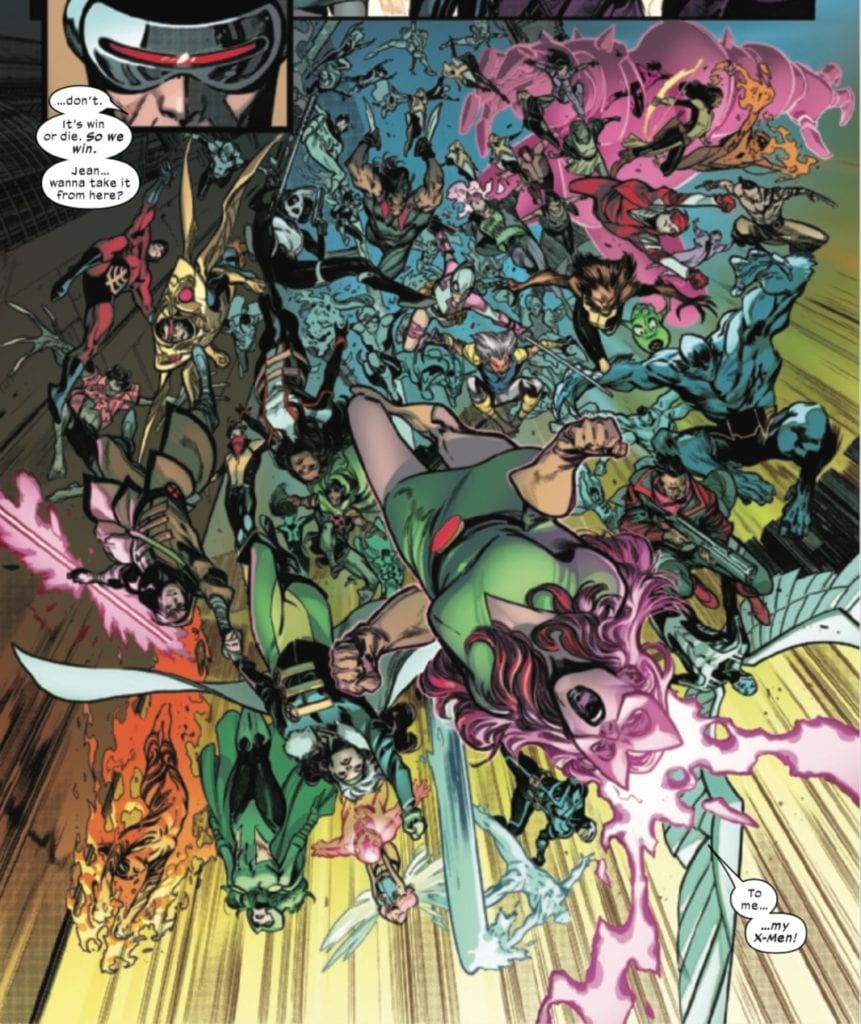
X of Swords – Destruction has its own “arrival of Thor” moment with the return of the Captain Britain Corps! Tell me the following image doesn’t look a little “bi-frosty.”
Mystical back up arriving in a stream of light to fight a terrifying, faceless army? I’ve seen this move before. But I still like it.
But this is only one of the “F@ck yeah!” moments in this issue. The other, and much more “Endgame-y” moment arrives in the form of every X-Man ever showing up to save the day.
This wouldn’t be the first story to try to copy the Endgame formula of having the calvary, consisting of multiple characters and cameos, show up and save the day. Rise of Skywalker tried this (to far less fanfare) with the arrival of Lando Calrissian in the final act of that movie, but I think it works better here in X of Swords – Destruction. And like Endgame, the arrival of back-up, while a cool moment, doesn’t guarantee success, but only with the sacrifice of a champion, for the sake of both his world, and his family.
3. A main character takes possession of an ultimate weapon to save the day.
Robert Downey, Jr.’s Tony Stark was the heart and soul of the MCU for eleven years. His death by taking the Infinity Gauntlet from Thanos dealt the final blow to the Mad Titan and his army. Likewise, X of Sword‘s main protagonist (arguably), Apocalypse, was able to win only by taking the source of his wife’s power to control the Amenthi army, the Annihilation mask.
By taking the mask and surrendering, Apocalypse is able to bring the battle to an end, and while he must join his wife and children in Amenthi, he saves Krakoa.
4. The story is brought to an end and sets up a new status quo.
While Avengers – Endgame brought a certain amount of closure to the MCU, it was far from a true ending. Certain character arcs were concluded, but a new status quo was set up in the MCU. People would have to live with the consequences of “the Blip.” Sam Wilson became Captain America, and Thor abdicated his throne and left Valkyrie in charge of Asgard. Endgame left us a world without Tony Stark or Steve Rogers. Plus it set up a bunch of new Disney+ Marvel shows.
Likewise, the status quo of the X-titles was changed by the conclusion of X of Swords – Destruction. We are now out of the “Dawn of X” era and into “The Reign of X.” Apocalypse joins his wife and children in Amenthi, and Arakko and its mutants have joined Krakoa, thus altering the dynamics of the mutant nation. The Quiet Council has experienced a dramatic shift. The X-Men have been restored as a team, and now run the former S.W.O.R.D. base, with Al Ewing launching a new title centered around it.
Of course, every comic event by its nature changes the status quo of a universe somewhat, some more than others. X of Swords – Destruction definitely alters the X-Men’s status quo moving forward, even though the entire event plodded along a bit aimlessly sometimes. House of X/Powers of X gave us a hint at where the future of the X-titles is heading, even as Dawn of X laid the groundwork of the new status quo while setting up the first big event in Hickman and company’s run. X of Swords – Destruction gives us some idea of what lies in store, providing an opportunity for some truly unique X-stories, while hopefully avoiding the sometimes-plodding pace of this event.
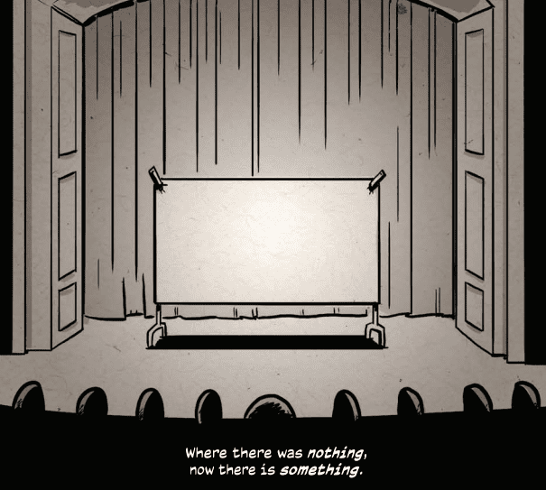
The Comic Book History of Animation Credit: IDW Publishing
Comic books are very adaptable and are able to tell many different types of story in a wide range of styles. It is for this reason that the format is useful for educational purposes with the image and text relationship better at engaging readers quickly and more memorably. This makes the medium perfect for something like IDW Publishing’s new series The Comic Book History of Animation, part one of which is released on 9 December 2020.
Promising to cover the entire spectrum of animation history, the first issue starts in the roots of illustration and searches for the seeds of animation. Fred Van Lente and Ryan Dunlavey have chosen a very informal style of both presentation and narration, firmly establishing a child friendly environment. A quick read through highlights that there is something for everyone on these pages.
The Comic Book History of Animation Credit: IDW Publishing
Start at the Beginning
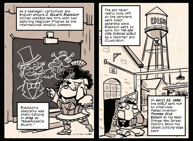
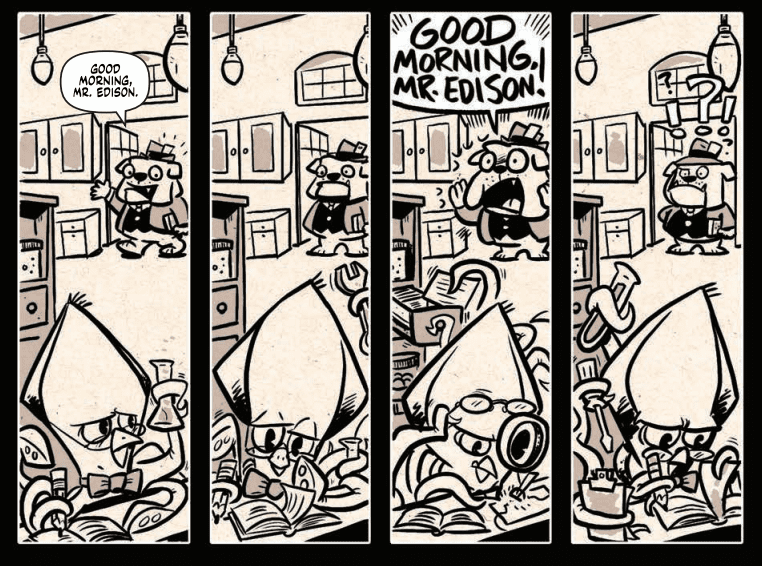
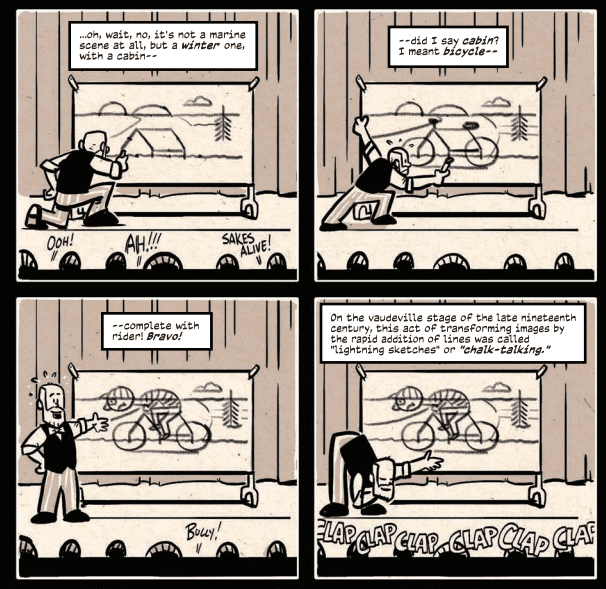
Following in the footsteps of Scott McCloud and his Understanding Comics, The Comic Book History of Animation (known as simply History for this point on) reaches into the past to help cement the historical timeline of ‘moving cartoons’. Animation didn’t spring into the world fully formed and Van Lente/Dunlavey have cherry picked moments that led to the creation of the form as it is understood today. These moments focus on the creation of the Art work; performance drawing and Chalk-Talking, which in the modern world would be better understood in relation to an educational environment.
The focus on the act of drawing does two things for the reader. Firstly, it instantly creates a parallel between Comics and Animation which is a theme that flows through History, even if not explicitly stated. The second thing it does is allow Van Lente to build his narrative from a specific point of view, one that is inherently American. Very little is mentioned of the European advancements in animation technology such as Charles-Emile Reynold’s animation machine which predates any of the narrative in History.
Obviously no-one expects a full account of everything that happened but this point about bias is worth making because of the narrative that unfolds. The question of the author’s reliability is raised and the reader should keep this in mind throughout the rest of the comic. The problem of ‘history’ in a broader term is something that McCloud also had to contend with in his books and some of his work is now being critiqued more closely, opening up the field of Comics. The same should be done with History, with the reader using this comic as a starting point for their own education.
The Comic Book History of Animation Credit: IDW Publishing
Presentation and Audience
Dunlavey has adopted a ‘Funny Animals’ style for the comic, invoking a rich tradition in both comics and animation. The Funny Animal approach allows him to distance the characters in the narrative from the real historical figures just enough for over the top humour and caricature which is an essential element of this comic. For example, Richard Outcault is depicted as his Yellow Kidcharacter both invoking the comic strip and the creator in one simple drawing. And Walt Disney is drawn with the famous Micky Mouse ears making him instantly recognisable throughout.
Subtle changes in the artwork give the reader an indication of what the animation styles were like, enhancing the narrative element in the caption boxes. This works to the advantage of the comic, making it obvious that there is more going on than a parody of famous animators. The continuous use of the caption boxes as a narrator is also a telling creator choice. Instead of using an avatar to guide the reader through History, Van Lente has chosen a more disconnected voice, reducing the fingerprint of the writer. It makes it easier to sell the narrative, and comic, to a wider audience without a visual lecturer. The voice could come from a peer, a teacher, or even a friend, which makes it more accessible.
One of the failings of the comic, however, is this lack of direction regarding the intended audience. Animation, just like comics, has a reputation for being ‘childish’, often being branded with the moniker ‘just for kids’* and texts like this comic are attempting to escape that.
Unfortunately, there is a mixed message within this comic as it is both for kids and for adults but not in the perfectly merged way of a Pixar movie. The title of this first chapter is Silent… but Deadly which is a juvenile joke that sets the tone for the comic; it is after all printed on the cover. Further such gags are scattered throughout which will bring a smile to your face if you are so inclined to that humour. However, there are also more adult themes blatant within the text. The comic touches on alcoholism, corporate bullying, and pornography. Unlike Horrible Histories, a wonderful series of books that wallows in the murky, but more appropriate, side of history, Van Lente’s comic sways between childish and adult, flipping the reader from funny caricature high jinx into an almost dismissal of the misogyny buried deep within the industry. This makes it difficult to draw the line between farce and reality. Again, the problem in History comes down to the concept of Authorial Integrity.
From a reading experience point of view, there’s little to dislike about History. The artwork is engaging and often more challenging than you might expect. Dunlavey places the heavy textual element comfortably into the panels and creates a pleasant flow for the narrative. In places the images do feel more illustrative than storytelling but then other pages are the complete reverse.
The design of the layouts work especially well for easy accessibility which is surely a requirement as some of the target audience for this comic may not be ‘comics’ fans. This accessibility is also reflected in the Funny Animal motif Dunlavey uses, constantly reminding the reader of the Animation, and Comic, aspect of the historical narrative. History has a style which is used from cover to cover to sell the product in a particular way, to a particular audience.
The Comic Book History of Animation Credit: IDW Publishing
Conclusion
The cover of The Comic Book History of Animation is fun and that sense of enjoyment travels throughout the pages. Van Lente and Dunlavey have curated a fascinating look at the history of American Animation and presented it in a fun way that draws on lofty Comics traditions of representation and biographical narrative. Scholarly work such as Understanding Comics, and influential comics like Maus are obvious influences and these creators are clearly telling a story that is close to their hearts.
Everyone who reads History will get something out of it and learn something new. The best way to look at this is as an introduction into the history of animation, as if Van Lente is opening the door and beckoning you to go through. Once on the other side it is up to you to discover the greater history of the medium and expand your education.
Most importantly, the art style suits the narrative, even if some of the contrasting tones make it difficult to know who this is aimed at. It will be interesting to see how the series develops, especially from an artistic point of view: will Dunlavey incorporate modern animation styles as the story progresses? Will it become less Funny Animal and more realist or expressionist? Either way, it will definitely be worth checking out.
The Comic Book History of Animation Credit: IDW Publishing
*There is a much wider discussion around this point in both comics and animation. People argue so vigorously against comics/animation being a children’s medium and yet it is an often overlooked fact that this is exactly how the industries viewed themselves. The ‘kids’ market was, and is, instrumental to the success of both media.
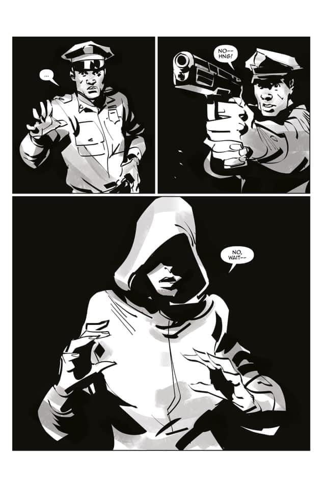
Black Cotton is an alternate reality series coming out this February from Scout Comics. The series is by co-writers Brian Hawkins and Patrick Foreman, artist Marco Perugini, letterer Francisco Zamora, and graphic designer Jerry Nilsson. Monkeys Fighting Robots got the chance to speak with the co-writers about the new series.
About the series:
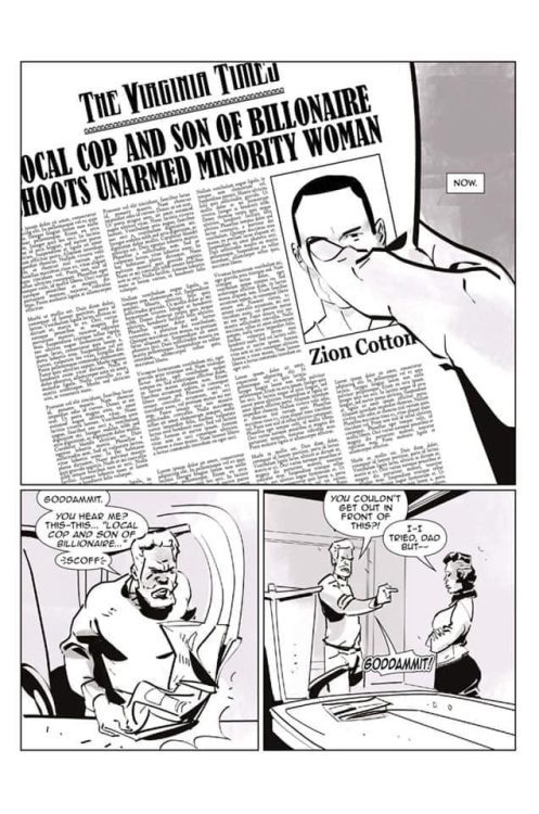
Set in an alternate reality where the social order of “white” and “black” is reversed, an elitist family, the Cottons, are rocked by a tragic shooting that begins to unravel long-standing family secrets that could not only destroy the family but also divide the fragile social climate of the world.
MFR: At first glance, the most noticeable aspect of this comic is it is in greyscale. What inspired this choice? Was it intentional, even at the writing stage of this comic?
Brian Hawkins:I’m definitely a fan of grayscale. That goes back to The Walking Dead for sure. But the choice for black and white/grayscale for Black Cotton was definitely story-based. We talked about it early, the grittiness of it, and since it is a story about black and white, i.e., “color,” to take color out of it — seemed poetic and right — also, it allows you to focus on the characters and to see them “without color” for who they are through the lens of social order in this universe.
Patrick Foreman:Absolutely. We talked about trying to remove people’s implied bias or preconceived perceptions. After talking about it out for hours, we both thought the best way to accomplish it would be to simply remove the colors.
MFR: What was the collaborative process like? Did you encounter any obstacles when trying to create the story and its world?
HAWKINS:No obstacles at all! Patrick and I really complement each other well. He’s a consummate collector and has been for years, and I’m definitely a comic book enthusiast. We bring a lot of the same ideology to the table but also a healthy difference, and that creates a great balance. As far as the process goes — we talk on the phone; we have weekly zoom meetings to craft story while also talking about the business side of comic book creation and how to build the Black Cotton brand. Once we’ve outlined the story, I would then script.
FOREMAN:None. Brian and I work great together. We both have a high level of respect for each other and our creative ideas. Brian is a seasoned veteran with several books under his belt. Throughout this process, he has shared so much knowledge with me. I will forever be grateful for his guidance. Black Cotton would not be a reality if he had not taken me under his wing with this collaboration. It has been great, and I am sure it will be great 10 years from now too.
MFR: I think it’s safe to say that Black Cotton deals with significant, current issues. But, what was the idea behind the choice to set the story in an alternate reality?
HAWKINS:We wanted the freedom of having a world like ours but not ours. We didn’t want the same sordid history that we actually have as a bedrock in the real world to be the same foundation for this story.
So in Black Cotton, we see a world that is like ours, but not reversed in many ways, but not just reversed in a lot of ways — also different. The similarities that we see as readers, we are taking into the story with us from our world, and what we have to deal with is our own implicit bias, but the Black Cotton Universe/Reality isn’t a world where things diverged to make the reality different– it’s actually a reality where Africans never came to America as slaves. And White Americans were never slaves either, so it’s not a reverse as in a flip-flop.
It’s a holistic reversal, truly another perception of reality to challenge how we perceive this reality, ultimately to bring about a higher level of understanding of the human condition. So, in the Black Cotton Universe, we are dealing with a reality where oppression has taken place without slavery- so we see some of the same horrible mentalities and ills and brutality even without slavery having ever been present.
FOREMAN:I believe it all began with the famous and one of the most asked questions; “What if…” Once you start there, then it is easy to go down a rabbit hole with the right topic. With all of the events that have happened just over the past 10 years, more and more people are secretly asking questions such as “if that happened to..”, “If they were…”, “If they could only see it from…” Many times conversations are hard to have because the participants do not feel they are in a safe zone to partake in the dialog. We wanted to create a masterpiece that people would enjoy while also creating a safe environment where readers could walk in other people’s shoes. We want people all around the world to start engaging in fresh, new conversations.
MFR: What can you tell us about the Cottons, this series’ protagonists?
HAWKINS:They are a family of immense wealth. As far as fictional billionaires go, think Carringtons from the TV show, Dynasty. The Cottons are an elitist family, what would be considered in our world as being part of the One Percent. They are historically wealthy, dating as far back as over 400 years (which is purposely stated as four hundred year because it parallels our real-world history of slavery). The Cottons were immigrants from Africa, among other African immigrants, who ended up settling in the Americas. No one took from the Native Americans or any original settlers, but instead bargained and, in some instances outwitted, there were various and different ways and methods by which the African immigrants came into power aka the ruling class of America — but that’s a different story that we will delve into later.
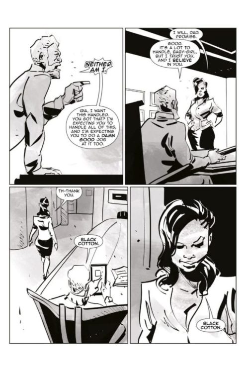
So, when the story starts here — the Cottons are a strong family unit that rallies around their own mantra of “Black Cotton,” which is a mindset for them as a family as well as how they made their money… Literally manufacturing black cotton. The family dynamic consists of Elijah Cotton, the patriarch, Jaleesa Cotton, the matriarch, Zion Cotton, the oldest brother and also a police officer, Qia Cotton, the only daughter and also COO of Black Cotton Ventures, and Xavier Cotton, the youngest brother and teenager. We will explore that Black Cotton mindset throughout the comic… This segues perfectly into the next question…
MFR: At the press release for the series, Brian Hawkins noted that “Black Cotton” is a comic, but it’s also a mindset; it’s a mindset that’s being explored in a comic. Could you both elaborate on this quote?
HAWKINS:Black Cotton as a mindset is about love, honoring familial bonds, kinship, empowerment, encouragement, edification, enlightenment, and most definitely self-reliance. “Black Cotton” represents tenets that are rooted in the essence of what makes a person a full human being, perfect in the sense of existing as a human being that can mature and grow as you’re supposed to, understanding that there is no separation between individual and group, that one is a part of the other; it takes individuals to make a group, to form a whole, and they have to strive for the best version of themselves to better not only themselves but others. That’s Black Cotton.
FOREMAN:Black Cotton Mindset is going back to the beginning before perception occurs. Black Cotton Mindset is color blind and curious like newborn babies’ minds are. It is there that people are able to cross the implied stereotype boundaries we have unknowingly developed over the years.
MFR: Do you have any piece of advice for comic book writers or comic creators, in general?
HAWKINS:Work on your craft first — if you’re a writer, write and really understand the storytelling structure as it pertains to comic book writing. The same goes for artists — even though I cannot speak directly to that as a writer — but I can as an editor; I know that the artist has to be telling the same story as the writer; their canvas is just a different part of that whole (that goes back to the Black Cotton mindset of individuals = the whole, right?).
So, craft, again — how do I tell this story through art? How do I bring it to life? There’s a method to that which goes along with vision. This is where the second part comes in, collaboration. Comic book writing and creating as a whole is about collaborating and thus, communication and openness is a necessity. You have to go into that willingly. Again, the individual becomes the group, to make the whole (that’s Black Cotton again!)
Last, is limitation. Ideas can be vast, and most creators want to just create, create, create, but it takes limiting yourself to focus, to really bring something to life. You have to embrace the idea that you have time and that you do not have to do it all now to be a creator. It took me a while to learn that and then even longer to put it into practice. Presently, I have a few projects coming out, finally coming to life, but it isn’t because I’ve just been on a rampage of creating — I began to limit myself years ago, focusing on project by project, saying ‘no’ to myself a lot of times when I wanted to start something new without finishing what I’d already started and now some of those projects are coming to fruition. It’s the simplest lesson but the hardest to grasp: Less is more.
FOREMAN:Always have a Mentor. Having a mentor helps you continue to grow and get better with your craft. Never lose your vision. Write your vision down, and then build your team around that vision. The team will determine how far you can go. The Black Cotton team is truly special and operates as one. This makes the whole process enjoyable. It is within that type of environment that legendary masterpieces are created.
MFR: Thank you for taking the time to talk with us, and best of luck with Black Cotton.
You can pre-order the first issue in December or pick it up when it hits local comic book shops this February from Scout Comics.
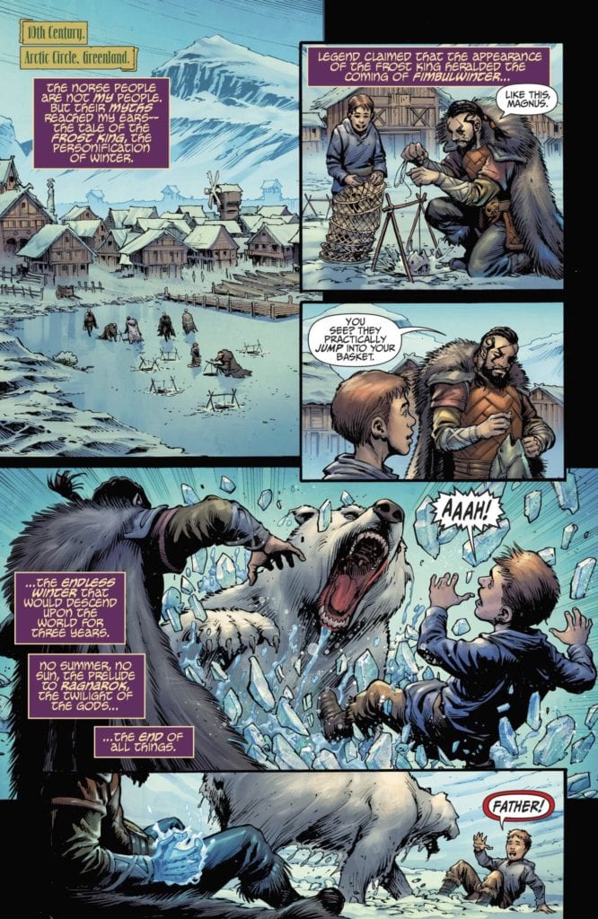
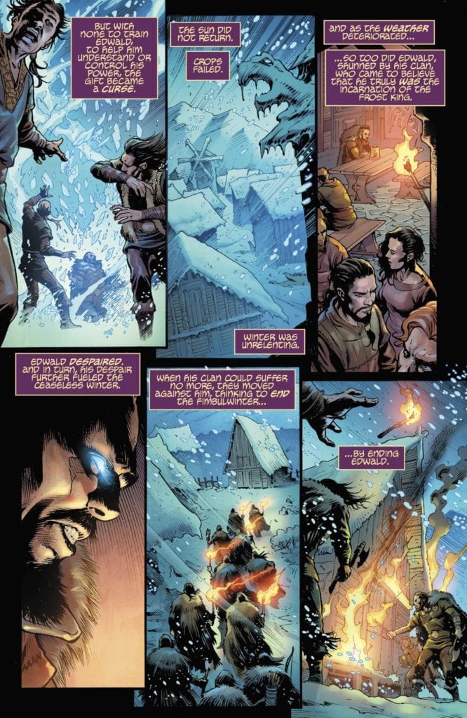
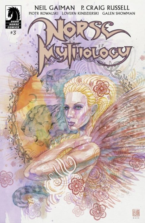
Norse Mythology #3, out December 9th from Dark Horse Comics, is the beginning of another classic story with many of your favorite gods and an exciting series of events.
Norse Mythology #3 Story
It is impossible to dispute that the stories portrayed in this series are classics, and Neil Gaiman’s writing brings the ancients tales to life and makes them feel new. P. Craig Russel flawlessly transitions Gaiman’s retelling of the iconic stories to the medium of comic books so that it flows naturally and effortlessly pulls the reader in. I have never been well-versed in Norse mythology, so as someone who is experiencing many of these stories for the first time, I can attest that they are made to be gripping and wildly entertaining tales. The stories have a slightly more mature tone than children’s books. They are entertaining for older ages, but I could see this series resonating well with children a few years before their teens. I know I would be going absolutely crazy over this series at age eleven when I read every mythology-related book I could get my hands on. Norse Mythology #3 has a story that captivates readers despite little action and dialogue that flows perfectly.
Art
The art of Piotr Kowalski is incredible to look at. Norse Mythology #3 has minimal action, so the characters’ facial expressions and body language do the heavy lifting. Kowalski’s faces match perfectly with the dialogue presented, and it is evident when a character is hostile or discomforted from body language alone. Kowalski also did a phenomenal job with the highly detailed character costumes and backgrounds in the issue. It seems like every god or goddess in the issue is wearing some fur, chainmail, or jewelry with a surprising amount of detail. Thanks to the talents of Kowalski, all of these characters look amazing. The backgrounds of the issue — mostly the interiors of buildings in Asgard — have detailed stone walls with stunning shading. By nailing the finest of details, Kowalski can make the world of Asgard feel like a place that truly exists.
Norse Mythology #3 features the spectacular coloring of Lovern Kindzierski. The wondrous characters from Norse myth would be nowhere near as exciting without his work on this issue. Kindzierski uses a broad color palette for his characters and settings, which quickly establishes a fantastical tone for the world. It makes you feel like you’re taking a small glimpse into a vast and complex world, which is a great feeling to be getting across for any fantasy tale. Kindzierski also uses the technique of single-colored backgrounds to his advantage. This is done in some cases to add energy to a panel. A warm color like yellow adds to the ferocity of a character in a panel and helps the emotion come across clearer. It is also used to help a character stand out, even if an intense emotion does not need to come across. This is done with cool colors that contrast the bright style of the book’s characters and helps aim all attention to the character on a panel.
Galen Showman provides some stunning lettering that helps make Norse Mythology #3 such a riveting read. For example, Showman often includes speech bubbles that don’t have words. This may seem strange at first, but a word bubble with an exclamation point or a spiral is an effective way to portray sounds people make without creating onomatopoeia that attempts to express the same emotion. Showman also uses alternate speech bubble borders and background colors to help express emotion in a character’s dialogue and uses intriguing fonts for action panels that require sound effects. In all, Showman provides some mesmerizing lettering in the issue.
Conclusion
Norse Mythology #3 helps cement how this series is one of the most enjoyable and accurate ways to portray classic mythology. The writing of the issue is simple yet flows well, and the art complements the story extraordinarily well. For any fans of mythology, I could not recommend this series more.
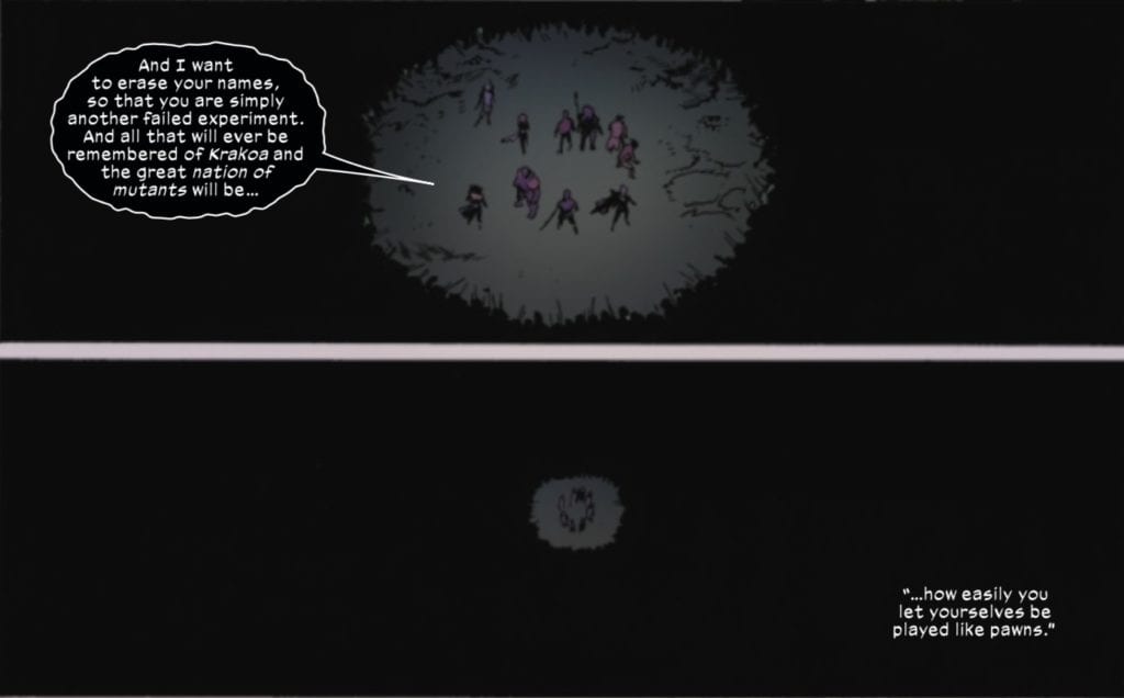
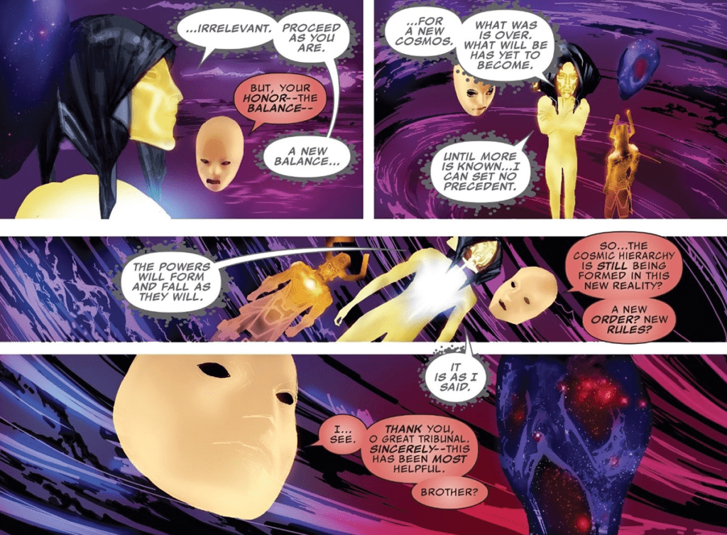
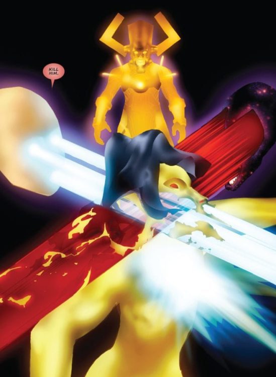
With Annihilation/Genesis refusing to accept the results of her duel with Apocalypse, Amenthi forces attack Otherworld.
There are a few cool moments in this book, including an “arrival of the Calvary” moment as Jubilee and the Priestesses of the Green arrive. However, given the overwhelming numbers of the Amenthi forces, this has the same effect as the elves’ arrival at Helm’s Deep in Lord of the Rings: The Two Towers. While Arakko loses some of its champions, with Bei the Blood Moon switching sides and the White Sword departing, readers are treated to an image of Krakoa’s remaining champions surrounded by a sea of Amenthi darkness.
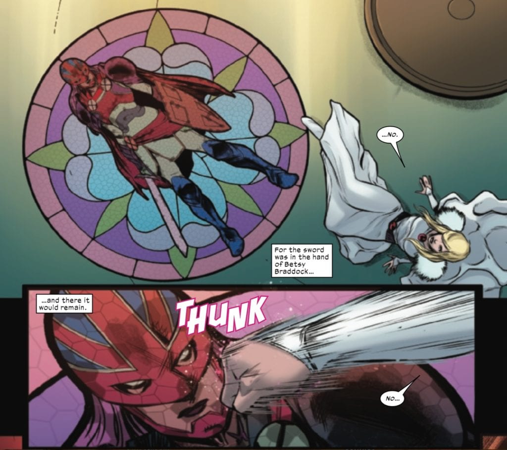
However, this issue ends with a glimmer of hope, as readers discover that the Captain Britain Corps has been reborn, and, much to Saturnyne’s consternation, is modeled not on Brian Braddock, but Betsy, with multiple iterations of Betsy Braddock responding to the call to defend the Starlight Citadel.
Longtime readers of Hickman’s work will remember that the Captain Britain Corps fell during his Avengers run by the Beyonders. In this issue, Howard and Hickman revisit the plot point and restore the Corps. This may, however, leave readers with questions. The biggest question may be why the multiverse’s pattern for Captain Britain is based on Betsy and no longer on her brother Brian (as it had been in the past). Why would Betsy be Saturnyne’s true protector?
Sure, there are some in-story explanations about Betsy being the template and Saturnyne’s spell not going as she wanted, but perhaps there is another explanation as well.
In the fallout from Hickman’s Secret Wars, Al Ewing launched The Ultimates, a title that explored, among other things, some of the consequences of the multiverse’s death and subsequent rebirth. Readers learned in that series that the current multiverse was its eighth iteration, the multiverse from before Secret Wars having been its seventh.
This new multiverse is still in the process of settling in Ewing’s run, meaning that a new balance is establishing itself among Marvel’s great cosmic powers, a lesson the Living Tribunal learns the hard way in a dispute with Master Order and Lord Chaos.
A new multiverse with a new set of rules means there can be a new template for the Captain Britain Corps, not only in the 616 Universe but every universe.
Fron writers Gerard Way and Shaun Simon and artist Leonardo Romero comes the action and emotion-heavy third issue of “The True Lives of the Fabulous Killjoys: National Anthem.” This issue poses a renewed focus on its core cast of characters as the old band of Killjoys gets back together and rediscovers their trauma and will to fight. With Outstanding visual work from Romero and colorist Jordie Bellaire as well as stellar lettering from Nate Piekos, this is yet another brilliant ride of a comic from this team.
“After finding their final missing member, the reassembled Killjoys exterminating team have a shootout with an enemy gang and discover a bizarre authoritarian scheme from their corporate adversaries.”
Writing & Plot
Gerard Way’s and Shaun Simon’s script for “National Anthem” #3 focuses on getting the rest of the Killjoys back in the band and developing the emotional root of their struggle. Introducing and reintroducing new and returning members of the team is allowing the pair of writers to cover different kinds of internal and external struggles and shows these characters defeating their traumas. It’s great both in terms of a way to get into and empathize with these characters, as well as be a motivator to both overcome one’s own struggles and empathize with those of other people. Way and Simon have managed to take this sort of cliched concept of fighting the establishment and refurbishing it for the socio-political talking points of 2020. The dialogue and narration are still a flavorful combination of excellent naturalistic dialogue, crazed in-universe not-speak, and artistic poeticism. This chapter’s pacing breathes a bit more than the last two issues, as new cast members are brought into the fold and there’s actually a moment for downtime. This being said, there are still some outrageous fight scenes mixed in with the character’s own revelations and self-discoveries. The final page dialogue blurb will be a treat for both fans of the original Killjoys comic as well as die-hard MCR fans. This is another stellar and sharp script that promises much more insane fun in the coming chapters.
Art Direction
The style that Leonardo’s heavily silver-aged inspired pencils gives “National Anthem” #3 might be the biggest draw of this book from the outside, even more than Gerard Way’s star power. The classic blended with contemporary look is one that has been making a big comeback with the likes of Nick Derington and Doc Shaner, but Romero’s is distinct in it’s design. His thin lines allow for more of a more open use of color as well as the cultivation of the faux-60’s aesthetic this comic strives for. The character animations are sharp despite any sort of shadows or inked textures, and the tine details in the panels are as clear as day. Speaking of those colors, Jordie Bellaire’s palette uses a huge variety of shades that pop off of every page. Each panel has the effect of one of those overwhelming neon road signs but in a really cool way. The vivid choices in this book look stunning, and are a huge portion of why this insane series works. The lettering from Nate Piekos functions much in the same way Romero’s art does; classically inspired but with contemporary touches. The accents and effect lettering are filled in by Bellaire’s colors and blend into the environment like part of the scenery. This comic looks spectacularly spot-on, like pop-art on acid, and it’s arguably the best feature of this thus far outstanding series.
“True Lives of the Fabulous Killjoys: National Anthem” #3 is an impactful and turbulent ride of a chapter. Gerard Way and Shaun Simon’s script offers punk mayhem and his usual weirdness but with a topical heart that grounds the story and its characters in a place of relatable reality. The visuals from Leonardo Romero and Jordie Bellaire are a phenomenal fusion of classic weirdness and modern techniques that make one of the coolest looking books on shelves right now. Be sure to grab this third chapter of this brilliant comic series from your local comic shop on 12/9!
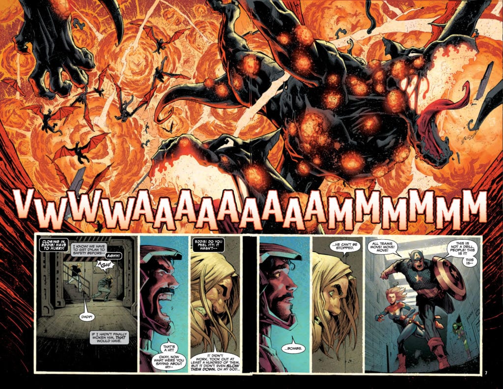
King in Black #1 is in your local comic book shop right now, as Donny Cates, Ryan Stegman, inker JP Mayer, color artist Frank Martin, and letterer Clayton Cowles bring Knull to earth for an epic five-chapter Marvel Comics event.
Did I mention this was a blockbuster comic? There are NINE double-page spreads in this book. Stegman is given the freedom to explode the Marvel Comics Universe all over this book with four jaw-dropping shocking moments. The pace of the book is very brisk because of Stegman’s Michael Bay-inspired artwork.
Cates does his job and sets up an insane conflict with insurmountable odds for heroes to overcome and figure out how to save the world yet again. Where Cates excels is in how accessible this first issue is to a new reader. If you are a fan of the Marvel Cinematic Universe, you can pick this book up and hold your own understanding of the plot. Where explanation is needed, Cates fills in the gaps. As mentioned above, there are four cliffhanger moments that Cates could have ended the first issue on, but he throws everything at this comic to keep stunned and begging for more.
Martin is the force that separates King in Black #1 from all other giant Marvel Comics event books. This is not a Spider-Man event book, this is a Venom event book, and the color palette is DARK. The darkness sets the tone for the series, and then Martin screams in your face with his electric blues, on-fire yellows, and deep blood reds. The colors used invoke emotion and get into your soul. King in Black #1 feels like the final chapter of 2020.
Cowles must be smiling ear-to-ear, admiring the job he did on this issue. There are so many different lettering elements in King in Black #1 that make the book so much fun to read. The gigantic sound effects are off the charts with scale. The tone and texture in the word balloons is very emotional, from Captain America’s confidence, to Knull’s consumption of death, to Eddie Brock’s torment and relationship with the symbiote.
King in Black #1 is a complete book that gets you excited to read comics and dig through back issues to research the story.
Since the early days of the medium, graphic novels have proven to be well-suited to non-fiction storytelling. But among the glut of superheroes and other more popular fiction, we can find something to love in every insightful biography or educational graphic novel. Here are five books that deserve more attention.
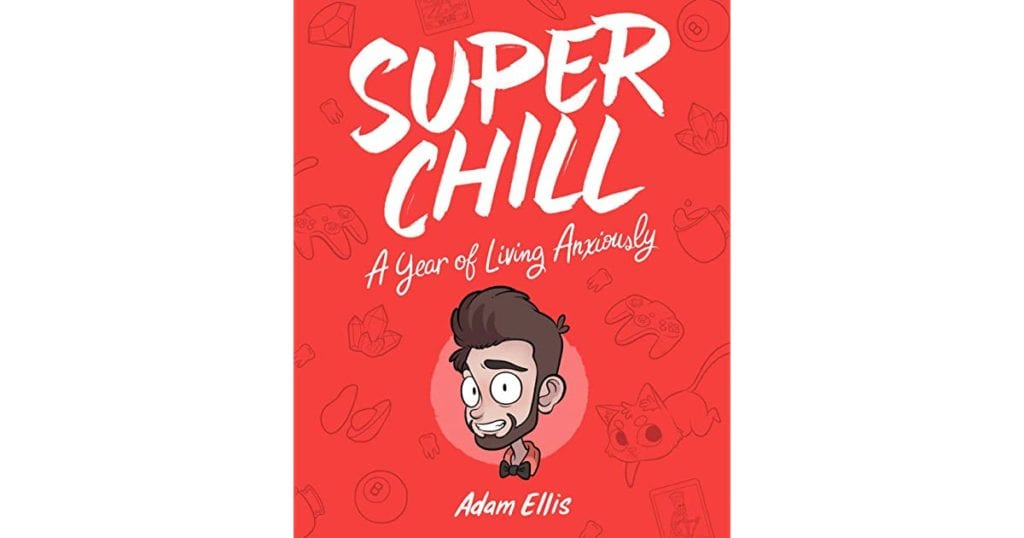
SUPER CHILL: A YEAR OF LIVING ANXIOUSLY
Adam Ellis’ 2018 solo work isn’t strictly a graphic novel, but we can stretch the rules to fit this funny and relatable book. Super Chill collects fifty-plus short comics full of absurdity and personal embarrassment. From a story of an awkward psychic reading to the scene of a wildly shaking leg causing the world to explode, expressive lettering, bright coloring, and a cartoonish style make us cringe and laugh in equal measure. So, if you’ve also imagined an Autumn leaf reminding you of your mortality or had anxiety dreams at all, then this is the book for you.
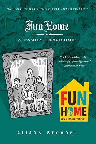
FUN HOME: A FAMILY TRAGICOMIC
Alison Bechdel made the mainstream with her eponymous feminist media “test.” But, if you want to know the art behind the name, Fun Home is an excellent place to start. As it was published fourteen years ago, it’s had plenty of time to make many top ten graphic novels lists–and rightfully so. Bechdel employs a classic comic strip style to tell her tragic family story. Divided into seven chapters, the balance of humor, drama, and the objectivity given by time make this a highly readable book.
SEEN: EDMONIA LEWIS
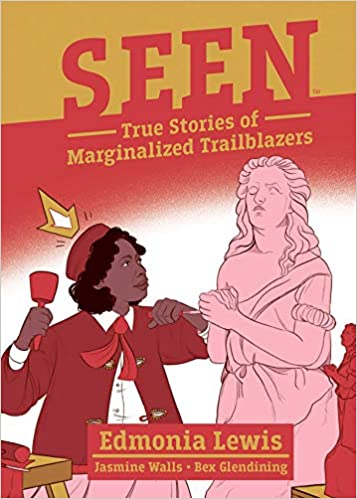
To escape the pandemic’s steady upheaval of our lives, we’ve had plenty of new works to soothe our wounds. Some have been pure escapist entertainment, while others are more politically poignant. In the latter category, Seen: Edmonia Lewis is the first in an original series entitled “Seen: True Stories of Marginalized Trailblazers” from Boom! Studios’ Boom! Box imprint. Written by Jasmine Walls and illustrated by Bex Glendinning, Edmonia Lewis’ story is told in a straightforward manner using short captions and quotations from Lewis herself and other historical figures. To complement the writing, the artistic style is relatively unadorned except in Glendinning’s renderings of Lewis’ sculptures. However, colorist Kieran Quigley and letterer DC Hopkins have their chances to shine in adding pastel color to a time period we’ve mostly seen in black-and-white and in breaking up blocks of text into easily read bits. Another feature of the book is panels in the form of scraps of old paper, a choice that adds a touch of flair and highlights the time period. This book is a must-read of 2020. Pick it up in time for the next installment titled Seen: Rachel Carson, which will be released in March of next year.
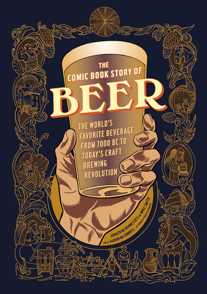
THE COMIC BOOK STORY OF BEER
Let’s face it; if all our history texts from high school were in comic book form, we’d all have loved the subject more. While beer as a subject is interesting through any media, its ancient history comes to life, and its complicated modern economic journey becomes easily digestible in graphic form. Illustrator Aaron McConnell contributes dynamic and animated art, while Mike Smith and Jonathan Hennessey provide insightful, clear, and gripping prose. Merge your love of beer and graphic novels with this book.
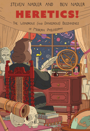
HERETICS! THE WONDEROUS (AND DANGEROUS) BEGINNINGS OF MODERN PHILOSOPHY
I don’t think I’m alone in saying that philosophy as a subject can be intimidating and overwhelming to any layman feeling ill-equipped to tackle life’s big questions. Have no fear fellow laymen, Heretics! is an extremely accessible introduction to important modern philosophers and their ideas. Written by philosophy professor Steven Nadler in collaboration with his illustrator son, Ben Nadler, their humor and whimsy make philosophy seem surprisingly cool. Ben’s fun illustrations, including a panel of the Devil working on his MacBook, hilariously contrast his father’s summaries of Spinoza and Locke’s grand concepts. Soon you’ll be talking about “pre-established harmony” and “empiricism” with the best of them. I also defy you to read this book and not want it to be reimagined as a series on Adult Swim.
End your year on a high note by picking up a graphic novel or two. Which graphic novels would make your own list?


")