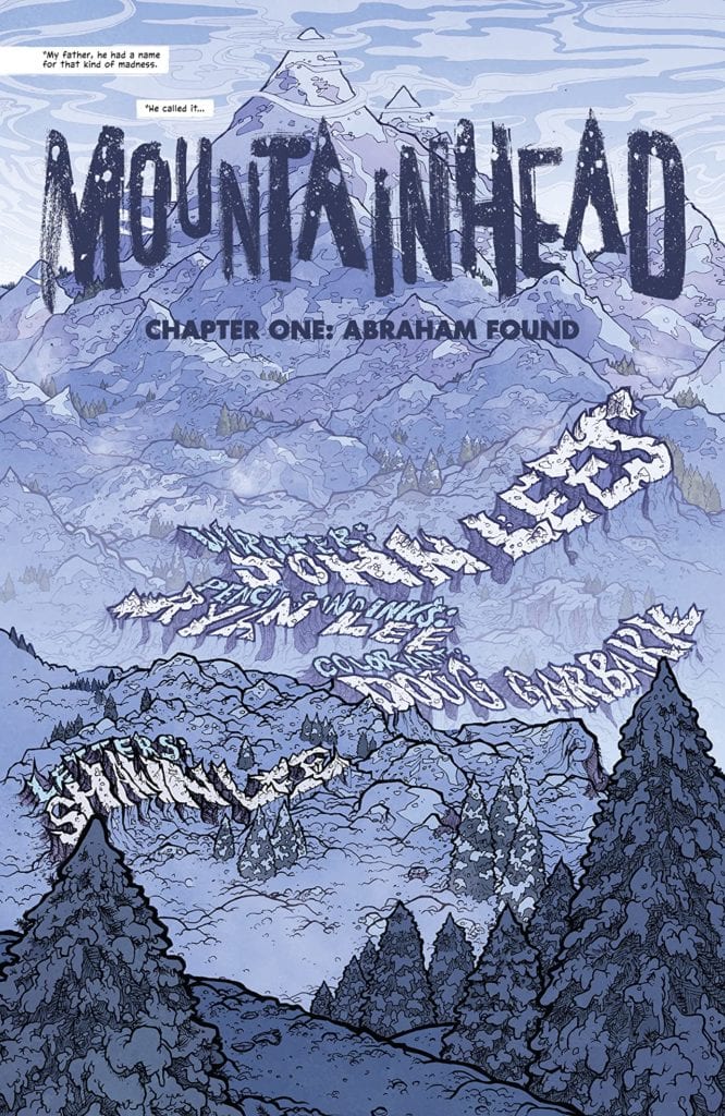
Home Blog Page 210

Review: Lies And Prophecies In SWEET TOOTH: THE RETURN #2

Writer and artist Jeff Lemire returns to the story that arguable made his career for the second chapter of “Sweet Tooth: The Return.” Where the prior issue was steeped in mystery and confusion about what became of the world since the original comic, this follow-up clears much of that fog by answering some questions and deepening the connection between this series and its acclaimed predecessor.

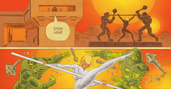
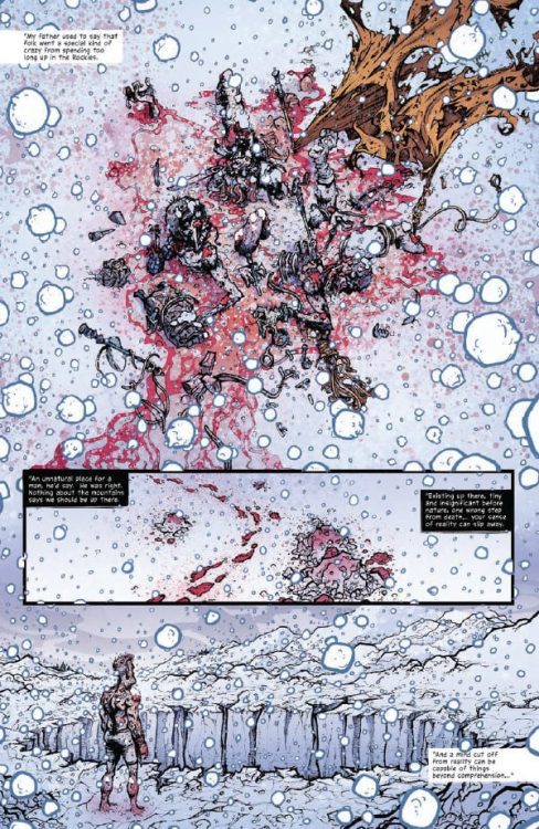
“Father is not very happy with the boy. The boy should have listened to Father. Surely, every boy needs to play, run, and be wild…but the boy can never be free…not really. Now the boy has done something quite bad and made Father very unhappy. Go to your room, young man! But the rooms here are very small, and dark, and cold, and the boy is not very happy in them. No one is happy. But sometimes, even from a bad time, something special and unexpected can blossom.”
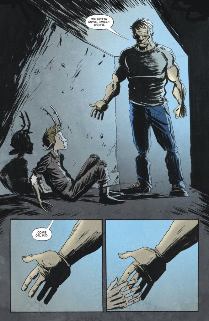
Writing & Plot

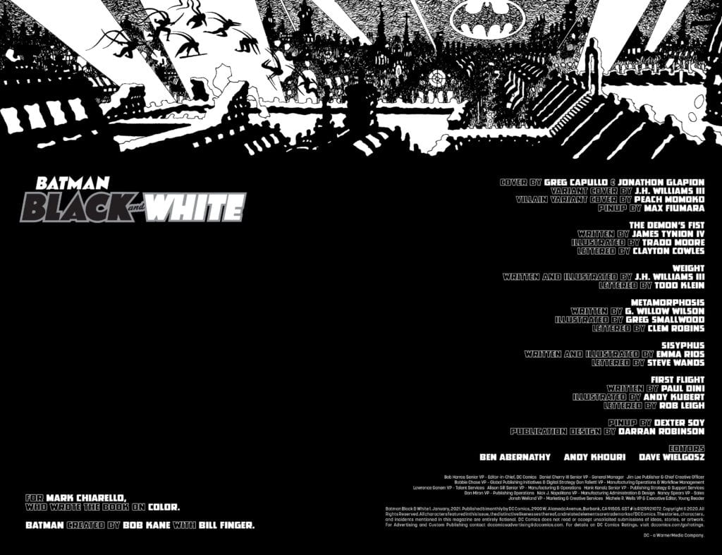
Jeff Lemire’s signature style of taking grandiose concepts and shrinking them down into digestible bits via character-building holds here in “Sweet Tooth: The Return” #2. The secrecy and confusion in the last issue is cleared up quite a bit, and it’s accomplished through uh, “The Boy’s” (his name is a spoiler) interaction with the world and people around him. Lemire’s ability to ground stories in how people are affected in a given world is one of the main aspects of what makes him special as a writer. The concepts covered in the original Sweet Tooth are still here, but they’re covered up in a steadily clearing layer of haze. This is obviously due to Lemire not wanting to give away what exactly has happened to this world since the original comic ended, but it’s also a neat narrative trick for people who read the original comic…quite some time ago. I last read all of Sweet Tooth almost 2-ish years ago, and while I remember the key points and characters, there’s a lot that is fuzzy (albeit familiar) to me. Lemire puts us in The Boy’s position whether he intends to or not; showing familiar images in a familiar order, but in a sequence that doesn’t match up. Rediscovering this story and world has been a wonderous experience these first two issues, and it’s made me want to go back and reread the original series even more. Lemire’s charming dialogue sensibilities are still on point, making for a comic that is a stellar mix of tense mystery and character story worth investing yourself in.
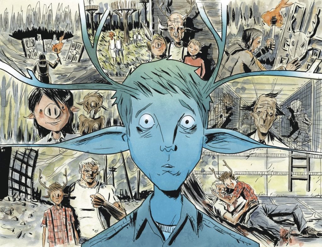
Art Direction

I said in my review for “The Return” #1 that this story could not be told without Jeff Lemire’s pencils working alongside his words. This holds true here on the second issue, and I doubt there will ever be a time this changes. Much like his scripts, there’s an almost indescribable charm to Lemire’s art that makes it absolutely perfect for the world of Sweet Tooth. The characters, while all presented in Lemire’s signature rough-hewn thin lines and skinny bodies, all have fantastically well-animated and expressive facial expressions as well as a uniqueness in each person’s design. The details are surprising as well, with articles of clothing being lined with pockets,, seams, and wrinkles that pull off a realism not expected in a comic with this kind of art style. The impossible-to-duplicate aesthetic of this series is also crafted by the watercolor style of Jose Villarrubia. His unique multitude of shades is matches and fills in Lemire’s pencils with a visual eye that pulls off similar tricks to the story’s creator; things are completely grounded in one moment, but then take off in strange and hypnotizing directions when the story gets mythic. The visual look of both this and the original comic is unmistakable, and this story couldn’t be presented with in any other way.

“Sweet Tooth: The Return” #2 is a stellar second chapter that clears up some of the mystery and connects the dots between this comic and the original Sweet Tooth. Lemire’s charming character writing and ever-fantastic plotting hold strong in this issue, as well as his ability to keep a story interesting by giving the reader tasty crumbs of intrigue in every chapter. The visuals by both himself and Jose Villarrubia are the signature rough-edged but delightful aesthetic this series is known for and I wouldn’t have it any other way. Be sure to grab this issue when it arrives at your local comic shop on 12/8!

Monkeys Fighting Robots Youtube

INTERVIEW: Tom Scioli on Process, Princess and His New Patreon Account

Scioli

Cartoonist Tom Scioli made waves this year when his comics biography Jack Kirby: The Epic Life of The King of Comic was released (read our chat with Tom about that here). Tom has now followed that up with a couple of new projects, one of which is an exciting new Patreon account. Tom is releasing all sorts of comics there, including Princess, his latest sci-fi story.  Read all about it and make sure to check out all of Tom’s work, it’s some of the best comics/cartoons being put out.


Monkeys Fighting Robots: So when we last spoke Tom, your latest book Jack Kirby: The Epic Life of The King of Comics,  had just come out. Now you’ve started two recent endeavors I wanted to ask you about. First off, you’ve created a Patreon. What made you decide to jump into that?
Tom Scioli: I wanted the extra motivation. I’ve kept busy during the past year, but I wanted the little bit of extra pressure to push me beyond my comfort zone.
MFR: What can readers expect from your Patreon? 
Scioli: I’m sharing comics in progress that I’m working on at the moment, most recently a superhero comic called Super Tiger. I’m sharing PDFs of recently completed works like Young Zeus and Princess. I’m currently coloring one of my older comics, The Myth of 8-Opus, and I’ve been sharing those pages as I complete them. I’ll dig into my archives and share what I find.
MFR: What do you get out and enjoy of Patreon as a creator?
Scioli: I enjoy the contact and engagement. It lets me know which works connect. I made coloring 8-Opus a higher priority because that’s what Patrons kept asking for.
Scioli
MFR: As a subscriber, I gotta say I loved the recent Princess comics you put out. It feels like one of those ’80s movies I would see on a UHF channel as a kid. It cued up memories of stuff like Ice Pirates, the Masters of The Universe film, Last Star Fighter.  Is Princess a recent concept, or one you have had for a while?
Scioli: Working on comics like Go-Bots and Transformers vs GIJOE made me realize that 80’s sci-fi is really where my heart is. I love 60’s Marvel and 70’s DC, but the eighties are my sweet spot. I started working on Princess after I finished Super Powers, so it was probably around 2017.
MFR: You also adopted a style close to what you did in the Kirby book for Princess? Why did you choose this look?
Scioli: It helps the reader identify with the main character.
MFR: 2020 in general has seen a huge surge in Kickstarters, Patreons, Etsy and other self-published routes. Obviously, the pandemic was a huge factor in that, but why do you think indie comics specifically have found so much success in these formats?
Scioli: You can engage directly with your audience. You get feedback at every stage of production. You build an audience and gauge demand before you go to press.
MFR: Where do you see comics going in 2021? 
Scioli: I have no idea. I wish I could predict that. My hope is that once the pandemic is over things are going to bounce back in a big way and all the things we’ve been doing out of necessity will make the whole industry more structurally sound.
MFR: You also started a YouTube Channel, Total Recall Show. Tell our readers about it. And what made you want to do your own video podcast?Scioli
Scioli: I host it with my friend Matt Zeoli. We talk about whatever we feel like talking about that week. Mostly movies and tv shows. Occasionally comics. One of our ongoing themes is we read early drafts of movie scripts and compare them to the finished product. That’s been really interesting. I’m always interested in process and the road from idea to execution. As far as what made me want to do it, I’d been doing a number of Zoom interviews and other people’s shows, and I’ve been a recurring guest on the Cartoonist Kayfabe show. I’d done enough of these things that I felt like I had a grasp on how to make one of these, so why not make my own show. More than anything, it’s an excuse to get together and have the kinds of conversations I haven’t been able to have lately.
MFR: What else are you working on as the year closes? 
Scioli: I’m working on Super Tiger. I’m working on a follow-up to Young Zeus. I’ve got a couple of top-secret projects in the works that I can’t talk about. 
Monkeys Fighting Robots Youtube

HEROES AT HOME: Quarantine Doesn’t Stop The Fun Times

Heroes At Home Cover

Heroes At Home is a Marvel Comics quarantine special out on December 9. Comedy writer Zeb Wells brings some cartoony stories about the human side of Marvel heroes. It’s something artist duo Gurihiru are all too eager to showcase. Selective use of lettering by Joe Sabino and Jay Bowen make these quick and easy stories stand out from one another.

Heroes At Home: Satirical Character

Throughout Heroes At Home, readers see some of their favorite characters go about their domestic lives. While Spider-Man is certainly no stranger to these depictions, it is nice to see other characters get the treatment. It’s hilarious seeing Captain America face the dilemma of eating spaghetti fresh or doing dishes when he’s out of plates. Then there’s something endearing with Wolverine doing a puzzle out of a picture. It’s like wanting to connect with the friends in that picture and making an effort to do so. Zeb Wells certainly knows how to balance comedy with endearing tales, as his resume suggests.

Easy Expression

Gurihiru gives Heroes At Home an efficient use of their art styles. For the scenes where characters don’t need to speak, their expressions and situations tell all the story needed. For example, with Panther’s mask looking ever stoic, his body language makes his actions all the more appealing. Compare that to the Venom segment where Eddie and Venom’s facial expressions display their dynamic, especially when Eddie runs out of toilet paper.

The lettering in Heroes At Home by Sabino and Bowen go hand-in-hand with communication. The Captain Marvel segment has the most dialogue, which serves as an elaborate joke. Because along with the background and resolution, witty dialogue makes it all the more entertaining. It’s the little things like that that make a difference for fans of all kinds of visual storytelling to love.

Keep Your Heroes At Home

Heroes At Home is one of those stories that serve as good fodder for mainline comics. It’s a special little episode fans like myself enjoy for how each character expresses themselves. With so many stories focusing on the action, it’s nice to relax and see superheroes be people. It even serves as a decent Marvel equivalent to Dear Justice League for these depictions. That’s not even including how the creatives make full use of their roles in the production. Several segments make every use of comic art elements to tell their story.

Monkeys Fighting Robots Youtube

The Plan Unveiled in THE RED MOTHER #11

THE RED MOTHER #11, available Wednesday from BOOM! Studios, and this is the moment we’ve all been waiting for. Everything is finally starting to come together, as the inevitable fate chasing after Daisy McDonough comes ever closer.

Notice how close the Red Mother has come, in The Red Mother #11.

Eleven issues ago, Daisy’s entire life was changed, and not for the better. She went from having a life she loved, to a life where she seems to keep losing everything. Now, it seems that whatever entity has gained an interest in her, has come back to take the rest. Or has it?

The Red Mother #11 is a dark issue, yet it is also a climatic one. This is an issue we’ve been waiting for, as the build-up has been steadily leading to whatever is about to happen next. After this, there will be only one issue left in the series.

That begs the question, how will the series wrap up? Will it continue on this dark path, or will Daisy find a way to fight, and possibly even win? I don’t know about everyone else, but I have my hopes. Though I’m not entirely certain which direction the series will ultimately take. That’s half the appeal.

A calm beginning to this tale (The Red Mother #11).

The Writing

The Red Mother #11 is, in a way, a very trippy issue. It bounces back and forth between something borderline mundane, and something truly haunting. It is the perfect metaphor for the mental place that Daisy has found herself in.

Written by Jeremy Haun, this issue is clearly setting up for the final conflict of the series. Everything is coming together, and that means there’s a lot of heartache in store. Haun went to great lengths to clarify the intent – and actions taken by many secondary characters in this series.

It did an excellent job of increasing the tension. There’s a difference between knowing (or suspecting) and seeing. Something that this issue really drove home, as the betrayals are made clear. It’s tough to see all at once, but still cleverly written.

Yet this issue also raises dozens of questions along the way. What the endgame is. How this cult formed. How Daisy will react – how she could fight back. All of those questions, and so many more. Only one more month until we can see how it all ends.

Donuts seem like an excellent idea right about now. (The Red Mother #11)

The Art

As with the writing, the artwork within The Red Mother #11 bounces between the mundane and the horrifying. Seemingly at the blink of an eye (pun intended) at that. The artwork makes the fear of the unknown – of things hidden in plain sight, feel almost like a common occurrence.

Danny Luckert’s artwork really does bring the story to whole new heights. The more graphic nature of events is carefully handled. It doesn’t shy away from the gore…but it also doesn’t seem to relish in it. Instead, the focus is on the plot, as it should be.

The seeping of red hues in this issue, as with all of the others, is one of the many ways that the artwork excels. Imagine the way seeing the color purple makes you feel when reading Jessica Jones. It’s a similar effect happening here, only with a supernatural twist.

Ed Dukeshire’s lettering brings it all together. Daisy’s break, the actions made by everyone, the impact of knife on flesh. It’s all made clear through the lettering, complimenting both the writing and the artwork.

Even Daisy’s therapist is making an appearance in The Red Mother #11. Odd, no?

Conclusion

The Red Mother #11 is a dark and disturbing issue, but for all the right reasons. We’re nearing the end of the series, and thus the mystery. The tension has reached an all-new high, and it shows clear as day on the pages of this issue.

Monkeys Fighting Robots Youtube

How to Turn the Tides in FIREFLY #23

FIREFLY #23, available Wednesday from BOOM! Studios, brings us back to the characters we all know and love – and an adventure that we never imagined to see them in. This world is starting to look more and more futuristic by the day.

spoilers ahead

We’ve seen it happens dozens of times. A favorite television show (or movie) continued on, but only in comic book form. That is the fate for Firefly, thanks to the early cancellation of the series. From the comics, fans have finally had a chance to learn some of the answers they’ve long been asking.

Now, it feels like the series is moving on. We’re not looking into the past anymore – not learning about what made the characters the people we know them to be. Instead, we see our heroes (and sometimes villains) facing off against a threat like no other.

Admittedly, this sort of change could result in a take it or leave it response from the fans. After all, the series is taking risks, and some of those risks have forced dramatic changes in the world. Changes, that people might just love. Or hate.

Enter Firefly #23, this is an issue that not even the most die-hard fans could have predicted. The Alliance may be gone, but enemies are quick to fill that void. It’s a depressing thought, and the times aren’t looking a whole lot brighter.

A reminder of the past for this variant cover of Firefly #23.

The Writing

So, here’s the good thing about Firefly #23: it is taking risks. This entire plot arc has been full of surprises, and I thoroughly believe that Greg Pak should be given credit for that fact. Also, who can fault the series for bringing back some fan favorites? (I know I for one will never quite be over the events of Serenity).

The plot also raises some reasonable questions about ethics, Mal’s character (and method of getting things done), and the concept of following the letter of the law (as opposed to the intent). These are all good debates to bring up, and could arguably result in some interesting conversations among fans.

That being said, the plot does get pretty…weird at times. The whole robot concept isn’t new, and by itself is fine. But it doesn’t feel quite at home in the world of Firefly. If anything, it feels like it totally came out of left field.

A matter made a bit more uncomfortable by the design of the droids. Not that they’re bad looking – simply because they look like Malcolm Reynolds. More than that, they act like him. As I hinted at above, this isn’t a plot that we could have anticipated.

Is this the strongest Firefly plot out there in the comic continuity? No. But it is taking risks, and having a bit of fun in the process, both of which are facts that I respect. Though I confess that I feel a certain eagerness to see everyone happily ensconced in the safe place that has been discovered (though I have no doubt that bad luck will continue to follow the crew, and ruin those plans).

Mal looks ready (willingly or not) to face a whole army in Firefly #23.

The Art

Firefly #23 is full of a unique combination of artwork and styles. The backdrops are bold and vibrant, the droids equally bright against the otherwise Western-style setting. It forces a merger between the whole science fiction and Western concept, but in ways that we haven’t seen before.

Lalit Kumar Sharma and Daniel Bayliss were the lead artists for this issue, and they did a good job of finding the balance between those concepts. The droids look terrifyingly similar to our hero, while everyone else seems to be feeling the fatigue of constant battles and conflict.

Marcelo Costa’s bring life to the issue, thanks to those bold colors already mentioned. They’re eye-catching and memorable, especially when there’s something explosive on the pages (literally). I’m particularly fond of Costa’s sunsets, the reason for which should be fairly obvious.

Jim Campbell’s lettering is the final touch. The sounds and noises of the world feel almost real, and even the distinction in guns is made clear through the lettering. Bullets versus lasers, and everything in between.

The crews back together (mostly) on this variant of Firefly #23.

Conclusion

Firefly #23 is arguably not the strongest issue in the series, yet it brings with it more changes and risks. That makes it memorable, and I’ve got to respect that, if nothing else. I don’t know how much longer this arc will be stretched out, or how it’s going to end. Another point in the creative team’s favor, as the series has become truly unpredictable.

Monkeys Fighting Robots Youtube

Review: Mutant Town Organizes For Community Action In TEENAGE MUTANT NINJA TURTLES #112

TEENAGE MUTANT NINJA TURTLES #112, available in comic book stores on Wednesday, December 9th, takes readers on a tour of the inner workings of Mutant Town’s community. Previous issues focused largely on action and espionage, so it’s refreshing to see a change of pace. We find that the people of Mutant Town want to take organizing action to address their grievances. And what ensues is a debate over what sort of political choices they will take going forward.

Story

Rather than jumping into a fight scene from the get-go, writer Sophie Campbell shows readers what Mutant Town has “morphed” into over the past arc: a community for the disenfranchised. The Turtles, Alopex, Sally, and other have taken it upon themselves to develop a true community for the mutants.

We then see a mutant visitor arrive in search of the support group meeting. This individual, “Jay,” is shown to be skeptical over the community’s effectiveness, but nonetheless decides to visit.

Campbell gives Mona, Jennika, and the newcomer Jay realistic personalities, allowing readers to invest more deeply into the characters. Each character’s grievance is both personal and communal—speaking to the experience of marginalized groups in our own world. We also find their organizing efforts relatable to their real life counterparts, which includes both the comradery and sharp disagreements.

Artwork

Jodi Nishijima’s penciling and ink work, Ronda Pattison’s coloring, and Shawn Lee’s lettering crafted engaging illustrations for this issue. The personified animal styling of the mutant citizens reveal emotions, showing how characters don’t always need to be human to convey feelings. We also enjoyed the variety of colors used for each individual, showing how they each retain their own style and preferences post-mutation. And the font styles used for each character helped express their emotions through the use of bolded words to emphasize particular powerful parts of their dialogue.

Conclusion

TEENAGE MUTANT NINJA TURTLES #112 is a great template for what community dialogue should look like. We’re excited to see how the differing groups reconcile their differences and move forward together.

Do you think the mutants will find a path forward? Let us know in the comments below!

Monkeys Fighting Robots Youtube

Advanced Review: MOUNTAINHEAD VOL. 1 Will Keep You Awake At Night

MOUNTAINHEAD VOL. 1 out January 13, 2021, from IDW Publishing, is the first collected edition of the horror series by writer John Lees, artist Ryan Lee, colorist Doug Garbark, and letterer Shawn Lee. The series is the perfect combination between profound, emotional character arcs and a truly horrifying tale.

About the series:

Abraham Stubbs and his father Noah roam America in a nomadic existence. Convinced sinister government forces are pursuing them, Noah has them living off the grid, burgling houses to survive. Elsewhere, on Mount Rector, the lone survivor of a climbing expedition staggers homeward, covered in blood. Both are on an inevitable collision course with the picturesque Canadian resort town of Braeriach. Massive storm clouds are brewing. The animals are running. Something else is on its way.

Writing

Lees knows exactly how to craft a beautiful, engaging horror story. Every aspect of his writing works in this book and makes you fall in love with Mountainhead a little more. Each character talks like a real person would talk. The brilliant jump scares wakes up the reader, and right from the very start of this comic, they could easily tell through everything going on in the background and in the front: something messed up is about go down. When the messed up stuff does start happening, the reader is already so invested in the characters and their journey that they’ll accept anything Lees throws at them.

But, what I’d truly want to give high praise for is the way Lees handles Abraham, the main character, and his character arc. The reader instantly falls in love with this brave, scrawny kid and understands each choice he makes throughout the story. Abraham may be broken in more ways than one, but because of that, it’s all the easier to connect with him. All the readers can see a little of Abraham in them. But, especially, his character arc ends up being incredibly satisfying to the reader. It truly feels like something has changed about Abraham forever.

Mountainhead Vol. 1 Sample page 1

Art

Ryan Lee’s artwork in this book is phenomenal. His unique, highly-detailed art style never ceases to amaze the reader. Somehow, it even resembles the works of Tim Burton. The acting looks and feels real and manages to convey the character’s emotions beautifully. There are actually a few instances in this book where a character starts monologuing over a full page, and Lee chooses to draw the panel with only one “shot type” and angle throughout the entire page. But, this never feels boring to look at. With each new panel, small changes further engage the reader in the monologue and tell them more about those characters.

Although, what really catches the eye in Mountainhead Vol. 1 is Lee’s stunning panel layouts. Some layouts are ordinary for a reason. Lee wants us to feel comfortable while reading these pages. He almost wants us to feel complacent. But, when the horrifying, grotesque things happen, Lee goes all out with his layouts and present the reader with some of the most imaginative panel layouts I’ve personally seen in a very long time.

Coloring

Garbark’s colors pair beautifully with Lee’s art. Garbark often masterfully contrasts between the cold blues and the bold, bright reds to fit the feeling of Lees’ terrifying, poignant tale. Whenever vomit, blood, or spit takes place in the panels, the colors look highly saturated and bright which elevate the feeling of discomfort when looking at these moments. Garbark’s colors always direct the reader’s eye effectively to the most important thing in each panel. Brilliant work from Garbark.

Mountainhead Vol. 1 Sample page 2

Lettering

Shawn Lee’s lettering is a sight to behold. It both fits the art style and the writing’s eerie mood, but it also goes out of its way to present the reader with a great lettering style that, on its own, could be dissected for hours. The placement of the word balloons guides the reader’s eye well. The lowercase font pairs well with Ryan Lee’s art, and some of the sound effects leap out the page beautifully. Each sound effect has a different style and font, making the reading experience all the more interesting, engaging, and fun.

Conclusion

Mountainhead Vol. 1 will keep you awake at night for two main reasons. Firstly, it is an awfully terrifying comic that constantly keeps you on your toes. Secondly, the work by all the creators involved is so masterfully done; you can’t help but think about all the ingenious ways in which these creators made you feel so incredibly nervous and frightened when reading it.

The first volume hits local comic book shops on January 13th, with the final order due December 21st. Do yourself a favor and please pre-order or pick up this trade paperback.

Monkeys Fighting Robots Youtube

EXORSISTERS Volume 2: Kick At The Darkness (Until You Stop Laughing)

Exorsisters Vol. 2 Cover

Exorsisters Volume 2 finishes an ironic humor series Image Comics collects on October 28. Writer Ian Boothby works with Pixie Trix Comix artist Gisèle Lagacé to close out this supernatural action-comedy. Joining them are colorist Pete Pantazis and letterer Taylor Esposito.

Background

Exorsisters follows the titular characters Cate and Kate Harrow, “twin” exorcists who literally go to Hell and back for a paycheck. Except Kate’s actually Cate’s soul, it’s complicated. What’s not as complicated is that there’s a primordial evil who wants to annihilate existence. Wouldn’t you know it, these two are all that stand between this “First Shadow” and his goal, which brings us to the plot of Exorsisters Volume 2.

Exorsisters Volume 2: Kick At The Darkness

Exorsisters Volume 2 is new reader friendly by giving the reader an outline of the main characters’ backstory. All while showing Cate’s and Kate’s character. Neither of them would prefer to live in ignorance and bliss of paradise. To the reader, their backstory shows an empathetic angle, allowing them to share Cate’s refusal of a retcon attempt. It’s also a treat for returning readers who reward them for paying attention to the details. Naturally, the sisters are always at a disadvantage in their situations, but they use it to their advantage throughout the series. That’s the essence of action-comedy, using whatever’s available to use as reactionary forces against an antagonist.

It also shows a duality between horror and comedy. The main antagonist, the First Shadow, is by all accounts holding the cards, so everything looks helpless. But thanks to the reader empathetically connecting to the sisters, they become part of the way to defeat him. How? Because Ian Boothby systematically introducing the reader to plot elements of Exorsisters Volume 2 to clue them in to the big finale, one that feels very satisfying.

Why So Serious?

Gisèle Lagacé has a relaxing art style that befits the comedic elements of Exorsisters Volume 2. Like how can you take some things seriously when an old-timey cartoonish fly is in a panel, which benefits things by quite a lot when scary looking shadow hands are in the same panel. That doesn’t mean things don’t get serious; claw marks on Kate still look serious even if most pain is transmitted to the antagonist.

Pete Pantazis’ colorwork decorates Exorsisters Volume 2 with plenty of detail to make emotional moments flashier. Sometimes flames benefit from brightness, while exaggerated faces have a red background with rising lines to further utter terror. On that note, Taylor Esposito’s letter work does whatever is necessary to enhance the visuals. That look of utter terror, for example, has an empty wordmark to emphasize screaming from the face. Otherwise, lettering is minimal so that it doesn’t take away from the humorous art of Lagacé.

Exorsisters Volume 2 Gives You A Good Time

Exorsisters Volume 2 brings the reader a good time by being both new reader-friendly and contrasting a bleak situation. When facing the end of the world, it might be best to have fun while doing it. Laughter really can be the best medicine when facing insurmountable odds.

Monkeys Fighting Robots Youtube

Review: TALES FROM THE DARK MULTIVERSE: FLASHPOINT #1 – What Happens When Thawne Is The Star?

TALES FROM THE DARK MULTIVERSE: FLASHPOINT #1 hits comic book stores on Tuesday, December 8th, turning one of the DC Comic’s most pivotal stories on its head. Originally, Barry Allen traveled back in time during Flashpoint to prevent Eobard Thawne from murdering his mother, losing his powers temporarily in the process. But what would happen if Thawne thwarted the Scarlet Speedster’s plans? That is what this issue explores in an equally engaging story.

Story

Unlike the Flashpoint event of the main multiverse, this dark version provides readers with a narrator in Tempus Fuginaut. Drawing similarities to Allen, the god-like being describes his purpose as being opposite that of Thawne. Fuginaut and Allen cross the halls of time in service of hope; the yellow-garbed villain serves nothing but despair.

This narrative choice sets the tone by providing context while dipping out just in time for Thawne to shine. He’s the “star,” but a number of moving pieces make their mark in this issue as well.

Longtime fans of Flashpoint will soon find Allen and Thomas Wayne’s Batman of this Earth in a familiar setting, waiting for the catalytic bolt of lightning to bring back the hero’s powers. But the foretelling of Fuginaut and Thawne’s sudden appearance usher in the breaking point of this alternate story.

The beauty of this issue lies in its ability to deviate while maintaining the tone of the original. Bryan Hitch’s writing speaks to readers as if they’re a part of the narrative themselves. His pacing is also particularly effective when unveiling new dark dimensions in this alternate world.

Artwork

Pencils and Inks

Hitch’s penciling, along with Andrew Currie and Scott Hanna’s ink work, craft stunning images in much the same style as those from the original Flashpoint story. The character of Thawne seems to bristle with so much energy, one might believe he’s ready to jump off of the page.

Colors

Alex Sinclair and Jeremiah Skipper’s coloring does a great job of emphasizing Thawne’s otherworldly powers. Each bolt of red lightning emanating from him contrasts with the more mundane background shades.

Letters

Rob Leigh’s lettering helps distinguish between each form of dialogue—whether it be Fuginaut’s narration, Thawne’s gloating, or Wayne’s contemplating. The differences in color and font style help readers focus on who’s speaking.

Conclusion

This issue’s thrilling, alternate Flashpoint will be remembered as a work of genius. TALES FROM THE DARK MULTIVERSE: FLASHPOINT #1 commemorates one of DC’s fan favorite stories with an engaging an twist.

Do you like Thawne-focused stories like this? Let us know in the comments below!

Monkeys Fighting Robots Youtube

Review: BATMAN: BLACK AND WHITE #1 Ends with a Bang

Batman Wilson DC Comics

Batman: Black and White #1 is DC Comics’ celebration of one of their biggest characters. It features stories full of ninjas, bats, and pearls. All the ingredients for a good Batman story. While some of these stories struggle to stand out from DC Comics’ other celebrations of the character, one story in particular shines.

“The Demon’s Fist”

  • Overall: 3.7/5
  • Writing: 3.5/5
  • Art: 4/5
  • Lettering: 3.5/5

James Tynion IV writes “The Demon’s Fist,” with Tradd Moore on art and Clayton Cowles on letters. Tynion’s stories are typically chock full of exposition. Characters in his scripts tell the readers exactly how they feel, with little room for interpretation. But “The Demon’s Fist” is different. Not only does Tynion dodge over-explaining, he completely removes all dialogue. Relying heavily on Moore’s dynamic, intricate art pages, Tynion allows the art to do the talking. It’s a great example of a writer trusting his collaborators. And Moore’s art really is spectacular. Cowles pushes every text box to the corners and edges of the page to give as much room as possible to Moore’s detailed fight scenes.

“Weight”

  • Overall: 3.8/5
  • Writing: 2.5/5
  • Art: 5/5
  • Lettering: 4/5

JH Williams III writes and draws “Weight,” with Todd Klein lettering. The script is simple and a little on the nose. But the script isn’t the point. This story could almost exist without any of the words. It’s a tour of Batman’s career, with gorgeous splash pages showing all the characters we know and love. Williams blends his own art style with those of Batman manga or Batman: The Animated Series. Klein uses every blank space on the page. Often, Klein’s lettering sticks close to Batman himself. It reminds us that Batman is an action hero whose inner monologue is constantly blaring inside his own head.

“First Flight”

  • Overall: 3.7/5
  • Writing: 2/5
  • Art: 4.5/5
  • Lettering: 4.5/5

Paul Dini writes “First Flight,” with Andy Kubert on art and Rob Leigh lettering. Dini, usually a master of stories big and small, stumbles in this short story. The story itself draws from the mythology of Grant Morrison’s run on Batman. And so Dini becomes a slave to showing readers how his story ties in. Dini unfortunately spends the whole time tying this story to someone else’s, instead of telling his own story. Kubert’s art also already did all that work for Dini. It’s so reminiscent of Morrison’s era, as Kubert was one of the major artists throughout that period, that it immediately acts as a window into the past. Kubert puts these characters in stances and positions we’ve seen before, to send us back. Leigh’s lettering is brilliantly “comicbooky.” His small variations in dialogue make each line jump of the page. And Leigh’s simple choice to give caption boxes teared edges sends us back to the days of Batman and the Black Journal.

Batman Wilson DC Comics

“Sisyphus”

  • Overall: 3.8/5
  • Writing: 3.5/5
  • Art: 4/5
  • Lettering: 4/5

Emma Rios writes and draws “Sisyphus,” with Steve Wands lettering. Rios doesn’t try and make logical sense in this story. It’s not even fully clear which character(s) the story is talking about. But Rios is deliberately shirking off the idea of a “Batman situation” being her short story. She’s not just going to write Batman in a typical Batman-type scene. No, Rios wants to talk about what makes the character the character. Wands mimics Rios’ own logic and flow by twirling the lettering through the pages. It’s through Wands that we see how Rios wants us to see her work. Wands sets the road, we follow it through the images that blend together into intricate splash pages.

“Metamorphosis”

  • Overall: 5/5
  • Writing: 5/5
  • Art: 5/5
  • Lettering: 5/5

G. Willow Wilson writes “Metamorphosis,” with Greg Smallwood illustrating and Clem Robins lettering. “Metamorphosis” is, hands down, the highlight of Batman: Black and White #1. Wilson also fights the expectation to just “set Batman up in a Batman-type scene,” but she does so in a wildly different way. She takes a typical Batman scene and flips it on its head. Smallwood’s art is mesmerizing. His brilliant attention to detail, the tiny changes in a character’s expression from one panel to the next, speaks volumes. Robins has just as much a stake in making this story beautiful. Whether it’s the lyrics to a song on the radio curling down the hallways, or the “SLAM” of a head through a wall, Robins makes every moment count. “Metamorphosis” is one of the strongest Batman short stories I’ve ever read, though it’s charmingly unassuming about its own brilliance.

Batman Wilson DC Comics


DC Comics’ Batman: Black and White #1 is fun. If you like Batman, you’ll definitely like this issue. If you want a reason to pick this issue up, “Metamorphosis” is that reason. The other stories do a wonderful job of peeling back the layers of what makes the Bat. But “Metamorphosis” is a surgical knife, applying dangerous amounts of pressure to Bruce Wayne’s heart. Pick up Batman: Black and White #1, out from DC Comics December 8th, at a comic shop near you!


Monkeys Fighting Robots Youtube