Home Blog Page 173

Legends Merge in ONCE & FUTURE #17

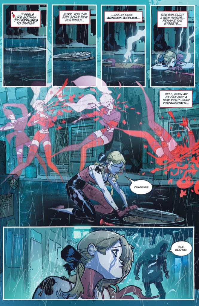
Image’s ONCE & FUTURE #17, available now, takes fans back to a world where the legends of old rise again – in warped versions of themselves. Written by Kieron Gillen, with artwork by Dan Mora, Tamra Bonvillain, and Ed Dukeshire, this issue is set to merge those legends into something new and horrifying.

That does not look like a creature I’d want to mess with.

Once upon a time, Duncan was unaware of the secret life his grandmother lived. He was unaware of the war she fought on a daily basis. Oh, to go back to those days of innocence. Now, Duncan is as entrenched in the war as she, and it is getting darker by the day.

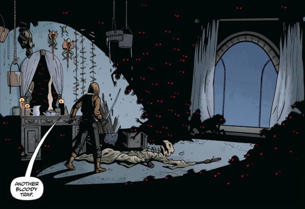
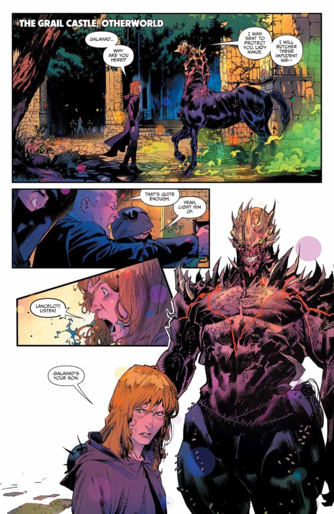
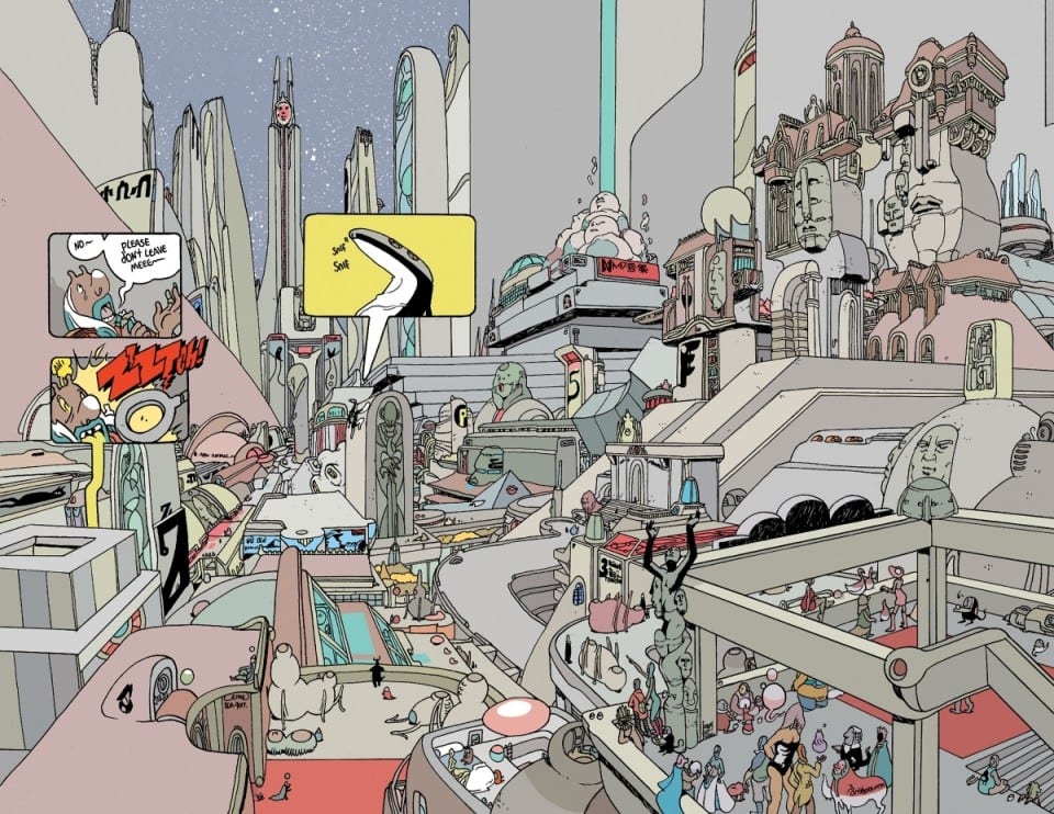
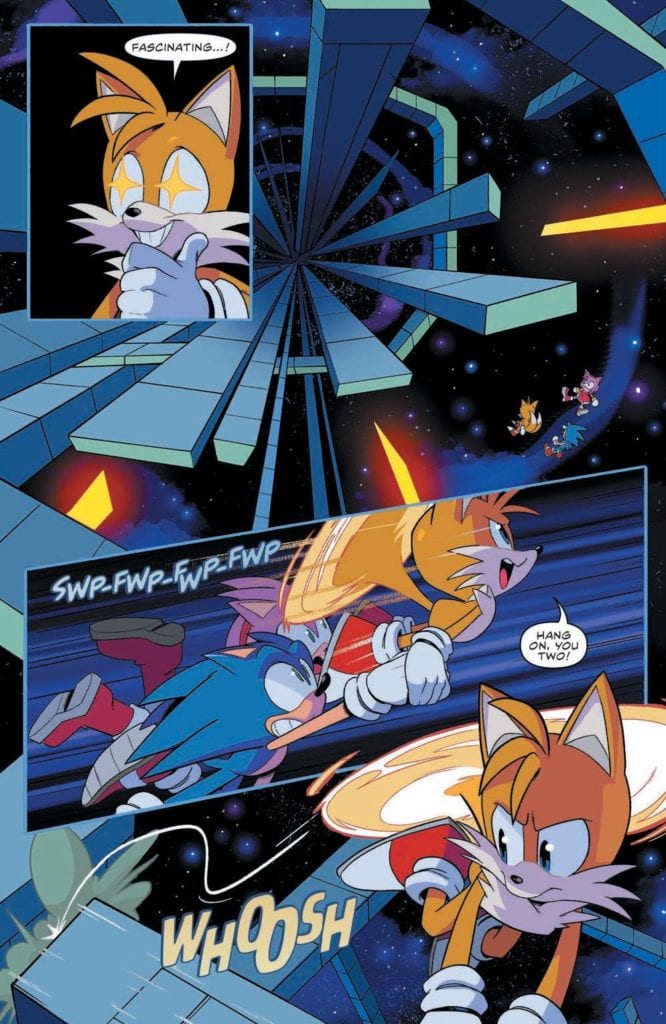
The beings mentioned in legends of old have been rising once again – and they are not the friendly heroes we would like to imagine. No, they’re warped versions that bring nothing but pain and death with them, especially to those that are far too aware of their tales.

Once & Future #17 is an issue we’ve all been waiting for, as the previous one left us with a promise. Here, we’re about to see several legends collide – and your guess is as good as any as to how that is going to play out.

Can’t really see the family resemblance anymore, can you?

The Writing

Once & Future #17 brings with it a lot to take in – which is probably the understatement of the century. Written by Kieron Gillen, this issue really does pack a punch. With three separate narratives carrying the story forward, it’s easy to get lost in the story.

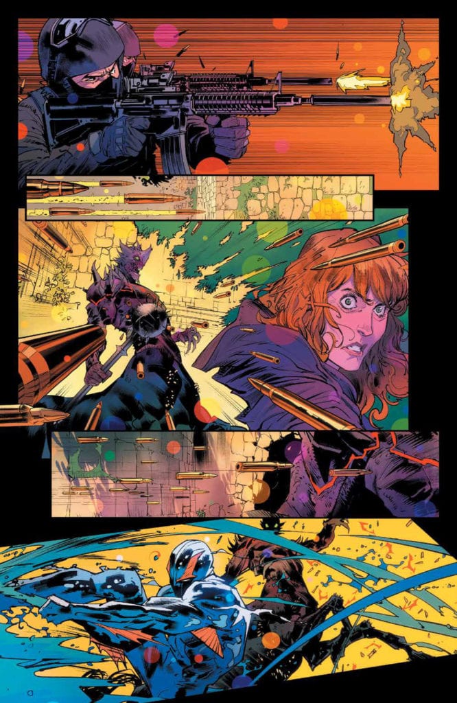
It also moves the plot forward at a steady clip, throwing heroes, antagonists, and other story figures all into the same mix. It had a lot of potential to get overly complicated and convoluted, yet it managed to steer clear of that trapping.

More than anything, Once & Future embodies poetic justice turned to horror. These are people who have been trying to warp (or stop) the stories to their own liking. It came at a cost, and once again, hubris has taken over.

That is just one of the many familiar themes that run through this twisted series. Gillen has done a brilliant job of taking all of these themes and tropes and twisting them into something so much more sinister.

Well, that fight got started rather quickly.

The Art

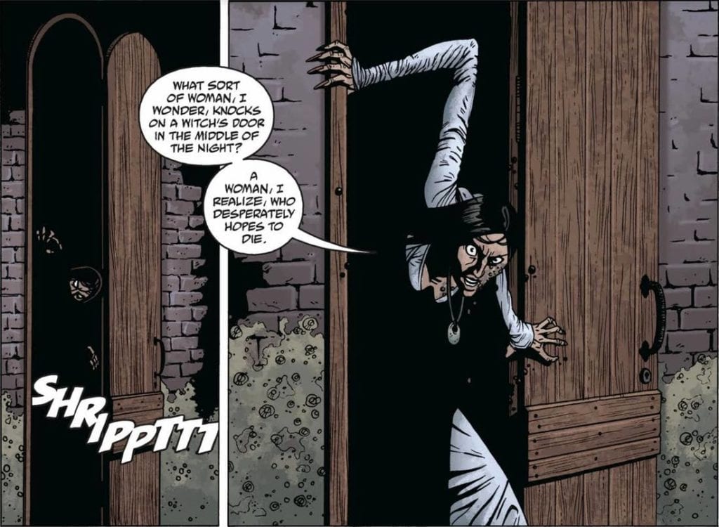
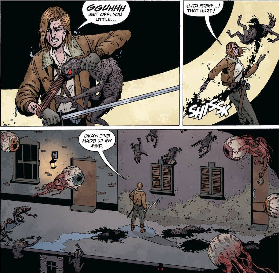
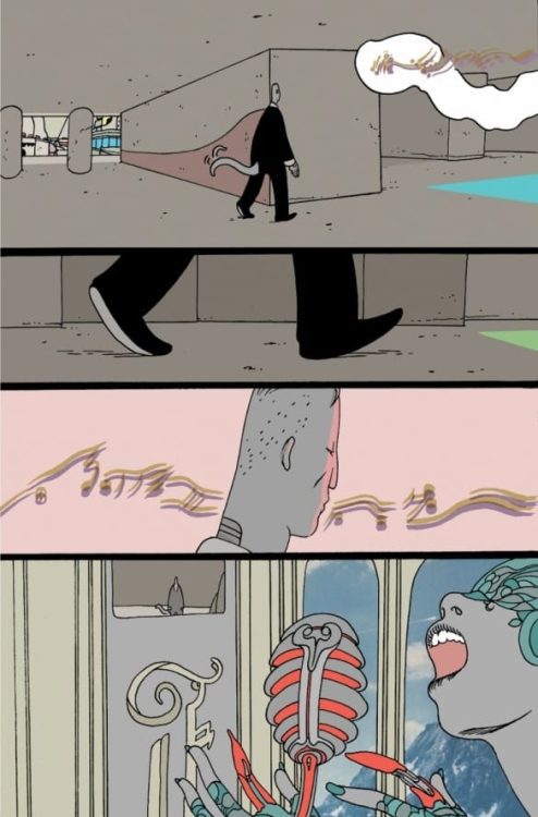
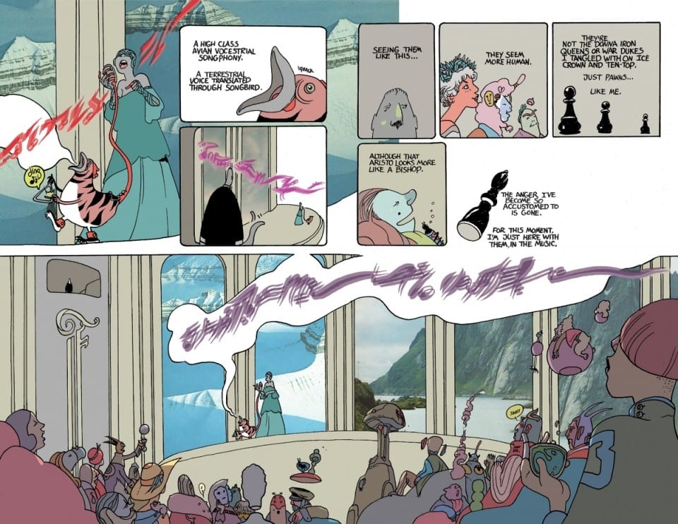
As per usual, the artwork inside Once & Future #17 is absolutely stellar. Magic and mayhem collide in brilliant and striking fashion. Frequently, the scenes battle between looking beautiful – and looking like a creation of pure horror.

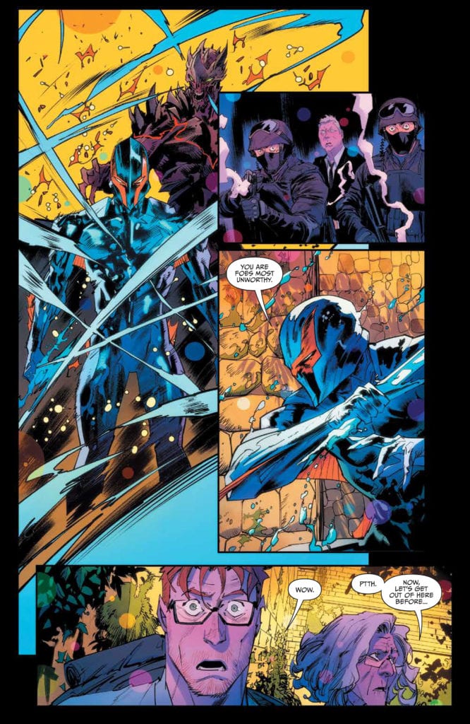
Dan Mora’s art works well for this plot. His characters are larger than life in the best of ways, especially those legends that I keep referencing. He’s also officially created one of my favorite comic book dragons, which is a feat.

Tamra Bonvillain’s colors have always been a highlight of the series, but that feels truer now than ever. Stepping out of the real world and into this fantasy…it’s like the setting ran away. The backgrounds are stunning, even when they lean towards the simple side, thanks to the color palette.

The lettering, provided by Ed Dukeshire, is another example of fine art. Here our collected characters go through a wide range of emotions (predominantly panic, in some instances), and it’s the lettering that really picks up and portrays that.

Is that an insult, or a threat?

Conclusion

Once & Future #17 is another memorable addition to the series. It’s a fast-paced read, with plenty going on to keep the readers occupied. All while upping the ante – and giving the characters room to forge ahead with the decisions they’ve made.

Monkeys Fighting Robots Youtube

How the World Changes in NOMEN OMEN #13

Several surprises await in Nomen Omen #13.

Image Comics NOMEN OMEN #13, available now, is about to change the world in characters in unpredictable yet fascinating ways. Thanks to the works of Marco B. Bucci, Jacopo Camagni, Fabiola Ienne, and Fabio Amelia, this is no longer the world that Becky knew so well.

Several surprises await in Nomen Omen #13.

As The World Falls Down” Part thing brings readers ever nearer to the conclusion of the series. With only two issues left, it’s slightly difficult to picture how Becky (and her allies/friends) will have the time to right the world.

Nomen Omen #13 is an issue that brings with it change. That in itself is going to be an understatement. Last we saw, Arcadia had breached into New York City. Becky was fighting to replace her heart. And the fate of many characters was in question.

Now it’s time to see how all of those pieces fall – for better or worse. That has always been one of the stronger storytelling points in this series – obfuscating the truth and the confusion surrounding allies versus enemies.

The Writing

In many ways, Nomen Omen #13 feels so very different from the rest of the series so far. Marco B. Bucci took a lot of risks in writing for this issue, and it shows. The world (at least, New York) has changed, as have all of the characters involved.

But it goes further than that. Even the tone of the story itself felt altered. The story itself is the same, but it feels different. It’s subtle and ephemeral, but it is very much present. It comes hand and hand with all of the other changes and surprises that occurred within these pages.

There are multiple narratives in this issue, some of which in themselves are quite the surprise. New characters, old characters, altered characters, the works. It kept the story moving forward while somehow managing to raise even more questions in the process.

On that note, the narrative surrounding Becky is a beautiful one. It resonates with power. This is a character who has come full circle and is finally claiming ownership over everything that makes her the person she is.

The Art

Much like the story, the art inside Nomen Omen #13 brings with it changes. Though perhaps not quite as drastic in scale. Still, the scenes are remarkable and vibrant – a fact that should stick to all readers’ minds. This series had been heavily black and white, once upon a time.

Jacopo Camagni’s character designs are truly a work of art. The newest addition is striking yet is the perfect counter to what we already know. Likewise, Becky has changed so much, and the artwork did an excellent job of portraying those transitions. Personally, though, the image of the map is the one that kept drawing my eyes back to it. It feels so grounded – and yet so otherworldly at the same time. It’s the true essence of this series.

Fabiola Ienne’s colors are to die for – literally, in some instances. The colors in Nomen Omen have always been a vital clue of what is going on behind the scenes. That fact is more important than ever, as every page is full to bursting – a stark contrast to the first issue. The backgrounds in this issue are especially lovely (see page 19).

Finally, Fabio Amelia’s letters brings it all together. There are many subtle details worth watching for, as the lettering tells the truth behind the words. Otherwise, we might make the mistake of forgetting who the enemies are.

Conclusion

Nomen Omen #13 is a brilliant issue that breaks from an already creative mold to bring fans a world in constant flux. With only two issues left in the series, it’s safe to assume that whatever follows next is going to be just as bold.

Monkeys Fighting Robots Youtube

Review: RAIN LIKE HAMMERS #3 – Trapped In Strange Body On A Planet Of Bourgeoise Aliens

Comics Auteur Brandom Graham returns with yet another chapter of his latest creative outing in “Rain Like Hammers” #3 from Image Comics. Unlike the last issue, this issue is actually a direct sequel to the events of issue #2 and offers more of the same wit, secrecy, satire, and class commentary as we’ve come to expect from this comic. With endlessly clever writing and off-the-wall visuals, “Rain Like Hammers” continues to be one of the most fantastically unique comics on shelves right now.

“Supercriminal Brik Blok’s new butler body craves eating dust and can see through walls. How will he adjust to his new carapace? Meanwhile, the dead start returning to the palace-world of Skycradle.”

Writing & Plot

Brandon Graham’s clever and poignant writing still holds strong in “Rain Like Hammers” #3, with the mix of odd absurdity, satire, and hilarity carrying this chapter along splendidly. Graham’s brand of satire never fails to feel appropriate no matter how out of left field some of the sequences can be (the butlers being engineered to enjoy the taste of dust is both weirdly funny and frighteningly relevant). The way the aristocracy of Skycradle are presented, as well as how their servant class is illustrated in comparison, feels like a Monty Python skit on a completely different frontier. Outside of the purely humorous and satirical elements though, there is a character-centric heart that carries this story along. The sense of trapped isolation that Brik Blok feels in his borrowed body while trying to accomplish his goals comes through in a genuinely emotional manner. I find him to be a delightfully enjoyable protagonist as we watch him navigate both his surroundings and this strange new body he inhabits. The rising B-plot we find his lost lover in is also highly interesting, and her own struggle with navigating the aristocratic expectations of this city-planet are just as claustrophobic as Brik’s plight. The further this story goes the more poignant and intriguing its story becomes, and it makes every issue a delight to open and experience.

Art Direction

There’s not much I can say about Brandon Graham’s art here in “Rain Like Hammers” #3 that I haven’t already said in the prior issues. The mixture of absurd design geometry and hilarious fluid animation plant the reader in the perfect atmospheric tone to experience this comic. The alien, almost Dr. Seuss-ian design language of the cities and various creatures and characters is delightfully fun, but is also focused enough on its main character and character expressions as to actually as to keep the story grounded. The panel direction is all over the place but in a well-orderd way, meaning that there is little to no structure to how the pages are constructed. Little panels will appear in a clustered order on one page, followed by a series of massive splash pages and yet everything still makes sense. The only way this works is because Graham is the sole writer and artist on the book, making the cartoonist’s vision come to life in a way that is only achievable by this solitary vision. This is a brilliant piece of the comics medium, and this series as a whole is a visual treat on multiple levels.

“Rain Like Hammers” #3 is yet another delightfully witty and poignant chapter in this phenomenal comic series from Brandon Graham. The writing is both hilarious and emotionally gripping, full of clever satire and nuance. The visuals are unlike anything you’ve ever seen if you’ve never read a Brandon Graham book, and it begs top be discovered and enjoyed. Be sure to grab this latest issue when it hits stands on 3-24!

Monkeys Fighting Robots Youtube

Review: HAHA #3 – How A Lack Of Words Can Speak Volumes

HAHA #3, available in stores on Wednesday, March 24th, is the next intriguing installment in W. Maxwell Prince’s series on the life of clowns. While not a clown per se, this issue features a pantomime and his attempts to make a living. What’s interesting about this story is the complete lack of dialogue—a feature that perfectly illustrates the tale’s theme.

Story

Readers meet a mime (presumed to be “Remi” from the title) in the opening panels of this story. The performer tries his hardest to put on a show for the people passing by on the boardwalk. Employing a number of techniques, Remi just can’t seem to excite his audience. So, in desperation, Remi forms finger pistols and pretend to fire them—to no avail.

The sad realities of life quickly befall our protagonist. With no one interested in his miming, he travels home, feeling rejected by life itself. We see him turning on the news and melting into a world of sadness after work, which resembles our own lives in similar life stages.

Eventually, a small glimmer of hope meets Remi in the form of a flyer. It promises to pay the person who finds “copper wire” in a dump. Jumping at the opportunity, our mime friend races to the scrap heaps. But what he finds there could change his world forever.

Prince’s plot is amazing in its clarity, especially without the use of dialogue. We feel the unbearable weight of world that won’t throw Remi a bone. What’s more, the narrative captures that experience of hope when a small opportunity promises to alter our outcomes.

Artwork

Roger Langridge’s artwork pairs wonderfully with the story Prince is telling. The cartoony format gives readers the impression this story may be suitable for children before turning toward darker scenes. Seeing the protagonist sleep on a couch, struggle to pay rent, and riffle through garbage brings up realistic problems people face in our own world. We also loved how the coloring makes a clear distinction between Remi and his surroundings—the pasty white on his face and red and black outfit stood out against the more natural background colors. Additionally, despite the lack of dialogue, the lettering for the sound effects fit in well with their panels’ illustrations.

Conclusion

HAHA #3 offers readers an abrupt change in Prince’s storytelling formula while retaining a similar message. We hope the creative talent behind this series tries out even more unique formats.

Were you a fan of this unique storytelling format? Let us know in the comments below!

Monkeys Fighting Robots Youtube

Review: Help Comes From Unlikely Places In POST AMERICANA #4

POST AMERICANA #4, available in stores on Wednesday, March 24th, sees the meeting of our resistance heroes and a mighty death squad sent by the President. The group found Carolyn’s mother enslaved at the hands of the government last issue, meaning she could offer assistance if freed. But pitting five people against the elite forces of the American government almost guarantees a losing battle. Can anyone save them?

Story

In this issue’s first panels, readers find themselves in the recent past. Carolyn is a child and her mother sits with her on the borders of their Redhill community. Her mother’s words helps readers see what kind of hero she is—one who’s willing to get her hands dirty in order to protect the vulnerable.

Back in the present, the reunion of this particular mother and daughter pair could not have been more fitting. In a blaze of action, Carolyn confronts her mother’s captures, murdering them on the spot.

The reconciliation of these two is a refreshing change of pace amidst of all the bloodshed. We see that underneath all of her toughness lies a girl who missed her mom. But their moment together is cut short by a group of the nefarious President’s soldiers. Fortunately, the sudden appearance of Night Terror and Donny throws a wrench in the government’s plans.

Steve Skroce’s narrative is well-paced, thrilling, and full of raw emotion. Seeing Carolyn, her mother, Mike, and the rest of the resistance stand strong against their oppressors is awe inspiring.

Artwork

Skroce’s penciling and ink work offers more gore in this issue than any of the previous installments. The depictions of severed limbs and explosions help set the extreme tones laid throughout the narrative. These stunning illustrations are filled out with bright reds and earthen shades, courtesy of colorist Dave Stewart. In addition, Fonografiks’s lettering did a great job of employing onomatopoeia words that mesh well stylistically with the illustrations themselves.

Conclusion

POST AMERICANA #4 ups the ante tenfold. The mother-daughter reunion, bloody fight scenes, and escalating tensions with ‘post-America’ make this an issue readers won’t want to miss.

What do you think of Night Terror’s reintroduction? Let us know in the comments below!

Monkeys Fighting Robots Youtube

Review: Infiltrating The Enemy Stronghold In SONIC THE HEDGEHOG #38

Sonic The Hedgehog

Sonic The Hedgehog #38 out this week from IDW Comics features Sonic falling through space. Luckily for him, Amy, and Tails it becomes apparent this is all just a trick by Dr. Eggman. This wild ride deeper into enemy territory was created by Evan Stanley (writer and artwork), Bracardi Curry (artwork), Matt Herms (colorwork), and Shawn Lee (lettering).

Summary

Sonic, Amy, and Tails are stuck in a mysterious new Eggman base. Each room holds a challenging surprise and the hallways don’t make any sense! Can they figure out how to escape unharmed?

Sonic The Hedgehog

Writing

A better feel for Evan Stanely’s style is apparent with this second arc of the Sonic The Hedgehog IDW series. It prioritizes the attention to character emotions and how they react to events in the world around them more. A prime example of this comes from Tail’s overwhelming joy from the curiosity of what is happening around him. This aspect mixed with Stanley working on results in authentic emotional moments.

The downside to this style is sometimes the world-building can suffer. This issue is for the most part two groups infiltrating an enemy base. While Sonic’s group is focused on the strange happenings of the base, Tangle and Belle investigate hoping to find out more about Belle’s past. Instead of building to a monumental change for Sonic’s world, the more likely outcome seems to be we know a little more about Belle. Seems a bit less grand in scale compared to events of the Battle for Angel Island or the Zombot storyline.

Sonic The Hedgehog

Artwork

The artwork by Evan Stanley and Bracardi Curry blends so well there is no noticeable change in style from panel to panel. The pair focus on body language such as Belle’s tight movements to show how timid she is. At the same time, there is a lot of attention to fast action scenes moving along at a smooth pace.

The colorwork from Matt Herms improves the quality from the previous issue. Gone are the distracting burgundy backgrounds and instead, blacks and blues are used to create a sharper look to the layout. It helps to give the illusion the characters are falling through a void.

Sonic The Hedgehog

The lettering by Shawn Lee focuses on adding a volume to the voices from panel to panel. Special care is used to show speech as being whispered or through electronic devices. Also, the use of breaking up a sound effect starting in one panel and ending in another makes perfect sense for showcasing teleportation.

Conclusion

Sonic The Hedgehog #38 seems like a return to form compared to the previous issue. Yet, the overall lowkey plot of the story may make the audience long for the grander storylines previously in the run. Maybe Sonic The Hedgehog will have to use the Chaos Emeralds to stop the moon from falling or something in the future.

Monkeys Fighting Robots Youtube

Review: DETECTIVE COMICS #1034: Who’s this “Bruce Wayne” Guy?

Detective Comics Tamaki DC Comics

This is not your grandmother’s Detective Comics. Hell, it’s not even the Detective Comics of your slightly older brother. No, writer Mariko Tamaki, artist Dan Mora, colorist Jordie Bellaire and letterer Aditya Bidikar are making Detective Comics their own! With Detective Comics #1034, the start of their collective run on the series and a follow up to their fantastic Future State run, this creative team is going full speed in a new direction. The biggest new character to watch out for is some guy called “Bruce Wayne.”

Writing

Of course, Bruce Wayne has actually been in Detective Comics before, but not like this. Tamaki isn’t writing Bruce as the man waiting for the sun to go down so he can kick but. She’s writing him into new, uncomfortable areas. Thanks to Bruce’s incredible wealth, he had the luxury of keeping everyone at arm’s length. But due to the events of the Joker War, Bruce is now living in an apartment. He’s begrudgingly getting to know the neighbors, even attending a party or two. It’s odd, frankly. Just one issue ago, Batman was as he’d always been. Mostly just Batman kicking butt with the occasional cameo by Bruce.

It’s tempting to fault Tamaki for this bold, new direction. Seeing Bruce getting hugged by an overzealous neighbor seems… very different. But, as readers, we’re simply sharing in Bruce’s discomfort. We can feel his rising anxiety as all of his secrets get that much closer to the light. So, Tamaki’s script is actually brilliant. It’s hard to read at times but that’s because we feel so much for the character. Tamaki is showing us the vulnerable, human side to Bruce Wayne. In some ways, it feels like a brand new character, and I can’t wait to get to know him.

Art

Mora helps us to see through Bruce’s eyes. Through page layouts, he shows us how Batman experiences life. On one page, Bruce subdues a bunch of goons. The whole fight is done in a single double page spread. But it feels even faster than that. In the center, we see Batman bursting in. Above this image, in small overlapping panels, we see everything Bruce took note of before entering the room. And at the bottom of the page, we get a similar bunch of panels of each goon getting put down. It all goes by so fast, but Mora highlights each important detail. It’s a brilliant visual representation of just how fast Batman’s brain works.

Coloring

Bellaire does a fantastic job of making Bruce seem out of place. When we first see Bruce, he’s at a fundraiser that gets attacked. The moment that the attackers hit the lights, every other character fades into the background. But Bruce looks bright against the dark background. These are the moments that he lives for. Not long after, we see Bruce attending a neighborhood party. This time, the opposite happens. We see the bright faces of everyone around him. They seem happy and full of life. Bruce is in the foreground with the light not reaching his face. He looks dark and grim compared to everyone else. In each scene, we see how Bruce is different. He lights up at the sight of danger, while everyone else cowers, and slinks away when things get sociable, while everyone else is having a jolly old time.

Detective Comics Tamaki DC Comics

Lettering

Bidikar’s letters are always a joy to read. But this issue has some truly exceptional moments. As the party crashers are taking charge of the room, Bidikar writes a big “BOOM” over one of their heads. The crook looks off panel. “Crap,” he says. He spotted Batman. But the “crap” is written perfectly. In a large word balloon, it’s written in a tiny, grey font at the center. You can just hear the goon, almost too scared to speak.

The following “KRAK” and “WHACK,” the results of Bruce’s fists, show us just what this guy had to be scared about. And later, as Bruce is working on a new headquarters, he stretches out and we can see a small “KRIK.” Bidikar uses the same font as the “KRAK” of Bruce punching a goon. It’s such a fun way to tie those two moments together. Bidikar is telling us exactly why Bruce’s back is killing him.


DC Comics’ Detective Comics #1034 is a wild read. It almost doesn’t feel like a Batman comic. But that’s because this creative team isn’t trying to fit a mold. They’re doing their own thing and infusing this action packed series with lots of humanity. Pick up Detective Comics #1034, out from DC Comics March 23rd, at a comic shop near you!


Monkeys Fighting Robots Youtube

HARLEY QUINN #1 – Stephanie Phillips Takes Our “Hero” In A New Direction

Harley Quinn 1 cover

In DC Comics’ Harley Quinn #1, on sale March 23, The Mistress of Mayhem officially joins the Infinite Frontier initiative with a launch that should interest casual and hardcore fans alike. Writer Stephanie Phillips takes Harley in a direction that echoes the character’s recent exploits in her movie and her animated series by capturing her struggle to be a hero. Riley Rossmo’s art takes some getting used to, as it’s rough around the edges, but it thematically fits Harley’s imperfect beginning as a crimefighter. Colorist Ivan Plascencia compliments the book’s cartoonish aesthetic by utilizing vibrant colors when the situation calls for it, and letter Deron Bennett brings a few fitting tricks to the table, like unconventional sound effects, to bring even more pizzazz to the story.

Harley Cake
Even on the first page, it’s clear that Harley Quinn is in for a rough day.

With Harley’s newest solo adventure, Phillips picks up where the Cupid of Crime left off at the end of “Joker War.” Based out of her new apartment in Little Santa Prisca, a corner of Gotham named after Bane, Harley is determined to prove that she’s one of the good guys, but this quest is already proving to be quite difficult. The public doesn’t trust her, and it’s hard to blame these people; after all, Harley used to pal around with the Joker. Plus, even though Batman is giving her a chance, the Dark Knight quickly clarifies that he’s watching Harley like a hawk. Clearly, the former Suicide Squad star has her work cut out for her.

From the start, Phillips makes it clear that Harley is struggling to escape her past. Perhaps the most compelling device used to convey this conflict comes with the usage of appears to be Harley’s ghost, or at least her past self. During a confrontation with a harsh citizen who calls her a clown, Phillips shows the reader how the Harley of old would have reacted; she would have simultaneously quipped and smashed the bully with a hammer. But the new Harley internally watches this violence unfold and takes a passive approach to the situation. Instead of escalating the conflict, she removes herself from it by departing the scene. It’s also clear that she’s saddened by this mistreatment, which makes Harley even more sympathetic right away.

Harley vs. self
In Harley Quinn #1, The Cupid of Crime battles the person she used to be.

Rossmo and Plascencia beautifully capture this tale of two Harleys. The current-day version is drawn with her modern costume and subdued colors that fit nicely in the midst of the pouring rain. Meanwhile, the classic Harley, old costume and all, pops off the page with brilliant red tones, representing the character’s inner anger and her temptation to revert to this reckless version of herself. Harley overcomes her instinct to lash out at her critic, but this clash of her two selves makes this moment one of the book’s most powerful.

Bennett’s lettering works well with the story from start to finish. In one particular instance, he subtly adds to the narrative that’s unfolding on the page. He compliments the thunderstorm setting by utilizing a character-themed sound effect. Rather than using a traditional yellow for the electric lightning, Bennett instead incorporates a purple background to this sound, which naturally makes the reader think of the Joker because, after all, it’s his color. This choice connects with the theme that Harley can’t quite put her past behind her, as the Joker’s ghost is still right there, nipping at her heels. This book is Harley’s chance to stand on her own two feet, but she can’t escape the Joker that easily.

Harley Quinn #1 is an intriguing beginning to a new chapter for one of DC’s most popular characters. Phillips borrows some narrative elements from Harley’s recent ventures away from the page and offers a few distinct variations, such as the scene where a bully reduces her to tears. This issue may not be an explosive beginning to this fresh direction, but it certainly hooks fans by offering a few compelling teases of what’s to come.

Monkeys Fighting Robots Youtube

BATMAN/SUPERMAN #16: The Finest Of Their Worlds Collide

Batman/Superman #16 Cover

Batman/Superman #16 from DC Comics begins an invigorating take on the World’s Finest. Writer Gene Luen Yang depicts a Batman on one Earth and a Superman on another as a big mystery unfolds beyond them. Artist Ivan Reis presents this grand plot in a unique method of parallel storytelling via simultaneous film reels. Colorist Danny Miki ties it all together by decorating the worlds in appropriate tones for Superman’s optimism and Batman’s gothic landscape. Finally, letterer Saida Temofonte gives each moment of intensity a chance to firmly connect these two disparate worlds.

Batman/Superman #16: Finest On Two Worlds

Batman/Superman plots in parallel
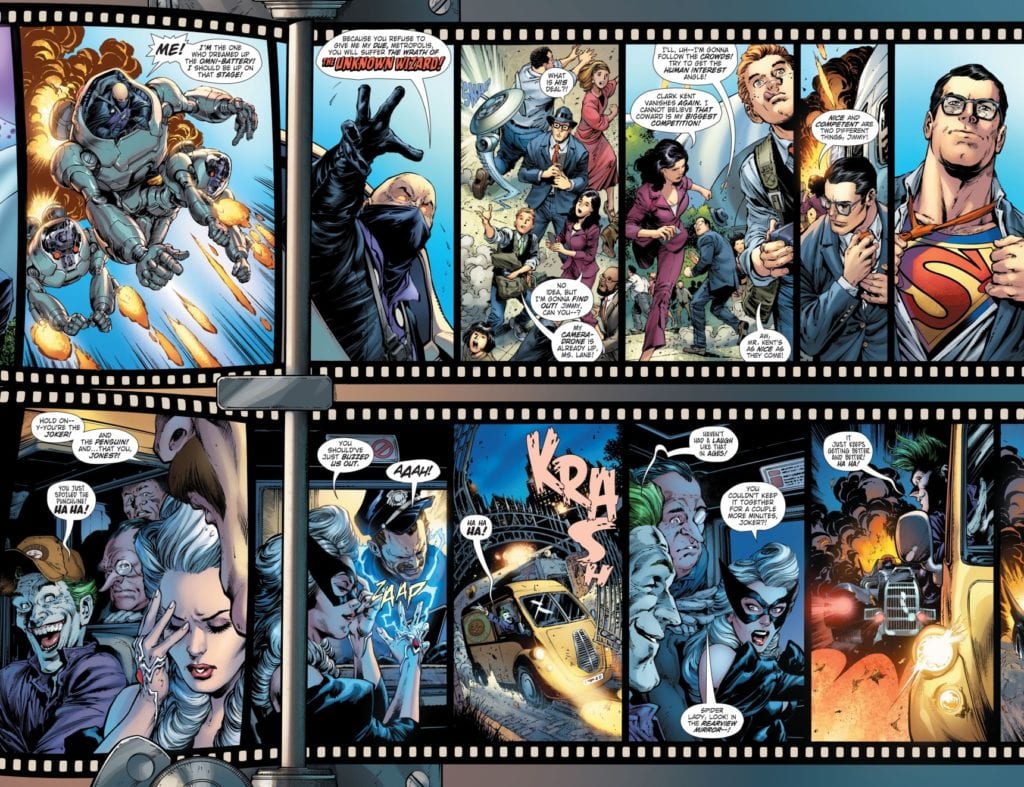
Yang takes Batman/Superman #16 away from DC’s present time for a standalone tale of two worlds where Superman and Batman don’t coexist. The lack of one and the other affects each world for the worse. Without Batman, Superman has little reason to suspect the seedy Wayne Family under Martha Wayne. On the other hand, the lack of Superman makes the already gloomy state of Gotham feel outright dreadful. The image of the Joker being unable to contain his laughter comes across as sad, rather than frightening, given this dismal context.

That’s not to say either hero is entirely at the mercy of his dreary world. Superman has Lois Lane and Jimmy Olsen to steer him in the direction of trouble he might miss. Meanwhile, Robin’s lines bring quite a lot of levity to the grimness of Gotham City. The use “Holy (X)” even serves as a tribute to the iconic Robin depiction by Burt Ward from the Adam West Batman show.

The Classics Reborn

Read the way you want
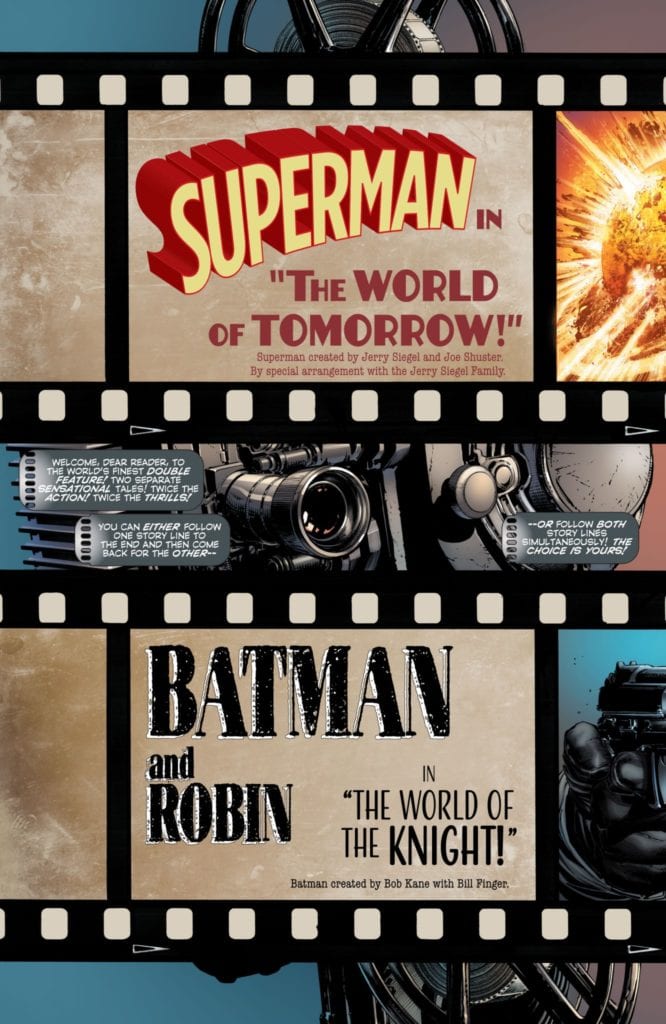
Artist Ivan Reis gives Batman/Superman #16 a choice as to where the reader can look at the story. On the Superman side of things, there’s a bright outlook, complete with The Man of Steel’s costume that’s reminiscent of its Golden Age design. As for Batman, his design also resembles his Golden Age costume, but it lacks the yellow elements. This artistic choice by Miki makes Robin’s brighter colored costume stand out even more; he literally lights up the page.

The lettering by Temofonte make fitting use with its stylizations. The opening captions match up with the film reels, as if the narrative is speaking directly to the reader. As for the basic word balloons, they’re all in a contained space, save for large sound effect stylizations. They’re so loud and powerful that a scream from Lois connects to the Batman reel that draws the dynamic duo’s attention towards her.

Batman/Superman #16: Miss And You Will Feel A Void

Batman/Superman #16 is a can’t-miss book. With a grander narrative that links two of DC’s finest heroes, the art makes sure readers can fit the experience to their preference. Remember that this issue is just the beginning. There’s much more to come, so fans of both characters should stay tuned for the next few issues to see how this story unfolds.

Monkeys Fighting Robots Youtube

Review: LADY BALTIMORE #1 Is An Adventurous Witch Hunt

From the legendary Mike Mignola and writer Christopher Golden, as well as artists Bridgit Connell and colorist Michelle Madsen, comes a monster-filled occult adventure and sequel series in the form of “Lady Baltimore ” #1. This follow up to the original Baltimore offers the exact sort of demonic and monstrosity-laden hijinks we’d expect from a Mignola offering, and the team here manages an exciting (if not a bit overwhelming) blend of action set pieces and outstanding visual work.

“Once she was Sofia Valk, living in a village overrun by evil. In time she became Lord Baltimore’s most trusted ally. Now, more than a decade after his death, Europe has erupted with the early battles of World War 2 and dark forces are rising again. With witches, vampires, and Nazis on the march, Sofia must embrace the title of Lady Baltimore!  But can she fight monsters without becoming a monster herself?”

Writing & Plot

Much like its predecessor, “Lady Baltimore” #1 feels very much like a Mignola comic while also managing to still feel fresh. Lady Baltimore, Baltimore, and Joe Golem all three make a new connected “Mignola-verse” that is not connected to the Hellboy Universe (I hear that question a lot, so I feel I have to clear it up). The script from Christopher Golden is yet another occult adventure with plenty of occult-babble and magic, but still diffused with the  character-centric moments we expect from these books. The pacing of this issue is super-tight, with every page feeling like it matters. The dialogue is varied from character to character, with each cast member having their own personality. Sofia Valk herself is an entertaining protagonist, while the rest of the cast likely just needs a bit more time to settle in to the story. One issue I had with this comic is that is sort of has the feeling where you feel like you’re walking into a conversation when it’s already halfway over. Yes, I know that this is a sequel-series, but one of the strongest elements of shared-universe comics such as this is that a new number 1 issue should function as a solid starting point for new readers. It isn’t unnavigable or anything, and Golden does provide some level of context and background for these characters’ relationships, but it still feels like you’re coming in late to the party. If you haven’t read the original Baltimore though, I’d highly recommend it because it’s really quite good. In any case, this pre-WWII era occult adventure is still a really fun start to this sequel-series, and it’s held aloft by its sense of adventure and well-written chemistry among the cast.

Art Direction

Like with any Mignola comic, “Lady Baltimore” #1 has the perfectly put-together dark and historical mixed with bloody and spooky aesthetic that is perfect for the story. We have the talents of penciller Bridgit Connell and colorist Michelle Madsen for this. There’s a phenomenal amount of detail from Connell’s pencils, both in the character animations and set pieces. The architecture of late 1930’s Europe comes alive with cobblestone and worn brick architecture. The facial animations and designs for each cast member are unique and present the characters’ personalities in a way that makes them easily relatable to the audience. The monster designs and occult symbols are all perfect Mignola-style offerings, with tendril-filled grotesques and floating eyeballs crawling and exploding with gunfire in slimy brilliantly gross fashion. The panel direction flows with a careful eye for both action sequences and character focus. Every page feels like its part of a larger set piece with narrative function, and all of the visual elements flow together in top form. Madsen’s colors are all covered in darkness, bathed in fire and moonlight and it all look outstanding. The atmosphere she gives this book is spot-on and fits perfectly into the world of Baltimore and the Mignola portfolio as a whole.

“Lady Baltimore” #1 is a tightly paced and monster-filled jumpstart to this new adventure in the world of Baltimore. While the script can feel a bit overbearing in terms of its information, its still a carefully written blend of revealing character moments and occult action. The visuals from Bridgit Connell and Michelle Madsen are dark and detailed, blending perfectly into the larger world of this series and as pieces of the Mignola library as a whole. Be sure to grab this first issue when it hits stands on 3-24!


Monkeys Fighting Robots Youtube