Home Blog Page 160

SAVAGE #4: Laughing With The Gauche, Laughing At The Mad

Savage #4 Cover

Savage #4 ends Valiant Entertainment’s absurd action-comedy on May 12. Writer Max Bemis gives each major character a humorous dynamic to clash with. Artist Nathan Stockman gives the issue all of the energy of a slapstick cartoon. Triona Farrell colors these segments to further energize the events taking place, and Hassan Otsmane-Elhaou accents everything with specially designed lettering.

Savage #4: Make Your Place

Savage #4 plot of Henry Sauvage
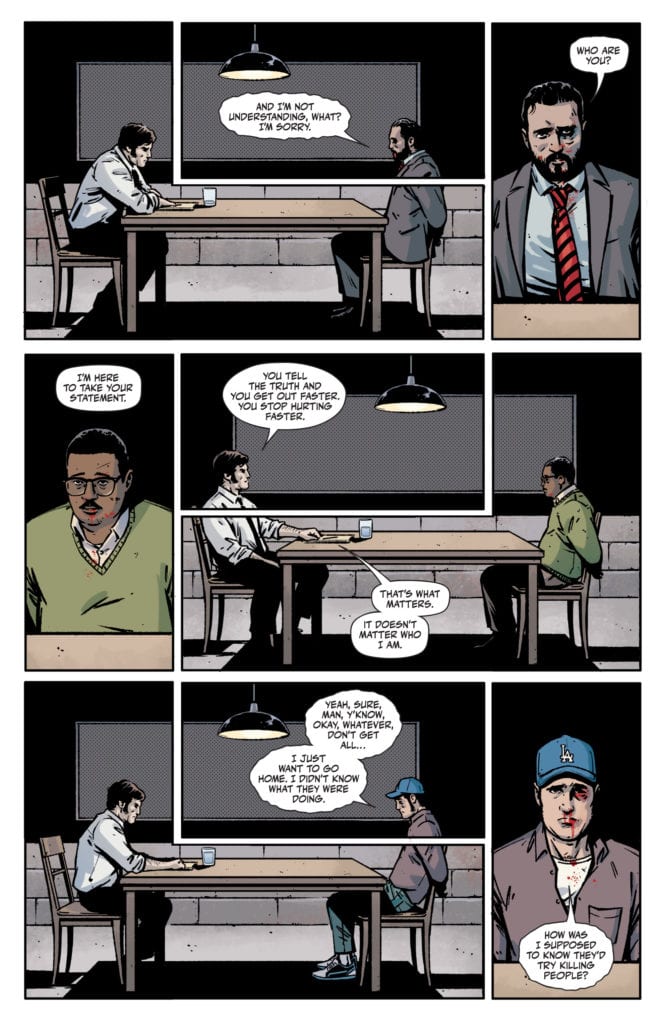
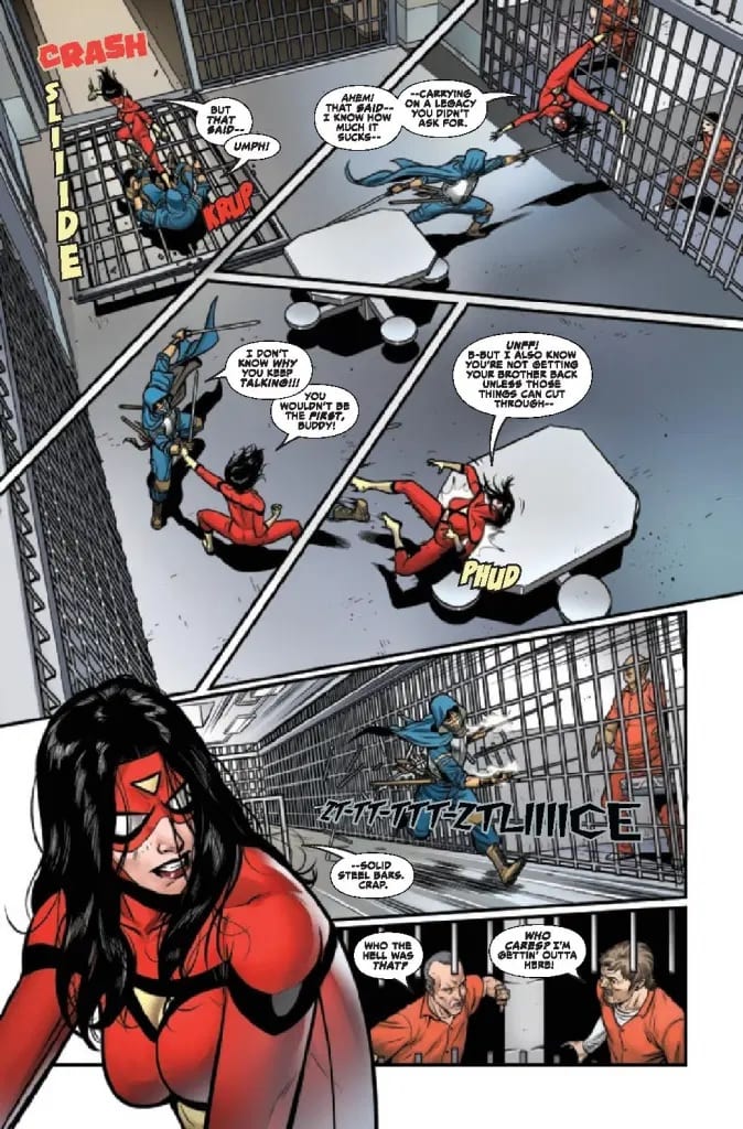
For Savage #4, Bemis has the issue focus on the character dynamics of the main cast. Between Kevin and Henry are brothers who bring out the worst in each other. Calling back to Kevin’s lack of proper social skills, Henry isn’t really honest with himself partly because of his reference point. Every talk Henry has with someone reveals his self-duplicity, where he mixes half-truths with his feelings of inadequacy. Compare this to how Kevin speaks with Mae, where he has actual conversations complete with Stargate references. Unlike how the villainous Nealon sees the other three characters as a means to an end. It’s all pretty easy to find characters to like and hate with how they interact.

Savage Slapstick

All factors of the issue's art
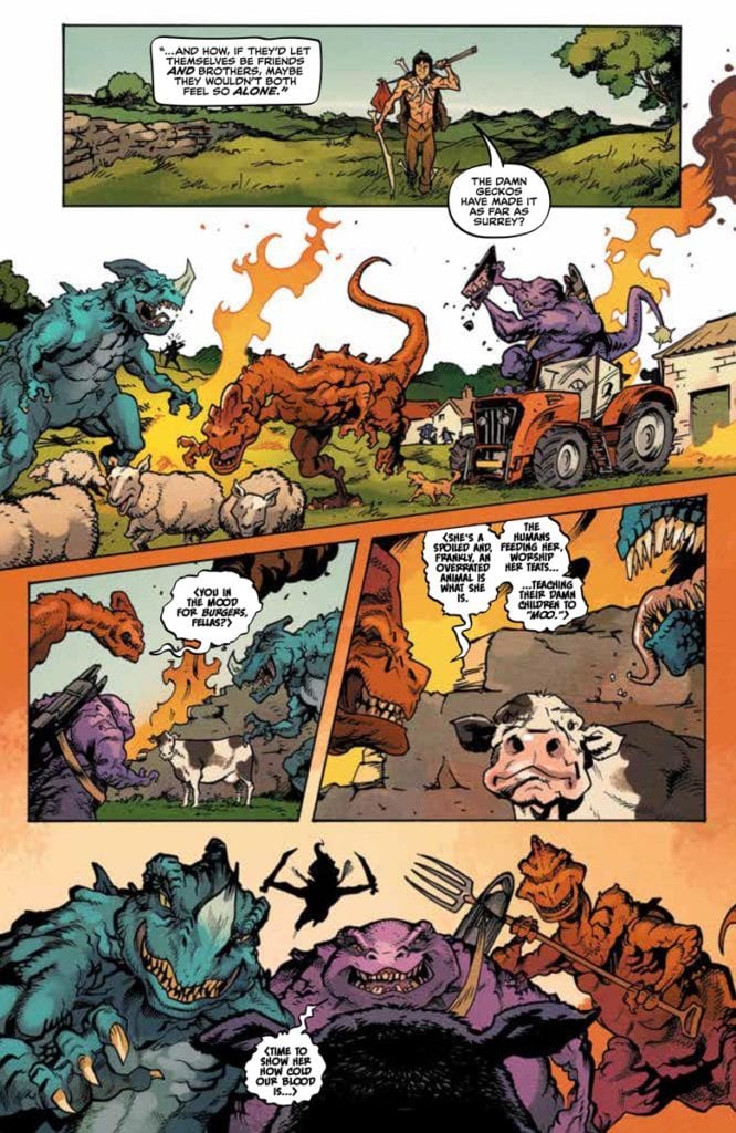
Savage #4 features highly energetic art from Stockman. Savage’s actions have this strong sense of anticipation where throughout the page, his wild movements wind up for an attack. The attack, in turn, is delivered in such an exaggerated fashion it actually looks rather cartoony. That’s to say nothing of the bizarre designs of the dinosaurs with equally surreal coloring by Farrell. I mean, they even have a language that Savage can speak in rough-looking speech balloons by Otsmane-Elhaou. Which along with hand-drawn sound effects like when Savage brutally beats a dinosaur, adds to the overall absurdity

Finish With Savage #4

Savage #4 finishes its most enjoyable run by fully embracing the absurdity that comes with being an awkward teen. With a character that readers can laugh with, such absurd story developments are normalized. A reader can’t help but wonder what will come next for Kevin Sauvage Jr.

Monkeys Fighting Robots Youtube

SCOUT’S HONOR #5: Personal Honor Over Blind Faith

Scout's Honor #5 Cover

Scout’s Honor #5 finishes AfterShock Entertainment’s tense miniseries on May 12. Writer David Pepose makes this issue about the meaning of brotherhood in its best way. Luca Casalanguida, as series artist, illustrates all of the events in a gritty manner. Colorist Matt Milla gives scenes an intensity that gives way to levity, and letterer Carlos M. Mangual makes every action an extra bit of impact.

Scout’s Honor #5: Honor Before Excuses

Pepose revolves Scout’s Honor #5 around the worst and best of brotherhood. As previous issues showcase, the Ranger Scouts uphold a very toxic system through deceit. The antagonist, Scoutmaster Shepherd’s son Dez has to hide who he is to fit in. But there was still value to be found, which the protagonist Kit epitomizes after separating herself from the toxicity. Her willingness to share the world’s bounty makes her someone to root for. This issue isn’t just the resolution of Kit’s character arc; it’s the beginning of Dez’s own arc by following Kit’s example. It all brings a real sense of a hopeful future in a post-apocalypse.

Grit Means Courage

Scout's Honor #5 conflict

Casalanguida brings out the gritty aesthetic of the series to its limit. The Ranger Scouts strive to make themselves as unforgiving as the wasteland; so when the wasteland survivors the Highwaymen come knocking, it’s a clash of grittiness. Most of the pages have combinations of orange, red, and brown by Milla to demonstrate Shepherd’s desire to keep everyone in a state of conflict. By the end of the issue, the smoother art under a blue sky perfectly displays the plot’s resolution.

Mangual’s lettering enhances every action taken by the characters in Scout’s Honor #5. The hand-drawn look to them provides an extra layer of authenticity. The roaring of a truck and other vehicles feel absolutely loud when accompanied by the dynamic action scenes.

Get Scout’s Honor #5

Scout’s Honor #5 gives this mini-series a gripping ending full of character progression. Among all of the grim undertones, it is genuinely nice to see people stand up to it all because that’s when authentic actions take place.

How did you enjoy Scout’s Honor? Leave your thoughts in the comments.

Monkeys Fighting Robots Youtube

Review: Combat Is Heavy In SONIC THE HEDGEHOG #39

Sonic The Hedgehog

Sonic The Hedgehog #39 out this week from IDW Comics makes sure the action is turned up high. The journey into Dr. Eggman’s base results in Tangle and Belle finding the control room as Sonic, Tails, and Amy have to fight against new robots. This issue came to life thanks to Evan Stanley (writer and art), Bracardi Curry (art), Maria Keane (inking), Matt Herms (colorwork), and Shawn Lee (lettering)

Summary

https://www.idwpublishing.com/product/sonic-the-hedgehog-39/
Sonic, Amy, and Tails are still stuck in Dr. Eggman’s evil tower and being subjected to his increasingly crazy tests. It doesn’t help that Tangle and Belle have unknowingly begun controlling the tower and are making it impossible for their friends to escape!

Sonic The Hedgehog

Writing

The journey into what turned out to be a testing base for Dr. Eggman has been a slow one. Sonic and his team entered the base, found the place to be mysterious, and have faced very little resistance overall. This issue finally arrives at the point where it cements the idea Sonic and his friends are in danger. This is achieved by having the trio fight against some new creations by Dr. Eggman. It’s a much-needed issue dedicated to battle and action.

The part of the description about what Belle and Tangle are up to is incorrect. They are able to capture Orbot and Cubot and get some information out of them but nothing major. The mystery behind Belle’s identity is still in play and will be revealed in the next issue. Considering a new arc is set to behind in issue 41, you can put good money on it finally happening.

Sonic the Hedgehog

The most noticeable aspect of the letter work by Shawn Lee is the use of sound effects to aid in the action scenes. The letter work adds a distance auditory aspect to the issue. The addition of a large effect to a standard bubble as Tangle grabs Orbot and Cubot adds a distinct look of surprise to the moment.

Artwork

The artwork by Evan Stanley, Bracardi Curry, and Maria Keane sell the phenomenal action scenes in this issue. The main standout is an experimental machine Dr. Eggman unleashes on Sonic, Amy, and Tails. The combat as the trio take on this dangerous bot is powerful and impactful thanks to the incredibly detailed art.

The colors work by Matt Herms makes the action pop. The weapon effects of Dr. Eggman’s machines and the eerie green color of the portals are especially noticeable. The colors are working hard to add a visually pleasing aspect to each panel.

Sonic the hedgehog

Conclusion

Sonic the Hedgehog #39 doesn’t advance the story very far but it’s an issue filled with some great action. Sometimes you just need a good issue filled with action to help move a story along. The ending to this arc ends with the next issue and hopefully, Belle will get the answers she’s hoping for.

Monkeys Fighting Robots Youtube

Review: Reelin’ In The Years In TIME BEFORE TIME #1

Written by Declan Shalvey (Bog Bodies, Injection) and Rory McConville, with art from Joe Palmer, “Time Before Time” #1 is an engaging and wholly entertaining opening chapter to this ruined future time travel comic series. With colors by Chris O’Halloran and letters from Hassan Otsmane-Elhaou, this comic displys its influences openly to the point where it starts to feel pretty unoriginal, but its held together by sharp writing and pacing and fitting visual work.

“The year is 2140, and to escape a world with no future, many turn to the Syndicate, a criminal organization who, for the right price, will smuggle you back in time to a better life. After working for the Syndicate for years, Tatsuo and Oscar decide to steal one of their boss’s time machines—but soon find that the one thing you can’t run from is your past.”

Writing & Plot

Every story you read in our time is going to have its influences, whether they be subtle or blatantly obvious. What matters is how these influences are used in the creation of a new tale. Declan Shalvey and Rory McConville succeed in opening up a science fiction world with a great premise  – sending people back in time to escape the calamity that we have made our planet – and creating a simple yet effective motivation for the protagonist to also get the hell out of Dodge. However, if you know what this story pulls much of its influence from, it can be a little distracting. See, this comic’s plot borrows, whether accidentally or unintentionally, a lot of its concepts from Rian Johnson’s 2012 sci-fi film Looper (which is brilliant on its own). Granted, Shalvey and McConville have given the idea of time travel as this crime syndicate-led underground act and spun it in a slightly different direction than Johnson’s movie, but there’s still so much similarity that I couldn’t help but see it with every turn of the page. Again, this could be totally unintentional as there are so many very similar genre stories that accidentally borrow from one another all the time (I mean the lead character’s name is Tatsuo, so Looper wasn’t the only story on my mind). If you’ve seen Looper though, be warned that there’s a good chance that it going to dominate your thoughts while reading this comic. Everything else about this script is honestly solid. While we don’t get to spend a *ton* of time with a couple more important supporting cast members, there’s still enough detail from the story to paint a picture of the interpersonal relationships amongst these people and the protagonist, which created an emotionally effective twist early on in the issue. The dialogue is sharp, with some clever twinges of humor sprinkled throughout. Despite its overbearing similarity with one other piece of recent science fiction, this is a thoroughly well-written comic.

Art Direction

The bleak ruined future of “Time Before Time” #1 is brought to life by the pencils of Joe Palmer, with colors by Chris O’Halloran, and it’s a look that well suits this story. Palmer’s thick lines and heavy inks darken a bleak Earth with the exact sort of atmospheric aesthetic you’d expect from a cyberpunk-esque comic. The architecture of the run down apartment structures and syndicate-owned warehouses is excellently well constructed in its dilapidation, with crumbling concrete and cracked sidewalks marking much of the scenery. The character animations and details are outstanding, with thin lines marking stress and age in characters as well as making obvious emotional reactions. Every character has a different design making them easy to tell apart. The colors from O’Halloran are spot-on for this comic as well, with dreary ashen greys marking the outside world on the future, dotted by faded neon in nightclubs and via streetlights to make this comic feel like a true cyberpunk experience. Otsmane-Elhaou’s letters use a familiar and safe font that is highly dynamic, changing effortlessly based on character’s tone and delivery. From the visual end, this is a tightly put together package that sticks the landing in regards to creating the world this story takes place in.

“Time Before Time” #1 is the kind of sci-fi story you’ve probably seen before, but is still delivered in a way that should be refreshing to most readers. Declan Shalvey and Rory McConville’s script is focused and tightly paced, offering considerable amounts of plot and characterization within this issue’s page length without ever feeling bogged down. The visuals from Joe Palmer and Chris O’Halloran are perfectly bleak, rife with detail and appropriate tone for this kind of ruined cyberpunk future. Be sure to pick up this debut issue when it hits shelves on 5/12!

Monkeys Fighting Robots Youtube

Girls of the Summer Turn to Horror in THE SILVER COIN #2

Image Comics’ THE SILVER COIN #2, available now, is the second issue in this horror anthology created by Michael Walsh, Ed Brisson, Jeff Lemire, Kelly Thompson, and Chip Zdarsky. This time it’s Thompson (Captain Marvel, Hawkeye) and Walsh (Black Hammer, Star Wars) who have been set free to terrify readers.

Looks like a classic horror film, right?

I can’t really speak for anyone else out there, but I have been really digging what the comic industry has been putting out for horror lately. This anthology promises to be more spine-tingling goodness, with works from Michael Walsh, Ed Brisson, Jeff Lemire, Kelly Thompson, and Chip Zdarsky.

If you didn’t get a chance to tune into the first installment of this series, never fear. It’s an anthology, so readers can really dive in at any point they so desire. However, I would strongly recommend doubling back and checking out The Silver Coin #1 when you have the chance.

The year is 1993, and young Fiona Watterman is getting ready to head off to summer camp. She knows that it will be nothing like the horror movies that she adores, but still, a girl can hope, right? The Silver Coin #2 is a poignant reminder to be careful what you wish for.

Ah, now it all makes sense.

Writing

The Silver Coin #2 is a twisted mash-up of Mean Girls and Friday The 13th, in the most delicious and horrifying ways possible. Kelly Thompson has written something that is simultaneously so familiar and so haunting.

It’s quite perfect. It’s so easy to see how the story will flow from one page to the next. More than that, it’s easy to get into the mind of this awkward teenage girl and begin feeling resentment for her fellow campers.

The focus of this horror tale has shifted. In the first story, the presence of the coin felt all-powerful and unavoidable. Here, it’s almost more ephemeral. Like the characters have to chase it before the actual horror sets in.

Thompson’s writing puts two horrors up against each other here, creating a stark contrast. There’s the horror that humans can put on one another through callous actions, and then there’s the horror that comes with ageless beings and artifacts.

Some people would love a camp like this – but apparently not Fiona.

Artwork

The Silver Coin #2 feels so much like a classic horror movie; it may just cause a double-take or two. Michael Walsh’s artwork perfectly captures that aesthetic, especially in the first few panels of the issue (with good reason).

A few intentionally jarring transitions are found here, which help drive home the point of the narrative. Conversely, Walsh did almost too good of a job portraying the smaller moments of horror – the human moments.

They feel far too real, and it makes the story come to life. Fiona’s emotions are clear to read on her face. It’s impossible to hide from and really does an excellent job of setting up for the final surprise in this issue.

Speaking of, the horror elements in this issue felt thematically appropriate. As mentioned earlier, it does feel like a classic horror movie. Minus a few of the more obvious tropes, that is. The last few pages are by far the most graphic – but the details hidden within those moments are what we need to be paying attention to.

That spells trouble.

Conclusion

The Silver Coin #2 brings with it a new horrifying tale for this anthology. It is simultaneously a perfect partner for the first issue and a solid standalone read. It’s thrilling, turning the key element (the silver coin) into a surprising element of the series.

Monkeys Fighting Robots Youtube

How the Battles Follow Us Home in SPIDER-WOMAN #12

Marvel’s SPIDER-WOMAN #12, available now, is about to explain Jessica Drew’s latest enemies: The Brothers of the Sword. Written by Karla Pacheco, with artwork from Pere Perez, Frank D’Aarmata, and VC’s Travis Lanham, this issue is going to bring with it many answers.

Get ready to learn about the Brothers of the Sword in Spider-Woman #12.

In the last issue, readers got to see the one and only Spider-Woman go back to basics. She’s back home, back to fighting, and best of all? She’s back in that iconic suit that fans love so much. All of this begs the question, what’s about to go wrong in her life?

As it turns out, she really didn’t have to wait long to find out. She now has two new enemies, plus a few personal problems that she’s going to have to work out. And in Spider-Woman #12, we’re about to learn more about all of the above and then some.

And so the battle begins. Again.

Writing

To say that there’s a lot going on inside of Spider-Woman #12 would be an understatement. Jessica is facing a war on two fronts, though, for the longest time, it feels like she doesn’t even know it. Written by Karla Pacheco, this issue isn’t afraid to jump back and forth between different problems.

One of the more satisfying parts of this tale was learning about The Brothers of the Sword. Their appearance last issue was pretty iconic, but we didn’t really learn all that much about them (unless you count seeing them rob a bank as ‘enough’). Now their origin is finally going to be better explained. Better yet? There’s quite a lot of depth to their history, and it’s undoubtedly going to affect their story going forward.

I do have to admit that there was one jarring moment in Spider-Woman #12. The transition between the two scenes felt a little too abrupt. One moment the fight was just winding down, and the next, Jess was back at home (queue more drama on that front).

While I appreciated the chance to see more of that storyline unfolding, it did feel like there needed to be something more between these two moments. Otherwise, it was a pretty solid read from beginning to end, and I, for one, am very anxious to see how both arcs will pan out.

This is what a determined brother looks like.

Artwork

It seems like there are two modes in Spider-Woman #12. Either Jessica Drew is dodging drama, or she’s fighting. One could argue that they’re two sides of the same coin, especially for superheroes. Throw in a flashback or two, and suddenly we have an entire issue worth delving into.

Pere Perez had such a creative way of portraying the fight scenes that unfolded. It made it feel like the fight was moving forward quickly. More than that, it captured the cramped and narrow space that the fight took place in. All of which admittedly made things a bit more complicated for Spider-Woman. What a surprise, right?

Frank D’Aarmata’s colors help distinguish the present from the past while also ensuring that the leading characters practically pop off the pages. Not literally, but it sure does feel like it at times. Many of the panels feature a darker backdrop (courtesy of the setting), but it makes Spider-Woman’s costume all the brighter.

The lettering in Spider-Woman #12 is arguably the best I’ve seen out of this entire series. VC’s Travis Lanham lettering is divine. There’s something so haunting and lyrical about how the letters weave around The Brothers of the Sword. Really, it actually looks musical. There’s an implied movement here or a temptation, depending on who’s asking. It’s so evocative and goes wonderfully with the story that’s been laid out before us.

At this point, there’s no room for doubt about where this fight is happening.

Conclusion

Spider-Woman #12 was a dramatic and bold issue, through and through. There’s lots of fighting, but also some very relevant backstory that readers needed to know about. Best of all, the issue has already set up for future conflict. Now to see where it all leads.

Monkeys Fighting Robots Youtube

CURSE OF THE MAN-THING: Looking At The Mini-Crossover Event

Curse of the Man-Thing promo art

Curse of the Man-Thing was a mini-crossover series focusing on the titular muck monster. Being a C-list Marvel Comics character with a divisive reputation, it’s difficult for mainstream publishers to endorse him. So Steve Orlando and his creative team make Curse of the Man-Thing a crossover with Marvel’s best-selling titles. This strategy is effective, but it has some flaws too. How can Marvel make better use of this strategy? This is the research from the gutters—warning, spoilers ahead.

What Is Curse of the Man-Thing About?

Curse of the Man-Thing does not follow Man-Thing as much as it does his originator, Ted Sallis, and his conflict with the Harrower. Sallis now exists as Man-Thing’s subconscious, where he spends his days lamenting his every decision. So when Harrower uses Man-Thing to shape the world into her image, Man-Thing calls Ted into action to speak with people from his past. This includes Captain America, his old associate, the Lizard, and a demon who played a part in Man-Thing’s creation. All to confront Harrower in one final showdown where Ted makes peace with himself and Man-Thing.

The Problem With Man-Thing

Man-Thing has a very divisive reputation in the Marvel fandom. The character has no autonomy or even a personality. In fact, it’s appropriate to call Man-Thing an “it” for the reactionary nature it exhibits. The late Steve Gerber uses this blank slate status to make commentary/satire about human nature and the absurdity of the Marvel universe. It’s a very clever use of horror that Chris Claremont continues in his run on the Bog Beast. J.M. DeMatteis’s 1997 run focuses on the character in recontextualization on Man-Thing’s origin. That series is well received if overlooked, unlike what comes afterward.

Hans Rodionoff, a screenwriter for the 2005 Man-Thing movie and a Marvel Knights prequel, receives poor reception. This, along with the Dead of Night comics, add gore in bland and mean-spirited fashions. Even worse is the Man-Thing mini-series by Goosebumps‘ R.L. Stine, which is by far the poorest depiction. Everything in that series is so absurd; it’s hard to get scared or laugh. At best now, Man-Thing makes cameos and sporadic appearances.

Curse of the Man-Thing Pros

Avengers: Curse of the Man-Thing #1 Cover
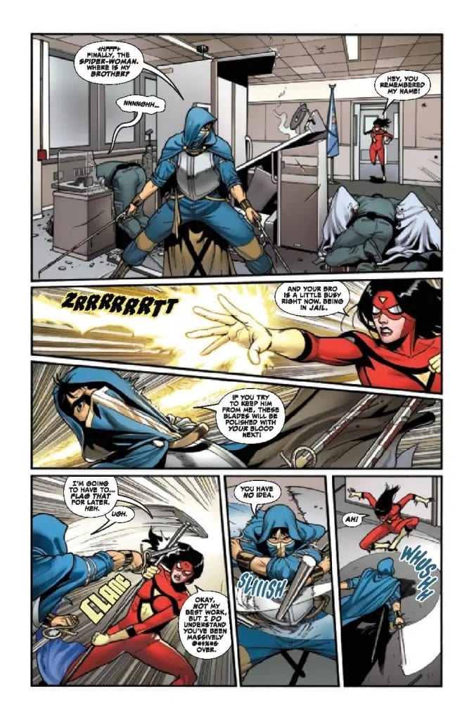
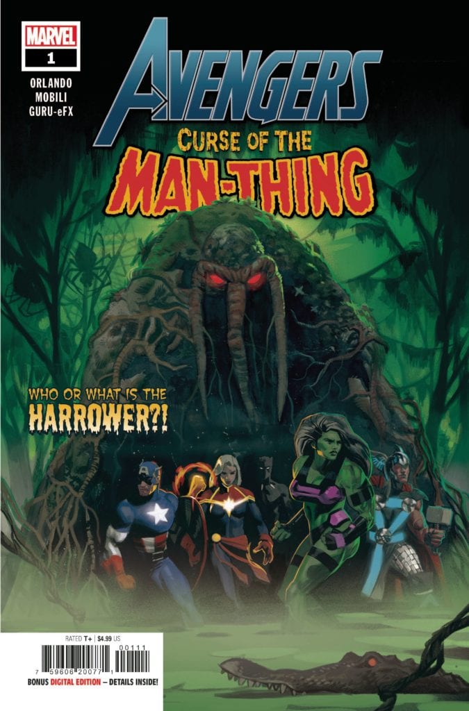
Orlando and Marvel decide to celebrate Man-Thing’s 50th anniversary while minimizing the chance of failure. Curse of the Man-Thing serves as a crossover mini-event by Marvel’s biggest franchises. Each of which has some form of connection to the Bog Beast. For example, Avengers features Captain America, whose super-soldier serum Ted tried to replicate. The series goes to the lengths to show Ted in a desperate and vulnerable state to reach that very pinnacle. Things were getting so bad for him; Ted made a deal with a devil to get results. Thankfully not the usual bargain with Mephisto, but another character that can lead to encounters with Death Rider.

Curse of the Man-Thing Cons

Despite all of the potential in Curse of the Man-Thing‘s formula, there are some concerns. For example, the pencilers change with each issue. On paper, this sounds like a good way to save time, but it can also change the atmosphere in an inorganic way. Francisco Mobili’s softer pencils fit well into Man-Thing’s horror aesthetic. Unlike Andrea Broccardo’s sharper penciling that looks more at home on pin-ups.

SPIDER-MAN CURSE OF MAN-THING #1
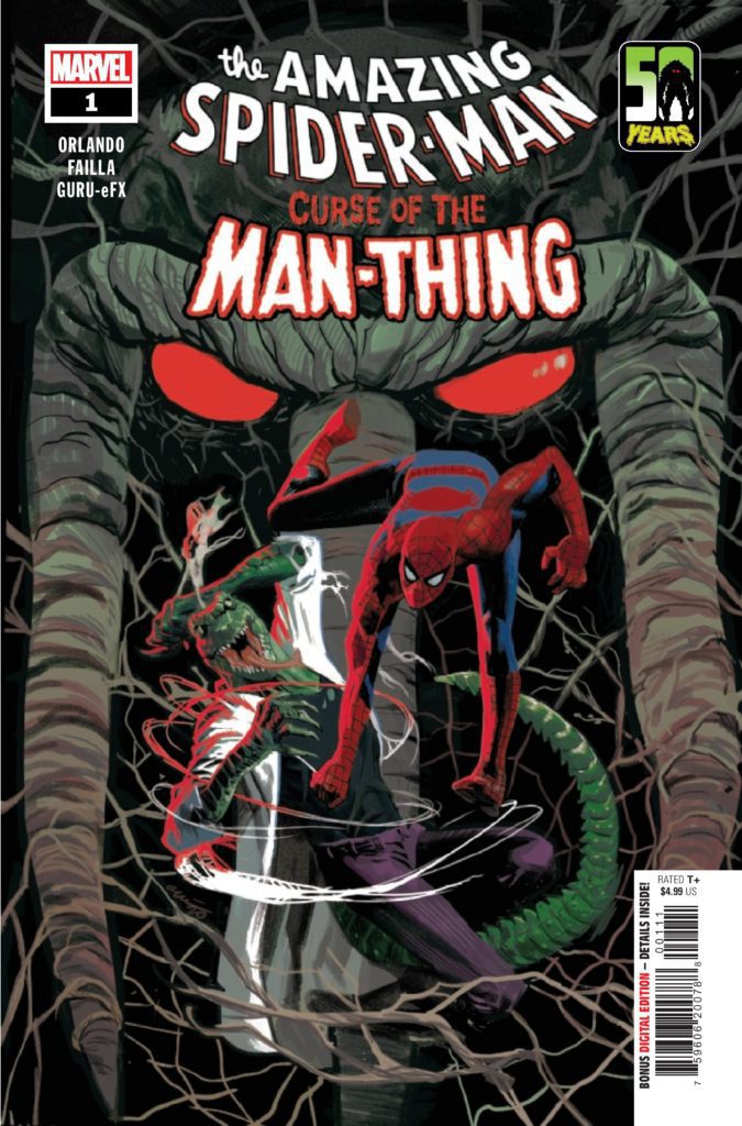
Then there are the placements of characters and how awkward their presence is in the macro story. For example, in the Spider-Man issue, the inclusion of Curt Conners is a callback to Ted co-creating the Lizard Formula. But the way Ted builds up Curt as the creator of his super-soldier formula turns out to be a lie. This, along with how Spider-Man becomes a plot element, feels more like fan service than a story with stakes. If anything, the plot would’ve gone faster if it skipped to the X-Men issue, which features the problem of defeating the antagonist Harrower without trouble despite the first issue presenting her ability to fight Man-Thing.

What Marvel Can Do Differently

The Curse of the Man-Thing outline can serve as a good model for some of Marvel’s lesser-used characters. For example, Justice and Speedball are two reserve Avengers who have connections across the Marvel Universe. Also, with the cancellation of the New Warriors: Outlawed storyline, they could really use a win. But to do so without Man-Thing’s pitfalls, they’ll need not only characters they have a history with but how they bounce off one another. The conflicts and transitions into another chapter need a payoff. Otherwise, they’ll just drag on. This consistency should also mean the artwork for the sake of moods.

What do you all think? Is Curse of the Man-Thing the beginning of a trend where C to D-List characters can get more attention? Or is the reliance on star power just a cheaper way for these characters to ride on everyone’s coattails? Leave your thoughts in the comments.

Monkeys Fighting Robots Youtube

Review: THE DJINN Reminds You To Be Careful What You Wish For

The Djinn is the sophomore feature from the directors that made an impact with The Boy Behind the Door at last year’s Fantastic Fest. The tension-filled isolation in a single space is replicated during The Djinn, and these directors have masterfully used the confined space to offer another heart-pumping ride of a film. The Djinn seeks to remind those that watch to be thankful for what is already in their life and to be careful what they wish for. A film that does become repetitive due to the one location setting, but still delivers a solid horror tale.

Ezra Dewey, who also starred in The Boy Behind the Door, returns to join the co-directors in this terrifying film. If using single space locations is what works for these two, then I’d say don’t fix what isn’t broken. However, there are moments in The Djinn where it could be argued this may have worked better as a short film. Directed and co-written by David Charbonier and Justin-Powell, the film stars Ezra Dewey, Rob Brownstein, Tevy Poe, and Isaiah Dell. The Djinn follows Dylan Jacobs (Dewey), a mute boy struggling to cope with his mother’s suicide. One evening, while his father, Michael Jacobs (Brownstein), works overnight as a DJ, Dylan unleashes something in their apartment. Dylan’s inability to accept himself as he is may result in yet another heartbreak if he isn’t careful. Dylan doesn’t realize his single-parent life, and being mute could be much worse, and he’ll learn that soon enough.

Tevy Poe as “The Djinn” in David Charbonier and Justin Powell’s THE DJINN. Courtesy of IFC Midnight. An IFC Midnight release.

Charbonier and Powell have skillfully written a film about a sympathetic child, who just wants his mother back. He’s also blaming his inability to speak for why she chose to end her own life, which makes Dylan easy to feel for. His father is nonexistent for most of the film’s runtime, so Dylan’s progression is the driving force for this narrative. It’s another fun game of cat and mouse, similar to The Boy Behind the Door. Still, this film’s appeal doesn’t last for long due to those repetitive sequences of Dylan running to the same rooms at times. After finding the Book of Shadows, presumably left by the last tenant, Dylan performs a ritual called the wish of desire. This unleashes The Djinn, an entity that will give Dylan a voice after enduring an evening of terror. The script probably could have been trimmed a bit because while the message is made clear, it feels like this was dragged on longer than it should have been.

Charbonier and Powell deliver some impressively tense, and dreadful moments throughout this film. This entity can shapeshift, so there’s a moment where Dylan is chillingly terrorized by his deceased mother. Several instances will make your skin crawl, but Dylan already blames himself for his mother’s death in ways and now she is chasing him around the apartment like a crazed maniac, which makes that sequence so frightening to watch. Dewey’s performance as Dylan is fantastic, and he embodies the innocence of a little boy tremendously. His ability to carry the film with little to no dialogue is wonderfully handled. A bone-chilling score by Matthew James feels in for Dylan’s voice, as he tries to survive the night against this entity. The use of sound design is important here, and assists in conveying Dylan’s emotions during this traumatic night he is forced to participate in, it is his voice.

Rob Brownstein as “Dad” and Ezra Dewey as “Dylan” David Charbonier and Justin Powell’s THE DJINN.

The Djinn could be looked at as an overly long tale about things that go bump in the night, but it has a lot of heart to it and delivers an effective tale about a young boy who just wants to speak. While there is no denying that this doesn’t pack the same intensity as The Boy Behind the Door, this second outing highlights the co-director’s ability to utilize single spaces in the best ways possible once again.

Monkeys Fighting Robots Youtube

Review: The Pieces All Fall Together in RORSCHACH #8

Rorschach King DC Comics

The story of DC Comics’ series Rorschach is complex and confusing. But writer Tom King, artist Jorge Fornes, colorist Dave Stewart, and letterer Clayton Cowles don’t let us think for a second that that’s because they are being unclear. No, Rorschach #8 is incredibly clear. It’s concise and meticulously ordered. Yet somehow, this creative team is able to communicate chaos. It’s through order that they show us what’s missing and what doesn’t make sense. They lay everything out carefully, that way we can see all the holes. This creative team continues to use their incredible powers to blow our minds.

Writing

King has never been so verbose. His pages are full of text in this issue. King is usually known for his quiet comics. Often, the pauses in his scripts speak louder than the words do. This issue is actually no exception. Our main character, the detective figuring out the story behind Wil Myerson, is interrogating three people. Each witness has a lot to say. Their accounts spare no details. For every brief question, there’s a long answer. But everything about their testimonies feels harmless. We begin to wonder if the detective has gone down the wrong rabbit trail, or if he’s just being played. King masterfully skirts past holes in each story, then comes back to make us question what we think we know. It’s like he dumps all the puzzle pieces on us, then shows us that they don’t fit together. They can’t be the right pieces. It’s a brilliant journey that he takes us on in this issue, deepening the mystery with each revelation.

Rorschach King DC Comics

Art

Fornes’ page layouts play a huge role in making us feel like we’re missing part of the picture. He makes use of dead space throughout this issue. Almost every page is more or less a 24 panel grid. Many pages combine some panels, but when you break it down, it’s still 24 panels. Often, pages have panels that are fully dedicated to text. Instead of using caption boxes, we get white panels full of text. And when Fornes combines panels to create one image, with a panel in the middle of that image blanked out for text, we get the sense that we’re missing part of the picture. Because we quite literally are. Fornes makes us feel that it’s the dead space that holds the answers. The issue reads like an evidence board that’s missing what links it all together. It’s fantastic, infuriating, and beautifully done.

Rorschach King DC Comics

Coloring

Stewart’s coloring is deliberately simplified. When one character tells their version of events, those events are shown in a certain hue. When Wil’s lawyer says what he remembers, we see everything through a red haze. Wil’s therapist and handyman recount things in green and blue respectively. Not only does this help us keep track of who’s speaking, but it gives us a sense that the truth is being distorted. We aren’t seeing things as they truly are. When the detective finished his interrogation, he grabs a cup of water from the water cooler. Each plastic cup is colored differently. One is red, one is blue, one is green. As he updates his supervisor on how the interrogation went, we see him drink the water and throw it away. But in each image of the cup, it’s a different color. It’s Stewart’s incredibly simple way of showing how monotonous these things are to the detective. His routine is the same, his conversations with his supervisor don’t change, only the days change. Same thing, different day.

Lettering

Cowles places much of the lettering in this issue in the dead space of each page. The white panels not only get filled with captions, but with the speech bubbles of the characters. Their words go from their mouths in one panel, up into the dead space of another. When Cowles does place captions over an image, he stays true to the style of the rest of the issue. Caption boxes are big and white. They purposefully get in the way of the rest of the picture. And finally, Cowles makes a point of always having quotation marks around the captions. Even when two paragraphs exist in the same caption box, each starts with a quotation mark. Other letterers often omit quotation marks where they can. But Cowles never wants us to forget that we’re being told this story. We won’t forget who the speakers are, Cowles makes sure of that.


DC Comics’ Rorschach #8 is an incomplete picture. It taunts us with the information we don’t have while overloading us with information that doesn’t fit. This creative team impresses upon us what it feels like to look for the truth in a sea of misinformation. They use their ordered, clean storytelling to show us the chaos beneath the surface. Pick up Rorschach #8, out from DC Comics May 11th, at a comic shop near you.

Monkeys Fighting Robots Youtube

S03E01: Kickstarter, Comics, and Disc Golf

Monkeys Fighting Robots Podcast Logo

If you are reading this, it means you have survived the apocalypse! I’m back to talk with you about life, comics, and a bit of disc golf. Man, I’m such a nerd! Thanks for checking out the podcast, have a great week, and let me know if you read any great books on NCBD!

Send emails to Matt@monkeysfightingrobots.com

About the Monkeys Fighting Robots Podcast

Never heard of Matt Sardo?
For starters, he made the Kessel Run in less than 11 parsecs. Prior to that, he gave Doc Brown the idea for the flux capacitor and led the Resistance to victory over SkyNet – all while sipping a finely crafted IPA. As a radio host, he’s interviewed celebrities, athletes and everyone in between. He’s covered everything from the Super Bowl to Comic-Con.

Monkeys Fighting Robots Youtube