

Written by Declan Shalvey (Bog Bodies, Injection) and Rory McConville, with art from Joe Palmer, “Time Before Time” #1 is an engaging and wholly entertaining opening chapter to this ruined future time travel comic series. With colors by Chris O’Halloran and letters from Hassan Otsmane-Elhaou, this comic displys its influences openly to the point where it starts to feel pretty unoriginal, but its held together by sharp writing and pacing and fitting visual work.
“The year is 2140, and to escape a world with no future, many turn to the Syndicate, a criminal organization who, for the right price, will smuggle you back in time to a better life. After working for the Syndicate for years, Tatsuo and Oscar decide to steal one of their boss’s time machines—but soon find that the one thing you can’t run from is your past.”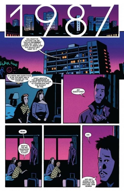
Writing & Plot
Every story you read in our time is going to have its influences, whether they be subtle or blatantly obvious. What matters is how these influences are used in the creation of a new tale. Declan Shalvey and Rory McConville succeed in opening up a science fiction world with a great premise – sending people back in time to escape the calamity that we have made our planet – and creating a simple yet effective motivation for the protagonist to also get the hell out of Dodge. However, if you know what this story pulls much of its influence from, it can be a little distracting. See, this comic’s plot borrows, whether accidentally or unintentionally, a lot of its concepts from Rian Johnson’s 2012 sci-fi film Looper (which is brilliant on its own). Granted, Shalvey and McConville have given the idea of time travel as this crime syndicate-led underground act and spun it in a slightly different direction than Johnson’s movie, but there’s still so much similarity that I couldn’t help but see it with every turn of the page. Again, this could be totally unintentional as there are so many very similar genre stories that accidentally borrow from one another all the time (I mean the lead character’s name is Tatsuo, so Looper wasn’t the only story on my mind). If you’ve seen Looper though, be warned that there’s a good chance that it going to dominate your thoughts while reading this comic. Everything else about this script is honestly solid. While we don’t get to spend a *ton* of time with a couple more important supporting cast members, there’s still enough detail from the story to paint a picture of the interpersonal relationships amongst these people and the protagonist, which created an emotionally effective twist early on in the issue. The dialogue is sharp, with some clever twinges of humor sprinkled throughout. Despite its overbearing similarity with one other piece of recent science fiction, this is a thoroughly well-written comic.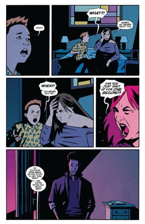
Art Direction
The bleak ruined future of “Time Before Time” #1 is brought to life by the pencils of Joe Palmer, with colors by Chris O’Halloran, and it’s a look that well suits this story. Palmer’s thick lines and heavy inks darken a bleak Earth with the exact sort of atmospheric aesthetic you’d expect from a cyberpunk-esque comic. The architecture of the run down apartment structures and syndicate-owned warehouses is excellently well constructed in its dilapidation, with crumbling concrete and cracked sidewalks marking much of the scenery. The character animations and details are outstanding, with thin lines marking stress and age in characters as well as making obvious emotional reactions. Every character has a different design making them easy to tell apart. The colors from O’Halloran are spot-on for this comic as well, with dreary ashen greys marking the outside world on the future, dotted by faded neon in nightclubs and via streetlights to make this comic feel like a true cyberpunk experience. Otsmane-Elhaou’s letters use a familiar and safe font that is highly dynamic, changing effortlessly based on character’s tone and delivery. From the visual end, this is a tightly put together package that sticks the landing in regards to creating the world this story takes place in.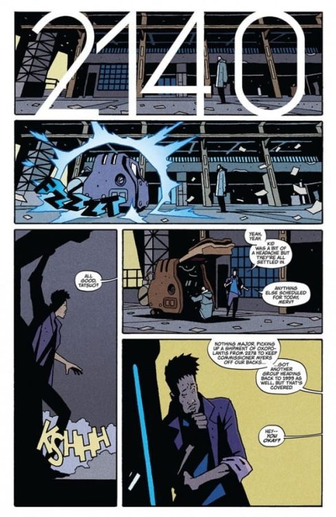
“Time Before Time” #1 is the kind of sci-fi story you’ve probably seen before, but is still delivered in a way that should be refreshing to most readers. Declan Shalvey and Rory McConville’s script is focused and tightly paced, offering considerable amounts of plot and characterization within this issue’s page length without ever feeling bogged down. The visuals from Joe Palmer and Chris O’Halloran are perfectly bleak, rife with detail and appropriate tone for this kind of ruined cyberpunk future. Be sure to pick up this debut issue when it hits shelves on 5/12!