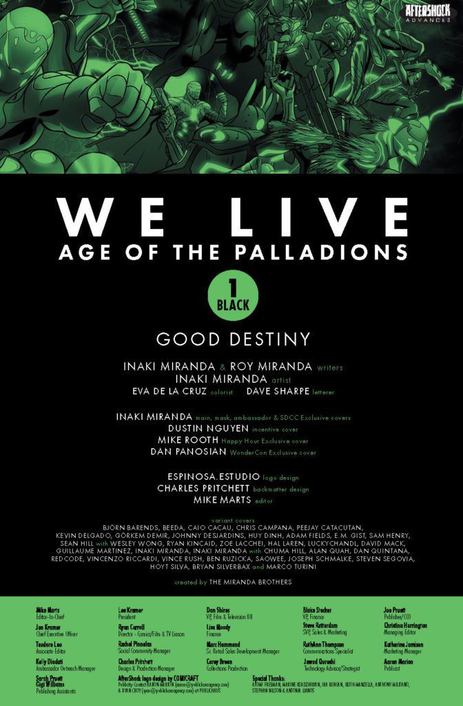
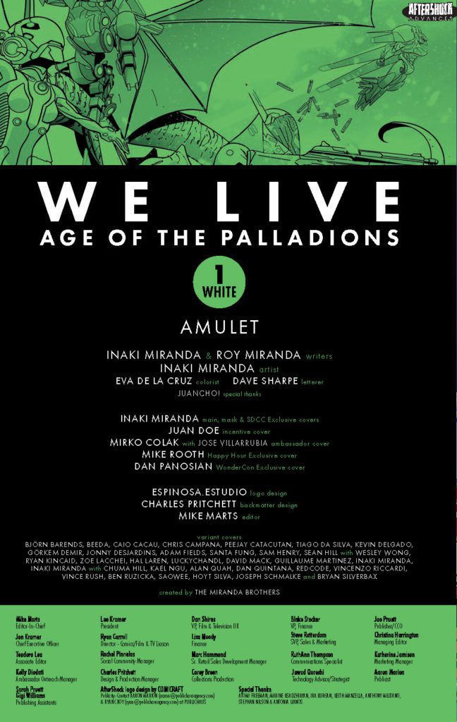
We have a special treat for all you AfterShock Comics fans this week! The publisher kindly provided MFR with not one, but TWO exclusive previews today, for two books dropping March 9th: WE LIVE: AGE OF PALLADIONS #1 BLACK and WE LIVE: AGE OF PALLADIONS #1 WHITE!
Again, these are TWO separate comics with TWO distinct stories. Both issues are written by Inaki & Roy Miranda and drawn by Inaki Miranda, with colors by Eva De La Cruz, and letters by Dave Sharpe. Inaki Miranda also did the main covers for both issues. Dustin Nguyen did the incentive cover for the BLACK issue, while Juan Doe did the incentive cover for the WHITE issue.
WE LIVE: AGE OF THE PALLADIONS COLLECTIBLE TRADING CARDS!
Heightening the excitement and appeal of AfterShock’s #1 selling titles, the Miranda Brothers have created collectible trading cards for each issue in this story arc!
Check out both previews below:
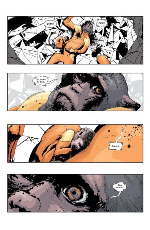
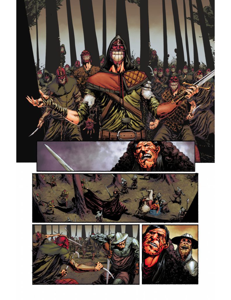
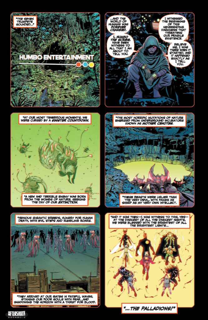
WE LIVE: AGE OF THE PALLADIONS #1 BLACK
About the issue:
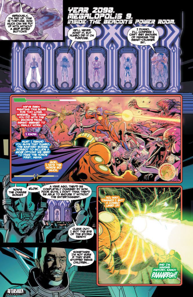
We are back into the hopeful, apocalyptic world of Tala and Hototo.
Year 2090. Six years have passed since Salvation Day, when Palladions, with their majestic powers, emerged as the protectors of humanity, saving the five remaining Megalopolis and securing the future of the human species.
But nothing stays and the horizon always brings a new storm.
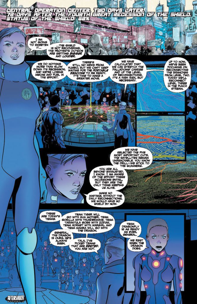
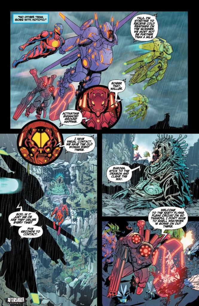
These are dark times. Death, famine and desperation lurk around the streets of Megalopolis 9. The shield has lost thirty percent of its reach. The New Nature has learned to create cuts in the energy channels that power the Beacon and the Palladions. A neverending horde of beasts siege the remains of the city, increasing the desperation among the population.
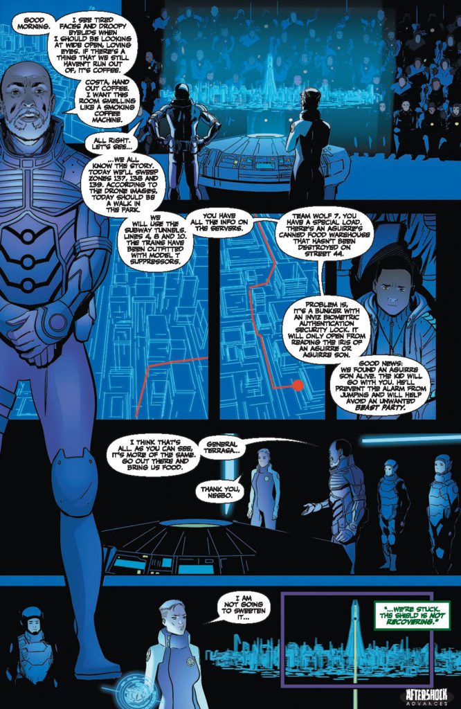
The responsibility of keeping the city afloat lies on the shoulders of Generals Nesbo and Terrassa, who have to resort to risky survival measures. The reconnection missions are the only thing that is keeping the population secure…but nothing seems enough.
Powerlessness corners the Palladions, who fear not being able to protect the city.
Everything is black, except for the white snow that covers with silence the dying, black present.
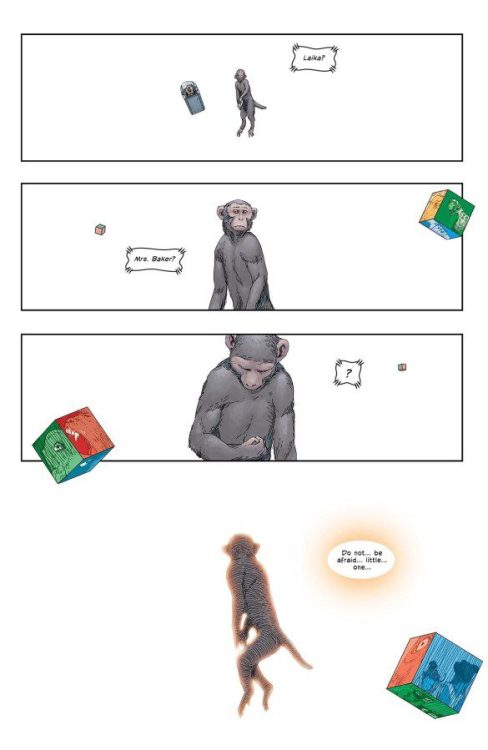
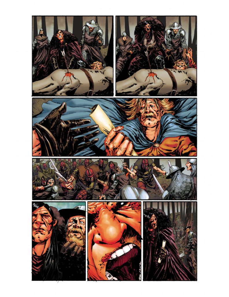
WE LIVE: AGE OF THE PALLADIONS #1 WHITE
About the issue:
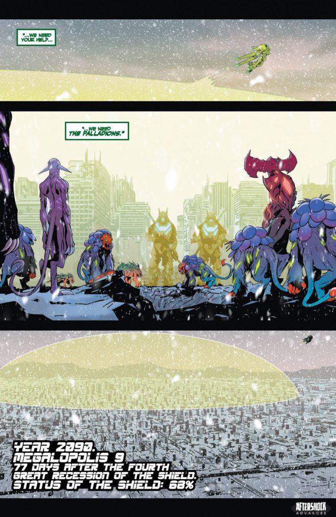
We are back into the hopeful, apocalyptic world of Tala and Hototo.
Year 2090. Six years have passed since Salvation Day, when Palladions, with their majestic powers, emerged as the protectors of humanity, saving the five remaining Megalopolis and securing the future of the human species.
But nothing stays and the horizon always brings a new storm.
These are dark times. Death, famine and desperation lurk around the streets of Megalopolis 9. The shield has lost thirty percent of its reach. The New Nature has learnt to create cuts in the energy channels that power the Beacon and the Palladions. A neverending horde of beasts siege the remains of the city, increasing the desperation among the population.
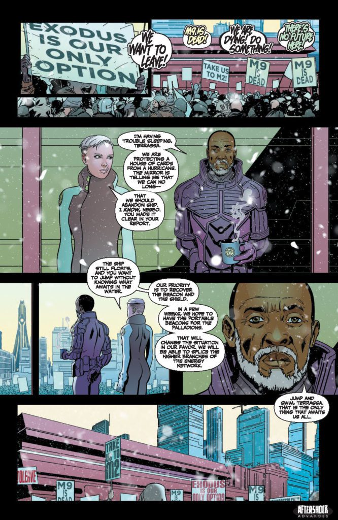
The responsibility of keeping the city afloat lies on the shoulders of Generals Nesbo and Terrassa, who have to resort to risky survival measures. Journeying outside of the city in search of food is the only thing that is keeping the population alive, but nothing seems enough.
Fear opens its way through Megalopolis 9 like a great crack of faith that separate more and more the population from the Palladions.
Snow covers the city with a heavy white mantle, invoking oblivion and nothingness.


Are you reading WE LIVE? Sound off in the comments!