Modern Metal Pioneers Spiritbox Unite with
Z2 Comics for Haunting New Graphic Novel,
Eternal Blue: A Spiritbox Graphic Novel, Including
Ghost-Communicating Spiritbox Replica
The breakout band of 2021 joins acclaimed writer Jim Krueger
and artist Amilcar Pinna for the surreal story behind debut LP
LOS ANGELES, CA–Following their formation in 2017, Canadian quartet Spiritbox has
continually possessed the charts with its dynamic blend of metal and block-leveling live
shows. The group will now channel the story behind its 2021 debut, Eternal Blue
(topping at #13 in the Billboard Top-200), in a new graphic novel co-created alongside
veteran comic scribe Jim Krueger (Earth X, Justice) and artist Amilcar Pinna (Poppy’s
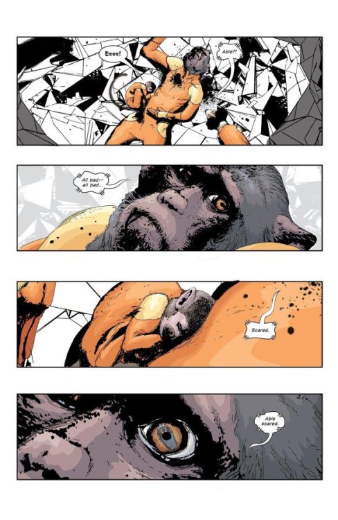
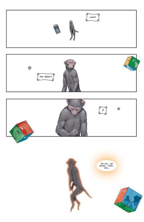
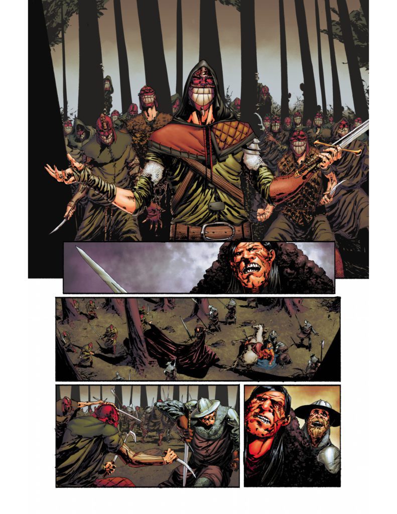
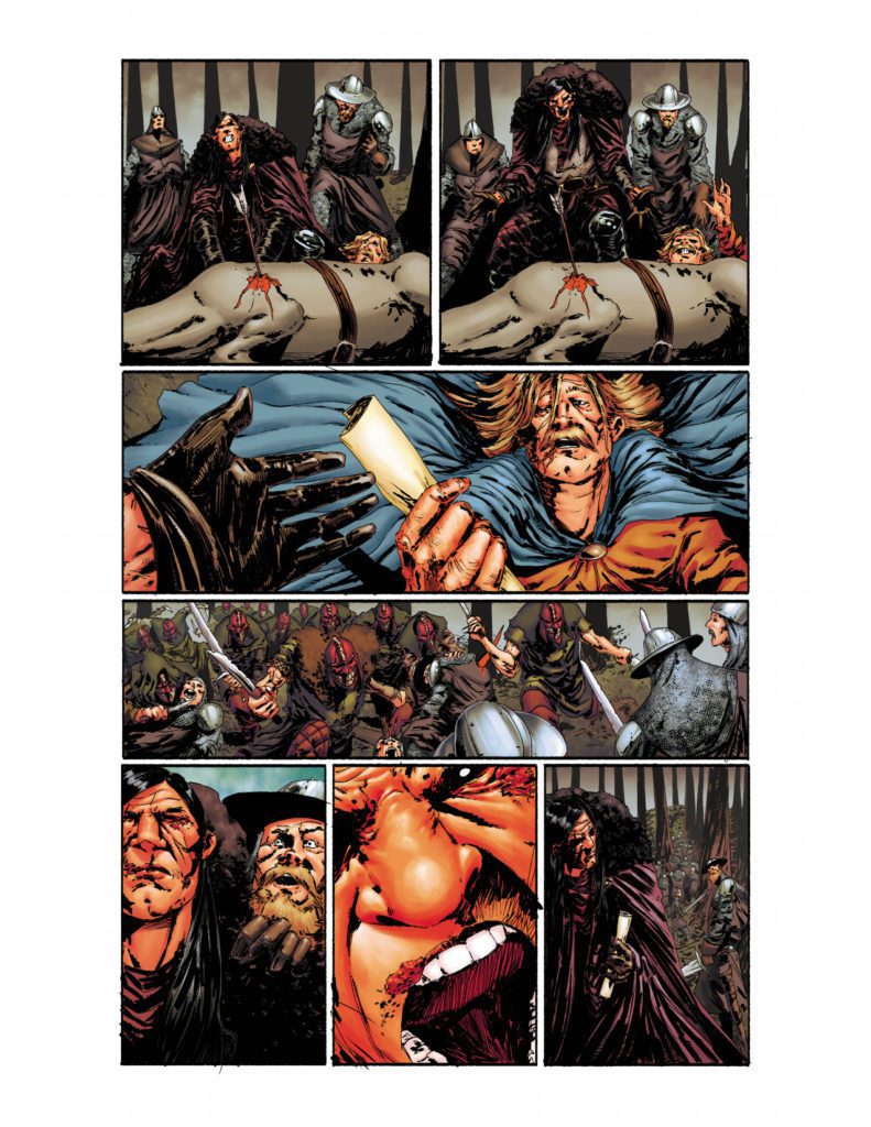
Inferno, Generation X). The graphic novel unspools the eerie tale of Eva, a brilliant
painter on the verge of unbelievable acclaim and success. But her inability to reconcile
her public perception with her true self allows a Spiritbox—a device used to
communicate with the dead—to transport her to an ethereal world. Here, she finds
herself trapped in a realm where false shadows become real and dangerous.
“I am in love with this story and artwork. I cannot wait for you to discover Eva and the
world that she has been thrust into,” explains Spiritbox vocalist Courtney LaPlante. “It
truly is an extension of my feelings and the state of mind I held while writing our album,
Eternal Blue, and the lyrics that resonate with me still. Although we are very different, I
can’t help but let a lot of myself seep into Eva’s personality and experiences. I care
about her so much. Jim and Amilcar are brilliant and we are so happy to share this with
you after keeping it to ourselves for so long.” 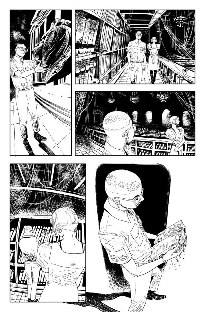
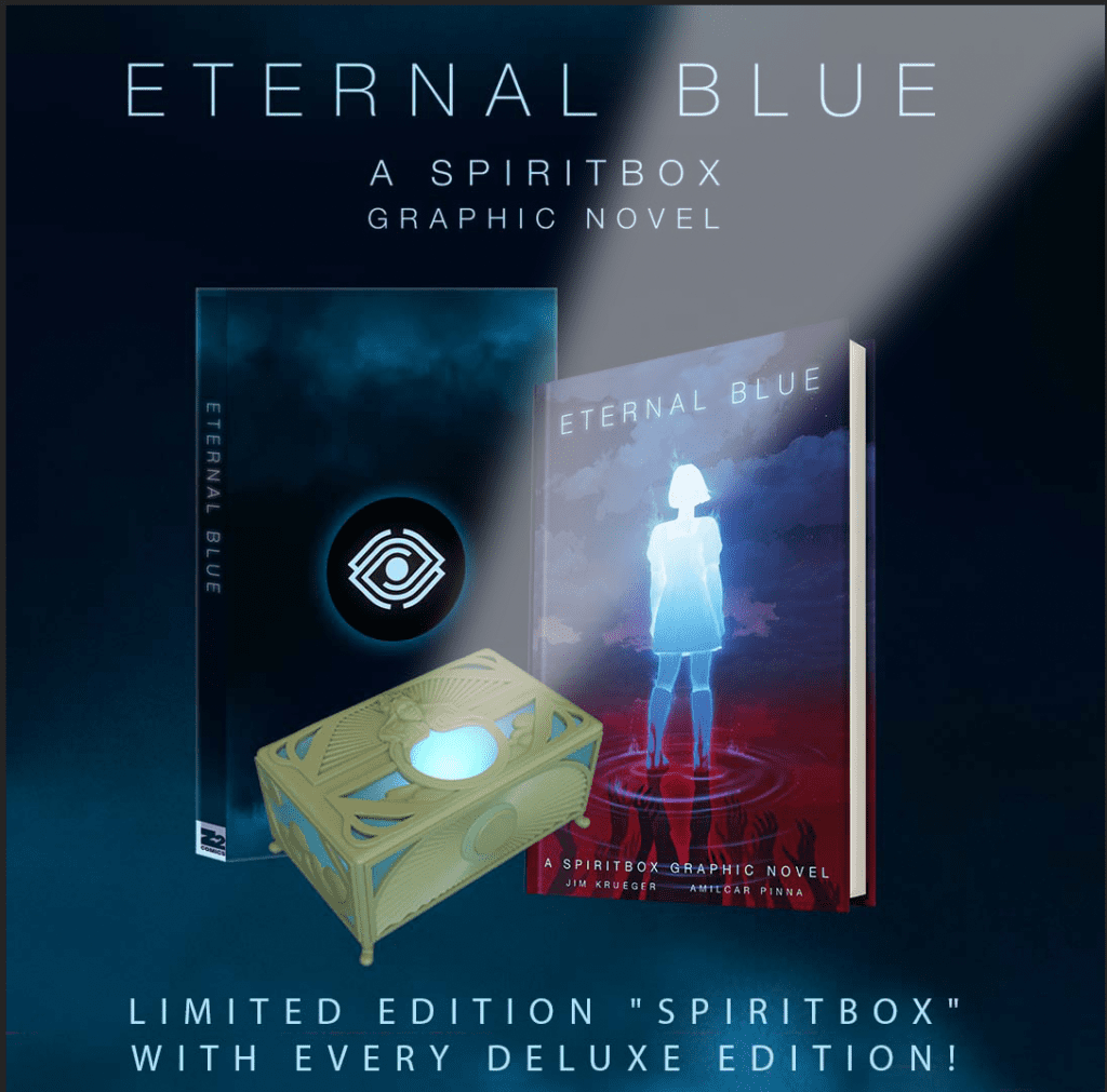
Ushering the cursed device from the pages of Eternal Blue: A Spiritbox Graphic
Novel to reality, deluxe versions of the book will include a fully functional Spiritbox
replica. This machine cycles through the radio frequency spectrum, creating a din of
white noise that lost souls harness to communicate from beyond the veil. This limited
edition Spiritbox is a precise replica of the mysterious artifact that allows Eva to escape
from the shadow world. When activated, the box gives off a blue glow as it emits the
noises of the spirit world. From the top of the box, an image of Eva is projected onto the
ceiling.
For the last four-plus years, Spiritbox has sent tremors through the metal
establishment; singles “Holy Roller” and “Secret Garden” respectively charted on Billboard’s Hot Hard Rock Songs at 25 and within Billboard’s Mainstream Rock Chart
Top 40. Following its release, the record peaked at 13 on the US Billboard 200 and
topped both Billboard’s Top Rock Albums and Hard Rock Album charts. To date,
Spiritbox has received more than 100 million digital music streams and has graced the
covers of Revolver, Kerrang, Rock Sound, Pollstar and had the number one song
on Sirius XM Liquid Metal for two consecutive years—the first artist in the history
of the program to achieve this.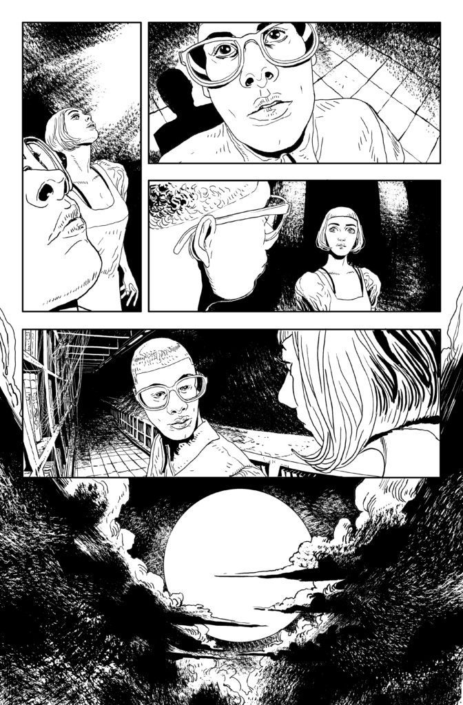
“Spiritbox has such a precise concept of their aesthetic, and how it ties into their
music, that it makes the process of collaboration and creative exploration a joy,”
editor Rantz Hoseley explains. “The result is an ambitious and haunting journey
that pulls you down through the Eternal Blue darkness into a surreal realm of
deeply personal exploration. For me, this is one of those books where it’s thrilling
to get to read the story before everyone else, and I cannot wait for everyone to
be able to experience Eva’s journey.”
“When I took on this job, I had no idea what it was going to become. I loved the
poetry and metaphoric mysteries of Spiritbox (the band),” writer Jim Krueger
says. “I loved their music and the chance to finally work with Z2. But again, I was
unprepared for the magic that happened creatively with this one. Or the places I
was going to be allowed to go. And the art, the art. I cannot wait for people to
see this. But grab quick, I might be buying all the copies.”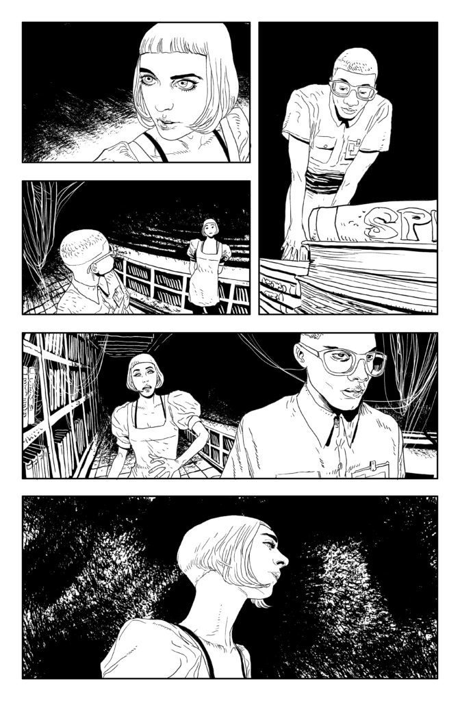
“I couldn’t wish for a better script to draw! Jim’s writing on Spiritbox is weird, nightmarish, and surrealist! All things that I love to draw!” artist Amilcar Pinna
elaborates.
Z2 and Spiritbox present Eternal Blue: A Spiritbox Graphic Novel by writer Jim
Krueger, artist Amilcar Pinna, and colorist Treonna Farrell in both softcover and
hardcover formats, with covers courtesy Justin Cherry available in comic shops, as well
as deluxe, super deluxe and platinum editions packaged with a Spiritbox device,
exclusive vinyl variant LP of Eternal Blue, gallery-ready prints by Jason Levesque, and
more available exclusively through Z2’s webstore.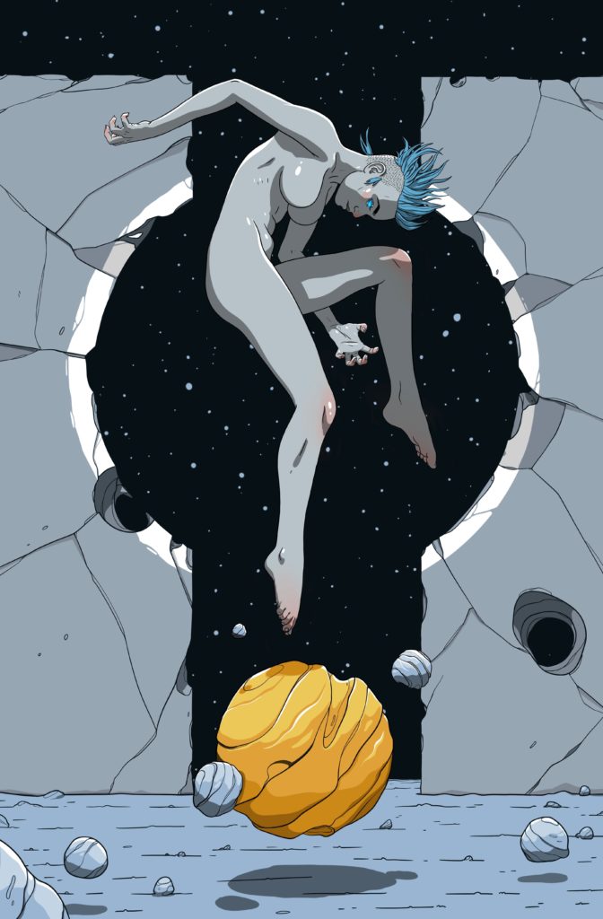
About Z2:
Recently dubbed the “hottest brand in music” by Forbes, Z2 has quickly become the
premier destination for authentic graphic novels and collectibles, created in partnership
with top-tier artists, musicians and pop-culture icons. Distributed globally via Simon &
Schuster, Z2 has produced 50+ unique graphic novel properties, collaborating with
Gorillaz, Blondie, Elvis Presley, Freddie Mercury, Balmain, Joan Jett & The
Blackhearts, Jason Derulo, The Grateful Dead, Machine Gun Kelly, Sublime,
Beethoven, RZA, Mötley Crüe, Vince Staples, Cheech & Chong, The
Doors, Anthrax, Public Enemy, Ronnie James Dio, King Diamond, All Time Low,
Judas Priest, Ivan Moody, Yungblud, Cypress Hill, Babymetal, Major Lazer, Alter Bridge, Sturgill Simpson, Poppy, John Lee Hooker and Charlie “Bird” Parker.
Learn more at Z2comics.com, and follow us on Instagram (@z2comics) and Twitter
(@z2comics).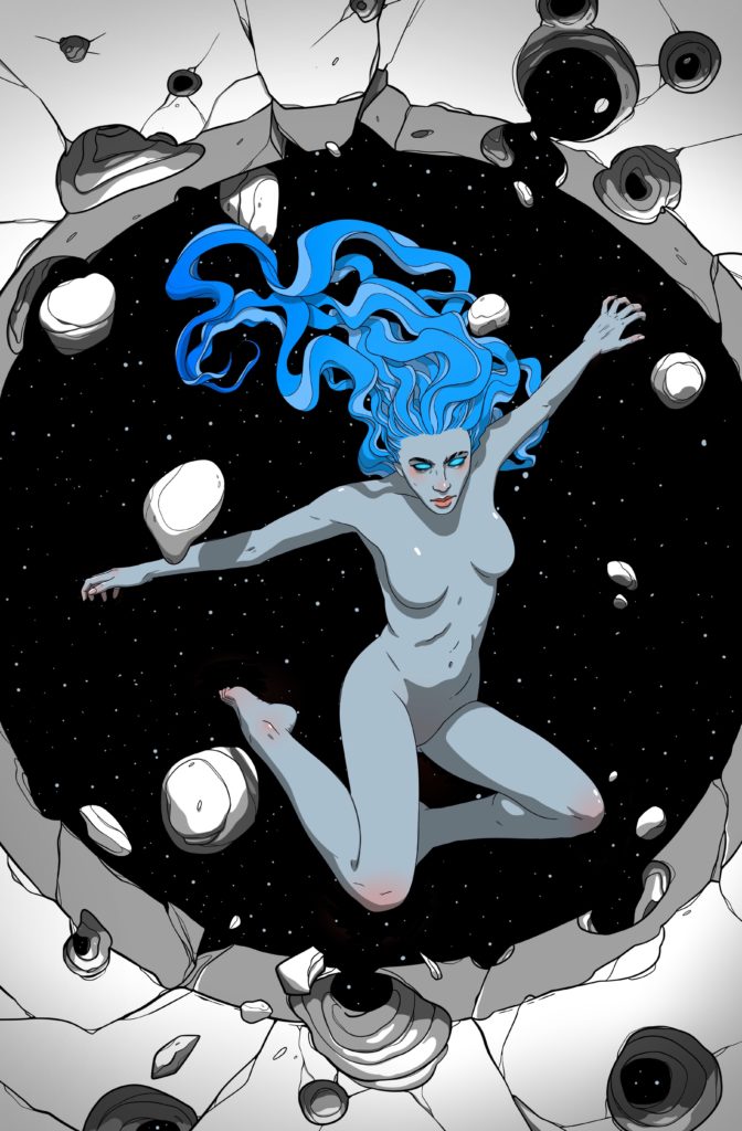
About Spiritbox:
Named after a device some believe capable of communicating with the dead,
there’s a gleeful sense of the paranormal running through all that Canadian
metallers Spiritbox do, but this is a group of artists who are very much brimming
with life and creating something remarkable with their music. With ambitious and
intelligent debut full-length Eternal Blue now out in the world, successes continue
to roll in for Spiritbox, with their first LP topping the U.S. and Canadian Rock and
Hard Rock charts, breaking the top 20 in the U.K., Germany and Australia, and
peaking at #13 on the Billboard 200.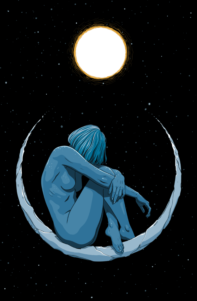
Spiritbox’s music is characterized by fierce intensity, unwavering emotion and
technical splendor. Architects frontman Sam Carter is a notable fan, and features
on Eternal Blue song “Yellowjacket.” Elsewhere, single “Circle With Me” blends
the light-and-dark, soft-and-heavy facets of the band’s sound effortlessly, while
on “Secret Garden,” Spiritbox thrillingly mix pop with prog-rock. The cumulative
result is a band who have “delivered a staggeringly brilliant record that
resoundingly delivers on the hype” (Metal Hammer), and with an unbreakable
connection between themselves and their fans firmly in place, the band remains
determined that the Spiritbox phenomenon continues to usher in more and more
followers who identify with Eternal Blue’s imaginative and universal messaging.