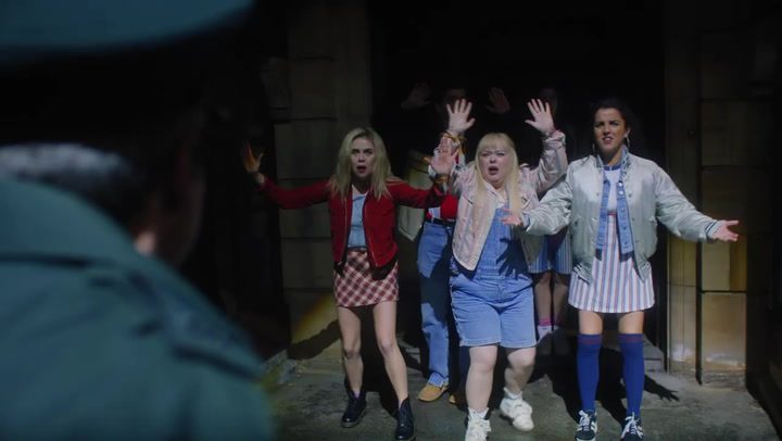
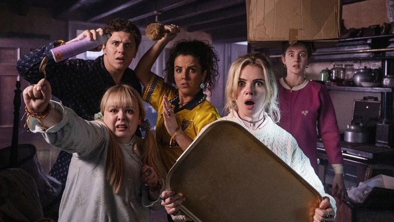
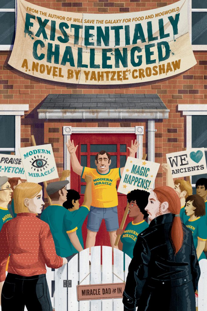
Yahtzee Croshaw, creator of the ZERO PUNCTUATION gaming review series, returns with his sixth novel at Dark Horse Comics: EXISTENTIALLY CHALLENGED, the much anticipated sequel to DIFFERENTLY MORPHEOUS!
Originally released as an audiobook, EXISTENTIALLY CHALLENGED will be available in bookstores on January 17, 2023, and at comic stores on January 18, 2023, with a new cover by Ethan Kimberling.
About the novel: With magic declassified in the UK, fake psychics and fraudulent healers are running amok, so it’s up to the Department of Extradimensional Affairs’ newly appointed Skepticism Officers to crack down on them. But when they set their sights on Modern Miracle, a highly suspicious and fast-growing faith healing cult with remarkably good social media presence, even their skepticism is put to the test.
Is Modern Miracle on the level? Is Miracle Meg’s healing magic real? Why do dead bodies keep showing up on their doorstep? And just what is Miracle Dad’s preferred flavor of crisp?
Of EXISTENTIALLY CHALLENGED, Croshaw said, “I always like to start a story from a question, and in the case of Existentially Challenged, it was, ‘How would people feel about the church in a world where magic has suddenly turned out to be real?’ From there, things took a few turns. I hope you like it, as I have big plans for the ongoing DEDA series. Differently Morphous was the boulder placed on top of a snowy hill, and now we’re kicking it down the slope.”
Are you looking forward to EXISTENTIALLY CHALLENGED? What is your favorite Yahtzee Croshaw novel? Sound off in the comments!
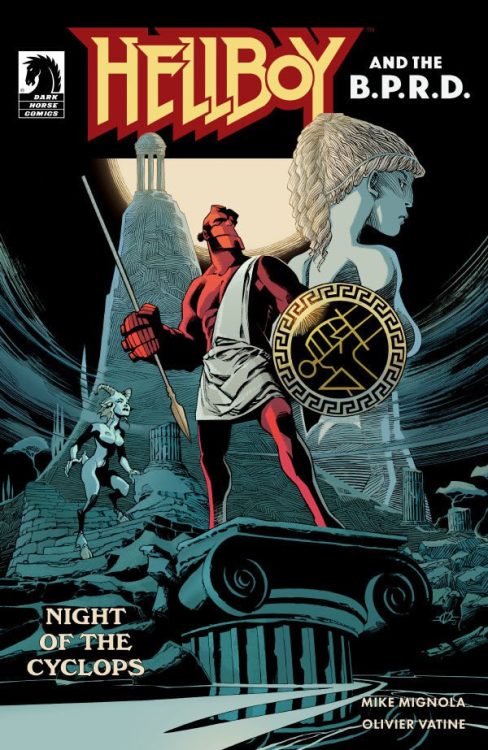
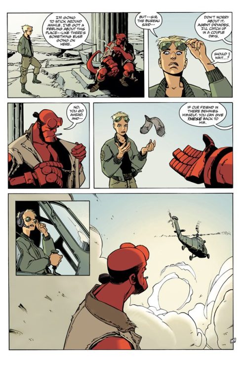
From legendary series creator Mike Mignola and writer & artist Oliver Vatine comes a blast of a one-shot in the form of Hellboy And The B.P.R.D: Night Of The Cyclops. Featuring letters by Clem Robins, this Hellboy tale takes us into the realm of Greek mythology for one of the most fun one-shots in this universe in recent memory.
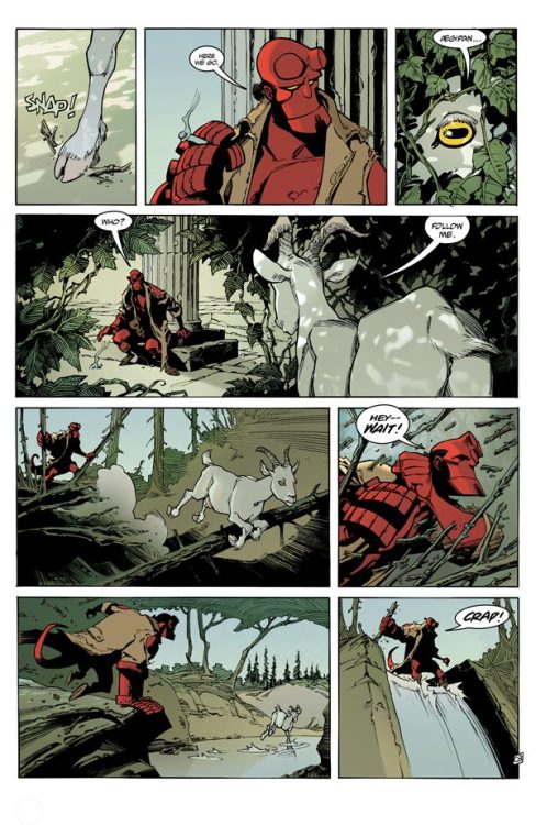
“Just as he finishes up one job in Greece, Hellboy is detoured into another adventure by . . . a goat? Join Hellboy in a strange hidden land of treachery and togas as he takes on the wrath of a jealous god.”
Writing & Plot
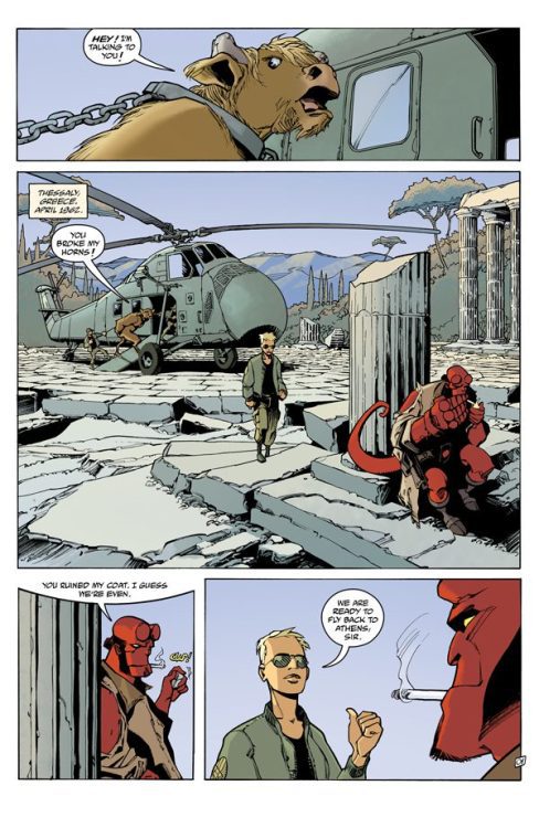
Mignola teams up with another great storyteller in Oliver Vatine to tell the kind of memorable tale that makes this universe so enjoyable in Hellboy And The B.P.R.D: Night Of The Cyclops. This one-shot sees ‘Big Red’ accidentally discovering a new adventure in Greece after fighting a monster with the B.P.R.D. He decides to follow a talking goat (typical Hellboy stuff) to a mysterious and forgotten land placed under a curse by a jealous Greek god. The rest is a funny and witty blast of a comic book, with swingin’ action and a little cutesy romance. Plot wise, it’s what one may expect from a Hellboy comic. Nothing here will be all that surprising, but the execution is what matters. Every element of this issue’s plot feels like a pulp adventure, from discovering this hidden land to the big exposition-y bit and the big heroic battle. Mignola and Vatine’s dialogue is clever and funny, with Hellboy doling out quips and one-liners in his usual gruff fashion. One of the plot elements, involving the jealous god’s son, feels a bit out of place compared to the tightness of the rest of the comic. However this is a minor nitpick, as this book is so fun that it completely overshadows this little inconsistency. Night Of The Cyclops is one of the most fun one-shots in this universe in recent memory.
Art Direction
The Hellboy universe is most known for its iconic visual style, and Oliver Vatine ranks among the best to utilize that style in Hellboy And The B.P.R.D: Night Of The Cyclops. His pencils mimic the signature style created by Mignola while still very much retaining his own aesthetic. His color work however is much brighter than the average Hellboy comic, and it helps craft this comic’s Ancient Greek aesthetic. Vatine’s designs for the mythical beings that show up are obviously based on mythical Greek creatures. The satyrs and the titular cyclops, and even the God that shows up are all easily identifiable (the cyclops for obvious reasons) but are crafted in a way that convincingly makes them look like a part of this universe. Vatine’s compositions carry that methodical style of the rest of the Mignolaverse comics. Every panel feels deliberate and full of weight, making the major plot developments all the more impressive. This carries over to the action scenes, which all pack a huge punch that matches both the pulp-feel of the comic and HB’s traditional “red right hand” swings. Clem Robins utilizes the same font style used in the rest of the Hellboy universe, and one again crafts a stellar reading experience with it. He uses that hand-drawn feel to make fonts that reflexively change with tense along with this series’ now iconic SFX style to blend in with the rest of the art. Overall, Night Of The Cyclops is one of the most unique and stellar looking Hellboy comics one could stumble upon.
Verdict
Hellboy And The B.P.R.D: Night Of The Cyclops is a fun and excellent one-shot that stands out in a series of great one-shots. Mike Mignola and Oliver Vatine craft a familiar story molded from Greek myth but with the humor and pulpy mystery & action we expect from a Hellboy book. Vatine’s artwork is stunning, with his stellar designs, weighted action, and bright colors making one of the best looking books in this universe in recent memory. Be sure to grab this fantastic one-shot when it hits shelves on May 25th!
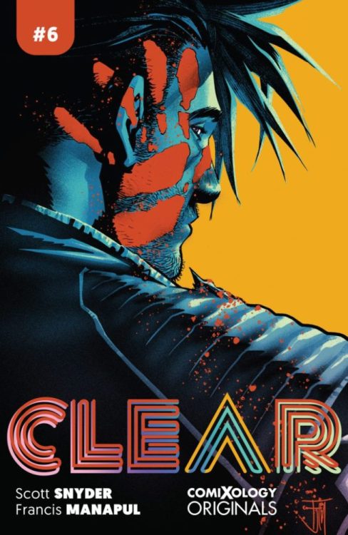
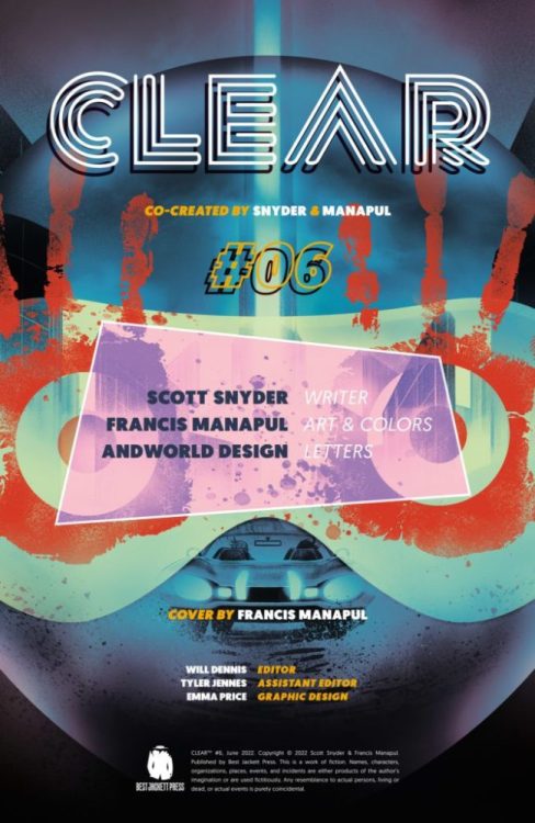
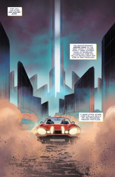
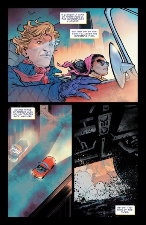
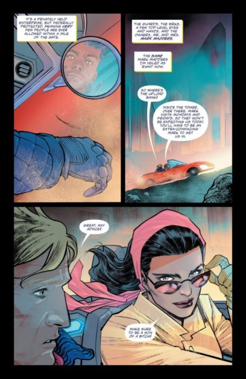
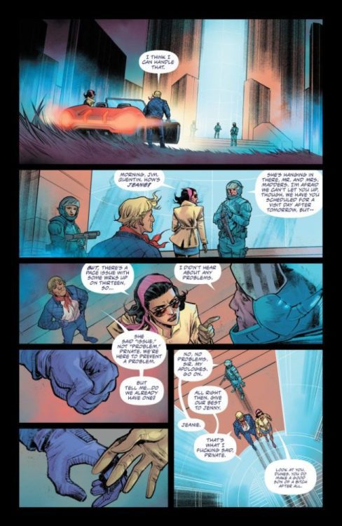
CLEAR #6 drops on ComiXology May 31st, but thanks to the digital publisher, Monkeys Fighting Robots has an exclusive six-page preview for our readers. The book is written by Scott Snyder, with art and colors by Francis Manapul, and you will read Andworld Design’s letter work.
About CLEAR:
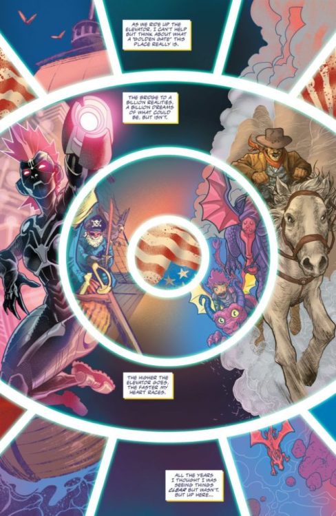
Welcome to the future, a world where people can connect to the internet neurologically and mediate the real world through the lenses of their eyes, transforming reality. Everything can be skinned to fit a preference from steampunk to old fashioned Hollywood glamour. If you can name it, you can live it. You choose how you see the world and no one else knows what you’re seeing.
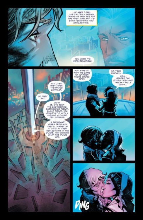
San Francisco, private detective Sam Dunes is working a case when he’s approached by his former police partner, who informs him of his ex-wife’s alleged suicide. But nothing about this adds up. And when he receives a gift in the mail, Dunes finds himself pulled into a wild and twisting mystery that stretches from the city’s deadly underworld to the even deadlier heights of the city’s wealthy and powerful elite.
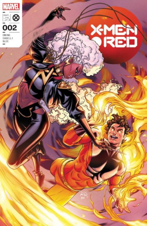
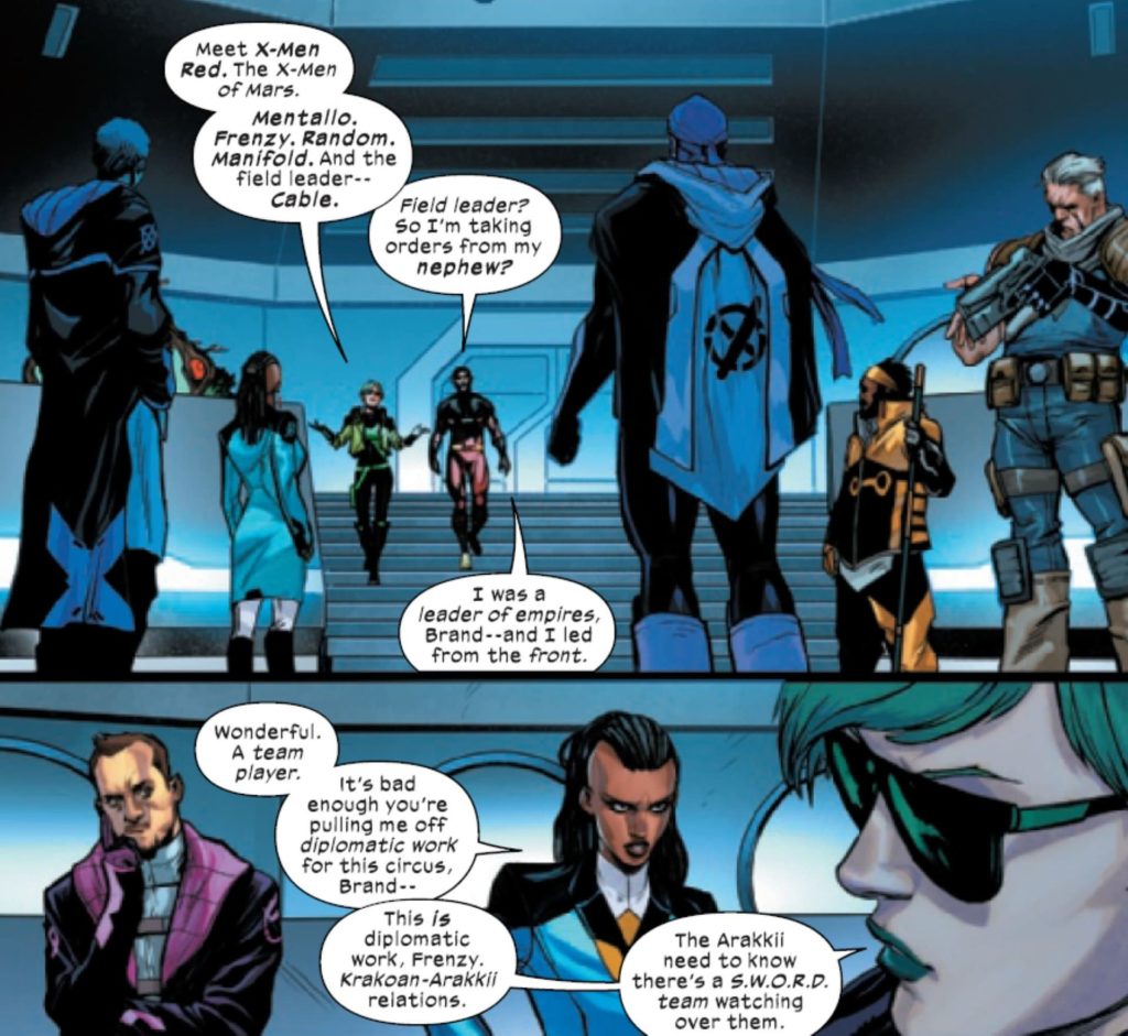
The last issue of X-Men Red ended by creating a new team of mutants. With the second issue, we see that Agent Brand is forming her own crew. Al Ewing has a good name at Marvel comics. You’d be hard-pressed to find someone who didn’t love his run on ImmortalHulk. Ewing has also worked his magic when he joined the X-universe with S.W.O.R.D. He’s joined on this issue by Stefano Caselli on pencils, Federico Blee on colors and letters by Cory Petit.
WRITING
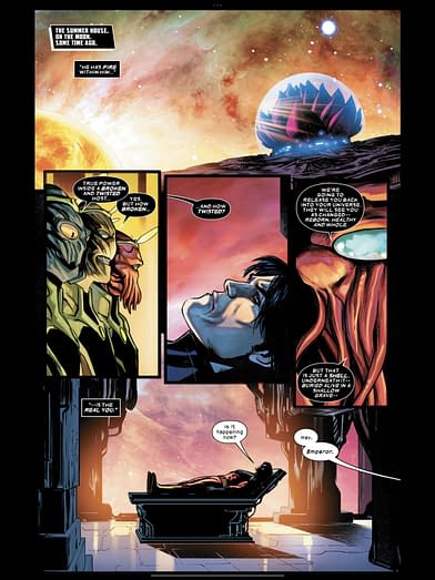
Al Ewing starts off this issue with a flashback to something Jonathan Hickman did in his X-Men run. Vulcan struggling with his anger and the fire inside him is a plot point that was touched on by Hickman and hasn’t been expanded on until this issue. Ewing shows us that Vulcan has kept his cool in the past, the fire is overtaking him and it’s uncontrollable. The most interesting thing about this issue is that Ewing gives us Abigail Brand’s X-Men team. This consists of shady mutants who have fought on both sides before. The team is led by Cable, who is also no stranger to controversy. Ewing produces a nice balance of social commentary and action in X-Men Red. We witness the Arakii people wanting to fight for themselves and get upset when Brand’s team attempts to help them. This plot point works on many levels but is good to see the parallels to today’s society.
ART
The pencils by Stefano Caselli stand out this issue. The panels where Brand and Manifold argue feel very close and intimate. This works because Caselli uses many close-up panels to show the different emotions that Manifold is going through. Brand’s face and emotion remains unchanged, which says a lot about her. The Arakii villagers have a good look to them. Caselli draws them almost creepily. We’re so used to seeing most of our heroes looking like they can pass for normal in this book, but Caselli does a great job of showing us mutants that don’t have that benefit. Caselli is at his best this issue when he is drawing a lot of emotion on character faces. Vulcan is an excellent example of this because he’s a conflicted character. Caselli shows us a Vulcan who has rage inside of him through all the emotions we see building in him this issue. The pencils for X-Men Red #2 are top-notch and will only continue to get better with Caselli.
The colors are extremely important in a major book like this. Federico Blee is a professional who knows how to liven up a page. Things as simple as the glow from a blue cube shining on Arakii residents is made infinitely better with Blee’s experience. X-Men Red is an appropriate title for this series since red is a color that is used a lot in this issue. When Vulcan rages, Blee uses red to signify this. Blee gives Mars a gorgeous red background. Of course, Vulcan also has red on his costume. In the color world, red is considered a hot color. This makes sense that a hot-tempered character like Vulcan would be surrounded by red.
The letters by Cory Petit are effective and useful. As Vulcan and Storm tangle in a battle, Vulcan unleashes some energy. Petit places a “Kra-Kroom” perfectly on the right side of the panel. It’s lined up with the energy being released from Vulcan’s body. As Cable loads his gun, a “click-clak” is over the gun as it’s being loaded. There are panels that are dialogue-heavy, but Petit makes sure to not have any of the word balloons cover the faces of the characters in the panel.
CONCLUSION
X-Men Red #2 adds more character development and plot to an already strong story. Al Ewing has been building to some of these events since his work on S.W.O.R.D. The pencils by Stefano Caselli are near flawless and get better with every issue. X-Men Red #2 is on sale at a comic shop near you.
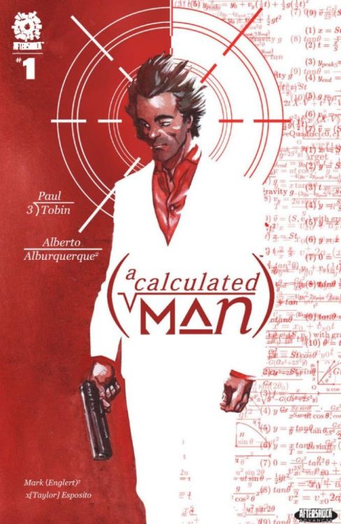
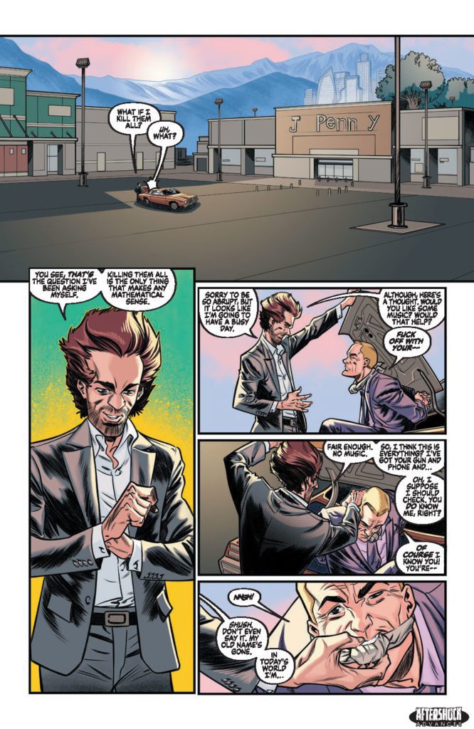
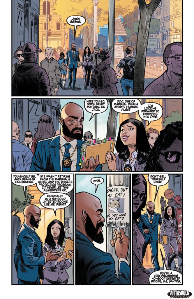
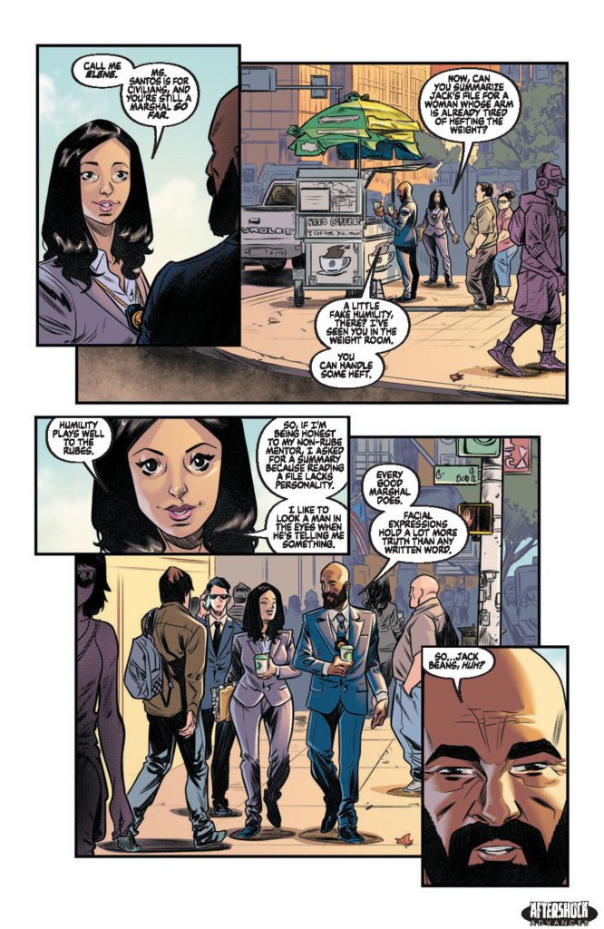
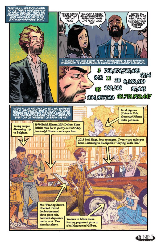
A CALCULATED MAN #1 hits your local comic book store June 15th, but thanks to AfterShock Comics, Monkeys Fighting Robots has an exclusive four-page preview for you.
About the issue: A verifiable math genius, Jack Beans used to run the numbers for the Pinafore crime family, until one day he ran them too well and concluded that the only way out of this life was in a casket or Witness Protection. So, he turned state’s evidence and ran.
Now, the Pinafores are out to end their favorite accountant. Little do they know that Jack’s skills with math and his perfect memory have made him a better killer than they ever could have realized. What follows is a journey full of murder, mayhem and mathematics.
The series is by writer Paul Tobin and artist Alberto Albuquerque, with colors by Mark Englert, and letters by Taylor Esposito. The cover is by Albuquerque, and there is also an incentive variant by Andrea Mutti.
Check out the A CALCULATED MAN #1 preview below:
Are you looking forward to A CALCULATED MAN? Sound off in the comments!
The Prince of Parody Unites a Host of Acclaimed Artists; Collaborators include Drew Friedman, Mike & Laura Allred, Bill Plympton, Peter Bagge, Sam Vivano, Aaron Augenblick and Many More
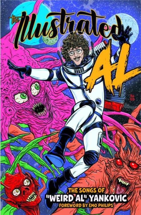
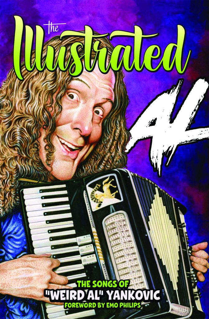
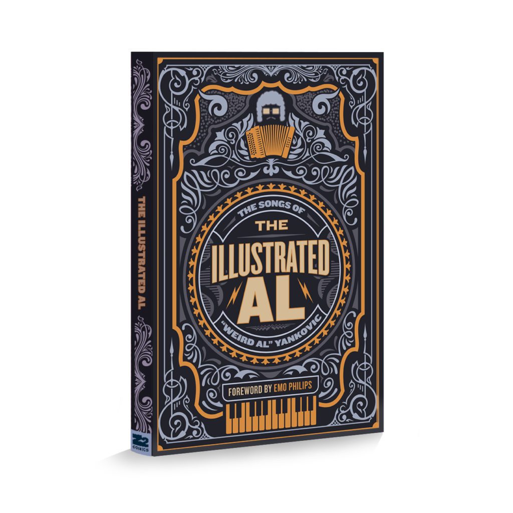
LOS ANGELES, CA—Z2 Comics has announced a collaboration with pop culture icon “Weird Al” Yankovic to publish The Illustrated Al: The Songs of “Weird Al” Yankovic. Written by “Weird Al” Yankovic, this career-spanning visual feast unites some of the top living cartoonists to express Al’s “Yankovisions.” The Great AL-merican Songbook features 20-plus classic songs interpreted by such artists as Drew Friedman (MAD Magazine), Mike & Laura Allred (Madman), Bill Plympton (Your Face, Guard Dog), Aaron Augenblick (Superjail!, Ugly Americans), Peter Bagge (Hate), Sam Viviano (MAD Magazine), Steve Chanks (Revolver Magazine), Danny Hellman (Village Voice), Felipe Sobreiro (Luther Strode, Death’s Head), Gideon Kendall (MegaGhost), Michael Kupperman (Up All Night, The New Yorker), Wes Hargis (My New Teacher and Me!, When I Grow Up), Ruben Bolling ( Tom the Dancing Bug and Super-Fun-Pak Comix), Fred Harper (The New York Times, The Wall Street Journal), and many more! The book also features a custom print set from Jesse Philips and a foreword from legendary comic Emo Philips, who is also opening for Al on his current 133-show tour of North America
“It’s such an incredible honor to see my song lyrics brought to life by some of my all-time favorite cartoonists and illustrators,” Yankovic says. “I’ve actually been playing the long game—the only reason I spent four decades in the music business is so that one day I could have my very own graphic novel.”
“Weird Al” Yankovic is the biggest-selling comedy recording artist of all time. A five-time Grammy winner, his 2014 release Mandatory Fun was the first comedy album in history to debut at #1 on Billboard’s Top 200. He is one of only three artists to have had their own Top 40 hits in each of the last four decades. On August 27, 2018, the Hollywood Chamber of Commerce awarded Weird Al with a star on the Hollywood Walk of Fame. The upcoming Roku Original film, WEIRD: The Al Yankovic Story, promises to reveal every facet of Al’s life, “from his meteoric rise to fame to his torrid celebrity love affairs.” Daniel Radcliffe is portraying Al in the titular role.
“I don’t remember a time in my life before ‘Weird Al’ Yankovic and, frankly, I don’t want to. His music, lyrics, artistry, and humor have been a constant influence in my career,” project editor and Z2 Comics Chief Business Officer Josh Bernstein continues. “Having Z2 assemble this all-star roster of the greatest living cartoonists to collaborate with Weird Al has been a dream come true. I hope both new and long-time Al-fanatics appreciate the love, care, and insane art that is going into this project. As always, we dare to be stupid.”
Z2 Comics and “Weird Al” Yankovic present The Illustrated Al: The Songs of “Weird Al” Yankovic in both softcover and hardcover formats, as well as oversized hardcover deluxe, and an oversized hardcover deluxe hand-signed edition. Drew Friedman and Mike & Laura Allred provide cover art. Deluxe editions include a wax pack of collector’s cards, a 3-piece art set from Jesse Philips, a vinyl slipmat, drink coasters, and, in the Super Deluxe Edition, Al-signed books as well as a “Weird Al” Yankovic branded mini-accordion.
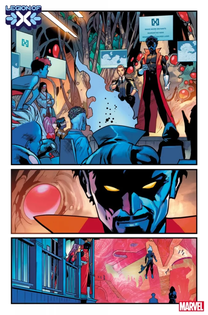
Writer Si Spurrier (Way Of X, Hellblazer) and artist Jan Bazaldua (Mr. & Mrs. X) team up for a stunning and complex new #1 with an insane new focus in Legion Of X #1. With Frederico Blee on colors and letters by Clayton Cowles, this new Krakoa-X comic sees the creation of a new mutant peacekeeping team with a new ideology for the Mutant utopia. With an intricate and intriguing script and jaw-dropping visuals, this comic is primed to be a headscratcher for some – but an absolute treat for others.
“The lost must be found, and the wicked must face redemption — or retribution. It’s up to the ever-soulful swashbuckler NIGHTCRAWLER to keep the spark alive and LEGION to host his unique team in the psychedelic mindspace called THE ALTAR. With PIXIE on point, JUGGERNAUT as a one-man riot squad and a host of X-favorites on the beat, the LEGION OF X will do anything to protect mutants’ right to pursue happiness and hope. Kicking off with a hunt for a missing Arakkii god and a skinjacker possessing innocent mutants, read this issue and come meet WEAPONLESS ZSEN, ORA SERRATA…and a villain worth praying for. The DESTINY OF X bares it heart and soul right here!”
Writing & Plot
Si Spurrier is back to once again guide us (and Nightcrawler) through the chaotic beauty of his view of Krakoa in Legion Of X #1. The Way Of X writer returns to the new era of X-Books with Kurt Wagner and a motley crew of mutants becoming Krakoa’s new peacekeepers. This team, consisting of faces new and familiar, is unorthodox (even by modern X-Men standards) in a way that makes this series extra unpredictable. To make matters even more interesting, this new team’s HQ is found in a dimensional bubble found in the mind of the one and only Legion. This first chapter takes readers to numerous locations and situations, from Krakoa proper chasing down fugitive murderers, to talking to extraterrestrial-mutants on Arrako (aka Mars), and into the depths of Legion’s own psyche. Every aspect of this comic’s plot is deeply engaging and intriguing – if not also a bit head-spinning. Spurrier throws quite a lot at the reader here, meaning it may take multiple reads to truly understand all the concepts he’s explaining. This is certainly not a new reader friendly comic, as a cursory knowledge of classic X-Men and a more solid, up-to-date knowledge of the Krakoa-era is needed to understand much of what is happening here. That said, this would still be a pretty entertaining read if someone went in mostly blind just by how wild some of the stuff Spurrier is throwing at the reader.
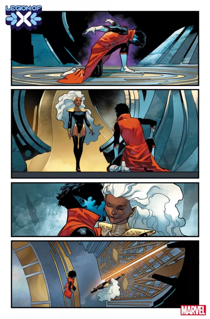
Spurrier’s sense of dialogue is both unique unto him while fitting the Hickman X-Men mold. One of the defining characteristics of X-books in this era is the snarky, clever dialogue and memorable character moments. Well, Spurrier is just the guy to call for the current brand of X-writing. Each of his interpretations of the mutant cast are diverse and fun to read in their own way. Watching Juggernaut try to be chummy with people he has no doubt tried to pummel to death is delightful. Legion awkwardly acknowledging his dismissive father, the model parent Charles Xavier, is appropriately uncomfortable. Best of all is, of course, Spurrier writing Nightcrawler. Wagner has come a long way from when he first arrived on Krakoa, and seeing him as a bearded leader of this new peacekeeping force is truly satisfying. Watching him become flabbergasted as he’s flirted with (sort of, hard to tell really) by an alien warrior woman is hilarious. Spurrier is an absolute treat in this comic, as his taste for charming characterization and intelligent story crafting are on full display here.
Art Direction
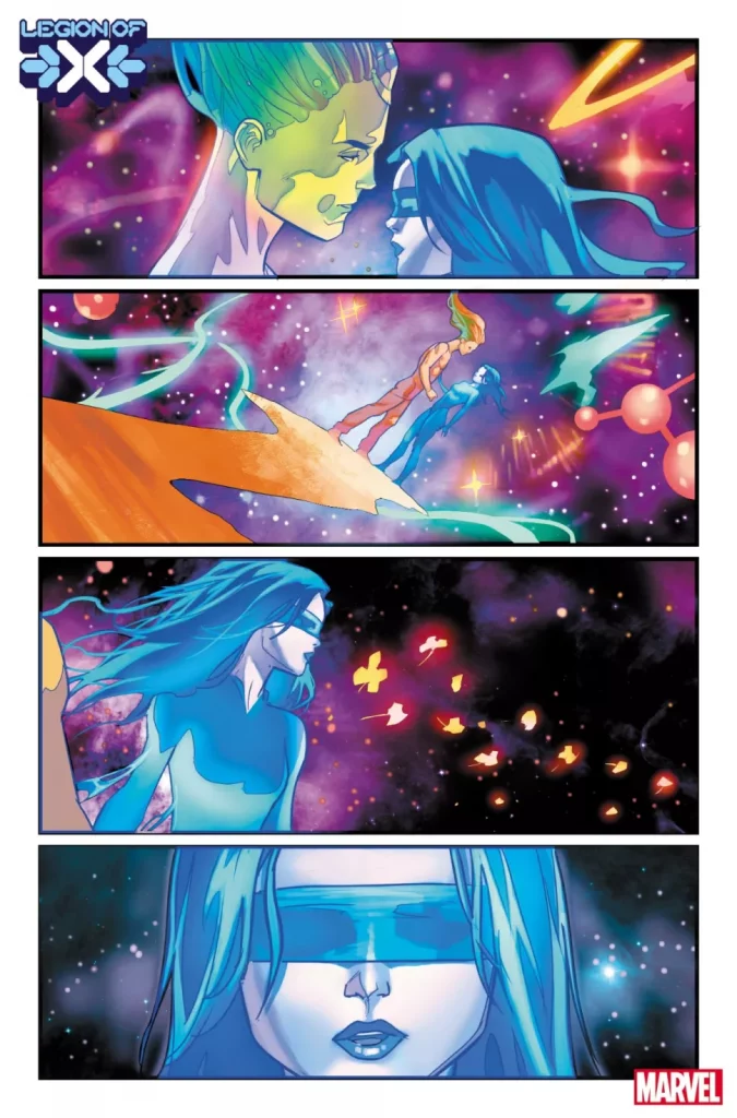
The Krakoa era of X-books is visually defined by its striking, bright, utopian visuals of this new world, and Jan Bazaldua delivers more of that beauty in Legion Of X #1. Her designs of mutants new and classic are striking, with her own style managing to carve out a niche within the house-style of this era. Her take on Legion and the mental landscape that is The Altar are absolutely stunning, fitting perfectly with the beauty of Krakoa while being an entity unto itself. Her design for a godlike Legion is wildly cool, and has to be one of the best new designs for an old character in the past few years of X-comics. Bazaldua goes just as hard with her work on Arrako, with the numerous natives – and most notably Ora Serrata – as well as the Arakii gods, all having fantastic original designs that fit with the rest of the visual language. Her page and panel composition is often just a busy as Spurrier’s script. She nails the reading experience though, with panel-heavy pages that focus on just the right frames to guide the story along in a manner that makes the busy plot as easy to parse as possible. Bazaldua’s art here is the perfect blend of grandiose and character-focused.
Frederico Blee’s colors finish off the visual experience with an incredible luster. Just like the rest of the X-comics in this era, every page is loaded with stunning, wildly colorful panels that show off this utopia is all its glory and glamour. The sequences in The Altar are especially gorgeous, with plumes of space-y energy firing off around the forms of Legion and his lover. The lettering from Clayton Cowles is solid and easily readable. He uses the same font style the rest of this era’s X-Men books use and, as always, it looks stellar. Overall, Legion is an absolutely brilliant looking comic book.
Verdict
Legion Of X #1 is a complex and stunning comic book. Si Spurrier’s script asks the reader to pay attention as he throws a ton of events and info at the reader, but what’s happening here is so engaging and entertaining that it’s hard to really fault him. The visuals from Jan Bazaldua and Frederico Blee are jaw-droppingly stunning, and make for one of the finest looking X-books in the Krakoa era. Be sure to grab this new issue when it hits shelves on May 25th!
I recently got to sit down with Plastic and Vinyl writer Doug Wagner and artist Tim Odland to talk about their upcoming absurdly fun and action-filled Norse-myth comic Beware The Eye Of Odin. It’s a blast of a read and the first issue hits shelves on June 22nd!
“VINYL and PLASTIC creator DOUG WAGNER returns with artist TIM ODLAND and colorist MICHELLE MADSEN to bring you a tale of Vikings, Trolls, Frost Giants, and Valkyries.
When a Viking prince finds the Eye of Odin, he must return it to its rightful owner or face a death of boils and decay. By his side are a one-armed warrior past his prime and a female warrior convinced she’s a Valkyrie. Monstrous mayhem ensues.”
MFR: Hey guys, thanks for taking the time to speak with me about the new book. It’s an absolute blast!
How did you come to settle on the idea behind Beware the Eye of Odin? Was playing around in the Norse mythology toybox something you both had always wanted to do, or was it a more ‘lightning strike” moment?
DOUG: It’s all Tim’s fault. I’m not gonna say he had this all planned out beforehand, but the second I asked if he’d like to work together on something, “Vikings and trolls” shot out of his mouth. No hesitation. No discussion. Just “Vikings and trolls!”
TIM: Yeah, that sounds about right. There might have been a few things floating around in my head but just for a fraction of a second. Vikings and Trolls interested me the most.
Doug is such a great collaborator that he just didn’t go away, write a script, and come back to say, “draw this.” He considered asking me what I was interested in. After knowing him for a while, I’d say he’s the type of writer that can find THE story in anything.
I thought the lore around the Norwegian trolls was a fertile ground to tell a story. I haven’t really seen too many comics or movies, here in the states, that explore that type of Troll. These guys have a little more spice than your typical giant or ogre. Like a vampire or werewolf, they have a specific set of rules to follow to best them. I thought they’d make a great villain and would be a great jumping off point to start a book. Then there’s Vikings… I mean do I need to explain myself there?
The Norse mythology thing was something I’ve always been interested in because my father is in fact Norwegian. I’m connected to it in that way.
MFR: How did you guys end up working together? What has your creative process behind this book been like?
TIM: We meet at a local “Draw Night” and discovered we lived like a mile apart. We would carpool down to Draw Night once a week and eventually we were like, “let’s work on something together.”
The creative process was great! There was a total back-and-forth dialogue we had going. Doug would bring something to the table and then I would add to it. Then I’d bring something to the table and Doug would add to it. There never seemed to be a moment for me where I got a, “No, let’s not do that.” It was always “Let’s see if this fits.” It seemed to me that we were on the same page during the whole process. We knew what would fit when we brought it.
When I’d go off to draw my pages Doug would always say, “Remember to have fun. That’s why we’re doing this!”
DOUG: That’s how I remember us gettting together as well. Two creatives carpooling to meet up with other creatives. I’ll add that the first time I saw Tim’s art I had immediate hopes we’d work together on something. I’m a huge fan of his style and his approach to story.
As far as the creative process, Tim was incredible to work with. You can tell just through his description that he’s all about delivering the best work we could over worrying about who created what or his ego. I had a fantastic time working with him, and as he said we simply tried to have as much fun coming up with something together as we could.
MFR: Tim, I’ve heard you described as a “newcomer” to the comics scene. I find that hard to believe because this book is STUNNING. What was the creative process like as an artist in terms of visually coming up with the look and feel of this mythology-based world?
TIM: Newcomer… Yeah, I’ve made my living as a designer doing illustration and graphics for products, but I’ve always loved comics. Doug was very gracious writing a script for me knowing I never really had done any comic work.
I learned so much with this book. It was literally like a thesis project for a degree in comics. I found out there where a lot more skills to consider than just drawing and uploading.
In terms of visually coming up with the look and feel of the world, I did my research and then ran it though my own visual filter. I looked at what was considered real Norse culture. I referenced the historical clothing, housing, and objects. I looked at design elements like Norse knots and runes. When it came to designing characters and environments, I had all that stuff in the back of my mind and could riff off it to create something with a familiar flavor.
For the trolls, I looked at Swedish artist John Bauer and Norwegian artist Theodor Kittelsen and threw in my own ample assortment of grotesqueries. Things like extra arms, double heads, multiple eyes to a socket made the Trolls a riot to draw. There was going to be a lot of them so that was also a great way to make each one unique.
MFR: Outside of the mythology itself, what were some of your biggest influences going into crafting and telling the story in Beware the Eye Of Odin?
DOUG: Oh gosh! That’s always a tough one to answer. For me, it was a mix of everything fantasy and sci-fi that I’ve engorged myself on over the years, but there are a few movies in particular that I think helped shape my approach – 13th Warrior, Clash of the Titans, and especially, the Norwegian film Trollhunter. It was fun to take what I enjoyed about those films and try to fit them into the story Tim and I wanted to tell. With all three of those movies, there’s a very everyday man confronted by the supernatural or otherworldly kind of vibe that I wanted to capture. With that said, I would be remiss if I didn’t acknowledge that Tim’s initial troll drawings had a massive impact on my approach. They were unlike any trolls I’d ever seen before, and he put this grungy, headhunter, mystical touch on them that immediately had my head racing on how to properly incorporate it. Didn’t I say earlier this whole thing was all Tim’s fault?
TIM: At the beginning of this project, I remember talking about those three movies and they were definitely a common ground of interest we both had. That might be why our creative process went so smoothly. Love for those stories to set the tone for our book’s direction.
On my end, as a kid, I always loved a good adventure movie. Some of my favorites were the Ray Harryhausen ones: Clash of the Titans, The Sinbad movies, and Jason and the Argonauts. I’m not that old. These movies were already old when I first saw them. I was always enamored by the creatures and how comparatively tiny the heroes were. I remember drawing that cyclops a hundred times. It was always the monsters that got me into drawing. It wasn’t until later in this project that I realized a lot of that inspiration was coming out of me.
MFR: So Doug, judging by your writing in your other comics like Plastic and Vinyl, it’s safe to say you very much have your own style. How did you adjust that style, if at all, when approaching this sort of comic that has a very different subject matter compared to your most popular work?
DOUG: Ha! I have to admit this is definitely different from my latest serial killer-y style of books. To be honest, I’m not sure I consciously adjusted my style as much as adjusted the tone. I wanted this to be more pure fantasy with my weird storytelling sense and humor mixed in. With works like Plastic and Vinyl, I purposefully push the edge and try my best to keep the reader off-balance emotionally. To me, that’s what makes an enjoyable horror/dark comedy. With Beware the Eye of Odin, it was more about taking the classic mythology and morphing it to fit my story senses and what I’d want to read. At its base, Beware the Eye of Odin is still one of my horror stories but with a broader audience in mind. I simply wrapped it in witch doctor trolls, venomous tiny humanoids, Earthen Smiths, and Vikings instead of serial killers and cults.
MFR: Modern takes on ancient mythology have always been popular, but they are absolutely massive right now – especially in comics. This works so well because of how myths and folklore work almost like a game of telephone going back thousands of years, with so many different interpretations of these stories being crafted and welcomed. Did either of you feel like there was any obligation to hold to any sort of “classical” version of this lore? Or are your feelings more along the lines of “hey, let’s mess around with some old toys and have a great time!” ?
DOUG: Personally, I didn’t feel any obligation to hold on to any of the “classical” lore, but I did want to use some of those “classical” tales to help set up our world, to give the reader a common frame of reference from the very start. For instance, the Eye of Odin relic is based on the classic tale of Odin giving his right eye to the Frost Giant King Mimir in exchange for “true wisdom.” In todays’ world, almost everyone knows who Odin is, what Frost Giants are, and who the Vikings were, so we used that to establish our world so we wouldn’t have to spend all of our time retelling tales. Now after that, it was Tim and Doug playing in the sandbox with our toys. No holds barred.
TIM: You’ve got it right on. Mythology is always a great starting point for any adventure story. There is already a general knowledge or structure to the world to build off and we had a great time doing just that.
***********
Be sure to pre-order Beware The Eye Of Odin from your local comic shop, and check out Wagner’s other comics like Plastic and Vinyl, available now!
From writer & artist Natasha Alterici comes a beautiful, funny, and kickass take on old Norse mythology in Heathen. Featuring additional art by Ashley A. Woods and lettering from Rachel Deering and Morgan Martinez, this series is an impactful tale of love, acceptance, masculinity & femininity, and how to negotiate with mermaids. Featuring a fantastic character-driven plot and stunning visuals, Heathen is a must-read for 2022.
“Aydis is a viking, a warrior, an outcast, and a self-proclaimed heathen. Aydis is friend to the talking horse Saga, rescuer of the immortal Valkyrie Brynhild, and battler of demons and fantastic monsters. Aydis is a woman. Born into a time of warfare, suffering, and subjugation of women, she is on a mission to end the oppressive reign of the god-king
Odin.”
Writing & Plot
Natasha Alterici comes out of the gate tackling socio-political issues left and right in Heathen, while still crafting a wholly engaging and entertaining story. As the solicit states, Aydis – our protagonist – is a woman woman and a warrior, which isn’t *that* rare, but still, men will be men. On top of this, she has been banished from her village for her romantic affiliation with another woman. So, she journeys in exile to free the legendary leader of the Valkyries from a curse Odin placed on her. This is an era of warfare and superstition. Not only do the traditions of the Norsemen hold, but Christianity is making a growing impression on these Vikings’ homeland. All of these subjects and more are handled by Alterici via memorable moments throughout the story. As characters part ways for a time they come across different situations (side quests, really) that broach of particular subject matter. What’s special here is that it all fits so well. None of it feels forced, as the tone is light and fantastical enough that the whole comic has a sort of limitless story possibility. That being said, these sequences still feel grounded in reality.
Alterici’s choices in characterization and dialogue do a wonderful job of creating a consistent tone in the comic. Despite much of its serious subject matter, Heathen is often very funny. The back and forth among many of the characters is snarky and witty, without ever broaching too hard into Whedon/MCU style “quips” that are so prevalent in modern dialogue writing. While there are a lot of great scenes and memorable characters, I believe my favorites are Skoll and Hati. If they could get their own spinoff, that would be great. With all the levity this comic brings, Alterici still lands the serious moments perfectly. The importance and gravity of the major plot events and the more commentative scenes are all treated with care. Alterici pens some absolute magic in this book, with a cast of wholly memorable and unique characters and themes that will no doubt hit hard for many readers. While there is a bit of a plot contrivance near the end (some allies meeting up with other allies out of nowhere) and the final issue does feel a tad rushed, this series is very tightly constructed and wonderfully written.
Art Direction
What will doubtless stay in readers’ minds after finishing Heathen is how Alterici visually crafts her take on the Norse world. Her approach mixes a sort of watercolor and wax-pencil landscape design with phenomenal character animations to craft something completely unique. Readers will be immediately endeared to the cast just through how much attention to detail Alterici puts into facial expressions. There’s a sort of “Webtoon” style approach to her design, and this is meant entirely as a compliment. Every page has a definite “thumbnail” moment that nails down the book’s humor. On the other hand, all other ranges of emotion are felt deeply in how Alterici displays it in her cast. Animal and creature designs are also on point. It’s tempting to ask how Alterici felt while drawing so many horses and wolves, known pain-points for comic artists, but regardless she absolutely nails it every time. Her landscape and many other details are often kept to a minimalist sort of sketchbook style. This, combined with her earthy watercolor tones, makes the series feel more like an ancient scrawling of a mythical tale. This isn’t always the case, as many of the outfits and some structures are given considerable attention depending on the context of a scene. Alterici’s page and panel composition creates a steady, careful pace for the reader to move through the story with. Character moments have a great classic “comic strip” feel to them, where conversations come off as measured and impactful. The action is also well-choreographed and epic, making the badass sequences be, well, more badass. The lettering from Rachel Deering and Morgan Martinez is solid and easy to read, with a hand-drawn feel that fits the comic. The SFX notes sort of blend into the panels, making them noticeable while not standing out too much.
It should be noted that Alterici steps away from the art after issue #8, with Ashley A. Woods taking over for the final four chapters. The shift is clearly noticeable, but most readers should adjust quickly to the change. Woods does a great job of mimicking Alterici’s style and utilizing her designs to finish this comic’s story. Truthfully, I find Alterici’s work preferable, but Woods is still stellar in these final issues. Overall, Heathen is is a fantastic looking comic series with a noticeably unique visual style that suits its setting and atmosphere brilliantly.
Verdict
Heathen is yet another outstanding original creation in the Vault Comics lineup. Natasha Alterici, with the help of artist Ashley A. Woods and letterers Rachel Deering and Morgan Martinez, creates a powerful, meaningful, kickass, and hilarious 12-issue story that takes full advantage of its mythology by breaking all the fake rules that are placed upon it. With heartfelt and clever character-focused writing and perfectly fitting art, this full softcover collection of Heathen is a must-own for 2022. Be sure to grab a copy from your local comic shop today!
Firestarter manages to tell an uninteresting story that also happens to be poorly written. The original film from 1984 starred Drew Barrymore in the titular role, and while not great, it is better than this latest attempt. Firestarter does show signs of potential but is held back by its weak performances, poor editing, and a script that cause a lot of unintended laughter. Leaving little room to connect with its characters, Firestarter will not be remembered in the near future.
Based on Stephen King’s Novel, Firestarter follows Charlie, a girl with pyrokinetic powers, hunted by sinister forces that want to use her gift for mass destruction. Directed by Keith Thomas, the film stars Ryan Kiera Armstrong, Zac Efron, Sydney Lemmon, Kurtwood Smith, and Gloria Reuben. Halloween Kills co-writer Scott Teems wrote this screenplay, and it offers one of the most uninteresting narratives this year. Armstrong is acceptable in the role of Charlie, but her scenes with Efron, who stars as her father, are not very convincing.
Besides its stale acting, Firestarter has a screenplay that will make a lot of viewers struggle to comprehend certain character motivations and decisions. For instance, Charlie is in public school despite her parents knowing the danger she could cause. They are trying to hide from this agency that is after Charlie, so this seems like an obvious thing to not do if you want to hide. Charlie’s parents are very familiar with this agency, which makes this decision hard to digest.
John Carpenter’s score for Firestarter is the strongest component when considering how inferior the other aspects are. It’s working overtime to add an ounce of tension or intensity to certain scenes. I can say that the practical effects used were impressive, but it felt like more care went into displaying Charlie’s powers than it did in giving viewers a compelling story. Every character is one-note or unlikable, minimal effort is put into telling you why you should be invested in this narrative.
Thomas’ direction here just completes this messy film, as a lot feels like it’s racing to a finish that isn’t worth witnessing. Poor pacing combined with these moments that do nothing to further the plot make Firestarter a chore to sit through. One of its worst bits of dialogue comes from a character highlighting that they shouldn’t trust everything on their TV. Perhaps the way it was delivered is what made it cringe, but it seemed like a hollow attempt to virtue signal.
Firestarter might be the worst film experience I’ve had so far this year, but I enjoyed certain parts of this film. As mentioned above, humor can be found in how idiotic this story gets. Laughable dialogue is one thing, but lining yourself up to be slaughtered when there’s room to escape is another level of hilarious. Charlie has a sequence in the finale where she is taking out those that stand in her way, and none of them seem to notice the failed efforts of their peers before deciding to battle Charlie themselves.
If there’s one redeeming quality about Firestarter, it’s that it doesn’t overstay its welcome. To those that feel like they are trapped while watching, don’t worry, the film won’t drag on. However, some might argue that it loses its steam after the opening credits. Firestarter just doesn’t have much going for it outside of the effects, which become horrendous once blood tears are introduced. If Carpenter’s score wasn’t here, this would be a very rough experience. Firestarter is going to work for some people, but as a whole, this one won’t be remembered in the years to come.