Home Blog Page 73

Review: ABOVE SNAKES #1 Is Everything You Love About Westerns (And More)

above snakes image comics sean lewis hayden sherman hassan otsmane-elhaou

ABOVE SNAKES #1 — out July 13th from Image Comics — is a thrilling, captivating entry into this world. It’s perfect for fans of westerns, tales of vengeance, and snarky, talking birds from across the netherplane. The series is by writer Sean Lewis, artist Hayden Sherman, and letterer Hassan Otsmane-Elhaou.

This is the story of Dirt, a man seeking vengeance against those who killed his wife while he was away at war. Accompanying Dirt is Speck, a golden vulture who wants to feed on the blood Dirt spills.

Now, a veteran wandering the west hunting for vengeance probably sounds familiar. It’s one of those concepts that’s been done — and done well — plenty of times before. It’s a winning formula, but Lewis, Sherman, and Otsmane-Elhaou take things further. ABOVE SNAKES is anything but old hat. This creative team leans into the tropes of the genre and plays with them in fresh, fun, and interesting ways.

above snakes image comics sean lewis hayden sherman hassan otsmane-elhaou

Lewis gives you all the information you need to know about this story in the dialogue/narration of the first few pages. It’s a masterclass in efficiency, quickly introducing you to the world and setting the tone up top so that you can enjoy the ride. The same goes for Lewis’ characterization: through dialogue, we get an immediate sense of who Dirt and Speck are. We know their respective voices and personalities before either of them even enter a panel.

Dirt is the gunslinger you love to root for. He’s broken, cynical, and reluctant, but there’s something else there too. The reader can see more in Dirt, even if he can’t see it in himself. Coupled with Lewis’ snappy, direct dialogue, Sherman’s art cements Dirt’s character in your mind. The artist’s signature raw inks and colors reveal Dirt’s worn and tired face, but still the antihero stands tall. He’s a towering figure in this lawless and violent world.

above snakes image comics sean lewis hayden sherman hassan otsmane-elhaou

Sherman’s whole world design for ABOVE SNAKES is first-rate. They’ve largely made their name drawing sci-fi, but damn it all if the artist wasn’t born to draw a western. The world of SNAKES is a barren and dirty place. Sherman’s mashing of fiery reds and soothing blues creates some real stand-out moments in the middle of this issue when the bullets start flying. Westerns are a staple of film history, and there is a true cinematic quality to the way Sherman frames and colors this issue.

Hassan Otsmane-Elhaou is one of the best letterers working today, so it should be no surprise that his work on ABOVE SNAKES stands out as a highlight of the book. From the sound effects, to the style of Speck’s dialogue, to the typewriter feel of the narration, the lettering is such a major part of what makes this book feel unique and special. There are little things, like building a word balloon into a character’s reflection in a knife, that just make you stop and appreciate the thought and care that was put into this comic.

Whether or not you traditionally like westerns, do yourself a favor and pick up ABOVE SNAKES #1 when it comes out July 13th. This is a comic from a creative team at the top of their game.

above snakes image comics sean lewis hayden sherman hassan otsmane-elhaou

Monkeys Fighting Robots Youtube

Review: AQUAMAN: ANDROMEDA #1 – “The King Beneath The Sea”

From acclaimed creators Ram V (These Savage Shores, Swamp Thing) and Christian Ward (Invisible Kingdom, Blood-Stained Teeth) comes a tale of the deep and its king like nothing you’ve seen before in Aquaman: Andromeda #1. Featuring letters from Aditya Bidikar, this DC Black Label chapter is a stunning and thought-provoking blend of scientific adventure, mythology, and philosophy. With a wickedly smart and thoughtful script coupled with medium-breaking visual work, Andromeda is one of the most refreshing releases from DC Comics in recent years.

“Deep in the Pacific Ocean, at the farthest possible distance from any land, sits Point Nemo: the spaceship graveyard. Since the dawn of the space race, the nations of the world have sent their crafts there on splashdown, to sink beneath the silent seas. But there is something…else at Point Nemo. A structure never made by man. And that structure seems to be…waking up.

The crew of the experimental submarine Andromeda, powered by a mysterious black-hole drive, have been chosen to investigate this mystery. But they aren’t the only ones pursuing it. Anything of value beneath the ocean is of value to the master pirate Black Manta…and anything that attracts Black Manta attracts Arthur Curry, his lifelong foe, the Aquaman! But heaven help them all when the doors of the mystery at Point Nemo swing wide to admit them in…”

Writing & Plot

Ram V is taking us under the sea and asking us to pay attention with his script for Aquaman: Andromeda #1. He throws notions of cosmic horror regarding the unknowns of the sea our way almost immediately, connecting this with the potential terrors out in the depths of space. He then tosses in discussions regarding the dual identities of Arthur Curry & Aquaman – a man of 2 worlds. These premises are guided by a plot that feels like an amalgamation of Jules Verne, Lovecraft, and a take on DC’s king of the sea we’ve never seen before. Note that this is a Black Label comic, so this book isn’t limited by the underpinnings of the DC universe proper. As such, Ram has made an Aquaman story in a world where he is an unknown figure, and humanity has not yet met alien life. As such, this issue is a first contact story on two fronts. Like a mix of 10,000 Leagues Under The Sea and James Cameron’s The Abyss, this comic mixes wonder and terror in a carefully cultivated manner, while still having time to also be a book with DC heroes and villains.

If you’ve read Ram V’s works, you should know that he’s a writer that asks a bit more from his audience. He tends to use narrative anecdotes that offer a thematic window into the kind of ground his writing will cover. Andromeda is very much the same, with characters’ internal narration and some conversations having deep thematic significance that will carry weight through the rest of the series. Crew members meditate on their past experiences with the ocean and with death. Arthur Curry contemplates his dual nature as man and god-king of the sea. These sequences in the script are fascinating and in some ways poetic, deepening the comic’s presence between the more brass-tacks plot events. This is not your typical mainstream superhero comic. This is a chapter that asks its readers to pay attention so the text and subtext, so as to glean as much from what the story is doing as possible. If you aren’t the type to like their comics dense and wordy (in the best possible way), this won’t be for you. However, if you’re willing to take the narrative journey Ram is offering here – and it is indeed a journey – I think you’ll find it most fulfilling.
Art Direction

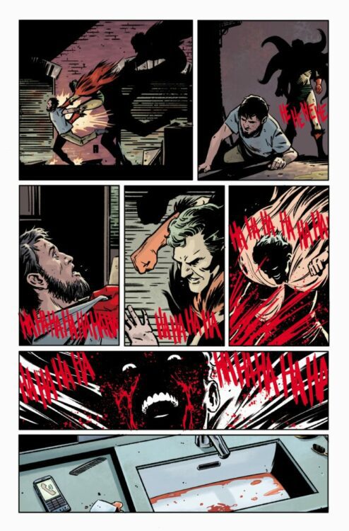
So much of what makes this comic such a unique trip into uncharted waters is Christian Ward’s visual work. The unique blend of aquatic wonder and cosmic horror is brought to life in striking detail by Ward’s painted art style. Every one of his sequences feel carefully planned, with every kind of moment being memorable and thoughtfully presented. Those quiet conversations and meditative moments come off as both intimate and vast thanks to how Ward presents those scenes. Close ups on characters get the audience a better view of their perspective, before Ward changes the scale and focus to remind us just how small these people are.  This works in perfect tandem with the words Ram is writing and, on the whole, makes for some of the best writer & artist synergy that can be observed in the medium. The big plot moments feel properly grandiose and terrifyingly thrilling. Ward’s design for Aquaman’s armor here is fantastically alien in an almost classical way. It combines the hostile and mysterious unknown of the deep with Curry’s traditional suit. I’d be curious to see what specific moments in the comic were Ward interpreting Ram’s script, and which were parts just added in by the artist on a whim.

Ward’s use of his sort of watercolor painted approach creates a further depth to the comic’s atmosphere. The ocean is a murky combination of blues and greens, its bottom intentionally unclear. The scenes within the Andromeda and during dreams/flashbacks are dominated by hazy light and atmosphere that makes every moment feel cold and lonesome. There’s a sense of inconsistency in Ward’s character detail that, while it may rub some the wrong way, feels totally intentional. The way Ward crafts his colors to make specific details intentionally hard to parse is what lends credence to that theory. The lettering from Aditya Bidikar is as stellar as one would expect from one of the best in the industry. His work here perfectly captures conversation with dynamic fonts that alter ever so slightly with the tone. His lettering for Verne’s narration/journaling is done in a standard Word doc. style font, and this separates itself from the in-story dialogue nicely. Overall, Andromeda is a deeply atmospheric and complex use of visual storytelling in a comic.

Verdict

Aquaman: Andromeda #1 is a beautiful and tension-filled mix of horror and wonder. Ram V starts this Black Label series off by presenting an Aquaman story for both complete newcomers and longtime fans, focusing on ideas of legend and the unknown instead of super heroics. Christian Ward’s visuals are deep, gorgeous, and complex, crafting an experience that works in perfect synergy with the contemplative cosmic horror script Ram has made. Do yourself a favor and pick up this issue when it hits shelves on June 7th!


Monkeys Fighting Robots Youtube

Exclusive 5-Page Preview: PEARL III #2 (Brian Michael Bendis & Michael Gaydos)

Exclusive Preview: PEARL III #2

PEARL III #2 hits your local comic book store on June 29, but Monkeys Fighting Robots has an exclusive five-page preview for our readers, thanks to Dark Horse Comics. Brian Michael Bendis writes the book with art by Michael Gaydos.

About PEARL III #2:
The New York Times bestselling, Peabody, and multi-Eisner Award-winning writer Brian Michael Bendis (Superman) and superstar Jessica Jones co-creator Michael Gaydos begin a masterful saga involving art, crime, loyalty, and passion.

Another blistering chapter in the saga of Pearl Tanaka. This young tattoo artist is still coming to terms with the fact that her entire family has always been the most hardcore yakuza clan when her tattoo shop is horribly destroyed and her awesome friends targeted for assassination by rival clans. Or is it someone closer to them? Bear witness to one of the most beautiful comics on the stands today as master illustrator Michael Gaydos brings another fully painted chapter of Pearl Tanaka to life.

Enjoy the preview below.

Monkeys Fighting Robots Youtube

INTERVIEW: Production Designer Marek Dobrowolski Talks The Walking Dead & More

walking dead-Marek Dobrowolski-interview

Marek DobrowolskiThe Walking Dead just finished its 11-season run on AMC+, leaving spinoffs in its wake plus an endless supply of stories set in the new zombie-infested world. Production designer Marek Dobrowolski entered the post-apocalyptic world to create a unique look.

In 2010, The Walking Dead exploded onto TV screens with a cinematic pilot. As the series went on, its popularity grew. At one point, the series was breaking viewership records in specific demographics. But all good things must come to an end. The series took viewers into places they’d yet seen for its final season. The Walking Dead ended its run with a bold new look as it closed out this long-running portion of the story.

PopAxiom spoke with Marek Dobrowolski about becoming a production designer and creating the look for the final season of The Walking Dead.

Craft

Marek was born in Poland, where he studied fine arts and became a graphic designer. After receiving his fine arts degree, Marek studied for an extra two years to study theatre, television, and film. After that, he became a theatre designer doing costumes, lights, and sets.

“I met Alvin Ailey from the American Dance Theater,” Marek says, after crossing the pond to work in New York. “I learned a lot from him. I was able to get a Fulbright grant to continue learning in the New York theatre world.”

Now financially secure, Marek traveled the United States working on different shows. He realized that American theatre was very different and much more commercial than he had expected. It’s not subsidized in any significant way, which leads to a problem. The Fulbright grant ended, and Marek had to figure out how to make a living.

“Jon Cryer’s manager put me in touch with Cannon Films, who hired me to do a series of period fairy tales known as the Cannon Fairy Tales. We went to Israel and Italy, and we shot nine fairy tales in a year and a half, back-to-back. That was a great experience,” says Marek.

Marek traveled the world for another year, working primarily in theater before returning to the United States to concentrate on film full-time. “I moved to Los Angeles where I was hired as an art director by Bruno Rubeo for a film by Taylor Hackford called Blood In, Blood Out. That was my first exposure to Chicano culture and their mafia of the 60s. It was fascinating. We did a lot of interesting things related to the culture.” He brought that fascination to another film he worked on just three years later — The Craft. “I was pushing for that. It’s iconic. It’s where the magic comes from. It fit.”

the craft-Marek Dobrowolski-interview

Theatre versus Film

Marek explains one major difference between designing for the stage and screen. “There’s a director and a designer in theatre and no one else. As a designer, I am the visual director. With the director, we come up with the visual story. They concentrate on blocking and acting while I work on what’s around the players. We also have a lighting person providing input, though; in Europe, I would also likely be doing that. So it’s a much more coherent approach.”

In theatre, “you’re there rehearsing separately, then dress rehearsals, then it’s opening night, and it’s all over. It’s history. You come the next day and now stand on the sidelines. There’s this distance. The baby is born. That’s the difference. You are with the director from beginning to end, you create this thing, and then it’s gone.”

“In film,” he continues, “you are there at the beginning creating with the director. Then, you’re just facilitating the shoot, ensuring that what they need is there. It’s a completely different mindset. To a certain extent, you lose that control that you have in theatre. In film, you create an environment, but it’s up to the director and DP how the film is shot, and you hope that your sets survive. Then there’s an editor who cuts things his way.”

Walking Dead

The Walking Dead reached its 11th season and was ready to bow out with an unforgettable 24 episodes. Marek explains how the Walking Dead team wanted a new environment, a new world, and something very different for the final season.

Marek presented building a town square for season 11. “I got to build this town based around this old train station from 1885 that served as the town’s headquarters,” he says.

It was a fresh look for a long-familiar-looking show. “I heard a lot from the writers and actors that it was a great change because they’d been in the forest for so many years.”

“The idea for the headquarters was about exploring something different,” he shares. “We could’ve set it in a city hall, but that’s normal. Let’s do something different. It’s a different world. That’s where the train station idea came from.”

Marek Dobrowolski-production designer-walking dead

Wrapping Up

It’s the age of content, many productions are racing from one set to the next. Marek likes the middle ground. “I love the mini-series approach. It’s like a big movie that’s packed with stuff. I had the privilege of working on a couple of those, like Hitler: The Rise of Evil on CBS. Then, I worked with Steven Spielberg on Into the West. Six two-hour epic movies about the Lakota people based on historical events.”

“I’m working on Justified,” he says about upcoming projects. Justified: City Primeval is a highly anticipated sequel to the popular series and will be eight episodes.

The basis for the series is Elmore Leonard’s City Primeval: High Noon in Detroit. However, Marek reveals, “We shot in Chicago, which is a fantastic city. It bloomed over the years with all these new buildings and architecture. But we’re supposed to be in Detroit, so we can’t show any of that.”

“I wish we could shoot in Detroit,” he says, “but we are in Chicago for various reasons. So we do some tricks to sell to the audience that we’re in Detroit. It’s a shame because Detroit is such an interesting city with such a great story.”

Marek describes how they work to find similar looks; old factories or abandoned buildings. He mentions that the crew will also be shooting in Miami.

Is Justified: City Primeval on your watch list?

Thanks to Marek Dobrowolski and Impact24 PR
for making this interview possible.

Find more interviews from Ruben R. Diaz!

Monkeys Fighting Robots Youtube

Review: DO A POWERBOMB #1 – Heart And Power From The Top Ropes

From contemporary comics powerhouse Daniel Warren Johnson (Murder Falcon, Beta Ray Bill) comes a wrestling comic full of genuine heart and absolute kick-assery in Do A Powerbomb #1. Featuring colors by Mike Spicer, this opening issue is full of hope, tragedy, and absolutely incredible action. With a powerful script, an unexpected genre-blending twist, and Johnson’s usual medium-best art, this love-letter to wrestling and family is the absolute must-read from the Image roster this month.

“Lona Steelrose wants to be a pro wrestler, but she’s living under the shadow of her mother, the best to ever do it. Everything changes when a wrestling-obsessed necromancer asks her to join the grandest pro wrestling tournament of all time, which is also the most dangerous! It’s The Wrestler meets Dragonball Z in a tale where the competitors get more than they ever bargained for!”

Writing & Plot

When handled skillfully, familiar tropes can and will still pack a huge punch. Johnson does just that with the story here in Do A Powerbomb #1. This comic takes inspiration from hundreds of other stories with the whole “continuing a legacy” plot, but here it’s handled with such genuine emotion and shock that it still comes out as very compelling. Seeing Lona Steelrose and her family together rooting for her mom, the greatest wrestler of her time, is some truly inspirational stuff. There’s a real heart to Johnson’s character writing that makes the familiar elements in this story just feel so good to read. When the tragedy strikes, it lands painfully. It is truly surprising just how much impact the turn of events in this has, and it’s all because of how great Johnson is at creating emotional sincerity in his work.

Outside of the strictly character-focused dialogue and plot-building, this comic feels absolutely epic. As someone who isn’t into wrestling, this issue hooked me with just how unbelievably cool the sport is presented here. Most of this is in how Johnson draws it, but there’s a lot of great energy in the writing as well. The writing for the announcer as the wrestlers make their way to the ring had my hair on end, and the banter between the two fighters is the perfect blend of hokey and badass. The big genre turn at the end of the book is the perfect cap to this high-energy love letter to wrestling and comic book-style fantasy action storytelling. Much like Murder Falcon, Johnson wears his influences on his sleeves and it absolutely rules.

Art Direction

It isn’t exactly a surprise that Daniel Warren Johnson’s art in Do A Powerbomb #1 is, in professional terms, rad as hell. The Wonder Woman: Dead Earth creator’s pencils and page compositions will draw readers into their scenes with detail then give them whiplash with the sheer ferocity of his action sequences. His characters are all memorably designed, and this goes triple for his excellent wrestling costumes. The spectacle of the wrestling ring and the match that ensues in the first half of the comic is easily one of the most memorable sequences in recent comics. The choreography? Utterly phenomenal. Johnson’s love of wrestling explodes across every panel with spot-on accurate moves that are perfectly exaggerated when they need to be. The whole comic’s aesthetic is so explosively energetic that by the time the setting change occurs at the end, it’s a surprise – but it totally works. There’s such an over-the-top display of the love of both wrestling and the comics medium comes out in Johnson’s ability to craft absolute visual dynamite. Intimate, emotional moments land with perfect sincerity because of how Johnson builds and frames the scenes.  Every positive said about the writing before is truthfully only so good because the art is doing the actual lifting for the story. This comic is an absolute marvel of visual storytelling, and I cannot wait to see what happens next now that the story’s big genre-bending twist has been revealed.

DWJ’s frequent collaborator Mike Spicer is on hand with the colors for Powerbomb, and as usual, the man absolutely destroys it. Spicer perfectly adds even more vivid energy and dimension to Johnson’s already stunning pencils. Every panel and sequence has just the right atmosphere and energy thanks to the colors. The lighting in the ring gives the sequence an audible effect that rarely feels so intense when reading a comic. The somber or quiet moments are toned down with darker and calmer hues. When the weird, out of this world stuff hits, it feels like the reader is stepping out of AEW and into He-Man. Finally, Johnson’s own letters are every bit as much a part of the visual experience as the pencils and colors. His hand-drawn fonts shrink and explode with every line, and his SFX bring nothing but pure power to the sequences. This is, visually, an adrenaline rush of a comic and a screaming example of what makes this medium so special.

Verdict

Do A Powerbomb #1 is an absolute marvel of a comic book. A perfect blend of massive thrills and genuine emotional weight, Daniel Warren Johnson crafts a beautiful and powerful love letter to comics and wrestling. With help from Mike Spicer’s colors, this is easily one of the most powerful, creative, and wildly kickass debut issues of the year. Be sure to grab this new release when it hits shelves on June 15th!

Monkeys Fighting Robots Youtube

Exclusive Preview: Patrick Kindlon and Goran Gligovic’s RUN THE DUNGEON

From writer and vocalist Patrick Kindlon (Frontiersman, We Can Never go Home, S.H.I.E.L.D.: Secret History) and artist Goran Gligovic comes a D&D style fantasy by way of Punk Rock with Run The Dungeon. Featuring letters by Jim Campbell and published by Z2 Comics, this graphic novel written by the vocalist of the bands Drug Church and Self Defense Family promises a march through dark fantasy with hilarious and quippy commentary on religion, politics, and beyond.

Goran Gligovic, who crafts this OGN’s gloomy dark-fantasy setting, offered some words behind his thought process going into Run The Dungeon:

“Growing up I didn’t have much contact with tabletop roleplaying games, but the archetypal Tolkienesque fantasy language they (mostly) employ bled into other forms of entertainment, like comics and movies. The thing about archetypes is that you always run the risk of appearing derivative if you actually use them, but subverting them never stops being a fun exercise—at least to me. Much of the credit for the characters in this book goes to Patrick, as I merely tried to convey a little bit of their, shall we say ‘unwholesomeness’ in a fun and appealing way.”

Check out the preview below, then head over to z2comics.com to grab your copy – available now!

“Relst is just your average young man. Except he is stuck in an Endless Dungeon. Follow him as he “adventures” through the Dungeon hoping to escape to the surface world. Run the Dungeon is for fans of witty fantasy adventures everywhere. Includes a soundtrack from Self Defense Family.”

Monkeys Fighting Robots Youtube

AfterShock Comics Exclusive Preview: KAIJU SCORE: STEAL FROM THE GODS #3

aftershock comics exclusive preview kaiju score

KAIJU SCORE: STEAL FROM THE GODS #3 hits your local comic book store June 22nd, but thanks to AfterShock Comics, Monkeys Fighting Robots has an exclusive four-page preview for you.
About the issue:
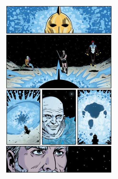
Michelle and her crew are about to go into the belly of the beast, and that’s not just a metaphor. But are they ready for a job that has no margin for error? And even if they are, the true nature of the score is about to be revealed, and not all of them are going to make it out of this issue alive. Take your blood pressure pills for the tense third chapter of KAIJU SCORE: STEAL FROM THE GODS.

The series is by writer James Patrick and artist Rem Broo, with colors by Francesco Segala, and letters by Dave Sharpe. The cover is by Broo.

Check out the KAIJU SCORE: STEAL FROM THE GODS #3 preview below:

aftershock comics exclusive preview kaiju score

aftershock comics exclusive preview kaiju score

aftershock comics exclusive preview kaiju score

aftershock comics exclusive preview kaiju score

aftershock comics exclusive preview kaiju score

aftershock comics exclusive preview kaiju score


Are you reading KAIJU SCORE: STEAL FROM THE GODS? Sound off in the comments!

Monkeys Fighting Robots Youtube

Review: KNIGHTS OF X #2 – “Magic, Mon Ami”

Writer Tini Howard (Excalibur, Catwoman) and artist Bob Quinn (Way Of X) are back with another chapter of Mutants in the land of Arthurian legend in Knights Of X #2. Featuring colors by Erick Arciniega and lettering from Ariana Maher, this issue sends our mutant knights into open combat against their foes for the sake of struggling mutants in Otherworld in a dazzling and immensely entertaining issue. With an exciting, sharp script and outstanding visuals, this is a comic for fans of readers who like a little medieval fantasy with their X-Men.

“THE QUEST REVEALED! Betsy Braddock has assembled her Knights of X! Their mission: to save Otherworld from Merlyn and his powerful henchmen…by finding the holy grail of mutantkind. But Otherworld is vast, and innumerable armies stand in their way. When Merlyn targets the Crooked Market, a safe haven for mutantkind, the Knights must split up. Will Captain Britain find the grail? Will Gambit lead the others into a deadly trap? Death looms over the Knights — in more ways than one.”

Writing & Plot

Tini Howard splits up her mutant knights into two plot threads for Knights Of X #2. One team is led by Gambit, investigating Merlyn’s offensive against the Crooked Market and aiding the struggling mutants hiding there. The other is led by Betsy Braddock – aka Captain Britain – to bust some allies out of a prison. This entire issue is a rollicking ride of mutant magic and intense action.  Howard carefully weaves clever dialogue through titanic battle sequences to keep the story’s focus on character above all else. Outside of the big action moments are quiet, often sweet character moments of our heroes showing their true selves. Gambit is, unsurprisingly, a big old softie when it comes to kids. Mordred? Very polite, even when being overwhelmed by enemy forces. Rictor and Shatterstar? Adorable, you love to see it. Howard gives readers great character moments while building a story that matters and kicks ass. She also makes it abundantly clear that Braddock and her Knights are effectively on their own for this mission. They’re cut off from Krakoa and their loved ones/fellow mutants, making the stakes higher while also cementing Knights as very much its own story in a larger whole. The story here may not be the most consequential of X-books, but it’s still one more than worth a read.

Art Direction

This entire era of X-Men comics has been gifted with incredible visual work, and Knights Of X #2 is no exception. Bob Quinn draws these medieval-fantasy mutants with a stunning attention to detail and fantastic animations. His work here is noticeably heavier on inks than most other Krakoa-era X-comics. This detail actually helps set this comic’s world apart from that of the rest of the current X-books. This world of fantasy and “witchbreed magic” doesn’t have the bright utopian sheen of Krakoa. This touch is proven even more effective when it contrasts with the bright powers and costumes of the Knights themselves. Quinn’s shimmering displays of mutant energy and sleek takes of classic costumes are the booming centers of attention for the reader – and beacons of hope for the denizens of Otherworld. There is often quite a lot happening on these pages, so it’s fortunate too that Quinn’s page composition is generally very solid. Events are easy to follow and intelligently laid out depending on how he wants certain details and events to impact. There are a couple moments where it can be difficult to figure out who’s talking, with so many characters often occupying a single panel. Regardless, Quinn’s work here is immensely impressive.

The colors from Erick Arciniega are vivid and varied, bringing a high fidelity sheen to this comic that has come to be expected from the current run of X-books. Arciniega uses a perfect selection of darker hues to match the inks, and his choices really sell the atmosphere of this different breed of X-comic. The lettering by Ariana Maher is solid, as she utilizes the same font and style as the other X-comics of the Krakoa era. Her work here almost disappears into the reading experience, with cool SFX lettering and dynamic speech fonts. Overall, Knights is as gorgeous a book as one would come to expect from the Krakoa era.

Verdict

Knights Of X #2 is a thoroughly entertaining and compelling comic. Tini Howard’s script is a perfect blend of sweet character moments, humor, and stellar action. The visuals from Bob Quinn and Erick Arciniega are beautifully animated and atmospheric, crafting a unique visual experience within the larger X-Men world. Be sure to grab this issue when it hits shelves on June 1st!


Monkeys Fighting Robots Youtube

Review: AMAZING SPIDER-MAN #2 Lets Tombstone Loose

Last month a new run on Amazing Spider-Man began. This series, with a new creative team and a new direction, seems to have a time jump. As readers, we don’t get all the details about what has happened. Zeb Wells worked on the previous run, so there is some continuity in the writing department. John Romita Jr is the artist for this series. He’s joined by Scott Hanna on inks, Marcio Menyz on colors and Joe Caramagna on letters.

WRITING

What works best for Zeb Wells in this issue are his character interactions. Wells starts us off with a conversation between Peter and Norman Osborn. Norman is still sane at this point and offering Peter a hand. It’s interesting to see the man Norman could have been if he never turned into the Green Goblin. Tombstone has an almost heartwarming conversation with his Daughter Janice. One thing Wells and other writers have tried to hammer home in their last series is that Tombstone loves his daughter. Wells also shows us that Tombstone does not plan on being as affectionate with his enemies. We’re going to see a Tombstone who is ready to get his hands dirty. A special shout-out for using the White Rabbit for this series too. She’s an underused character with good potential. Amazing Spider-Man #2 continues to build on the mystery of what Peter did while solidifying the villains in the story.

ART

Romita Jr. is the artist who lays down the pencils for this issue. His work at times feels very boxy. In this issue, character faces seem a little misshapen. After that small criticism, Romita Jr. does turn in one of his better performances. Helped out by Scott Hanna on inks, Romita Jr. puts down pencils lines on for Norman Osborn and Hanna smooths them out. Hanna also uses hatching and minor cross hatching on characters to help provide detail. Tombstone is a character that receives a lot of that shading and hatching. This also makes it look like he’s taking a more villainous turn.

The colors by Marcio Menyz work well with Romita Jr.’s pencils. Menyz uses a lighter color palette. Things like Peter wearing a blue shirt don’t leap off the page at you, but they are colorful enough to draw your attention. There is a lot of shading in this issue, especially in panels where Tombstone talks to his daughter. Menyz uses dark backgrounds in these panels. This allows the white from Tombstone to stand out further.

Letters by Joe Caramagna matter here. Something as simple as a Tombstone’s word balloons being puffed out allows us to read his voice as gruff or scruffy. When a character gets excited, which happens a couple of times in this issue, Caramagna does an excellent job of using exaggerated fonts. Sometimes the letters extend outside the word balloon, like when Peter is yelling at Norman.

CONCLUSION

Amazing Spider-Man #2 is a good issue that builds off of the previous one. As a reader, we still don’t know what Peter did to make everyone in his life so mad at him, but that is part of the mystery of this issue. Zeb Wells writes a fun Peter who is down on his luck, but very relatable. The pencils had their hiccups, but ultimately work. Amazing Spider-Man #2 is available at a comic shop near you!


Monkeys Fighting Robots Youtube

Review: Beautiful Chaos in TOKYO INTERSTELLAR IMMIGRATION

Comics are uniquely suited to spectacle. Their stillness gives you time to drink in feats of daring. It lets colorful, distinct outfits shine. In America, comics gave us superheroes – costume-clad circus performers starring in crime serials. While Japan’s approach to superpowered spectacle gave us multi-million-selling mega-hits like Dragon Ball and One Piece. It’s part of why comics have become the backbone of today’s bombastic Hollywood blockbusters. Tokyo Interstellar Immigration by Mado Guchimoto takes influence from quite a few of those blockbusters. But it also stands to remind everyone what comics do best.

Tokyo Interstellar Immigration follows young secret agents Lein and Ann who work for the titular Interstellar Immigration Bureau. Think a sort of Men in Black-ish clandestine organization who investigate hostile space aliens on earth and wipe the minds of any chance observers. But Lein’s motivations for helping the Bureau are tied to her criminal mentor, Hein, who the organization is keeping in a tightly locked cell. The two thieves have entered a weary truce with the Bureau, helping with investigations in exchange for information on a mysterious past tragedy. Ann, meanwhile, is a gigantic beast contained in human disguise, only able to speak in brief fragments. So don’t expect Lein or Ann to be terribly professional. But they’ll get the job done, minus one or two city blocks.

In the manga’s afterword, author Mado Guchimoto expresses love for Hollywood sci-fi spectacles, ranging from Blade Runner and the Matrix to Battleship and Chappie. Unabashedly big-budget, flashy, tech-heavy movies. But the stillness of comics lends itself to a kind of showmanship that’s even denser. Expect lots of spreads crammed with various alien designs and techno-organic machinery. Some communicate psychedelic landscapes through intricate, symmetrical patterns. Glossaries at the back of each arc cram in information that couldn’t fit on the pages themselves, like explanations for how intersections between dimensions work, or that a species of cabbage-like aliens show status by how many doors their minifridges have. It’s a lot, and a few pages might end up reread in an attempt to get a firm handle on it all. This is Guchimoto’s professional debut, and so it shows the kind of hungry, throw everything at the wall approach you’ll find in many early works. But that’s an approach well suited for comics, where pages can be slowly read or reread at the reader’s pace. And it’s easy to get swept along when everything looks this damn stylish.

To help keep track of who’s speaking through all the chaos, each character is given their own shape of speech bubble. Lein’s mentor Hein communicates through a speaker, rendered in sharp, square, bubbles, while Ann speaks in spiky, uneven bubbles. One-off characters are given more playful variations. A bookstore owner speaks in book-shaped bubbles, a locksmith’s are shaped like a keyhole. But the dialogue, translated by Andrew Hodgson, doesn’t slack in giving the main trio distinct voices, either. Lein has a sarcastic deadpan tone, Hein is ornery and a bit playful, while Ann… well, speaks like the Hulk. They’re fun characters to read, and help keep the comic anchored through all the dizzying spectacle.

Letterer Kalvin Travis also does an excellent job rendering the sound effects littered throughout the comic in English, from spiky “chomps” to pulsating “tha-thumps.” Some even weave in and out of the art like physical objects. It must’ve been quite a pain to redraw the many, many SFX, but the effort shines through.

Tokyo Interstellar Immigration is loud. The character designs are loud, the action is bombastic and in-your-face, and the many aliens equally intricate and grotesque. But there’s a confident showmanship to it all, a joy to overloading the viewer with information. If this book were a song, it’d be the kind I wouldn’t mind blowing my eardrums out to. Tokyo Interstellar Immigration is currently available on Kindle, with a physical release to eventually follow.

Monkeys Fighting Robots Youtube