A Walk Through Hell #12 hits your local comic book shop on July 24, but thanks to AfterShock Comics, Monkeys Fighting Robots has a seven-page exclusive preview.
A Walk Through Hell is a modern American horror unlike no other, written by Garth Ennis (Preacher, The Boys, The Punisher) and drawn by Goran Sudžuka (Y: The Last Man, Hellblazer), Ive Svorcina handled colors, and Rob Steen lettered the issue.
About A Walk Through Hell #12:
Carnahan—or what now looks out from behind his eyes—finally tells Shaw the truth about what’s in store for humanity. As the world begins its transformation according to the villain’s grand design, Shaw realizes she has only one card left to play—one that will almost certainly mean her own destruction.
Check out the preview below
Do you have A Walk Through Hell on your pull list? Comment below with your thoughts on the series.
Scout Comics‘ Midnight Sky #1, by James Pruett, Scott Van Domelen and Ilaria Fella is the start of brand new science fiction series that builds an effective mystery right from the start and thrusts readers into a frighting and resonant post-apocalyptic world.
What would you do if you discovered your son wasn’t really your son? He may look like him, act like him, but deep down in your soul you just know… he’s been replaced. Then your worst fears are realized when the light hits his face just right and you accidentally see his true appearance for yourself. But he isn’t the only “different” one that you discover… your neighbor, your friend, even your husband. Do you scream? Do you run? Or do you fight back? And how can it be that your daughter is the best and, perhaps, last hope for mankind?
Midnight Sky #1 Written by: James Pruett Art by: Scott Van Domelen Colors by: Ilaria Fella
Story
Midnight Sky #1 starts with a simple scene, a family is packing for a big move. Jacob, the father, has landed a new job and everyone is coming with. It’s a relatable, well-recognized scene for about 3 or 4 pages and then shit gets weird. Something happens (no spoilers but let’s just say it’s violent and disturbing) that lets readers know something is off about this family. And then we get a time jump and we’re full-on immersed in a new, unpredictable post-apocalyptic world. The effect is jarring, but Pruett’s writing is strong in those early scenes, so the reader is invested in what is happening and why. Pruett also writes the main character, Jennifer, in a way that makes her compelling. We can see her resilience and independence early on, so there’s no question her and her children would be survivors after whatever even decimated the world.
And the event in question, although hinted at, is not fully explained just yet. We are given clues without much exposition, a rarity in sci-fi stories attempting to build a mythology and world. It’s not all spelled out and may require a second read to pick everything up, but Pruett is building a large mystery here and mysteries are meant to be poured over and studied.
The pacing of this first issue is great. It unfolds at an even clip, and even with all the time jumping and flashbacking, it’s never confusing. The reader is always aware of time and place.
Art
The art in Midnight Sky #1 is tight, clean and very effective. Scott Van Domelen’s pencils linework strikes a good balance between delicate and grit. The result is a subtle surrealism that is perfect for this kind of story. When you throw in Ilaria Fella’s muted, evocative and moody coloring, the result is a book that has tons of creepy atmosphere, even in the early scenes before the shit hits the fan. And when things do fall apart, the world we are shown is bleak, and both alien and recognizable (shout out to the story being set here in Florida!)
The characters faces are also very expressive, and there’s a strong use of closeups and reaction’s that are easy to read. Facial expression (or ‘acting’) is difficult to pull off in comics, and the art team here does it very well.
Conclusion
Midnight Sky #1 shows tons of promise as it builds it’s characters, mystery and world. Its scope is both grounded and epic. It’s a book readers should defietly give a chance once it hits their local comic shop in September. So be on the lookout and grab it!
Invaders #7 succeeds as a callback to Civil War but it’s a fairly standard beginning to a new chapter in the series.
Invaders #7 has several of the ingredients that made Civil War so successful.
Think of everything that made Civil War (the movie and the comic event) one of the most famous Marvel stories in recent memory. The conflict between Captain America and Iron Man arguably tops that list. Then, in the movie, Bucky Barnes is a key player in the story. Invaders #7 features these essential elements and, as a result, the issue feels like another non-canonical continuation of Civil War. Readers who want to see this feud continue to play out will probably enjoy Invaders #7. Otherwise, writer Chip Zdarsky’s latest installment is simply average.
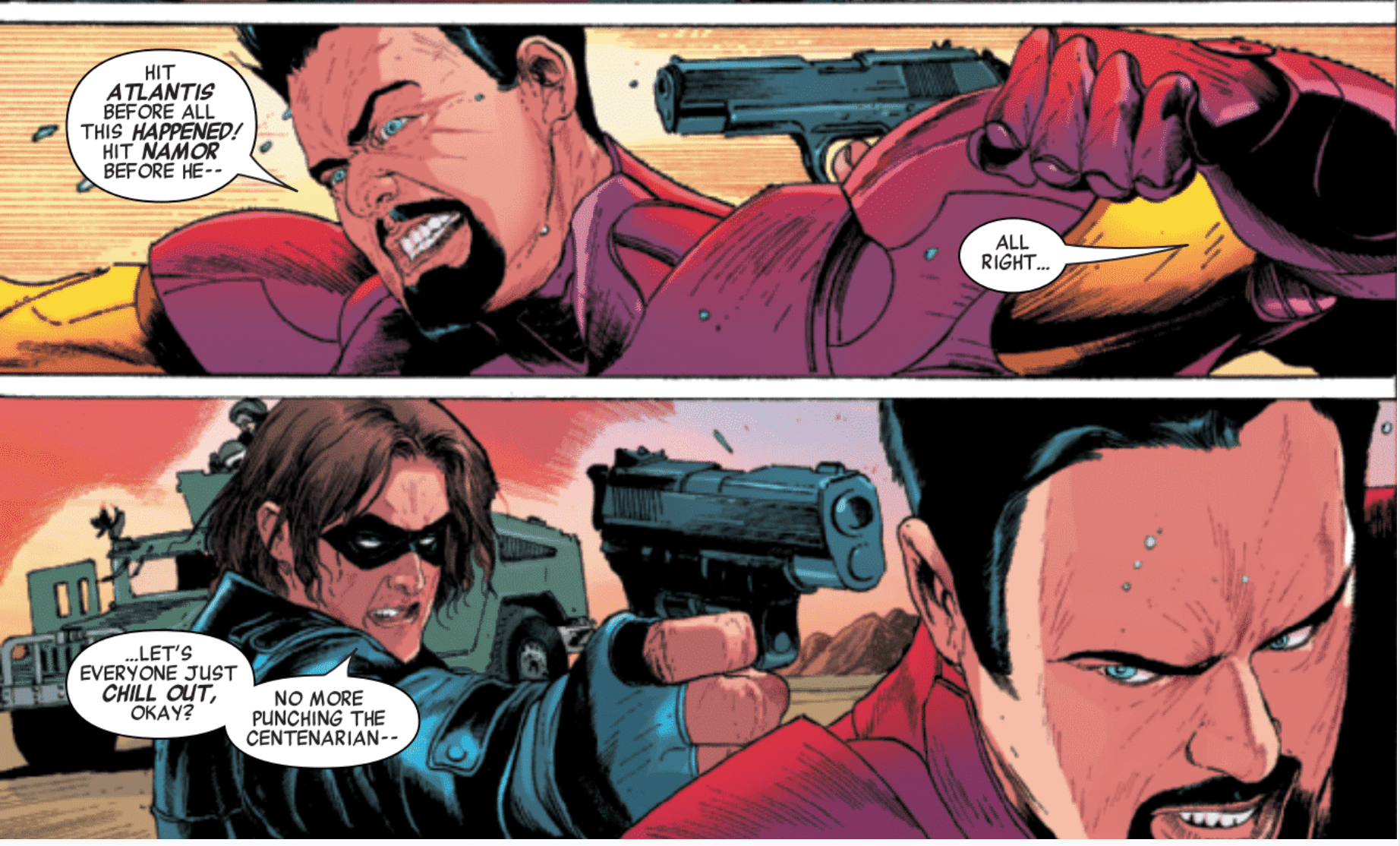
It wouldn’t be Civil War without a fight between Bucky Barnes and Iron Man.
As a fan who can’t help but smile at even the slightest reference to Civil War, this writer enjoys Invaders #7. The allusions to Mark Millar’s iconic event aren’t heavy-handed; instead, they feel like natural consequences to Steve Rogers’ failure to stop Namor from attacking the surface world. Tony Stark has every right to be angry with his longtime teammate on the Avengers. Stark has popped up throughout the series (and other recent comics) and warned Rogers about Namor. Just as he was in Civil War, the First Avenger is stubborn to a fault and countless people have to pay the consequences when Namor launches two attacks that turn the residents of two cities into water-breathers.
Rogers’ and Stark’s facial expressions take their argument to another level.
Sometimes, the little things make all the difference. Here, the work of artists Carlos Magno and Butch Guice and color artist Alex Guimarães make the argument between Rogers and Stark feel deeply personal. They’re not just two characters throwing emboldened words at each other on paper. They’re two friends with a complicated relationship and this latest incident plunges them into a new conflict with each other. Guice and Guimarães actually draw the spit flying from Rogers’ and Stark’s mouths and the sweat on Starks face as the fight intensifies, which makes the dialogue feel harshly real.
Another fine detail comes when Stark gets the last word before he storms off. Rogers asks Tony not to attack Atlantis because innocent American citizens are staying there. “I’m a realist, Steve, not a monster,” Stark replies. While he leaves, Guimarães draws Stark’s face in shadow. This small choice makes the line more impactful because the shadow represents Stark’s renewed distrust of, and disappointment in, Rogers. Hopefully, Zdarsky will continue to explore this relationship.
Namor is undeniably a more villainous version of Aquaman in Invaders #7
It’s easy to focus on the implications of another conflict between Rogers and Stark but Invaders #7 also launches the series into a new chapter, “Dead in the Water.” Going into the issue, Namor had already attacked the surface world. Now, Rogers and other heroes have to do whatever it takes to end this looming war. Unfortunately, by the end of this opening installment, Namor looks even more indomitable because he gains possession of the Sërpent Crown, which will allow him to command others and resist telepathic interference. By using this powerful artifact, Namor basically becomes a villainous Aquaman, if not one of his antagonists. Magno and Guice make the crown look like Medusa’s hair, which complements the tonal shift from a superhero story into one that’s about modern mythology. As the Sub-Mariner puts the crown on his head, his trusted aide Machan tells him, “you’re invincible.” That possibility should terrify Stark and Rogers, especially since they’re not on the same page anymore.
The Sërpent’s Crown could make Namor unstoppable.
Throughout the issue, Zdarsky and the art team fully embrace the comparisons between Namor and Aquaman. In one panel, Namor, holding a golden trident, sits on an underwater throne that looks like it’s right out of DC’s version of the lost city. (Arthur Curry, is that you?) These associations are inevitable, especially when Namor, like Curry, continually fights for the survival of his people despite a (seemingly) ethnocentric surface world.
In Namor’s eyes, these people are dangerous through their arrogance; they stubbornly seek to maintain their way(s) of life despite the fact that they’re polluting the planet. Zdarsky touches on some real-world issues and puts a Marvel’s spin on them. At one point, a news broadcast mentions that, eventually, the oceans will be the only habitable land left, which is why Namor feels justified in his decision to transform some humans into water-breathers. (He’s preparing them for life under the sea.) Logically, anyone can poke holes in that argument but Zdarsky’s usage of these problems brings some realism to the comic.
As the beginning of a new storyline, Invaders #7 won’t blow you away; it merely gets the ball rolling. But a renewed conflict between Stark and Rogers and the incorporation of pollution concerns make this a successful issue.
What’d you think of Invaders #7? Where do you hope to see the story go from here?
Almost every comic book character has a human sidekick. Batman has Alfred, Wonder Woman has Etta Candy, and Superman has the most famous sidekick of all, Jimmy Olsen. The young redhead has been appearing in Superman media since 1940 and has become one of his most iconic staples.
The reason for this iconic status is still up for debate. While Alfred and Etta are a big help to each of their respective heroes, Jimmy is more of a nuisance than anything. Each new story for the paper ends up getting him into trouble or transform him into a super being for a little while. With how much Superman saves him, I’m shocked no one puts him under the damsel in distress category. Maybe there is a hero underneath the bumbling, and this series by Matt Fraction is going to show it. How could this possibly go wrong?
**Some Spoilers Below**
Story:
We open our story with a history lesson of Metropolis. While the Luthors have made a significant impact on the city, there was one family that had been thorns in their side for centuries: The Olsens. Since it started as New Oberstad, the Olsens are said to be one of the original Metropolis families and refuse to give in to a Luthor. Even Jimmy’s brother, Julian, constantly butts heads with Lex over cases in the city. Jimmy, however, continues to be the bumbling fool of the family, with his most recent stunt for press involving a space jump and a turtle man serum. The whole thing causes create mass hysteria and cause damage fees to skyrocket for the Daily Planet.
If it wasn’t made evident by the bizarre summary, this story is kind of all over the place. There isn’t much of a major narrative until the last page cliffhanger, which raises so many questions. Before that, however, we get a brief history of the Olsens and a reminder that Jimmy is a screw-up. While I do find the history of Olsens interesting, there is nothing new brought to our main character. There are a few little easter eggs of Jimmy’s past sprinkled in, including the several names he took whenever he got superpowers, but it isn’t enough to make the story interesting. It’s not bad, but the second issue has its work cut out for it.
Art:
The art for this issue is a bit of a mixed bag, at least for this reader. Steve Lieber is the illustrator, and his style has its high and low points. He tries to go for a realistic mixed with a cartoonish style, capturing the bizarreness of Jimmy’s life. Sometimes it works, mainly when focused on Olsen himself. Turtle Boy Jimmy looks incredible as well as his many misadventures retold by Perry White.
The editor for the Daily Planet is also an example of the downside of the art. Perry looks terrifying, almost monster-like. I understand that it is supposed to be exaggerated since Jimmy had caused another massive bill, but he’s also supposed to be one of the most human characters in the Superman mythos. Other examples of these hiccups are Joachim Olsson, and Lex Luthor looks more than happy to watch his family monument got destroyed. This art style might be suited for other readers, but not this reviewer.
Conclusion:
Overall, this first outing of Jimmy Olsen was middling. While the story seems to be all over the place, it promises an adventure of strangeness with Superman’s best pal. While some of the art isn’t my cup of tea, there is potential to make this series look fantastic as well. It definitely has enough pull to bring a reader back in for the next issue, but the team has a lot of work to do if he wants to keep them.
Gideon Falls #15 from Image Comics hits your local comic book store today; written by Jeff Lemire, with art by Andrea Sorrentino, colors by Dave Stewart, and design & letters by Steve Wands. The series continues to churn out complex storytelling with breathtaking artwork.
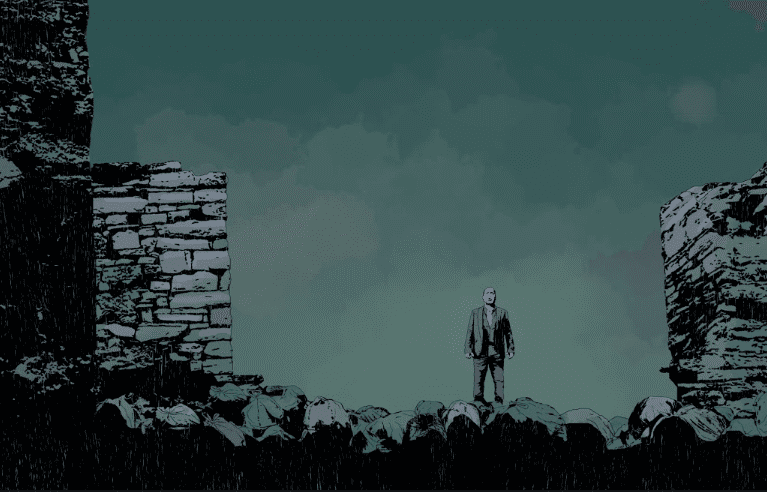
Spoilers follow after the next image.
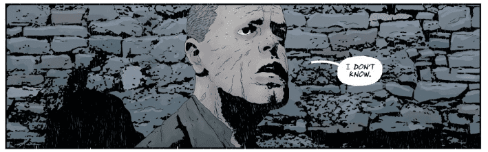
The most recent issue of Gideon Falls brings two of the main characters together. In the last issue, we saw a future Gideon Falls the people there referred to as the “city near the center” where future technology was housed in a barn…not a black barn, not yet at least. Gideon Falls #15 starts with Father Wilfred waking in a city that feels familiar but very different. Given what we found out in the last issue, this appears to be a different city than the one we’ve come to know, but eerily the same. There is something sinister in this town’s past, and it’s unraveled slowly but surely.
Lemire does it again. He’s giving us enough of the story to keep it progressing but still keeping the readers in the dark about the past of this town. Sorrentino never disappoints in this book. His layouts and the way the story unfolds is beautiful. Sorrentino treats us to an absolutely gruesome two page spread that I can still see in my nightmares. Stewart shows off his versatility in this series week in and week out. Two books released this week showcase just how good he is. Silver Surfer: Black #2, also out this week, is full of bright, vibrant colors that pop off the page. With Gideon Falls, Stewart is using paler, dirty colors that fit the horror mystery of this book. Wands is a perfect fit for this title as well. His lettering is scratchy and has the feeling of someone hurriedly filling out a journal. If you’ve been reading Gideon Falls you know quite a few of the characters have their walls covered in paper and scribbles like they’re trying to find out who Pepe Silvia is, the lettering gives it that feel that we are reading someone’s ramblings about the crazy goings-on of this haunted, troubled town.
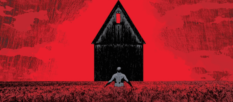
Norton Sinclair has been missing from the story for a few issues now. As the past has told us, Norton is very crucial to what is happening. Is the terror of this town his fault? Is it cursed because of him? Dr. Xu runs into Father Wilfred at the end of this issue while looking for Norton. She first visited Norton’s apartment trying to find him. While she is sitting on his bed, we get a glimpse of the smiling man. I’ve got to believe that Norton is the key to something very sinister happening here. Dr. Xu takes a hasty drawing of the black barn from his apartment, and before she nearly gets knocked upside the head with a pipe, she yells out to stop and then holds up the drawing to ask Wilfred what he knows about the black barn.
I had never heard of the show Twin Peaks before Lemire mentioned it a few times on his Instagram. Of course, anything my favorite author is going to reference multiple times deserves my attention. I’m currently about halfway through the 2nd season, and I can see the influence Twin Peaks has had on this story. Both are named after a town, slowly reveals more and more of the terrible past of each town, Twin Peaks has the black lodge Gideon Falls has the black barn, and I’m positive that is not where the similarities will end. Many comic books these days jump right into the action. Lemire has mastered the slow burn that keeps us highly intrigued and curious about how the story will unfold. If you like suspenseful horror that keeps you guessing and has you going back to reread previous issues, look no further than Gideon Falls.
What have you thought about the story so far? What are your thoughts about the black barn? Let us know in the comments.
Silver Surfer Black #2 might be one of the most beautiful books I’ve seen in quite some time. Tradd Moore’s art is as creative and original as it gets. His style looks straight out of some ancient Japanese scrolls; he happens to be drawing superheroes with it. Still, I find myself opening this issue and just staring the day away at these pages. Moore’s take on Galactus on the opening page has to be my favorite rendition of the character. Dave Stewart’s color work is top-notch. He brings out the very best of Moore’s art with vibrant colors that make the entire issue pop. Clayton Cowles makes sure each character’s narrative is easy to follow by color coding and stylizing the word bubbles.
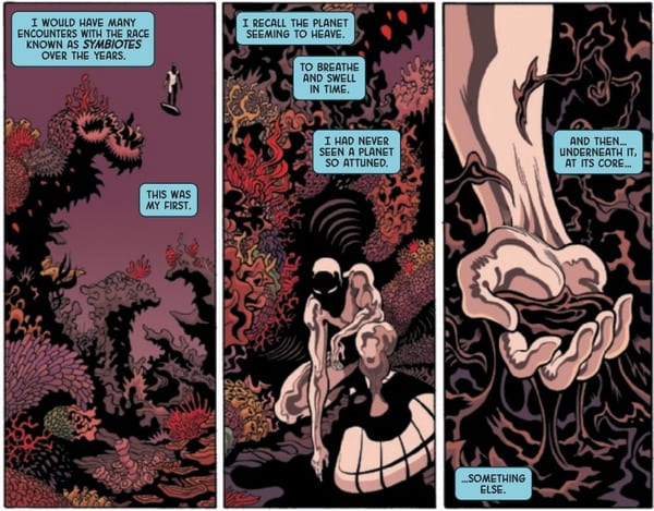
SPOILERS AFTER THE NEXT IMAGE
In this issue, the Silver Surfer takes on Knull and the symbiote cage planet in utterly gorgeous battle scenes. Norrin Radd is coming to terms with some of his demons while facing one of the more powerful new villains in the Marvel Universe, as he mentions he has had many encounters with symbiotes, but this is his first. Donny Cates is making symbiotes a large part of the new Marvel, and this piece of narration by the Surfer lets the readers know we have many more interactions coming. Knull infects the Surfer with a symbiote of his own and the design work for the Void Knight is astounding. I guarantee Silver Surfer fans will love the Venomized version graciously given by the great Moore. My only beef is the name, sounds like a Batman from a Gotham that exists in a black hole.
Silver Surfer Black #2 delivers with another appearance of the symbiote dragon mounted by Knull in pursuit of Norrin. At this point, the Surfer has rid himself of the symbiote and flees the King of Darkness, while being drawn to an ominous voice that knows all the thoughts careening through the Surfer’s mind. The use of wide and long panels throughout the book allow Moore’s work to shine and gives the book a cinematic feel. Every panel is captivating as the next; you’ll have to pick up this issue to find out how it ends.
Did you love this issue as much as I did? Let us know in the comments.
James Fortean, much like his mentor General Thunderbolt Ross, would like nothing more than to destroy both Bruce Banner and the Hulk. So much so that he vowed to do whatever it took to subdue the monster, even if it cost him his reputation. THE IMMORTAL HULK #21 is the story of Fortean’s fall from grace; it explores the motivations behind the character’s actions and the process he went through to create Shadow Base.
Story
The issue immediately takes readers to Shadow Base where Fortean and Dr. Charlene McGowan discussing their next plan of attack against the Hulk. Fortean decides to use an experimental armor that will allow him to traverse a great distance into the base of Gamma Flight’s operations in the hopes he will access the husk of Abomination, which could give him a leg up in the fight. McGowan pleas with him to choose a safer route, but the hardened military man claims he must bring order to the chaos that is the Hulk.
How the general came to this unyielding position is beautifully explained through flashbacks. Readers are transported into Fortean’s memories, witnessing the devastating moments that fostered a rock-hard determination to fight for order through any means necessary. It is here we finally feel some sympathy for the character, ultimately finding common ground in his desire for peace. And the method through which Fortean thought he could find it was outside of conventional military procedure, thus leading to the creation of Shadow Base.
Writer Al Ewing has often shifted the first-person narration of his THE IMMORTAL HULK run to supporting characters to fully flesh out the character dynamics affecting the story. But the way in which he unpacks the pivotal moments of Fortean’s history is nothing short of legendary.
Art
Ryan Bodenheim joins the illustration team as a guest artist and does not disappoint. His penciling and inking provide the clean-cut details of Fortean’s memory scenes while simultaneously showing a progression toward less defined illustrations to represent the general’s descent into chaos. Likewise, Paul Mounts follows suit, starting off with fewer color palettes and then expanding them as the scenes become more chaotic.
VC’s Cory Petit’s lettering once again adds a fitting somber tone to the issue. Using a cryptic white font on black backgrounds to feature ominous quotes reminds readers of the mythology’s roots in horror.
The Comic Covers
Alex Ross’ cover for THE IMMORTAL HULK #21 features Fortean viewing monitors showing various scenes from the Hulk’s history. This gives us a look into the character’s obsession with the green giant.
Conclusion
This issue does an amazing job of taking a seemingly one-dimensional antagonist and giving him depth one could sympathize with. It’ll be intersting to see whose level of hatred is higher: the Hulk’s or Fortean’s.
Did you like this issue’s focus on Fortean? Let us know in the comments below!
The AGE OF X-MAN is over, Lonnie Nadler and Zac Thompson’s mutant utopia comes crashing down. AGE OF X-MAN: OMEGA wraps up this X-Men event.
***SPOILERS LIE AHEAD***
Marvel loves to do these “Omega” epilogue issues following event stories, we just saw the War Of The Realms one last week. What’s different with Age Of X-Man is that this doesn’t serve as final closure and teases for future stories. Age Of X-Man: Omega is the legitimate final chapter, a finale for all six of the books at once.
The false world that Nate Grey created comes crumbling down as the rebellious mutants awaken from their dreamlike state. You can’t keep the X-Men from their family and duties for too long.
Thompson and Nadler asked interesting questions and took us down intriguing paths throughout Age Of X-Man. It may not have been the most explosive or action packed X-Men event, but it was never supposed to be. This was an intellectual exercise, posing questions and performing thought experiments much like X-Man himself.
This may have been an event that wasn’t for everyone in the mutant fandom community, but you can’t deny that it was very much it’s own. Age Of X-Man certainly wasn’t an X-Men story we’ve seen before.
We got to see what it would be like for Magneto’s childhood dream to come true, a world where mutants are the only species in town. His vision wasn’t fully formed thanks to the misguided rules and policing that Nate Grey enforced.
At the conclusion of this story, a piece of Magneto stays behind with Nate so they can dream it all up again from scratch. Whether or not we ever revisit this plane of existence, it’s a satisfying ending for both characters after going through what this Omega issue provided them.
Artist Simone Buonfantino provides an emotional farewell for our characters. This is a stressful and complicated ending and the art illustrates that superbly. Our story moves along at a brisk pace, Buonfantino lays it out in an easily digestible spread. The scene with Iceman making that young kid in the diner feel safe was a heartwarming and memorable moment.
Colorist Tríona Farrell breathes one last breathe of life into this world before it’s erased. It’s a bright and colorful world with a tinge of darkness peaking out from underneath. The pages of our X-Men transitioning back to their normal selves are particularly beautiful.
What these characters have just gone through, to now go back to their actual reality puts many of them in an interesting place to begin this new Hickman era of X-Men comics. This wasn’t an event that promised to shake things up forever or alter our favorite characters, but it definitely changes the way some of these mutants may think going forward.
Age Of X-Man makes a fine addition to the overall continuity of X-Men comics and history of major events. It may have been overshadowed by War Of The Realms happening concurrently, but I believe this is a story that will continue to be effective and age well.
Overall, Age Of X-Man may not be the most crucial bit of X-Men reading but it most definitely accomplishes what it set out to. Thompson and Nadler’s vision is delivered clearly throughout and the themes explored are worth the reader’s time.
Age Of X-Man: Omega wraps up all six stories at once without turning into a convoluted mess. This is a final chapter rather than an epilogue, and for that it’s one of the best Omega issues Marvel has published in a while.
Arthur Curry has fought elemental beings, befriended gods and goddesses, and regained painful memories of his accidental death at the hands of Mera, all in the past 10 issues. And now it’s time to bring him home. Writer Kelly Sue DeConnick uses AQUAMAN #50 as a springboard for Arthur’s reintroduction to his friends and home in Amnesty Bay, Maine. But with his new Old God friends in tow, how will they react?
Story
The people of Amnesty Bay have long witnessed the incredible feats and powers of their hometown hero, but none of them could have prepared for his return from the grave. Every shop owner, newspaper, and government official wants nothing more than to hear from the man himself, especially now that he’s accompanied with mysterious strangers. Fortunately for Athur, Diana Prince, a.k.a. Wonder Woman, arrives on the scene just in time to divert the crowd.
DeConnick uses this moment to relay a powerful message through Diana in the face of fearful questions from the crowd. When someone claims the town has a right to know who “these people” are, the warrior delivers a topical yet timeless response. She replies, “I come from a small community. We don’t receive many visitors, but every once and a while a wanderer does find our shores. When that happens, it is not our custom to begin with demands of who they are or where they come from…we begin with, ‘How can we help?'”
The story then places a focus on Arthur and his attempt to acclimate his new family to the small town, but this is cut short after the gods listen to a tale of a mysterious lighthouse. They realize location described may be the perfect locale for the time being and rush over to the area. But what mysteries could be hiding there? And how will Arthur decide whether to stay with the gods or attempt to reach out to Mera in Atlantis? These questions and more are explored in this brilliant addition to the AQUAMAN line.
Art
Robson Rocha and Eduardo Pansica’s pencils, combined with Daniel Henriques and Júlio Ferreira’s inks, give readers a feel for Amnesty Bay through their incredible sense of detail. From the wooden piers to the local bars, the artists immerse one in the harbor town.
Sunny Gho’s colors stand out in this issue as well. Giving Arthur a mixed palette of bright and earthy tones, we can visualize him as the connection between life in Amnesty Bay and the superhero world represented by Diana’s arrival.
Clayton Cowles’ letter boxes are placed in a non-traditional format as it they are following the flow of the story’s action. This is particularly effective in slowing down the reader’s reading speed so they may take in each scene.
The Comic Covers
Rocha, Jason Paz, and Alex Sinclair’s main cover shows an ominous illustration of Black Manta sneaking up on Arthur, giving readers a sneak peak at the next villain the face the aquatic hero. Josh Middleton’s variant cover takes this theme further by featuring a reflection of Arthur and Mera in the foe’s mask to establish these characters as the focal point of the new story arc.
Conclusion
AQUAMAN #50 does a great job of melding Arthur’s new friends – the Old Gods – with his friends and family in Amnesty Bay. It’s the perfect bridge between the previous storyline and the plot DeConnick is setting up with the lighthouse tale.
What did you think of Arthur’s return to Amnesty Bay? Let us know in the comments below!
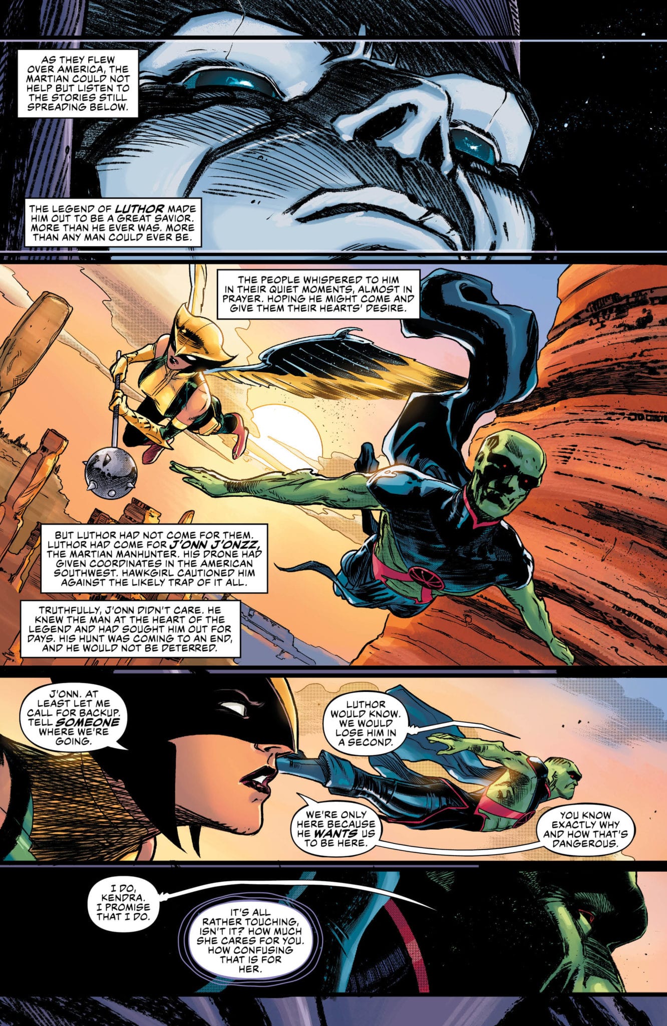
Previously on Justice League, Martian Manhunter, while on the hunt for Lex Luthor, recalled a traumatizing moment in his childhood at the hands of Lex’s father. Instead of finding Lex, he stumbled upon a decoy Professor Ivo, who was creating a mechanical human/Martian hybrid army for Perpetua. Upon defeating the apex predator bots, with the aide of Hawkgirl, J’onn J’onnz was still relentless in his pursuit for Luthor. Not a moment too soon, a holographic Lex arrived with a message for the Manhunter from Mars to come and find him.
Meanwhile, the other members of the Justice League, now with the World Forger as an ally, come the Monitor’s doorstep to recruit him in the fight against his mother, Perpetua. Superman and Flash begin to remember the previous Crises that they endured in a previous life. The Monitor agrees to join the crusade, and the team heads to the dwelling of the last cosmic sibling – Anti-Monitor.
Justice League #28 is written by James Tynion IV, with pencils by Javier Fernandez and Daniel Sampere, and inks by Fernandez and Juan Albarran. This issue is the final in the Apex Predator storyline, which leads into the Justice-Doom War and continues the Year of the Villain crossover event.
** Spoilers Below **
Story
The Apex Predator rises! Justice-Doom War is coming! This is the culmination of the Legion of Doom’s master plan, and they will take the Justice League to far-out places they may never return from…and do things the DC Universe may never recover from.
Just like that, the “Apex Predator” arc comes to its conclusion. And it’s quite an exciting one at that. Tynion does an exemplary job with the back and forth debate over the nature of humanity between Martian Manhunter and Lex Luthor. The tension bleeds through the page. The other plot thread with the Justice League, World Forger, and Monitor arriving on Qward doesn’t hit quite as compellingly. But it’s okay as we don’t spend that much time with them in this issue.
These are the greatest minds in the DC Universe, so it makes perfect sense to pair these two together. Tynion writes them as if they are somewhat in awe of one another’s intellect, giving off a very Sherlock/Moriarty dynamic. They are enemies that want to destroy one another yet cannot help but be interested in just how they would do it. We have witnessed a thrilling evolution of Lex Luthor over these 28 issues of Justice League, particularly in the Year of the Villain one-shot, and it’ll be exciting to see how it pays off in the upcoming Justice-Doom War.
Art
Javier Fernandez brings his signature dark and gritty artistry to this issue, and it’s now clear more than ever why he was a good choice for this story. In the previous issue, it was the way he illustrated the fluctuating appearance of J’onn J’onnz throughout the issue. In this issue, it’s Fernandez’s cloaked and frightening Lex Luthor that wins the book. He positions Luthor that gives the reader just enough to see his transformation, yet still holds back to keep him dark and foreboding.
Daniel Sampere does the artwork on the pages in the Hall of Justice, featuring a small but memorable scene with Starman, Jarro, and Shane (the son of J’onn J’onnz and Hawkgirl from the Sixth Dimension). His style is lighter in tone and coloring, offering a quick but cute palette cleanser before the book’s dark conclusion.
Conclusion
While the scene with the Justice League on Qward felt a bit off, it was the moments between Lex Luthor and J’onn J’onnz that made this issue as gripping as it is.
What do you think of Lex Luthor’s transformation in Justice League #28? Let us know in the comments.