Home Blog Page 435

Review: DEATH’S HEAD #1 – Big Guns And Mile-A-Minute Action

Monkeys Fighting Robots

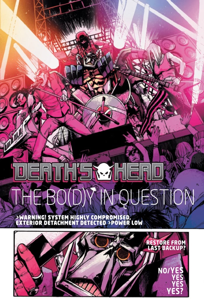
Cyborgs, dimension-hopping, space bounty hunters…sounds interesting, yes? All that and much more is here in Death’s Head #1, the new title from Marvel.

After a meeting with his employer goes south, Death’s Head finds himself transported to Earth. He revives in the middle of a punk show, only to find himself squaring off against Wiccan and Hulkling of the Young Avengers, and antics ensue.

The Writing

Death’s Head isn’t exactly an obscure figure. The cybernetic bounty hunter is a cult favorite first introduced in the UK in 1987. In the character’s own way, Death’s Head is a perfect distillation of ‘80s dark age, hyper-violent excess. And, in that spirit, Death’s Head #1 doesn’t spend much time establishing the character, preferring instead to jump right into the action.

The book doesn’t offer readers much time to breathe. It’s one action sequence flowing into another, with Death’s Head intent on killing just about anyone he can get his hands on. It may just be the shared UK roots, but one can’t help picking up on hints of Judge Dredd here, at least in terms of style.

Writer Tini Howard is not shy about weaving humor into the story as well, though. In fact, it’s that balance of humor and action that proves critical to making the story work. The banter between Hulkling, Wiccan, and Death’s Head is among the strongest assets present in Death’s Head #1. There are chuckle-worthy moments spread throughout the book, too (“Drain in floor detected. Statistics suggest that the likelihood of being eviscerated in a room with a drain in the floor is 94%.”) Without that critical counterbalance, the book could come across as very one-note.

That said, there are more subtle themes at play here, too. Even though Death’s Head is the name on the cover, much of the real conflict seems focused primarily around Wiccan. The character’s desire to rejoin The Avengers seems to be central to his development, and to the story at large.

The book provides some intrigue as well, closing this initial issue with a hook meant to ensure readers return. Based on what we see, it looks like we’re in for an interesting ride.

Death's Head #1

Death's Head #1

Death's Head #1

The Artwork

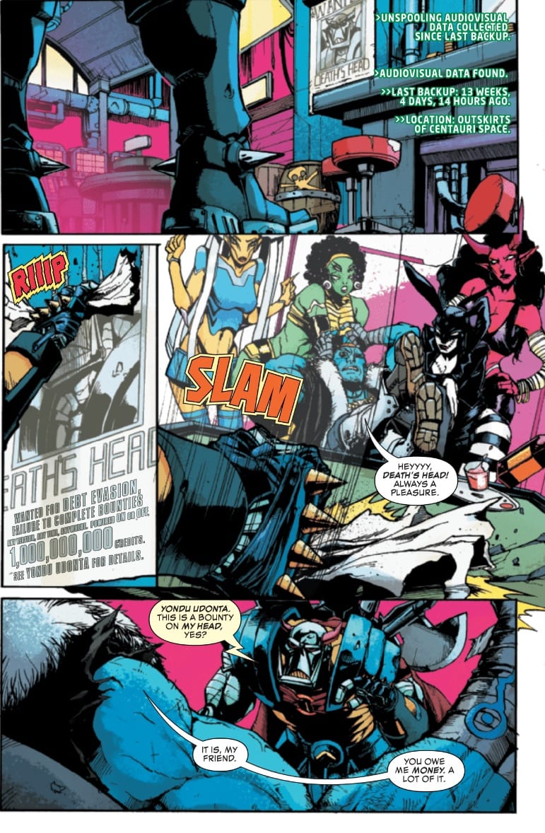
Artist Kei Zama brings some fairly impressive artwork to the table in Death’s Head #1. Her illustrations are dynamic and crackle with energy on each page. This works especially well for the fight sequences through most of the book. Still, it’s richly-detailed, which helps to securely ground the reader, especially in those quieter passages.

The inks effectively convey the mayhem of these scenes. Of course, that does have its downsides, too. Some sequences can be hard to follow, given the constant shifts and unorthodox use of perspective. There is the odd panel here and there in which it’s hard to make out what’s really being shown. Despite those issues in composition, it’s a strong and well-stylized showing overall.

Colorist Felipe Sobreiro employs a wide and very vibrant color palette in Death’s Head #1. The colors can almost overload the reader’s eye at certain times; the effect works, though, underscoring the chaotic action unfolding on the page. Sequences seen through the eyes of Death’s Head employ hazy, yellow-tinged effect that clearly echoes notes of The Terminator, further underscoring the ‘80s action tone.

Final Thoughts

Death’s Head #1 is a great beginning for Marvel’s new miniseries. If you’re in the mood for big guns and mile-a-minute action, you won’t want to miss this one. Pick it up July 31 at your local comic book shop.

Monkeys Fighting Robots Youtube

Review: POWERS OF X #1 – A New Epic Beginning For The X-Men

Monkeys Fighting Robots

Jonathon Hickman’s Powers of X #1 gives fans tangible evidence that his run will be one of X-Men’s best. The art team consisting of R.B Silva, Adriano Di Benedetto, Marte Gracia, VC’s Clayton Cowles on letters, and Tom Muller with designs are no slouches propping up Hickman’s story with stellar art. It may be too early to call, but all signs point to Powers of X being one of X-Men’s essential reads.

Take all of that with a grain of salt because this is very much a Hickman story. Creepy Anthropomorphic aliens? Check. A Strong Inclination towards Prophecy? Check. Unconventional Storytelling methods? Check. Graphs consisting of made-up statistics, terms, and languages? Super Check. If you are not a fan of Hickman’s previous runs on Fantastic Four, Secret Wars, or his stellar Image Comics‘series East of West then Powers of X may be a bit of a difficult read.

Review: POWERS OF X #1- A New Beginning For a New X-Men Epic

As mentioned prior, Powers of X #1’s script can be a bit difficult to follow as it takes place in four separate time periods.

Year 1: The Dream
Year 10: The World
Year 100: The War
Year 1,000: Ascension

With each having to do with the prominence of Mutants in that time. It’s difficult to speak much of the plot without giving too much away; it should be read rather than explained. It seems like the more critical time periods are Year 100: The Man-Machine-Mutant War and Year 10: when House of X takes place.

Hickman’s writing style thoughtful and meticulous and it is refined to precision in Powers of X #1. The use of the fortune cards from Year 1 in Year 100 was particularly noteworthy. If there is one critique of Hickman’s script, it’s that there are a lot of moving parts, especially in Year 100. It’s almost confusing to decipher who are the mutants and who are the machines and what exactly they are fighting about. A graph comes in later to help explain and put some things into context, but it requires a couple of rereads.

Review: POWERS OF X #1- A New Beginning For a New X-Men Epic

The artistic team of Silva, Di Benedetto, Garcia, Cowles, and Muller proves ideal for Powers of X. Silva’s lines are expressive and defined, Di Benedetto and Silva’s ink is exact, and Gracia’s colors are deep and add nuance to each scene. The highlight of the issue remains the overall design of Krakoa in Year 10 and the Human-Machine Monolith and surrounding town in Year 100. Krakoa looks naturalistic and spiritual like an Elvish Cathedral while The Tower of Nimrod is industrial and stoic, like a cleaned-up version of Blade Runner’s L.A.

The art team does struggle somewhat with scenes containing a lot of movement or action. While the action panels are neatly drawn and colored, the overall fight between mutants and humans/machines in Year 100 feels poorly choreographed. It looks like characters are just charging at each other and screaming. It can also be confusing to remember where characters are in the fights in relation to the enemy, and their weapons as most of the shots are intense close-ups on the faces before pulling out to wide explosions or action panels.

Review: POWERS OF X #1- A New Beginning For a New X-Men Epic

Also, in the scene where Nimrod is putting his prisoner in the torture machine, there is a surprising lack of detail on Nimrod himself compared to his machine. Nimrod’s lack of sharp define lines makes him look made of clay or silly putty when viewed from afar.

In tandem with its twin House of X, Powers of X #1 is shaping up to be the exact reboot X-Men needed. Hickman’s script is nuanced and political, and the art team proves they are more than capable of delivering on their potential. Simply put, every X-Men fan should be reading Powers of X #1.

Monkeys Fighting Robots Youtube

Why DAWN OF X Is Different From Previous Relaunches

Monkeys Fighting Robots

We are now living in the age of Jonathan Hickman’s vision for the X-Men. We’ve seen plenty of line-wide relaunches for Marvel’s beloved mutants, but this time is different. This is the DAWN OF X.

House Of X #1 was as bold a statement as one could make, this creative shift is deadly serious–and an absolutely bombshell. Every comic book fan has heard it all before, the publisher promises that this new series will “shake the world to it’s core” and how nothing will ever be the same.

DAWN OF X

The difference this time is that Jonathan Hickman is behind the wheel in a monumental return to Marvel. His time away from the publisher has allowed him to evolve into undeniably one of the top talents in the industry.

He brings with him all the experience and tools he’s gained from his work on East Of WestBlack Monday Murders, and The Manhattan Projects. Combine the layout and structure of those brilliant works with his already well-established Marvel credibility (Fantastic Four, FF, Avengers/New Avengers, Secret Wars, Infinity, etc.) and we’ve got a recipe for exhilarating comic books.

Die-hard X-Men fans have been through some tough times over the last decade and beyond. False promises, failed relaunches, that whole Inhuman agenda, etc. It’s time to put that behind us. This is no simple shake-up on the surface level, this is a foundational re-imagining.

Dawn Of X is what the line of X-Men comics will be called once House Of X and Powers Of X lay the groundwork on a weekly basis for the next three months.

PROFESSOR HICKMAN


Here’s why you should buy what Hickman is selling…


Dawn Of X won’t just be a shift to more colorful art, that didn’t cut it. During the ResurreXion in 2016 we were promised a “return to form” for the X-Men. The only promise kept by Marvel was these characters and costumes being more vibrantly colored like they were before the 2000s.

We’re not just swapping roles between heroes and villains, that was a dead horse beaten one too many times. The mutants are a united front, even a militant one. We may have seen them remove themselves from society plenty of times, but not like this. The concept of Krakoa is far from that of Genosha, Utopia, or Nation X.

This isn’t some stunt like bringing the x-teens to the current timeline. There were plenty of good stories to come out of Battle Of The Atom, but it was a gimmick that ran it’s course well before it was reversed. The changes Hickman is implementing are full-scale.

HOUSE OF X 1

No longer are these mutants in dwindling numbers, fighting to survive. Powers Of X may show us different times in a newly established timeline, but this is nothing like Death Of X or post-House Of M. Our mutants aren’t struggling, they’re thriving. It forces the whole world to be on their heals.

This is a relaunch that’s birthed out of story rather than gimmick. There’s no resurrection or death of a major character as the driving force. This is a united mutant front, the evolution and progression that these characters have needed for a long time. We now have a creator who’s willing to finally push them forward.

There’s plenty of mystery, and not just who’s underneath a mask, there’s a large web of story and information to uncover that can’t be contained to one short series. It may be a sleek and beautiful looking modern comic book, but it still reads like a classic comic book mystery–it’s just dressed up in an astonishing and complex manor.

POWERS OF X 1

It’s also a bold new direction in design, mirroring Hickman’s other grand scale work. Previous relaunches were half-assed, they played it safe. Whether that was editorially mandated or fell on the creative teams themselves, it did little to generate the kind of excitement surrounding Dawn Of X.

There’s nothing safe or regurgitated about the path Hickman has readers set on. This is uncharted territory surely to keep everybody on the edge of their seats.

X-Men comics are going to get weird again. One of the greatest points in X-Men history was when Grant Morrison was behind the wheel during New X-Men. Hickman has his own brilliant brand of bizarre that he won’t be shying away from as we’ve seen already in the first issues of House/Powers Of X.

This is a bold new direction, one that’s not just confined to one corner of the vast 616 universe. Demonstrated in House Of X #1, this new direction for mutants will be impossible not to incorporate into all of Marvel’s books whenever path’s cross. This will be a benchmark moment in Marvel’s long universal continuity.

The endgame here for Hickman’s X-Men isn’t just to trick people into buying X-Men comics again. The mission statement here is to make the mutants matter again in a major way. This is to be achieved through unrivaled creativity, bold storytelling, and expertly crafted execution.

The effects of this launching point will be felt for many years to come. This is not a drill, prayers have been answered, Hickman’s vision has arrived. The X-Men are front and center once again, right where they belong.

DAWN OF X TITLES


Monkeys Fighting Robots Youtube

Review: MANOR BLACK #1 Offers Spooky, Gothic Goodness

Monkeys Fighting Robots

Manor Black #1, the inaugural issue from creators Cullen Bunn and Brian Hurtt’s new Dark Horse miniseries, is a true gothic horror treat.

Roman Black, the patriarch of an old magical family, faces a crisis. He must select an heir to his line before he “ascends.” However, he’s unready to make a decision, seeing all of his children as either unready or unworthy. Things change, though, when a new young mage enters the picture through happenstance.

The Writing

Cullen Bunn and Brian Hurtt are no strangers to balancing spooky and fun elements in stories. The pair collaborated on the critically-acclaimed supernatural western The Sixth Gun. Now, they team-up again to introduce what promises to be another spellbinding work of magic and mystery with Manor Black #1.

This issue provides a nice opening for the narrative. It introduces our cast of characters, the central conflict, and sets the plot in motion. It’s surprisingly concise in that regard; almost a textbook example of what a first act should accomplish. Despite that, it still manages to be engaging and tell a compelling story from page one. This is a difficult balance to strike as a writer, yet the team pulls it off well.

The reader definitely picks up on the tension in Roman’s situation. It’s never explicitly stated, but one clearly reads the distrust bubbling within the family.

One nitpick would be that we don’t know as much about Ari, the mage Roman rescues. While the book opens with her story, we quickly divert away to follow a pair of local cops for much of the middle section of Manor Black #1. How much bearing their subplot will have on the broader narrative is unclear. Regardless, it might have been nice to get more about Ari here.

Beyond that minor sticking point, the writing is excellent overall. It leaves the reader asking several questions, while setting an eerie tone for the broader narrative. While the book may just be setting the stage, it does so in a surprisingly incisive, yet tactful manner.

Manor Black #1

Manor Black #1

Manor Black #1

The Artwork

Given the strength of the storytelling, it could be easy to simply provide adequate visuals and let the writers carry the book. Fortunately, artist Tyler Crook is not willing to take the backseat in Manor Black #1. After collaborating with Bunn on Harrow County (also from Dark Horse), the pair are back together here, and promising great things to come.

Crook strikes a fine balance between detailed and a minimalist approaches. He employs each in careful measure, hewing toward a minimal look when the focus is on the action or character interaction, but more fully illustrating other panels to establish setting, tone, and mood.

That’s to say nothing of the illustrations themselves. Crook’s style is soft and watercolor-esque. It’s charming, though despite the softer look, it’s still remarkably effective at conveying apprehension or malice. It’s a difficult balance to achieve, but the artist demonstrates a sense of mastery over his style, commanding it as needed. Crook presents some striking imagery in Manor Black #1. Roman Black’s conference with his ancestors stands out as a particularly interesting sequence in this regard. The way the artist illustrates their grotesque visages, and the ghostly entities that rise from them, is particularly strong.

Crook also provides colors for the book. The washy textures possess that unique watercolor look, but are still crisp, precise, and absolutely gorgeous. It’s difficult to judge the colors and line work in isolation, as the two are so closely connected. Still, really great stuff either way.

Final Thoughts

Manor Black #1 is a home run. Bunn and Hurtt’s storytelling is sharp, and brought to vivid life by Crook’s sublime artwork. Definitely worth checking out, so grab a copy this Wednesday at your local comic book shop.

Monkeys Fighting Robots Youtube

Review: MALL #1 Is A Sharp, Intense, And Haunting Look At Consumerism in America

Monkeys Fighting Robots

Mall #1 is out August 28th from Vault Comics, and it’s an action-packed look at consumerism gone wrong that you absolutely have to read.

The world has ended, and The Mall is all that remains. The residents within are divided into warring gangs that live by two rules: “protect what’s yours, and take from whoever’s stupid enough not to do the same.” Andre Walker, heir to the Gacy’s empire, is framed for the murder of a tribal leader and forced to navigate this treacherous landscape to prove his innocence. 

It’s Dawn of the Dead meets The Warriors, and it’s fucking badass.

The series is by writers Michael Moreci and Gary Dauberman, and artist Zak Hartong, with colors by Addison Duke, and letters by Jim Campbell.

mall #1 review vault comics

First off, Moreci and Dauberman write one of the best opening pages to a series that you’ll ever see. It’s the epitome of “simple yet effective.” In just five panels and ten (short) caption boxes, we’re given everything we need to know about this world. It sets a bleak and gritty tone. Not only that, but it’s told in first person narration, so it builds a personal connection to the reader. We’re not being lectured to; we’re having a conversation. The voice establishes a sort of punk rock, nihilistic atmosphere: the world ended, nothing else matters, let’s get on with the story.

This vibe is solidified by the outstanding art team. Hartong’s linework is gritty; he makes the world feel not only lived in, but worn out from years of violence. His action scenes feel raw and unbridled. Duke then utilizes a muted color palette to emphasize this dark, bleak future, throwing in splashes of brighter, more vibrant colors to make certain moments pop. Campbell actually does the same thing with his letters, throwing in some hot pink sound effects during an action scene. His lettering is otherwise styled in a way that further grounds the story in reality, and it guides your eyes through this hellscape with great ease. Mall has a very unique, intense feeling, and that’s due largely to the art and lettering.

After the opening page, Mall throws you right into the action. Multiple mysteries are set up in the first few pages; there’s an intriguing element of “what the hell is going on?!” that will keep you reading, and then have you demanding the next issue ASAP. Every page is thrilling and engaging, thanks to the explosive art from Hartong and Duke. Every panel feels necessary. Between the intrigue and the action (oh man, this is a bloody comic), there’s not a slow or dull moment between the covers. All of the exposition, worldbuilding, and character development are woven seamlessly into the story. This is a debut issue done right.

mall #1 review vault comics
“Vault Vintage” variant cover, an homage to Gray Morrow’s cover to MARVEL PREVIEW #3 (1975).

But action and intrigue can only carry a comic so far. The stories that last are the ones that have depth and something to say. Mall definitely has something to say. 

This team is telling an exciting story, but if you look under the hood, you’ll see that it’s also a very clear commentary on consumerism and capitalism. As stated earlier, “the world has ended, and The Mall is all that remains.” The society within the mall is a caste system, with power directly tied to wealth. Gangs are named after brands and stores; they’re literal mascots. Our protagonist, Andre, is called “heir to the Gacy’s Empire,” which sounds an awful lot like a certain department store you’ll find in most shopping malls.

Even after the apocalypse, America still values money above all else. The rich are still in charge, only now they don’t have to hide in the pockets of politicians.

Just typing those words filled me with rage, and that’s the true power of Mall. It feels relevant. It feels like this could actually be our future if society continues down its current path. That’s perhaps the most interesting thing about this comic, and it’s definitely the most terrifying.

And Andre seems to be the only one who can see the insanity in the way their society is run, which instantly puts the reader in his corner and makes him an endearing hero worth rooting for.

Mall is the best kind of comic: the kind that nourishes your brain with intelligent, well thought-out commentary while also entertaining the hell out of it. Vault is on a hot streak – maybe one of the hottest the industry has ever seen from an indie publisher – and this series is just another notch in the win column.


FOC (Final Order Cutoff) for Mall #1 is August 5th; call your local comic shop this week and tell them you want it!

Monkeys Fighting Robots Youtube

Review: ANGEL #3 Destroying Demons, Internally And Externally

Monkeys Fighting Robots

A terrifying rescue mission puts Angel on the path to salvation but what will be the ultimate cost?

In BOOM! Studios re-imaging of the Buffy-verse, Angel’s past is being rewritten and so, it seems, is his future. Writer Bryan Edward Hill doesn’t shy away from prophetic statements and over hints at what is in store for everyone’s favourite vampire with a soul.

Angel #3 Credit: BOOM! Studios

Angel Vs Demon

This issue of Angel starts with a demonic smack down. Angel uses his knowledge of the demon world to battle an evil creature without harming the host; at least that is the plan. All of this violence is to rescue a troubled woman trapped in an asylum, a woman haunted by some something demonic. A woman named Winifred Burkle.

Hill opens this issue by showing the reader the consequences of Angel’s past actions. He wants the reader to have the knowledge of the pain and suffering caused by the ‘hero’ in their minds as they move through this issue. The contrast between the opening page and the energetic fight scene that follows tells the reader everything they need to know about where Angel came from and where, emotionally, he is in the present day.

The historic violence is static and controlled. Angel stands above the destruction he has caused and soaks it up. Each moment is a snap shot of suffering. In comparison, the violence in the modern day setting is chaotic and animated. Angel is in the thick of it, taking a beating and fighting hard for himself and those he sees as victims. Hill wants the reader to see how much Angel has changed but also he reminds us that it can take more effort to do the right thing. Being ‘good’ is hard work.

The second half of the comic is about Angel trying to connect with Fred. The plot requires them to work together to defeat the ‘big bad’ in this current story but Hill takes their relationship building much further. With the help/hindrance (you decide) of Lilith, Hill builds an entire world around the two central characters. The hints at what is to come create a heightened level of excitement because of the characters and situations they contain. Hill dives headfirst into the old series and pulls out snippets to tease the readers with.

There is an element of ambiguity regarding some of the flashback/flash-forward sequences because Gleb Melnikov does not rely on creating photo-realistic impressions of the characters. Melnikov’s style does however work in the narratives favour. By hinting at so much in the story Hill could spoil any twists or surprises coming up but by creating a visual ambiguity it fuels speculation. Is that Darla in one of the flashbacks? It is a little unclear, although it alludes to that fact, but nothing is certain.

Angel #3 Credit: BOOM! Studios

Visual Storytelling

One of the visual strengths in this issue of Angel is the dynamism Melnikov injects into the compositions.  He creates an abstracted 3D world that the characters inhabit producing an uncomfortable feeling in the reader. It draws on the horror aspects at the heart of Angel’s story where nothing is safe and the world contains a wealth of the unknown. The violence is accentuated because Melnikov drops the backgrounds and shows the reader only the interactions between the two characters fighting. Your attention is focused entirely on the back and forth between the two battling demons.

After this opening scene the page layouts are more inviting, allowing the reader to settle into a sense of security as the connection between Angel and Fred is built. Melnikov uses establishing shots to create this safe environment and to illustrate the relationships between the characters in the scenes. The building of this safe environment helps to make a number of scare panels work effectively later in the comic.

The mood in each scene has been created by Roman Titov’s colors. The vibrate reds and oranges during the fight make the moments larger than life while expressing the sense of danger for the characters. Titov then pulls back on the coloring, favouring muted, naturalistic colors for the background in Angels home.

Some elements of the scenery are aptly colored to reflect the characters that the props interact with. Most notably is the chair in which Fred sits. Titov has colored this with a dark green representing the illness Fred is inflicted with. It is a constant reminder that there is something wrong with Fred, even when her speech patterns suggest otherwise.

Ed Dukeshire is responsible for successfully bringing out the speech patterns of the characters. He constantly breaks Lilith’s speech up in to several balloons; some joining while others are linked via connectors. This gives Lilith a majestic, mysterious ambience and adds weight to her words.

Angel #3 Credit: BOOM! Studios

Conclusion

Angel often plays second fiddle to Buffy and is often over looked in the larger conversation. This new series, and this issue in particular, is recreating the mythos in intriguing ways. Hill has packed this comic with foreshadows and prophetic speech but keeps it all within the narrative structure. Although he is constantly setting up future events it all seems relevant to the story in hand.

There is a lot of impressive storytelling going on in Angel with each creator picking out the emotional aspects of the characters and the story. The small details add additional layers to the pages, giving the reader more insights into the cast. In short, everything serves a purpose and this makes Angel a gratifying read.

Monkeys Fighting Robots Youtube

Review: Classic Batman/Joker Action in DETECTIVE COMICS #1008

Monkeys Fighting Robots

Detective Comics #1008 takes place against the backdrop of DC’s Year of the Villain event. While the last few pages have some tie-in material, most of the issue is dedicated to classic clown antics.

The Joker is back in town, taking over—where else—the local theme park. He holds the park’s attendees hostage with Joker Venom, forcing Batman to play along with his carnival charade until Bats can find a way to stop his reign of terror.

The Writing

Detective Comics #1008 opens with a familiar premise. The Joker gets back to basics, launching a seemingly-meaningless stunt to goad Batman into reacting. The first half consists mainly of Joker menacing his hostages; Bruce doesn’t hit the scene until near the book’s midpoint. It’s nothing we haven’t seen before, but it’s presented well enough to make it decently engaging.

The interactions between Batman and The Joker are the focal point of the book. Much of the story’s middle section, probably it’s most interesting, show the pair simply taking in the fair together. They work off one another in a straight man / funny man routine, actually producing some decent humor. This is, to be honest, the book’s most interesting element.

We don’t really know too much about Joker’s plan in Detective Comics #1008. We see that his hostages are under threat from Joker Venom, and presumably they can’t simply remove the devices that deliver the toxin. The setup for the punch line isn’t really established, though, as Joker alludes to some vague unspecified doom on the horizon (an allusion to Year of the Villain). The whole situation is largely a contrivance to get Batman and Joker together for the purposes of comedy. It’s not as much of a problem as it sounds, though. As mentioned, the plan isn’t the book’s point; it’s the interactions between The Joker and Bats that sell the work.

From a writing standpoint, it’s not the most interesting or substantial work in Tomasi’s run thus far. That said it’s an enjoyable read, presenting a simple, close-ended story in a single issue. Classic fare for what is, at its core, an episodic detective story.

Detective Comics #1008

Detective Comics #1008

The Artwork

Doug Mahnke’s on art detail for Detective Comics #1008. His scratchy style gives the book an interesting look, providing some added grit to the visuals.

The facial expressions are a standout point in the art department, especially with The Joker. Mahnke seems to take special glee in drawing the manic, stretched, and lined face of the character, and it comes across in the unsettling, ever-sinister clown’s eyes and smile. This vision of the Clown Prince of Crime is really a visual treat.

The pages are broken up without much consistency in layout in Detective Comics #1008. There is also a lot of contrast in where the reader’s eye lands from one panel to the next. That said, the artist still manages to present a consistent final product with good flow that hits the story beats.

There are lots of vibrant colors courtesy of David Baron. The artist manages to inject subtle hints of shadow and darker textures into the mix, though, despite the garish tones that the carnival setting calls for. The colors are true to the story, but also help sell the subtle menace behind the Joker’s actions. It’s great work, all things considered.

Final Thoughts

Most of Detective Comics #1008 doesn’t seem very significant in a broader narrative context. That said, it’s an enjoyable one-and-done story. It might qualify as filler, but at least it’s good filler. Find it this week at your local comic shop.

Monkeys Fighting Robots Youtube

Marvel Comics Preview: THANOS #4 (OF 6)

Monkeys Fighting Robots

THANOS #4 (OF 6) hits your local comic book shop on July 31, but thanks to Marvel Comics, Monkeys Fighting Robot has a five-page preview.

About the issue:
Gamora is coming into her own, but as the bond between her and Thanos continues to grow, so does the unrest among the proto-Black Order… Now, with the threat of mutiny brewing underfoot, Thanos will do anything to keep his power – no matter the cost.

THANOS #4 (OF 6) is written by Tini Howard, with art by Ariel Olivetti, and Jeff Dekal worked on the cover.

Check out the preview below:

Monkeys Fighting Robots Youtube

Marvel Comics Preview: STAR WARS AGE OF RESISTANCE SPECIAL #1

Monkeys Fighting Robots

STAR WARS AGE OF RESISTANCE SPECIAL #1 hits your local comic book shop on July 31, but thanks to Marvel Comics, Monkeys Fighting Robot has a five-page preview.

About the issue:
A ONE-SHOT SPECIAL FEATURING YOUR FAVORITE CHARACTERS FROM THE NEW STAR WARS TRILOGY! Star Wars fans first met Resistance leader and confidante of Leia Organa VICE ADMIRAL AMILYN HOLDO at the end of her story in 2017’s The Last Jedi-now, witness her triumphant beginning! This July, Hugo Award-winning writer G. Willow Wilson (MS. MARVEL) explores a pivotal conflict in Holdo’s early career that will start the young woman down the path to heroic infamy for the rebellion! With her ship at the mercy of a dangerous enemy, it’s up to Holdo to outsmart their foe and win the confidence of her compatriots in the process. With art by Elsa Charratier! The infamous “pirate queen” of Takodana, MAZ KANATA, thought she’d seen everything in her thousand-plus years of running a bar and hiring smugglers. But it turns out that the criminal underworld is always full of new surprises…especially when she hires HAN SOLO and CHEWBACCA for a job!

And Poe Dameron’s loyal companion, the astromech droid BB-8, just can’t seem to stay out of trouble. His missions always seem to escalate into a full-blown adventure! And if it means a win for his friends and the heroic Resistance freedom-fighters the little droid will stop at nothing to get the job done!

STAR WARS AGE OF RESISTANCE SPECIAL #1 is written by Tom Taylor, G. Willow Wilson, Chris Eliopoulos, with art by Elsa Charretier, Matteo Buffagni, Javier Pina, and Phil Noto worked on the cover.

Check out the preview below:

Marvel Comics Preview: STAR WARS AGE OF RESISTANCE SPECIAL #1

Monkeys Fighting Robots Youtube

Exclusive AfterShock Preview: ORPHAN AGE #5 – Dark Times Are Coming

Monkeys Fighting Robots

The post-apocalyptic adventure ORPHAN AGE #5 hits your local comic book store on August 14, but thanks to AfterShock Comics, Monkeys Fighting Robots has a four-page preview of the issue written by Ted Anderson with art by Nuno Plati.

Orphan Age is a modern-day western centered on building characters and creating emotional attachments to its diverse cast. A cross between The Walking Dead and The Good, The Bad, and the Ugly. – Darryll Robson

About the 32-page issue:
Surrounded by lights. No way in or out. The dead send a message. The tools they left us and those we built again. Some secrets are better-left secret. Some forgotten moments are better left forgotten. If there is no road, make one.

Anderson has previously worked on MOTH & WHISPER, My Little Pony, and Adventure Time. You will recognize Plati’s artwork from Alpha: Big Time and Marvel Girl. ORPHAN AGE #5 is lettered by Marshall Dillon, with colors by Joao Lemos.

Check out the ORPHAN AGE #5 preview below:

Exclusive AfterShock Preview: ORPHAN AGE #5

Exclusive AfterShock Preview: ORPHAN AGE #5

Exclusive AfterShock Preview: ORPHAN AGE #5

Exclusive AfterShock Preview: ORPHAN AGE #5

Exclusive AfterShock Preview: ORPHAN AGE #5


Do you have ORPHAN AGE on your pull list? Comment below with your thoughts on the series and AfterShock Comics.

Monkeys Fighting Robots Youtube