Home Blog Page 430

Review: BLACK HAMMER/ JUSTICE LEAGUE: HAMMER OF JUSTICE #2- Two Stellar Teams Combine To Form A Comic That Is Just Alright

Monkeys Fighting Robots

Reading Black Hammer/ Justice League: Hammer of Justice #2 is a lot like watching someone play with their favorite toys. It is clear that writer Jeff Lemire has the utmost respect for this paradigmatic super team that his award-winning Black Hammer series has made a legacy of deconstructing. While it feels odd to see someone other than Dean Ormston and Dave Stewart draw and color Black Hammer’s stellar cast, artist Michael Walsh certainly puts forth a valiant effort. Black Hammer/ Justice League: Hammer of Justice #2 out this week, is definitely a slower chapter, but the revelations it is building up towards feeling seismic.

Black Hammer/ Justice League: Hammer of Justice #2 picks up initially 10 years after the events of the first chapter with the Justice League already settled into the town of Rockwood. Batman has a history with the local law enforcement as he has been previously cited for vigilantism, Wonder Woman is a schoolteacher, and Superman has settled into the role occupied by Abraham. Simultaneously, the Black Hammer crew is coping with the fact of dealing with Starro, being placed into this bizarre new world of Metropolis, and encountering the rest of the Justice League.

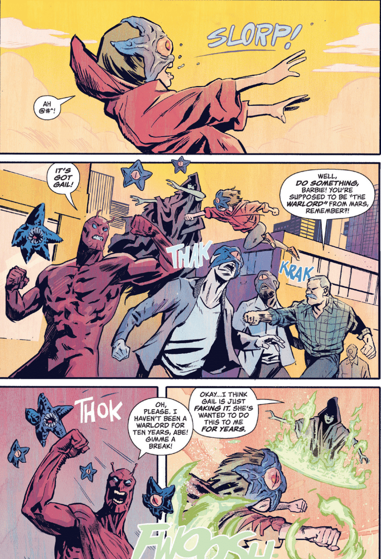
Lemire is clearly having a ball placing these two groups of characters in these new circumstances. The manner in which the police officer scolds Batman while he pulls him over, is a direct reflection of how ridiculous the situation is. Batman literally got pulled over for being a vigilante but not because he was pummeling the Joker instead he is investigating who was tipping cows. This light-hearted tone is also shown when Gail is potentially faking being controlled by Starro to take a swing at Madame Dragonfly and Gail’s realization that she cannot curse in this dimension.

Colonel Weird and Green Lantern’s storyline definitely seems to be the main branch for information, which is especially odd for Weird. Weird has always been the Knowing Observer who is reluctant to spill any coherent thoughts so learning how he processes information and seeing the Para-Zone is a nice look to see why he is this way. The introduction of the Bizarro Black Hammer Crew is also a nice touch.

Michael Walsh’s art is clearly inspired by Dean Ormston and Dave Stewart’s, but it definitely fails to live up to their lofty standards. Walsh’s depiction of Rockwood is really the only setting that stands out. Walsh drapes Rockwood in heavy shadows and makes clever use of setting that story around sunset/night time, adding to the lurking unease to it.

Golden Gail, First Class Actress

However, in daylight, the cracks are shown. And the main detraction is how certain panels have a surprising lack of detail, especially when it concerns to Aquaman and the Green Lantern Corps. I understand that the style isn’t as focused on the fine photo-realistic details of everything, but some panels are simply unfocused. For instance, when shown the entirety of the Green Lantern Corps, one is simply shown as a blue blob in the corner. Also when Green Lantern and Colonel Weird are in the Para-Zone, they point out a mystery man in pictures and he is almost undistinguishable due to the lack of focus.

It feels disingenuous to critique Black Hammer/Justice League: Hammer of Justice #2 too much as it combines two of the most well written and/or prominent super teams in creation. But something is simply not clicking the way it should. Lemire’s script is effective, punchy, and thoughtful. Walsh’s art and Nate Piekos’s letters are serviceable. But the combination of these two sensational entities is producing something just good enough, which is just a tad disappointing.

Monkeys Fighting Robots Youtube

Review: TITANS: BURNING RAGE #1 Is Great For New Fans

Monkeys Fighting Robots

Debuting in Walmart exclusive Titans Giant #1, #2 this new Titans story is available to the Direct Market for the first time as Titans: Burning Rage #1. Written by DC Comics veteran  Dan Jurgens, Titans: Burning Rage #1 is an easy starting point for those interested in this long-running team. Let’s call it Titans #1 for brevity’s sake.

Minor Spoilers Follow

Jurgens throws us straight into the action with a confused Beast Boy delivering pizza to his Titan teammates who seem to be absent from their T-shaped building. With a crackle of purple air Raven arrives to wisp the green hero to help the other Titans. Once on the scene of S.T.A.R. Labs Jurgens and team introduce us to one of our villains for Titans #1; The Disruptor. Wanting to amplify his power he breaks into S.T.A.R. Labs to steal an Amplifier, which name explains itself. Gotta love naming schemes.

Failing in his task due to the Titans effort Disruptor returns to H.I.V.E., now this is where that spoiler warning comes in. Back at base Robin playfully throws the container the Amplifier resides in at Beast Boy. First off, why would you throw something such as that? That alone makes no sense especially for someone trained by the likes of Batman. To make this scene worse the container is empty, meaning Disruptor was in fact able to steal it. Why didn’t Robin check it at the scene? If it was any Titan other than Robin that could be understandable, alas it’s not, making it seem out of character.

This is the only blemish in a well-written entry issue by Jurgens that seems to not take place in DC’s canon, making it more of a side story. This and the great team introduction page midway through makes Titans #1 a fantastic opportunity of being an entry point for anyone interested in the Teen Titans. Jurgens writes each character unique and true to his or her incarnations while sprinkling in elements for fans of the past, showing how well-versed and caring he is in this universe.

The line art by Scott Eaton and Wayne Faucher’s inking reflect this ease of excess for newcomers. With each character’s action being drawn fluidly making it easy on the reader’s eyes while drawing them towards the next element. The fighting doesn’t involve anything unique or groundbreaking but this works out for the better with each moment being clear and precise. This simplicity shines in the aforementioned Titans training page with a single page showing all characters in action then transitioning into smaller panels spotlighting each member’s powers and wonderfully lettered name/logo.    

Jim Charalampidis’ colors fall in line with the theme of easy access with a palette that’s pleasant for the eyes. With no colors clashing with each other or overpowering another we get what is essentially a perfect balance of a color spectrum that isn’t too much at once.  

Jurgens storytelling for Titan #1 blends effortlessly with Eaton and Faucher’s fluid action. These elements mixed in with Charalampidis colors make for a great first issue for long-term Titans fans and new alike. The only abnormality in the color department being Starfire’s hair color difference on the cover and inside the comic. 

Side Note: It’s weird that DC calls it Titans: Burning Rage when the team themselves say Teen Titans. The main difference being the Titans usually are in their late teens, whereas the Teen Titans are just that; teens. But tomatoes potatoes, right?

Side Note 2: The T-Tower is one of the cooler comic bases. No, that’s not up for debate.

Memorable Quote:

“But when you keep me from my pizza, you’ve gotta pay.” – Beast Boy.

I’m going to side with you on that Beast Boy, don’t mess with another’s food or food time!

Monkeys Fighting Robots Youtube

Review: Super Smart Superhero Origin Story in OMNI #1

Monkeys Fighting Robots

An emerging new Superhero Universe forms the backdrop for the adventures and drama in Omni #1 from international publisher, Humanoids. Writer Devin Grayson introduces the reader to this new world through the eyes of Mae Walters, friend and assistant to newly Ignited medical Doctor Cecelia Cobbina.

The comic opens with a quick introduction to the Humanoids shared superhero universe. Humanoids has been a powerhouse of European comic books with some extremely famous creators working for them. In more recent years they have started to make their presence known in the American market. With the hiring of Mark Waid and John Cassaday, to name just a few, Humanoids have launched their new universe of comics under the Ignited banner.

Ignited refers to an evolutionary jump that has created a number of super powered humans. Across the world people are transforming as their powers emerge. One such person is Cecelia Cobbina, the hero of Omni, a medical doctor who has been working in extreme conditions with the Doctors Without Boarders project.

Super Smart Superhero Origin Story in OMNI #1
Omni #1 Cover Art Credit: Humanoid Inc

Omni Present

In the first issue of Omni, Cobbina is travelling America trying to find out what has happened to her and, more importantly, WHY it has happened. With her on her journey is Mae who has a romantic notion about the superhero aspect of Cobbina’s life and this plays an important role in the storytelling.

Writer Devin Grayson has written a fair number of superhero comics for the Big 2 publishers and this is evident in this first issue. She structures the story around the sidekick and her take on the origin of the hero of the comic. Mae is writing a journal of her adventures and Greyson uses this storytelling technique to frame the action around the Origin of Cobbina’s powers. This allows the story to jump from past to present, introducing the readers to the characters while also building the plot in an exciting way.

This structure also allows Greyson to naturally include a lot of voice over exposition bringing the reader up to speed much quicker. Greyson moves the plot forward quickly, incorporating a fascinating origin story into the larger narrative.

Cobbina’s power set revolves around super-fast analytical thinking which is not a typical power for a superhero comic. This allows for some creative thinking from the art team to truly show off Cobbina’s power. In the origin scene artist Alitha E Martinez creates a series of ghost like interpretations of Cobbina to represent the different aspects of her mind. Colorist Bryan Valenza gives each aspect a different color wash to give them an ethereal feel but also to create a link to the ‘voices’ inside Cobbina’s head.

The effect is completed by the lettering provided by A Larger World. They match the coloring of each aspect to the various caption boxes that float around the initial double page spread. This coloring is then carried forward to the rest of the comic meaning that panel space can be saved by not having to physically represent each voice. The overall effect is wonderful with the establishing scene and the follow up conversations building not only Cobbina’s character but also giving personalities to each of the voices.

Super Smart Superhero Origin Story in OMNI #1
Omni #1 Credit: Humanoid Inc

World Building

Unlike James Mcavoy’s character in Split, Cobbina’s multiple personalities all work together to read a situation and come up with a solution or action in super-fast time. She is like a one-person Council of Reeds but without the self-important, world destroying tendencies.

Omni is set in a realistic world and the art reflects this. Each scene has a strong physical location rendered beautifully by Martinez. The chaos of a battlefield surgery tent is depicted with as much importance as a quiet suburb porch conversation. Both of these have significance to the Cobbina and neither is given more weigh in the narrative.

There are some moments where the storytelling doesn’t work as well as others. There are a couple of scenes where it takes a minute to realise that it is a flashback, or part of Mae’s journal logs. And there are some awkward speech balloon placings resulting in a break in conversational pacing. However, the overall plot and visuals of the comic are engaging. The quick introduction at the beginning makes it easier for the reader to get straight into the comic without feeling that they have missed something and from there on, Omni carries itself brilliantly.

Super Smart Superhero Origin Story in OMNI #1
Omni #1 Credit: Humanoid Inc

Conclusion

Based on the quality of this comic it does make you want to check out other titles in the shared universe. The concept is a sound one, and is very reminiscent of the ending to the T.V. series The 4400. Omni isn’t a typical superhero comic but it does contain new ways of looking at the associated clichés, similar to Stronghold from AfterShock Comics.

If you are bored of the standard capes and cowls narratives from the Big 2 publishers and fancy something different, then Omni and the Ignition Universe is for you.

Monkeys Fighting Robots Youtube

Review: STAR TREK YEAR FIVE #4 Evokes All The Best Original Series Memories

Monkeys Fighting Robots

Recreating the magic of Star Trek: The Original Series while continuing to engaging old and new fans alike is no mean feat but IDW Publishing have found a team to do just that in Star Trek Year Five issue 4, which is out this week.

Completing the second story of the series, Brandon Easton reflects on the consequences of the Enterprise crews’ earlier visit to Sigma Iotia II. Captain Kirk and his crew are famous for bending the rules to suit their current needs but where does that leave the planets and aliens that they interact with? When the Enterprise warps away, what happens to those left behind?

In the second part of Easton’s story, the full extent of the damage done to Sigma Iotia II is realised and Kirk is forced to intervene further in the planets politics.

The issue opens with Spock running for President against the rich elite, backed by the Southern Continent who have been forsaken by the ruling classes. Meanwhile a space station orbiting the planet is falling apart due to lack of funding and will crash through the atmosphere at any moment. Bureaucracy has tied the hands of the planets officials and even Kirk is bound by Federation Law. But with a mutiny brewing on the Enterprise and Spock involving himself in current affairs, Captain Kirk is running out of options and running out of time.

STAR TREK YEAR FIVE #4 Evokes All The Best Original Series Memories
Star Trek Year Five #4 Credit: IDW Publishing

Captains Log

This is without a shadow of doubt Star Trek: TOS. Easton has captured the tone of Gene Roddenberry’s original concept beautifully. The pacing of the story and the building of drama from the opening scene to the inevitable solution plays out exactly like one of the 1960’s episodes. The duel dilemma facing the crew allows Easton to keep all of the main cast in the story: an approach often used in the series.

The characters and their reactions to the situations they face are exactly as a fan of the show would expect. Easton understands the ins and outs of the Enterprise crew and what each is capable of: Spock’s unfaltering logic, Kirk’s reluctant rule breaking, and Scotty’s deductive reasoning. Each of the cast excel in their roles and every scene serves a purpose in the overriding plot.

Social commentary and moral questioning is evident throughout. The problems on the planet and the pent up rage felt by one of the crew members on the Enterprise are all relevant to a modern day audience. Some of the speeches given by the cast may come over as a little preachy, especially if you do not have the same politics as the creators, but for the most part the opinions fit with the characters and the world of Star Trek.

There is only one moment where Captain Kirk reflects verbally on the situation that breaks the reading experience. For a brief moment the writer’s voice takes over the character’s voice and the speech breaks the flow of the narrative. This is quickly recovered but, unfortunately, the moment is still there.

STAR TREK YEAR FIVE #4 Evokes All The Best Original Series Memories
Star Trek Year Five #4 Credit: IDW Publishing

Rendering Year Five

The artwork for Year Five is outstanding. Martin Coccolo captures not only the physical appearances of the cast but also the emotional reactions of the characters. His facial work is excellent, giving the narrative it’s emotional weight. The layouts and constant shift from long shots to close ups capture the Original Series atmosphere.

There is a sense of the grandiose but done on a budget. Coccolo focuses on characters over scenery allowing an occasional long shot to establish the scene. There is a large cast, with extras on the planet as well as the Enterprise, and Coccolo gives each character their individuality; they stand differently, move differently, and all round act differently.

Star Trek Year Five is also surprisingly colourful, both in the script and in the visuals. Colorist Fran Gamboa is not afraid to splash the color around filling each page with a full world of visual delights. But he also affects the mood of a scene very effectively by draining some color out and focusing on another. Most notably is the scene in the engine room of the Enterprise where the dangerously high tensions are illustrated via the wave of red covering everything.

In such a conversation heavy script it is important to get the lettering right and Neil Uyetake has done an excellent job. With the speech balloons there is nothing outrageous or challenging but the text inside reflects the nuances of the character’s speech. There is a distinctive speech pattern for the central cast so that their personalities clash creating the dynamic relationships between the crew.

The sound effects also have an air of ‘made on a budget’ about them which adds to the overall charm on the comic. Each creator appears to go out of their way to make the reader think this is an episode from the 1960s.

STAR TREK YEAR FIVE #4 Evokes All The Best Original Series Memories
Star Trek Year Five #4 Alternative Cover Credit: IDW Publishing

Conclusion

Fans can be difficult to please. What works in a franchise for one person may be the fly in the ointment for someone else. However, the creative team behind Star Trek Year Five has produced something that is as close to Original Series as anyone is likely to get and you can’t ask for more than that.

The characters, the plot, and everything about the design has that 1960’s feel about it in all the best possible ways. This is a joy to read, especially if you are a fan but the real beauty is that it stands alone in its own right. Fan or not, Star Trek Year Five looks good and reads better.


Monkeys Fighting Robots Youtube

Review: RED SONJA #7 is a Masterwork of Comics Storytelling

Monkeys Fighting Robots

Mark Russell’s work on this series only grows more engrossing with time. It’s a powerhouse run thus far, and Red Sonja #7, out this week from Dynamite Entertainment, may well be the best issue yet.

Sonja finds herself alone after losing Kryon, her last remaining family member, in our last issue. As she demonstrates, though, Sonja’s not one to give in to despair. Instead, she decides to finally mount an attack on Dragan in an attempt to rescue the surviving Hyrkanian prisoners.

The Writing

With Red Sonja #7, Mark Russell delivers an engrossing story. There’s plenty of action contained in these concise, yet thoroughly-engaging pages. Beyond the surface, though, the narrative is crammed full of interesting and incredibly-compelling thematic elements to unpack.

The book opens to Sonja reflecting on her childhood memories of Kryon, weaving grass shields as a childhood prank (an element that will come up again later). From here, we jump to Kryon’s funeral. Sonja wants to make one thing clear, though: despite her grief, revenge is not her aim. Rather, the primary focus is rescuing as many of her people as she can from Dragan’s sadism.

Sonja’s resolve is tested, though, when she has Dragan in her sights. Here, she’s forced to make a choice between seeking revenge and helping the living. The option she ultimately chooses says a great deal about her core character.

The highlight of Red Sonja #7—perhaps one of the most striking moments of the series thus far—comes toward the book’s end. Sonja’s advisor Cerkus delivers a monologue that is a surprisingly poignant critique of blind nationalism and empire. “Nations and empires are not a cult of personality,” he says, “but a symptom of humanity’s common psychosis. The need to find our worth in power.” It’s incredibly-well written, especially when cast alongside the action on the page. Dragan’s own guards foreshadow this theme earlier in the book, pondering Dragan’s circuitous motivation.

It’s intelligent and thought-provoking, without losing momentum. In Red Sonja #7, Russell proves himself to be a masterful storyteller.

Red Sonja #7

Red Sonja #7

Red Sonja #7

The Artwork

Bob Q takes over art duties from Mirko Colak beginning with Red Sonja #7. His work is eye-catching right from the first page, opening on a pastoral scene of young Sonja and Kryon, before hard-cutting to the latter’s funeral. He does a great job of capturing mood, really embellishing the emotional  pitch of these sequences.

The illustrations really shine, though, once we delve into the more action-packed pages in the book’s middle. The work is dynamic, constantly shifting perspective to reflect the chaos of battle. He employs some very deliberately-placed repetition, though, which works to nice effect.

While Colak’s work on the series’ first arc was very good overall, the artist did have some issues conveying expression. Bob Q, however, manages to provide some incredibly expressive and lively work. You feel the emotion on the page; the resolve, grief, and terror in characters’ faces comes across very clearly.

Final Thoughts

Red Sonja #7 is excellent from start to finish. This issue cements the current run of Red Sonja among the very best comics of 2019. Get it this week at your local comic book shop.

Monkeys Fighting Robots Youtube

How Gwenpool Plans to Stay Relevant in GWENPOOL STRIKES BACK #1

Monkeys Fighting Robots

Gwenpool is back and she’s fighting for her series – and her life – in GWENPOOL STRIKES BACK #1, hitting your local comic shop on August 14 from Marvel Comics. In her usual fourth wall breaking ways, Gwen is very aware of the cost of losing the readers favor.

Gwenpool is back, and she’s fighting dirty to stay relevant.

***SPOILER WARNING***

Fans of Gwenpool are likely thrilled to hear that she’s gotten another series to her name. Granted, it’s only a five issue series, but we’ll take what we can get. New readers will potentially get a kick out of this series as well, though they may not appreciate all of the references made.

As per usual, Gwen is painfully aware of her status in the comic book world, courtesy of her limited abilities. This also means that she’s aware of what will happen if she stops appearing in comics. It’s more or less a death sentence for her, due to being fully ported into this realm.

Gwenpool Strikes Back #1 gives Gwen the chance she needs. A literal and figurative fight for relevancy in a world where comic books saturate the market. But if anybody can do what nobody else is trying, it’s Gwenpool.

Gasp! An internal monologue!

Leah Williams picked up where Christopher Hastings left off – with Gwen fighting to find a way to save her series (and her life). Williams perfectly captured all of the quirks that make Gwenpool so unique, while also acknowledging Gwen’s other appearances in team-ups (West Coast Avengers).

This issue is a lot of fun and a lot of fourth-wall breaking. It’s silly, it’s a little bit insane, and it’s full of referential humor. And let’s not forget that it’s got plenty of Gwen and her desperation to become something more.

Time for our little shark friend to explain everything.

Gwen has given up on trying to become a beloved character through normal means. It’s time to fight dirty. And that means getting some new powers of her own. Her ability to jump through comics is amazing – but as she noted within these pages, it’s frequently retconned in teams, thus reducing her chances. And Gwen needs all of the chance she can get.

Gwen’s attempts are clearly going to wrap up other Marvel characters in the process. As you can clearly tell from this cover, Spider-Man has already been pulled into her first attempt. And the cover for the next issue hints at the Fantastic Four being her next target.

Dancing makes all explanations better, right?

This series is already proving to stick true to the humor that made so many fall in love with Gwenpool and all of her antics. She’s steadily embracing what makes her different, and thus making her a few steps further from being the hero she originally wanted to be. But that’s okay.

That is…quite a photo Gwen.

The new artistic team is forging a new path with Gwenpool Strikes Back #1. Our leading lady and her abilities are still clear, but there’s more detail than previously seen in her series. Her edges are sharper, and more similar to her original appearance on Earth 616.

David Baldeon, Jesus Aburtov, and Joe Caramagna are the artists behind this issue. And it’s safe to say that they had fun working on this issue. Gwen’s antics are always somewhat comical, but in this instance, they’re further heightened by the brilliant artwork provided.

Some panels are more standout than others, but that was clearly done with intent. Such as that one page spread focused entirely on Gwen’s high school photograph. Yeesh. That’s pure Gwen right there.

In the next issue, nobody is safe.

Gwenpool Strikes Back #1 has already proven that this series will be everything fans could have hoped for – and then some. It takes the situation that Gwen is in seriously, and brings the fight for her character to a level not normally seen. That does make the series somewhat bittersweet, but it’s balanced out with the quirky humor and insane antics.

Monkeys Fighting Robots Youtube

Review: ABSOLUTE CARNAGE: SEPARATION ANXIETY #1 Maximizes Real-World Horror

Monkeys Fighting Robots

Marvel Comics’ Absolute Carnage: Separation Anxiety #1 (on sale August 14) is the most terrifying, unsettling comic you’ll read this year.

Absolute Carnage: Separation Anxiety
Sadie finds herself trapped in a genuine nightmare.

The War of the Realms was fantastic and, of course, frost giants are quite scary. But with this tie-in, writer Clay McCleod Chapman grabs you and increasingly shakes you to the core.

Absolute Carnage: Separation Anxiety #1

Writer: Clay McCleod Chapman

Artist: Brian Level

Color Artist: Jordan Boyd

Letterer: VC’s Travis Lanham

Family Matters

When the story opens by focusing on a dysfunctional family that’s otherwise ordinary, cynical readers might think, “These characters don’t matter; where are the symbiotes?” But McCleod Chapman succeeds where a number of tie-ins fall short because he makes these (mostly) ordinary people dynamic characters. Sadie and her family have the misfortune of coming into contact with a symbiote reminiscent of Venom. In many ways, though, the subsequent infection is a secondary plot. McCleod Chapman focuses his energy on Sadie’s family that’s rapidly fracturing.

For readers who grew up in broken homes, this story will deeply resonate. But everyone can appreciate the power of Sadie’s heartbreak because we all know someone whose experienced a toxic upbringing. From the first page to the finale, the reader roots for Sadie because she’s an innocent little girl in a remarkably challenging situation before the symbiote even arrives. She deserves so much better than the anguish she experiences on a daily basis.

One of the scariest parts of Separation Anxiety, like any good demonic possession movie, is the balance between the ordinary and the macabre. In this case, it comes in the contrast between the monstrous symbiote and Sadie’s stereotypical parents. For every time that the symbiote-infected parents try to infect Sadie and her brother Billy, they talk about how much they want to be together again. In the context of a family that’s about to irrevocably fall apart, this dichotomy is gripping. McCleod Chapman weaves Sadie’s wish to have a happy family throughout the story and the results are devastating. There are no happy endings here, which makes Separation Anxiety feel ironically realistic; any other ending would have felt forced and phony.

Texas Chainsaw Vibes

In the original Texas Chainsaw Massacre, the dinner scene is physically and emotionally uncomfortable to watch. In an issue packed with stunning visuals and horrifying plot elements, a similar sequence of events in Separation Anxiety deserves to be recognized because it’s hard to stomach.

This scene also showcases some of the best artwork in the comic. On their own, the story beats are gruesome. Sadie’s symbiote-infected mom kills a neighbor, who innocently checks on the family when he hears screams. Later, after the parents chase Sadie and her brother for a while, Sadie stumbles into her mom, who has prepared dinner for the family. But the main course is the dead neighbor himself. The reveal feels like it’s ripped right out of a horror movie.

Level contrasts some normal dinner food (rolls, meat and vegetables) with the neighbor’s charred body. His face looks like that of a zombie or even a mummy but he’s only been dead for a few hours. The choice to show such a rapid decomposition makes Sadie’s infected mom seem even more powerful because she’s the one who killed the guy. Most disturbingly, the mom is in her human form but her dead smile, combined with letterer VC’s Travis Lantham red speech bubble, makes it clear that Sadie’s mom is long gone. Altogether, it’s a chilling sight.

Absolute Carnage: Separation Anxiety

In one of the more shocking reveals, Sadie’s mom shows her daughter what’s for dinner.McCleod Chapman and artist Brian Level don’t leave anything to the imagination. They show the parents and the newly-infected Billy dining on the neighbor’s corpse. Here, the perspective shifts; the reader sees the body from a new angle that hides its eyes and teeth. As a result, the corpse looks even more mummified and it’s even more disturbing to see Sadie’s dad practically drooling over the body. The small artistic touch of having lit candles surround it makes the scene feel like a gruesome ceremony.

Absolute Carnage: Separation Anxiety #1
Sadie’s family prepares to dine on the neighbor’s corpse.

As if that wasn’t ghastly enough, the creative team continues to ratchet up the horror. The symbiote-infected family holds Sadie captive while they say grace before the horrid meal. The trio prays to Knull, the god of the symbiotes, before Level shows them munching away on the neighbor’s flesh. Level zooms in on these shots and color artist Jordan Boyd’s usage of browns and oranges shows the body’s decomposition. The image of Sadie, who’s trapped by the symbiote tentacles, crying out of wide-open eyes, drives home the scene’s frightening tone. In an uncomfortable combination, the monsters ravenously pick away at the body while they hold a typical weekday dinner discussion. (The dad asks his son, “Anything exciting happen at school today, bud?”)  Throughout the issue, the creative team masterfully inverts the reader’s expectations at every turn and that’s particularly evident in this scene.

Absolute Carnage: Separation Anxiety #1
More than any other panel, this shot feels like a callback to the “Texas Chainsaw Massacre” dinner scene.

Tie-in comics for major events usually don’t fall in the “can’t miss” category. Most of the time, they don’t feature significant characters or meaningfully progress the overall story. Two of those statements might apply to Absolute Carnage: Separation Anxiety. You won’t see Spider-Man or Venom here and the event is just starting to unfold. But anyone thinks about skipping this issue would miss the best horror comic of the year. If you’re a fan of Marvel or if you like scary stories, read Separation Anxiety. Just don’t do it before bed because it’ll make it impossible to fall asleep.

What’d you think of Absolute Carnage: Separation Anxiety #1? Do you want to see more tie-ins like this?

Monkeys Fighting Robots Youtube

Review: Strong Storytelling & Artwork in REAVER #2

Monkeys Fighting Robots

In Reaver #2, out this week from Image Comics, our merry band is deep in hostile territory, and are forced to set up camp due to the driving snows. They have a plan for how to travel safely without attracting unwanted attention. However, a simple fact that they don’t understand about Rael society makes that plan largely moot.

The Writing

While the first issue was largely exposition and setup, it feels much more like we’re in the story proper here. With Reaver #2, writer Justin Jordan engages readers by eschewing the backstory and introductions that occupied much of the first book. Instead, he keeps the reader’s attention focused on the action within the story.

We also get to learn a little more about the world itself in this issue. While our first chapter featured a lot of expository worldbuilding and backstory, it comes across more organically within the context of the story here. We learn a bit more about the Rael, for instance, through context within the narrative, not necessarily through exposition.

There is more action in Reaver #2, particularly in the book’s second half. The protagonists never really feel like they’re in danger, but it’s engaging and compelling nonetheless. There is some character development as well. It’s subtle, but several members of our party seem to show a greater sense depth and complexity compared to what was on display in our first issue.

That said, the sticking point here is the chemistry between characters. It’s clear that they don’t particularly like or care about one another beyond their utility as a party member. That said, characters—even ones who don’t like each other—still need to have some emotional reaction to one another. Here, it’s primarily kept to either mild annoyance or indifference. This complaint doesn’t apply universally to all the characters’ interactions, though, and it’s not nearly enough to be a major problem. In all, the writing improves over the first issue in just about every area.

Reaver #2

Reaver #2

Reaver #2

The Artwork

One of artist Rebekah Isaacs’s greatest assets in our first book was the rich level of detail with which she brought the story to life. With Reaver #2, much of the issue takes place against the backdrop of a snow-covered environment. As a result, the artwork doesn’t get as much time to shine as before.

Fortunately, her character designs are quality work, allowing for expressive visual storytelling. We see the cockiness or fear in individuals’ eyes and body languages, making them feel like more rounded, fleshed-out characters. The images flow well, hitting the story beats and providing legible and engaging action sequences. It’s a very utilitarian, meat-and-potatoes style of illustration. While the style Isaacs employs in Reaver #2 doesn’t take a lot of chances, it does its job well.

Again, given the snowy environs, colorist Alex Guimarães doesn’t have as much opportunity to explore his palette. When the chance presents itself, though, Guimarães is more than happy to take it, cutting through with eye-catching and bold colors that break up the somber whites and blues.

Final Thoughts

It didn’t introduce the story, but Reaver #2 sets a positive trajectory for the new series, helping it stand out from the fantasy-by-way-of-Suicide-Squad setup. Find it this week at your local comic book shop.

Monkeys Fighting Robots Youtube

Review CATCH-22: A Hilarious and Tragic Examination Of The Toll of War

Joseph Hellar’s satirical novel Catch-22 is regarded as a literary classic and one of the best war novels ever published. It is also a sprawling piece of work that is difficult to adapt. Hulu has attempted to adapt the novel to the small screen with a number of talented people attached to the series.

Catch-22 focuses on the 256th US Army Air Squadron based in Italy in 1944. One of the bombardiers, John Yossarian (Christopher Abbott), is desperate to get out of the war, especially when Colonel Cathcart (Kyle Chandler) keeps rising the mission quota. As the war progresses Yossarian loses more and more friends, which put a strain on his mental state.

Catch-22 was told in a non-linear fashion where it jumped to and from different events. The writers of the season, Luke Davies and David Michôd, set out to tell the story in a more traditional, linear fashion. It goes from Yossarian and his fellow crewmen training to Yossarian having a mental breakdown by the end. As a straighten version of Catch-22 the series works, especially for people who are unfamiliar with the novel.

Due to the series going for a linear style it does straighten out the character arc for Yossarian. At the beginning of the series, he is a selfish asshole who looked for any way out of the war with a ‘to hell with anyone else’ attitude. By the end, Yossarian becomes a more sympathetic character because of the mental stress he was placed under. He did have a level of morality to him as exhibited when he casts a caring eye over an Italian teen (Viola Pizzetti) and being repulsed by Aarfy’s (Rafi Gavron) actions in Episode Five. Events early on in the series come back to bite Yossarian on the ass later on. Abbott perfectly plays the selfish asshole and the man cracking under the pressure.

Catch-22 was famously a satire on the US military and bureaucracy. The series keeps this in tack and due to the involvement of George Clooney and his creative partner Grant Heslov they ensured the series had a Coen Brothers-esque style to it. There were hilarious verbal exchanges from the outset like when Cleverly (Pico Alexander) gave advice to a superior officer, Scheisskopf (Clooney) advise on how to conduct the military parades. Throughout the series, there are satirical swipes against the military that could be applied to today like Milo’s (Daniel David Stewart) war profiteering and Cathcart takes pride in the destruction of Italian cities. It is a show that embraces absurdities like when one character gets a big promotion just because it’s quicker than to correct a mistake and Yossarian getting punished with a bravery medal.

The series also has somber moments because of the death and loss. Catch-22 builds on the friendships Yossarian has made during the series. They felt genuine, especially Yossarian’s friendship with Nately (Austin Stowell), so it hurts all the more when someone dies. It contributes to Yossarian’s eventual breakdown because all the people he knows either die or are sent away, leaving him trapped in an endless loop of bombing missions. It is a show that is willing to show or at least alludes to darker aspects of war. Catch-22 is able to walk the fine line of comedy and tragedy without being tonally jagging. At times Catch-22 shows that comedy and tragedy are able to merge, like at the end of episode three where the airmen play around with a German fighter and the sixth episode starting as a comedy before going into heavier territory.

Catch-22 does have an excellent cast who perfectly played their characters. Stewart as Milo was a great find to play the wheeling-dealing Milo, who ends up operating a trade network across Europe and North Africa. Chandler and Kevin J. O’Conner made for effective villains, one a colonel who is looking for his own glory, so plays with the lives of his men and his deputy who is a clever but weaselly man. Clooney had been effective at playing buffoonish yet vindictive commander who rapidly rises through the ranks. The whole show is an indictment of the American officer core who get the rewards whilst their men pay for it.

Paramount Television and Hulu clearly spent a lot of money on the show. As well as having a casting of talented actors the show was filmed on location in Italy, where it got to show off the beauty of the Italian countryside. There was also a great deal of care for the military gear, especially the CGI for the bombing missions as planes have to go through a barrage of flak.

Catch-22 was considered an unfilmable novel, but the team who made the miniseries gave it a damn good try and were able to make an effective and entertaining

Monkeys Fighting Robots Youtube

Review: THE BABOON Is The All-Ages Adventure Comic You’ve Been Waiting For

Monkeys Fighting Robots

Jamie Jones’ The Baboon: The Mustelid Menace is now available to the public following its successful Kickstarter campaign, and it’s the perfect, action-packed comic for fans of Saturday morning adventure cartoons like Johnny Quest

The graphic novel is written and illustrated entirely by Jones, whose previous work includes Kicking Ice, A Constant Distraction, and his own anthology comic The Whisper. The Baboon is Jones’ first comic as a full blown cartoonist.

Barton Marlow is the Baboon, a swashbuckling adventurer “who will stop at nothing to defend the world from the greatest evils known to man.” In “The Mustelid Menace”, Babs and his crew travel to a dark and dangerous castle to retrieve the mysterious Jackal formula from the nefarious Professor Weezal.

jamie jones the baboon review

Jones created The Baboon as an homage to classic Hanna-Barbera adventure cartoons, and he 100% captures the spirit of those shows in this comic. You can almost hear the booming voice of a narrator as you’re reading: “Will the Baboon make it out of Castle Mustelid in one piece? What plans does Professor Weezal have with the Jackal formula? Find out next week, same time, same channel!” But then you’re overjoyed because you don’t have to wait until next week; you just have to turn the page.

This is a FUN comic. It’s got the snap, crackle, and pop of a sugary cereal that you should be eating while you read it. It’s got enough action, excitement, and humor to fill your tank and keep you reading; you’ll knock this bad boy out in a single sitting and immediately start it over again.

jamie jones the baboon review

Jones’ art is The Baboon’s greatest strength. His cartoony style is big and exaggerated. It’s got tons of energy and motion that really helps sell the action sequences. The colors are vibrant and striking; Jones uses a lot of solid colors and switches them up often for emphasis. There’s a unique and special quality to the art. The cartoonist definitely wears his influences on his sleeve (Jones is a big fan of Eric Powell, and you can see that in this work), but at the same time it looks like nothing else on the market. 

A card-carrying cartoonist can tell a story with his or her art alone. You should be able to take the dialogue and still follow the story and feel what the artist wants you to feel. Jones has already mastered that skill. The setting perfectly establishes the tone and atmosphere by itself. Castle Mustelid is a dark and gloomy place where danger lurks around every corner. Turn to any page and you feel that in your gut. It generates this feeling of suspense. Then, Jones delivers the emotion in the characters’ faces. You feel what they feel: the excitement, the fear, and the love.

jamie jones the baboon review

And on that note, if the art is the number one reason to pick up The Baboon, then the characters are number two. The story is a pretty simple and straightforward adventure, but it has a ton of heart and soul courtesy of this cast. The Baboon crew feels like a real family. Their love for one another is palpable, but they also bicker and argue in a relatable way. Their relationship feels authentic. Each one of them has their own voice and personality, but perhaps the standout crew member, other than the Baboon himself, is Babs’ sidekick Monkey Bones. The young boy’s sense of wonder and enthusiasm is so earnest that you immediately connect with him as a reader. Chances are, if you’re seeking out self-published adventure comics, you’ll see yourself in Monkey Bones. He’s a reminder of why we love comics and adventure stories in the first place. Plus, come on, “Monkey Bones” is a pretty badass codename for a preteen sidekick.

Jamie Jones came out swinging with his first full comic as a cartoonist. The Baboon: The Mustelid Menace is an all-around good time that you can enjoy on your own or share with your kids, and we don’t get too many of those all-ages comics these days. Cartoonist Kayfabe co-host and X-Men: Grand Design writer/artist Ed Piskor says Jones has “got [cartooning] figured it out already” — see why for yourself.


You can buy THE BABOON: THE MUSTELID MENACE right now by clicking here, as well as the new, super-limited edition Baboon mini-comic “One Night Only”.

Read the first five pages of THE BABOON:

jamie jones the baboon review

jamie jones the baboon review

jamie jones the baboon review

jamie jones the baboon review

jamie jones the baboon review

jamie jones the baboon review

Monkeys Fighting Robots Youtube