Home Blog Page 428

Review: PRETTY VIOLENT #1 Is a Pleasurable Gore-fest Of Cartoon Violence

Monkeys Fighting Robots

If over the top violence and strong language is your thing, then Image’s new series Pretty Violent will rip out your guts! This colorfully violent ongoing is out this Wednesday, full of gore and lots of swears, delivering on everything its title promises.

In this day and age, everyone wants to be a hero, even someone whose family members consist of villains. That’s where Pretty Violent #1 begins, with our main character Gamma Rae and her desire to be different. Having been born strong, she (unlike her siblings) has the desire for good deeds–not wicked. But with every dream comes the crushing of said dreams, and the crushing of body parts.

Over the course of Pretty Violent #1, Gamma Rae learns just how hard it is to become a hero while learning how hard it feels to be hit with a dead body. Writers Derek Hunter and Jason Young violently present the plot in the first few page, showing what our main character desires and how a world filled with heroes this desire will become a violent gore fest.

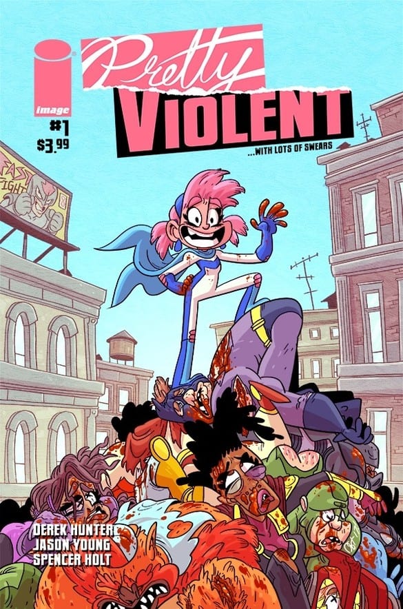
Gamma Rae goes through multiple setbacks throughout Pretty Violent #1, but is constantly covered in optimism (and gore) for her goals. At points she gets literally caked in gore, yet her costume stays clean. Either that’s a superpower in itself or she has a great tailor! She has a cape so we know it’s not Edna Mode.

With art that’s reminiscent of Adventure Time and other new age cartoons, it makes sense that Pretty Violent #1 is drawn by Derek Hunter, who was an animation designer on the show. Hunter draws a colorfully violent world where Gamma Rae’s adventure to becoming a hero leaves a wake of bodies. Brains splattered, guts ripped asunder, and many other acts of horrific violence are drawn in such a cartoon matter that they seem more fun than it should.

When having a character ripped in half, not many artists think to make it fun or have the guts spell out DEAD, but that isn’t the case with Hunter’s art in Pretty Violent #1. Bright colors by Spencer Holt mixed with flavorful uber violence help carry Gamma Rae story to becoming a hero. If Pretty Violent #1 was drawn in anything other than over the top cartoon antics it wouldn’t work as well as it did, or stand out as such.

Violence spills from the panels into the white space of the pages causing fights to seem bigger than keeping them confined in panel. Hunter does this playing with panels in a few different instances and ways to make Pretty Violent #1 be exactly what its title implies. This unique take on art doesn’t stop on just the art side, but Hunter plays with speech bubbles, dialogue and sound effects.

Onomatopoeia and sound effects are a highlight in comics, but aren’t used often in different or fun ways. Granted that could be because more and more comics feel the need to be “serious” to be the next classic, but Pretty Violent #1 has no care about any of that. Instead Pretty Violent #1 is more concerned with having fun and making the reader feel as if they’re watching an adult version of Saturday Morning Cartoons.

Gore and body parts aplenty, Hunter uses this to his advantage by turning blood or guts into sound effects. This method makes it so the violent hits in Pretty Violent #1 feel more dramatic and akin to a cartoon. Much like a cartoon, Hunter makes the emotions of characters feel overdone. This use of overdone or overly drawn emotion is seen in most cartoons and works perfectly in this universe.

Over the top violence in Pretty Violent #1 wouldn’t have worked to such a great effect if not for Holt’s vivid colors. Hearkening back to its cartoon nature Pretty Violent showcases majestic use of brighter and lighter coloring mixing in with the gore. With this colorful take on violence the images pop off the panels that much more.

Pretty Violent #1’s art carries this debut issue more so than its plot. The characters may be fun and over the top, but that’s all. The story doesn’t break boundaries for comics, but damn will you have a fun time reading it. Unlike other comics that are trying to be the next Watchmen or such, Pretty Violent doesn’t seem to be going for that, going instead for a story where you can pick it up to enjoy beautiful, gory, over the top violence that will stick in your head.

Pick up Images Pretty Violent #1 at your local comic store this Wednesday!

Monkeys Fighting Robots Youtube

Review: STRONGHOLD #5 – All Good Things..

Monkeys Fighting Robots

This week sees the final issue of Stronghold from AfterShock Comics hitting the shelves and when Gods are woken can anyone survive the unparalleled anger that has been brewing for centuries?

From the very first issue Stronghold has been ambitious and pushed the boat out when it comes to storytelling. The individual creators are all on top form but when they come together they produce something spectacular. Although it may not be selling numbers to equal Marvel or DC comics, Stronghold has the potential to be a significant title in comic book studies. At its heart is a meta-deconstruction of superhero tropes and science fiction clichés.

STRONGHOLD #5 All Good Things..
Stronghold #5 Cover Credit: AfterShock Comics

Gods Of Fiction

In this final issue Phil Hester questions the concept of Gods and aliens. He draws lines between the two and then raises concerns over the blind acceptance of both. Over the previous four issues Hester has built up Michael’s life just to tear it all down again in the finale.

The story moves at a break neck speed in the first half of this issue. Hester brings the major characters together in ‘The Temple’, which is the title for this chapter. Once everyone is in place everything is explained and it’s quite the mind blower: a conspiracy, centuries in the making.  In narrative terms it’s like Jonathan Hickman and Alan Moore got together to write a superhero story. Think Miracleman crossed with The Black Monday Murders.

The scale of the story has exploded over the course of the five issues but Hester manages to keep the entire narrative rooted in two characters, Michael and Claire. Their relationship has grown over time and the interaction between them allows the reader to accept the rest of the story. It is also a narrative crutch on which the plot leans. Without the believable characters the story would fall apart.

STRONGHOLD #5 All Good Things..
Stronghold #5 Credit: AfterShock Comics

Myth Building Art

Elements of the Superhero genre are replicated within the pages of Stronghold but they have been subverted to meet the needs of the narrative. Superman’s Fortress of Solitude has been turned into a tomb to bury the history of the Primacy, otherwise known as Michael. The concept of a safe haven for the superhero to escape to has been twisted by Hester and turned into a palace of false worship and disturbing imagery thanks to Ryan Kelly’s artwork.

The reader is introduced to the Temple slowly before a full page spread exposes the vast, empty horror of the Primacy’s past. Kelly keeps the backgrounds obscured in the early pages to make the full reveal more impactful. The sense of wonder and awe is mixed with revulsion and fear in the vast space of rock and petrified Titans. The scale of the Temple reflects the scale of the narrative as the history is unveiled.

The design of Michael’s real self is alien enough to standout against the humans surrounding him but still recognisably Michael. This is achieved through a mix of intricate inking and a contrasting coloring. Dee Cunniffe makes Michael’s form stand out in the panels by giving him an unnatural purple color, free from shades. His appearance represents the alien-ness of his heritage and creates a division between him and the humans, even the augmented humans like the Holdmother.

The division is important for the plot and the visual expression makes it much easier for the reader to accept. In a comic as complex as Stronghold has become it is important to make the storytelling as clear as possible and this is exactly what Kelly and Cunniffe have done.

The final piece to the puzzle is adding the drama. While the script and the art build a lot of the tension and establish character, it is arguably Simon Bowland’s lettering that gives the story it’s pace and, in turn, builds the drama. He splits the speech up and spreads it across multiple panels, like paragraph breaks, giving each idea or phrase its own space to breath. Sometimes he uses connectors to stretch the break and at other times his balloons butt up against each other.

By changing the types of links between balloons Bowland is able to draw out speeches or condense them depending on the narrative weight of the statements. He also keeps the majority of the balloons floating up against the top of the panel boarder. This makes it easier for him to emphasis a particular speech balloon simply by bringing it down, into the panel so that it doesn’t touch any of the boarders.

STRONGHOLD #5 All Good Things..
Stronghold #5 Credit: AfterShock Comics

The End

Stronghold has a complex, multi-layered story and technically wonderful art work. As this is the final issue the story of Michael and Claire inevitably has to come to an end. And it is in the closing pages of this comic where the only complaint can be levelled at it. The whole thing is over too quickly. Hester and Co wrap everything up in the last few pages and it feels too sudden. In some ways it is like an episode of Star Trek: The Next Generation where the plot is neatly wrapped up in the final five minutes.

After the roller-coaster ride of a series the ending comes too soon. It is lacking a final chapter, an aftermath to the story. This would allow the creators to examine other aspects of the Superhero genre while giving the characters and solid send off.

Despite the abrupt ending, everything about Stronghold is expertly produced to create an exciting, multifaceted comic. It can be read on a number of levels and will appeal to a wide range of readers. It is a self-referential science fiction story that takes comic book craft seriously. Anybody who reads comics should be reading this and anybody who studies comics should be studying this.

If you have not read the previous issues it may be too late for you to get into Stronghold but I would recommend, without doubt, to hunt down the trade collection as soon as it is released. You will not be disappointed.

Monkeys Fighting Robots Youtube

Review: BAD RECEPTION #1 And How To Ruin The Perfect Day

Monkeys Fighting Robots

Bad Reception from AfterShock Comics is a modern horror about a collection of friends who gather for a wedding and go off grid with no internet, no phones, and no contact with the outside world.  What could possibly go wrong?

Chapter one, Vows, sets the scene by making the reader follow a trail of blood through the darkness in one of the most ambitious opening gambits in any comic this year. Juan Doe, creator, writer and artist on the comic, engages a risky approach to bringing the reader into the story. The first third of the comic contains caption boxes of a radio interview overlaid onto a black background with an expanding red trail splitting the page in two.

The trail starts like a sound wave, representing the radio interview but grows as the interview becomes more intense until a double page reveal hammers home the true nature of the trail. Doe slowly builds up tension, making the reader question where this opening is going and the anticipation he creates pays off on that double page; it’s a jaw dropper of a moment.

BAD RECEPTION #1 And How To Ruin The Perfect Day
Bad Reception #1 Cover Credit: AfterShock Comics

Daring Openings 

The openings strength lies in introducing the two main elements of the story in a very simple, minimalistic way. The trail of blood leads ultimately to the murder aspect of the comic, something that will be picked up in later issues, while the radio conversation sets out the Technological element of the story. It introduces the reader to the concept of Nomophobia, the fear of no-mobile-phone, which in turn explains a large part of the character’s personalities and reactions further down the line.

The opening is bold and daring. The number of pages it takes up illustrates Doe’s commitment to the cause but could in fact put some people off. This is not how a mainstream comic would handle this type of story. Doe takes his time, making sure that he makes his point without rushing it. He teases the reader for several pages, making them wait for the payoff.

If this comic is going to lose any readers, it will be in those first few pages. If you make it to the end of the opening still engrossed, the shock factor alone will see you through the rest of the comic. If you skip a head you will not be invested enough to continue with the comic.

BAD RECEPTION #1 And How To Ruin The Perfect Day
Bad Reception #1 Credit: AfterShock Comics

Characters Good And Bad

Doe’s lettering and coloring in the opening of Bad Reception is very straightforward but is an approach that works particularly well for this type of story. The Radio conversation has formulated caption boxes with two colors, one for each speaker. It makes it very clear on each page who is talking.

As the story progresses Doe uses contrasting colors on the page to highlight different aspects of the plot. The top two thirds of each page are given over to introducing the characters. Doe has his two central characters compile a wedding guest list and then shows each guest being invited to the wedding. This is a beautiful way of introducing the characters and each of their relationships with the happy couple.

Doe changes the panel coloring for each guest to distinguish between them on a page and give some instinctive indication of their personality.  Doe’s protagonists have a warm, emotional red tinge that also foreshadows future events, as indicated by the opening.

To contrast all of the guests introductions, there is another character being introduced in the bottom third of each page. There is no text, no speech to give the reader any clues as to who it is but there is a lot to indicate what kind of person it is. The colouring is a mix of blood red and deep, cold blues. The actions portrayed are violent and merciless. Doe juxtaposes the introductions on each page comparing the technological needy, carefree friends and family of the couple with the wild, off the grid character in the bottom third of the comic.

This approach to storytelling constantly underlines the threat to the characters. With the bottom third being used in this way Doe is able to keep that element of violence in the reader’s mind on every turn of the page; you simply cannot escape from it. This creates additional tension and builds suspense perfectly. Doe is able to introduce a large number of characters while maintaining a disturbing, lingering atmosphere.

BAD RECEPTION #1 And How To Ruin The Perfect Day
Bad Reception #1 Alternative Cover Credit: AfterShock Comics

Conclusion

This is a difficult first issue. Doe has a lot to introduce in the way of characters and concepts but he manages to do it with an element of flair and panache. There are a number of complex characters that Doe introduces and each is an individual from the moment they appear on the page. The framing of the story allows a naturalistic introduction and the layout of the pages allows Doe to create an unsafe environment for the reader. He does not let you forget the violence at the heart of the story as introduced in that opening gambit.

The bold opening and the approach that Doe has chosen, may put some people off. This is a challenging comic with some moments more challenging than others. However, if you commit to it, allow yourself to get lost in this world Doe has created, the payoff from each section is wonderfully handled and will make you want the next chapter straight away.

Although Bad Reception is set up like a slasher movie, with the psychopath preparing to kill the misbehaving teenagers, anyone who has read a murder mystery story will know that it’s not going to be that simple. Juan Doe has created an unnerving and engaging opening issue with clever, atmospheric panels that draw the reader relentlessly across the page. Find a safe place to read this comic because there is no safety contained within.

Monkeys Fighting Robots Youtube

ORPHAN BLACK: THE NEXT CHAPTER – How The Writers Handled Change Of Medium

Monkeys Fighting Robots

Becoming a professional writer in comics is tough. Most writers work in other mediums to perfect his or her storytelling craft. That is why it was important to chat with Lindsay Smith and Heli Kennedy. They are a great example of expanding into new mediums for writers.

Orphan Black is a science fiction series that lasted five seasons, ending back 2017. Created by Graeme Manson and John Fawcett, the show starred Tatiana Maslany as several identical people who are clones.

What made Orphan Black resonate with fans is how well it portrayed the moral and ethical implications of human cloning, and its effect on issues of personal identity.

Now, two years later, Orphan Black has been resurrected by Serial Box, a platform that has merged ebooks and podcasts. Orphan Black: The Next Chapter is set 8 years after the season 5 finale, featuring all the same characters and narrated by the lead actor Maslany, with the ten-episode season starting on September 12.

Monkeys Fighting Robots had a chance to talk with Lindsay Smith and Heli Kennedy of the Serial Box Orphan Black Writers Room about the new season and change of the medium.

What're You Reading This Weekend?

MFR – What is the biggest difference between writing a television script and a serialized audio play?

SMITH – Since Serial Box is both text and audio, it’s easiest for me to treat it like writing prose, same as I do for novels. But unlike my own novels, Serial Box is a hugely collaborative, constructive process. There’s always magic that happens at every writers’ summit when we all get together to brainstorm a coming season, everyone bringing their own particular strengths and creative twists to the process that I don’t think any of us could have come up with on our own. I love it.

KENNEDY – Since this series is both audio and text, I’d say the biggest difference for me is the ability to express the internal, emotional lives of characters. Delving into characters’ thoughts, memories and feelings allows us to share details about them which would be difficult to put on screen. The characters in the Orphan Black universe are unique, fleshed-out individuals, so being able to do this is fun. If something goes down between Cosima and Delphine, we can really get into the internal nitty gritty of it—from both sides.

What're You Reading This Weekend?

MFR – Since you have an unlimited special effects budget with the audio series do push the story in new ways that you couldn’t with the TV show?

SMITH – Well, this season is going to be pretty explosive… sometimes literally! But I think another big advantage of the prose text/audio format is how deep inside characters’ heads we’re able to get. It was so much fun to look at how Tatiana Maslany portrays each of the different clones and extrapolate that into their thought process.

KENNEDY – Well, I’d say we aren’t as concerned about budget or the number of clones we put in a scene. We don’t have a technodolly to contend with (the programmable camera crane that made it possible to shoot Tatiana as several characters in the same shot). So that’s awesome. We can use any and as many clones as we want! And since the characters are so dynamic, it’s amazing to have this freedom. I had some of this freedom in the comic series I wrote for the show, but with prose I’d say the sky’s the limit.

MFR – Tatiana Maslany carries a heavy load when it comes to building up tension, how do you set her up for success?

SMITH – We’ve tried our hardest to do right by her and these phenomenal characters. And while a lot of them have moved forward in their character arcs since the TV show’s end, this serial’s still going to feel like signature Orphan Black–conspiracies, crazy science, drama, and a core group of badass women being awesome.

KENNEDY – Tat’s a wiz when it comes to making characters pop using her voice and accents—it’s one of Orphan Black’s hallmarks. So, we worked hard to give her individuals she could bite into. I think these strong characters will pull you into this new Orphan Black rabbit hole—some crazy stuff is gonna go down. I can’t wait to hear everyone come to life. And we may have thrown a couple new accents at Tatiana…just for fun…hee, hee.

MFR – ORPHAN BLACK has a passionate fanbase, did this provide more pressure to hook the listener with the first episode or are you going for a slow burn?

SMITH – It is a lot of pressure! We’re starting with the somewhat risky move of introducing a new clone on page one–one who doesn’t know who and what she is. But I think fans are going to love her, and especially love seeing how her connection to the sestras we already know and love will unfold in some very surprising ways.

KENNEDY – The fan base is extremely passionate and intelligent, so it’s always a lot of pressure. But we worked to keep the pace and vibe of the book series consistent with the show: we’re introducing new clones that we really love and new, cool science in a classic OB mystery propelled by thriller-like action. Damn, we hope clone club likes it!

ORPHAN BLACK: THE NEXT CHAPTER - How The Writers Handled Change Of Medium

MFR – What has been the best part of working on ORPHAN BLACK: THE NEXT CHAPTER, and why?

SMITH – Seeing the passionate response from fans who are so excited to see this amazing story continue. Their enthusiasm for the project makes all the hard work completely worth it, and we’re so honored to have their support with the next chapter.

KENNEDY – For me, working with a brilliant team of Sci-Fi/Fantasy novelists and dedicated editors has been amazing. We have a team of people with diverse, interesting backgrounds in hacking, ethics—one of our writers is a futurist! Like, how cool is that?! Brainstorming and just chatting with them has been exciting, educational and totally fulfilling. It’s been a pleasure to collaborate with everyone—you all rock!

MFR – Have there been talks about what to do with the material after release? (Novelization or graphic novel)

SMITH – Season 1 of my previous serial with Serial Box, The Witch Who Came In From the Cold, was republished as an omnibus by Saga Press. I wouldn’t be surprised if we see something similar for this!

KENNEDY – Personally, I’d LOVE to adapt this series into a graphic novel, if anyone’s thinking about it… I really like working in that medium, and would love to see our characters after having read and heard them.


Are you going to check out the new season of Orphan Black? Comment below with your thoughts.

Monkeys Fighting Robots Youtube

Review: DETECTIVE COMICS #1009…Not the Book to Read Before Catching a Flight

Monkeys Fighting Robots

Bruce Wayne exists in two separate realities: that of a billionaire playboy, and another as the Caped Crusader. But, what’s Bruce to do when one of the world’s deadliest assassins seems to be gunning for the former persona and several of his powerful and wealthy associates? That seems to be the question in Detective Comics #1009, out this week from DC Comics.

Bruce is off to a business conference in Singapore, and he insists of sharing a jet with several fellow CEOs. Of course, this makes for trouble when Deadshot is on your trail.

The Writing

With Detective Comics #1009, writer Peter J. Tomasi delivers a solid story that builds to a strong, cliffhanger ending.

Despite the dark tone of the first page, the book has equal doses of action and comedy. Bruce playfully trades barbs with both Alfred and Lucius, interspaced by Deadshot’s introduction, where he also exchanges some slightly more tense dialogue. He manages to transition smoothly into a serious tone in the book’s second half without giving the reader tonal whiplash.

The action stretches plausibility; I mean, how much bad luck—and bad timing—could one planeload of people have? Still, the ending promises a great premise for our next issue. Bruce is ready to go Batmode once Deadshot shows up, but he can’t under the circumstances. It presents an interesting quandary for him, and it’ll be interesting to see how he pulls it off.

That said, Detective Comics #1009 isn’t terribly compelling on its own. Instead, it feels a bit like we’re setting up a more interesting story to come. Contrast this with our last issue, which was a self-contained, one-and-done story. This isn’t really a fault on the book, as you sometimes need chapters like this in episodic storytelling. In general, Detective Comics #1009 places all the pieces on the board, setting the stage for the action to come.

In all, it’s a fun entry in the series. From a narrative standpoint, though, it mainly serves to get all the characters in place to tell a larger story. Aside from the jokes, there’s not as much to sink one’s teeth into.

The Artwork

Christian Duce provides artwork in Detective Comics #1009. His style is well-suited for the job; detailed and expressive, but not overly-heavy, with just a hint of cartoonish flair. He manages to convey the grim tone of the first few pages, then transition seamlessly as Batman’s façade peels back to reveal the Bruce Wayne persona underneath.

One of the strengths on display here is the ability to convey action effectively. The artwork balances dynamism and cohesion, delivering a final product that’s visually engaging, but still flows nicely from panel to panel. There’s so much going on in the last third of Detective Comics #1009 that it can be a little visually overwhelming, but the reader never feels lost or unsure of what should be the focus of attention.

The color by Luis Guerrero is very vibrant. He employs a brighter palette than we’re accustomed to seeing in a Batman book. It meshes well with Duce’s illustration style, though, giving the book a complete and cohesive look.

Final Thoughts

Detective Comics #1009 is an interesting read, and it sets us up for an even more interesting story to come. In that light, I’d recommend it. Pick up a copy for yourself at your local comic book shop.

Monkeys Fighting Robots Youtube

AfterShock Comics Exclusive Preview: DARK RED #6 – New Story Arc

Monkeys Fighting Robots

Dark Red #6 hits your local comic book store on September 4, but thanks to AfterShock Comics, Monkeys Fighting Robots has an exclusive four-page preview to share with you.

The series is by Tim Seeley and Corin Howell, with colors by Mark Englert, letters by Marshall Dillon, and a cover by Meghan Hetrick. The incentive cover is by Howell.

About Dark Red #4:
NEW ARC STARTS HERE

In the aftermath of war, Fall’s End is littered with the dead. Chip has his territory back…until something else walks into his town.

Something not human. Not vampire.

Something hungry.

Tim Seeley (BRLLIANT TRASH, Hack/Slash, Grayson) and Corin Howell (Ghostbusters, Bat-Mite) bring you a contemporary and horrifying tale of vampirism in the heart of America—one that’ll make you jump right out of your boots.

The series uses vampires as a way to talk about the isolation of Middle America and the political divide our nation is facing. You can read Monkeys Fighting Robots’ review of the first issue by clicking here.

Take your first look at Dark Red #6:


Are you reading Dark Red? Sound off in the comments with your thoughts on the series!

Monkeys Fighting Robots Youtube

Preview: DEADPOOL ANNUAL #1 – Acts Of Evil With A Twist

Monkeys Fighting Robots

DEADPOOL ANNUAL #1 hits your local comic book store on August 21, but thanks to Marvel Comics, Monkeys Fighting Robots has an exclusive four-page preview.

DEADPOOL ANNUAL #1 is written by Dana Schwartz, with art by Reilly Brown, Aaron Kuder is the cover artist, Nelson DeCastro & Craig Yeung inked the book, Matt Herms with Guru-eFX are the color artists, and Joe Sabino lettered the pages.

About the issue:
ACTS OF EVIL! Eight-year-old Peter Quincy is willing to pay seven dollars to the person who can kill his bad dreams, and the Merc with a Mouth is on the case! But if Deadpool wants to earn that sweet, sweet paper, he’s going to have to throw down with Nightmare himself!

If you are a podcast nerd you know Schwartz as the host and creator of the podcast Noble Blood.

Schwartz is a fresh voice for Marvel as she’s written for Entertainment Weekly The New Yorker, The Guardian, The New York Observer, Marie Claire, Glamour, Mic, GQ, VICE, and others according to her website.

Schwartz could be a perfect fit for Deadpool as she’s created a parody Twitter account called @GuyInYourMFA based on the people she’s encountered in fiction workshops, and another one called @DystopianYA about the tropes in all of the young adult fiction books she’s read.

With Schwartz as the writer, are you more excited for the DEADPOOL ANNUAL? Comment below with your thoughts.

CHECK OUT THE DEADPOOL ANNUAL PREVIEW BELOW


Deadpool (Wade Winston Wilson) was created by writer Fabian Nicieza and artist/writer Rob Liefeld, the character first appeared in The New Mutants #98 (cover-dated February 1991).

Monkeys Fighting Robots Youtube

Review: Rich Artwork & Storytelling in SONATA #3

Monkeys Fighting Robots

With Sonata #3, in stores this week from Image Comics, creators David Hine, Brian Haberlin, and Geirrod Van Dyke recover much of the magic they kindled on the first issue.

Sonata, Pau, and Treen are thousands of kubits from home, in the planet’s southern hemisphere. At the same time, the Ran and Tayan put aside their differences momentarily, deciding to brave the Valley of the Sleepers to try and rescue the kids. However, the situation may not be as it appears, with one side planning an unexpected double-cross.

The Writing

Sonata #3 follows two concurrent plot threads: that of Sonata, Pau, and Treen, and that of their people back at the Lumani village. The book opens to the trio being observed by a lone figure in the desert. We presume this figure to be a survivor from one of the Ran’s expeditions, which is later affirmed. Meanwhile, the village falls under attack from a giant, which displays some unusual abilities we’ve not yet seen them exhibit.

The narrative in Sonata #3 is driven primarily by human drama. There’s plenty of interpersonal squabbling, but it manages to avoid becoming irritating or frustrating. The conflict between these groups is believably written and compelling overall.

We’re also treated to a broader look at the world itself. For instance, we get contrasting creation myths from Sonata and Pau, each ascribing a different significance to the Sleeping Giants. They suitably reflect the diverging worldviews and attitudes of their respective cultures. Then there’s the Lumani, who seem to know more about the planet’s history than they let on to the offworlders.

One sticking point, however, is the lack of urgency in Sonata and Pau’s story. They resolve that it would be wise to head back through the portal. However, they seem content to spend all of Sonata #3 putzing around in the Southlands regardless. Much of the action is focused on the other narrative thread here.

The storytelling is engaging and evocative overall. It’s less reliant on genre tropes than our previous issue, and provides a few genuine surprises along the way.

Sonata #3

Sonata #3

Sonata #3

The Artwork

Brian Haberlin’s dreamy, cloudy artwork is a treat in Sonata #3. While not quite as striking as in our first issue, it retains the rich detail and ethereal mood that really sell the illustrations. The mood makes the work feel like a cohesive whole, contrasting closely-cropped panels and wide, open images in regular intervals.

While the environments are more barren, the artist beings some inventive creature designs to the table in this issue. We see more of the Sleeping Giants, plus some bizarre, wendigo-by-way-of-hyena creatures, reinforcing the danger as well as the beauty of the planet our characters inhabit.

Van Dyke’s coloring completes the illustrations, bringing the pages of Sonata #3 to vivid life. Though muted, the color palette of earth tones interspersed with quick flashes of bright reds and gold give the images a lot of gravity. It’s hard to separate the illustration from the colors; the two form a perfectly-cohesive, singular presentation.

Final Thoughts

Sonata #3 is another winner. It’s a strong chapter in an increasingly-complex work of science-fantasy. Highly recommended. Check it out this week at your local comic book shop.

Monkeys Fighting Robots Youtube

Morrison’s ‘The Green Lantern’ Ending, ‘Blackstars’ Beginning

Monkeys Fighting Robots

If you’ve been enjoying The Green Lantern by Grant Morrison and Liam Sharp, your reading list will be soon be undergoing a big change.

DC Comics has announced that October’s issue #12 will be the end of the series (for now). This isn’t a huge surprise, as Morrison confirmed before the book even launched that issues #1-12 would be the “first season” of his storyline.

morrison green lantern

But with an ending comes a new beginning. DC also announced a November debut for Green Lantern: Blackstars, written by Morrison and illustrated by Xermanico, spinning out of plot thread from the current series.

Morrison Green Lantern blackstar

DC’s official description reads as follows:

Following the catastrophic events of The Green Lantern #12 by Grant Morrison and Liam Sharp, scheduled to hit shelves October 2nd, 2019, no Green Lanterns can be found patrolling their space sectors…not a single power ring lights the darkness! What happens in the finale of Morrison and Sharp’s incredible year-long run is shrouded in mystery, but the Green Lantern Corps is no more! Scratch that—they never existed in the first place. What has Hal Jordan done?

According to the writer,

“Oa is the skeleton-paved haunt of vengeful demons. And the Blackstars—a sinister cult of universal peace and harmony, involving surrender to the will of the insidious and/or possibly illuminated Controller Mu—are in the process of subjugating the universe to their creed.”

Here’s the solicitation for October’s last TGL issue:

THE GREEN LANTERN #12
written by GRANT MORRISON
art and cover by LIAM SHARP
variant cover by RILEY ROSSMO
The Green Lanterns will fall! Insidious plans meticulously set in motion since
issue #1 have reached their boiling point. As defeat looms for the Corps, Hal
Jordan’s showdown with his monstrous antimatter counterpart sets the stage for the final pages of this issue—and the moment that will echo throughout the entire DC Universe! How bad is it for Hal and the Corps? There’s no GREEN LANTERN #13 next month…but writer Grant Morrison is crafting the next chapter of this story, and it’s coming soon! Only there’s no “Green Lantern” in the title. After the events of this issue, how could there be?
ON SALE 10.02.19
$4.99 US | 40 PAGES
FC | RATED T+

Have you been keeping up with The Green Lantern? Will you follow Morrison over to Blackstars? Leave us a comment!

Monkeys Fighting Robots Youtube

Review: ORPHAN AGE #5 Piles On The Tension

Monkeys Fighting Robots

Fear grips the city of Albany as members of The Church bring violence to their community in the latest issue of Orphan Age from AfterShock Comics. The terror of living in a post apocalypse world is hammered home by the creators as the plot takes a disturbing turn.

Chapter 5 of Orphan Age is entitled Exodus and deals with themes familiar to anyone who has every read a post-apocalypse style story. Whether it is the fear of starvation or a hoard of brain eating zombies, the decision to stay or flee a settlement faces anyone who has survived for any length of time. In Ted Anderson’s vision the threat comes from a violent, misguided religious sect who set siege to the free state of Albany. Much of this issue is taken up with the reaction of the towns folk, focused of course on the central cast.

ORPHAN AGE #5 Piles On The Tension
ORPHAN AGE #5 Credit: AfterShock Comics

A Shrinking Landscape

Anderson uses the situation to explore the relationships of his cast and to allow new facets of their personalities to shine through. Jeopardy creates drama and drama produces the chance to really get into a character’s psyche. The beauty of this chapter is that Anderson introduces the threat and then increases the tension via the reactions of the people. The Church and their followers are barely seen, their actual actions a side note to the narrative. This chapter, like each previous one, is about the characters, about Princess, Willa and Daniel especially.

The plot revolves around a siege and all that it entails. The strain it puts on the inhabitants of the city and the divisions that can form. Nuno Plati’s art work captures this aspect of the story stunningly. He uses the panels to board the characters in, reinforcing the imprisonment with crisscross wire fences, walls of small windows and gutters running through images. For many of the panels, he places single characters in the scene with virtually no background. This highlights the separation between the characters and is heightened even further when Plati stretches the same close up over two panels.

The effect this has on the comic is that it creates an uncomfortable atmosphere. The fear and desperation of the town is evident without having to show a city in turmoil. This also permits Plati the opportunity to focus on specific relationships, drawing attention to them.

This is most notable with Daniel and Lindy who are growing closer and closer. Plati allows them to share panels with tentative transitions from one moment to the next illustrating the nervousness surrounding them. Plati then draws back to extreme close ups with room for only one character when their discussion turns to the problems they face.

ORPHAN AGE #5 Piles On The Tension
ORPHAN AGE #5 Credit: AfterShock Comics

Orphaned Characters

The coloring helps to set the atmosphere of the piece. Nuno Plati and Joao Lemos flood the town of Albany with dark, shadowy hues. Blocks of color mark out backgrounds but the foregrounds are not much different in tone. The isolation of the people and foreboding they feel about the situation is made clear via the oppressiveness of the color.

The speech balloons are like white holes piercing this gloom. It draws the reader to the speech allowing the character interactions prominence on the page. The emphasis in the text by Marshall Dillon is juxtaposed against the facial images drawn by Plati giving each moment a fuller reading.

The contrast of the speech and art on a page is used to not only focus the reader’s attention on character but also to highlight moments where there is no speech. Some establishing panels lack sound helping to fix location and others act more like inserts with an abstract moment breaking up the scene. This is most often used to create character isolation or a strong emotional reaction.

ORPHAN AGE #5 Piles On The Tension
ORPHAN AGE #5 Credit: AfterShock Comics

Conclusion

This issue is very conversation heavy but there does come a moment of action at the end which is a release for the reader as much as for some of the characters. The moment is like a cork popping from a bottle with all the tension building behind it. It is a much needed scene and finishes the chapter off in style. The consequences of this issue will follow the characters through the next stages of their story and there are a number of haunting images that will take a long time to shake off.

This embracing style of storytelling is perfect for comic books. The pacing can be difficult but when it has this calibre of artist working on it the story flows, beat for beat. The strong layouts and attention to character makes this issue of Orphan Age work in spectacular fashion. This series is heading in the right direction and slowly marking itself as a worthy successor to The Walking Dead.


Monkeys Fighting Robots Youtube