STEEPLE #1 is the start of an all-new series from Dark Horse, out this Wednesday. Get ready for a world of ghost and ghoulies, with only an understaffed church standing as protection against the dark.
A dramatic cover for a first issue; gets your attention, doesn’t it?
***SPOILER WARNING***
Steeple #1 is the start of a new series, and the cover art alone is likely enough to draw in a few new readers right away. They say that Tredregyn is a land that the sea (or the devils) want back. And they would be right. Here only one lonely priest stands between the land and the beasts that wish to take it back.
That is until Billie Baker came to town. She’s an over-enthusiastic priest in training. And while she asked for a difficult assignment – she probably didn’t have this in mind. But already we can tell that she’s not the type to give up or run away.
An iconic cover, full of lots of promises.
John Allison is the writer and lead artist behind this project; which explains why the whole issue felt so cohesive. The first issue didn’t waste any time in introducing the plot, main characters, or the setting (which in this case is actually fairly important). Yet, despite all of that being established, this issue didn’t feel dry in the least.
Steeple #1 found plenty of time to let our characters shine, and to sneak in some witty or comedic moments as well. And then, of course, there’s the intensity of the fighting and implied threat. It all balances out very well.
A car bursting into flames as you head to a new job…no that’s not ominous at all.
Also involved in the artwork was Sarah Stern, who provided the colors for this issue. Together, Allison and Stern bring this world full of demons and ghouls to life. And the end result is something shockingly charming.
The characters portrayed are all unusual but in subtle ways. And then there are the monsters themselves, which are worth taking a look at. So far they’re leaning more towards classic b list horror than truly haunting, but that fits the tone of this series perfectly.
Lastly, Jim Campbell provided the lettering for this issue. His final touches allowed the story to flow in an organic way. The thought boxes weren’t in the least bit intrusive, which is always fantastic to see.
Hesitation turns into a rescue.
Steeple looks like it’ll be perfect for any readers looking for a fun and quirky escape. The series is full of energy and life, yet has plenty of twists and turns in store for readers. That promises for an entertaining read, while still being relaxing in its own way.
Silver Surfer: Black #4, out this week from Marvel comics, dives deeper into the origin of Galactus.
This issue is an absolutely gorgeous cosmic adventure from Donny Cates and Tradd Moore. Dave Stewart adds vibrant colors to the beautiful panels while Clayton Cowles has the subtle lettering down pat.
WARNING: SPOILERS FOLLOW
Moore’s graffiti/street art style shines in this space crusade. Vivid colors and unimaginable horrors paint a fierce battle between the infant Galactus and the Silver Surfer. Beasts of red and silver sprawl across the pages as they attempt to intimidate each other.
Moore uses stunning two page spreads to show the sheer magnitude and spectacle of this encounter. He draws like someone told him never to use straight lines, and it keeps my eyes immersed in the details. Oceans of blood and obliteration of worlds have never looked so divine.
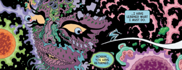
Silver Surfer: Black #4 takes the surfer back before his maker was born for a story the Marvel historians will love. In the last issue, as the surfer is trying to help ease intolerable pain for Ego, Norrin discovered the cause was the incubator of Galactus. Norrin believes this is his opportunity to end it all and save billions of lives by killing Galactus before he becomes the Devourer of Worlds.
One part of the story that doesn’t make much sense to me involves Uatu, the Watcher. Uatu interferes and stops Norrin from hurling the Galactus incubator into a white dwarf star, ultimately ending his cataclysmic future before it even begins. The Watcher tells Norrin they have declared there must be a balance of light and dark, except later he says a growing darkness will be the end of everything they know, yet he will not interfere.
If this is on purpose, it would appear that Uatu prefers chaos, protecting the calamitous future of Galactus while allowing Knull to end everything. Perhaps Uatu is not so much a watcher as he is an ally for the darkness. Cates has been leaving his mark on the Marvel universe, and a manipulative watcher would be an excellent catalyst for future stories and timelines.
While unveiling an origin for Galactus, Cates leaves the details open for either himself or someone else to elaborate on that tale. Norrin is telling us about Galactus’s universe but says “when his universe died or perhaps was killed”, so Cates is not handcuffing anyone’s creativity when Marvel chooses to tell that story.
Continuity in comic books is always changing, and being vague about the past of the characters is the easiest way to avoid having to retcon something later on. This is a masterful storytelling ploy and almost assures that we will get a mini-series to explain Galactus’s life further before the hunger consumes him.
Silver Surfer: Black #4 also reveals that the “Thanos Wins” story, where the surfer appears as the Fallen One while wielding mjolnir, is an alternate timeline, his decisions create branches of new realities and the current proposition is one of those branches as well. Norrin has tremendous guilt for what he watched Galactus do as his herald, but still can’t bring himself to kill him, because Uatu reminds him that nothing will change except he has to live with the guilt of what he does this day.
Silver Surfer: Black #4 is another gorgeous issue packed with cosmic battles, hard decisions, revelations, and sets up an intriguing finale that I cannot wait to read.
What did you think of the latest Silver Surfer: Black? What do you think about the new reveal of Galactus’s past? Let us know in the comments below.
Year of the Villain is in full swing, and DC’s been dissecting, examining, and challenging its best baddies all the way to the top of the sales charts. It only makes sense that one of the fiends to get the YOTV treatment would be Batman nemesis The Riddler, and this week, his time in the spotlight starts from writer Mark Russell, artist Scott Godlewski, and colorist Marissa Louise. But how does The Riddler: Year of the Villain handle a Silver-Age, potentially whiffable character like Edward Nygma? Read on to find out.
The Riddler: Year of the Villain Cover – DC Comics
The Bad, The Bad, and The Ugly Truth
This comic asks one central question throughout, namely; why does the Riddler keep doing his thing? It takes a LOT of effort to stick to his shtick, and so far, Edward has very little to show for it. Opposite Eddie throughout this issue is King Tut, a D-list Batman villain probably most famous for his appearances in the 1966 Adam West Batman. The two characters commiserate about Batman, and the effort it takes to be “themed” supervillains. Most relevantly, how Apex Lex Luthor isn’t offering them the help to him the other baddies. Their conversations lead Eddie to a somewhat despairing conclusion: maybe being the Riddler has been a waste of his life.
In a desperate attempt to catch Batman once and for all, Riddler and King Tut join forces and set a trap, though Riddler is admittedly half-assing it. But what Eddie doesn’t know is that Apex Lex does have something for him, it just doesn’t look like his other villainous handouts. Their encounter will force Eddie to relive his past, soul search his present, and, if this storyline sticks, change his future forever.
The Riddler: Year of the Villain Page 3 – DC Comics
A Man Without a Plan Makes for a Great Plot
Writer Mark Russell casts The Riddler neatly in a story about an existential crisis. Pairing him with an even more ridiculous character in King Tut was a great touch to bring out the struggles Eddie is going through. In one memorable scene, Riddler asks himself if he’s just as ridiculous as the Egyptian-themed baddie. “Am I like that?” he ponders, “Are we all? Just going through life, Never suspecting how pathetic we are until we see ourselves in the reflection of those we pity?”
Despite that previous line, this comic makes excellent use of humor. Fans of silver-age spoofing comic comedies like Superior Foes of Spider-Man will surely get a kick out of the way this comic is written. However, if you like the more serious, egomaniacal confidence of the Riddler in Tom King or Scott Snyder’s run of Batman, you might be wary of this interpretation of Eddie. It’s not that this comic doesn’t take itself seriously, just that Eddie is starting not to. Honestly, though, that’s where this comic finds its strength. We’ve seen Riddler be goofy, psychotic, vile, and funny before. But in this self-evaluation of his life, he’s just plain relatable.
The Riddler: Year of the Villain Page 4 – DC Comics
Quizzical Looks
The Riddler: Year of the Villain is an emotional, character-driven story just as much as it is a trip to Gotham City, and that doesn’t work without Scott Godlewski’s exceptional art. Long stretches of this comic are just conversations Riddler has, but the Godlewski’s mastery of small, important pieces of body language bring dimension to the people in the book. A lesser artist would have relied on the dialogue to do the character work, but Godlewski makes these people his own by how he directs them.
Don’t expect anything revolutionary with the looks of these characters (we’re pretty much working with the Riddler from War of Jokes and Riddles), but this story doesn’t call for reinvention. In fact, it doesn’t work if there is any. Still, we get some fun flashbacks to the evolution of the Riddler’s persona, so anyone who likes “homemade” comic book outfits will enjoy what Godlewski does with that.
Speaking of flashbacks, this story does a great job flipping back and forth between present, past, and hypothetical future, none of which would be possible without colorist Marissa Louise. Her distinct clarifications between time period helps the reader jump around through time while keeping the narrative flow going. Without her vision for different eras of Gotham, the comic’s non-linear plot could have been muddled.
The Riddler: Year of the Villain Page 5 – DC Comics
But Will It Last?
If there’s any problem reader could have with this solid, introspective look into a fan-favorite villain, it’s the same problem they’d have with any major comic book event. That is; will these actions last? The Riddler: YOTV seems to think the answer to that is “no.” Some of the bigger choices in the book are made without a ton of premeditation, lacking the buildup that it would take to truly change Eddie into the character he is by the end of this book.
Then again, we’ve been surprised before. If DC does stick with the story in this book, if they let its consequences build and explore The Riddler’s reasoning for doing what he does, then this book is the start of a new era for Edward Nygma. You’ll have to read it to find out exactly how, but don’t miss it if you care about the character. This could be the beginning of a new chapter in the story of The Riddler.
Even if you don’t care for Year of the Villain, or if this book is the beginning of a new Riddler, or anything that’s going on in DC at the moment, you should still pick up this book. It’s a quiet, honest examination of how even a dream job can become a tedious nightmare, and that’s a fear that too many of us can relate to. The Riddler: Year of the Villain is out today, September 11th, at your local comic book store, so don’t miss it when you come across a copy.
Let us know what you think o The Riddler: YOTV over on our Twitter, then give us a follow while you’re there. For more comic reviews like this one, and all the best discussion on comic books out today, stay tuned to Monkeys Fighting Robots.
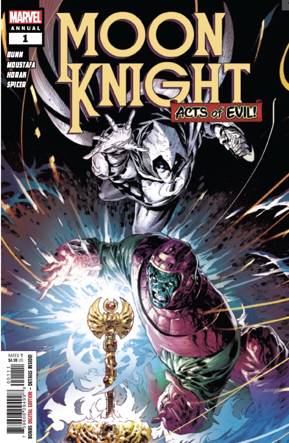
This week Marvel releases another issue in their “Acts Of Evil” campaign, pitting heroes against enemies they aren’t used to facing. MOON KNIGHT ANNUAL #1 sees Marc Spector on a chase through time against the mighty Kang The Conqueror.
RACE FOR THE TIME STICK!
***SPOILERS LIE AHEAD***
Writer Cullen Bunn throws our favorite Marvel headcase on a mission through time. Kang tries to erase the existence of Khonshu and his loyal followers from time, but not without Khonshu’s lunar warriors putting up a fight.
Kang is an all-time great Marvel villain that spends more time on the shelf than others. This makes his appearance something special to pay attention to. Moon Knight is an underrated hero of the 616 universe that currently has no ongoing series. Together they undoubtedly warrant investigation.
Marc Spector’s adventure through all of time and space is a fast-paced blast with old school appeal. This is a self-contained one-shot story that requires no previous reading and features no follow-up conclusion.
THE KANG CASINO LOOKS PROMISING
Cullen Bunn scripts a fun adventure that’s easy to digest. His voice for Marc Spector is rather dull but the story doesn’t call for much personality (or personalities). The main conflict is between Kang and Khonshu, with the many Moon Knights being merely tools.
Marvel’s “Acts Of Evil” is perfectly represented here, these two characters were not likely to clash otherwise and it’s a joy to see them on the page together. There’s no real compelling motivation for Kang to wipe out Khonshu and the moon worshipers–other than denying the idea of godhood itself. That doesn’t matter in a one-shot with a focus on quick fun though.
Moon Knight Annual #1’s biggest highlight comes from the efforts of artists Ibrahim Moustafa & Matt Horak with colors by Mike Spicer. Throughout this time adventure we’re treated to a number of interesting Moon Knights throughout history. Each and every one is distinct and pleasing to the eye.
NOTHIN’ LIKE A NICE MOON-BOOT TO THE FACE
The “on your left” moment at the end with all of the various Knights showing up to help Marc defeat Kang together is a predictable but satisfying conclusion. The different Moon Knights themselves are distinct in their respective eras but the environments we encounter them in have very little in both design and color to set them apart from one another.
Moon Knight’s installment in the “Acts Of Evil” campaign is a fun read. It’s not the most memorable tale but it definitely gets the job done in the over-sized annual format. If you’re a Moon Knight fan pining for a new series, this should help hold you over for now (also Kang rules!).
Riri’s hunt continues in IRONHEART #10, out from Marvel Comics this Wednesday. This issue is full of twists and surprises, as well as an unexpected new team for our leading lady.
A foreboding title for this issue.
***SPOILER WARNING***
Riri Williams has always considered herself the solitary sort. Yet she seems to constantly attract people to her. And Ironheart #10 proves that this truly is a pattern, no matter where she may find herself.
Riri’s quest has brought her to the heart of Wakanda, where she met up with the one and only Shuri (check out the last issue for their dramatic introduction). This issue brings in a third member to the team, more if you count their backup. So if you’re looking for some fun team-ups, this issue is a good one to check out.
This page perfectly showcases Ironheart’s color palette.
Eve L. Ewing wrote the script for this issue, and fans are going to be captivated by what she did here. Ewing wove together an issue full of laughter, teamwork, and some surprising drama. It makes for a fun and quick read. And naturally leaves fans anxious to get their hands on the next issue.
The twist/cliffhanger at the end of this issue is one of the main reasons readers will be looking forward to the next issue. But that’s probably no surprise there – the series has been building up towards a bigger plot for a while now.
The humor in this issue was spot on. And can easily be summed up in one word: Shuriri. Take a moment and digest that one. It’s okay, we’ll wait. Yep. You did read that one correctly. Ironheart #10 is full of quips and humor along those lines.
Time for a screen chat.
Also working on Ironheart #10 we have Luciano Vecchio and Matt Milla. Vecchio provided the lines, while Milla did the color. And together they created something outstanding. Their way of portraying Riri’s tech and the magic within these pages is truly stellar. The projections from Riri have never looked so good. It’s safe to say that a new standard has been set here.
Also on the project is VC’s Clayton Cowles, who provided the lettering for the issue. There was a lot that we needed to be told in this issue, and Cowles managed to do so without interfering in some of the amazing artwork mentioned above. It was the right balance.
Anybody else notice the tombstone?
Ironheart #10 was a fun and interesting read, with a sudden twist that added weight right at the end. It’s refreshing, in many ways, to see Riri working in a team again. With any luck, we’ll see these three continue together for just a bit longer.
When you’re facing trouble, it’s often vital to put your trust in other people. In Red Sonja #8, out this week from Dynamite Entertainment, the titular warrior decides to do just that.
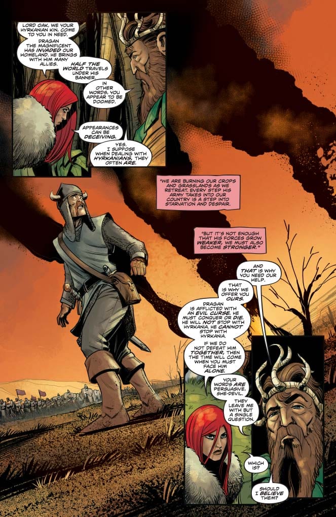
The Hykanians venture to meet with the woodland tribes, and Sonja puts he her trust in their leader, Lord Oak. One of Dragan’s agents is at work to disrupt that arrangement, though, and divide their budding alliance.
The Writing
Mark Russell focuses away from the action in Red Sonja #8, turning instead toward more political drama. The writing doesn’t quite reach the heights of our last few issues. However, it’s still a strong showing on Russell’s part.
The book serves the larger narrative well, advancing the story as the Hyrkanians begin to run out of options and grow desperate. And, while not quite as sharply-focused as in previous chapters, Red Sonja #8 carries thematic weight.
Sonja and Lord Oak spend the book’s first half engaged in on-the-fly politicking. The two understand the gravity of the situation in which they find themselves. They both know that a unified front is their best chance of defeating the Zamorans. Whether or not they can rely on one another, though, is the calculation they struggle to make.
Lord Oak is said throughout the book to be, above all else, an honorable ruler. However, a segment of his people are hungry for revenge after the death of Vorgon, his own kin, in an earlier issue. Virtues like honor can fail, especially when confronted with temptations like greed or revenge. The result can often be tragedy and destruction, both for the object and the target. On one hand, this could be read as a cynical, even misanthropic theme; however, Russell doesn’t present it as such.
In Red Sonja #8, Sonja and Lord Oak’s instincts are to trust one another, even despite some reservations. They recognize they face a common threat, and are prepared to cooperate for the sake of survival. What threatens to undermine that trust is not their own animosity, but the machinations of a bad actor who manipulates and turns them against one another. He works to play one faction within the woodland tribes into destroying the truce. In doing so, they risk bringing disaster on their own people.
The Artwork
Bob Q’s artwork is as impressive as ever in Red Sonja #8.
One of the standout elements is the manner in which he lays out the panels, especially in the book’s first half. There’s a meticulous sense of symmetry to the pages as Sonja and Lord Oak speak, spotlighting the delicate and fragile balance of their budding alliance. On one page, for instance, we see the two facing off in juxtaposed panels in the top-left corner. The artist then mirrors the image in the bottom-right corner, laying out the page like a playing card. There’s a lot of continuity of motion in these pages, suggesting careful thought and planning went into the work.
The character designs feel a bit more utilitarian in Red Sonja #8 than in previous issues. That said, their expressiveness remains one of the strengths of Q’s work on the book. The figures are dynamic and carry a lot of momentum throughout this chapter.
Final Thoughts
Red Sonja #8 comes off the highpoint set in our last issue, continuing the strong direction of the series. If you’re not already reading this every month, get on it.
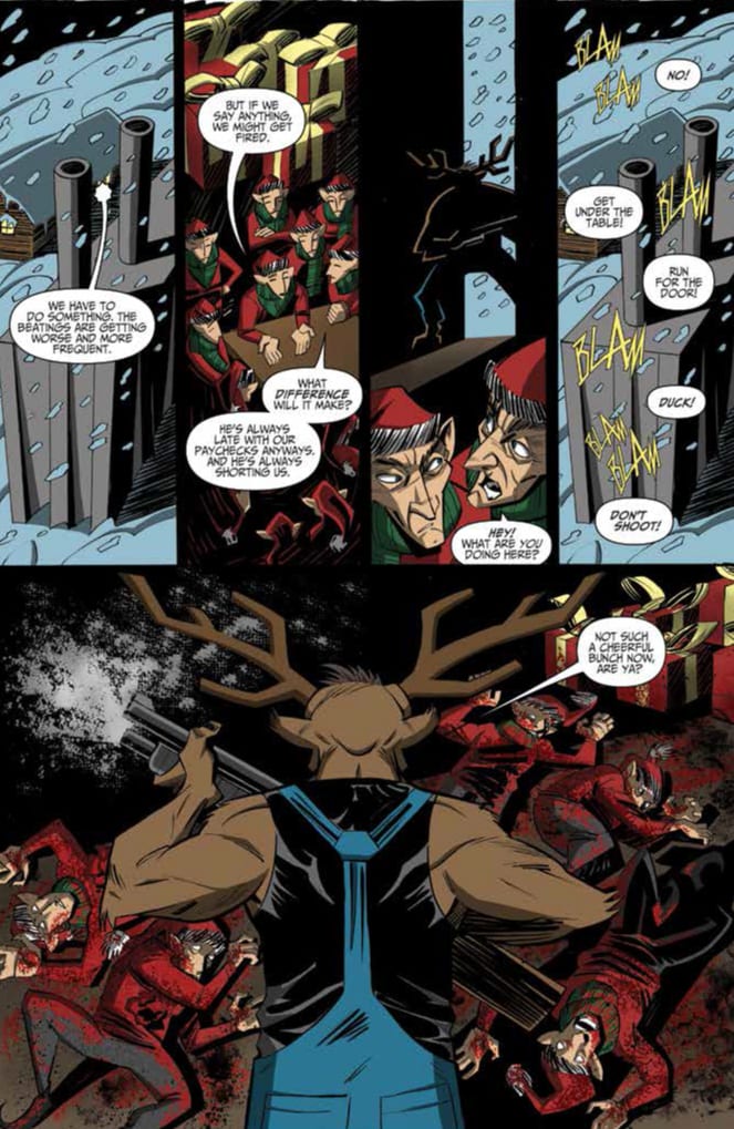
Action Lab: Danger Zone’s Chainsaw Reindeer #1 (on sale September 10) is bonkers. Writer Brandon Rhiness takes the premise, a reindeer brandishing a chainsaw, and runs wild with it. He offers the reader an unrelenting gorefest and readers who like their comics with an extra serving of blood and guts will likely enjoy the ride.
Chainsaw Reindeer #1
Writer: Brandon Rhiness
Pencils & Inks: Carlos Trigo
Colors: Przemyslaw Dedelis
Letters: Chris Johnson
Rhiness almost exclusively focuses on the gratuitous violence, which produces an eye-opening story that’s light on substance. The main character, whom the series is named after, goes crazy and the subsequent killing spree takes him from the North Pole to Earth’s orbit and every in between. The titular character’s body count reads like a grocery list and it’s a doozy; he kills, amongst others, Santa Claus, the Loch Ness Monster, a leprechaun and, in total, over three billion people. The issue loses some steam after its enthralling beginning, where Chainsaw Reindeer brutally kills a morally monstrous Santa Claus.
Santa Claus has been naughty this year. (Credit of Action Lab Comics.)
This Santa is the most horrendous version of the character in recent memory. He’s more heinous than the imposter in Elf and the Robot Santa Claus from Futurama. This Kris Kingle is even more wicked than his counterpart in Weird Al’s “The Night Santa Went Crazy.” (This whole comic subverts the premise of that classic Christmas song.) Rhiness’ Santa mistreats Mrs. Claus (he tells her to shut up and mutters, “Bitch, you’re gonna get it one of these days,) he’s a terrible boss to his elves and he beats his reindeer. (Rhiness also implies that the abuse extends beyond physical violence.) Eventually, Chainsaw Reindeer gets revenge for these beatings and kills Santa in cold blood. Because Rhiness presents Santa as a vile villain, the reader roots for the the not-so-jolly Saint Nick’s demise. After Chainsaw Reindeer murders him, the unhinged protagonist delivers a one-liner that feels like it belongs in the latest action blockbuster starring Dwayne Johnson. (Imagining that the Reindeer was voiced by Johnson made the moment even more enjoyable.)
Chainsaw Reindeer’s reign of terror has only just begun. (Credit of Action Lab.)
In a book with such a violent story, the art is particularly crucial to the comic’s success and the combination of penciler/inker Carlos Trigo and color artist Przemyslaw Dedelis bring the bloody script to life. In the most impactful scene, Trigo and Dedelis complement Chainsaw Reindeer’s dramatic invasion of Santa Claus’ home. The Reindeer is surrounded by dark shadows and the moonlight through the window mainly catches his eyes and the metal of the gun in his hands. Here, the stunning visual strengthens the suspenseful moment. Plus, Trigo and Dedelis help each and every murder feel gruesome with blood spatter that pops off the page and grisly depictions of the chainsaw annihilating the victims. By the end of the book, the constant stream of deaths makes them blur together in the narrative but the art team still makes them visually memorable.
In Chainsaw Reindeer #1, there’s not much to sink your teeth into once you look beyond the gore. But the delight from seeing a crazed reindeer killing an abusive Santa Claus is just too incredible to ignore. Interested readers should check out this comic because, if nothing else, you won’t read another one like it this year.
What’d you think of Chainsaw Reindeer #1? Do you want to see more of this series?
From New York Times Bestselling author, Jonathan Maberry, and IDW Publishing comes a new Post-Apocalyptic thriller to get your teeth into. Pendemica is a disturbing mix of horror and political intrigue waiting to get you hooked.
With the bravado of a James Bond movie and the pacing of a Frank Miller comic, Pandemica hits the floor running and doesn’t pause for breath. The question is, can you keep up with the break neck speeds with which Maberry writes?
Pandemica #1 Credit: IDW Publishing
Spreading The Pandemic
Quite often post-apocalyptic stories throw the reader straight in at the deep end with a world already in ruins. This approach was taken with films like Mad Max and comics like The Walking Dead and the more recent Orphan Age. In each of those examples, the creators introduced the survivors and built the world from their perspective. In Pandemica Maberry instead faces the ‘end’ head on, with the destroyed world becoming the mysterious place, barely featured.
It starts with an act of terrorism reminiscent of flashback sequences from V For Vendetta, portrayed in the style of a Mission Impossible movie. A secretive figure is shown breaking into the South Texas Detention Complex and poisoning a water supply. This heralds the start of a contagion that ruthlessly attacks specific members of society.
The story follows the Mulder-esq character, Dr Katz who has an outlandish theory about the contagion that even his own government doesn’t want to hear. Maberry introduces Dr Katz on a television show mocking him and his ideas while passing comment on modern news reporting.
Maberry keeps the action moving while spinning out the conspiracy at the heart of the story. The narrative is fast paced, like a Dan Brown novel set in the X-Files universe. As a reader, you barely get the chance to breath as one scene slides into another, each introducing new elements or advancing the plot at an alarming rate.
Despite this high octane approach to storytelling, Maberry has complete control over the characters and their development. He introduces a fairly large cast, especially for a first issue, but he gives everyone their own space to make an impact. There are some architypes in there that you would expect from a thriller of this nature however, Maberry goes above and beyond in the creation and presentation of these characters.
Pandemica #1 Credit: IDW Publishing
Drawing To The End
The super-fast pace of Pandemica works because Alex Sanchez keeps a tight rein on the images, controlling what the reader sees on every page. His layouts are designed to give the reader as much information as possible in the least amount of panels. This is achieved with careful planning the establishing shots and a minimal of panel transitions per scene.
That is not to say that the narrative is rushed through the pages. Sanchez instead picks out the specific elements of each scene and relays these to the reader in detailed panels. The composition of the panels illustrates much more than what the reader can see. Sanchez brings out the characters using body language and expressive gestures.
A large portion of the page is taken up with text, turning some sections almost into prose. Shawn Lee splits the speech up using the balloons to create natural pauses and breaks in conversation. He positions the word balloons on the page to create a flow of dialogue leading the reader either across the page or directly down it.
Some of these pages are extremely well laid out to control the reader but there is a certain amount of over load, especially with text. The coloring helps to pacify a large extent of this, with Jay Fotos’ natural colors emphasising Sanchez’ heavy inking style.
For the majority of the comic, the combination of art and letters carries the narrative and in the moments where the page is too densely packed the intriguing aspect of the story itself is enough to see the reader through.
Pandemica #1 Credit: IDW Publishing
Conclusion
Pandemica is a refreshing take on an apocalyptic narrative and it’s obsession with the build-up gives it an edge over other comics in the same genre. The narrative style has more in common with block buster movie thrillers than the type of comic you would expect from Pandemica’s cover. This is certainly a prime example of not judging a book by its cover. It is a clever comic in many respects but occasionally attempts too much at once.
If you enjoy binge worthy Netflix thrillers or political page-turners in the style of Tom Clancy then you’ll love Pandemica. If you’re looking for a Walking Dead replacement, you might have to wait a few issues.
Trees: Three Fates #1 is another excellent beginning to the celebrated Trees anthology series. Created by acclaimed writer Warren Ellis and artist Jason Howard, Trees: Three Fates #1 sets up a thrilling mystery set 10 years after the eponymous Tree-like alien constructs land in the incredibly small town of Toska, Russia. Ellis’s script seems to be intent on tying together more humanistic problems to the sci-fi setting and Howard’s expressive style adds the emotional punch. Trees: Three Fates has all of the ingredients for a sensational series.
Trees: Three Fates #1 begins 10 years after the “Tree” landing in Toska, with a mysterious murder being found at the base one of the structures. The apparent detective of Toska, Klara Voronova, whose romantic partner died in the tree landing, is tasked with solving the investigation.
Beginning this chapter with a flashback to when Klara’s partner, Sasha, died was a clever decision by Ellis, putting the seed of doubt in the readers mind about Klara. Sasha had problems; Klara did not seem without fault in the exchange, and ending it with the sudden smashing of Sasha certainly left a mark of trauma on Klara.
The town of Toska is set to be a character of its own, and Ellis’s insistence on telling the reader its extremely small population size insures that most characters in the town will be unique. Based on the limited character introductions we get in Trees: Three Fates #1, you can’t help but get a Twin Peaks vibe from the story. The characters were not as particularly hokey as in Twin Peaks, but the over-the-top dialogue from the villains in this chapter combined with the small setting set this feeling off.
The usage of the android Boris to assist in the crime scene investigation was a smart way of introducing how far humanity has come since the Trees fell 10 years ago. In the flashback, it seemed to be the present-day but the introduction of Boris gives this story an undeniably futuristic edge to it. Boris’s handlers are saying there is no electricity for the town because a goat slept on the solar panels was a humorous way to show how much these small towns struggle despite the mechanical assistance.
These Trees Don’t Need The Lorax To Speak For Them
Jason Howard’s linework is exceptionally emotive in Trees: Three Fates #1. There is detail and clearly defined structure and composition when necessary, but when the emotions start flying, Howard cuts loose. The manner in which Klara’s face shifts from yelling at Sasha to horror was iconic. Howard overemphasized Klara’s sharper features to make her look frenzied and furious while mad but gave her softer and rounder features when Sasha died.
Dee Cunniffe’s colors do more than hold their own in conjunction with Howard’s art. Cunniffe drapes almost every scene in moody blues, grays, and forest greens. But when the excitement begins, Cunniffe gives everything an orange or bright background so the emotion pops off the page.
There is no reason to doubt Trees: Three Fates #1 to begin with. The creative team of Warren Ellis, Jason Howard, Dee Cunniffe, and Fonographiks (letters) is proven. And the team does not disappoint. Trees: Threes Fates #1 sets up a story that could be the best in the anthology.
For Suicide Squad fans, the hits keep on coming. Not only is James Gunn’s movie sequel now underway, but now DC Comics has announced a new ongoing series that launches in December.
The Injustice 2 team of writer Tom Taylor and artist Bruno Redondo will be shepherding “the wildest version of the Squad yet,” according to the press release.
This new version of Task Force X is already full of changes, with new villains—any of whom could die on a mission or be dispatched by an all-new and mysterious leader who has replaced Amanda Waller. This Squad’s new mission is to neutralize a new group of international super-terrorists known as the Revolutionaries—and not everyone on either side will make it out alive! But when the U.S. government’s most deniable team of antiheroes realizes that the surviving Revolutionaries will be joining the Squad, that’s when the fireworks really begin!
Taylor spoke with the Hollywood Reporter about the series. When asked what will differentiate his Squad from past versions, the writer said:
“For a long time, there’s been a sense of safety around the Suicide Squad. The anti-heroes and villains have gone out on the mission, fought dirty, won dirty and most of them have come home. In our book, that’s not the case any more. The team we send out in issue one won’t all live through the first mission. DC characters with years of history are going to be confined to history after issue one. Truly, no one is safe.”
Regarding the premise of the title itself, he added:
“One of the main things I want to do with this series… is to push the idea of these actually being suicide missions. No reader should know what to expect when picking up this book. We don’t want anyone reading our series and thinking, ‘well, they can’t die because they’re in the movie.’ No one is off limits here.”
And on the topic of more B and C-list characters (a Squad hallmark), Taylor said:
“We’ll absolutely see some more obscure villains. We’ll see some very early on, and I have a list of more I want to use if… say, unfortunate things happen to some of them. We have Cavalier, who I think is ridiculous, but the squad needs ridiculous, Shark, Zebra Man — who has great, unique powers, Magpie — who I’ve always associated with that first team-up of Superman and Batman, and others.”
You can read Taylor’s entire interview here. Suicide Squad #1 arrives in December as a 40-page debut issue with a cover by Ivan Reis and Joe Prado.
Are you ready for Taylor’s all-new, all-different take on the Squad? Leave us a comment!