Home Blog Page 408

NSFW Review: MONEY SHOT #1 – Hits All The Right Spots

NSFW Review: MONEY SHOT #1 - Hits All The Right Spots

A story about scientists having sex with aliens for the glory of mankind-and money.

Have you ever wondered what sex with creatures from outer-space would be like? Look no further, Vault Comics’ sex-filled space adventure—Money Shot #1 hits comic book shops on October 23.

Warning: Some sex-related and inappropriate jokes/thoughts may follow.

NSFW Review: MONEY SHOT #1 - Hits All The Right Spots

Some Foreplay (Story)

Money Shot #1 has a simple premise, “A story about scientists having sex with aliens for the glory of mankind-and money.” But Writers Tim Seeley and Sarah Beattie make it anything but simple. They could’ve had Money Shot read as just a silly sex adventures in space, which would have sold well. Instead, they develop characters that are fun and relatable. All while keeping the silly sex adventures in space.

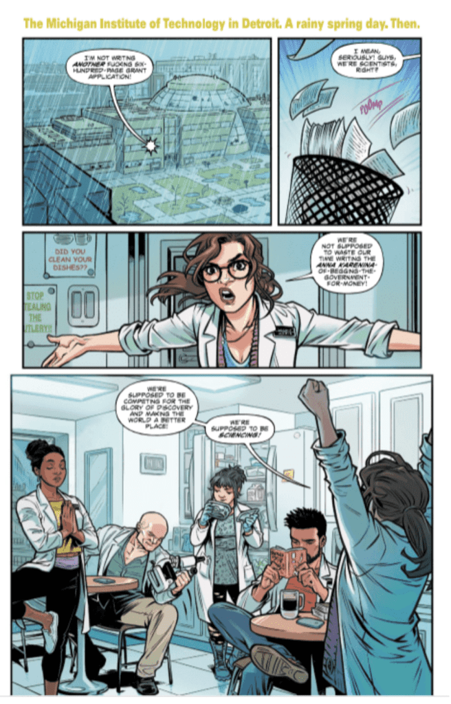
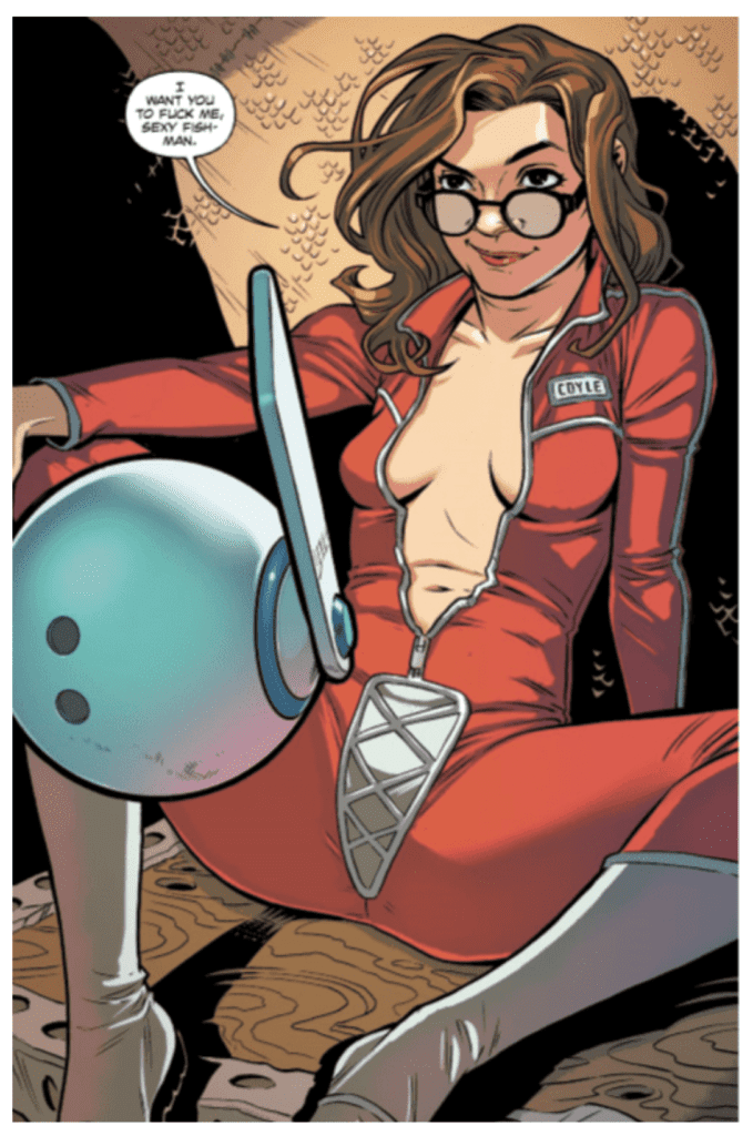
The opening page of a comic will hook the reader. It is essentially giving the audience a quick sample of what’s in store. Be it with humor, awe, violence, an opening crawl explaining the plot, or shock. Money Shot #1 has an opening crawl giving all the necessary history, but the first page with art is the real ‘money shot.’

Artistic qualities aside, Money Shot #1’s opening page does its job perfectly. The art and dialogue are in harmony and stick the landing of a gotcha page. Check it out below.

NSFW Review: MONEY SHOT #1 - Hits All The Right Spots

The Kink Made With Ink (Art)

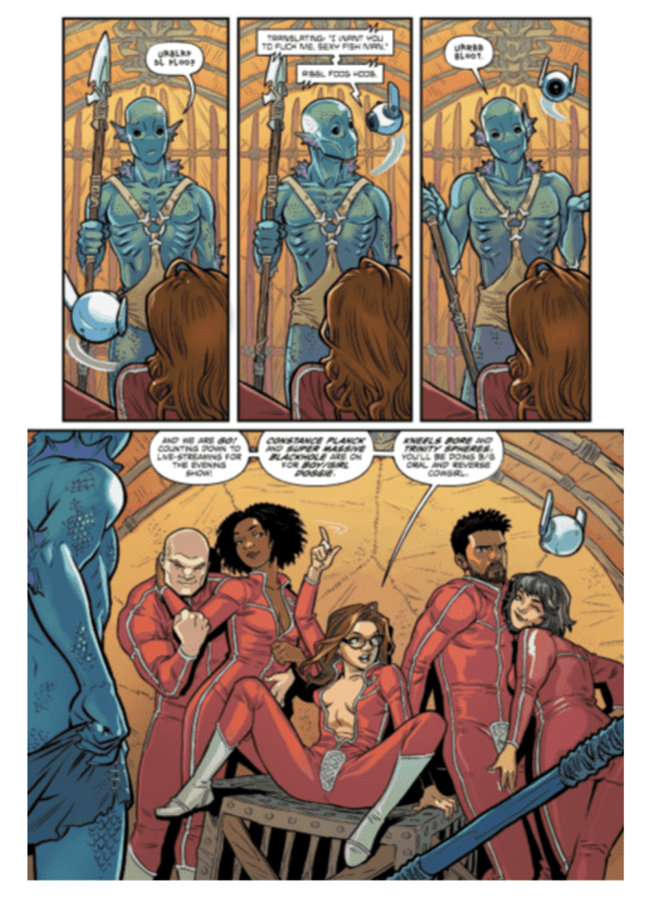
For a story that deals with humans having sex with aliens, Rebekah Isaacs’ art makes it seem plausible. Now, we don’t condone that. While Isaacs’s pencil work looks realistic, she keeps parts cartoonish. This bodes well with its grounded characters while making the aliens feel out of this world.

On the subject of aliens, the designs are great. Hopefully, several planets are explored, so more species can be exposed.

Keeping the colors akin to those seen on earth, colorist Kurt Michael Russell spices it up once on an alien planet. By giving the planet an overall orange/yellow tint, Russell makes it feel different to earth.

Writing on The Body (Lettering)

Relying on visuals for laughs and story beats, the lettering by Crank! never obscures the art. Whenever there is more dialogue than usual, Crank! maneuvers it as not to cover up the naughty moments. Crank! adds some unevenness to the aliens’ lettering, helping the sense of another language. It’ll be great in future issues of Money Shot if this theme continues, with each species letters/bubbles reading differently.

The Climax (Money Shot Conclusion)

The series title may scare some people away, or even the synopsis. But if comedy, drama, and hot alien sex is your thing, Money Shot #1 will have you coming back for more.

Memorable Quote: “I want you to fuck me, sexy fish-man.” – Dr. Ocampo

Money Shot #1 is filled with quotable moments. But for the opening page, this line throws you headfirst into how far this story will go.

Readers From Earth

Was Money Shot #1 your type of fetish? If so, let us know down below!

If Money Shot isn’t your cup of tea, check out our reviews for Vault Comics’ other fantastic series.

Monkeys Fighting Robots Youtube

Evil Looms in the Horizon in EVERYTHING #2

Monkeys Fighting Robots

Even the most die-hard mall haters will be shocked by the revelations presented EVERYTHING #2, which releases this Wednesday from Dark Horse Comics. Sometimes corporate greed is a good enough reason to hate mega shopping centers. And then, there are days where you wish that were all that was wrong.

This cover makes you wonder what’s about to happen.

***SPOILER WARNING***

Things have been strange ever since the new mall moved in…and not in the way one would expect. Everything takes every dark thought and horror a person can have and mashes it into a consumer environment. The end result is something odd and disturbing.

Everything #2 continues to take the everyday items and turn them into something more sinister. While it may be a series full of bright colors – it is surely anything but a happy and cheerful tale. The real question on readers’ minds is: what exactly is happening here?

There is a lot of information stuffed into the second issue in the series, leaving plenty for us readers to pick up between the lines. Or between the panels, as it were. There are still many answers to be found. And the characters within the series are not doing much better, in regards to figuring things out.

Something seems a little bit broken about her…

Just by looking at the cover of Everything #2, it’s clear that things are about to take a more surreal turn. And believe us, this issue more than keeps to that promise. The leaning towards the weird and inexplicable is getting stronger, as is our fascination with what is happening.

Christopher Cantwell’s storytelling style is a unique one – merging multiple perspectives and tales alongside mock brochures; the result is something mildly off-putting. And there’s no doubt that this was the intention the whole time.

Each of the characters and perspectives in this tale has a purpose – but that seems to be varying dramatically. Some seem to be naive victims; others are coming off as significantly more sinister. It’s impossible not to theorize how all of their stories will end up tying together.

Actually, all of the perspectives seem to be having trouble in this issue…

With a plot as strange as this one, it’s probably no surprise to hear that the artwork can be a bit psychedelic at times. The surreal elements mash together with vibrant colors, creating something that’s both fascinating and perturbing.

I.N.J. Culbard was the artist for this issue, and he nailed the details in this issue. Some of the characters were indescribably and undeniably off in their behaviors and movements. It’s the sort of off that once you notice, you can’t stop noticing. And that single element sets the tone for the entire issue.

Steve Wands provided the lettering for this issue, and his work complemented the artwork and the story nicely. The lettering in the retro ads was exceptionally well done, but even the more minor elements were efficient and elegant.

There is something oddly enchanting about this scene, isn’t there?

Everything #2 was an eerie and fascinating tale – proving that horror can come in all shapes, sizes, and colors. The mystery inside what is happening has continued to expand, leaving readers more curious than ever.

Monkeys Fighting Robots Youtube

Review: HOUSE OF X #6 – Poor Apocalypse Has No Friends

Monkeys Fighting Robots

The living island becomes home to a thriving mutant society in House of X #6 out this week from Marvel.

Jonathan Hickman is the man behind the charts. Pepe Larraz is the young gun artist helping shape the world of Hickman’s X-Men. Marte Garcia and David Curiel add the pearlescent purples and beautiful blues to the Krakoan oasis. The celebration on Krakoa radiates off the page as any mutant with visual powers are showing off what they can do. There’s probably a reason this issue uses multiple color artists; it looks like it was an absolute BLAST! (hehe)

VC’s Clayton Cowles reigns over the letters in House of X #6. This chapter is mostly a voice over, so Cowles doesn’t have much to do here except word bubbles, and lots of them. His standout moment is providing a fantastically drawn scream swirling down a pit into exile.

While this issue takes place mostly on Krakoa, the art team was able to flex and show us just how breathtaking the living island is. If you’re a living island, I would hope for some beautiful landscapes and lush terrain, and Krakoa is precisely that. It looks like a place that will make the world jealous that they can’t visit for summer vacation. Jealousy never leads to anything great.

No society functions without rules, laws, and ideals. House of X #6 establishes the basic goals and beliefs of mutants moving forward. The Quiet Council of Krakoa is made up of mutants with all different motivations, and each group appears to get an equal voice. The excitement I have for a future with a council consisting of the likes of Sinister, Apocalypse, and Sebastian Shaw is just indescribable. The guaranteed tension during debates that Hickman has opened the door for is going to be some must-read material.

After the first meeting of the council, the celebration of everything they have created begins. In scenes reminiscent of Return of the Jedi, mutants are throwing the party of their lives. Fireworks and other visual spectacles provided by the powers of overjoyed mutants light the skies above Krakoa. Old friends embrace and join together in laughter, children gather around the fire for tales of wonder, libations are shared amongst past enemies, and everyone seems to be embracing the new path that has been laid out before them.

Apocalypse does not look like someone that has just accomplished his life’s work. He sits alone in the darkness while everyone else celebrates. Is he rethinking his stance? Is he plotting for when the humans inevitably come to destroy what they have? Has he simply spent so much of his life causing others pain that he just has no one that cares about him? Is it all of the above? We will have to wait to find out. I hope the future sees Apocalypse asking Wolverine how to make friends.

As we have learned through this series, Powers of X shows us the outcomes of the events in House of X. Xavier and company have implemented their plan and have begun the transition into the new order, but what awaits them? Will the plan bring them the utopia they dream of, or will it unravel right in front of them?

With the last Powers of X issue heavy with information about machine societies, it only seems fitting that the finale will be right after mutants have established their lives on Krakoa. I think nano sentinels will infect Krakoa, and since “Make More Mutants” is one of the three laws, mutants will reproduce omega sentinels at alarming rates, and the machines will implode into a black hole.

What did you think of the end of House of X? What do you think will happen in the Powers of X finale? Let us know in the comments below.

Monkeys Fighting Robots Youtube

Review: Marvel’s GHOST RIDER #1 Begins One Hell of a Story

Monkeys Fighting Robots

Though Hulu might not have been on board with the story, fans are thrilled to see Marvel returning to the tale of the Ghost Rider. To bring the Spirit of Vengeance roaring out of the events of Damnation and Absolute Carnage, Marvel has commissioned one HELL of a team in writer Ed Brisson, artist Aaron Kuder, colorist Jason Keith and letterer Joe Caramagna. But like a giant, flaming motorbike, Ghost Rider is sure to be a difficult machine to operate. With a complex history and high fan expectation, does the Ghost Rider team stick the landing, or do they go up in smoke (er, in a bad way)?

Abandon All Hope, Ye Who Are Jumping On Here

If, like many of the people picking up this book, you’re not aware of Ghost Rider’s most recent activity in the Marvel Universe; here’s a quick primer: Mephisto is being held in the Sanctum Sanctorum. Johnny Blaze is King of Hell. Danny Ketch is swapping a mournful attitude for as much whiskey as he can drink, and the city of New York has gone a decent amount of time without demonic invasion.

Of course, that changes at the beginning of this issue, when Johnny stops a troop of demonic jailbreakers trying to flee into our world. To figure out their purpose, Johnny travels to Earth and teams with the liquored-up Danny, stopping a monstrous escapee before catching up with his brother/fellow Ghost Rider. But while Johnny’s on Earth, another force is building in the world below. Pretty soon, Mephisto won’t be the only challenger for the throne of Hell.

Ghost Rider #1, Page 4. Published by Marvel Comics.

You Look Like Hell

Fans of Ghost Rider’s unique look as opposed to the rest of the Marvel universe will definitely be pleased by Ghost Rider #1. In fact, Aaron Kuder’s characters are the absolute strongest part of this book. Kuder is to comics what Hieronomous Bosch is to classical paintings: the denizens of his Hell help build out a world that is entirely nightmarish, but in kind of a fun, circus-ey way. Kuder also nails the look of the Ghost Riders, portraying an aged, weathered Johnny Blaze and a morose, brooding Danny Ketch in a way that’s both respectful of the characters’ origins and different enough to tell a new story.

Of course, Kuder’s work wouldn’t read nearly as well without the madness of Jason Keith’s colors filling it in. Keith makes Hell a feverish, red place, far from the gloomy and cold underworlds of Sandman. Plus, Kuder’s work on our own spiritual plane isn’t bad either. Native New Yorkers will take note of the distinctions in tone that Kuder applies between Manhattan and Brooklyn, affecting not just the setting of the story, but the mood of the scenes told within.  Maybe that’s because Kuder’s spent a lot of time in NYC, or maybe it’s just because drawing Times Square and drawing the Ninth Circle of Hell aren’t that different.

Ghost Rider #1, Page 5. Published by Marvel Comics.

Devil’s in the Details

Marvel familiar Ed Brisson brings humor and humanity to the world of Ghost Rider, ensuring this comic doesn’t lag as the reader goes through it. He handles Danny Ketch especially well; even if you’re not familiar with the character, you’ll end up liking him by the end of this issue. Johnny Blaze, too, is expertly handled in the story. He’s got a tough, “I’m getting to old for this shit” kind of vibe that’s refreshing in a book that could have easily starred brooding, over-monologuing anti-heroes.

However, the plotting of this first issue is a little thin. We can definitely tell there’s something huge coming to the supernatural corner of the MCU (fans will love the chart of underworlds found in the back of this book), but there’s very little actual information as to what that threat might be. Of course, this book is the beginning of a mystery, so the pilot issue shouldn’t contain too many reveals. Still, the structure of this issue might leave a little too much out, making the reader wonder what’s going on by the end. Basically, we shouldn’t be sure of much heading into Chapter 2 of a mystery, but we definitely need to know what the mystery is.

All that said, Brisson definitely gives hints of a larger mythos contained within the pages of Ghost Rider #1. Similar to what Marvel did with the Immortal Hulk and Venom, Brisson is working to retool a fan-favorite character into a horror-leaning antihero. For many fans of this trend and of the character itself, this will be a really exciting development. If that sounds like you, then absolutely pick up this book. There are big things ahead for Ghost Rider, and even if they aren’t 100% clear in this issue, you won’t want to miss where this story begins.

Ghost Rider #1, Page 3. Published by Marvel Comics.

Overall Thoughts

Ghost Rider #1 is not the strongest introduction to a series that Marvel has recently put out, but one can’t read it without thinking that something huge is coming out of it. With Johnny facing threats both internal and external and Danny questioning the purpose of his powers, there’s a lot for a good villain to use against the heroes in pursuit of the Throne of Hell. And when that Hell is drawn by Aaron Kuder and colored by Jason Keith, it’s absolutely worth pursuing. Pick up Ghost Rider #1 in your local comic book shop on October 2nd.

For more reviews like this one, follow us on Twitter. And for all the best discussion, reviews, and news on comics, stay tuned to Monkeys Fighting Robots.

Monkeys Fighting Robots Youtube

LEGION OF SUPERHEROES: MILLENNIUM #2 Takes The Scenic Route

Monkeys Fighting Robots

Join DC Comics this Wednesday on a gorgeous trip through time in Legion of Superheroes: Millennium #2; no Rip Hunter time machine necessary.

You may not need a time machine, but if you need a refresher, check out the previous issue’s review!

Booster Gold Era Interior Art

Plot of The Ages

Writer Brian Michael Bendis concludes Rose/Thorn’s time-spanning trip through the DC Universe, ending in the 31st-century; the thriving era of the Legion of Superheroes team. This is no surprise, as it’s literally called Legion of Superheroes: Millennium #2. Plus, toted as a lead-up to the new series. That in mind, it’s more about the journey, not the destination.

Sadly this journey isn’t near as diverse, or mystery driven as the first issue.

With the introduction of Rose/Thorn’s immortal mystery in the first issue, Legion of Superheroes: Millennium #2 takes that plot nowhere. Bendis has Rose/Thorn aimlessly moping around time. As a character, she is so bland that any other person would have worked as well, or better. It seems she was used to not mess with other well-known characters. Or, showing DC still cares for their characters from varying futures.

Essentially Rose/Thorn has given up finding out why she is immortal, or what’s transpiring. But she does seek out the Legion. Hopefully, these questions are the reason.

Booster Gold Era Interior Art

Legion of Colorists

Legion of Superheroes: Millennium #2 features a multitude of artists and colorists, but not which page they worked on. Like the first, DC Comics lists their names in order they appear. But, the number of colorists aren’t equal to the artists. So, sadly we aren’t able to match who’s with who, instead here are the two colorists name: Tomeu Morey, and Jordie Bellaire.

The Art/Colors of The Future

Each artist/colorist brings their absolute best pencil (or digital pen) to Legion of Superheroes: Millennium #2. The art carries the pace and weight of the story throughout, hitting harder than any of the dialogue/story.

Nicola Scott’s art fits magnificently with Booster Gold’s Space Museum story. Her story is dialogue-heavy, but she makes the most of it. Having the characters conversation take place as a walkthrough of the Museum, Scott showcases holograms of past memorable DC Comics moments. The colors for this era are bright and popping, mimicking the stories they portray.

Bursting into the scene is Jim Cheung’s OMAC era. Cheung beautifully illustrates this opening double-page spread. Cheung is able to make OMAC look corny like his initial debut, yet terrifying at the same time. Color-wise, the OMAC era relies more on grays, while keeping OMAC bright blue.

As great as the other artist pencils are, Jeff Dekal’s pages should be printed, laminated, framed, and put upon your wall. Dekal’s double-page spreads should have more than the four pages allotted. Each page feels like a work of art between the sublime moments being showcased, and out of this world colors. The dialogue for these pages changes colors for Rose/Thorn when either is talking, which looks impressive.

For the 31-century is 2019’s Legion of Superheroes artist—Ryan Sook. The five pages dedicated to this era show why Sook was chosen as the ongoing series artist and designer. As his work is easy to follow, yet has a myriad of details.

Booster Gold Era Interior Art

Letters Seen in The Futures

As with most Bendis stories, there is a lot of words. Seriously, a lot. Letterer Dave Sharpe does his best to help guide the reader through the dense moments. But, in some cases it’s hard to follow, or it covers up the art.

Welcome Back Legion of Superheroes

The story does has a few fun moments, but Legion of Superheroes: Millennium #2 overall plot lacks. When reading through it it reads like a grocery list, alas, the art makes it worth the look through.

Memorable Quote: “I hope she poops my panties and goes catatonic.” – Rose

This was one of the only moments Rose/Thorn’s character shined through. Which, is a bummer, as she is a fun character that can be played in fun, interesting ways.

Reader of The Future

What have you thought of the lead-up story to the Legion of Superheroes series? Let us know below!

Monkeys Fighting Robots Youtube

Review: Heroes Struggle on Destiny Beach in DOOM PATROL WEIGHT OF THE WORLDS #4

Monkeys Fighting Robots

The Doom Patrol finds trouble at Destiny Beach!

The Doom Patrol has been making a name for themselves amongst the stars. After being reunited by Crazy Jane, the team has been going planet to planet helping who they can. They recently had a detour as they found themselves trapped in the mind of Mento, but they are soon able to recruit him. Along with that, the team has been getting upgrades to their powers, such as Negative Man becoming positive and Robot Man getting a new body. What new adventure could the world’s strangest heroes stumble upon next?

Doom Patrol WotW 4 cover

**Some Spoilers Below**

Story:

We open with an explanation of what the mythical Destiny Beach is. It is where several bodybuilders go to get the same powers as Flex Mentallo. It is the ultimate paradise to get in shape, which is why it’s shocking when the Doom Patrol arrives to find the beach trashed.

It’s revealed that another group of bodybuilders has taken over, with their leader wearing a powerful symbiotic set of trunks. To save the beach, Flex challenges the villainous muscle heads to a flex-off with members of his old workout group. Meanwhile, Cliff has been working to help the people of the universe in any way he can. Every time he does a good deed, his robotic body instantly upgrades, giving him the incentive to keep going.

Doom Patrol WotW 4 p1

This continues to be a strange book with one-off adventures instead of there being one big overarching story. On the one hand, it caters to the people who really enjoy the bizarre nature of the book. These solo adventures also help with character growth, with everyone evolving into new versions of themselves.

The downside of this style of storytelling is the fact it makes the series feel disjointed. I complete forgot Destiny Beach was a thing as it wasn’t mentioned since issue one and we never mentioned it in issues two or three. Add that to the fact the only connection to the past issues is the side story with Cliff, it just feels out of place. In the previous series, things were random, but they still all connected. Maybe it will in the end, but for now, Doom Patrol just feels lost.

Doom Patrol WotW 4 p2

Art:

For this issue, we have Nick Pitarra doing the art, and he honestly does a great job with the issue. He was able to match the overall cartoonish style of the new iteration of the Doom Patrol as a whole, but still go above and beyond with his own designs. The people of Destiny Beach look great, albeit comical with the number of muscles they flex for the final showdown.

Another great part of the art is Tamra Bonvillain’s colorwork. While previous issues have been more vibrant to have the characters pop, she actually keeps it more grounded. This style definitely had me hooked to keep my investment in the story. There were vibrant scenes as well, but those were contained to the places that were certainly in better shape, such as Dannyland. Overall, Bonvillain works well with Pitarra and makes this issue really stand out.

Doom Patrol WotW 4 p 3

Conclusion:

This issue of Doom Patrol is as strange as the rest of the series, but these one-off adventures are starting to show cracks. While I enjoyed the Destiny Beach adventure and the final flex off, it feels rather pointless as it isn’t connected to the other adventures. The art team has done an excellent job with this issue with beautiful designs and colorwork, especially during the final flex-off. While it was an okay issue, the series needs to find an overarching story to tell or risk losing focus from readers.

Monkeys Fighting Robots Youtube

Review: NO ONE LEFT TO FIGHT #4 – A Thunderous Rebirth, And Finally Someone To Fight

Monkeys Fighting Robots

No One Left To Fight #4 is probably the first solid entry in Aubrey Sitterson and Fico Ossio’s short miniseries. This certainly is not a slight considering every previous chapter in this story has been sensational, but No One Left To Fight #4 finally introduces the climactic first and final enemy, and I can’t help but feel slightly disappointed. This will surely prove divisive for fans of the series, but Writer Aubrey Sitterson, Artist and Colorist Ossio, fellow colorist Raciel Avila, and Letterer Taylor Esposito have certainly done enough in No One Left To Fight to assure readers that every character or plot point has its purpose.

No One Left To Fight #4 began like any other No One Left To Fight chapter. Vâle, Timór, Krysta, and Pod are on a mission to find their old comrades Quon and Kaya who now live a simpler, less conflict involving, more natural life. One aspect of No One Left To Fight that Sitterson has succeeded tremendously in is his sense of world-building. Since the beginning, Sitterson has dropped the reader in this world where the main story has already been finished. All of the heroes have fulfilled an arc, and all of the villains have been seemingly vanquished. Despite this, the reader never feels left out or like their lacking information.

Sitterson never beats the reader over the head with narration or uncharacteristic monologues; instead, he opts for his characters to speak naturally. At first, we don’t know the reason why Quon and Kaya chose to separate from society and become peaceful natured hermits. But through their dialogue with each other and our heroes, we learn that Kaya and Quon may have done some unbecoming deeds in the past. But this information is allowed to unfold naturally, so the true gut punch when the Hierophant is introduced is a quick aside, but it hits hard.

The climax of this chapter will draw a line amongst the fans of this story, though. A large part of this story has been the lingering threat of The Hierophant coming back for Vâle. While Sitterson has never explicitly questioned whether the Hierophant was real or not, I feel that there were previous hints of it in the story. For instance, No one has seen the re-emergence of the Hierophant besides Vâle; his feelings of anxiety spurned this entire tale. Then when the Hierophant appeared to Vâle in the previous chapter following Vale’s emotional discussion with Winda, no one else noticed the lightning and thunder that seem to follow the Hierophant’s entrance, but they all heard Winda chewing out Vâle? Couple this with Vâle’s consistent hallucinations/time displacement dilemma, it is easy to theorize that Vâle is merely unwell.

Instead, the Hierophant appears in the flesh to everyone. There is certainly enough time for Sitterson to use this as another tool to further his Shonen-type deconstruction intelligently, but certain fans will be disappointed.

Another Old Friend, Another Person Timór Doesn't Get Along With
Another Old Friend, Another Person Timór Doesn’t Get Along With

Fico Ossio and Raciel Avila’s art and colors are almost beyond reproach in this chapter. Ossio and Avila are just as deft at depicting a truly serene and peaceful scene in which Vâle has found true happiness fishing as they are depicting total mayhem and destruction such as when the Hierophant appears. Bruton’s dramatic rebirth is like an 80’s death metal album cover designed by a 14-year-old and simply put, it rules. The electric blue lighting crackles off the page, and Bruton’s character design is impeccable. Think a neon-green Doomsday with goat horns and a Luchador mask, yeah… pretty badass. The teaser image for the final issue is even better, and I want it on a poster. Taylor Esposito’s letters at the top of the image are perfect and remind of an announcer introducing a new wrestler into the ring.

No One Left To Fight #4 is further proof that Aubrey Sitterson and Fico Ossio’s creation should not be ignored. While the appearance of the Hierophant may divide the fan base slightly, there is no fear that Sitterson won’t make the result feel earned. Taylor Esposito’s letters and Raciel Avila’s additions to Fico Ossio’s colors are noted and welcome. It is hard to imagine any other creative team taking on No One Left To Fight.

Monkeys Fighting Robots Youtube

Review: The Bat is Back in Town in BATMAN #80

Monkeys Fighting Robots

The Battle for Gotham begins in Batman #80, hitting shelves this week from DC Comics. All things considered, the stakes couldn’t be much higher.

Batman and Catwoman begin their fight on the streets, working their way through the rogues’ gallery gauntlet. Meanwhile Gotham Girl, seemingly deprived of the Venom shipment interrupted by BatCat in our last issue, is near-death. And for that, Thomas Wayne swears revenge.

Batman #80

The Writing

Tom King’s writing in Batman #80 is compelling and well-paced. The dialogue is relatively sparse, allowing action to drive the story through most of the book. When dialogue is present, though, King doesn’t waste many words. It’s purposeful and targeted to achieve the greatest effect.

This issue indulges the reader in some pretty straightforward street brawling. The villains, one by one, come to the horrifying realization that Batman is back in Gotham, and he’s on the warpath. It’s fun, and it offers a bit of catharsis after seeing Bruce on the back foot for the last several issues.

All that considered, Batman #80 is not without flaws. Namely, the gamble Bruce makes at the book’s end stretches the limits of plausibility. It’s a great twist that heightens the drama and hooks the reader, ensuring we come back to discover what happens in the next issue. It’s difficult to imagine Bruce making such a wager, though, and it feels like something he would never do. It’s out of character, and it reflects poorly on his persona in general, spoiling an otherwise stellar work.

The book has a lot going for it all things considered, reckless endangerment aside. It’s another solid chapter in King’s culminating storyline.

Batman #80

Batman #80

The Artwork

The legendary John Romita Jr. and Klaus Janson team up to provide artwork for Batman #80. The pair takes a conventional approach, dividing each page into neatly-gridded panels. While not the most dynamic layout, it lends the book a sense of symmetry, tying everything together nicely. It’s rather meat-and-potatoes, but it’s done oh, so well.

Romita Jr. has an eye for creating dramatic illustrations. He skillfully uses repetition with subtle change in perspective or proximity to the subject to make the work feel cohesive while heightening tension. The images flow fluidly, with each still leaving a unique impression. For his part, Janson provides impressive work, making the book feel crisp, while also having a bit of grit to it.

Excellent though the pencils and inks may be, colorist Tomeu Morey doesn’t allow his peers to upstage him. Batman #80 is packed with rainy streets at night, and the setting allows Morey to showcase some beautifully stylish and expressive work. The artist highlights many of the pages in outlandish accent colors, giving it a vaguely neo-noir vibe.

Batman #80

Final Thoughts

Aside from troubling issues with Batman’s characterization, Batman #80 is a home run. It’s worth looking past the problems for the compelling storytelling and gorgeous artwork.

Monkeys Fighting Robots Youtube

RUNAWAYS #25: Who Is Doc Justice?

Monkeys Fighting Robots

Sometimes even the heroes need heroes, a fact which we’re firmly reminded of in RUNAWAYS #25. Coming out this Wednesday from Marvel Comics, this issue will have all fans asking; who the heck is Doc Justice?

Who is this mysterious Doc Justice?

***SPOILER WARNING***

Long have the Runaways been living up to their names. They have no permanent home, no family outside of each other. And frequently it feels like they’re still searching for a purpose. All of these emotions – and then some – are the focus of Runaways #25.

All Runaways fans know that our young heroes can’t maintain a good thing. Once it actually seems to be going their way, something is bound to come up and force another dramatic change in their lives. It’s a cycle that they cannot run from. And it’s this fact that keeps them unbalanced and continually facing the risk of tragedy.

So, with that in mind, we knew that a change had to be looming on the horizon. The last few issues have been building up to it a bit, with Nico and Karolina seeking new purposes in their lives. But Runaways #25 takes that pressure to a whole new and explosive level.

The farther we get from the day this photo was taken, the sadder it becomes.

Rainbow Rowell somehow managed to weave so much into this single issue – it takes a little bit to sort through it all. Several major plots are running through it, of course. But then there are some smaller – but still noteworthy – moments as well.

First in many fans minds will likely be; who the heck is Doc Justice? And what’s the catch? Because it seems pretty odd that none of us have heard of him. One would think that a legit hero would run across any of the other Marvel heroes at some point before now. The foreshadowing with this guy is so thick it’s almost impossible to see through.

Second. Um, Chase’s tattoo? What. It’s hard to decide how to feel about this one. Amused? Broken-hearted? Concerned? All of the above? And that is one of the smaller elements of this issue, just to give you an idea of what is to be found inside these pages.

Another concerning moment surrounds Nico and the foreshadowing. This is something that eagle-eyed fans have been concerned about ever since Nico made her deal. In a way, it’s good to see that this subplot hasn’t been dropped. But it’s also extremely concerning to see that something is lurking just out of sight – something that Nico is continually ignoring.

Enter Doc Justice! But who is he?

The artistic team did an excellent job of handling the multiple plots and a variety of emotions expressed in Runaways #25. While the main focus was undoubtedly on the elephants in the room, the artwork also allowed for a decent amount of subtlety, folding in secondary stories (like the one mentioned above) without a single word needing to be said.

Andres Genolet was the lead artist for this issue, and we love the amount of personality and emotions they were able to push into our beloved Runaways characters. Meanwhile, Federico Blee and Matthew Wilson were the colorists for this issue. Their work felt delightfully familiar to the rest of the series, while also having a bit of fun here and there.

VC’s Joe Caramagna was the letterer for this issue, and his final touches made the story. There were several iconic moments and panels in Runaways #25 that were made larger than life thanks to the lettering involved.

We might not know much about the man, but clearly he can fight.

Runaways #25 was an issue designed to force change, while also building up to something more. In that sense, it was the perfect Runaways plot. And you know the story has only just begun.

Monkeys Fighting Robots Youtube

Review: COPRA #1 Brings Michel Fiffe’s Cult Comic To Image And It’s Great

Monkeys Fighting Robots

Image Comics brings Michel Fiffe’s excellent indie superhero comic Copra under its banner with a debut issue that is a treat for longtime fans and an excellent jumping in point for new ones.

From Image- COPRA returns in the first issue of its all-new ONGOING SERIES! Acclaimed comics auteur MICHEL FIFFE picks up where his band of mercenary misfits left off, reintroducing the entire cast of his Suicide Squad-esque revenge machine in a brutal standoff against their own leader. Jump right into the thick of it with the world’s greatest action team in this extra-length debut milestone.Copra

Copra #1
Written, Drawn, Inked, Colored, Lettered and Produced by: Michel Fiffe

Copra #1 opens with a few quiet and catch up pages. Fiffe drops us in on his Suicide Squad analog as they take a moment to rest after their last mission (Copra: Round Five). Using roll call techniques and just a little bit of exposition, Fiffe quickly gives new readers all they need to know (who the team is and why they are in Miami) before the shit hits the fan and we get a full-on classic Copra action scene. And what an action scene it is. We get robots, guns, super-powered fistfights and martial arts moments. Fiffe excels at writing and drawing a kinetic scene. Flipping through the pages is exciting, and the images feel like they are moving and popping off the page.

Copra
Roll call!!!!!!

His understanding of the comics medium is obvious. He pulls influences from all sorts of places: manga, indie comix, Steve Ditko, 80s outlaw comics, 90s Image and much much more. One of the best aspects of reading and looking at issues of Copra is figuring out where the comic book influences come from and how Fiffe tweaks them and pushes them to make them unique, bizarre and totally his own. His art also feels HAND-DRAWN and so immediate you feel like Fiffe is drawing right in front of you. Copra is the best kind of homage; filled with love, knowledge of the medium and originality. It’s a fucking pure pleasure to read if you are a comics fan.

Copra
Excellent use of layout and composition!

The story itself may be a take on Suicide Squad, but the weirdo backstories and strange characters give it a very offbeat tone that at times adds some surrealism to the story and makes the characters such outsiders that you can’t help but fall in line and root for them.

Copra
Just look at this crazy goodness!!!!

If you really dig comics, then Copra is a must buy. Grab this issue, buy the previous collections and jump right in. Fiffe is one of our best current comics artists/cartoonists and this is the kind of thing only this medium we all love can pull off.


You can pick up Copra and any and all comics at your local comic shop.


Monkeys Fighting Robots Youtube