In Spider-Man #2, J.J. and Henry Abrams solidify Benny Parker as a bona-fie hero, with Sara Pichelli continuing to prove she was born to draw Spider-Man comics.
From Marvel Comics- The most anticipated comic event of the year continues from J.J. Abrams (Star Wars, Star Trek, Lost, Alias), Henry Abrams and Sara Pichelli (SPIDER-MAN, GUARDIANS OF THE GALAXY)! Peter and Mary Jane have had their first run-in with the new villain Cadaverous and it did not go well. What horrific impact from this horrific villain will scar them the worst?!
Spider-Man #2 Written by: J.J. Abrams & Henry Abrams Art by: Sara Pichelli Inking Assitant: Elisabetta D’Amico Colors by: Dave Stewart Letters by: Joe Caramagna
Story
With a lot less set up needed, Spider-Man #2 starts to dig into Benny Parker and what makes him different (and similar) to his father. We get to spend a lot of time with the kid now and the writing duo of Abrams and son use that time to show and (and not tell) who Benny Parker really is. What we get is a kid angrier than his father, but that need to do the right thing is rooted in him as well. He’s a good kid, but with a huge chip on his shoulder. His antagonistic relationship with Peter is also very different from what Peter had with his uncle Ben; Pete is just not the father figure Uncle Ben was.
But when Benny finally swings into action, it’s great. It feels big, scary, exciting and dangerous. Benny is urged on by new friend Faye Ito, a great character that will hopefully continue to be a constant.
We also do get to spend some time with Peter in this. Pete here has a deep sadness that has risen to the surface in him. That sadness has always been a part of Spider-Man, but Peter here is literally an absent parent in this, not to mention an absent hero and not so friendly in the neighborhood.
Art
Sara Pichelli is without a doubt one of the best artists to ever draw Spider-Man. This issue, in particular, has some of the best linework she has done. The panels with Benny wearing a slightly big Spider-Man costume have the off-kilter vibe and weird visuals of the early Steve Ditko Spidey stuff. Like Ditko, Pichelli draws gangly and long-limbed figures which fit in great here. When Benny swings, it’s all arms and legs and webs everywhere. It’s fucking fantastic! Pichelli is such a master of her craft; the action scenes are dynamic and the quite scenes feel serene.
Elisabetta D’Amico’s inking assists along with Dave Stewart’s colors add weight and energy to the art. The pages become fluid and start to become cinematic. Visually the book as that Abrams touch we all love to see in his films.
Conclusion
This take on Spider-Man continues to surprise and be fun; it really does feel like a new take on the character. It’s also beautiful. It’s the rare high-profile comic book from an artist outside the medium actually works (see Kevin Smith’s run on Daredevil and Green Arrow). Grab it today.
Spider-Man #2 is available now from Marvel Comics. Grab it at your local comic shop today.
ONCE & FUTURE #3, out this Wednesday from Boom! Studios tells a significantly darker and more disturbing tale of King Arthur and his devout followers. In a world full of King Arthur retellings, this one stands out amongst the pack.
Once again the sword’s reflection has changed, in this cover of Once & Future #3.
***SPOILER WARNING***
Take a look through any collection of books or comics, and the odds are good that you’ll find more than one retelling focused on the legend of King Arthur. With that in mind, note that Once & Future is a completely different take.
ONCE & FUTURE #3 is a world in which letting King Arthur continue his eternal rest is for the good of all man. Because some legends are better left alone. It’s a darker rendition of the tale, but that is why it has become such a fascinating read in such a short period of time.
And okay, throwing an awkward man and his elderly grandmother into the mix certainly helped to shake up any preconceptions we had about this series. Best of all, their interactions allow for the occasional moment of comic relief, giving the readers a chance to breathe before diving back in.
Take a good look at the creative team for this issue – because it is worth talking about.
Kieron Gillen is the author behind Once & Future, and fans of his previous works probably didn’t need to be told this. He has such a distinctive way of writing – telling a story that is both compelling and bone-chilling.
Once & Future #3 is no exception to this rule. This issue starts with a dramatic battle (the one hinted at with the conclusion of the second issue) but then backs off to give us a chance to learn more about the situation at hand.
And to be fair, there is still a lot we need to learn about what is going on. Thankfully, Duncan seems to be equally ignorant. So we get to learn alongside him. Something to be even more grateful about is the fact that unlike Duncan, we won’t have to be risking our necks to gain this knowledge.
In the previous issue, there were hints of a few more classic tropes rearing their heads. And this issue essentially confirmed that fact. These tropes are going to help add to the complexity of the situation, all while giving us something familiar to lean back on. It’s cleverly done.
Is this a good example of spray and pray?
Once & Future #3 gets to boast about many things, including the brilliant artwork. This series has already been getting a lot of attention on that front, and the third issue does not disappoint. There’s something so eerie and foreboding about the way the artists have rendered the supernatural in this series. But it’s also all sorts of perfect.
The dichotomy between the two sides in this series cannot go unnoticed. On the one hand, we have figures that are classically and sinister-looking, corpses rising from the graves, and the like. The living among their side is that beautiful that doesn’t look real – like they’ve taken a step away from humanity. And in a sense, they have.
On the other side of the war, we have a man and his grandmother. His character always looks so dramatic on the covers, yet the issues portray a very different man. He wasn’t raised for this battle, and he’s struggling a bit. Meanwhile, his grandmother is all lines and determination. Even her expression has been hardened by her drive to see things through.
Knowing all of this about the art, it’s probably no surprise to hear that there is an amazing artistic team working behind the scenes here. Dan Mora was the lead artist for this issue, with Tamra Bonvillain providing the coloring, and Ed Dukeshire doing the lettering. And all credit for the look and feel of this series should go to them.
Of course, grandma has bombs in her bag.
Once & Future #3 somehow managed to balance the pacing of the previous issues with the need to provide some answers about what is happening. And all while increasing the tension of the situation. This combination has made for a perfect read, not just for fans of the creative team (though there is that), but for fans of King Arthur and lore and well.
STEEPLE #2, out this week from Dark Horse Comics, reminds us that there is more than one way to fight the evil of the world. Steeple tackles the rich debates of religion, expectations, and how to give back.
Billie is looking a little overwhelmed in this cover image.
***SPOILER WARNING***
Steeple is the latest series to come from the mind of John Allison. And like Giant Days, this series is already proving to defy expectations and preconceptions about it. The series is set in a coastal city – one which has much more going on than meets the eye.
This is a land over which many forces battle over. The monsters of the sea want it back, while one Vicar stands in their way. Meanwhile, another…less orthodox church has taken up residence. It’s relatively easy to start making assumptions about how the series is going to go from here.
But Steeple #2 has already taken a few surprising turns for the newly formed fans. And that’s brilliant. Once again, Allison is busting expectations and defying the norms, all while providing fans with an enchanting escape from the real world.
The alternate cover for Steeple #2 is certainly a dramatic one.
There are many opinions and expectations when it comes to the battle of good versus evil. But Steeple #2 forces us to reconsider all of it. How do we know what is good or bad, just by taking a look at things? And is there more than one way to do what is good, and fight evil?
This issue doesn’t go so far as to answer any of those questions for us, but it will get readers thinking. All while continuing the plot arc of one very enthusiastic and new Vicar. There’s something so wholesome about Billie, and we’re not just talking about her chosen profession here. She’s so willing to see the good in everyone. And perhaps that is exactly what this town needs.
In some ways, the series has put down its dark and mysterious edge. Instead, it’s taken a new focus. Yet there still seems to be a lingering sense of foreboding in the panels. Almost like we’re missing something. Only time will tell what that is.
Billie has a plan for the day, and she will not be swayed.
Along with being the writer for this series, John Allison is also the lead artist. Perhaps that is why everything feels so cohesive in this series, with the artwork perfectly complementing the tale being told. The overall theme and tone for this series have been an odd balance between foreshadowing and chipper. But it works here, especially within the artwork.
Steeple #2 featured some truly dramatic sky scenes, as well as plenty of opportunities to get a better look at our leading characters. As with the first issue, the characters seem to be strikingly designed, going for a simple and understated look whenever possible. But in many ways that fit with the art style and tone of the series itself.
Sarah Stern’s colors enhanced the artwork in this issue, giving us this almost bubbly feel. And if bubbly and enthusiastic doesn’t fit Billie’s personality, we don’t know what does. But seriously, the colors are well suited to this tale, and Stern’s grasp of the practice created some truly dynamic scenes.
Jim Campbell was the letterer for this issue, and his work was as understated as it was perfect. Just like how we like our lettering – it fits in so seamlessly as to almost feel like it wasn’t present.
We wonder what could have happened to that vacuum cleaner….oh right.
Steeple #2 may have thrown some unexpected twists our way, but the series is off to a fantastic start. This issue confirmed that like Allison’s other works, Steeple will be a heavily character-driven plot. And we can’t wait to see what these characters will get into in the next issue.
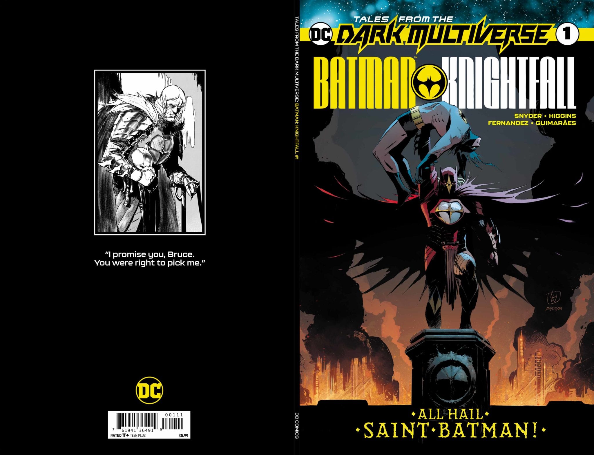
Tales From The Dark Multiverse Batman Knightfall by Scott Snyder, Kyle Higgins, Javier Fernandez and Alex Guimares successfully revisits and fully realizes the classic Knightfall storyline as we visit a world were Azrael permanently became Batman and holds both Gotham and Bruce Wayne in his grip.
From DC Comics – Thirty years after Bruce Wayne was broken and failed to take back the mantle of the Bat, Jean-Paul Valley, now known as Saint Batman, has turned Gotham into the city of his dreams. In his new order, killing has become commonplace and criminals live in constant fear-all in the name of justice. But just when all seems lost, a new hope for Gotham City rises…the son of Bane!
Tales From The Dark Multiverse Batman Knightfall Written by: Scott Snyder & Kyle Higgins Art by: Javier Fernandez Colors by: Alex Guimares Letters by: Clayton Cowles
Story
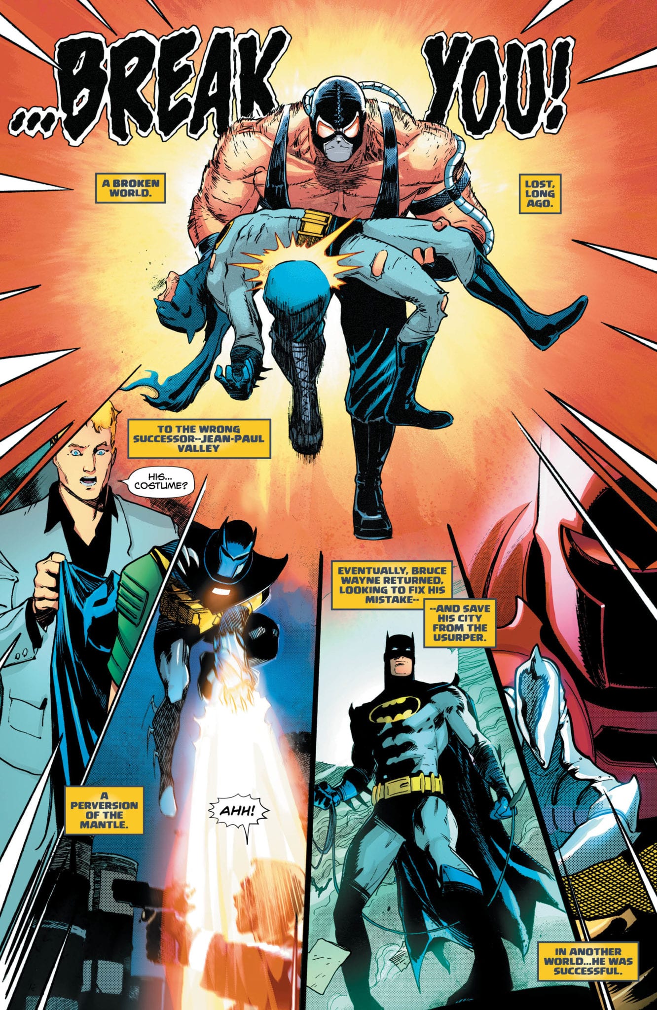
Tales From The Dark Multiverse Batman Knightfall is basically the first in a DC Comics version of Marvel’s What If… series (right down to the omniscient, cosmic narrator). And like that classic series, the stories are only going to work if the initial concept has a great hook. In this case, Batman Knightfall does. Writers Snyder and Higgins take the classic Knightfall storyline, have Azrael become Batman, and then push it darker and darker. ‘Saint Batman’, as Azrael is now called, is as sadistic as you would think. He’s Batman with the fever and righteousness of a religious fanatic. A fanatic also hopped up and addicted to the drug Venom. And what he has done/is doing to Bruce Wayne is just…well it’s fucked up. Really fucked up. Snyder and Higgins write a scary villain here and his unhingedness is very real.
Snyder and Higgins also throw in some unexpected characters. We get the son of Bane, who is driven by revenge and a reformed Lady Shiva, who is always fun.
And since this is a Dark Multiverse spin-off, there are also hints and nods to a looming crisis and what’s going on in the DCU in general. But nothing to really alienate someone not current and caught up.
Art
The art in this book is great. Javier Fernandez, with his more noirish and fluid art, brings a new look and feel to the Knightfall Batman that tones down the cheese and exaggeration that didn’t age well. Fernandez creates the dark and eerie mood needed for this story, and his composition and layout choice is top-notch. He also knows how to really use a splash image.
When you mix in Alex Guimares colors everything comes alive. Guimares uses colors to heighten mood and emotion, bringing out even more energy in Fernandez’s linework. The work here reminds me of Gotham Central and Criminal. It has that vibe.
Conclusion
Tales From The Dark Multiverse Batman Knightfall is a great start to what looks like to be a fun series of books. DC seems to be going hard on these Multiverse ideas. If the rest of the books have this twisted sense and gorgeous art readers are in for a treat.
Tales From The Dark Multiverse Batman Knightfall is out now from DC Comics. You can get it at your local comic shop.
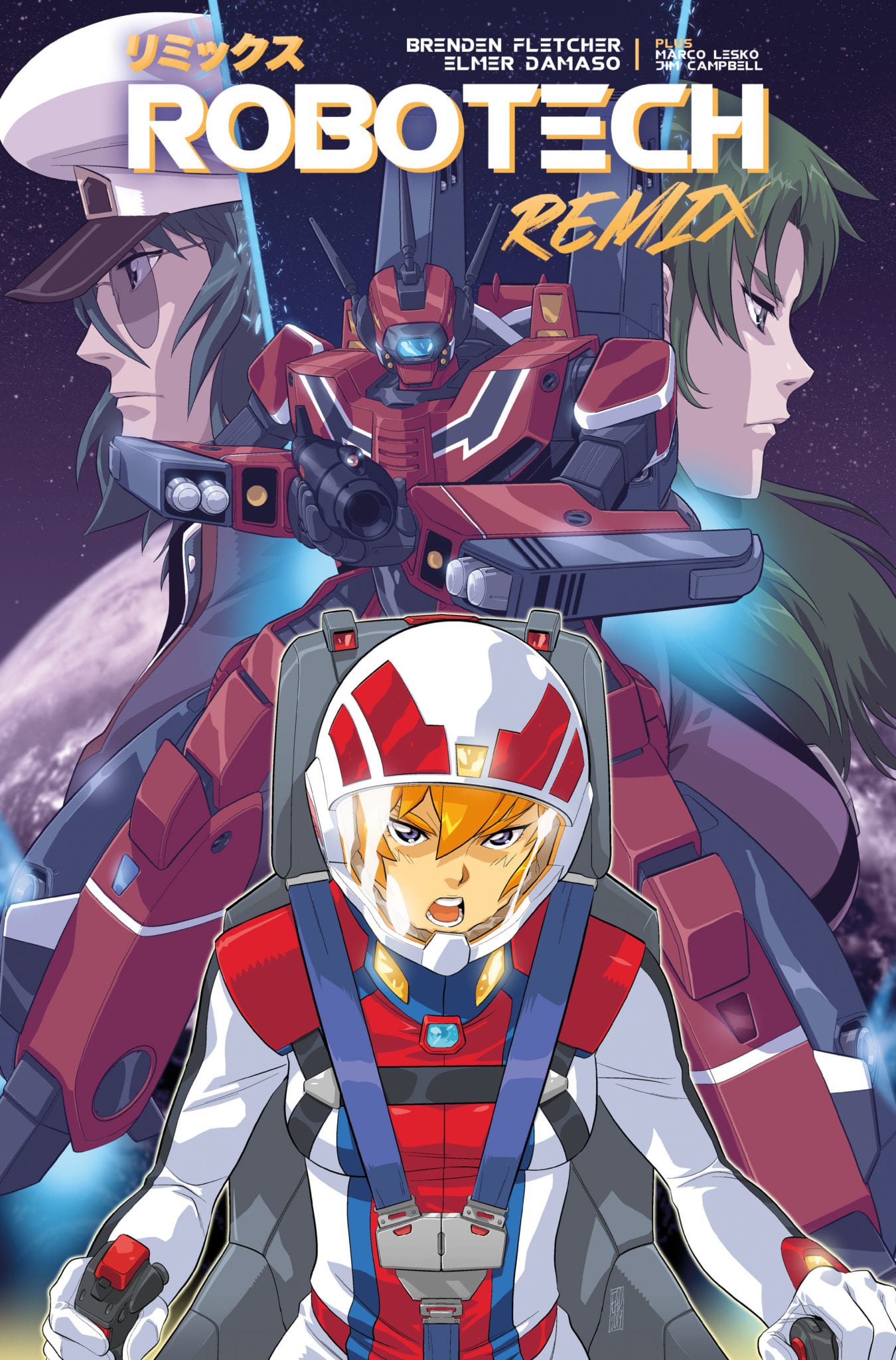
A new chapter begins in the Robotech series with Robotech Remix as Brenden Fletcher puts focus on a Dana Sterling from another universe with the help of Elmer Damaso and Marco Lesko providing the artwork. Will the time displayed pilot be able to deal with making sure she doesn’t destroy the universe in the process?
Summary
As Dana struggles to find her place, a new enemy arrives and Max may have found a way to send Dana home.
Writing
It’s hard to personify the overall product on display here. It is simultaneously a direct continuation of the previous series while at the same attempting to keep the information simple for readers who might be using this as a starting point. Does it succeed? Kind of, what is presented here is a decent jumping-on point. But it still feels like more enjoyment would be had if the reader was up to date with the previous material.
Brenden Fletcher seems to have a story in line, but it feels like it will appeal to more hardcore fans of this franchise over the newer readers. The blatant callouts to characters introduced in the limited released sequel, Robotech II: The Sentinels are rampant. While it’s exciting and welcoming to have these characters be updated. It makes it a bit hard to not read this issue without having to pull up the Robotech Wikia and check to make sure you’re not missing a character introduction or Easter Egg.
Artwork
The artwork is the real draw of this issue. Elmer Damaso does a fantastic job with the emotional expression of the characters. The indecision and uncertainty Dana is feeling is made vividly clear by the artwork employed. Also, Max looks dapper in his captain uniform.
With Marco Lesko providing the colors, the issue gets plenty of great action moments. The sci-fi and battle effects capture the eye from page to page. The two-page splash, when an alien craft appears out of nowhere, is a monumental moment to behold.
The lettering work by Jim Campbell adds a good dynamic of delivery with the storytelling. The sound effects are on point as well and add a perfect audio element to the issue.
Conclusion
Robotech Remix #1 is a good starting point, but the easter eggs and references drag it down. Credit must be given to Titan Comics for not rehashing the original Robotech stories, but it seems like the book is intended for the more hardcore fans. Still, as long as the story surrounding Dana flows smoothly, then Robotech Remix will be an essential installment for fans of the franchise.
The story continues in STAR WARDS ADVENTURES: RETURN TO VADER’S CASTLE #3. Out this Wednesday from IDW, it would seem that Vader’s Castle is both a source of fascination for the fans and characters – constantly churning out story after story.
Ventress is off on a hunting mission.
***SPOILER WARNING***
It would seem that nobody can stay away from the temptation that is Vader’s Castle. What is it that fascinates us about it? Okay, we know full well what it is. And it’s all thanks to the location and lore of this castle.
So it’s no surprise that once again a series has popped up revolving around Vader’s Castle, and that is has been appropriately named Return to Vader’s Castle. The series has quickly become a collection of short stories, all told by the few residents of Vader’s home.
In the first issue, we saw what Darth Maul had been up to since his…dramatic change in body shape and size. In the second issue, we saw how far Grand Moff Tarkin is willing to go to win. And now? Now we’re seeing a tale revolving around the one and only Ventress.
Thom Hudd isn’t having the best of days…
Star Wars Adventures: Return To Vader’s Castle #3 carries on the format introduced in the first two issues of the series. There is an overarching plot connecting everything, a prisoner and his tormentor, and their collective history. But it also contains a compact plot, telling the story from start to finish.
This issue tells the tale of Ventress and how she never gives up once she’s taken a job. Even if that means she won’t get paid in the end. It’s just the type of person she is. Ventress is a unique and iconic character – especially for fans of Rebels. So it was almost fun seeing her pop up once again.
It was also a good reminder for why you’re seriously better off not arguing with her. Just stick to the agreement, and nobody gets hurt. Probably. Maybe. We can hope, at least, right?
Cavan Scott once again returned to write this miniaturized story, and he had a bit of fun here. He pulled put a vindictive character into the same plot as an iconic creature in the Star Wars realm. But it was still surprising to see how it all panned out.
And of course, there’s the ever-growing curiosity about the main plot of the series. Specifically, about how Thom Hudd is planning on escaping Vanee’s torturous experiments, or Vader’s Castle, for that matter. We’d also like to know what his goal was in arriving here because from where we’re standing, it looks like a bit of a suicide mission.
Maybe muttering isn’t the best thing to do when trying to hide.
Star Wars Adventures: Return To Vader’s Castle #3 portrayed many iconic characters in an almost fun manner. Perhaps it’s just the colors and overall brightness that makes it feel that way. This style is perfect for a younger audience and is just begging for a cartoon version.
But while the artwork itself does have a lighter feel, let’s not forget that sometimes it is portraying something incredibly dark. Scenes such as the Ventress’ hunting spree, or the torturing of Thom Hudd. Or how about the unleashing of an unspeakable monster on an unsuspecting town. Somehow the artists managed to show us all of that, without ever getting overly graphic. It’s an impressive feat.
Francesco Francavilla and Nick Brokenshire were the artists behind these smart and dynamic scenes, with Andworld Design providing the lettering. And you’ve got to admit; together they’ve got style.
Back on Coruscant, there’s a monster on the loose. Well, a different sort of monster, that is.
Star Wars Adventures: Return To Vader’s Castle #3 lived up entirely to the hopes and expectations set by the first couple of issues. And it leaves us wondering what sort of tale they’ll be covering next. No matter what it is, there’s no doubt it’ll be an exciting story.
STRAYED #3, out this Wednesday from Dark Horse comics is the tale of an astral projecting cat – and his journey to find new worlds. This issue will stab at the hearts of cat lovers everywhere while slapping on a bandaid filled with intrigue.
Yet another lovely cover for Strayed.
***SPOILER WARNING***
By now most fans are well aware of the plot behind Strayed. Lou is an adorable cat with the unique ability to astral project. Unfortunately for Lou, where he should be having the time of his life exploring the universe, he’s instead stuck in a horrible situation.
Forced to go on the hunt for new planets to take over, Lou is desperate to make his owner proud. Yet his owner only wants Lou to be free and happy. And healthy. You see, astral projecting has a price, and it’s a hefty one.
And that is where Strayed #3 begins. Lou is once again exploring, though he likely doesn’t know the damage caused by every find he reports. And it’s only a matter of time until the truth comes out. But what can Lou do about the situation? As adorable as he is, he’s just a cat. Right?
The space scenes in this series are truly outstanding.
Strayed is one of those series that will truly tug at the heartstrings of all animal lovers – but especially cat lovers. Seeing Lou’s devotion to his owner is one thing, but then seeing him actively put in danger (through health risks) brings the emotional toll to a whole new level.
So it’s safe to say that Strayed is not a casual and relaxing read. But that’s okay. Instead, it’s perfect for anybody looking to see a whole slew of fascinating new worlds. Or to see a unique take on some science fiction tropes.
Carlos Giffoni is the author of the series, and we’re only now getting to see the long term plan he has for these characters. There’s something much more significant going on behind the scenes. The plot is more than just the human race being its usual greedy selves (though there is that). The story is more than even the love between an owner and her cat.
But Giffoni has taken his time laying out the groundwork for the series. That admittedly resulted in a lot of questions in the earlier parts, but now that we’re getting into the swing of things, it feels like the series is balancing out. Now all of the questions come out of concern for the leading characters.
There are still is a lot left to this tale, naturally. Lou has only just been allowed to realize his role in what was happening. And so far, he hasn’t been given a chance to come to terms with it all. It will be interesting – and perhaps a little heartbreaking – to see how he accepts this information over time. And what he does about it.
Admittedly there is still some room for development, as far as the antagonists are concerned. They feel like flat archetypes, albeit greedy and money-hungry ones. With time the series could potentially push their motives into something truly intimidating. But we’ll have to see how far that goes.
A double-page spread showing off some of the conflict in this series.
As per usual, the artwork behind Strayed #3 is absolutely striking. Honestly, this series is worth reading for the artwork alone. The multitude of unique worlds shown in this series so far has been breathtaking. We’ve seen vibrant worlds full of intricately designed plants, ethereal creatures, all full of effervescent life.
Juan Doe deserves all the credit for how Strayed looks. He’s behind everything, except for the letters, which is done by Matt Krotzer. Doe designs everything from the dynamic lines to vibrant colors. And what he comes up with is truly breathtaking. It leaves us hoping that we’ll see more of space and the many planets available to see just how far his creativity can be pushed.
A new history has been revealed.
Strayed #3 was a surprisingly emotional issue, thanks in part to the way it concluded. Even knowing that things will likely turn out okay (in the short term, at least), it’s hard not to be anxious about what is happening. All while being curious to see how Lou and his owner will get out of their horrid situation. Only time will tell how Lou handles the latest bit of news thrown at him.
Toy Story 4 released in June to rave reviews and has worked its way to a billion or so dollars, but the real story is about Forky, the breakout star character who is getting a series of animated shorts and putting the music to the CGI magic is composer Jake Monaco.
Tony Hale returns in Forky Asks A Question as the voice of the titular character. If you don’t know, this is the mildest of mild spoilers, Forky is a toy that was just a spork until Bonnie, the main human character in Toy Story 4, turns him into Forky. The episodes are set to air starting in November on the upcoming Disney+ subscription service.
PopAxiom spoke with Jake Monaco about his work on scoring some Scooby-Doo, the documentary Through the Windows, and making Forky for Disney and Pixar.
Falling In Love
Jake was born in New Jersey, raised in New Hampshire, and went to college in Virginia. “Music has always been a part of my life. I played the guitar when I was very young … In high school, I joined some bands and played all through college.”
Jake did a “little bit of scoring” during this time too. Eventually, Jake and his bandmates went their separate ways. “I still wanted to pursue a career in music.”
Jake was made aware of the USC film scoring program. “I checked it out … and fell in love.” Jake applied and received a spot in the program.
Post-USC
After finishing the program at USC, Jake earned a gig with composer Christophe Beck (Frozen, Ant-Man). “I was with him for seven-and-a-half years or so. It went from an assistance-ship to an apprenticeship.”
Jake says of his time with Beck, “There’s nothing like real-world experience.”
Jake’s career blossomed from there. “Chris and I are still great friends and work together every so often.”
In the era of the great content expansion, there’s been a more diverse mix of scores and composers thinking outside the box. “I think a lot of the singer-songwriter background I had helps me a lot with my film scoring. It brings a different flavor.”
About Forky Asks A Question
Forky is a product of Pixar who is one of the most consistently good filmmaking studios ever. Oh, and Pixar’s part of Disney, one of the other most consistent studios ever. “What I love about both Disney and Pixar is that everyone is so excited about what they are doing. It’s so collaborative.”
Jake expands on the collaboration present for Forky, “Bob Peterson, who directed all the Forky episodes, flew down with a couple other people from the project. We sat in Studio A at Capitol Records with six or seven of the top musicians in L.A. and went through the recording process.”
“It’s one of my favorite things about my job and the industry I’m in.”
Getting Stinky & Dirty
Last year, our sister-site interviewed Guy Toubes, the creator of hit kids YouTube series Stinky and Dirty. Jake became part of the show after submitting some samples. “I watched the pilot, and one of the things about the show is the trucks, they utilize what they have to solve any issue that they come across. I thought it would be fun to embrace that in the musical approach of the show and try and use more found objects.”
What exactly does that mean? “A banjo made out of a hubcap. Instead of using a standard shaker, I’d fill up a plastic bottle with sand or beads or rice; bang on pots and pans instead of a more traditional drum.”
Stinky & Dirty is a highly creative show about being creative problem solvers, and behind the scenes, that same creativity was going on. “It was about finding interesting and unique instruments to bring to the palette of that show.”
Supporting A Story
Every project is different. But there are questions to ask when starting any new one. “Who is the target audience? Is it for teens … a more mature, adult audience?”
Once those questions are understood, “… then it’s about supporting the story.”
In regards to kids’ shows specifically, Jake explains, “I think one of the tricks is finding that middle ground so that it’s really supporting a story for a pre-school audience but then making it less monotonous for adults watching along with the kids. I want the viewing experience to be fun for everyone involved.”
On Another Note
Jake’s work appears in Through the Windows, a documentary about the Twin Peaks Tavern, a gay bar in the 70s which challenged the status quo by opening its windows. What’s it like shifting gears from computer generated forks to real-world rebellion? “For the documentary, Through the Windows, it’s more about achieving a tone. What’s the mood?”
Jake further explains, “We’re not going to try and acknowledge every beat that’s happening on screen but instead, ride along with the emotion that the storytellers are sharing with us.”
More questions arise. “Is it happy or peppy or serious? And how do we bring those emotions together into a sonically cohesive world.”
Musical Puzzles
Every project is a puzzle to be solved. “With shows like Stinky & Dirty or DinoTrux, it’s more about … jumping in and writing for the episode.”
For other projects, you’re getting pieces of the larger puzzle at a time. So, Jake works with what’s available. “We have a main character theme opportunity here. We have a love scene here. And an opportunity for our antagonist’s theme here.”
“I’ll tackle those three spots, present those, and then from there figure out the rest.”
Singing & Driving
Jake lives in L.A. and primarily works out of a home studio, which means he doesn’t often drive even though it’s a source of inspiration. “My best spot for ideas is while I’m driving in my car. When I’m driving to meetings, I typically don’t listen to much of anything in the car, and my brain will start working.”
Jake continues, “I might start thinking through a story. Toying around with ideas.”
To preserve the idea, “I’ll sing stuff into my phone.”
The snippet of the idea becomes part of the bigger puzzle and the joy of composing for Jake. “Then there’s the challenge of taking that 10 or 15 second bit and making into something that will work for two or three minutes.”
Wrapping Up
Jake worked on Be Cool, Scooby-Doo, so as a lifelong Scooby-Doo fan, I’d be remiss to not ask what that was like. “Having the opportunity to be part of the legacy of Scooby-Doo, it’s amazing.”
Who inspires and influences Jake daily? “Spending those years with Chris was great. He helped my musicality grow by leaps and bounds. Thomas Newman has always been one of my favorites. What he’s done, and continues to do, with Pixar projects from Finding Nemo to Wall-E, is as unique as the stories themselves. ”It’s such an emotional journey that he can take us on.”
Outside of the film music world, “I listen to a lot of indietronica music. It’s got a bit of the indie nature and is rough around the edges but also still more polished. A lot of interesting sounds and devices that bands are using their production these days.”
“What if I used that but flipped it and reversed it and turned it into the sonic identity for this character.
Forky is on its way, so what’s next for Jake? “I’m in the middle of working on another Pixar short called Lamp Life starring Bo Peep.”
Forky Asks A Question will be part of Disney+
when the service launches on November 12th, 2019.
Thanks to Jake Monaco and Rhapsody PR for making this interview possible.
Want to read more interviews like this? CLICK HERE.
Vault Comics has been consistently amazing with its debut issues; this streak continues in the fast-paced, plot-heavy HEIST #1.
The Crew For The Job
Every heist needs a crew, Vault Comics’ newest series is no different, featuring Writer Paul Tobin as the plan man, with a detailed outline (artist) by Arjuna Susini, Vitrio Astoneto on blueprint duty (colors), and Saida Temofonte writing it all down (letters).
Plot, or How To Plan To Steal a Planet
The story in Heist #1 moves quickly; in each moment Tobin adds subtle world building, and varying amounts of character development. Tobin reveals Glane’s character and world in four quick panels.
The following pages, Tobin explains Glane’s recruitment plans. Each new development feels fast and lengthy enough to keep the ball rolling while mysteries evolve. These moments show how deep Tobin built the universe.
But, as fun as Glane is, he feels akin to other con-men tropes, with witty banter, oozing charm, all while being a lovable rogue. These aren’t bad per se; there’s a reason it’s such a long-running trope. But if you placed any other famous con-man character here, the story would feel the same.
The Art of a Heist
Heist (the planet) is as slimy and grimy as you’d expect a planet full of thieves (and worse) to be. This sense of uncleanliness is courtesy Susini’s claustrophobic art. The crowds seen will have you constantly checking pockets for content. Or, even your back for knives, due to the multitude of assassins.
The cluttered vibe Susini’s art emits matches perfectly with the story Tobin tells. But in some moments, the busy panels become a tad much, obscuring things that transpire. But these aren’t common unless multiple things are happening.
The few segments of high octane violence keep the pace the story strives for, as these moments are fun while making you crave more. Helping the busy panels stand out are the contracting colors by Vittorio Astone.
Usually, planets consisting of thieves have landscapes that are presented as grayish and dull. Heist’s planet exudes these grimy colors while adding in a brighter palette to help it seem lively, and futuristic.
As thriving as the crowds are, the world and people never make noise. While reading Heist #1, it seems off, as some added background noises would’ve given Heist an even livelier feeling. Besides that, Temofonte has a lot of words to work with, while trying to find the perfect spot to put boxes/bubbles not to hamper the art.
The Heist of a Lifetime (Conclusion)
Although it does feel clustered at some parts, Heist #1 is a great first issue. Proving that Vault Comics is one of the top publishers at the moment.
Memorable Quote: “You’re the one who farted in the wrong direction, and she got the stink.” – Hardy (Bartender)
Hardy has a unique way with words. I wish he were my Bartender.
Readers of Earth
If this piques your interest, check out, Heist #1 when it releases November 6. When you do, let us know what you think down below. While you’re at it, check out our other Vault Comics reviews!
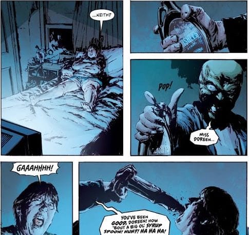
The Mask, the zany anti-hero that’s been a fan favorite since his debut in 1987, is back in the limelight with THE MASK: I PLEDGE ALLEGIANCE TO THE MASK #1’s release Wednesday, October 16th. The series picks up almost two decades after the notorious figure known as “Big Head” disappeared, a period in which the city has somewhat recovered from the chaos. But the recent murder of two foster parents (who happen to be extremely abusive) has people talking about The Mask again. And in the midst of a highly contentious election season, it’s hard to believe the city will remain unscathed.
Story
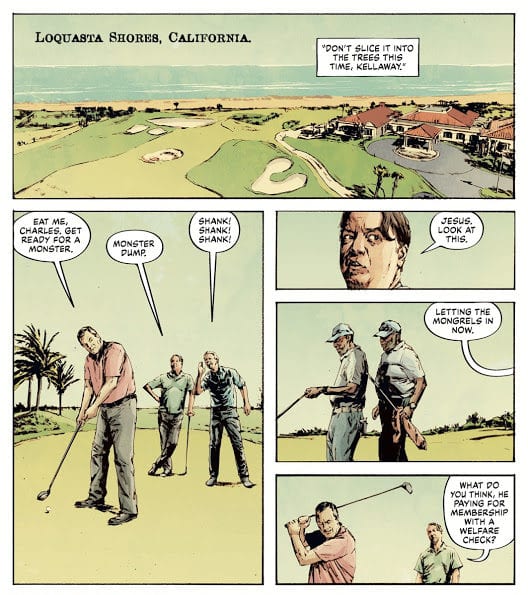
Mitch Kellaway, a detective lieutenant serving Edge City, has lived a largely unglamorous existence throughout his career. Routinely disgraced by his golf buddies and largely unrecognized by the police department, the man resorts to drinking for some reprieve. But Kellaway notices the news report saying one of the foster parents’ children describe the killer as having a “cabeza de verde,” which means “green head” in Spanish. Fending off a horde of bad memories from his past run-ins with The Mask, the detective races to find backup.
While Kellaway attempts to alert those who would help the city prepare for The Mask’s return, Mayor Kathy, the former girlfriend of Stanley Ipkiss (the mask’s previous wearer) charges ahead in her campaign in the U.S. presidential race. Unfortunately, a gigantic obstacle lays in her way. She must find a way to address the crumbling infrastructure of Edge City, deal with the recent reports of The Mask, and, most personal of all, face extortion from a tech billionaire who’s heavily invested in her election. He has dirt on her previous stint as The Mask and plans to implicate her in the recent murders unless she writes legislation to give him full access to user data on any technological platform.
Both of these storylines are set within a political climate filled with hate, distrust, and fear—much like our own.
Writer Christopher Cantwell brilliantly weaves together our modern, contentious, and crazy political climate into the equally zany antics of the THE MASK series. We see the effects the vigilante has on peoples’ lives—Kellaway, Kathy, and many more—and it proves Cantwell can bring multiple unique points of view into the storyline.
Artwork
Patric Reynolds’ penciling, Lee Loughridge’s coloring, and Nate Piekos of Blambot’s lettering each capture the gritty style that marked this series’ heyday in the late eighties and early nineties. We see that the grit is much stronger nowadays, however, with little zaniness at this point in the narrative. The blood from The Mask’s murders looks real, and the font styles presented in the lettering bear witness to the terror each character experiences due to The Mask’s reappearance.
The Comic Covers
Main Cover
Reynolds’ cover artwork features The Mask hiding under an ordinary hoodie, surrounded by posters urging the public to vote for him. This illustration’s is straight to the point: The Mask has returned under our noses, and he’s moving into politics.
Variant Cover
Rafael Albuquerque’s variant cover also depicts the titular character in a hoodie, only this time it’s covered with stars from the America flag. We also see that he’s holding a bag of cash, coupled with a backdrop of red and white stripes. The implication is that the notorious figure is planning to rob the country blind, both in terms of material goods and the values we hold dear.
Conclusion
THE MASK: I PLEDGE ALLEGIANCE TO THE MASK #1 is a promising political satire unlike we’ve ever seen. Marrying the already complex character of The Mask to our own world’s zany and cruel politics will speak to politically aware readers on multiple levels.
Do you like the political tones in this continuation of THE MASK series? Let us know in the comments below!