Home Blog Page 403

Review: AQUAMAN #53—The Erasure Of One’s History

AQUAMAN #53, available in stores on Wednesday, October 16th, opens up a new chapter in the life of Arthur Curry. After failing to save a man named Ralph from a horrific sea creature in issue #52, he’s been looking for answers. Fortunately, those answers have arrived right under his doorstep in the form of Tristram Maurer. The Amnesty Bay loremaster seems to have survived after two centuries, and he has a message for Arthur about the sea beast. At the same time, the villain Black Manta has set his sights on Atlantis. Will the former duo of Arthur and Queen Mera be able to alleviate these threats together, or have the past events destroyed any chance of a reunion?

Story

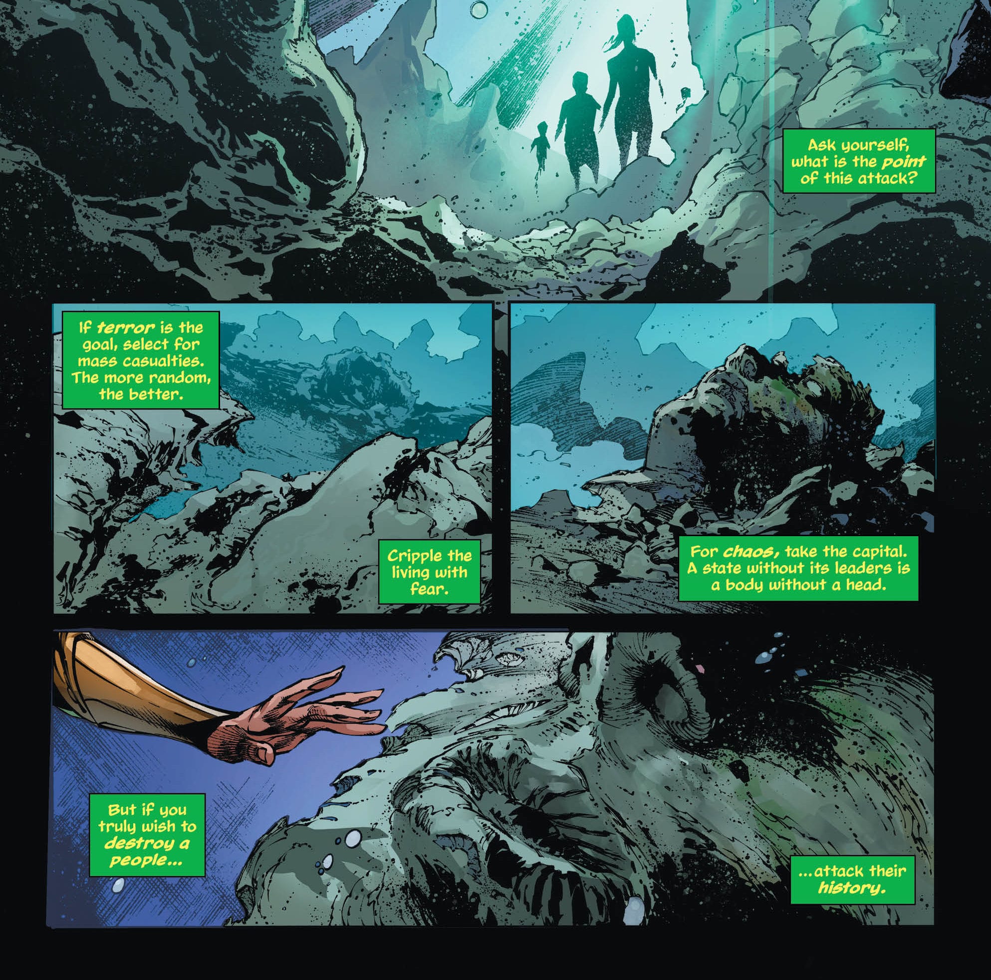
Mera and her Atlantis guard pay a visit a number of destroyed statues in their city gardens, tracing the evidence left behind to Black Manta. Mera interprets this as an act of aggression, an attempt to erase the nation’s history. In response, she seeks out Arthur’s assistance in taking down the villain, despite their current estrangement.

Mera investigates the rubble in the Gardens of Caeusa

While this is taking place under the sea, Maurer, who told horrific tales of monstrous beasts some 200 years ago, has a message for Arthur: the monsters are real. The old man shares memories of imagining fantastical creatures as a boy, only to find that they became fully corporeal beings soon after. Because of this unfortunate ability Maurer exiled himself from Amnesty Bay and society at large. Now he’s a man full of regret, both for his creations and lost history.

Writer Kelly Sue DeConnick weaves a tale of lost history within this issue—we see material losses in the histories of Atlantis and Maurer. Mera must cope with the lost of historic architecture from Black Manta’s terrorizing attack, and Maurer comes to terms with his self-imposed exile from his home in Amnesty Bay. Can both of these groups come together and stand up against their respective threats?

Artwork

Maurer imagines beasts as a boy

The artwork was wonderfully diverse throughout AQUAMAN #53. Robson Rocha and Eduardo Pancica’s penciling, fully fleshed out by Daniel Henriques and Júlio Ferreira’s inking, easily transitions from Mera’s underwater kingdom to the small town vibes from Amnesty Bay. Sunny Gho’s coloring adds to this effect as well, especially when Maurer recalls his past; the memories of the old man and his monster creations all have a tan tint to show that these events took place in a distant past—or were ripped out of the pages from a storybook. Clayton Cowles’ lettering is another great feature of the book’s art, offering a variety of narration dialogue boxes to give the reader context; this includes the historical recap of Amnesty Bay’s founding and Maurer’s narration of his childhood memories.

Comic Covers

Main Cover

Rocha, Jason Paz, and Alex Sinclair put together the main cover. It features Arthur’s Aquaman uniform sitting on an empty Atlantis throne, symbolizing Mera’s search for her co-ruler to alleviate the city’s threats.

Variant Cover

Rafa Sandoval and Rex Lokus’ variant cover gets up close and personal, depicting a close-up view of Arthur’s battle scarred face. Its a perfect reflection of the violence ramping up in Amnesty Bay.

Conclusion

AQUAMAN #53 hits home with relevant themes of regret and loss. It also sets up a number of threats that will put our heroes to the test. We can’t wait for the next issue!

What did you think of Arthur and Mera’s short-lived reunion? Let us know in the comments below!

Monkeys Fighting Robots Youtube

Heroic Moments Abound In ABSOLUTE CARNAGE #4

Monkeys Fighting Robots

In Marvel Comics’ Absolute Carnage #4, on sale October 16, writer Donny Cates takes the series to a thrilling next level ahead of its looming conclusion. In an event filled with despair, the latest issue gives the reader some hope while it maintains the previously established stakes. After another gripping installment, we can’t wait to see how this epic story ends.

Absolute Carnage #4

Writer: Donny Cates

Penciler: Ryan Stegman

Inkers: JP Mayer, Jay Leisten and Ryan Stegman

Color Artist: Frank Martin

Letterer: VC’s Clayton Cowles

When we left off, the Hulk had just bonded with the Venom symbiote and Cates picks up in this same moment. The first page shows Hulk-Venom crushing Carnage.The image of  the Gamma Green Giant fused with a symbiote is delightfully wacky because he’s inherently a beast, so pairing him with a powerful extraterrestrial suit feels like overkill. Hulk-Venom is another reason why Absolute Carnage feels like DC’ Comics’ Dark Nights: Metal; it embraces the ludicrous side of comic books. (In Cates’ Venom, There have also been symbiote dragons and, later this issue, Carnage looks like a winged demonic beast from Hell.) Cates strikes the balance between the goofy and the grim, which is why we can appreciate the cinematic first page.

Absolute Carnage #4
The Hulk-Venom hybrid is an incredible sight.

This dynamic opening splash from penciler Ryan Stegman makes it feel like the Hulk is bursting out of the comic book. Inkers JP Mayer, Jay Leisten and Stegman add texture to the page; the crumbling wall feels three-dimensional, which adds to the animated style. Color artist Frank Martin makes the Hulk and Carnage look demonic in their own ways. He gives Hulk glowing green eyes and gruesome, gnarly teeth while he continues to make Carnage look like a fiery jack-o’-lantern with a jagged red smile. Finally, letterer VC’s Clayton Cowles conveys the duality of Hulk and Venom by juxtaposing a green outline for the former’s dialogue with a black background for Venom’s speech bubble. Once again, the art team is firing on all cylinders, which makes Absolute Carnage a pleasure to read.

Now that the Venom symbiote has bonded with the Hulk, Eddie Brock is practically powerless. But that doesn’t stop him from being the most heroic character in this issue. Cates continues to give the series’ various protagonists valiant moments and Eddie takes the cake here. Though he’s unarmed, he holds down the fort when the other heroes are incapacitated. Eddie picks up Captain America’s shield and charges into fight a horde of Carnage’s minions. This moment makes you want to stand up and clap. Eddie isn’t as virtuous as Steve Rogers but he keeps growing into his best self. At times, Cates foreshadows that this growth will lead to a heroic sacrifice.

Absolute Carnage #4
Spider-Man tries to stop Eddie from doing something reckless.

Eddie, a classic loner, has something to live for now. He has to protect Dylan, his son, at all costs. When Carnage’s goons invade the heroes’ safe house, it’s up to Eddie to hold them back. Eddie’s sheer willingness to single-handedly wage war against the swarm is inspirational. Before he risks his life, Spider-Man tries to stop his nemesis. In a heart-warming moment, Eddie asks Spider-Man to protect Dylan. ““You’re all I have,” he says. “Please, for whatever i’ve been to you over the years, just please do this for me.” The complex relationship between Spidey and Eddie has been one of the most fascinating narratives in this series, and hopefully the finale will add even more depth to it.

Absolute Carnage gets better with each passing issue. In the most recent installment, the heroes rally, though Carnage gains momentum, too. The stage has been set for an incredible finale and we’ll have to wait to see how it holds.

What’d you think of Absolute Carnage #4? How do you want to see the series conclude?

Monkeys Fighting Robots Youtube

Review: HIT GIRL Season 2 #9 Provides Beauty And Horror In Equal Measure

Monkeys Fighting Robots

Her tour of the world has brought Hit Girl to India this week in the first part of Peter Milligan’s run on the comic. With the additional talent of Alison Sampson, Triona Farrell, and Clem Robins, Image Comics hold nothing back as the young vigilante brings violence to India’s largest city, Mumbai.

Like a spirit of vengeance crossed with the A-Team, Hit Girl  prowls the streets looking for someone who needs her services. With Mumbai’s population being over nineteen million people, it isn’t long before she is engorged in violence but will the cultural differences cause her greater concern than she thought possible?

HIT GIRL Season 2 #9 Provides Beauty And Horror In Equal Measure
Hit Girl Season 2 #9 Alternative Cover Credit: Image Comics

Hit the Ground Running

Peter Milligan is no stranger to violence having worked for a number of years on stories for 2000AD. He is also known for crafting surreal mysteries and mind warping tales of wonder. This somehow makes him a perfect fit for a Hit Girl story set in the underworlds of India. His research into the culture is obvious and he uses the culture shock of the central character to explore some of the world of Mumbai.

Mindy McCready lands into Mumbai and quickly gets involved with a bizarre kidnapping and exploitation ring. In her attempts to get to the heart of the gang she is faced with blockages she has never encountered before. Meanwhile Milligan shows the reader the otherside of the coin, with the wealth and opulence behind the villainy.

This contrasting nature of Mumbai provides a perfect opportunity for the artwork to really shine; and with Alison Sampson on art duties, the visuals do just that. Sampson has a delicate touch with very fine inked lines. She picks up every detail possible, especially in the architecture, illustrating beautiful, and bountiful, sets for the action to take place in. The exquisite design work in the Indian buildings and decoration is brought to life in every panel. Mumbai becomes a fully immersive world for the reader to get lost in, just as Hit Girl herself does.

HIT GIRL Season 2 #9 Provides Beauty And Horror In Equal Measure
Hit Girl Season 2 #9 Credit: Image Comics

Details, Details

The plot has some disturbing elements and so does the artwork. Sampson is as competent at depicting violence as she is at building liveable spaces. There is something unnerving and raw about the violence on show in this issue of Hit Girl. Previous runs of Kick Ass, the more recognisable visuals, have been brutal but always in a comic book way. Sampson brings a disturbing realism to the work. This is enhanced by the realistic coloring style of Triona Farrell.

Farrell’s vibrate colors bring out the beauty of India and the culture but this style makes the violence more impactful. Within this bright, shining world, the slashes of a machete or even something as simple as a slap to the face, stand out. The pain the characters feel is evident and in the readers face. As the story continues, Mindy begins to feel as if she is out of her depth, lulled into a false sense of security, just as the reader is by the attractive and inviting colors from Farrell.

This discomfort and awkwardness is further enhanced by Sampson’s use of unconventional viewpoints. She wildly swings the point of view from a long shot to a close up and then to a ground shot, looking up at the deformed figure of a man, looming over the reader. Sampson used this style to great effect in her horror comic Winnebago Graveyard, and it works just as well here. Hit Girl‘s world is not a safe, comfortable place and that is reflected in the way that Sampson leads the reader through Milligan’s plot.

The lettering brings some much needed grounding to the comic. Clem Robins seemingly straightforward approach to the speech balloons and the captions help to steady the wilder aspects of the comic. However, if you look real close, even Robins is manipulating the reader’s impression of Hit Girl‘s world. Occasional bolding of text not only gives emphasis in a particular speech but also alludes to something larger within the plot. References to the Beggarman and the Mumbai Diary stand out on a page as if they have a great significance. 

HIT GIRL Season 2 #9 Provides Beauty And Horror In Equal Measure
Hit Girl Season 2 #9 Credit: Image Comics

Conclusion

This issue of Hit Girl is something special. It is obviously Hit Girl and draws likenesses from that world of storytelling but everything else about this comic feels new. The visual aesthetic and attention to cultural details gives the story some weight. The focus on the story is the cultural shock that Hit Girl experiences and this is portrayed through every strand of the comic. The creators invite the reader into this alluring world and then instantly make you feel uncomfortable. 

This is a step up in every way from the original source material that spawned Hit Girl. Milligan, Sampson, Farrell and Robins all share one thing in common; their attention to detail. Together this makes for a comic that is instantly re-readable and a pleasurable, visual experience.

Monkeys Fighting Robots Youtube

Review: Springer Brings The Action In TRANSFORMERS #13

Monkeys Fighting Robots

The new Transformers series from IDW Comics written by Brian Ruckley has been playing the slow game to re-introduce famous faces to this new series but takes a step forward with this issue. Fan-favorite Springer comes in but what does he add to the story as the entire planet continues to search for two different killers?

Summary

The hunt is on! Chromia and Prowl launch a massive security operation, desperately trying to track down two murderers. Bumblebee visits an injured Windblade, Orion Pax, Sentinel Prime, and Megatron wrestle for control and influence.

Transformers

Writing

This issue seems to be taking things in a better direction than previous issues. The slow pace has been the major flaw against this series since its reintroduction. The main mystery introduced in the first issue hasn’t been solved but here it at least feels there is some forward momentum. Investigations leading to shootouts do have a way of drawing characters in much more effectively than political dialogue. Thanks, Springer and Sideswipe for shooting first and asking questions later. Your reckless behavior makes for a much more entertaining issue.

On the more low-key side, Brian Ruckley is still playing the underlying tension angle through the use of Bumblebee. The yellow undercover agent is trying to his best to stay in good graces with the Decepticons Ascenticons to the point he is willing to get their new badged etched into his chest. The suspense is high as he tries to find out more information about who killed his mentee and at the same time he doesn’t know who he can trust in his new group of “friends.” Hopefully, he will move closer to cracking this case and ending at least one of the mysteries this story has introduced.

Transformers

Artwork

The credit for the pencils and inks goes to Alex Milne and Angela Hernandez. Though their styles are different, they seem to blend in a way which doesn’t distract from initial viewing. It’s only after a second reading does the differences become noticeable. Mixing of art styles like this is a testament to their skills as artists.

The coloring work by Joana LaFuente and Josh Perez adds a great deal of atmosphere to the piece. The shadows as Bumblebee investigates the Ascenticons adds a feeling of dread around the situation, while the effect work makes the action scenes pop. There also is a great sense of pain in one scene as Springer is thrown into an energy field which is brought to life perfectly by the colorwork of the pair.

Tom B. Long on lettering adds the right sense of sound to every frame of the comic. The opening showcasing the branding with the new symbols has the perfect sound effect with “Cank-Shhh”. The effect work really helps to add to the cinematic feel of the story.

Transformers

Conclusion

Transformers # 13 is a step in a better direction with more transforming and more action instead of the building conspiracy. The new Transformers series isn’t bad but it still has a long way to go to catch up to the saga which predated it. With more issues like this, such a feat would actually be obtainable.

Monkeys Fighting Robots Youtube

Review: VAMPIRELLA #4 is a Narrative Turning Point

Monkeys Fighting Robots

There are plenty of superheroes in the annals of comics lore who operate in the shadows. I think it’s fair to count Vampirella among them; perhaps as more of an antihero than a conventional superhero. One thing common to most of them, though, is a penchant for daring—and often public—deeds. Being in the public eye doesn’t mesh with Vampirella’s persona. But, when her dedication is questioned in Vampirella #4, out this week from Dynamite Entertainment, she’s forced to choose whether to remain hidden or to reveal herself.

Vampirella #4

The Writing

Writer Christopher Priest’s narrative struggled somewhat to find its footing in the few first issues of this new run. Vampirella #4, though, sees the book really hit its stride.

The issue opens with the undead Von Kriest reenter the narrative in a flashback to before the plane crash. Of course, this is just laying groundwork for further developments, as we soon refocus on our protagonist’s own turmoil. In contrast to earlier issues which felt somewhat scattered and unfocused, the writing here is sharp and well-paced. We learn more about Vampirella’s relationship to The Six Marys, and to her other human counterparts. Specially, how they experience, and relate to, their sexual identities and anxieties about them.

In addition, Benny the Witch emerges as a much more interesting character in Vampirella #4. Although he’s popped up here and there, it’s in this issue that we really get a taste for his persona. He’s equal parts sardonic comic relief and moral voice; a Jiminy Cricket figure with a taste for gallows humor. Benny also serves as a foil to Vampirella’s guardian Eustankhios (Stan, for short), who has a much more amoral and dismissive reaction to Vampirella’s heroics.

The writing in Vampirella #4 is concise, yet hard-hitting. Earlier issues had spans that felt inconsequential, even dull in their extraneousness. Here, though, Priest doesn’t waste any words. This is the most compelling, and most complete, issue yet in the story, and it feels like we’re headed somewhere great.

Vampirella #4 Vampirella #4

The Artwork

Ergün Gündüz clearly has an eye for symmetry in his compositions. Throughout the book, we see panels divided neatly into a fairly-consistent grid format. The artist’s illustrations match the tone and emotional pitch of the narrative well. However, the strict adherence to the format of the pages can sometimes clash with the story; some panels feel overly-cluttered with word bubbles, distracting from the artwork.

The art, as a whole, is solid. Gündüz provides more of the enticing and lively action we’ve seen in earlier issues. Panels, especially when the action picks up in the book’s latter half, carry momentum from one to the next and accentuate the storytelling.

That said, the artist sometimes has issues creating convincing facial expressions. Characters’ faces, especially that of our titular heroine, sometimes feel rather cold and lifeless; their eyes a little too much like dolls’ eyes. This isn’t an issue unique to Vampirella #4, though. It’s remained a consistent gripe over these last few issues.

Gündüz also provides colorwork for the book. He opts for a very earthy palette of tones, with browns and darker greens dominating much of this issue. While not always the most visually exciting, it’s skillfully applied and compliments the linework well.

Vampirella #4

Final Thoughts

Vampirella #4 reads like a turning point for the series. While the first three issues felt more like prologue, this book gives the impression we’re really starting to advance the narrative. I recommend it.

Monkeys Fighting Robots Youtube

Review: Music, Mayhem, And Emotional Tragedy In KILLER GROOVE #5

Monkeys Fighting Robots

In the final issue of AfterShock ComicsKiller Groove, out this week, writer Ollie Masters brings his violent 1970’s drama to a climactic end. It has all been leading to this, a final confrontation between old lovers; between the music and the family; between good old fashioned right and wrong.

After five issues of exploring the underground culture of 1970’s Los Angeles, Masters focuses the finale on the central characters and the consequences of their actions or, in some cases, their in-actions.

Music, Mayhem, And Emotional Tragedy In KILLER GROOVE #5
Killer Groove #5 Credit: AfterShock Comics

The Killers Story

Like a spinning record, Masters has tightened his story issue after issue, the needle edging ever closer to the centre of the vinyl disc and the inevitable conclusion. 

Previous issues of Killer Groove have contained intricate, complex story lines with multiple characters coming and going, weaving around each other like the separate tracks of a record. Surprisingly, this final issue is very focused. It centres on the relationship between Jonny and Jackie and the consequences of their actions over the last four issues. An inevitable confrontation is coming and Masters manipulates the reader’s reactions by exploring the emotional personalities within his characters. 

At first Jonny was a tragic figure, desperate to do whatever it took just so that he could make it in the music business. The reader had some sympathy for him but as his story progressed he quickly became a man to despise. There was a brief moment of respite, where redemption became possible but ultimately his act of kindness was as selfish as all his other acts. 

Jackie started in a dark place, cut off from those around her and this, in turn, affected her life style. She was in a slump. Her journey forced her to interact with people and take responsibility for her actions. This led to the formation of a family around her, a family that she has grown to love. Ultimately, when this family became threatened, she had to rise up and fight back.

This final issue of Killer Groove is where those two character arcs cross over and their futures are as entwined as their pasts. Masters brings each character arc to a satisfying conclusion and the art tells the emotional story beautifully. 

Music, Mayhem, And Emotional Tragedy In KILLER GROOVE #5
Killer Groove #5 Credit: AfterShock Comics

Groovy Art

Eoin Marron creates outstanding drama through his layouts and compositions. He uses thin inked lines for the characters but drowns the scenery in shadows producing an oppressive atmosphere for most of the comic. Characters like Lucy appear to have the weight of the world on their shoulders while Jonny is slipping ever further into the darkness of his own making. 

There are also a number of metaphorical visuals. They form part of the storytelling but also indicate character decisions and emotions. Marron drops them into a page, usually in the final panel, causing the reader to pause and reflect. It is a technique that helps to control the pacing of the comic and slows the reader down, especially on pages which are text light.

Throughout the run of Killer Groove, Jordie Bellaire has provided the atmosphere via bold color choices. Each page is a visual representation of the characters moods, with dingy grey and browns creating a sense of hopelessness or cold blues indicating an emotionless killer. 

Equally, the unique speech balloons provided by Hassan Otsmane-Elhaou have been consistent, adding to the singular look of the comic. The subtle changes in the shape of the balloons or the angles of the tails add emphasis and, in some cases, emotion to the speech. The sound effects have a rough edged font which reflects the harshness of the actions they relate to. Every aspect of the comic has been designed around creating a single, overriding atmosphere for the development of the characters and plot.

Music, Mayhem, And Emotional Tragedy In KILLER GROOVE #5
Killer Groove #5 Credit: AfterShock Comics

A Killer Conclusion

Like any good Noir story, Killer Groove has a violent ending which is neither uplifting or too down beat. A moment in the lives of these characters has come to an end, satisfying enough for the reader but not everything is neatly tied up, which is the way it should be. Masters has created a complex web of a story, leading the reader and his two central characters to an inevitable, emotional, confrontation. 

The writing is the match of a Dashiell Hammett story: a thriller fuelled by characterisation. The artwork looks like a 1970’s gangster movie but the layouts and composition are uniquely comics. Killer Groove is clearly inspired by some of the best thrillers from every medium and will in turn inspire future stories of this nature. 

With Killer Groove, AfterShock Comics have a surefire hit on their hands.

Monkeys Fighting Robots Youtube

NSFW Review: MONEY SHOT #2 You Read For The Plot

Monkeys Fighting Robots

On November 13, Vault Comics’ Money Shot #2 will show that scientists having sex with aliens is more than just eye candy.

If you missed the foreplay don’t fret, check out the review of Money Shot #1 here. If you liked the first issue, let your local comic book shop know, as the final order date for Money Shot #2 is October 21.

Money Shot #2 Interior Page. Art by Rebekah Isaacs, Colors by Kurt Michael Russell, Letters by Crank!

XXX-Ploring (Story)

Money Shot #2 begins with the XXX-Plorers in a sticky situation. But, before delving too deep, credit needs to be given to whoever came up with that name. Whether it be writers, Tim Seeley, Sarah Beattie or another on the team, damn big kudos on XXX-Plorers. Wouldn’t be surprised if that was their video series name.

That’s the greatest part of Money Shot #2, everything about the story feels smart, relatable, heart-warming, funny, and surprisingly down to earth. The latter hitting hardest. How can a story about scientists having sex with aliens feel down to earth? It turns out; other planets have problems that we face. Maybe the violent aliens aren’t violent, just sexually frustrated.

Seeley and Beattie keep the great development between the characters while adding in even more comedy. To teach the XXX-Plorers about the history of sex, Dr. Ocampo has the team sit through a slideshow, Mystery Science Theater 3000 style. In these two pages, the duo can showcase each character, while keeping the laughs coming.

Money Shot #2 Interior Page. Art by Rebekah Isaacs, Colors by Kurt Michael Russell, Letters by Crank!

The Naked Body (Art)

Artist Rebekah Isaacs keeps the high energy seen in the debut issue. Isaacs’ keeps the actions of the XXX-Plorers grounded, and human. While making the designs and movements of the aliens disgustingly different.

The difference in species and planet isn’t limited to design, as colorist Kurt Michael Russell paints a similar yet differing world. Russell’s yellow/orange tint continues on the alien planet but is explained via a plot that transitions to more earthly colors.

The letters provided by Crank! continue to help guide through the more substantial dialogue moments. Money Shot #2 contains the same aliens from the first, meaning Crank! keeps the unevenness in lettering. But once the translation kicks in, the unevenness turns into solid wording, much like the humans.

Money Shot #2 Interior Page. Art by Rebekah Isaacs, Colors by Kurt Michael Russell, Letters by Crank!

The Money Shot (Conclusion)

The blood, sweat, tears, and…other bodily fluids poured into Money Shot #2 shows throughout. If the themes showcased throughout Money Shot is your cup a tea, then it’s worth the read.

Memorable Quote: “Tell him I will bathe in his banana liquor and juggle his ancient yam bags like a pro-wrestler. Whatever will get us out of this fucked up sea world.” – Dr. Leong

I’m completely at a loss of words.

Readers on Earth

Are you excited for the second issue? Let us know down below!

Monkeys Fighting Robots Youtube

INTERVIEW: Erica Rice And Getting Tacky Just Right For Between Two Ferns: The Movie

Between Two Ferns is a web series from Funny or Die, hosted by Zach Galifianakis that awkwardly interviews famous people. Now on Netflix is Between Two Ferns: The Movie, starring Galifianakis and costume designer Erica Rice has plenty to say about what it takes to make the oddball style of all these characters look right.

Between Two Ferns: The Movie is directed by Scott Aukerman and features Zach Galifianakis as himself, delivering a deliciously dead-pan character who asks strange questions, mispronounces things, and gets facts completely wrong while interviewing the likes of Matthew McConaughey, Gal Godot, and David Letterman who Zach calls “Meth Santa.” In the film, Zach and his crew seek to restore their reputation after Will Ferrel embarrasses them on Funny or Die (the film’s producer). It’s meta within meta, and if you loved the web series, there’s no doubt you’ll love the movie.

PopAxiom un-awkwardly interviewed Erica Rice about her work making costumes and the tacky-chic of Between Two Ferns.

Making Costumes

Erica was interested in acting and directing from an early age and “…went to school for theatre.” Not soon after, “I went to L.A. to pursue acting.” Erica was making costumes for her own multimedia theatre company “… out of necessity. We were small.”

Soon, she started making costumes for other companies, then indie movies, then “… I did 80 episodes of Comedy Bang Bang.”

Erica’s career’s taken into the wardrobes of things as large as Marvel films. What’s the significant difference between those films and smaller budgeted projects like Between Two Ferns? “… time to prepare. On a Marvel film, you have months to work things out, and you have multiple fittings.”

Doing Tacky Right

Zach’s version of himself on the show is notably a bad dresser. “Of course, Zach is the first one cast. He wanted to stay consistent with the web series. He had a couple blazers he wanted us to remake … which came from his dad’s closet.”

Erica and her team completed multiple versions of the blazers. “… he wouldn’t even try them on.”

According to Erica, Zach would say, “It’s better if they don’t fit well.” She attributes this to Zach’s “… and Scott’s sense of humor.”

“I knew going into it that it wasn’t going to be some sleek design job … it was so much fun. Every fitting was like a playground.”

Look Of Carol

Zach’s on-screen team includes Lauren Lapkus as Carol Hunch, the equally awkward right-hand woman and producer of the show within the movie. “We made her pants a little too short and gave her black socks so they would stand out … a shirt with ruffles … then Scott suggested a vest over that.”

“We found these weird little eccentricities.”

In comedy, it’s all about the joke and less about looking unrealistically fabulous at all times. “It’s a joy working with comedians.”

Celebrity Guests

The show’s first guest is Matthew McConaughey “A lot of the celebrities dress themselves or have a stylist. So I would talk to their team and tell them to dress like they were going to a daytime talk show.”

The effect? The celebrities feel, “… more elevated. So that Zach would always be the worse-dressed person in the room.”

In the case of McConaughey, who opens the film in a crazy water stunt, there was a stunt double and a need for many versions of his look. “We spoke to his team, learned what his favorite brands were, and gave him a rack of options. He chose what felt most like him.”

For another star cameo, Peter Dinklage, “… we made a kimono.”

Erica had to work fast because some celebrities were only available for a limited time. “You’re getting casting two nights before. It’s kind of a form of improvisation. I think we made Dinklage’s robe overnight. You’re having to really work on the fly and think ahead about the idea of the character so that you’re ready.”

Fabric And Tech

Erica’s been in the business now for nearly 10 years, and what’s something she’s learned along the way? “Fabric is key. Early on, I would do a lot of flat colors and fabrics. But as I worked with designers, I learned about texture.”

Every era and every genre has a certain style that requires a specific fabric. “Superheroes have their own specific type of fabric. It’s an industry kind of standard across the board.”

“Fabric means everything.”

Technology improvements change the film and television industry seemingly every year. It’s no different in the world of costuming. “3D printing’s also become a big thing now. There were a lot of things on Black Panther that was 3D printed.”

“It’s an exciting time. The possibilities for creating costumes are sort of endless now.”

Wrapping Up

Short films, television shows, movies. What is Erica’s primary source of inspiration? “… real people. Especially when I’m working on something like Between Two Ferns. I love to watch people and the way they dress. I love that about living in the city and seeing people walk around and how they dress.”

Erica adds, “I do watch fashion shows and pay attention to what the new trends are.”

But affirms, “… so much about costume design is about character, and so it goes back to real people as to where I get my ideas.”

If Erica heard of a remake happening, what film would she work extra hard to get the gig as the costume designer? “I think it would have to be The Princess Bride.” I told Erica that there are rumors of that remake happening, and I could feel her face light up. “I had that movie completely memorized when I was a kid. And it’s a combination of period and comedy, which is my dream job.”

Between Two Ferns: The Movie is out on Netflix. So, what’s next for Erica? “A movie I worked on called The Space Between … a movie about the music industry in the 90s starring Kelsey Grammar and Paris Jackson. And a couple other things that I can’t talk about just yet.”

Thanks to Erica Rice and Impact24 PR for making this interview possible.

Want to read more interviews like this? CLICK HERE.

Monkeys Fighting Robots Youtube

Review: THE FLASH #80 Sees Threats On Multiple Fronts and Suffers from it

Monkeys Fighting Robots

The Flash faces Death through a Familiar Foe!

The Black Flash is hunting the Force Avatars. Ever since the Strength, Sage, and Still Forces entered the prime earth reality, the Speed Force has been slowly dying. It sends Black Flash to eliminate the other Forces to save it. Barry was unable to save Psych of the Sage Force but was able to save Fuerza and Steadfast. While Fuerza goes into hiding with Commander Cold, Zoom reappears and takes Steadfast. He had taken the powers from the other forces to become more powerful than any speedster before him. What could the mad speedster want with the avatar of the Still Force?

Flash 80 Cover

**Some Spoilers Below**

Story:

We open with a one-sided battle between Black Flash and Barry. Once the speedster of death had thrown our Scarlet Speedster around, he warns him to stay out of the way. Barry and Iris reconvene and begin trying to piece together where exactly Zoom went. Barry explains the history of Hunter Zolomon to Iris, telling her his tale of how one fatal mistake caused him to spiral down the path to become the Supervillain we know him as today. Meanwhile, Wallace and Avery have found the location of the new Rogues. Just as they are ready to take them down, however, the pair witness them swearing to take over with their new gear.

Flash 80 p1

This issue has officially changed hands in terms of villain and their goal, and it was almost a smooth transition. The biggest problem I end up asking about is why we didn’t just start with Zoom’s return. Zoom had always been a looming threat, but he should have been given his own storyline. The Black Flash story was already getting sidelined by the Year of the Villain Rogues story, and Zoom pushes him out the rest of the way. I understand this was going to try and be a big shocking twist, but it just feels forced. 

That being said, Zoom’s master plan is actually surprisingly interesting now. He explains that instead of trying to beat Barry, he would use his powers he gained from the other Forces to face off against the Black Flash. Considering how he noted that death had been apart of his life at every turn, he had to take down death itself. 

Flash 80 p2

Art:

We sadly don’t get Rafa Sandoval’s art style this time around. Instead, we get the return of Scott Kolins, and I am honestly disappointed. I’ve never been the biggest fan of this style. While Rafa Sandoval’s style was more slick, Kolins goes for an edgier style with sharper lines. It causes some of our heroes to feel flat or look completely ridiculous. One example of this is Iris’ hair, as it always stands up as if there was static in the air.

There are a few designs that actually stand out and benefit from Kolins’ style. The Rogues and Black Flash look menacing in his style, especially in the two-page spread of the Death Speedster tearing through Barry. Luis Guerrero helps out as well with expert colorwork, causing every character to pop off the page. This style would be perfect for a Halloween story, but not this one.


Conclusion:

Overall, this issue was a bit of a letdown. While initially excited for the return of the Black Flash, the Year of the Villain and Zoom’s return has completely sidetracked it. Kolins’ style isn’t doing the story many favors either but has a few moments where it shines. There is certainly potential here, but the creative team really needs to knock it out of the park with the conclusion.

Monkeys Fighting Robots Youtube

Exclusive Preview: LUCIFER #13 – War Is Declared On God

Monkeys Fighting Robots

Lucifer #13 hits your local comic book store on October 16, but thanks to DC Comics, Monkeys Fighting Robots has an exclusive six-page preview that sets the stage for an intense issue as the angel Raguel bleeds out.

About the issue:
A SECOND, RATHER IMPROMPTU, WAR ON HEAVEN
Lucifer is at war. Standing alone against Heaven, the Devil is forced to play his greatest trick. Meanwhile: an important decision is made regarding a baked potato, and the blood of an angel stains the sands of Earth.

Lucifer #13 is written by Dan Watters, with art by Sebastian Fiumara, Dave McCaig colored the book, Steve Wands is the letter man, and Tiffany Turrill worked on the cover.

Are you reading Lucifer? What do you think of the new Sandman Universe one year later? Comment below with your thoughts.

Check Out the Lucifer #13 Preview:

Lucifer is based on the characters created by Neil Gaiman, Sam Kieth, and Mike Dringenberg.

Monkeys Fighting Robots Youtube