Home Blog Page 392

A Whole New Flerkin Problem MARVEL ACTION: CAPTAIN MARVEL #3

MARVEL ACTION: CAPTAIN MARVEL #3 is the cheerful and amusing conclusion to the Flerkin plot arc that we’ve all been hoping for. Coming out this Wednesday from IDW, this issue is everything that Captain Marvel (and Flerkin) would have wanted.

The Guardians meets Flerkins…that actually sounds familiar, doesn’t it?

***SPOILER WARNING***

Marvel Action: Captain Marvel has been a delightful and quirky series. It’s one of those rare series that is perfect for fans of all ages. And it shows our heroine in the best light. And okay, it also includes lots of Flerkins, and thus is automatically guaranteed to be awesome.

Naturally, that meant that we had high expectations for the final issue in this rather short series. But did it hold up to those expectations? Yes, yes it did. This issue was perhaps the quirkiest of the series, sneaking in little moments that will make you smile (or full-on laugh out loud).

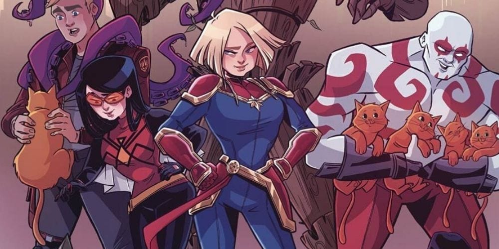
Marvel Action: Captain Marvel #3 brings the Guardians of the Galaxy into the mix. And you just know how Rocket feels about Flerkins (spoiler alert: he hates them). So not the best mix out there, but thankfully this version of the Guardians of the Galaxy is adorably supportive of Captain Marvel and all of her horrible cat puns. So they’re more than willing to help save the day.

And yes, we do consider freeing a bunch of Flerkins from a Kree mind control device as saving the day. If you don’t agree, well, you’ve probably run across a cranky Flerkin or two in your life. And we feel bad for you.

A better look at our furry friends and their saviors.

Sam Maggs had a slightly whimsical take on the whole Marvelverse in this series, but it fits in well with the subject at hand. Seeing the Guardians of the Galaxy in a toned-down form was oddly adorable and endearing. But don’t tell them we said that.

The girl power/bestie power in this issue was an absolute highlight, and a joy to read. Jess and Carol are friendship goals, plain and simple. They’re a perfect example for young readers to see. And a healthy dose of nostalgia for the older readers in the audience.

But those puns! Carol has clearly been saving up on her cat puns because she unleashed in this issue. And just when you think you couldn’t roll your eyes hard enough, Jess joins in on the mix. And she’s got mad mother puns to throw around.

The conclusion to this issue, and thus the series, will make readers laugh out loud. The character interactions, in particular, are a pure delight. As it Drax’s request. And we’ve got to know – is anybody else hoping that this becomes canon? Because, yes please!

The artwork in Marvel Action: Captain Marvel #3 perfectly matched the writing. It was light and bubbly. But let us not ignore some of the things the artists were able to sneak into this issue. Such as Chewie in a spacesuit, it’s not something we knew we needed in our lives until now.

Sweeney Boo was the lead artist, and they are directly responsible for some of the best moments. There’s the aforementioned Chewie scene, of course. But there’s more than that as well. It isn’t every day that an artist gets to render dozens of Flerkins in a single scene, so Boo clearly made the most of it.

The colorist, Brittany Peer, helped to increase the amusement of the issue. Her colors were bright and fun. Peer was not afraid of going with vibrant colors for the backgrounds in some scenes, but in a way, it worked.

Finally, Christa Miesner provided the lettering did a solid job of it. What do you think the odds are that Miesner was able to add in those puns while wearing a straight face?

Marvel Action: Captain Marvel #3 was the conclusion the readers deserved. It was quirky and delightful – perhaps more so than the previous two issues, which is saying something. It was a lighter take on the superhero life, and that allowed for some comical and lighthearted moments. And it was exactly what we needed.

Monkeys Fighting Robots Youtube

NEW MUTANTS #1 – Old Crew, New Space Adventure

Space travel, snappy dialogue, interpersonal/group conflict, and action are just a few of the many amazing things you’ll find this Wednesday in Marvel Comics’ phenomenal NEW MUTANTS #1!

Aren’t hip with the New Mutants? Or you just need a refresher on some of the characters? Check out Marvels roll call to get caught up!

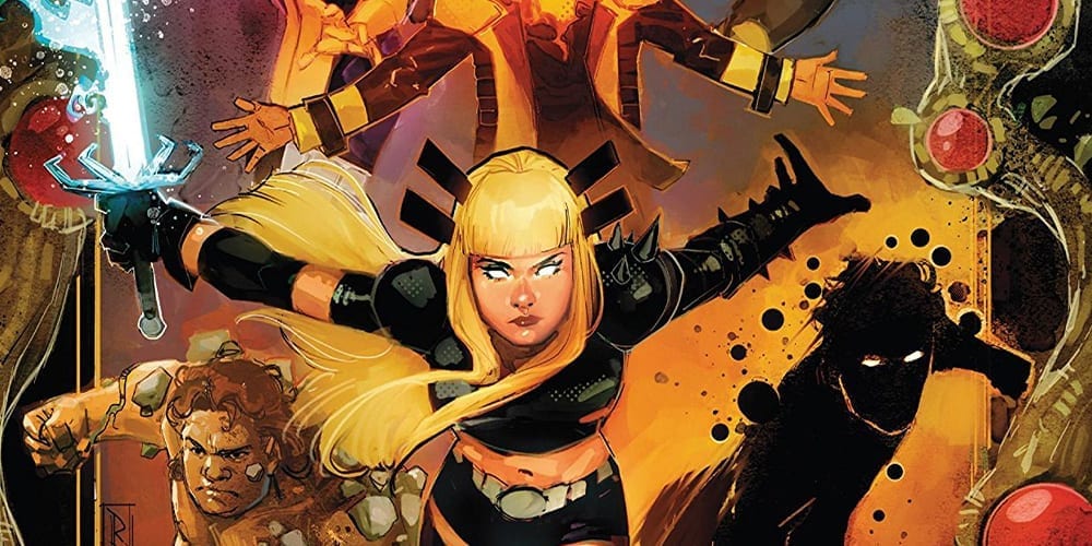
Art by Rod Reis, Letters by VC’s Travis Lanham

New Mutants in Space

New Mutants #1 starts its story as a simple trip to space, with the group making their way to see a friend. That may not sound like a simple start, but for mutants that’s just another Sunday. But, with their ride being the famous Starjammers – a group of galactic pirate outlaws – it’s more like a Mutant Friday. Couple in their knack of not listening to authority figures, then you have one hell of a space trip.

Writers Jonathan Hickman and Ed Brisson keep the attitude upbeat, and the zingers fast with dialogue that makes you want to be one of the ‘cool’ New Mutants. If the X-Men were the adults that stay home and BBQ, then the New Mutants are the cool hip kids that go out Friday night and watch Jubilee in concert, even if they have work the next morning. Any moment a character speaks, one of the team has a retort ready in the saddle. But no two characters sound alike.

Instead, Hickman and Brisson can retain each member’s characteristics, while showcasing why/how they work as a team. By the end, the group of mutants starts to feel akin to a family, more than a team.

Art by Rod Reis, Letters by VC’s Travis Lanham

Respecting The Old, Embracing The New

One of the highlights of the original New Mutants run was the art provided by Bill Sienkiewicz. Even today people talk about it’s impact, and how unique it is. Artist Rod Reis style emulates Sienkiewicz, but never strays to far into the absurd. This limiting of absurdity bodes well, because as revered as the unique style is, it’s hard to market to new readers.

Only praising Reis with his likeness to Sienkiewicz is a disservice of how great his art is. Between the fluid lines and watercolor esque look, Reis’ art is jaw-droppingly beautiful. Nearly every page will have you rereading it, but instead of words, you’ll be scanning the pencil and colorwork. Reis executes one of the few fighting moments with raw chaos, yet is still able to contain the pencils and colors in the panels. Or when personal moments happen between characters, Reis drops the background emphasizing what transpires.

Keeping pace with Reis’ art and colors is a grand task, seeing how abstract and chaotic it can become. Throughout New Mutants #1, VC’s Travis Lanham can keep said pace. This is seen exponentially in the two moments Lanham uses sound effects during the Magik and Raza. In this clash of steel, Lanham bends the lettering around the action, never getting in its way, yet still standing out gloriously.

Art by Rod Reis, Letters by VC’s Travis Lanham

To Space And Beyond!

New Mutants #1 is one of the best first issues to come out of the recent Dawn of X line. Between its fun and lovable characters, high stakes plot, and breathtaking art New Mutants deserves a spot in your pull list.

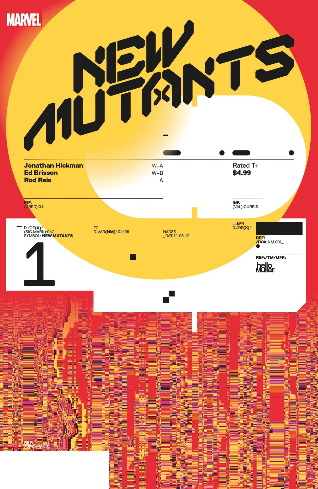
Cover Story: Graphic designer, Tom Muller knocks it out of the park again with an abstract cover! Much like the Excalibur #1 cover, I don’t know if it means anything deep. But it’s awesome!

Variant Cover by Tom Muller

Memorable Quote: “If you ask me to do that again, I’m probably going to punch you in the face. So. Many. Times.” – Mondo

I wouldn’t call myself a Mutant Master, but as a kid, I did own the Marvel X-Men The Ultimate Guide. Meaning, I knew my fair share of mutants. But, I’ve never heard of Mondo, and after New Mutants #1, I’m a fan of him.

Old Reader, New Reader

Four titles under the belt and two more to go how do you feel about the new line of X titles? Comment below with your thoughts.

Monkeys Fighting Robots Youtube

What Is Lost in WEB OF BLACK WIDOW #3

WEB OF BLACK WIDOW #3, out this Wednesday from Marvel Comics, continues Natasha’s journey to find the truth – and the person digging up her past. The series so far is a gritty tale that fans of the Black Widow will adore.

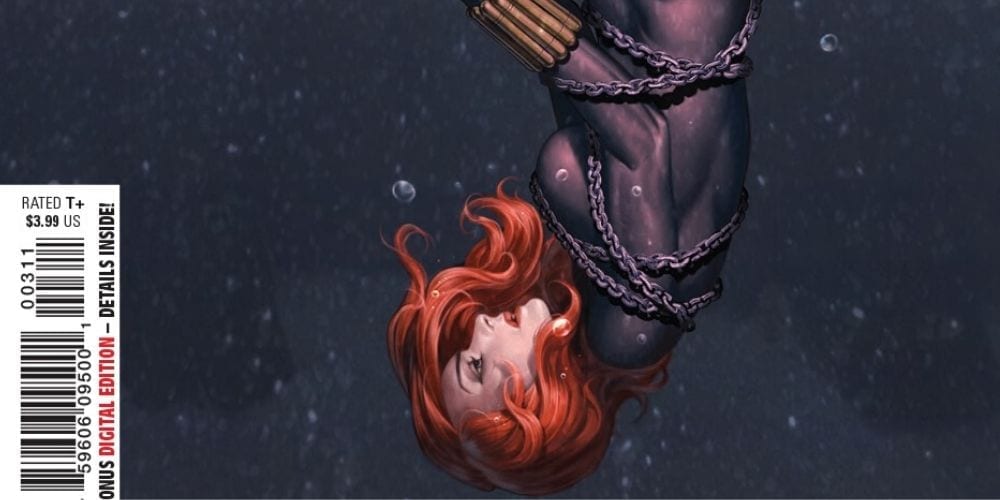
This cover looks mildly concerning for our Black Widow, does it not?

***SPOILER WARNING***

Black Widow‘s series has always excelled at questioning some of the darker elements within Marvel. Natasha’s backstory alone opened a pathway for that discussion. But this latest plot arc in Web of Black Widow #3 has taken it further than ever.

The past is never far behind. And it doesn’t matter if you can remember it or not – you cannot run from it. Even Natasha, who is willing to face this problem head-on, is going to have some difficulties. All thanks to the memory loss she’s learning – and how it was more significant than she initially assumed.

A refresher (up top) for those who need it, and an excellent view of all the creative members involved.

Web of Black Widow #3 does an excellent job of weaving several plots together. As with the last few issues of the series – the past and the present are dancing with one another. Slowly, they’re merging into something so much more significant.

Jody Houser has done an interesting job here, forcing Black Widow’s history to the forefront. Even in the way the story is being told makes it clear that there are holes in the story. And that means there are holes in Natasha’s memory.

There were some truly fascinating moments within this issue. And all because the series has taken the time to set the scene. It makes us wonder what will be next – because it’s clear that they’re building up to something.

This is going to be interesting…

Web of Black Widow #3 hosts a variety of dramatic moments, and thus there are plenty of opportunities for the artists to have some fun. Ironically, while the fight scenes are exciting to look at – they aren’t the highlight of the issue. No, that award goes to the flashbacks.

Each issue has shown us a different set of events from Natasha’s past. But this issue had some of the most striking examples. Perhaps the best decision of all was not to fully render secondary characters in the scene. Instead, they appeared blown out – more of a glowing white than a person with identifiable features. It resonated strongly with the concept of Widow missing parts of her memory.

Stephen Mooney (pencils and inks), Triona Farrell (coloring), and VC’s Cory Petit (lettering) worked together to bring us this issue. And their teamwork is notable. It’ll be interesting to see what they decide to tackle next.

And an old ally suddenly comes into focus.

Web of Black Widow #3 was a strong addition to the series. Black Widow seems to be a bit closer to answering the mystery at hand. And yet there is still so much that we need to learn about what is happening. And this issue seemed to raise more along the way.

It’s a solid issue, reminding us that Natasha is and always was more than what her previous employers wanted her to be. And yet, there is still a tie to her past. One that she’ll never be able to cut free from.

Monkeys Fighting Robots Youtube

Review: Reality Grows Ill In THE DREAMING #15

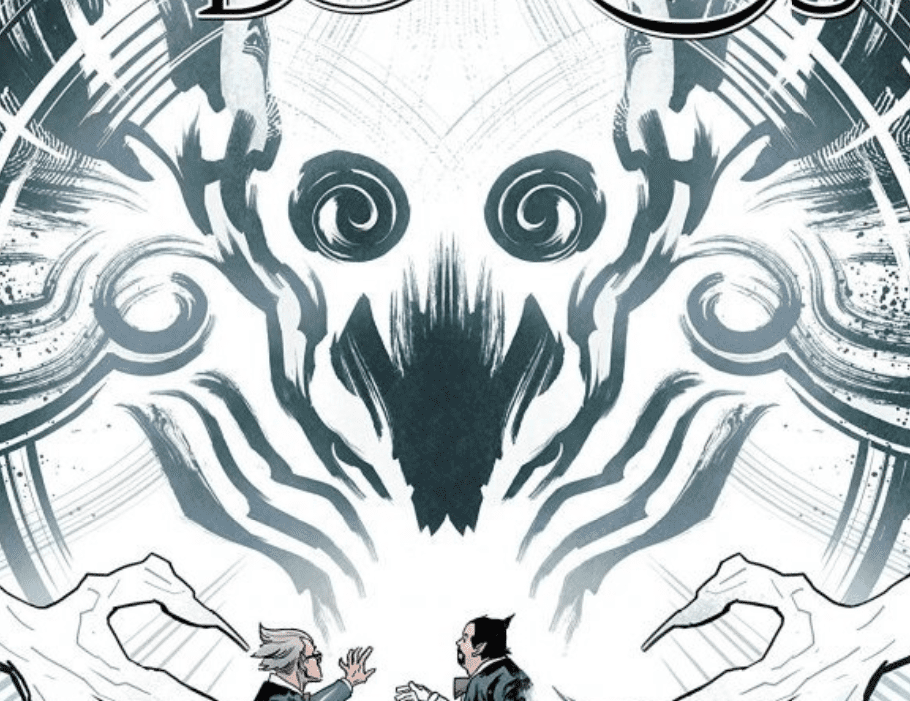
Writer Simon Spurrier and artist Bilquis Evely helm what may be the most tense and dread-inducing chapter of The Dreaming thus far with issue #15: “The Crown, Part One.”

Abel, keeper of Secrets and Mysteries; Murderer and Victim

Wan, the fully-sentient “dream machine” that has taken Dream of the Endless’ place has assumed control of the Dreaming as it has seen fit. However well this entity may mean, it still has the callous touch of a soulless mind. The decisions it makes have started to bring more harm than good, and Matthew the Raven’s need to find the true Dream Lord has reached its climax. There’s even more to Wan than any of the Dreaming’s residents could possibly know, and with it in control of people’s subconscious, reality begins to head in a devastating direction.

For the first issue of his final arc on this series before G. Willow Wilson takes command, Si Spurrier trades in the humor and sweetness of the previous issue for all-out dread and horror in this one. This issue is full of trademark Sandman narrative queues, such as the repetition of a key idea and the numerous important anecdotes of those having dreams outside the primary story. Spurrier has always been able to ape Gaiman’s writing style when necessary for this series, but what he can do with character and narrative is a skill all his own. Longtime favorite Sandman universe characters are still reacting to the leadership change and their own struggles, but none as hard as poor Abel with the loss of his brother, Cain. Having to pull double duty as the keeper of Secrets and Mysteries now is doing more trauma to the character than can be stated here, and Spurrier handles it with a deft hand. The shocking revelations and sudden left-hook twists will stick in the mind of any reader, and it all feels earned. All of the different and seemingly unrelated plots introduced in earlier issues are becoming intertwined in true Sandman fashion, making it an absolute treat to see where it could be going next.

Bilquis Evely just doing what she does.

Once again powerhouse artist Bilquis Evely returns to give Spurrier’s words form, and as always she knocks it out of the park. Her ability to blend grounded realism with visions beyond absurd or fantastical and maintain such a huge range of expression and detail is likely her greatest artistic feat, and it’s on full display here as usual. This issue is slightly more grounded because of its plot, but it still gives Evely plenty of room to stretch her talents on the full cast of characters and the emotional turmoil they currently face. Her pencils are brought to life by Mat Lopes’ colors, which cater to every bit of life and detail the art deserves. An endless palette of colors, from deep blacks to neon pinks, breathes life into each issue of The Dreaming and this issue is no different. It’s simply jaw-dropping work from the art team behind this series.

Simon Bowland’s lettering is sharp and clear, while also adhering to concepts set forth in Gaiman’s Sandman. For this issue specifically, the special lettering Matthew the Raven’s dialogue gets is replicated perfectly while still obviously being easy to read.

The Dreaming #15 kicks off the final arc of Si Spurrier and Bilquis Evely’s run with a thick atmosphere of foreboding and suspense. Eloquent and beautiful without being too dense, The Dreaming still proves itself to be a worthy successor to Sandman and the rightful flagship title of DC’s “Sandman Universe.” It will certainly be a privilege to witness where Spurrier and Evely take this story in its final three issues.

Monkeys Fighting Robots Youtube

Review: Space-Pirates Stay Sleazy in YONDU #1

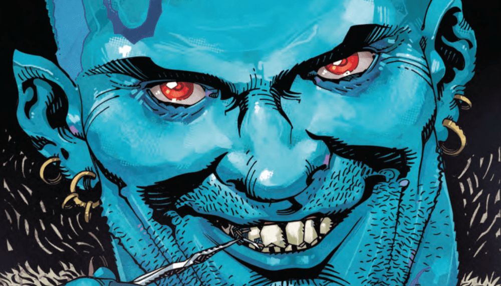
Writers Zac Thompson and Lonnie Nadler team up with artist John McCrea to deliver an opening issue for Yondu full of low-class and trashy characters in the dirtiest reaches of the galaxy – just as the old pirate deserves.

Yondu Udonta, the criminal voted most-likely-to-owe-you-money in the galaxy, has learned how to survive on his own. After being cast out of his Centaurian tribe at a young age, he’s learned how to fight, double-cross and steal his way to safety and a quick buck. On the verge of a serious payday, Yondu stumbles across one of the most valuable objects in the universe: The Herald’s Urn. In the process of trying to flip it for a pile of cash, the pirate learns that his Centaurian heritage may mean more to himself – and those of his tribe – than he could ever care to know. Also, he’s wanted for stealing fuel, a crime punishable by death. Such is life for everyone’s favorite Cetaurian lowlife.

The script for “Yondu #1” penned by Zac Thompson and Lonnie Nadler is full of galactic slang and internal dialogue. Yondu’s own language is somewhat minimal due to him being such a loner. When he does speak, it’s typically to try and coax his way out of something. The slang terms that Thompson and Nadler use are fitting to both the character and feel of the book, and have echoes of DC’s “Lobo” character. This isn’t a criticism, as it obviously works. An interesting note about Yondu’s inner voice that comes up as narration is that his words come across as if he were a character trying to convince himself of how he lives. There’s a good deal of imagery that suggests that Yondu is clearly unhappy with how his life turned out, but his inner voice is constantly trying to convince both the reader and himself otherwise. There’s a neat shift from Yondu to another important supporting character and that character’s culture that is essentially the complete opposite of Yondu’s voice. Where Yondu is crude and insincere, this character is noble and direct with his regal dialogue. Without getting into spoilers, this character’s culture and voice bring an extra dimension to the writing and the story at large, and it will surely be one of the most interesting aspects of this series as it continues.

Few artists can create the kind of dirty and grimy illustrations necessary for a comic starring Yondu Udonta like John McCrea can. His work here consists of unattractive lowlifes and dusty backwaters that really sell the mood of what the story is shooting for. McCrea’s art doesn’t shoot as much for detailed character expression and emotion as much as it actually caricatures such aspects. Yondu’s expressions of irritation or disgust are made visible in an almost over-the-top manner, the same of which can be said for basically every character in the book. Enviornments are given an kind of polluted and gritty look that fits the sort of “used future” aesthetic this type of low-sci-fi earns. Much of this is due to McCrea’s use of heavy shadow and cross-hatching to create a consistently dark tone to his art. This is aided by Mike Spicer’s color work, whose wide array of colors are usually cast in a kind of shaded filter. It looks as if each panel were run through a cloud of charcoal dust before being printed. Again, none of this is an insult, as it works perfectly for the kind of comic being made here.

“Yondu #1” is the start of what’s sure to be a gnarly ride through the roughest reaches of the galaxy. Zac Thompson and Lonnie Nadler have written a fun and grimy issue that doesn’t require any knowledge of Marvel’s cosmic events, so it’s a good jumping on point for someone who doesn’t know much about this universe as a whole. John McCrea’s art perfectly captures the grungy atmosphere needed for this sort of book. Any fans of Yondu – whether from prior comics or his portrayal in the Marvel Cinematic Universe – can rest assured that this is a worthy pick from your local comic shop.


Monkeys Fighting Robots Youtube

Review: SPAWN #302 Takes On The World

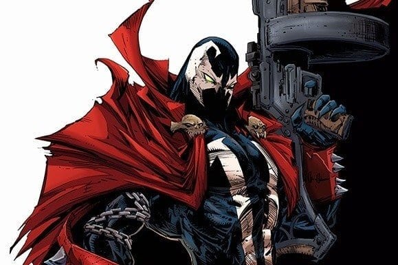
SPAWN #302 cover artwork

SPAWN #302 opens up an exciting new chapter for everyone’s favorite Hellspawn. Available in comic book stores on Wednesday, November 6th, Todd McFarlane’s latest installment is clearly riding on the coattails of the events from issue #301, featuring Al Simmons, a.k.a. Spawn, adjusting to his new “celebrity status” as Earth’s fighter against injustice. At the same time, new configurations of Hellspawn have seemingly erupted from the Earth itself, and corruption in all forms plague society.

It looks like this crusader has more than enough to keep him busy, but will his one-man army be enough?

Story

As if the notoriety and acclaim wasn’t reward enough for his recent feats, Spawn also received major suit update a few issues ago. The character’s gone through many costumes throughout his history, but this particularly change is significant in that it marks a clear distinction between the man and mask. Simmons is able to send the symbiote suit to do his bidding apart from his body—a practice he’s been prone to enacting on his targets as of late.

On top of these new abilities, readers witness Simmons embrace aspects of who he was before his death. Rather than relying solely on Hellspawn powers for the crime-fighting throughout this issue, he’s found the confidence to rely more and more on his military training to do the job. No suit? No problem. Because as we learned in issue #300, the power of this hero is in the man, not that costume.

But despite the relative ease with which Simmons tracks down corrupt businessmen and dealers in this issue, a greater threat slowly bubbles to the surface in conjunction with his improved powers.  Is there anyone who can lend aide to the hero?

Artwork

SPAWN #302’S illustrations embody an impressive blend of realism and supernatural horror. McFarlane and Jason Shawn Alexander’s penciling and ink work provides readers with crisp representations of Spawn and the men he murders, gore and all. This is completed by colorists Peter Steigerwald and Greg Menzie’s deep shades of crimson and black, with a splotch of bright green to remind us of the necroplasm that’s ever-present in our hellish hero. And Tom Orzechowski’s lettering ensures all of this artwork remains in focus by placing his long swaths of dialogue text in optimal spaces in each panel.

Comic Covers

SPAWN #3-2 variant cover

Covers A, B, and C

McFarlane and Greg Capullo’s penciling and Menzie’s coloring for these covers are top-notch Covers A, B, and (colorless) C depict Spawn in his sleek new suit while holding an impressive military-grade gun, reminding readers that this hero is ready to continue the fight with both his Spawn powers and combat training. .

Covers D and E

McFarlane and Menzie take on covers D and E as well, which feature Spawn and the newly introduced She-Spawn from a few issues back. This helps promote the mini She-Spawn series that could potentially coincide with the main series. We hope so; Spawn needs all the help he can get to face the coming battles.

Conclusion

The new storyline McFaclane sets up in SPAWN #302 has the potential to renew the character’s universe with multiple versions of Hellspawn. Will they assist him in his fight against injustice? Or will seek to make his life even more of a living hell?

How do you think Simmons’ recent stream of murders will affect the coming events? Let us know in the comments below.

Monkeys Fighting Robots Youtube

Review: GREEN LANTERN: BLACKSTARS #1 Ushers In Controller Mu’s New World

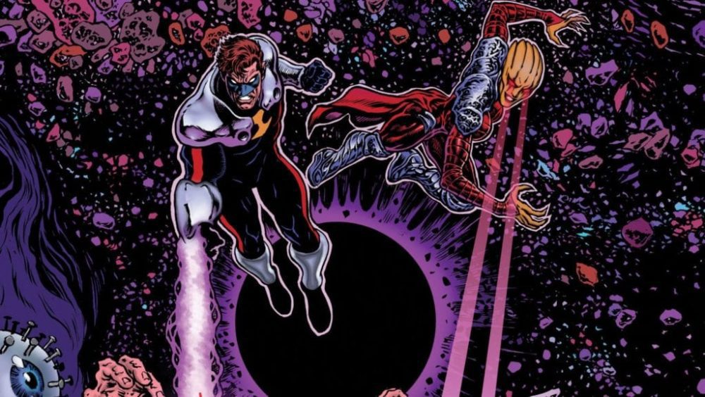
GREEN LANTERN: BLACKSTARS #1 cover by Liam Sharp

Grant Morrison’s revival of Hal Jordan in THE GREEN LANTERN last year introduced an  intriguing, otherworldly horror to the character’s mythos. He and artist Liam Sharp crafted storylines that tackled all that is weird and unsettling in our cosmos, including an intergalactic slave trade, drug trips, and parallel versions of the hero (and a not so heroic doppelganger). Now the hero finds himself enlisted in the Blackstar militia, seemingly brainwashed to do their bidding.

Story

When Hal agreed to the Guardians’ plan to infiltrate the Blackstars ranks as a mole back in THE GREEN LANTERN, he didn’t expect to be with them long. The goal was to learn what diabolical plan Mu was setting in motion and report back. But through a series of betrayals and cataclysmic events, Hal (adopting the name “Parallax”) finds himself in the hands of Countess Belzebeth once more. And the duo is tasked with planning housewarming party for Controller Mu.

The location? Planet Oa.

monstrous exiles on Oa

The godlike Guardians are no where to be seen. In their place lie horrific monsters of a Lovecraftian nature, poised to inflict existential terror upon the protagonists and readers alike. But before a Nyarlathotep look-a-like can finish its threat, Belzebeth unleashes her own brand of terror by biting into it like an afternoon snack. Such a display allows her, a single Blackstar warrior, to gain control of these creatures trapped on an abandoned Oa and prepare for Mu’s arrival.

Baellestra lays down the law

Morrison’s depiction of Belzebeth is inspiring despite her obvious villainous nature. It’s refreshing to see a story with a woman taking the reigns in and of herself without a “strong man” leading the way. In fact, our strong man (Hal) in this scenario sits back and enjoys watching her taking the lead.

This book looks to continue upending more expectations as the two Blackstars “domesticate” more of the monstrous features of Oa before the grand master behind it all arrives. However, the question remains: Is Hal is ready to usher in a universe ruled by Mu?

Artwork

Xermanico’s penciling, Steve Oliff’s coloring capture both the sci-fi and horror elements beautifully in this inaugural issue. Xermanico brings these horrific creatures living on Oa to life with detailed views of their appendages and fangs, then quickly transitions to the sleek, clean lines found on the Blackstar ships. The colors used highlight these transitions even more, moving between the darker, earthy tones of the monsters to the industrial grays and greens characterizing Mu’s technology. One feels as if they’re caught in an imperial takeover, reminiscent of humankind’s forced control of the otherwise uncontrollable natural forces.

Steve Wands’ lettering is another great feature of this piece. His fonts often burst out of the bubbles meant to contain them, most clearly seen when the monsters of Oa scream in agony. This leaves readers doubting who the real monsters are—the creatures on Oa, or the Blackstars?

Comic Covers

Main Cover

Liam Sharp, the master artist behind the recent THE GREEN LANTERN run, crafts an action packed title in the original series’ style. This helps establish a clear continuity from the former series into Morrison’s new chapter.

Variant Cover

Diego Rodriguez and Darick Robertson’s variant cover gives readers a clearer look at Hal and his new Blackstar teammates. The former hero is standing front and center with a determined look, showing us he’s ready for the inevitable challenges lying in wait with this team.

Conclusion

The first installment to the GREEN LANTERN: BLACKSTAR series is a hit right out of the park. Our expectations were not only met but surpassed by the in-depth characterization of Belzebeth and the beautiful artwork.

Do you think Hal has completely left his life as a Green Lantern behind? Let us know in the comments below!

Monkeys Fighting Robots Youtube

Review: Paradise Is Lost In X-FORCE #1`

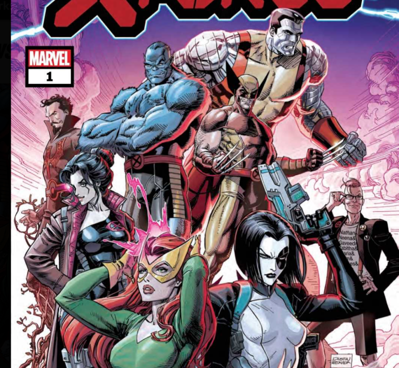
X-Force #1
Things look pretty grim for Domino in X-Force #1.

In Marvel Comics’ X-Force #1, (on sale November 6), writer Benjamin Percy unravels the utopia Jonathan Hickman has crafted throughout “Dawn of X.” Beneath the surface of the idyllic fade of Krakoa stands a nation that’s as flawed as any other, if not more so.

X-Force #1

Writer: Benjamin Percy

Artist: Joshua Cassara

Color artist: Dean White

Letter: VC’s Joe Caramagna

X-Force #1
There’s a deeper mystery beyond the one that’s sure to grab your attention.

Percy shows there’s no such thing as a true paradise, both by exploring the dark side of Krakoa’s new freedom and shattering the illusion with a devastating cliffhanger. To do so,  Percy quickly captures Wolverine’s genuine voice. Maybe more than any other character, Logan would be one of Krakoa’s most cynical residents. He’s lived a long, hard life, so he knows better than to blindly accept a supposedly perfect solution to mutantkind’s problems. Early on, a conversation between Beast and Wolverine emphasizes this character trait.

Percy’s ability to depict Logan as we know him is immediately evident when Wolverine saves Hank McCoy from a mysterious monster in a meadow. Beast asks Logan to let the creature go because he wants to study it. Wolverine, jaded as always,  reminds McCoy that there’s a predator in every meadow. He also criticizes McCoy and the others for their naivety; “That’s what Krakoa does,” Logan says. “Makes everyone feel safe. And when you’re safe, you’re soft.” This conversation is an early indicator of Percy’s mission to interrogate the notion of paradise and the consequences such a place can cause. Later, when one of the X-Men’s most beloved members is gunned down, Logan’s words ring particularly true.

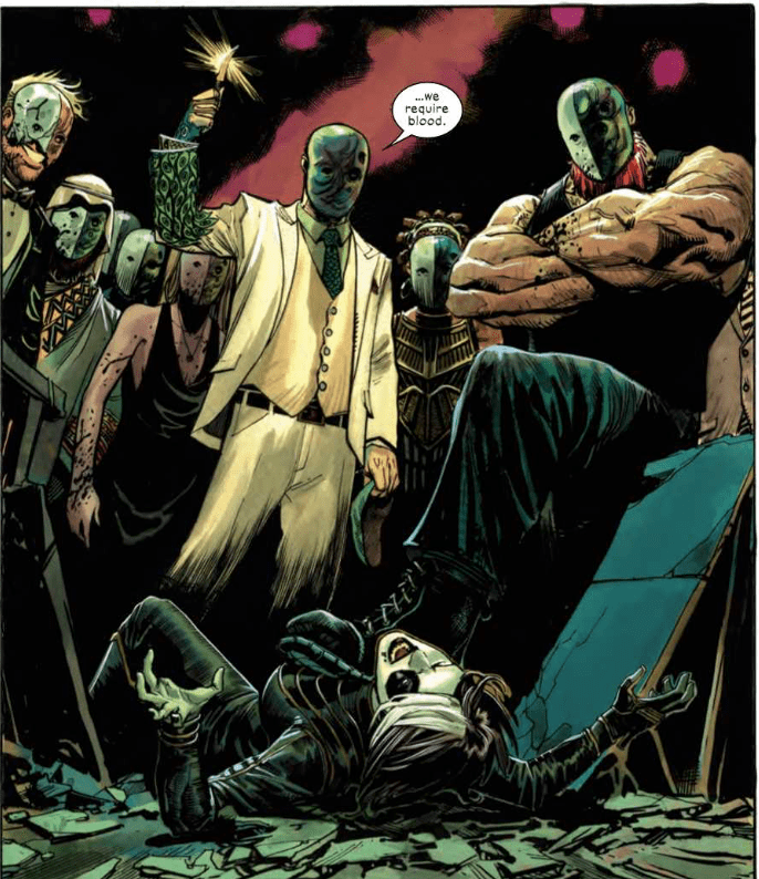
As eye-catching as the assassination is, Percy plants the seeds for a mystery even more compelling. In the first scene, we see a secret meeting of a menacing organization that could give the Court of Owls a run for its money. All the members are wearing matching masks and the group’s leader demands that they all prove their loyalty by allowing their blood to be tested. He vows to “scrub away” anyone who has the X-Gene. Hearing about this cult meeting would be off-putting enough but the art team makes it the most unsettling moment of the story.

X-Force #1
In X-Force #1, Domino meets a group pretty similar to the Court of Owls.

On the first page, the group’s leader calls his demand for blood a “purity test.” Here, artist Joshua Cassara isolates the character and he’s set against a black background. To boost the creepy factor, color artist Dean White sprinkles in red globes to foreshadow the leader’s bloodlust. When a Bane-like minion discovers the identity of Domino, an undercover attendee of the meeting, the moment becomes even more forbidding.

Cassara shows Domino’s best efforts in battle in a packed panel where she fights numerous cult members. But she succumbs to the group’s numbers advantage when a brutish goon slams her through a table. Using perspective, Cassara shows the cult members standing over a fallen Domino and you know her night’s about to get a lot worse.

X-Force #1 doesn’t blatantly bring the team together but it organically sets the stage for its formation. Of the various “Dawn of X” titles, it might be the most intriguing because it subverts the widespread idea that Krakoa is a perfect safe haven for mutants and we can’t wait to see where Percy goes from here.

What’d you think of X-Force #1? With the death at the end, is there more than meets the eye?

Monkeys Fighting Robots Youtube

Review: The Present Dooms The Future In AMAZING SPIDER-MAN #33

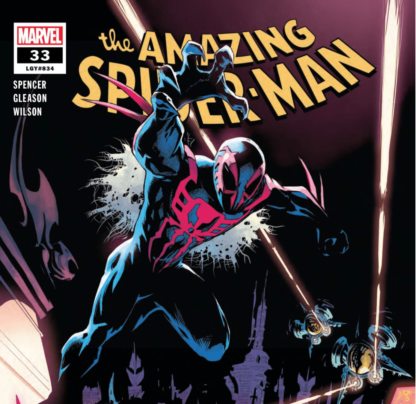
Amazing Spider-Man #33

In Marvel Comics’ Amazing Spider-Man #33, (on sale November 6), writer Nick Spencer builds the intricate foundation for Marvel 2099. He keeps the event shrouded in mystery but it’s only a matter of time before the story hits the next level.

Amazing Spider-Man #33

Writer: Nick Spencer

Artist: Patrick Gleason

Colorist: Matthew Wilson

Letterer: VC’s Joe Caramagna

Amazing Spider-Man #33
Miguel O’Hara goes out of the frying pan and into the fire.

Each and every part of Amazing Spider-Man #33 organically connects to the next. There’s no wasted space. Early on, it’s hard to see how the Foreigner’s schemes are related to the big picture. But by the end, the various moving parts combine to set the stage for a layered thriller. What’s not to like? There’s political drama, villainous planning and Peter Parker’s continual struggle to get anywhere on time. Spidey takes a backseat because the narrative focuses on the action surrounding him.

Because we’re gearing up for Marvel 2099, it’s fair to wonder how Spencer kicks off Marvel’s return to the future. Like last issue, we see Miguel O’Hara again. His displacement in time has left Miguel confused about his mission in the present. But Miguel is certain about two things: the world he comes from is in danger and he needs Spider-Man’s help to save it. You’d think  the progression of the event’s story would be primarily tied to Miguel. Instead,  the future is most evident during a presentation at Empire State University.

Here, Peter’s mysterious new classmate, Jamie, reveals his science project, one that the ever-tardy Peter supposedly worked on. It’s called the Clairvoyant and it allows the user to look into the future to calculate the statistical probability of any given outcome. While the device itself could have ramifications on the story, it’s Jamie’s dialogue that’s particularly telling.

Jamie echoes Miguel’s question in the previous issue: “What has yesterday done to tomorrow?” Through Jamie, Spencer digs deeper. As the student presents his project, he ponders the “unintended consequences of today’s innovations on the world of tomorrow.” Spencer continues to subtly include the realistic questioning of our present impact on the future. More than anything else, this exploration could be the most rewarding element of Marvel 2099 because Spencer has the opportunity to make a statement.

Amazing Spider-Man #33
There are plenty of similarities between Marvel 2099 and “Into The Spider-Verse.”

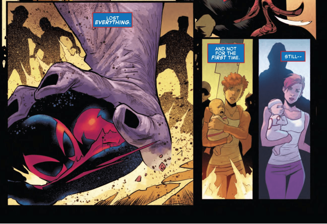
Spencer’s strong script is complemented by some fresh stylistic choices by the art team. Early on, while Miguel tries to get his bearings in the present, his view of the world is juxtaposed with his memories. When he’s surrounded by a crowd, he flashes back to the destruction of the world. Artist Patrick Gleason shifts to a sketchy, distorted style that looks like the multiverse dissonance in Spider-Man: Into The Spider-Verse. Colorist Matthew Wilson utilizes electric blues and greens to convey the impending destruction.

Amazing Spider-Man #33
In the issue’s most cinematic panel, Miguel’s mind plays tricks on him.

Gleason also showcases chronal confusion when a woman in the crowd reminds Miguel of a lost love. Gleason juxtaposes the two women in adjacent panels to produce a tangible sense of Miguel’s disorientation. In a story about time travel, the art can be crucial in conveying its numerous possibilities and the art team nails it here.

“The future just got a lot less scary,” Jamie says at the end of his science presentation. We’ve all read enough comics to know better: messing with time travel always leads to disastrous results. While we’re still not sure where the story is going, Spencer continues to build a strong structure for the impending heart of the story.

What’d you think of Amazing Spider-Man #33? Are you glad Marvel is going back to 2099?


Monkeys Fighting Robots Youtube

Review: COFFIN BOUND #4 Darkly Comic To The Bitter End

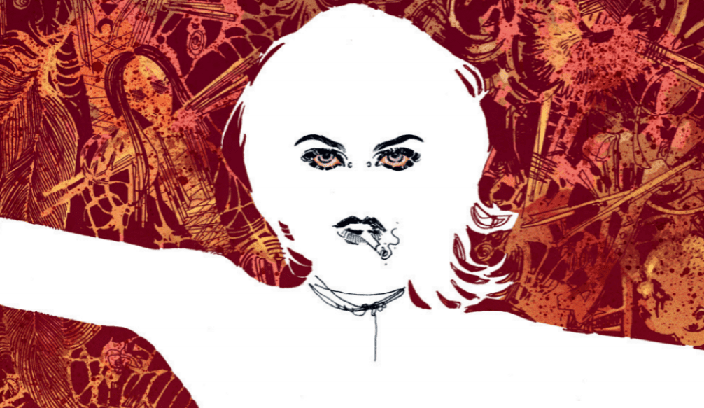
Coffin Bound cover detail
Coffin Bound #4 Credit: Image Comics

The final issue of the first arc of the Image ComicsCoffin Bound edges its way into stores this week. With an extended page count from writer Dan Watters and artist Dani, it promises to be a jolting kick to the mind as well as the eye.

What constitutes existence and exactly how far does someone have to go to remove themselves from the world? Izzy’s journey is almost over but there are still loose ends to tie up and not everyone wants her to disappear entirely.

Coffin Bound #4
Coffin Bound #4 Credit: Image Comics

Nearing the End

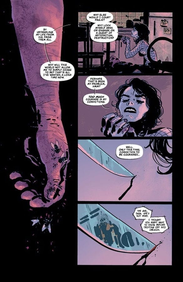
From the very beginning of this issue, Watters‘ illustrates the grotesqueness of violence and death. As he tells the story of Izzy he does not glorify any of her actions. The cold,lonely death that she has chosen was not an easy choice and no matter what she does to extract herself harmlessly from the world, there are always unsettling consequences.  

And so starts this issue, with Izzy sat in the ugly consequences of the world around her. On the one hand Watters’ makes a solid case for Izzy’s decision to die but on the other hand he highlights the awful aftermath of death. Those left behind suffer more than those who leave. Izzy’s attempts to remove herself from the world have failed and others have paid the price, others like Taqa.

Watters’ uses this bleak landscape to examine the human condition, especially relating to death and it’s after effects. His characters are experiencing consequences and reacting emotionally to a subject that is difficult to discuss. It can be argued that Coffin Bound is a personal autopsy of grief. The characters represent different reactions to a situation and their interactions are the colliding thought processes of a single mind. The desire to disappear; the rage of abandonment; the need for control; and even the urge to document; all of these are reactions to a traumatic event.

Watters’ has created a world of uncomfortable fitting characters that represents something greater, something that a reader can identify with. It is entertaining but can also act as a form of reflective therapy. You will get different reading depending on your state of mind when you pick this up.

Coffin Bound #4 interior art
Coffin Bound #4 Credit: Image Comics

Art to the End

Dani’s visual style is sublime. It encompasses a gothic horror tradition, which is present within the narrative, and combines this with modern aesthetics. Drawing on a host of modern apocalyptic influences, from Tank Girl to Mad Max, Dani produces something that is unique but familiar. There is a comfort to the setting which in turn is destroyed by the can’t-look-away horrors. 

Stripped flesh; swarming flies; shards of glass in disembodied eye balls; this is a nightmare made real however, the art is so tantalising that the reader slowly turns page after page until the very end.

The dark tones of the story are reflected in the dark tones of the coloring provided by Brad Simpson. Shadows and shades lead the reader through the quagmire of the landscape, accentuating and spotlighting areas of interest.

The scratched, impressionistic art style which utilises negative space as much as defined imagery, creates the sense of a dislocated mind. This idea is picked up by Aditya Bidikar when producing the lettering. The borders and balloon tails are not as defined as in other mainstream comics. The stark white of the balloon stands out on the darkly colored page but the forms of the balloon are broken, in some cases non-existent, which mirrors the central characters attempts to remove herself from the world.

Coffin Bound #4 Credit: Image Comics

Conclusion

Throughout the series, and in particular in this issue, the creators are illustrating a world disintegrating. The central characters are losing themselves, whether intentionally or not, and the landscape around them is following suit. Watters has created a complex story that is both a literal and metaphorical dissection of an emotional state of being. The art by Dani, Simpson, and Bidikar, reiterate this while creating a landscape on the page that reflects the emotion within the story.

This four issue run of Coffin Bound has been something to behold. A darkly comic tale of self destruction and eradication told in a sublimely modern gothic style, Coffin Bound is a visual success but is also an emotional one. It will affect readers in different ways and much of that will depend on how you approach what the creators have to offer.

Coffin Bound is more than entertainment, it is a comic book therapy session that you may not know you needed.

Monkeys Fighting Robots Youtube