Home Blog Page 385

FIREFLY #11, AKA Don’t Mess With Mrs. Reynolds

FIREFLY #11, out this Wednesday from Boom! Studios is a good reminder for why you’d best think twice before messing with certain mothers. Fans of Firefly will be curious to see just what Mrs. Reynolds has to bring to the table.

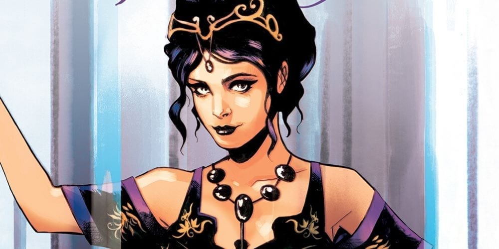
Inara is looking striking as ever on this cover for Firefly #11.

***SPOILER WARNING***

The latest series set in the Firefly universe has been setting up for something major for quite some time now. And it seems like it’s all about to come to a head. In the last issue, we had a major surprise thrown our way, in the form of a new ally arriving on the field. Only, her arrival actually makes things even more complicated than ever.

While this tale wasn’t written by Joss Whedon, it is still set in the world that he created. And it’s keeping it alive, no matter what it takes. And that means throwing some crazy or surprising plots at us, from time to time.

That being said, there is a finite amount of time that these stories can fit into. And we must be starting to run low. So we’re just going to go ahead and appreciate as much as we can. And that’s easier to do without getting too particular about timelines.

The ladies of the Serenity crew are looking fierce on this alternate cover.

Firefly #11 was an issue full of surprises, betrayals, and political maneuvering. The entire Firefly crew have been pulled into a confrontation that Mal and Zoe had hoped never to see again. And things are about to get messy.

Greg Pak has written us an interesting tale up to now. It seems like Mal (and the crew) have been thrown from one mess to another, but in truth, it was all leading up to this moment. Or rather, this series of moments.

Even knowing that they’re all going to walk away from this doesn’t help to ease the tension much. Though it is making us question how it’s all going to get resolved, considering how bad things are looking.

The latest twist is a strange one. In a way, it sort of fits with Mal’s character. But in other ways, it’s left us with even more questions and concerns than ever. And perhaps a few raised eyebrows. But only time will tell how it all plays out.

This striking alternate cover of Firefly #11 features the one and only River.

Firefly #11 had some beautiful artwork to support this hectic issue. The backdrops were stunning – starry skies and romantic backdrops for what is looking to be a bloody setup. That should make for a jarring setting, but it fits.

The fire and battle scenes were likewise fascinating to look at, though there’s likely to be a whole lot more of that in the following issue or two. And finally, the facial expressions helped bring this issue a few steps further, reminding us of all the characters we fell in love with during the TV run.

Dan McDaid and Vincenzo Federici were responsible for the pencils and inks for this issue, while Marcelo Costa did the coloring. And finally, Jim Campbell did an excellent job with the lettering (as always).

Zoe and Wash are looking adorable on this sweet alternate cover of Firefly #11.

Firefly #11 was a bit of a strange issue, all things considered. But it’s holding our attention, and leaving us curious to see how everything unfolds. Considering all of the difficulties any series with constrained timelines must face, they’ve done a decent job of things.

The real question is, will the crew be thrown into another crisis, once they’re free of this whole mess? Or will they get a breather for once? Oh, who are we kidding? The Firefly crew never seems to catch a break.

Monkeys Fighting Robots Youtube

GWENPOOL STRIKES BACK #4: Time to Form the Perfect Team

GWENPOOL STRIKES BACK #4, out this Wednesday from Marvel Comics, continues Gwen’s slightly crazed gambit for saving her series, and thus her skin. It’s a masterful example of chaos and fourth-wall-breaking, with Gwen going above and beyond to win the battle.

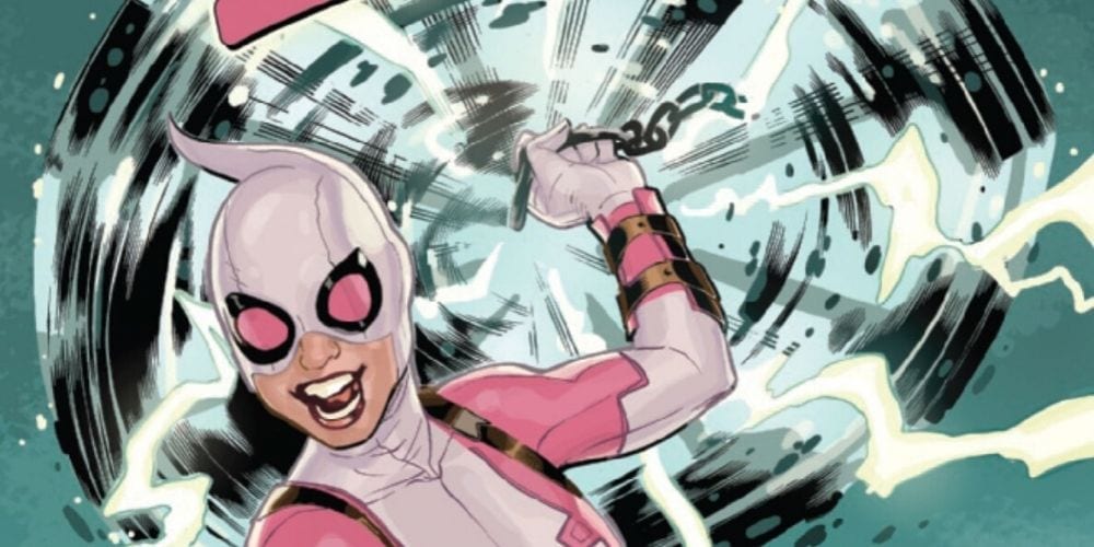
Gwenpool and Mjolnir…that seems like a safe combination!

***SPOILER WARNING***

Fans of the massive personality known as Gwenpool have been enjoying this miniseries, while also seeing it for the hope that it is. We can’t help but hope that this series will garner enough attention to get her another full series.

The entire premise behind Gwenpool Strikes Back has been shockingly clever. Leah Williams has run away with the idea of Gwen’s fourth-wall-breaking abilities. And she’s used them to start a conversation about comic sales and how their effects are always harsher on any character who isn’t an A-lister (no offense, Gwen).

The fourth issue in the series brings us a Gwen at full force. She’s determined to get some attention, and as we saw in the last issue – she’s not afraid to pick a fight to do it. But now she’s forced to find a way out of said fight. Thankfully, Gwen is nothing if not resourceful.

Please make note of the special guest for this issue.

Gwenpool Strikes Back #4 may be a series of chaotic events, but there are some treats snuck into the pages. These moments are specifically designed for fans of the character. After all, it’s the fans who will freak out at the fact that Christopher Hastings wrote an entire page of this issue. And yes, before you worry – his page is just as inane and delightful as you might be hoping.

While Hastings wrote that one page, Williams took charge of the rest. And as anybody following the series is aware, Gwen is up for one massive fight – all thanks to the big guy that she ticked off. The fight is something unexpected, in a way. Gwen uses her panel hopping abilities to good effect, giving fans a solid reminder of all the reasons we fell in love with her in the first place.

But naturally, that means that things get a little crazy along the way. This is Gwenpool we’re talking about, after all. The end result is a lot of dramatic bouncing around, some light humor, and a few truly laugh out loud moments. In short, it’s exactly what the fans have been hoping for.

Apparently Gwen knows Morse code. Who knew?

Gwenpool Strikes Back #4 had a lot of fun art crammed into these pages, but that’s probably no surprise at this point. The artist team has taken the script that Williams wrote and just run away with it all.

That being said, there were some seriously noteworthy elements here. For example, the multiple Gwen’s all look exactly like the comics they were ripped from, and that is something easier said than done. It helped make them all distinct, and added to the hilarity at the same time.

Gwen’s abilities were also shown off to perfect effect here, with some dynamic panel diving interspersed around sillier moments. And the final highlight of this issue would probably be the sense of movement and impact. There are a few scenes which will make you wince in sympathy, but it kind of fits what Gwen has been up to lately.

And of course, we’ve got to give credit to the artists behind all of this. David Baldeon provided the pencils and inks, while Jesus Aburtov did the coloring. And lastly, there’s VC’s Joe Caramagna, who provided the lettering (and thus all of the sound effects and complicated speech bubbles).

Christopher Hastings, AKA ‘Daddy’

Gwenpool Strikes Back #4 was a fast-paced and chaotic issue, full of Gwen at her best – both in the humor department and regards to her abilities. This is the Gwen that fans have fallen in love with, and it’s great to see her back.

Monkeys Fighting Robots Youtube

Review: QUESTION: THE DEATHS OF VIC SAGE #1-Who Are You? Who? Who?

Vic Sage uncovers something from his own unsavory past in the midst of chaos in The Question: The Deaths of Vic Sage #1, out this week from DC Black Label.

Jeff Lemire scripts a unique mystery for the Question the likes of which he has never dealt with before. Denys Cowan pencils and Bill Sienkiewicz inks this dark tale, and Chris Sotomayor handles the colors for Hub City on the brink of collapse. Willie Schubert takes care of the lettering.

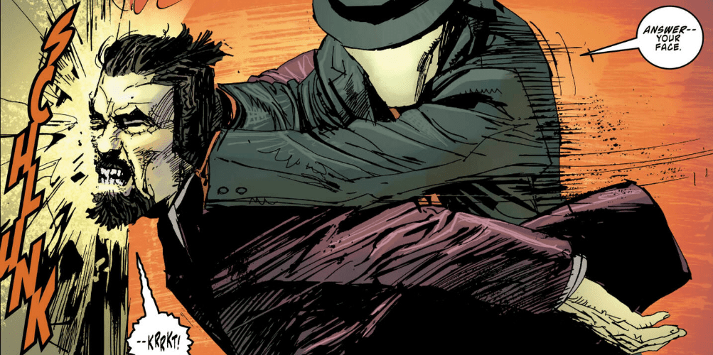
In the modern age of comic books the art has become very realistic and extremely detailed in quite a few cases. Shading is usually done with cross hatching and short straight lines, but Cowan and Sienkiewicz use scribbles that make this book look like it was made decades ago and just finally released this week.

Cowan and Sienkiewicz give this book a very gritty feel that looks like a throw back to the late 80’s. While the art makes this book look like a counterpart to The Dark Knight Returns, the issue brings up some very real and very current problems in today’s society. The Question: The Deaths of Vic Sage is a new book I’m sure Frank Miller would actually love.

Sotomayor’s work does a fantastic job of portraying the nostalgia of an older story. The color blending is more obvious and you can still see “brushstrokes” in a few panels. Sotomayor’s color palette is not too expansive in this issue, and is very similar to the style you’d see in the horror genre.

The Question: The Deaths of Vic Sage #1 reminds me of Seven; the detectives are investigating the killer in all these very shady and seedy locations where the lighting is always dim to avoid detection. These are places most people would avoid, and if you had to walk down an alley lit like Sotomayor’s Hub City, you would be checking your phone for any alternate route or dialing 911 preemptively so all you’d need to do is hit send.

Schubert’s lettering looks free hand and similar to handwriting. While the words have the appearance of an older comic, the sounds are very crisp and modern. The lettering combined with the use of internet and computers are the consistent reminders that this issue is not actually a flashback.

With questions still needing to be answered Vic sits down at a computer and shows, those that still might not have realized, that the internet has the answers for everything. If you’re out there spouting off completely wrong information when all you have to do is perform a search on Google, it’s pretty embarrassing for all of us.

Just like in the rival’s Immortal Hulk, also out this week, the Question is dealing with a city full of people that have had about enough of the bull$#!t. A Bug’s Life taught us that strength in numbers is insurmountable, but obviously not enough of the public has seen that movie. The generation that grew up with that movie are adults now, and things have got to change.

We’re starting to realize the power we have and it’s scaring those in power so much they’re throwing billions of dollars into the pockets of garbage politicians who couldn’t pass an English test to save their lives. Stories like this one and the Question’s relentless pursuit of the truth are inspiring forces giving us the confidence that what we’re doing isn’t a lost cause.

We can do better. We will do better. Vic Sage will guide us.

What did you think of The Question: The Deaths of Vic Sage? How do you think this book would fit into Frank Miller’s Dark Knight universe? Let us know in the comments below.

Monkeys Fighting Robots Youtube

AfterShock Comics Exclusive Preview: DARK ARK: AFTER THE FLOOD #2

dark ark after the flood aftershock comics exclusive preview

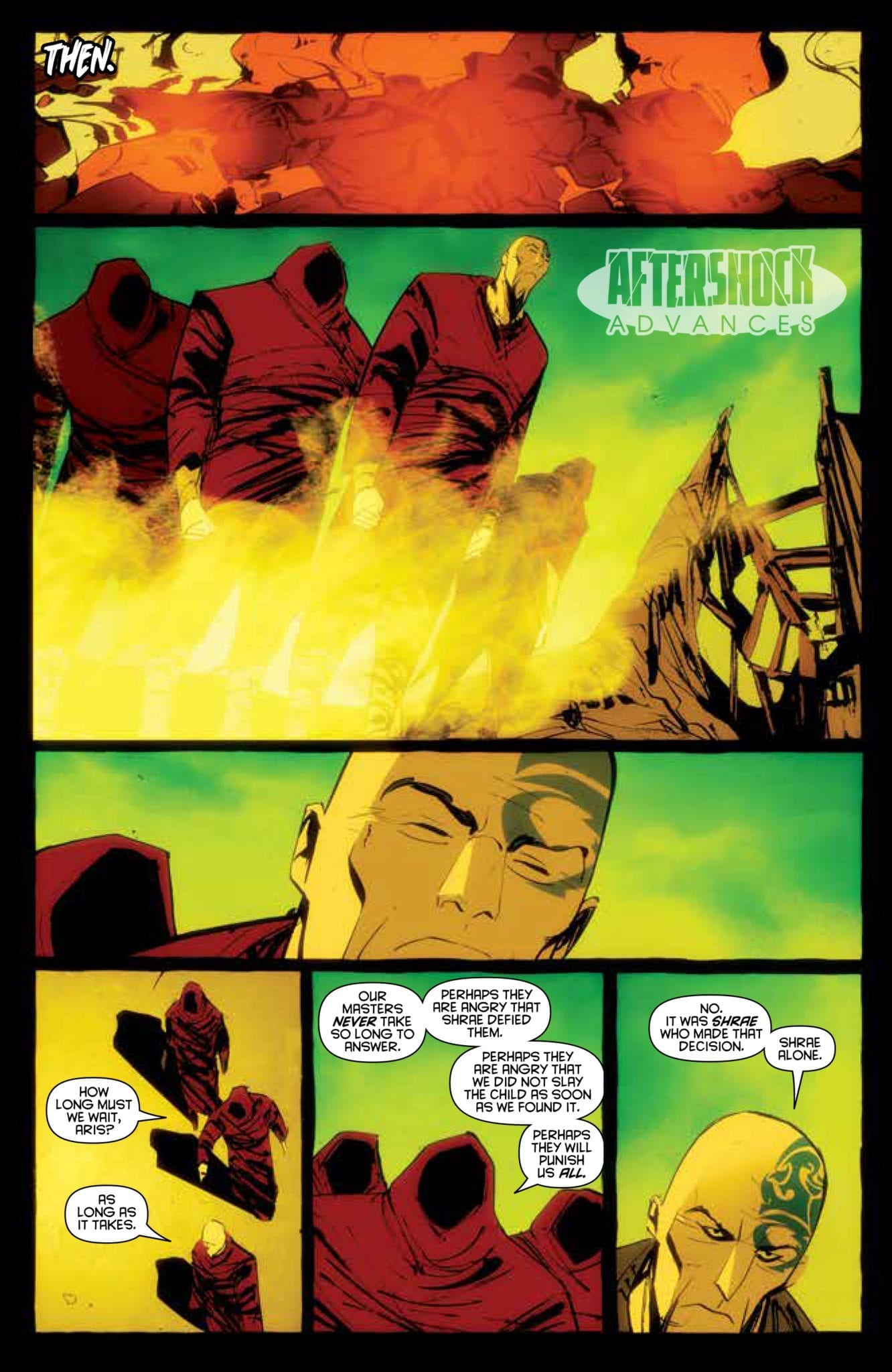
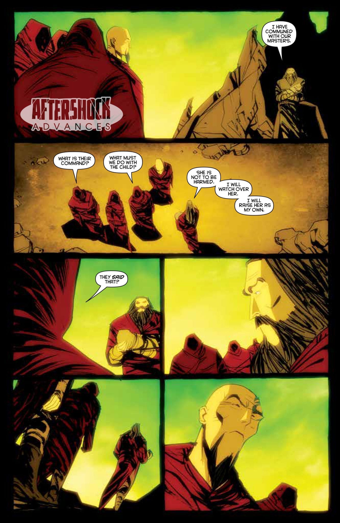
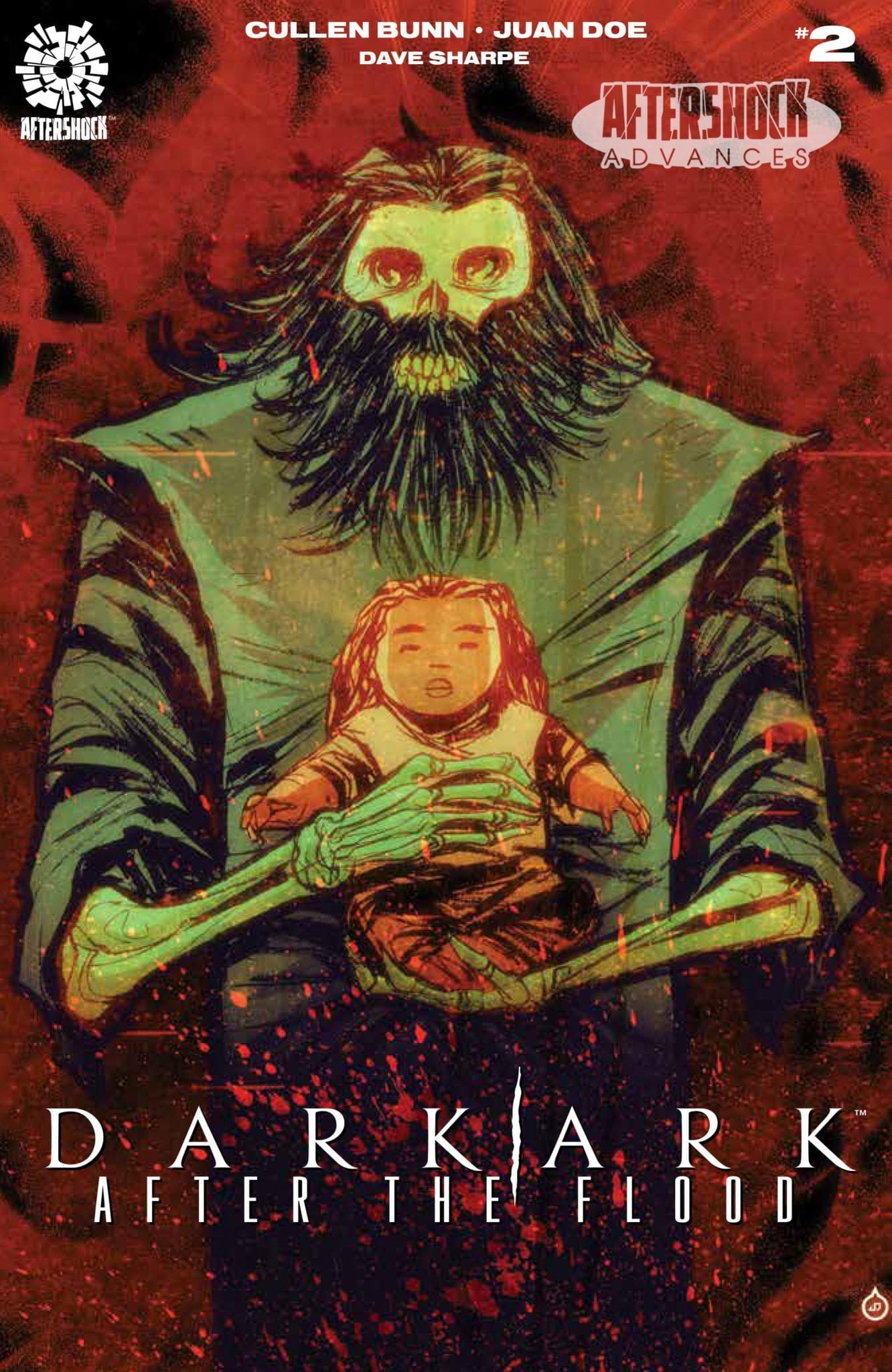
DARK ARK: AFTER THE FLOOD #2 hits your local comic book store December 4th, but thanks to AfterShock Comics, Monkeys Fighting Robots has an exclusive four-page preview for you.

About the issue:
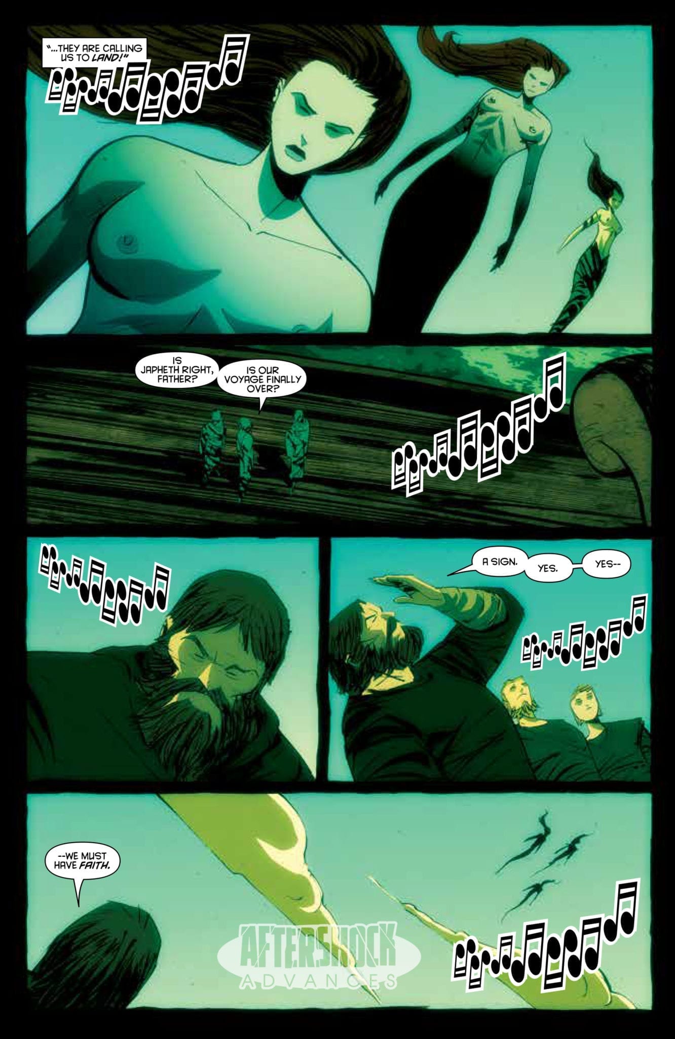
Now that the creatures of Shrae’s Ark have found land and made a home for themselves, they have a new challenge ahead of them: they must find a way to make sure that Noah’s Ark finds land, too. And as Khalee struggles with her newfound  power and her position as human leader of the monsters, new revelations about her own birth come to light.

Dark Ark: After The Flood is by writer Cullen Bunn and artist Juan Doe, with letters by Dave Sharpe and a cover by Juan Doe. The series is a continuation of Bunn, Doe, and Sharpe’s original Dark Ark run.

MFR critic Corey Patterson says of the series, “Bunn masterfully weaves together a narrative that raises just as many questions as it answers”

Check out the DARK ARK: AFTER THE FLOOD #2 preview below:

dark ark after the flood aftershock comics exclusive preview

dark ark after the flood aftershock comics exclusive preview

dark ark after the flood aftershock comics exclusive preview

dark ark after the flood aftershock comics exclusive preview

dark ark after the flood aftershock comics exclusive preview

dark ark after the flood aftershock comics exclusive preview


Are you reading Dark Ark? What’s your favorite series from AfterShock? Sound off in the comments!

Monkeys Fighting Robots Youtube

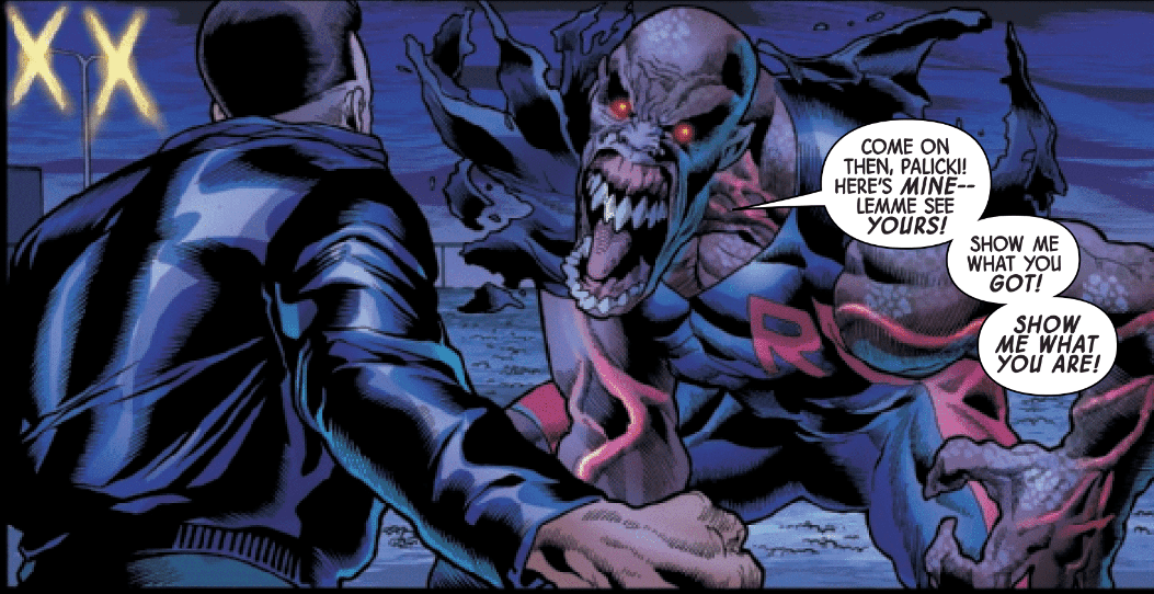
Review: IMMORTAL HULK #27- Please Run, Smash Class is in Session.

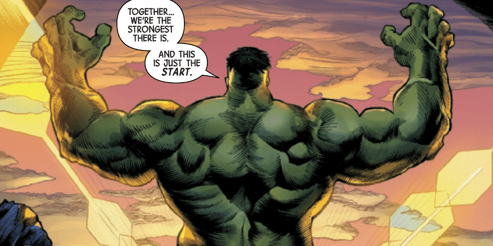
Bruce Banner dishes out some SMASH lessons in Immortal Hulk #27, out this week from Marvel.

After Banner delivered his manifesto to the world, it is time to kick the plan into action. Stories like Immortal Hulk #27 and this week’s Question: The Deaths of Vic Sage highlight problems that are being brought to the surface all over the world. The youth of tomorrow have grown up and they’re done taking $#!t from corporations and war mongers. Comics and other stories in today’s society could very well be the driving force behind these uprisings all across the globe.

Hong Kong, Chile, Iran, and here on our own soil, the public is beginning to learn the power they have in numbers. Without us, the corporations don’t have anyone to sell their garbage to. The sooner global consumers realize the power we all possess just by being the many over the few, the better off we will all be. Immortal Hulk #27 explores these very real problems with a very monstrous twist.

Al Ewing is absolutely killing it with Immortal Hulk in the absolute best way possible. I was admittedly not even a fan of the Hulk until this series. Taking the jade giant back to his roots in horror was the best thing that has happened at Marvel since Robert Downey Jr.

Joe Bennett is cementing himself as one of the legendary Hulk artists. There’s not much to say about his work in this book that hasn’t been said hundreds of times already. It really is that good and if you’re still not reading this book at this point, I don’t know what else to say to convince you, but this is still Marvel’s best, and I don’t think there’s even a close 2nd.

The army of inkers handling Bennett’s pencils are Ruy Jose, Belardino Brabo, Marc Deering, and Sean Parsons. Usually with that many people contributing to one artist’s work there would be noticeable differences with each inker, but the art stays consistent throughout the entire issue.

Paul Mounts is the regular colorist for Immortal Hulk and he gives Bennett’s work that little extra that pops off the page. Mounts delivers beautiful bright colors time and time again that are exactly what comics are made for. The fight scenes are every bit as cinematic and every bit as awesome as any MCU film.

VC’s Cory Petit handles the letters and once again does such an amazing job with adding action into the panels without obscuring any artwork. His letters fit so well it appears as part of the art instead of an addition to it.

While the first 25 issues tackled Banner learning about some of his new abilities, discovering things about himself, and focusing his anger. Now that his anger is focused, it is time to start the plan in motion and destroy the human world.

Last issue we saw Banner keep mentioning “human world” and Immortal Hulk #27 shows us exactly what he meant by that. He means to disrupt the world as we know it and bring back much simpler and happier times when multiple greedy corporations weren’t fighting for every penny of our paychecks.

Roxxon has been established in the Marvel universe to essentially act as capitalism personified, or monsterified in this case. Banner goes after their data servers and seriously hinders Roxxon’s ability to further control public consciousness. Just like in the real world, corporations have discovered how valuable public opinions are to their bottom line and controlling the beliefs of easily manipulated people allows them to keep doing what they do.

Our personal information has never been more valuable, but we consistently give it away for free so advertisements can cater directly to us. What started as a way for people to connect and be social has turned into a brainwashing machine for profit. Have any of you actually bought anything from those annoying Youtube ads that interrupt whatever you’re trying to watch or listen to? If anything it makes me hate whatever company is interrupting my song.

It’s getting crazy out there, Hulkamaniacs. Get your masks and spray paint ready.

What did you think of Immortal Hulk #27? Do you like the political aspect or would you rather get back to roaming through hell? Let us know in the comments below.


Monkeys Fighting Robots Youtube

Review: More Troubles On The Horizon With TONY STARK: IRON MAN #18

Iron Man

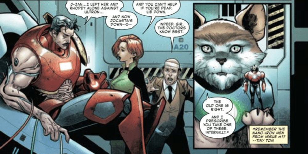
The steps leading up to Iron Man 2020 continue in Tony Stark: Iron Man #18 as Don Slott, Christos Gage, Paco Medina, and Edgar Delgado find another way to make Tony’s future more difficult. Will all of this building towards a new title distract from the intense battle taking place again Ultron or help to establish the new future for the Iron Avenger?

Summary

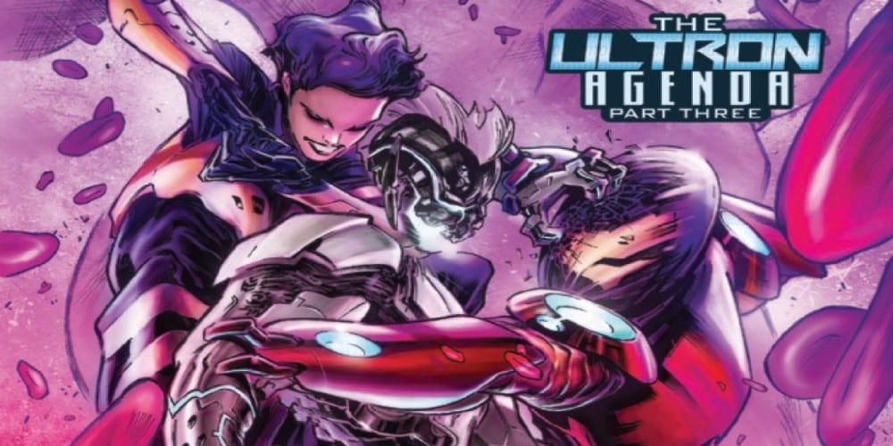
“The Ultron Agenda” continues! Chapter 3: Inner Conflict! While Rhodey and friends fight the robot war topside…a literal war rages on INSIDE TOny STARK! It’s the Wasp and a remote piloted Nano Iron Man versus a shrunken Ultron/Pym inside Tony’s physical body.

Iron Man

Writing

There really doesn’t seem to be much going right for Tony these days. He has questioned his own existence, had a major disaster take place with his technology, and his best buddy Rhodey barely feels comfortable thinking about putting on the War Machine Armor. So what does Dan Slott and Christos Gage do? Simple they decide to throw up another hazard on the horizon.

The problem comes from Arno Stark, who’ project is guaranteed to send Tony’s world upside down. Tony really can’t catch a break lately. The only good thing in his life right now is his relationship with Janet but let’s hope nothing happens to her (knock on wood). Still, even though there are a lot of seeds for the future event, the battle against Ultron remains entertaining and intense. Even when a company has plans for a major event, its important to see issues like this where the right elements are set in place for it to come off as a natural part of storytelling.

Iron Man

Artwork

The art by Paco Medina with Walden Wong on inks helps to really shape how the battle is happening on two fronts. Between the fight on the streets against Ultron/Pym to the fight in Tony’s body, both environments are striking and visually distinct. The winner of these two arenas is definitely Tony’s body as the detail is paid to blood cells and oxygen swirling around the heroes.

Thanks to the coloring work by Edgar Delgado a sense of peace and discomfort comes through quite well. The eerie light remains on technology like Ultron/Pym and his cyborgs showcasing how they are unnatural and should cause dread. Yet, with the final page, the use of proper lighting allows for a reveal which will make many an Iron Man fan swell with joy.

Iron Man

The lettering by VC’s Joe Carmagna aids in telling a story when body language alone doesn’t cut it. One scene, in particular, comes to mind, as Tony is in the armor and it is impossible to tell how he is feeling. Yet, thanks to lettering, the moment lands in showcasing it is a blow Tony did not see coming.

Conclusion

Though more people are probably more focused on what is going to happen with Iron Man 2020, the steps leading up to this event are important. Tony Stark: Iron Man #18 features an intense battle but still has time to tell a gripping story. The future may be ever-changing for Mr. Stark but watching it unfold has been a joy.

Monkeys Fighting Robots Youtube

Heartbeat #1 Is A Slow Beating Heart That Gains Momentum

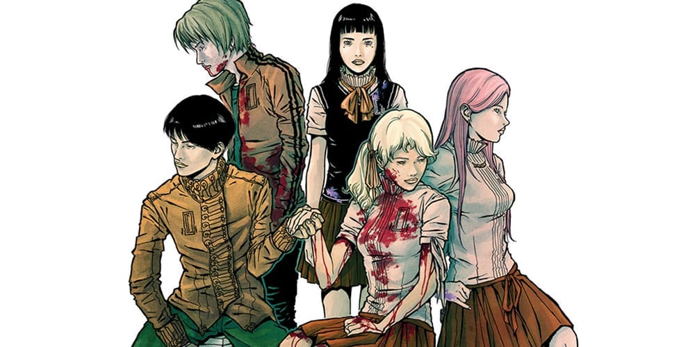
Maria Llovet’s 2015 Spanish comic about a dark high school filled with bloodthirsty kids, and titled moral codes – elegantly dubbed HEARTBEAT – hits your local comic shop this Wednesday in English from BOOM! Studios.

Interior Art By Maria Llovet

Art With Rhythm

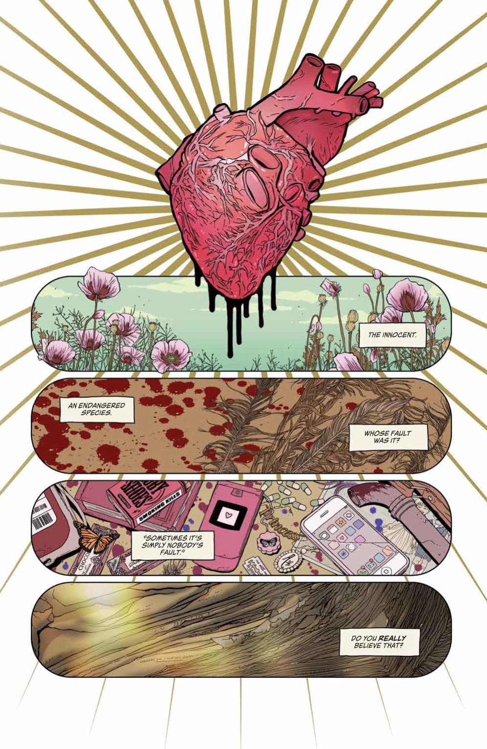
Heartbeat #1’s opening page (seen below) showcases Llovet’s great sense of panel rhythm and foreboding imagery. A large heart covers the top third of the page with motion lines spilling out from the middle, giving the enlarged organ a certain beat; a “heartbeat” if you would. The panels that follow show quick shots of things that have happened or may. Each panel that follows the heart feels as if it’s in tune with said organ.

Throughout Heartbeat #1, Llovet keeps the panels rectangular, varying the sizes for certain moments. But for the most part, she keeps this panel scheme to portray a slow build-up. That is until the end, where she picks up the pace with smaller rectangle and square panels, simulating a higher heart rate that Eva feels as she runs from a particular scene.

In addition to art, Llovet does the coloring for Heartbeat #1, which features scaled-down bright colors. At moments these colors pop, but never enough to draw the attention away from the art that adorns the page. Llovet’s art style is extraordinary. Be it busy pages that include a ton of miscellaneous items in the background, or clean backgrounds; she makes both look phenomenal. The style she brings is reminiscent of Manga, as is the story.

Interior Art By Maria Llovet

Steady is The Tale

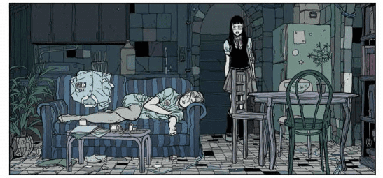
The trend of being akin to Manga continues with Heartbeat #1 story, as it takes its time to slowly build the world and main character. This slow build-up of Eva’s daily life, and the world help crescendo the life-altering moments that transpire. Throughout the narration filled panels, we learn of her day-to-day struggles and the relationships she has with fellow classmates. These moments further the impact of events that will happen later on, giving the chest-pounding last few pages more weight.

At first, this slow-paced storytelling feels like the first steps of another slice of life, Manga. Especially with the schoolgirl outfits, and our main character is sporting an eye patch. These clearly being a nod towards a multitude of Manga/Anime. Yet this pacing matches the rhythm she sets with the paneling throughout. Granted, this “take it slow” approach could be a deterrent for readers that went in expecting a blood bath, or something near that idea. But, for the story Llovet is telling, it works gracefully.

Lettering comes courtesy of lettering studio—Andworld Design. Heartbeat #1 is never too heavy with its dialogue, plus Llovet keeps enough space in her panels, making the placement of dialogue bubbles/narration boxes easy. If a single panel has only one bubble/box, the placement of the next panels box will be on the opposite side, essentially helping guide the reader’s eyes across the page.

Interior Art By Maria Llovet

A Heartbeat Away

Llovet’s story of a high school with a dark secret, love, horror, death, and the moral dilemmas Eva has to choose is a hard comic to recommend. Is it because Heartbeat #1 is bad? Hell no. As you can see above it’s amazing. Alas, the slow burn, the use of some haunting images and the twisted story being told feels as if it’s for a niche group. If you’re part of said group, Heartbeat #1 will get your heart pumping.

Translation Notes: Heartbeat #1 was originally published in Spanish with a French and an Italian version following. The English translation is handled by Andrea Rosenberg. As a frequent reader of Manga that has seen a varying amount of good and bad translations, Rosenberg’s work falls under the great category. No sentencing, wording, or punctuation seemed off, nor did what anyone was saying not translate well.

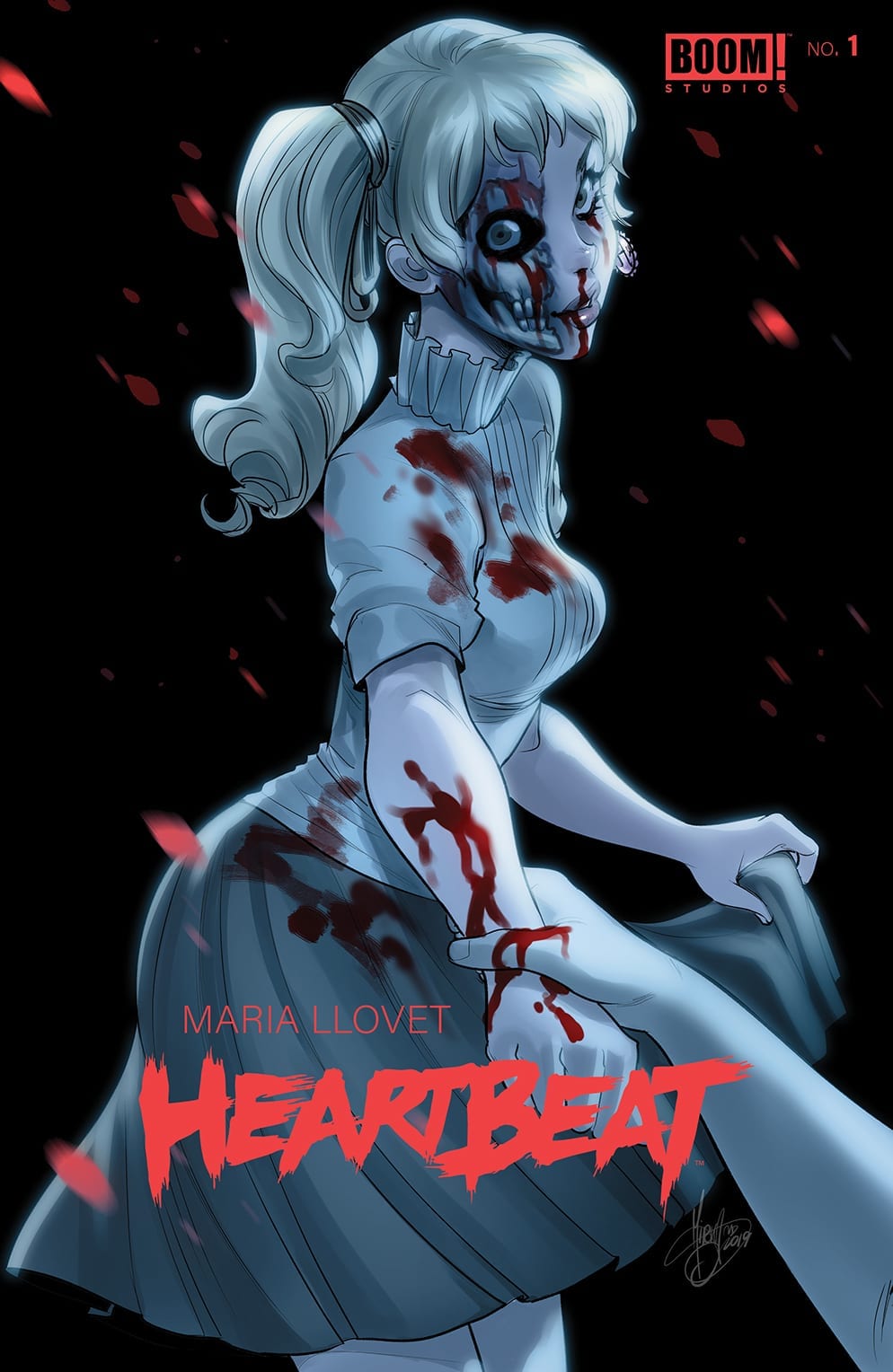
Cover Story: Llovet’s cover is amazing for its simplicity and design. But I’m a sucker for Mirka Andolfo, who did an amazing cover! Well, you could call them two different covers. But the statement remains, they’re awesome!

Heartbeat #1 Variant Cover By Mirka Andolfo

Dear Reader

Did you read Heartbeat when it originally released in 2015? Or is this your first time reading it? Either way, let us know below!

If you want more of her art check out BOOM! Studio’s Faithless.

Monkeys Fighting Robots Youtube

DC Comics’ RWBY CHAPTER 6 Is Short But Still Important

On the shelves this week from DC Comics, RWBY Chapter 6 continues the comic run of the well known Rooster Teeth franchise with our first look at the story beyond the character introductions.

RWBY Chapter 6 tells another tale of team RNJR’s adventures during their time together from the fourth season of the show. While this issue felt particularly short, it does bring a plot point back up that the animated series started, but hasn’t touched upon since — something to be handled by Ruby, Nora, Jaune, and Ren.

(RWBY Vol 3 spoilers ahead)

During the fall of Beacon, story antagonist Cinder Fall broadcasted the chaos across the world of Remnant, showing its populace a warped interpretation of what the students at Beacon Academy were being taught. Cinder claimed the students were being bred into child soldiers and killing machines, and all who watched the broadcast were shown a biased feed that only supported the statement.

RWBY viewers never really got to see the effects the broadcast had on the populace after the matter, only briefly when it is revealed that the nations were separated and communications between them were at a halt. RWBY Chapter 6 finally shows us the aftermath of Cinder’s broadcast among more common folk in the world of Remnant.

An example of what effect Cinder’s broadcast had

Though as a story it is a bit short and sweet, I will say Meghan Hetrick’s art is exceptional, detailing each character well in their design. What is even more worth noting, the fantastic and different redesign of the Manticore Grimm.

The Manticore which is significantly bigger than its appearance in Volume 6

Still on the colors is Arif Prianto, who continues to do an amazing job maintaining the color themes for each character in their design, as well as giving the world a lush and vibrant palette. I feel Prianto understands the characters and world of RWBY very well, and I hope he stays for a long time to come.

Gabriela Downie continues the lettering in this issue, which is optimized and easy to digest, even for longer parts of dialogue the font and spacing are presented in a manner that’s not so intimidating and welcoming to anyone new to comics. Being that the target audience leans more towards RWBY fans who may not necessarily read comics often, this seems like a smart direction to take.

While I appreciate RWBY in a comic-book form and the stories being told are enjoyable, I do hope in the future there will be some continuous story arc established in these issues. As of right now, they do seem more inclined to tell short stories that are open and closed, but it’s only issue 6, so there’s still time to see where it goes. As a RWBY fan, I am still happy with the issues to date, as an avid comic reader, I’m still holding out for that cherry on top.

Monkeys Fighting Robots Youtube

Review: Castle Grayskull Grows Corrupt in HE-MAN: MASTERS OF THE MULTIVERSE #1

Writer Tim Seeley (Grayson, Hack/Slash) comes together with a fantastic art team to create a blast of a first issue in “He-Man: Masters of the Multiverse #1.” The debut comic for this six-issue mini-series is sure to please long-time He-Man fans, while still bringing enough new to the table to be an enticing read.

Across the multiverse, Eternia lies at the center of every universe with He-Man as a force of absolute good. That is, except for the one Anti-Eternia, where a dark image of He-Man is created. This anti-He-Man takes off across the multiverse to steal the power from all other Castle Greyskulls in the multiverse, all the while killing the heroes who defend them. Now, it’s up to a rag-tag team of surviving He-Men to band together and stop this villain from gaining control of the entire multiverse!

If there’s one thing writer Tim Seeley knows how to do, it’s make a story that’s a blast to read. The script behind this first issue of “He-Man” is full of exciting twists, balanced pacing and perfect dialogue for this sort of book. The reveals of new characters and locations all come across as wondrous and, frankly, cool as hell. Any brief moments of exposition are delivered in a way that feels natural and necessary, and as such they don’t effect the speedy pacing of the issue. The dialogue itself feels like classic He-Man, but it never gets too campy. It’s a fine line that Seeley balances here. Let’s face it though, any issue that opens with Skeletor’s evil laughter is an absolute winner. Sure, the whole “someone is taking over the multiverse” trope has indeed been done to death, but getting to see it done in a new He-Man comic is too much of a treat for it to be a major critique. This is an issue that neatly accomplishes a lot of story in the span of only 20 pages.

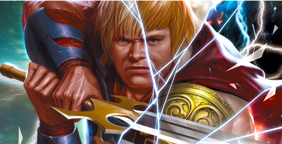
Any long-time comic fan understands how important the right art is to a proper sword & sorcery series. Fortunately, Dan Fraga‘s pencils and Richard Friend’s inks create a style reminiscent of the classic designs of the 70’s and 80’s while still making it fit for a He-Man story. Fraga’s penciling is indicative of the 90’s musclebound character art that he cut his teeth on, but it’s sharpened here to just the reasonable amount of over-the-top. Fraga draws a fantastic He-Man, as well as an excellent amount of detail to the world(s) that the characters inhabit. Richard Friend’s inks give excellent definition and depth to everything from He-Man’s absurd musculature to the bolts of magic Skeletor lobs at his nemesis. The comic looks like someone dug up an issue from the 1980’s, and you wouldn’t want it any other way.

What sells the look of this new He-Man comic just as much as Fraga and Friend’s art is Matt Yackey‘s top-notch coloring. The color choices in this issue look like a toy commercial and damn does it look fantastic. Characters are perfectly matched to their classic cartoon versions, but with the visual pop of modern techniques. Everything from blobs of projectile sorcery to drawings of the multiverse are given the neon-sheen of old-school color palates that have apparently aged like wine under Yackey’s supervision. If you came for Seeley’s take on the classic character or for Fraga’s artistic interpretation, you’ll stay for Yackey’s incredible colors.

“He-Man and the Masters of the Multiverse #1” is a fantastic start to a new mini-series featuring Eternia’s massive cast of heroes and villains. The pages within bring to life enough classic material for old fans to get a kick out of, but an intriguing enough premise to tide over newer fans who may be more unfamiliar with the characters. Tim Seeley’s script works in conjunction with the talents of an outstanding art team to make this a blast to read. Whether you’re a long time fan of the heroes of Castle Greyskull or a first-time observer, this issue is a worthy pick from your local comic shop on 11/20.

Monkeys Fighting Robots Youtube

Review: THE MASK: I PLEDGE ALLEGIANCE TO THE MASK #2 Presents America At Its Worst

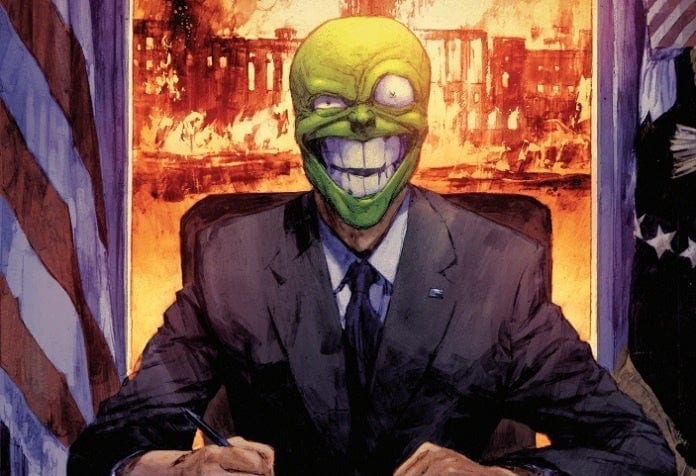
I PLEDGE ALLEGIANCE TO THE MASK #2 main cover artwork

I PLEDGE ALLEGIANCE TO THE MASK #2, available in comic book stores Wednesday, November 20th, gets more political than ever—with just a touch of blood. Mayor Kathy Matthews continues to push her campaign for the presidency despite a alarming number of murders among the candidates. Many speculate that a new person assuming The Mask persona is behind the killings; what’s peculiar is that they’re currently running for president as well. No one knows who this late-comer is, but it seems a large segment of the public have taken to his message—a message that embodies America at its worst.

Story

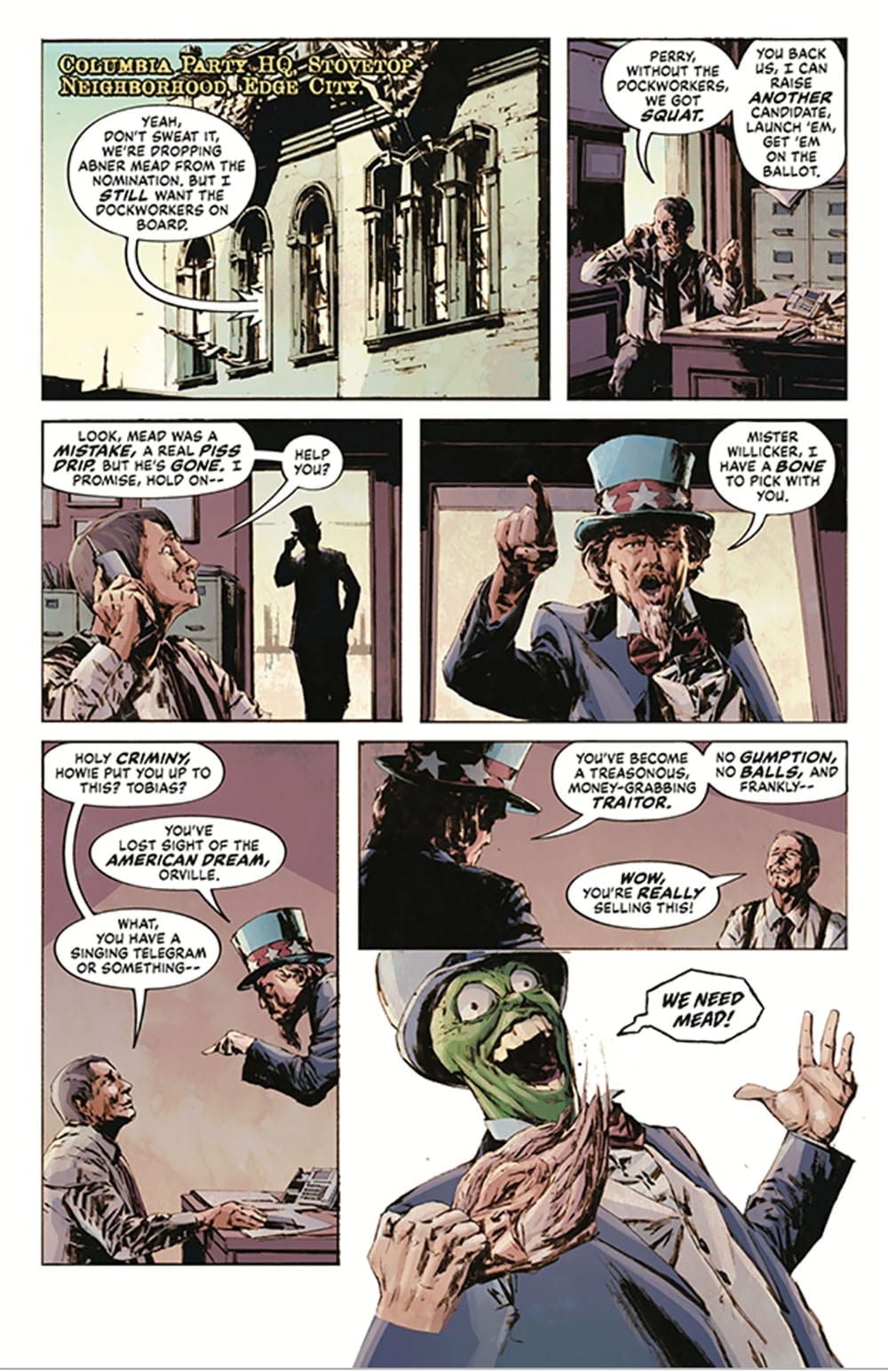
The drama all starts when The Mask, dressed as Uncle Sam, pays a visit to Orville Willicker, leader of The Columbia Party and player in the current race. Willicker believes him to be nothing more than one of his aides and plays along with number of personal indictments. But the fun ends when The Mask proceeds to murder the man in cold blood.

The Mask as Uncle Sam

Following this horrific event, The Mask murders three other presidential candidates in quick succession, leaving the political landscape even more chaotic than before. Despite this atmosphere, Kathy remains committed to her campaign, though she does spend her free time sparring with boxing instructors to keep her physically and mentally sharp. However, The Mask wastes no time setting his sights on her, planting his agents at one of her public speeches and orders him to lob a bomb at her podium.

Fortunately, Kathy survives, and decides to beef up her security, enlisting long-time Mask chaser Detective Mitch Kellaway into her personal entourage. Though they’ve butted heads over the yeas, the duo know how to hold their own against The Mask.

Writer Christopher Cantwell adds a neat twist to this story by letting The Mask run for president. Outlandish as it seems, the vigilante’s own campaign promises of wealth and guns hits a disturbing cord in its similarities to America’s modern politics. Can Kathy find a way to stop the megalomaniac before he takes her life, wins the election, or both?

Artwork

Patric Reynolds penciling and inking, along with Lee Loughridge’s coloring, provides a grungy and gritty vibe for the Edge City setting—a perfect fit for this story. The back alley meet-ups, the police chases—scenes employing dark shades and bold lines—give us just enough clarity while keeping much hidden in the darkness. The only brightness we see comes in the form of The Mask’s outlandish costumes and unforgettable green face. Nate Piekos of Blambot’s lettering reinforces this by using jagged borders on much of The Mask’s dialogue balloons—quite literally adding “edges” to this chaotic being who represents the degeneracy of Edge City itself.

Comic Covers

Main Cover

Reynolds and Loughridge lend their expertise to the main cover, depicting “Big Head” in all his glory in the presidential seat at the White House—the worst nightmare for some and a dream come true for others. The burning U.S. capital behind him adds to the chaos this candidate wishes unleash.

Variant Cover

James Harren’s artwork places Javier Antanasio, the mask user from issue #1, front and center, gazing ahead with a crooked smile while tormented faces of The Mask. This shows the many personalities that have worn the mask and the tormented existences they lead.

Conclusion

The twisted tale told in I PLEDGE ALLEGIANCE TO THE MASK #2 is uncannily relatable in its scope, seeking to draw in mature, politically savvy comic book fans. Readers will undoubtedly be on the edge of their seats watching the Edge City “hero” take the country into his own hands.

Do you think The Mask has a shot at winning the election? Let us know in the comments below!

Monkeys Fighting Robots Youtube