Harrow County creator Cullen Bunn teams up with artist Naomi Franquiz to bring us “Tales From Harrow County: Death’s Choir” #1. This first issue is a brilliant start that brings to bear all the southern-Gothic charm and character storytelling that made its predecessor such a hit.
Ten years have passed since the young witch Emmy defeated Hester Beck for the soul of Harrow County. Ten years have passed since Emmy made her exit and left her best friend Bernice as protector of their backwoods home. Now, Bernice acts as stewardess of Harrow and all its countless haints in order to keep the darkness at bay. With World War II in full swing however, the sorrow in both our world and the next is at an all-time high. So when a ghostly choir starts raising Harrow’s dead, Bernice will have to pull out all of her magical stops before their quiet home is overrun.
Writing & Plot
Some of the strongest elements in the original Harrow County series are writer Cullen Bunn‘s sharp ear for naturalistic dialogue and tight plotting. This continues to hold true in the first issue of “Death’s Choir.” The characters, from Bernice herself to the townsfolk and the supernatural creatures all feel like real people. There’s a comfortable naturality with the way people speak in Harrow that when combined with the effective prose of the narration makes this series a continual joy to read.
The plot following Bernice’s life as the local witch and the townsfolk’s hardships during WWII offers heartfelt character storytelling in the midst of the supernatural background. The supernatural elements themselves are presented in their usual charm and mystery. There’s a familiarity with the ghosts and ghouls aspect of this issue that will be a treat to long-time Harrow fans but also not be alienating to newcomers. While it’s only been a few months since the original Harrow County ended, it’s still reassuring to see that Bunn has lost none of his edge when approaching this world.
Art Direction
Tyler Crook makes for a tough act to follow. The Harrow County artist and co-creator is responsible for the entire visual aesthetic of this acclaimed horror series. Fortunately, artist Naomi Franquiz has come aboard to replicate this iconic atmosphere. Franquiz’s work on “Death’s Choir” is highly reminiscent of Crook’s art, while still maintaining her own visual style. The thick linework and facial detail create a sort of lighthearted atmosphere when interacting among characters. At the same time, this style creates its own unique atmosphere when the horror elements are introduced. Much of this comes from the watercolors used in this issue. This is a technique that has become almost synonymous with Harrow County and it’s great to see Franquiz maintaining this style.
If it sounds like this is saying “Franquiz just copied Tyler Cook’s style,” it isn’t. It just seems that the two have a very similar technique, and Franquiz was knowledgable enough about Harrow to know how to maintain that iconic look. Crook does lend some of his talents to this first “Tales From Harrow County” issue. His lettering provides the reading experience with a variety of tonal dialogue for the audience to latch onto. He switches from relatively normal fonts in most narration and dialogue to wavy or angled text from supernatural sources. It’s a small artistic touch that works wonder with the tone of the book.
“Tales From Harrow County: Death’s Choir” #1 is a phenomenal start first issue. This first of a four-part mini-series is a wondrous return to Harrow County in terms of both the story itself and the work that has gone into it. Cullen Bunn brings back all of the original series’ strengths, from the personal character stories to the charm and mystery of the quaint backwoods horror. Naomi Franquiz brings her own style of art to the table while also paying perfect and direct homage to the art that made the original series so memorable. If you’re a fan of Harrow County or are just in need of a great horror comic, be sure to pick this one up at your local comic shop on 12/18.
If you’re looking for range in a comic book publisher, you’d be wise to pay attention to It’s Alive. This October, It’s Alive published a delightfully positive, brightly-colored sci-fi adventure called Pink Lemonade, which combined the best parts of Jack Kirby’s art and Evel Knievel’s stunts. Now, It’s Alive has changed gears entirely, drawing us into a dying world and the stories of those surviving there in Justin Madson’s Breathers. Breathers is an anthology title set on an earth without fresh air. The characters’ lives are very different, but they all share a similar strife. Without their titular gas masks, they couldn’t live.
Breathers happens in four short segments. In the first, Damsel in Distress, we see this world through the eyes of little Mara, who escapes the harsh realities of her home by playing make-believe with her stuffed dragon. The second story is The Wealthy Bachelor, a guy-meets-girl tale that would be right at home in a rom-com format, but affected deeply by the world’s necessary face gear. The third is Filter K, which gives us a window into crime and law enforcement on this dying planet. And finally, there’s Bedtime, which returns us to Mara’s home. This time, though, it’s through eyes of her mother, for whom an imaginative escape is not an option. Each of these segments is heart-wrenching for its own reasons, and though we get very little time with each character, Madson’s masterfully turns them into fleshed-out, lovable and deeply relatable people.
The Stories
The most appealing thing about the short stories in Breathers is just how localized they are. Madson doesn’t ever get in to why the Earth has so little oxygen, or plot out some quest to save it. Instead, his stories accept the world’s condition as a fact of life, tracking with the down-to-earth, human drama that springs out of it. These stories are tiny, intimate moments between one or two characters. They relying on the emotional weight of their interactions rather than flashy sci-fi imagery. In a market with an annual schedule of reality-altering crossover events, Madson’s commitment to his grounded world is a refreshing change of pace. It gives his stories more space to grow or, if you’ll forgive the joke, breathing room.
The Art
There’s a passage in Scott McCloud’s Understanding Comics about the relatability of characters with minimal features. The more simplistic the face, he says, the easier it is to apply to anyone, whereas a character with more “realistic” features will start to look like a separate, therefore not relatable, person. Justin Madson’s character designs put this theory to the test and prove it exactly right. These characters, though distinct in their personalities, are fairly universal in their designs. They could be you or me, or even more terrifyingly, our loved ones. These character designs aren’t realistic: they’re real.
Oh, and have you seen the Jeff Lemire/Matt Kindt cover??
The Colors
When Madson originally self-published Breathers, the comic was entirely in black and white. This probably lended itself to the grim state of the world, accentuating the hopelessness you see the characters going through. And if Justin Madson was a lesser comic creator, adding color to this book might have brightened that mood.
Simply put, it does not.
Madson’s bleak color pallet gives a reader the distinct message that the natural world is dying. Don’t get us wrong, it’s not quite apocalyptic, though it’s not far off. Madson has crafted a look that’s kind of a “nuclear fall,” toeing the line between our world and post-civilization, but not quite crossing it. This, more than anything else in the book, does the job of unsettling the reader. After all, it’s easy to separate yourself from a world in flames that looks nothing like your own. The creepiness of Madson’s earth is the familiarity it shares with our own.
The Lettering
Breathers makes the best use of unconventional comic lettering since Richard Sala. Like Sala’s work, the speech bubbles and letters Madson uses are shaky and unsure. They’re completely different from the sturdy, determined speech captions of your average hero book. When you hear these characters’ voices in your head, they come out nervous, and you can’t help but feel the same way. Far from being just a n added touch to the already unsettling mood of this book, the lettering is one of its pillars, driving home the oncoming doom of its world in a concrete way that’s also entirely consistent with the book’s art. If you’re a comic reader that overlooks the lettering, Breathers is a great place to start paying attention.
Overall Thoughts
According to an interview with Newsarama, Justin Madson has been working on Breathers since the late-2000’s, when he hand-copied the pages of the book and distributed them himself. Years later, Breathers had culminated in an indie comics masterpiece, a story that is prescient but not preachy, full but not flashy. The only criticism of this book we can offer is that there could be a more diverse cast of characters. We get a great sense of the world of Breathers already, and telling the stories from a wider variety of viewpoints could flesh out that world even more, connecting it to even more readers.
Still, there are plenty of Breathers stories left to tell, plenty of opportunities for Madson to explore those viewpoints. Madson has set up a framework that could expand for years and never get boring, and if Breathers gets the attention it deserves, we’ll see those stories on shelves soon. If you want to help get Breathers into the world, you can order a copy to your local comic book store, or over at It’s Alive’s website. Whether you’re interested in supporting indie books or just getting a fellow comic reader something great for the holidays, Breathers is worth every cent.
For more reviews like this one, follow us on Twitter. And for all the best comics discussion and interviews, keep an eye on Monkeys Fighting Robots.
Code 8 is a science fiction film starring Robbie Amell (The Flash) and Stephen Amell (Arrow) in a world where super-powered people exist but are fugitives from the law. Production Designer Chris Crane married the familiar present with near-future creativity to create a brave new world.
In Code 8, Robbie Amell plays Conner Reed, one of just four percent of the population of Earth who displays incredible superpowers. However, in this future world, people with such powers are considered dangerous and wanted by the law. Conner joins a group of thieves to survive. But as law enforcement closes in, Conner’s only defense is the power that makes him a fugitive.
PopAxiom interviews Chris about his life leading up to becoming a production designer and his work making Code 8’s world come alive.
Photography To Designer
Chris’ road to production design started early. “I was around 14 and was watching Twin Peaks in reruns on Bravo. I noticed how much I liked the look and aesthetic of the show and wanted to be transported to such a beautiful yet dangerous place.”
The curiosity born in the town of Twin Peaks, made Chris begin to “… pick up on certain styles and looks I liked when I watched TV or film. I started to get into different time periods look for colours used, or not used, in certain films. I also loved anything with world-building and made up places and even products and branding.”
Naturally, Chris immediately went into production design, and the rest is history. Not exactly. “It was a pretty complicated and roundabout journey that got me into Production Design …”
The short version of the story starts at Ryerson University in Toronto, Ontario, Canada, where Chris took photography after High School. “I met a bunch of people in the film program there and helped them on their projects. Deciding photography was not for me career-wise, I left school and started working at H&M …”
At H&M, Chris ended up with a promotion to Window Visual. “A few years of that, and I realized I did not enjoy where I was in life.”
Chris had friends in the right places, though. “A friend of mine, who I had met at Ryerson, was beginning to Production Design small indie features and short films, and she convinced me to take a job as her Set Decorator.”
The soon-to-production designer learned and soon realized that’s “… what I ultimately wanted to work towards.”
About Code 8
Code 8 is based on a short film of the same name, which was produced by Robbie and Steven and director Jeff Chan. Chris actually met with Jeff back in 2016 about working on the short film, but it “…ended up shooting in LA Instead of Toronto.”
Now interviewing for the feature film version of Code 8, Chris says, “… it was nice to check in, watch the short film … and get into what I liked and where I thought we could talk about things.”
The discussion continued. “We went over what Lincoln City was and the types of people that lived there. The different looks and colors that would denote the haves and have-nots of this world.”
About working on Code 8: “I loved the short film and the script, so it was easy to connect and go over ideas.”
After the weekend interview, Chris returned to a feature film project he was already working on. “I went back to work and found out I had the job right soon after we wrapped.”
What’s Your Mood?
Even before interviews for Code 8 or otherwise, Chris will “… put together a mood board and package… “
Chris continues to add to this board throughout discussions and reading the script, which offers a flood of ideas. “As soon as I start to read a script, ideas start to come. I just grab images from Google or screen grab from films that come to mind. Or I write down notes and ideas.”
Chris admits this means that while reading the script, he will “… stop on and off to get ideas down.” But there’s some method to the madness. “It’s my way of finding what the script means to me. I’m also afraid of losing out on a possible idea. That doesn’t mean I don’t go through large chunks, just reading and enjoying. Still, I also enjoy figuring out what I think I am seeing as I read and who the people are or the places they find themselves.”
So, what does Chris’ mood board contain? “It is way easier to show a colour then to describe it and to show a mood or look then to discuss it… That becomes the jumping-off point, and now there are already references to show producers, location managers, and my team. From there, I can do deeper dives with research and references. Start putting together more ideas and get all departments on the same page as far as the look or what colours we are going for or what types of locations we hope to find.”
Army Of We
The filmmaking process is a massive dance between many departments. Chris talks about one of his dance partners, the costume designer. “… it is always great to go through some of the looks on different sets and see what they were thinking for certain looks for characters. Sometimes, my work informs their work; I have the approved wallpaper or colours for the space or know what some of the location options are, etc. Sometimes, they will have a look or colour for a character …” Chris shares an example from Code 8. “… the Costume Designer Bernadette Croft wanted to go with a lot of blues in designing the wardrobe for ‘Conner’ (Robbie Amell), so that was something we had to think about when creating spaces that his character would be in.”
Another department is Visual FX, in this case, Playfight. “I was so lucky to work with the team at Playfight. They were always around to discuss what needed to be a practical set piece or prop and would discuss what would be set extensions or would have an overlay. A lot of the shows I work on mostly keep it as something to deal with in post, and so I do not always have a lot of interaction with them. They were also all there since the beginning, having worked on the short film, so it was great to ask them how they did certain things or what they were planning to do this time around.”
Alternate Familiarity
Code 8 takes place in a near-future world, so viewers will recognize some things but also see tech that’s not real but very plausible. “Creating an alternate reality was the best part!
Something familiar yet different. Director Jeff Chan had the motto ‘it’s not sci-fi, it’s 5 seconds in the future’. So instead of making everything up from scratch like crazy, unfamiliar futuristic, we looked at what was upcoming tech today or where things looked like they were heading. Keeping things slick and modern but not totally impossible.
According to Chris, the production had “… so much fun with the world-building. Other than makes and models of cars, we tried to rebrand everything, from the Lincoln City logo to the fake soda pop brand that is advertised. I even had the art department make parking meter cover-ups and tiny Lincoln City logos to cover the Toronto City logo on all seen street signs. I love seeing that kind of thing in movies, so I wanted to put as much world-building into this as I could-yet keep it familiar and relatable.”
Wrapping Up
When it comes to the question of influences and inspirations, Chris says, “Anything and everything can influence me. I love going through the design sections of used book stores and finding books on old signage or movie poster art. I love random Instagram accounts that only showcase 1980s high-end offices or low budget horror movie deaths. I do not think there is one way, or even a right way, to work in creative fields.”
Chris spreads the love to fellow production designers working today. “I had the pleasure of being on a panel with production designer Mark Steel and am so excited to see his work on the new season of The Umbrella Academy. Michael Bricker’s work on Russian Doll was incredible. Lisa Soper’s work on The Chilling Adventures of Sabrina is visually stunning. I am also excited to see Hannah Beachler’s work post Black Panther, and I loved Paul Austerberry’s work on Shape of Water.”
What movies does Chris love when it comes to production design? “I have always loved Edward Scissorhands… The original Alien, the 80’s craziness that is Brian DePalma’s Body Double and Ken Russel’s Crimes of Passion, the mod-60’s futuristic 2001: A Space Odyssey. I also love the mood and atmosphere that early-mid 80’s slasher flicks have, even the cheesy ones. They all tend to have fun with design, based on the subject matter and lower budgets.”
Code 8 comes out on December 13th, so what’s next for Chris? “Well, an incredible series I did for the streaming service Crave called New Eden comes out January 1st in Canada. It’s a dark comedy (very dark) about a fake 90s documentary about a fake 70s all-female cult and how things go terribly wrong. Also, Two feature films I designed come out in the early spring; Run This Town from director Ricky Tollman is a modern take on old political thrillers that involve the former Toronto Mayor Rob Ford scandals of 2012 and Disappearance at Clifton Hill from director Albert Shin which releases February 28th. It’s about a young woman named Abby (Tuppence Middleton) and her arrival back in her hometown of Niagara Falls, Ontario, Canada. There she must uncover a dark memory from her past in this modern-day noir.”
Will you be watching Code 8?
Thanks to Chris Crane and Impact24 PR for making this interview possible.
Want to read more interviews like this? CLICK HERE.
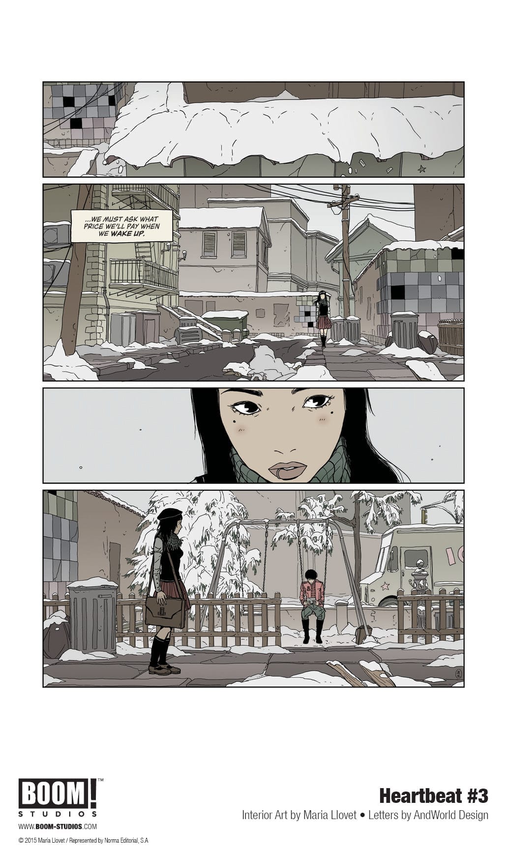
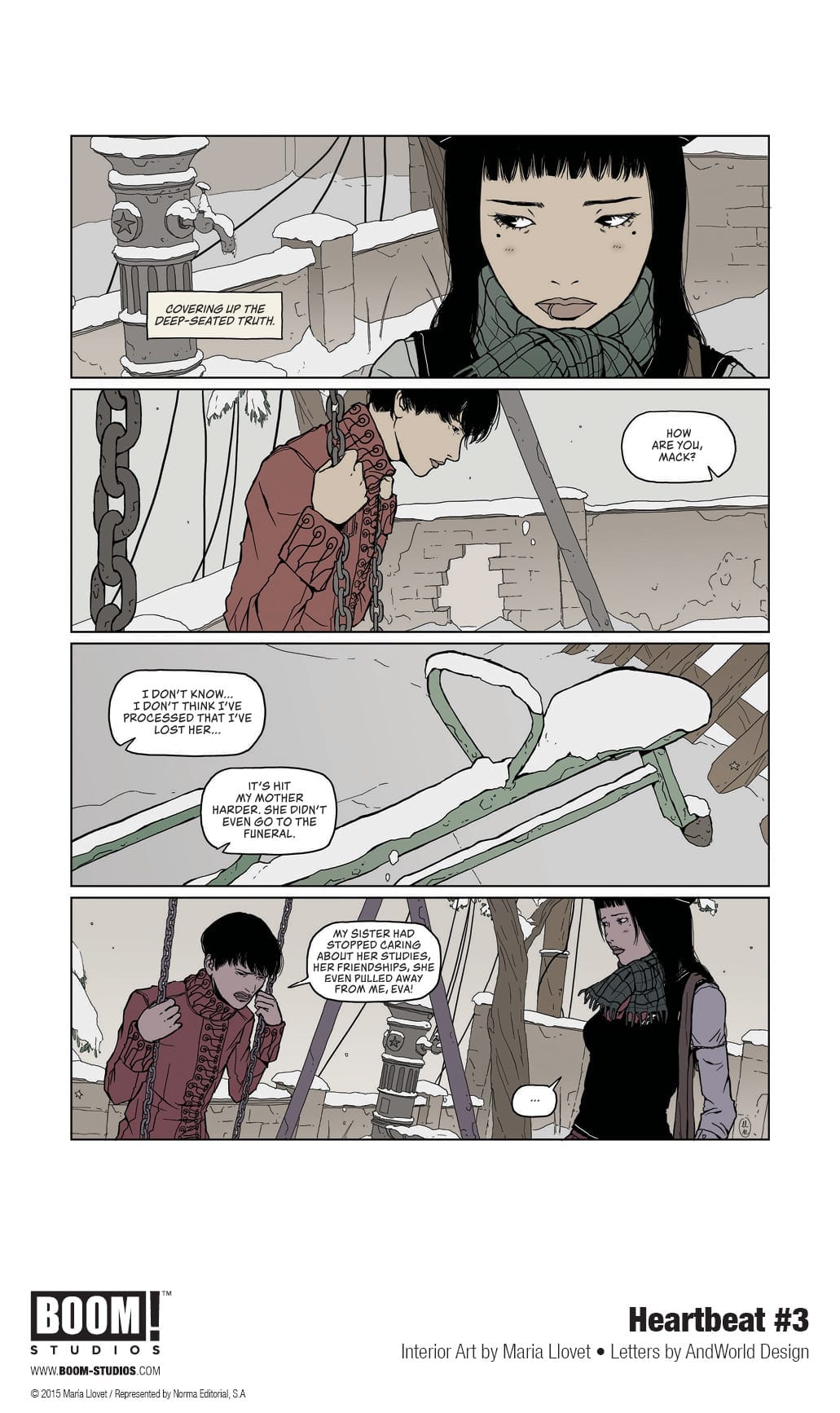
Heartbeat #3 hits your local comic book store on January 2nd, but thanks to BOOM! Studios, Monkeys Fighting Robots has an exclusive five-page preview for you, AND the first look at Jen Bartel’s variant cover!
About the issue: After a thrilling encounter with Donatien, Eva finds herself becoming more interested in his macabre tastes. As the murderer draws her deeper into his world, what parts of herself is Eva willing to give up to get closer… and will she miss them when she’s done?
Heartbeat #3 is by writer/artist Maria Llovet (Faithless), with letters by AndWorld Design. The series is translated by Andrea Rosenberg.
The five-issue series focuses on Eva, a high school outcast who learns that the most popular boy in school enjoys the taste of blood and will literally kill to get it. BOOM! describes Heartbeat as “a dark, violent, decadent, disturbing story, in which life and death, blood, and love are inextricably intertwined.”
Take your first look at Jen Bartel’s beautiful variant cover:
And check out the full Heartbeat #3 preview below:
Are you reading Heartbeat? Sound off in the comments!
Welcome to ‘I’d Buy That For A Dollar’ a column where I will be exploring the weird and wonderful world of dollar bin diving. The only rule is each and every comic is purchased for one dollar (or less!).
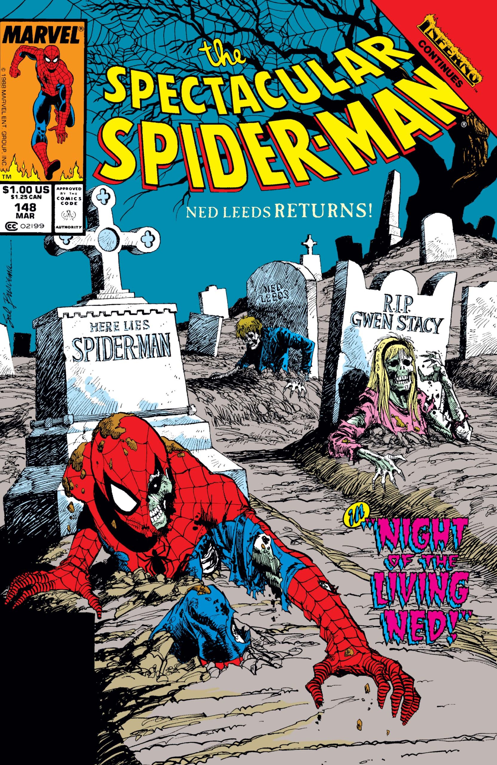
This week’s book is The Spectacular Spider-Man #148.
The Spectacular Spider-Man#148
‘Night of The Living Ned’ Written by: Gerry Conway Pencils and Inks by: Sal Buscema Colors by: Bob Sharen Letters by: Rick Parker
I was very indecisive about what book to choose for this week. So I decided to call on fate and went out on a last-minute dollar bin hunt; I also decided I would use a book I would find as this week’s choice. Well, I’m glad I did because I ran into one of my favorite comics as a kid; The Spectacular Spider-Man #148. The artist on Spectacular at the time, Sal Buscema, was on the title for years and is probably in my top three Spidey artists of all time. I always grabbed Spectacular when I saw it. This issue was a part of Marvel’s Infernocrossover (a horror-themed company crossover involving demons and limbo flooding into the Marvel Universe). As such, the story is pretty much straight-up horror and was pretty cool to an eight-year-old kid like me.
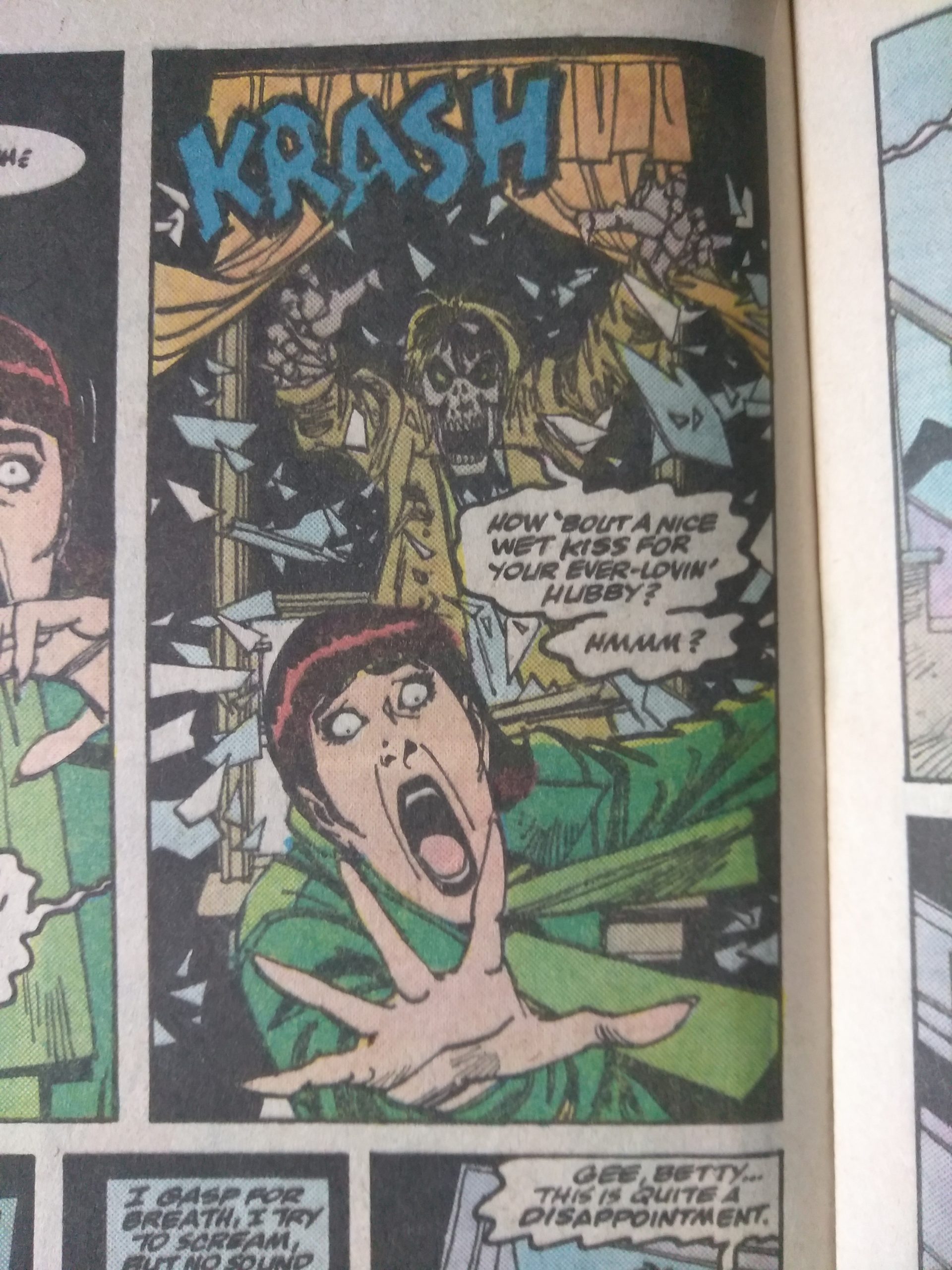
Brief synopsis: As Betty Brant and Flash Thompson board up an apartment to keep out the ghouls and ghosts (ala Night of The Living Dead. Remember this was way before the zombie craze too!) they are attacked by what it seems like the re-animated corpse of Ned Leeds, Betty’s ex-husband, a reporter, Peter Parker’s friend and also thought to be the Hobgoblin for some time; man Spidey comics piled on the melodrama in the 80s. Anyway, the story gets very hallucinatory and atmospheric. It scared the crap out of me as a kid. Let’s take a look at some pages!
Here’s my copy!
This is one of my favorite panels in the book and it perfectly captures the E.C. Comics vibe going on in the issue. Pretty gruesome-looking stuff for a Spidey comic!
This page with Flash Thompson fighting some kind of demonic Spider-Man is awesome. Love the layout and use of lightning. Again very true to horror!
Here’s that demonic Spidey!
And another great Zombie Ned!
Here’s a great image of New York as it was changed by demonic forces in Inferno.
I usually like to write about a few ads and there weren’t that many cool ones in this issue. Except for this. This WWF ad is just perfect for its time.
You can find great dollar bins at almost every local comic shop. So find a shop, ask a comic clerk and start bin diving!
The Year of the Villain has seen a significant upgrade for the Rogues of the Flash. As Lex Luthor recruited villains from across the world, Captain Cold gathered his team and gave them all upgrades as Barry dealt with Zoom and the Black Flash. When Flash finished his battle, he was far too weak to stop the Rogues from taking over.
Months pass, and Central City has been under the frozen grip of Cold. After the future heroic version of Cold is murdered by Snart, Barry is able to break free of the prison he’s left in and joins Kid Flash and Avery Ho. But when he is with them, he realizes that there is something wrong with his powers. What the heck happened?!
**Some Spoilers Below**
Story:
We open with Golden Glider, The Flash, and the young speedsters walking through the frozen bay. Their destination is a ship in the center owned by the Weather Wizard, who continues to make blizzards to keep people at bay. Glider hopes that he can get a piece of a mirror that will help them overthrow Captain Cold. The only problem is that Barry and the other Flashes have to wear power dampening collars due to the Speed Force overloading their systems.
Meanwhile, Captain Cold has begun to realize that this might have been a bit more than he can handle. When he tries to talk to Lex for advice, the leader of the Legion of Doom reminds him to trust everything he does.
While I wasn’t sure about the story in the opening issues, it has impressed me with the direction it’s going. This could have been a retread of any of the Rogue stories since the New 52 relaunch, but instead, we feel the stakes and logical character development. Both sides are affected by the Doom War’s conquest of Earth, both emotionally and physically. Flash needs to relearn how to control the Speed Force, raising the stakes exceptionally. The Rogues, realizing that this is not them, brings a smile to my face and hope we will see their return to regular street-level criminals.
The only real problem I have with the issue is the lack of real explanation. A comic only gets so many pages, but a few of the questions are just brushed over. How does Golden Glider’s bands control the Speedster’s speed? How is a mirror going to stop Cold? Why is Weather Wizard isolated? These are more nitpicks that will probably be answered in the next few issues, but it still bothered me.
Art:
While he doesn’t come around often, Christian Duce’s art continues to be some of the best art that the Flash comic has had. His designs for each of the characters are amazing, especially when using their powers. The Speedsters in overdrive is one of the coolest looks since the start of Rebirth. The same goes for each of the Rogues, with Weather Wizard being the stand out member with his lightning attacks. Luis Guerrero compliments these designs with beautiful colors. The battles pop off the page when these two work together, and it’s incredible. I hope that this team will stay long after the events of this tale.
Conclusion:
Overall this is turning out to be a great chapter in the Rebirth era of the Scarlet Speedster. The extreme action and character-building amongst the Rogues are the highlights of this issue. The art team goes above and beyond to give us a feast for the eyes. The creative team is working hard to provide us with a fantastic tale, and I honestly can’t wait for the next issue. The Flash is at peak performance, and I highly recommend picking up this issue before the next.
Nerd culture is powerful. A group of a little more than a hundred teens and a few adults meet up in the basement of a hotel to discuss comic books, and, 50 years later, the event is a massive, Hollywood-courting, society-defining, fandom-creating, international powerhouse that draws in more than 130,000 fans every single year. Like the blooming of a giant … and, at times, admittedly stinky … flower, the San Diego Comic-Con (SDCC) has grown well beyond the visions of its original creators. But this tumultuous change didn’t happen overnight. This infographic created by HighRises.com maps out what’s been happening in the past half-century at San Diego’s most famous event, and shows how this tiny meet-up became one of the most important places for promoting new, nerdy stories.
Comic-Con: International turned 50 this year. (And, coincidentally, so did Sesame Street!) This might boggle the minds of many non-comic-book fans, who may have only started to hear the buzz about the con in the early 2000s. Between 2000 and 2005, the attendance of the con nearly doubled. There’s been a lot of cool stuff that’s been happening relatively recently, from literally shaking the roof of Hall H in 2006 during the showing of early 300 footage to the con’s biggest year in 2015, which drew in a crowd of 167,000, to the panel that assembled the real-life actors behind The Avengers. The press and coverage has also gotten pretty extreme lately, with A-list actors going in costume only to reveal themselves in panels and events.
5 Facts About San Diego Comic-Con:
But Comic-Con had a rich history before it became this intense, powerful hype-train. In the early 90s, for instance, Hellboy was introduced as a character officially via the official SDCC comic. Back then, comic-book fans would have recognized the Toucan as the official logo, rather than the now-famous eye. And, even before then, in 1976, a little film that was doomed to flop was promoted in a tiny panel at Comic-Con to a room of a few hundred fans. It didn’t flop, and you may have heard of it. (Or maybe not … it’s a really obscure, 1970s movie. It’s called Star Wars.)
Check out the timeline and learn about just how important Comic-Con has been for pop culture in its past 50 years!
This project was spearheaded by Denny Oh for HighRises.com
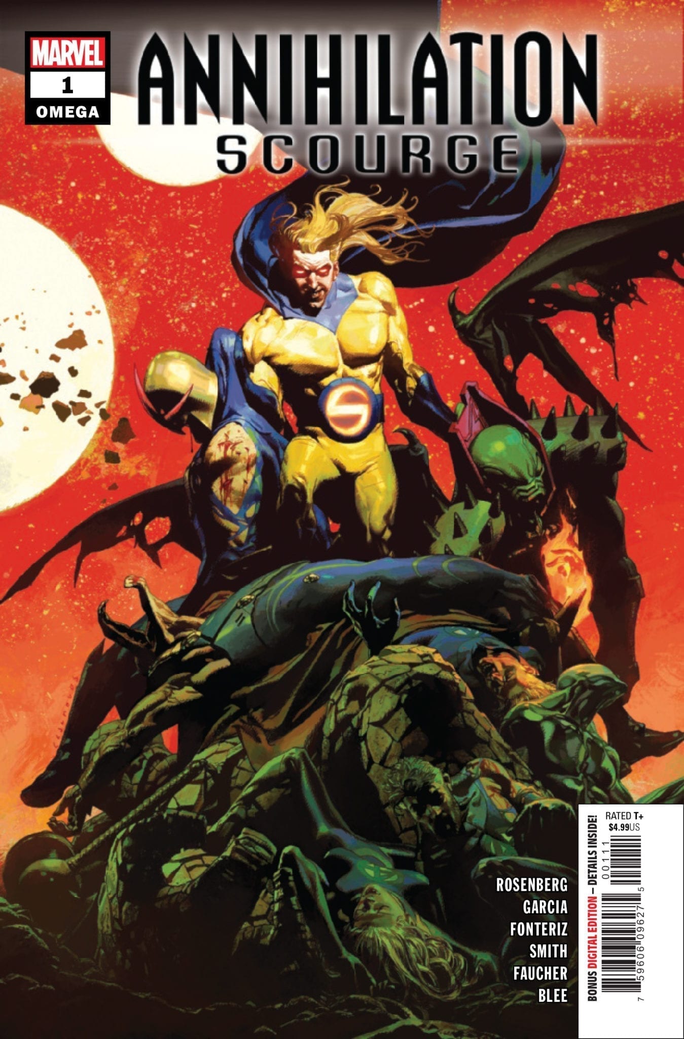
Annihilation – Scourge Omega #1 hits your local comic book store December 18th, but thanks to Marvel Comics, Monkeys Fighting Robots has an exclusive five-page preview for you.
About the issue: In the face of the Annihilation, there is no more room in the cosmos for heroes or villains – only survival.
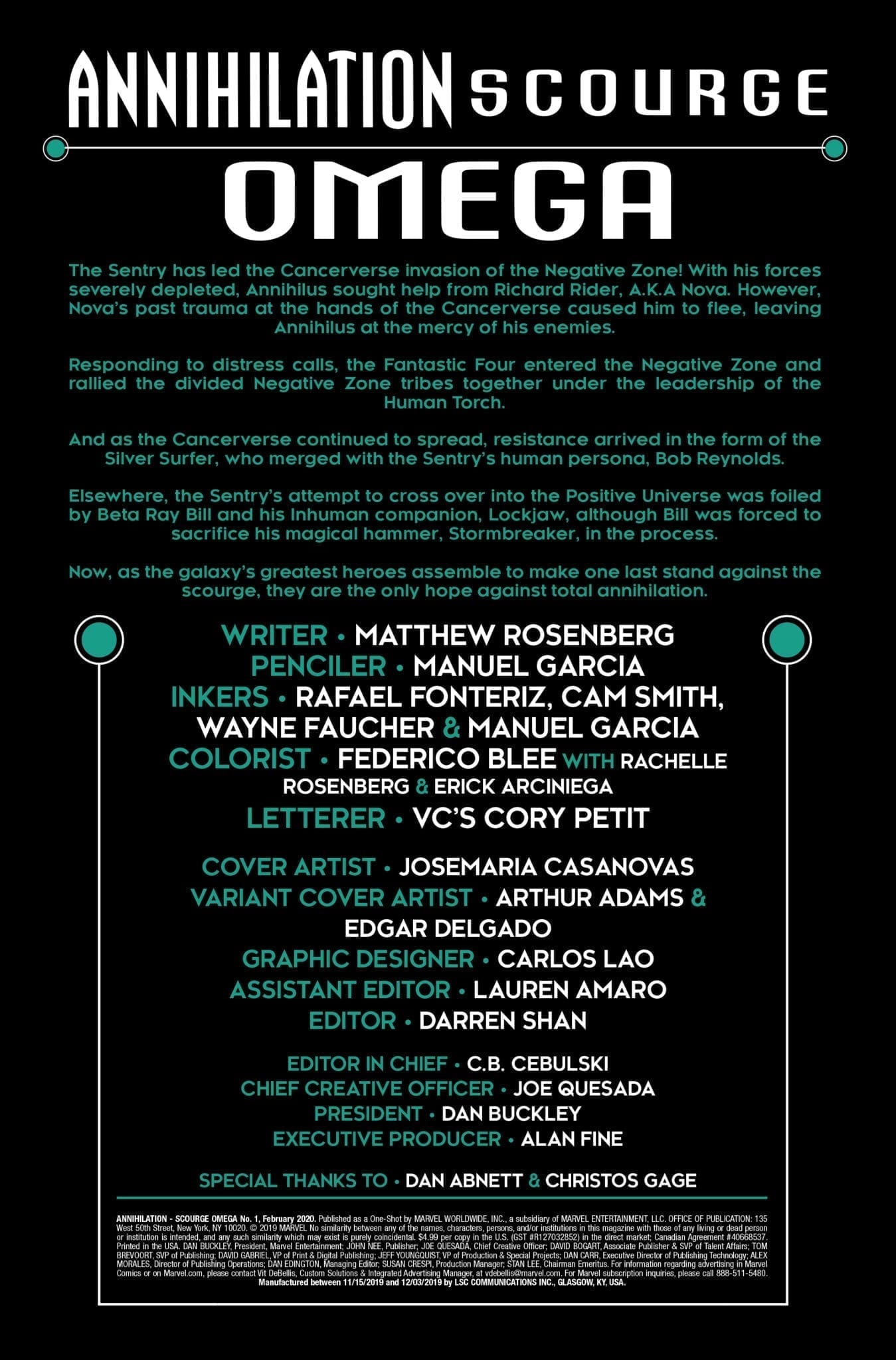
Annihilation – Scourge Omega #1 is by writer Matthew Rosenberg and penciller Manuel Garcia. Inks are by Garcia, Rafael Fonteriz, Cam Smith, and Wayne Faucher; colors are by Federico Blee with Rachelle Rosenberg and Eric Arciniega; letters are by Cory Petit. Josemaria Casanovas did the main cover.
This issue marks the end of Annihilation – Scourge, an event that’s been running through a series of one-shots over the past two months starring Nova, Silver Surfer, Beta Ray Bill, and the Fantastic Four. The story is a follow-up to Marvel’s Annihilation from 2006, a smash-hit event that led to a renaissance of cosmic superhero comics.
Check out the Annihilation – Scourge Omega #1 preview below:
*WARNING: SPOILERS AHEAD FOR ANNIHILATION – SCOURGE*
Are you reading Annihilation – Scourge? What is your favorite Marvel Comics cosmic event? Sound off in the comments!
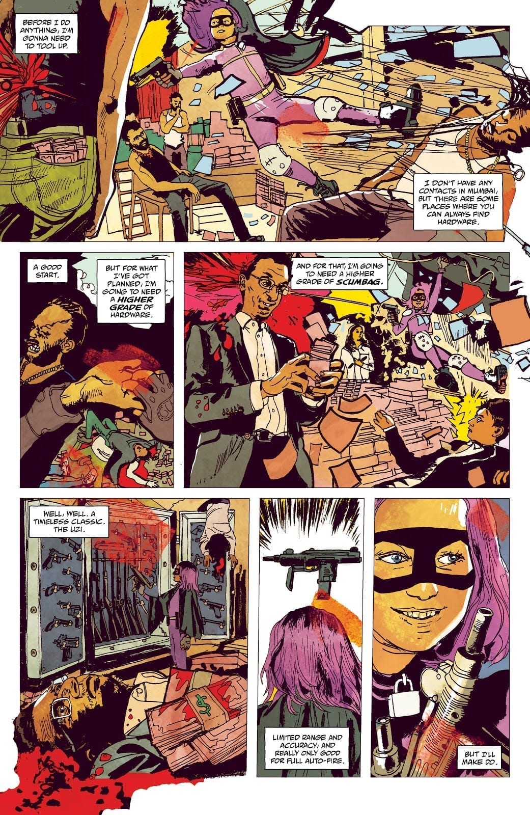
Continuing the world tour of one of Millarworlds more popular characters, Hit-Girl heads towards violent conflict on the streets of India this week. The third part of this arc from Image Comics is a spectacular vision of beauty and the corruption that lies just beneath the surface.
It is a hard hitting and poignant story produced by some of the greatest creators working in comics today. Peter Milligan has been writing comics for a while now, having worked for both of the major publishers on some of the biggest titles. Alison Sampson is relatively new to comics but her work so far has been outstanding and instantly recognisable. In their hands, is there any limit to what Hit-Girl can become?
Hit Girl Season 2 #11 Credit: Image Comics
The Story on the Street
Hit-Girl finds a friend who offers her some comforts that she’s not used to and her influence is spreading to the children of Mumbai. But she can’t allow herself to forget her mission and some harsh words are going to come back to haunt her.
Peter Milligan weaves a complex web of characters throughout the pages of Hit-Girl. He reveals the narrative through a stream of interactions, moving from one character to the next like links in a chain. Hit-Girl herself moves through these links, the common denominator in the story, and forms the larger narrative.
The characters are all fully rounded, complex individuals with histories waiting to be explored. Any number of them could feature in their own story, filling page after page. This is one of Milligan’s strengths; he is able to create engrossing characters, full of life, in a very short amount of time. The cast for Hit-Girl: India is surprisingly large but does not feel overcrowded at any time.
The criminal underworld that is depicted is also the perfect foil for Hit-Girl. She is still a child, although older than her years, so the threat to other children makes it more personal for her. This is demonstrated through her actions, especially in this issue. She implicitly trusts Ram and puts her life in his hands. This is not something that she would do with an adult, especially one she barely knows. Milligan portrays Mindy’s strengths and weaknesses through her interactions with the other cast members.
Hit Girl Season 2 #11 Credit: Image Comics
Indian Ink
As engaging as Milligan’s story is, the real star of this comic is the artwork by Alison Sampson and the colors by Triona Farrell. Together they have created a beautiful world for the characters to inhabit. Every page is so vibrant and energetic. The reader gets a real sense of location and the strange contradiction that is Mumbai city. The mix of affluence and poverty, sitting side by side, reflects the contrasting characters in the narrative.
Sampson’s style also contains an element of this contradiction. She has an expressionist style that is centred around a highly accurate architectural base. The settings are hyper realistic with an amazing attention to detail. The characters step into this world and then, as the action hots up, they twist the images to fit their warped behaviour.
Hit-Girl obviously has the greatest effect on the perspective within the panels but she isn’t the only one. It is as if Sampson is using composition and perspective to further character development. This means that some pages become almost ludicrous while others are overwhelming in their details. The notion of time within the narrative is controlled through the panel layouts and Sampson’s refusal to stick to the standard conventions of comic book storytelling.
Clem Robins’ lettering is more standard in presentation however minor inflections in the fonts give the characters individual voices. The placement of speech balloons adds to the pace of the narrative and gives Robins the chance to play with the interactions that are so important in Milligan’s script.
Hit Girl Season 2 #11 Credit: Image Comics
Conclusion
This version of Hit-Girl seems so removed from previous versions. There is a beauty in the imagery and a vulnerability in the characters that feed off each other and, in turn, fuel the greater narrative. Milligan is telling his story of a corrupt Indian city and fitting Hit-Girl into that. It works, and it works well but you do get the feeling this story could easily exist without Mindy’s presence.
Three issues into this four issue story and there is so much for the reader to immerse themselves in: the narrative, the art, the action. This Hit-Girl story is a spectacular read because it has so much going on and relays the information in such a surprising way. The comic is visually one of the best things currently on release. The warped realism of the art punctuates the social discourse at the heart of Milligan’s script and highlights the intriguing dissection of Hit-Girl as a character. You will come away from this comic believing you have read an entire arc, not just the standard 22 pages.
Detective Comics #1017, out this week from DC Comics, follows on the heels of our last issue, which closed out Mr. Freeze’s Year of the Villain arc. The book—a standalone story from writer Tom Taylor—offers an interesting and engaging change of pace.
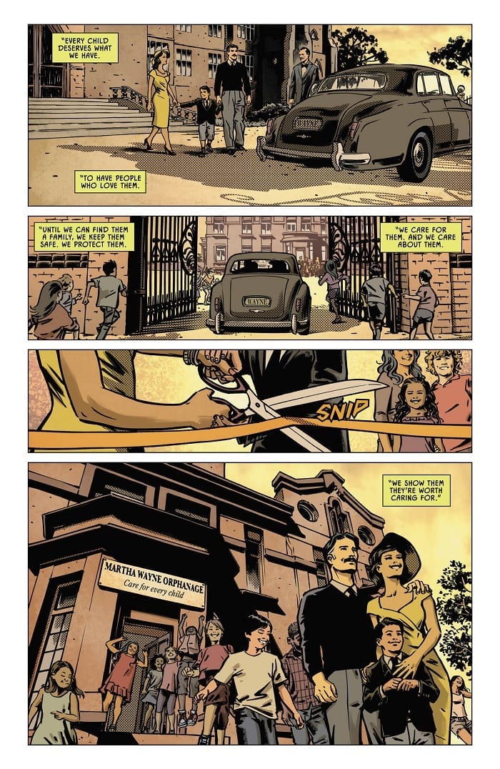
When children begin to disappear from an orphanage funded with support from Wayne Enterprises, our protagonist decides to take action. In this case, though, he finds that Bruce Wayne—not Batman—may be the best persona to investigate the disappearances.
The Writing
Taylor offers up a quieter, standalone story here. Like the book’s namesake, it’s more of a genuine detective caper than an action story.
We’re well-aware of the impact Batman has on his hometown. In Detective Comics #1017, though, Taylor seeks focuses on Bruce Wayne’s capacity to impact the city of Gotham, even when he’s not wearing the mask. It’s a facet of the character that often goes overlooked in favor of the super-heroics, but one that’s well-worth exploring.
It’s a novel approach to the character, and one that we wish we could see more often, to be honest. Delving into Bruce Wayne’s role as Gotham’s foremost philanthropist could spark an interesting conversation, especially at a time when the philanthropy of real-life billionaires is under greater scrutiny. Compounding the political relevance is the backstory for one of the children, who only ended up in the orphanage after being separated from his parents at the border.
While Detective Comics #1017 is compelling in isolation, the ending is a bit of a disappointment in some regards. After uncovering the mystery of the children’s disappearances, Bruce pledges to locate the missing orphans. We don’t get to see this happen, though; the book’s end is largely exposition, summarizing the climax in a brief montage.
While this could set up an interesting and emotionally-powerful, multi-chapter story arc, it ends up leaving the action to be carried out off-page. As a standalone story, though, it’s unlikely to be followed-up on, which is a shame, as it would offer a compelling and interesting exploration of Bruce’s role in Gotham beyond the shadow of The Bat.
The Artwork
Artist Fernando Blanco brings a unique style to Detective Comics #1017. The book straddles the line between cartoonish and serious in terms of style; characters are expressive and lively, while retaining a sense of grit.
The creative team explores some interesting and varied layouts throughout the book. One page may be divided into evenly-spaced horizontal strips, while the next could be split into four quadrants. There’s a sense of internal consistency to the individual pages, though, along with a reliance on repeated visual motifs. This prevents the illustrations in Detective Comics #1017 from feeling unfocused or random.
Blanco doesn’t shy away from delivering the details in his work, either. His illustrations serve to fully-engage readers in the story. While it’s not overly-meticulous, the level of detail here hits the sweet spot.
Color artist John Kalisz’s work is not exceptionally eye-catching. It is, however, skilled and well-detailed. The artist takes a meat-and-potatoes approach, but it works for the effect that the book is trying to achieve.
Final Thoughts
Detective Comics #1017 is a solid little self-contained tale. Although it could have used more space to tell this story, it’s a great exploration of Bruce’s character outside the cape and cowl.