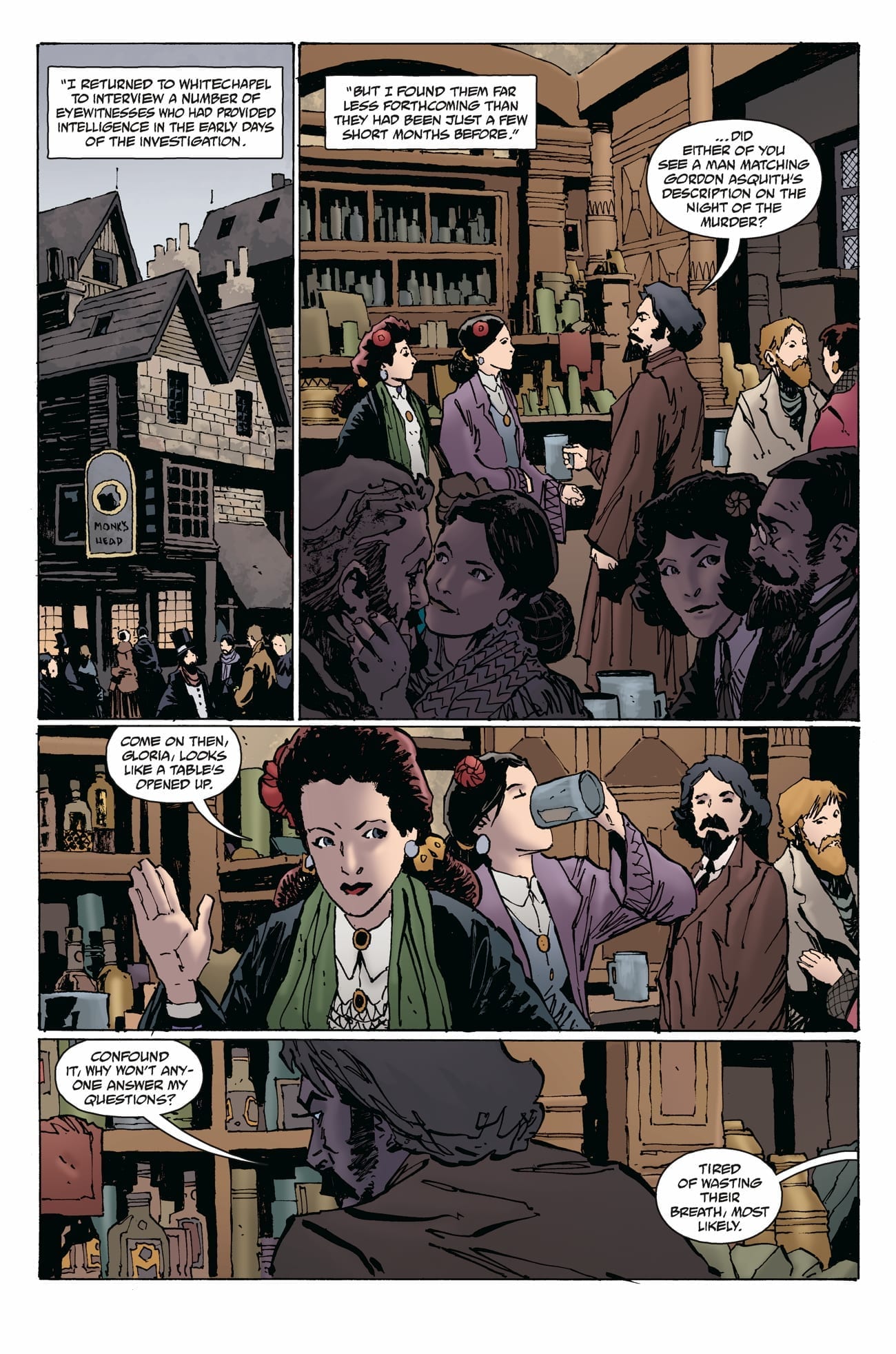
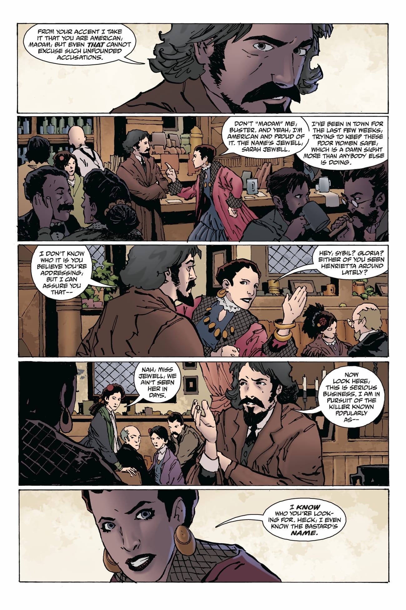
WITCHFINDER: THE REIGN OF DARKNESS #2 hits your local comic book store tomorrow, December 18th, but thanks to Dark Horse Comics, Monkeys Fighting Robots has an exclusive five-page preview for you.
About the issue: A new suspect arises as the Witchfinder continues his investigation into the Ripper murders! But with his investigative integrity in question, that may be the last thing he needs. Meanwhile, Sarah Jewell’s attempts to infiltrate the mysterious Proserpine Home could reveal the true culprit–or put both her and Edward Grey in even more danger!
The comic is by writers Mike Mignola and Chris Roberson, and artist Christopher Mitten, with colors by Michelle Madsen, and letters by Clem Robins.
Sir Edward Grey, the titular Witchfinder, was first introduced in Mignola’s Hellboy before receiving his own comic book. Reign of Darkness is actually the sixth volume in the Witchfinder series, and the third consecutive one to feature the team of Mignola and Roberson.
Reign of Darkness sees the legendary paranormal investigator take on one of London’s greatest threats: Jack the Ripper!
Check out the WITCHFINDER: THE REIGN OF DARKNESS #2 preview below:
Are you reading WITCHFINDER: THE REIGN OF DARKNESS? What is your favorite Mike Mignola book? Sound off in the comments!
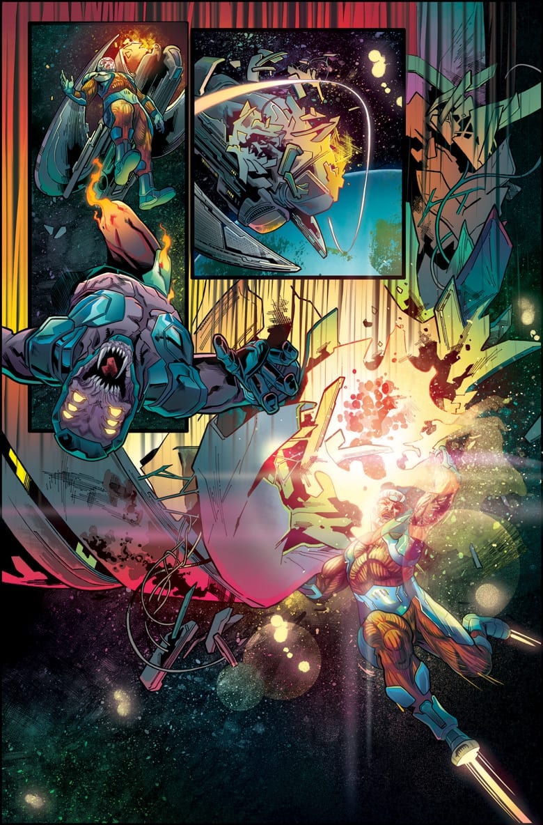
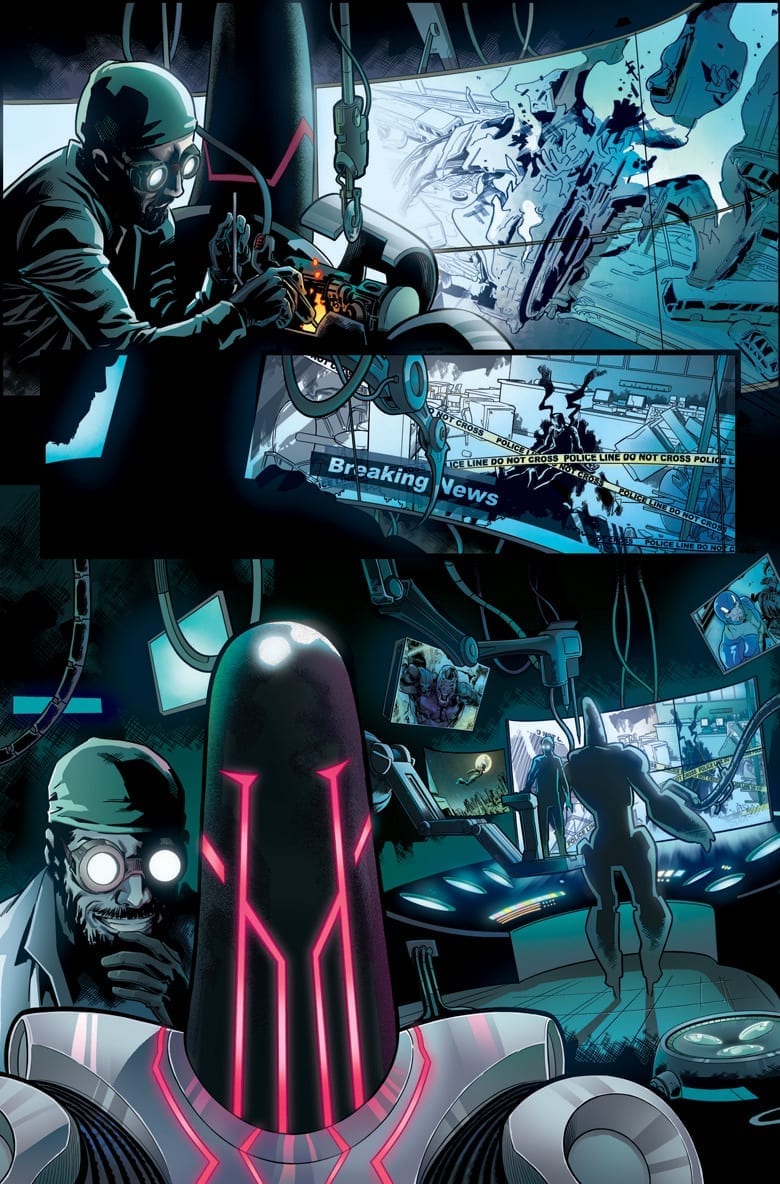
Valiant Entertainment announced today a new X-O MANOWAR series launching on March 25th, 2020.
From the official press release:
X-O MANOWAR #1 unleashes the Valiant Universe’s most powerful hero in an all-new series this March!
From fan-favorite writer DENNIS “HOPELESS” HALLUM (Star Wars: Darth Vader – Dark Visions) and breakout star artist EMILIO LAISO (Marvel’s Spider-Man: Velocity), a futuristic threat arises to destroy the planet, and the ancient warrior king – Aric of Dacia, a.k.a. X-O Manowar – is the only person with the courage and power to stand against impossible odds! Can Aric evolve into the superhero the world needs today?
The series will also feature colors by Ruth Redmond, letters by Hassan Otsmane-Elhaou, and covers by Christian Ward, Jeff Dekal, Rod Reis, Greg Smallwood,and Raúl Allén.
“What excites me most about the series is how much world building Valiant is letting us do,” remarked Hallum. “New villains. New allies. New friends and community. We’re planting Aric firmly on the ground so a big crazy comic book garden can grow up around him. There’s a very human story at the heart of this, but make no mistake, we’re filling up the X-O toy box with rad new toys.”
Take a look at the initial art reveal:
Are you looking forward to the new X-O MANOWAR? Sound off in the comments!
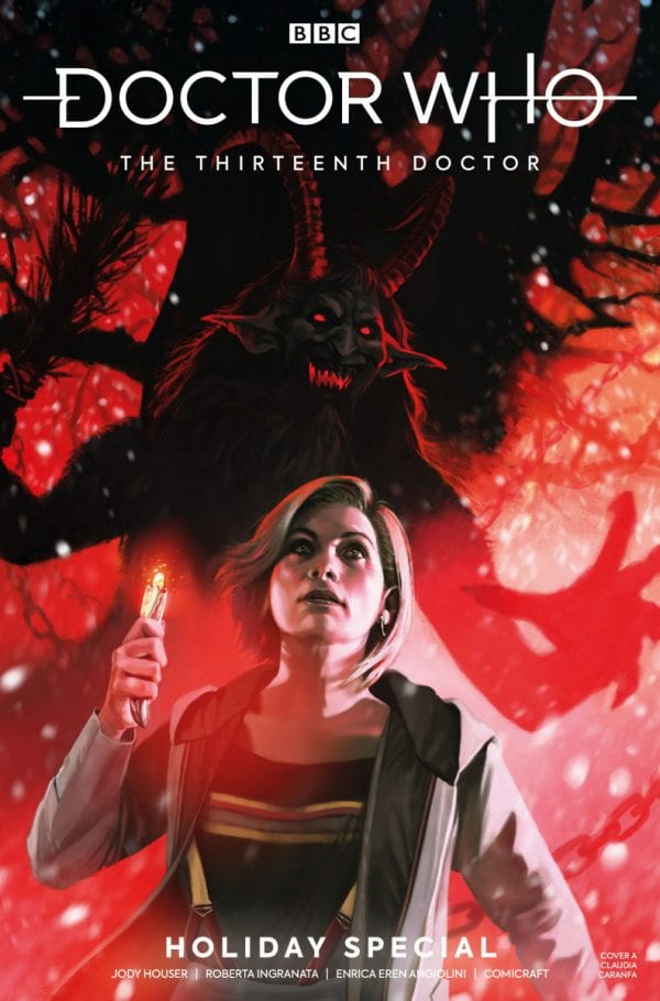
Doctor Who 13th Doctor Holiday Special Part 2 Credit: TITAN Comics
As the New Year creeps ever closer with it’s promise of brand new TV Doctor Who, Titan Comics release the final part of their 13th Doctor Holiday Special. Just in time for the Christmas Break, the Holiday Special hits the shelves with a second oversized issue of time travelling fun.
With all of the TARDIS crew present and correct, can the Doctor find out who stole their memories, why they have been imprisoned, and keep quiet about the real Father Christmas?
Doctor Who 13th Doctor Holiday Special Part 2 Credit: TITAN Comics
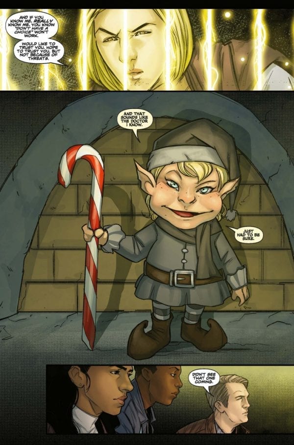
A Christmas Story
After having their memories altered, The Doctor and the TARDIS crew find themselves on the trail of a dastardly kidnapper. Heading into a winter wonderland they are captured by toy soldiers and imprisoned in Father Christmas’ basement.
And it just gets more outrageous from there.
After the first, scene setting issue, this concluding part to the story is a mixed bag, just like a Christmas Stocking. To continue the simile, it has a selection of funky toys and tasty sweets but also the boring socks and slightly bruised orange. There are good points and bad.
When it is good, this Holiday Special is very, very good. Jody Houser has embraced the Doctor Who festive tradition of creating a slightly ridiculous, feel good story. She has thrown the Doctor and her companions into an over the top Christmas setting complete with elves, wrapping paper, and even Father Christmas himself.
With a year of writing the comic under her belt, Houser has already proven that she can write these characters. If this is your first issue of the 13th Doctor comic, you will find that the characters on the page act and speak exactly as you would expect. The interpretation is spot on and the words drift off the page in the voices of the actors. If you read a 12th Doctor comic then this one, the voice of the central character will automatically alter as you read.
Part of this is down to the speech patterns written by House and partly due to the character rendering by Roberta Ingranata. Ingranata captures each pout and smile perfectly. Although there is an element of simplification in the rendering, none of the characterisation is lost; it is as if Ingranata has condensed the characters into their simplest, but most recognisable forms.
The other characters, the villains and the aliens, are all wonderfully designed with that over-the-top Christmassy feel. This matches the fun story that Houser is telling and produces an easier, lighter reading experience.
Doctor Who 13th Doctor Holiday Special Part 2 Credit: TITAN Comics
The Art of Winter
Unfortunately, in places, the lightness of the script and the art works against the story and the narrative reveals play out with a touch of flippancy. The resolve to last issues cliffhanger is disappointing as a result and certain other story elements are quickly cast aside, overlooked, or seemingly forgotten. This is because everything is taken in it’s stride and it becomes easy to miss important information or narrative beats.
There is also a problem with the visual manipulation of time. On some pages there are elaborate panels structures that lead the reader naturally through the story, adding punctuation to the narrative beats. Other pages are awkward, with too many panels representing a sequence of movements or the layout crowds the page making the visuals overlap and jumbling the story.
As the pacing is consistent, so too the narrative loses momentum and you will find yourself having to reset your inner storyteller on a number of occasions.
The colourist is consistent throughout, giving each page a festive glow. Enrica Eren Angiolini carries the emotional beats from sequence to sequence, altering the palette as required. This is also true of the letterers; Richard Starkings and Sarah Hedrik. The placement of the speech balloons lead the reader gently across the page as best it can while fighting, at times, the composition behind it.
Doctor Who 13th Doctor Holiday Special Part 2 Credit: TITAN Comics
Conclusion
Imagine the scene: it’s Christmas Day, the presents have all been opened, the food consumed, and all you want to do is sit back, relax, and enjoy a bit of light entertainment that doesn’t require much thought. Into this picture the Doctor Who Christmas Special was thrown. It was designed around such festive states and relaxed attitudes, until they started to use them for Regeneration stories.
This Holiday Special from Titan Comics owes more to those early stories with killer Christmas Trees and murderous Herald Angels. Houser has written something enjoyable, if a little daft, and will give you a warm fuzzy feeling. It won’t have much of a lasting impact and might not come out for another read for several more Christmases, but it is worth reading.
If the panels were tighter, and the composition stronger, it may have given the story more emotional impact. As it is, the character work is wonderful but the storytelling is awkward. While not being as good as the first part, or the first year of comics, it fits the festive season snugly and will help pass a lazy, Christmas day.
With just a little over two weeks left in the year, we are rounding up our favorite comic book covers of 2019!
2019 was a great year for comics big and small, and narrowing our favorites down to those below was a near impossible task. These are simply our picks, but we want to know yours too, so be sure to comment and let us know what YOUR favorite covers of the year were!
Nominations were collected by publishers, creators, and the Monkeys Fighting Robots team, and were then voted on by the MFR team. Thank you to all the publishers and creators who contributed nominations; we can’t wait to see what new goodies you have coming in 2020!!
Honorable Mentions:
Life and Death of Toyo Harada #1 Glass Variant
(Doug Braithwaite & Travis Escarfullery)
We love covers that do new and interesting things, and this glass variant from Valiant Comics fits the bill perfectly! Illustrated by Doug Braithwaite and crafted by Valiant Director of Design and Production, Travis Escarfullery, this is a cover that you can literally see yourself in. This is actually the publisher’s third glass variant, with two coming out last year for Bloodshot Rising Spirit #1 and Livewire #1.
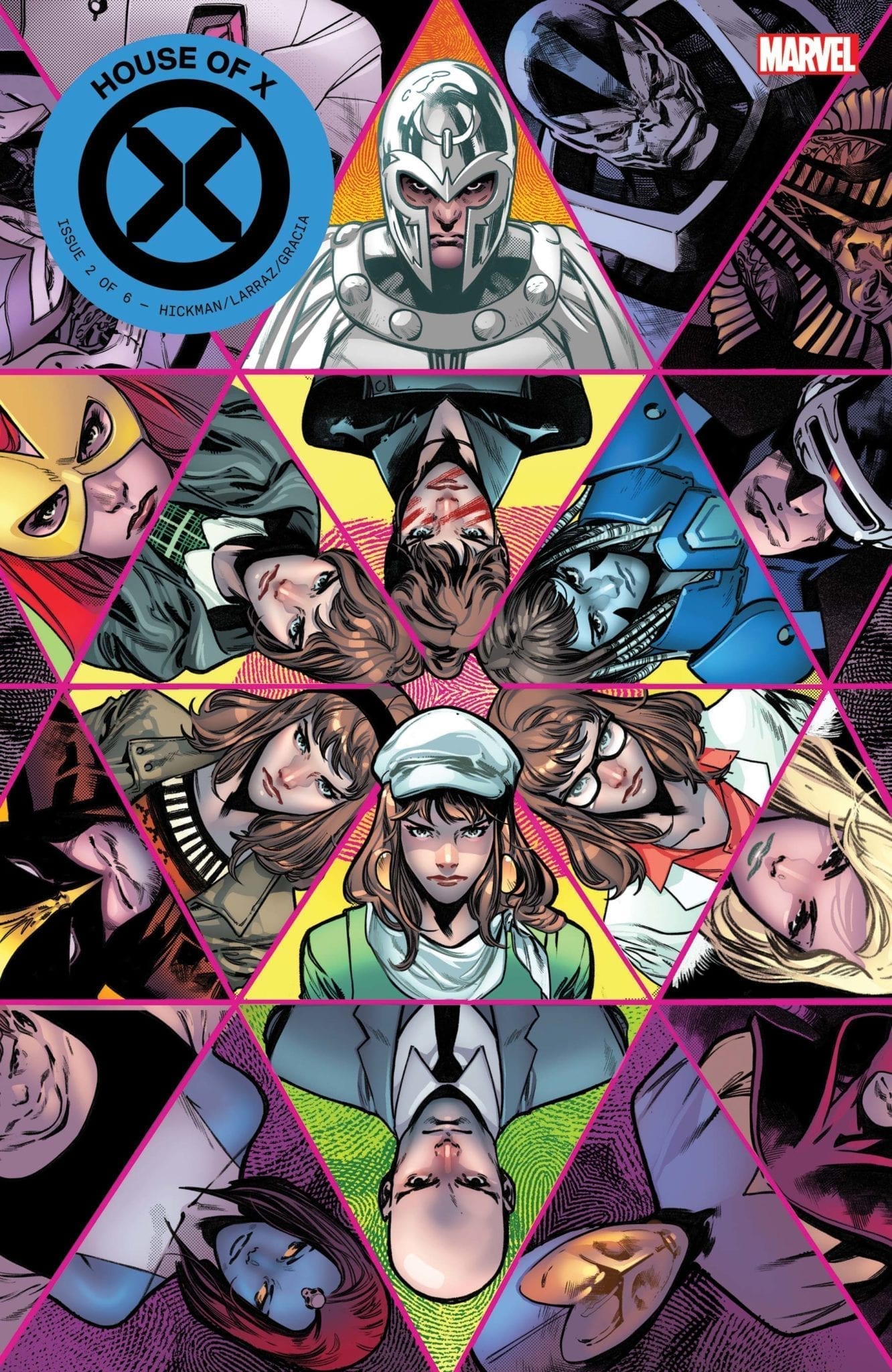
House of X #2 (Pepe Larraz & Marte Gracia)
We should have know this House of X issue was going to rock our world as soon as we saw the cover. The symmetry, the colors…all of it blends together to inform the reader of the complex yet fun ride inside.
Our Favorites From 2019 (in no particular order):
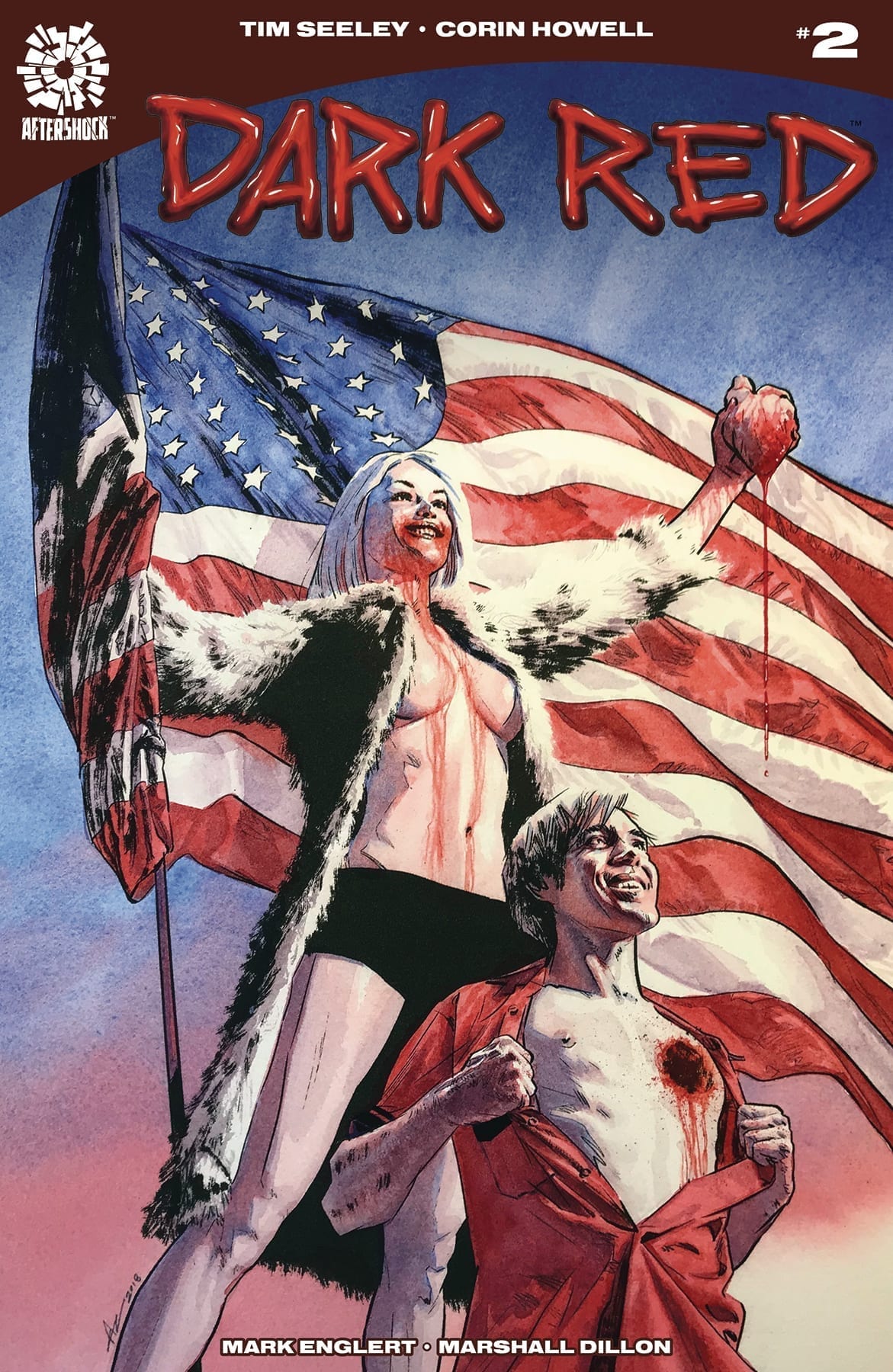
Dark Red #2 (Aaron Campbell)
A good cover should capture the essence of the story inside, and just look at this one for AfterShock Comics’ Dark Red. It’s bloody; it’s symbolic; it’s patriotic. Aaron Campbell sets you up perfectly for the political vampire comic you’re about to read.
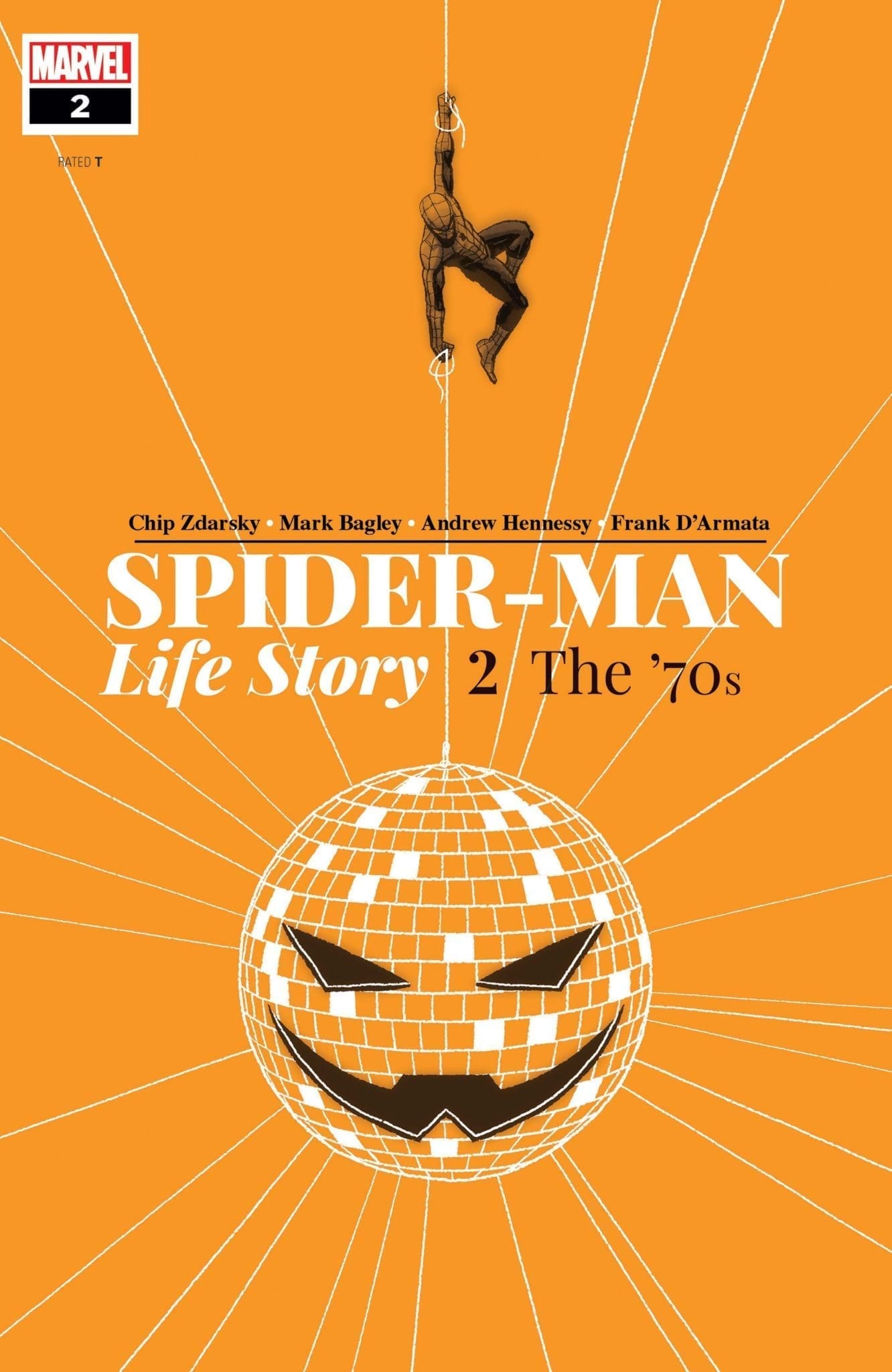
Spider-Man Life Story #2 (Chip Zdarsky)
Monochromatic covers rule, plain and simple. They really allow the book to stand out on the shelf among the rest of the week’s new comics. This one by Chip Zarsky (who also wrote the series) is memorable, not just for the artist’s bold use of orange, but for how it represents the strain that Spider-Man is under within the story.
Invisible Kingdom #6 (Christian Ward)
Christian Ward made our Best Covers list last year too, and you can see why. He’s easily one of the best artists working today, with a gorgeous, surreal style that simply doesn’t look like anything else on the stands. There’s an almost dreamlike quality to his Invisible Kingdom covers; they’re all great, but the subdued color palette on this one makes it stand out among the rest.
The Joker: Year of the Villain #1 (Forbidden Planet Variant) (Jock)
Similar to what we were just saying about Christian Ward, Jock’s art has a very surreal edge to it. Plus he draws the quintessential Joker for the 21st century. All of that combined with the trippy neon colors tells you all you need to know about this dark comic before you even open it.
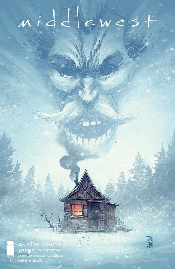
Middlewest #10 (Jorge Corona)
Middlewest #10 has perhaps been the most powerful issue in the series yet, and that honor extends to its cover as well. The blues and whites make this book feel frigid and harsh; the mists and the trees make it feel claustrophobic. There’s a sense of isolation, and of course we can’t leave out the GIANT ANGRY FACE billowing out of the chimney. This is an emotional one.
Livewire #11 (Fashion Variant) (Annie Wu)
Remember what we said earlier about monochromatic covers? The yellow on this Livewire variant really POPS and makes this book stand out, and the Rolling Stone homage gives it a unique vibe. This is a cover that would make you pick up this book even if you haven’t read any issues prior.
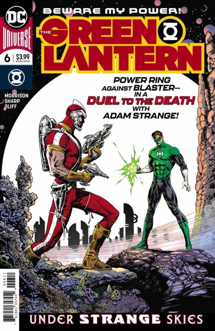
The Green Lantern #6 (Liam Sharp & Steve Oliff)
Every Liam Sharp/Steve Oliff cover for The Green Lantern is outstanding, but this one featuring Adam Strange takes the cake. It has this neo-western/gunslinger scene, and the copy makes it feel like an old-school sci-fi comic from the 50s. Plus, just look at all the detail Sharp put into the setting!
Going to the Chapel #4 (Johanna The Mad)
One look at this cover is all you need to understand why they call her Johanna the Mad… it’s because her work is MAD good (*mic drop*). The pinks and purples, and the soft nature of the coloring speak to both the romance and the western sides of the story, and just look at that wedding dress. This image of Emily in her dress holding a shotgun, it just perfectly communicates the nature of Chapel.
Coda #11 (Matías Bergara)
This Coda cover looks like it could have been the poster for an 80s fantasy movie, or the cover to a heavy metal album. Bergara tells you, “This story is about a journey, but it will not be an easy journey. It will be a perilous one.” The looming darkness over the bright, colorful mountain speaks volumes.
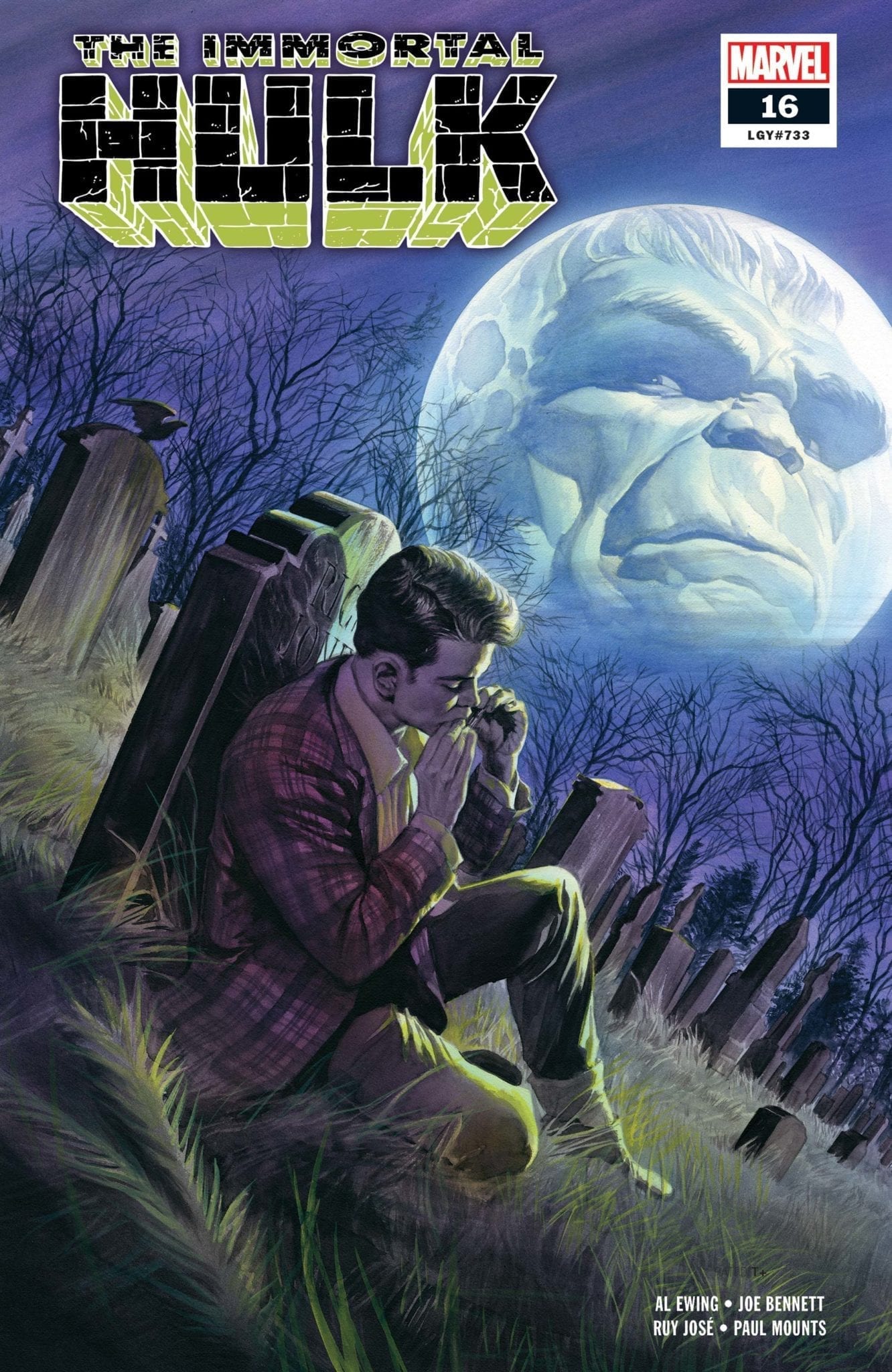
Immortal Hulk #16 (Alex Ross)
Alex Ross has been doing some of the best cover work of his career on Immortal Hulk, and that’s saying a lot. Any one of his covers could have made this list, but we chose this more understated one because it really speaks to the horror nature of the book. The darker colors, the graveyard setting, the looming full moon with the Hulk’s head inside…it all fills you with dread and fear for Rick Jones (and you SHOULD fear for Rick Jones).
What were your favorite comic books covers from 2019? Let us know in the comments!
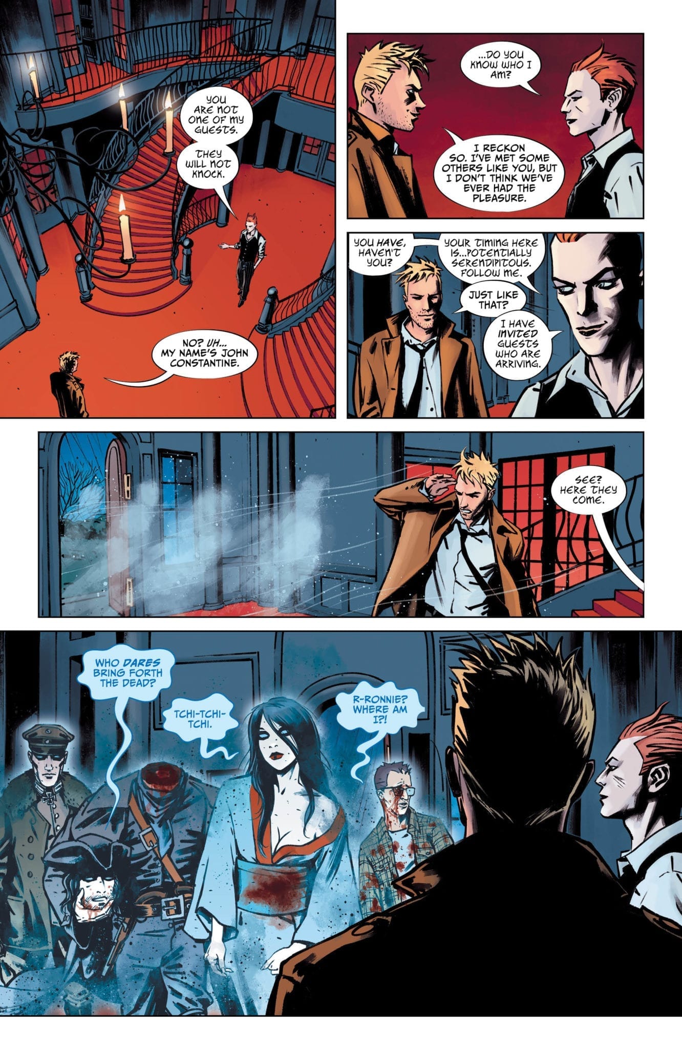
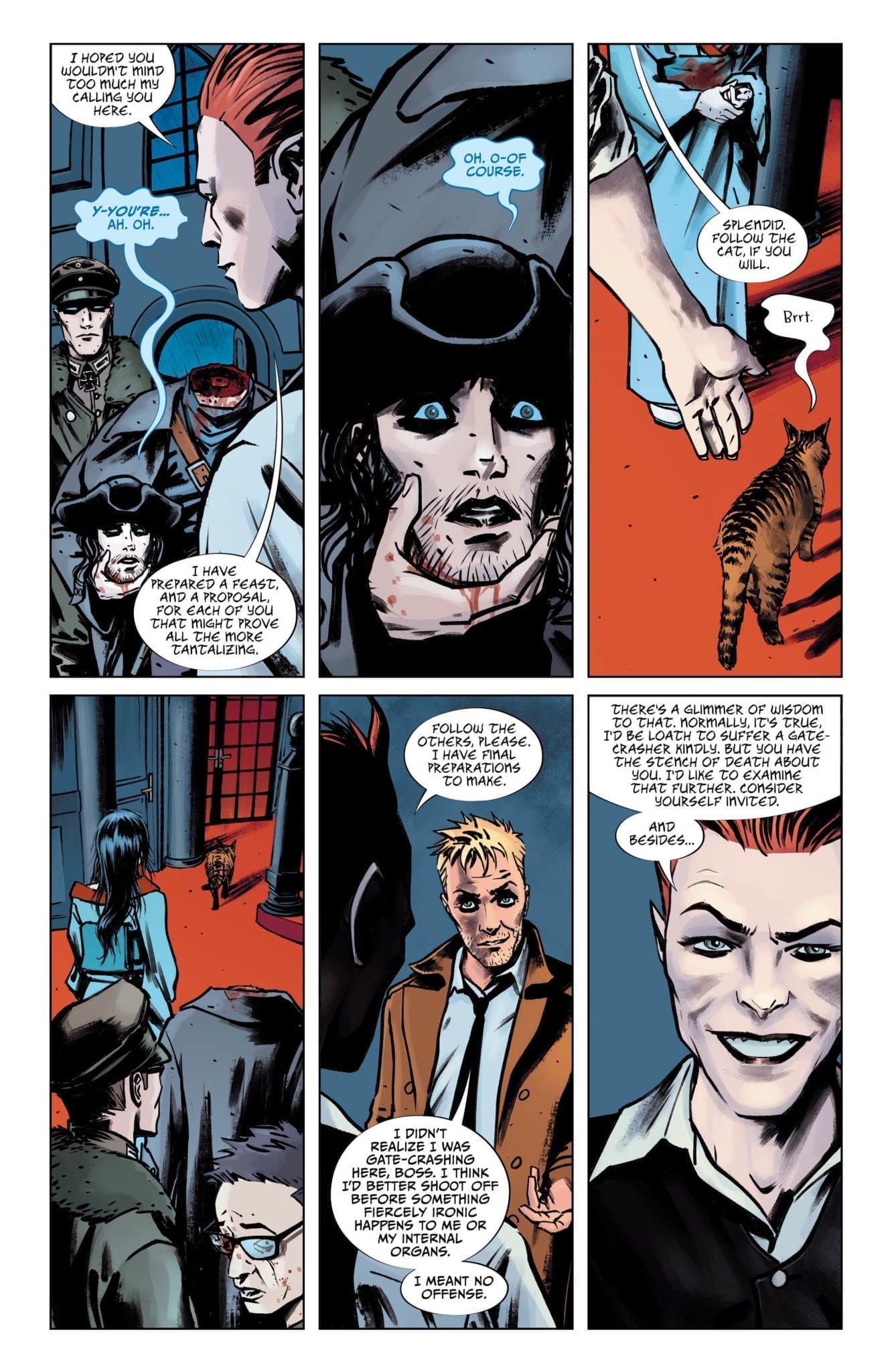
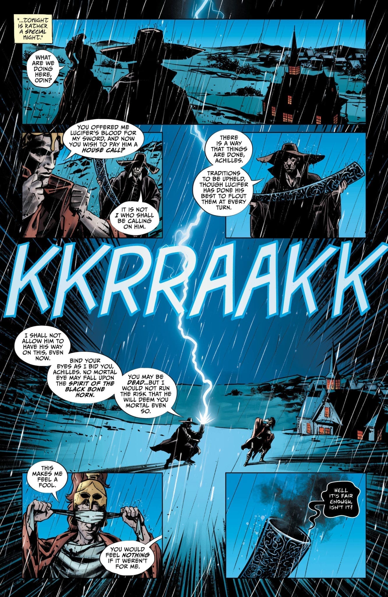
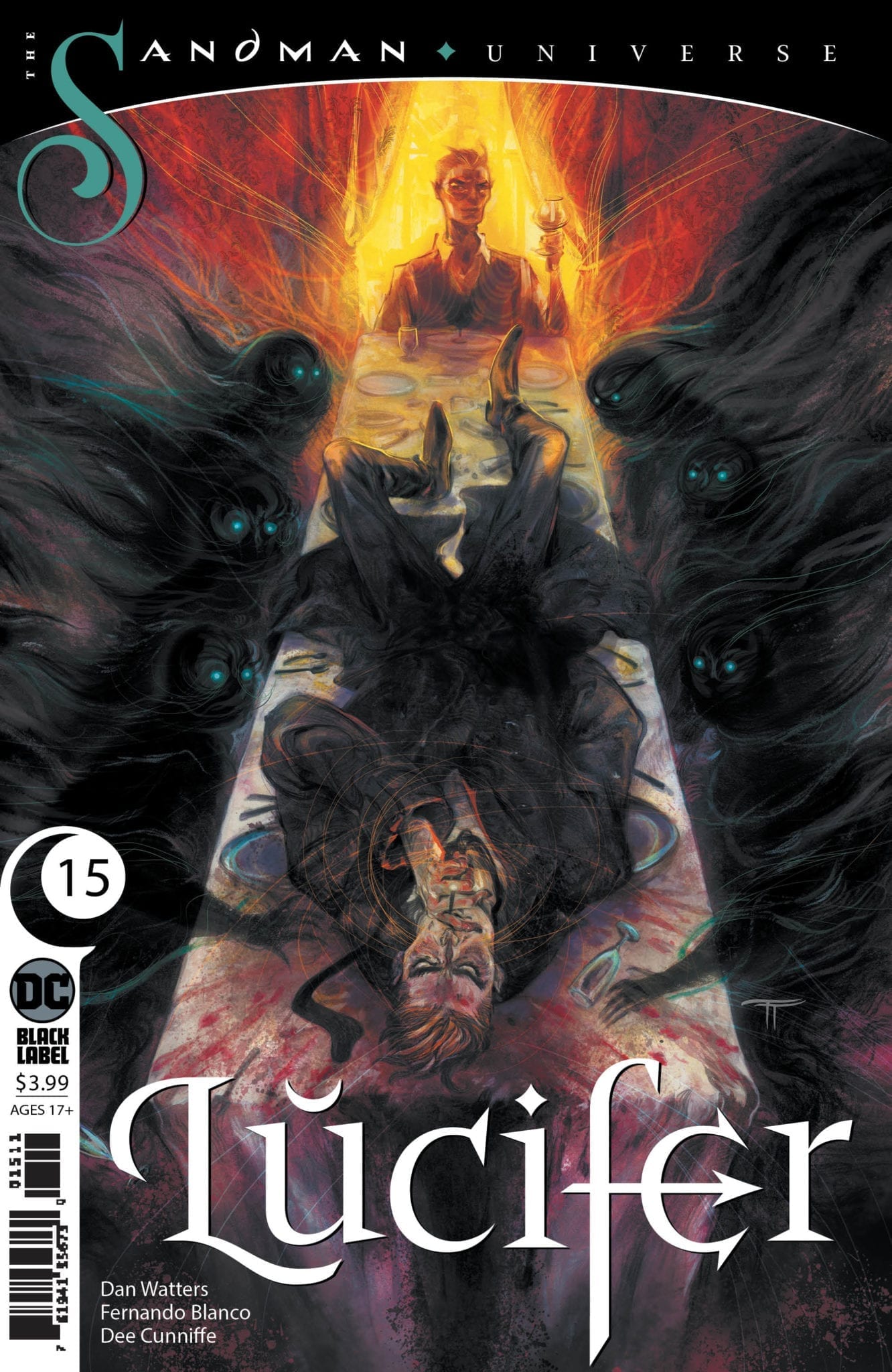
Lucifer #15 hits your local comic book store on December 18th, but thanks to DC Comics, Monkeys Fighting Robots has an exclusive four-page preview for you.
About the issue: Lucifer is hosting. With his new abode complete, the prince of darkness is throwing a nice little housewarming dinner party to break the place in. Invited are a collection of miserable individuals whose souls are the devil’s to command. But when an uninvited guest by the name of John Constantine crashes the party, all hell breaks loose. Meanwhile: a horn is blown, a dead man is murdered, and a closet proves to be quite a bit more spacious than first expected.
The comic is by writer Dan Watters and artist Fernando Blanco, with colors by Dee Cunniffe and letters by Steve Wands. The cover is by Tiffany Turrill. Lucifer is part of the “Sandman Universe” line of comics, curated by Neil Gaiman, and centered largely on characters Gaiman co-created.
To mark the 25th anniversary of the landmark series Marvels by Kurt Busiek and Alex Ross, Marvel Comics has already given us Marvels Epilogue and the massive Marvels Monster-Sized Edition hardcover.
Now comes news of a new 2020 series: Marvels Snapshots.
According to Marvel.com, “industry legend Kurt Busiek will bring together incredible creative teams for eight standalone, double-sized issues showcasing Marvel’s most beloved characters from the Golden Age to today.” Alex Ross will provide painted covers for the series.
The first issue will be the World War 2-set Sub-Mariner: Marvels Snapshot #1 written by Alan Brennert and illustrated by Jerry Ordway. According to Brennert:
“I can honestly say that I enjoyed working on this story more than any comics story I’ve done in years. I grew up reading (and loving) Marvel’s Golden Age heroes in the 1960s, in reprints in FANTASY MASTERPIECES. But I never thought I’d have a shot at writing them—especially the All-Winners Squad!—and I’m grateful to Kurt Busiek and Tom Brevoort for providing me the opportunity, and to Jerry Ordway for bringing it all to glorious life.”
Editor Breevort adds:
“The MARVELS SNAPSHOTS books will provide a different perspective on moments throughout Marvel history while also giving a wide range of talent, many of whom are new to Marvel, to play in our sandbox under the expert watch of Kurt Busiek.”
The remaining books in the series — and their respective creative teams — are yet to be announced. Head over to Marvel.com to read the full press release; Marvels Snapshots arrives in comic stores March 2020.
Are you looking forward to following Kurt Busiek back into the past for a tour of Marvel history? Let us know in the comments!
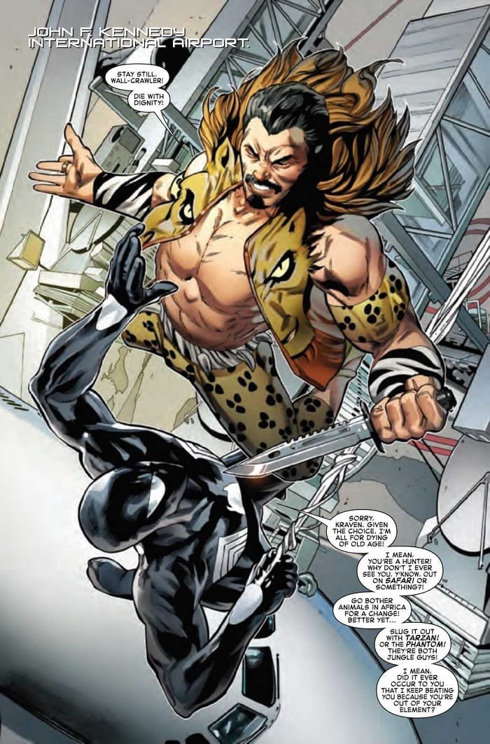
With Symbiote Spider-Man: Alien Reality #1, out this week from Marvel Comics, creators Peter David and Greg Land offer up an interesting hook for their next installment of black suit Spidey stories.
We first see a strange object crash to Earth. While Black Widow sets about investigating, Doctor Strange appears, suggesting this is no ordinary space rock. Meanwhile, Peter Parker dukes it out with Kraven the Hunter, only to find himself suddenly trapped in an alternate reality. In a flash, one of his oldest enemies is suddenly his partner, and he’s romantically involved with another superhero. Even the Spider-Mobile is back. Following the bizarre twist, Peter’s left to try and uncover what’s real, and who’s responsible.
The Writing
Writer Peter David lays out an intriguing lead to the story in Symbiote Spider-Man: Alien Reality #1. The Word of God—a book of powerful spells capable of manipulating reality—is in play. The book, of course, falls into the hands of one of Spidey’s classic villains, who uses it to alter Spider-Man’s life. Thus, what starts out as a rather mundane story quickly takes on an interesting, even comedic twist.
David does a good of pacing the story. He allows the weirdness to trickle out, bit by bit, as Parker realizes something is not right. The twists keep coming right up until the last page, ending with a cliffhanger that is sure to keep readers coming back. It’s also nice to see Hobgoblin get some attention, as he’s been a somewhat underutilized antagonist in the last few years.
Much of the book, especially in its second half, is one continuous sequence. If not handled properly, this could result in a poor balance of action and narrative. Fortunately, David finds a sweet spot to balance these elements in Symbiote Spider-Man: Alien Reality #1.
Although not packed with much thematic depth, the book offers a compelling and fun alternate reality story. While science may be Peter’s strong suit, throwing magic into the mix brings a kind of chaotic energy. With magic involved, just about anything could happen, allowing Hobgoblin to bend reality at will. The result is a book that packs surprises, without feeling too detached from its own internal logic.
The Artwork
Greg Land’s character designs in Symbiote Spider-Man: Alien Reality #1 are impressive and eye-catching. Where the work really shines, though, is in the characters’ expressive features. A raised eyebrow or a look of bewilderment on a character’s face really brings the writing to life and helps to draw the reader into the world of the book.
Speaking of drawing in the reader, there is an impressive level of attention paid to detailing the backgrounds throughout. The illustrations are vibrant and dynamic, with some truly excellent images sprinkled throughout.
On the whole, the layout and structuring of the page in Symbiote Spider-Man: Alien Reality #1 isn’t the most inventive use of the format. However, the artist compliments David’s writing well, hitting the story beats and effectively and clearly conveying the action on the page.
Frank D’armata’s colors are rich and very warm. There’s painstaking attention to detail here, with the artist taking care to show subtle gradients that capture shadow and light. It’s a strong showing in the art department overall.
Final Thoughts
Symbiote Spider-Man: Alien Reality #1 is a great start for this new story. Strong artwork and interesting story combine to bring a creative black suit story to life. Definitely worth checking out.
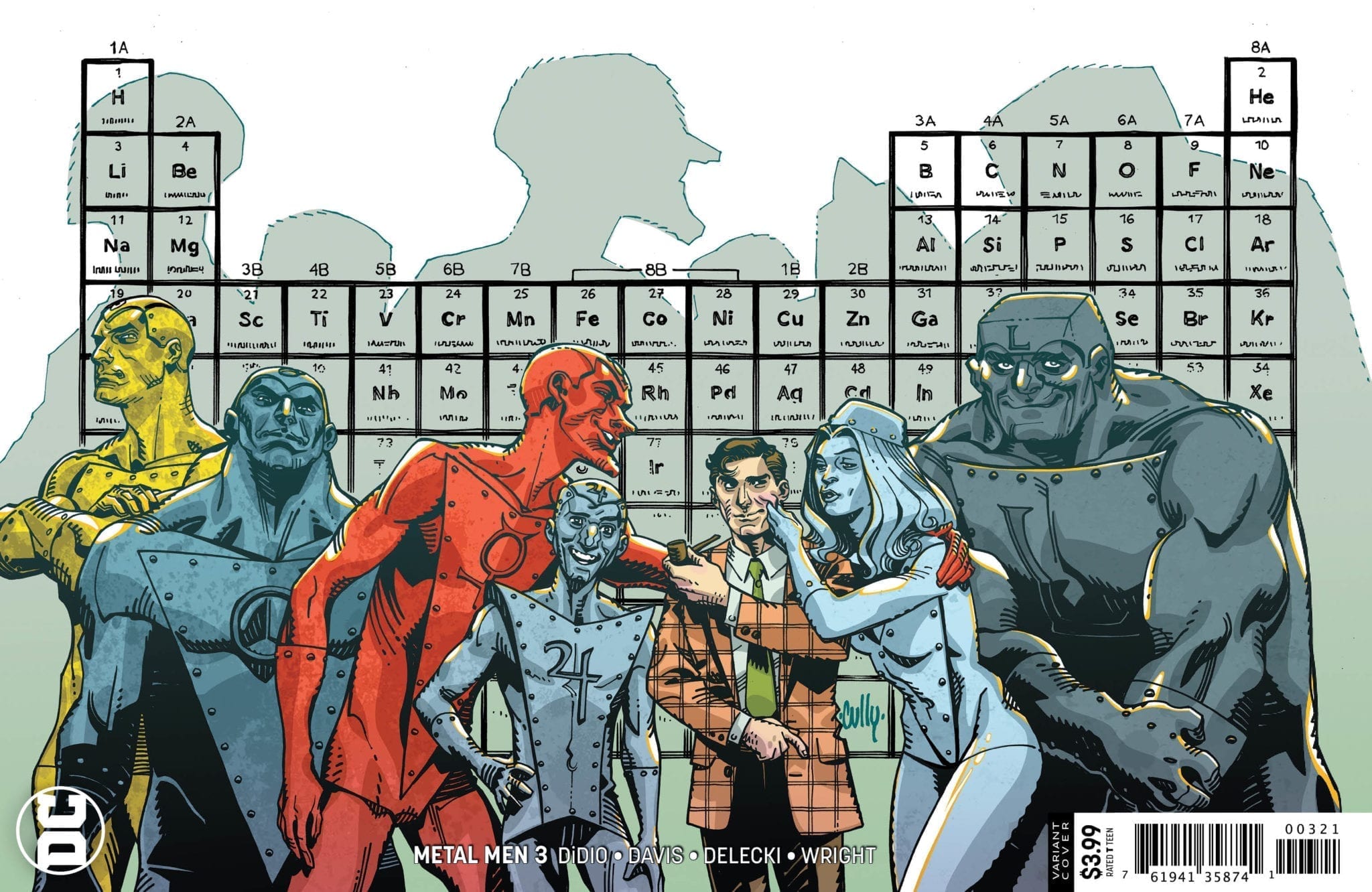
Metal Men #3 hits your local comic book store on December 18th, but thanks to DC Comics, Monkeys Fighting Robots has an exclusive six-page preview for you.
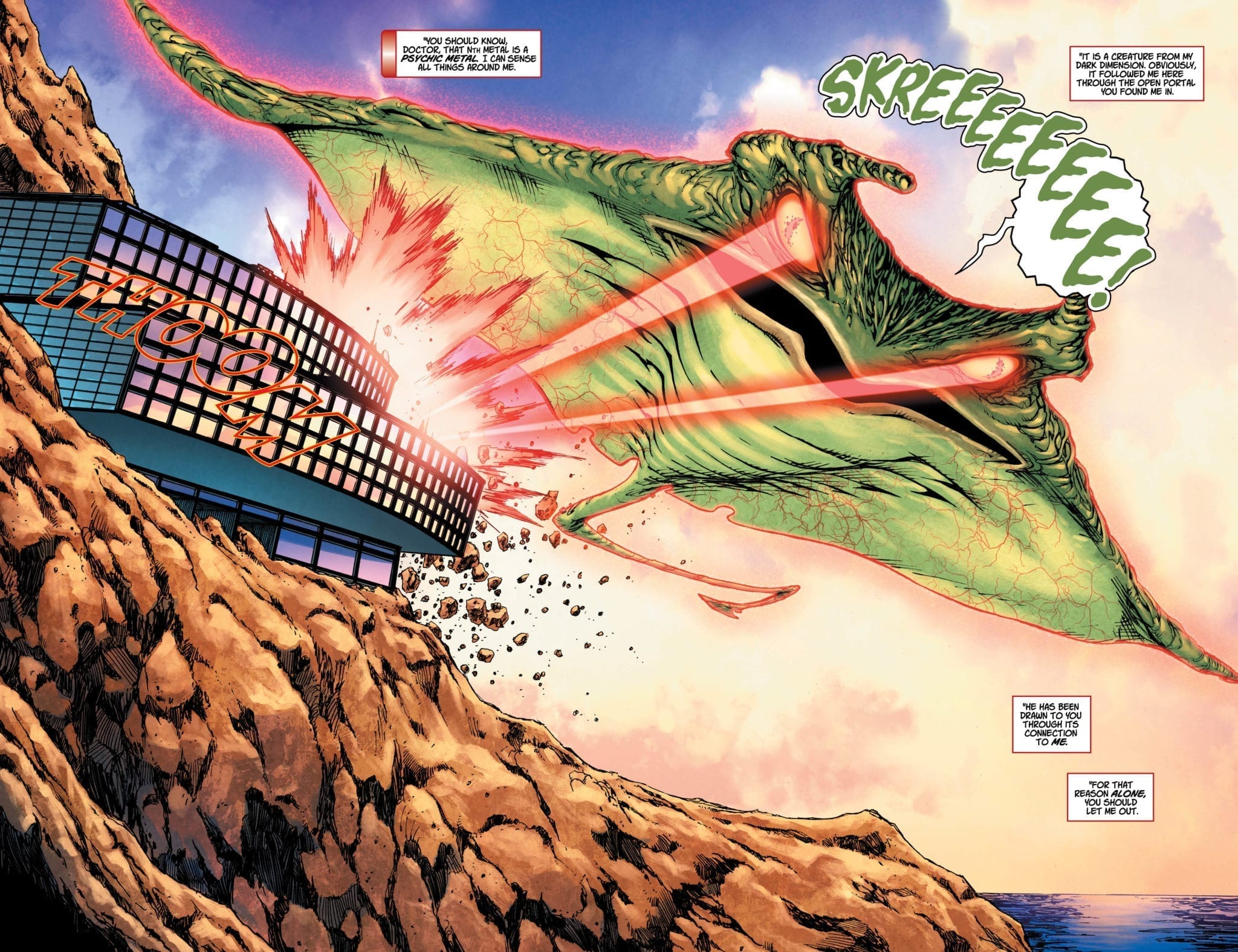
About the issue: In this issue, it’s kaiju versus giant robot versus the Metal Men! After killing off one of the Metal Men, Nth Metal gets placed into a holding cell at the lab so Doc Magnus can learn exactly how dangerous it is! That is, until a giant, flying manta with lasers coming out of its eyes attacks the lab-and now the Metal Men must team up with a giant robot in order to save the day!
Metal Men #3 is by Dan DiDio and Shane Davis, with inks by Michelle Delecki, colors by Jason Wright, and letters by Travis Lanham. The main cover is by Davis, Delecki, and Wright, with the variant by Cully Hamner.
The Metal Men are one of DC Comics’ more obscure (but beloved) teams, created in 1962 by Robert Kanigher and Ross Andru. Prior to this series, they were most recently seen in Doomsday Clock as one of the teams that confront Watchmen‘s Doctor Manhattan.
Check out the Metal Men #3 preview below:
Are you reading DC Comics’ Metal Men? Sound off in the comments!
Harrow County creator Cullen Bunn teams up with artist Naomi Franquiz to bring us “Tales From Harrow County: Death’s Choir” #1. This first issue is a brilliant start that brings to bear all the southern-Gothic charm and character storytelling that made its predecessor such a hit.
Ten years have passed since the young witch Emmy defeated Hester Beck for the soul of Harrow County. Ten years have passed since Emmy made her exit and left her best friend Bernice as protector of their backwoods home. Now, Bernice acts as stewardess of Harrow and all its countless haints in order to keep the darkness at bay. With World War II in full swing however, the sorrow in both our world and the next is at an all-time high. So when a ghostly choir starts raising Harrow’s dead, Bernice will have to pull out all of her magical stops before their quiet home is overrun.
Writing & Plot
Some of the strongest elements in the original Harrow County series are writer Cullen Bunn‘s sharp ear for naturalistic dialogue and tight plotting. This continues to hold true in the first issue of “Death’s Choir.” The characters, from Bernice herself to the townsfolk and the supernatural creatures all feel like real people. There’s a comfortable naturality with the way people speak in Harrow that when combined with the effective prose of the narration makes this series a continual joy to read.
The plot following Bernice’s life as the local witch and the townsfolk’s hardships during WWII offers heartfelt character storytelling in the midst of the supernatural background. The supernatural elements themselves are presented in their usual charm and mystery. There’s a familiarity with the ghosts and ghouls aspect of this issue that will be a treat to long-time Harrow fans but also not be alienating to newcomers. While it’s only been a few months since the original Harrow County ended, it’s still reassuring to see that Bunn has lost none of his edge when approaching this world.
Art Direction
Tyler Crook makes for a tough act to follow. The Harrow County artist and co-creator is responsible for the entire visual aesthetic of this acclaimed horror series. Fortunately, artist Naomi Franquiz has come aboard to replicate this iconic atmosphere. Franquiz’s work on “Death’s Choir” is highly reminiscent of Crook’s art, while still maintaining her own visual style. The thick linework and facial detail create a sort of lighthearted atmosphere when interacting among characters. At the same time, this style creates its own unique atmosphere when the horror elements are introduced. Much of this comes from the watercolors used in this issue. This is a technique that has become almost synonymous with Harrow County and it’s great to see Franquiz maintaining this style.
If it sounds like this is saying “Franquiz just copied Tyler Cook’s style,” it isn’t. It just seems that the two have a very similar technique, and Franquiz was knowledgable enough about Harrow to know how to maintain that iconic look. Crook does lend some of his talents to this first “Tales From Harrow County” issue. His lettering provides the reading experience with a variety of tonal dialogue for the audience to latch onto. He switches from relatively normal fonts in most narration and dialogue to wavy or angled text from supernatural sources. It’s a small artistic touch that works wonder with the tone of the book.
“Tales From Harrow County: Death’s Choir” #1 is a phenomenal start first issue. This first of a four-part mini-series is a wondrous return to Harrow County in terms of both the story itself and the work that has gone into it. Cullen Bunn brings back all of the original series’ strengths, from the personal character stories to the charm and mystery of the quaint backwoods horror. Naomi Franquiz brings her own style of art to the table while also paying perfect and direct homage to the art that made the original series so memorable. If you’re a fan of Harrow County or are just in need of a great horror comic, be sure to pick this one up at your local comic shop on 12/18.
If you’re looking for range in a comic book publisher, you’d be wise to pay attention to It’s Alive. This October, It’s Alive published a delightfully positive, brightly-colored sci-fi adventure called Pink Lemonade, which combined the best parts of Jack Kirby’s art and Evel Knievel’s stunts. Now, It’s Alive has changed gears entirely, drawing us into a dying world and the stories of those surviving there in Justin Madson’s Breathers. Breathers is an anthology title set on an earth without fresh air. The characters’ lives are very different, but they all share a similar strife. Without their titular gas masks, they couldn’t live.
Breathers happens in four short segments. In the first, Damsel in Distress, we see this world through the eyes of little Mara, who escapes the harsh realities of her home by playing make-believe with her stuffed dragon. The second story is The Wealthy Bachelor, a guy-meets-girl tale that would be right at home in a rom-com format, but affected deeply by the world’s necessary face gear. The third is Filter K, which gives us a window into crime and law enforcement on this dying planet. And finally, there’s Bedtime, which returns us to Mara’s home. This time, though, it’s through eyes of her mother, for whom an imaginative escape is not an option. Each of these segments is heart-wrenching for its own reasons, and though we get very little time with each character, Madson’s masterfully turns them into fleshed-out, lovable and deeply relatable people.
The Stories
The most appealing thing about the short stories in Breathers is just how localized they are. Madson doesn’t ever get in to why the Earth has so little oxygen, or plot out some quest to save it. Instead, his stories accept the world’s condition as a fact of life, tracking with the down-to-earth, human drama that springs out of it. These stories are tiny, intimate moments between one or two characters. They relying on the emotional weight of their interactions rather than flashy sci-fi imagery. In a market with an annual schedule of reality-altering crossover events, Madson’s commitment to his grounded world is a refreshing change of pace. It gives his stories more space to grow or, if you’ll forgive the joke, breathing room.
The Art
There’s a passage in Scott McCloud’s Understanding Comics about the relatability of characters with minimal features. The more simplistic the face, he says, the easier it is to apply to anyone, whereas a character with more “realistic” features will start to look like a separate, therefore not relatable, person. Justin Madson’s character designs put this theory to the test and prove it exactly right. These characters, though distinct in their personalities, are fairly universal in their designs. They could be you or me, or even more terrifyingly, our loved ones. These character designs aren’t realistic: they’re real.
Oh, and have you seen the Jeff Lemire/Matt Kindt cover??
The Colors
When Madson originally self-published Breathers, the comic was entirely in black and white. This probably lended itself to the grim state of the world, accentuating the hopelessness you see the characters going through. And if Justin Madson was a lesser comic creator, adding color to this book might have brightened that mood.
Simply put, it does not.
Madson’s bleak color pallet gives a reader the distinct message that the natural world is dying. Don’t get us wrong, it’s not quite apocalyptic, though it’s not far off. Madson has crafted a look that’s kind of a “nuclear fall,” toeing the line between our world and post-civilization, but not quite crossing it. This, more than anything else in the book, does the job of unsettling the reader. After all, it’s easy to separate yourself from a world in flames that looks nothing like your own. The creepiness of Madson’s earth is the familiarity it shares with our own.
The Lettering
Breathers makes the best use of unconventional comic lettering since Richard Sala. Like Sala’s work, the speech bubbles and letters Madson uses are shaky and unsure. They’re completely different from the sturdy, determined speech captions of your average hero book. When you hear these characters’ voices in your head, they come out nervous, and you can’t help but feel the same way. Far from being just a n added touch to the already unsettling mood of this book, the lettering is one of its pillars, driving home the oncoming doom of its world in a concrete way that’s also entirely consistent with the book’s art. If you’re a comic reader that overlooks the lettering, Breathers is a great place to start paying attention.
Overall Thoughts
According to an interview with Newsarama, Justin Madson has been working on Breathers since the late-2000’s, when he hand-copied the pages of the book and distributed them himself. Years later, Breathers had culminated in an indie comics masterpiece, a story that is prescient but not preachy, full but not flashy. The only criticism of this book we can offer is that there could be a more diverse cast of characters. We get a great sense of the world of Breathers already, and telling the stories from a wider variety of viewpoints could flesh out that world even more, connecting it to even more readers.
Still, there are plenty of Breathers stories left to tell, plenty of opportunities for Madson to explore those viewpoints. Madson has set up a framework that could expand for years and never get boring, and if Breathers gets the attention it deserves, we’ll see those stories on shelves soon. If you want to help get Breathers into the world, you can order a copy to your local comic book store, or over at It’s Alive’s website. Whether you’re interested in supporting indie books or just getting a fellow comic reader something great for the holidays, Breathers is worth every cent.
For more reviews like this one, follow us on Twitter. And for all the best comics discussion and interviews, keep an eye on Monkeys Fighting Robots.