Home Blog Page 371

Review: Extreme Malpractice in WITCHFINDER: REIGN OF DARKNESS #2

The Hellboy universe is driven by such consistent quality that the unusually “meh” debut issue of “Witchfinder: Reign of Darkness” was seen as an anomaly. Unfortunately, not much has improved here in the second issue. “Reign of Darkness” #2 is a directionless chapter. The “mystery” is explained in blobs of dialogue, and the pacing is distractingly cluttered. The character art is once again strangely off-putting. The momentum that was built on the final pages of issue #1 goes to waste in this follow-up.

Sir Edward Grey (a.k.a. The Witchfinder) continues his tumultuous investigation into the identity of Jack the Ripper. As soon as his most likely suspect is just out of reach, he receives an unlikely suggestion from an outside source. An American woman by the name of Sarah Jewell believes she knows the true culprit. Grey will have to withstand criticism from the law, the covering of the truth, and even desperate brigands to track down this monstrous villain.

Writing & Plot

One of the most effective aspects of Mignola’s work and the Hellboy universe as a whole is the use of art to tell a story. Dialogue and narrative are obviously key, but letting the panels talk bolsters the atmosphere. Moments of introspection and suspense are created in these quiet moments. Unfortunately, this book offers none of those strengths. While some solid dialogue is to be had, the writing here is bloated with needless exposition. Any and all “investigation” is given away by characters just reciting facts or speculation. There is no investigating to be had. While the dialogue exchanges are well-written from a language standpoint, they too are often a bloated bore to read.

The appearance of a key Hellboy universe character (no spoilers) is a treat, but it isn’t enough to offset the strange pacing this comic has. It doesn’t feel like a steady flow of events leading to a climactic conclusion. It just feels like a series of scattered related occurrences. The first issue had similar problems, but it at least had a definite direction and a promising final page. This issue neither capitalizes on the prior nor builds toward the next in any exciting way. There’s a fight scene that occurs roughly midway through the issue that feels very much out of place. The scene itself is cool in that is demonstrates some of Grey’s paranormal knowledge, but it doesn’t do anything for the plot. Hopefully this actually proves to be more important in forthcoming issues. With two issues down in this five-issue mini-series, it’s more than a little worrying that the writing feels so cobbled together.

Art Direction

The pencils and inks on this Witchfinder series thus far have been a mixed bag. The environmental details of 19th century London are well-executed and properly atmospheric. The brick buildings and dingy crime scenes in “Reign of Darkness” make for a stellar setting for a paranormal Jack The Ripper tale. If only the character art could match the quality of the setting. Once again, the work on the characters themselves looks as if it’s unfinished. There’s still this partially-rendered look to their facial features and clothing. It’s reminiscent of when a game engine is still loading all the textures, so the character faces are blurry and featureless. It’s a shame that this still isn’t working, especially in a series that’s part of a universe full of wonderfully unsettling horror artwork.

The colors are mostly a bit of a saving grace. The grayed palette is reminiscent of foggy industrial England and adds considerably to the authenticity of the era being replicated. However, they also come in a little underwhelming on close-up detail work. The entirety of a piece of clothing, for example, will sometimes be colored in a single shade regardless of the lighting from the environment. This may sound like an absurd nitpick, but when in tandem with the pencils and inks, it becomes a noticeable distraction.

“Witchfinder: Reign of Darkness” #2 is an even more disappointing follow-up to an already lukewarm debut issue. Blocky exposition and a poorly paced plot overtake any clever dialogue that is there to be had. The art direction looks as if it were unfinished and is mostly distracting in a series that needs to be engrossing. Any elements of mystery and suspense are squashed by loads of explanations in dialogue. With this being the second of only a five-issue mini-series, it’s a bit disconcerting that this comic has failed to impress thus far.

Monkeys Fighting Robots Youtube

Review: COUNT CROWLEY: RELUCTANT MIDNIGHT MONSTER HUNTER #3

This second-to-last issue of “Count Crowley” takes some time away from the monsters to focus on Jerri’s familial struggles and a strange conspiracy. The emotional beats may be a bit derivative, but they’re certainly effective and make Jerri an even more engaging protagonist. With consistent art and fun but emotionally charged plot, “Count Crowley” continues to be a worthwhile read.

After escaping an undead attacker, Jerri Bartman attempts to get some help from friends and family after her altercations. When they all dismiss her claims as delusions of a disturbed alcoholic however, she continues her investigation on her own. Upon finding the original Count Crowley Vincent Frights (er, Freis), she discovers that this whole horror story she’s uncovered has been hundreds of years in the making.

Writing & Plot

Writer David Dastmalchian continues to effectively mix goofy monster horror with compelling character drama. Sequences of fighting off creatures from golden-age horror films are intercut with gutting interactions between Bartman and the locals who know her. The tale of the alcoholic in need of redemption is not a new one, but it’s still effective when done right. Jerri is an easy character to root for as she roots around for answers and dodges werewolves, skeptics and sexist old men. The dialogue is as always sharp and naturalistic in this third issue. The plot itself is a compelling mix of Scooby-Doo for adults and a compelling turn-around for a struggling human being. Dastmalchian is proving himself to be a highly competent writer who knows how to weave great character stories with charming concepts.

Art Direction

The duo of Lukas Ketner’s pencils with Lauren Affe‘s colors continues to provide stellar and fitting artwork for “Count Crowley.” Keter’s realistically drawn people and classically-minded monsters exist perfectly in the comic’s environmental detail. Jerri’s desperation as she fights back welling emotions in visually deeply compelling. The book’s atmosphere is reinforced by Affe’s 60’s horror-inspired color choices. The influences “Count Crowley” displays are made most evident by the art team’s fantastic work here. Dastmalchain’s engaging and campy scripts are sold by Ketner and Affe’s combined efforts.

“Count Crowley: Reluctant Midnight Monster Hunter” #3 is an emotionally gripping and world-opening third chapter. Dastmalchian’s sharp ear for natural dialogue and compelling character storytelling pays off in spades in this issue, increasing the stakes of the series going forward. The consistently top-notch art from Lukas Keter and Lauren Affe nails fulfills this comic’s aesthetic from month-to-month, and issue #3 is no different. Be sure to keep this series in your pull list at your local comic shop until the final issue drops next month.

Monkeys Fighting Robots Youtube

Review: JOHN CONSTANTINE HELLBLAZER #2 Urban Horror That Doesn’t Hold Back

John Constantine Hellblazer #2
John Constantine Hellblazer #2 Credit: DC Comics

Continuing the expansion of the Sandman Universe from DC Comics, the second issue of John Constantine Hellblazer barges onto the shelves this week, pushing the other titles around and generally making a nuisance itself. The 17+ age limit is justly earned and not just because of the use of excessive language; within these pages, horror awaits.

Those of a nervous disposition or are easily offended have been warned. John Constantine doesn’t pull his punches and neither does writer Simon Spurrier. If you want an easy read, you’d best look else where.

John Constantine Hellblazer #2
John Constantine Hellblazer #2 Credit: DC Comics

Great Things Are Done..

On the Streets of London, the gangs fight over territory and peddle their drugs but something worse is taking the gang members. A supernatural force is tearing apart anyone who wanders haplessly into the wrong park at the wrong time. Only one man can help; but John Constantine isn’t easily persuaded and threats don’t really work on him.

In this second issue of the Hellblazer relaunch, Simon Spurrier throws the central character into the middle of a supernatural nightmare while building a team of new characters around him. This issue continues to expand the cast that was introduced last month, filling out the roles and cementing Constantine’s character in the process.

Spurrier does two things exceptionally well this month. The first is that ‘A Green and Pleasant Land’ is a suburb urban horror story. It includes tropes from a selection of modern horrors and moulds them into something truly unnerving. K-Mag is a modern witch, gruesome to the bone and forms the body-horror element of the story. The ‘Angels’ in the park account for a large part of the supernatural but also provide the religious link that horrors tend to favour. There is even a mysterious old man and a sceptic to complete the assembly.

Naturally linking all of these elements is Spurrier’s take on Constantine who is, as noted in previous reviews, a return to the good old English Bastard of the late 80’s. And this is where Spurrier’s second success is evident: the narrative is brimming with subtle, and some not so subtle, social commentary. Like King Arthur of old, Constantine is a representation of England. He is a manifestation of the country in human form. The hopelessness, anger, and occasionally bitterness on display comes from a growing mood within a certain section of the population; a section who will probably be reading this comic.

Despite the grim outlook, the central characters are all fighters, desperate to survive. Constantine collects like minded souls both in the narrative and in the readership. Spurrier understands this and aims the social commentary directly at us, showing us the seedy truth but also reminding us that not all is lost. 

John Constantine Hellblazer #2
John Constantine Hellblazer #2 Credit: DC Comics

Hell in Art

Aaron Campbell’s art captures the grimness of the violent horror and the disheartened mood of the country. His harsh inking style and use of heavy shadows creates an uncomfortable feeling. There is a lack of safety within the panels for either the characters or the reader. This disjointedness is partly a reaction to Constantine’s own displacement in time. He has yet to find a place in this modern day world and the art illustrates this at every turn.

Jordie Bellaire picks up this motif with her coloring. The panels are brought to life with expressionistic colors rather than realistic ones. Sicking greens and unnatural bright oranges carry the tone throughout. The colors even pick up elements of the narrative that might not immediately be apparent. There is an obsession with the poetry of William Blake in this issue of Hellblazer and Bellaire’s coloring reflects the artwork of the 18th century poet and artist. The flashback sequences especially conjure up images of the Romantic Age.

Creating a poetic flow to the narrative is achieved through the placement of the speech balloons and the breaks in the conversations. Aditya Bidikar breaks up the sentences so that he can space them out within the panels creating natural pauses. There is also some clever use of coloured speech balloons to represent supernatural elements of the story.


John Constantine Hellblazer #2 Credit: DC Comics

Conclusion

Constantine as a character has always represented the world outside the pages of the comic. He is a funnel through which real life passes so that it can be examined in fantastical tales of horror and magic. Spurrier’s take on the character is daring and exciting. He draws the horror out of the world and yet, it is the stark realities of our world that have the most disturbing effect on the reading experience. 

Visually it’s a delight, if a touch grotesque, but it is hard hitting and Spurrier does not hold back. There is a lot within these pages that can cause offence and it’s mostly offence that needs to be caused. Unfortunately the real world is a tough place right now, and Constantine is feeling it all too well. But like any hero, anti or otherwise, the modern day wizard brings out the best in those around him and it is these sidekicks who are proving to be the most interesting element of this comic.


Monkeys Fighting Robots Youtube

YOU ARE DEADPOOL: A Narrative Comic Book Store

You Are Deadpool, so raise havoc.

You Are Deadpool is several things: it’s Deadpool at his most meta, another masterpiece by “Al Ewing,” and a comic book mashed with a tabletop game. By using issues of the series as campaign scenarios along with two (or more) dice, the player embarks on a trial and error based time travel campaign. But perhaps most of all, it’s a comic about comic book store culture. Yes, it’s a thing. Now to understand anything about this culture, there are some important subjects to go over, because this stuff can get comprehensive and overwhelming for first-timers. Below is the research from the gutters.

What Is You Are Deadpool?

Gerry Duggan style or Rob Liefeld?Deadpool requires little introduction for even non-comic fans. Whether it’s Ryan Reynolds’ portrayal on the big screen or the comics written after Rob Liefeld, Deadpool is a snarky fourth-wall-breaking mercenary with a healing factor that makes him close to immortal. His entire history revolves around being a funny meme or a sad clown. Some of the best Deadpool attributes, however, come from his resourcefulness in reaction to comics’ absurdity. All of which makes Deadpool an entertaining character to play as in games. But while video games like Marvel vs. Capcom 3 and the Deadpool video game keep to the memes, tabletop games offer more variety.

Kieron Gillen in You Are DeadpoolYou Are Deadpool, written by Ewing with art by Salva Espin, is the concept of Deadpool in a Dungeons & Dragons-esque situation. But instead of game masters and absurdly named weapons, it’s a game of resource management and morality, each of which plays into the scenarios where Deadpool is sent through time to different comic eras. At the suggestion of Kieron Gillen, players make use of two dice in combat against a usually higher number of dice. Given the stakes, resource management and memorization is a necessity to progress through. Meaning much like with Deadpool, the reader/player will either feel accomplished or too frustrated to finish and just get another comic from the store.

The Culture of a Comic Book Store

Comic book stores themselves have a semi-unique culture to them aside from putting overpriced monthlies on shelves. It’s a place of community for pop culture lovers to share their passions. On their best days, they’re like less expensive conventions complete with guest appearances from comic artists. And for those who wanna do something other than stick noses in inked paper, there’s often a space to play tabletop games. From Magic the Gathering to Dungeons & Dragons, there’s something for everyone.

You Are Deadpool (His Other Voice Anyway)

Deadpool appeals to everyone despite being strictly advertised for more mature teens. It’s through that very popularity that readers get a first look into how comic stores work.

Some people get intimidated by comic stores because of how overwhelming they can be from intimidating book organization to staff uninterested in newcomers. People like Eric Ravenscraft recommends going with the flow instead of starting from the beginning. Because like meeting people for the first time, it’s best to follow from a fresh start. You Are Deadpool follows that same logic by giving readers minimal background and the choice to play Deadpool the way writers like Daniel Way depict him. Who knew tabletops had so much in common with comics?

Comics Are The Game

You Are Deapool lets you make your own dice.

While readers get to know Deadpool through gameplay, they also get an introduction to another part of comic shops. As stated previously, the stores include both a space to play and get the means necessary to play tabletop games. Unlike video games (which tend to support manga more than western comics), tabletop games offer a more hands-on approach. As such, games like D&D and Magic offer more social, cognitive, and innovative play styles.

Because why go one way when you make a visit memorable. Some of the best comics feel like you are living in the comic’s world. Some of the best comic shops meanwhile feel like being in a comic. “Jay and Silent Bob’s Secret Stash” have the aesthetics while “Vault of Midnight” goes out of its way to make the medium accessible. From podcasts to exhibits, people can see comics in all of their glory. Somebody has to make decades of history accessible.

You Are Deadpool (The Comic Historian)

One of Deadpool’s notable tools is his use of Marvel Comics history. The time travel plot helps reinforce this by reintroducing concepts from all around Marvel’s history. From the most obscure characters like Master of Kung-Fu‘s Super-Midnight to ridiculous tropes through the Grasshoppers. Even A-Listers get their time in the limelight for a short while, like the Fantastic Four, Daredevil, and Captain America (as Grasshopper). While this seems paradoxical from the getting into comics intro, generating interest in the past is what can get more people to comic shops. Because let’s face it, tabletop comics can get boring alone.

(Insert Marketing Trick)

Thankfully, playing You Are Deadpool doesn’t just amount to fans of the character but anyone interested in visiting a comic shop. Aside from getting a few monthlies, maybe people will have an interest in staying for more. Maybe they can even bond with fans over a story or play a game or two. Marvel UK even released a You Are Deadpool RPG set to go along with the comic. Who knows, maybe somebody will even have an event dedicated to the concept. Too bad it can’t do something about comic stores problems with age gaps.

But what about the rest of you? Still, find comic shops to be a little overwhelming, or are you willing to try something a little different? Leave your thoughts in the comments.

Monkeys Fighting Robots Youtube

SUICIDE SQUAD #1 Is Undiluted Fun

Suicide Squad #1, written by Tom Taylor, with art by Bruno Redondo, colors by Adriano Lucas and letters by Wes Abbott, is a promising beginning to a new era for the titular team. With the creative team behind Injustice on this, it’s clear this series will be no-holds-barred. The first issue does not disappoint.

Writing

Taylor’s writing manages to establish the characters without rushing into creating a “team dynamic.” Instead of trying to create a “rapport,” he lets the characters be driven together by circumstances. It’s also very clear that this is not the same team we’ve seen in many other iterations. Taylor has already established loads of new characters that look to be taking huge roles in the series. He’s wiping the board clean, creating the kind of reboot that means anything can happen. If his track record tells us anything, this is going to be a wild ride.

Drawing

Redondo’s art is gorgeous. Throughout, he constantly shifts perspectives to give a sense of movement and chaos. When Magpie is being stalked down a dark hallway, he continually alternates how we see her. We sense her panic as we go from close up to zoom out, from behind her to in front of her. It’s like listening to her raised heartbeat. And when someone jumps out of the dark at her, their pupils are minuscule. It goes to show Redondo’s mastery that he can make a page fit for a horror comic in the pages of Suicide Squad.

Coloring

Lucas’s colors help give even the most brutal moments a sense of levity. When one character’s skull explodes in another character’s hand, the neon yellow background offsets the gore. It almost has the feel of a Tarantino movie. Lucas is egging the reader on to find a kind of beauty in the violence. With all the bright yellows and reds surrounding each moment of explosive blood, it’s like watching a light show, not an execution.

Lettering

Abbott’s lettering is a huge player in what makes this comic so fun. Screams follow characters down to their deaths, and the lettering is constantly changed up. Even when writing various explosions, Abbott gives us the sense that a head and a ship blowing up make different noises. Abbott’s lettering is clear and precise and is evolving as the issue progresses. If he’s experimenting with lettering this much in issue 1, I can’t wait to see his work in issues to come.

Suicide Squad #1 is exactly the riot it should be. It’s undiluted fun that actively chooses not to hold back in each moment. Read this series while you still can, it’s bound to be changing drastically as each month goes by. Pick Suicide Squad #1 up at your local comic book store on Dec 18th.

Monkeys Fighting Robots Youtube

WONDER WOMAN: DEAD EARTH #1 Rushes Past Its Own Brilliance

Written and drawn by Daniel Warren Johnson, with colors by Mike Spicer and letters by Rus Wooton, Wonder Woman: Dead Earth #1 rushes to be the story it wants to be. The overloaded pages draw away from the brilliant concept and artwork. While it’s off to a rocky start, this series still has great potential.

Writing

Johnson’s concepts for the series are brilliant. Setting Diana in a post-apocalyptic wasteland feels like a match made in heaven. Yet Johnson seems to be pushing his characters to get to know one another artificially. As soon as Wonder Woman breaks out of her cryogenic chamber, she’s met with constant oversharing and clumsy exposition. It’s one of those cases where half of the dialogue could be cut out. Sometimes it’s better to know when not to answer a question. The very idea of having Wonder Woman out of her element is what makes this story so compelling. If every question she has is met with an immediate answer, the mystery dwindles. Johnson’s concepts truly are brilliant, but he needs to trust them more.

Art

It’s interesting that Johnson pencils and inks his own work here. Interesting because he kind of steps on his own work throughout. Johnson sets the scene so beautifully with his art; the exposition provided by the characters is excessive. We can see there was a nuclear holocaust. We can see the pain of their existence in their faces. They don’t need to cry on one another’s shoulders. They don’t need to have deep conversations upon meeting each other. The silences speak louder than words, and Johnson’s art is proof of that.

Colors

Spicer’s coloring opens the door to this dark world. With dark greys and blacks, Spicer gives a feeling of death and stagnation. With yellows and purples, he creates a sense of danger and evil. We see abominations wandering the wasteland, cast in a reddish-purple tone. A horde of monsters try and break into the camp, and they are colored the same way. Wonder Woman looks flushed throughout, giving her a similar look. Will Diana be dangerous in the future of this series, perhaps?

Lettering

Wooton’s lettering stands out amongst other works for having a more handwritten feel. Wooton adds to the gruff atmosphere in this way. Nothing on this dead earth is easily won. Many of the sound effects have a graffiti type feel to them. Like Wooton spray-painted over Johnson’s work. It truly helps create a sense that this world is run-down.

The concepts behind Wonder Woman: Dead Earth #1 are brilliant. The execution is underwhelming. This series clearly has more places it’s planning to go. Once Johnson sets the stage, he might be able to trust his own ideas more. Pick up Wonder Woman: Dead Earth #1 at your local comic book store on December 18th.


Monkeys Fighting Robots Youtube

Real Comics Shop Folk Dish On “Comic Book Guy”

It was 30 years ago this week that The Simpsons debuted as a half-hour sitcom. In those three decades, the animated TV series has hatched catchphrases like “Doh!” “Eggs-ellent,” and “Smell you later,” to name a few. But perhaps most pertinent to readers of this site is: “Worst episode ever.”

That indelible line belongs to “Comic Book Guy,” owner of Springfield’s Android Dungeon comic book store. (After more than two decades with no given name, the character revealed it, with a comically annoying lack of fanfare, as Jeff Albertson.)

Overweight, opinionated, and possessing an elephantine memory that allows him to criticize his favorite TV shows in granular detail (“In episode 2F09, when Itchy plays Scratchy’s skeleton like a xylophone, he strikes the same rib twice in succession, yet he produces two clearly different tones…”), the character represents the worst of comic-con nerdom.

As the series approached its latest milestone, I began to wonder: What do real-life comic book shop owners think about the character? He’s a gross exaggeration, right? Or is he eerily accurate? Or both? And so, making the rounds of my local comic book shops, I posed those very questions.

“That dude 100 percent exists,” said Dan Palomares, manager of Comicopia in Boston. “I’ve seen that dude, in this space.”

Frankly, I was expecting a little more hedging, but Palomares’ was one of many such unvarnished comments I heard. “Actually, it’s a pretty accurate depiction,” said one cashier (the only one of my sources who requested anonymity). The consensus was that the know-it-all-ism depicted by Albertson (as no one calls him) is indeed representative—at least of a subset of comic book fans.

In fact, I even stumbled upon the tantalizing possibility that Comic Book Guy existed, in flesh and blood, and once waddled the streets of Cambridge, Massachusetts. There, in Harvard Square, at Million Year Picnic, New England’s oldest comic book shop, owner Tony Davis explained.

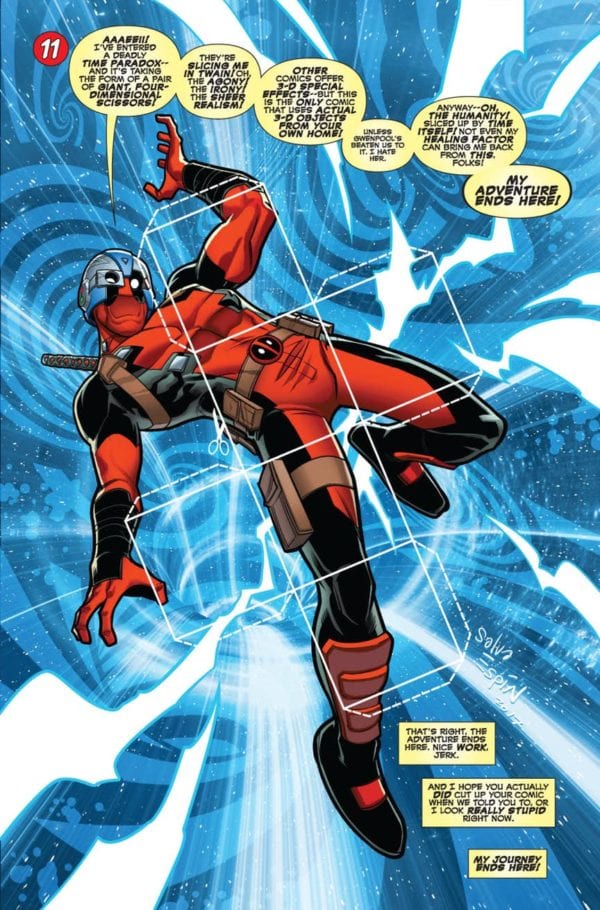
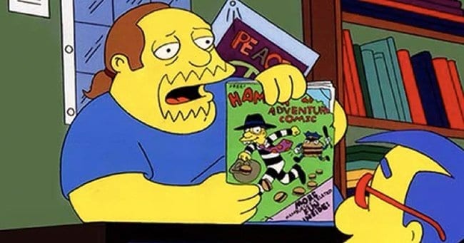
“There was a guy, Hans, who worked here at one point, who claimed that he was the inspiration for Comic Book Guy,” said Davis. “Hans was a young, heavyset guy with long hair. And he would judge customers’ choices, out loud.”

There does sound a semblance. But how, in Hans’ view, did the Simpsons writers discover him? Simple. “A lot of the Harvard Lampoon guys [e.g., Conan O’Brien], who later went on to The Simpsons, used to shop here.”

Could Hans be right? Davis himself had doubts. I would have to seek the truth from a writer or producer of the show.

But before we get to that, note what Davis said about Hans “judging customers’ choices, out loud.” Confronting shoppers with a haughty attitude seems like a bad business practice, but when it comes to comic books, it’s not altogether unexpected. To be sure, none of the folks I interviewed, in the fall of 2019, had anything like that attitude, and yet somehow all felt that the character rang true. Maybe it’s because comic books inspire more passion in people—sellers and consumers—than other products.

Well, most other products. An obvious parallel came up in my conversation with that one anonymous cashier. When I asked if he had a favorite Comic Book Guy line, he said, “The classic, ‘Worst episode ever.’ That just distills that nerdy putting everything down even though you love it. It’s something you love, but you just feel compelled to crap on it. It’s making people feel bad for what they’re into.”

As soon as he said this, I thought of Jack Black’s hyper-critical, more-knowledgeable-than-thou record shop clerk in High Fidelity.

“Yes,” Anonymous agreed. “It’s levels of gate-keeping, ‘Keep out of my subculture.’ Trying to make it seem too complex to outsiders. I don’t get that mindset. I’m excited if I get to clue someone into something cool.”

Funnily enough, Jack Black later appeared (or his voice did) on The Simpsons as the rather friendly, welcoming owner of a rival, hipster comic book store, across the street from the Android Dungeon. Jesse Farrell, manager of Hub Comics in Somerville, clued me into this episode I’d missed. (Season 19, episode 7, if you’re keeping track. It included this priceless tidbit: Milhouse asking Alan Moore to sign a copy of Watchmen Babies in V for Vacation.)

“I think we’re more like that store,” Hub’s Farrell said. “It was a correct, up-to-date stereotype.”

Still, Farrell feels that Comic Book Guy is accurate—and exaggerated. “It’s both,” he said. “It’s a loving stereotype.”

“I experienced this moment of comic book shop solidarity,” Farrell related. “I was at New England Comics in Brookline, and on the TV, a ‘Treehouse of Horror’ [Halloween] episode was on. There’s a part where Comic Book Guy is walking down the street, reading an issue of Aquaman and saying, ‘But Aquaman, you cannot marry a woman without gills. You’re from two different worlds!’ And then he sees a nuclear missile heading his way and says, ‘Oohh, I’ve wasted my life.’

“The entire store just burst out laughing,” Farrell said. “It was an amazing moment of unity.” (Comicopia’s Palomares, too, said this line was one of his favorites.)

Speaking of unity, across town at the aforementioned New England Comics in Brookline, Riley Villiers—the youngest, and the only female staffer who happened to be behind the register at any of the handful of stores I visited on my unscientific expedition—had the most encouraging news.

Compared to when Comic Book Guy was created in The Simpsons’ early days, “there’s not the same kind of consumers or gatekeepers anymore,” Villiers said. “The audience has broadened, and we don’t have the same kind of gatekeepers in the industry—as in, the people higher up. It used to be exclusively for boys, but now I think the publishers do a better job of making comic books inclusive for all genders and other backgrounds.”

Okay, the suspense has gone on long enough. What about Hans and Harvard Square? I got in touch with Mike Reiss, a Harvard Lampoon alum who was one of the first writers, and later a producer, of The Simpsons. (Highly recommended for comedy fans: Reiss’ memoir, Springfield Confidential.) My question: was Hans the inspiration?

“Comic Book Guy was simply an archetype,” said Reiss. “When I go to Comic Cons, the crowd looks like it’s 15 percent Comic Book Guys. People have speculated that the voice is imitating animator Ralph Bakshi, but it was purely an invention of Hank Azaria. We figured he’d be a one-shot character, which is why we didn’t even give him a name.

“There’s no Harvard connection,” Reiss added. “Interestingly, long after we’d created the character, I met his double working in a comic book store 100 yards from our Simpsons offices.”

Have you met a real-life Comic Book Guy? Or do you have a favorite line of his? Post it in the comments below. (Here’s mine: “This is a rare photo of Sean Connery signed by Roger Moore. It is worth $150.”)

“The answer is ‘fries.'”
Monkeys Fighting Robots Youtube

The End of Another War in FIREFLY #12

FIREFLY #12, out this Wednesday from Boom! Studios, concludes the end to the most recent war that Mal and crew have found themselves a part of. It’s a chaotic mess, full of loyalties and politics.

What a classic Firefly cover!

***SPOILER WARNING***

It’s been so heartwarming to see the series that Joss Whedon created continue on in comic book form. The crew of Serenity have been getting themselves into one mess or another in the comics for years. But none of the messes can really compare to what Mal just faced.

Firefly #12 is an issue that the series has been building towards for quite some time. Each member of the crew has had the opportunity to create their own allies in this plot. And that all ends up being vital in how this war ends.

Mal is looking just a little bit smug on this alternate cover of Firefly #12.

If you haven’t been following the series up until this point, you might be asking yourself ‘what war?’ And the answer is a very simple one. What war have Mal and Zoe been fighting this whole time? For while we say the war is over, it never does truly end.

One thing that might be slightly confusing is trying to figure out at which point in time this series is currently set. We know that it must occur after the events of the show itself, but it also much be before the movie itself (being that several characters did not survive that series of events). That’s a fairly limited window. And it’s been growing ever smaller, with each and every reboot of the series.

This alternate cover for Firefly #12 is arguably one of the best so far.

The Plot

Firefly #12 concludes several plots that have been running through this series for quite some time. Grek Pak did an excellent job of wrapping up most of the loose ends – while leaving fans with some lingering questions.

Given the theme leading up to this point – that the war never really ends – we are left wondering if this is really the conclusion to the plot. Or if this all explains the rising tensions that can be found during the events of Serenity (or something else).

Admittedly, some of the elements in this wrap up felt a little bit too…convenient. The sort that are clearly designed for the purposes of drama. And while that in itself isn’t a bad thing, it doesn’t feel quite like the Firefly we know and love. On the bright side, it does set up for the next plot, which is something.

The men of Serenity all with their iconic looks on this variant cover.

The Art

Firefly #12 is an issue full of drama and action. And it’s the action in this issue that’s really the highlight. Showing off fight scenes when characters are within ships and on the ground can be difficult, but the artistic team did a solid job of it here.

They also showed just how dangerous this battle could have been – and the costs that each side would have experienced had something not been done about it. That is so much easier said than done, so this fact really deserves a lot of credit.

Dan McDaid (pencils/inks), Marcelo Costa (colors), and Jim Campbell (letters) did an excellent job working together for this project. While some artistic license was taken for how the characters were designed, they all resembled the characters we have come to love. And there are a few scenes especially worth note (such as the one where Jayne had to duck and run).

An so we’re on the verge of a war, all over again.

In Conclusion

While Firefly #12 concludes this plot, there is still so much left to this story. Not only are we already set up to dive right into another plot, but many subplots have yet to be resolved. And that means we’re not done reading about our favorite crew. Only time will tell how bad the next mess is going to be.

Monkeys Fighting Robots Youtube

Trees and Mysteries in LUMBERJANES #69

LUMBERJANES #69, out this Wednesday from Boom! Box brings our Lumberjanes to a classic moment in their series: they are finally to learn how to cut down a tree, properly. Fans will enjoy the irony of that situation, while being fascinated with the mystery forming.

All of the Roanoke cabin can fit on this massive tree!

***SPIOLER WARNING***

Lumberjanes #69 is the start of a whole new plot for our endearing Lumberjanes. Having just witnessed a battle between two goddesses, you’d think they’d want a bit of a cool down. But apparently bored Lumberjanes = troublesome Lumberjanes.

This alternate cover of Lumberjanes #69 hints at the past.

The Plot

Lumberjanes #69 is an issue set in two different timelines. One is set firmly in the past, telling the story of past Lumberjanes. While the other is the tale of the Roanoke cabin we’ve come to love so much. Oh, and did we mention that the Lumberjanes are finally (finally!) learning how to cut down trees; hard to believe that hasn’t happened before now, given their namesake.

Shannon Watters and Kat Leyh have done it again. They’ve woven together a deceptively simple plot, one that will bring the Lumberjanes up again something new and intriguing. That inevitably means that they’ll be getting into some sort of trouble. But considering this whole plot started with them being punished for misbehaving (read: carving their names into a tree), that was probably to be expected.

The element of the two timelines was an especially nice touch. It hinted at an adventure yet to come for our campers, while also raising our curiosity about the campers of the past. The balance between the past and present has always been carefully honed in this series, with the line becoming thinner in plots such as these.

Along with being a plot filled with mystery, this issue had a few fun pieces of information as well. Or at least, it’s fun if you’re the type hoping to learn more about trees. This little tidbit did make Molly come off even more endearing than ever, which didn’t feel possible before now.

What a dramatic tone for the start of this new plot.

The Art

Lumberjanes #69 was a bright and colorful issue, with the campers trekking out into the woods to learn the fine skill of cutting down trees. Or rather, the timeline set in the present is all bright and colorful.

The timeline of the past is, very appropriately, colored in sepia tones. It made a clear distinction between the past and the present, while also hinting at how far past these events really were. In short, it was all perfectly handled.

Kanesha C. Bryant and Julia Madrigal were the lead artists for this issue, and they’re the ones responsible for the dynamic scenes, as well as the growing sense of mystery in this issue. Meanwhile,

Maarta Laiho is the one behind the color palette we already discussed. And finally, Aubrey Aiese was the letterer for this issue – and their sound effects were sublime.

Apparently sneaking off in the night is a Lumberjane tradition.

In Conclusion

Lumberjanes #69 was a brilliant start to a new plot arc, proving that this series is far from over. And thank goodness for that fact. The intrigue and air of mystery were exceptionally handled in this issue, making readers eager to see what will happen next.

Monkeys Fighting Robots Youtube

Trials of the J Team in RUNAWAYS #28

RUNAWAYS #28, out this Wednesday from Marvel Comics, brings us the Runaways like we’ve never seen them before. The crew have settled in well to this new team, all but one. Yet we can’t help but feel like something is about to go horribly wrong.

The cover for Runaways #28 is truly brilliant, with Nico looking as fierce as ever.

***SPOILER WARNING***

The Runaways have found themselves in a mansion, welcomed with open arms by a hero known as Doc Justice. He asks nothing of them…though they have been encouraged to join his superhero team.

Seeing the Runaways being run by a whole new leader – one who happens to be an adult – is one of the strangest experiences yet. Given the common themes of the series up until this point, fans can only expect the worst for what will happen next.

Early morning training session!

The Plot

Runaways #28 is an issue that drastically moves forward the Doc Justice plot – but in a way where only the fans can really see what is happening. Well, the fans and Gert. But then again, she’s been suspicious this whole time. Good girl!

Rainbow Rowell has woven us a tale here, in which the hero is nothing like he seems. It’s once again falling back on the themes that the Runaways can’t always trust the adults around them, and when you think about it, that’s when the series really shines. No wonder this plot has been getting our attention so much.

It’s probably safe to assume that after this issue, any people who were still hoping for the best from Doc Justice will have given up. He’s that perfect sort of slimy, where he’s all cute and nice to your face – but in truth is thinking the worst of you. And really, that’s the one type of antagonist the Runaways are never prepared to face.

This whole plot has been decidedly insidious for that reason. It shows how brilliant Rowell is at writing subtle and slow building plots. Considering we have no idea how this plot arc is going to end up going, that couldn’t be more true. Though there’s little doubt that this plot will end explosively – one way or the other.

Along with the buildup of Doc Justice’s plot are several subplots. And it’s the Gert subplot that is perhaps the most heartbreaking one of the series so far. The dramatic event in this issue was completely unexpected – and the last thing Gert needed to have to deal with at this point. But it is proof that the Runaways are far from healed.

That’s actually not a bad play, all things considered.

The Art

Runaways #28 was an issue with several dynamic scenes. There are several highlights of this issue, between the expressions and events that occurred. The plot itself wouldn’t have held nearly so much weight, if not supported by such artwork.

Andres Genolet was the lead art for Runways #28, with Dee Cunniffe providing the colors, and VC’s Joe Caramagna doing the lettering. Together they showed us a version of the Runaways that are being split apart. Not by a villain, but by a slimy hero of all things.

The costume redesigns are still stunning, though the edge they’ve taken is even more alarming than ever. Though perhaps that’s because of the images that are clearly being featured in newspapers and magazines – it feels a whole lot like exploitation.

Nico has been feeling for a long time like she couldn’t (wouldn’t) rely on her magic.

In Conclusion

Runaways #28 was a surprising issue on more than one count, all while finally showing us the true colors of a hero we were never inclined to trust. You’d think that’d be more satisfying than it was, but Gert’s hurt colored the whole issue with somber tones.

Despite (or in spite) of all of this, we’re very much looking forward to seeing how the whole Doc Justice plot ends up playing out, in the long run.

Monkeys Fighting Robots Youtube