Home Blog Page 368

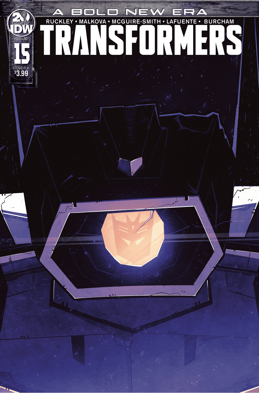
Review: TRANSFORMERS #15 Reintroduces The Best Parts Of IDW’s Megatron

Transformers

With Transformers #15 by Brian Ruckley, Anna Malkova, Bethany McGuire-Smith, Joanna LaFuente, and Josh Burcham the series feels like it is capturing what it has been missing. What is the element does this issue bring to the table? A familiar side of a character.

Summary

A conspiracy unravels. The Autobots race to restore order. Megatron reaches his breaking point and Shockwave finds himself broken. There are no more Ascenticons. There is no more Rise. There are only… The Decepticons.
Transformers

Writing

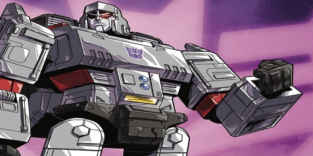
This issue helps to establish the backstory of a very popular character. With this new series, there has been a lot of re-introductions of familiar characters. Here, the origin of Megatron is put on full display for the audience to see. Again the origin featuring Megatron and his journey from a miner to a gladiator, and finally as the leader of the Decepticons is put on display. It comes as a comfort to see the detailed origin of the character has survived in this new series.

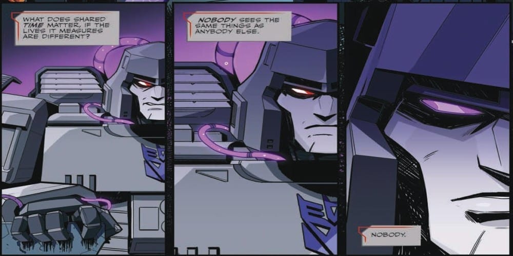
Brian Ruckley also makes sure to cement one of the most distinguishing aspects of Megatron by putting his rage on display. To showcase to Shockwave who is in control of the situation, Megatron is quick to show he is without a doubt the leader of this new movement. It’s impressive to see and showcases the side of Megatron which made him so interesting to read in the previous IDW series.

Transformers

Artwork

This issue uses a mixture of two different art teams in a very artistically pleasing manner. With Anna Malkova on art and Joanna LeFuente on colors, the modern moments of the story play out. The pair bring a very powerful moment forward as Megatron realizes the only way to get his point across is with his fists.

Meanwhile, with art by Bethany McGuire-Smith and colors by Josh Burcham, some very powerful flashbacks are put on display. Megatron and his intense struggle to prove his worth is played out with some images. Though simple at times, these panels showcase the ever-changing world Megatron has to conquer.
Transformers

With the letters by Jake M. Wood the issue has a great sound to it. From helping with the transitions between two time periods and aiding with a delivering of powerful blows with a fight scene the lettering is in peak performance.

Conclusion

Though the initial plot introduced of the murder of Brainstorm has yet to be solved, it is good to see the series still has potential. Transformers #15 finds a way to revitalize the interest in the comic and make the reader want to read more. Hopefully, this newfound potential will be squandered in the next issue.

Monkeys Fighting Robots Youtube

STRANGER THINGS: INTO THE FIRE #1

STRANGER THINGS: INTO THE FIRE #1, out January 8th from Dark Horse comics, is a dramatic start to yet another tale from the Stranger Things universe. If you felt like the story of the original test subjects wasn’t over, you won’t be disappointed with what is about to begin here.

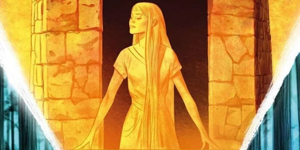
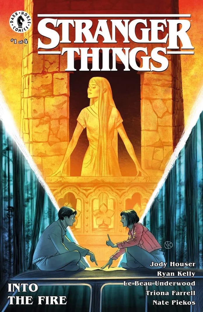
A shining and mysterious cover to this new series.

***SPOILER WARNING***

Stranger Things: Into the Fire is the perfect series for fans who enjoyed the last series (Stranger Things: SIX). Set several years after those events, we’re following the lives of the text subjects that were around before Eleven was born.

After the conclusion of SIX fans might have found themselves wondering what happened to the two subjects who escaped: Ricky and Marcie. Well, you need not wonder anymore, for Into the Fire is about to explore their ensuing adventures.

Take a look at who’s on this alternate cover of Stranger Things: Into the Fire #1!

The Plot

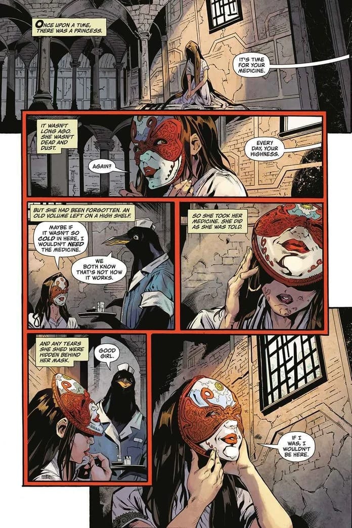
Stranger Things: Into the Fire has what is perhaps one of the best openings of any of the Stranger Things graphic novels to date. It’s interesting and dramatic, and more than a little bit disturbing and somber. In short, it’s perfect. And it did its job well; readers will be immediately pulled into the plot, wondering what is going on with this strange and lonely girl.

This latest series was written by Jody Houser, who clearly has been enjoying the world of Stranger Things. No complaints here. We personally love the journeys she’s been taking us on. We have no doubt that this story will be just as fascinating.

Stranger Things: Into the Fire #1 has a lot happening within the pages. There are so many reveals, alongside surprising cameos and appearances. It’s a lot to take in. The best thing about this issue is how Houser has connected characters from past comics with characters from the Netflix series (you’ll see who we mean). It’s just the right balance – while also providing us with an opportunity we’ve been hoping for.

The thematic ties to Alice in Wonderland are strong on this alternate cover.

The Art

Stranger Things: Into the Fire #1 will feel right at home with the rest of the franchise. The retro style and tones are the perfect touch. But that didn’t stop the creative team from experimenting a bit, here and there.

There are so many different scenes portrayed within these pages. There’s that introduction, which all alone is compelling enough to get us to read more. Then we have to consider the other settings, such as time (at least two different points, shown in this single issue) and location (again, several different areas are shown).

Given the large creative team involved, it’s really no surprise that they were able to pull off so much in such a short period of time. Ryan Kelly (pencils), Le Beau Underwood (ink), Triona Farrell (colors), and Nate Piekos of Blambot (letterer) all worked together to bring Houser’s story to life.

Talk about an introduction! This is captivating to the extreme.

In Conclusion

Stranger Things: Into the Fire #1 was a dramatic beginning to this series. Already we’re invested in what will happen next, while also being just a little bit curious and unsure. It’s the perfect balance for this franchise when you think about it. Fans of the world will want to make a point of checking out this series – though they should probably only do so if they’re up to date with the last graphic novel series as well.

Monkeys Fighting Robots Youtube

WEB OF BLACK WIDOW #5

WEB OF BLACK WIDOW #5, out this Wednesday from Marvel comics, concludes Black Widow’s latest tale. It’s a story of revenge and scheming in all the best ways. It is very much a story befitting the infamous Natasha Romanoff.

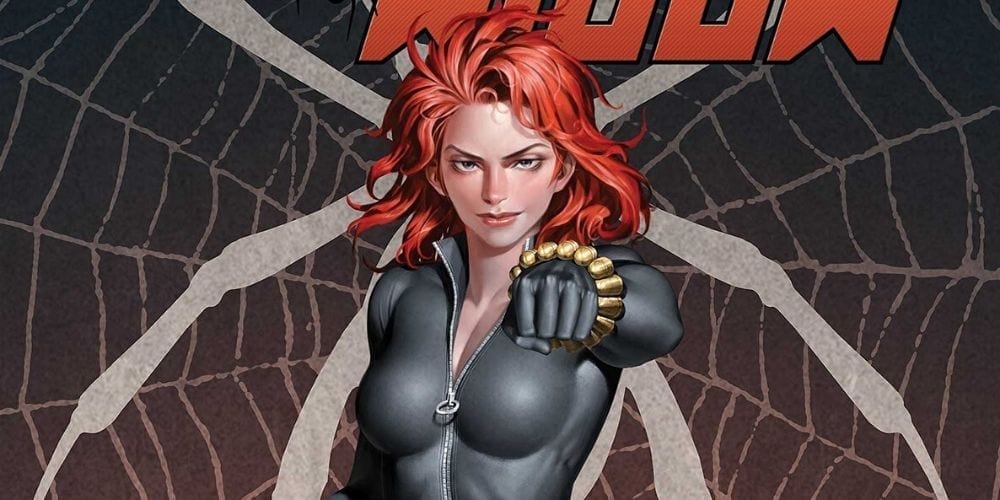
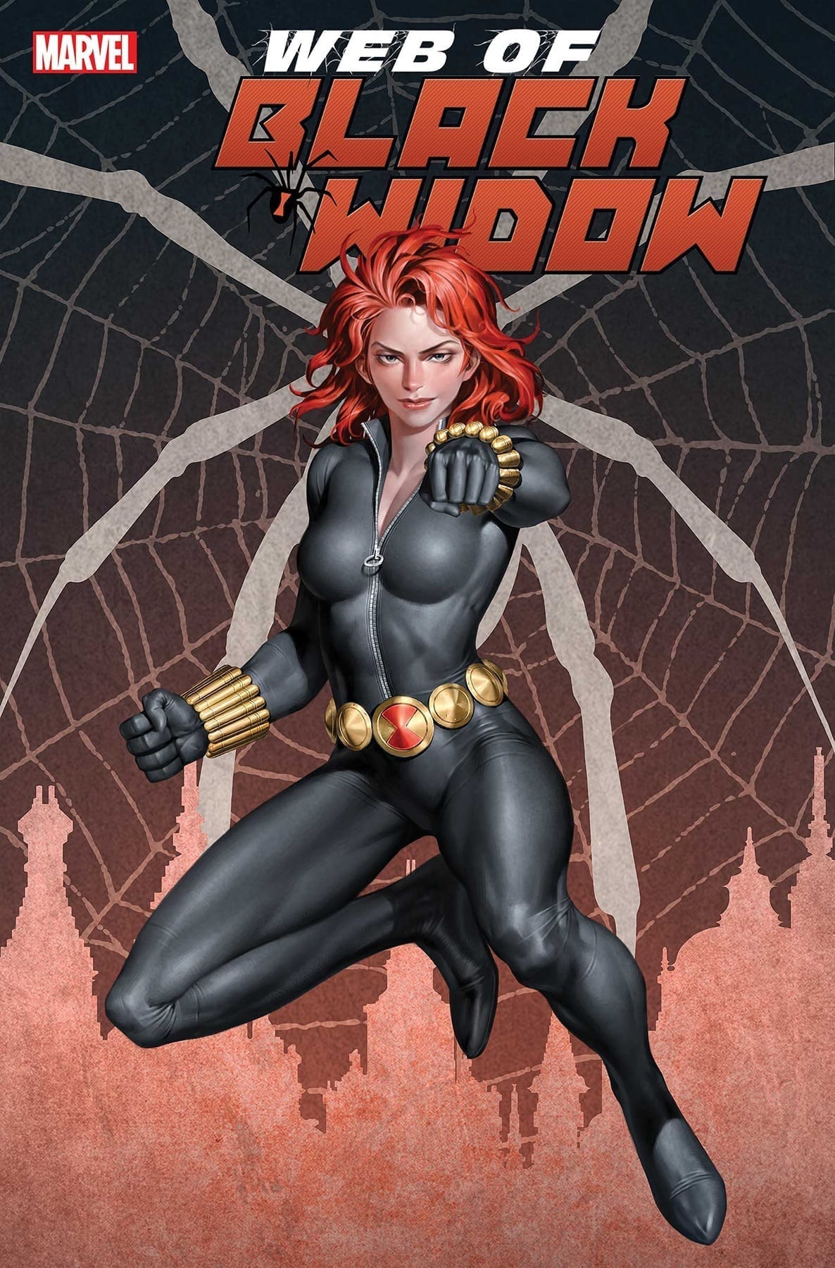
Natasha is looking sassy and smug on this final cover.

***SPOILER WARNING***

Web of Black Widow has been the tale of Natasha Romanoff, and how an enemy of her past was desperately seeking revenge. This was an enemy who knew the Black Widow well and knew exactly who to target to make the heroine look guilty.

This fifth issue concludes this miniseries, and it is a dramatic and compelling story right up to the end. This series is ideal for long-standing fans of Black Widow, but don’t let that statement intimidate any newer fans from giving it a go.

Never stop to monologue.

The Plot

Web of Black Widow has been a series that constantly compares the past to the present. For in this instance, Black Widow cannot escape her past. Thankfully, Natasha has always been the type to face her issues head-on, so running was never really an option for her.

Jody Houser’s writing in Web of Black Widow #5 was careful and intricate. This is the issue that wraps up the entire plot, after having already revealed who the antagonist is. Looking back on the rest of the series, you can clearly see the groundwork that was laid for the dramatic revelation that is about to occur.

Laying groundwork is something that is always easier said than done. Houser did an excellent job here. The elements were so clear as to almost be telegraphing what was about to happen – but not quite. Instead, they simply jumped to the forefront the moment it was all explained. It was quite clever.

There was something highly satisfying in seeing the resolution in this issue. Perhaps it’s because we were given a chance to see Natasha think outside of her normal bound box. Or perhaps it’s because we simply got a chance to see Black Widow in action once again. No matter the reason, it sure is good to see her up and fighting once again.

All the steps Black Widow took to get here.

The Art

Web of Black Widow #5 is a vibrant piece of art. The whole issue is highly stylized, with heavy shading and bold colors strewn about. It’s honestly the perfect fit for Black Widow, suiting both her darker past and her general nature.

This issue called for, unsurprisingly, a lot of flashbacks and scene changes. Yet each and every different scenario was distinct and immediately clear for what it was. That is yet another thing that is easier said than done. But it was vital for this particular plot.

Stephen Mooney was the lead artist on this project, with Triona Farrell providing those bold colors, and VC’s Cory Petit lending a hand for the lettering. Together they made this tale a memorable one.

And suddenly it all makes sense.

In Conclusion

It is actually sort of sad to see this plot conclude. But at least Web of Black Widow #5 did the series justice with its ending. This was an intricate tale, one that forced the Black Widow to face her past, while also acknowledging when she needed a little extra help. It was beautifully done and has once again raised our hopes for seeing her get a longer running series. Fingers crossed!

Monkeys Fighting Robots Youtube

The Enemy of Your Enemy in BATGIRL #42

BATGIRL #43, out this Wednesday from DC Comics, concludes the dramatic plot involving the Oracle. This entire plot has been a unique solution to the dilemma of tie-ins, and the end result has been a fascinating and alarmingly intelligent read.

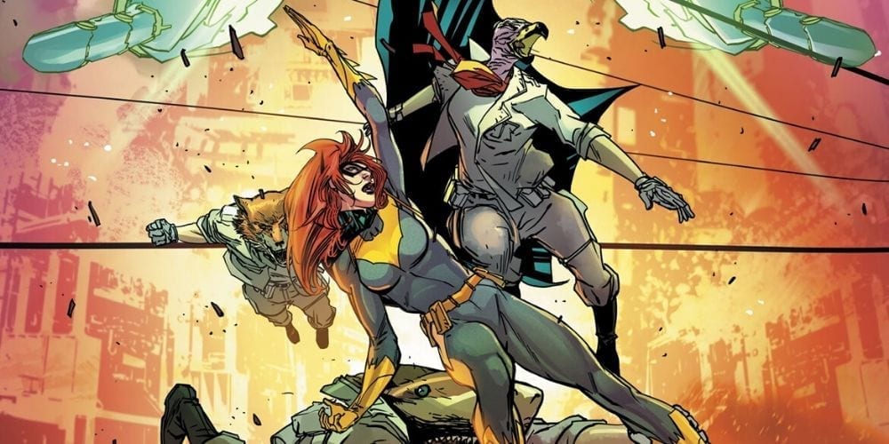
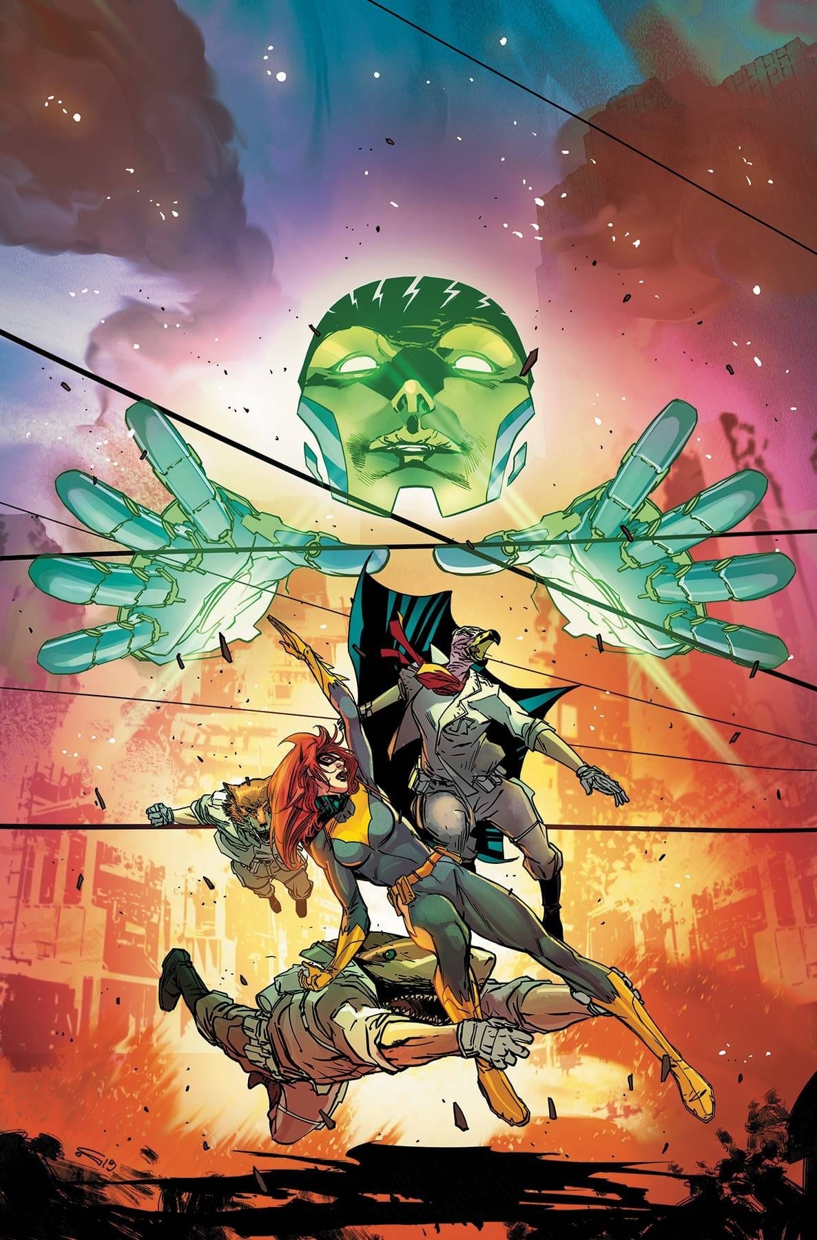
Batgirl #42 features the impending showdown of Batgirl vs the Oracle (and Oracle’s minions).

***SPOILER WARNING***

Oracle Rising has been a brilliant and intense read. Stemming from the Year of the Villain, this plot pits two of Barbara’s mantles up against one another. Barbara is Batgirl, and Batgirl is Barbara. But where does that leave Oracle?

As it turns out, Oracle herself (itself?) would like to know. And she’s feeling rather bitter and abandoned about the whole situation. This issue, Batgirl #42 concludes the plot, resolving the tension and so much more. But how far will Batgirl have to go in order to win this mirror match battle of the minds? Fans will be fascinated and curious to see how Barbara thinks her way of this mess.

And here’s a slightly better view of the battle, thanks to the virgin cover of Batgirl #42.

The Plot

Cecil Castellucci has done it again. Here is a compelling story of Batgirl, where she’s been forced to think outside of the box. That is to say, she has to think outside of her normal way of thinking. She’s already quite talented at seeing solutions that most others would overlook.

Batgirl #42 brought with it several changes alongside the conclusion. That’s to be expected, of course. But these changes, while surprising, also fit in nicely with where the series has been building up to for a while. We don’t yet know where it will go – but there’s no doubt that we’ll be finding out soon enough.

There were a lot of interesting elements to this issue. For starters, there was that delightful twist on the ‘enemy of my enemy’ concept. It worked brilliantly here and added some extra tension since none of us really knew how it was going to play out from there.
Then there’s Batgirl and her clever way of thinking. That was something we needed to see here. It was the perfect comparison to the way Oracle was thinking and acting. That made it the ideal way to conclude this plot, even though there is a lingering concern that the battle is not yet over (that whole rule about characters having to die graphically on screen before it’s truly over).

As far as tie-in plots go, this is one of the best ones to come out in recent times. It was clever, it was compelling, and it really shined a light on everything that makes Batgirl an ideal leading character. So if you’re looking for an example on how to merge two plots together, take notes.

This variant cover of Batgirl #42 isn’t afraid to take a breather and celebrate the holidays.

The Art

The artwork inside Batgirl #42 was vibrant and so alive. That probably had a little bit of something to do with the color palette – there was a lot of fire and explosions to be found in this issue. But it was also more than that as well.

Unsurprisingly, it’s the fight scenes and way Batgirl moves around the scene that really takes the show in this issue. Everything about her looks quick and decisive, which is fairly on point for her style. The creative team did an excellent job of showing all of that off.

Carmine Di Giandomenico was the lead artist for this issue, with Jordie Bellaire providing the colors, and Andworld Design doing the lettering. These artists work very well together, and we’re looking forward to seeing more from them in the future.

In Conclusion

Batgirl #42 was a fun and intense conclusion to an intriguing plot. It’s hard to believe that Batgirl and Oracle would ever be pitted against one another like this, but this whole plot arc has proven that it was both inevitable and exciting (to read).

Monkeys Fighting Robots Youtube

Battles and Delusions in CRONE #3

CRONE #3, out this Wednesday from Dark Horse comics, may be an issue full of fights and battles, but that doesn’t stop it from hitting shockingly close to home with its latest revelation. It would seem that Bloody Bliss’ past has truly come back to haunt her.

A disturbing cover is to be found for Crone #3. What will this foretell?

***SPOILER WARNING***

Crone has been the tale of Bloody Bliss – once a brilliant and terrifying warrior. Now she’s a broken old woman waiting for death. The last few issues have taught us that the past isn’t as far behind as one would like. Death and violence are once again terrorizing the people, with their only hope being Bloody Bliss’ return.

Crone #3 continues this dark and disturbing tale. Once again we find ourselves transported to this violent world, and it’s clear that the world hasn’t changed all that much. Despite Bloody Bliss’ best efforts. There’s something to be said in that, but perhaps it is best not to dwell on that thought too long.

A vibrant alternate cover of Crone #3, though arguably one that is also very concerning…

The Plot

Dennis Culver has once again woven an intricate and concerning tale. By merging Bliss’ past and present, we’ve had a unique opportunity to learn so much about a single character in a very short period of time. We’ve also been granted a glimpse of the world, and thus can clearly tell how little has truly changed.

It’s a concerning thought. But one that Culver likely wanted us to ponder while reading Crone #3. One thing is certain; Bliss may be old, but the fight is far from out of her. The same cannot be said about her weapon (which is still satisfyingly accurate).

The highlight of this issue is without a doubt the appearance of the new antagonist. This is the part of this plot that really touches close to home. Many of us will never have to face a physical battle the way Bloody Bliss has. But we have had to face her other enemy.

Almost every reader out there has likely faced a person who refused to take no for an answer. Given the culture we’re in right now, that is an openly discussed subject. So there’s something both alarming and personal about its addition in this series.

By this minor inclusion on Culver’s part, he’s managed to bring the entire battle home in a completely unexpected way. Suddenly we can connect with Bliss. And admittedly it’s going to make the inevitable beat down of the antagonist so much more satisfying.

The Art

As with the rest of the series, Crone #3 is full of brilliant artwork. The fight scenes are powerful and dynamic. Perhaps more so now that we’ve seen a version of Bliss that is capable of loss and failure. There’s something human in that, don’t you think?

Justin Greenwood has set the tone with his artwork in this issue. The character poses and expressions are a particular highlight, as they enhance the mood – while clearly broadcasting their opinions on what is happening.

Brad Simpson was the colorist for this issue, and his work is simply divine. The colors are rich and luxurious, regardless of which color palette is making an appearance on the page. His colors bring the characters – and their battles – to life.

Finally, Pat Brosseau was the letterer for this issue, and he did an excellent job. Brosseau has gone with an understated look, while also complementing the time period and art style with his choice of font.

In Conclusion

Crone #3 was another thrilling read in the series. Arguably, it’s the most intense yet, despite the decrease in flashbacks. There was something very human about the struggle shown, while simultaneously bringing the fight and threat to epic proportions.

Monkeys Fighting Robots Youtube

When Families Feud in FIREFLY: THE OUTLAW MA REYNOLDS

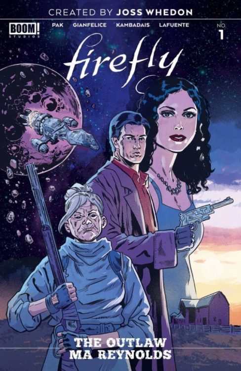
FIREFLY: THE OUTLAW MA REYNOLDS, out this Wednesday January 8th from Boom! Studios pits a son and mother against one another. Given that both are members of the Reynolds family, it’s safe to say that things are going to get explosive.

Ma Reynolds does not look like a woman to mess with on this cover of Firefly: The Outlaw Ma Reynolds.

***SPOILER WARNING***

Joss Whedon’s world lives on through the Firefly comics. It’s hard to believe that the series has continued on for so long, yet there is many a fan out there who will never complain about that fact. Especially given the short life of the TV series.

Firefly: The Outlaw Ma Reynolds may be a one-off issue, but it is one that ties directly into the core plot of the recent Firefly run. Thus, if you haven’t yet picked up the series, we’d suggest holding off on reading this one.

This issue immediately follows the events of Firefly #12. In Firefly #12, Malcolm Reynolds managed to bring an end to a new war that was about to erupt. Well, new in a relative sense. For this war is an old war; the battle between the Browncoats and the Alliance.

The Plot

Firefly: The Outlaw Ma Reynolds is a different and interesting sort of issue. If you’ve been following along with the series, this is not the first time that you’ve seen Ma Reynolds. But it might be the first time you’ve seen how she raised Mal.

It actually answers a lot of questions about Mal, come to think of it. He didn’t have a warm and happy upbringing – hints throughout the series and novels already told us that much. But the depth of that lacking wasn’t clear until now.

In essence, this issue pitted Mal up against his own mother. It was sort of comical in a way, what with the Alliance somehow getting Mal to work for them (long story). But it was also strange and surreal. It’s hard to picture this series of events taking place during the live-action run, but then again, things change.

Greg Pak managed to bring us a completely unexpected plot here. It’s safe to say that most fans would never have expected to see Mal working for the opposition, regardless of the reason for doing it. The conclusion was another surprising twist – one that may have made fans stop and stare at the pages. Or maybe not.

This black and white cover of Firefly: The Outlaw Ma Reynolds really forces you to notice the expression of each character, doesn’t it?

The Art

Firefly: The Outlaw Ma Reynolds is a brilliant example of artwork. It’s dynamic and fun to look at, and for a variety of reasons. While it doesn’t look exactly like the original show or movie, that isn’t a bad thing. The artists felt comfortable enough to run with their own styles here, and it worked out for the best.

This issue featured several talented artists working alongside one another. Davide Gianfelice and George Kambadais were the lead artists on this project. Their decision making behind the expressions of our characters was the highlight here, particularly in regards to showing the blatant conflict on Mal’s face.

Meanwhile, Joana LaFuente took charge of the colors. And those colors! There is so much to love about the color palette chosen here. It has a Western feel, which is appropriate, of course. But it also blends in several other elements. The end result is something truly magnificent.

Finally, Jim Campbell was the letterer for this issue. And you can see that he had a bit of fun with his work here. It combined nicely with the rest of the elements of this issue.

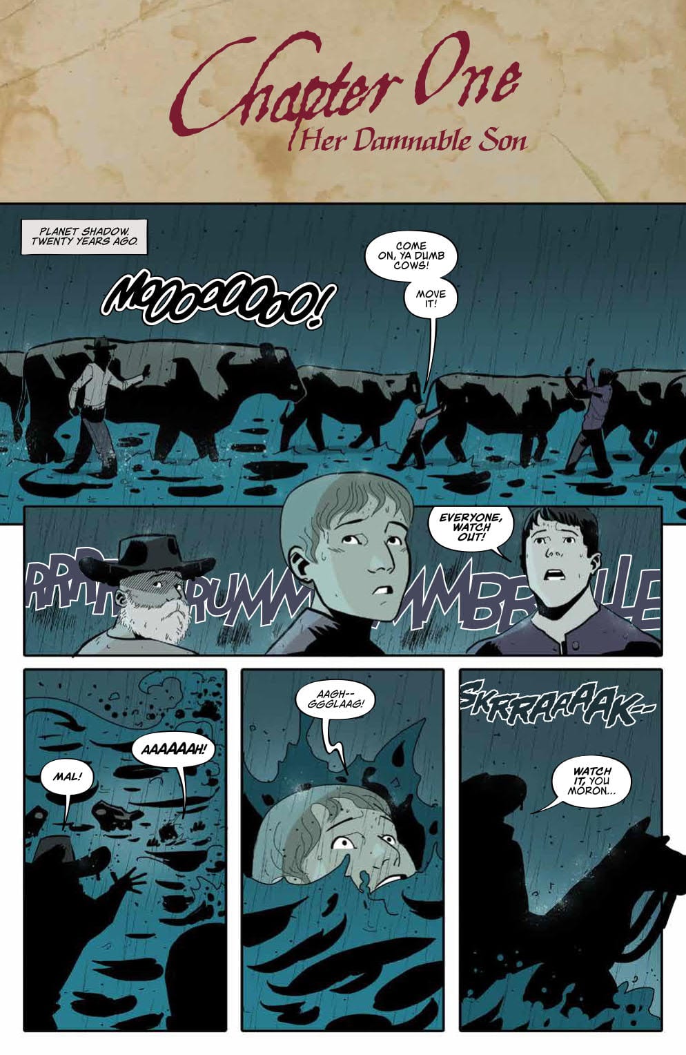
Here’s a rare sneak peek into Mal’s past.

In Conclusion

Firefly: The Outlaw Ma Reynolds was a unique reading experience. In some ways, it was a very heavy story, yet in other ways, it felt light and comical. It was an interesting balance to support a surprising tale.

Monkeys Fighting Robots Youtube

The Trials of Magic in NOMEN OMEN #4

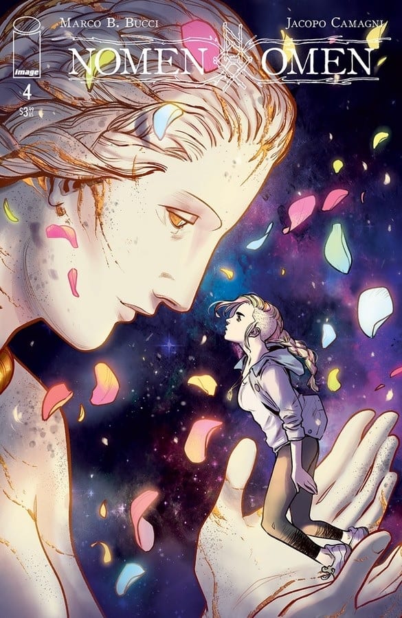
NOMEN OMEN #4, out this Wednesday from Image Comics is another stunning addition to a series of magic suffused into an otherwise ordinary world. There are unseen things at work in Becky’s life, and that is about to make everything so much more complicated for her.

A stunning (and slightly disturbing) new cover for Nomen Omen #4.

***SPOILER WARNING***

Thus far, Nomen Omen has been a unique series full of fascinating elements and brilliant artwork. Becky has not had what most people would consider a normal life. She hasn’t exactly had a calm life either, with all the risks to her life and health.

That brings us to the current plot. Something dramatic has been happing to and around Becky as of late. It’s forced to her step outside the realms of comfort, all while trusting a man who is most certainly not mortal.

This alternate cover for Nomen Omen #4 raises questions for who Becky is about to meet.

The Plot

Nomen Omen #4 was a very much appreciated issue, for a variety of reasons. For one thing, readers have finally been handed several answers to questions we’ve been asking since the beginning. There’s something supremely satisfying in that.

Marco B. Bucci did more than simply answer our questions. He wove us a tale of legend, lore, curses, and death. The situation that Becky is in is arguably more dangerous and dire than we originally thought. But it is likewise full of magic and brilliance. Will the two balance one another out?

Where the rest of the series has so far been steeped in a strong sense of mystery, Nomen Omen #4 took on a truly ethereal quality. That’s thanks in part to Becky’s quest for answers (and later, for survival).

That isn’t to say that this issue felt heavier, on the whole. There was actually a decent sense of humor to be found, especially when one is willing to read between the lines. Becky and the people she comes across and delightfully witty and sassy, and that helps to bring the tone back down to earth.

Becky is looking somewhat distressed on this variant cover of Nomen Omen #4.

The Art

Nomen Omen has always featured some stunning artwork. It’s dramatic and unafraid to take risks – as evidenced by that unique yet striking color palette. And Nomen Omen #4 does not break that mold.

The artwork in this issue was beautifully, especially when surrounding the two women whom Becky sought after for help and guidance. They were, simply put, stunning. Though both in their own ways.

Jacopo Camagni is the artist responsible for essentially everything but the lettering in regards to the artwork in this issue. They did an excellent job of portraying this series of events. If we’re being honest, the series would not be the same without Camagni at the helm of the artistic side of things.

Fabio Amelia from Arancia Studio was the letterer, and they did an excellent job of working the story visually into the pages. It is subtle and unobtrusive, which is ideal when your eyes desperately want to wander the pages instead.

And here is a sneak peek at what is to come, with the cover for Nomen Omen #5.

In Conclusion

Nomen Omen #4 was an issue well worth the wait. We’re finally getting answers, while still being unsure of what will lay ahead in Becky’s path. We do know one thing, and that is the fact that she only has so much time to resolve what has been done. And we’re very much looking forward to seeing it happen.

Monkeys Fighting Robots Youtube

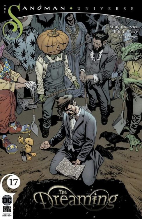
Review: A Peaceful Unmaking in THE DREAMING #17

THE DREAMING #17

The Dreaming #17 is one of the most poetic and emotional chapters in this story so far. In fact, it’s likely one of the most beautiful chapters in all of the Sandman saga. Writer Si Spurrier’s complex but easily navigable plot is assisted by Bilquis Evely’s artwork in what is only the second to last issue of their phenomenal run.

Wan’s takeover of Dream’s realm is nearly complete. As his identity slips away, Abel only has one secret left in his pocket. And poor, tortured Lucien, lost and without purpose, longs for nothing but release, and to return to the foundations of the Dreaming. So why can’t he go? Does he have a purpose yet to serve? If he wants to die…why must he continue to pay the high cost of living?

Writing & Plot

Spurrier’s wide range from eloquence to simplicity in his writing is matched only by how tightly plotted his threads are. The complexity of The Dreaming‘s story so far is crescendoing to a tense and unpredictable climax. There truly is no way to guess at how this tale will end, and this of course makes it all the more engrossing. Spurrier’s often poetic narration is again reminiscent of Gaiman’s Sandman, but he still makes it his own. There are emotional beats and a specific character callback that will both thrill and devastate longtime fans of this universe. Again, this is a rather complex story, much like its predecessor and “Sandman Universe” cohorts. There can be quite a bit to keep track of and sometimes cryptic language to pore over, but it’s absolutely worth it to those who will give it the effort. Spurrier proves once again that he has been the perfect choice to take readers back to the realm of dreams, and it will be a wonder to see how his tale wraps.

Art Direction

Artistic phenom Bilquis Evely returns to The Dreaming to lend talents to the creation of this mythical setting. Once again, she succeeds in brilliant spades. The immense originality and detail given to this world made of dreamscapes is utterly breathtaking as usual. Environments are painstakingly drawn and delightfully unpredictable. Character features are as varied as the massive cast itself. Emotional moments are drawn with every ounce of artistic pacing imaginable. The colorwork by Mat Lopes is equally brilliant, using a massive array of gloomy and bright colors that give life to Evely’s pencils. The visual spectacle of this issue matches that of all of Evely and Lopes’ other issues, and that’s the highest praise that can be given here.

The Dreaming #17 is once again a poetic and beautiful triumph. Spurrier’s tight unpredictable plotting works hand-in-hand with his wide range of writing talent. The incredible artistic dreamscapes and emotional moments captured by Evely and Lopes are some of the best work in the medium. The Dreaming continues to be one of the best comics being published right now. With only one issue left in their run, be sure to keep picking this series up at your local comic shop.


Monkeys Fighting Robots Youtube

Review: Matt Fights For The Soul of Hell’s Kitchen In DAREDEVIL #16

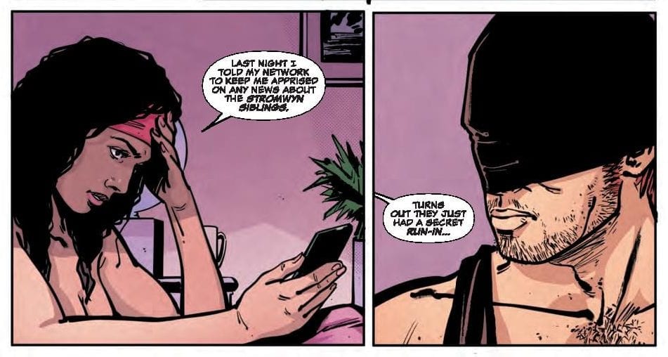
Matt's heart breaks over Hell's Kitchen

DAREDEVIL #16 hits comic book stores Wednesday, January 1st, and it looks like our hero, Matt Murdock, is juggling many moving pieces in his life. His romantic rekindling with Elektra complicates his relationship with Mindy Libris (who’s happens to be married), and the brother of the man Matt accidentally murdered is seeking legal action. On top of this, crime levels have risen in Hell’s Kitchen after the Stromwyn family bribed the NYPD to stay away, allowing crime levels to rise. Now the former horned head is looking for answers, and he’s willing to take on the Stromwyns, Kingpin, and whoever else stands in his way.

Story

Matt, along with Elektra, has been working to bring down crime levels in his hometown—but apart from the superhero identity “Daredevil.” He hopes he can forge a new identity in which to protect Hell’s Kitchen while minimizing casualties. But in this issue we see the intimate side of this partnership, albeit laced with talk of the next mission.

Following a lead to Wilson Fisk, Matt heads out to find the crime lord in hopes of learning about his connection to the Stromwyns. But a thorough interrogation unveils the truth: Fisk had nothing to do with the NYPD’s withdrawal.

It seems Matt and Elektra may need to take the fight directly to the heart of the storm.

Writer Chip Zdarsky has been pushing Matt through a gut-wrenching personal transformation for the entirety of his run, and this issue is the perfect example. We see Matt patrolling the city in a whole new way by simply absorbing the conversations of families across the city, rather than with a specific “goal.” In a way, he’s becoming more in touch with the “soul” of the city.

Artwork

Jorge Fornés’s penciling and ink work, Nolan Woodard’s coloring, and VC’s Clayton Cowles’s lettering came together as a cohesive set of artwork for DAREDEVIL #16. The lines are well-defined, yet employ the perfect amount of heavy shading to keep with the series’ dark tones. In addition, the coloring mimics city lights on the buildings of Hell’s Kitchen. The lettering was great as well, employing varying dialogue boxes and fonts to distinguish Matt’s speech from his personal thoughts.

Comic Covers

Main Cover

Julian Totino Tedesco’s main cover illustration depicts Matt and Elektra in a passionate kiss to showcase the rekindling romance that’s become a large focus in this storyline.

Marvels X Variant Cover

Ryan Benjamin and David Curiel’s variant cover artwork features a (literal) demonized version of our hero, showing how the identity Matt supposedly left behind continues to creep into his life.

Conclusion

DAREDEVIL #16 shows readers an deeper look into Matt and Elektra’s relationship while developing the drama between the NYPD, the Stromwyns, and Hell’s Kitchen.

What do you think lies in store for Matt and Elektra’s future? Let us know in the comments below!

Monkeys Fighting Robots Youtube

Review: Tim Meets His Future Self In BOOKS OF MAGIC #15

BOOKS OF MAGIC #15, available in comic book stores Wednesday, January 1st, dabbles in time travel with the introduction of an alternate version of Tim from the future. Tim has been told of a possible future in which he wreaks destruction, but there are undoubtedly other timelines in which he fights for good. Either way, Tim must find a way to decipher this visitor’s true intentions lest he endanger himself and his friends. But are there any people left in his life that he hasn’t ostracized?

Story

Tim is one frustrated young magician, more so than usual. His friends have abandoned him, fearful of his powers, and his teachers aren’t going easy on him in class. On top of this, a magical cult is after him.

Tim believes the threat is abated for a little while thanks to John Constantine’s meddling in BOOKS OF MAGIC #14. But Ms. Rose cues him in on another threat; a group with the magical world’s law on its side.


dc comics exclusive preview books of magic #!5

The young wizard leaves school abruptly to get some air, but runs into a twenty-something man who looks a lot like himself. This stranger reveals himself to be a version of Tim from the future.

Writer Kat Howard portrays Tim and his future counterpart beautifully in this issue. Each has their own distinct personality, yet retain the qualities that make readers enjoy the character: his feistiness, rashness, and general awkwardness. It was a delightful touch that made this story enjoyable.

The older version seems like a good guy, especially after helping Tim save people in danger on the streets of London, but can Tim trust him?

Artwork

Tom Fowler’s penciling, Craig Taillefer’s ink work, Jordan Boyd’s coloring, and Todd Klein’s lettering were each pieces of the beautiful artwork found in BOOKS OF MAGIC #15. The scene settings feature crisp, solid lines that fully define the characters. Each individual figure is given their own unique colors to highlight their personalities, such as Tim’s bright yellow jacket to distinguish him from his fellow boarding school classmates.

The lettering was a nice feature of this issue as well, specifically in distinguishing between the present and future Tims. Each character’s dialogue is placed within letter boxes that look just like scrap pieces of paper, though they’re cast in different colors. This helps emphasize the sense of continuity between the two magicians at opposing stages of life.

Comic Cover

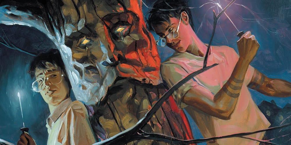
Kai Carpenter’s cover features Tim and his future self, opposing one another on either side of a mystical tree. This shows readers the animosity that will ultimately brew between them and the magic in the middle of it.

Conclusion

Tim’s existential crisis appears to have been slightly abated due to his doppelganger’s treachery, but there’s still a lot of factors up in the air. We’re anxious to see what Tim decides to do next.

What do you think the future Tim has in store for the Tim in present time? Let us know in the comments below!

Monkeys Fighting Robots Youtube