Home Blog Page 364

Review: Rich Plot, Uneven Pacing in 20XX #2

20XX #2

After an unceremonious introduction, Mer finds herself suddenly swept into the world of the sym gangs in 20XX #2, out this week from Image Comics.

Surviving the attack by East Side gang members, Lucas brings Mer to meet with the West Side leader. The question: how will she choose to use her new powers, and where will they lead her now?

The Writing

Our first issue of this four-part series focused primarily on establishing our story, worldbuilding, and introducing the cast of characters. With 20XX #2, though, the creators toss the reader into the deep end of the pool. The intricacies of inter-gang politicking take up most of this issue, with our protagonist barely managing to keep up.

Writers Lauren Keely and Jonathan Luna pack a lot of information into this single issue. The book is fast-paced in terms of how it’s plotted. However, characters tend to be rather long-winded, with a lot of dialogue crowding each page. The result is that the book can feel slow, despite actually moving along quite fast.

The writers also deepen the story significantly with 20XX #2, adding several new threads to the larger plot. We have more characters, each reacting to the state of the world in different ways. We have drug dealing and conflict between rival sym factions. Then, we have Mer’s life outside of the gang, as she tries to adjust and meet other nonaligned syms. It’s a rich narrative…almost to a fault. This all might have been helped by having one or two more issues to spread across, given the relative complexity of the story. This would have helped with the pacing of the story.

Keely and Luna aren’t subtle about the themes of oppression and fear regarding the sym population in 20XX #2. While it can be a bit heavy-handed, it’s still within the realm of believability, given the scope of this disease. It’s entirely believable how a disaster on this scale, compounded by catastrophic climate damage, might have warped society significantly.

In all, the writing is strong. Almost too strong, truth be told; as mentioned, this story really feels like it will need more than four issues to tell in a satisfying manner.

The Artwork

In addition to writing, Luna also provides illustrations for 20XX #2. The character designs are excellent overall, with the artist opting for a realistic style. The precision of the inks, along with the softer designs and lines and the absence of colors, gives the work a soft quality that is easy on the eyes.

Luna’s characters are generally expressive, and convey a sense of liveliness and animation. The reader can pick up on the doubt, confusion, or shock conveyed in a character’s eyes and body language. There are points at which they can feel a bit stiff, though, so it’s not as consistent as one might like.

While there is considerable detail in the illustrations, the settings themselves are very minimal. We see a lot of nearly-empty rooms and blank walls, with maybe a table or a window being the only set dressing. As a result, much of the focus is on the characters. That said, the figures feel almost as if they’re interacting in a blank void through much of the book.

Final Thoughts

20XX #2 is a solid second chapter for this miniseries. It’s a rich and complex story that holds the reader’s attention, even through the sequences of extended dialogue.

Monkeys Fighting Robots Youtube

Indie Comics and Creator-Owned Comics: What’s the Difference?

Indie Comics demonstrate the difference Alternative Comics

Indie Comics are becoming more popular, but most websites mislabel indies as creator-owned content. So what exactly is the difference between the two? Another site, “What’cha Reading?” also asks this question. Because let’s face it, what some people view as independent is not the same as what others think. This is the research from the gutters.

The People’s Definition of Indie Comics

The Uniques on originality
Who says Indie Comics need to be original?

According to Investor Words, any independent company is “a company not controlled by another company.” For comics, this has a lot of meanings; as Chuck Suffel of What’cha Reading points out, “independent seems to be one of the more nebulous terms.” Some say indie comics mean non-superheroes, thanks to titles like Elfquest or Bone. But there are several superhero titles like The Uniques that stand contrary to that statement. Others say that indies are any comic other Marvel or DC because of those publisher’s popularity. All of those, however, detail alternative press comics. Image and Dark Horse comics are just as popular, complete with IP notoriety, which comes to another argument.

Who Owns What?

So publishers, like Image and Dark Horse, host publishing platforms where creators retain the IP rights. Other publishers like Oni Press and IDW use this model as well. However, some of these other publishers are under higher ownership. IDW, for example, is part of Idea and Design Works; Oni Press and Valiant meanwhile got bought out by larger corporations. In layman’s terms, those companies’ series are not really indie comics. As for Image and Dark Horse, they’re another story.

Image and Dark Horse have no corporate owners, but they do have influential support systems. Dark Horse, for instance, is an overall entertainment company, the comics are now a division of the primary one. The rest of the company handles deals like merchandise or Netflix shows. Most of these companies have plenty of resources and don’t usually require additional help. That’s not to say some companies don’t try to take some advantages like Kickstarter.

Indie Comics Lack Support

To support themselves and cover the costs to keep publishing his or her comics, a few creators use crowdfunding websites, including “Kickstarter” and “Indiegogo.” Unfortunately, without established fanbases or viral hits, the financial angle proves to be difficult.


Most creators don’t even get a stable income from Patreon alone as Graphtreon displays. Of them, only the first ten publishers on the list make sales money comparable to annual small business sales near $100,000. Even MFR favorite indie comics series God-Puncher doesn’t receive a lot of support; just look at creator Lane Lloyd’s Patreon. Yet the use of crowdfunding to sustain themselves shouldn’t be what makes something indie. Even established artists like Jimmy Palmiotti have these accounts. One Image series does give some insight into the difference between indies and creator-owning comics.

The Indie Comics Connection

In Airboy by James Robinson and Greg Hinkle, Image publisher Eric Stephenson calls Robinson up for a job offer. This displays the main difference between creator-owning, alternatives, and indies more than anything, connections. Robert Kirkman, for example, mainly got into Image Comics through any connections he could find. Also, while Image Comics doesn’t own the series it publishes, the company owns the publishing, marketing, and distribution rights. Look no further than the copyright details saying “no part of this publication may be reproduced or transmitted, in any form or any means.” Meaning while the creators own creative rights, they can’t sell the comics on his or her terms. Not without a lot of paperwork anyway. It’s a different story if the creator owns both the series and publisher.

One such publisher is “Benitez Productions” and series Lady Mechanika. Joe Benitez owns both properties, and his website allows him to sell his products to consumers directly. However, Benitez holds several connections, not unlike Image or Dark Horse. This includes but is not limited to “Diamond Comics Distribution Inc.” which provides access to distribution. Indie publishers like “Unlikely Heroes Studios” however lack some of these connections unless they meet some criteria.Zach Dolan, you are an inspiration to indie comics.

The Non-Indie Criteria

Companies like Amazon and Diamond seem to have some high mark criteria to have anyone’s series featured. Amazon appears to be more lax as long as there is some hype or popularity behind something. UH Studios’ primary series Super! for example is available on Amazon unlike UH’s other series and merchandise. This is no small feat, as even companies that exist in name only like “Space Goat Publishing” still have content that can be purchased like Heroines. Diamond meanwhile has an even bigger threshold.

Diamond holds a near-monopoly over comic book markets, and it takes more than a cult following to get on its catalogs. According to Pen & The Pad’s Fraser Sherman, the publisher needs to make $2500 in retail orders. That requires quite a bit of networking to achieve, from paying for con booths to promoting at local bookstores. Most indie comics can’t even afford to mass print without crowdfunding.

The Price To Be Indie

This brings up a pretty decent question that a few creatives, including Michel Fiffe, likely go through. Is being a publisher independent of these support systems and connections financially worth it? Even the likes of Fiffe and Tesladyne had to compromise their independence by making deals with the creator-owned companies. When looking at circumstances like that, it’s no wonder people get the terms confused.

What do you all think; is a lack of licenses and business connections the thing that separates indie comics from simple creator-ownership? Leave your thoughts in the comments.

Monkeys Fighting Robots Youtube

WRETCHES #2 – New Worlds, New Characters, Same Mission

Shea’s search for her kidnapped brother continues in WRETCHES #2 as she runs into a badly beaten bot that maybe her only chance of finding Sean.

Wretches #2 Roughs to Pencils to Inks by Salo
Salo Farias Roughs to Pencils

If you need a refresher on Wretches #1, check out our review, then pick up the second issue from Scout Comics’ store.

From Wretches to Riches

Wretches #2 may not have the grandiose opening pages as the previous issue, but James E Roche grabs your attention nonetheless. Shifting the focus from the kidnapping of Sean, Roche instead introduces the reader to our new “Shocker Junkie” character, Burr. At first, the sudden shift to a new character comes as a surprise. This is due to it feeling as if Roche has dropped the plot of Shea finding her brother. But, by the end of Wretches #2, Roche develops Burr enough to were you want to know more about him while tying him into the overall scheme.

That’s not to say Roche focuses only on Burr throughout, as we get a quick glimpse of how well it’s going with Sean. But before going back to Burr, he shifts back to who we’ve all been looking for, Shea. Roche writes each character distinctly, with Shea being the most badass as she eats up every scene she is in. The one interaction shown of Shea showcases how she isn’t someone you want to cross, especially when she is on a personal mission. Even on the crime-ridden planet of Manerah, you’d never want to cross her path.

Wretches #2 Page without words.
Interior art by Artist Salo Farias, Colorist Chunlin Zhao

Art Worthy of The Crime

Although the focal point of the story changed, artist Salo Farias keeps the same vigorous energy from the first issue in Wretches #2. The planet our characters visit is labeled as the underbelly of a crime-ridden world. Even if this information was never stated, Farias’ art perfectly portrays this idea. The locations seen throughout Manerah gives off a cluttered and slimy vibe as if things that shouldn’t be spoken of transpires there. The times we are shown what occurs in Manerah, Farias makes sure the art hits all of your senses.

Helping Farias’ art take over your senses is the rough colors by Chunlin Zhao. In this sense, “rough” is for the dirty, gritty, dusty colors Zhao adds to the pages. The colors Zhao employs during some of the exterior shots of Manerah hits you so hard you’ll be tasting the grain. Yet, Zhao doesn’t color everything rustic. By adding in bright or light colors throughout Wretches #2, Zhao adds in colors that complement each other. During a panel that features a darker color palette, Zhao amplifies it with a bright/blank background.

An element that stood out significantly in the previous issue was letterer Chas! Pangburn’s use of varying designs for aliens. This multitude of different word bubbles and narration boxes return in Wretches #2. Pangburn’s fantastic lettering isn’t limited in differing alien lettering, as when a character shows emotion, he makes sure you read it in said tone. Throughout Pangburn uses the issue as a lettering sandbox, which works out magnificently.

Wretches #2 behind the scenes.
Pencils by Salo Farias

Conclusion

Even though Wretches #2 changes its spotlight to a new character (whom we’ll see more of), the one chance we see Shea shows how great of a character she is. That’s not to bring our new character Burr down, as his moments are equally as fun while adding in a fair amount of world-building. Combine that and the fantastic visual elements, and you’re treated to a tremendous follow-up issue.

Cover Story: The standard cover of Wretches #2 is impressive, yet I love the Farias and Marc Sintes variant. The variant mirrors the original to a degree, but the duo pumps up the brutal meter making for one epic cover.

Variant by Salo Farias and Marc Sintes

Dear Reader

If you got the chance to check out the first and second issues of Wretches, let us know what you think down below.

Monkeys Fighting Robots Youtube

GHOST-SPIDER #6: Is This A ‘FANTASTIC’ New Arc?

Gorgeous cover by Greg Land and Frank D'Armata

Hitting the shelves this week from Marvel Comics, Ghost-Spider #6 kicks off the newest adventure for our favorite inter-dimensional webhead.

We take a step back from The Jackal and all the oddities that follow him this issue. Ghost-Spider #6 starts five years back to show the Storm siblings, Susan and Johnny, are actually models in Earth-65, pompous, rich, models. We then jump one year ahead to see a younger Gwen watching the news showing the Storm siblings have gone missing since their tour in Latveria.

Yup. Those are the Storm siblings. Very different from what you might expect.

Previously, we have seen Earth-65’s Ben Grimm and Reed Richards already. Richards is a child genius who has developed tech for Gwen in the past, and Grimm being a police officer in the same precinct as Captain Stacy. Now that we have all four, and a name drop of “Victor Von Doom” in this issue, one can only imagine what’s in store for us in this next story arc.

Additionally, this issue has Gwen enjoying her life some more. We see her getting along well with her friends, including MJ, for once, and we even get a wholesome father-daughter interaction between the Stacys with a fun twist you won’t find elsewhere.

With the last issue ending on The Jackal’s escape and the death of Earth-65’s own Miles Warren, it’s a little awkward moving on from that arc right away. That being said, I don’t think we’ve seen the last of The Jackal or the weapon Earth-65 Warren created to potentially kill Gwen’s symbiote. All of that seems to be on the back burner for now.

Ig Guara and Rosi Kämpe handled the art for this issue; as such, it resembles the earlier issues of Spider-Gwen: Ghost-Spider before Takeshi Miyazawa started working on it. The style is very fresh, and the shading reminds me of a more pointillistic style with the shadows being dotted in.

This page is so sweet. It might be the calm before the storm, but I hope the calm just lasts a little longer, and we get more of these fun moments.

The best part of Earth-65 is honestly Earth-65. The constant purple shading over everything and the neon-colored windows and lights that pop out add so much character to the setting and show just how different it is from Earth-616. Ian Herring continues to prove he has an understanding of these palettes with His spectacular coloring issue to issue.

As mentioned, there’s a good scene between Gwen and Captain Stacy in this issue, and the lettering for that scene takes it up a notch. Their conversation feels genuine, and the pacing between them feels natural for a father-daughter discussion. They don’t seem like they’re fighting, because they’re not. They’re disagreeing and not outright exploding at each other. This shows a lot of progression in their relationship, as Captain Stacy seems to be accepting that Gwen’s grown into her own person.

Overall, Ghost-Spider #6 is a fine start to what’s coming next for Gwen. We get to continue seeing the average day of a more grounded superhero with a unique situation where everyone knows exactly who she is. There’s a lot of charm in this character that you won’t find in other comics.

While it’s still very up in the air what direction this arc will take, it’s off to a fun start in its ambiguity. Writer Seanan McGuire has a passion for writing this character, and it clearly shows in each issue. McGuire’s run has been a more uplifting tale of Gwen’s redemption. Something very different from the original started by Jason Latour and Robbi Rodriguez. Ghost-Spider has been very different from what I expected it to be, but I am still excited to see what happens every time a new issue drops.

Are you keeping up with Earth-65? What other characters’ doppelgangers from this Earth would you like to see? Let us know in the comment section below!

Monkeys Fighting Robots Youtube

Marvel Comics Exclusive Preview: VALKYRIE: JANE FOSTER #7

marvel comics exclusive preview valkyrie jane foster #7

Valkyrie: Jane Foster #7 hits your local comic book store January 15th, but thanks to Marvel Comics, Monkeys Fighting Robots has an exclusive four-page preview for you.

About the issue:
TIME OF DEATH: NOW!
Valkyrie teams up with Marvel’s Mightiest Medics to save the life of the ultimate patient – Death herself! With a universal force on the cosmic operating table, the end of everything is one slip of the scalpel away… but has one of Jane’s surgical team forgotten their Hippocratic Oath?

Valkyrie: Jane Foster #7 is by writers Al Ewing and Jason Aaron and artist Pere Pérez, with colors by Jesus Aburtov and letters by Joe Sabino. The main cover is by Mahmud Asrar and Matt Wilson, with the variant cover by Kris Anka.

One could call Valkyrie the successor to Jason Aaron’s incredible 7-year run on Thor, as it continues the story of Jane Foster, and Aaron himself is co-writing.

This issue will also be co-writer Al Ewing’s final issue; starting with issue #8 next month, Norwegian writer Torunn Grønbekk (whose name literally means “to love Thor”) will join Aaron as co-writer.

Check out the Valkyrie: Jane Foster #7 preview below:

marvel comics exclusive preview valkyrie jane foster #7

marvel comics exclusive preview valkyrie jane foster #7

marvel comics exclusive preview valkyrie jane foster #7

marvel comics exclusive preview valkyrie jane foster #7

marvel comics exclusive preview valkyrie jane foster #7

marvel comics exclusive preview valkyrie jane foster #7


Are you reading Valkyrie: Jane Foster #7? Sound off in the comments!

Monkeys Fighting Robots Youtube

I’d Buy That For A Dollar: SPAWN #10 (May 1993)

I'd Buy That For A Dollar

Welcome to ‘I’d Buy That For A Dollar’ a column where I will be exploring the weird and wonderful world of dollar bin diving. The only rule is each and every comic is purchased for one dollar (or less!).

This week’s comic is the infamous Spawn #10.

Spawn

Spawn #10
Story by: Dave Sim
Art by: Todd McFarlane
Letters by: Tom Orzechowski
Colors by: Steve Oliff & Reuben Rude

This issue was guest written by Cerebus creator Dave Sim (Cerebus was one of the longest-running indie comics in history and had a huge and controversial impact on the industry). Sim, along with Allan Moore, Neil Gaiman and Frank Miller were all brought in by Spawn creator Todd McFarlane and given an issue to write. It was news making at the time as Spawn was the biggest book in the market and all those writers were giants. What’s interesting about this issue specifically is that it’s the only one not reprinted in recent trades and collections of Spawn. So the only way to find it is in the wild world of bins!

The issues themselves were all also pretty good, with Sim’s being the weirdest. Where all the other writers sort of stuck to the Spawn mythos, Sim (ever the rebel) turned his story into a commentary on the ownership of artistic creation, specifically when it comes to comics. The whole thing is actually very clever and it’s an entertaining read too. But as a fifteen-year-old comics nerd, it went way over my head at the time it came out.

It was great finding it again in the wild and even greater reading and flipping through it with more mature eyes. Anyway, let’s take a look!

Here’s my copy. I love this cover (I love McFarlane’s black and white pencils and any chance to see them is great!)

Spawn

Next up is an early page that I think highlights how awesome those early issues of Spawn looked. There’s a great use of composition below and the colors are fantastic. It’s a beautiful page.

Spawn
Love the linework on the roman numerals and I ADORE the small Spawn image in the lower left.

The next image I want to focus on is a two-page spread the is the image I think most people will remember from this issue. If this issue is an essay, then this image is the thesis.

Spawn
Can you name all the character arms?!

It’s pretty striking and not subtle at all huh? Sim’s telling us selling your creations is literally putting them in a cage. The tied up and blindfolded just further pushes it; when you sell your creation you also make it impossible for you to ever have any say or control at all.

Pretty heavy stuff to throw in a book that was still not even a year into it’s run. In hindsight it’s was a daring fucking move and doesn’t stop there. Here’s another critical image.Spawn

Earlier I noted how much I loved these early Spawn issues. Let’s take a look at another beautiful page for the sake of the art alone. I love how colorful and alive the page feels.

Spawn

And then there are these great, small black and white moments too.

Spawn

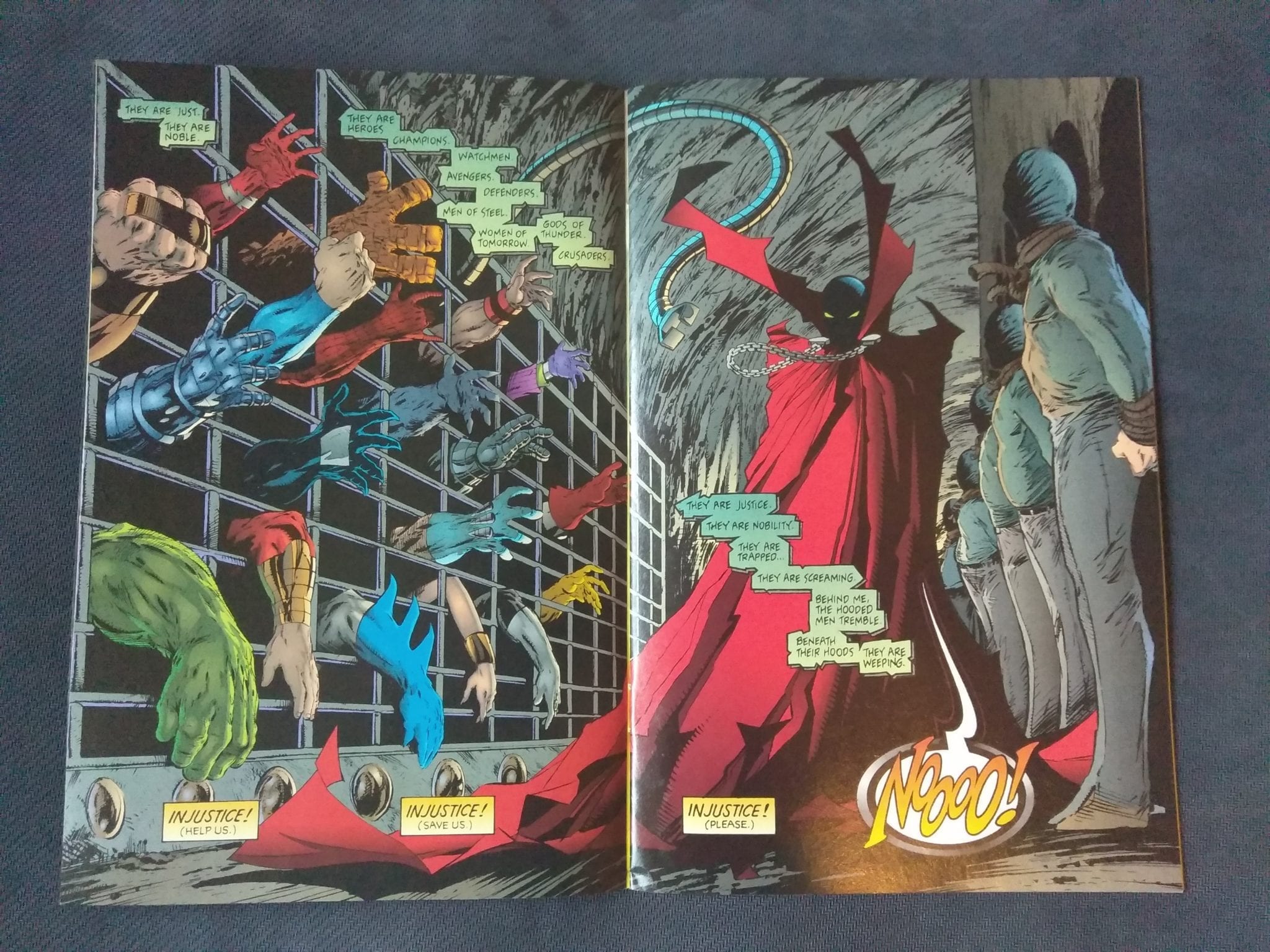
And then we get the final image of the issue, which drives home the ownership passion once again.

Spawn
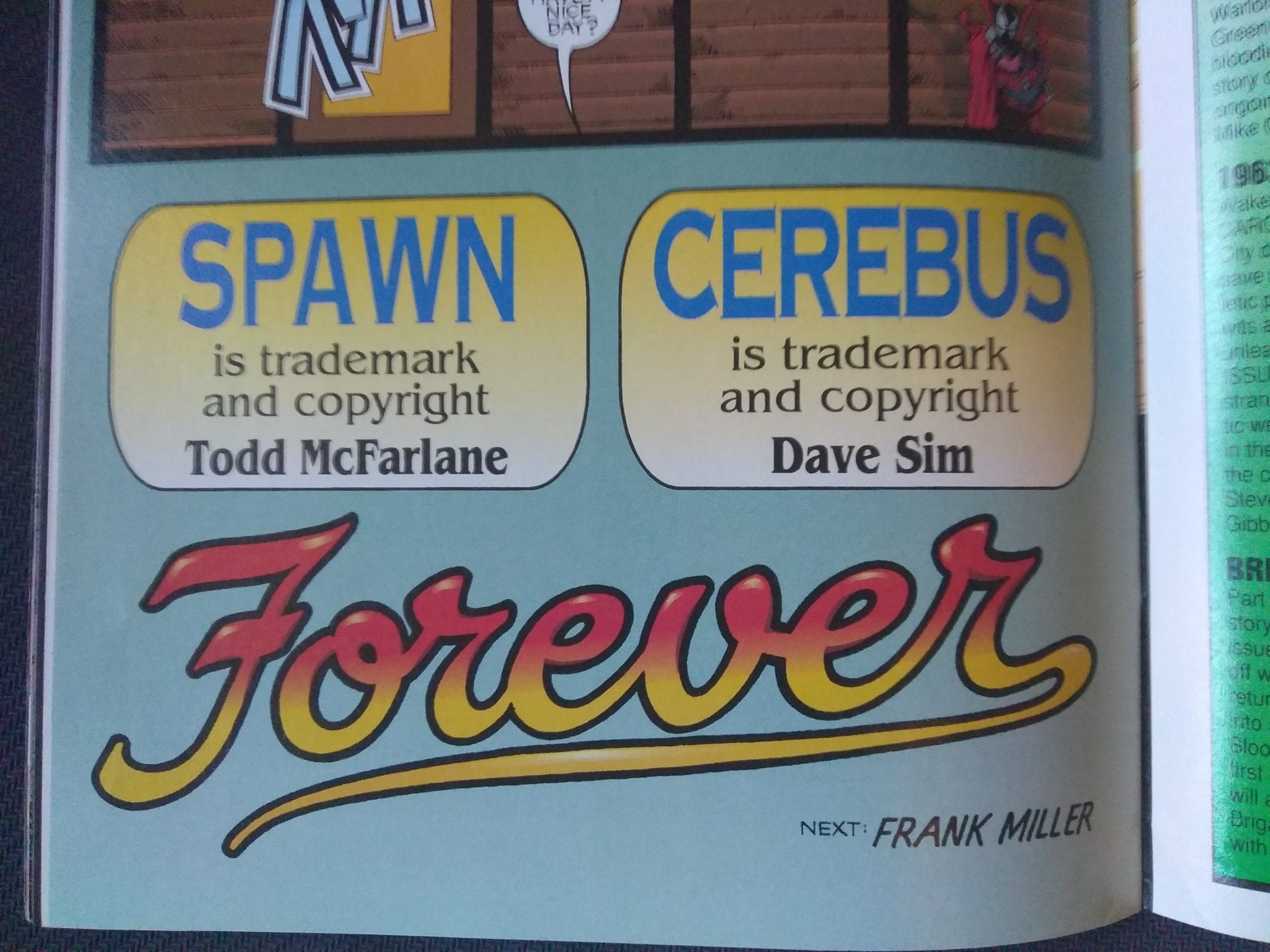
Spawn #10 was a definite great find and honestly, it belongs in any solid 90s comic book collection. Grab it if you see it!


You can find great dollar bins at almost every local comic shop. So find a shop, ask a comic clerk and start bin diving!

Got your own awesome dollar bin finds? Toss them at me! 
Send emails to manny@monkeysfightingrobots.com
Follow me on Instagram: _idbuythatforadollar_
Tweet at me: @MannyG1138

Monkeys Fighting Robots Youtube

Review: BATMAN #86 Begins A New Story With a New Creative Team

A New Era of Batman Begins

It has been a long time since the Batman title has had a new creative team. Tom King has been covering the series since Rebirth began and has made quite a few changes to the status quo, for better or worse. While it started strong, the series became more and more of a headache with flashbacks, twisting narratives, and one of the most disappointing weddings in comic history.

King’s run ended with Bane sent away, and Alfred dead. This isn’t the first time we’ve lost Alfred, but one of the first times in the prime DC universe. What will Bruce do now that his oldest ally is gone?

Batman 86 Cover

**Some Spoilers Below**

Story: 

Bruce Wayne has been pushing for the reconstruction of Gotham in the wake of Alfred’s death. With his name and charm, he is able to convince the politicians to build the improvements fast. Bruce has made differences as Batman as well. He asks Lucius Fox to create a new set of devices to help fight criminals easier.

Along with a brand new bat-like flyer, he is also given devices to project shadows of himself to face criminals. This is terrible news for the first group Batman meets: A group of assassins lead by Deathstroke. Meanwhile, The Joker kills off his entire crew as he plans the perfect crime.

Batman 86 p1

It feels refreshing to start from square one. The last time we had a Batman tale without all the extra baggage was I Am Gotham. That isn’t to say that this story completely erases King’s aftermath. It makes it better. You can see that the events of the previous run have affected Batman, both positively and negatively. He wants to change Gotham permanently through this reconstruction plans, which was a suggestion Alfred made in life. Batman is seeking a way to end the war that Alfred has begged Bruce to stop for years. It will obviously not end, but it’s nice to see the creative team honoring the previous team’s story rather than brush it off.

The only problem I have is that we don’t see how the Assassins are connected to the Joker. We only know they are connected because a random side character reveals it to Catwoman. If it were equally random assassins, I would have given a pass, but you can’t have characters like Deathstroke, Cheshire, and Merlyn without explaining their part more. It gets worse as we don’t actually see Batman take them all down. We will clearly understand it in the next issues, but stand-alone, it felt glossed over.

Batman 86 p2

Art:

Tony S. Daniel returns as the artist for the series, and he brings his A-game. His designs to the new tech are fantastic, and he continues to give us very emotive characters to get us hooked in. Tomeu Morey takes these designs further by adding vibrant colorwork to bring them to life. The team’s best work comes at the end where we watch Joker’s gang get killed. It’s drawn well and given haunting colors that will stick with the readers for a while.

Batman 86 p4

Conclusion:

This was a good start to the creative team’s first story. The overarching story up in a great way while keeping the previous team’s story. It feels like an organic next chapter in the Rebirth era of Batman. The art team delivers a spectacular look for the series going forward and has me extremely excited for the next chapter. The only issue I have is the forced inclusion of these deadly assassins without much explanation. This will probably become more clear over time, but it doesn’t ruin this opening to a whole new run.

Monkeys Fighting Robots Youtube

Review: The Population Grows Backwards in THE CLOCK #1

Writer Matt Hawkins brings to bear the terrors of eugenics and bio-terrorism in “The Clock” #1. This first issue is an interesting start that unfortunately focuses a bit too much on the plot and not enough on the characters.

Within three weeks, hundreds of millions of healthy people worldwide contract various forms of aggressive cancer, and the proliferation, seemingly a viral outbreak, stumps the best scientific minds available. But after a leading cancer researcher loses his wife and watches his nine-year-old daughter begin to succumb to the same illness, he must race against the clock to end a global conspiracy that could propel the world straight into WWIII…or worse.

Writing & Plot

Matt Hawkins‘ script for this first issue of “The Clock” is immensely proficient at discussing the larger plot of this story. However, it tends to rush over its character-focused moments. The premise of a weaponized cancer Hawkins displays here is properly frightening and relatively unique as far as grounded science fiction goes. The writing takes great pains in explaining exactly what the overbearing global issue is in the plot. The sense of urgency and desperation here is certainly felt, even if the writing itself is often a bit clinical. Admittedly, the protagonist being a scientist does a lot to explain this issue. A problem is found however when many of the characters don’t have their own distinctive voice within the narrative. Another problem is that, although the personal issues of the main characters are addressed, any smaller moments are usually rushed past to make room for more jargon. This is likely just a first issue problem, but it does struggle to make the reader care for this cast the way that a good story should.

Art Direction

Artist Colleen Doran lends her talents to the artistic creation of “The Clock.” While she is likely known for her more fantasy-oriented work on series such as Neil Gaiman’s Sandman or Warren Ellis’ Orbiter, this issue proves her abilities to create more grounded scenes. The focus of Doran’s art is an ironic opposite of Hawkins’, as all the focus has to be on the characters. Each character therefore is easily discernable and very much human in how they display emotion. The environmental art is suitably detailed for this kind of semi-realistic story. Bryan Valenza’s colors are equally effective in bringing this world to life in a grounded fashion. The visuals are nothing spectacular, but they do their job.

“The Clock” #1 is an intriguing and tense debut issue that is unfortunately just a bit dry. The focus on expository jargon-filled dialogue makes the reading experience less than engaging. The characters are given understandable conflicts and moments of tragedy, but they are often rushed over to get to more of the overarching plot. The art does its job of giving the world and characters life, but it isn’t anything too outstanding. The story itself is genuinely interesting however, so hopefully future issues can iron out some of these stresses.

Monkeys Fighting Robots Youtube

Review: THE DOLLHOUSE FAMILY #3, Where Demons Stay Meddlesome

“The Dollhouse Family” has been one of the most intriguing horror comics in recent memory thus far. This third issue only proves the point even further. Writer M.R. Carey along with artists Peter Gross and Vince Locke bring forth the most chilling issue of this series yet.

Childhood ends. Children grow up. And young Alice is now a mother herself, raising her daughter alone in 1990s London. But the Dollhouse has never forgotten the promise that she made. The Dollhouse knows where she’s gone. And so does Jenny, the ghost of the girl who died in her orphanage…

Writing & Plot

M.R. Carey‘s meticulous plotting and sense of terror return in brilliant spades in “Dollhouse Family” #3. The two plotlines separated by almost two hundred years are as engaging as ever, without ever tripping over one another. On top of this, there is a significant time jump in Alice’s life that doesn’t feel rushed in the slightest. It’s a bit mind-boggling how Carey handles consistent time jumps without ever overstuffing the plot. On top of this, the mystery and intrigue of this story continues to mount alongside the horror. This is likely the most outright frightening issue of this series yet. Carey demonstrates his knowledge of horror in comics with chilling turn-of-the-page scares that will stick in the mind as you read. The human character drama and real-world issues in this book feel realistic as well, making for a fantastic and engaging read all-around.

Art Direction

Peter Gross’ handling of layouts and Vince Locke’s art once again creates the brilliant Gothic aesthetic of “Dollhouse Family.” The panel layouts are never seen in any conventional manner, and this assists in creating the winding horror story’s atmosphere. Gross manages to give Carey’s scripts the exact artistic panache they require to really sell the time-jumping unpredictability of this haunting tale. Locke’s pencils and inks also once again prove to be perfect for the sort of classic Vertigo-esque series being made. The characters and environments have the proper brilliant detail put into them, but they are assisted by the sort of “printed on newspaper” look that old Vertigo series had. Locke’s unsettling and outright horrifying visuals are sure to delight fans of this genre. Once again, “The Dollhouse Family” is a flawless fusion of narrative and art to create something truly special.

“The Dollhouse Family’ #3 is a stellar creation of Gothic-horror in comics form. M.R. Carey’s plotting is consistently paced and delivers the unexpected from month to month. Gross and Locke’s visions of this world help to create the most outright intense and terrifying issue of this series thus far. “The Dollhouse Family” is without a doubt one of the most impressive comics on DC’s Black Label imprint.

Monkeys Fighting Robots Youtube

Review: The Island Betrays Hana In RONIN ISLAND #9

RONIN ISLAND #9 main cover artwork

RONIN ISLAND #9, available in comic book stores on Wednesday, January 8th, unveils a pivotal event in the world of Hana and Kenichi. After weeks of fighting and eluding the Shogun’s army, the young samurai has finally arrived at Ronin Island. Her team is ready to warn the islanders of the impending invaders. Will they welcome our heroes with open arms? Or could their long-held ideals of welcoming withered away under the winds of fear?

Story

As the large mass of fused Byonin makes its way toward the Island, Hana retreats in her mind and recalls her first encounter with Elder Jin. The young girl feels unwanted by the rest of the Island.

Jin, attempting to soothe Hana with platitudes of the Island’s equality and open-mindedness, is shut down immediately. Hana offers up her own lived experience of exclusion in spite of the community’s espoused ideals. So, with an amazing sense of understanding, Jin instills within her a sense of confidence due to her ability to bring people together.

This flashback is placed here to serve as a diametrically opposed scene to what Hana and her companions meet next. Upon arriving at the Island, Jin refuses to let the wayward travelers back into their community, citing their desire to protect themselves from those intimidating forces on the outside. This betrayal hits Hana hard, making her question the ideals of “togetherness” and “equality” the Elder taught her so long ago.

Writer Greg Pak weaves together a narrative that hits home with its themes of familial estrangement. When Elder Jin rejects Hana and her friends, readers witness an abandonment of the community’s ideals in service of fear.

Artwork

Giannis Milonogiannis’s penciling, Irma Kniivila’s coloring, and Simon Bowland’s lettering work together seamlessly in this flashback focused issue. The transitions between Hana’s memories of her early life on the Island and those of her present predicament are distinguished by a varying degrees of opacity in lines and colors. This stylistic choice applies to the lettering as well.

Comic Covers

Main Cover

Milonogiannis and Msassyk’s main cover artwork depicts this issue’s star, Hana, riding on a boat toward the Island with sword in hand. We see a clear sense of determination on her face as she seeks to protect her home.

Preorder Cover

Ethan Young crafted the predorer cover as usual, this time depicting a Byonin infected bear in a traditional East Asian art style. This helps us visualize the creatures as legendary monsters.

Conclusion

RONIN ISLAND #9 hits readers hard and allows them to sympathize with Hana more than ever before. We’ve all been betrayed by those we once looked up to, but can we blame someone for reacting out of great fear?

Do you think Hana will survive after being shut out from the Island? Let us know in the comments below!

Monkeys Fighting Robots Youtube