Home Blog Page 363

Meet the Yokums: Al Capp – On Reading the First Year of Li’l Abner

Al Capp
"Whaffo' are you writin' 'bout me?"
Al Capp
“Smeee!”

As both a character and as a brand, Li’l Abner is a standout. Al Capp’s best-known creation hit the newsstands in August of 1934 and enjoyed 43 years of ongoing publication. Sensibilities in the ’30s were significantly different than those of today. The use of stereotypes and caricature were commonplace, especially in comic strips and on the pages of pulp magazines. Nowadays, Capp’s representation of simple southern folk living complicated southern lives might be met with hostility by some. After all, what right did Al Capp, a New Yorker born in Connecticut, have to parody life in the south?

Right or wrong, readers devoured Capp’s tales of life in Dogpatch, USA. In its heyday, Li’l Abner boasted a readership that numbered in the millions, and, after reading the first year, I can safely say that, anachronistic political incorrectness aside, I understand why.

Meet the Yokums: Great Grandaddy Yokum – Al Capp

Li’l Abner vs. Streetcar

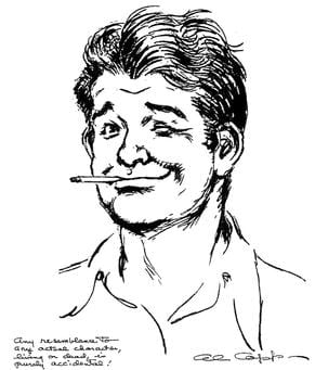
Before diving into Dogpatch, the pastoral southern paradise that is home to the Yokum family, the uninitiated should probably learn a few things about Li’l Abner‘s creator, Al Capp, born Alfred G. Caplin. Capp led a full and controversial life peppered with staggering wins and losses. Creating Li’l Abner, a one-of-a-kind comic-strip franchise that spawned several successful adaptations including two major motion pictures, was probably Capp’s biggest win. His biggest loss, an event which changed his life forever, happened at nine years old when a streetcar ran over Capp’s left leg.

To prevent the spread of gangrene, doctors amputated Capp’s leg well above his knee. Though the young Connecticuter survived and eventually learned to walk using a prosthetic wooden leg, the prosthesis was unreliable and very difficult to master. Continual discomfort and periodic breakdowns of his prosthesis made Capp’s life difficult, but the underlying embarrassment about his injury caused Capp significant stress as well.

Al Capp
“They give good oo-mox.”

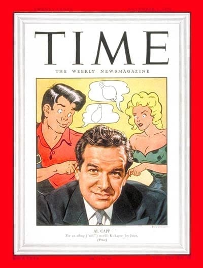
Al Capp, Celebrity at Large

A hardy individual, though, Capp proved that tenacity, talent, and a bit of luck can go a long way. Capp made his name not only as one of the last celebrity cartoonists but also as a TV-and-radio personality who frequently appeared on The Tonight Show, so much in fact that Capp appeared on shows hosted by Steve Allen, Jack Paar, and Johnny Carson!

Li’l Abner, Political Pundit

Although in the early years Capp used Li’l Abner as a means to lampoon stuffed-shirt conservatives, whether from the north or the south, as the character and Capp aged Li’l Abner developed a decidedly more conservative tone.

Campus Cartoon
“Don’t tread on my ink, man…”

Capp came down on what many would consider the wrong side of history on a number of landmark political issues, including in his support for the war in Vietnam. Where many other artists and intellectuals protested the war, Capp protested the protestors, taking issue with what he considered un-American actions of anti-war demonstrators and hippies. One such jab was Capp’s insertion of the student group SWINE (Students Wildly Indignant about Nearly Everything) into Li’l Abner, a parody of the very real Youth International Party (YIP) and Students for a Democratic Society (SDS).

Not Quite Enough Southern Charm

Claims of sexual misconduct by a variety of women, including Goldie Hawn and Grace Kelly, act as reprehensible low-points in this entertainer’s full and astonishing life. One wonders what Li’l Abner or Mammy Yokum would’ve had to say about Capp allegedly exposing himself to four female University of Alabama students in 1971 or his being charged with indecent exposure, attempted adultery, and sodomy by a University of Wisconsin-Eau Claire student in 1972.

Al Capp
That is a terrifying baby.

Meet the Yokums: Li’l Abner’s Al Capp

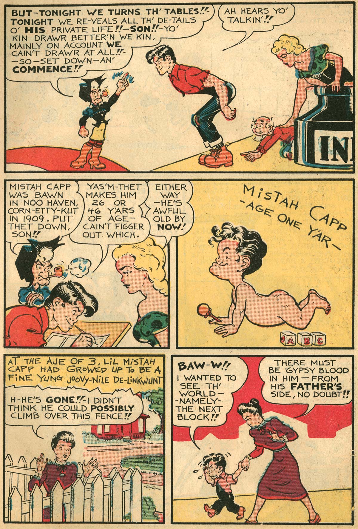
Rather than go into too much detail on these and other parts of Capp’s life, I’ll refer interested readers to Capp’s comic-strip “autobiography.” One of the best bits of bonus material in IDW‘s collection Al Capp’s Li’l Abner, The Complete Dailies and Color Sundays Volume One: 1934–1936 is Capp’s sequential art autobiography, written as if Li’l Abner is writing, drawing, and inking the strip instead.

Capp’s autobiographical strip covers pivotal moments in the cartoonist’s life, including the amputation of his leg, his recovery from his amputation, meeting his wife, the birth of his children, and his struggle and eventual success in his professional life.

Though this account is romanticized, it acts as a good indication of what Capp saw as the formative moments of his life, and, though it glosses over some ugly moments in true Capp fashion the moral of the story is that you can’t keep a good man down.

Meet the Yokums: Next Up, The Yokums

Now that the uninitiated have some idea of what Li’l Abner‘s creator was all about, it’s time to get on with introducing Capp’s creations, the constituents of Dogpatch. Check out my article on Li’l Abner‘s titular character and the rest of the Yokum family.

Monkeys Fighting Robots Youtube

Review: Wringing Out The Good Magic In TALES FROM HARROW COUNTY: DEATH’S CHOIR #2

The sequel to one of the best horror comics of the decade receives a stellar second issue in “Tales From Harrow County” #2. Cullen Bunn’s brilliant senses of plot, pacing, and dialogue are met with Naomi Franquiz’s perfect watercolor art to create a series that fits in perfectly with its predecessor.

As the specter of World War II haunts Harrow County, specters of a more literal sort begin to invade. When a ghostly song begins to call forth the spirits of the long buried, Bernice must work to save the place she calls home, even if some residents may reject her help.

Writing & Plot

Cullen Bunn‘s excellent ability to progress the plot via the characters is as strong as ever in “Tales From Harrow County” #2. The central plot surrounding the ghosts and the spectral singing is brought to life solely through how Hattie discovers it. The mystery is still at large of course, as Bunn never shows his hand. The combination of backwoods horror and intimate character issues is what made the original Harrow County such a fantastic series, and this is a continuation of that style. Socio-political issues are handled with professional brilliance and subtlety as well. The notion of bringing Harrow’s backwoods magic up against Christian Fundamentalism in this era has always been an intriguing one, so watching it happen is just as fascinating – and frustrating – as one might imagine. This, alongside Hattie’s romantic relationship and the goings-on of WWII make this a tense and consistently gripping read even without the horror elements. Once again, Cullen Bunn flexes his talents in endless degrees.

Art Direction

Once again Naomi Franquiz flexes her artistic talents in her second issue of “Tales From Harrow County.” It’s astonishing how much her art replicates Tyler Crook‘s from the original Harrow County while still being very much her own work. The watercolor work still creates the often swampy and other-worldly atmosphere of this horror series. The pencils have a softness on the human and better haint characters that give them friendly relatability. Don’t let that fool you though; Franquiz can still draw one hell of a monster. The superb artwork is supported by series co-creator Tyler Crook’s distinctive lettering, giving different people and specters their own fonts that somehow perfectly encapsulate how they would sound. The visual side of Harrow County continues to look stunning and original thanks to this fantastic art direction.

“Tales From Harrow County: Death’s Choir” #2 is an eerie and endearing follow-up to a spectacular first issue in this sequel series. Cullen Bunn has lost none of his touch with the world of Harrow County and continues to cleverly add new issues both supernatural and social. Naomi Franquiz manages to perfectly emulate the work of Tyler Crook while still maintaining her own artistic touch. So far, “Tales From Harrow County” is proving to be every bit as stellar a series as its predecessor.

Monkeys Fighting Robots Youtube

Review: THE WAR OF THE WORLDS – The Worst Adaptation Possible

H. G. Wells’ The War of the Worlds is considered one of the author’s best works, and it set the standard for alien invasion stories. Under the stewardship of Peter Harness and Craig Viveiros, the BBC adaptation takes the story back to a period setting.

The year is 1905: Britain rules the waves, and the sun will never set on the Empire. This image gets shattered when aliens from Mars invade the planet. Two people who get caught up in the invasion are George (Rafe Spall) and Amy (Eleanor Tomlinson), an educated couple living in sin. They set out to survive the invasion and the aftermath.

The War of the Worlds is a great story, and it shows with the number of times it has been adapted. Some of the most famous were Orson Welles’ radio adaptation in 1938, the ‘50s adaptation, and the Steven Spielberg/Tom Cruise in the 2000s, and 1996’s Independence Day was War of the Worlds in all but name. The BBC mini-series was the first adaptation to be set in England and moving the story to the early 20thcentury. I was personally excited about this mini-series because I thought it would be more loyal to the source material. These hopes were sadly misplaced.

The War of the Worlds was a short novel: it’s less than 200 pages long, and most of the characters were nameless, so changes were bound to happen. The series does keep some of the key sequences, like the main character sending his wife to his brother for safety, the attempt to cross the English Channel, and the main character getting trapped in a building. But for the most part, this version of The War of the Worlds was its own story.

This version of War of the Worlds was wasted potential. The creators took a fast-paced novel and made it into a slow slog. The series started slowly due to the need to establish its characters before the invasion. Still, the first episode spent more than half its run time looking at how George and Amy became ostracized due to their living situation. The series only picks up during the final quarter of the first episode when the Tripods attack Woking and most of the second episode, which was focused on the actual invasion.

The creators of the series made a really strange choice with how they structured the show. The series flipped back and forth from two different timelines. Half the story was set during the alien invasion; the other half took place many years later in a post-apocalyptic version of London. This extinguished any tension in the story because we know that Amy survives the invasion. The first episode did end up with a seemingly effective twist where Amy goes to the Admiralty building in London in the hope that she can meet up with George. But the twist was ruined when it revealed what happened – so it ended up making no sense. It was like two different writers worked on the script, but they didn’t consult each other.

The series could have easily used this template – the first episode would have looked at the aliens arriving and the response from the government, scientists, and locals, the second would have been about the actual war, and the third could have looked at the aftermath of the invasion and how humanity would rebuild. It’s a simple three-act structure. The creatives could have had fun with the concept by showing how people in Edwardian England could have reacted to and interpreted these events and added a twist to the alien-invasion and post-apocalyptic genres.

The series had some weak special effects. Being a British TV production, the special effects were never graduated to be the best, although His Dark Materials and the latest seasons of Doctor Who have had excellent production values. The CGI for the Tripods were passable, but the rest of the CGI looked like Doctor Who during the early years of the modern series. The CGI backdrops of a destroyed London were particularly notable because they were so poor.

The War of Worlds should have been a slam-dunk considering the source materials and the potential of the historical setting. Instead, the BBC has provided one of the worst adaptations of a great novel.

Monkeys Fighting Robots Youtube

The Apple Doesn’t Fall Far From The Tree in TARTARUS #1

The science-fiction tale of a daughter paying for her mother’s sins bursts elegantly to comic shelves February 12th in Image Comics’ newest series, TARTARUS #1.

The badassery of Surka in Tartarus #1
Interior art by Jack T. Cole, letters by Jim Campbell.

As Tartarus #1 debuts in February, meaning you still have time to order it. FOC is January 20th, so make sure your local comic shop will have it in stock.

THE FOUNDATION OF TARTARUS

Tartarus’ premiere issue receives the double-sized treatment (44 pages) that sets up the past and the present. Writer, Johnnie Christmas uses this to his advantage by keeping the first half (and some) dedicated to Surka escaping from imprisonment in a deep leveled complex. The amount of pages given to Surka’s side of the story is perfect. We are treated to just how much of a badass she was while showcasing why she was such a feared/wanted criminal. The backstory sets up the reasons why all hell breaks loose when we learn of her daughter, Tilde’s heritage.

Leaving the past Christmas thrusts the reader to where the main story takes place, 17 years later, with Surka’s daughter.

The slow-paced nature and extra pages flesh out the story and world-building greatly. Towards the end of Tartarus #1 it’ll seem as if you’ve read the first volume of a graphic novel trilogy published by Humanoids Publishing. Said feeling can be attributed to multiple facets of Tartarus being reminiscent of The Incal and other European Comics. Story-wise, this is due to the aforementioned slow pace that Christmas uses to build the story up, plus its unique science fiction.

The “foundation” for Tartarus is strong in its freshmen issue with the sense that the creators went deep in the lore to help make the world. Each moment feels calculated and thoroughly thought out with a sense of history between the characters and background waiting to be explored. With the first issue, Christmas introduces some questions that linger, yet answers some. Thus, not making you feel cheated while keeping you wanting more of the world.

Cigarettes and more can kill in Tararus #1
Interior art by Jack T. Cole, letters by Jim Campbell.

PLENTIFUL ART

The European Comic vibe continues with the art, which has a strong Moebius resemblance. Each panel by Jack T. Cole is adorned with thin lines that connect to make a beautiful picture. All of Cole’s backgrounds show an insane amount of detail that tell stories of the world and their devices. Tartarus #1’s pages contain such a vast array of imaginative science fiction devices that make you stare in appreciation at their complexity. Much like Christmas’ writing, Cole’s art does a great deal of fleshing out the world.

Cole’s colors in Tartarus #1’s blend effortlessly with the story and art being told. At times the pages feel as if they were ripped from a 1980’s science fiction palette. When the moment calls for a bright retro feeling, Cole makes sure that the page pops out. Yet, the colors don’t stop at bright and poppy. Cole fills Tartarus #1 with such a vast array of colors that each panel will inflict differing emotions while leaving you enamored in their glory.

Jim Campbell’s letters continue the European Comic atmosphere, yet the style is easier to pin down. The font style mirrors some of Tom Frame’s work on Judge Dredd. Campbell’s lettering is exquisite throughout Tartarus #1, with him heightening the emotion of each scene. As the letters never cover any important detail while helping the reader in some of the more busy parts.


Tartarus #1 contains some great fight scenes!
Interior art by Jack T. Cole, letters by Jim Campbell.

TARTARUS CONCLUSION

When all of Tartarus #1’s elements combine its exaction mirrors a 1980’s European Comic in an alluring manner. This aesthetic may fill the void for some readers, yet equally may not be others cup of tea. Nonetheless, Image Comics and the team behind Tartarus very well have an early “Best of 2020” contender on their hands, and hopefully in yours.

Fun Fact: Johnnie Christmas was the artist for William Gibson’s Alien 3. You can see our review for that here.

Monkeys Fighting Robots Youtube

Review: RAI #3 Builds Off FALLEN WORLD

Rai #3 cover

Rai #3 out this week from Valiant Entertainment is a surprisingly great jumping-on point for people who have read Dan Abnett’s epic beginning in Fallen World. From the vast world, the threats, and the themes all in one fell swoop.

Quick Recap

Rai is on a journey to prevent the second rise of Father, a powerful AI, and his creator. Unfortunately for the cyborg ronin, he’s at a disadvantage. Father is possessing the body of Valiant’s cash cow, Bloodshot. Now father plans to regain his rule over life in the future world by finding backups in Rai’s predecessors. Doing so will bring him back to full functionality. With an army of devout followers and access to every digital communication at this Red King’s fingertips, Rai has to go analog. While this prevents Father from tracking Rai and his “older brother” Raijin, it also leaves them isolated from allies. Which is where the primary conflict comes from.Rai #3 in full detail

Rai #3 Plot

Rai, having cut himself and Raijin off the numerous networks have to track down whatever backups are left. But that leaves Rai’s allies unable to contact him, including his confidant Lula. It’s a piece that genuinely feels right with the plot, to either be a self-reliant human or use technology when it’s most appropriate. Raijin himself feels violated when he realizes what Rai did to them both. Because despite being more mechanical, he’s still a conscious being. With someone like Bloodfather around, it’s a circumstance that people will have to learn to workaround. Because ultimately, both sides are right in their own way.

Art

The photorealistic art style made by Juan Jose Ryp pencils and Andrew Dolhouse’s color really help illustrate the settings. Unlike the art in Fallen World, this more rustic appearance helps tell the wild settings. Given the dusty wilds and the demented looking mindscape of Rai’s virtual world, it tells the story with the dialogue.

Dave Sharpe’s use of clever placement of word balloons guides the reader through the story. Then there are the diagrams that accompany the introductions, a great way to save time on exposition rather than bore people with words. What words there are in the diagram speak a great deal about perspective, especially since it highlights the machine-following Red King and his followers. Accompanying them are bright blue lights that contrast against dark backgrounds to highlight tension. As if the tensions in a vulnerable night or Rai’s troubled mindscape doesn’t speak it enough.

Read Rai #3

Rai #3 fills the quota of how every comic can be someone’s first, at least to a degree. Some people might need to have some background material before going into this. Because when they do they will see the transitions the narrative goes through. On its own it’s still a good read.

Monkeys Fighting Robots Youtube

Review: PRETTY DEADLY THE RAT #5

Pretty Deadly The Rat cover detail
Pretty Deadly The Rat #5 Credit: Image Comics

It may feel as though it’s just begun, but Pretty Deadly The Rat reached its dramatic conclusion earlier this month. The five issue mini-series published by Image Comics has been a magical journey through the depths of 1930’s Hollywood, blending reality with mythology using some of the most beautiful art work currently on the shelf.

It has been a story of tragedy, vengeance, and soul searching. Is this the end? In a way it is, but in an equally truthful way it isn’t. When it comes to Pretty Deadly, it isn’t about the endings, but the journeys.  

Pretty Deadly The Rat #5
Pretty Deadly The Rat #5 Credit: Image Comics

Final Words

In the final issue Ginny and Frank, the Conjure-Man, are within sight of their goal. Although they are in the clutches of the Reaper of Obsession they can see the end and an opportunity to free the lost Clara Fields. 

A deal is made but a deal with any form of Reaper is never a good idea.

Kelly Sue DeConnick’s script is poetry in motion. Her words build a world of abstract images and emotional drama derived from the dreams and thoughts of her characters. The cast represents a number of concepts which are sometimes easy to understand, like the Reaper of Obsession, but often more complex. DeConnick’s writing is about picking those concepts apart and looking at them from a different view point. 

In this final issue DeConnick brings the characters together and demonstrates how to move on in life, or in Clara’s case in death. The power of forgiveness is one of the strongest weapons that people possess which is why it features so strongly in the denouement of The Rat. A number of the speeches given by the characters resonant out of the pages; providing lessons for us all to learn. In these turbulent times, it is up to individuals to take control of their own lives. It is not easy and there are consequences, the fate of Ginny being one, but by standing up for herself and finding the confidence to rise above her mistakes, Clara is able to take the upper hand. 

In places the narrative may feel unsatisfactory, as the reader isn’t getting what they want. This however, is part and parcel of mythological storytelling. The tale is told by the teller and the listener has no control. One of the aspects of Pretty Deadly is the storytelling framing device of the Bunny and the Butterfly. 

These represent the creators of the comic and DeConnick uses them to speak directly to the reader. They are meta-fictional creations who don’t break the fourth wall as much as create it. They add an extra layer to the myth-building like a Bard, creating a story within a story. These characters act like conduits for the themes and meanings, creating a narrative bridge for the concepts to cross over from the comic to the reader.

The final issue of The Rat manages to draw in the narrative threads that were introduced in the first issue but also some of the story elements from previous Pretty Deadly comics. There is not a definitive ending for a number of characters and leaves a several story-lines hanging but as Bunny point’s out “This was Clara’s story. It is finished now,”

Pretty Deadly The Rat #5
Pretty Deadly The Rat #5 Credit: Image Comics

Drawing a Dream

The Rat is set near the beginning of the Golden Age of Hollywood but it’s story is far from the glitz and glamour. Emma Rios clearly draws inspiration from movies of the 1930’s but not necessarily those brightly lit Hollywood greats. Instead her imagery and style comes from European cinema, especially the German Expressionists. The abstract nature of her storytelling and the wild mix of unbelievable landscapes with intimate close ups, creates a world of wonder that is familiar but unrecognisable at the same time.

On the one hand Rios is telling the story of the central characters and their journey through a broken dream. On the other Rios is capturing emotional concepts and relaying them in a form of visual poetry. Individual panels may not make sense by themselves but that is not the way to read this comic. Each page is a stanza to the comics poem. The images loop backwards and forwards, in and out, producing an emotional experience.

Jordie Bellaire’s colors heighten this experience by creating verses in the narrative. The changes in color palettes from one section of the story to the next provide breaks that the reader can instantly recognise. As you turn a page your mood is instantly affected by the change in color and the tone of that stanza is set.

Inside all of this emotion are the characters who are given their voices partially by what they say but, in large part, by how they say it. To differentiate the characters and inject individualism into their speeches, Clayton Cowles makes all of the lettering different. He gives each character their own style, whether it’s font or color, and them manipulates this to produce tone and intention. The cast’s voices are as individual on the page as if they were actors on a soundtrack. Take away the visuals and leave the speech and you still know exactly who is talking.

Pretty Deadly The Rat #5 Cover art
Pretty Deadly The Rat #5 Credit: Image Comics

Conclusion

Bringing all of these amazingly creative ideas together into one single comic has produced something sublime. This is the comic book equivalent of a Maya Deren film. The film Meshes of the Afternoon introduces the concept of a narrative into an Avant-guard movie using similar imagery and storytelling techniques that is used within the pages of Pretty Deadly.

The hopeful and the lost are often the same and The Rat focuses on contradiction of character and purpose. In the end this is a comic about the interaction of characters and ideas. The central story has a beginning, middle, and end but it becomes lost in the tales of others: just like in life. As one story ends, another starts.

Pretty Deadly The Rat is a beautiful work of visual poetry. The final issue has now been released and it proves to be an outstanding, one sitting read. If you have not picked this up then I highly recommend the collected volume when it is released in March this year. Each issue has been majestic but in totality, Pretty Deadly The Rat is a walk through a dream you will never forget.

I’ve said it before and I’ll say it again, every aspect of this comic is outstanding.

Monkeys Fighting Robots Youtube

Review: Player 2 Enters The Game in ALIEN VS. PREDATOR: THICKER THAN BLOOD #2

The second issue of “Alien Vs. Predator: Thicker Than Blood” is a beautiful but forgettable read. The plot itself is rushed and introduces new characters at random, but it’s helped out by some great AVP action and phenomenal artwork.

With nowhere left to run but into the Predators’ ship, every turn leads Maria and Tyler deeper into danger–until they discover a captive xenomorph. Could the Alien be the weapon to tip the scales in their favor, or will they find themselves caught in a crossfire?

Writing & Plot

The script in “Thicker Than Blood” #2 unfortunately doesn’t have the straight-forward momentum the first issue had. The actions of the two lead characters don’t really make much sense in the context of the story. Granted, one of them is an android, so this could excuse the nonchalant attitude he has towards his “parents” deaths. The older daughter’s actions however just seem rushed for the sake of getting to the action. The suspension of disbelief, even in a series such as this, can only get the audience so far. There’s a sudden introduction of a random side-character as well that feels completely out-of-place and purposeless in the goings-on of the plot. The action on the other hand is quite great. The kids gain a new member of their party near the end of the issue that will hopefully make for a more fun follow-up chapter.

Art Direction

The real draw and saving grace to “Thicker Than Blood” is the outstanding artwork. Doug Wheatley’s renderings of characters both human and alien are so realistic it’s a bit unnerving. This is meant in the best way possible, as its some of the best comic art currently hitting shelves. Shipboard details and gory bits are given great attention and sell the hell out of the atmosphere. Wheatley’s pencils and inks are given color by Rain Beredo, who nails the dark and grimy-yet-polished aesthetic an AVP series needs. Everything from the lighting to splashes of crimson red and glowing green blood looks absolutely stellar. If there’s any one reason to check out this comic outside of its franchise roots, it’s the visual work.

“Alien Vs. Predator: Thicker Than Blood #2” is a beautiful mess of a comic. The plot with Maria and Tyler rushes past the prior tragedy they have experienced to the point that the pair is almost unlikeable. The disjointed script is partially saved by some great action moments and absolutely phenomenal artwork. Hopefully this mini-series’ plot can pull it together in its final two issues.


Monkeys Fighting Robots Youtube

Exclusive DC Comics Preview: LUCIFER #16

Exclusive DC Comics Preview: LUCIFER #16

Lucifer #16 hits your favorite comic book shop on January 15, but thanks to DC Comics, Monkeys Fighting Robots has a six-page exclusive preview for you.

About the issue:
THE RARELY SPOKEN OF BODY FACTORIES OF HELL
Who is the Hunted God? That is what Lucifer must discover after prophecy dictates he must save this mysterious prey from a deadly fate in the Wild Hunt, a mythic quest led by one of the most dangerous entities in existence: Odin himself.

Lucifer #16 is written by Dan Watters, with art by Max Fiumara, Dave McCaig colored the book, Steve Wands is the letter man, and Tiffany Turrill worked on the cover.


Are you reading DC Comics’ Lucifer? Sound off in the comments!

CHECK OUT THE LUCIFER #16 PREVIEW BELOW:

Lucifer is based on the characters created by Neil Gaiman, Sam Kieth, and Mike Dringenberg.

Monkeys Fighting Robots Youtube

Review: Rich Plot, Uneven Pacing in 20XX #2

20XX #2

After an unceremonious introduction, Mer finds herself suddenly swept into the world of the sym gangs in 20XX #2, out this week from Image Comics.

Surviving the attack by East Side gang members, Lucas brings Mer to meet with the West Side leader. The question: how will she choose to use her new powers, and where will they lead her now?

The Writing

Our first issue of this four-part series focused primarily on establishing our story, worldbuilding, and introducing the cast of characters. With 20XX #2, though, the creators toss the reader into the deep end of the pool. The intricacies of inter-gang politicking take up most of this issue, with our protagonist barely managing to keep up.

Writers Lauren Keely and Jonathan Luna pack a lot of information into this single issue. The book is fast-paced in terms of how it’s plotted. However, characters tend to be rather long-winded, with a lot of dialogue crowding each page. The result is that the book can feel slow, despite actually moving along quite fast.

The writers also deepen the story significantly with 20XX #2, adding several new threads to the larger plot. We have more characters, each reacting to the state of the world in different ways. We have drug dealing and conflict between rival sym factions. Then, we have Mer’s life outside of the gang, as she tries to adjust and meet other nonaligned syms. It’s a rich narrative…almost to a fault. This all might have been helped by having one or two more issues to spread across, given the relative complexity of the story. This would have helped with the pacing of the story.

Keely and Luna aren’t subtle about the themes of oppression and fear regarding the sym population in 20XX #2. While it can be a bit heavy-handed, it’s still within the realm of believability, given the scope of this disease. It’s entirely believable how a disaster on this scale, compounded by catastrophic climate damage, might have warped society significantly.

In all, the writing is strong. Almost too strong, truth be told; as mentioned, this story really feels like it will need more than four issues to tell in a satisfying manner.

The Artwork

In addition to writing, Luna also provides illustrations for 20XX #2. The character designs are excellent overall, with the artist opting for a realistic style. The precision of the inks, along with the softer designs and lines and the absence of colors, gives the work a soft quality that is easy on the eyes.

Luna’s characters are generally expressive, and convey a sense of liveliness and animation. The reader can pick up on the doubt, confusion, or shock conveyed in a character’s eyes and body language. There are points at which they can feel a bit stiff, though, so it’s not as consistent as one might like.

While there is considerable detail in the illustrations, the settings themselves are very minimal. We see a lot of nearly-empty rooms and blank walls, with maybe a table or a window being the only set dressing. As a result, much of the focus is on the characters. That said, the figures feel almost as if they’re interacting in a blank void through much of the book.

Final Thoughts

20XX #2 is a solid second chapter for this miniseries. It’s a rich and complex story that holds the reader’s attention, even through the sequences of extended dialogue.

Monkeys Fighting Robots Youtube

Indie Comics and Creator-Owned Comics: What’s the Difference?

Indie Comics demonstrate the difference Alternative Comics

Indie Comics are becoming more popular, but most websites mislabel indies as creator-owned content. So what exactly is the difference between the two? Another site, “What’cha Reading?” also asks this question. Because let’s face it, what some people view as independent is not the same as what others think. This is the research from the gutters.

The People’s Definition of Indie Comics

The Uniques on originality
Who says Indie Comics need to be original?

According to Investor Words, any independent company is “a company not controlled by another company.” For comics, this has a lot of meanings; as Chuck Suffel of What’cha Reading points out, “independent seems to be one of the more nebulous terms.” Some say indie comics mean non-superheroes, thanks to titles like Elfquest or Bone. But there are several superhero titles like The Uniques that stand contrary to that statement. Others say that indies are any comic other Marvel or DC because of those publisher’s popularity. All of those, however, detail alternative press comics. Image and Dark Horse comics are just as popular, complete with IP notoriety, which comes to another argument.

Who Owns What?

So publishers, like Image and Dark Horse, host publishing platforms where creators retain the IP rights. Other publishers like Oni Press and IDW use this model as well. However, some of these other publishers are under higher ownership. IDW, for example, is part of Idea and Design Works; Oni Press and Valiant meanwhile got bought out by larger corporations. In layman’s terms, those companies’ series are not really indie comics. As for Image and Dark Horse, they’re another story.

Image and Dark Horse have no corporate owners, but they do have influential support systems. Dark Horse, for instance, is an overall entertainment company, the comics are now a division of the primary one. The rest of the company handles deals like merchandise or Netflix shows. Most of these companies have plenty of resources and don’t usually require additional help. That’s not to say some companies don’t try to take some advantages like Kickstarter.

Indie Comics Lack Support

To support themselves and cover the costs to keep publishing his or her comics, a few creators use crowdfunding websites, including “Kickstarter” and “Indiegogo.” Unfortunately, without established fanbases or viral hits, the financial angle proves to be difficult.


Most creators don’t even get a stable income from Patreon alone as Graphtreon displays. Of them, only the first ten publishers on the list make sales money comparable to annual small business sales near $100,000. Even MFR favorite indie comics series God-Puncher doesn’t receive a lot of support; just look at creator Lane Lloyd’s Patreon. Yet the use of crowdfunding to sustain themselves shouldn’t be what makes something indie. Even established artists like Jimmy Palmiotti have these accounts. One Image series does give some insight into the difference between indies and creator-owning comics.

The Indie Comics Connection

In Airboy by James Robinson and Greg Hinkle, Image publisher Eric Stephenson calls Robinson up for a job offer. This displays the main difference between creator-owning, alternatives, and indies more than anything, connections. Robert Kirkman, for example, mainly got into Image Comics through any connections he could find. Also, while Image Comics doesn’t own the series it publishes, the company owns the publishing, marketing, and distribution rights. Look no further than the copyright details saying “no part of this publication may be reproduced or transmitted, in any form or any means.” Meaning while the creators own creative rights, they can’t sell the comics on his or her terms. Not without a lot of paperwork anyway. It’s a different story if the creator owns both the series and publisher.

One such publisher is “Benitez Productions” and series Lady Mechanika. Joe Benitez owns both properties, and his website allows him to sell his products to consumers directly. However, Benitez holds several connections, not unlike Image or Dark Horse. This includes but is not limited to “Diamond Comics Distribution Inc.” which provides access to distribution. Indie publishers like “Unlikely Heroes Studios” however lack some of these connections unless they meet some criteria.Zach Dolan, you are an inspiration to indie comics.

The Non-Indie Criteria

Companies like Amazon and Diamond seem to have some high mark criteria to have anyone’s series featured. Amazon appears to be more lax as long as there is some hype or popularity behind something. UH Studios’ primary series Super! for example is available on Amazon unlike UH’s other series and merchandise. This is no small feat, as even companies that exist in name only like “Space Goat Publishing” still have content that can be purchased like Heroines. Diamond meanwhile has an even bigger threshold.

Diamond holds a near-monopoly over comic book markets, and it takes more than a cult following to get on its catalogs. According to Pen & The Pad’s Fraser Sherman, the publisher needs to make $2500 in retail orders. That requires quite a bit of networking to achieve, from paying for con booths to promoting at local bookstores. Most indie comics can’t even afford to mass print without crowdfunding.

The Price To Be Indie

This brings up a pretty decent question that a few creatives, including Michel Fiffe, likely go through. Is being a publisher independent of these support systems and connections financially worth it? Even the likes of Fiffe and Tesladyne had to compromise their independence by making deals with the creator-owned companies. When looking at circumstances like that, it’s no wonder people get the terms confused.

What do you all think; is a lack of licenses and business connections the thing that separates indie comics from simple creator-ownership? Leave your thoughts in the comments.

Monkeys Fighting Robots Youtube